

Poc
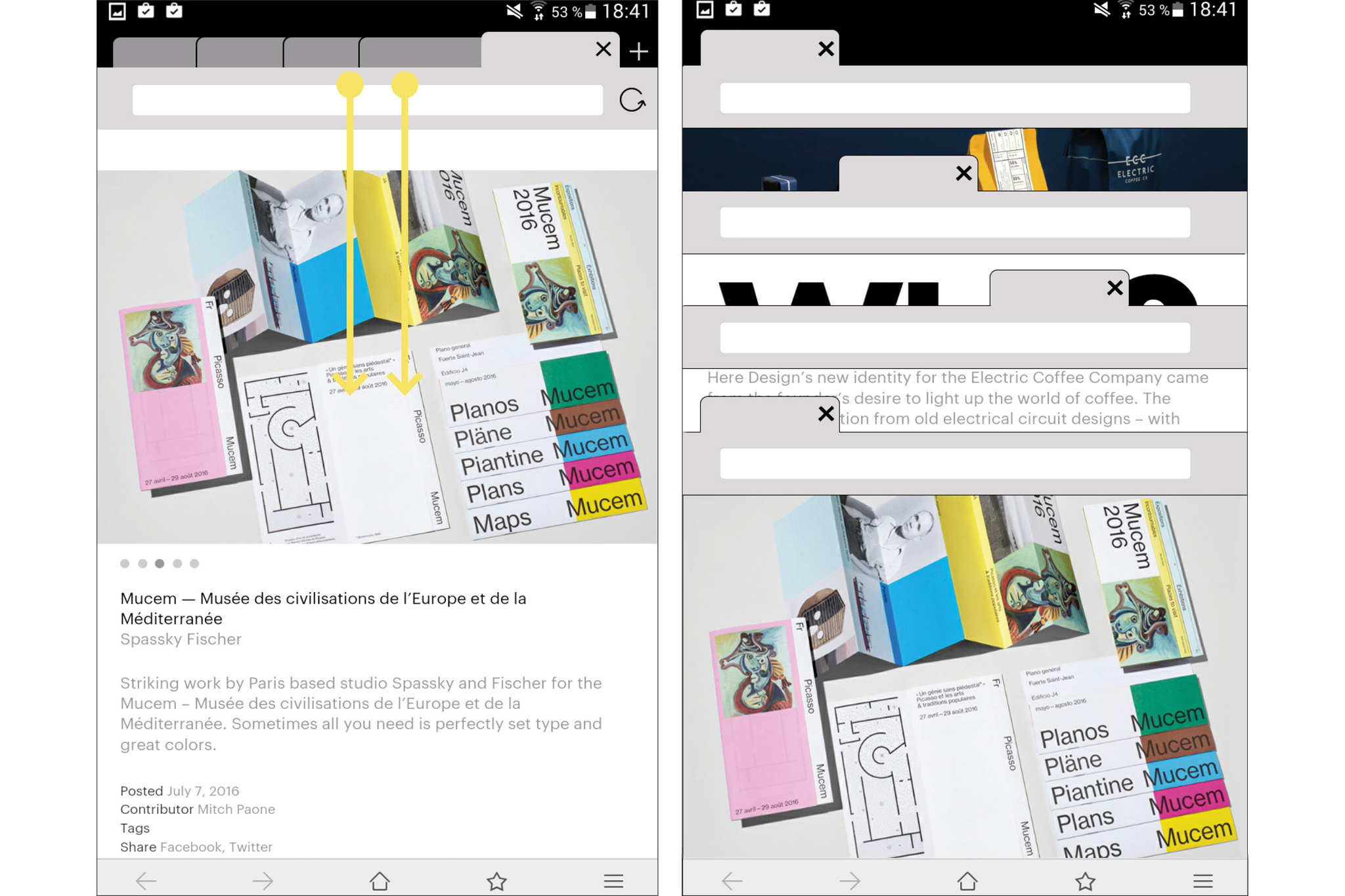
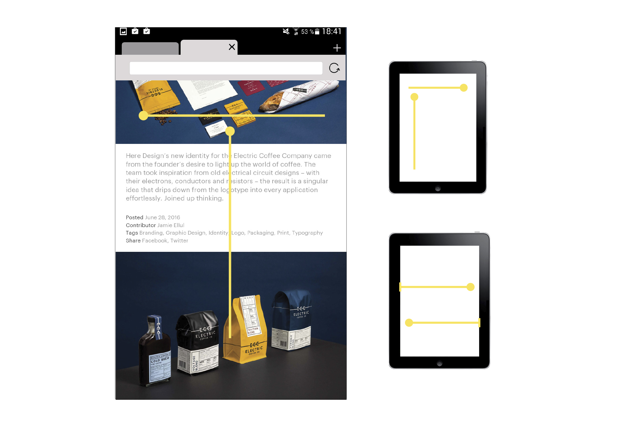
Why is it still more enjoyable to browse the internet on a computer or laptop, than on a smart phone or tablet? Opening and copying links quickly into new tabs or notes, and sharing websites or images are amongst the most important things needed when browsing the internet. All of these actions should be easy and enjoyable, with the option of shortcuts. POC is a touch browser that makes it not only easier but also fun to browse on a tablet.
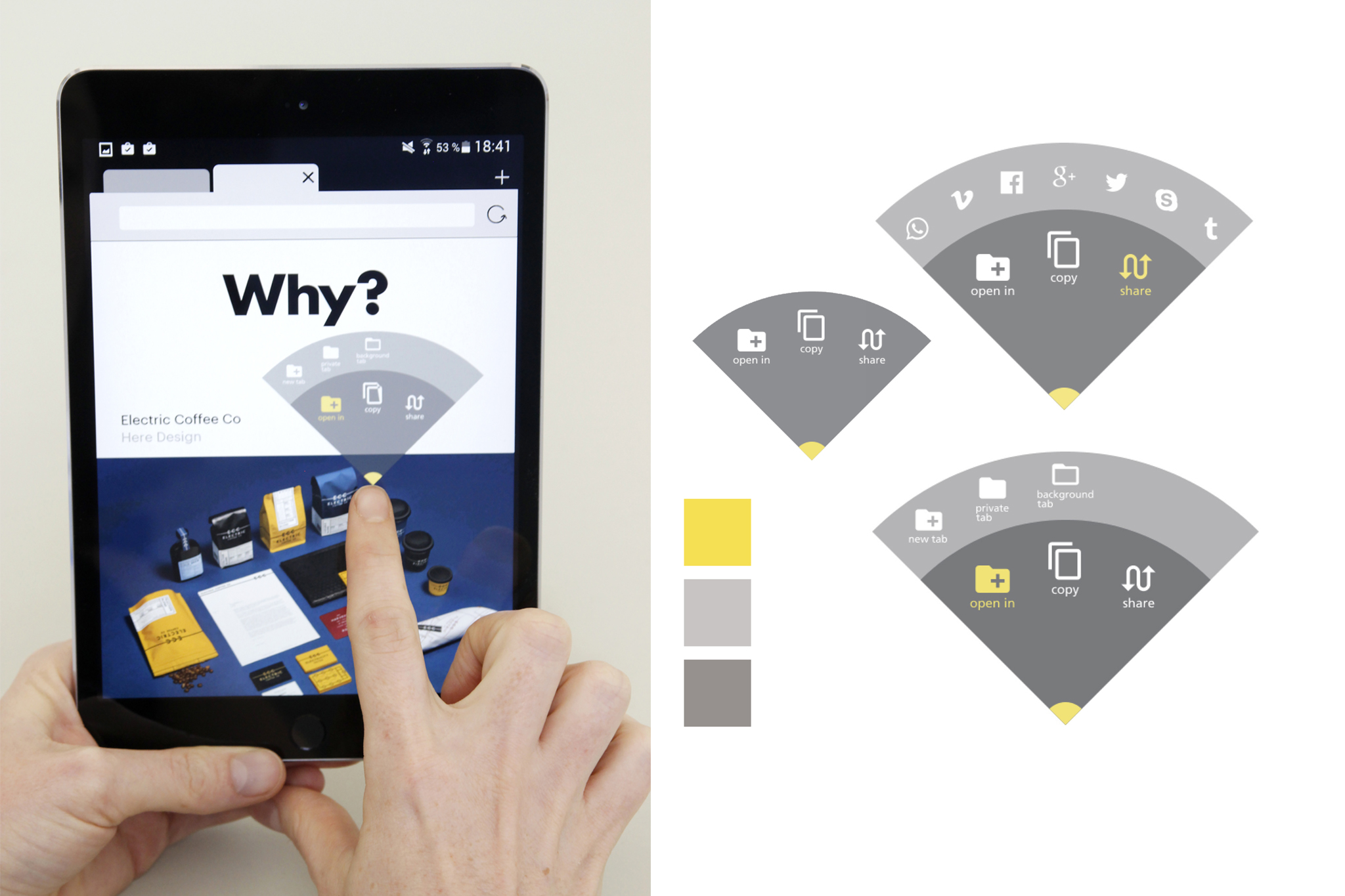
In many other browsers: when opening, sharing or copying a link there is most often a large and long menu which takes over the screen and forces the user to read a lot. I created a pop-up menu, which is a quarter circle. It opens up above your finger so that the whole menu is visible. The menu has two sub menus, which turn into a dial when there are more icons to show. When the menu no longer fits within the screen because the link or image to be clicked is too close to the edge, it turns 45 degrees. The icons also turn, so that their orientation is always horizontal.
