Archiv der Kategorie: Produktdesign

GRIPP – Layla Jordan

GRIPP is a helpful multitool designed for people with weak grip strength, to aid in the opening of cans, bottles and jars. Three openings of varying sizes can grip around the lids of jars or screw-cap bottles, providing a large handle with leverage to hold onto. A bottle opener and a ring-pull can opener are integrated in the sides of the tool, and the tweezer-like tip of the tool can be used to pick up food without getting your hands dirty. Due to the very strong and flexible nature of Formcard, the tool is not misshapen through repeated use and can be stretched around jar lids with a diameter of up to 10 cm.


Nutzungsmöglichkeiten – John Lörinci

In der Ausseinandersetzung mit Formcard und seiner Materialität habe ich im Verlauf des Projekts viel mit Konzeptideen herum gespielt um dem Material gerecht zu werden und dessen Potenzial der stetigen Verformbarkeit nutzen zuzuschreiben. In diesem Zusammenhang habe ich mich nicht auf die bisherige Formgröße von Formcard beschränkt sondern versucht Nutzungsmöglichkeiten zu entwickeln die einen spezifischeren Nutzen verfolgen.

Mein Finales Konzept beschreibt eine Individuelle und Angepasste Nutzung von Form und Geometrie die von jedem Nutzer spiezialisiert werden kann. Man erstellt also je nach Nutzungsgebiet simple Grundkörper die einfach aus dem selben Material wie die Formcards spritzgegossen werden können und dessen Endform durch verformung komplett vom Endnutzer bestimmt wird. Beispielsweise Stühle/ Hocker die als Grundobjekt als simpler Kubus verkauft werden können, doch aufgrund seiner Materialität vom Endbenutzer perfekt an das Gesäß angepasst sein können oder aufgrund der Möglichkeit von Verformung einen ganz bestimmten engen Platz in der Wohnung einnehmen, in die herkömmliche Sitzobjekte nicht passen. Wenn man diesen Ansatz weiter denkt, wäre es auch sehr interressant sich damit auf Objekte zu spezialisieren, bei denen eine hohe Anpassungsgenauigkeit und Individualisierung dessen Funktionalität verstärkt. Beispielsweise einen Einleger als Innenfutter eines Fahrradhelms, der aufgrund der stetigen Verformbarkeit perfekt an die Kopfform und Größe anpasst werden kann und somit eine bessere Passgenauigkeit für besseren Schutz bietet. Ein weiteres Beispiel sind potenzielle Anwendungen bei Knochenbrüchen als Ersatz von herkömmlichen Gips-Verbänden aufgrund der einfachen Handhabung, Wasserresistenz und Shorehärte.

Ich sehe viel Potenzial in Anwendungsmöglichkeiten des Polymorph Materials (Polymilchsäure), da es aufgrund seiner leichten Verarbeitung und vereinfachten Individualisierung Optionen bietet die spezifizierte Anwendung durch den Endbenutzer ermöglichen.


MELT TREE – Gustav Sundberg

The Melt Tree is a decorative object that can be enjoyed just as it is, as a jewelry tree or for hanging small objects on. It has been made by covering an inner construction made from aluminium foil with melted form cards. The aluminum does not contribute with much support itself and the strength of the tree is first achieved when the melted cards cool down.

The first step of the tree was to create the aluminum core. After that cards were melted and rolled out thinly before applied on the aluminum. Some cards were mixed or fully blended to achieve effects and new colors. The process continued until the aluminum was completely covered. As a final step, to achieve its melted and shiny look, the whole tree was re-melted in hot water until the desired look and shape was achieved.


Things – ChihYun Cheng

Formcard is similar to clay in that it can be freely molded into various shapes, but what more special is that it hardens after cooling, offering both flexibility and durability. It’s perfect for creative expression and integrating into everyday items. Some of the desk accessories created include a carrot- pen, a Traffic cone-shaped hair tie holder, and a fried egg-shaped corner protector. These items showcase the fusion of organic forms with practical functionality, turning imaginative designs into useful objects.


FORMCARD EXPERIMENT – Jul Gross

During an intense one-week project, we evaluated a product called FORMcard—a credit-card–sized piece of bioplastic that becomes malleable when submerged in hot water for a few seconds, then hardens again as it cools.

This experiment showcased FORMcard’s ability to create instant, perfect negative molds of existing objects and highlighted its lasting elastic properties. The result is a reusable cap for crown-cork bottles. The cap lets you reseal your beverage, protecting it from insects and providing peace of mind against tampering. A loop on top makes it easy to carry on a keychain or to hang your bottle from a belt loop or backpack.


Moodshapes – Moritz Glatte

My approach to working with FORMCARD was to seek out high-quality surfaces and to avoid the automatic DIY aesthetic.
After extensive experimentation, I discovered the dynamic transparency of stretched and thinned material. This discovery enabled me to achieve my objective by intentionally utilising the DIY characteristics and providing them with a new context. The concept of a mood lamp was created.

Through the technique of stretching and pushing the material on a hot surface, I was able to create large and thin sheets with a changing transparency.

These sheets were cut into rectangles and subsequently used as the lampshades.
The housing for the lamp was constructed from wood and consisted of two parts.
The first part was mounted on the wall, serving as the base and housing the light source. The second part holds the lamp sheets and can slide easily onto the base.

The main idea is to buy the skeleton of a lamp and create the lampshades independently in personal process using FORMCARD. This approach provides the object with an infinite range of aesthetics and creates a strong emotional connection to the owner.
Once a shade becomes boring, a new one can be created and exchanged easily.


THE MELTED TACTICAL RULER – Nicole Bedeker

The idea for the melted tactical ruler was inspired by Formcards material properties.I wanted to emphasize its ability for contrast and let it be seen in one object.Meaning I needed an object that reflects a very specific standard and looks very straight and clean, perhaps manufactured.After I was inspired by my own tactical ruler I recreated one out of Formcard.The next step was to let the material do its thing and deform.Now one can not use the tactical ruler as meant, but new shapes and possibilities are unlocked.


FORMPlant – Noga Kassif

FORMPlant harnesses the unique properties and accessibility of FORMCard — a moldable, reusable bioplastic — to create a modular support system and shaping tool for home plant growers.

The process begins with a simple transformation: the user heats and forms the flat card into a rod. This method is intuitive and easy to perform, while yielding an aesthetically clean and smooth result. The rods can vary in color, diameter, and length, allowing users to adapt the tool to their plant’s specific needs.

In the next stage, a portion of the rod is reheated in water and gently reshaped to support the plant in the desired position or posture. This hands-on process enables a direct, personal interaction with both the material and the plant.

Project Highlights:

  • Custom-fit design: Every plant grows differently — in shape, size, and movement. FORM PLANT offers a way to create a tailored support system in form and color that respects each plant’s individuality.
  • Sustainable, reconfigurable, and compostable: Made from bio-based plastic, the support can be reshaped and reused multiple times as the plant develops. Eventually, the material naturally biodegrades and can be composted, returning to the soil and nourishing the very plant it once supported — completing a thoughtful, closed-loop cycle.
  • Support wraps the plant — not the other way around: Unlike traditional plant stakes or ties, FORM PLANT encourages a new relationship where the support responds to the plant’s growth rather than restricting it.


DÜBEL – Emily Lechaux

Wenn der passende Dübel fehlt, bietet DÜBEL aus formcard die Lösung: Ein individuell anpassbares System, das sich schnell auf jede Schraube abstimmen lässt – sofort bereit für den Einsatz.


Hang’n’store – Amelie Wissels

For the short project, the goal was to design something using plastic cards that would simplify our daily lives. I chose to focus on food packaging and storage, especially since I’m currently on Erasmus and have very limited kitchen facilities. For example, I only have three bowls, and I dedicate one of them just for storing onions and garlic.
I wanted to take advantage of the material’s key properties—particularly its elasticity and flexibility. Thanks to the flexible rods (or tubes), each bag is held under tension, making it easy to stretch a bag for garlic just as well as for onions.
This product is built around what’s already available. For instance, onions are often sold in mesh bags, so I used that as my starting point. During the prototyping phase, I quickly realized that the base needed to be weighted for stability. Since I didn’t have many materials at home, I used other onions, fruits, or vegetables to weigh down the bottom. This solution not only stabilizes the structure but also provides extra storage—a win-win: fewer materials used, and more storage space for me.
I experimented with a range of techniques and tools—using a lighter, a hairdryer, and even an ice bath. The final finish isn’t perfect, as I had some difficulty getting the bottom tubes to the right level of elasticity and securing them properly to the bowl.
But in the end, the assignment was about creating something that improves your daily life. And with this bright yellow design, I can now store my onions and garlic in a fun and practical way!

MELT & MAKE – Aaron Bigos

The object I created during the short project “melt & make” is a little pocket mirror which allows you to carry your make up utensils with you. The smartphone like shape makes it blend in seamlessly, while the formcard frame gives it an individualistic touch and makes it an unique object. The possibility to change the attached utensils enables the user to mount all different sizes of equipment and makes it customizable with different shapes and colors.


GreenGrip – Alessa Schubert

GreenGrip was created from the bio-based Formcard material – an innovative product family of compostable plant holders for indoors and outdoors. Whether SpiralFix (climbing spiral for fixing to rods), LeafClips (clips for trellises), FlexRing (centerable spiral holder) or BranchHub (branch connector): All are stable, flexible, knot-free and leave no plastic waste behind – ideal for vegetable and ornamental plants.


CMD + SHIFT + D/ESIGN: PRODUCT DESIGN BA GRADUATES @VIENNA DESIGN WEEK

The March Bachelor’s degree graduates are exhibiting their final projects and offering insights into their visions for a better future at Vienna Design Week Last semester’s projects dealt with social tensions, ecological change, cultural issues, and societal upheavals.

“Design is our tool. The future is our goal. Everyone is invited – come by, inform yourself, and discuss with us!”

Emma Johann, Anna Wibke Münz, Emma Mende, Lilly Krämer, Friedrich Kreppel, Anton Oberländer, Paul Krüger, Gloriana Valverde, Luca Ortmann, Libi Gurdus, and Helena Wassilowksy

27.9.–4.10.2025, 1pm–7pm
Cocktail: 4.10.2025, 4pm–8pm
SHIFT – Mixer! (Atelier z57)
7., Zieglergasse 57

read more

Emily Lechaux nominated for VDID Newcomer Award

In the project Plastology Emily Lechaux developed ‚UFO‘ a designed for being durable, recyclable and repairable. The project is nominated for a VDID New Talents Award!

The VDID (Verband Deutscher Industrie Designer) DID supports young designers who solve relevant problems with well-thought-out, innovative ideas, questioning the status quo and seeking systemic answers. Projects that recognise complexity yet develop tangible solutions. They are not primarily concerned with technical perfection and aesthetics – what matters is the will to bring about positive change.

An expert jury, consisting of 10 VDID members with a wide range of expertise, has selected ten projects for the shortlist from over 120 submissions that are nominated for the VDID New Talents Award 2025. The winners will be announced and honoured at the award ceremony on 26 October.

Read more HERE

See more:
Verband Deutscher Industrie Designer
VDID Awards
Emily’s project in sose 2025

Johannes Lutz nominated for Bundespreis Ecodesign ‚Nachwuchs‘ 2025 !

In the project Loved Ones (objects to keep) Johannes Lutz developed ’04IN‘, headphones designed for being durable, recyclable and repairable. The project is nominated for a Bundespreis Ecodesign in the category nachwuchs!

All projects admitted to the jury meeting – including this year’s nominees – will be on display in an exhibition at the Metropolenhaus Berlin from 20 to 23 September, daily from 12 noon to 4 p.m. The vernissage will take place on 19 September at 6 p.m.
Further details and an online gallery featuring all nominees can be found on the website of the Federal Ecodesign Award.
Read more HERE

See more:
Bundespreis Ecodesign 2025
Johannes‘ UdK project in wise 2024/25

SHONA – Zhiyuan Peng

A storage system that adapts as life expands. SHONA is a modular storage system inspired by the sliding principles of shōji in traditional Japanese architecture. It is designed to adapt to changing needs with removable lids and bases, allowing stacked boxes to form larger volumes. The system supports stacking in multiple orientations and directions. Compartments can be rearranged using vertical or horizontal dividers.

SHONA is lightweight, made from recycled ABS, and easy to carry — even for children. It can be used individually or in combination, fitting into shared living areas, kitchens, or children’s rooms. Its neutral colour palette and customisable components allow it to blend into contemporary interiors while remaining flexible and easy to reorganise.

Ein Aufbewahrungssystem, das sich mit dem Leben weiterentwickelt. SHONA ist ein modulares Aufbewahrungssystem, das von den Schiebemechanismen der traditionellen japanischen Shōji-Architektur inspiriert ist.

Es wurde so gestaltet, dass es sich an veränderte Bedürfnisse anpasst: mit abnehmbaren Deckeln und Böden, wodurch gestapelte Boxen zu größeren Volumen kombiniert werden können. Das System ermöglicht das Stapeln in verschiedenen Richtungen und Ausrichtungen. Innenräume lassen sich durch vertikale oder horizontale Trennwände flexibel strukturieren.

SHONA ist leicht, besteht aus recyceltem ABS und lässt sich selbst von Kindern einfach tragen. Es kann einzeln oder in Kombination verwendet werden und passt in gemeinsam genutzte Wohnbereiche, Küchen oder Kinderzimmer. Die neutrale Farbpalette und auswählbare Komponenten sorgen dafür, dass es sich harmonisch in moderne Wohnumgebungen einfügt – dabei bleibt es flexibel und einfach neu zu organisieren.

The project:


The process:


MonoFold – Piet Engel

This side table is made from a single 4 mm PS sheet, heat-folded by hand using only simple tools: a heat gun, clamps, and bending guides. The flat pattern (1.4m × 1 m) was cut from a standard 2 × 1 m sheet, then locally heated and shaped with folds. Structural stability is achieved through folding and interlocking geometry. No screws, glue or other materials are used. The concept explores resource-conscious production using recyclable monomaterials and minimal infrastructure. While made from PS, the method applies to any low-melting thermoplastic. It’s a proposal for accessible, low-impact manufacturing: efficient in material, simple in process, and easy to recycle.

The project:

The process:


Weaving Poster – Noga Kassif

This project transforms discarded polyester advertising banners into woven textiles visualizing women’s parliamentary representation worldwide. Non-recyclable promotional materials gain new life through ancient feminine craft, exploring the intersection of advertising culture and weaving traditions. Using custom software, I convert global parliamentary data into weaving patterns and laser-cutting templates. The textiles encode each country’s percentage of women in parliament through color and pattern, creating beautiful fabrics whose data remains hidden without a legend. This invisible information system reflects women’s power – their ability to create beauty in homes and communities through skilled hands, despite inequality in high-level representation. The project celebrates quiet feminine strength while questioning contemporary gender dynamics.

The project:

The process:


POLYFUSE – Nicole Bedeker

Polyfuse is a project that explores the issue of single-use plastic bags. Though recyclable, many end up in parks, streets, or water and those we save often get forgotten in drawers. Polyfuse fuses these thin plastics with heat, creating sturdier, colorful membranes with unique shapes and patterns. Any HDPE or LDPE plastic, like ripped trash bags or bottle packaging can be used. It’s about reimagining waste, giving it new purpose and visibility. I chose to use the material as a light cover to literally and symbolically shed light on this transformation, turning forgotten waste into something  present, and positive within the home.

Polyfuse ist ein Projekt, das sich mit dem Problem von Einweg-Plastiktüten auseinandersetzt. Obwohl sie recycelbar sind, landen viele in Parks, auf Straßen oder in Gewässern – und die, die man zu Hause aufbewahrt, geraten oft in Vergessenheit. Polyfuse verschmilzt diese dünnen Kunststofffolien mithilfe von Hitze zu stabileren, farbenfrohen Membranen mit einzigartigen Formen und Mustern. Verwendet werden kann jeder HDPE- oder LDPE-Kunststoff, wie z. B. gerissene Müllbeutel oder Verpackungsfolie von Flaschen. Es geht darum, Abfall neu zu denken und ihm Sichtbarkeit und eine neue Funktion zu geben. Ich habe das Material als Lampenschirm eingesetzt – um im wahrsten Sinne des Wortes Licht auf diesen Wandel zu werfen und das Vergessene sichtbar und positiv in den Alltag zu integrieren.

The project:

The process:


FACETTE – Moritz Glatte

Facette is a modular pendant light designed for easy and tool-free customization to create distinct lighting moods. The assembly is based on a core that also functions as a diffuser. Shades and distance holders slide on and off this core, allowing you to change their order and orientation. The core attaches to the light bulb socket with a simple hanging mechanism and is vertically adjustable in three steps, enhancing versatility and atmosphere. The design features three main assemblies: a fully functional room light emitting illumination downward, sideways, and upward; a focused setup directing most light downward with minimal side and top glow, ideal for dining; and an atmospheric mode with a colorful acrylic shade creating a warm and colored ambiance. The shades, made of vacuum-formed acrylic and ABS, combine milky transparent, opaque, and vibrant orange elements.

Facette ist eine modulare Hängeleuchte, die sich werkzeuglos und mühelos anpassen lässt, um verschiedene Lichtstimmungen zu erzeugen.
Das System basiert auf einem zentralen Kern, der gleichzeitig als Diffusor fungiert. Schirme und Abstandshalter lassen sich in beliebiger Reihenfolge auf diesen Kern auf- und abschieben. Der Kern wird mit einem einfachen Drehmechanismus an der Glühbirnenfassung befestigt und ist in drei Stufen höhenverstellbar – für noch mehr Vielseitigkeit und Atmosphäre. Das Design bietet drei Hauptaufbauten: eine voll funktionale Raumbeleuchtung mit Licht nach unten, zur Seite und nach oben; eine fokussierte Variante mit gebündeltem Licht nach unten und minimaler Streuung – ideal für den Esstisch; sowie eine stimmungsvolle Variante mit einem farbigen Acrylschirm, der ein warmes, farbiges Licht erzeugt. Die Schirme bestehen aus tiefgezogenem Acrylglas und ABS und kombinieren milchig transparente, lichtundurchlässige sowie leuchtend orangefarbene Elemente.

The Project:

The process:


Refill Bodywash – Miron Bartosik

Single use packaging is one of the driving forces of the constant production and consumption of plastics on an unsustainable scale. When approaching this issue, the aim was to identify an easily replaceable (from single use to multi use) kind of packaging and find a context in which the change could be widely impactful. The supermarket dispensary system for shampoos could save 1.4 billion bottles annually while offering a pleasant experience for the customers. Providing additional value through the comfort of use and the visual appeal. This system would rely on a bottle returning system similar to pfand and big refillable containers for the dispensers.

The aim of this project was the alter the way we use plastics. The idea of eliminating single use packaging was the starting point of the project.

The project:

The process:


PALO – Layla Jordan

Over 150,000 tonnes of plastic packaging waste are generated annually in Germany’s transport and logistics sector, with the vast majority ending up in landfill (UBA, 2021). Palo is a reusable load-securing system designed to remove the need for single-use pallet wrap and strapping in warehouses. Made from durable woven PET fabric, straps and PLA components, it offers a robust, adaptable, and sustainable alternative. Palo attaches to pallet corners and can be quickly tightened via adjustable straps, securing a wide range of load shapes quickly and safely.


In Deutschlands Transport- und Logistiksektor fallen jährlich über 150.000 Tonnen Kunststoffverpackungsabfälle an, von denen der überwiegende Teil nicht recycelt wird (UBA, 2021). Palo ist ein wiederverwendbares Warensicherungssystem, das entwickelt wurde, um den Einsatz von Einweg-Folien und Bändern aus Kunststoff in Lagerhäusern zu verringern. Gefertigt aus strapazierfähigem, gewebtem PET-Material und Komponenten aus PLA, stellt Palo eine robuste, anpassungsfähige und nachhaltige Alternative dar. Palo wird an den Ecken der Paletten befestigt und lässt sich über verstellbare Gurte schnell straffen, wodurch unterschiedlich Formen und Großen sicher und effizient gesichert werden können.

The project:

The process:


FORMÖKOLOGIE – Johannes Lutz

A project focusing on new application possibilities for PHAs (Polyhydroxyalkanoates) – a compostable material that can degrade in almost any natural environment.

On one hand, the project explores ways to accelerate the degradation process through form and structure. On the other hand, it investigates application areas where the high material cost is less relevant, making PHAs a more viable alternative.

PHAs are produced by bacteria (such as Cupriavidus necator) from f.e. organic waste. Due to their strong barrier properties against water and oxygen, they are well suited for packaging. However, their current cost prevents them from gaining a strong foothold in the mass market.

This project is a search for alternative, meaningful uses – products whose life cycles make biological degradability desirable, and where the design is informed by the material’s natural origin and end-of-life behavior.

Ein Projekt, das sich auf neue Anwendungsmöglichkeiten für PHAs (Polyhydroxyalkanoate) konzentriert – ein kompostierbares Material, das in fast jeder natürlichen Umgebung abgebaut werden kann.

Einerseits untersucht das Projekt Möglichkeiten, den Abbauprozess durch Form und Struktur zu beschleunigen. Andererseits werden Anwendungsbereiche untersucht, in denen die hohen Materialkosten weniger relevant sind, wodurch PHAs zu einer praktikableren Alternative werden.

PHAs werden von Bakterien (wie Cupriavidus necator) aus z. B. organischen Abfällen produziert. Aufgrund ihrer starken Barriereeigenschaften gegen Wasser und Sauerstoff eignen sie sich gut für Verpackungen. Allerdings verhindern ihre derzeitigen Kosten, dass sie sich auf dem Massenmarkt durchsetzen können.

Dieses Projekt ist eine Suche nach alternativen, sinnvollen Verwendungsmöglichkeiten – Produkten, deren Lebenszyklus eine biologische Abbaubarkeit wünschenswert macht und deren Design von der natürlichen Herkunft des Materials und seinem Verhalten am Ende seiner Lebensdauer geprägt ist.

The project:


The process:


UFO – Emily Lechaux

The project aims to draw attention to an often-overlooked object by rethinking its conventional typology. A smoke detector — typically designed to fade into the background — becomes UFO, an unidentified flying object on your ceiling that is meant to catch your eye.

Beyond its appearance, the project promotes the idea of repairability. In Germany, smoke detectors must be replaced every ten years, regardless of their physical condition. This regulation — while rooted in safety — leads to the disposal of millions of fully intact housings, simply because the internal electronics reach the end of their certified lifespan.

UFO proposes a more sustainable alternative by separating the outer shell from the functional core. Rather than replacing the entire unit, only the electronic components are designed to be exchanged.

Ziel des Projekts ist es, einem oft übersehenen Objekt Aufmerksamkeit zu schenken, indem dessen konventionelle Typologie neu gedacht wird. Ein Rauchmelder – üblicherweise so gestaltet, dass er in den Hintergrund tritt – wird zu UFO, einem unbekannten Flugobjekt an der Decke, das bewusst ins Auge fallen soll.

Über seine äußere Erscheinung hinaus verfolgt das Projekt die Idee der Reparierbarkeit. In Deutschland müssen Rauchmelder alle zehn Jahre ausgetauscht werden – unabhängig von ihrem physischen Zustand. Diese Vorschrift, so sinnvoll sie im Hinblick auf die Sicherheit auch ist, führt dazu, dass jedes Jahr Millionen vollständig intakter Gehäuse entsorgt werden, nur weil die interne Elektronik das Ende ihrer zertifizierten Lebensdauer erreicht hat.

UFO schlägt eine nachhaltigere Alternative vor: die Trennung von äußerem Gehäuse und funktionalem Kern. Anstatt die gesamte Einheit zu ersetzen, sollen nur die elektronischen Komponenten ausgetauscht werden.

The project:


The process:


BLOOMING – Cody Toth

What if remembrance itself nourished lif?
A cemetery is a deeply emotional site where we go to honour loved ones. Traditionally, candles left at graves are petroleum based plastics or paraffin that persist in the landscape long after their light is gone.
This biodegradable cemetery candle is meant to transform that ritual into one that aligns with natural cycles. It is designed for impermanence, for decomposition, and renewal.
It preserves the symbolic meaning of the candle. It can be a vessel for light, hope, spiritual transcendence, while at the same time it is also a literal vessel for life, returning to the earth and nourishing it with flowers.
When we leave a candle at a grave what are we really leaving? My thesis focuses on changing the narrative of how we leave something on purpose; something not meant to be collected afterwards, something that gives back.

Was wäre, wenn die Erinnerung selbst das Leben nähren würde?
Ein Friedhof ist ein zutiefst emotionaler Ort, den wir aufsuchen, um geliebte Menschen zu ehren. Traditionell werden auf Gräbern Kerzen aus erdölbasierten Kunststoffen oder Paraffin hinterlassen, die noch lange nach dem Erlöschen ihres Lichtes in der Landschaft verbleiben.
Diese biologisch abbaubare Friedhofskerze soll dieses Ritual in ein Ritual verwandeln, das mit den natürlichen Zyklen in Einklang steht. Sie ist für Vergänglichkeit, Zersetzung und Erneuerung konzipiert.
Sie bewahrt die symbolische Bedeutung der Kerze. Sie kann ein Gefäß für Licht, Hoffnung und spirituelle Transzendenz sein, während sie gleichzeitig auch ein buchstäbliches Gefäß für das Leben ist, das zur Erde zurückkehrt und sie mit Blumen nährt.
Was hinterlassen wir wirklich, wenn wir eine Kerze an einem Grab zurücklassen? Meine Arbeit konzentriert sich darauf, die Erzählung darüber zu ändern, wie wir etwas absichtlich zurücklassen; etwas, das nicht dazu gedacht ist, hinterher eingesammelt zu werden, etwas, das etwas zurückgibt.

The project:

The process:


LUMBLE – Chih-Yun Cheng

LUMBLE is a modular, stone-inspired lamp crafted from recycled plastic, designed to provide calming and flexible lighting. Each unit can function individually or be stacked to enhance brightness and form sculptural shapes. Instead of hiding the flaws of reclaimed materials, LUMBLE highlights their natural textures and imperfections. When illuminated, these unique surfaces cast soft, organic shadows, giving each lamp its own character and turning everyday spaces into serene, visually engaging environments.

LUMBLE ist eine modulare, steinähnliche Lampe aus recyceltem Kunststoff, die für beruhigendes und flexibles Licht sorgt. Jede Einheit kann einzeln verwendet oder gestapelt werden, um die Helligkeit zu erhöhen und skulpturale Formen zu erzeugen. Anstatt die Unvollkommenheiten des wiederverwerteten Materials zu verbergen, hebt LUMBLE deren natürliche Texturen und Eigenheiten hervor. Beim Leuchten werfen diese einzigartigen Oberflächen weiche, organische Schatten und verleihen jedem Raum eine ruhige, visuell ansprechende Atmosphäre.

The project:

The process:


MASTER PROJECT EXHIBITION 2025 IN FELDFÜNF

UdK PRODUCT DESIGN PRESENTS:
FINAL_FINAL_FINAL.OBJ

The nine Master graduates of Product Design at the Berlin University of the Arts (UdK) warmly invite you to final_final_final.obj.
From September 30 to October 10, we showcase our final projects -in progress- at Feldfünf
Our exhibition opens up the design process itself: prototypes, iterations, and final pieces side by side.

“You are never done with a design, you’ve just met your deadline.”

A diverse collection of projects, exploring everything from fair practices on construction sites, innovative food storage solutions, menstrual care on the move, and much more.

On September 30 at 19:00, join us for a get-together with drinks & snacks – the perfect opportunity to connect, exchange ideas, and celebrate together.

Vernissage: September 30, 19:00
Exhibtion: September 30 – October 10.2025
Location: Feldfünf, Fromet-und-Moses-Mendelssohn-Platz 7–8, Berlin
Instagram: @udk_productdesign

check our PRESSKIT for all infos HERE

We look forward to seeing you!


WHAT GOES AROUND… COMES AROUND | SOPHIE STANITZEK | MA 2024

What Goes Around… Comes Around | Masterarbeit 2024


In einer alternativen Realität, die von der Präsenz zweier Sonnen geprägt ist, entwirft Sophie Stanitzek eine Welt, in der die Umweltbedingungen unberechenbar sind. Diese Realität ist von extremen Wetterverhältnissen, unerbittlicher Hitze und einem unberechenbaren Klima bestimmt. Unter dem ständigen Einfluss der beiden Sonnen müssen sich die Gesellschaften in einer Welt navigieren, in der herkömmliche Überlebensmethoden nicht mehr ausreichen und sich an diese raue Umgebung anpassen. Sophie Stanitzeks spekulative Designobjekte bieten Einblicke in diese Anpassungsstrategien. Aufblasbare Strukturen und Fresnel-Linsen werden in dieser neuen Welt zu unverzichtbaren Werkzeugen, die Sonnenenergie in lebenswichtige Ressourcen umwandeln. Eine Gesellschaft nutzt diese Objekte, um die Sonnenstrahlen für Energie und Wärme zu bündeln, während eine andere aufblasbare Unterkünfte und tragbare Technologien entwickelt, um sich vor den extremen Bedingungen zu schützen. Eine dritte Gesellschaft interpretiert diese Werkzeuge neu, um eine symbiotischere Beziehung zwischen Mensch und Umwelt zu schaffen, indem sie sie nutzt, um zum Nahrung anzubauen und nachhaltige Lebensräume zu schaffen. Durch diese spekulativen Objekte fordert Sophie Stanitzeks Projekt dazu auf, unser Verständnis von Energie und Ressourcen neu zu überdenken. Es hinterfragt, wie wir Solarenergie nutzen, und konstruiert Ansätze zu einem symbiotischeren Anthropozän, in dem Mensch und Natur in größerer Harmonie existieren und unser Umgang mit Energie bewusster und nachhaltiger wird.
In an alternate reality shaped by the presence of two suns, Sophie Stanitzek’s project imagines a world where environmental conditions are unpredictable. This reality is defined by extreme weather patterns, relentless heat, and an incalculable climate. Under the constant dual presence of the suns, societies must navigate a world where traditional survival methods are no longer viable, forcing them to adapt to this harsh environment. Sophie Stanitzek’s speculative design objects offer glimpses into these adaptive strategies. Inflatables and Fresnel lenses become essential tools, transforming solar energy into vital resources for survival. One society uses these objects to concentrate the suns’ rays for power and heat, while another crafts inflatable shelters and wearable technologies that shield against extreme conditions. A third society reimagines these tools to foster a more symbiotic relationship between humans and their environment, using them to cultivate food, manage water, and create sustainable habitats. Through these speculative objects, Sophie Stanitzek invites us to rethink how we use solar energy, emphasizing the importance of continuing to explore new ways to use the sun’s power. While technologies like solar cells have brought us far, she encourages us to imagine even more sustainable and innovative solutions that go beyond current approaches. The vision moves toward a more symbiotic Anthropocene, where humans and nature coexist in greater harmony, and our relationship with energy becomes more conscious, balanced, and regenerative

Fotos: Peter Oliver Wolff

Prüfer
I. Ferguson, L. Feireiss, M. Chmara

Sophie Stanitzek nominated in Diploma Selection Designblok Prague 2025

8-12 October 2025

In collaboration with EUNIC Cluster ČR to Designblok Prague presents the eleventh year of the Diploma Selection international competition for the most talented European graduates in the field of product and fashion design.

Sophie Stanitzek who graduated with an in MA Product Design in September 2024 is selected for the Diploma Selection 2025.
The exhibition in the Museum of Decorative Arts in Prague and the fashion show in The New Spiral Na Výstavišti will present graduate works by thirty competition finalists. The winners of both categories, selected by international expert juries, will receive a financial reward of 1000 EUR along with other prizes and the opportunity to present solo at the next Designblok festival.

keep an eye on Designblok’s Website and Instagram

Gregor, Lilly, Clara: German Design Graduates in Museum für Angewandte Kunst Köln

Unter dem Titel „Dare to Design – Spaces of Care“ sind dieses Jahr drei Produktdesign Absolventen Teil der German Design Graduates Ausstellung:
– Gregor Jahner, MA Projekt: Queering the Bathroom
– Lilly Krämer, BA Projekt: Wenn ich muss, dann muss ich halt
– Clara Schmelter de Escobar, BA Projekt: Carbogem

Initiiert von der Stiftung Rat für Formgebung – German Design Council, konzipiert und umgesetzt vom Kölner „Studio für Gestaltung“, werden 45 herausragende Abschlussarbeiten von Absolvent*innen der renommiertesten deutschen Design- und Kunsthochschulen gezeigt. Die Ausstellung findet vom 4. September bis 12. Oktober 2025 im MAKK – Museum für Angewandte Kunst Köln statt.

Die vielfältigen Projekte aus den Bereichen Produkt- und Industriedesign, Kommunikations- und Digitaldesign sowie Textil- und Modedesign eint ein kollektives Bewusstsein und der Wille zur Veränderung gegenüber drängenden Fragestellungen und anhaltenden Krisen. Sie verstehen Gestaltung als kollektives Praktizieren und als Akt der Fürsorge.

Die Ausstellung wird begleitet von einem diskursiven Rahmenprogramm. In Talks diskutieren Absolvent*innen und Branchenexpert*innen über die Zukunft von Design und Perspektiven für junge Talente. In Kooperation mit dem Museumsdienst des MAKK werden Workshops mit Graduates als Leitung umgesetzt.

Was passiert, wenn Gestaltung sich einmischt? Welche Rolle nimmt sie zwischen demokratischer Erosion und ökologischen Krisen ein? Vom 4. September bis 12. Oktober zeigt die Initiative German Design Graduates, gefördert vom Rat für Formgebung – German Design Council, die Jahresausstellung „Dare to Design – Spaces of Care“ im Museum für Angewandte Kunst Köln (MAKK).

45 Projekte und Konzepte junger Designtalente widmen sich den drängenden Fragen und gesellschaftspolitischen Herausforderungen der Gegenwart. In ihrer Vielfalt spiegeln die Abschlussarbeiten die Innovationskraft von Design wider. Jenseits des klassischen Entwurfsbegriffs und der reinen Form laden sie zum Diskurs über ein erweitertes Verständnis der Disziplin ein: Design als kollektive Praxis und als Akt der Fürsorge.

Die Preview findet am 3. September um 17:30 Uhr in Anwesenheit der Aussteller*innen und Mentor*innen aus Wirtschaft und Kultur statt. Mit dem Rundgang werden neun besonders herausragende Arbeiten als „Spotlights“ präsentiert. Um 19 Uhr folgt die Eröffnung der Ausstellung durch Dr. Petra Hesse, Direktorin des MAKK, und Lutz Dietzold, Geschäftsführer des Rat für Formgebung. Ein Paneltalk zwischen Julia Kostial, Direktorin Stiftung Deutsches Design Museum, und drei Mentor*innen lädt dann zum interdisziplinären Perspektivwechsel ein.

„Dare to Design – Spaces of Care“
Museum für Angewandte Kunst Köln (MAKK), An der Rechtschule 7, 50667 Köln

03.09.2025, 17:30 – 19 Uhr
Preview für geladene Gäste und Pressevertreter*innen, danach Eröffnung mit freiem Eintritt

04.09. – 12.10.2025
Dienstag – Sonntag, 10-18 Uhr, 04.09. und 02.10. 10-22 Uhr


Eight Graduates Produkt Design nominated as German Design Awards Newcomer 2026

Each year the German Design Council nominates German Design Award Newcomers.
The institute for Product and Prozess design is very, very  proud that a number of Product Design Graduates are nominated as Newcomer in the German Design Awards 2026! This year even six!

Among them:
Luca Ortmann – BA March 2025, see 
Esmee Willemsen – BA September 2022, see
Sophie Stanitzek – MA September 2024, see
Gregor Jahner – MA September 2024, see
Anna Maria Argmann – BA March 2024, see
Marie Kurstsjens – MA September 2025
Emma Johann – BA March 2025, see
Katharina Matejcek –
 BA March 2024, see

Esmee Willemsen, Anna Maria Argmann and Katharina Matejcek are part of the MA group studying product design at UdK in the upcoming wintersemester. Part of that same MA group, but graduated with an BA in Folkwang Essen and nominated as newcomer too, are Jan Chicon, see and Adrian Grabow, see

We are super proud to have so many inspiring and talented students on board in our upcoming courses!

Finalists will be announced soon. In February 2026 the winners will be announced at the website of the German Design Council. Keep an eye on the keydates HERE


ALLE KÜHE DUCKEN SICH – Helena Wassilowsky

https://vimeo.com/1109705908?share=copy

ALLE KÜHE DUCKEN SICH

ALLE KÜHE DUCKEN SICH ist eine Übersetzung von Träumen in Muster und physische Objekte. Anhand der Dokumentation zahlreicher Träume wurde eine Auswahl visualisiert und abstrahiert. Dabei entstand eine Sammlung aus Collagen, die als Grundlage für die weitere Entwicklung ins Materielle dient. Aus unterschiedlichen Materialien wie Wachs, Stoff und Aluminiumblech wurden drei finale Objekte realisiert: Wachsfiguren, transparente Vorhänge mit hellgrauen Drucken und ein kleiner Alu-Schrank mit Prägungen. Der Prozess nimmt die Fragmentierung des Träumens auf, die sich in Abstraktion, fehlender Erinnerung und der Materialwahl während der Umsetzung zeigt. Dabei wird untersucht, wie das Unbewusste in eine greifbare, körperliche Form übersetzt werden kann.

ALLE KÜHE DUCKEN SICH is a translation of dreams into patterns and physical objects. Based on the documentation of numerous dreams, a selection was visualized and abstracted. The result is a collection of collages that serve as the basis for further development into material objects. Three final objects were created from different materials such as wax, fabric and sheet aluminum: Wax figures, transparent curtains with light gray prints and a small aluminum cabinet with embossing. The process takes up the fragmentation of dreaming, which manifests itself in abstraction, lack of memory and the choice of materials during the realization. It explores how the unconscious can be translated into a tangible, physical form.


Prozess

MEMENTO – Laurin Höhne

MEMENTO

Memento ist ein kompaktes Wandregal, das Ordnung schafft, Kommunikation ermöglicht und auf unterschiedliche Nutzer:innen eingeht.

Im Alltag sammeln sich Schlüssel, Portemonnaie, Zettel oder kleine Erinnerungen oft lose im Eingangsbereich. Memento reagiert auf diese Situation mit einer klaren, funktionalen Lösung: Ein schlichtes rechteckiges Holzbrett mit eingearbeiteten Vertiefungen dient als Ablage, ein integrierter Magnet darunter hält Schlüssel sichtbar und griffbereit.

Das Besondere: Ein runder Spiegel steht lose auf dem Regal und ruht dabei in einer formschlüssigen Vertiefung – nicht fixiert, sondern ausbalanciert. So lässt er sich in der Neigung individuell einstellen und an verschiedene Körpergrößen oder Raumsituationen anpassen. Der Spiegel kann mit Kreidestift beschrieben werden – als Erinnerungsfläche, Nachrichtenträger oder einfach für Gedanken im Vorbeigehen.

Memento vereint Aufbewahrung und Ausdruck, Routine und Geste. Die Materialwahl ist bewusst einfach: Holz, Spiegelglas, Magnet, Kreide – alles gut verfügbar und in kleinen Serien leicht zu verarbeiten. Die Herstellung erfordert keine komplexen Werkzeuge.

Entwickelt wurde das Objekt im Rahmen einer Kooperation mit dem AW Newcomer-Shop und den DIM Werkstätten Berlin, einem inklusiven Werkstattverbund. Ziel war es, ein Produkt zu gestalten, das nicht nur funktional, sondern auch in seiner Herstellung zugänglich ist – als Teil eines sozialen Gestaltungsprozesses.

Memento ist ein leises, aber durchdachtes Objekt: Es unterstützt alltägliche Abläufe, macht Informationen sichtbar und erlaubt eine kleine, persönliche Interaktion mit dem Raum. Dabei bleibt es offen für individuelle Nutzung und Veränderung.

Memento is a compact wall-mounted shelf designed to bring structure, enable communication, and adapt to different users.

In many homes, keys, wallets, or notes end up loosely scattered near the door. Memento responds with a clear and functional solution: a minimalist wooden shelf with a hidden magnet underneath to keep keys visible and accessible.

Its key feature is a round mirror that sits freely in a form-fitting recess on the shelf. It isn’t fixed, but balanced – allowing the user to tilt it and adjust its angle to suit different heights or viewing needs. The mirror can be written on with chalk, serving as a space for reminders, messages, or quick thoughts on the way out or in.

Memento combines storage and expression, routine and gesture. The materials are intentionally simple: wood, mirror glass, magnet, and chalk – all easy to source and process. No complex tools are needed to produce it in small series.

The object was developed in collaboration with the AW Newcomer-Shop and DIM workshops Berlin, a network of inclusive workshops. The aim was to create a product that is not only functional, but also accessible in its fabrication – part of a socially responsible design process.

Memento is a quiet yet thoughtful object: it supports everyday routines, makes information visible, and allows a subtle moment of interaction with one’s environment – open to personal use and change.

Process

CANDLE IN THE WIND – Severin Mörz

CANDLE IN THE WIND

Candle in the Wind ist ein modulares, aus pigmentiertem Faserbeton hergestelltes Kerzenständer System. Das integrierte Fügeprinzip der Module aus Form und Gegenform dient als Drehpunkt und Kerzenaufnahme. Candle in the Wind – lädt damit dazu ein, individuelle Lichtstimmungen zu schaffen, die mit der diffusen Figur- Grund- Beziehung zwischen Licht und Modul, Licht und Projektionsfläche spielen. Die fließenden Farbübergänge im Modul stärken dieses Gestaltungsprinzip und spielen mit der Materialität der Module. Ein puristisches Objekt mit unaufdringlicher Präsenz bei Tag und Nacht.

Candle in the Wind is a modular candle holder system made of pigmented fiber-reinforced concrete. The integrated joining principle of the modules, consisting of a mold and counter-mold, serves as a pivot point and candle holder. Candle in the Wind invites you to create individual lighting moods that play with the diffuse figure-ground relationship between light and module, light and projection surface. The flowing color transitions in the module reinforce this design principle and play with the materiality of the modules. A purist object with an unobtrusive presence by day and night.

Process

AURA – Marvin Kakpo

Aura

Aura ist ein Untersetzer aus Keramik, bestehend aus zwei drehbaren Teilen, die durch eine Achse aus Leder und Silikon verbunden sind. Er ist anpassungsfähig und eignet sich für kleine wie große Gefäße. An der Wand aufgehangen wird er zu einem dekorativen Element.
Inspiriert von den Adinkra-Symbolen Westafrikas, symbolisiert die zentrale Öffnung die Vereinigung von Stärke und Demut.
Aura vereint Ästhetik, Funktionalität und Spiritualität in einem Objekt, das den Raum schützt und verschönert, den es bewohnt.

Aura is a ceramic trivet composed of two rotating parts connected by a leather axis and silicone. Adjustable, it adapts to both small and large dishes. Hung on the wall, it becomes a decorative piece.
Inspired by Adinkra symbols from West Africa, its central opening symbolizes the union of strength and humility.
Aura combines aesthetics, functionality, and spirituality in an object that protects and enhances the space it inhabits.

Process

IMA – Jul Gross

https://youtu.be/NItez6hoKMI


ima

Die ima-Spiegel sind eine Serie von Spiegeln für den Eingangsbereich, die zwei dort üblich zu findende Gegenstände – Spiegel und Kleiderhaken – zu einem Objekt vereinen.

Während ima als funktionaler Kleiderhaken dient, ermöglicht der Spiegel eine letzte Blickkontrolle vor dem Verlassen des Hauses. Der Haken selbst formt im Spiegelbild ein Lächeln. Dies schafft einen charmanten und bestärkenden Moment, der Nutzenden erlaubt, mit einem positiven Gefühl das Haus zu verlassen.

Als Teil des kollaborativen Projekts der UdK Berlin, dem A+W Newcomer Shops und DIM Berlin befasst sich das ima-Projekt mit einen inklusiven Designprozess. Die Spiegel adressieren das allgemeine Streben nach Anerkennung geleisteter Arbeit, das nicht alle gleichermaßen erfahren. DIM bietet Menschen mit Behinderung einen sicheren, angepassten Arbeitsplatz und ermöglicht ihnen die Teilnahme an kreativen Arbeitsprozessen. ima ist für eine Herstellung in einfachen Schritten konzipiert, sodass die meisten Komponenten vor Ort bei DIM produziert werden können.

Die ima-Spiegel reflektieren nicht nur das Abbild der Nutzenden, sondern würdigen auch die Menschen, die sie herstellen. So verbindet ima den Akt der Selbstbetrachtung mit dem übergreifenden Thema der Sichtbarkeit – sowohl im persönlichen Spiegelbild als auch in der sozialen Anerkennung, die die Hersteller*innen bei DIM anstreben.

The ima mirrors are a set of mirrors designed for the entranceway, combining two commonly found objects in this space – a mirror and coat hooks – into one coherent piece.

Whilst functioning practically as a coat hook, the mirror reveals a charming detail when glancing in the mirror as you prepare to leave. The hook itself forms a subtle smile in the mirrors reflection. This provides a charming and reassuring moment, allowing users to leave home with a positive feeling.

Being part of a collaborative project between UdK Berlin, the A+W Newcomer Shop, and DIM Berlin, the ima mirrors highlight an inclusive design process, addressing the shared desire for recognition that not all experience equally. DIM provides a safe, adapted work environment for disabled individuals, offering them the possibility to take part in a creative work process. ima is designed for production in straightforward steps, enabling most components to be manufactured in-house by DIM.

The mirrors reflect not only the user’s image but also acknowledge the people crafting them. In this way, ima connects the act of seeing oneself with the broader theme of visibility – both personal reflection and the recognition for the makers at DIM.


Process

BONBON – Jul Gross

Bonbon

Bonbon greift die Formsprache eines vertrauten Einrichtungsgegenstands im Eingangsbereich auf – die Garderobe – und adaptiert sie für Schuhe. Der 90 Zentimeter hohe Ständer bietet sechs Aufhängpositionen für bis zu drei Paar Schuhe. Seine spiralförmige Anordnung nutzt den Raum effizient, während die Schuhe ausreichend Abstand zueinander behalten.

Entwickelt während des kollaborativen Projekt zwischen der UdK Berlin, dem A+W Newcomer Shop und DIM Berlin, priorisiert Bonbon eine unkomplizierte Herstellung. Dies ermöglicht es DIM Berlin, die meisten Teile intern zu produzieren. Bonbon nimmt sich vertraute Möbelelemente vieler Haushalte zum Vorbild und interpretiert sie neu – eine platzsparende Schuhlösung für urbane Lebensverhältnisse.

Bonbon takes inspiration from another common entranceway object – the coat rack – and adapts it for shoes. The 90-centimeter tall pole offers six positions to hang up to three pairs. Its spiral arrangement uses space efficiently while keeping shoes adequately spaced apart. A handle on top offers support when putting on shoes, moving Bonbon, or using a shoe brush to restore a shine.

Developed through a collaboration between UdK Berlin, the A+W Newcomer Shop, and DIM Berlin, Bonbon prioritizes straightforward production. This enables DIM Berlin to manufacture most parts in-house. All drill holes share a uniform distance and 15-degree angle, simplifying the production workflow.

Process

MOÉ – Johanna Printz

Moé

Bei MOÉ handelt es sich um einen Mörser aus Steinzeugkeramik, der eigens für das Zerkleinern von Salz und Pfeffer gestalt ist. Dieses Produkt ist ein Sinnesobjekt und ein Tischbegleiter, der Salz und Pfeffer wieder zu dem macht, was sie einmal waren: wertvoll. Durch eine einfache, intuitive Drehbewegung können mit MOÉ beide Gewürze gleichzeitig verarbeitet werden. Seine Form liegt angenehm schwer in der Hand, MOÉ ist kompakt und reduziert. Die organische, steinige Formensprache ist eine Hommage an das natürliche Material des Mörsers und seine ursprüngliche Funktion als einfaches Werkzeug aus der Natur.

Die Idee zu MOÉ resultierte aus einer kritischen Auseinandersetzung mit der kulturellen Bedeutung von Salz. Über Jahrhunderte hinweg galt Salz als „weißes Gold“ – als Zahlungsmittel, Handelsware und lebensnotwendiges Gut. Im Zuge der Industrialisierung wurde es jedoch zu einem Massenprodukt und ist heute zu einem geringen Preis erhältlich.

Salz und Pfeffer sind kleine Zutaten mit großer Wirkung: Sie verwandeln einfache Mahlzeiten in wahre Genussmomente, machen das Essen nicht nur schmackhafter, sondern lassen es auch kulturell erleben und individuell genießen. Das Ziel war es, ein Objekt zu entwerfen, das die Gewürze wieder sichtbar und erlebbar macht. Dies sollte durch eine Verarbeitung erreicht werden, die nicht nur funktional, sondern auch sinnlich ist. Durch die Inszenierung auf dem Tisch erfahren Salz und Pfeffer eine neue Wertschätzung. Bei den meisten handelsüblichen Mühlen sind Salz und Pfeffer versteckt, sodass das Gewürz anonym bleibt ues nd seine Haptik und Qualität verloren geht.

MOÉ verarbeitet Salz und Pfeffer nicht durch Mahlen, sondern durch Zermalmen. Diese Methode zeichnet sich dadurch aus, dass die Kristalle und Körner unregelmäßig aufgebrochen werden, wodurch eine Freisetzung der ätherischen Öle begünstigt und eine Intensivierung des Aromas ermöglicht wird. Gleichzeitig lässt sich die Körnung kontrollieren: grob, gebrochen oder fein – die perfekte Wahlmöglichkeit für unterschiedliche Speisen.

Die Herstellung von MOÉ erfolgt mithilfe der Eindrehspindel in der Imaginären Manufaktur DIM. Dieses Werkzeug ermöglicht die effiziente und inklusive Herstellung der Form mithilfe einer für den Mörser entwickelten Gipsform und eines Schneidewerkzeugs.

MOÉ is a stoneware ceramic mortar specially designed for grinding salt and pepper. This product is an object for the senses and a table companion that restores salt and pepper to what they once were: valuable. With a simple, intuitive turning movement, MOÉ can be used to process both spices at the same time. Its shape is pleasantly heavy in the hand, MOÉ is compact and minimalist. The organic, stony design language pays homage to the natural material of the mortar and its original function as a simple tool from nature.

The idea for MOÉ resulted from a critical examination of the cultural significance of salt. For centuries, salt was regarded as ‘white gold’ – as a means of payment, a commodity and a vital commodity. In the course of industrialisation, however, it became a mass product and is now available at a low price.

Salt and pepper are small ingredients with a big impact: they transform simple meals into real moments of pleasure, not only making food tastier, but also allowing it to be experienced culturally and enjoyed individually. The aim was to design an object that makes the spices visible and tangible again. This was to be achieved through processing that is not only functional but also sensual. By staging salt and pepper on the table, they are given a new appreciation. In most commercially available mills, salt and pepper are hidden, so that the spice remains anonymous and its feel and quality are lost.

MOÉ processes salt and pepper not by grinding, but by crushing. This method is characterised by the fact that the crystals and grains are broken up irregularly, which encourages the release of essential oils and intensifies the flavour. At the same time, the grain size can be controlled: coarse, broken or fine – the perfect choice for different dishes.

MOÉ is produced using the „Eindrehspindel“ in the DIM Imaginary Manufactory. This tool enables the efficient and inclusive production of the mould using a plaster mould and a cutting tool developed for the mortar.

Process

LAIB UND LEINEN – Johanna Printz

Laib & Leinen

Laib & Leinen ist ein zweiteiliges Ensemble aus Brottuch und Schneidebrett, das Brot nicht nur aufbewahrt, sondern es auch stilvoll präsentiert. Das Produkt verbindet Funktionalität mit Sinnlichkeit und würdigt Brot als kulturelles Gut und lebendige Tradition. „Laib & Leinen“ ist Alltagsbegleiter, der dazu auffordert, den Umgang mit Brot bewusster zu gestalten. Es fördert den Austausch zwischen Menschen – sei es bei der einem gemeinsamen Frühstück, beim Backen oder als Geschenk, das eine tiefere Bedeutung hat als eine einfache Geste.

„Bread is a living tradition“ – Brot ist ein Kulturgut, das weit über seine kulinarische Funktion hinausreicht. Über Generationen hinweg wurde es weitergegeben und steht für Werte wie Gastfreundschaft, als duftendes Geschenk und als Teil des Alltags. In einer Zeit, in der Brot wieder vermehrt selbst gebacken und mit Leidenschaft geteilt wird, entsteht eine neue Wertschätzung. Die Inspiration für die textile Gestaltung stammt von Furoshiki, einer japanischen Technik zum Einwickeln von Gegenständen. Diese Geste wurde auf den Umgang mit Brot übertragen und als bewusste, fast zeremonielle Handlung ausgeführt. Das Ergebnis ist ein Objekt, das Brot nicht nur aufbewahrt, sondern dessen Stellenwert im Alltag in den Fokus rückt. Die Besonderheit von „Laib & Leinen“ liegt in der durchdachten Verbindung von Tuch und Brett. Der Zuschnitt des Leinens ist so konzipiert, dass er die Platzierung des Holzbretts intuitiv vorgibt. Das Tuch nimmt beim Aufschneiden Krümel auf und bewahrt den Laib beim Einwickeln vor dem Austrocknen.

Der textile Teil besteht aus 240 mg schwerem, stone-washed Leinen, das weder gefärbt noch gebleicht wurde. Es wurde mit GOTS-zertifiziertem Baumwollgarn vernäht, wodurch das Tuch lebensmittelecht ist. Leinen zeichnet sich nicht nur durch Atmungsaktivität und antibakterielle Eigenschaften aus, sondern überzeugt auch durch seine Langlebigkeit. In Kombination mit dem robusten Eichenholz entsteht ein Alltagsgegenstand, der funktional überzeugt und zugleich eine Geschichte erzählt – über Herkunft, Handwerk und Verbundenheit.

Laib & Leinen is a practical and thoughtfully designed two-piece set consisting of a linen cloth and wooden cutting board. It offers a functional and aesthetically pleasing way to store, slice and present bread in everyday life. By combining natural materials with a simple, clear design, Laib & Leinen supports a more conscious and careful handling of one of our most familiar foods.

Bread is a living tradition – passed down through generations, cherished in kitchens, and shared at tables. It speaks of care and craftsmanship, of hospitality and home. Whether given as a fragrant gift or enjoyed during a moment of pause, bread connects us. Today, as more people return to baking, selecting, and sharing it with intention, bread is regaining the reverence it deserves.

Inspired by Furoshiki, the Japanese art of wrapping objects in cloth, Laib & Leinen embraces the beauty of gestures. Wrapping a loaf becomes a quiet, almost ceremonial act – a sign of appreciation and thoughtfulness. The design carries this idea into everyday life, creating an object that not only protects bread, but presents it with grace.

The cloth is tailored from heavy, stone-washed linen – undyed, unbleached, and sewn with GOTS-certified cotton thread. Naturally breathable and antibacterial, the linen preserves freshness while allowing the crust to stay crisp. Carefully shaped, the fabric guides the placement of the oak board and gently catches crumbs as bread is sliced. When folded around the loaf, it becomes a protective envelope – simple and elegant.

The board itself is crafted from solid oak, treated only with linseed oil – free of chemicals, honest in feel. Together, cloth and board form a quiet celebration of craftsmanship, sustainability, and the soulful nature of everyday rituals. Laib & Leinen doesn’t just hold bread – it holds stories. Of origin. Of connection and of shared moments.

Process

DREI – Hadas Feinholz

https://youtu.be/0Ezj0XoY-dg

DREI

Eine Serie spielerischer Schreibtischobjekte, die dazu entwickelt wurden, Stress zu reduzieren – durch Momente visueller Abwechslung und haptischer Beschäftigung. Jedes Objekt liegt angenehm in der Hand, bewegt sich auf befriedigende Weise und sieht auf dem Schreibtisch schön aus. Jedes Spielzeug erkundet eine andere Eigenschaft des Drahtes und feiert dessen Potenzial. Drei ist für alle gedacht – besonders für Menschen, die tagsüber kleine Momente sensorischer Erdung brauchen. Es kann neurodiversen Nutzer*innen helfen, die Konzentration fördern und Entlastung bieten, ohne wie ein therapeutisches Hilfsmittel auszusehen. Sie eignen sich für alle, die einen Moment der Ruhe brauchen – Erwachsene, Kinder und sogar Katzen! Drei ist eine Alternative zum Griff zum Handy, hilft dabei, Bildschirmzeit zu reduzieren und das mentale Wohlbefinden zu unterstützen.

Alle drei Formen wurden mit 3D-gedruckten Vorrichtungen gebogen, die eine einheitliche und einfache Herstellung ermöglichen und für den DIM-Workshop gedacht sind. Drei besteht aus gedrehtem Stahldraht, überzogen mit einer dünnen, dunkelgrünen Beschichtung, die dem Metall Wärme verleiht. Griffe und Kugeln bestehen aus gedrechseltem Buchenholz, das aufgrund seiner Stabilität ausgewählt wurde.

Spielzeug mit mehrere Perlen

Entwickelt, um sanft über den Körper gerollt zu werden – über die Arme, die Stirn, den Nacken. Die Perlen gleiten über die Haut und bieten eine stille, taktile Möglichkeit, zu entspannen und die eigenen Sinne neu zu spüren. Ein Werkzeug für Kontakt – nicht mit anderen, sondern mit sich selbst.

Spielzeug mit Seil

Ein Seil windet sich um den gedrehten Draht und spiegelt seinen Rhythmus wider. Es gleitet in die Rillen, bleibt darin hängen und ruht im wiederkehrenden Muster des Drahtes.

So wird die Geometrie der Drehung betont und eine einfache Bewegung in etwas Faszinierendes verwandelt.

Drehender Kreis

Ein Drahtkreis bewegt sich auf und ab entlang eines verdrehten Drahtes. Der Draht führt die Schlaufe, lässt sie wie eine Mutter auf einer Schraube nach unten gleiten – ganz von selbst, allein durch Schwerkraft. Keine Kraft nötig, nur Gravitation.

A series of playful desk toys designed to reduce stress by providing a moment of visual interest and tactile engagement. Each object is designed to feel good in the hand, move in satisfying ways, and sit beautifully on a desk. Every toy explores a different quality of the wire and celebrates its potential. Drei is designed for everyone, especially those who need small moments of sensory grounding during the day. It can offer support to neurodiverse users, help with focus, and provide relief without looking like a therapeutic tool. They’re for anyone who needs a moment of calm including adults, kids and even cats! Drei is an alternative to reaching for your phone, it helps to reduce screen time and support mental well being. All three plays were twisted using 3d printed jigs, which make the production unison and simple, aimed to be used at the DIM workshop. Drei is made from twisted steel wire covered with a thin layer of dark green coating which helps to bring more warmth to the metal. The handles and beads are made of turned beech wood chosen for its strength.

Toy with many beads

Designed to be rolled gently along the body, across the arms, the forehead, the back of the neck. The beads glide across the skin, offering a quiet, tactile way to relax and reconnect with your senses. A tool for contact, not with others, but with yourself.

Toy with rope

A rope spirals around the twisted wire, echoing its rhythm. It slips into the grooves, catching and resting in the wire’s repeating pattern.

The emphasises the geometry of the twist, turning a simple motion into something mesmerizing.

Spinning circle

A wire circle rides up and down a twisted wire. The wire guides the loop, letting it slide downward like a nut on a screw, falling under its own weight. No force needed, just gravity.

Process

CHEEKY MIRROR – Gustav Sundberg

CHEEKY MIRROR

Der Cheeky Mirror lässt sich in der Hand halten oder ganz entspannt als Tischspiegel nutzen. Weil er selbstständig stehen kann, bleibt er auch dann sichtbar, wenn er gerade nicht gebraucht wird – ein kleiner Begleiter, der nicht in der Schublade verschwindet, sondern zurückhaltend den Raum mitgestaltet.

Gefertigt aus Glas, Birke und verchromtem Stahl, verbindet der Spiegel Materialehrlichkeit mit Leichtigkeit. Die Form ist reduziert, der Rahmen schmal – von vorne scheint das Spiegelbild fast zu schweben. Auf der Rückseite greift der Griff um eine runde Öffnung, die in Größe und Position dem Smiley auf der Vorderseite entspricht. Eine kleine Geste, die Vorder- und Rückseite spielerisch miteinander verknüpft – als würde das Lächeln hindurchwandern.

Der Smiley bringt Persönlichkeit ins Objekt und erzeugt durch seine Spiegelung einen stillen, fast spielerischen Moment. Seit den 60ern taucht das Symbol in Friedensbewegungen, in der Clubkultur und heute in unserer digitalen Kommunikation auf – ein Zeichen, das viele lesen können. Der Spiegel richtet sich an eine junge Generation oder an alle, die Freude an charmanten, leichtfüßigen Dingen haben.

The Cheeky Mirror can be held in the hand and placed standing on a surface. Its ability to stand gives it a presence even when not in use, turning it into an object that lives in the room rather than being tucked away—something useful that also quietly shapes its environment.

The mirror is made from glass, birch, and chromed steel—materials chosen for their clarity, durability, and simplicity. The form of the frame is reduced, from the front it appears like floating and the thin edge makes it appear lighter than it is. A circular hole is cut through the handle at the back—matching the placement and size of the smiley face on the front. This small gesture creates a play that links front to back, as if the smile travels through the object.

The smiley adds personality and creates a playful illusion through its reflection, bringing emotion to an otherwise neutral object. The well known smiley symbol has been around from peace movements of the 60s, to modern club culture and today’s everyday use of emojis. The mirror is thought to aim for a younger audience or anyone drawn to playful objects.

Process

ZUGEKLAPPT – Gustav Friebel

Zugeklappt

A bookend centered around finishing your books in a fun and playful way.

The concept of the bookend revolves around encouraging the completion of reading books rather than leaving them closed and unread. The design allows for an open book to be rested on the bookend, supporting it in a way that invites continued engagement. Additionally, when flipped, the bookend can hold multiple books upright.

Gustav Friebel

Process

WhatisIconoclasm by Antonia Schober

Iconoclasm is the deliberate destruction of monuments charged with political or cultural meaning, often as a result of shifts in power. This project reimagines and reactivates those lost monuments in Berlin, along with the voids they left behind, through an interactive digital platform. By scanning QR codes placed in the urban landscape, users can virtually experience these erased histories. Through camera and sound interaction, they actively shape the experience, highlighting that history is not fixed, but something we continuously create together.

Ikonoklasmus bezeichnet die bewusste Zerstörung politisch oder kulturell aufgeladener Monumente, oft ein Ausdruck von Machtwechseln. Dieses Projekt macht zerstörte Denkmäler in Berlin und die Leere, welche diese hinterlassen, durch eine interaktive Website wieder sichtbar: über QR-Codes im Stadtraum lassen sich vergangene Monumente virtuell erleben. Die Nutzer*innen gestalten aktiv per Kamera und Ton mit und beeinflussen Klang und Bild. Das Ziel ist erkennbar zu machen, dass Geschichte kein fester Zustand ist und wir aktiv mitgestalten können.

THE PROJECT

THE PROCESS


SENSORY ANCHOR by Max Dufner

A tactile interface that redirects feedback from the visual to the haptic channel, allowing users to focus more fully on sound. This shift is based on sensory ergonomics and aims to reduce distraction caused by dominant sensory pathways. The Sensory Anchor explores how interfaces can be designed not to steal our attention, but to guide it more meaningfully.

Ein taktiles Interface, das visuelles Feedback durch haptische Rückmeldung ersetzt und so den Fokus auf das Hören lenkt. Basierend auf Prinzipien der sensorischen Ergonomie, reduziert es visuelle Ablenkung und ermöglicht ein intensiveres Erleben von Klang. Sensory Anchor stellt die Frage, wie Gestaltung unsere Wahrnehmung beeinflusst und wie Interfaces uns nicht ablenken, sondern gezielt führen können.


THE PROJECT

THE PROCESS


LESSUSEFULLCUPS by Philipp Firmbach

LessUsefullCups is a series of drinking vessels that, due to their unique shapes, cannot stand upright on their own. To use them in everyday life, improvised supports are required. Some cups also work in pairs, encouraging creative interaction and problem-solving. In this way, they become playful prompts for everyday creativity.

LessUsefullCups ist eine Serie von Trinkgefäßen, die aufgrund ihrer speziellen Form nicht eigenständig stehen können. Um sie im Alltag verwenden zu können, sind improvisierte Hilfsmittel notwendig. Manche Becher funktionieren auch paarweise und regen dadurch zur kreativen Interaktion und Lösungssuche an. So werden sie zu einem spielerischen Impulsgeber im Alltag.

THE PROJECT

THE PROCESS


PRECIOUS MONEY by Nora Shalabi

“Whom do we give our precious… money?” uses graphically sabotaged product labels to disrupt everyday consumption and initiate reflection. Based on research into brands like “Coca-Cola”, “Club-Mate“, and “fritz-kola”, it features stickers and reusable paper sleeves that question corporate ethics. Interactive elements like scratch-off areas and thermochromic prints deepen engagement. As a participatory initiative, the project invites users to create, share, and distribute their own label interventions via an online tool and discuss boycott/buycott contents—currently through a prototype Instagram account.

“Whom do we give our precious… money?” nutzt grafisch sabotierte Etiketten, um alltäglichen Konsum zu irritieren und zur Reflexion anzuregen. Basierend auf Recherchen zu Marken wie “Coca-Cola“, “Club-Mate” und “fritz-kola” kommen Sticker und wiederverwendbare Papierbanderolen zum Einsatz, die die Verantwortung dieser Unternehmen hinterfragen. Interaktive Elemente wie Rubbelflächen und thermochrome Drucke locken zur thematischen Auseinandersetzung. Als gemeinschaftliche Initiative lädt das Projekt dazu ein, eigene Etiketten über ein Online-Tool zu gestalten, zu teilen und zu verbreiten – aktuell in der Prototypphase über einen Instagram-Account.

THE PROJECT

THE PROCESS


DENT MIRROR by Nicolas Straub

Dent Mirror is a simplistic wall mirror featuring a deliberate three-dimensional dent that distorts reflections and challenges the illusion of objective self-perception. The dent doubles as a grip groove and allows for 360° rotation, making the mirror interactive. By merging clarity and distortion, the design invites reflection on self-percetion and societal expectations. As a sculptural object, Dent Mirror merges function with disruption and questions the supposed objectivity of reflective surfaces.

Dent Mirror ist ein reduzierter Wandspiegel mit einer gezielten dreidimensionalen Verformung, die das Spiegelbild bewusst verzerrt und zur Reflexion über Selbstwahrnehmung und gesellschaftliche Ideale anregt. Die beulenartige Ausformung dient zugleich als Griffnut und macht den Spiegel über eine 360°-Drehung interaktiv. Als skulpturales Objekt verbindet Dent Mirror Funktion mit Irritation und hinterfragt die scheinbare Objektivität reflektierender Oberflächen.

THE PROJECT

THE PROCESS


at a certain point – Mona Mei

at a certain point

Unsere Welt ist auf Effektivität und schnelle Interaktionen ausgelegt. Herumwandern ist fast komplett aus unserem Alltag verschwunden. Der Weg ist nicht mehr das Ziel. Das Ankommen ist das Ziel. Aber was passiert, wenn man kein festes Ziel hat? Fängt man überhaupt an, zu laufen?
Das Projekt ‚an einem bestimmten Punkt‘ ist eine Webbrowser Applikation, die ermöglicht, eine individuelle Karte mithilfe alternativer Daten zu erstellen. Ein aufgenommenes Panoramabild wird in eine Point Cloud umgewandelt und in der digitalen Karte eingefügt. Wenn die äußeren Umstände während der Aufnahme dazu führen, dass das Panorama verwackelt oder unscharf wird, wird das auch auf dem eingefügten Scan sichtbar sein. Zudem beeinflusst die während der Aufnahme existente Geräuschkulisse die Darstellung des Scans.
Für Außenstehenden wird es dadurch schwierig, die dargestellten Orte in den Scans zu erkennen. Nur die Person die die Scans erstellt hat, kann sich an den eingescannten Moment erinnern und somit den Scan decodieren. Die erstellten Point Clouds sollen als Gedächtnisstützen für Momente dienen. Das Projekt soll ermutigen seine Umwelt mit allen Sinnen wahrzunehmen und wieder mehr Wertschätzung für diese zu bilden.

Als Inspiration für mein Projekt dienten die Sonic Meditations von Pauline Oliveros und die Kunst der kritischen Kartografie. Ich habe mich mit Fragen beschäftigt wie: wer entscheidet was kartografiert wird? Für welche Zwecke erstellen und benutzen wir Karten? Welche Daten werden in visualisiert. Was für Schlüsse über unsere Gesellschaft können wir daraus ziehen?

Das Projekt wurde mit Hilfe von KI programmiert.

Our world is layed out for effective and fast interactions. Strolling around has become almost obsolete in our day to day life. We are focused on arriving somewhere instead of going to places. But what if you dont have a desired destination? Will you even start walking?
The Project ‚at a certain point‘ is a Webbrowser application that invites you to built your own map based on alternative data. User capture their enviroment with a Panorama Picture that gets transferred into a Point Cloud and placed at the users current GPS Location in a map. If your enviroment causes your Panorama to look shaky or blurry the scan in the map will do too. The Sound of the moment of recording alters the scans appearance too.
Others may not recognize whats being displayed on the scan. Just the Person who scanned the moment can remember and decode the Point Cloud. The Point Clouds should function as a marker for a moment. The Project should encourage users to experience their surroundings with all their senses to gain more appreciation for it.

Inspirations for this project were Paulina Oliveros Sonic Meditations and the art of critical cartography. I refelcted on questions like: who decides what is getting mapped? For which Purpose are maps made? Which data is being shown in maps? What conclusions about our Society can we draw from the answers to these questions?

the Project was coded with the help of AI.

THE PROJECT

THE PROCESS

sidewing by Maya Weiß

 Sidewing is a 3D-printable object that works as a small drinking spot for city pigeons. It fits any standard PET bottle and can be stuck into soil or cracks in the urban landscape. As a quiet counter-move to spikes and defense systems, it creates little moments of care. Sidewing can be printed, shared, and adapted. It invites us to pause and watch — and gives a bit of wonder back to the pigeons we once bred and now call pests.

Sidewing ist ein 3D-druckbares Objekt, das im Stadtraum als Tränke für Stadttauben funktioniert. Es lässt sich mit jeder handelsüblichen PET-Flasche kombinieren und einfach in Erde oder Fugen stecken. Als Gegen-Geste zu Spikes und Abwehrsystemen schafft es kleine Orte der Fürsorge. Sidewing kann gedruckt, verteilt und angepasst werden. Es schafft Momente des Beobachtens und gibt Stadttauben etwas von der Faszination zurück, die wir einst gezüchtet haben und heute als Schädlinge diskutieren.

THE PROJECT

THE PROCESS


SABOTASCHE by Linus Havers

Leaving the supermarket and, once again, you’ve bought a lot you don’t actually need? Then the “Sabotasche” is your tool against consumer traps. In the shopping cart, it forces you to ask the crucial question: real need or pure impulse? This way, a manipulated purchase becomes a conscious act of self-determination. So: Take back control and sabotage a system that profits from your subconscious desires!

Aus dem Supermarkt raus und schon wieder viel gekauft, was du eigentlich nicht brauchst? Dann ist die “Sabotasche” dein Werkzeug gegen die Konsumfallen. Im Einkaufskorb zwingt sie dich zur entscheidenden Frage: echter Bedarf oder reiner Impuls? So wird aus einem manipulierten Kauf ein bewusster Akt der Selbstbestimmung.

Also: Hol dir die Kontrolle zurück und sabotiere ein System, das von deinen unterbewussten Wünschen profitiert!

THE PROJECT


THE PROCESS


NEWS SCRAPER by Leon Remmert

An alternative news source that seeks to disrupt the way we consume news — by breaking patterns and biases through the constant change of visuals and sources.

The device itself is equipped with four encoders, each of which controls one of the „filters“ that change the way you perceive your news on this device.

Eine alternative Nachrichtenquelle, die versucht, unsere Art, Nachrichten zu konsumieren, zu hinterfragen, indem sie Muster und Vorurteile durch den ständigen Wechsel von visuellen EInflüssen sowie auch die Quellen selbst verändert.
Das Gerät selbst ist mit vier Drehreglern ausgestattet, von denen jeder einen der möglichen „Filter“ steuert, die beeinflussen, wie du deine Nachrichten auf diesem Gerät wahrnimmst.

THE PROJECT

THE PROCESS


DEFACED CLUTCH by Ido Levi

The project explores an object that requires defacement to become usable. The clutch bag begins as a flat surface hardened by a coating. Its first use is an act of breaking — a deliberate gesture that creates transformation: from rigid material, through emerging cracks, to an opened volume. The user leaves unique marks on the object, and the break becomes a private aesthetic reflecting the moment of activation.

The idea was inspired by everyday objects that users tend to alter, wear down, peel, or scratch over time — scribbled-on desks, half-peeled stickers, marks on walls. These actions are bodily gestures that allow intimacy or control over everyday things. The product invites reflection on the threshold between use and destruction: What is damage? When is destruction intimate? When is it domination? And when is it simply part of our natural relationship with material and objects?

Materially, the clutch bag is made from fabric coated in two distinct layers: a flexible inner layer and a harder outer shell, like a crust. This combination allows the object to feel closed and rigid at first glance, yet to break in a controlled way and reveal its volume and usability. The layered structure gradually exposes a relationship between material, form, and user, offering a tactile experience where defacement becomes a personal point of entry.

 THE PROJECT

 THE PROCESS


How do you see yourself by Angela Emilia Klein

„(how) do you see yourself?“ is an interactive mirror that clouds your reflection when care turns to compulsion — protecting you from the rituals that blur healing and harm. The installation explores the fragile boundary between self-perception and self-obsession, inviting viewers to confront the psychological toll of overanalysis and the desire for constant self-monitoring.


„(wie) siehst du dich selbst?“ ist ein interaktiver Spiegel, der das Spiegelbild verschwimmen lässt, wenn Fürsorge in Zwang umschlägt — ein Schutz vor Ritualen, die Heilung und Selbstschädigung ununterscheidbar machen. Die Installation erforscht die fragile Grenze zwischen Selbstwahrnehmung und Selbstbesessenheit und lädt dazu ein, die psychischen Folgen ständiger Selbstbeobachtung zu reflektieren.

 THE PROJECT


 THE PROCESS


HELP EACHOTHER TO A DRINK by Annett Elis Männil

Small inconviniences and frustrations often lead to bonding moments between people who otherwise may have never interacted, therefore a world so focused on making everything as efficient as possible also disconnects us from one another. I intend to do the opposite and hope my project encourages you to take a moment, help eachother, enjoy the inconvinience, the company and the drink.

Kleine Unannehmlichkeiten und Frustrationen führen oft zu verbindenden Momenten zwischen Menschen, die sonst vielleicht nie miteinander interagiert hätten. Eine Welt, die so sehr darauf ausgerichtet ist, alles so effizient wie möglich zu gestalten, entfremdet uns daher auch voneinander. Ich möchte das Gegenteil erreichen – und hoffe, dass mein Projekt Sie dazu ermutigt, einen Moment innezuhalten, einander zu helfen, die Unannehmlichkeit, die Gesellschaft und das Getränk zu genießen.


 THE PROJECT

 THE PROCESS

Corrosion as Connection by Andri Cavegn

Corrosion is usually seen as failure — a threat to infrastructure, machines, and materials. But what if it could be used productively?

This bench explores a specific form of material decay: galvanic corrosion. When two dissimilar metals, such as aluminum and steel, come into contact in the presence of moisture, the less noble metal corrodes more rapidly. In the case of aluminum, this process produces a exceptionally hard oxide layer that expands as it forms, (ultimately locking the two metals together.)

In this design, stainless steel tubes and a carbon steel connector are fused by an inserted aluminum wedge, which expands as it corrodes and creates the bond.

Inspired by stuck bicycle seat-posts, this project turns a typically undesired reaction into a joining method. The result is a weld-free, flat-packable bench that finishes assembling itself through weather and time.

Korrosion wird normalerweise als Versagen betrachtet – als Bedrohung für Infrastruktur, Maschinen und Materialien. Aber was, wenn man sie produktiv nutzen könnte?

Diese Bank untersucht eine spezielle Form der Korrosion: die Galvanische Korrosion. Wenn zwei unterschiedliche Metalle – z.B. Aluminium und Stahl – in Anwesenheit von Feuchtigkeit miteinander in Kontakt kommen, korrodiert das unedlere Metall schneller. Im Fall von Aluminium entsteht dabei eine außergewöhnlich harte Oxidschicht, die sich beim Entstehen ausdehnt und die beiden Metalle schließlich miteinander verkeilt.

In diesem Entwurf werden Edelstahlrohre und ein Verbindungsteil aus Kohlenstoffstahl durch einen eingesetzten Aluminiumkeil verbunden, der sich beim Korrodieren ausdehnt und so die feste Verbindung schafft.

Inspiriert von festgefressenen Sattelstützen bei Fahrrädern verwandelt dieses Projekt eine normalerweise unerwünschte Reaktion in eine Verbindungsmethode. Das Ergebnis ist eine schweißfreie, flach verpackbare Bank, die sich durch Witterung und Zeit selbst fertig zusammenbaut.

THE PROJECT

THE PROCESS


MONO by Anton Benz

MONO

Viele Alltagsprodukte sind nicht für alle Menschen zugänglich. Verpackungen zum Beispiel erfordern oft den Einsatz beider Hände – für viele selbstverständlich, für manche eine Barriere.

Dieses Projekt zeigt eine Schachtel, die sich mit nur einer Hand öffnen und schließen lässt. Entstanden ist ein inklusives Objekt, das nicht nur funktional ist, sondern auch ästhetisch.

Many everyday products are not accessible to all. Packaging, for example, often requires the use of both hands – something most take for granted, but for some, it creates a barrier.This project presents a box that can be opened and closed with just one hand. The result is an inclusive object that is not only functional, but also aesthetically considered.

Process

FONTUTTI – Amando Pascotto

Fontutti

Fontutti ist eine Vogel- und Insektentränke mit integriertem Untersetzer für Blumentöpfe. Sie wurde entwickelt, um auf einfache Weise einen Beitrag gegen die Folgen des Klimawandels zu leisten – insbesondere gegen Wasserknappheit für Tiere im urbanen Raum.
Mit jedem Gießen wird nicht nur die Pflanze versorgt, sondern auch Vögeln, Bienen und anderen Insekten eine wichtige Wasserquelle bereitgestellt. Gerade in Städten, in denen natürliche Tränken fehlen, kann ein Objekt wie Fontutti das ökologische Gleichgewicht fördern.
Das Design folgt einem inklusiven Ansatz: Die Form ist verständlich, selbsterklärend und ohne technische Hürden. Durch eine zweifarbige Glasur lässt sich intuitiv ablesen, bis wohin das Wasser gefüllt werden muss, damit der Untersetzer gefüllt wird. Verschiedene gängige Topfgrößen passen in die zentrale Aussparung, sodass Fontutti flexibel einsetzbar ist – ob auf dem Balkon, im Hof oder im Garten.
Hergestellt wird Fontutti in der inklusiv arbeitenden DIM-Werkstatt, in der Menschen mit und ohne Behinderung zusammenarbeiten. Die Produktion erfolgt mit Hilfe einer Eindrehspindel – einem Verfahren, bei dem der Ton in eine Gipsform eingelegt und mithilfe eines rotierenden Profils geformt wird. Das Profilwerkzeug wurde eigens für dieses Projekt entworfen und 3D-gedruckt.
Als Material kommt gebrannter Ton zum Einsatz. Er ist robust, wetterbeständig und lässt sich gut recyceln. Fontutti ist ein funktionales Objekt – und zugleich ein Zeichen von Fürsorge: für Pflanzen, Tiere und Mitmenschen.

Fontutti is a bird and insect water source with an integrated saucer for plant pots. It was developed as a simple way to help counter the effects of climate change – especially the lack of water for wildlife in urban environments. With every watering, not only is the plant nourished, but birds, bees and other insects are also offered an important source of water. Especially in cities where natural sources are scarce, an object like Fontutti can help support ecological balance. The design follows an inclusive approach: its shape is clear, intuitive, and free of technical barriers. A two-tone glaze serves as a visual indicator, showing the water level needed to fill the saucer. The central recess fits various standard pot sizes, making Fontutti versatile – whether on balconies, in courtyards or gardens.
Fontutti is produced at the inclusive DIM workshop, where people with and without disabilities work together. The production process uses a turning spindle – a method in which clay is placed into a plaster mould and shaped by a rotating profile. This profile tool was specially designed and 3D-printed for the project. The material used is fired clay: durable, weather-resistant, and recyclable. Fontutti is a functional object – and at the same time, a gesture of care: for plants, animals, and fellow humans.

Process

HACKINGTIW – Aaron Bigos

HACKING TIW

Der Blumenständer „hacking TIW“ (twisted-in wire) ist nicht nur irgendein gewöhnlicher Blumenständer, sondern auch ein neuer Zugang zu einer alten Maschine. Er befähigt den Hersteller, Prozesse neu zu denken. Durch ein cleveres Design entstehen interessante Objekte, mit minimalen Materialkosten und kurzer Produktionszeit.

The flower stand “hacking TIW” (twisted-in wire) is not just any other flower stand, it is also a new way to access an old machine. It empowers the manufacturer to think processes anew. Through a clever design it creates interesting objects, with minimal material costs and short time of production.

Process

HOWRU – Aaron Slupinski

https://youtu.be/cX8sZstN23Q


HOWRU

HOWRU ist ein stapelbares Becherset aus vier unterschiedlich großen Bechern, in die jeweils der gleiche Inhalt von ca. 350 ml passt. Außen transparent glasiert, innen farbig, zeigt jeder Becher ein abstraktes Gesichtselement – fünfmal wiederholt, sodass ein grafisches Muster entsteht. Beim Stapeln der Becher formt sich ein wandelbares Gesicht, das spielerisch zur Interaktion einlädt, wenn die Becher nicht in Benutzung sind.

HOWRU is a stackable set of four cups in different heights, each holding approximately 350 ml of liquid. Glazed in transparent on the outside and colored on the inside, each cup features an abstract facial element—repeated five times to create a graphic pattern. When stacked, the cups form a changeable face that playfully invites interaction when not in use.


Process


Standard Non Standard – Gloriana Valverde | BA 2025

https://vimeo.com/1100902640?share=copy#t=0
Standard Non Standard

Wenn man durch die Straßen Berlins geht, findet man sehr oft ausrangierte Möbelstücke; und es ist interessant zu sehen, wie viel davon gleich aussieht: dieselben billigen, schnell herzustellenden Möbelstücke aus Spanplatten oder wellen Pappe. Das hat mich zum Nachdenken gebracht: Wie viele Möbel werfen wir jedes Jahr weg? Was bringt uns dazu, sie wegzuwerfen? Und warum besitzen wir Möbel, die man genauso leicht wegwerfen wie kaufen kann?

10 Millionen Tonnen Möbel landen in der EU jedes Jahr auf der Mülldeponie. Die Menschen werfen sie weg, weil die Reparatur kompliziert und manchmal teurer ist als ein Neukauf. Außerdem sind die Möbel so billig geworden, dass es jetzt einfacher ist, sie auszutauschen, um das Wohnambiente aufzufrischen.

Also beschloss ich, den Designprozess mit einem Material zu beginnen, das zwar als Abfall betrachtet wird, aber dennoch nützlich sein kann; auf diese Weise wollte ich mich von einem Designansatz lösen, der von der Verfügbarkeit neuer Materialien abhängig ist.

Nach dem Besuch von 3 Recyclinghöfen entschied ich mich, mit Holz zu arbeiten, da es eines der Materialien ist, das am häufigsten weggeworfen wird. In Deutschland landet zwar nicht alles auf der Mülldeponie, sondern wird für die Energieerzeugung und die Produktion von Spanplatten verwendet, aber die nachhaltigste Art, mit einem Material umzugehen, ist, es so lange wie möglich im Kreislauf zu halten, da dies energieeffizienter ist als es zu verbrennen oder in ein minderwertiges Material zu verwandeln.

Ich habe Keilzapfen verwendet, die allein durch Druck funktionieren und keinen Leim oder Schrauben benötigen. So lassen sich die Hocker leicht zusammenbauen, zerlegen und reparieren, wenn ein Teil kaputt geht.  Jedes Teil wird digital aufgezeichnet, so dass Ersatzteile anhand der archivierten Vorlagen reproduziert werden können. Wenn sich der Keilstift im Laufe der Zeit lockert, kann er tiefer gehämmert, plangeschliffen oder durch einen größeren ersetzt werden.

Für die Herstellung der Gelenknegative verwendete ich das Shaper Tool, eine handgeführte CNC-Maschine. Ich habe ein Grasshopper-Skript entwickelt, das SVG-Dateien für das Shaper Tool erzeugt, indem ich einfach die Breite und Dicke jedes Materialstücks eingebe. Dadurch konnte ich mit kleinen und unregelmäßigen Holzstücken arbeiten, die nicht in einen herkömmlichen CNC-Arbeitsablauf passen würden. Das Projekt macht sich die Ungleichmäßigkeit von Abfall zunutze, dessen Material eine Geschichte hat – es bietet etwas Einzigartiges, das Möbel aus neuen Materialien nicht nachbilden können.

When walking the streets of Berlin, you find discarded furniture pieces very often; and it is interesting to see how much of it looks alike: same cheap, fast-furniture pieces of particleboard or honeycombed cardboard. To see this made me wonder: how much furniture do we throw each year? What makes us throw it? And why do we own furniture that is as easy to throw as it is to buy?

10 million tons of furniture end up in landfills in the EU every year. People throw it away because repairing is complicated and sometimes more expensive than buying something new. And furniture has become so cheap, that it’s now more accessible to change it in order to refresh the feel of the home.

So I decided to start the design process from a material considered waste, but that can still be useful; and this way, to break free from a design approach that relies on the availability of new materials.

After visiting 3 recycling centres, I chose to work with wood, as it was one of the materials discarded in the largest amounts. While in Germany not all of it ends up in landfills but is used in energy generation and production of particleboard, the most sustainable way to treat a material is to keep it circulating as long as possible, as it is more energy efficient than burning it or turning it into a low quality material.

I used wedge pins that work through pressure alone, requiring no glue or screws. This allows the stools to be easily assembled, disassembled, and repaired if a part breaks. Each piece is recorded digitally, so replacement parts can be reproduced using archived templates. If the wedge pin becomes loose over time, it can be hammered deeper, sanded flat, or replaced with a larger one.

To make the joint negatives, I used the Shaper Tool, a hand-held CNC machine. I developed a Grasshopper script that generates SVG files for the Shaper Tool by simply inputting the width and thickness of each material piece. This allowed me to work with small and irregular wood pieces that wouldn’t fit a traditional CNC workflow. This tool also reduced the need for additional workshop machinery, simplifying the process.

The project embraces the non-uniformity of waste, where its material carries a history – offering something unique that furniture made from new materials cannot replicate.


Process


Betreut durch I. Hans, H. Neumann, S. Aziz

SCHEINALLEIN – Paul Krüger | BA 2025

SCHEINALLEIN

Das Trompe-L’œil ist eine wichtige Stilrichtung der bildenden Kunst, die die menschliche Faszination mit Illusionen verbildlicht. Aus der Bedeutungsschwere, die die Darstellung von Materialien in dieser Technik erzeugt, können Möglichkeiten für die Anwendung in der Produktgestaltung entstehen. Diese Möglichkeiten soll Schein Allein untersuchen und in Gestalt bringen.

Der Einsatz des Nicht-Schaumstoffs als Möbelfront ermöglicht es dem Schaumstoff aus seiner alltäglichen, umhüllten Umgebung herauszutreten. Durch die Absurdität des Einsatzes als Möbelfront stellt sich die Frage nach dem ,Warum Schaumstoff?‘, lässt die Betrachtenden dann aber mit dem ,Warum nicht?‘ zurück. Diese Unterbrechung in der Begegnung mit dem Möbelstück erzeugt die nötige Aufmerksamkeit, um die Nicht-Materialität in den Mittelpunkt zu stellen. Schaumstoff steht für den übermäßigen, häufig versteckten Konsum von Kunststoffen in unserem modernen Alltag. Das nur scheinbare Auftauchen des nicht bezogenen Schaumstoffs in einem Objekt des täglichen Gebrauchs kritisiert die Omnipräsenz von Kunststoffen. Die Anwendung des Trompe-L’œil bietet durch die Distanzierung von der eigentlichen Stofflichkeit die Möglichkeit diese Kritik gestalterisch zu formulieren.

Trompe-l’œil is a significant stylistic device used in the arts that reflects humanity’s enduring fascination with illusion. By portraying materials through this technique, it creates a layered depth of meaning—unlocking new possibilities when applied to product design. Schein Allein seeks to explore and give form to these possibilities.

The use of “non-foam” as a furniture front allows foam to step beyond its typical, concealed context. Its absurd recontextualization as a visible surface invites the question: Why foam?—and leaves the viewer considering: Why not? This moment of disruption draws attention to its non-materiality. Foam becomes a symbol of the excessive yet often invisible consumption of plastic in contemporary life. Its raw, unprocessed appearance in a functional object challenges the norms of material use and surfaces as a critique of plastic’s omnipresence. Trompe-l’œil, by creating distance between material and perception, provides a way to articulate this critique through design.

Credits for all images: Paul Krüger

Process

Betreut durch M. Hahn, H. Neumann, A.Stankowski

MO:COKITCHEN – Friedrich Kreppel | BA 2025

MO:CO Kitchen

MO:CO Kitchen ist ein modulares Küchensystem, das sich flexibel an die sich wandelnden räumlichen, funktionalen und sozialen Bedürfnisse des urbanen Lebens anpasst – und dabei Benutzerfreundlichkeit sowie die Freude am Kochen erhält. Ob Umzug, Familienzuwachs oder veränderte Lebensumstände, MO:CO Kitchen ist in der Lage mitzuwachsen. Die einzelnen Module sind robust, leicht herstell- und all Teile austauschbar – für einen nachhaltigen, lebenslangen Produktzyklus. Durch variable Arbeitshöhen, flexible Layouts und die Möglichkeit der Unterfahrbarkeit wird gemeinsames Kochen inklusiv und barrierefrei. Die Küche lässt sich vollständig trennen, erweitern oder neu zusammensetzen – und wird so zu einem lebenslangem Begleiter.

MO:CO Kitchen is a modular kitchen system that adapts flexibly to the changing spatial, functional and social needs of urban life – while maintaining user-friendliness and the joy of cooking. Whether moving house, adding to the family or changing living conditions, MO:CO Kitchen is able to grow with you. The individual modules are robust, easy to manufacture and all parts can be replaced – for a sustainable, lifelong product cycle. Variable working heights, flexible layouts and the option of wheelchair accessibility make cooking together inclusive and barrier-free. The kitchen can be completely separated, extended or reassembled – making it a lifelong companion.

Process

Betreut durch I. Hans, H. Neumann, J. Ribler

WENN ICH MUSS DANN MUSS ICH HALT – Lilly Krämer | BA 2025

Wenn ich muss dann muss ich halt

Selten benutzt man die öffentliche Toilette, wie man es bei sich zu Hause tut, denn außerhalb der eigenen Vier Wände erweisen sie sich fast immer als mangelhaft. Vor allem bei Frauen* ist ein öffentlicher Toilettenbesuch damit begleitet, sich zu überlegen, möglichst wenig anfassen, oft über der Kloschüssel zu schweben und sich daraus resultierend in eine möglichst unkomfortable Sitzposition zu begeben. Hinzu kommen oft lange Wartezeiten und unzureichende hygienische Voraussetzungen. Vielen Frauen* graut es deshalb vor dem Toilettenbesuch, so dass sie diesen möglichst lange hinauszögern. Im Versuch, den Problemen, mit denen sich Frauen* auf öffentlichen Toiletten konfrontiert sehen, zu begegnen, entstehen immer mehr Entwürfe für Unisex- oder Frauen*-Urinale, die darauf abzielen, die lange Wartezeit und die unzureichenden Hygienestandards der traditionellen Sitztoilette zu verringern.

Von Beginn an stand für mich die zentrale Frage im Raum, welche geschlechtsspezifischen Anforderungen an mich gestellt werden. Die Norm, dass Frauen beim Urinieren sitzen und dabei eine geschlossene Kabine nutzen sollen, reflektiert dabei tief verwurzelte kulturelle und historische Vorstellungen von Weiblichkeit als Inbegriff von Reinheit, Züchtigkeit und Zurückhaltung. Der männliche Körper gilt in unserer Gesellschaft als unhinterfragte Norm und öffentliche Infrastrukturen sind überwiegend an seine Bedürfnisse ausgerichtet. Der weibliche Körper hingegen muss oft in bestehende, häufig unzureichende Strukturen passen und sich diesen anpassen. Ziel war es ein Toilettenerlebnis zu schaffen, dass Frauen* dazu ermutigt, in öffentlichen Toilettenräumen, sowie auch beim Wildpinkeln verschiedene Pinkelpositionen auszuprobieren – unabhängig vom Geschlecht und losgelöst von vorgegebenen Vorstellungen darüber, wie der Körper sich dabei zu positionieren hat. Der Entwurf konzentriert sich weniger auf die Gestaltung einer alternativen Toilette, sondern vielmehr auf die Frage, warum solche Konzepte bislang kaum Anklang finden.

Viele unserer alltäglichen Gegenstände sind nach wie vor an den Körper des Mannes angepasst. Während der Hosenstall Männern ermöglicht, ihren Penis beim Urinieren unkompliziert herauszuholen, bietet er Frauen* kaum funktionale Vorteile. Mit der Zeit änderten sich zwar Kleidernormen, die Gestaltung der Hose blieb jedoch weitgehend unverändert. Das Problem: Der Ausfallwinkel der Harnröhre liegt viel tiefer, als der Reißverschluss sich öffnen lässt.

Die Bessere Hose eignet sich daher nicht nur für die Nutzung von Steh- und Hockurinalen, wie beispielsweise dem Missior, sondern auch für Situationen, in denen infrastruktuelle Gegebenheiten versagen – etwa beim Wildpinkeln.

PottyTraining intergriert das Pinkeln im Stehen schon von klein auf, denn auch das Pinkeln außerhalb der eigenen Vier Wände muss gelernt und erprobt werden. Während es zahlreiche Pissoirs für Jungen gibt, um das Pinkeln im Stehen zu üben, gibt es diese Möglichkeit für junge Mädchen kaum bzw. gar nicht. PottyTraining eignet sich der Form der meisten öffentlichen Steh-Urinale an und sorgt damit, dass Mädchen ihrem Körper mehr zutrauen und Normen der nicht im Stehen pinkelnden Frau gar nicht erst entstehen.

People rarely use public toilets the same way they do at home, because outside the comfort of their own four walls, such facilities are almost always inadequate. Especially for women*, visiting a public toilet often involves thinking about how to touch as little as possible, hovering over the toilet seat, and thereby adopting an uncomfortable position. In addition, there are often long queues and insufficient hygiene standards. Many women* therefore dread using public restrooms and try to postpone the visit as long as possible. In an effort to address the issues women* face in public toilets, more and more concepts for unisex or female* urinals are emerging, aiming to reduce long waiting times and improve hygiene compared to traditional seated toilets.

From the outset, I was confronted with the central question of what gender-specific expectations are placed on me. The norm that women should sit to urinate and use an enclosed stall reflects deeply rooted cultural and historical notions of femininity as synonymous with purity, modesty, and restraint. The male body is regarded as the unquestioned norm in our society, and public infrastructures are largely designed around its needs. In contrast, the female body must often adapt to existing—and often inadequate—structures. The goal was to create a toilet experience that encourages women* to try out different peeing positions in public toilet spaces as well as when urinating outdoors—regardless of gender, and free from preconceived ideas about how the body should be positioned.

Many of our everyday objects are still designed to accommodate the male body. While the fly on men’s trousers allows for convenient access when urinating, it offers women* little functional advantage. Over time, dress codes have evolved, but the design of trousers has remained largely unchanged. The problem: the angle of the female urethra is much lower than the fly typically opens.

Die bessere Hose are therefore not only suitable for use with standing and squatting urinals, such as the Missior, but also for situations where infrastructure fails, such as when urinating outdoors.

PottyTraining integrates standing urination from an early age, because peeing outside the home must also be learned and practiced. While there are plenty of urinals for boys to practice standing urination, similar opportunities for young girls are rare or non-existent. PottyTraining mimics the shape of most public male urinals, enabling girls to trust their bodies more and preventing the emergence of norms that associate women exclusively with sitting to pee.

Betreut durch A.Stankowski, G Joost, A. Engelmann

HIP – Libi Gurdus | BA 2025

HIP

HIP ist ein Küchenregalsystem, das aus sieben verschiedenen Regaldesigns besteht und entwickelt wurde, um tägliche Koch- und Küchenbedürfnisse zu erfüllen. Die Serie hilft, Kochprozesse zu organisieren und schafft gleichzeitig einen sekundären Arbeitsbereich auf der oft übersehenen Fliesenfläche, wodurch die Arbeitsplatte frei für die Essenszubereitung bleibt. Die Arbeit an HIP begann als Teil meiner Erforschung historischer Trends und Tendenzen im Küchendesign. Mir wurde bewusst, dass zeitgenössische Küchen weitgehend vom Wunsch getrieben werden, die Küche so nahtlos und unsichtbar wie möglich zu gestalten – eine Tatsache, die sich darin widerspiegelt, wie wir kochen und essen, und in starkem Kontrast zu funktionalistischen Ansätzen des frühen 20. Jahrhunderts steht, die Praktikabilität und zweckgebundene Räume betonten. Meine Antwort auf diese Beobachtung ist die Erschaffung von HIP – ein stilvolles Regalsystem, das das starre zeitgenössische Küchendesign herausfordert, indem es selbstbewusst werkstattähnliche Funktionalität auf die Küchenarbeitsplatte zurückbringt. HIP ist nicht nur von ikonischen Designbewegungen der Vergangenheit inspiriert, sondern reagiert auch auf die Bedürfnisse des modernen Lebens und schlägt eine flexiblere Interpretation dessen vor, was ein „Regal“ sein kann.

Der Name der Serie leitet sich von den Initialen des englischen Begriffs „Held In Place“ ab und unterstreicht sowohl den funktionalen Aspekt von HIP als auch sein verspieltes Design und seinen Charakter. Die Regale bestehen aus pulverbeschichtetem Aluminium, das ihre Langlebigkeit gewährleistet und keine Bohrungen oder permanente Installation erfordert; stattdessen hängen sie am speziell entwickelten HIP-Haken. Der Haken verwendet einen zuverlässigen Saugnapfmechanismus, um eine sichere, stabile und problemlose Befestigung zu gewährleisten. Dieses System macht es einfach, die Regale zu installieren, neu zu positionieren, zu reinigen oder vollständig zu entfernen, sodass Benutzer ihren Küchenraum an ihre individuellen Bedürfnisse, ihre Größe und sich verändernde Kochgewohnheiten anpassen können.

HIP is a kitchen shelving system consisting of seven different shelf designs, created to meet daily cooking and kitchen-related needs. The series helps organize cooking processes while creating a secondary working space on the often overlooked tile area, keeping the countertop free for food preparation. The work on HIP began as part of my exploration of historical trends and tendencies in kitchen design. I realized that contemporary kitchens are largely driven by the desire to make the kitchen as seamless and invisible as possible – a fact that reflects in how we cook and eat and stands in strong contrast to early 20th-century functionalist approaches, which emphasized practicality and purpose-built spaces. My response to this observation is the creation of HIP – a stylish shelving system that challenges rigid contemporary kitchen design by unapologetically reintroducing workshop-like functionality to the kitchen countertop. HIP is not only inspired by iconic design movements of the past but also responds to the needs of modern living, proposing a more flexible interpretation of what a ’shelf‘ can be.

The name of the series is derived from the initials of the term „Held In Place,“ highlighting both the functional aspect of HIP and its playful design and character. The shelves are made of powder coated aluminum that ensures their durability and require no drilling or permanent installation; instead, they hang from the custom-designed HIP hook. The hook uses a reliable suction cup mechanism to ensure a secure, stable, and hassle-free attachment. This system makes it easy to install, reposition, clean, or remove the shelves entirely, allowing users to adapt their kitchen space to their individual needs, height, and evolving cooking habits.

Process

Betreut durch I. Hans, A. Engelmann, J. Ribler

SUMO – Emma Mende | BA 2025

SUMO

Wir leben in einer Gesellschaft, die Leistung und Produktivität über alles stellt. Der Wert eines Menschen bemisst sich daran, wie effizient er arbeitet, wie viel er leistet, welchen Beitrag er zum Wirtschaftssystem liefert. Ruhe, Nichtstun und Chillen gelten in diesem Kontext nicht als legitime Zustände, sondern als Faulheit – als Ausdruck von Desinteresse, mangelndem Ehrgeiz oder sogar moralischem Versagen. Ein Tag ohne Ergebnis gilt als vergeudet, nicht als notwendige Erholung oder als fruchtbarer Boden für Kreativität, Intuition oder Selbstreflexion.

Bereits in der Kindheit wird uns eingebläut: „Zeit ist Geld.“ Dieser Satz ist nicht nur eine Redewendung – er ist eine Ideologie, die sich tief in unser Denken eingeschrieben hat. Sie prägt unseren Tagesrhythmus, unsere Entscheidungen, unseren Selbstwert. Selbst Pausen müssen heute Effizienz versprechen: Meditation wird zur Leistungssteigerung, Hobbys zur Selbstoptimierung und selbst Schlaf wird mit Apps und Gadgets überwacht, um seine „Wirkung“ zu maximieren.

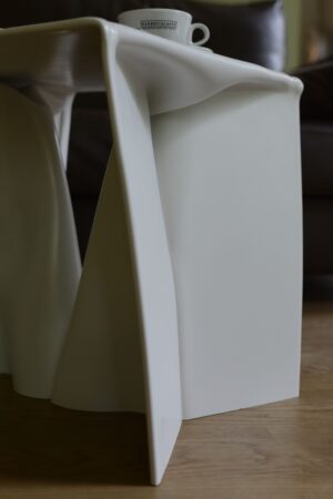
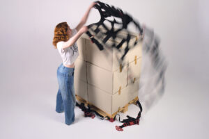
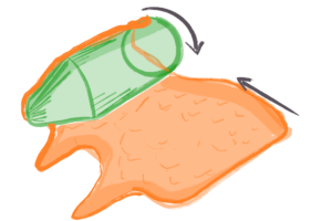
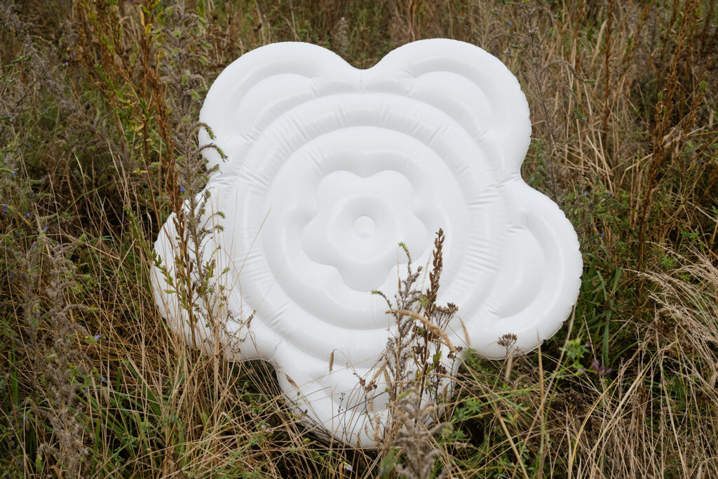
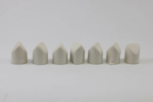
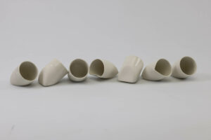
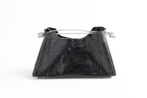
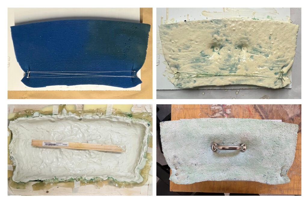
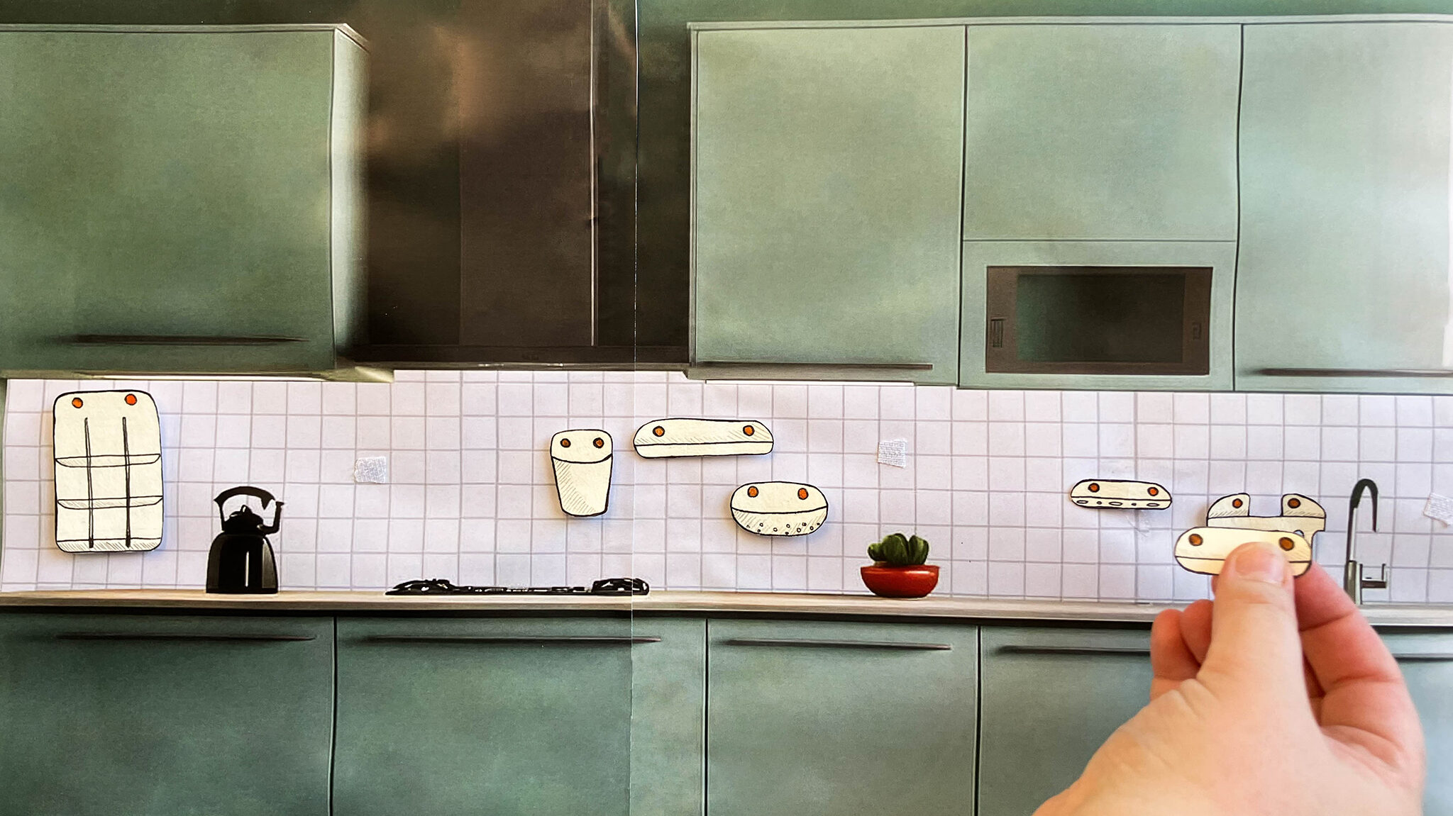
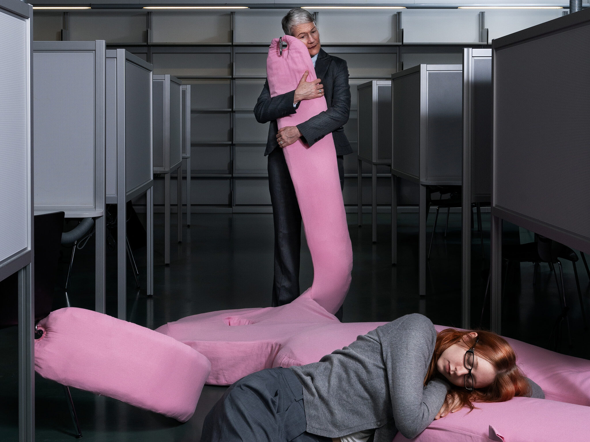
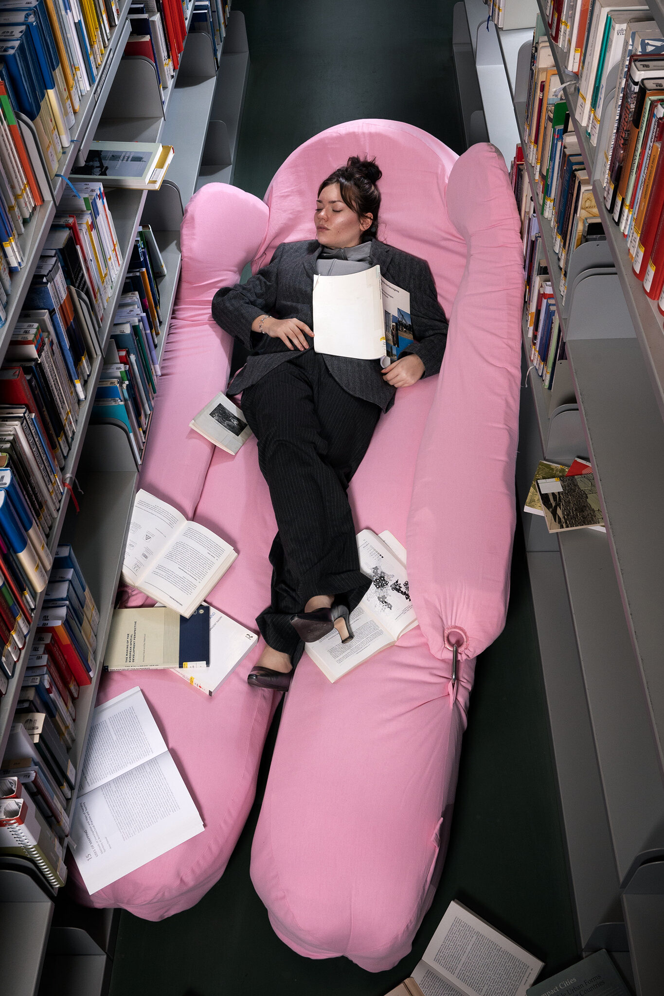
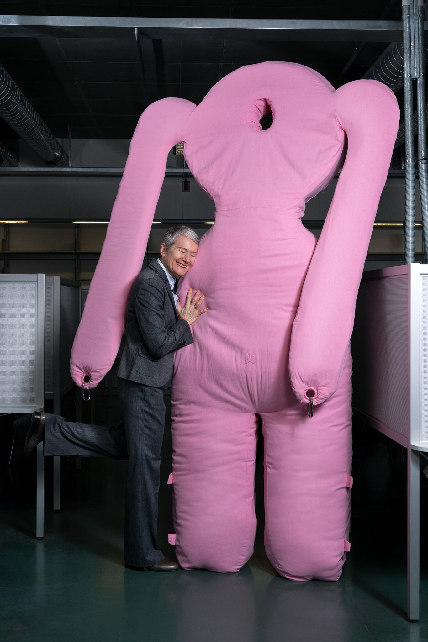
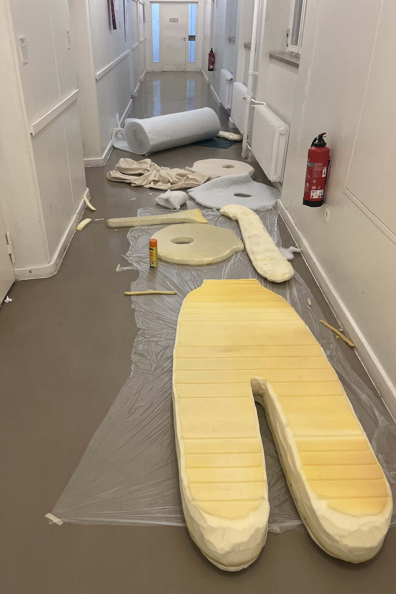
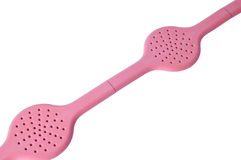
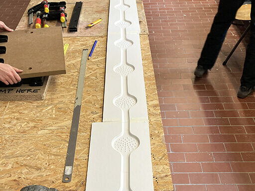
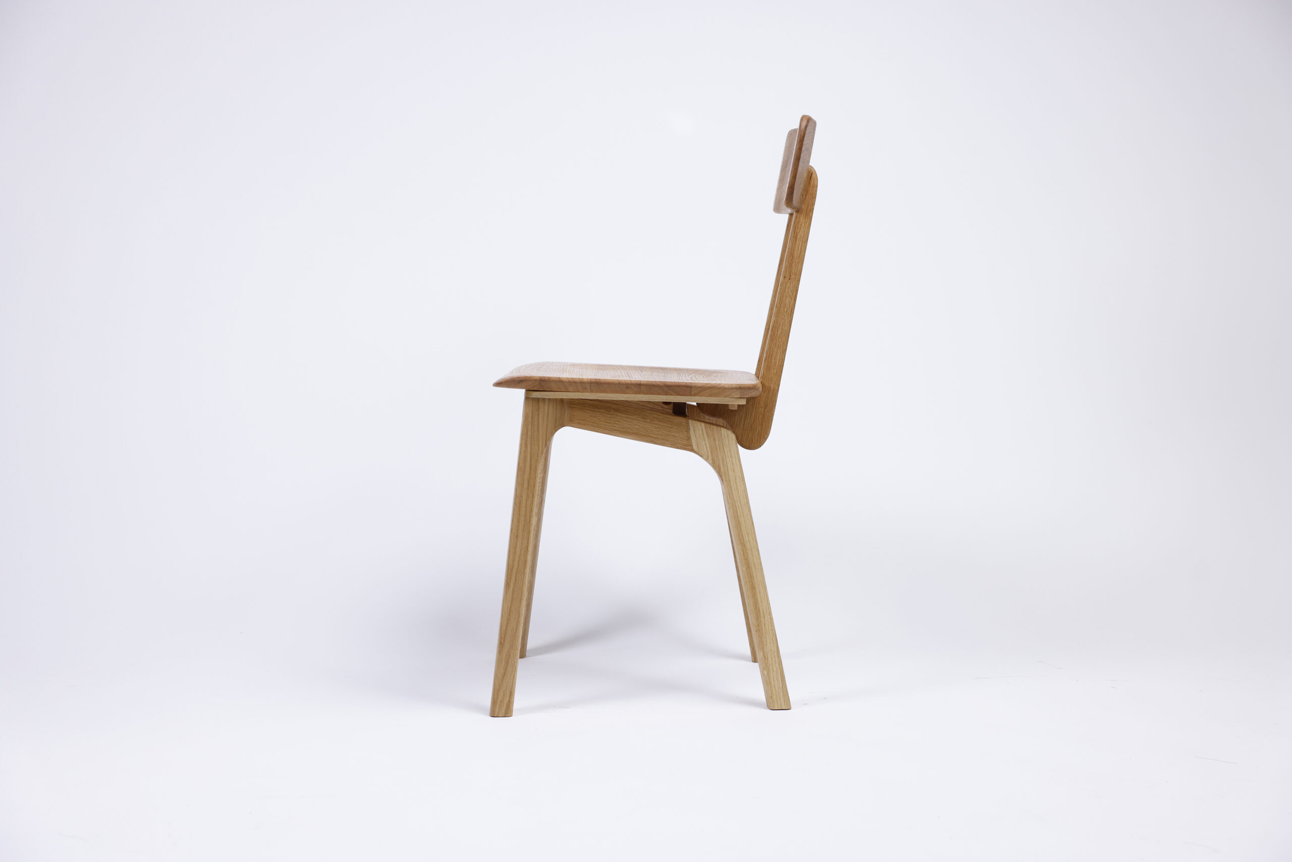
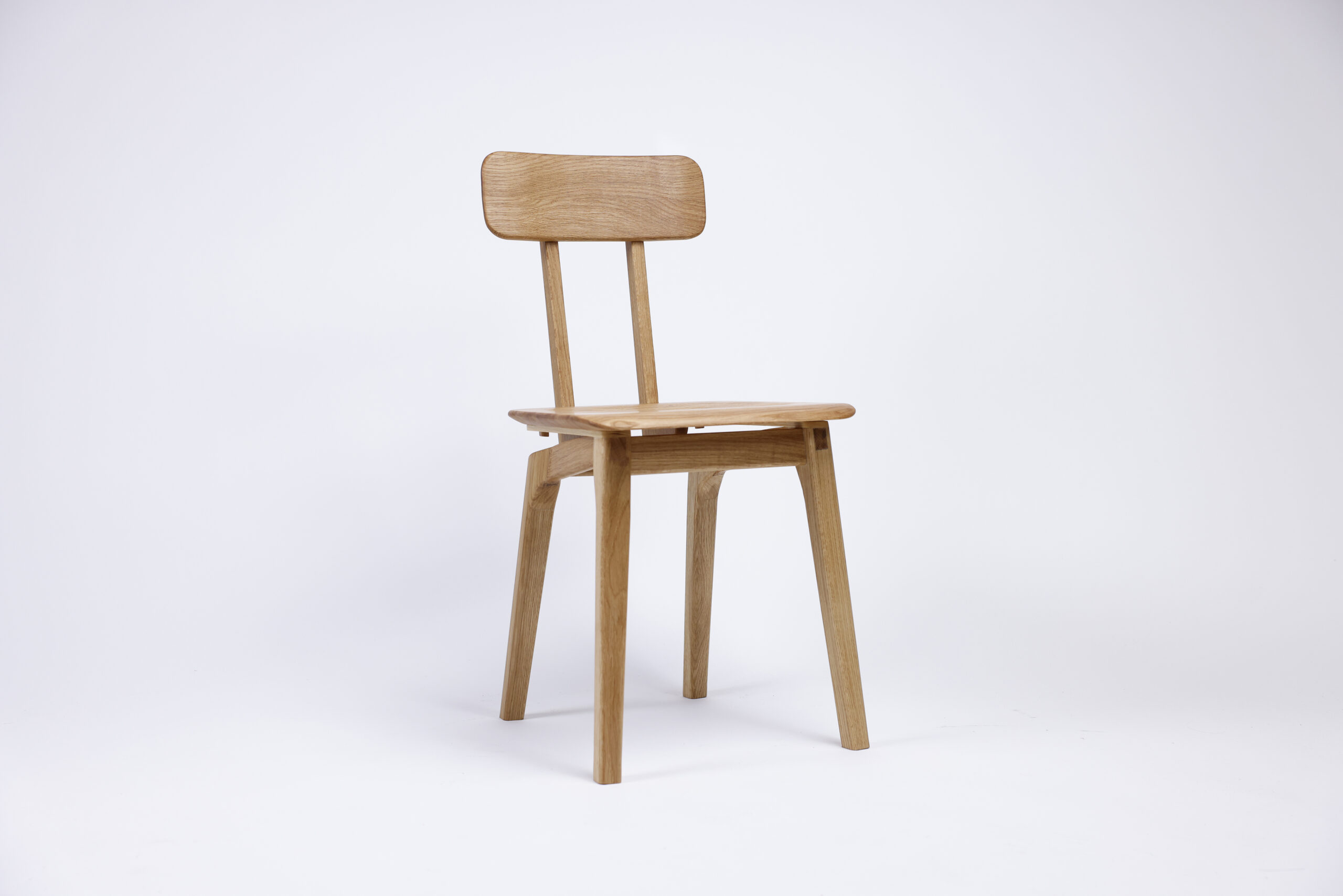
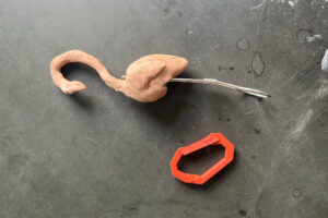
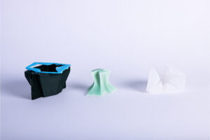
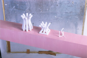
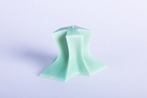
Inmitten dieser permanenten Hustle Culture ist SUMO entstanden – ein 2,80 Meter großes, rosafarbenes Wesen, das zum Verweilen einlädt. Inspiriert von Gelitin’s „Hase“ verbindet SUMO spielerische Monumentalität mit der Idee des Müßiggangs und stellt die Frage: Warum fällt es uns so schwer, nichts zu tun?

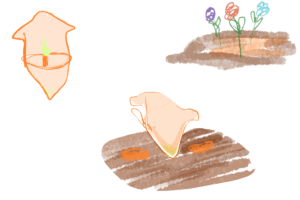
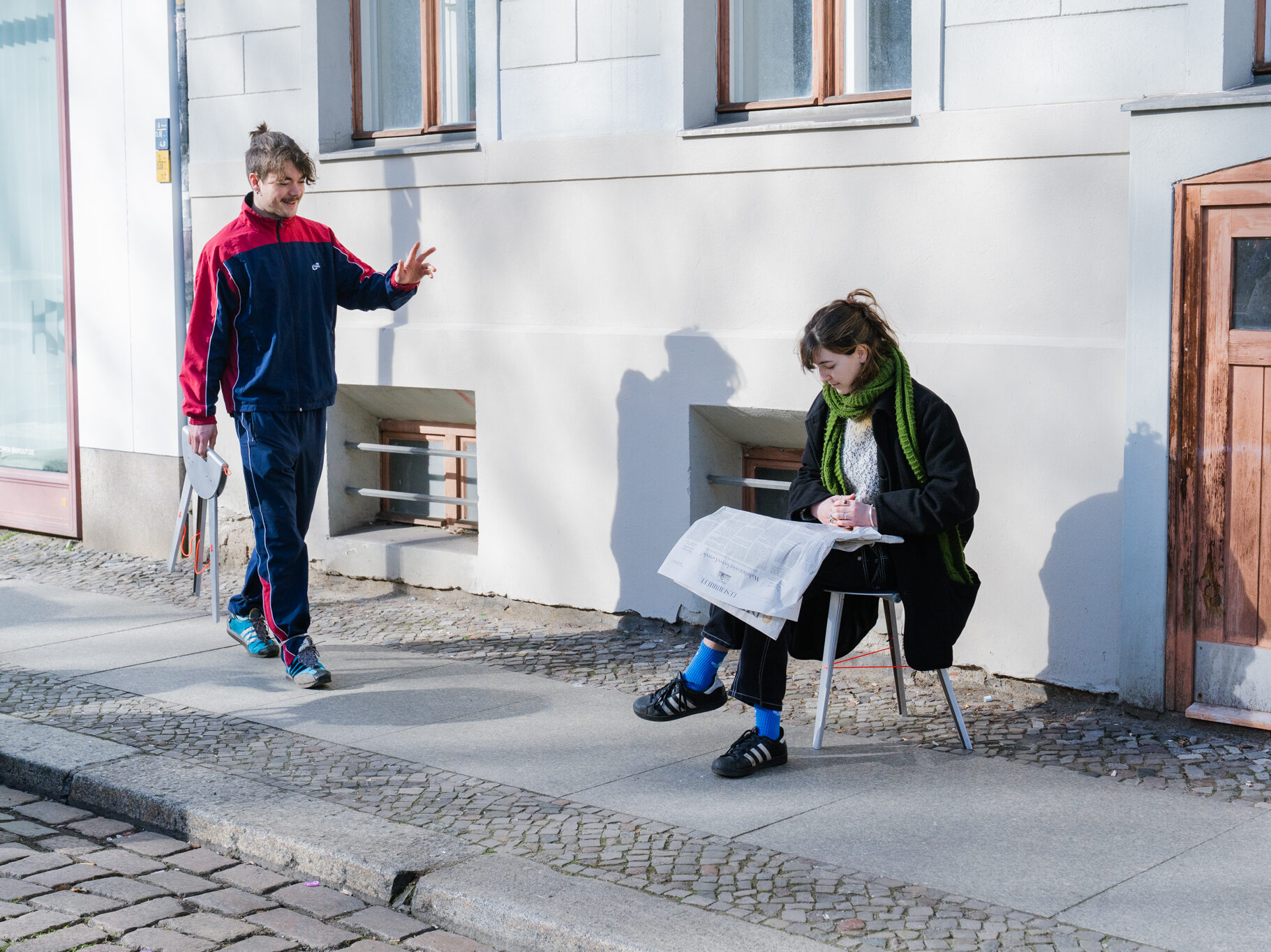
Seine auffällige Farbe und Präsenz im semi-öffentlichen Raum machen SUMO zu einem Symbol: für das Chillen, für Erholung ohne Zweck, für Pausen ohne Rechtfertigungsdruck. Es steht selbstbewusst im Raum und lädt Menschen ein, sich anzulehnen, zu setzen, zu liegen – ohne Ziel, ohne Erwartungen.

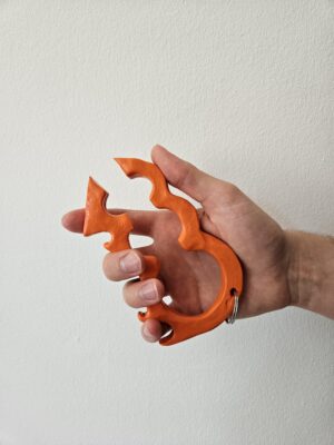
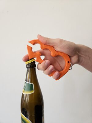
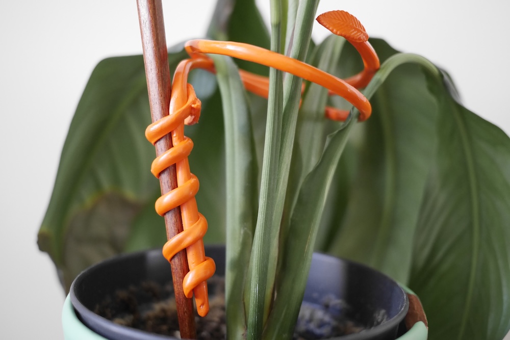
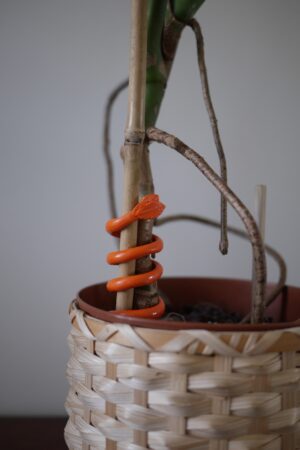
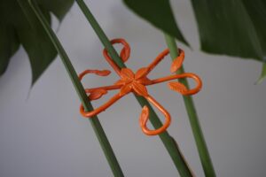
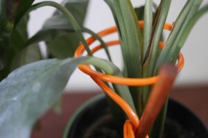
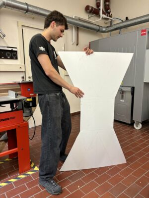
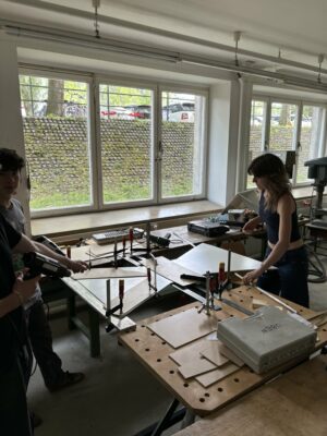
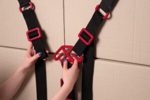
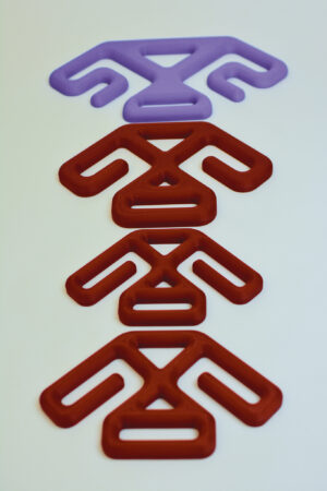
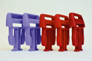
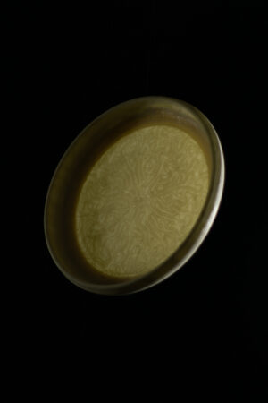
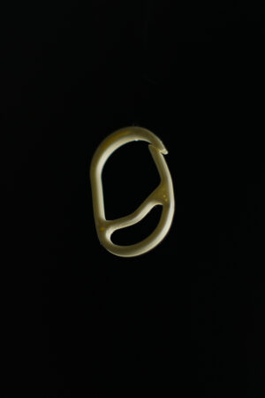
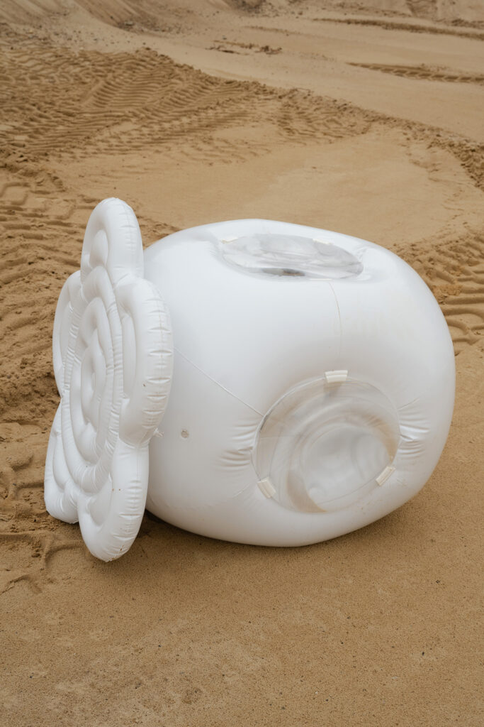
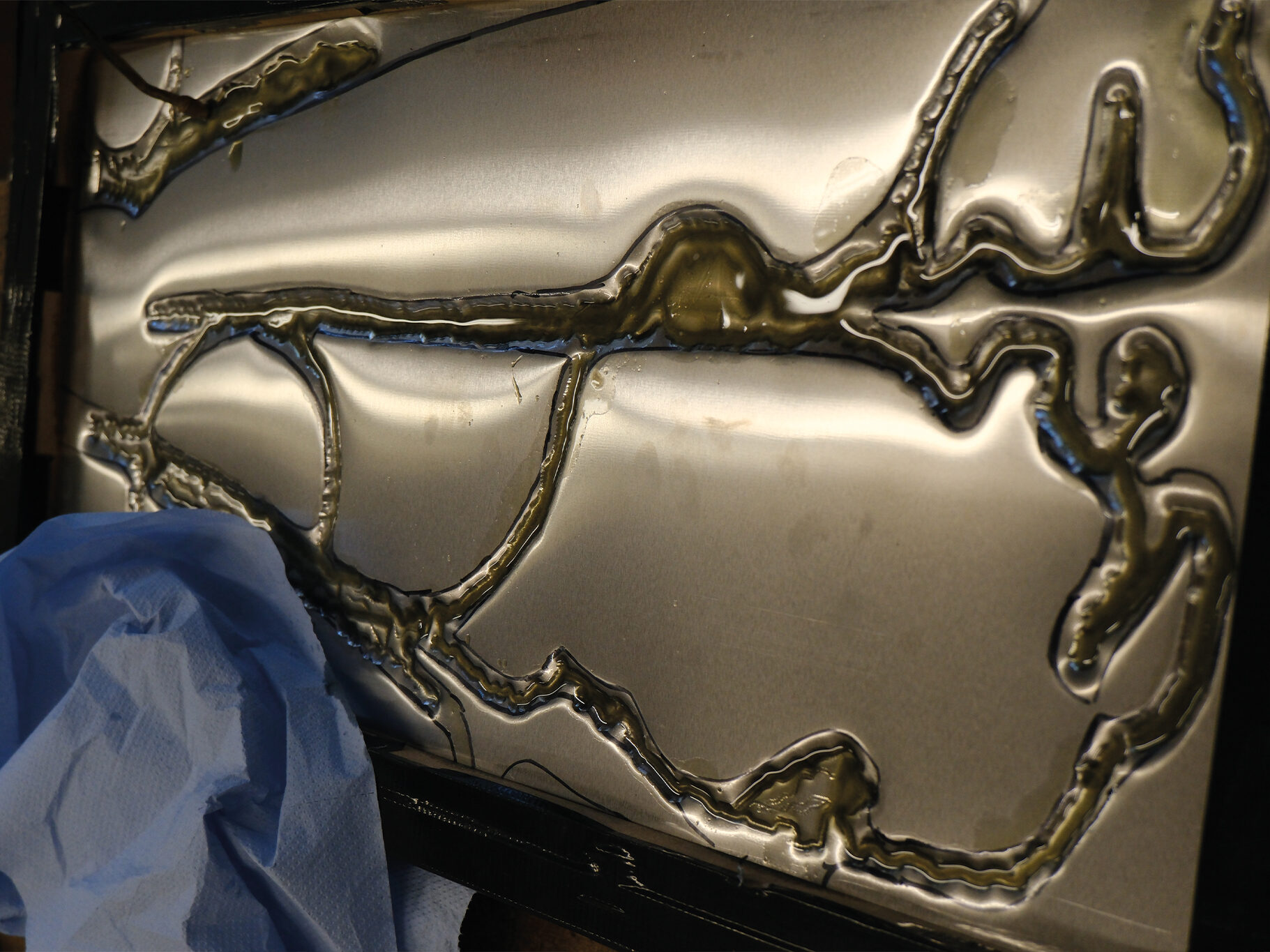
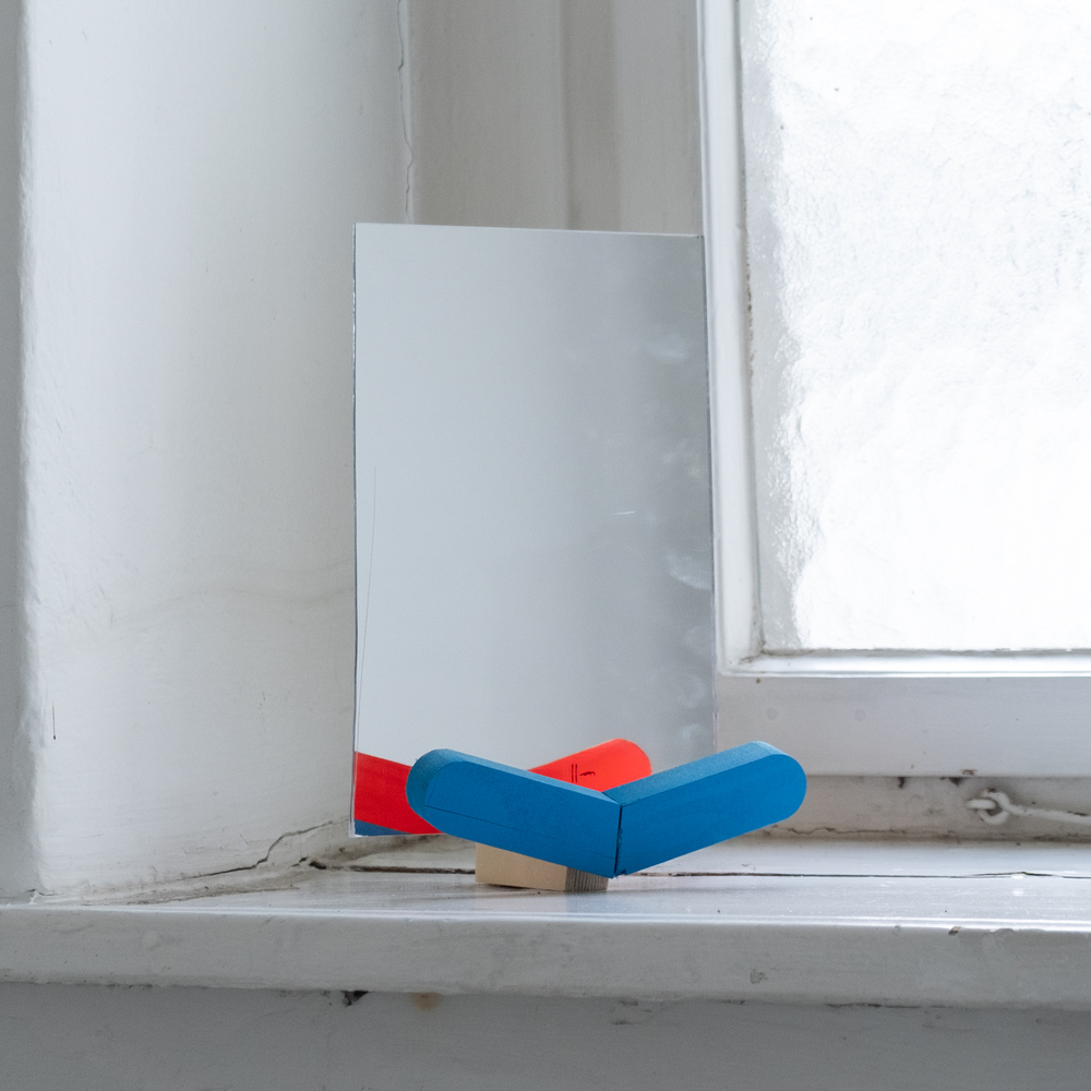
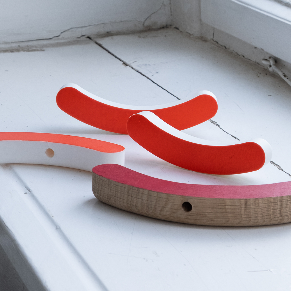
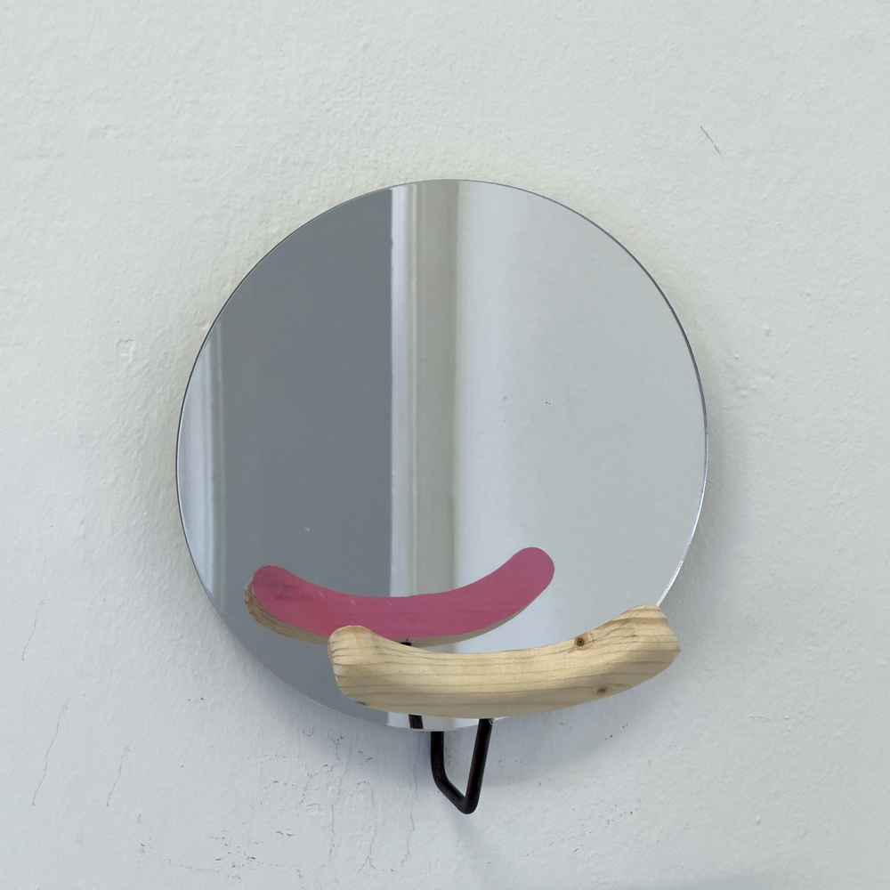
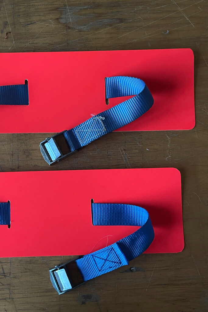
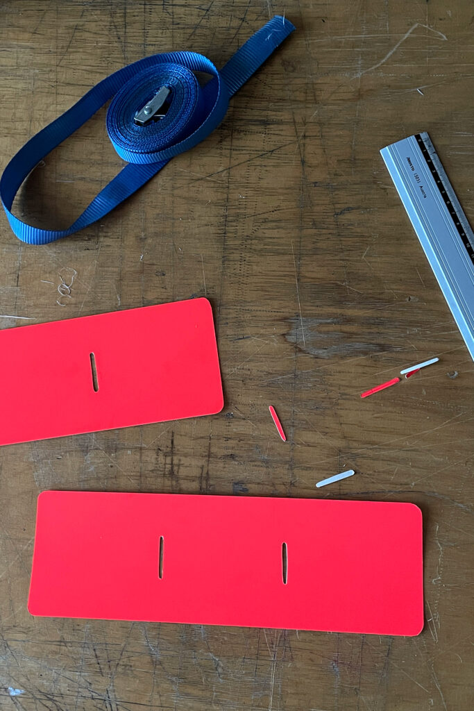
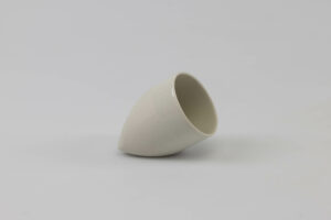
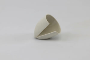
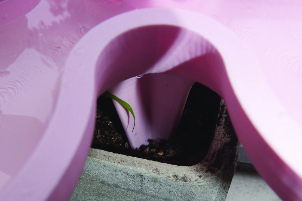
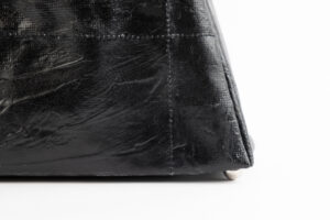
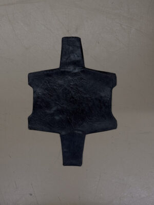
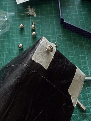
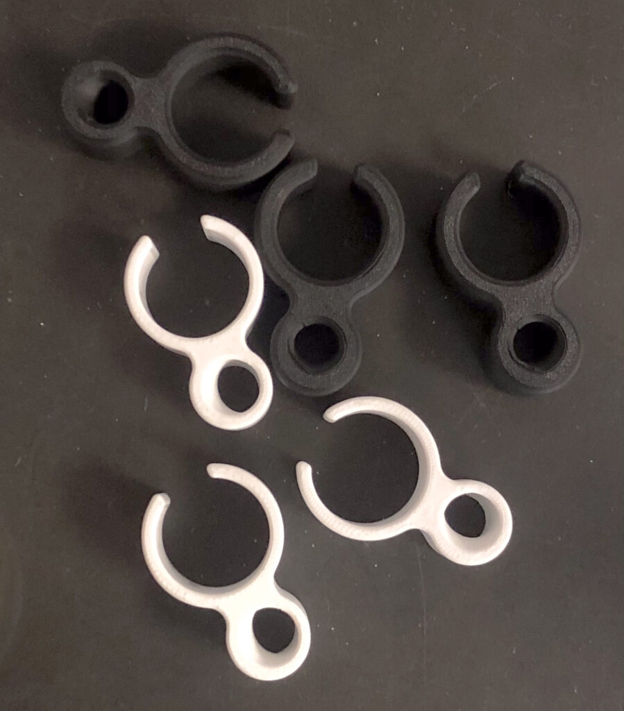
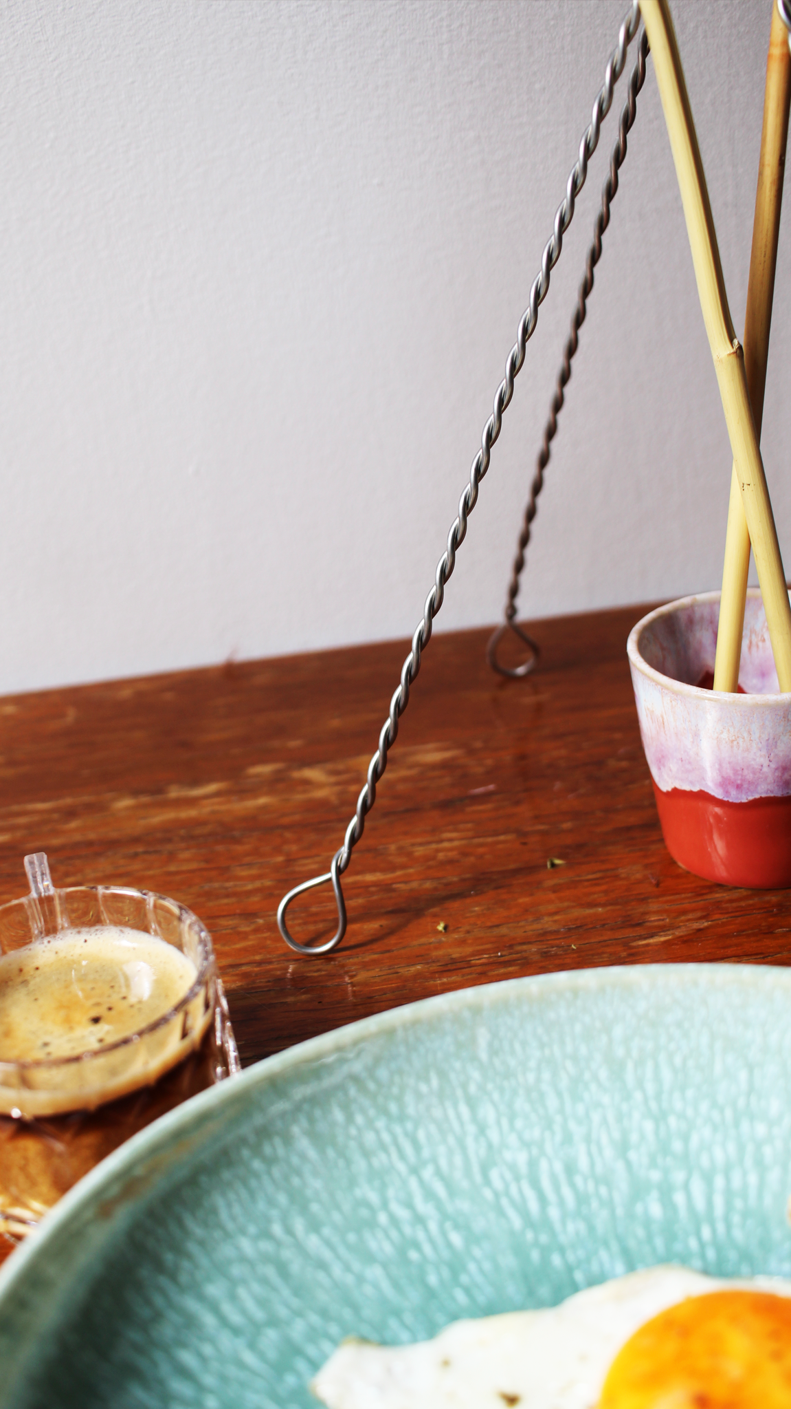
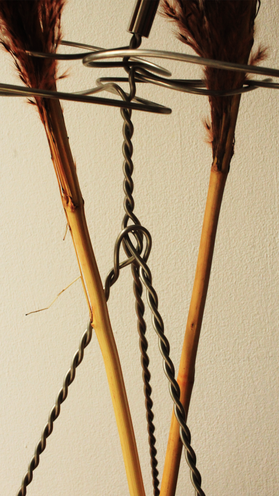
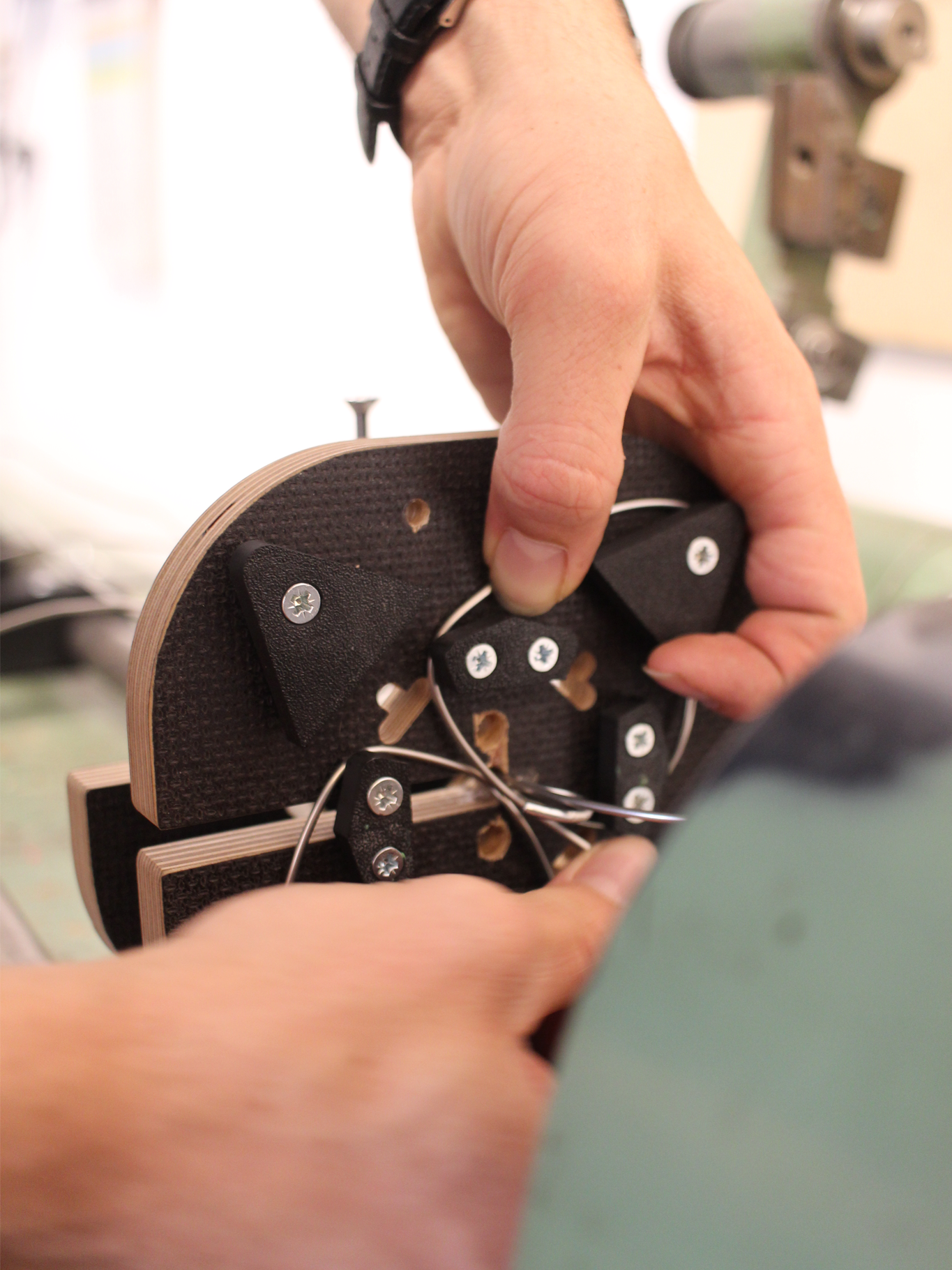
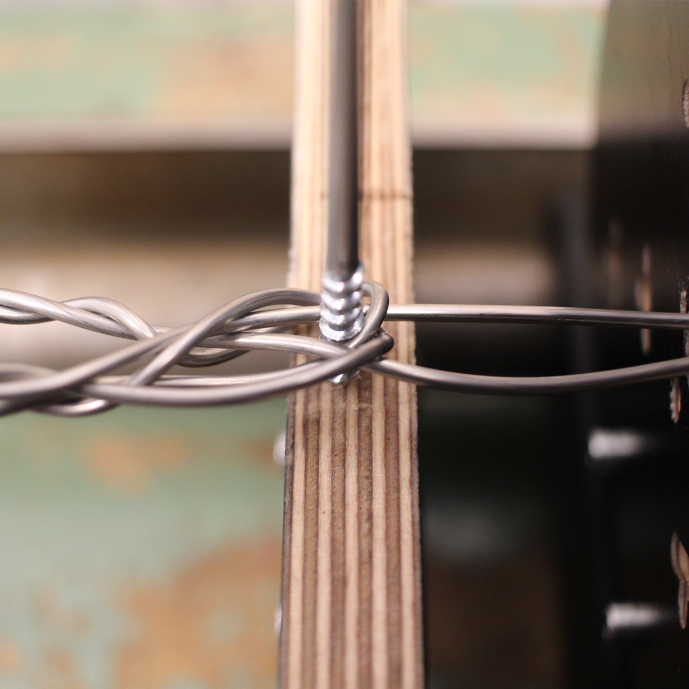
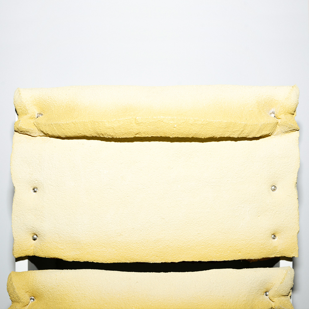
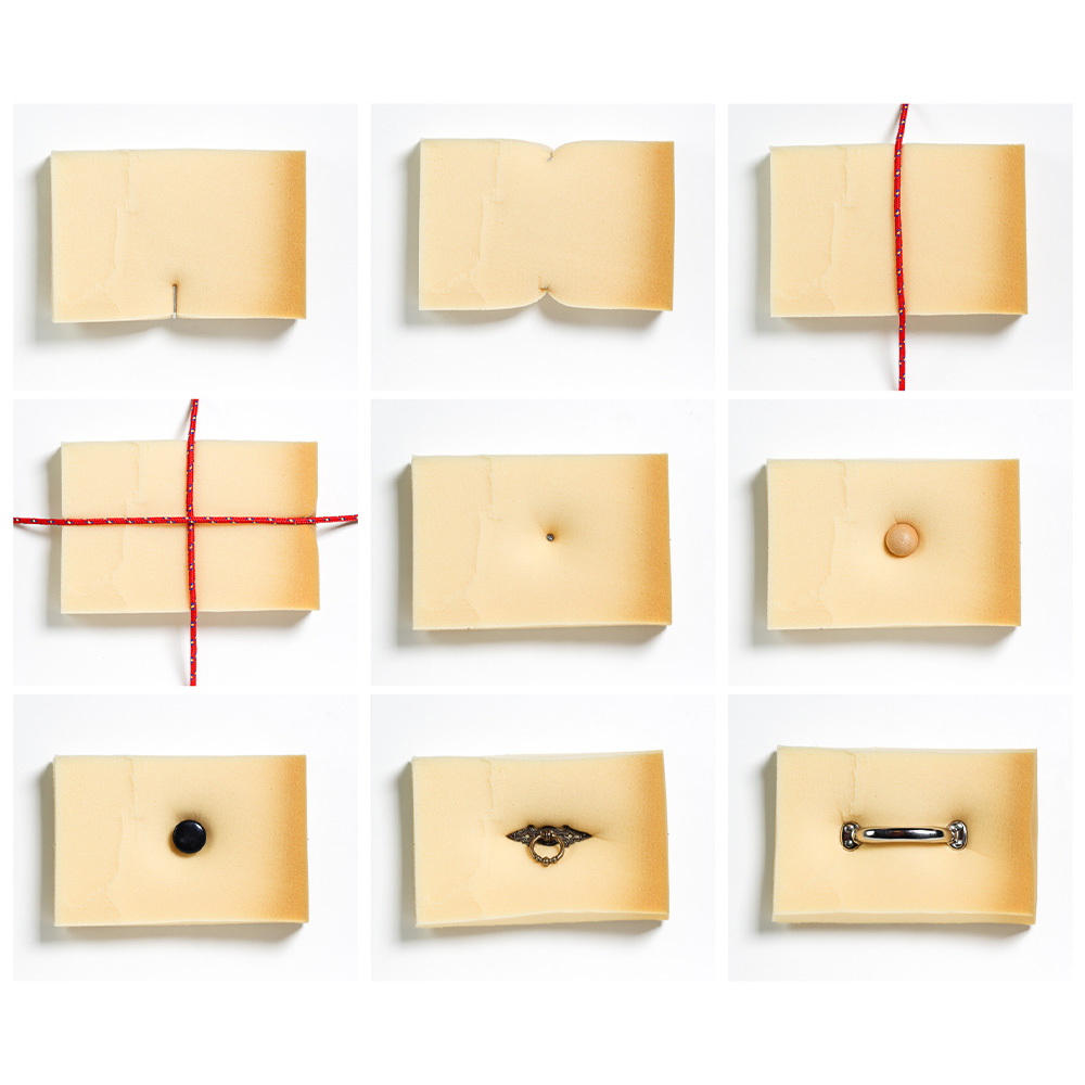
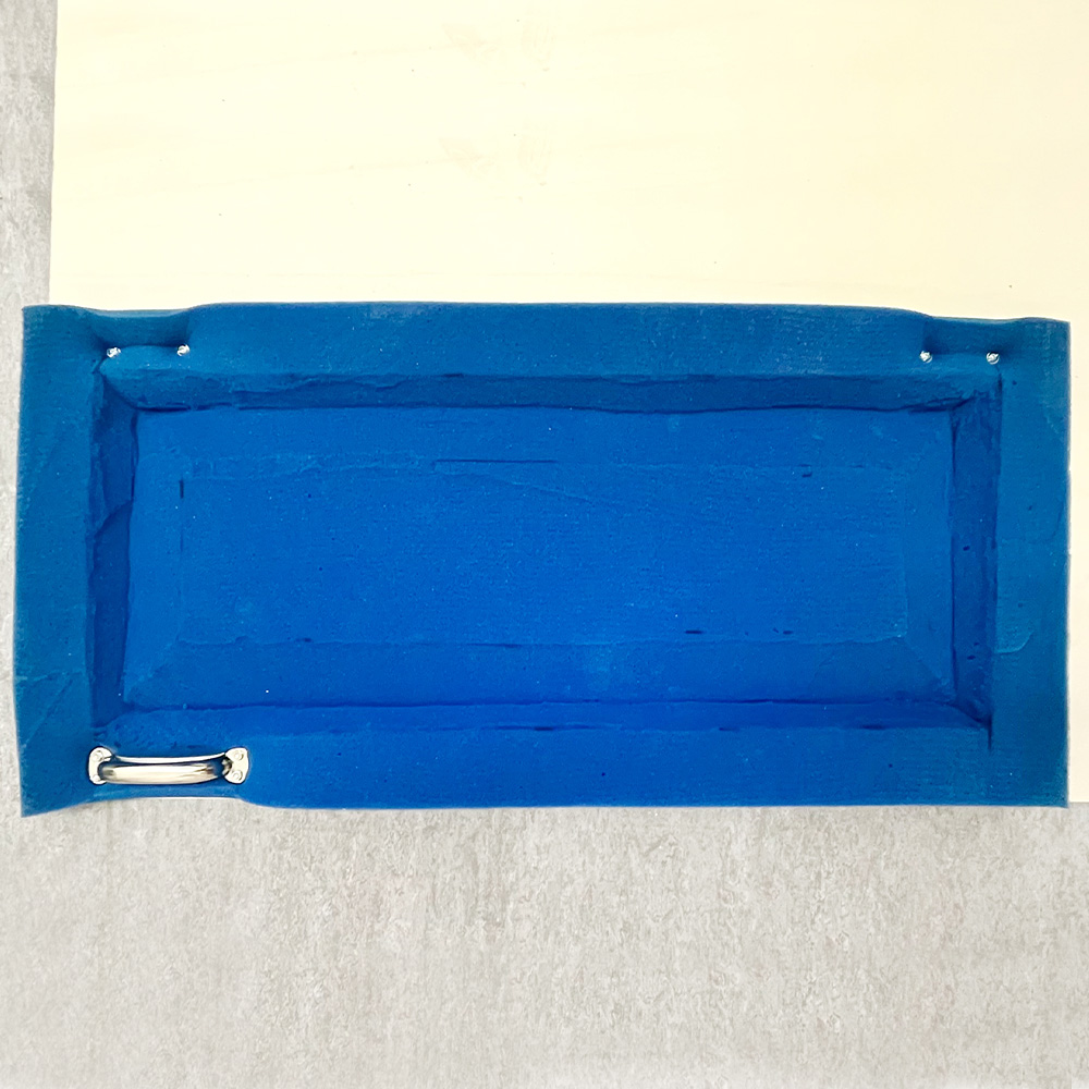
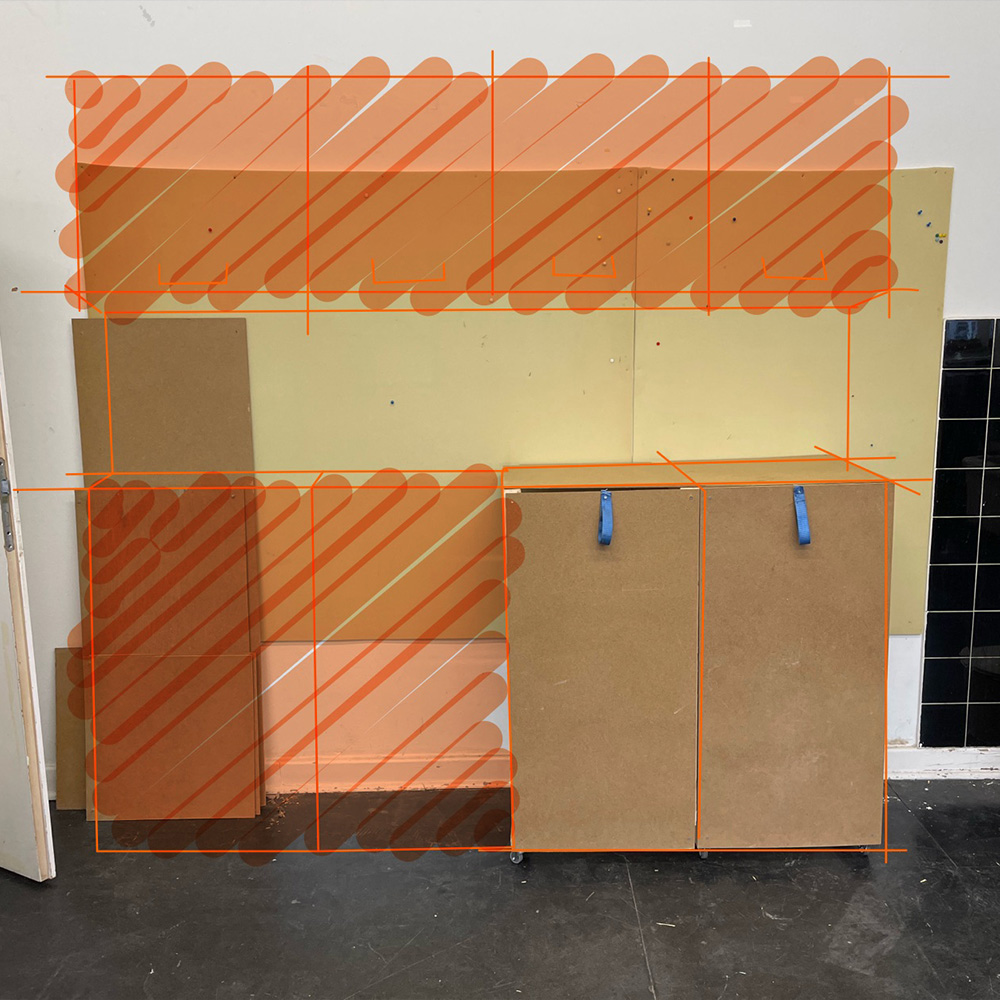
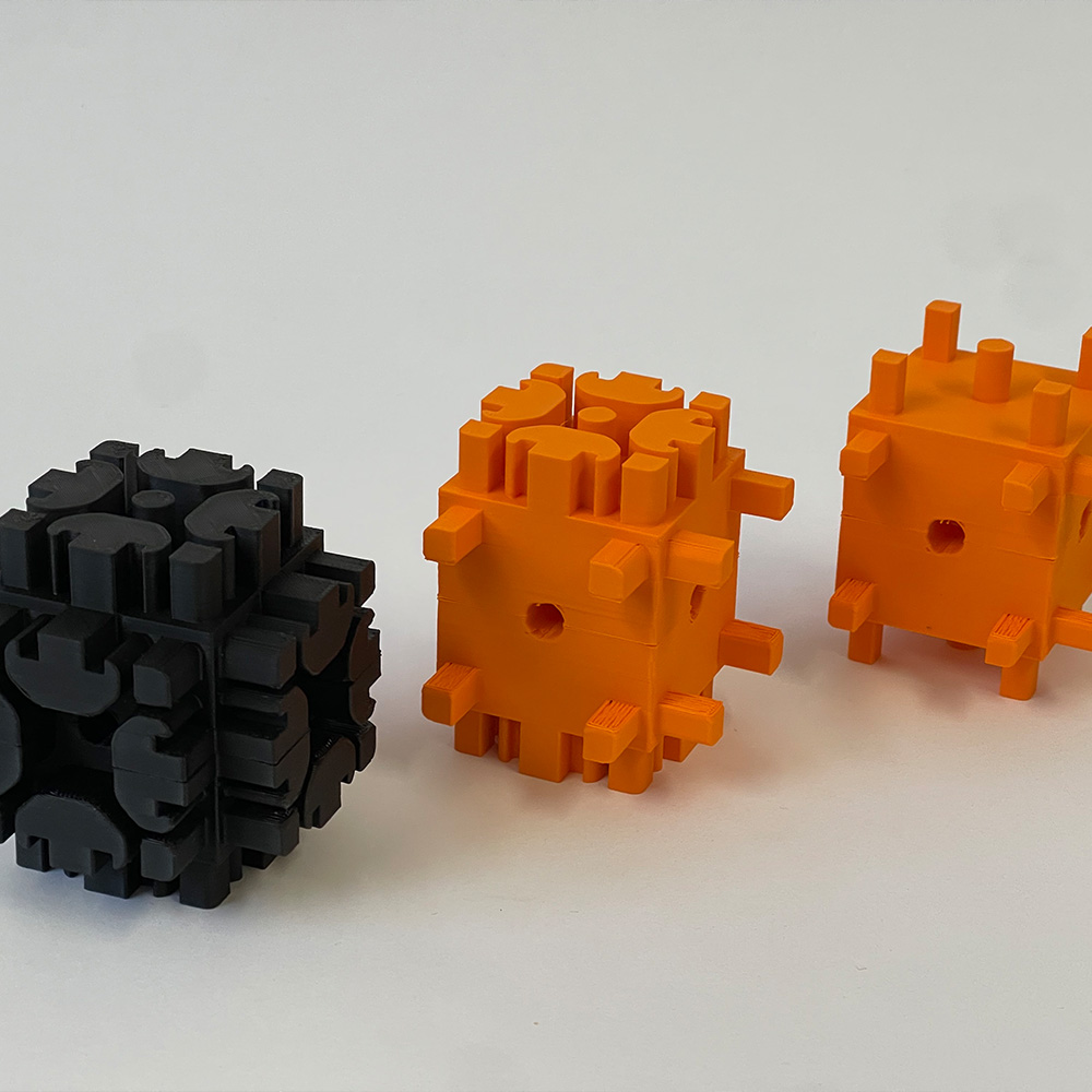
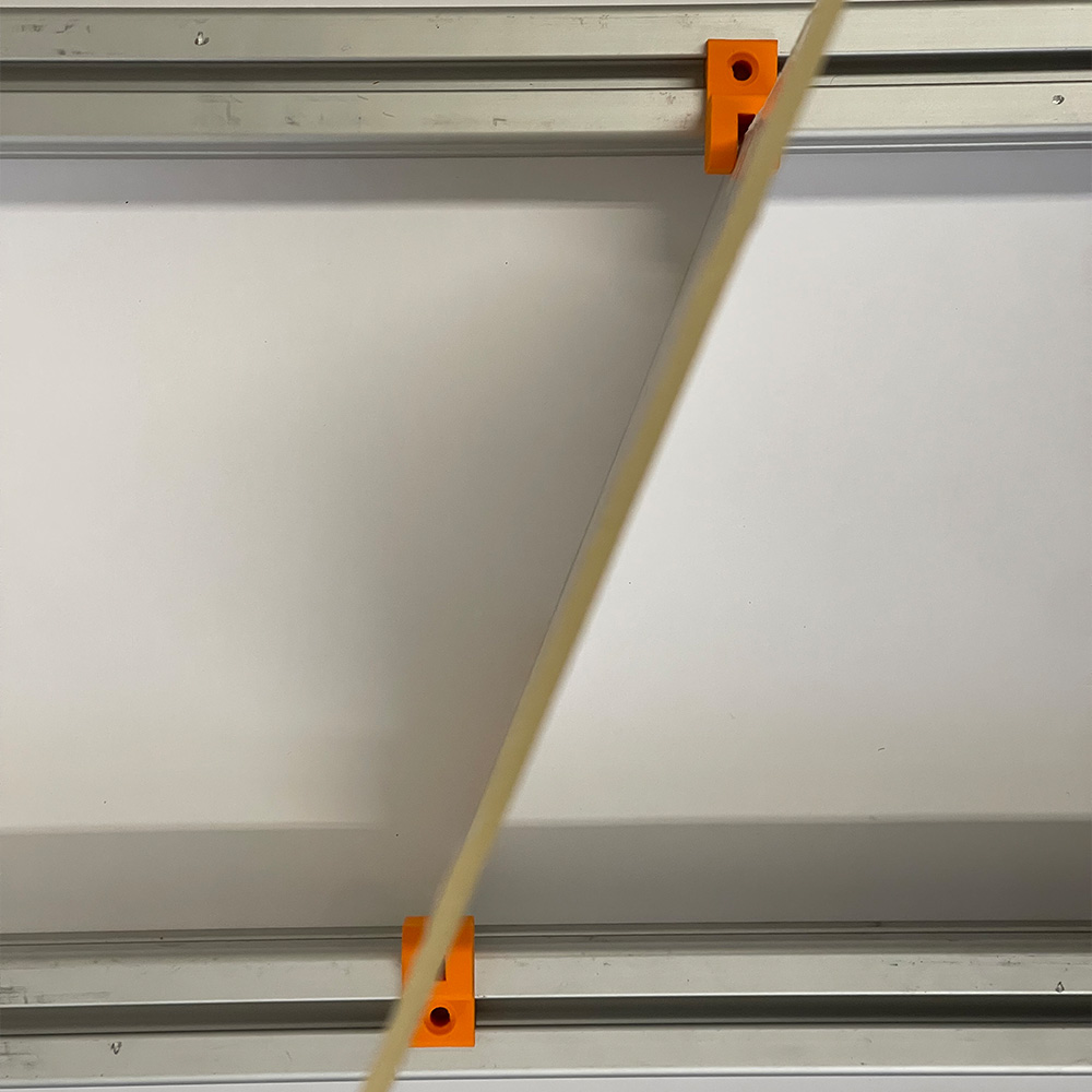
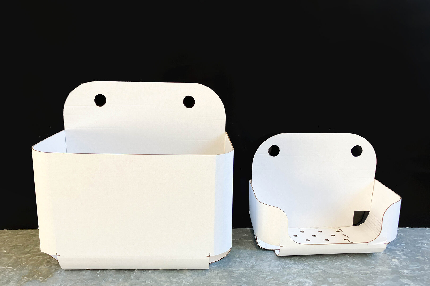
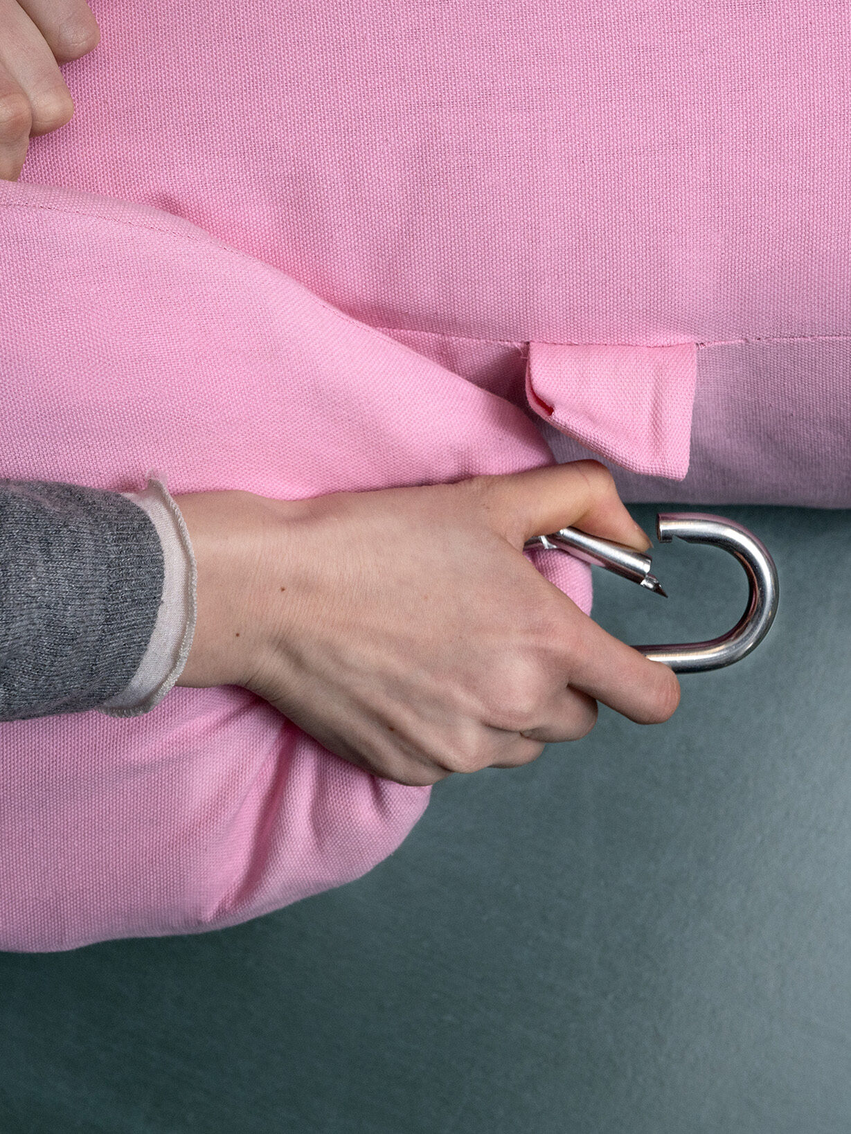
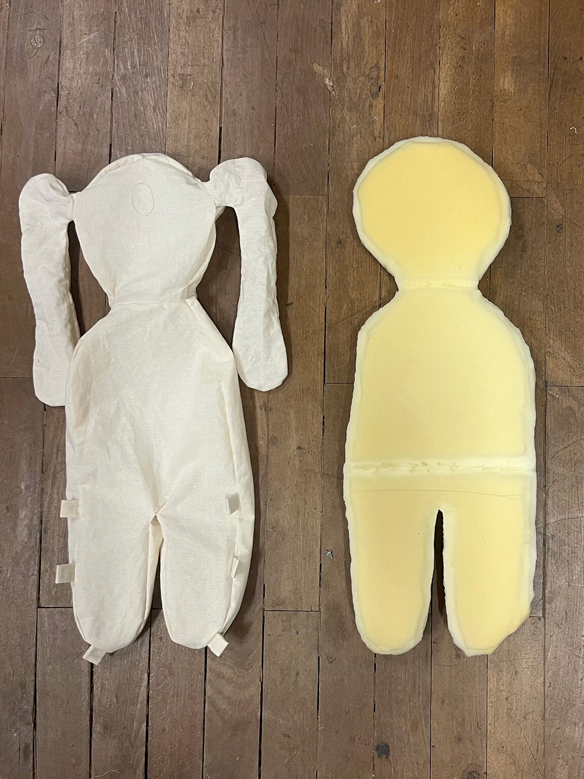
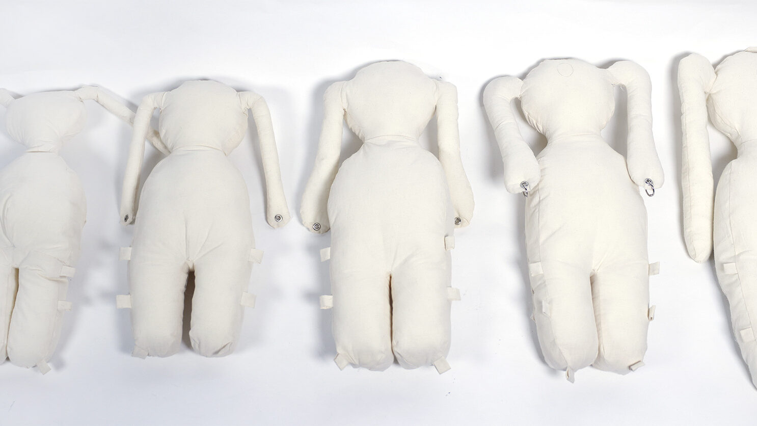
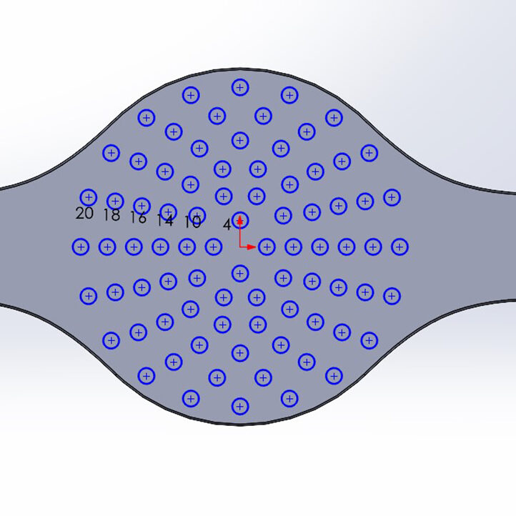
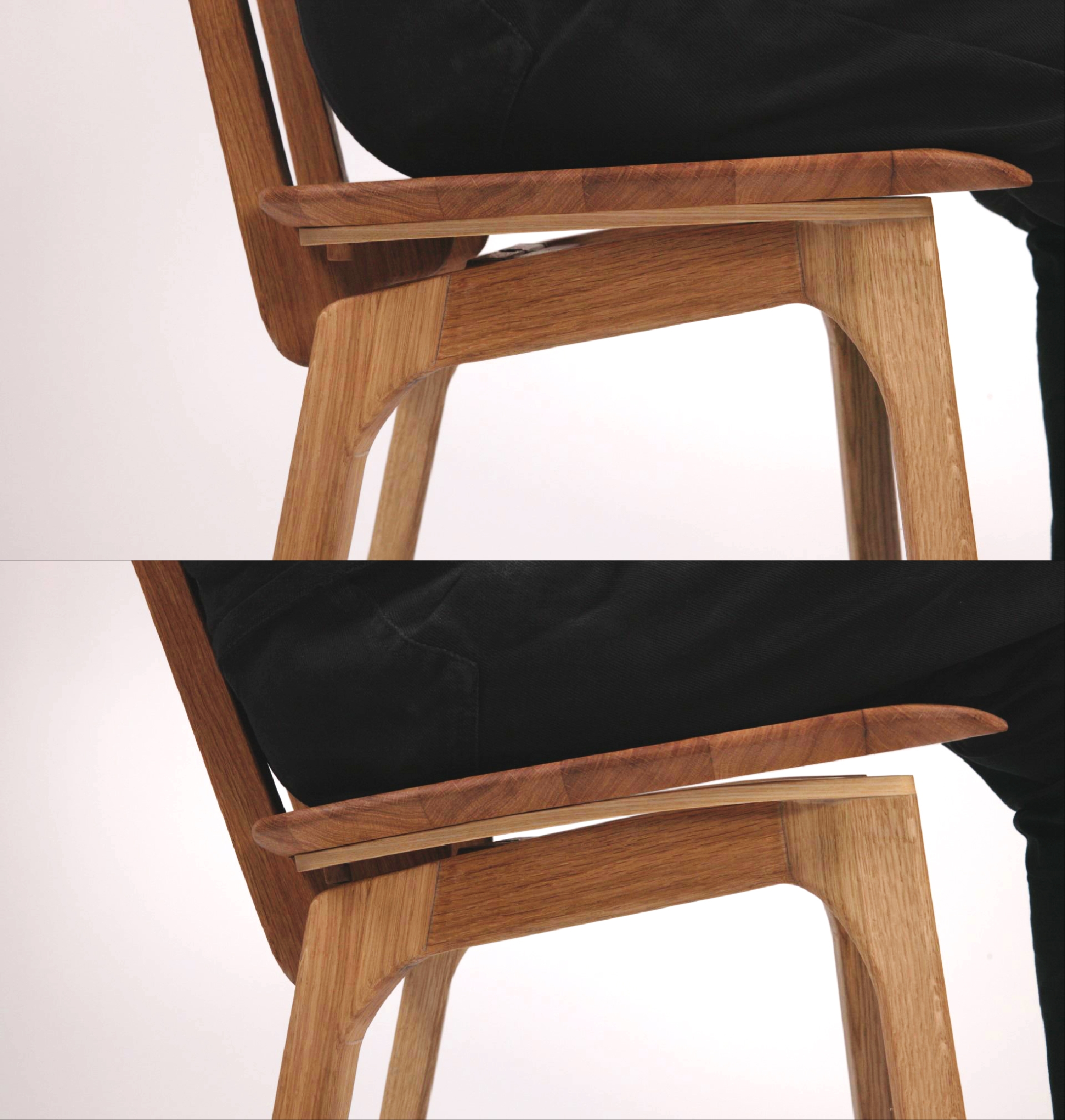
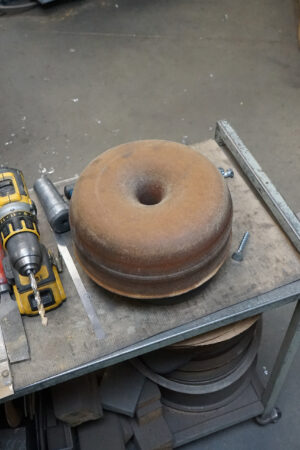
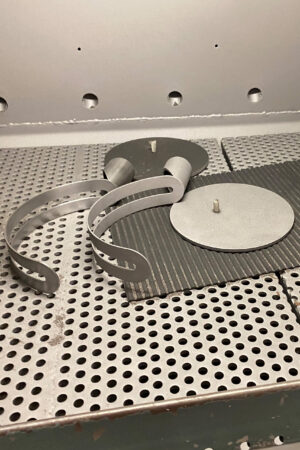
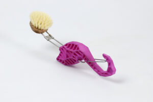
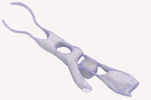
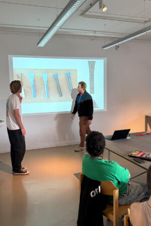
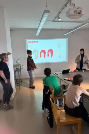
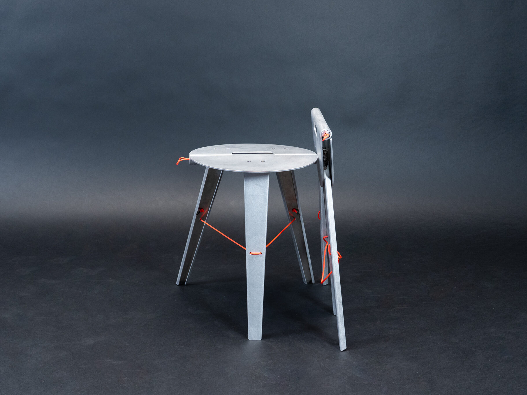
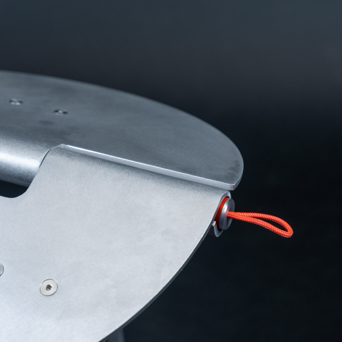
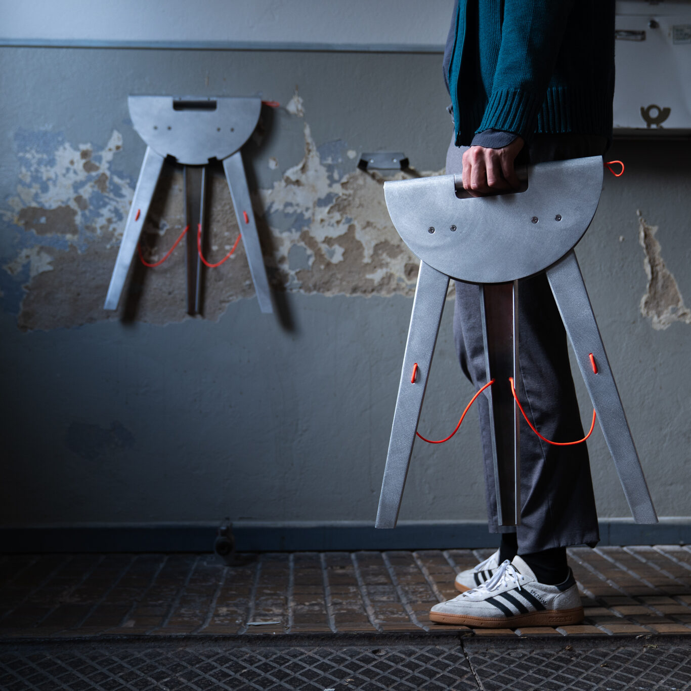
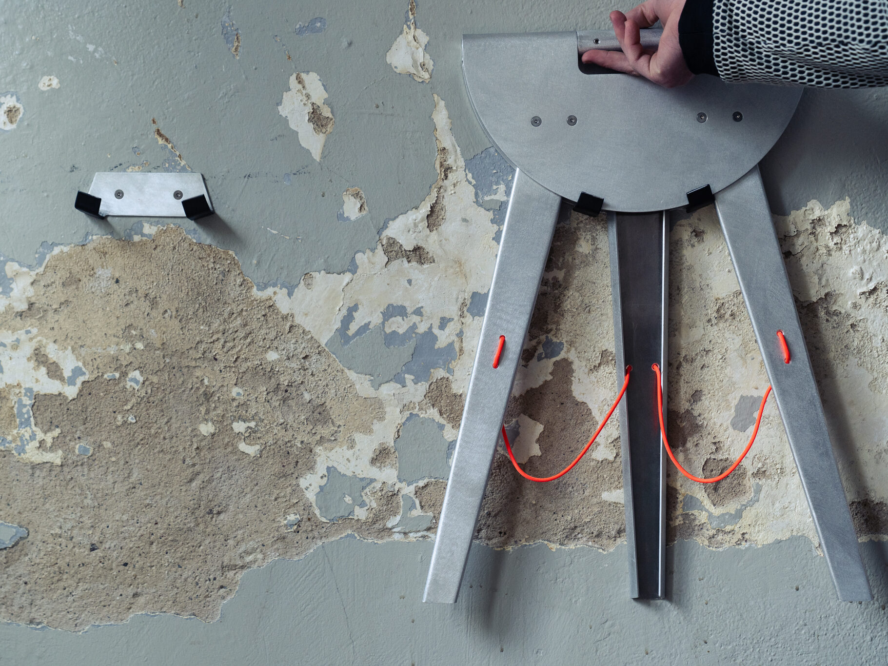
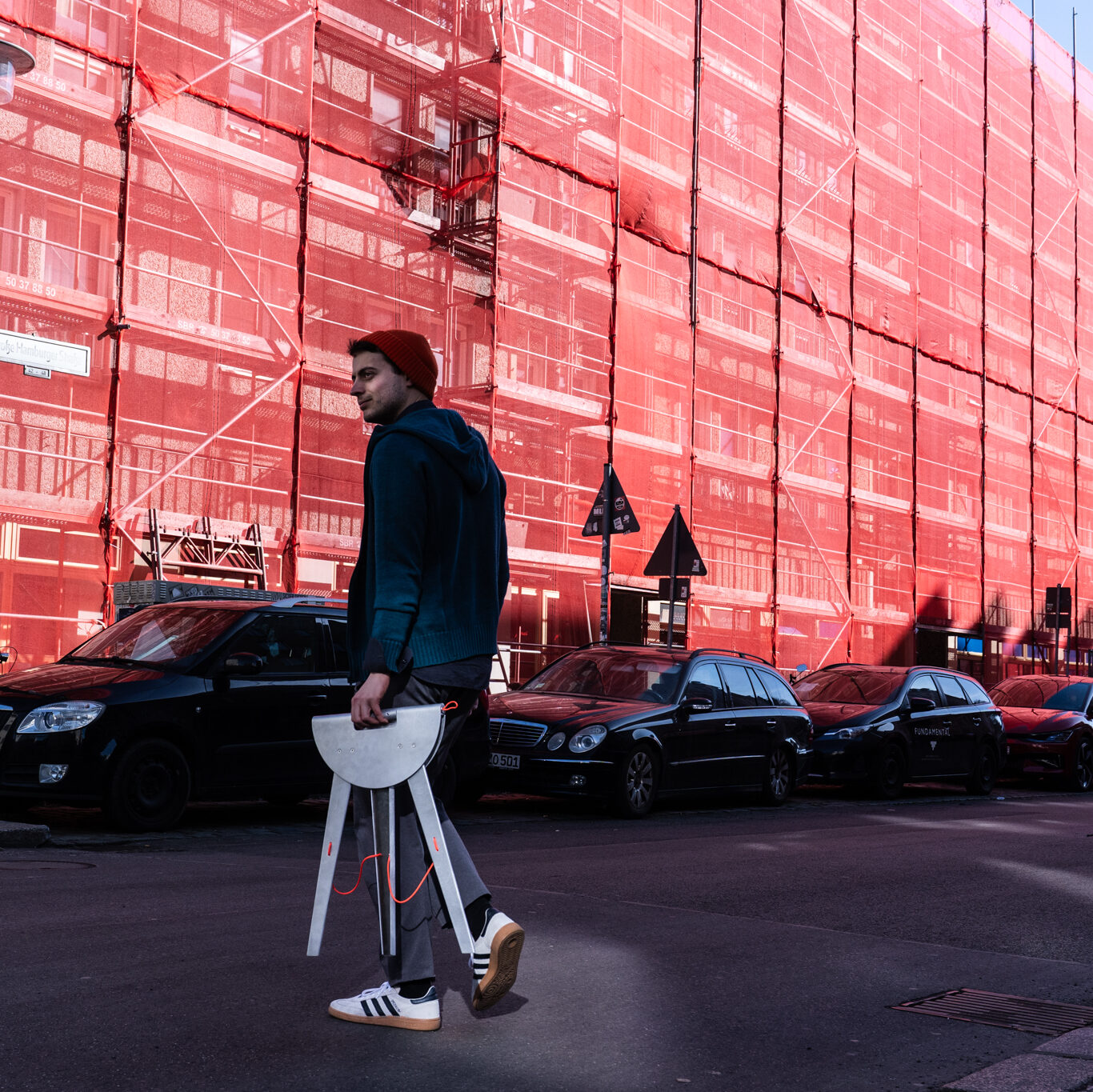
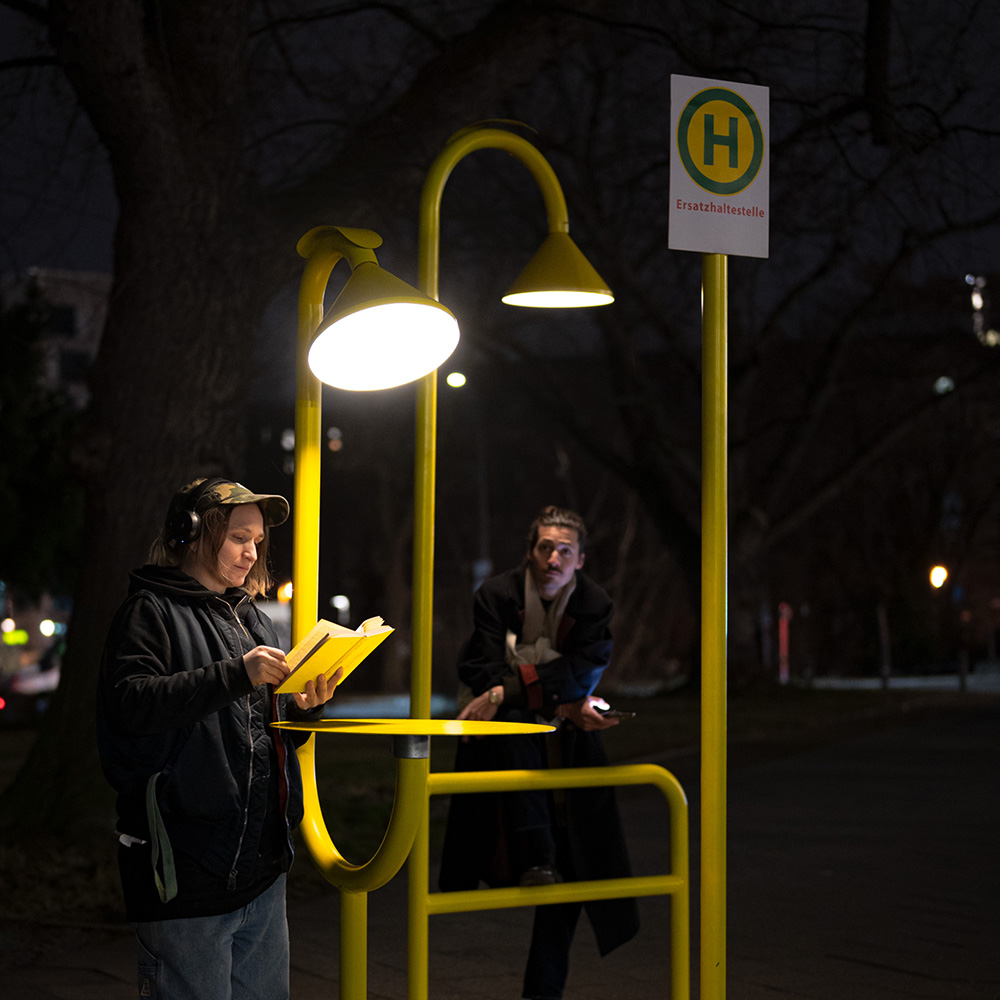
Durch Karabiner an den Ohren und Laschen an den Beinen lässt sich SUMO flexibel positionieren und sogar mit der Umgebung verbinden. So kann etwa der Kopf als Lehne aufgestellt oder SUMO an vorhandene Strukturen angebunden werden. SUMO ist beweglich, anpassungsfähig – und bleibt dabei in seiner Botschaft klar: Entspannung braucht Platz.

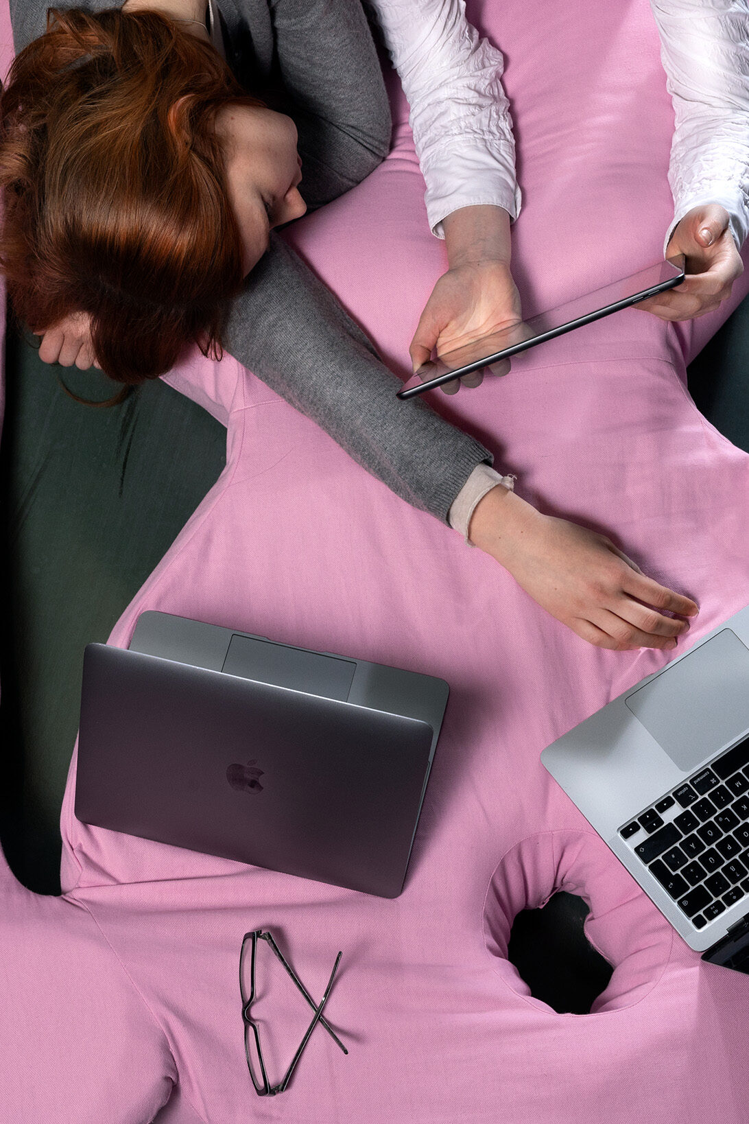
SUMO ist mehr als ein Möbelstück, es ist eine Einladung, sich dem Druck der permanenten Produktivität zu entziehen. Mit seiner großzügigen, weichen Form schafft es einen Ort, in dem Entspannung nicht nur erlaubt, sondern sichtbar wird. Es fordert dazu auf, sich ohne Legitimation hinzulegen, abzuhängen, Augen zuzmachen und die Idee von Müßiggang neu zu denken. In einer Gesellschaft, die Pausen oft mit Faulheit gleichsetzt, setzt SUMO ein Zeichen: Chillen ist kein Luxus, sondern eine Notwendigkeit.

We live in a society that places productivity and performance above all else. A person’s value is measured by how efficiently they work, how much they achieve, and what they contribute to the economic system. In this context, rest, idleness, and chilling are not seen as legitimate states, but rather as laziness – as a sign of disinterest, lack of ambition, or even moral failure. A day without measurable output is seen as wasted, rather than as necessary recovery or fertile ground for creativity, intuition, and self-reflection.

From early childhood, we are taught: “Time is money.” This phrase is more than a saying – it is an ideology deeply embedded in our thinking. It shapes our daily rhythm, our decisions, and our sense of self-worth. Even breaks today must promise efficiency: meditation becomes a tool for performance enhancement, hobbies are expected to serve self-optimization, and even sleep is monitored through apps and gadgets to maximize its „effectiveness.“

Amidst this relentless hustle culture, SUMO was born – a 2.80-meter-tall pink creature that invites people to pause and linger. Inspired by Gelitin’s Hase, SUMO combines playful monumentality with the idea of idleness, and poses the question: Why is it so hard for us to do nothing?

With its striking color and presence in semi-public spaces, SUMO becomes a symbol: for chilling, for purposeless rest, for breaks without guilt or justification. It stands confidently in the room, inviting people to lean, sit, or lie down – without goals, without expectations.

Equipped with carabiners on its ears and loops on its legs, SUMO can be flexibly positioned and even connected to its surroundings. Its head can be propped up as a backrest, or it can be anchored to nearby structures. SUMO is adaptable and mobile – yet unwavering in its message: relaxation needs space.

SUMO is more than a piece of furniture; it is an invitation to step away from the pressure of constant productivity. With its soft and generous form, it creates a space where rest is not only permitted but made visible. It urges us to lie down without justification, to hang out, to close our eyes, and to reimagine the idea of idleness. In a society that often equates breaks with laziness, SUMO takes a stand: chilling is not a luxury – it is a necessity.

Process

Betreut durch: M. Hahn, A. Engelmann, L. Feireiss

HYDROBAND – Anna Wibke Münz | BA 2025

https://vimeo.com/1095707085?share=copy

Hydroband – Ana Wibke Münz

Ein Band aus Hydrogel, das den Boden aufwertet, mit Nährstoffen versorgt und individuell an die Gegebenheiten des Bodens angepasst werden kann. Es basiert auf einer Polymerstruktur aus Hydrogel, die enorme Mengen an Wasser speichern und kontrolliert wieder abgeben kann.
Durch eine vorherige Analyse einer Bodenprobe können die Parameter des Bands exakt festgelegt werden, um eine optimale Versorgung des Bodens sicherzustellen. Die besondere Struktur des Bands fördert die Interaktion mit ausgetrocknetem Boden und trägt dazu bei, dessen Feuchtigkeitshaushalt zu regulieren.
Das Hydroband ist ideal für den landwirtschaftlichen Einsatz in einem Kreislaufsystem, das von der Aussaat bis zur Ernte angepasst werden kann.

Hydroband is a hydrogel strip that enhances the soil, supplies it with nutrients, and can be individually adapted to the soil conditions. It is based on a polymer hydrogel structure that can store and release large amounts of water. By analyzing a soil sample, the strip’s parameters can be precisely adjusted to ensure optimal soil supply. Its structure stimulates interaction with dried-out soil, helping to regulate moisture levels. Hydroband is ideal for agricultural use in a cyclical system tailored to a season from sowing to harvest.


Prozess


Betreut durch

I. Hans, H. Neumann, J. Ribler

Limeng Liu wins IF student award 2025!

Limeng Liu won an IF Student Award with TANI the chair she designed in the Find Your Footprint project in 2024, a Kooperation Projekt with Zeitraum Furniture.

TANI was created — a flexible and comfortable solid wood chair. Thanks to its two wooden springs, the seat can flex within a certain range, offering a sitting experience similar to that of a cantilever chair made from steel and plastic. To minimize waste, TANI also features a simple assembly mechanism that eliminates the need for tools or glue in the packaging.

The Jury stated: This solution stands out by making the product more nature-friendly through the use of sustainable materials and improved ergonomics. This adapts, the classic design of a cantilever chair to the era of sustainability. This has the potential to become a modern classic.

IF Student award claims to be the world’s premier design awards for students, receiving more than 7,000 entries annually from all over the world. iF Design offers a platform for innovative student concepts. Winners gain global recognition and a portion of the 50,000 EUR prize money.

Around 350 guests attended the Awards Ceremony on 20 June 2025 at the stunning Guggenheim Museum in Bilbao, Spain, UNESCO City of Design since 2014. The event was supported and co-sponsored by the Bilbao City Council, the Provincial Council of Bizkaia and the Basque Government, as they share and endorse the objective of promoting cultural and creative industries, design, young talent and the commitment to the SDGs.

CONGRATULATIONS LIMENG!

for more information see

THE SPUN SERIES – Gedrücktes Metall

Hauptseminar ab 5. Semester – Wahlpflicht Produktdesign und Anpassungsstudium MA

Prof. Holger Neumann, WM Julian Ribler


Endergebnisse

Poster

Prozess

Finale Präsentation

Besuch von Formmetall

SEMINARANGEBOT – COURSE OVERVIEW


Metalldrücken ist eine hoch-interessante Fertigungstechnologie, bei der eine flache Metallronde durch rotierende Verformung über eine Holz- oder Metallform gedrückt wird. Die Methode erlaubt es, mit vergleichsweise einfachem Werkzeugaufwand stabile, rotationssymmetrische Hohlkörper zu erzeugen. Die Technologie eignet sich sehr gut für Klein- und Mittelserien.

In diesem Seminar arbeiten wir mit einem erfahrenen Industrie-Kooperationspartner aus der Industrie zusammen, der eure Entwürfe professionell fertigen wird. Der Firma Formmetall in Dresden www.formmetall.de . Ihr erhaltet dadurch einen praxisnahen Einblick in reale Fertigungsprozesse, Materialverhalten und die technischen Bedingungen industrieller Produktentwicklung.

Semesteraufgabe 

Entwurf, Konstruktion und Fertigung eines individuellen Leuchtenkopfs in Form eines Rotationskörpers, der nach Maßgabe des Drück-Verfahrens umsetzbar ist – also ohne Hinterschnitte und unter Berücksichtigung der notwendigen Spannvorrichtung. Innerhalb dieses Rahmens soll eine gestalterisch eigenständige, konzeptionell durchdachte Form entstehen.

Der Leuchtenkopf wird als Reflektor auf eine bestehende Sockelleuchte aufgesetzt. Diese dient als Readymade, wodurch sich der konstruktive Aufwand für euch reduziert: Alle nötigen Komponenten – Befestigung, Fassung, Diffusor, Kabelführung sowie Montageelemente für Boden oder Wand – sind bereits vorhanden. So könnt ihr euch ganz auf den Entwurf und die Umsetzung eures Leuchtenkörpers konzentrieren. Zur Fertigung benötigt unser Kooperationspartner eine Holzform, die ihr selbst herstellt. Sie bildet das Positiv, über das das Metall gedrückt wird. Die Form kann entweder auf unserer 5-Achs-Fräse nach CAD-Daten produziert oder von Hand an der Drechselbank gefertigt werden. Die Holzformen müssen von uns nach Dresden transportiert oder versendet werden. Dort wird dann das Drehteil aus Aluminium gefertigt.

Anforderungen:

  • Regelmäßige Teilnahme (insbesondere obligatorisch, die Zwischen-  und Endpräsentation)
  • Referat
  • 1 : 1 Prototyp
  • Dokumentation, Kurzvideo und Plakat


Betreuer
Prof. Holger Neumann
WM Julian Ribler

KONSTRUKTION IV – HANDLE WITH CARE

Konstruktion / Material iV – HANDLE WITH CARE
PFLICHTSEMINAR TECHNOLOGIE / 4. SEMESTER BACHELOR

Prof. Holger Neumann, WM Julian Ribler


Endergebnisse

Poster

Prozess

Finale Präsentation

SEMINARANGEBOT – COURSE OVERVIEW

Kontext

Kunststoffspritzgussteile haben für Produkt DesignerInnen eine besondere Bedeutung – ein umfangreicher Teil der aktuellen Produktwelt besteht aus Entwürfen, die mittels Spritzguss in Serienprodukte umgesetzt wurden. Das heißt nichts anderes als, die wichtigste Fertigungsart in Bezug auf die Verarbeitung von Kunststoffen ist der Kunststoffspritzguss. Aufgrund dieser großen Bedeutung ist es besonders wichtig, die essentiellen Parameter dieser Technologie zu kennen und zu beherrschen.

Semesteraufgabe 

Die Semesteraufgabe besteht aus: dem Entwurf, der Konstruktion und dem Prototypenbau eines custom-made Bürstengriffs aus spritzgegossenem Kunststoff. Zur einfachen Umsetzung verwenden wir als Readymade einen sehr klassischen, modularen Bürstenhalter aus Metall als Inspiration und Ausgangspunkt für den Entwurf. Der Bürstenkopf kann und darf für die Umsetzung der eigenen Idee modifiziert werden. Das entworfene Bürsten-Objekt soll neue Funktionen, Haptiken und Formensprachen aufweisen/bzw. ermöglichen. Für den Spritzguss ist es wichtig, nur so viel Material  wie nötig zu verwenden. Materialansammlungen schrumpfen ungleichmäßig und machen Probleme. Der Werkzeugbau im Kunststoffspritzguss ist je nach Volumen sehr aufwändig und kostenintensiv – deshalb darf das entstehende Objekt ein definiertes Volumen von (xx) nicht überschreiten. Für einen professionellen Prototypenbau werden wir mit einem 3D-Druck Kooperationspartner zusammenarbeiten (Sintertechnik).

Wesentlicher Bestandteil des Design/Technologie Seminars ist zudem die umfangreiche Aneignung theoretischen Wissens über Kunststoffe und über die Herstellungstechnik „Kunststoffspritzguss“. Spezielle Software-Module werden in der begleitenden CAD-Übung (Mittwoch 10-13 Uhr) erlernt und dazu genutzt, ein virtuelles Modell eines 3-teiligen Spritzgusswerkzeugs zu erstellen.

Design Constraints

Das finale Objekt:

  1. muss in einer 2-teiligen Gussform gefertigt werden können
  2. besitzt durchgängig gleiche Wandstärken (ca. 2 mm)
  3. verfügt über keine Materialanhäufungen
  4. muss Entformungsschrägen besitzen, die ein Winkel von 3° oder mehr Grad aufweisen
  5. muss eine sinnvoll angelegte Geometrie der Formtrennung zwischen den beiden Formhälften haben
  6. verfügt über einen definierten Angusspunkt und berücksichtigt den Materialfluss in der Form.
  7. um all diese Vorgaben wirklich überblicken zu können, entwerft ihr als finales Proof-of-concept eine virtuelle Gussform
  8. Der Prototyp wird als 3D Druck umgesetzt

Anforderungen:

  • Regelmäßige Teilnahme – insbesondere Zwischen- und Endpräsentation
  • Referat in 2er Gruppe
  • Entwurf in 2er Gruppe
  • Teilnahme CAD-Solidworks-Kurs
  • Konstruktion eines virtuellen Spritzgusswerkzeugs
  • 1 min. Video


Betreuer

Prof. Holger Neumann
WM Julian Ribler

4 UdK projects on show in Re:start at Moderne Galerie Saarbrücken

17 May till 26 October The Modern Gallery in Saarbrücken shows: Re:start, an exhibition with works of various students and graduates of UdK Product design.

UdK works on show are:
– MAE modern restoration, by Cathy Wolters (MA)
– Bestek and Stigma, by Hendrik Lucka (BA)
– ReTurn, by Lale Knapp and Nele Oetjens
– Papilio, by Tobias Trübenbacher (BA)

What role can the museum play in the context of social transformation? What active contributions can the art world and museums make to climate protection and sustainability? The Modern Gallery of the Saarland Museum is asking these questions as part of the exhibition „Re:start. Creative positions for better futures“.

The guest project “Re:start”, curated by Mark Braun, professor of product design and designer, uses works by young designers to show how current challenges of climate change can be met. The focus is on new perspectives on the use of energy and resources, strategic changes in the areas of mobility, inclusion and consumption as well as experimental, nature-based materials and circular processes. Future-oriented scenarios for recyclable materials, products, architecture and urban space will be developed. At the same time, the focus is on resilience – how we can adapt to future living conditions and actively counteract them. The designers show how social transformation and empowerment can contribute to sustainable developments.

Find more info on the exhibition here
read the English hand outs here and here

Saarlandmuseum – Moderne Galerie
Bismarckstraße 11-15,
66111 Saarbrücken

17 May-26 October 2025:
Tue-Sun: 10.00 – 18.00h
Wednesday: 10.00 – 20.00h


SMAL – Anton Oberländer | BA 2025

Smal


Städtische Räume sind zunehmend geprägt von Anonymität, Schnelligkeit und stetigem Wandel. Nachbarschaften verändern sich, persönliche Begegnungen werden seltener. Dabei ist der soziale Austausch im unmittelbaren Wohnumfeld eine wichtige Grundlage für Lebensqualität und gesellschaftlichen Zusammenhalt. Möbel können hier eine entscheidende Rolle spielen: Sie schaffen Orte, die Begegnung ermöglichen, und aktivieren Schwellenräume, die im Alltag oft unbeachtet bleiben.

Im Rahmen meiner Bachelorarbeit widmete ich mich der Frage, wie Gestaltung gezielt dazu beitragen kann, nachbarschaftliche Interaktion zu fördern. Wie können Möbel helfen, gemeinschaftliches Leben im urbanen Raum neu zu beleben? Der Hocker smal ist ein konkreter Lösungsansatz innerhalb dieser Überlegungen: ein einfaches, leicht zugängliches Möbelstück, das dazu einlädt, gemeinsam genutzte Flächen wie den Hausflur, den Gehsteig vor dem Wohnhaus oder den Innenhof als Treffpunkte zu nutzen.

Eine Beobachtung, die diesen Gedanken bestärkte, war das veränderte soziale Verhalten während pandemiebedingter Einschränkungen. Als Treffen in Innenräumen erschwert wurden, gewann die unmittelbare Nachbarschaft an Bedeutung. Gespräche vor der Haustür oder im Hof zeigten, dass Schwellenräume Potenzial für soziale Begegnungen bieten, wenn sie als solche genutzt werden können.

smal schafft eine niedrigschwellige Einladung: Im Hausflur aufgehängt, nimmt der klappbare Hocker kaum Platz ein und steht jederzeit bereit. Bewohner*innen können ihn einfach ausklappen und damit bestehende Schwellenräume beleben. Ohne große Inszenierung entsteht die Möglichkeit, kurz zu verweilen, ins Gespräch zu kommen oder informelle Gemeinschaft entstehen zu lassen.

Die Gestaltung des Hockers ist geprägt von zwei wesentlichen Anforderungen: Er muss auf unebenen Oberflächen – wie typischen Gehwegen – stabil stehen und im eingeklappten Zustand möglichst wenig Raum beanspruchen, um Fluchtwege und Bewegungsflächen freizuhalten. Daraus entwickelte sich die Form eines dreibeinigen, klappbaren Hockers.

Für die Konstruktion wurde Aluminium gewählt – ein leichtes, robustes und brandschutzgerechtes Material, das sich gut für die Fertigung aus Blech eignet. Die Scharniere sind integraler Bestandteil der Konstruktion und werden direkt aus dem Material herausgearbeitet: Durch das Aufrollen der Blechkanten entstehen stabile Verbindungen, die sowohl die Klappfunktion ermöglichen als auch im zusammengeklappten Zustand einen ergonomischen Griff bilden. Eine integrierte Mechanik im Scharnier fixiert die Sitzfläche sicher in der ausgeklappten und eingeklappten Position. Durch Ziehen an einer Lasche kann der Mechanismus gelöst und der Hocker ein- oder ausgeklappt werden.

smal ist ein Ansatz, das nachbarschaftliche Zusammenleben neu zu denken. Das Projekt zeigt, wie gezielte Gestaltung alltägliche Räume aktivieren und damit die Qualität des urbanen Zusammenlebens nachhaltig stärken kann. Öffentliche und halböffentliche Flächen sind mehr als reine Verkehrswege – sie sind potenzielle Orte des Austauschs und der Gemeinschaft. Möbel wie smal können dazu beitragen, dieses Potenzial sichtbar und erfahrbar zu machen.


Urban spaces are increasingly characterized by anonymity, speed, and constant change. Neighborhoods are evolving, and personal interactions are becoming less frequent. However, social exchange in the immediate living environment is a crucial foundation for quality of life and social cohesion. Furniture can play a pivotal role here: it creates places that facilitate encounters and activates threshold spaces that are often overlooked in everyday life.

For my bachelor’s thesis, I focused on how design can specifically contribute to promoting neighborhood interaction. How can furniture help revive communal life in urban spaces? The stool smal is a concrete solution within this context: a simple, easily accessible piece of furniture that invites people to use shared spaces such as hallways, the sidewalk in front of the building, or the courtyard as meeting points.

An observation that reinforced this idea was the change in social behavior during the pandemic-related restrictions. As indoor gatherings became more difficult, the immediate neighborhood gained significance. Conversations in front of the door or in the courtyard showed that threshold spaces offer potential for social encounters when they can be utilized as such.

smal provides an easy invitation: hung in the hallway, the foldable stool takes up minimal space and is always ready for use. Residents can easily unfold it to activate existing threshold spaces. Without any elaborate setup, the possibility to pause briefly, engage in conversation, or foster informal community is created.

The design of the stool is shaped by two key requirements: it must stand stable on uneven surfaces – such as typical sidewalks – and, when folded, take up as little space as possible to keep escape routes and movement areas clear. From this, the form of a three-legged, foldable stool was developed.

Aluminum was chosen for the construction – a lightweight, durable, and fire-safe material that is ideal for manufacturing from sheet metal. The hinges are an integral part of the design and are created directly from the material: by rolling the edges of the sheet metal, stable connections are formed that not only enable the folding function but also create an ergonomic grip when the stool is folded. An integrated mechanism within the hinge securely locks the seat in both the unfolded and folded positions. By pulling on a tab, the mechanism is released, and the stool can be unfolded or folded back up.

smal is an approach to rethinking neighborhood living. The project demonstrates how targeted design can activate everyday spaces, thereby sustainably enhancing the quality of urban coexistence. Public and semi-public spaces are more than just passageways – they are potential places for exchange and community. Furniture like smal can help make this potential visible and tangible.


Process


Betreut durch I. Hans, M.Hahn, H. Neumann

SHIFT – BA graduates show during Berlin Design Week

In the last days of March 2025 ten students graduated at the Institute for Product and Prozess Design.

From 15 till 18 May they present their work during Berlin Design Week in Feldfünf, the temporary alternativ for Designtransfer, space for exhibitions and debates of UdK’s  Faculty of Design.

Anna Wibke Münz
Anton Oberländer
Emma Mende
Emma Johann
Friedrich Kreppel
Gloriana Valverde
Helena Wasillowsky
Lilly Krämer
Luca Ortmann
Paul Krüger
show their work and shift perspectives

VERNISAGE: 14 may, 18.00-22.00h
An opening event at the prelude evening of Berlin Design Week
Location:
Fromet-und-Moses-Mendelssohn-Platz 7-8, 10969 Berlin
(gegenüber das Jüdisches Museum see google maps)


WAITING FOR THE BUS – Luca Ortmann | BA 2025

https://vimeo.com/1080319124?share=copy#t=0


Waiting for the bus

Die Arbeit thematisiert das Warten an Ersatzbushaltestellen – Orten, die durch Anonymität und Identitätslosigkeit geprägt sind – und verwandelt sie in eine komfortable und vertraute Umgebung des Wartens.
Temporäre Warteorte sind meist wenig einladend und bieten selten einen angenehmen Platz zum Verweilen. Die Gestaltung beschränkt sich oft auf ein einfaches Schild, das lediglich den vorübergehenden Halt eines Busses kennzeichnet. Zwischen anderen Straßenschildern eingebettet, bleiben Ersatzhaltestellen kaum wahrnehmbar; der Ort wirkt rein funktional.
Dem Akt des Wartens selbst wird hier wenig Beachtung geschenkt. Dennoch bergen diese Orte ein großes Potenzial: Sie können Momente der Pause, der Ruhe und der Reflexion im Alltag ermöglichen. Gerade an Warteorten, die kaum gestaltet sind, sollte das Warten als bewusste Pause erlebbar und sichtbar werden.

The work addresses the experience of waiting at temporary bus stops — places characterized by anonymity and a lack of identity — and transforms them into a comfortable and familiar environment for waiting.
Temporary waiting areas are often uninviting and rarely offer a pleasant place to linger. Their design is usually limited to a simple sign indicating the temporary stop of a bus. Embedded among other street signs, replacement bus stops often remain barely noticeable; the place feels purely functional.
The act of waiting itself is given little attention. Yet these places hold great potential: they can create moments of pause, calm, and reflection in everyday life. Especially in locations where design is minimal or absent, the experience of waiting should become a visible and conscious pause.


Process


Betreut durch I. Hans, K. Busch, J. Ribler

MEET ME HALFWAY – Emma Johann | BA 2025

https://vimeo.com/1079930098?share=copy


Meet me halfway

Meet me halfway ist eine Einladung zur Begegnung – mitten im urbanen Trubel, zwischen Fremdsein und Nähe. Die Arbeit versteht zwischenmenschliche Begegnungen nicht als beiläufigen Effekt, sondern als zentrale Qualität öffentlicher Räume. Mit dem Blick für geteilte Momente und das Potenzial nonverbaler Interaktion entstehen gestalterische Interventionen, die dazu einladen, sich gegenseitig wahrzunehmen – und das Gemeinschaftsgefühl im Alltag zu stärken. Es geht ums Innehalten, ums Miteinander – und darum, Stadt als kollektiven, verhandelbaren Raum neu zu denken.

Meet me halfway is an invitation to encounter – in the middle of the urban rush, between being strangers and being close. The work understands social encounters not as an occasional effect, but as a central quality of public spaces. With an appreciation of shared moments and the potential of non-verbal interaction, the design interventions invite people to take notice of each other – and to strengthen connection in everyday life. It is about meeting each other halfway to reimagine the city as a space we shape together.


Process


Betreut durch I. Hans, G. Joost, J. Ribler

AAAAH! die UdK! – at Feldfünf, during Berlin Design Week | 15-18 May

14. May 18.00h Festive Vernissage
Opened by Prof. Dr. Markus HilGert – udk president

Students and graduates of the Institut for Product and Process Design at the University of the Arts Berlin reflect upon the position of design and its relationship to production and consumption.
> How to shape our future environment and make positive contributions to it?
> What role can material, cultural, technical, social, digital, craft, industrial, historic, artistic and personal impulses play in this?

Under the flag of UdK Designtransfer, the Product Design department shows projects that surprise, inspire, and invite to reflect at UdK’s temporary alternativ space Feldfünf.
The exhibited objects are characterized by adaptable design, unexpected functions, and a strong focus on sustainability – showcasing the diverse and exceptional potential of contemporary product design at UdK Berlin.

On display are semester projects from various courses and graduation projects, under supervision of Prof. Ineke Hans, Prof. Holger Neumann and guestprofs: Mathias Hahn, Aeneas Stankowski, Antje Engelmann:
> UnDogmatiK IPP’s  successful show in Milano 2025 at SaloneSatellite
> SHIFT work from IPP students who graduated end of March

The new UdK President Prof. Dr. Markus Hilgert will open the two presentations at the festive vernissage on 14. May 18.00h.

– – – – – – – – – – – –

Next to it a cooperation takes place with the WilhelmBraun-Feldweg Foundation of which UdK president Markus Hilgert is Patron.
On May 15th at 5 p.m Charlotte Singer-Fischer will give a short lecture about her prize-winning essay, which was published as part of the Braun-Feldweg Preis in November 2024:

Between The Lines. AI – a brave new future?
A book launch and lecture by Charlie Singer-Fischer, graduate of the Communication Design at Darmstadt University of Applied Sciences: What does Artificial Intelligence mean for design, language and the role of designers?
Charlie Singer-Fischer gives an insight into her book and a critical examination of current developments in intelligent systems. A digression between design theory and analysis, with examples and linguistic experiments.

VERNISAGE: 14 may, 18.00-22.00h
An opening event at the prelude evening of Berlin Design Week, at UdK’s temporary alternativ space Feldfünf
Location:

Fromet-und-Moses-Mendelssohn-Platz 7-8, 10969 Berlin
(gegenüber das Jüdisches Museum see google maps)

opening hours AAAAH! die UdK!
14. May – 18.00-22.00h, Vernissage
15. May – 11.00-22.00h, 17.00 Braun-Feldweg talk
16. – 18. May – 11.00-18.00h

BerlinDesign Week
15-18 may 2025: see programm
and… find more on: Berlin Design Week – Feldfünf

impression of opening event 


international press-coverage for ipp-undogmatik in Milan

Product design Students presented at Salone Satellite of the International Salone del Mobile Milano in halls 5 and 7
The fair was visited by 302.548 visitors with exhibitors from 37 countries. Most visitors are professionals, but also students visit: 8.517 students from Italy, 6.543 from other countries.

During the Salone del Mobile, the IPP-presentation in Milan got quite a number of press coverings.
Check out the acknowledgments and special mentions, as we are aware of so far.
See below

Lale, Nele & Noëlle at Detmold Design Week 2025

Holding“ is the theme for 2025 Detmold Design Week (May 10-17, 2025) – an active shaping of people, relationships, moments and spaces. What does it mean to hold something while the world keeps moving? Where does holding become protection, perseverance or a boundary?
During Detmold Design Week, Lale Knapp, Noelle Loke and Nele Oetjens exhibit the glass projects, which they realized CIAV Meisenthal during the Contain project (Sose 2024). Also on show the rest in grounds project that was realized in the Circular Impact project (wise 22/23). All projects came about under supervision of Prof. Ineke Hans. Find out more, here


IPP Undogmatik spotted by Barbara Friedrich

Barbara Friedrich – former editor-in-chief of A&W Architektur&Wohnen, journalist, moderator and design juror – discovered the UnDogmatiK presentation in Milan and mentioned in her insta, see below, or see post

IPP Milano event

orga team

event team

^ view from the stand


v view on the stand

IPP in Monopol magazine online

10.04.2025 press-coverage in Monopol magazine

Projects mentioned:
Gregor Jahner – Queering Bathrooms
Toni Müller – Entkatert
Anton Oberländer – small

It was also mentioned that the presentation was mainly self financed and that for the future shows like this are in danger because of Budget cuts by the Berliner Senat
See below or read here


Nele Oetjens and Lale Knapp winners in 2025 NEXT GEN DESIGN Award

The the NEXT GEN DESIGN competition 2025 announced 52 winners.
The ReTurn project of Nele Oetjens and Lale Knapp is one of them.

NEXT GEN DESIGN is a three-year programme of surveys, design competitions and event to encourage the European design sector – particularly young designers – to create, adopt and disseminate green and sustainable design that contributes to the European Green Deal.

Five prominent European design platforms and annual festivals are collaborating: Skopje Design Week, Mikser Festival from Belgrade, design austria from Vienna, What Design Can Do from Amsterdam, and Barcelona Design Center.

This year’s edition, themed “Redesign Tomorrow, Today,” received over 200 applications from 29 European countries, showcasing a range of creativity, innovation, and vision from the next generation of changemakers.
52 groundbreaking projects have been selected to represent the most inspiring, forward-thinking concepts redefining our collective future through sustainable, inclusive, and impactful design.

find more info here

OHRWURM – Mona Mei

Ohruwurm

Ohrwurm beschäftigt sich mit dem Thema der Reizüberflutung durch alltägliche, unvermeidbare Stadtgeräusche. Ohrwurm bietet eine Alternative zu herkömmlichen Noise Cancelling.

Anstatt störende Geräusche auszublenden, verändert das tragbare Gerät diese so, dass sie für Hörer*innen leichter zu ertragen sind. Eine selbstcodierte generative Drum-Maschine kreiirt Beats aus der Geräuschkullise der Umgebung. Tempo, Beat Art und Lautstärke sind von Benutzer*innen kontrollierbar. Wenn sich die Geräuschkulisse verändert, ändert sich auch der Beat. Eine zweite Option ist ein Live-Pitcher. Der Filter reagiert auf bestimmte Frequenzen. Wird ein bestimmter Ton erkannt, wird dieser zu seinem Dur-Akkord erweitert. Der Schwellenwert kann von Benutzerinnen geändert werden.

Recordings: https://maschinellemucke.bandcamp.com/album/ohrwurm

Instagram: misooderso

Ohrwurm is dealing with the topic of overstimulation through unavoidable urban noises. Ohrwurm aims to propose an alternative to Noise Cancelling.

Instead of shutting out disturbing noises the portable device alters them to be easier for the listener to endure. A self coded generative drum maschine creates beats based sounds detected by a microphone. Tempo, beat type and volume can be controlled by users. If the noises change the beat changes. A second option is a live pitcher. The filter reacts to specific frequencies. If a certain frequency is detected the tone is expanded to its major chord. The threshold can be altered by the user.

Process

MC – Cody Toth

The visualization of the common mood is brought together by the soundscapes created in the place that this artifact inhabits. The generative music serves as a reflection of the environment, capturing its energy, rhythm, and subtle shifts over time. As the sounds evolve in response to the space, they become an auditory representation of the collective atmosphere, offering an immersive way to experience and interpret a location beyond just its visual and physical elements.

This musical interaction allows us to reflect not only on the state of the physical space we embody but also on the choices we make about where we spend our time. Every location has its own sonic identity, shaped by its acoustics, ambient noise, and human presence. By tuning into these evolving compositions, we become more aware of how our environments influence us—both emotionally and mentally. In this way, the artifact transforms passive listening into an act of mindfulness, deepening our connection to the spaces we inhabit and the moods they evoke.

Die Visualisierung der gemeinsamen Stimmung wird durch die Klanglandschaften zusammengeführt, die an dem Ort entstehen, den dieses Artefakt bewohnt. Die generative Musik dient als Spiegelbild der Umgebung und fängt deren Energie, Rhythmus und subtile Veränderungen im Laufe der Zeit ein. Da sich die Klänge als Reaktion auf den Raum entwickeln, werden sie zu einer auditiven Repräsentation der kollektiven Atmosphäre und bieten eine immersive Möglichkeit, einen Ort über seine visuellen und physischen Elemente hinaus zu erleben und zu interpretieren.

Diese musikalische Interaktion ermöglicht es uns, nicht nur über den Zustand des physischen Raums nachzudenken, den wir verkörpern, sondern auch über die Entscheidungen, die wir darüber treffen, wo wir unsere Zeit verbringen. Jeder Ort hat seine eigene klangliche Identität, die von seiner Akustik, den Umgebungsgeräuschen und der menschlichen Präsenz geprägt ist. Indem wir uns auf diese sich entwickelnden Kompositionen einstellen, wird uns bewusster, wie unsere Umgebung uns beeinflusst – sowohl emotional als auch mental. Auf diese Weise verwandelt das Artefakt passives Zuhören in einen Akt der Achtsamkeit, der unsere Verbindung zu den Räumen, die wir bewohnen, und den Stimmungen, die sie hervorrufen, vertieft.


The project:


FORTUNEFORGE – Philipp Firmbach

Why wait for luck when you can take it into your own hands? The hand-operated fortune cookie machine invites you to experience the process of baking consciously. Through its semi-automated steps, each action gains significance and encourages ones own self reflection. Who actually decides what is written inside our fortune cookie? Why do we hope for a promising message instead of writing it ourselves? This machine serves as a reminder that we shape our own destiny – with our words, our wishes, and our decisions. Write your own future. Bake your own fortune.


Warum auf das Glück warten, wenn man es selbst in die Hand nehmen kann? Die handbetriebene Glückskeks-Maschine lädt dazu ein, den Backprozess bewusst zu erleben.
Durch ihre halbautomatisierten Abläufe gewinnt jeder Schritt an Bedeutung und regt zur Selbstreflexion an. Wer bestimmt eigentlich, was in unserem Glückskeks steht?
Warum hoffen wir auf eine vielversprechende Botschaft, anstatt sie selbst zu schreiben? Diese Maschine erinnert daran, dass wir unser eigenes Schicksal gestalten – mit unseren Worten, unseren Wünschen und unseren Entscheidungen. Schreiben Sie Ihre eigene Zukunft. Backen Sie Ihr eigenes Glück.

The project:

The process:


STRINGING TOOL – Max Dufner

The Stringing Tool is a digital application that simplifies 3D sketching, making CAD more accessible in early design stages. Inspired by Gaudí’s hanging model, it allows users to set points, connect them with lines, and manipulate force fields to create curves. Unlike traditional CAD, it offers flexibility without scale constraints, enabling real-time modifications. By bridging sketching and CAD, it enhances early design workflows, fostering creativity while maintaining structural precision and adaptability in modeling.

try it out yourself: http://max-dufner.me/Stringing-Tool-Project.html

Das Stringing Tool ist eine digitale Anwendung, die das 3D-Skizzieren vereinfacht und CAD in frühen Designphasen zugänglicher macht. Inspiriert von Gaudís Hängemodell, ermöglicht es den Nutzer*innen, Punkte zu setzen, sie mit Linien zu verbinden und diese mit Kraftfeldern zu manipulieren, um Kurven zu erzeugen. Im Gegensatz zu herkömmlichem CAD Programmen, bietet es Flexibilität und erlaubt Echtzeit-Modifikationen. Durch die Verbindung von modellhaften Arbeiten und CAD optimiert es frühe Design-Workflows, fördert Kreativität und gewährleistet gleichzeitig strukturelle Präzision sowie Anpassungsfähigkeit im Modellierungsprozess.

The project:

The process:


MODERN ORNAMENT – Moritz Glatte

The decorative design of the shoe cabinet is an attempt to find a modern ornament that fits today’s aesthetic. Decoration can give objects character and help convey their ontology to the consumer, potentially leading to a more sustainable and conscious way of living. In the age of digital media, these media strongly shape our visual world. To create ornaments that reflect this mood, a code generates random-based patterns that serve as the foundation for the decorations. From the infinite combinations of forms, the best ones are selected and transferred onto a piece of furniture through a unique, creative process. Various colored sheet materials are then hand-cut using a table saw and subsequently glued together. This process is repeated until the desired pattern emerges. Different material thicknesses in various colors result in a dynamic surface. The basic form of the furniture is strongly inspired by the ICC exhibition building in Berlin.

Die dekorative Gestaltung des Schuhschrankes ist der Versuch, ein modernes Ornament zu finden, welches in die heutige Ästhetik passt. Dekorationen können Objekten Charakter geben und dem Konsumenten dessen Ontologie verdeutlichen und zu einem nachhaltigeren und bewussteren Leben führen.
Im Zeitalter der digitalen Medien bestimmen diese maßgeblich unsere visuelle Welt. Um Ornamente mit dieser Stimmung zu kreieren generiert ein Code zufallsbasierte Muster, welche die Grundlage der Dekorationen bilden. Aus den unendlichen Formenkombinationen werden die besten ausgewählt und in einem eigenen, kreativen Prozess auf ein Möbel transferiert.
In Handarbeit werden dann verschieden farbige Plattenmaterialen an der Tischkreissäge zugeschnitten und anschließend Verleimt. Dieser Prozess wird so oft wiederholt, bis sich das gewünschte Muster ergibt.
Mit verschiedenen Materialstärken der unterschiedlichen Farben entsteht eine dynamische Oberfläche. Die Grundform des Möbels ist maßgeblich am Berliner Messe ICC Gebäude inspiriert.

The project:


The process:


GEBÄRDEN KENNENLERNEN – Maria Paula Salamanca Millán

Gebärden Kennenlernen is an interactive web application that introduces users to German Sign Language (DGS) and its culture through webcam interaction. In Germany, only about 200,000 people use DGS, which highlights how little it is known and visible.

The goal of this project is to raise awareness of the Deaf community, share knowledge, and encourage people to engage with German Sign Language and contribute to social inclusion – all through an accessible, digital, and interactive user interface.

Gebärden Kennenlernen ist eine interaktive Webanwendung, die Nutzer*innen durch Webcam-Interaktion an die Deutsche Gebärdensprache (DGS) und ihre Kultur heranführt. In Deutschland sprechen nur etwa 200.000 Menschen die DGS, was zeigt, wie wenig verbreitet und sichtbar sie ist.

Ziel des Projekts ist es, mehr Aufmerksamkeit für die Gehörlosengemeinschaft zu schaffen, Wissen zu vermitteln und Menschen zu ermutigen, sich mit der Deutschen Gebärdensprache auseinanderzusetzen und zur gesellschaftlichen Inklusion beizutragen – direkt über einem zugänglichen, digitalen und interaktiven Interface.

The project:

The process:

Shhh – Chih-Yun Cheng

Shhh is a device that helps control speaking volume in social settings. By detecting ambient noise, it provides visual feedback through lights that increase with volume, encouraging self-regulation. It improves shared spaces like homes, restaurants, and libraries by reducing unnecessary noise and promoting a more pleasant environment.

Shhh ist ein Gerät zur Kontrolle der Lautstärke in sozialen Umgebungen. Es erkennt Umgebungsgeräusche und gibt visuelles Feedback durch aufleuchtende Lichter, die bei zunehmender Lautstärke heller werden. So fördert es die Selbstregulierung. Shhh verbessert gemeinsame Räume wie Wohnungen, Restaurants und Bibliotheken, indem es unnötigen Lärm reduziert und eine angenehmere Atmosphäre schafft.

The project:


The process:


AMIE – Layla Jordan

Amie is an app concept designed to support children coping with serious illness in their family. It provides companionship, essential information, and coping strategies for children whose relative has suffered a stroke. At the heart of the app is Amie, a young girl who shares her own story of her dad’s stroke. Through her storytelling, Amie conveys important information about stroke and its consequences, offering guidance and reassurance as a ‘friend’ throughout the journey.

Amie ist ein App-Konzept, das Kindern Unterstützung bietet, die mit einer schweren Krankheit in ihrer Familie konfrontiert sind. Es vermittelt Begleitung, essenzielle Informationen und Bewältigungsstrategien für Kinder, deren Angehöriger einen Schlaganfall erlitten hat. Im Mittelpunkt der App steht Amie, ein junges Mädchen, das die Geschichte vom Schlaganfall ihres Vaters erzählt. Durch ihre Erzählungen vermittelt Amie wichtige Informationen über den Schlaganfall und seine Folgen und bietet dabei als ‚Freundin‘ Halt und Unterstützung auf diesem Weg.

The project:

The process: