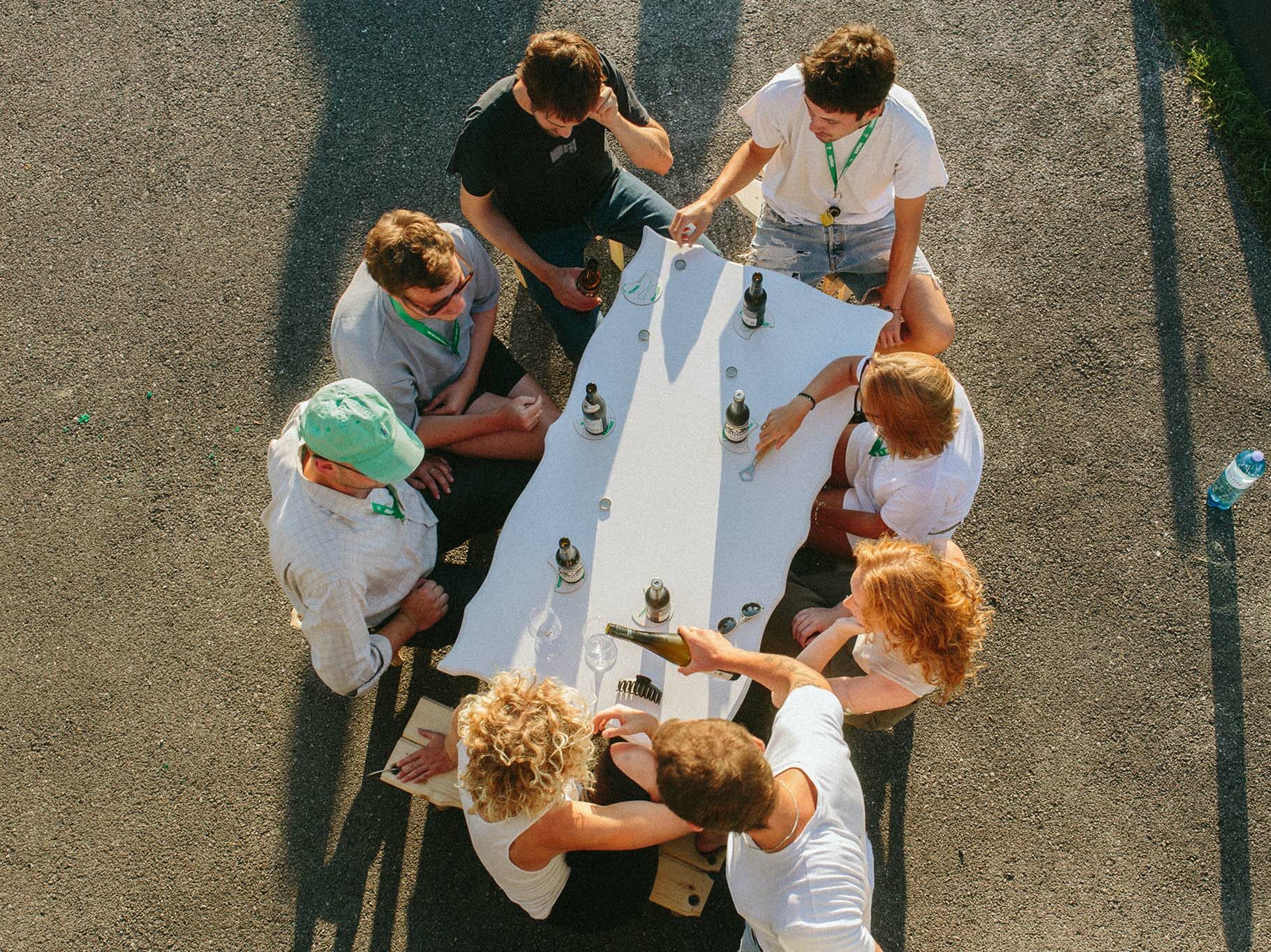
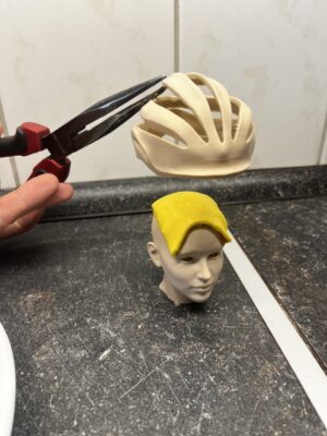
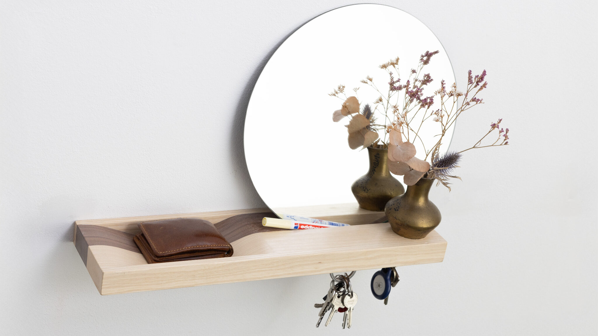
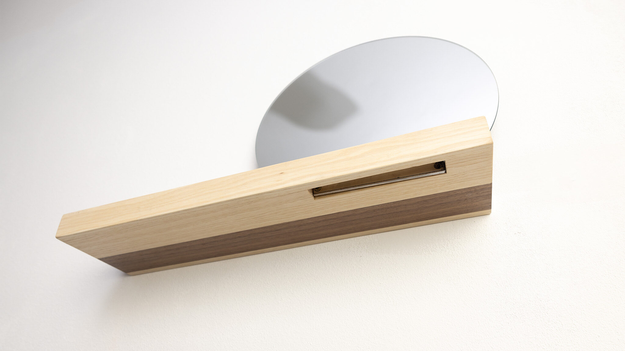
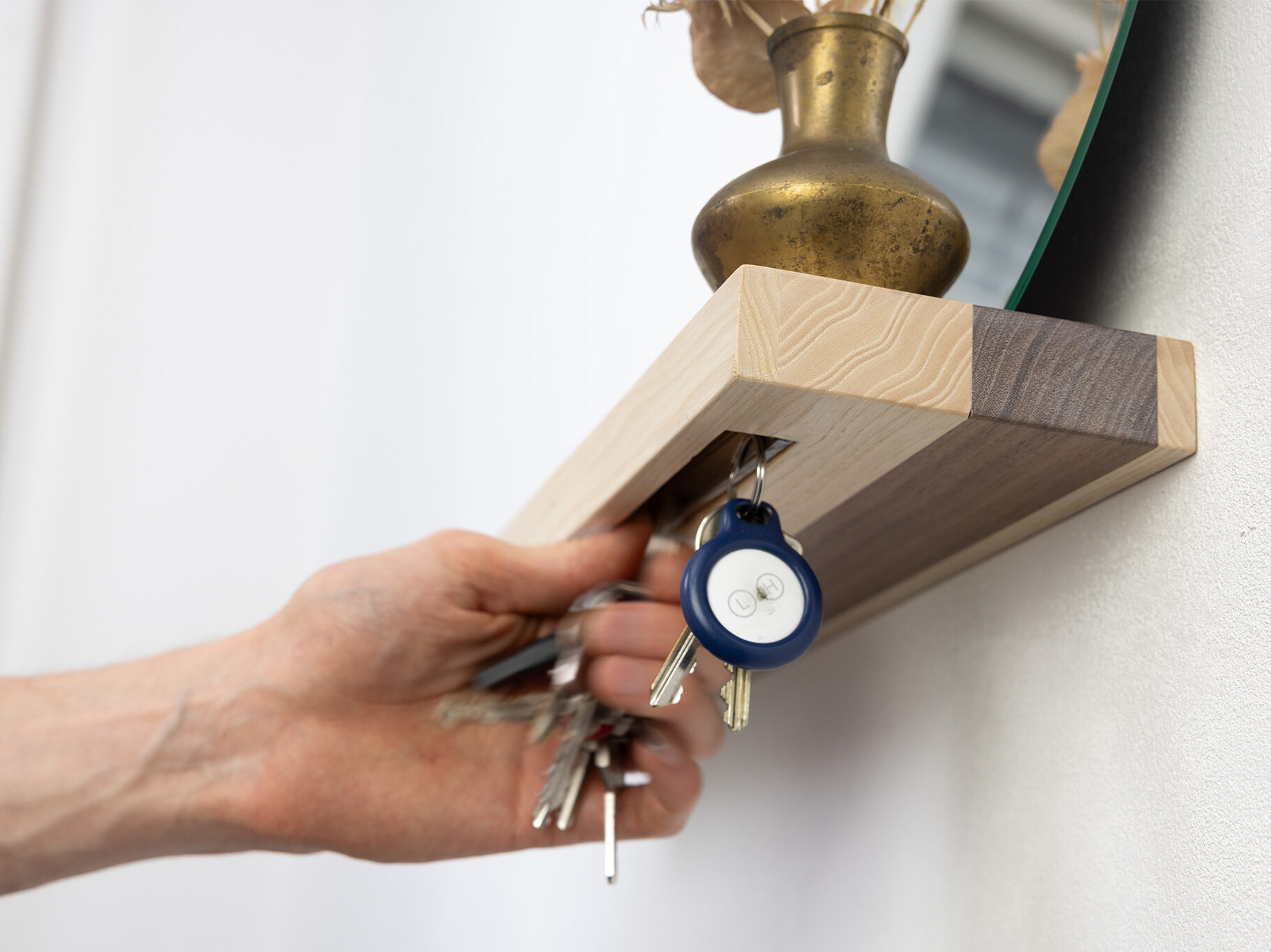
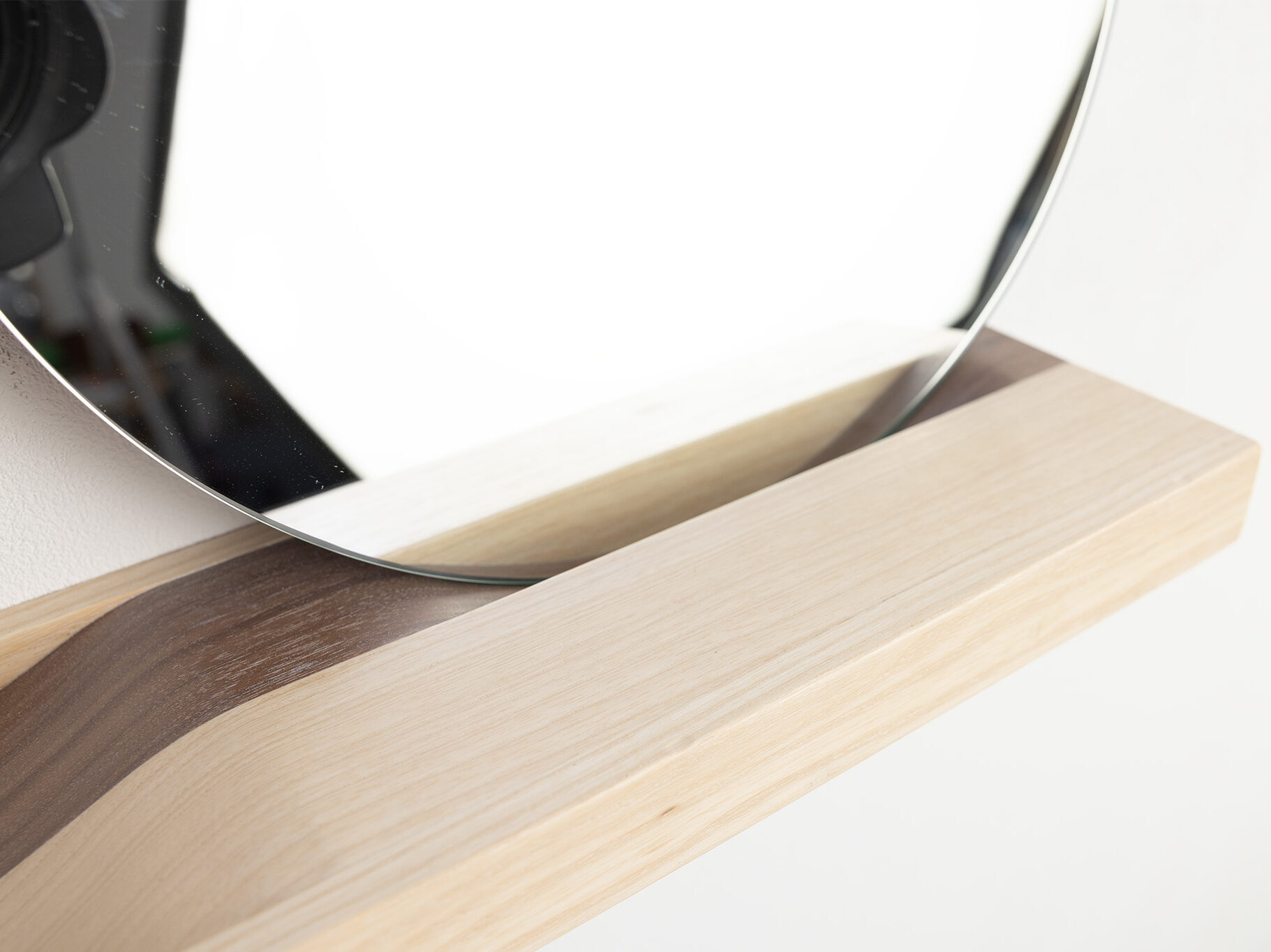
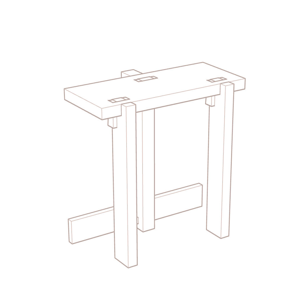
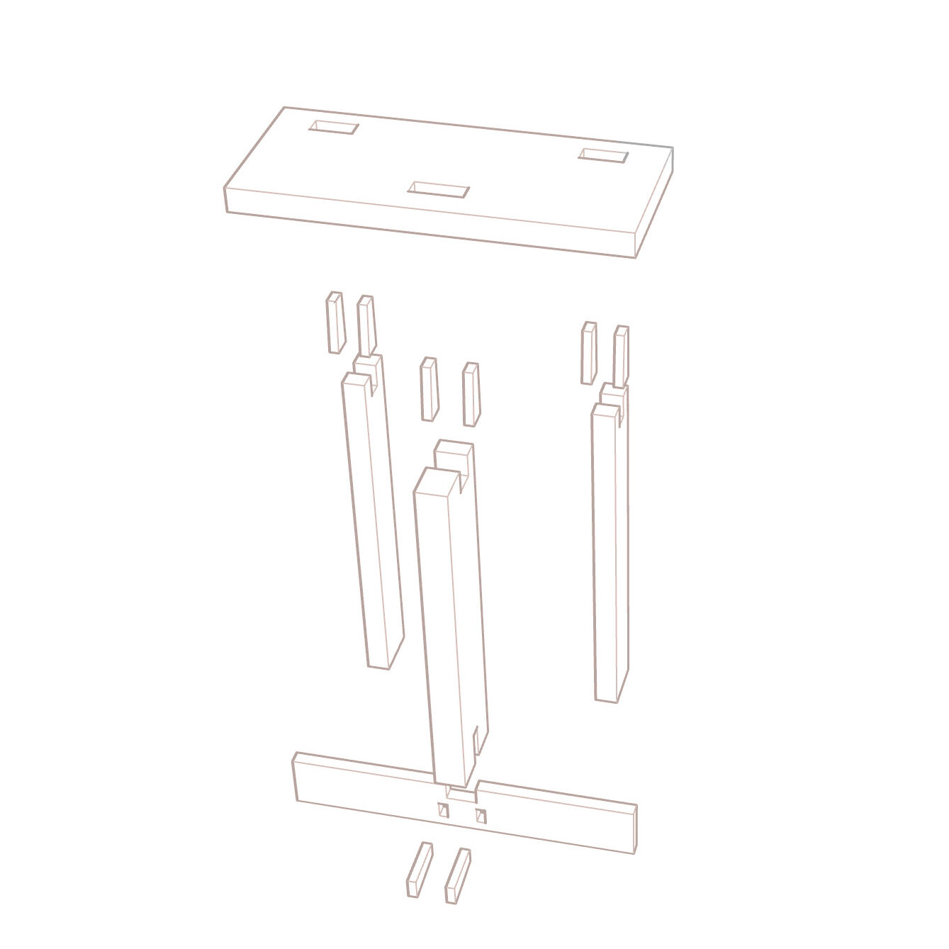
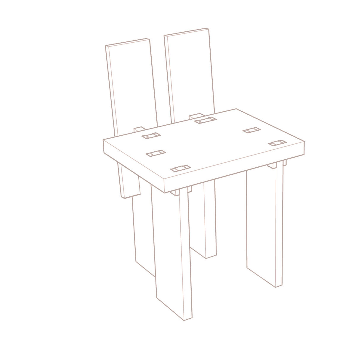
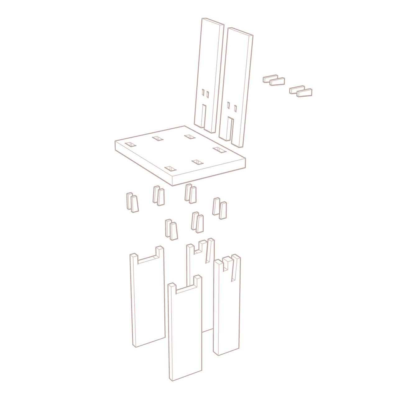
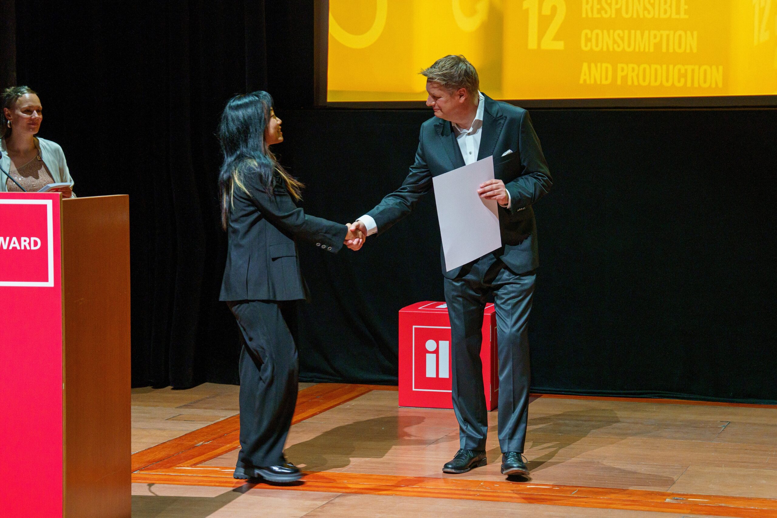
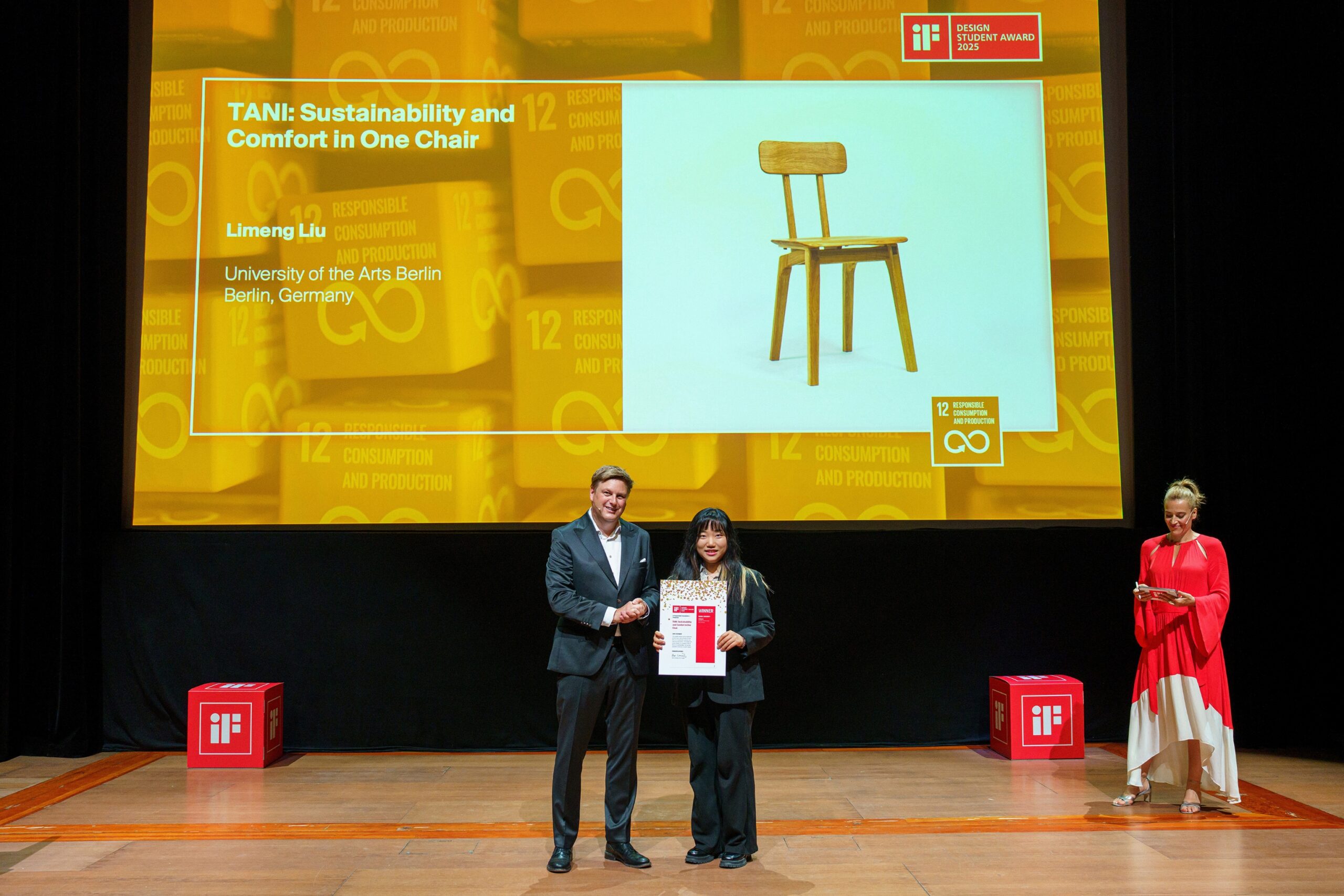
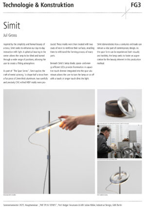
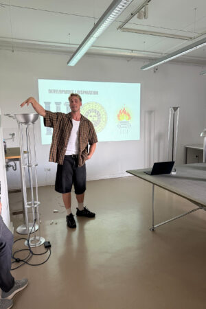
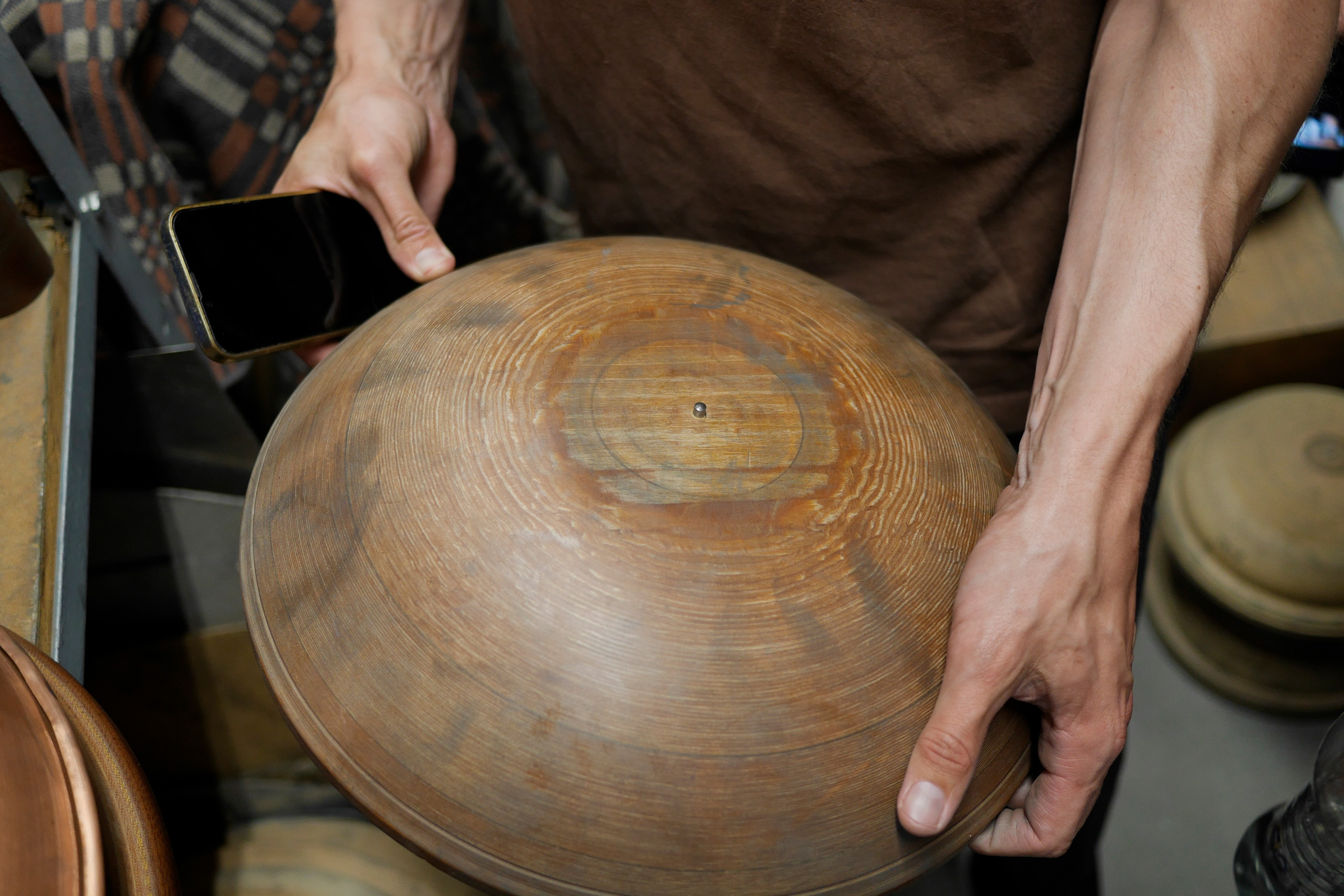
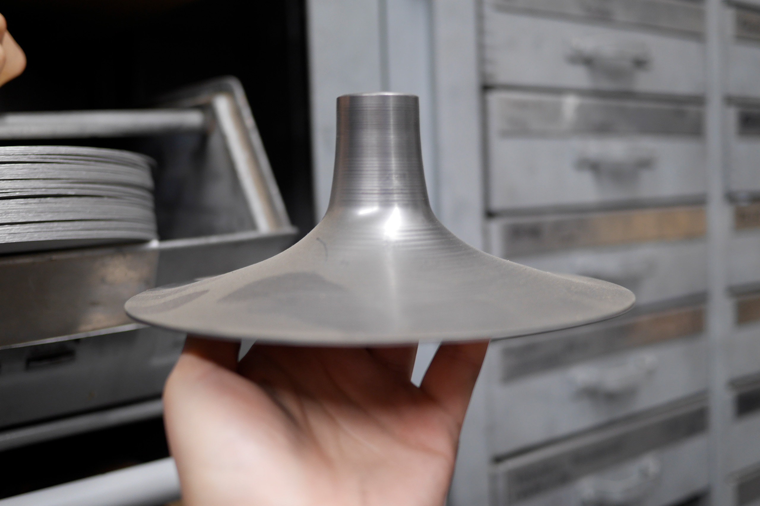
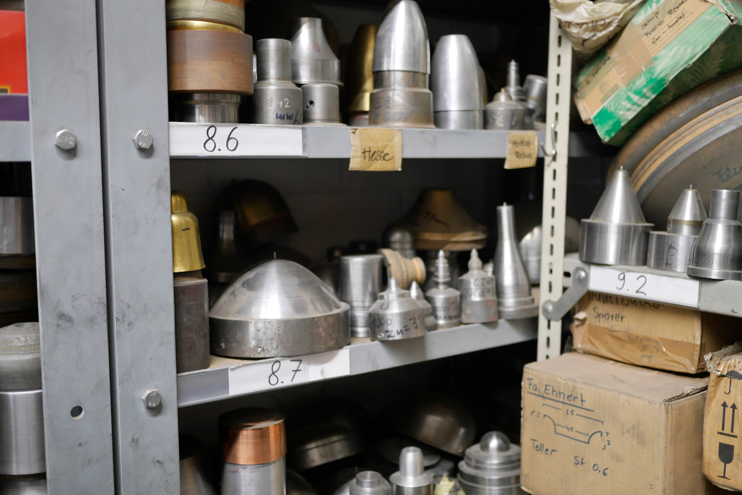
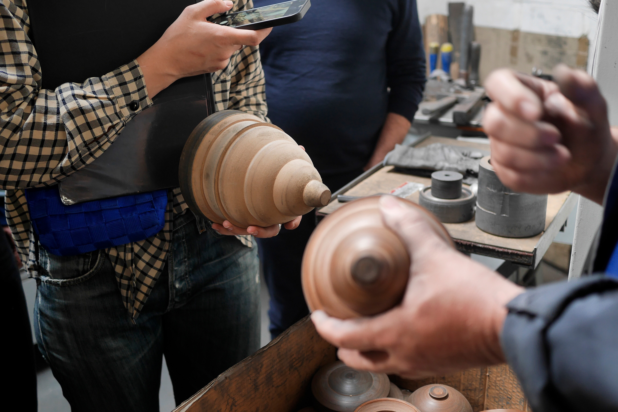
WiSe24/25 // Modedesign // Semesterprojekt
Eine zeitgenössische Lehrpraxis im Bekleidungsdesign wird bereichert durch diverse Perspektiven, die über das klassische Lehrangebot hinausgehen können. Fragestellungen, die von den Studierenden selbst ausgehen, bergen das Potential, Definitionen und Sichtweisen innerhalb der sich fortwährend weiterentwickelnden Disziplin zu erweitern und fördern kritisches und eigenständiges Denken. Freie Projekte bieten die Möglichkeit, an einer eigenen Entwurfsprojektidee oder an einem eigenen gestalterischen Forschungsvorhaben zu arbeiten und dieses unter der Betreuung von Lehrenden des Instituts durchzuführen.
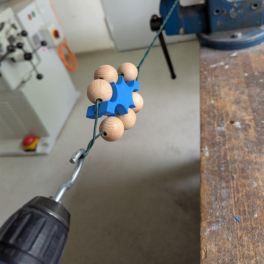
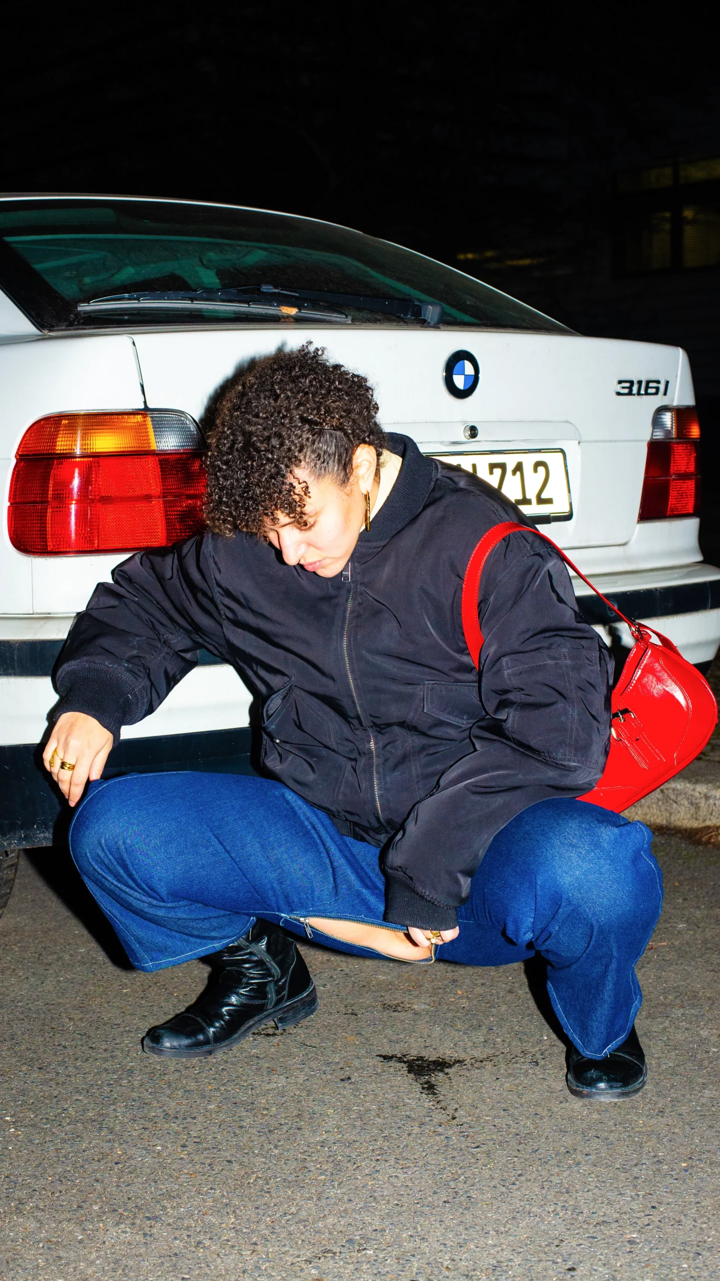
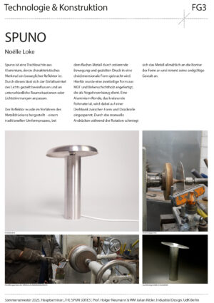
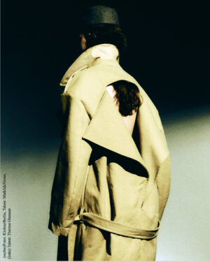
Luis Amlsgruber
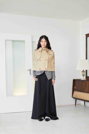
Creative Direction and Production: Josephine Aymar @josephineaymar
Design and Styling: Luis Amslgruber @luisamslgruber
Art Direction / Photography: Julia Lee Goodwin @julialeegoodwin
Hair and Make-Up Artist: Henriette Aue @fr.aue
Model: Qianyu Yu @uy.qianyu via @vivamodelsberlin
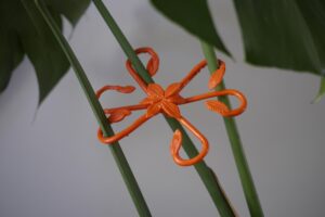
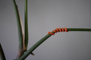
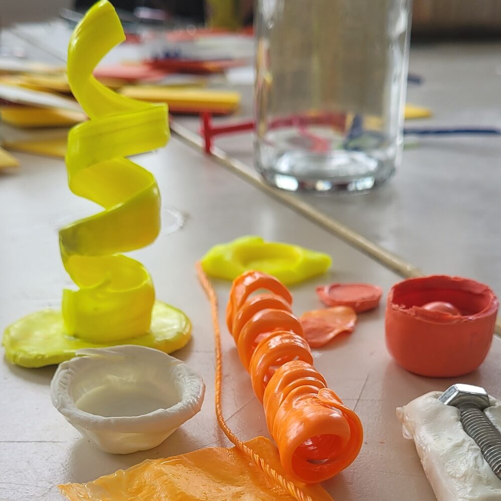
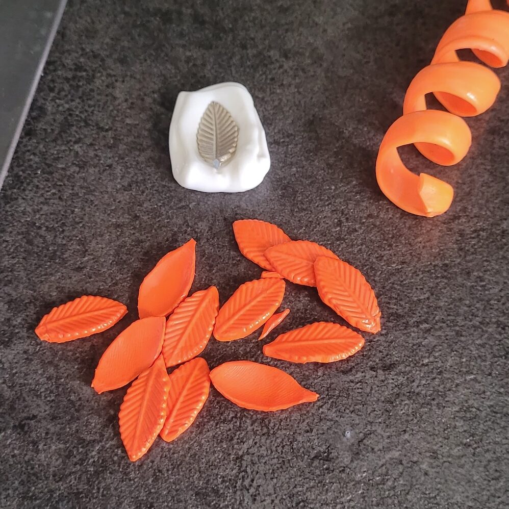
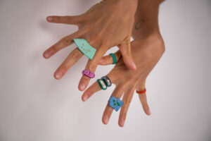
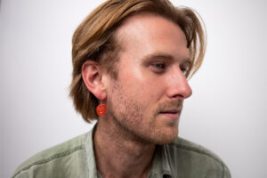
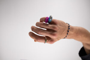
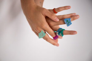
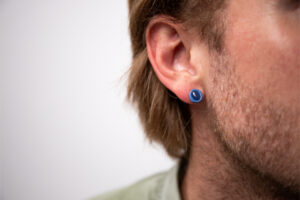
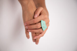
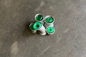
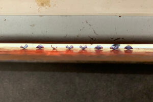
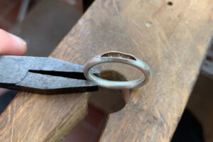
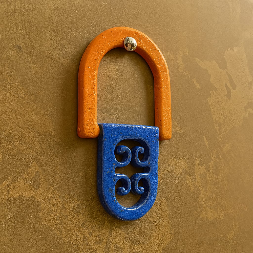
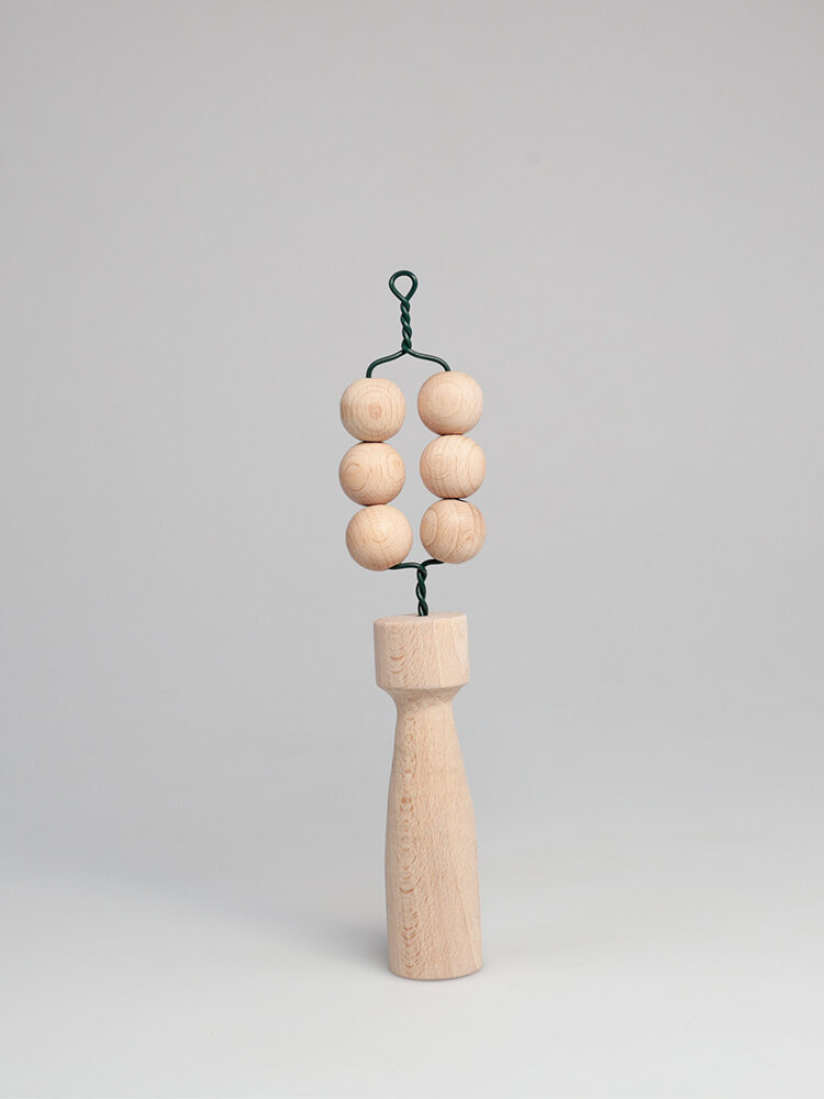
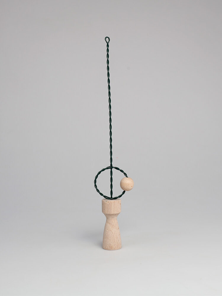
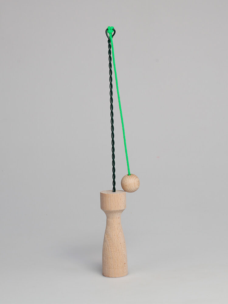
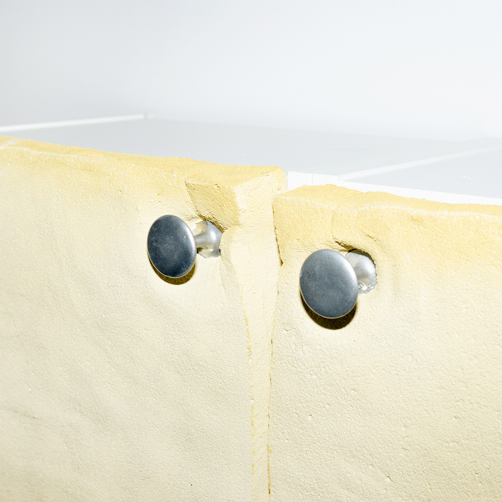
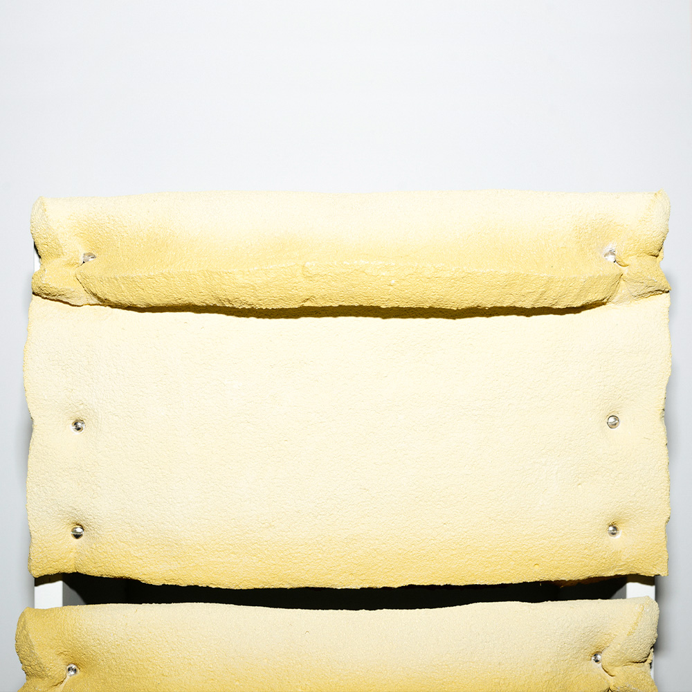
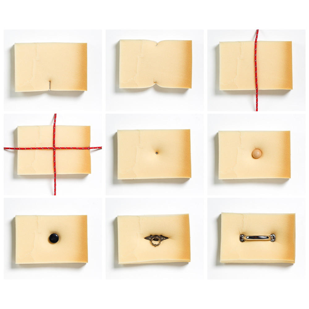
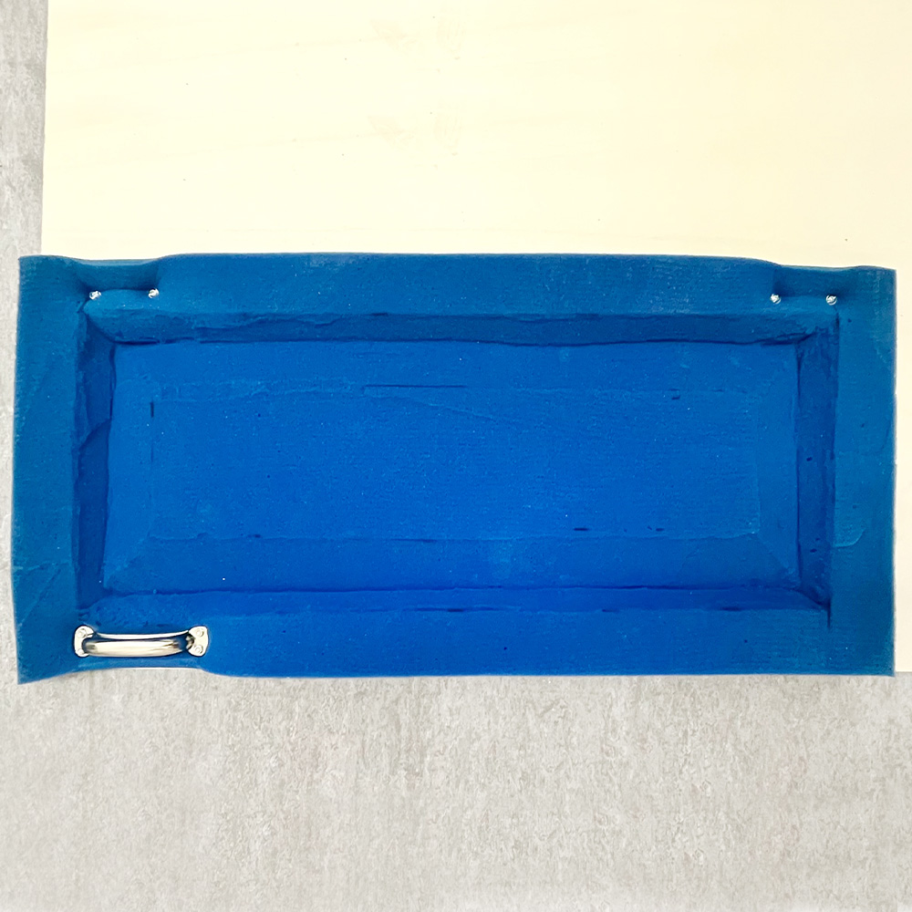
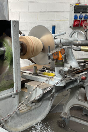
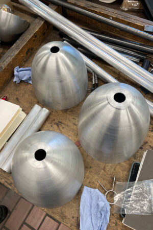
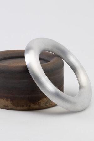
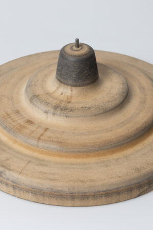
Jewelry: @larsen.jewelry @carolinegorg.atelier
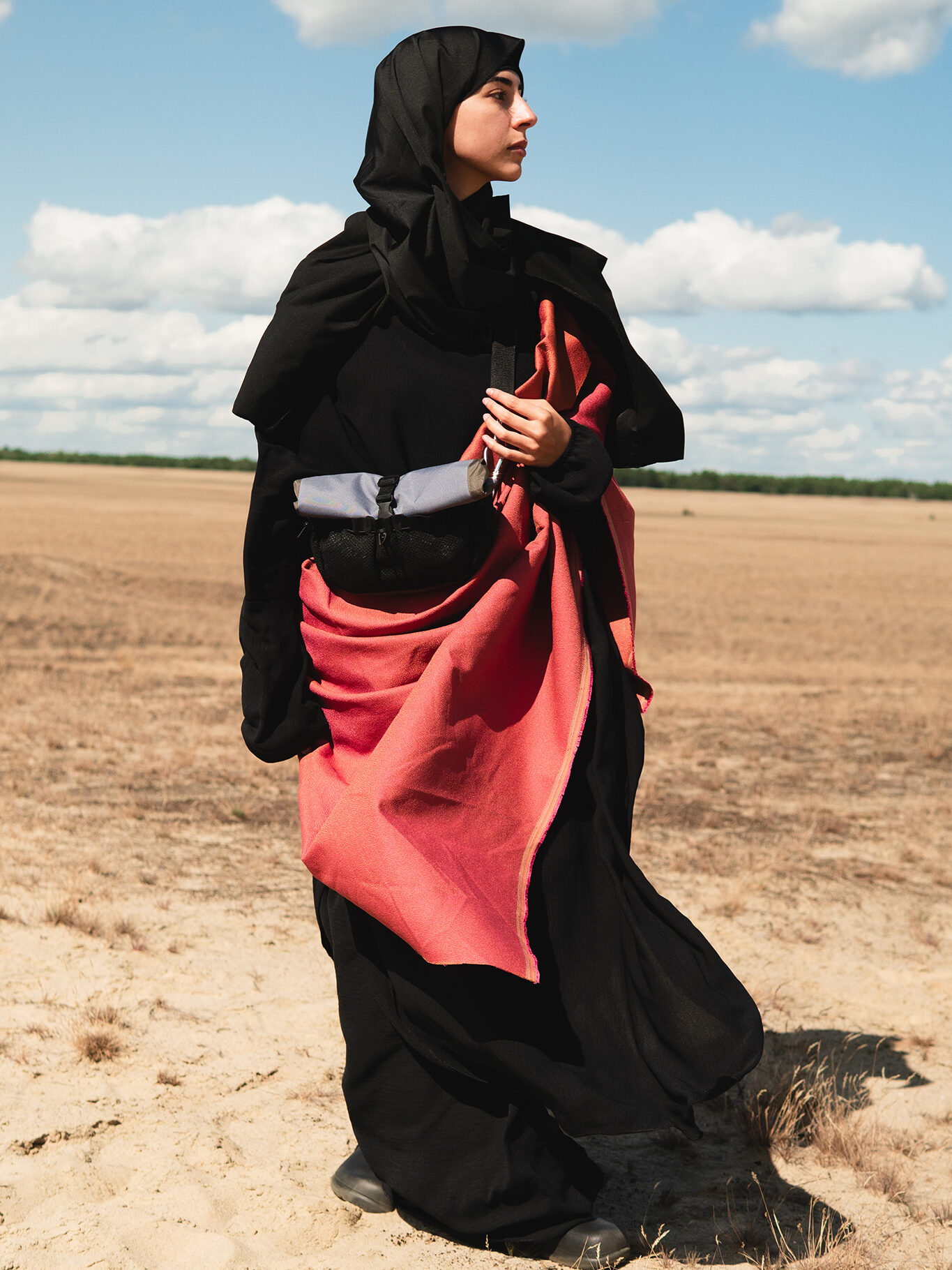
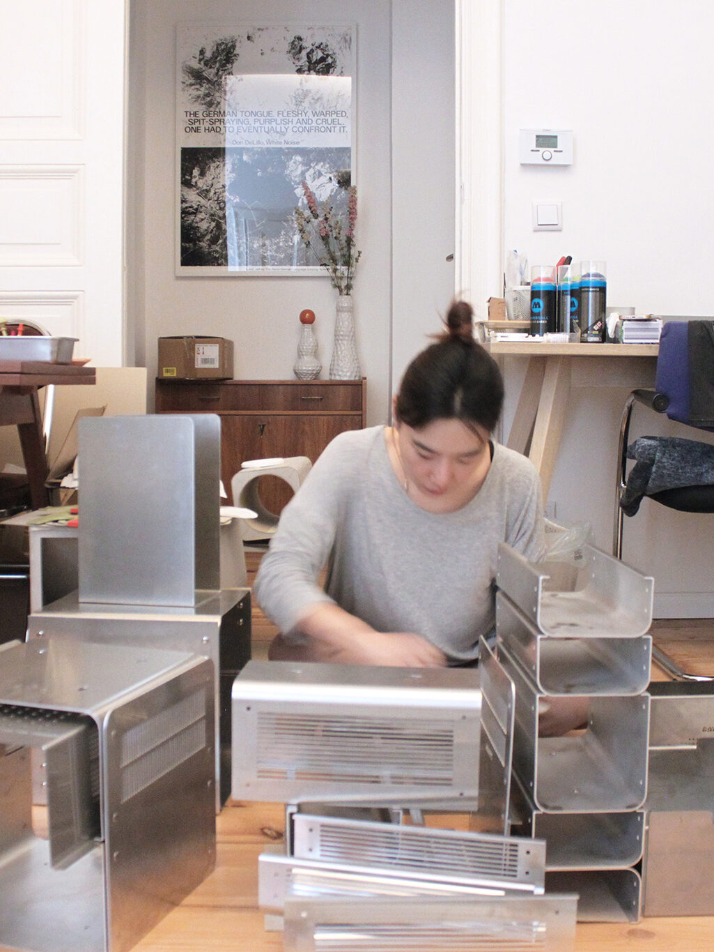
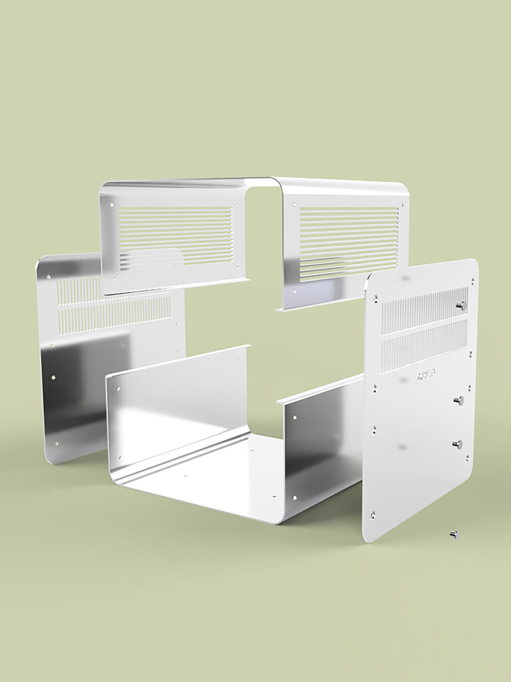
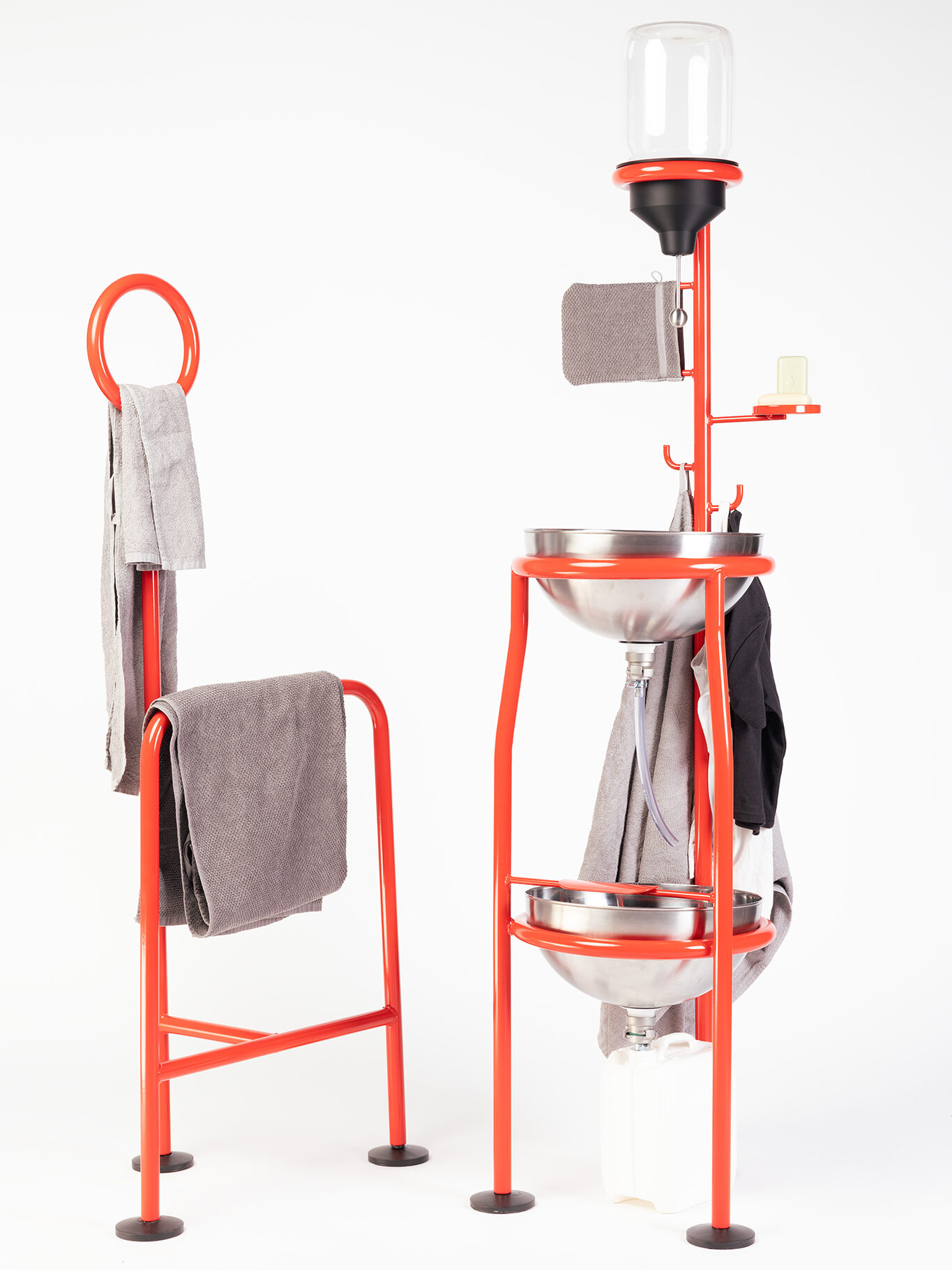
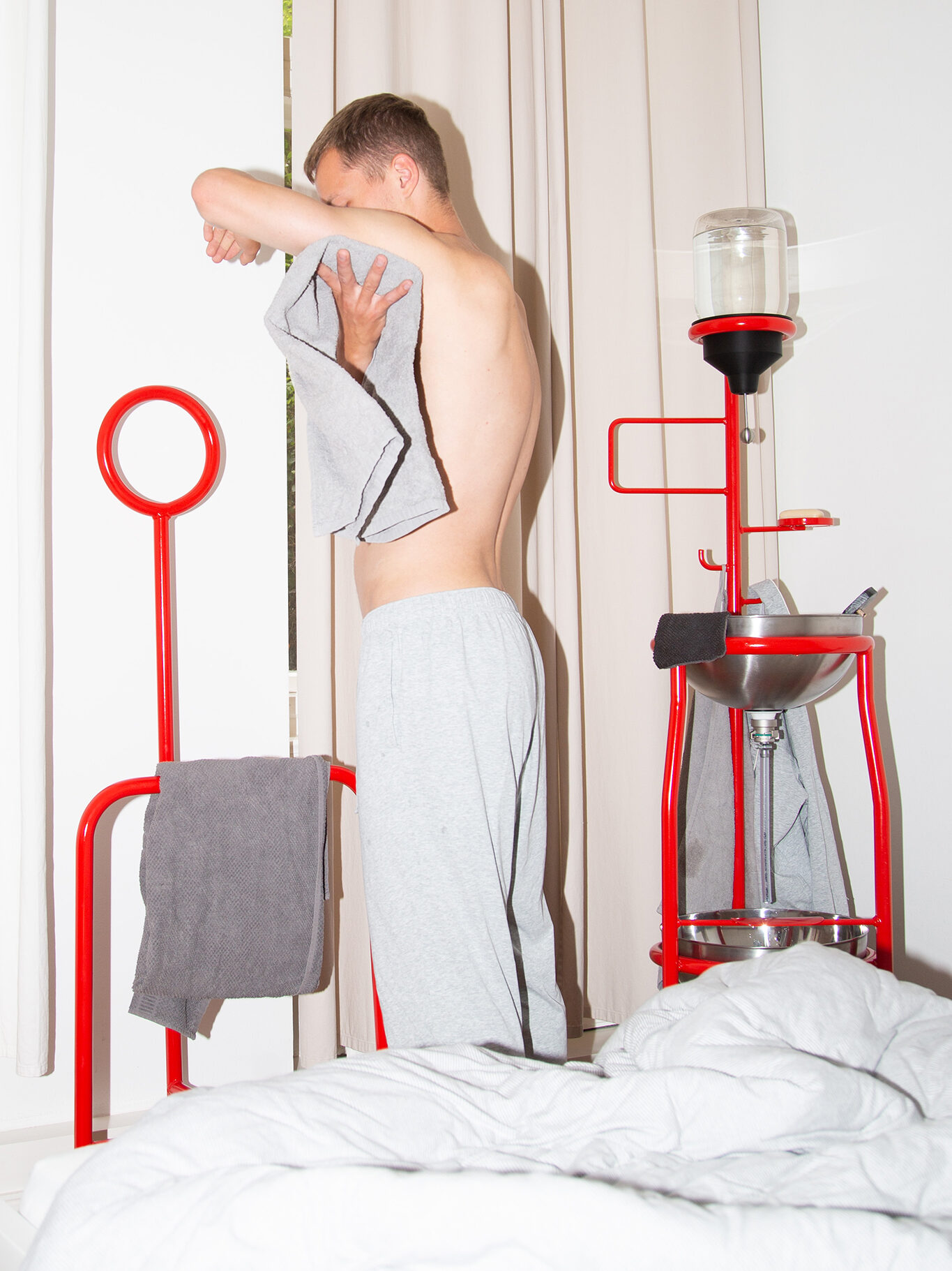
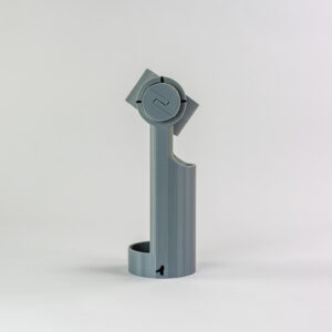
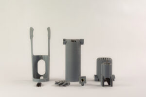
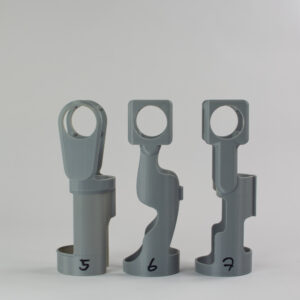
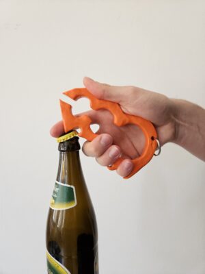
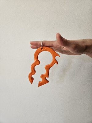
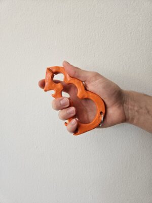
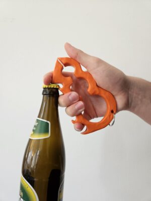
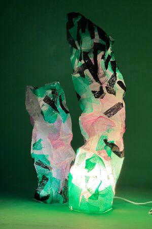
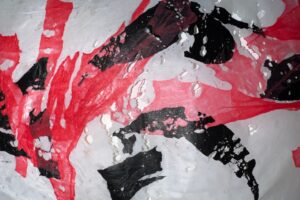
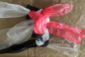
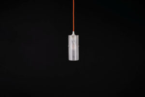
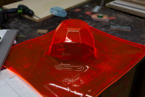
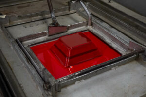
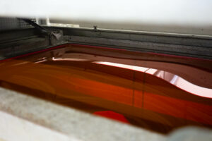
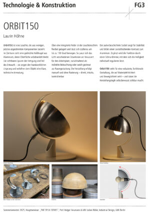
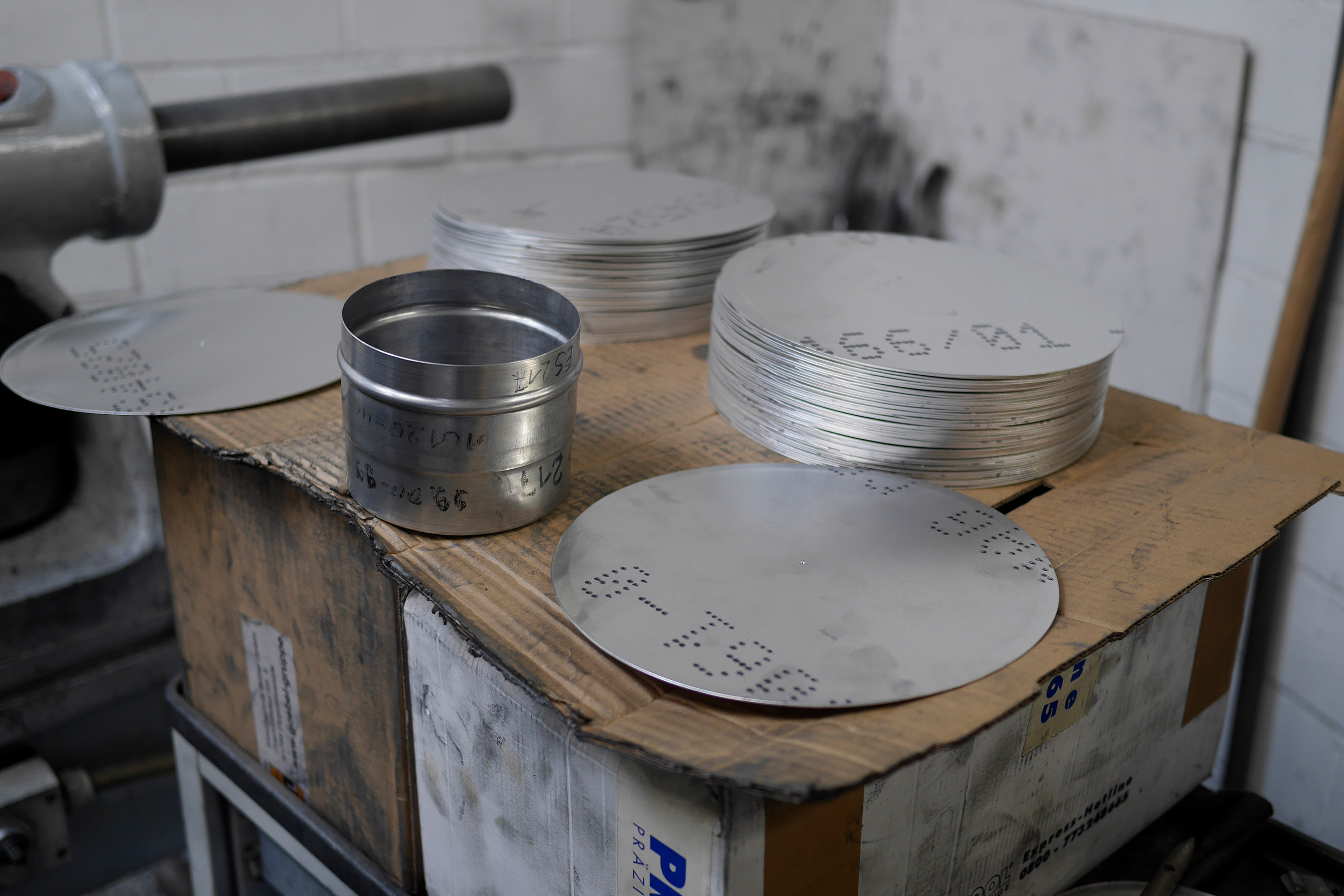
Tim Escher
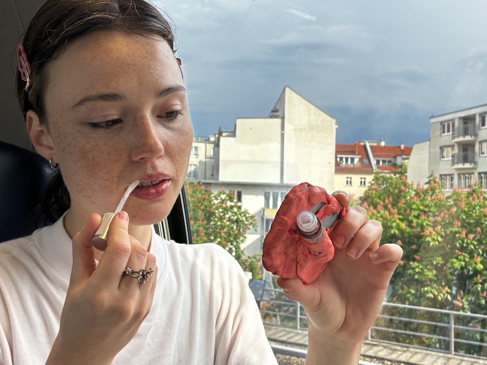
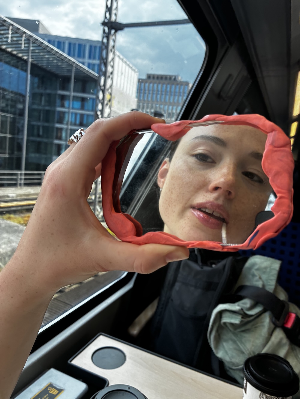
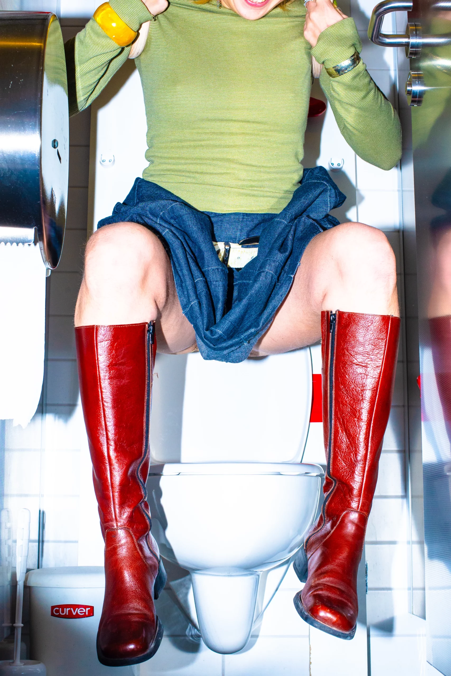
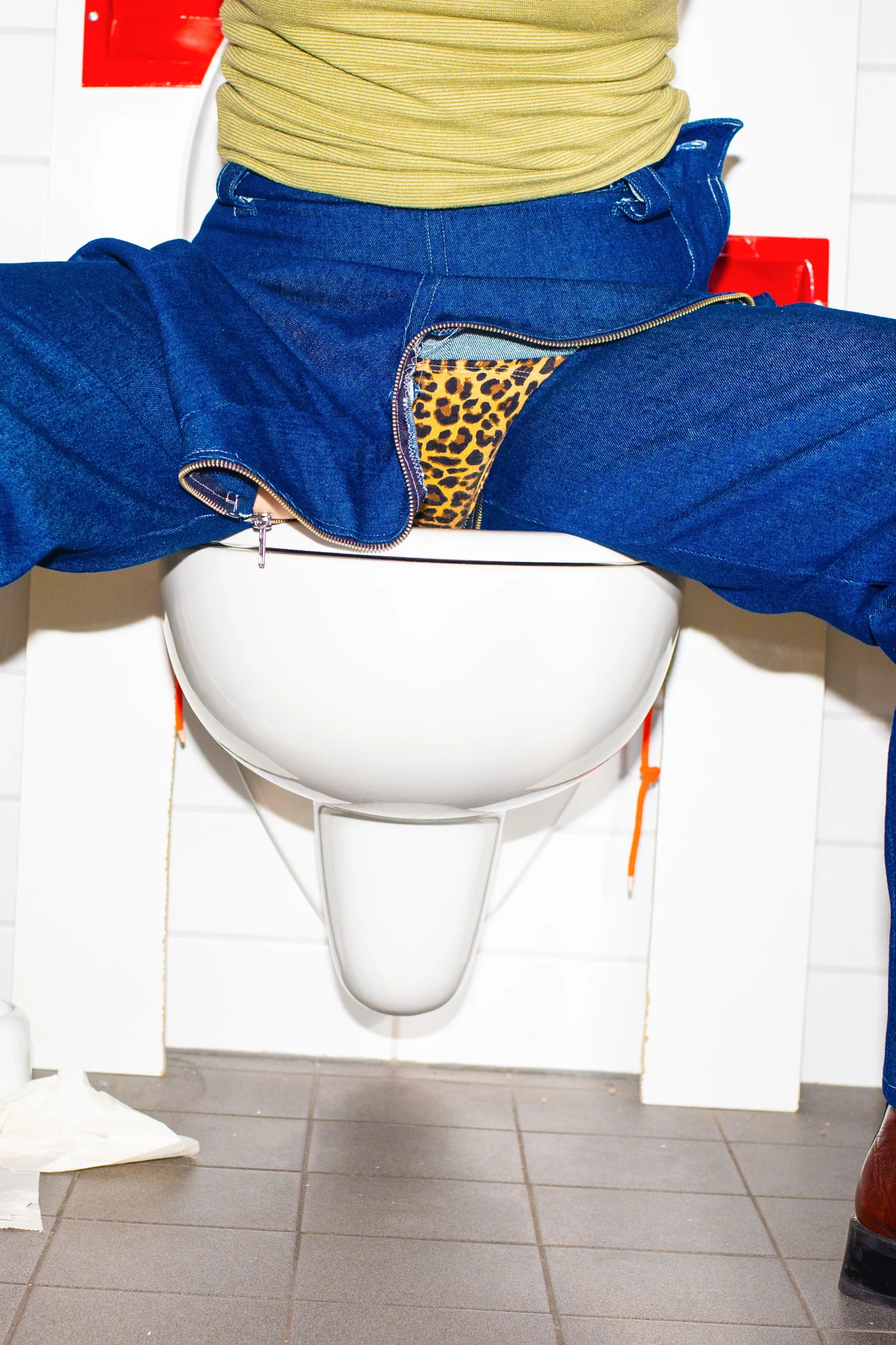
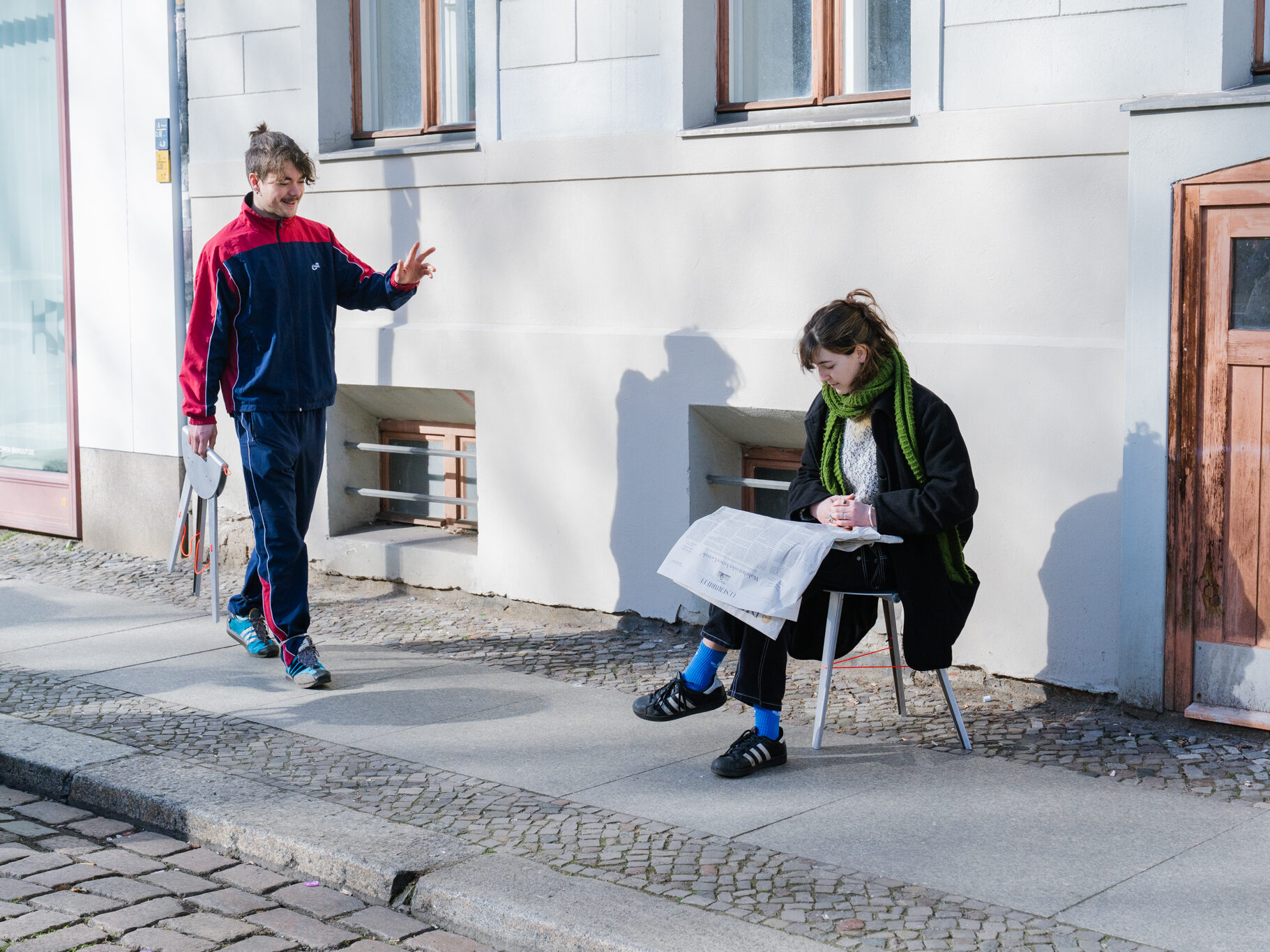
 FEELING OF CLOTH
Mode kann viele Gefühle entstehen lassen und transportieren, da sie mehr als nur eine äußere Erscheinung ist. Sie ist eine Form der Selbstexpression, die tief in die menschliche Psyche eindringt und eine Vielzahl von Emotionen vermittelt. In unserer Kleidung geht es um wesentlich mehr als nur Design, Stofflichkeit oder Verarbeitung. Es können radikale Expressionen hervorgerufen werden, welche sich mit Gegensätzen beschäftigen und so gegen traditionelle Normen und Werte fungieren. Jedes Kleidungsstück erzählt eine eigene Geschichte; es ist wie ein Kapitel in unserem persönlichen Buch, welches unsere Stimmungen, unsere Träume und unsere Persönlichkeit widerspiegelt. Sie spricht eine eigene Sprache und will uns ihre Emotionen übertragen. Durch das Wiederspiegeln von Gefühlen, erhalten wir die Möglichkeit, uns selbst auszudrücken, ohne ein einziges Wort zu sagen.
Ein Anzug oder eine Uniform vermitteln Stärke und Autorität. Durch das Gefühl des Tragens lässt es das Auftreten verändern. Es wird sowohl ein Selbstbewusstsein nach Außen übertragen, als auch eine Raffinesse, da Kleidungsstücke wie der Anzug zu den kompliziertesten Kleidungsstücken in der Herstellung zählen. Zu den wohl stärksten Emotionen, die Kleidung weitergeben kann, gehören Anmut, Glamour, Zugehörigkeit, Individualität oder Nostalgie. Die Sprache der Mode ist universell und grenzüberschreitend. Sie kann Menschen miteinander verbinden, indem sie gemeinsame Werte und Emotionen teilt, und gleichzeitig individuell einzigartige Geschichten erzählen.
In der heutigen Zeit ist die Wahl der Kleidung oft eine sehr bewusste Entscheidung, die darauf abzielt, unsere Werte und Stimmung zu kommunizieren. Die Mode soll nicht nur als äußerer Schein fungieren, sondern als ein Spiegelbild unserer Seele, unserer innersten Gefühle und unsere Psyche.
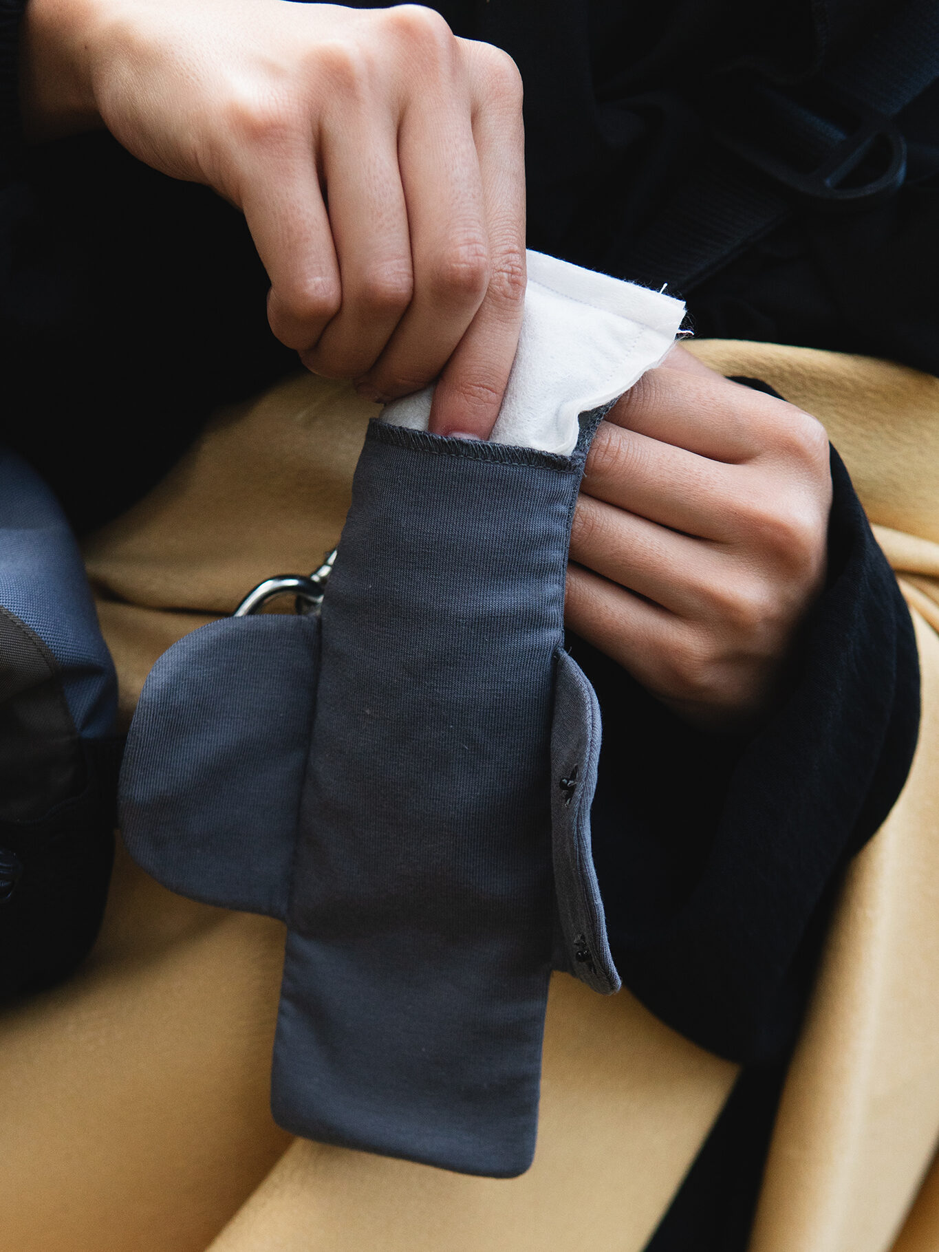
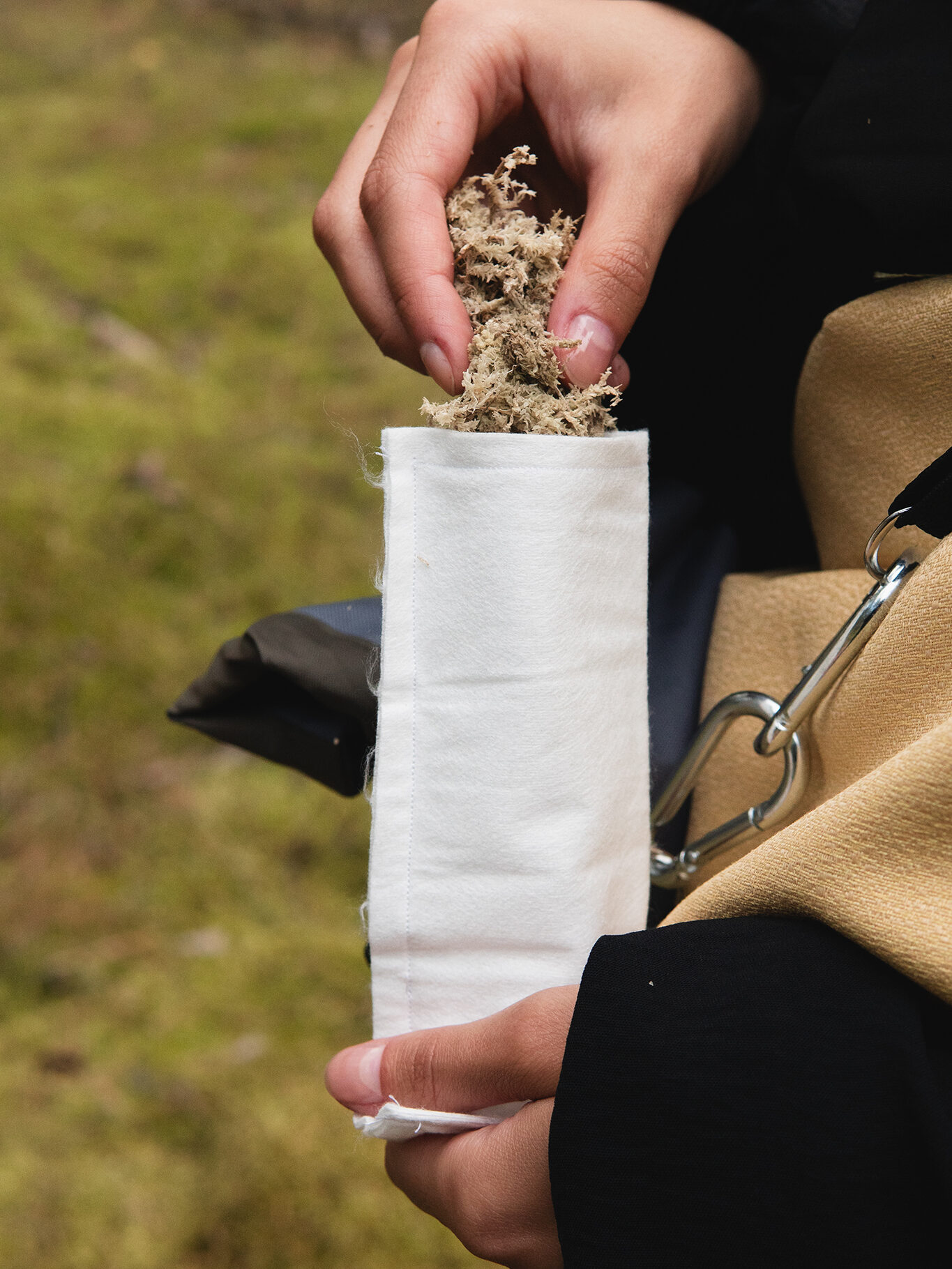
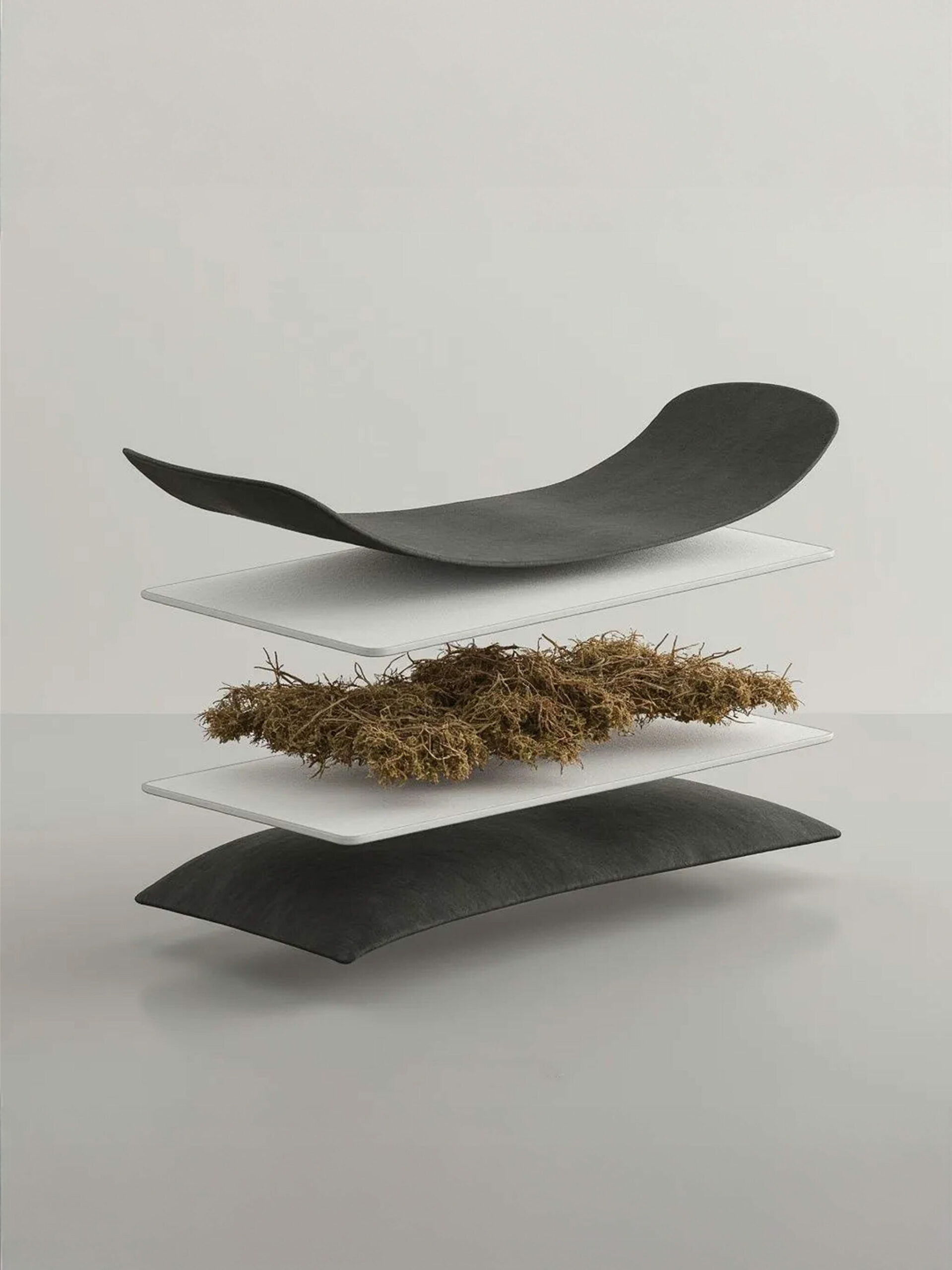
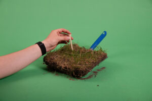
In meinem freien Projekt möchte ich mich zu einem mit den Gefühlen, welche Mode vermitteln kann, auseinandersetzen und zum anderen, wie Gegensätze von Materialien, Formen, Subversionen und Banalitäten die tragende Person beeinflussen.
Welchen Einfluss haben die verschiedenen Aspekte des Designs auf den Menschen, wie z.B. die Subversion von Geschlechtern, die Stofflichkeit, die Silhouette, der Zustand eines Kleidungsstückes und welche Gesten werden vermittelt? Wie verändern sich die Gefühle von einem sehr tragbaren zu einem untragbaren Kleidungsstück? Dies alles in Hinsicht auf die Introspektion (Def.: In·t·ro·s·pek·ti·on /Introspektion/ Substantiv, feminin [die]nach innen, auf das eigene Bewusst- sein, die psychischen Vorgänge gerichtete Beobachtung) der tragenden Person.
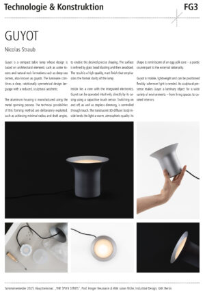
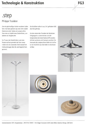
Charlotte Hüttenloher
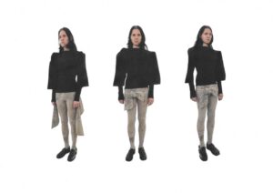
Siblings
Inspired by the concept of siblings wearing matching outfits, this design draws influence from children‘s and toddlers‘ clothing. Initially, the same print and color palette dominate the ensemble. However, upon closer inspection, the unique characteristics of each piece and the various ways they can be worn reveal the undeniable individuality of the garments and overall looks.
Photo: Charlotte Hüttenloher
Model: Arkadiusz Swieton
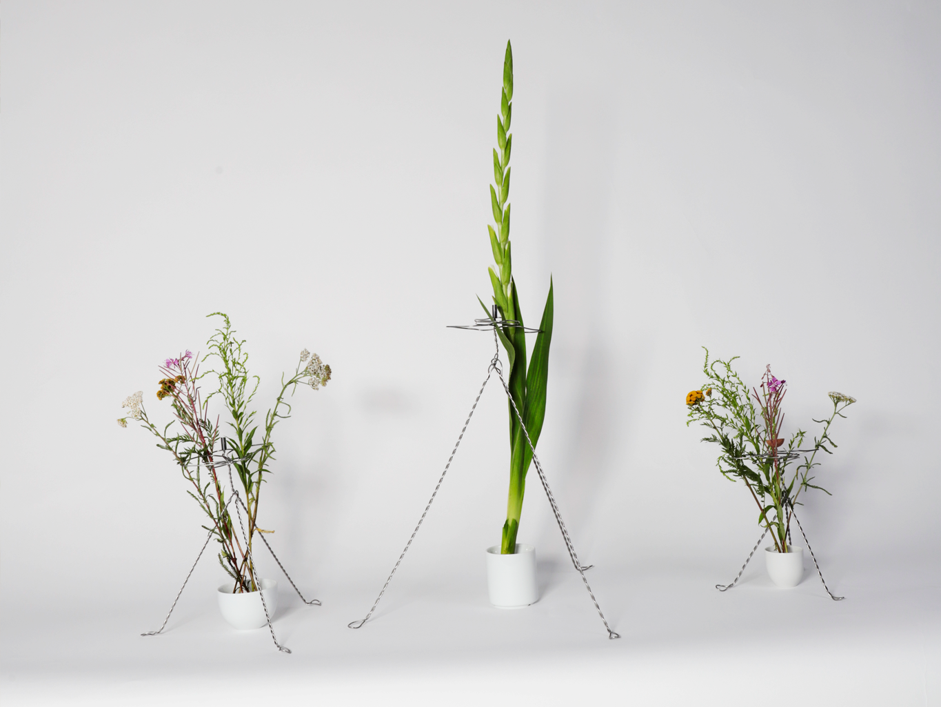
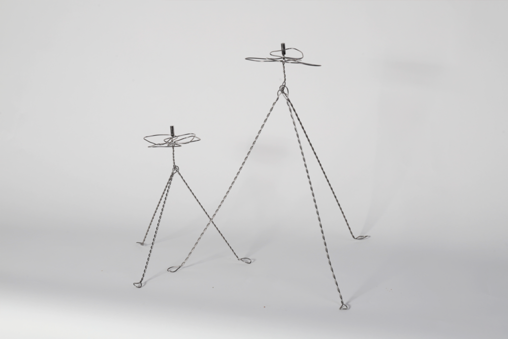
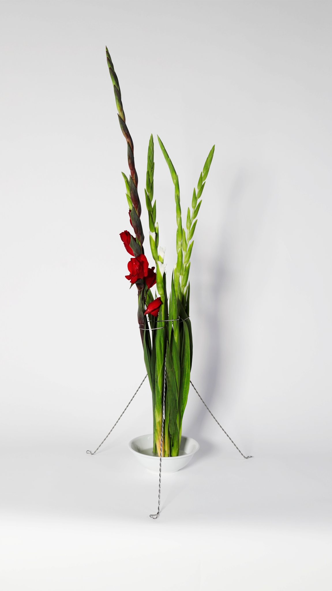
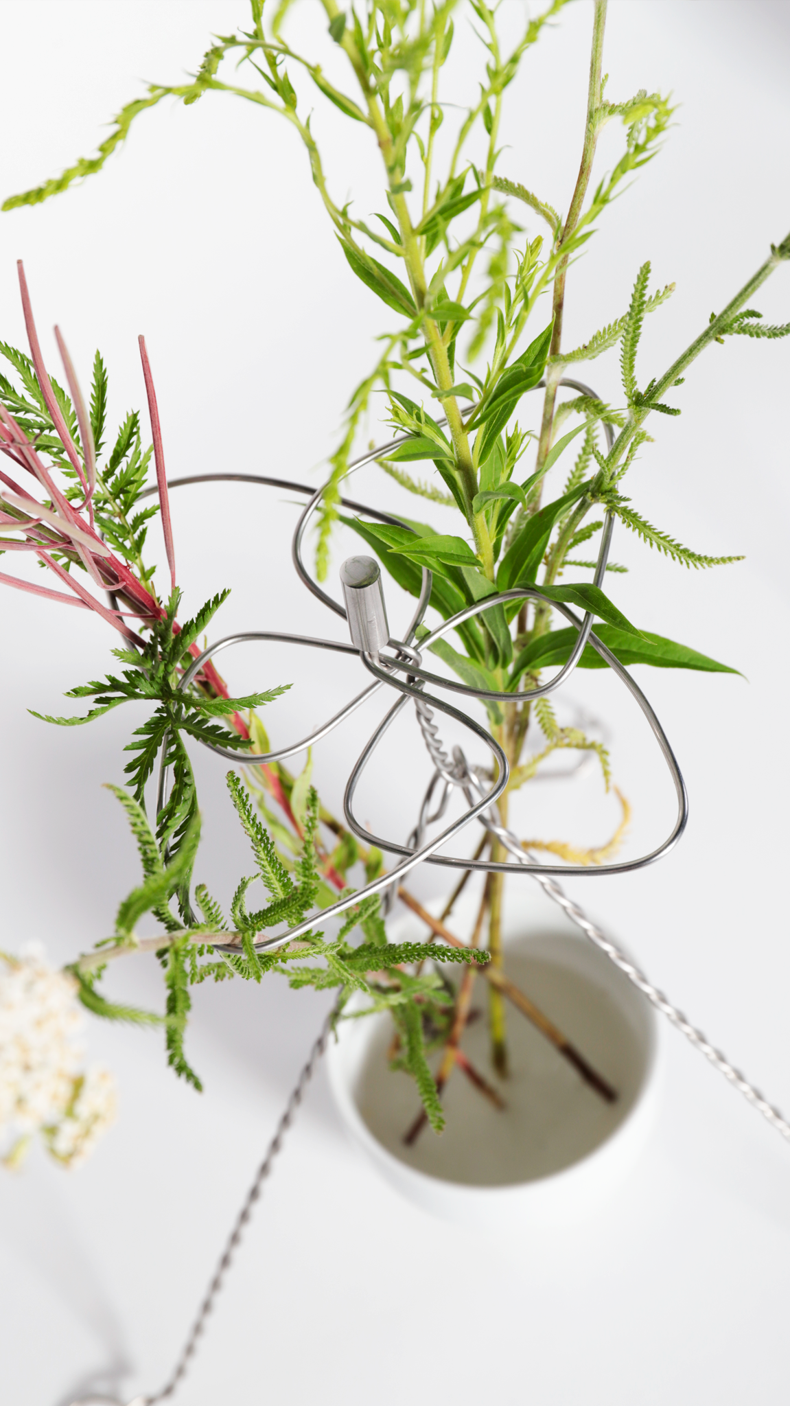
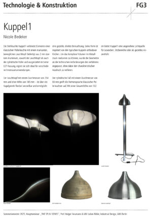
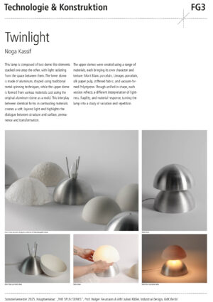
Leif Kessler

Melchior Rasch
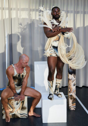
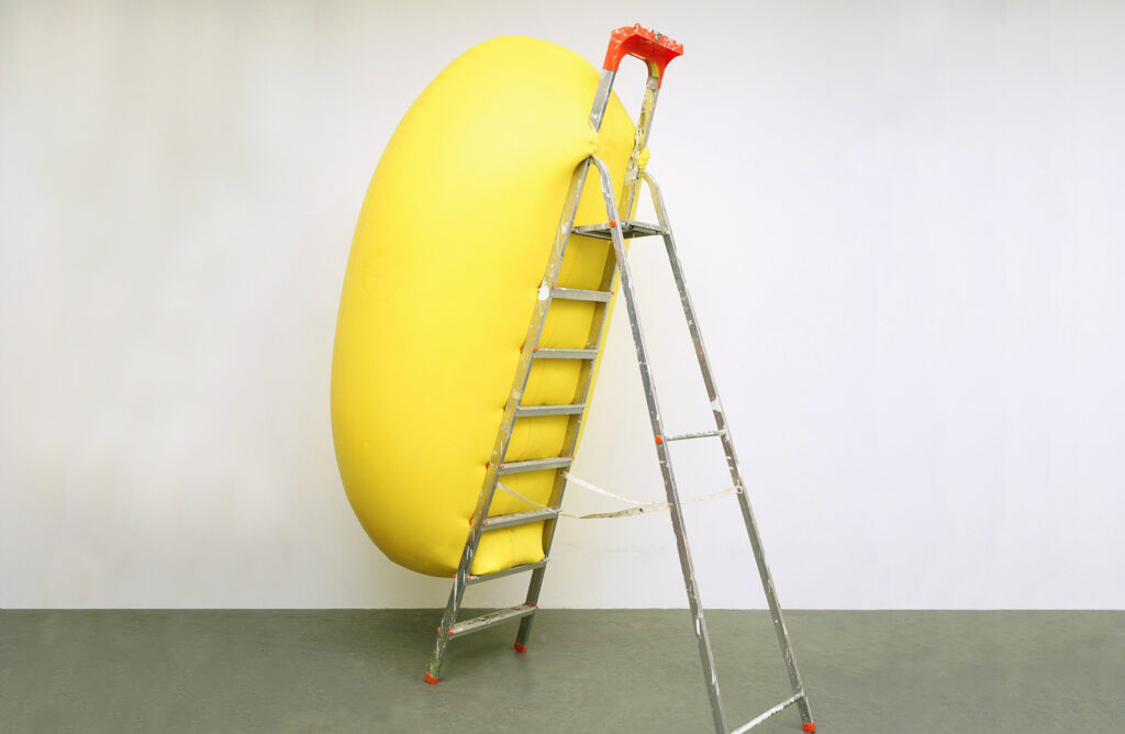
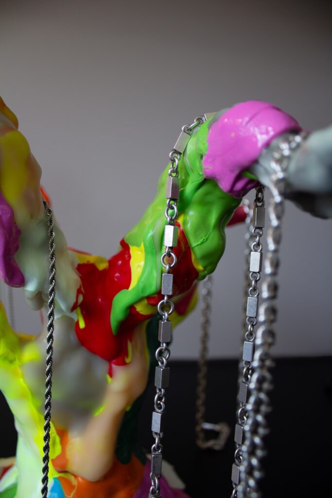
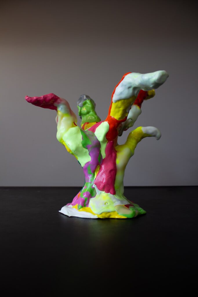
Der sich aufpumpende Mensch erschafft sich selbst. Gleich einem Bildhauer der sein Werk aus Marmor schlägt, trainiert er präzise die Muskeln seines Körpers durch Bodybuilding. Es geht ihm nicht um den Zugewinn von Kraft, es geht ihm darum sein eigenes Bild von Kraft herzustellen, Sein eigenes Bild zu modellieren, bis zur Perfektion. Doch was ist der Antrieb dahinter? Ist das wirklich zeitgemäß? Und Ist der sich aufpumpende Mensch von Unfreiheit geprägt? Die in den Körper investiert Zeit fließt in einen unabschließbaren Prozess der Selbstoptimierung. Und in seiner Unabschließbarkeit steht er still, staubt er ein, der Körper, der irgendwann doch ohnehin verfällt.
In den Designs wird das Spannungsfeld von Körperkunst, Männlichkeit und Unfreiheit eines Mannes inszeniert, der aussieht “wie aus Stein gemeißelt.
Photography: Melchior Rasch
Models: Aleksandar @i.am.aleksandar, Alexander @lexius_prince