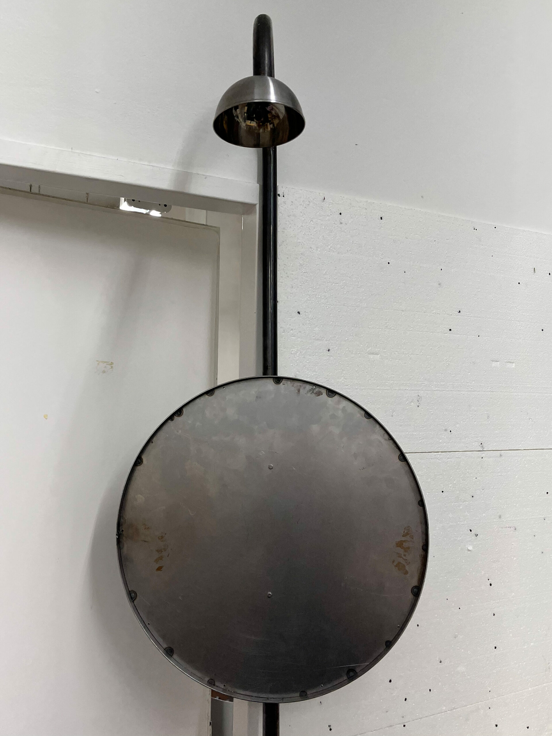
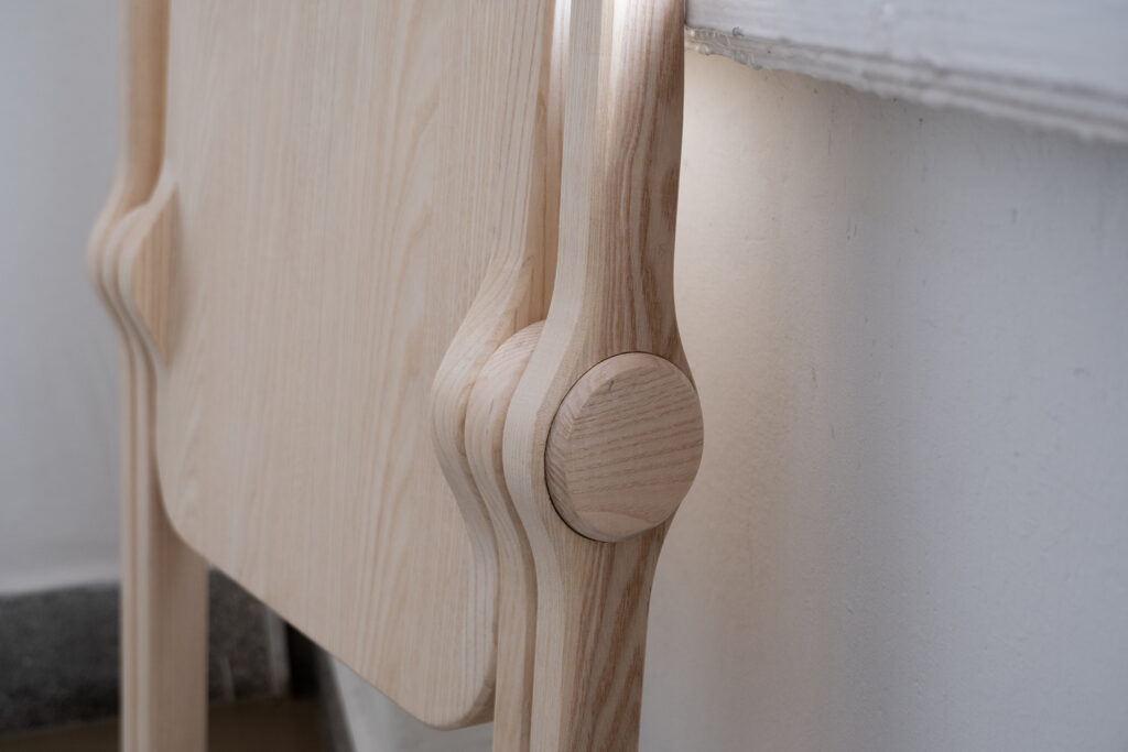
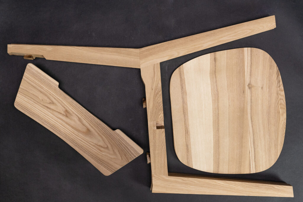
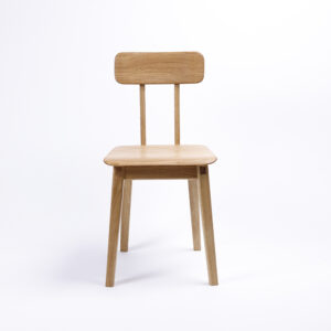
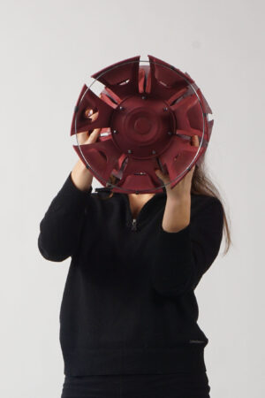
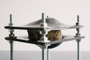
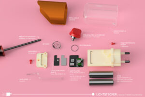
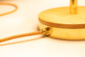
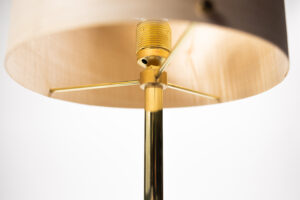
LEDs and batteries are often not replaceable and many luminaires are glued together. This makes repairs impossible and the entire light becomes electronic waste.
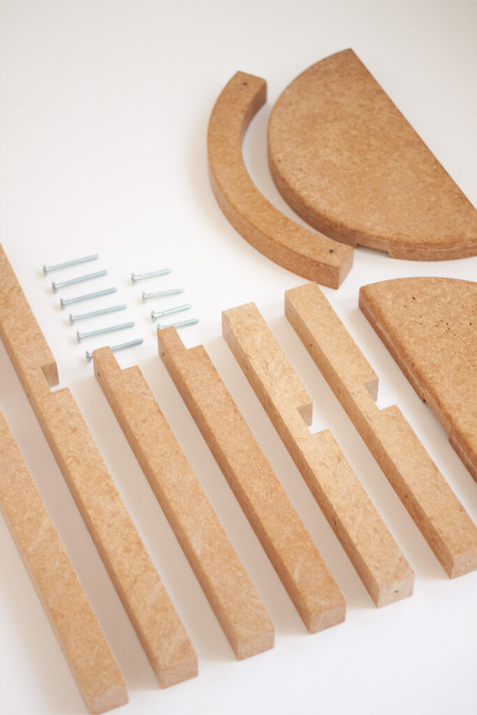
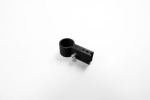
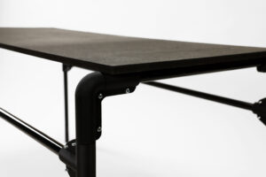
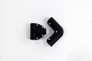
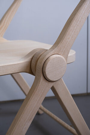
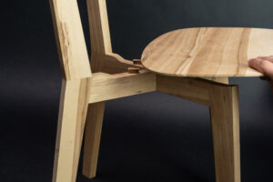
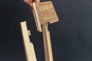
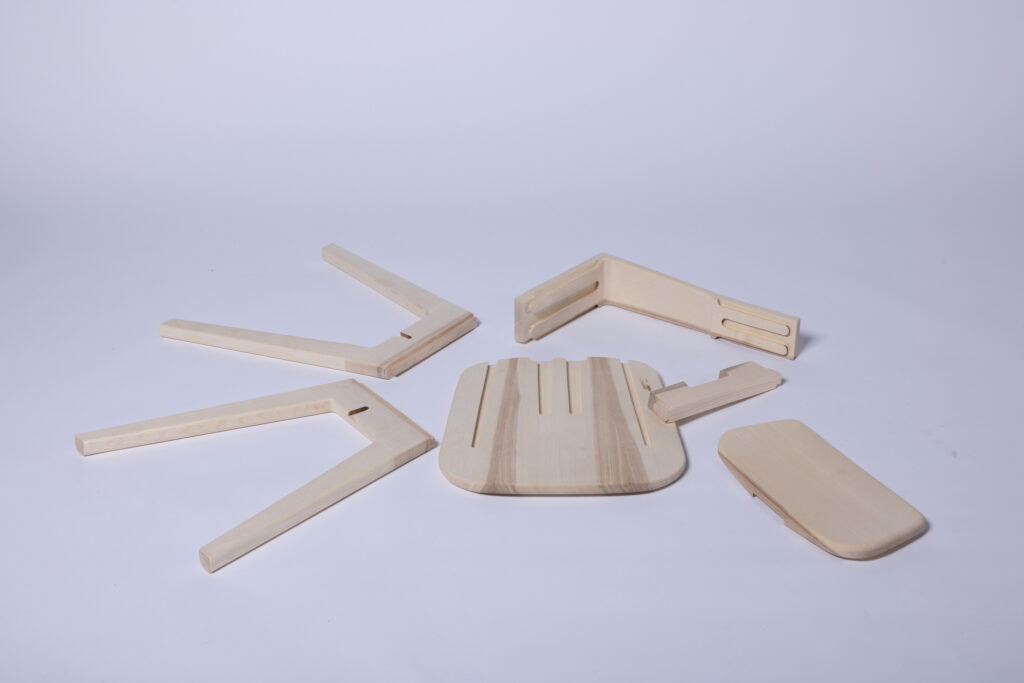
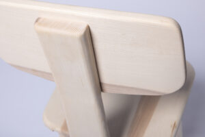
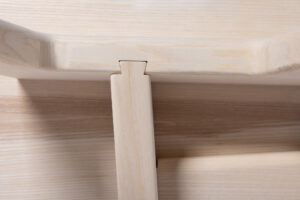
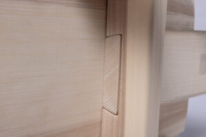
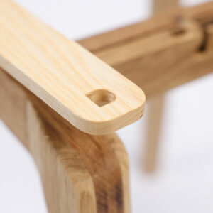
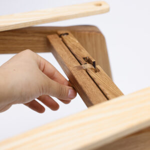
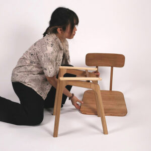
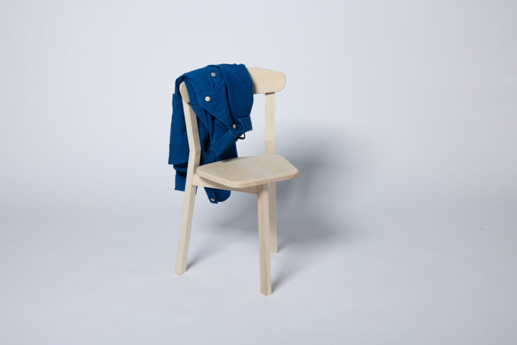
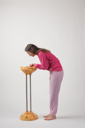
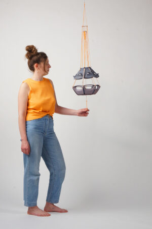
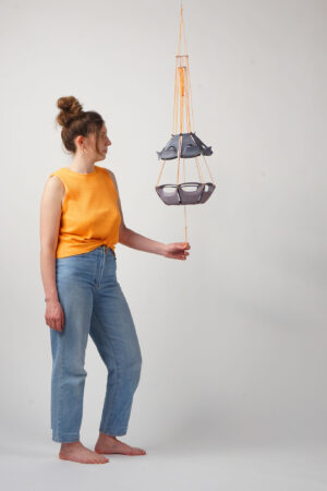
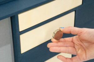
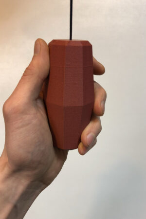
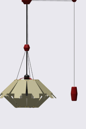
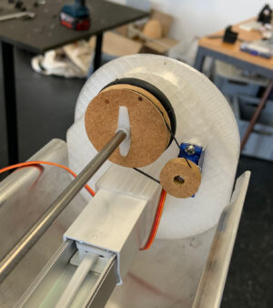
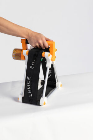
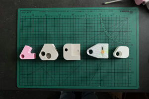
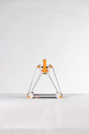
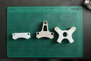
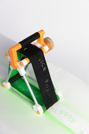
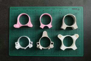
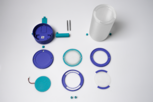
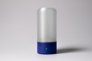
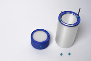
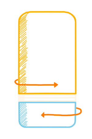
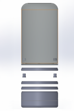
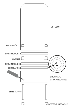
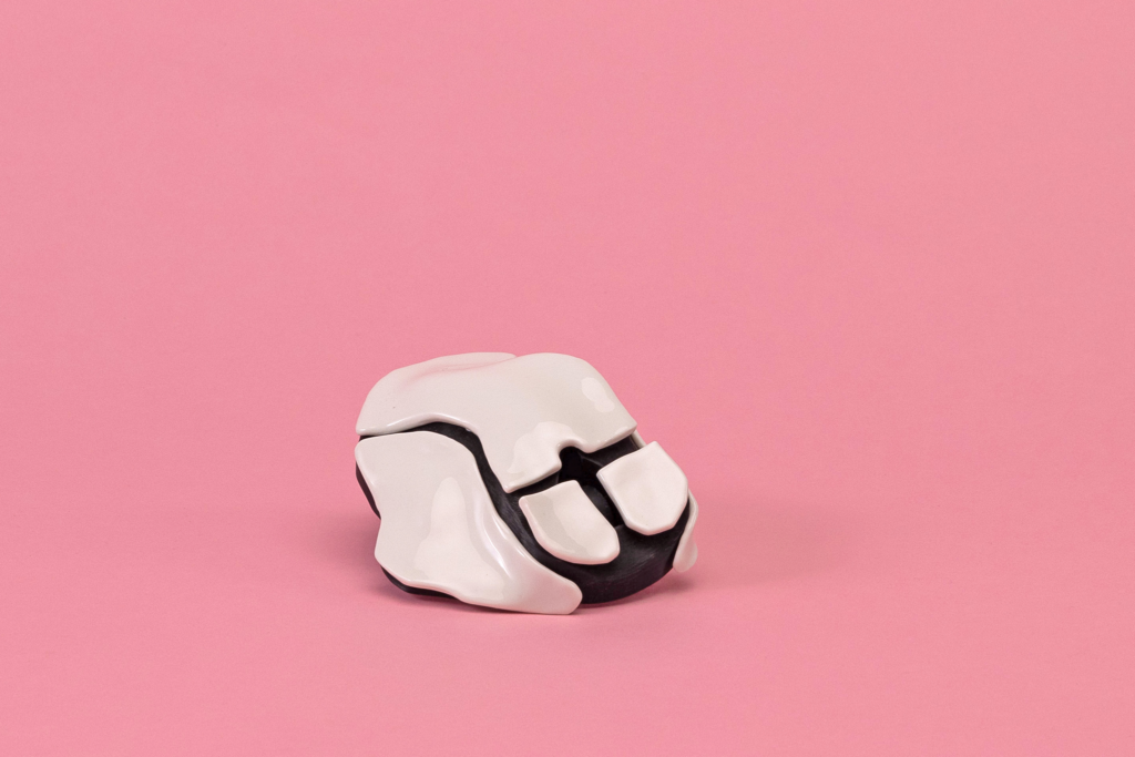
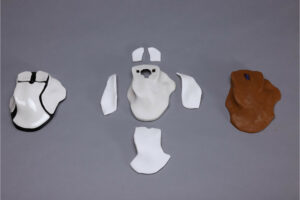
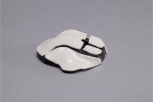
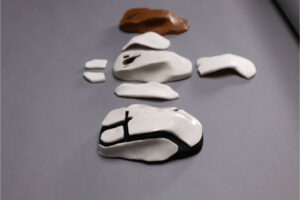
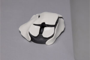
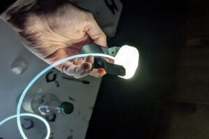
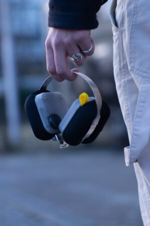
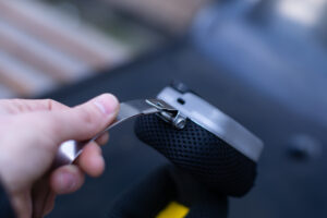
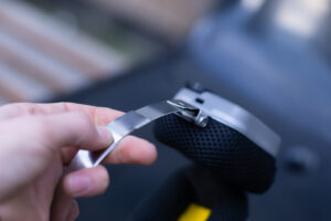
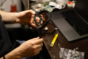
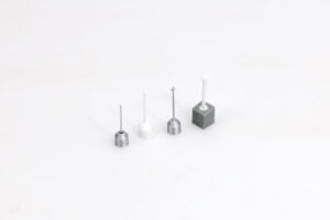
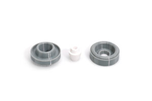
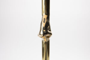
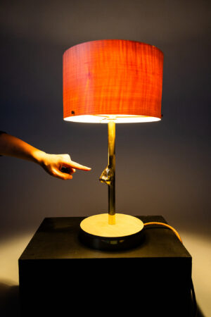
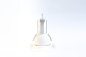
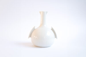
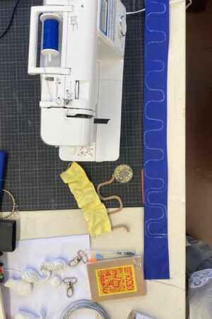
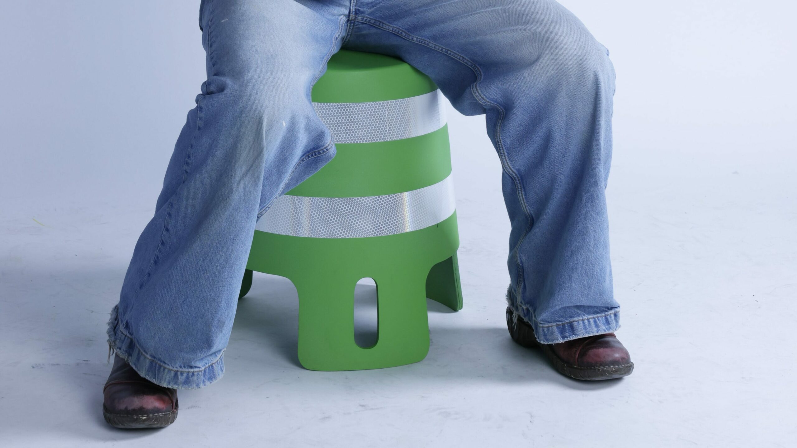
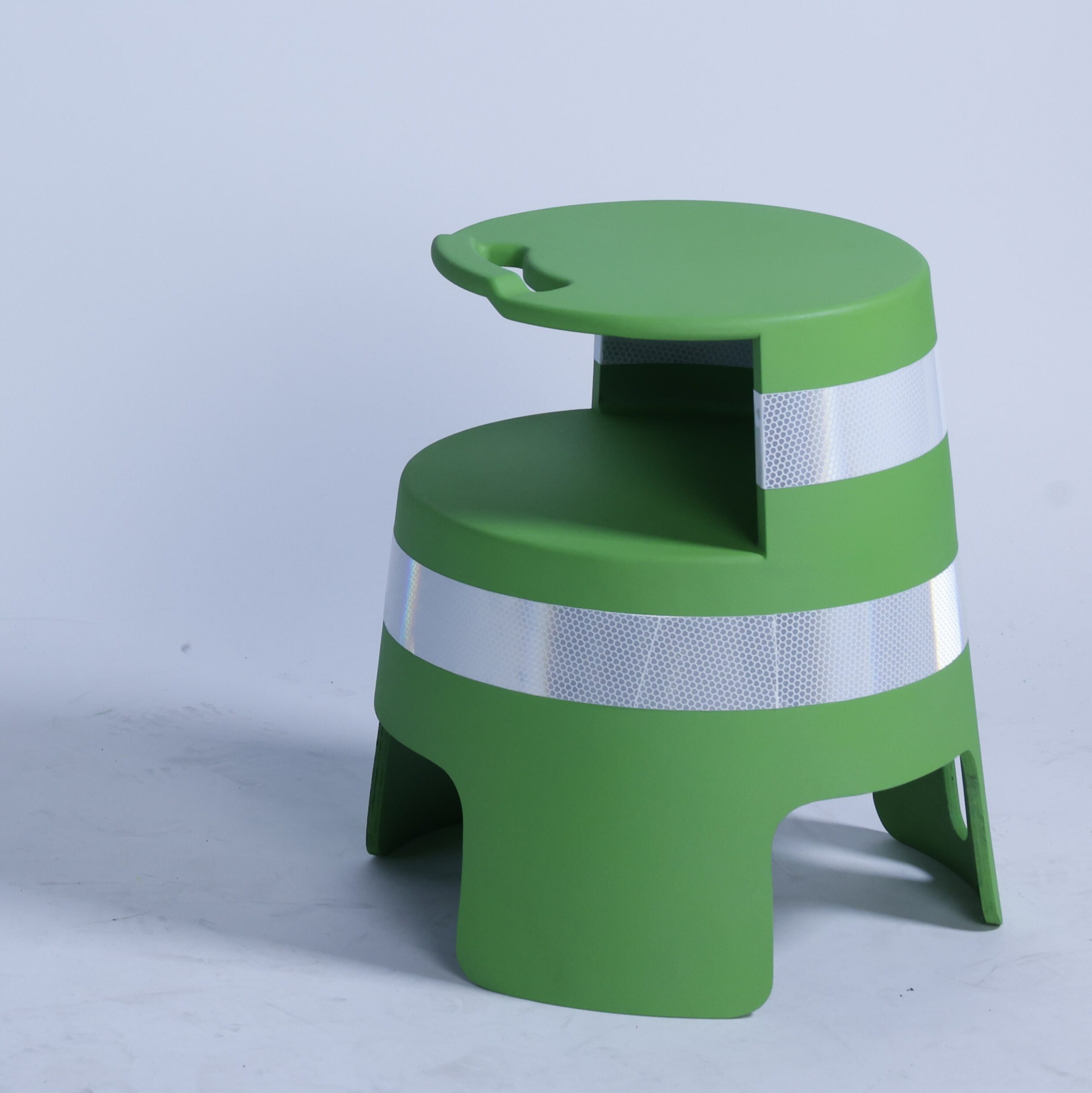
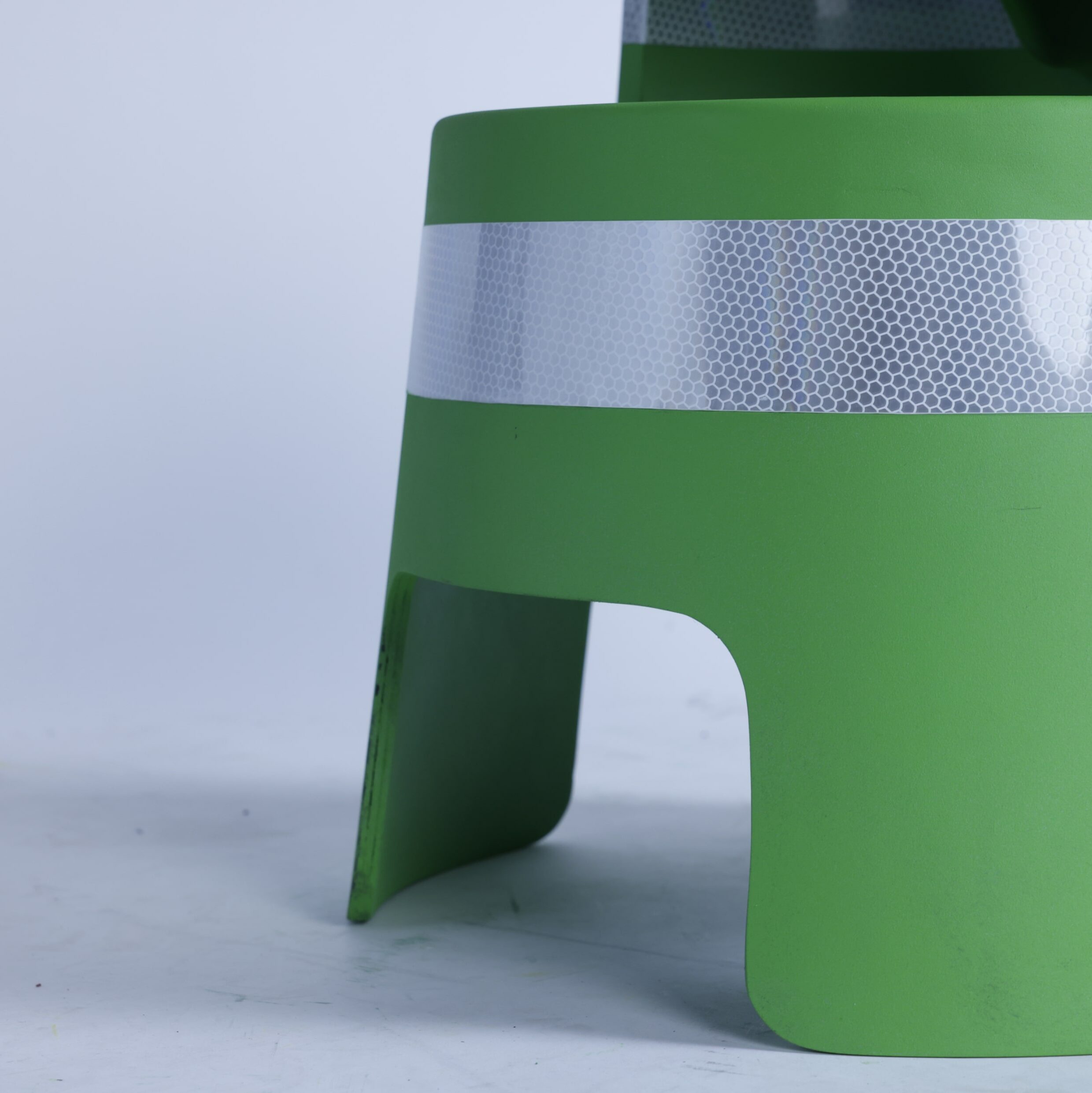
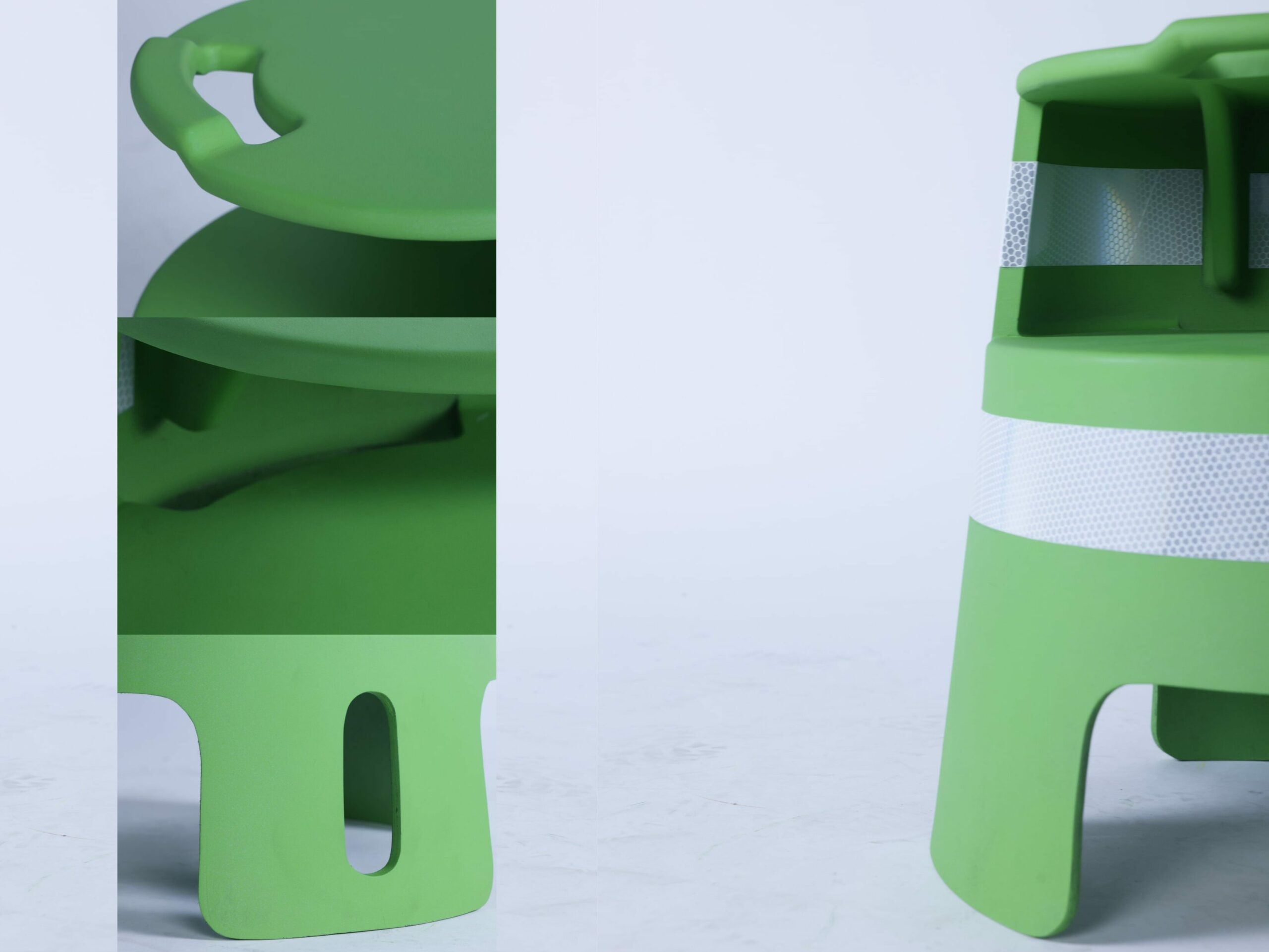
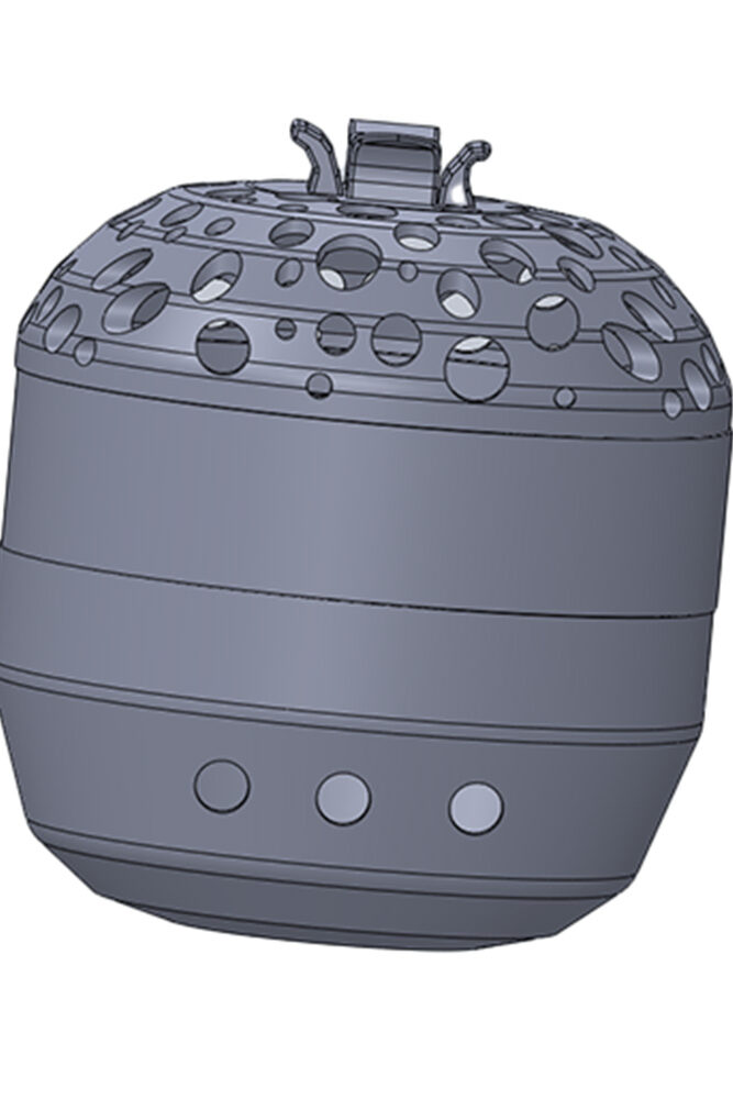
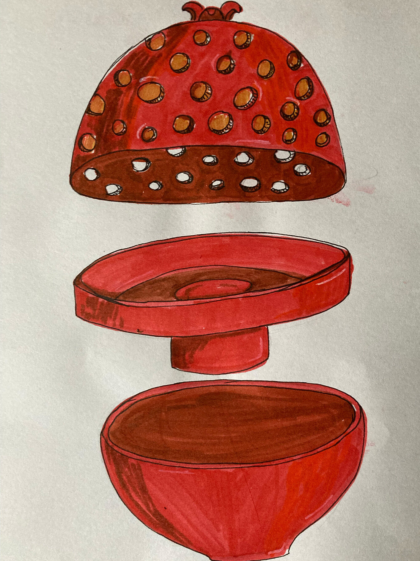
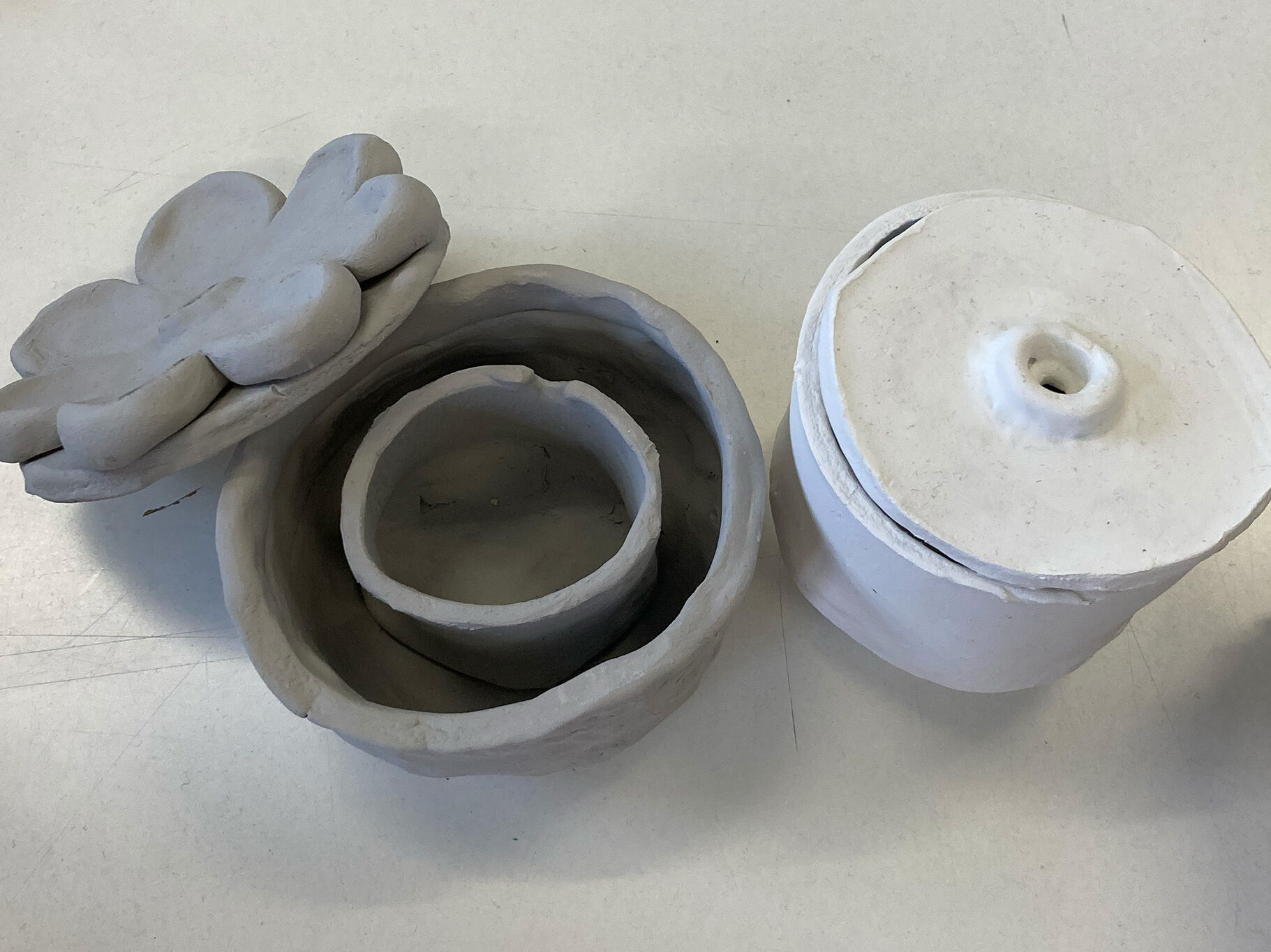
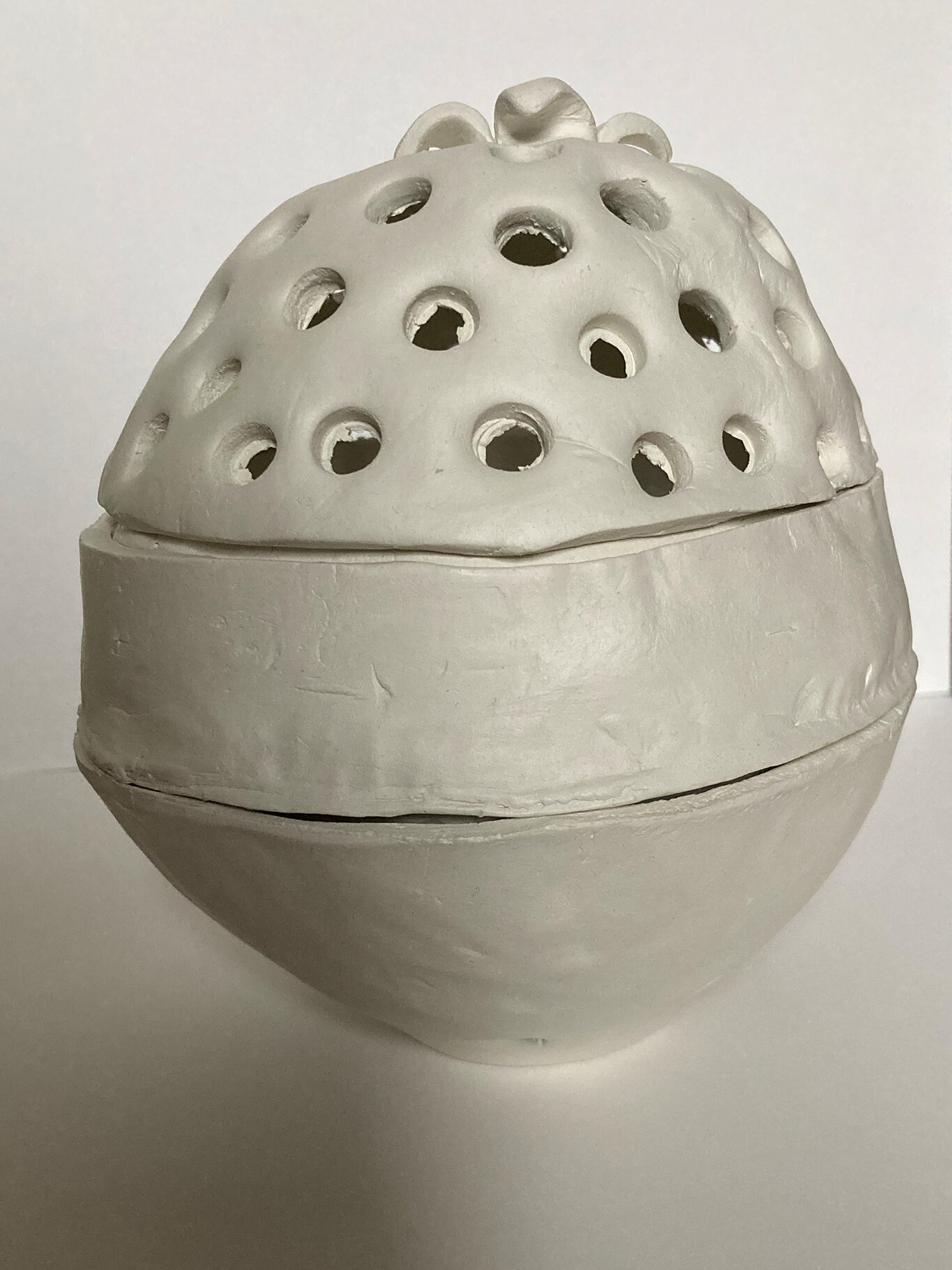
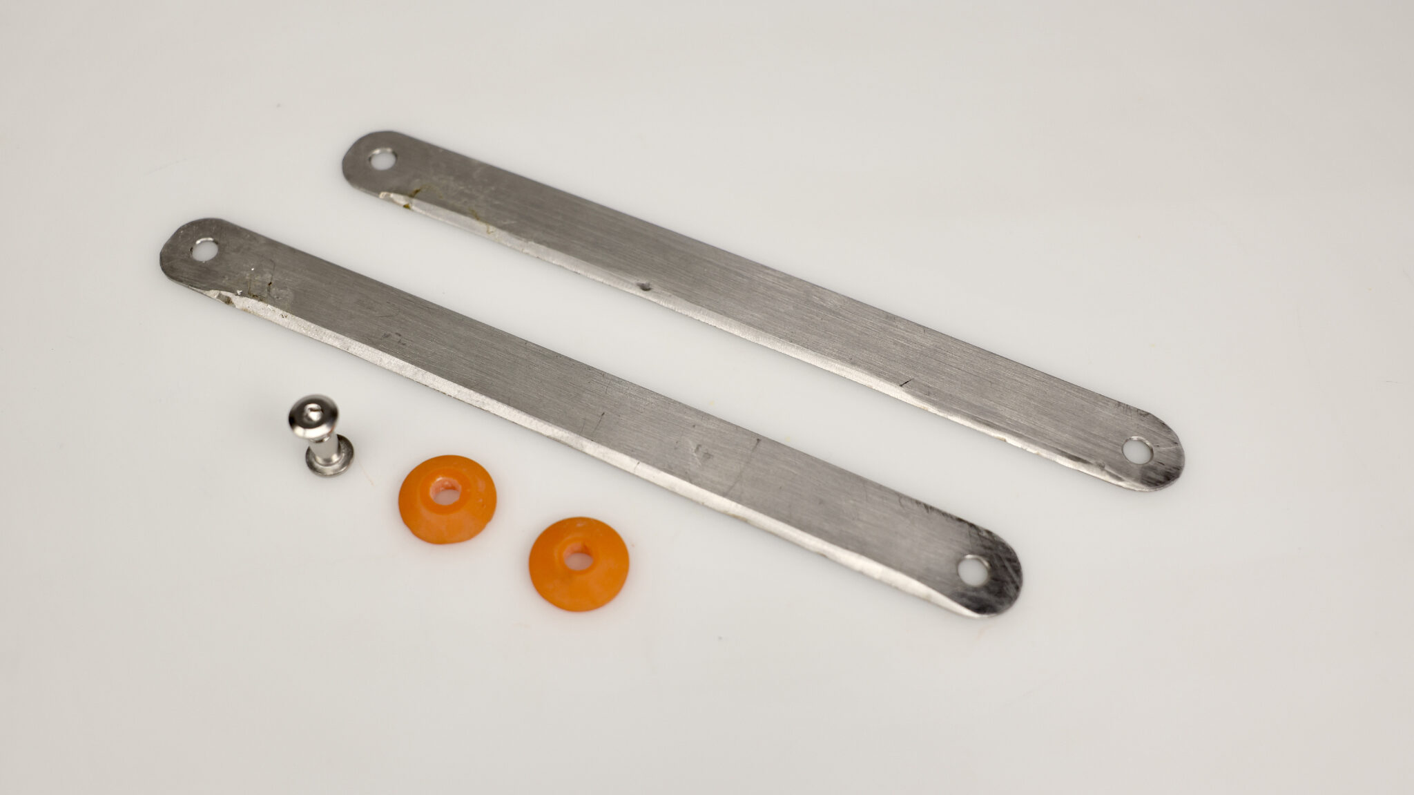
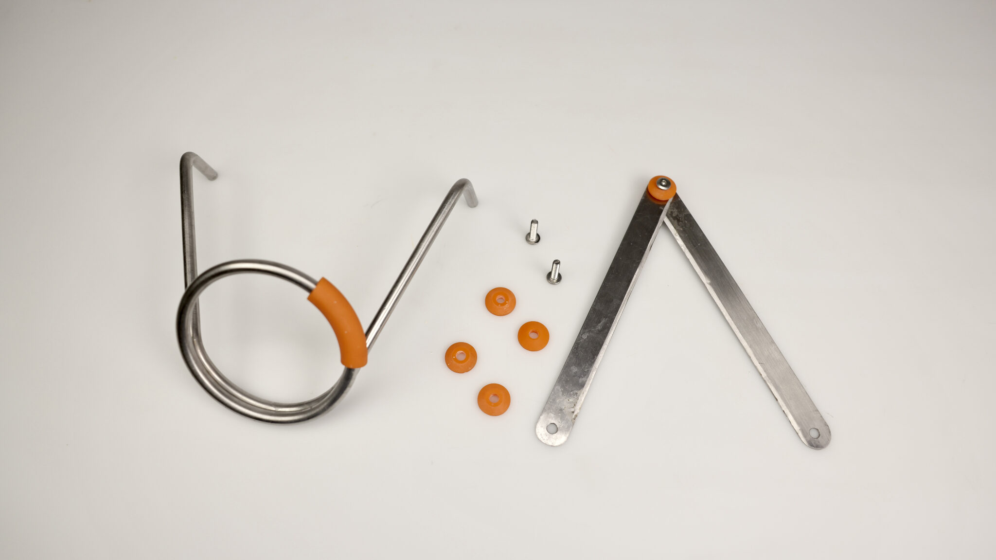
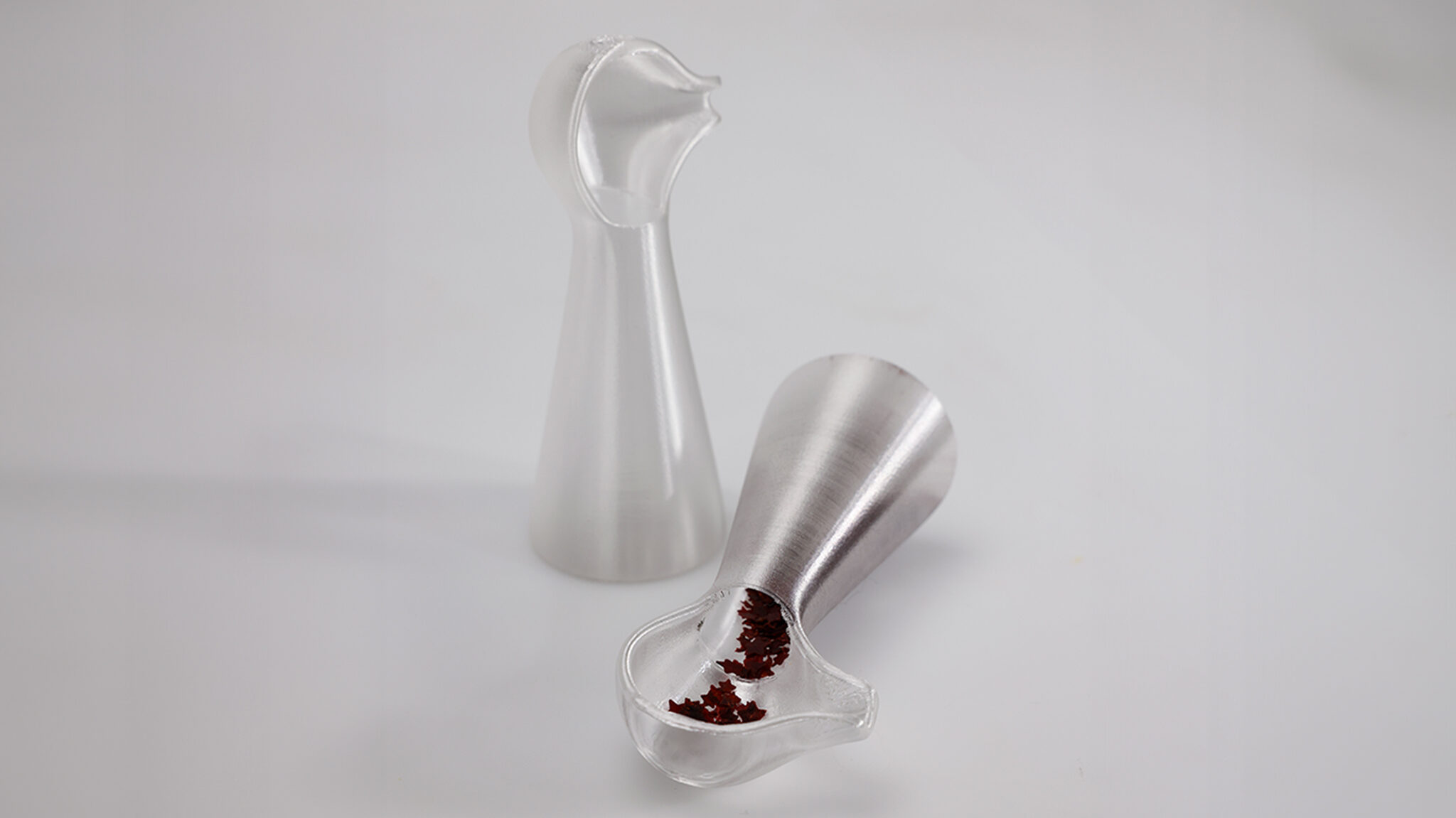
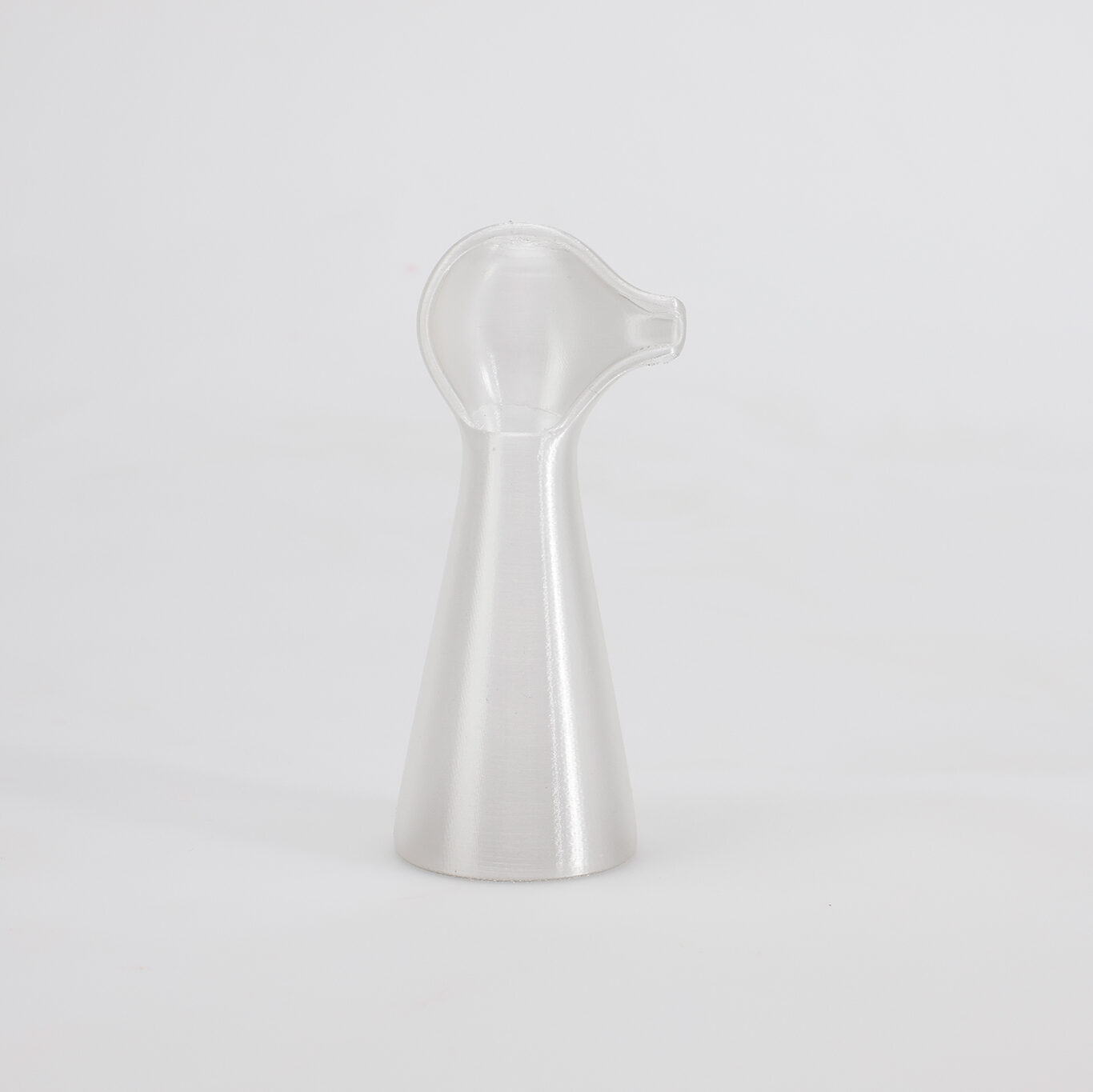
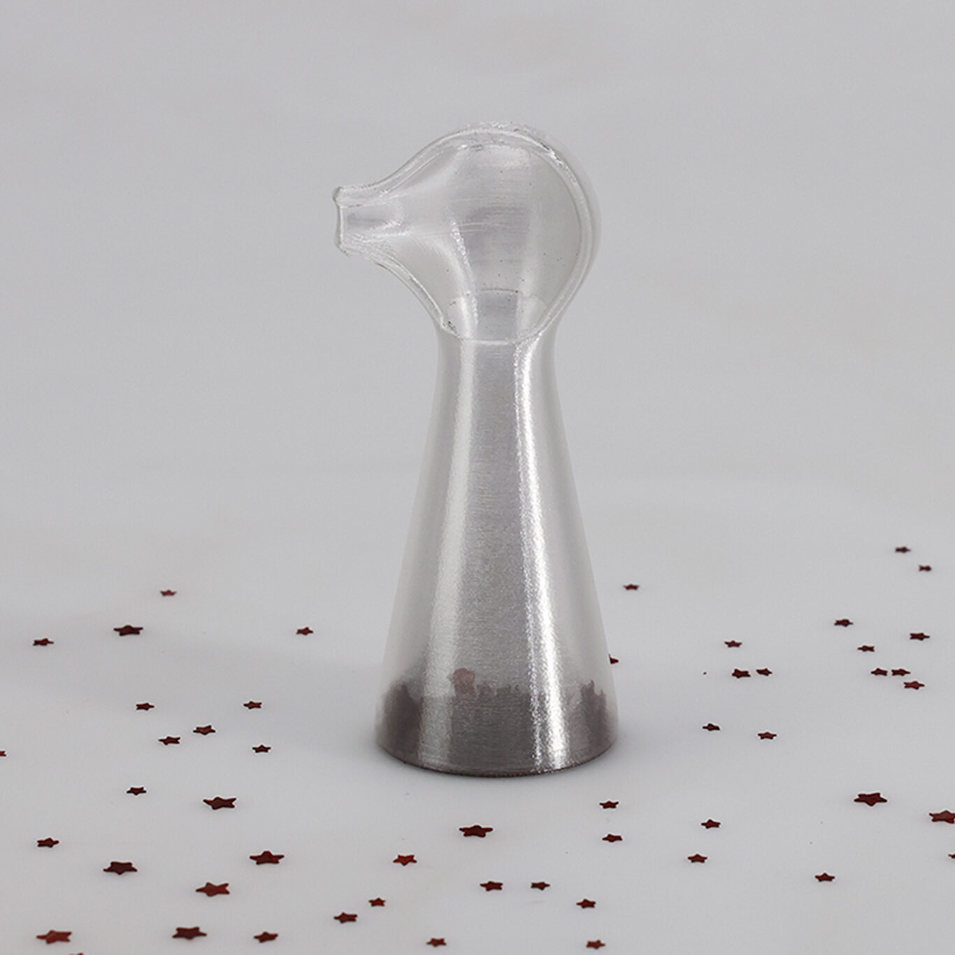
For this reason, the Stella indoor and outdoor rechargeable light can be completely dismantled. A cent coin is sufficient to loosen the screw connections. Its modular design makes it easy to replace all individual parts. Standards are used for the electronics and care is taken to ensure that all parts can be connected to each other via a simple standard JST connector. A QR code for each module provides operating instructions and quick reordering. Two superimposed polarization foils replace an electronic dimmer, avoiding additional electronics and electrical waste. The brightness can be regulated mechanically by turning the diffuser.
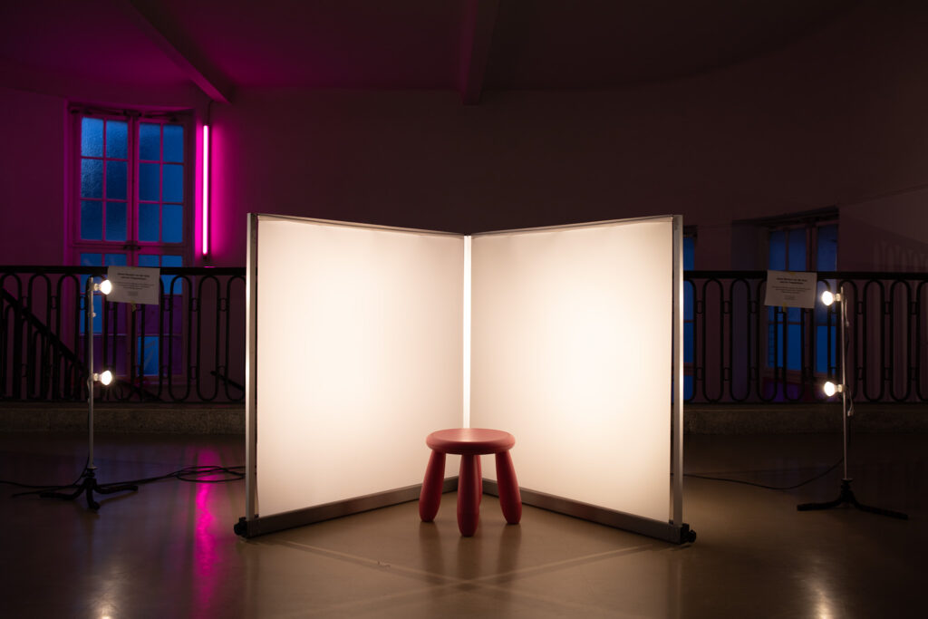
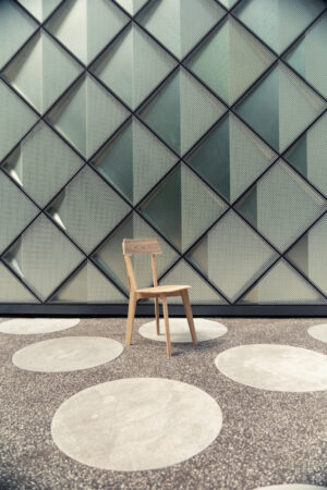
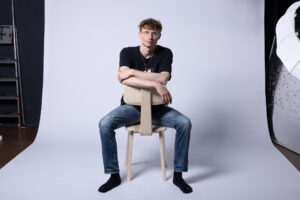
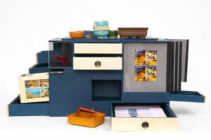
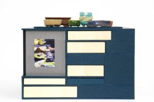
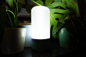
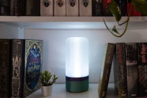
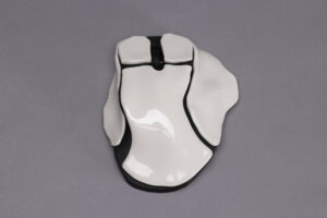
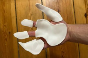
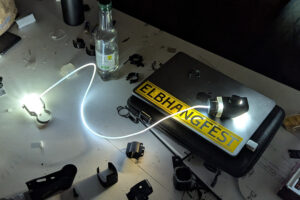
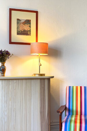
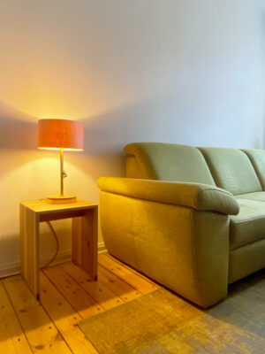
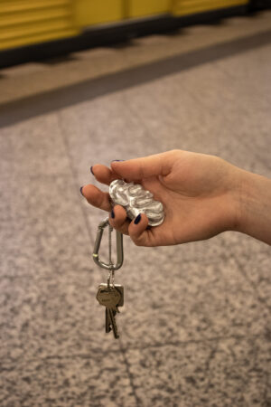
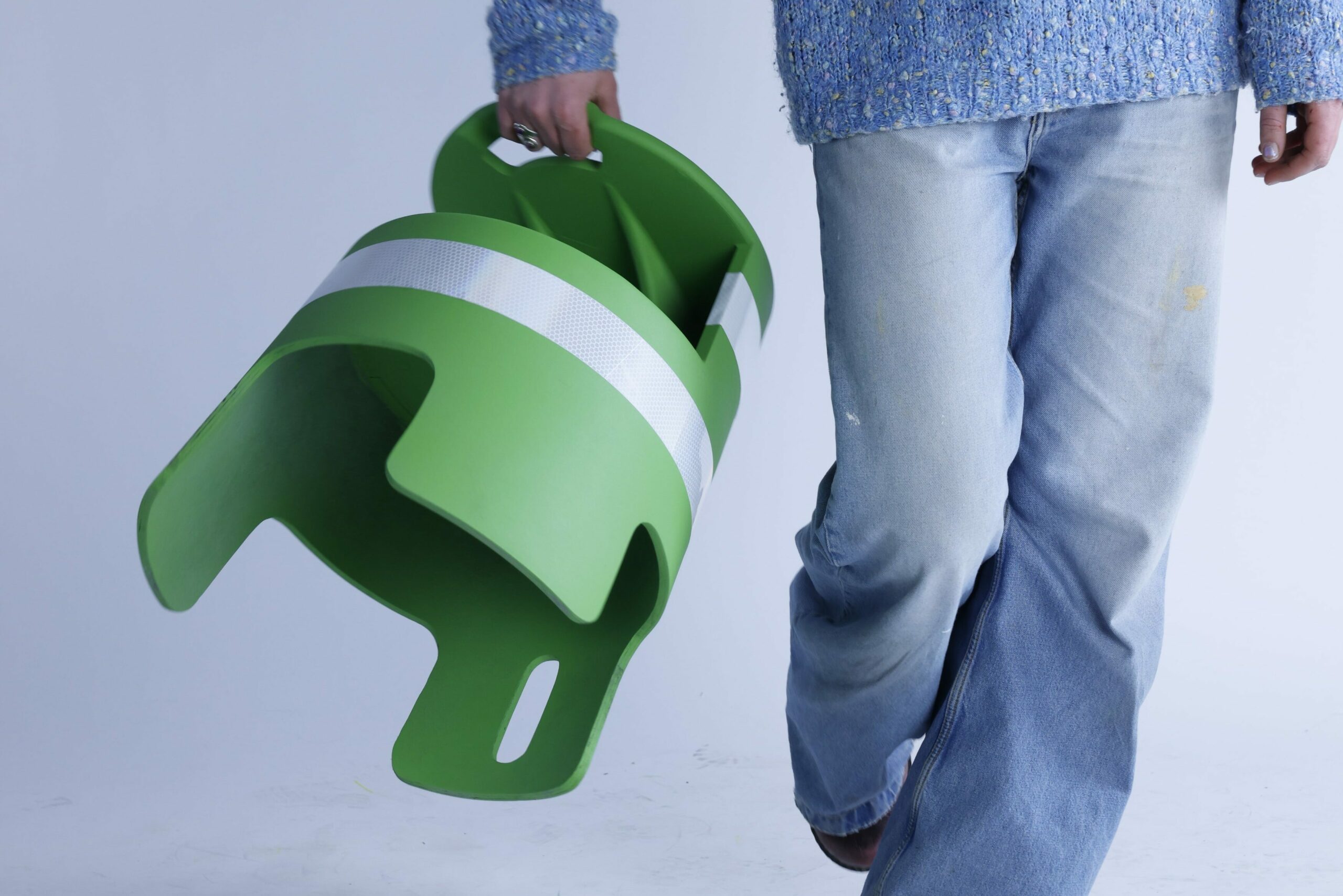
Stella is suitable for the bookshelf, as a night light or for on the go. Its mono-material housing (ABS) makes it lightweight and portable. Its rechargeable battery lasts up to 8 hours, making it the perfect companion.
LEDs und Akkus sind häufig nicht austauschbar und viele Leuchten sind verklebt. Dadurch wird eine Reparatur unmöglich, und die gesamte Leuchte wird zu Elektroschrott.
Die In- und Outdoor-Akkuleuchte Stella ist aus diesem Grund vollständig zerlegbar. Eine Cent-Münze ist ausreichend, um die Verschraubungen zu lösen. Ihr modularer Aufbau ermöglicht den einfachen Austausch aller Einzelteile. Bei der Elektronik wird mit Standards gearbeitet und darauf geachtet, dass alle Teile über einen einfachen Standard JST-Stecker miteinander zu verbinden sind. Ein QR-Code pro Modul bietet eine Bedienungsanleitung und eine schnelle Nachbestellung. Zwei übereinanderliegende Polarisationsfolien ersetzen einen elektronischen Dimmer, wodurch zusätzliche Elektronik und Elektromüll vermieden werden. Durch Drehen des Diffusors kann die Helligkeit mechanisch reguliert werden.
Stella eignet sich für das Bücherregal, als Nachtlicht oder für Unterwegs. Ihr Gehäuse aus Monomaterial (ABS) macht sie leicht und transportabel. Ihr Akku hält bis zu 8h und macht sie deswegen für den perfekten Wegbegleiter.
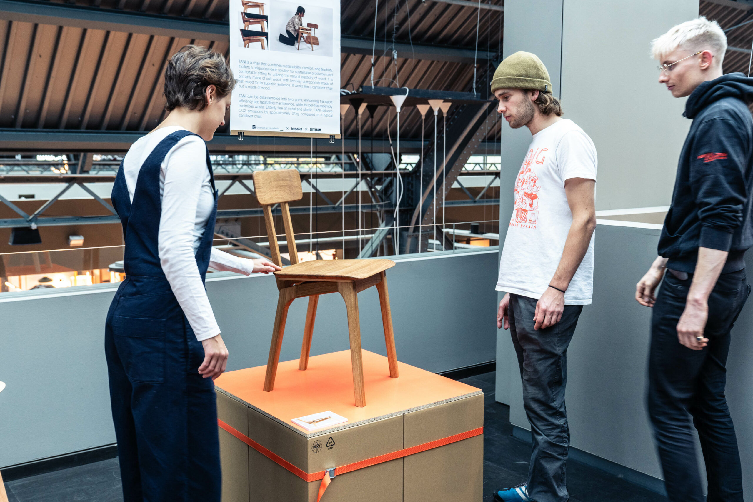
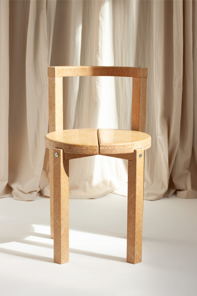
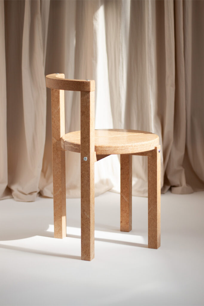
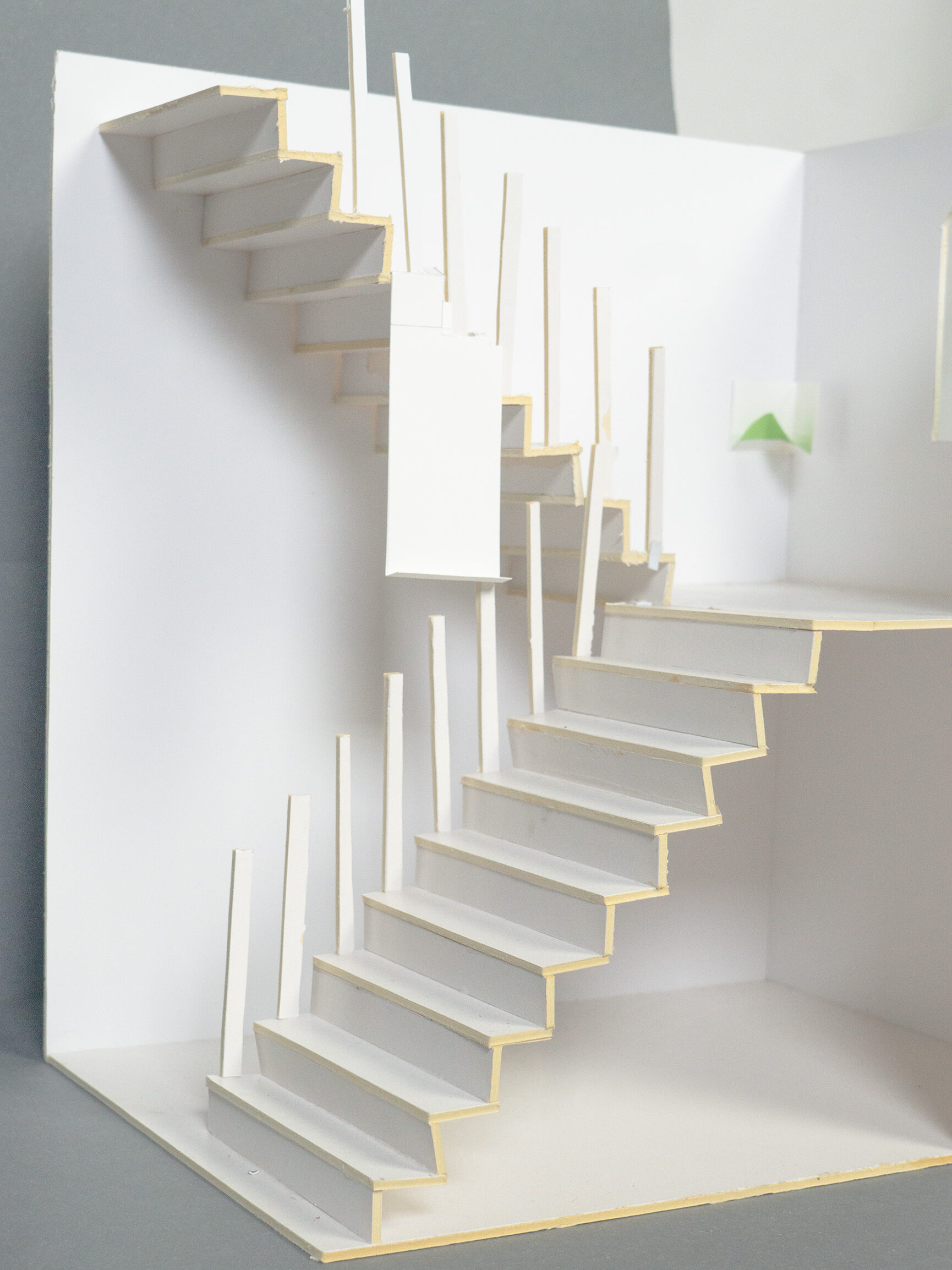
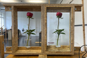
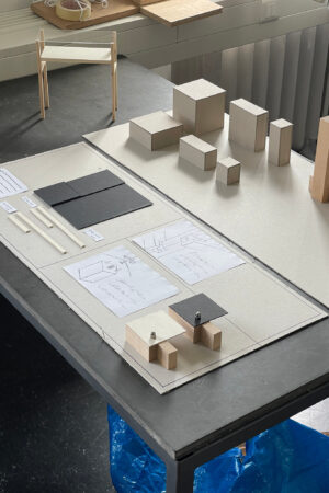
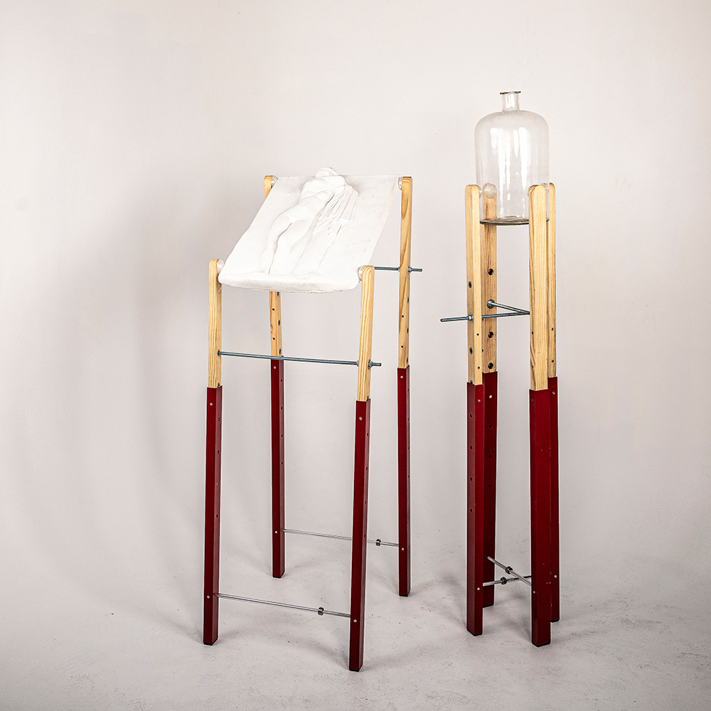
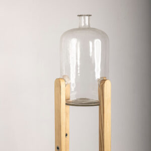
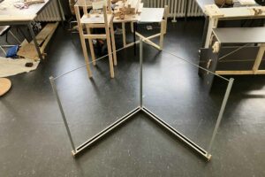
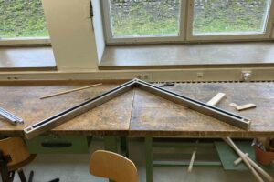
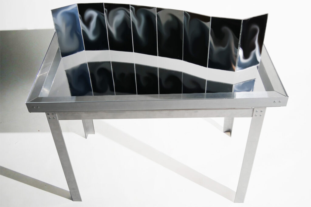
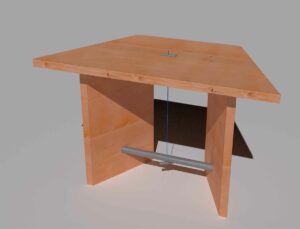
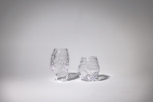
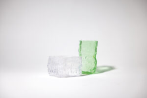
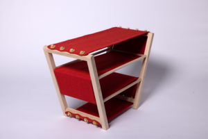
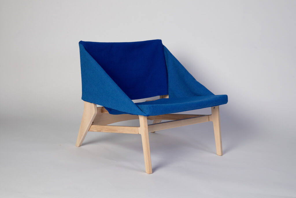
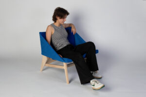
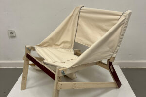
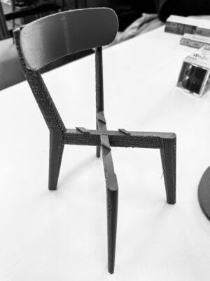
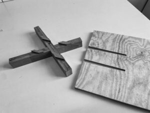
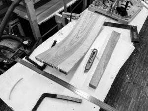
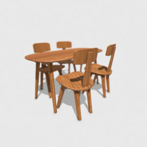
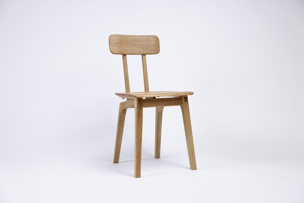
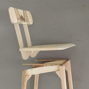
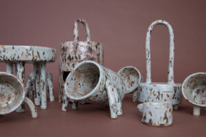
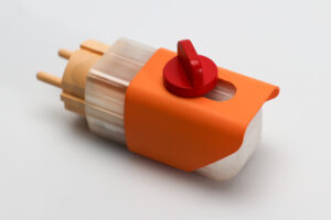
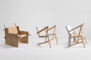
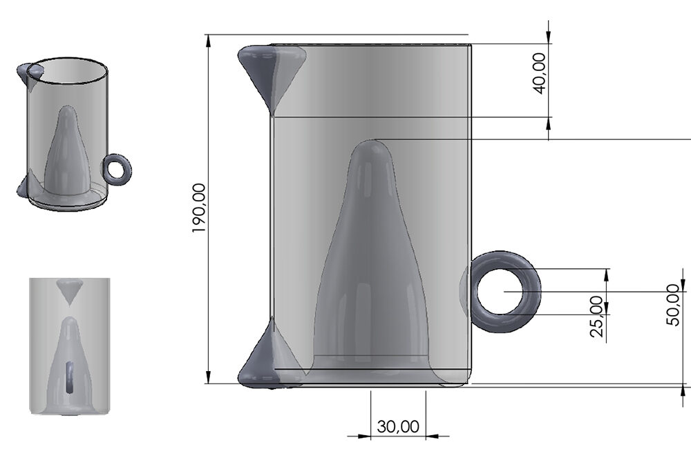
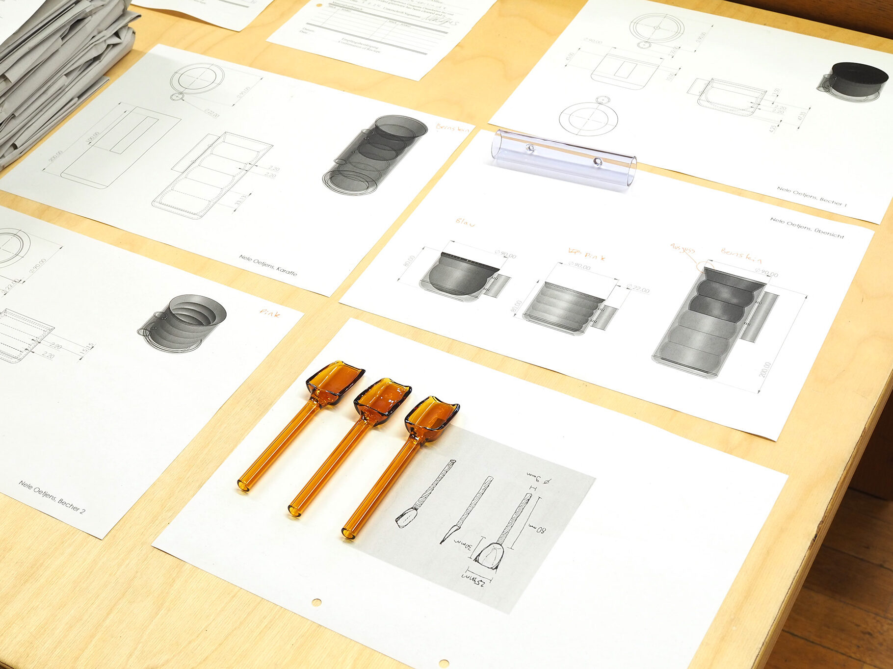
The project:

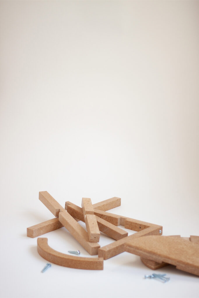
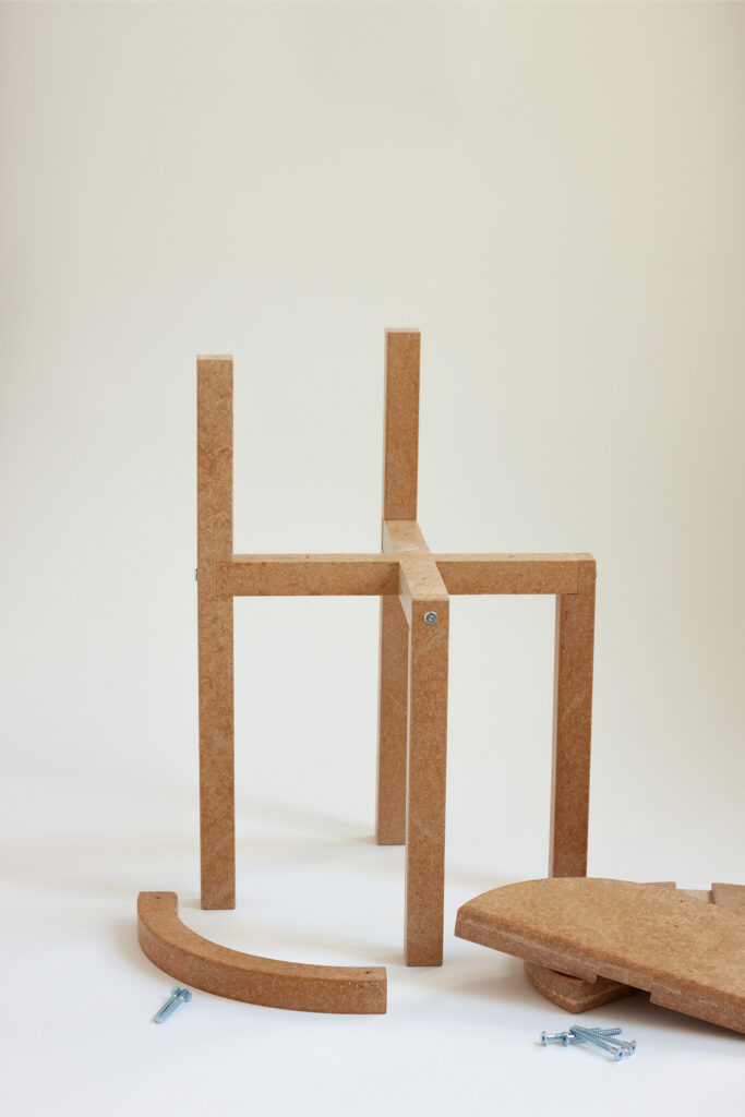
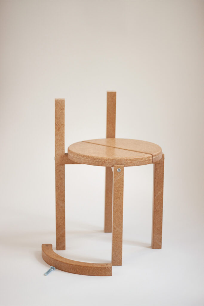
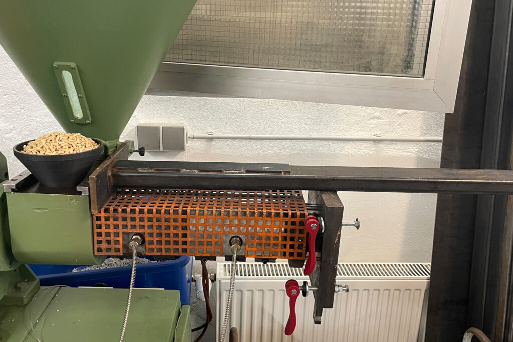
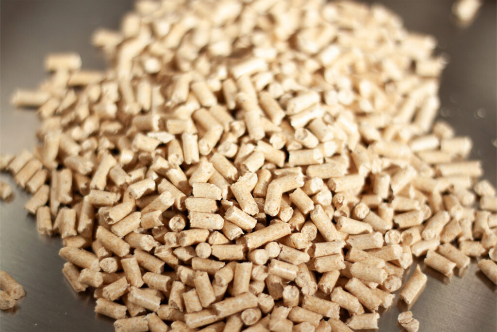
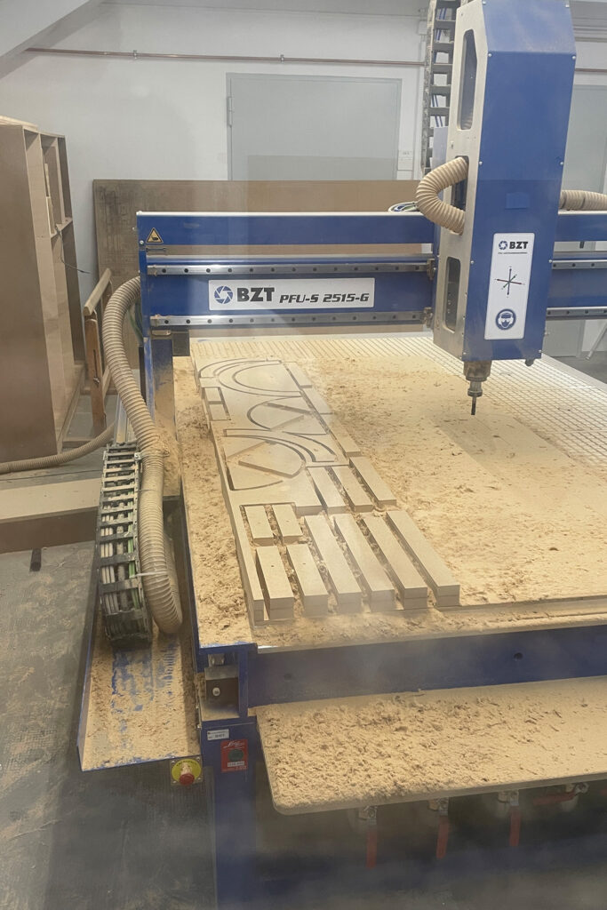
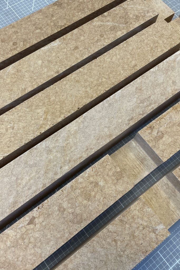
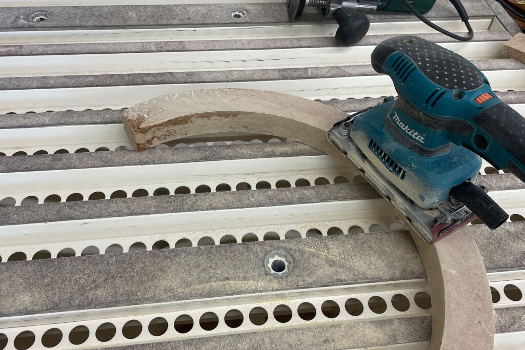
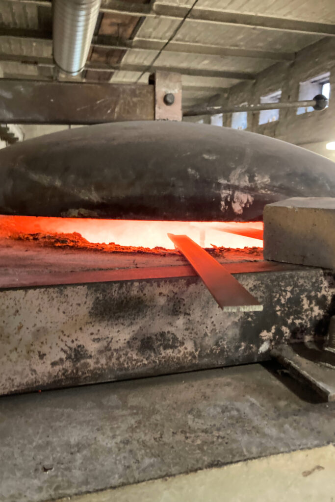
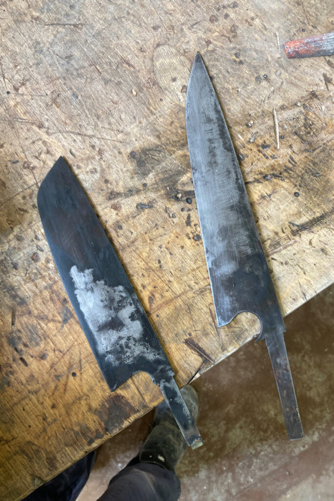
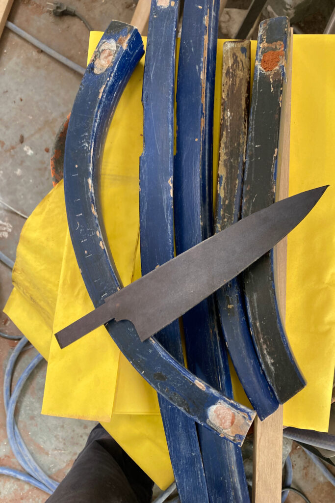
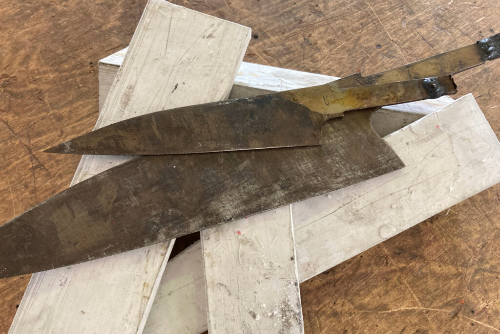
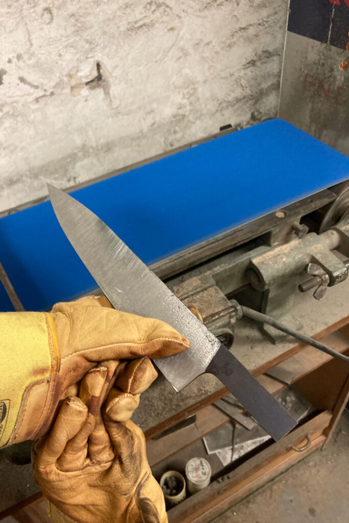
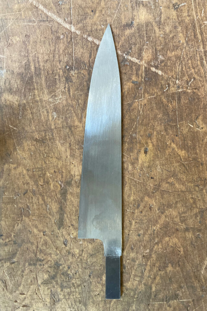
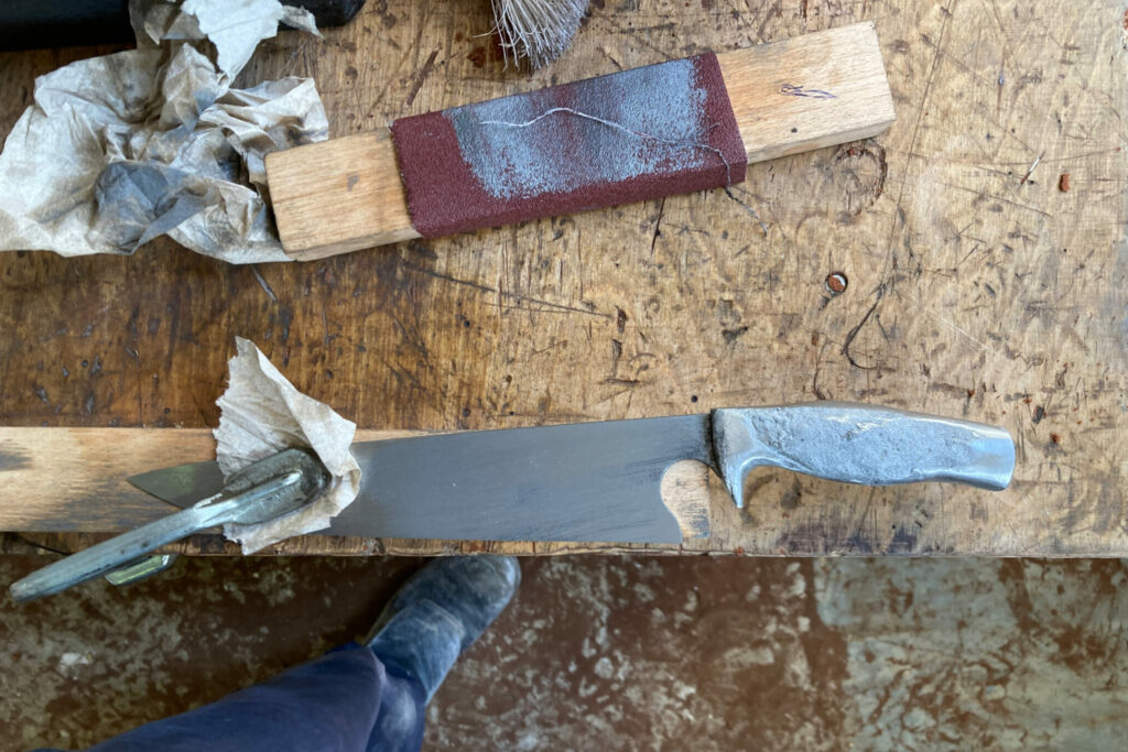
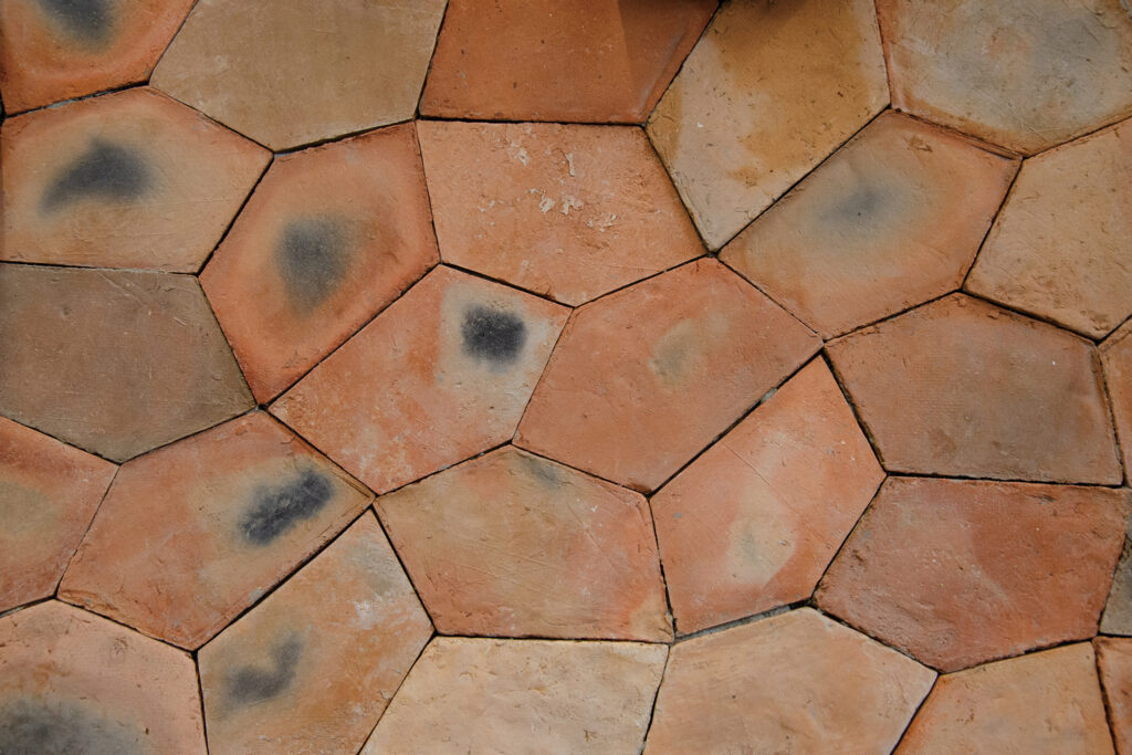
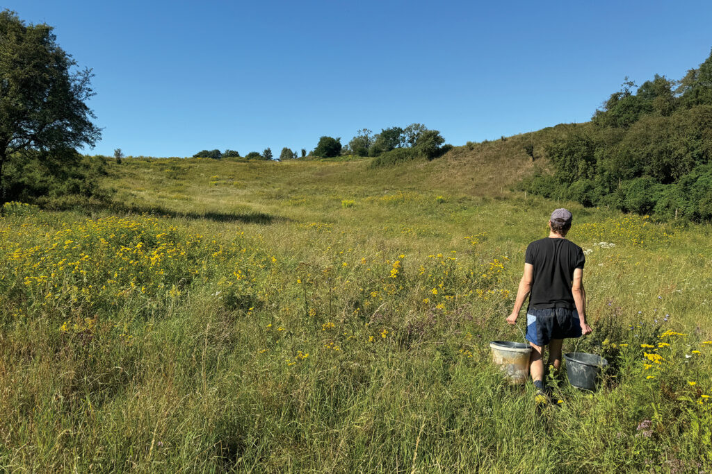
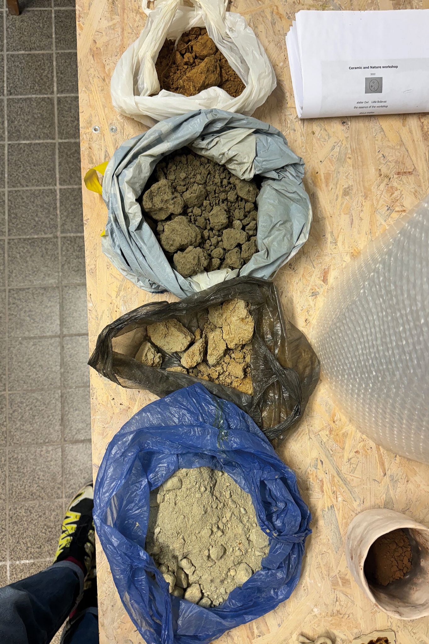
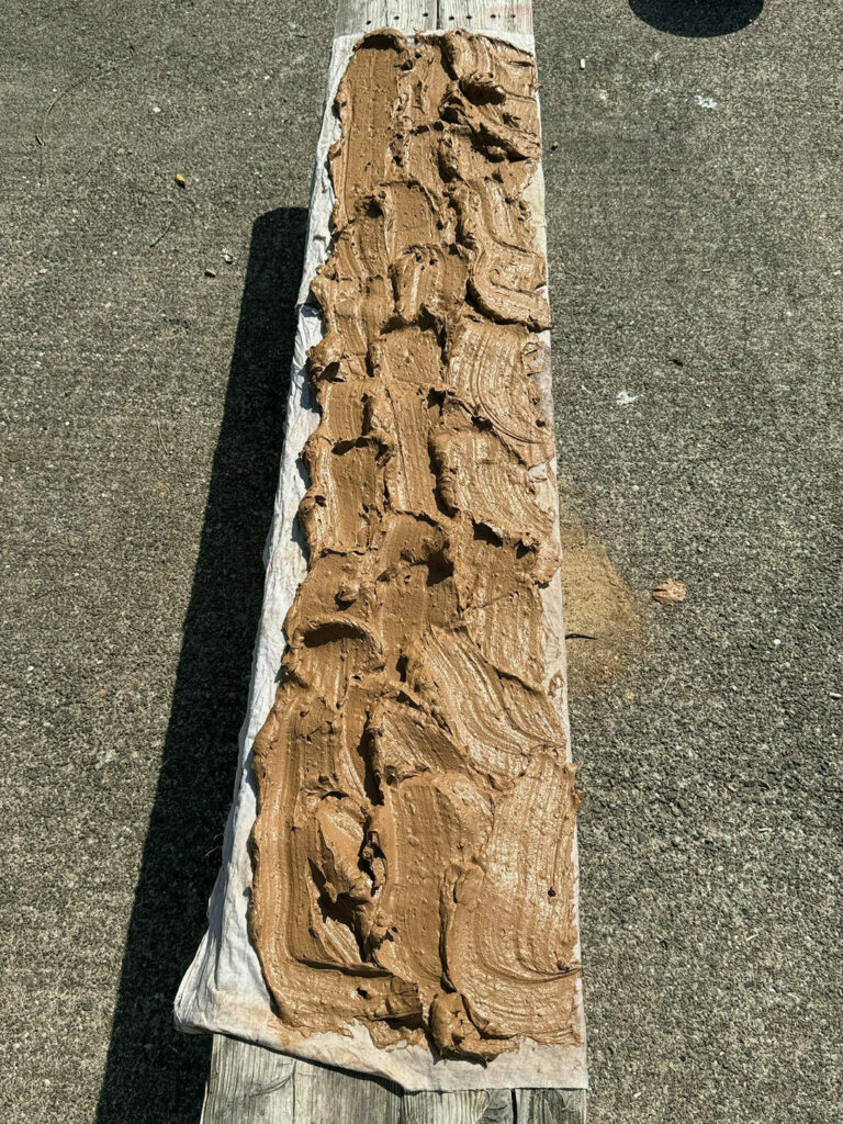
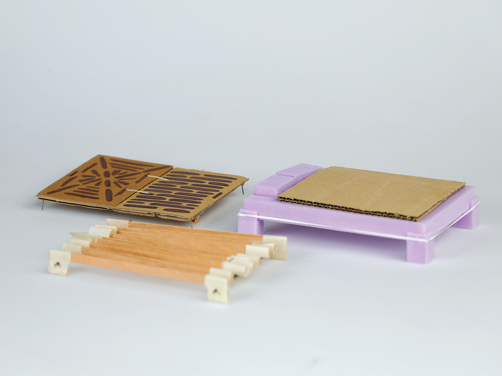
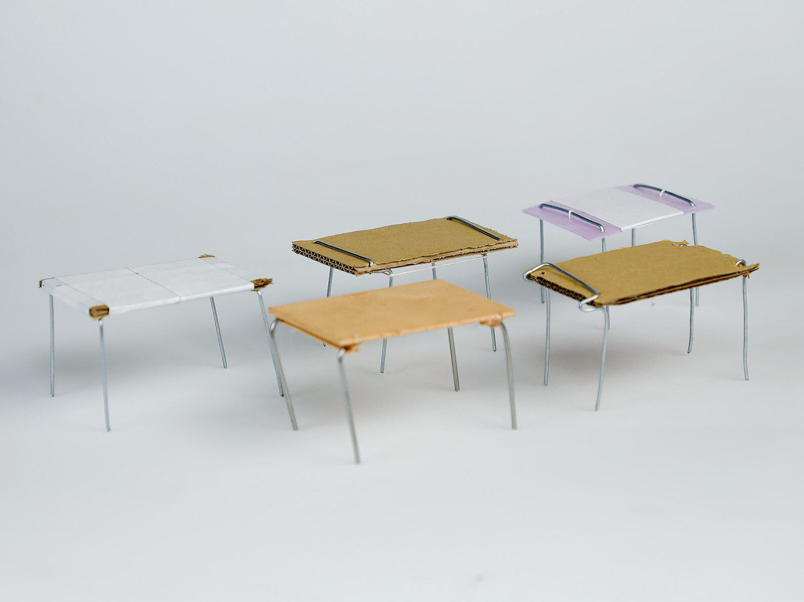
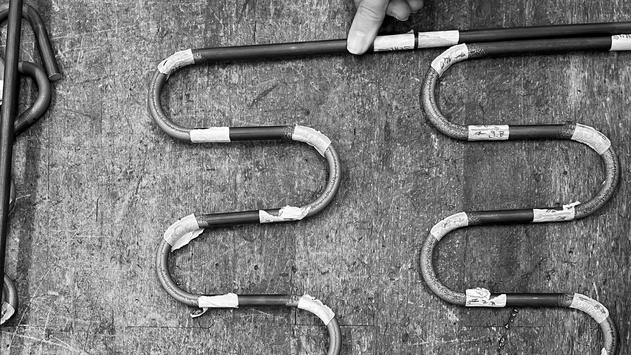
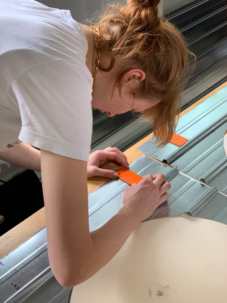
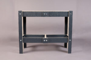
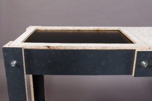
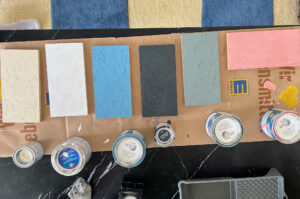
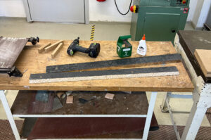
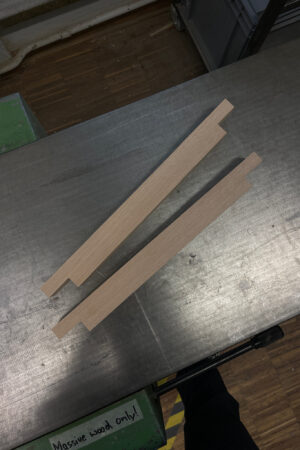
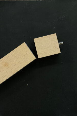
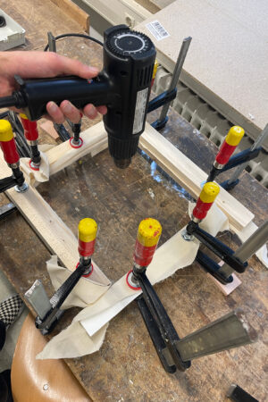
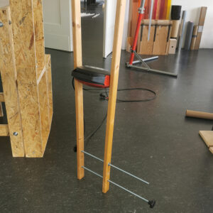
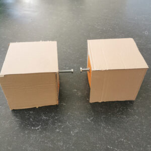
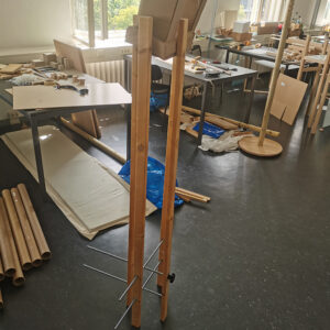
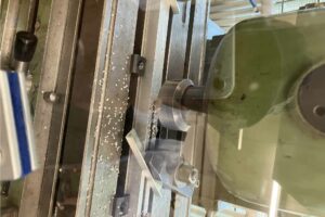
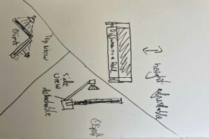
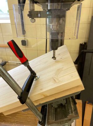
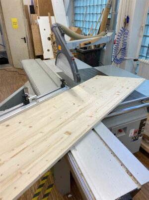
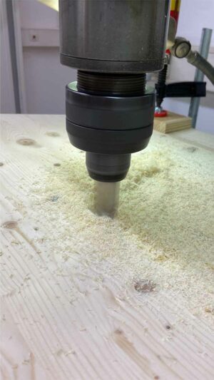
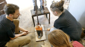
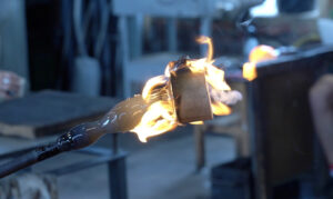
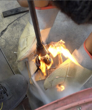
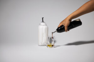
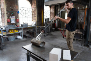
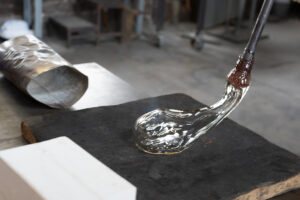
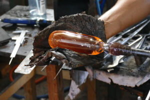
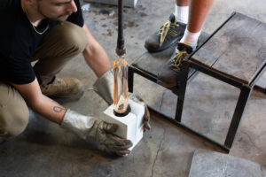
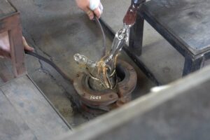
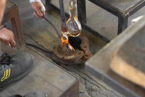
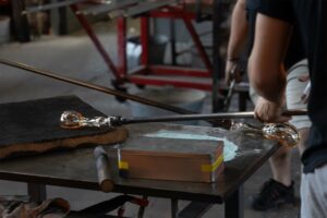
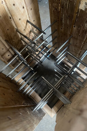
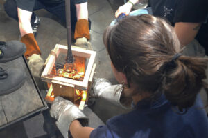
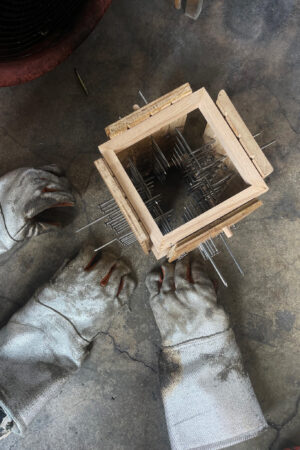
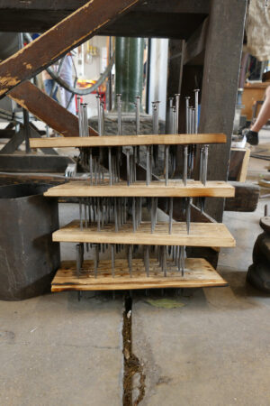
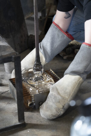
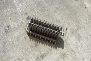
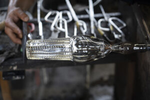
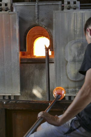
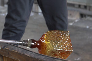
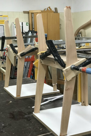
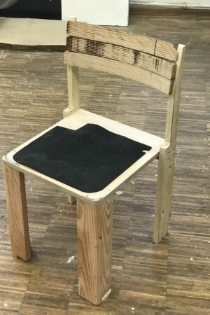
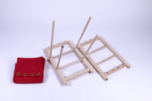
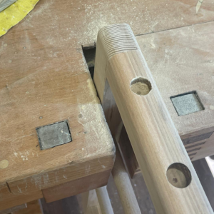
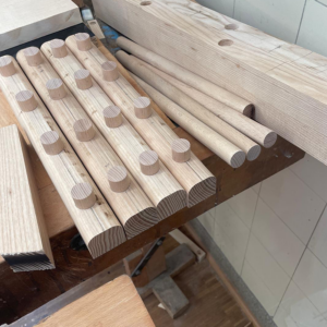
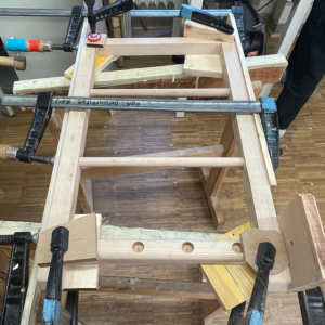
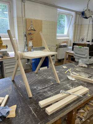
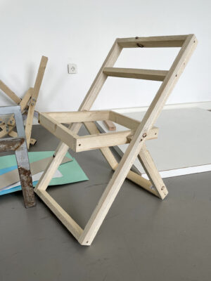
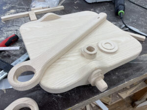
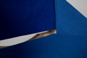
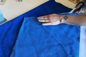
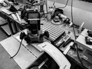
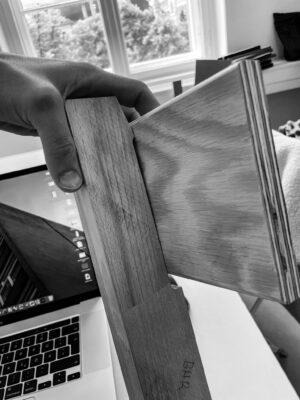
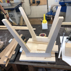
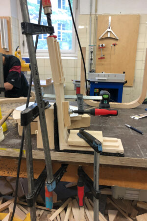
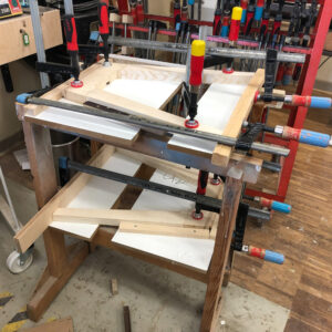
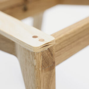
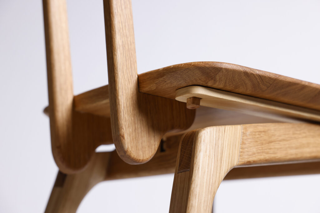
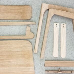
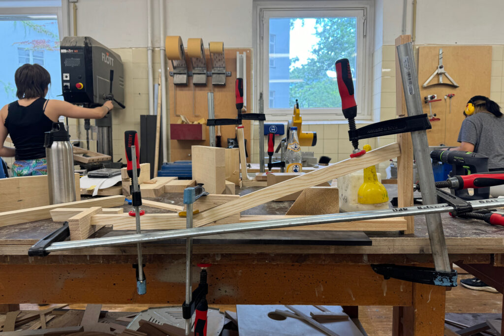
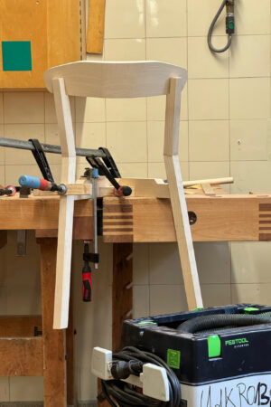
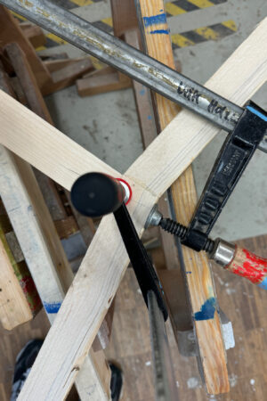
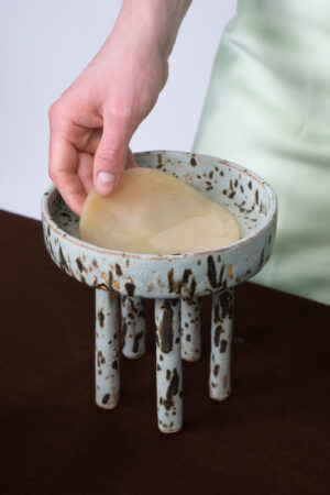
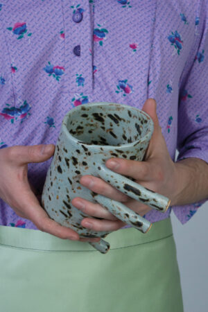
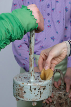
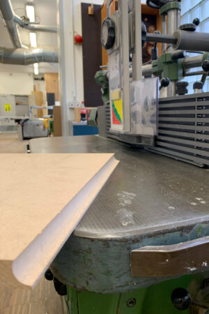
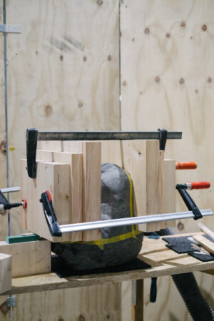
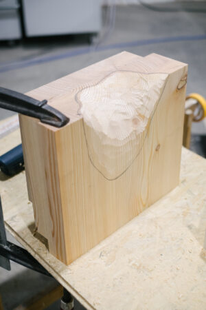
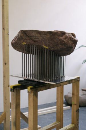
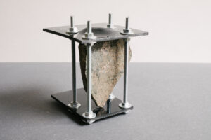
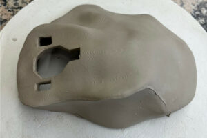
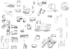
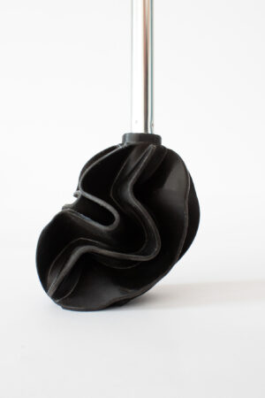
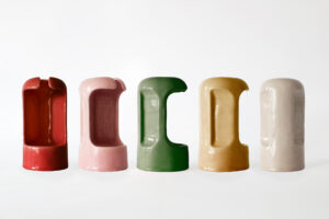
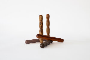
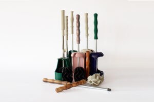
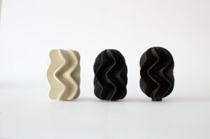
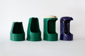
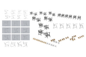
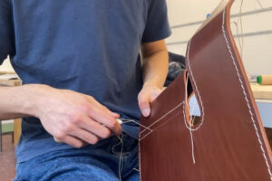
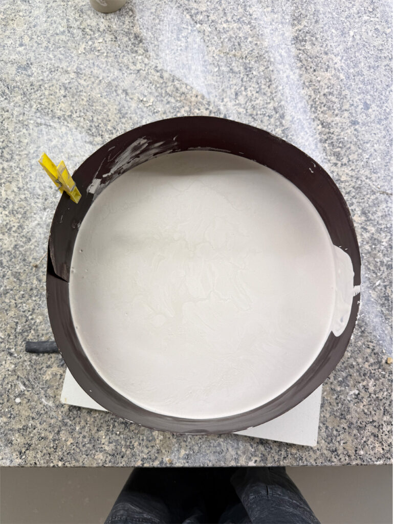
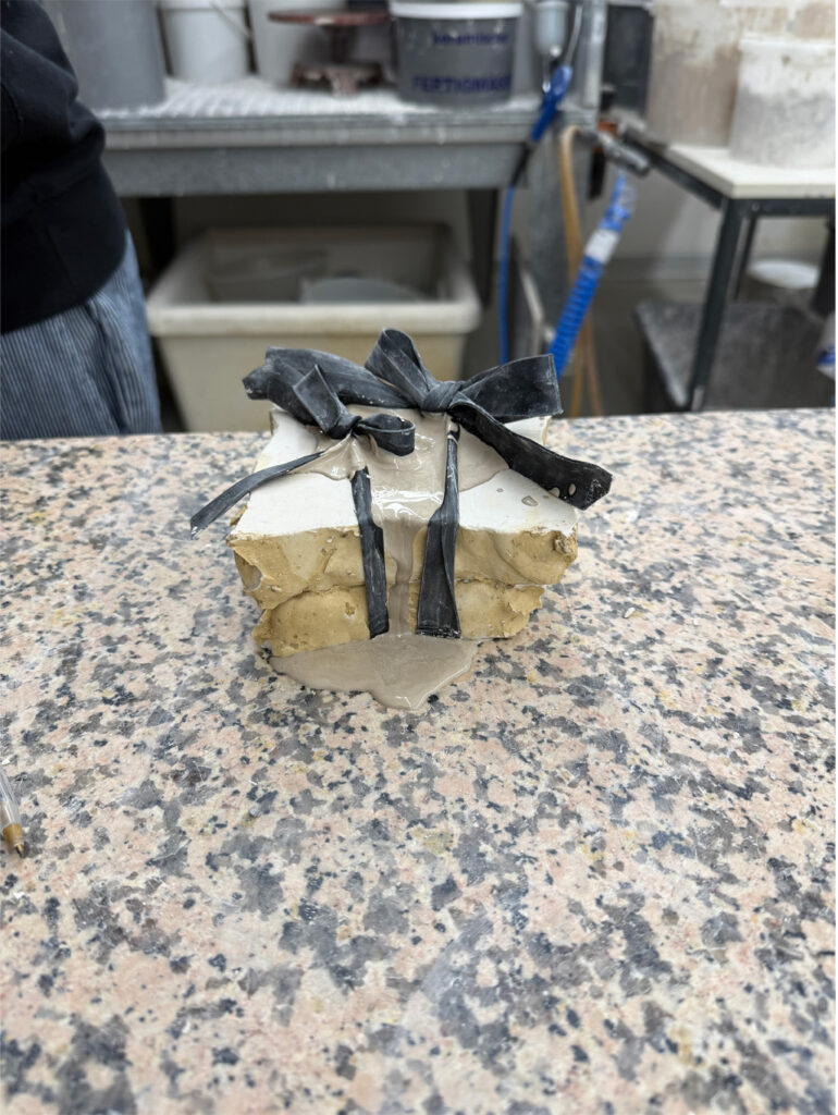
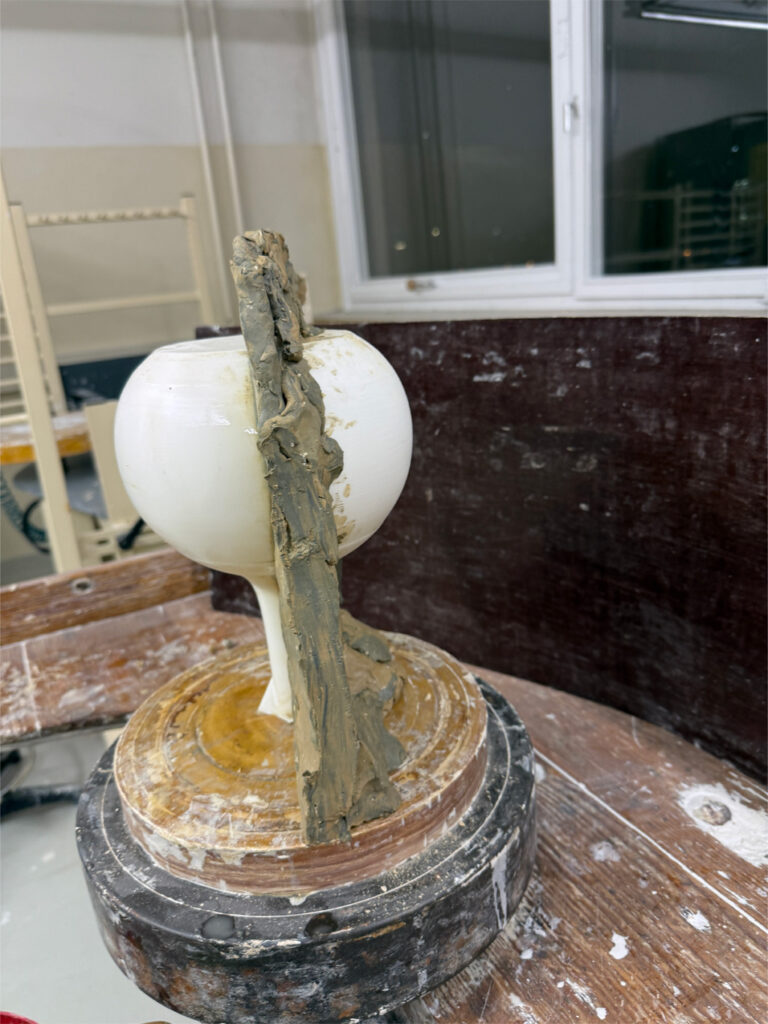
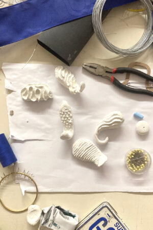
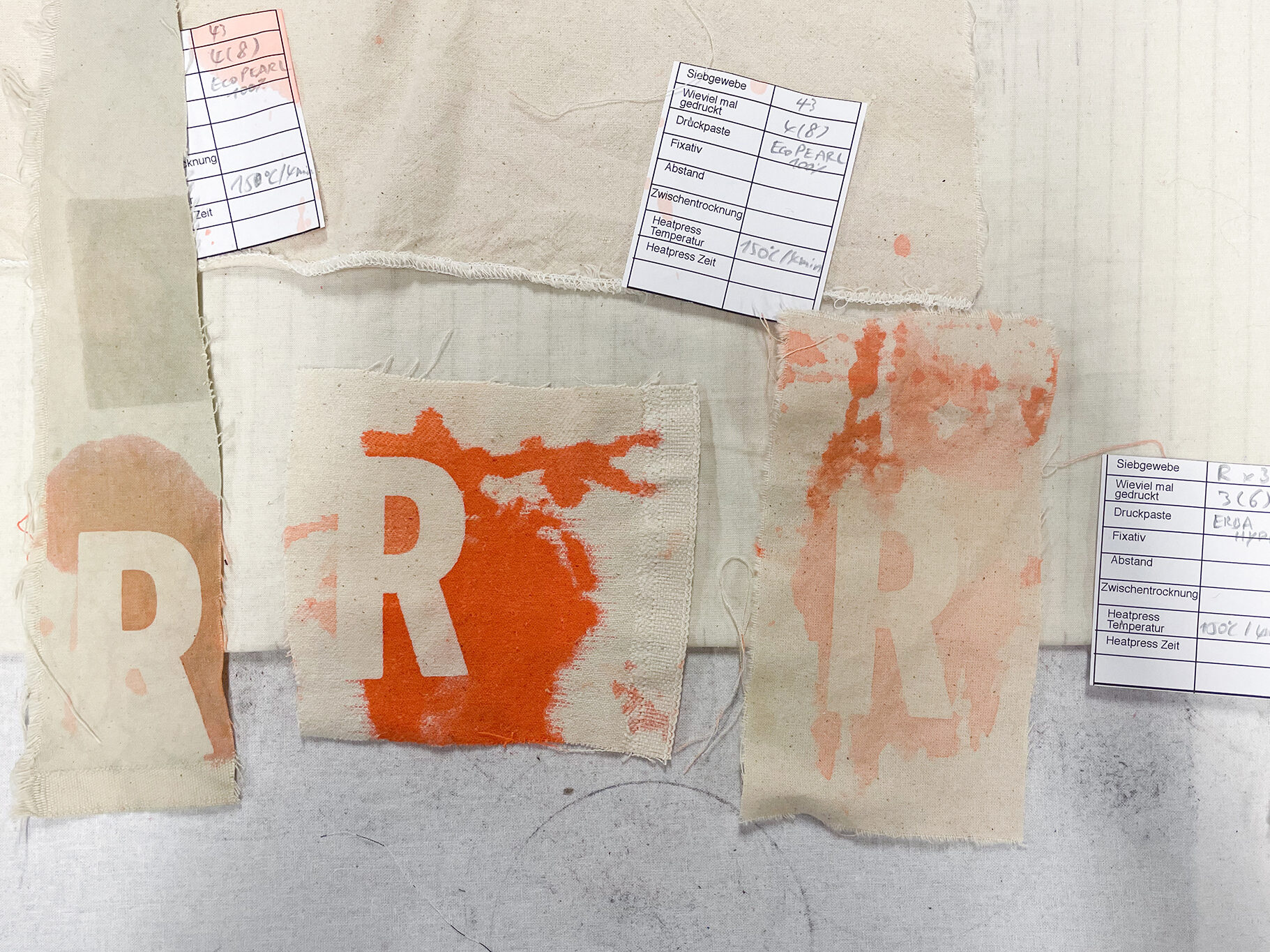
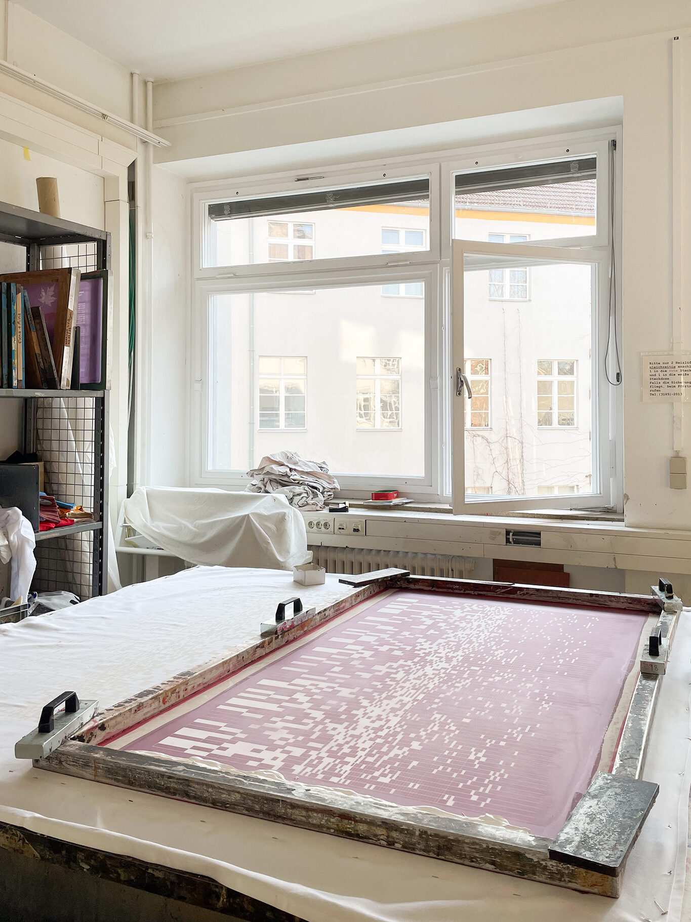
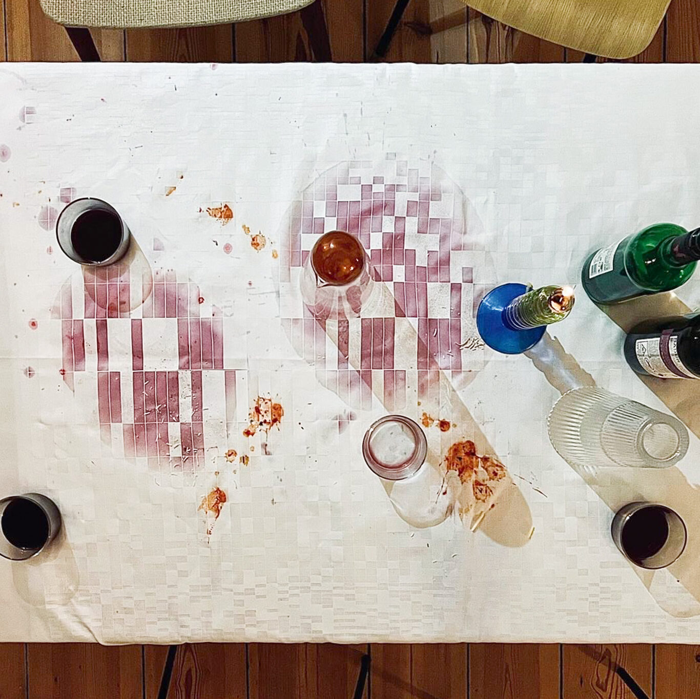
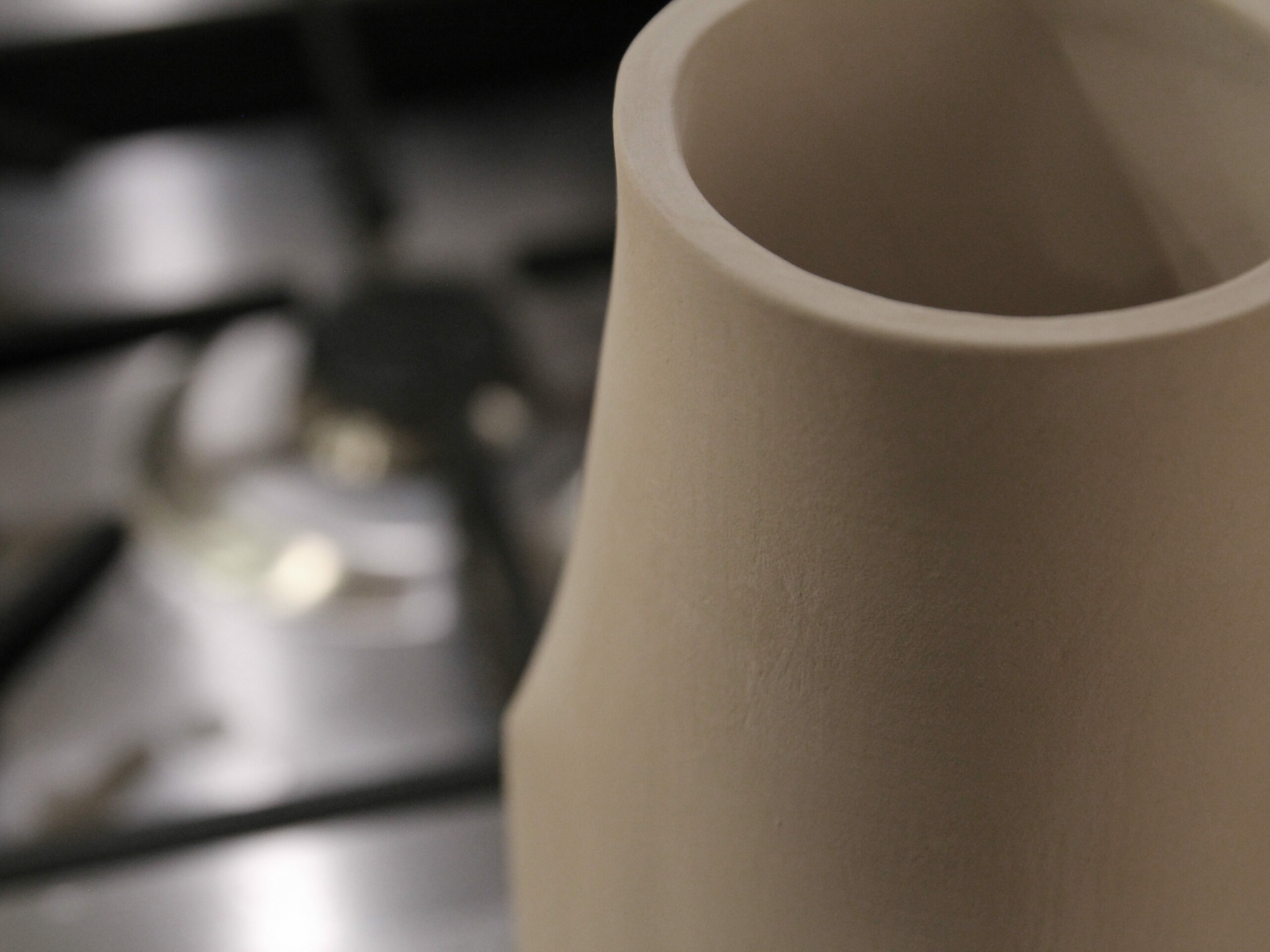
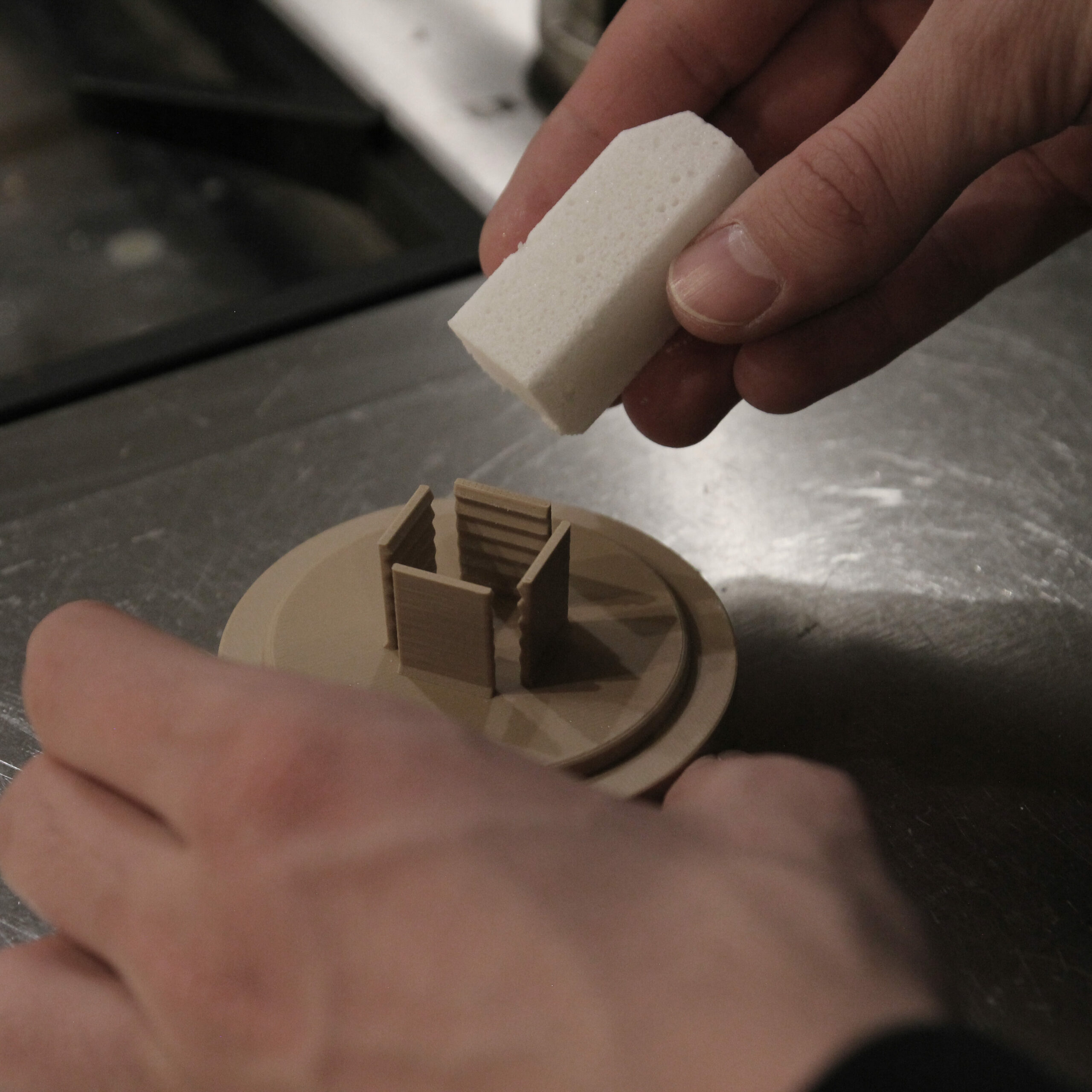
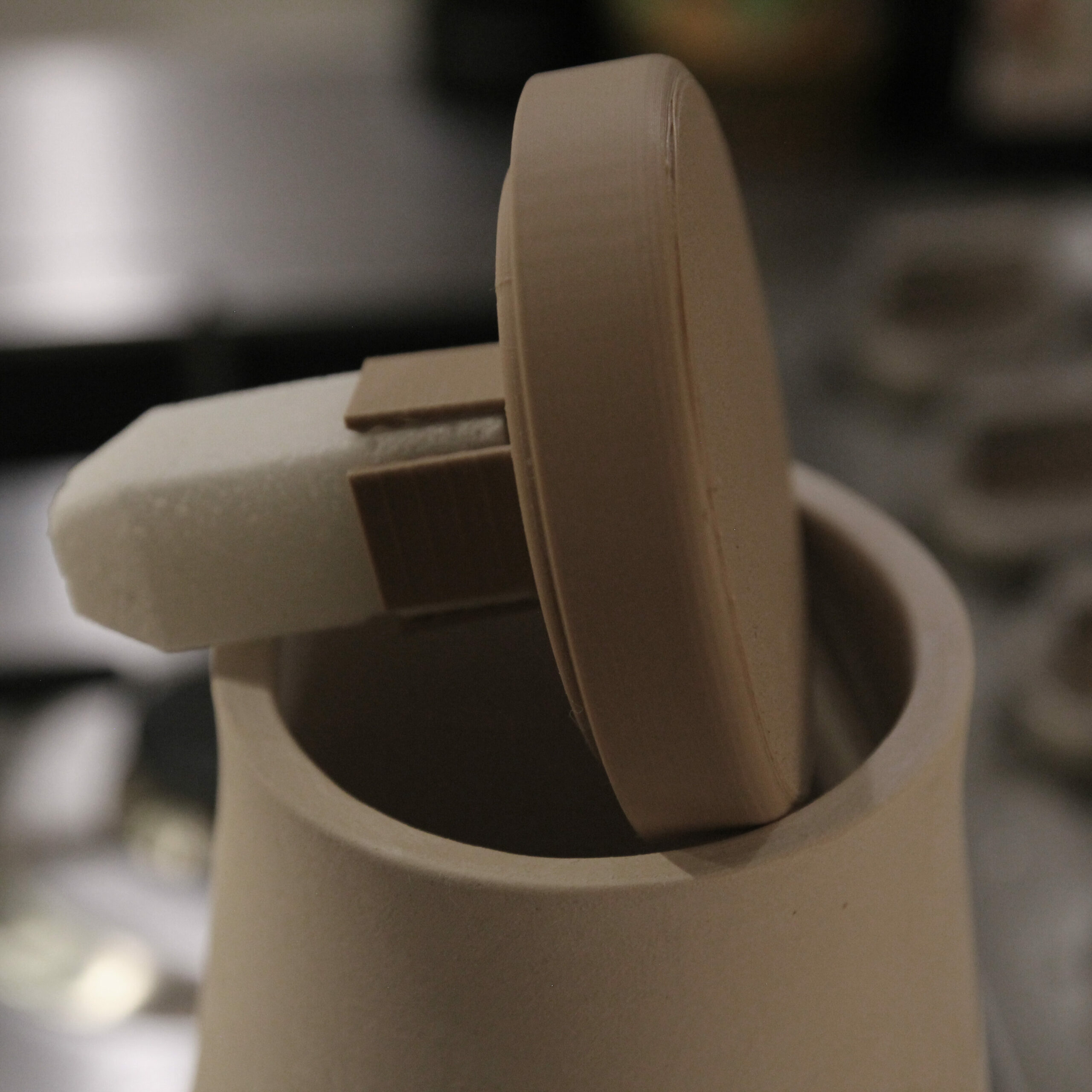
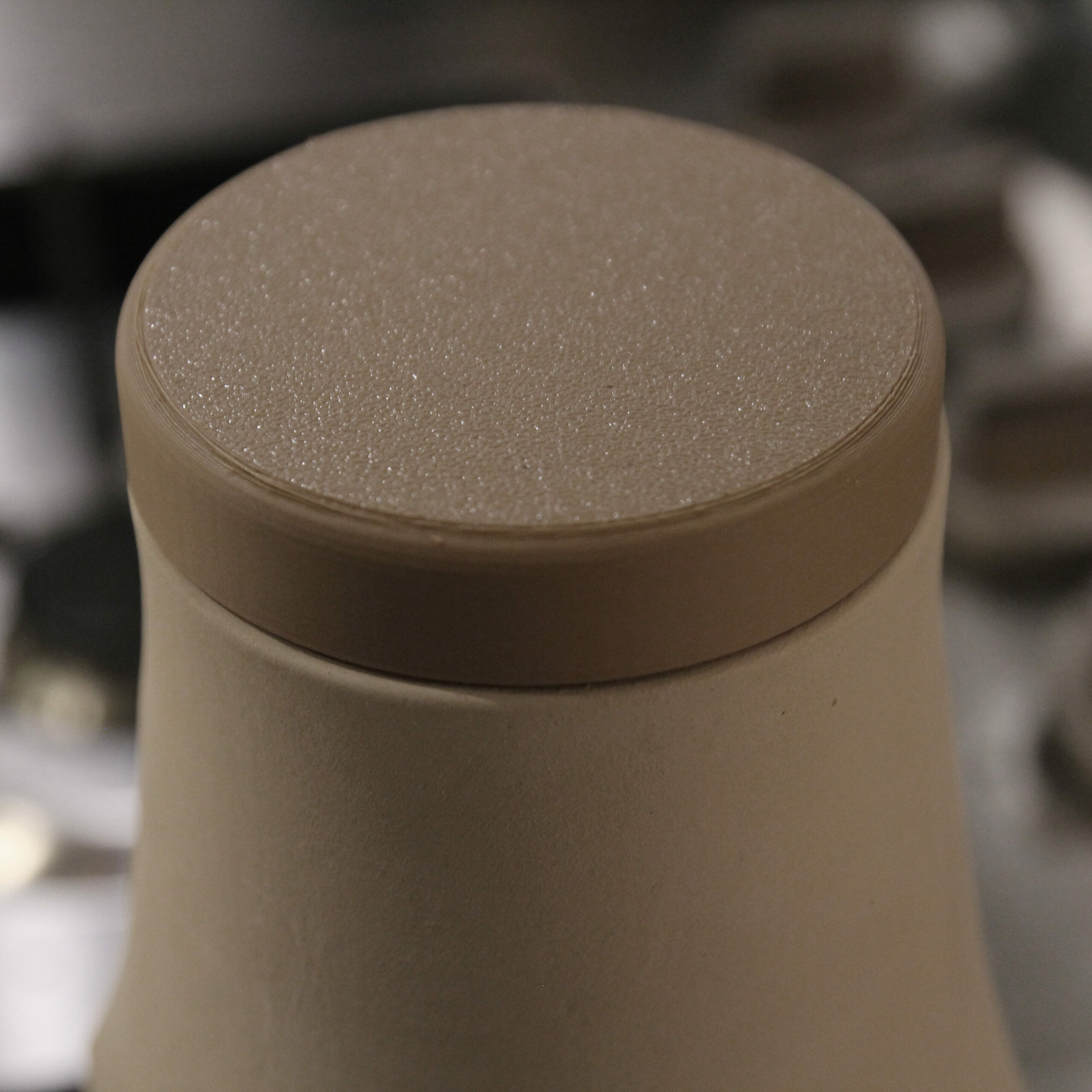
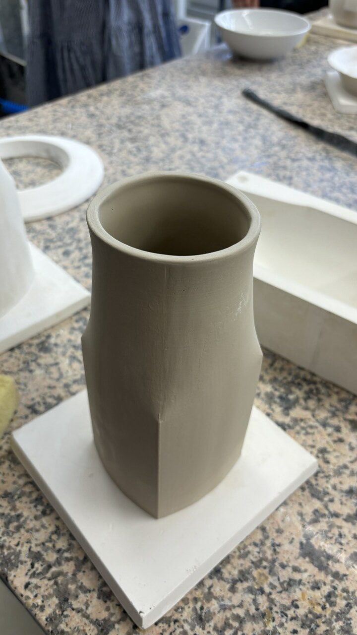
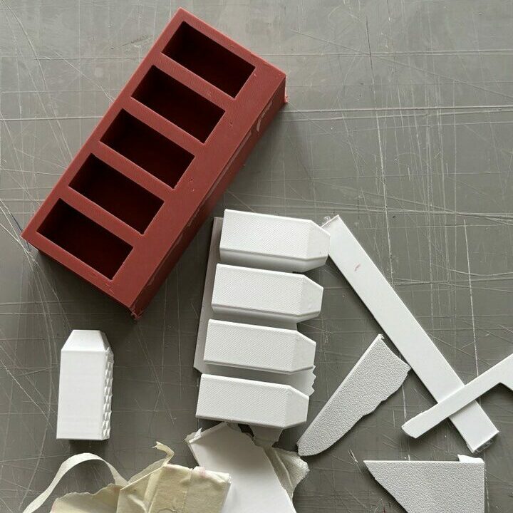
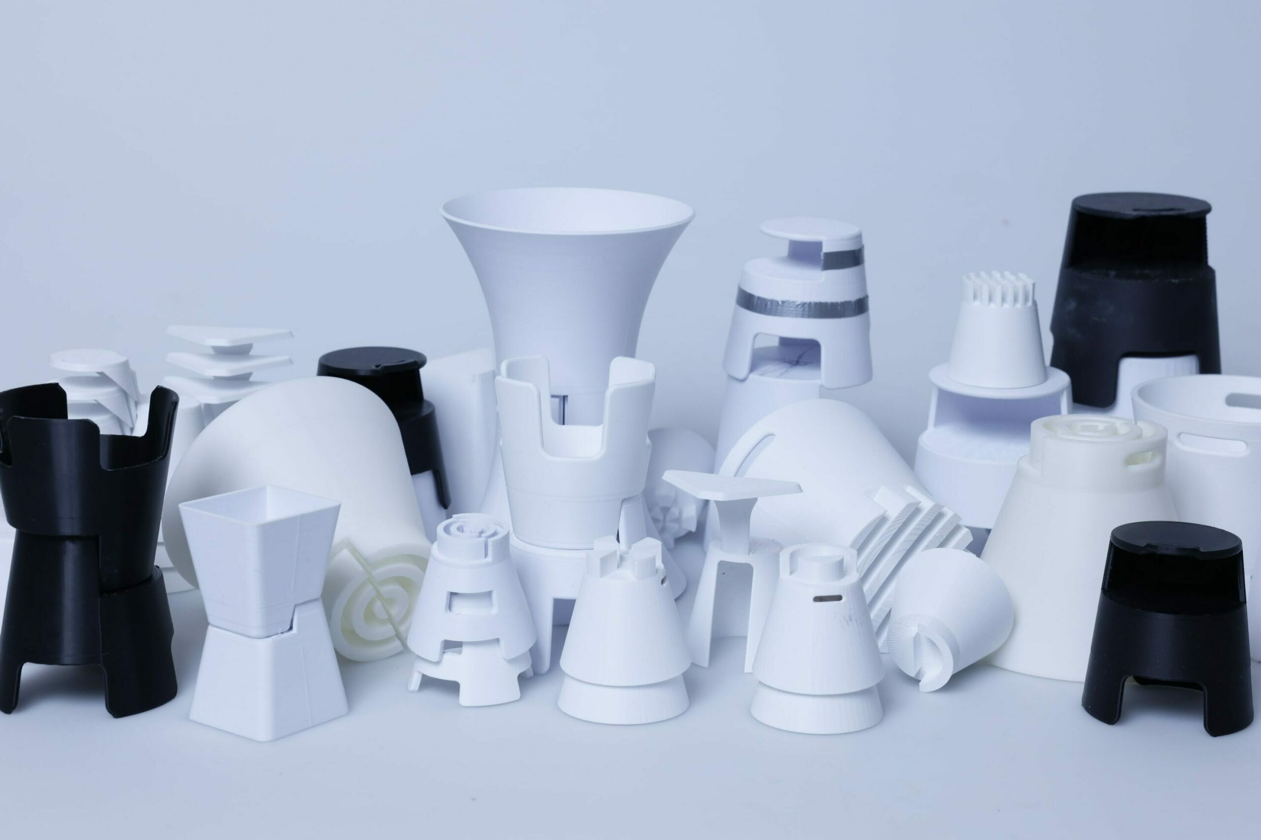
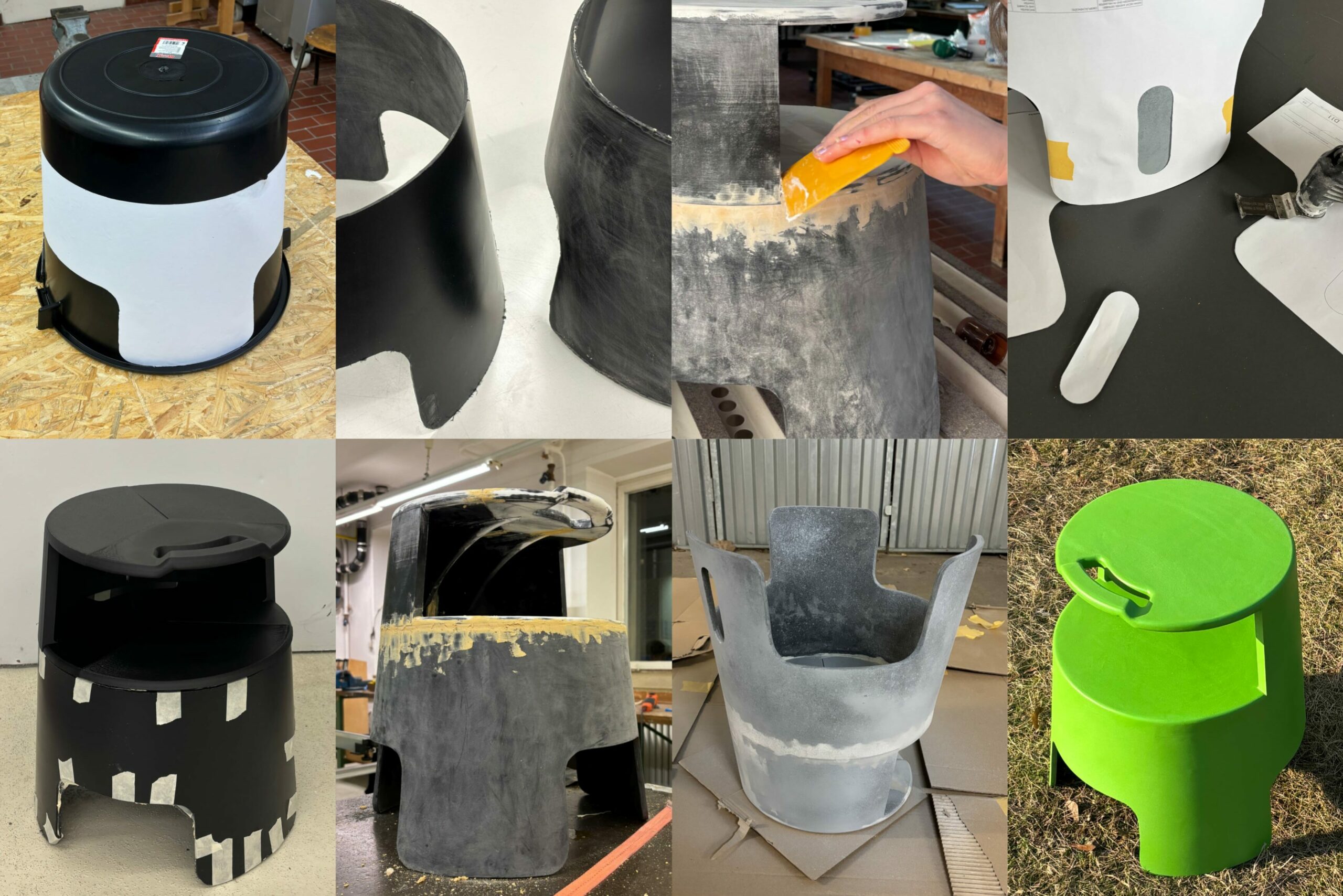
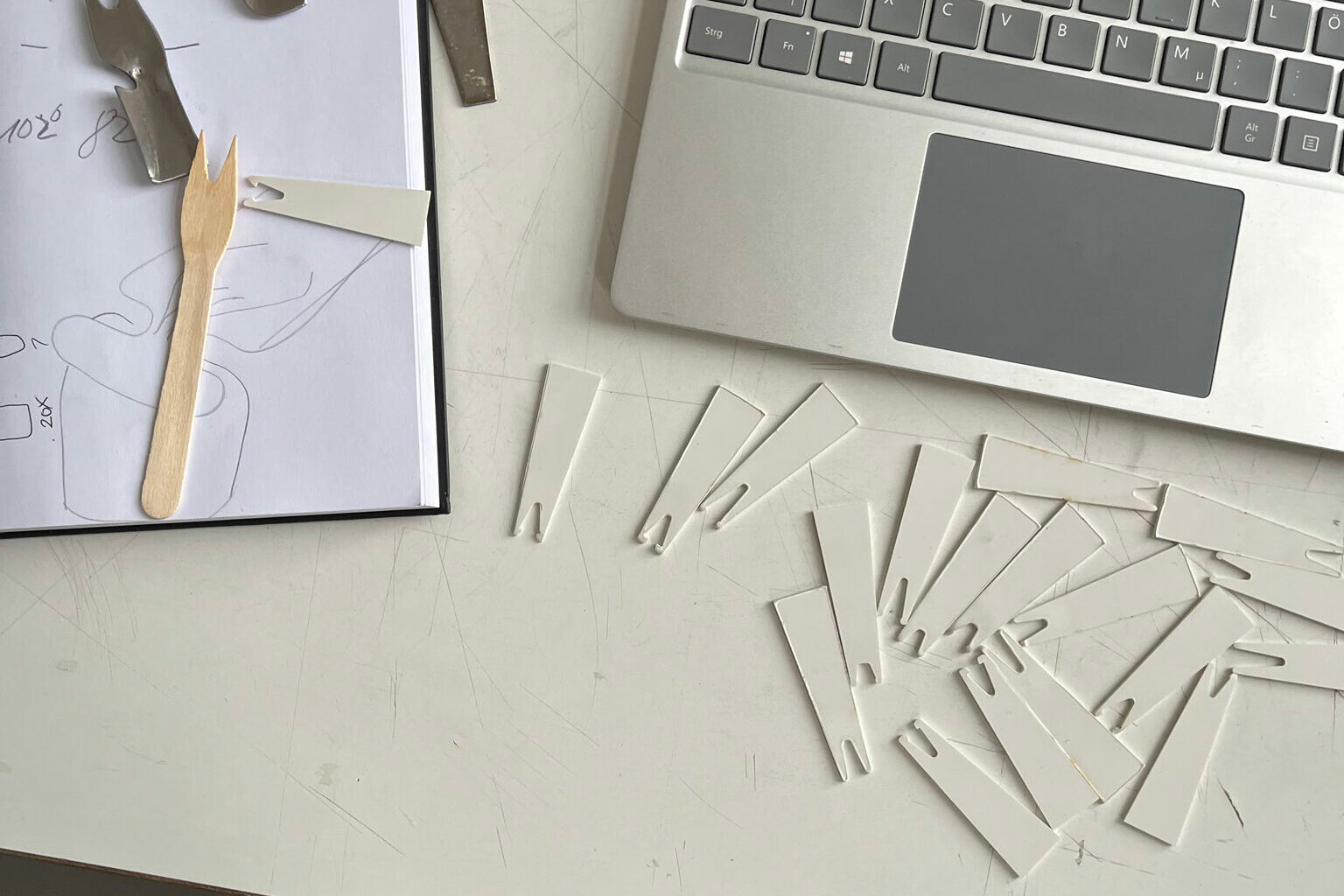
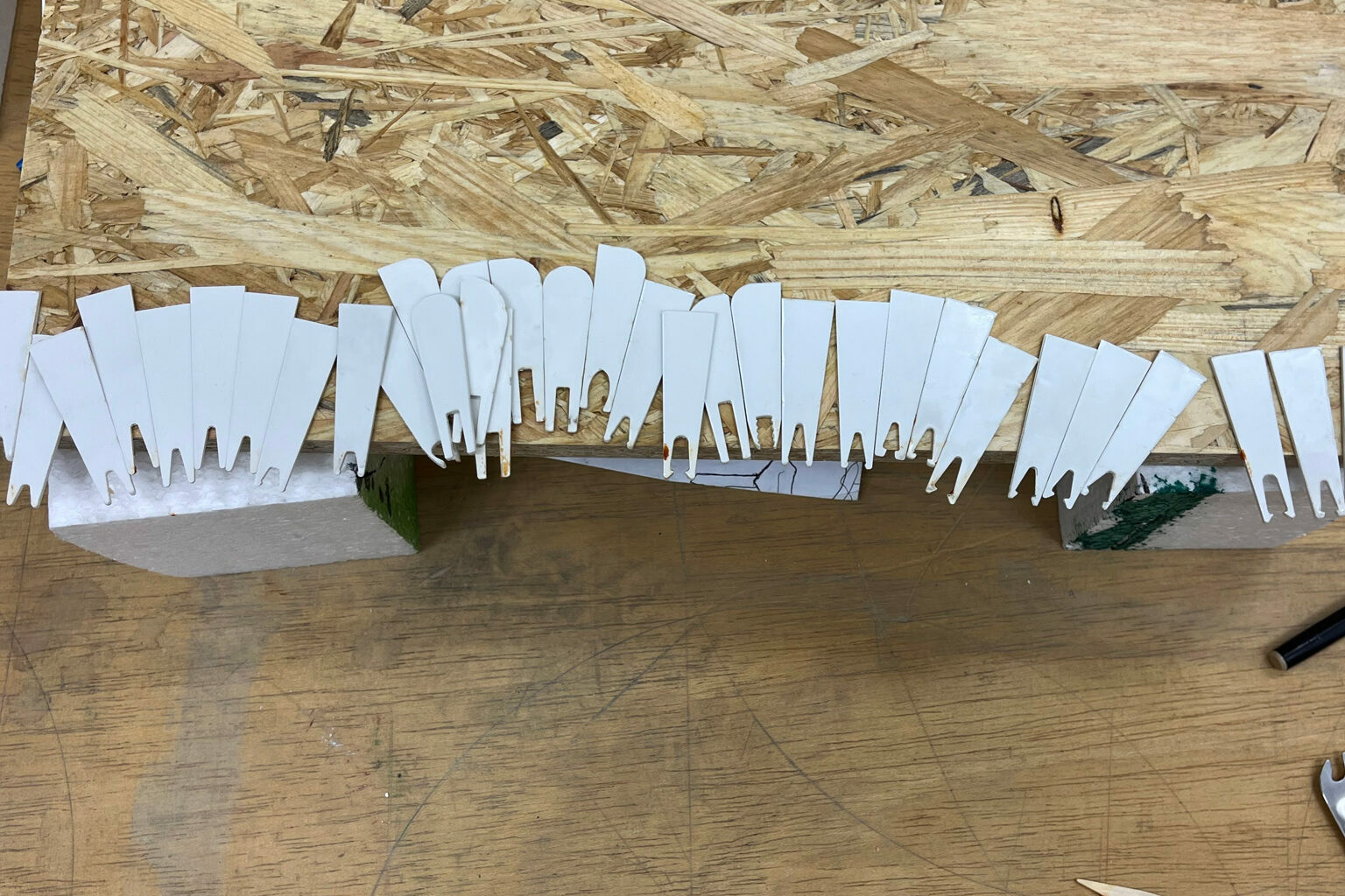
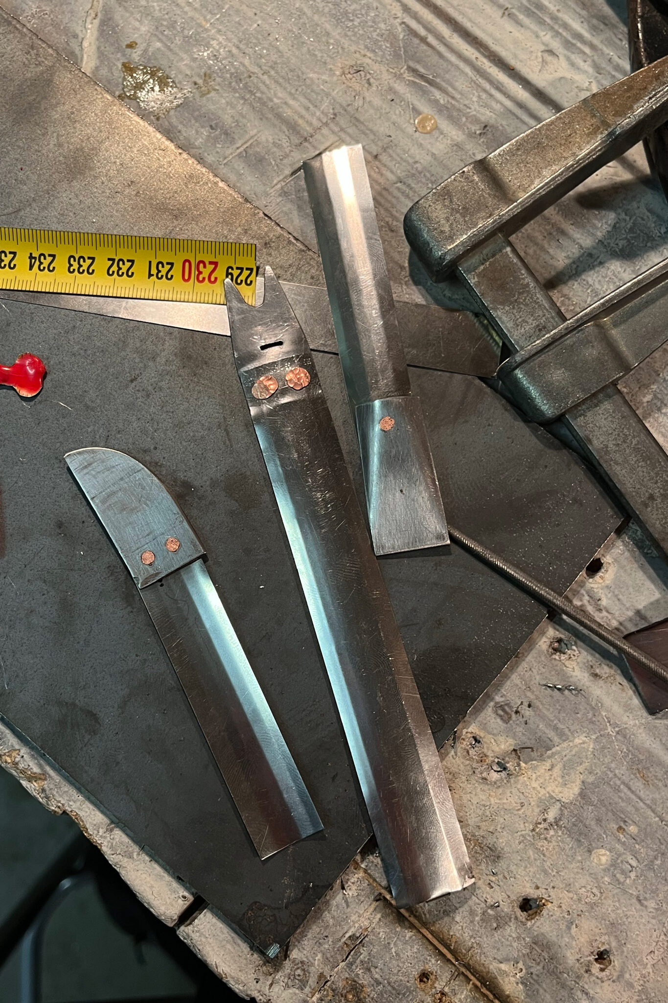
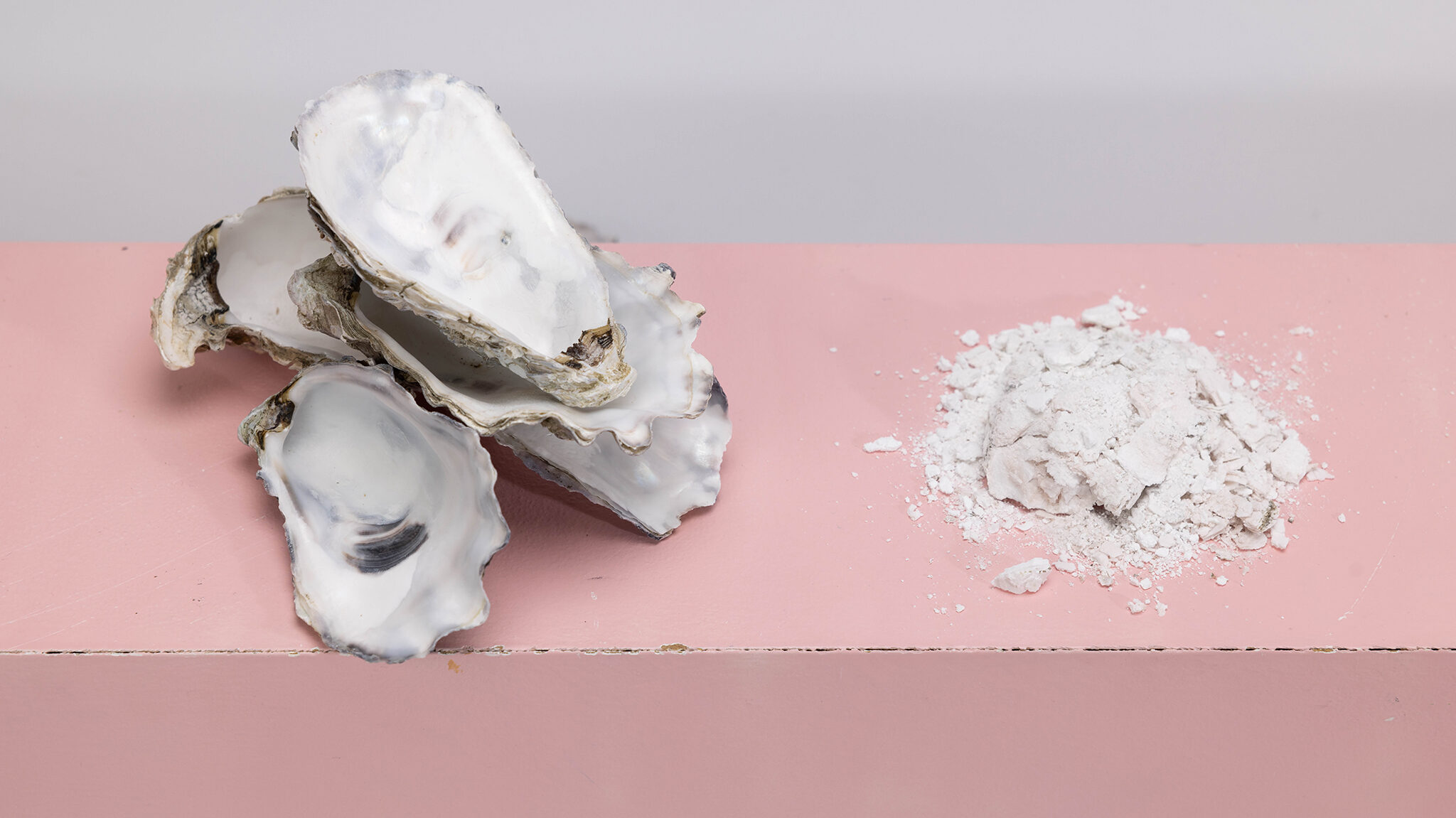
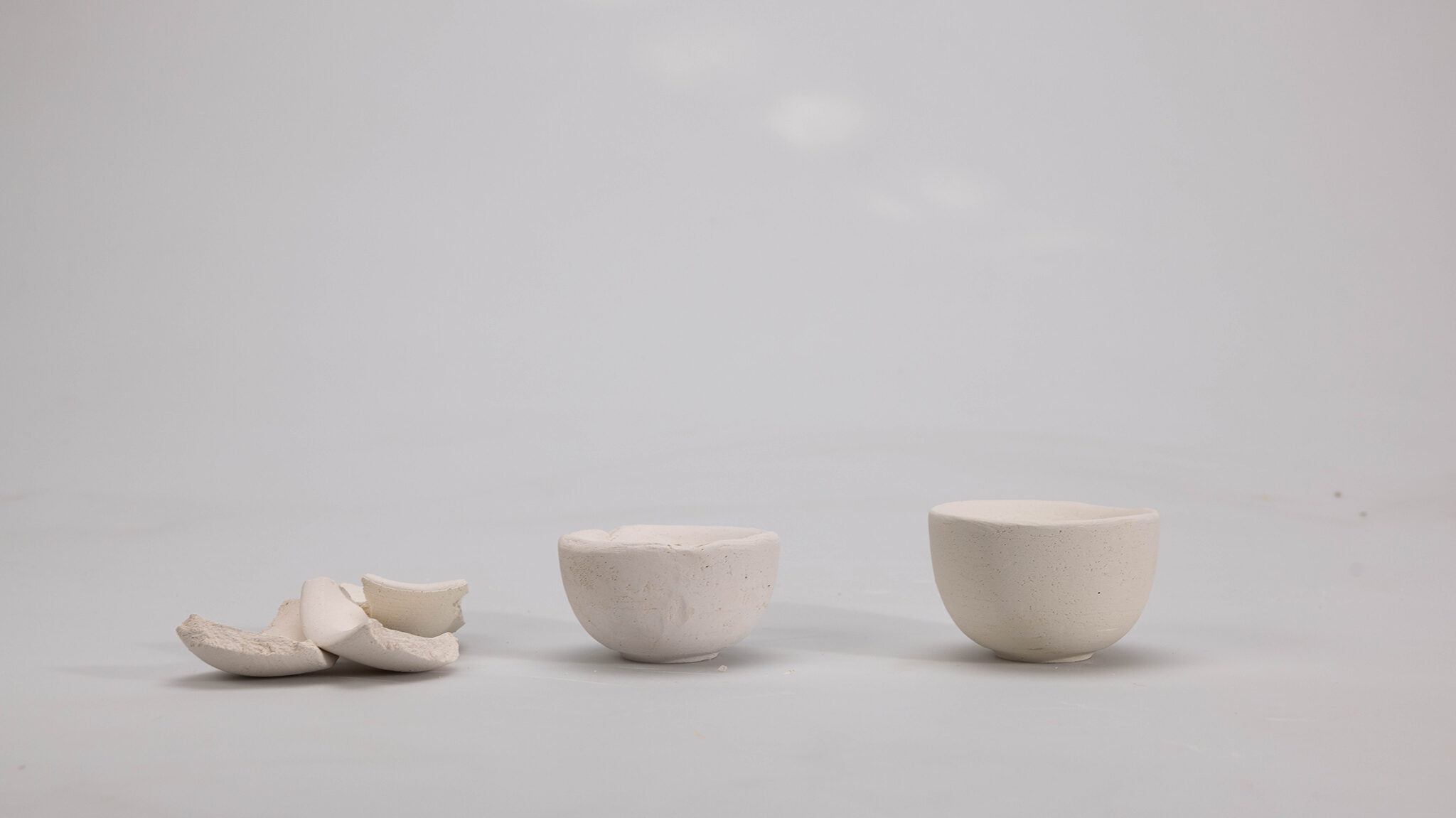
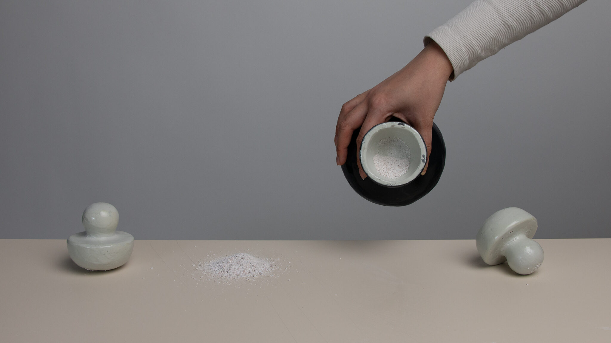
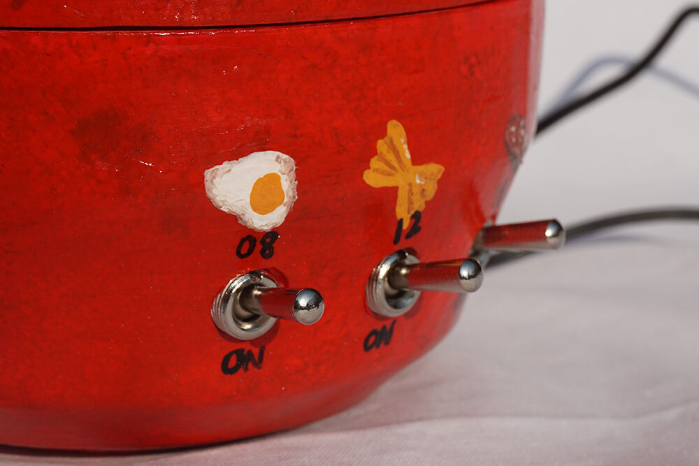
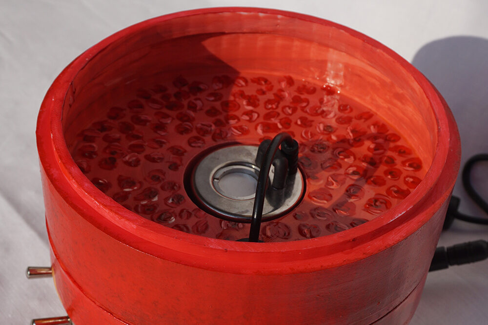
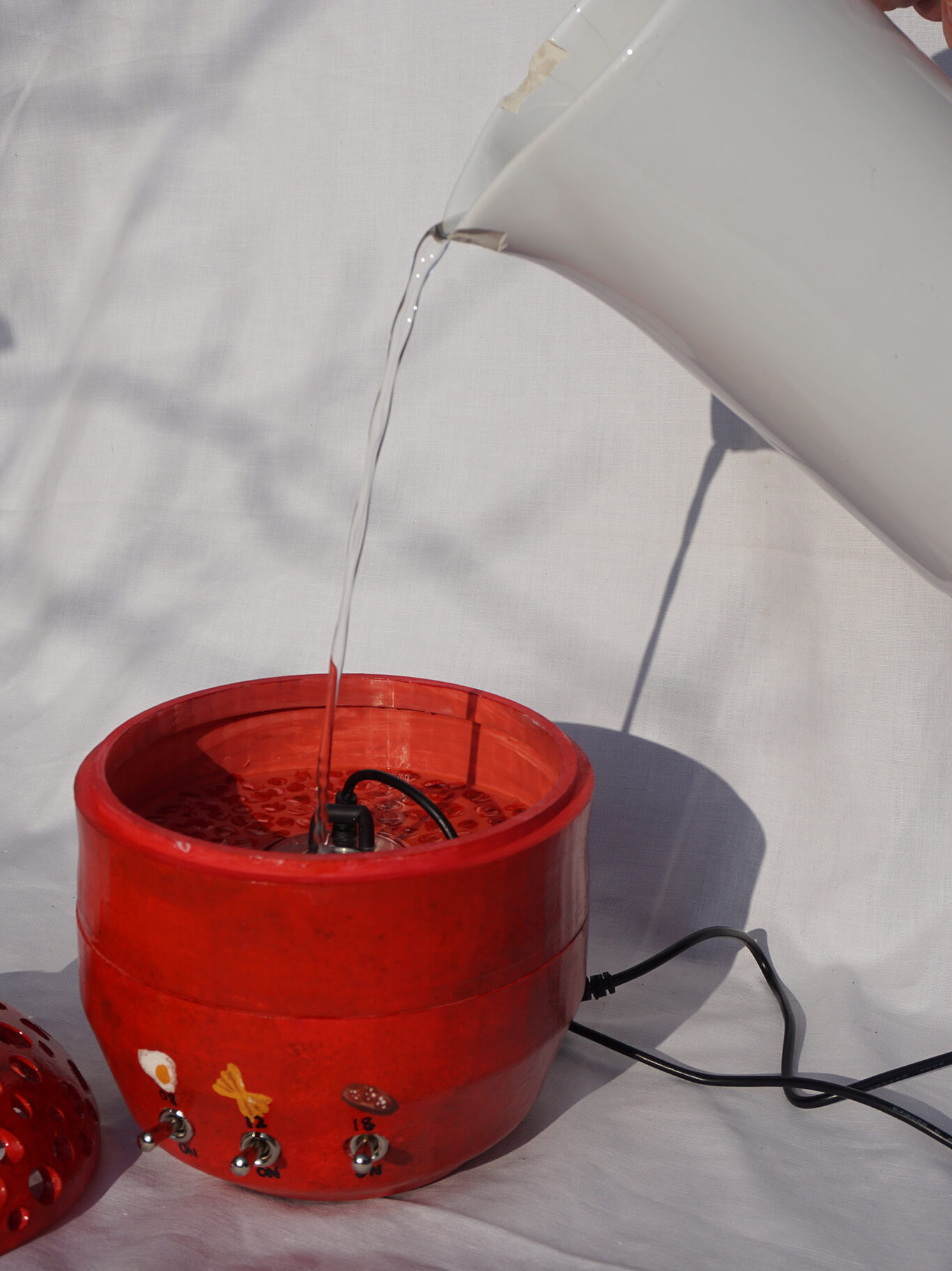
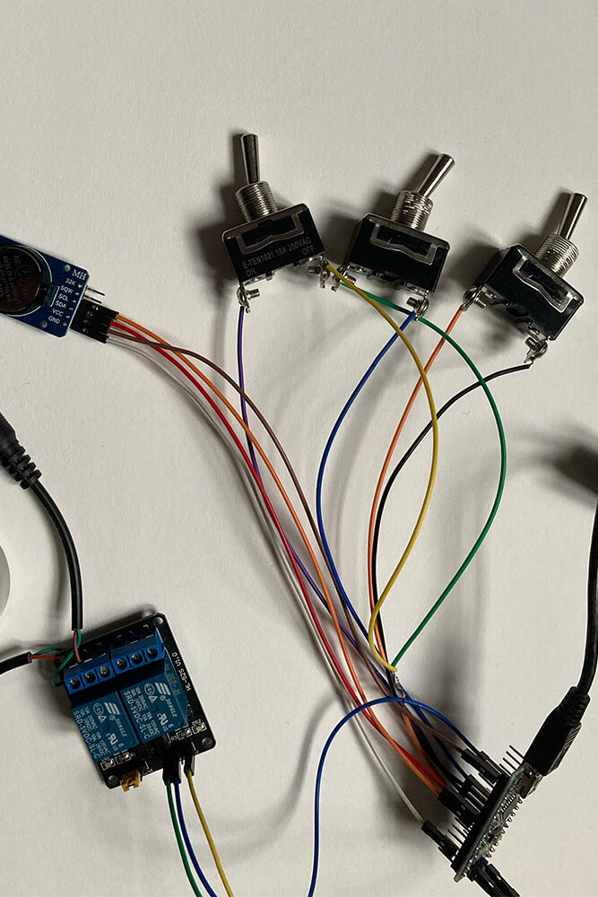
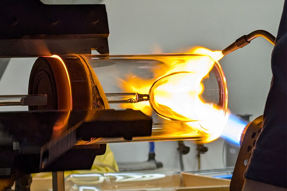
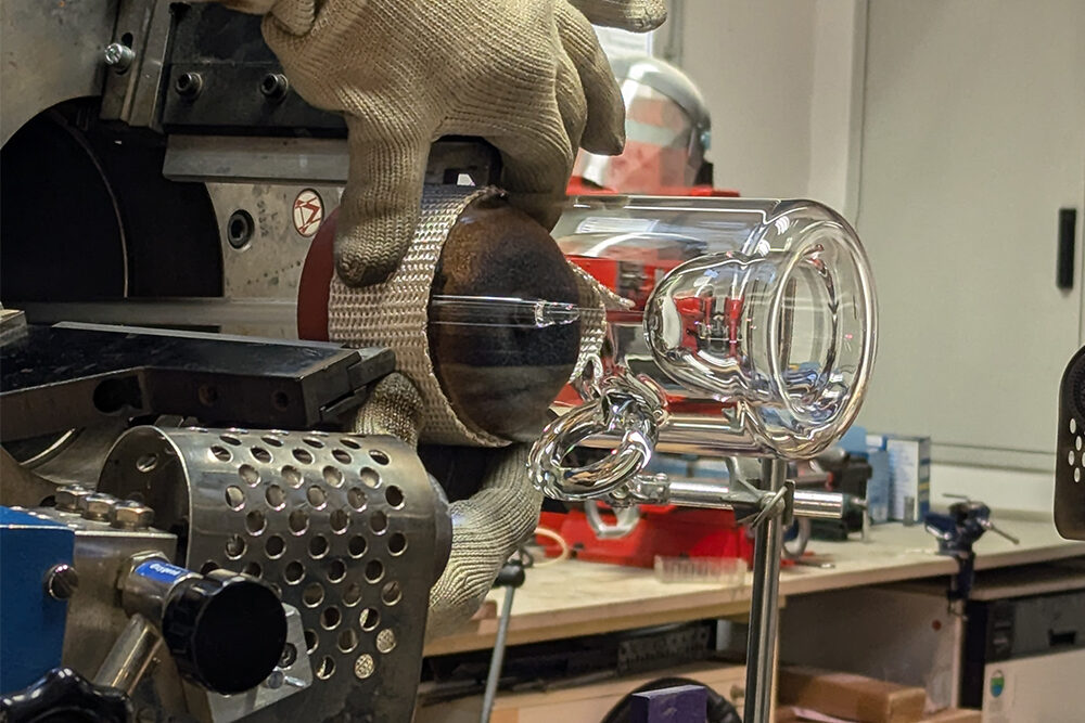
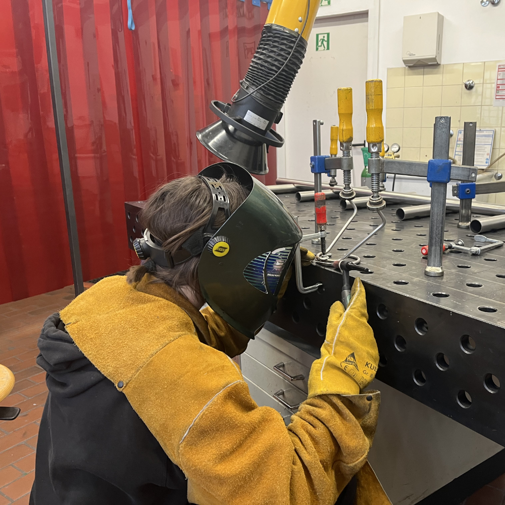
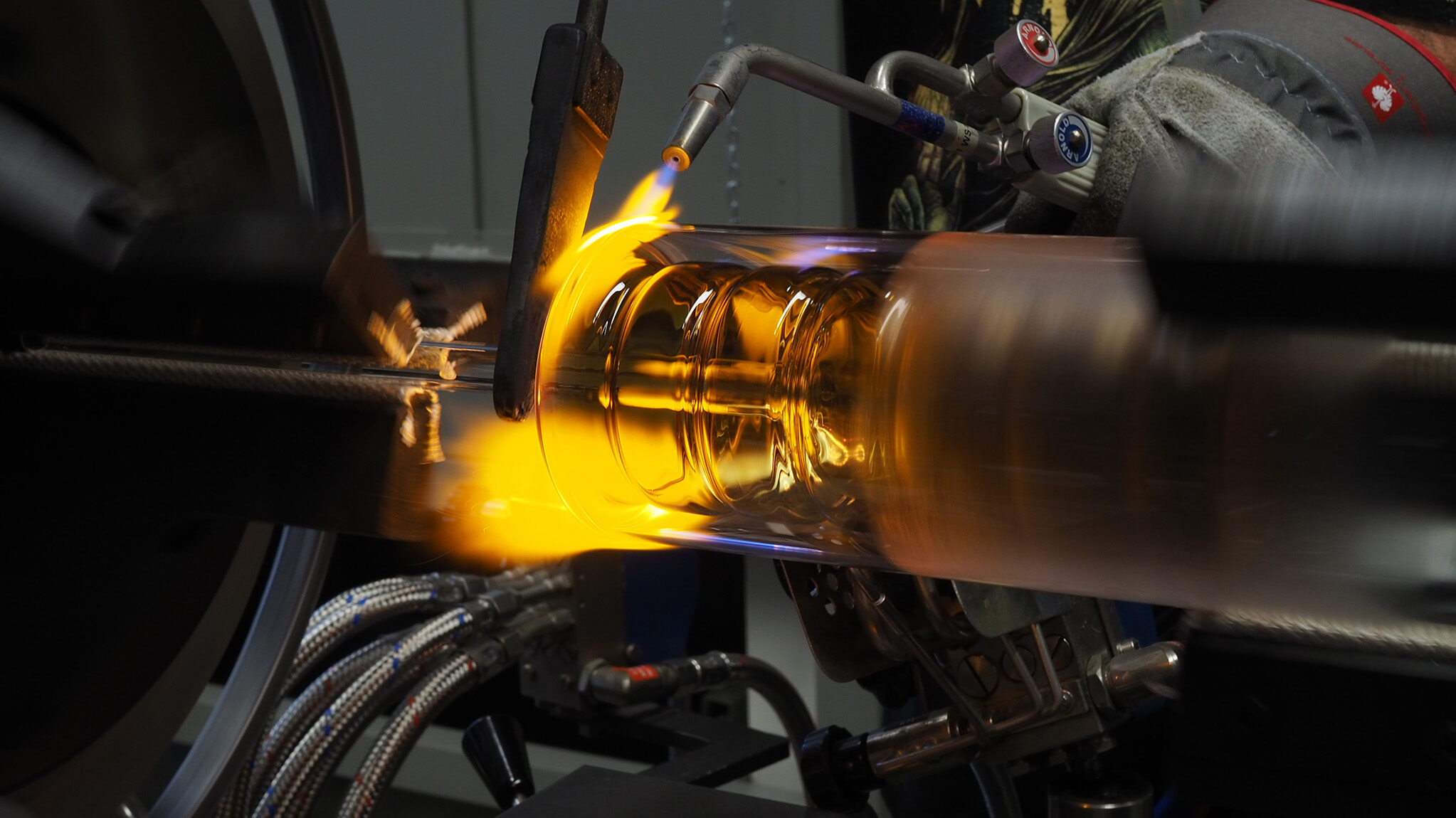
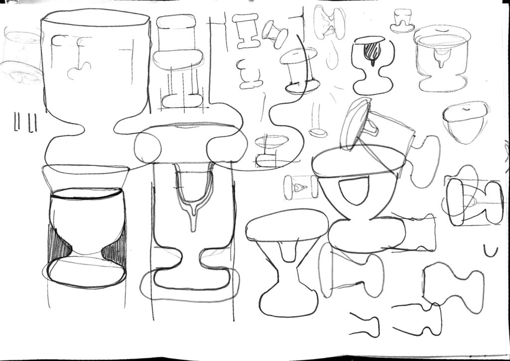
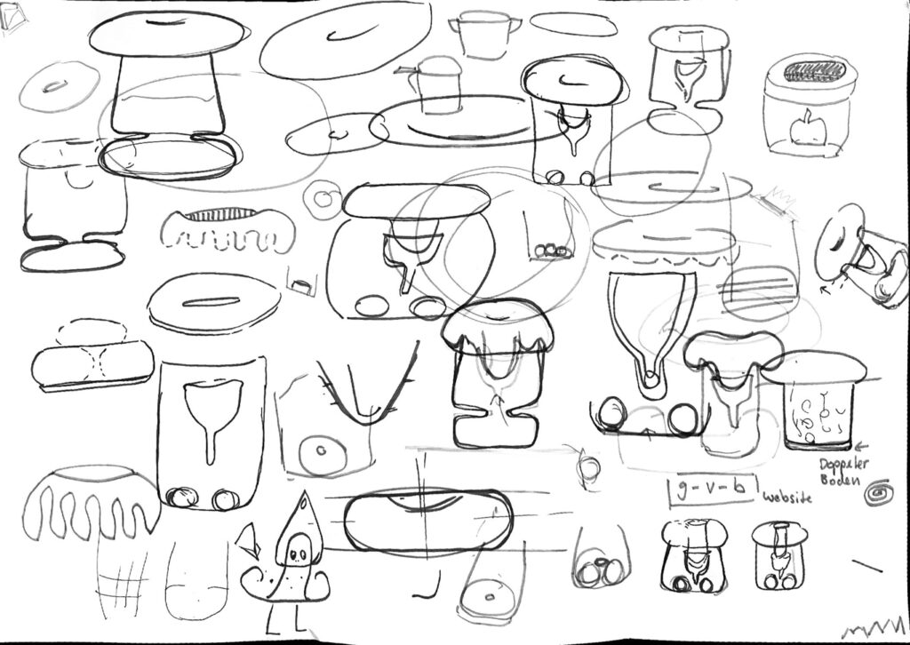
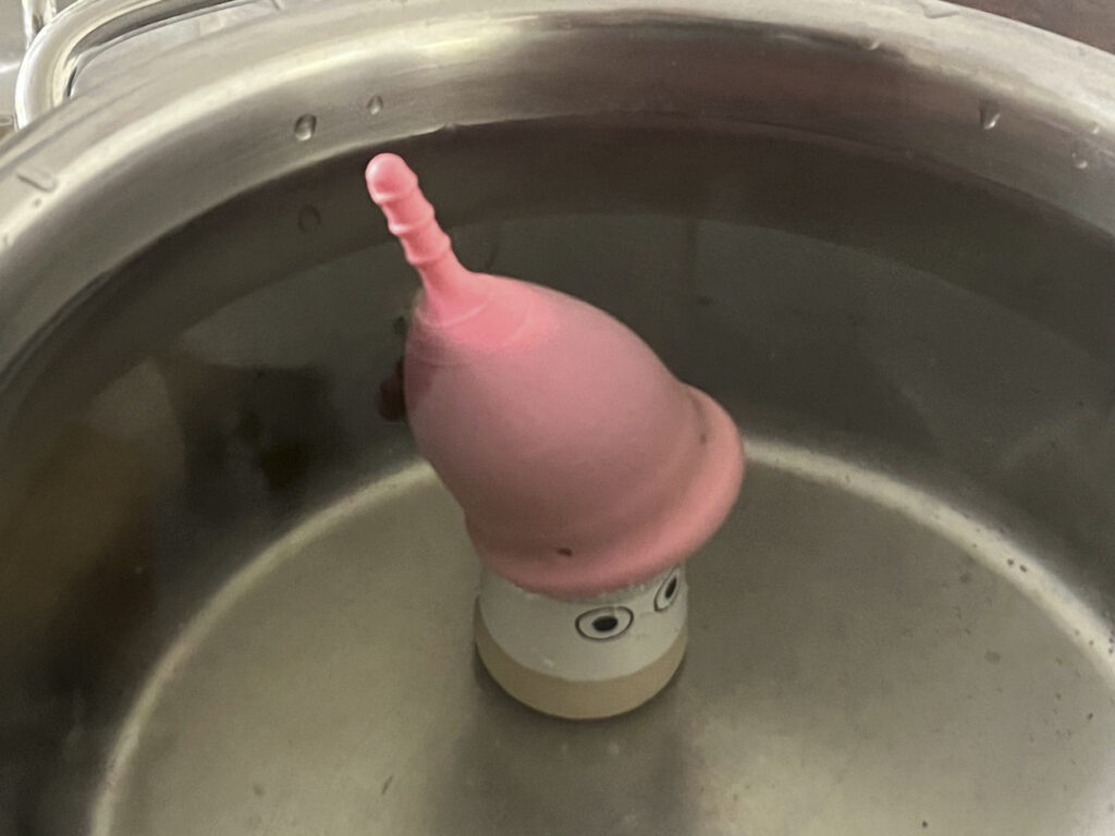
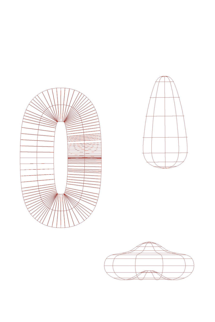
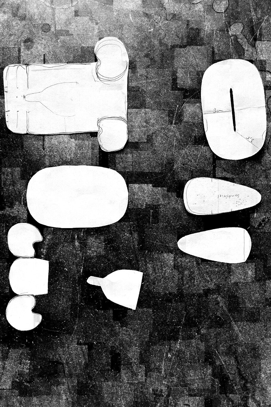
The process:


 *
*


")
")