„Die UDK führt einem sehr anschaulich vor Augen, auf wie vielen Ebenen Design seine Wirkung entfalten kann.“
Designer.
KM bei Prof. Axel Kufus 2004-2010.
„Die UDK führt einem sehr anschaulich vor Augen, auf wie vielen Ebenen Design seine Wirkung entfalten kann.“
Designer.
KM bei Prof. Axel Kufus 2004-2010.
„Als Designer war es mir immer wichtig Probleme von Menschen zu verstehen und darauf basierend Lösungen zu entwickeln.“
Design Leader & Experience Strategist.
Dipolm 2011.
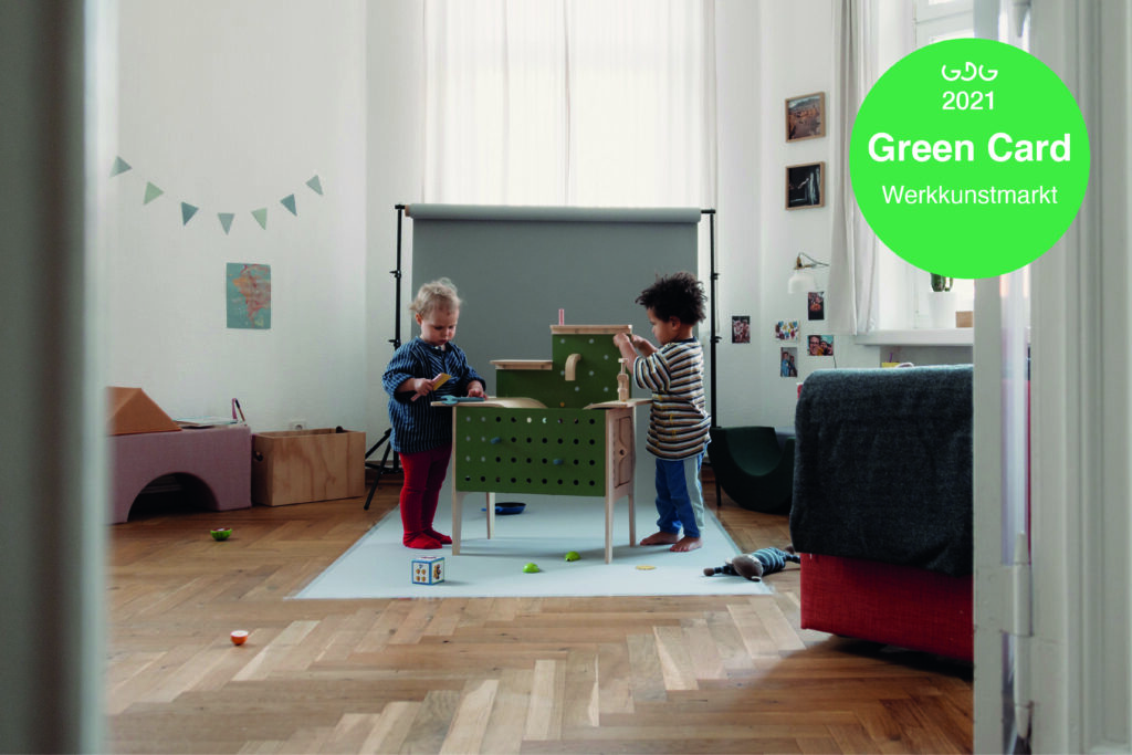
Christine Oehme won a participation, together with four other participants, at Werkkunstmarkt at the Wasserschloss Klaffenbach, which took part on the 6th and 7th November 2022.
See more: https://germandesigngraduates.com/green-cards-2021-2/
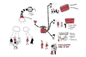
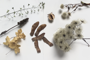
Warm up! ist das verbindende Motiv im Wintersemester 22/23. Zum einen als Objekt, als Kleidung, Accessoire oder Produkt zur körperlich/mentalen Funktionserweiterung, zum anderen als thematischer Kontext: In diesem Jahr sind wir alle zum Sparen von Energie und Wärme aufgefordert. Wie können wir dem Umgang mit Kälte und Frieren aber auch Unsicherheiten und Ängsten begegnen und die Erfüllung existenzieller Bedürfnisse wie Wärme und Sicherheit unterstützen?
Wie bei jedem neuen Start empfiehlt es sich, zunächst Körper und Geist spielerisch durch Bewegung auf „Betriebstemperatur“ zu bringen. Die Entwurfsarbeiten werden abschließend im Februar gezeigt bzw. performativ vorgeführt.
………………………………………………………………………………………………………………………………………………………….
basislabor design
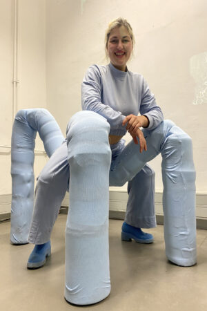
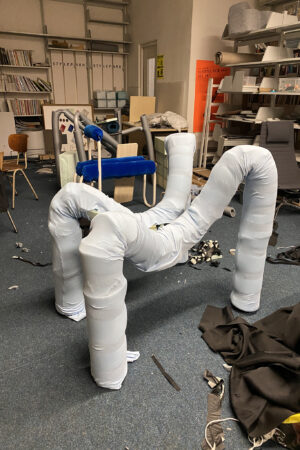
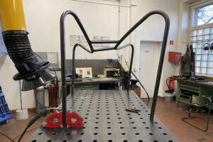
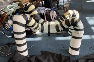
Durch die Bank
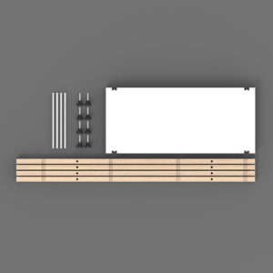
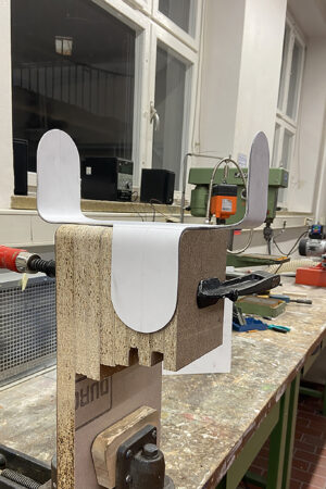
Basisprojekt Produkt, 2. Semester BA, Sommer 2023
Ein kollektiver Entwurfsprozeß für ein kollektives Möbel.
Einführung in den Entwurf über den konkreten Auftrag für eine Bank im Hof STR 118
über Recherche der öffentlichen Sitzbank historisch und konkret im Stadtraum Berlin,
Experimentalmodelle bzgl. Ergonomie, Nutzungsformen, Kommunikation, Interaktion
und Technik.
Nach dieser Einstiegsphase der Sammlung, Erfahrung und Analyse folgt eine Phase
paralleler individueller Bank-Entwürfe als Wettbewerb.
Ein oder mehrere prämierte Entwürfe werden dann wieder kollektiv kombiniert und optimiert
für eine Realisation. Das Erstsemester Produktdesign organisiert sich dann als Produktionsteam
zur Herstellung und Realisation dieses einen finalen Bank-Entwurfes im Hof
inklusive der Dokumentation des Prozesses als Ausstellung auf dem Rundgang im Juli.
………………………………………………………………………………………………………………………………………………………….
basislabor design
Start 17. April 9.00 Uhr
Basisprojekt Produkt, 2. Semester BA, Sommer 2023
Ein kollektiver Entwurfsprozeß für ein kollektives Möbel.
Einführung in den Entwurf über den konkreten Auftrag für eine Bank im Hof STR 118
über Recherche der öffentlichen Sitzbank historisch und konkret im Stadtraum Berlin,
Experimentalmodelle bzgl. Ergonomie, Nutzungsformen, Kommunikation, Interaktion
und Technik.
Nach dieser Einstiegsphase der Sammlung, Erfahrung und Analyse folgt eine Phase
paralleler individueller Bank-Entwürfe als Wettbewerb.
Ein oder mehrere prämierte Entwürfe werden dann wieder kollektiv kombiniert und optimiert
für eine Realisation. Das Erstsemester Produktdesign organisiert sich dann als Produktionsteam
zur Herstellung und Realisation dieses einen finalen Bank-Entwurfes im Hof
inklusive der Dokumentation des Prozesses als Ausstellung auf dem Rundgang im Juli.
Prof. Robert Scheipner
KM Johanna Dehio
und Gäste
Start 17. April 9.00 Uhr
R008
montags und dienstags 9.00 – 14 Uhr
R008
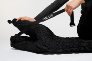
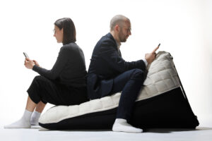
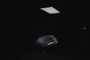
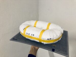
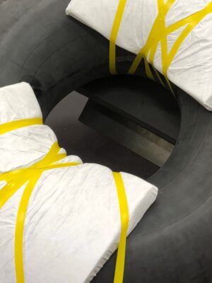
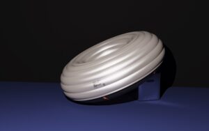
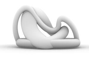
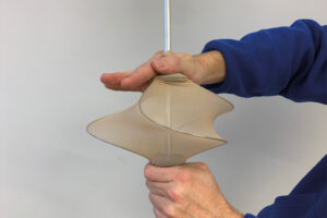
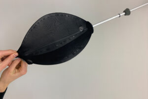
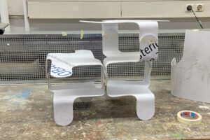
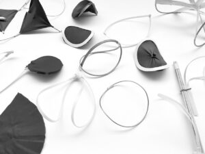
Airlay ist ein selbstaufblasbares Sitz und Liegemöbel, welches je nach Zustand zwischen Lounge Chair und Chaise Longue variiert. Mit einem Ventil als Interface wird die Sitzposition eingestellt. Durch das Eigengewicht des Körpers entweicht Luft nach außen. Das Verschließen des Ventils fixiert den jeweiligen Zustand. Steht die Person auf und öffnet das Ventil, füllt sich der Innenraum von selbst und das Möbel erreicht seine Ausgangsposition.
Die Kinematik basiert auf der Füllung mit Luft und schafft ein aktives Sitzerlebnis. Durch die Verlagerung des Körpergewichts passt sich die Form an. Airlay ist In- und Outdoormöbel zugleich und kann mit verschiedenen Überzügen individualisiert werden. Es hat keine Ober- und Unterseite, weshalb es von Rechts- und LinkshänderInnen gleichermaßen besessen werden kann.
Airlay is a versatile piece of furniture that can function as both a seat and a lounger. It features a self-inflating mechanism that allows the user to adjust the seating position using a valve. As the body’s weight presses down on the furniture, air is pushed outwards, allowing the shape to change between a lounge chair and a chaise longue. Once the desired position is reached, closing the valve fixes the shape in place. When the user stands up and opens the valve, the furniture begins to self-inflate, returning to its original shape.
The kinematics of Airlay are based on air filling, creating an active and dynamic seating experience. The shape of the furniture adapts to the user’s body type, shifting and conforming as they move around. Airlay is suitable for both indoor and outdoor use and can be personalized with various covers. It is designed without a top or bottom, making it ideal for use by both right- and left-handed individuals.


Supervised by
Prof. Burkhard Schmitz
Prof. Holger Neumann
WM Antonia Kühne
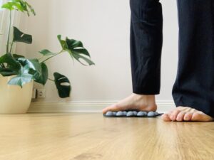
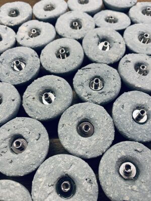
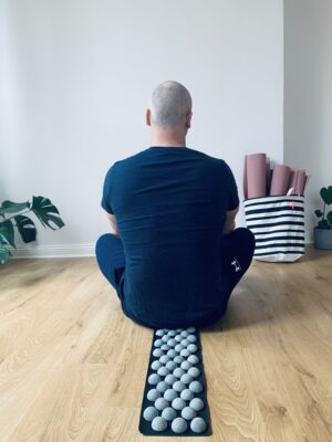
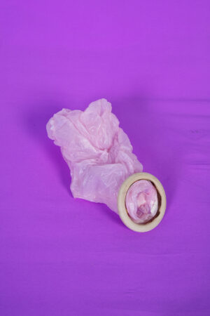
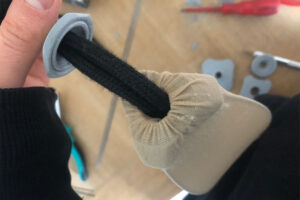
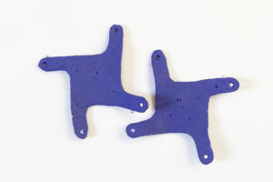
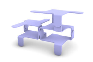
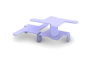
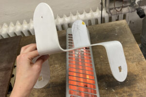
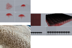
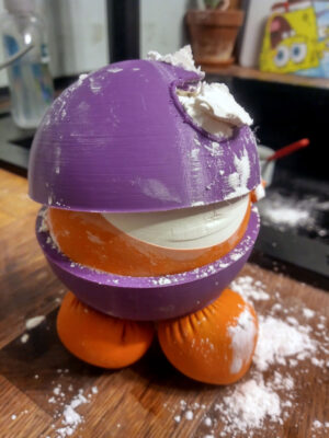
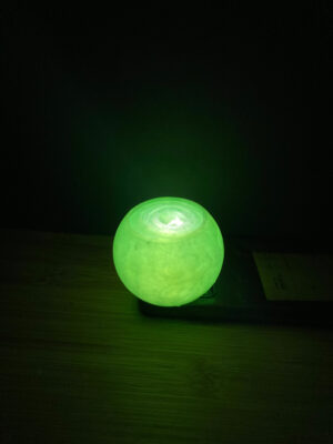
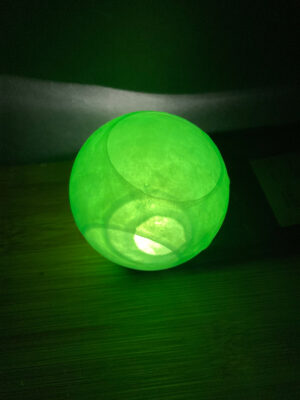
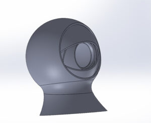
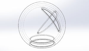
feel eco ist ein Wärmespender für den Hausgebrauch. Das Grundmaterial ist Ton, gemischt mit einem hohen Anteil an grobkörniger Schamotte. Es ist mir gelungen, eine wärmende Matte zu entwickeln, die dem Nutzer verschiedene Anwendungen für zuhause bietet. Grundlegend geht es um die Wärme, die die Halbkugeln abgeben können. Die Form und Anordnung der Objekte bringen durch ihre Oberfläche und ihre Geometrie einen massierenden Effekt mit sich. Dieses Produkt kann sowohl manuell als auch technisch, per 3D Drucker und Lasern, gefertigt werden.
feel eco is a heat dispenser for home use. The basic material is clay mixed with a high proportion of coarse-grained fireclay. I have succeeded in developing a warming mat that offers the user various applications. Basically it is about the heat that the hemispheres can give off. The shape and arrangement of the objects have a massaging effect due to their surface and geometry. This product can be manufactured both manually and technically, using 3D printers and lasers.

Supervised by
Prof. Burkhard Schmitz
WM Martin Beck
WM Steffen Herm
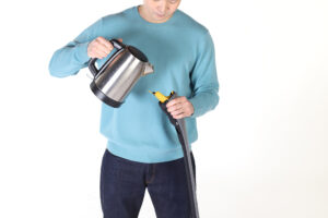
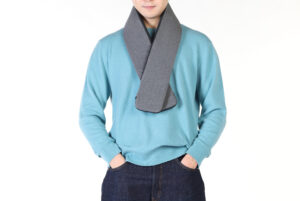
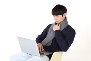
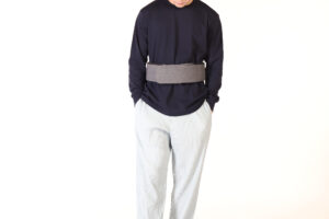
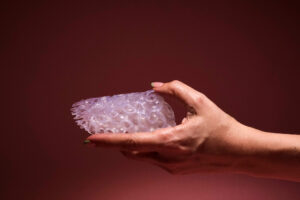
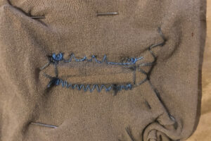
Der Heat Scarf ist eine flexible Wärmflasche mit einer weichen Hülle. Die aus Thermoplastischem Polyurethan (TPU) hergestellte Wärmflasche des Heat Scarf ist kratz- und abriebfester als Polyvinylchlorid (PVC) und frei von Schadstoffen und schädlichen PAK aus der Herstellung. Das macht die Wasserflaschen des Heat Scarfs recycelbar und sicherer.
Das Zickzack-Design der Flasche sorgt für Flexibilität beim Befüllen mit Wasser und passt sich ergonomisch an Hals und Bauch an. Der Hermetische Magnetic Band von Fidlock verfügt über einen dreifachen Verschlussmechanismus, der ein Auslaufen verhindert und durch Magnetismus automatisch verschließt. Die Öffnung mit 60 mm Durchmesser macht das Befüllen der Flasche sicher und einfach. Mit all diesen Eigenschaften fügt sich der 9 mm dicke Stopfen nahtlos in den Deckel ein.
Der speziell entwickelte Bezug schützt die Wärmflasche und bietet gleichzeitig einen hohen Tragekomfort. Die Oberseite besteht aus einer Kombination aus PU-Schaum und Baumwolle, die für eine flauschige, weiche Textur sorgt und die Wärme speichert, während die Unterseite aus atmungsaktivem 3D-Netzgewebe besteht, das für lang anhaltenden Komfort sorgt. Die Ober- und Unterseite des Bezuges sind farblich voneinander abgesetzt, damit sie leicht zu erkennen sind. Das schräge Gummiband sorgt dafür, dass der Wärmeschal mühelos um den Hals und den Bauch gelegt werden kann.
Der Heat Scarf eignet sich für verschiedene Outfits, vom Anzug über Freizeitkleidung bis hin zum Schlafanzug, und ist perfekt für den Gebrauch im Büro oder zu Hause. Er schmiegt sich eng an Ihren Körper an, so dass Sie die Hände frei haben, um zu arbeiten oder sich zu entspannen. Wenn er nicht gebraucht wird, lässt sich der Heat Scarf einfach zusammenfalten oder aufrollen und verstauen. Der Bezug ist bei 30 Grad in der Maschine waschbar.
The Heat Scarf is a flexible hot water bottle featuring a soft cover. Made from Thermoplastic Polyurethane (TPU), the Heat Scarf’s water bottle is more scratch-resistant and abrasion-resistant than Polyvinylchloride (PVC), and it’s free of pollutants and harmful PAHs from manufacturing. This makes the Heat Scarf’s water bottles recyclable and safer.
The bottle’s zigzag design ensures flexibility when filled with water and ergonomically conforms to the neck and stomach. The hermetic magnetic band from Fidlock features a triple-locking mechanism to prevent leakage and seals automatically due to magnetism. The 60mm diameter opening makes filling the bottle safe and easy. With all these features, the 9mm thick stopper fits seamlessly into the cover.
The specially designed cover protects the hot water bottle while providing user comfort. The top side combines PU foam and cotton for a fluffy, soft texture that retains heat, while the bottom side features breathable 3D mesh for long-lasting comfort. The top and bottom sides of the cover have distinct colors for easy identification. The slanted elastic band ensures effortless securing of the Heat Scarf around the neck and stomach.
Suitable for various outfits, from suits and casual wear to pajamas, the Heat Scarf is perfect for indoor use at the office or home. Its snug fit around your body frees your hands for work or relaxation. When not in use, simply fold or roll up the Heat Scarf for storage. The cover is machine washable at 30 degrees.
PROZESS


Prof. Burkhard Schmitz
Prof. Holger Neumann
KM Antonia Kühne
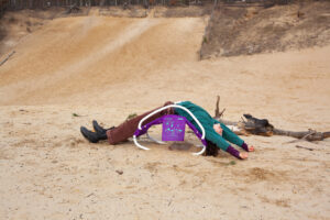
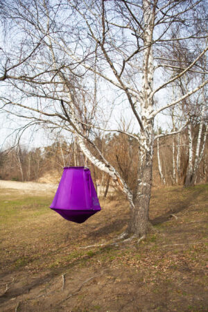
Als globalste Krise bedarf es dem Klimawandel and verschiedensten Arten von Aktivismen. Beinah in allen Gesellschaften weltweit versuchen Gruppen unterschiedlichster Kulturen durch aktivistische Methoden Veränderungen zu adressieren und die Politik zum Handeln zu bewegen. Der Klimawandel und die damit einhergehenden Klima Aktivismen verursachen bei vielen Menschen, die mit dem Thema in Berührung sind, Motivation, Aktionen aber auch Belastungen. Innerhalb des eigenen Engagements sieht man sich einem unendlich erscheinenden Berg von Arbeit gegenüberstehen. Auf der anderen Seite löst der Klimawandel selbst vor allem bei Menschen der jüngeren Generation Zukunftsängste, Trauer und Wut aus.
CALM IN CRISIS soll ein Raum eröffnen sich mit Klimagefühlen auseinanderzusetzen. Es wird untersucht, welche Aufgaben und Belastungen mit einem Engagement in der Klimakrise einhergehen und wie man mit diesen umgehen kann
Die verschiedenen Emotionen können lähmen, jedoch auch Energien freisetzen, die in Protestaktionen und Demonstrationen gebündelt werden.
Wie wird Klima Aktivismus betrieben? Welche Belastungen und Motivationen stecken hinter der Arbeit von jungen klimaaktivistischen Menschen? Wir gehen wir mit psychischen Belastungen von Klimawandel um und wie transformieren wir diese in Proteste?
Die Objekte der Serie CALM IN CRISIS kommunizieren auf verschiedene Art und Weise Szenarien von Klimaaktivismen. In unterschiedlichen Kontexten können die Objekte als Erholungstools, in einer Klimademonstration oder zur Entwicklung von neuen Formen des Protests genutzt werden. In fünf verschiedenen Objekten werden Situationen von Klima Aktivismus visualisiert und erfahrbar gemacht. Die einzelnen Objekte vermitteln dabei verschiedene Gefühle, die im Bezug zur Klimakrise empfunden werden können.
Die Sichtbarmachung der Wichtigkeit von Klima Aktivismus ist ein essenzieller Bestandteil von CALM IN CRISIS, der darauf abzielt das Handeln in den Vordergrund zu rücken und der Ohnmacht entgegenzuwirken.
As the most global crisis, climate change requires all kinds of activism. In almost all societies around the world, groups of different cultures are trying to address change through activist methods and to get policy makers to act. Climate change and the climate activism that goes with it cause motivation, action but also stress for many people who are in touch with the issue. Within one’s own engagement, one finds oneself facing a seemingly endless mountain of work. On the other hand, climate change itself triggers fears for the future, sadness and anger, especially among people of the younger generation.
CALM IN CRISIS is meant to open up a space to deal with climate feelings. It explores the tasks and burdens that come with engaging in the climate crisis and how to deal with them
The various emotions can paralyse, but also release energies that are bundled into protest actions and demonstrations.
How is climate activism carried out? What are the stresses and motivations behind the work of young climate activists? How do we deal with the psychological stresses of climate change and how do we transform them into protests?
The objects in the CALM IN CRISIS series communicate scenarios of climate activism in different ways. In different contexts, the objects can be used as recreational tools, in a climate demonstration or to develop new forms of protest. In five different objects, situations of climate activism are visualised and made tangible. The individual objects convey different feelings that can be experienced in relation to the climate crisis.
Making the importance of climate activism visible is an essential part of CALM IN CRISIS, which aims to bring action to the foreground and counteract powerlessness.


PROZESS
Supervised by
Prof. Jussi Ängeslevä
Prof. Jozef Legrand
KM Annika Unger
“There is no original or primary gender a drag imitates, but gender is a kind of imitation for which there is no original.” –Judith Butler
Geschlecht ist eine aufwändige und oft repressive Konstruktion. Ein Blick ins Internet genügt und man findet lange Anleitungen zur Herstellung von Männlichkeit oder Weiblichkeit. Geschlecht ist kein neutraler Fakt, es ist eine Kategorisierung, die wir gegenüber Menschen und deren Körpern vornehmen. Diese Kategorisierung geht mit Erwartungshaltungen gegenüber Aussehen, Charakter, Lebensweise und Sexualität einher. Personen werden von Geburt an innerhalb eines spezifischen Geschlechtersystems geformt. Gleichzeitig stehen Körper in ihrer Varianz sowie die Vielfalt menschlicher Existenzen vereinfachenden, binären Logiken entgegen.
Gender is an imitation for which there is no original ist eine Untersuchung binärer Geschlechterkonstrukte aus desidentifizierter (entfremdeter) Perspektive. In queerer Tradition habe ich mir normative Anleitungen zu binärem Geschlecht als nicht binäre Person wieder angeeignet und aktiv falsch oder neu interpretiert. Parodie und Missverständnis dienen als Mittel der Dekonstruktion von gesellschaftlichen und geschlechtlichen Normen.
Die Ambivalenz und Mehrdeutigkeit sprachlicher Formulierungen ermöglichte es, neue entlarvende und spekulative Varianten zu erzeugen. Stereotype Metaphern aus Internetforen wurden in ihrer bildlichen Übersetzung zu Metamorphosen des Gewohnten. Es ergeben sich Bilder und Objekte, die befremdlich und vertraut zugleich sind, welche meinen Körper formen und erweitern.
Dass wir von binären Normen stark beeinflusst sind, ist nicht zu verkennen. Die Normen lassen sich jedoch zerlegen und auf Neuinterpretationen und queere Potentiale hin untersuchen, bis die Norm sich in ihrer Absurdität entblößt und die Entfremdung ein Eigenleben entwickelt. An die Stelle normativer Geschlechtlichkeiten treten Gegenentwürfe, welche neue Verständnisse von Körper, Selbstfürsorge und Ausdruck anbieten.
„There is no original or primary gender a drag imitates, but gender is a kind of imitation for which there is no original.“ -Judith Butler
Gender is an elaborate and often repressive construction. One look on the internet is enough to encounter long instructions on how to produce masculinity or femininity. Gender is not a neutral fact, it is a categorization we make towards people and their bodies. This categorization is accompanied by expectations about appearance, character, lifestyle, and sexuality. People are shaped from birth within a specific gender system. At the same time, bodies in their variance and the diversity of human existences oppose simplistic, binary logics.
Gender is an imitation for which there is no original is an investigation of binary gender constructs from a disidentified (alienated) perspective. In queer tradition, I have re-appropriated and actively misinterpreted or reinterpreted normative guidance on binary gender as a non-binary person. Parody and misunderstanding serve as a means of deconstructing social and gender norms.
The ambivalence and ambiguity of linguistic formulations allowed for the creation of newly revealing and speculative variants. Stereotypical metaphors from internet forums became metamorphoses of the familiar in their pictorial translation. Images and objects emerge that are both alienating and familiar. They shape and extend my body.
That we are strongly influenced by binary norms cannot be denied. However, the norms can be deconstructed and examined for reinterpretations and queer potentials until the norm exposes itself in its absurdity and the alienation develops a life of its own. Counter-designs that offer new understandings of the body, self-care and self-expression take the place of normative gender.


PROZESS


Supervised by
This is a bachelors project with the goal to make personalized breast prosthesis affordable to everyone who is in need of it.
I don’t have the goal to show anyone what the perfect prosthesis in my opinion looks like. My goal is to encourage everyone to personally create an idea how their ideal prosthesis would look like and then give them the tools to create exactly that.
Through 3D technologies, such as 3D Scanning, CAD Programs and 3D Printing, this works as an instructions guide to create your personalized (external) breast prosthesis that is perfectly adapted to your body and your individual needs.
By creating the form on your own, you are independent from the selection at your local health care supply store.
The software used in this project is always also available as freeware, so that you only pay for the material costs for the 3D Print.
Through this project, I hope to break down barriers and that the wearers or prostheses are enabled and encouraged to autonomously create their own prosthesis with their individual needs in mind.
Due to the fabrication through 3D printing, it is possible to leave space behind the prosthesis for air flow, to copy exactly your own breast and to manipulate the overall texture to whatever form you like. There are no boundaries for your fantasies, personal choices and your individuality.
My long term goal is to built a network for the users, to exchange their tips and tricks for the process, to think the project further, and to have an anonymous database with 3D Scans, for people who are in need for breasts on both sides, and therefore cannot use a mirrored version of the remained breast.


PROZESS


Supervised by
Prof. Ineke Hans
Prof. Holger Neumann
KM Anja Lapatsch
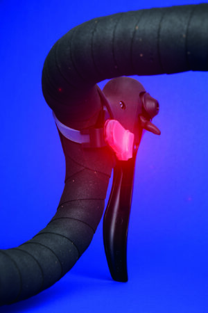
Riding around a city on a gravel bike, so one with a drop handlebar I have noticed a problem that arises when I want to use the bike bell. With my hands on the handlebars where I have access to the brakes when I want to use the bell, I have to raise one hand, use the bell which is fixed at the top of the handlebars – next to a stem, and then put my hand again where I can brake comfortably.
The moment when a cyclist has to use the bell is usually a potentially dangerous situation in which extreme caution must be taken. It is hard to predict how another traffic participant will behave. Letting go of the handlebars in such circumstances is somehow absurd because it is in such situations that the cyclist should have full control of the bike and be able to ring the bell as quickly as possible.
In the first phase of the concept FYBELL was a pragmatic solution to a problem that stems from the fact that in the past drop handlebars were only used on road bikes for sporting activities, but today there are many other bikes with such handlebars (gravel bike, touring bike, cyclocross bike) that are increasingly used in the city.
BUT WHAT IF THE CYCLIST KNEW ABOUT THE DANGER EVEN BEFORE IT HAPPEN?
From this point on, FYBELL was not only, based on research into ergonomics and different situations on the road, a design response to the above problem, but also a system that increases safety by raising the cyclist’s awareness of the potential danger they might encounter.
FYBELL is an intelligent system that collects from users and then analyses the following data:
The electric bike bell sends this data via Bluetooth to an app. The data is then analyzed by artificial intelligence algorithms, resulting in a map showing the dangerous areas.
When using the FYBELL system, a cyclist is warned at the moment they enter a dangerous zone in two ways:
The warning remains on as long as the cyclist is in the danger zone and then extinguishes.
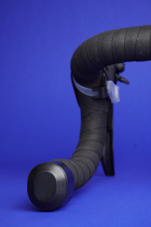
In the search for perfect ergonomics and the need for cleanliness and simplicity, the FLYBELL components have been arranged in two locations.
The connection between the bell and the button is wireless. This allows for quick and easy installation without the need to unwrap the tape.
FYBELL offers the potential for greater safety not only on bikes with drop handlebars but also for all cyclists.


PROZESS


Supervised by
Prof. Ineke Hans
Prof. Holger Neumann
WM Steffen Herm
Einfach, aus einem Material, kreislauffähig – die Ausstellung bei designtransfer zeigt verschiedene kreative Ansätze aus der UdK Berlin – Inspirationen aus vergangenen Zeiten, Entwicklungen von neuen Materialien und Anwendungen, langlebige und praktische Lösungen – von Semesterprojekten bis zu preisgekrönten Abschlussarbeiten und erfolgreichen Start-Ups.
Zur Berlin Design Week (8. – 17. Mai) sind unter anderem zu sehen – Urnen aus Kaffeesatz, Ziegel aus Kork, eine Deckenleuchte zum Mitnehmen, farbliche Vorkoster, erweiterbare Teppiche, biologisch abbaubare Regencapes von Weatherunderground und Produkte von craftingplastics!
9. Mai, 18:00: Vernissage mit Präsentationen
17. Mai, 18:00: Finissage mit Pop Up Präsentation one + one = one – Magic Moving Mechanisms, Kurzzeitprojekt mit Mathias Hahn, in Kooperation mit Design & Social Context
Ausstellung: 8. – 17. Mai, 12:00 – 18:00
designtransfer, UdK Berlin, Einsteinufer 43, 10587 Berlin
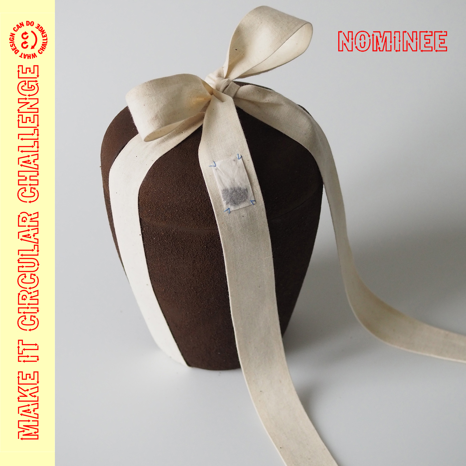
On March 30th. the nominees of the Make it Circular Challenge were announced by What Design Can Do and its partner the IKEA Foundation.
With their project REST IN GROUNDS Lale Knapp and Nele Oetjens are one of the 50 nominees out of 650 projects entered from 20 different countries!
During the Challenge open call, creatives were asked to submit ideas in at least one of five categories reflecting the key aspects or ‘value chains’ in a circular society. The Circular Design Challenge features exciting innovations that prevent waste by rethinking our way of life: from what we eat and wear, to how we build, package and buy.
Lale & Nele developed their REST IN GROUNDS project in the Circular Impact course (WiSe 2022/23 – Design & Social Context).
It concerns the design and manufacture of a biodegradable urn made from coffee grounds, which has the ability of neutralising the ashes and also has a positive impact
On 3 May, the 13 most promising projects will be crowned this year’s winners.
The winners will take home an award package designed to strengthen their projects and set them up for long-term success. And they will gain access to a six-month-long development programme which has been co-created by experts from the global Impact Hub network. Winning teams will also receive €10.000 each to invest in their project, as well as press and publicity through WDCD’s channels and those of their partners.
Read more about the challenge and nominations HERE
Read more about What Design Can Do HERE
Am 30. März wurden die Nominierten der Make it Circular Challenge von What Design Can Do und seinem Partner, der IKEA Foundation, bekannt gegeben.
Mit ihrem Projekt REST IN GROUNDS gehören Lale Knapp und Nele Oetjens zu den 50 Nominierten von 650 eingereichten Projekten aus 20 verschiedenen Ländern!
Während der offenen Ausschreibung der Challenge wurden Kreative gebeten, Ideen in mindestens einer von fünf Kategorien einzureichen, die die Schlüsselaspekte oder „Wertschöpfungsketten“ in einer Kreislaufgesellschaft widerspiegeln. Die Circular Design Challenge bietet aufregende Innovationen, die Abfall vermeiden, indem sie unsere Lebensweise überdenken: von dem, was wir essen und tragen, bis hin zu unserer Art zu bauen, zu verpacken und zu kaufen.
Lale & Nele entwickelten ihr Projekt REST IN GROUNDS im Circular Impact Kurs (WiSe 2022/23 – Design & Social Context).
Es geht um das Design und die Herstellung einer biologisch abbaubaren Urne aus Kaffeesatz, die die Asche neutralisieren kann und sich auch positiv auswirkt
Am 3. Mai werden die 13 vielversprechendsten Projekte zu den diesjährigen Gewinnern gekürt.
Die Gewinner nehmen ein Preispaket mit, das darauf ausgelegt ist, ihre Projekte zu stärken und langfristig erfolgreich zu machen. Und sie erhalten Zugang zu einem sechsmonatigen Entwicklungsprogramm, das von Experten aus dem globalen Impact Hub-Netzwerk mitgestaltet wurde. Die Gewinnerteams erhalten außerdem jeweils 10.000 €, die sie in ihr Projekt investieren können, sowie Presse- und Öffentlichkeitsarbeit über die Kanäle von WDCD und die ihrer Partner.
Lese HIER mehr über die Herausforderung und die Nominierungen
Lese HIER mehr über What Design Can Do

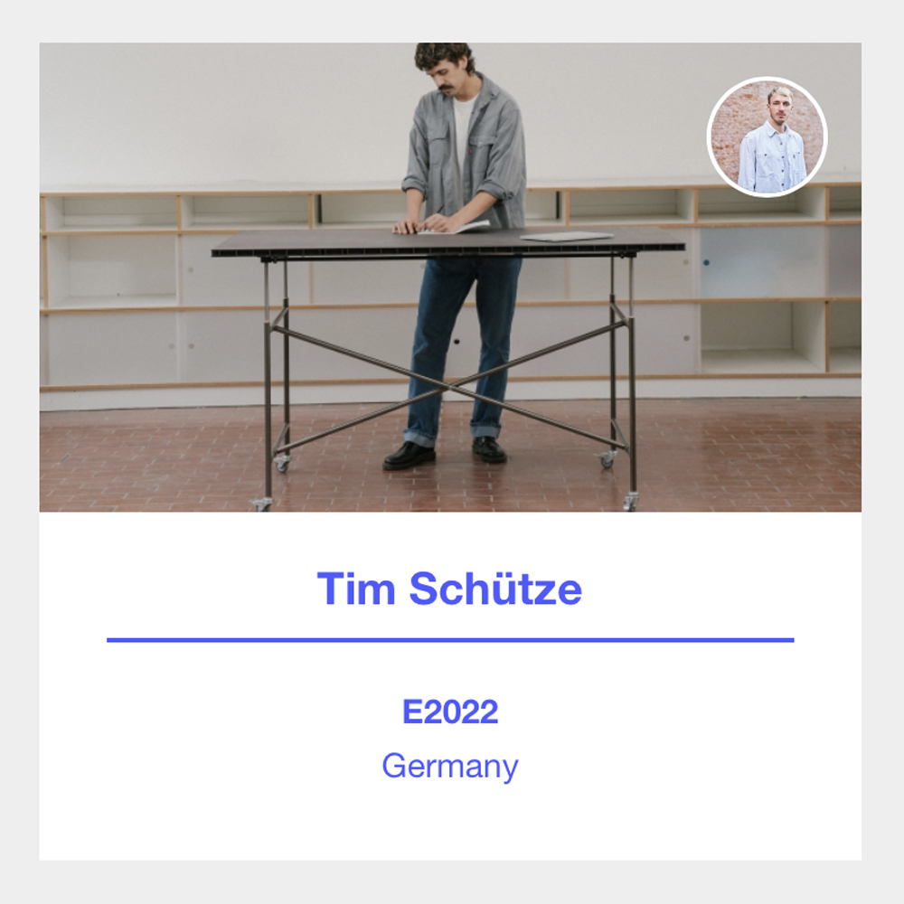
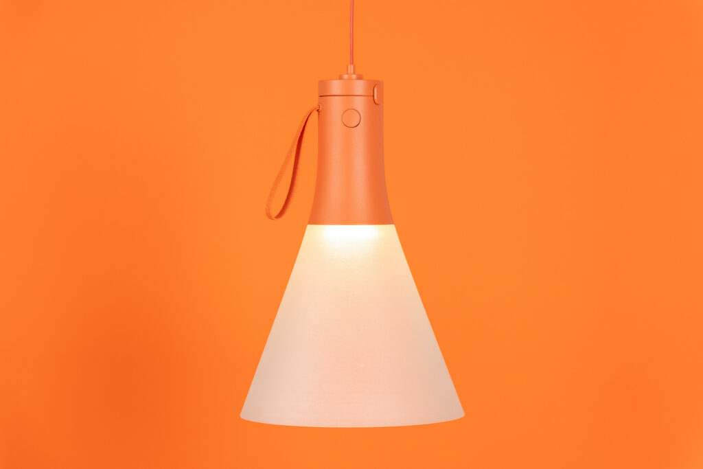
Emma Tietze & Tim Schütze – both MA students product design – are both selected for the Ein-und-Zwanzig exhibition in Milan from 17 till 23 April.
The international competition for design students, graduates, talents and newcomers organized by the German Design Council awards each year 21 projects to be presented during the Salone del Mobile 2023 to an international audience.
Nomination and participation in the one&twenty exhibition, means coverage of travel costs and accommodation, the opportunity to make contacts on site, as well as presentation in the press and social media channels of the German Design Council.
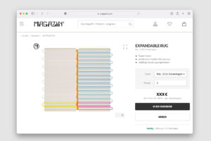
The project of Emma Tietze – Expandble Rug – was developed for the MA-cooperations project with MAGAZIN
Tim Schütze’s E2022 table found its origin in the Motion Theory project in Design & Technology 2022.
In Milan the best of all 21 projects will be announced, see/read more
Emma Tietze & Tim Schütze – beide MA-Studenten Produktdesign – sind beide ausgewählt für die Ausstellung Ein-und-Zwanzig in Mailand vom 17. bis 23. April .
Der vom Rat für Formgebung veranstaltete internationale Wettbewerb für Designstudenten, Absolventen, Talente und Newcomer prämiert jedes Jahr 21 Projekte, die während des Salone del Mobile 2023 einem internationalen Publikum präsentiert werden.
Nominierung und Teilnahme an der one&twenty Ausstellung, bedeutet Übernahme der Reise- und Übernachtungskosten, Möglichkeit Kontakte vor Ort zu knüpfen, sowie Präsentation in den Presse- und Social Media Kanälen des Rat für Formgebung.
Das Projekt von Emma Tietze – Expandble Rug – wurde für das MA-Kooperationsprojekt mit dem MAGAZIN entwickelt.
Der Tisch E2022, von Tim Schütze fand 2022 seinen Ursprung in das Motion Theory projekt in Design & Technologie.
In Mailand wird das beste aller 21 Projekte bekannt gegeben, siehe/lese weiter
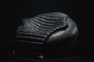
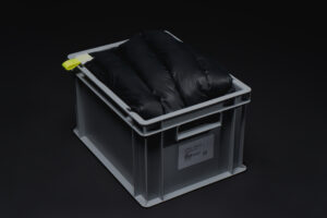
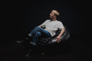
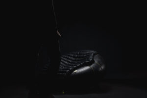
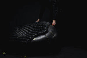
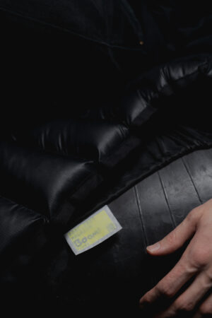
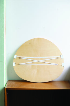
BOOM
Ein aufblasbarer Loungesessel
Die Zukunft wird kleinere Räume, häufigere Umzüge und eine direktere Verpackungslogistik bringen. Infolgedessen müssen Möbel mobiler, leichter und hybrider werden.
BOOM ist ein Prototyp eines Loungesessels, bei dem eine neue Kombination von Materialien und Konstruktionsarten erprobt wird. Das Ergebnis ist ein voll funktionsfähiges Loungemöbel, das in einer einzigen Kiste (35 x 55 x 40 cm) verstaut werden kann.
An inflatable lounge chair
The Future will bring Smaller spaces, more frequent moving, and more direct packaging logistics. As a result, furniture must become more mobile, lightweight & hybrid.
BOOM is a prototype lounge chair in which a new combination of materials and construction types are explored. The result is a fully functional piece of lounge furniture that can be stored in a single box (35 x 55 x 40 cm).

PROZESS
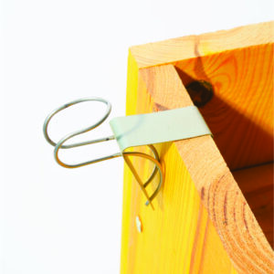
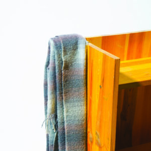
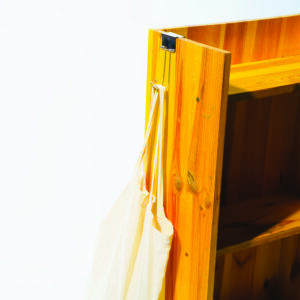
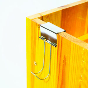
SHOOC
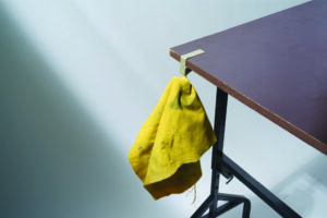
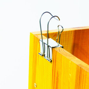
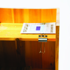
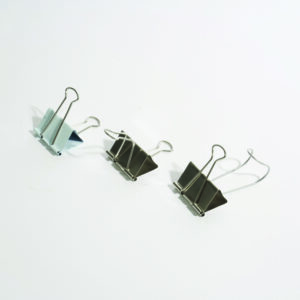
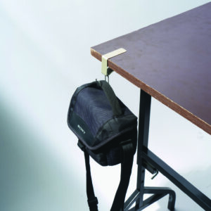
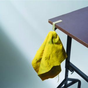
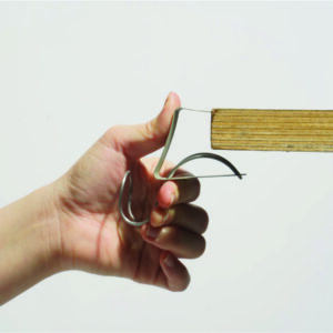
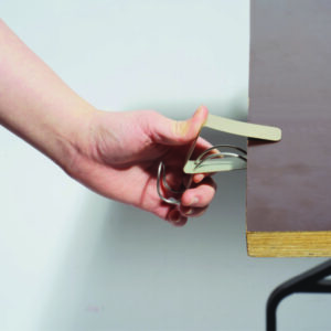
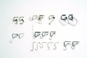
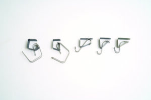
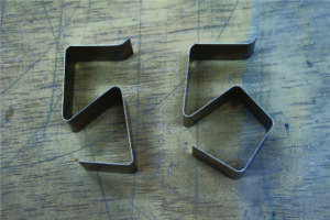
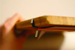
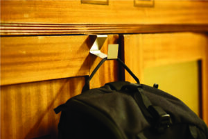
Ein Clip-Haken, der umso fester wird, je schwerer man ihn aufhängt
SHOOC kann an eine flache Oberfläche wie einen Tisch oder ein Bücherregal geklemmt werden. Dank der wippenden Struktur hält der Clip das Brett umso fester, je schwerer der Gegenstand ist, der am Haken hängt. Sowohl die Clips als auch die Haken sind aus Federstahl. Sie können ihn frei im Arbeitszimmer, in der Küche und als praktischen Aufbewahrungshelfer verwenden.
A clip hook that gets tighter the heavier you hang it
SHOOC can be clipped onto a flat surface like a table or bookshelf. Thanks to the seesaw-like structure, the heavier the object hanging from the hook, the tighter the clip grips the board. Both the clips and the hooks are spring steel. You can use it freely in the study, in the kitchen, and as a handy storage assistant.


PROZESS

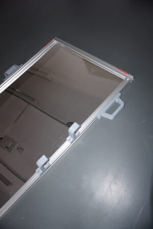
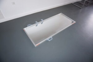
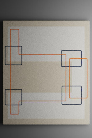
EXTRUDING REFLECTIONS
Spiegelsystem mit Aluminiumkonstruktionsprofile als Hauptgeometrie
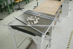
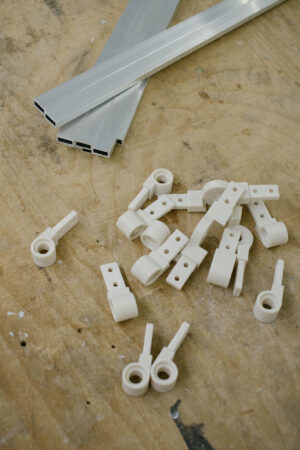
Extruding reflections ist ein spiegelsystem, welches innerhalb der Normen von Aluminiumprofilen funktioniert. Der Spiegel besteht aus einzelnen Teilen ohne dauerhafte Klebstoffe oder Verbindungen. Der Spiegel lässt sich leicht anpassen und ermöglicht einfaches Recycling, da er leicht in alle einzelnen Elemente zerlegen werden kann. Durch die Verwendung bestehender Geometrien müssen keine zusätzlichen Systeme geschaffen werden. Durch die Verwendung von Plexiglas und die zusätzlichen Griffe wird der Spiegel aus dem fragilen Kontext geholt und wird zu zu einer Art „tool“-Spiegel.
A mirror system using common aluminuim construction profiles as the major geometry
extruding reflections is a mirror system that functions within the norms of aluminum construction extrusions. the mirror consists of idividual parts without permanent adhesieves or connections. it provides easy customisation and enables easy recycling by enabeling the customers to deconstruct the mirror in its individual elements. by using existing geometries no additional systems have to be created. the mirror functions in an extremly strict way but adds playful elements that sets it apart from its contestors.
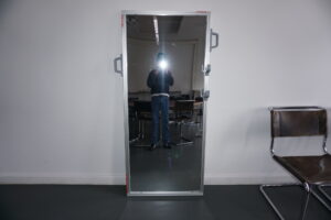


PROZESS


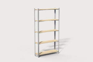
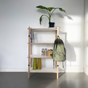
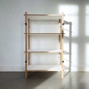
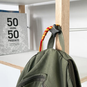
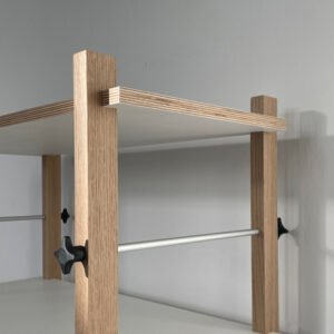
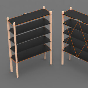
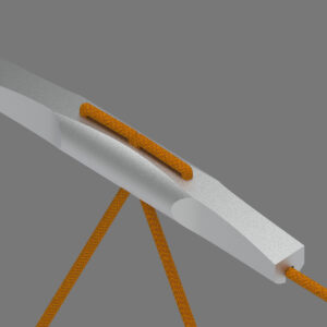
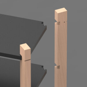
ODD STANDARDS
Ein variables Universalregal, das nachhaltige Plattenmaterialien nutzbar macht
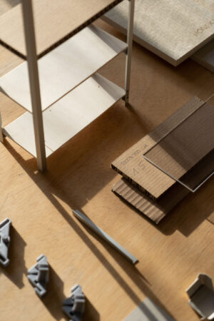
Ökologisch nachhaltige Plattenmaterialen sind für die Möbelindustrie der Zukunft von großer Bedeutung – um konventionelle Materialien zu ersetzen mangelt es jedoch oft an der Belastbarkeit. Odd Standards interpretiert vor diesem Hintergrund das Lastenregal neu. Indem die statische Belastung von der Rahmenkonstruktion getragen wird, ermöglicht es neue Freiheiten für das Material der Regalböden. Durch die Scherfunktion der Rahmenkreuze kann das Grundmaß zwischen 30–60cm Tiefe individuell angepasst werden. Eine Konstruktion aus wenigen Monomaterialien gewährleistet zirkuläre Stoffkreisläufe.
A variable multi-purpose shelving system that utilises sustainable panel materials
Ecologically sustainable board materials are of great importance for the furniture industry of the future – but to replace conventional materials there is often a lack of load-bearing capacity. In this context, Odd Standards revisits the universal shelf. By carrying the static load with the framework, it allows new freedom for the shelving material. The shear function of the frame crosses allows the base dimension to be individually adjusted between 30-60cm depth. The construction being made of only a few mono-materials ensures circular material cycles.
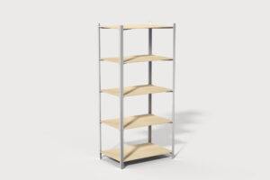
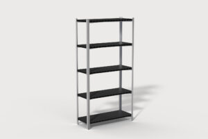
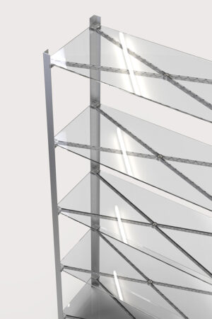
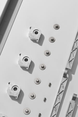
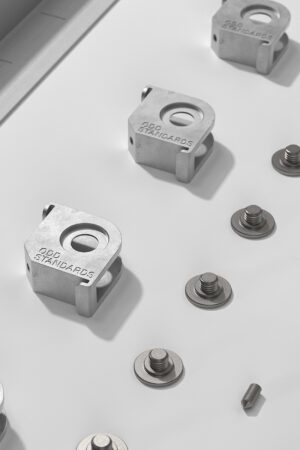
PROZESS
FAST WINGS
Ein fliegender Wäscheständer
Die Wäsche trocknet schneller. Die Nutzer profitieren von der natürlich befeuchteten Luft und dem Bewegungsspielraum. Das Produkt verbessert die Luftqualität in Innenräumen durch Ausnutzung der thermischen Bedingungen. Das minimale Design kommt mit möglichst wenig Ressourcen und Fertigung aus. Die Installation ermöglicht die Anpassung an verschiedene Raumhöhen und Grundrisse. Die Umlenkrollen machen die Wäsche federleicht.
Barrierefreies Design und haustierfreundlich
A flying clothes rack
It improves the air quality for interiors by utilizing the thermal conditions. The laundry dries faster. The users profit from the naturally moisturized air and the range of motion. The minimal design operates with less resources and manufacturing as possible. The installation adapts to multiple room heights and layouts. The pulleys make the laundry light as feathers.
barrier-free design and pet friendly
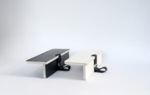
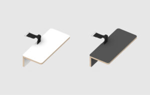
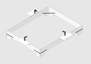
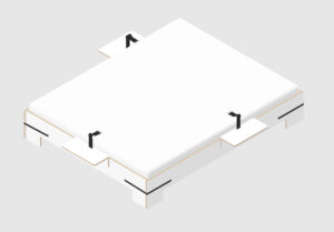
GURTBRETT
Add-On System zum MAGAZIN Sortiment
GURTBRETT ist der ergänzende Sidetable Nachttisch zum Bett GURTBETT.
Das Add-On Sortiment existiert als gesonderter Katalog, der Neukunden mit kostengünstigeren Produkten einen Einstieg in das Magazin Sortiment ermöglichen soll. Diese Add-Ons können mit bereits vorhandenem Inventar kombiniert und später mit weiteren Magazin Artikeln ergänzt werden.
Der Gedanke der Einsteiger Produkte wird realisiert durch kleinere Maßstäbe, einfache Produktionsmethoden und simple Materialauswahl.
add-on system to the MAGAZIN catalog
GURTBRETT is the complementary sidetable nightstand to the GURTBETT bed.
The add-on products exist in a separate catalog, which is intended to provide new customers with an introduction to the MAGAZIN assortment with affordable products. These add-ons can be combined with existing furnishing and later expanded with other MAGAZIN items.
The idea of entry-level products is realised through smaller scales, simple production methods and plain material selection.
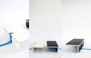
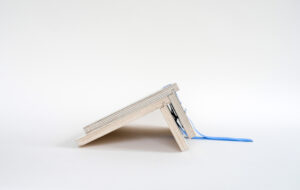
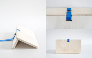
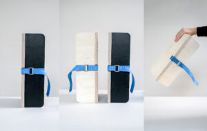
PROZESS


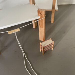
SCREW IT
Ein Regal für Stadtbewohner
„SCREW IT!“ ist ein Design, das den einmaligen Kauf eines qualitativ hochwertigen Möbelstücks für jüngere Verbraucher realistischer macht. Die Struktur dieses Regals besteht aus einem einfachen Schraubmechanismus und Überlappungsverbindungen zwischen langlebigen CNC-gefertigten Eichenbalken und Birkenmultiplex Platten. Der leim- und werkzeugfreie Mechanismus ermöglicht es den Benutzern, das Regal innerhalb von 3 Minuten auf- und abzubauen, was dem unsteten Lebensstil junger Stadtbewohner entgegenkommt, die ständig zwischen Mietwohnungen wechseln.
Jin Jing, MA WiSe 2022/23
A shelf for urban residents
“SCREW IT!” is a design that makes one-time purchase of high quality furniture product more realistic for younger consumers. The structure of this shelf is consisted of a simple screw mechanism and lap joints between durable CNC-ed oak beams and birch plywood. The glue-free, tool-free mechanism allows users to assemble and disassemble the shelf within 3 minutes, suiting the unstable lifestyle of young urban residents, who constantly drift between rental housing.
PROZESS
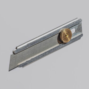
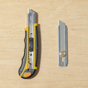
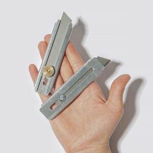
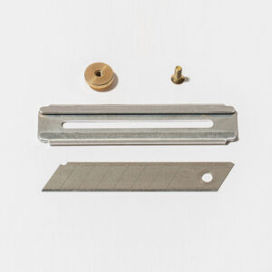
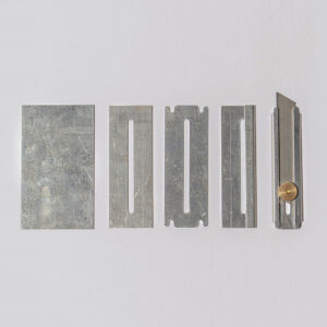
MINIMUM
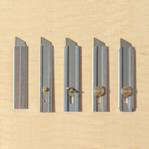
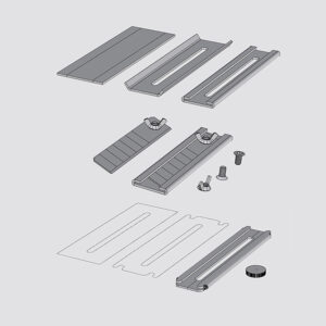
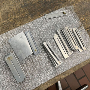
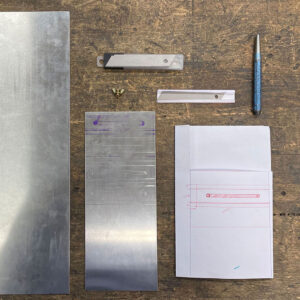
Ein einfaches Cutter
Das Projekt MINIMUM versucht, ein funktionelles Produkt mit dem geringsten Materialeinsatz und dem einfachsten Verfahren herzustellen, um das Produkt zu ersetzen, das wir jetzt verwenden. Das Messer besteht nur aus einer kleinen Aluminiumplatte, einer Schraube und einer Mutter.
A simplified knife
Project MINIMUM tries to make a functional product with the least amount of material and the simplest process to replace the product we are using now. The knife is made of just a small aluminum plate, a screw and a nut.
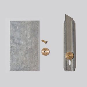

PROZESS
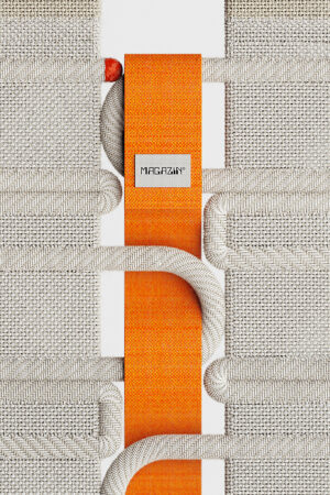
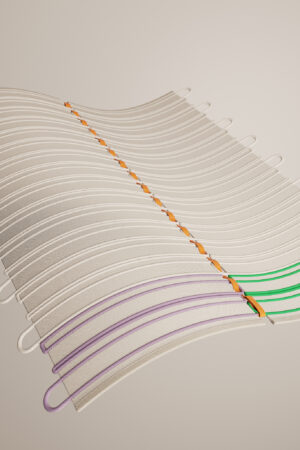
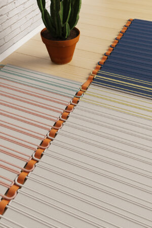
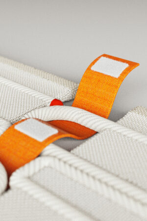
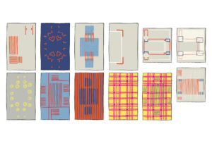
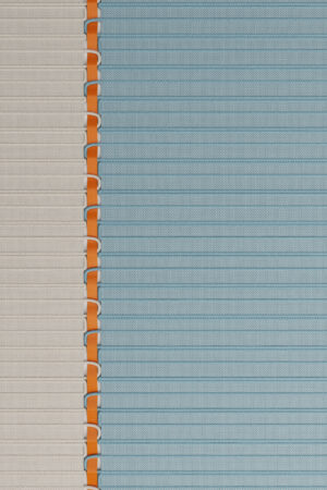
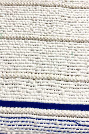
EXPANDABLE RUG
Die gewebten Teppiche der „Expandable rug“-Serie ermöglichen ein individuelles Spiel mit diversen Formaten und Mustern. Durch einen, in das Gewebe integrierten, textilen Verbinder, können einzelne Teppiche miteinander kombiniert werden. Kund*innen können so einfach passgenaue und wandelbare Raumkonzepte selbst mitgestalten.
Emma Tietze, MA WiSe 2022/23
The woven rugs of the „Expandable rug“ series allow individual play with diverse formats and patterns. Individual rugs can be combined with each other by means of a textile connector integrated into the fabric. Customers can thus easily help to design their own custom-fit and changeable room concepts.
PROZESS
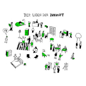
LADEN DER ZUKUNFT
Sich mit dem Laden der Zukunft auseinanderzusetzen bringt eine Reihe von Herausforderungen und Komplexitäten mit sich. Auf der Grundlage einer Analyse der eigenen Stärken und der Vision der Marke wurde ein Jahresprogramm entworfen, das das Konzept und die Philosophie für die Zukunft widerspiegelt. Der Zyklus ist ein Manifest für die gesellschaftliche Rolle, die Magazin spielen kann und ein Schritt in Richtung dieser Zukunft.
Andres Matthies, WiSe 2022723
Addressing the shop of the future brings a number of challenges and complexities. Based on an analysis of the brand’s own strengths and vision, an annual programme was designed that reflects the concept and philosophy for the future. The cycle is a manifesto for the social role that magazine can play and a step towards that future.
PROZESS
BWP ist der BusinessPlan-Wettbewerb Berlin-Brandenburg für Startups. Es wird gemeinsam durch die Senatsverwaltung für Wirtschaft, Energie und Betriebe des Landes Berlin und das Ministerium für Wirtschaft, Arbeit und Energie des Landes Brandenburg unterstützt sowie aus Mitteln der Europäischen Union kofinanziert.
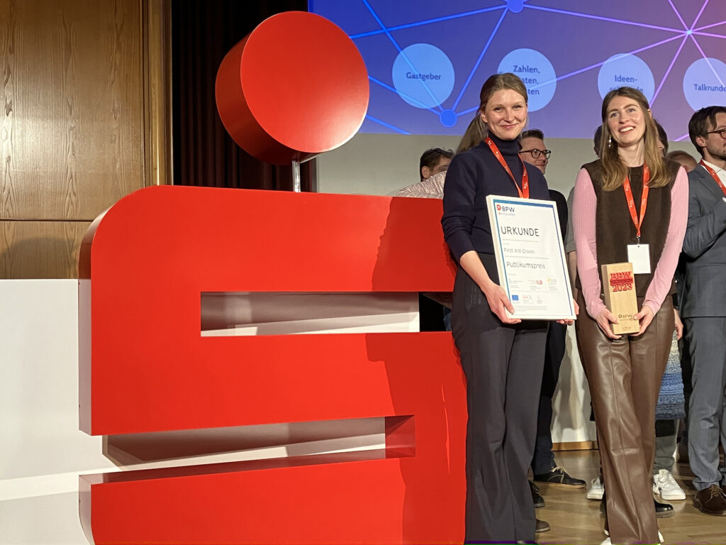
Am 29. März wurde eine Gruppe der 10 vielversprechendsten Startups, ausgewählt aus 256 Bewerbern, eingeladen, auf der Bühne der Berliner Sparkasse einen Projektpitch vor einem breiten Investorenpublikum zu geben.
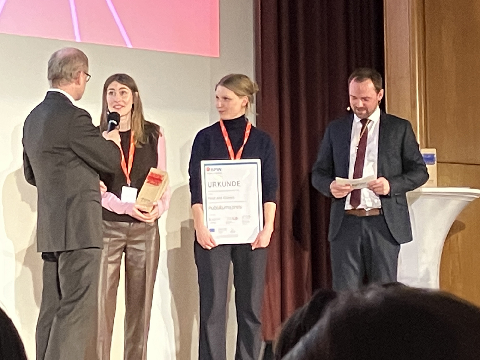
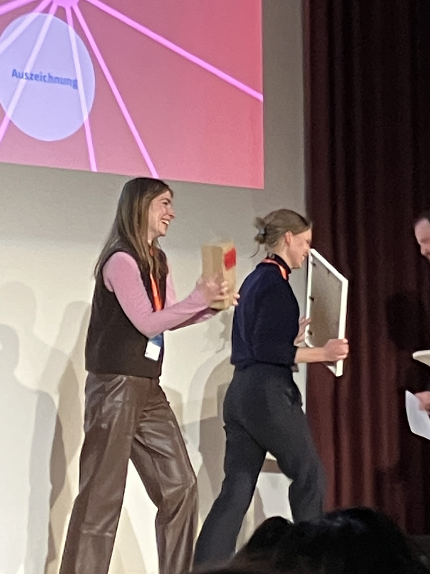
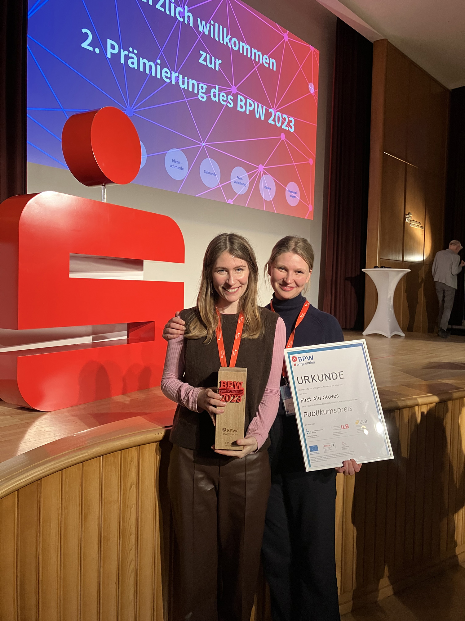
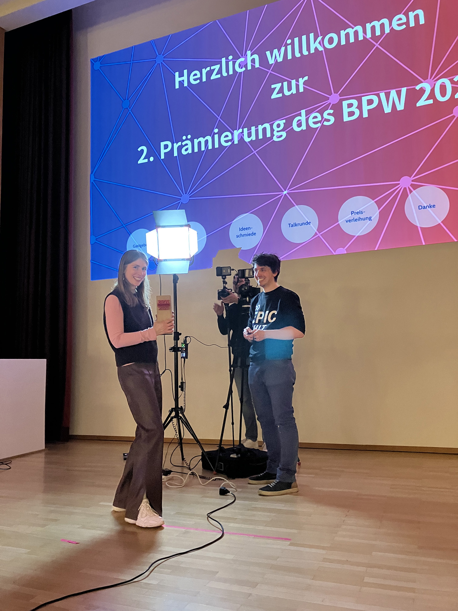
Anna Koppmann und Marie Radke – die im Creative Prototyping Stipendiums der UdK sind – stellten ihr Projekt First Aid Gloves vor und gewannen den Publikumspreis!
Die finanzielle Unterstützung des Preises ermöglicht ihnen den Start der ersten Produktion. Mehr lesen: www.bpw-berlin.de
BWP is a Businessplan competition for start-ups in Berlin-Brandenburg, supported by the Senate Department for Economics, Energy and Public Enterprises of the State of Berlin and the Ministry of Economics, Labor and Energy of the State of Brandenburg and is co-financed with funds from the European Union.
On 29. March a group of 10 most promising startups, selected from 256 applicants, were invited to give a project pitch on stage of the Berliner Sparkasse to a wide audience of investors.
Anna Koppmann and Marie Radke – who are in UdK’s Creative Prototyping Stipendium pitched their project First Aid Gloves and won the public award!
The financial support of the award allows them to start up the first production. Read more: www.bpw-berlin.de
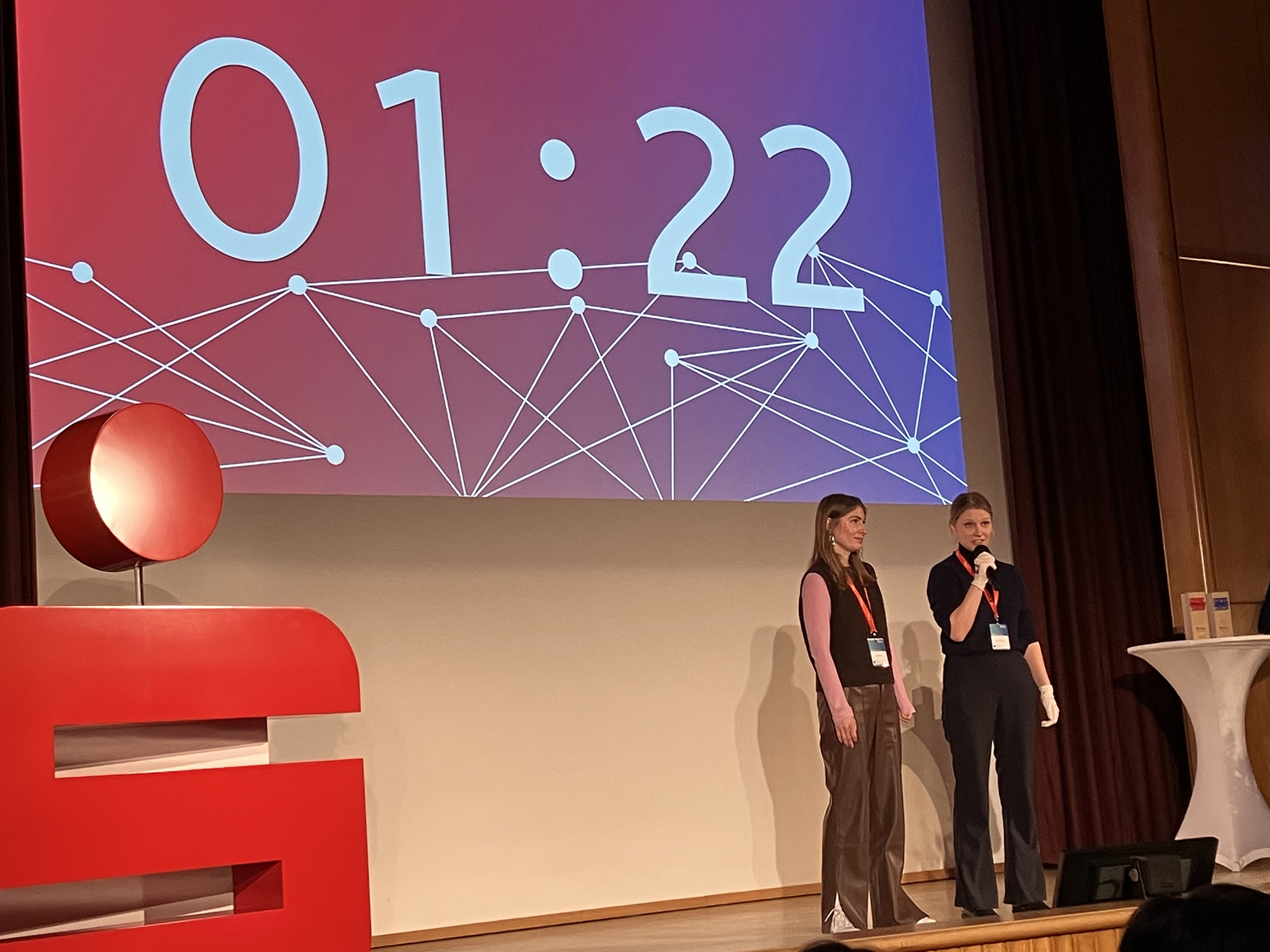
^ Pitch on stage – clock is ticking
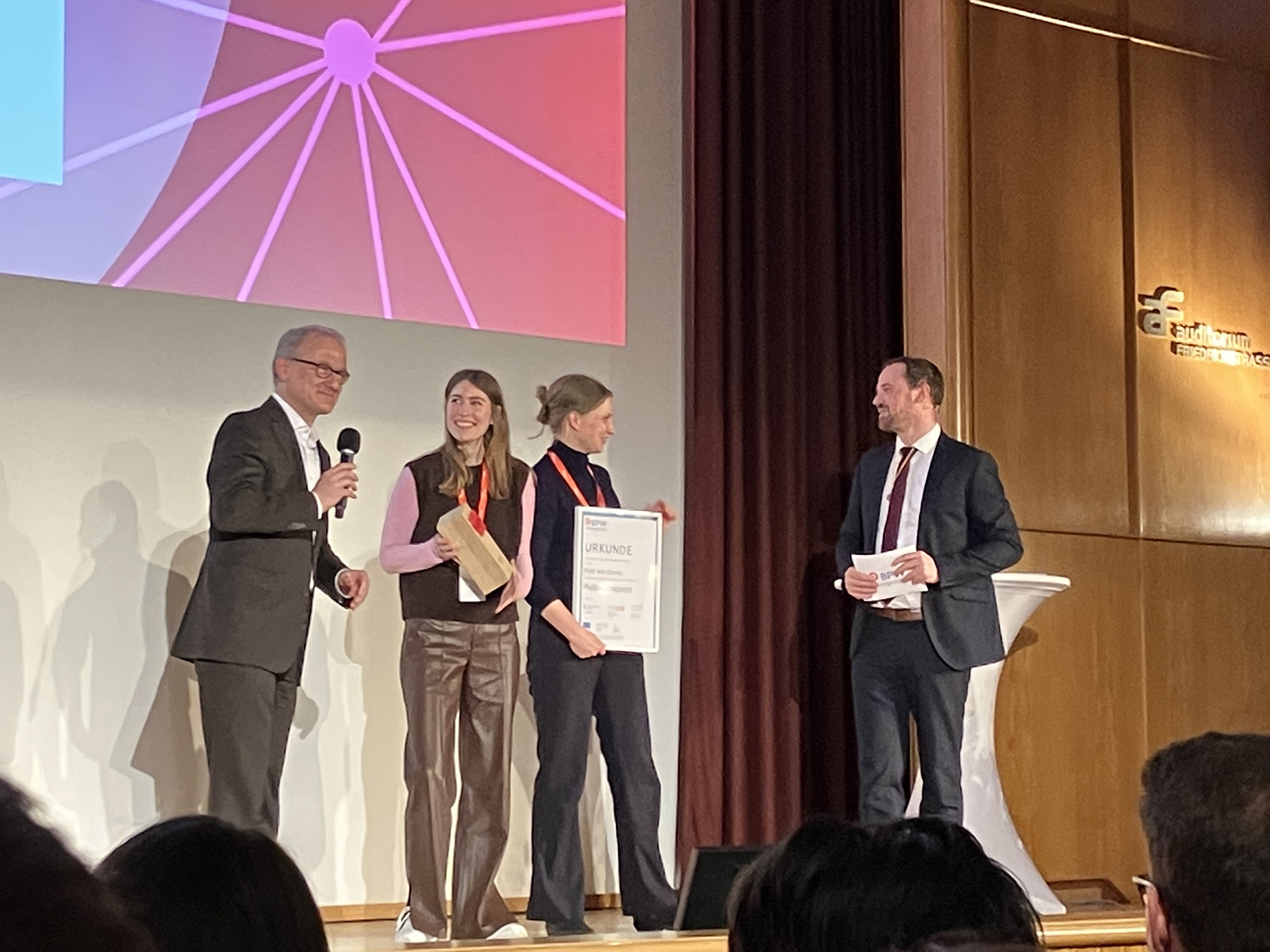
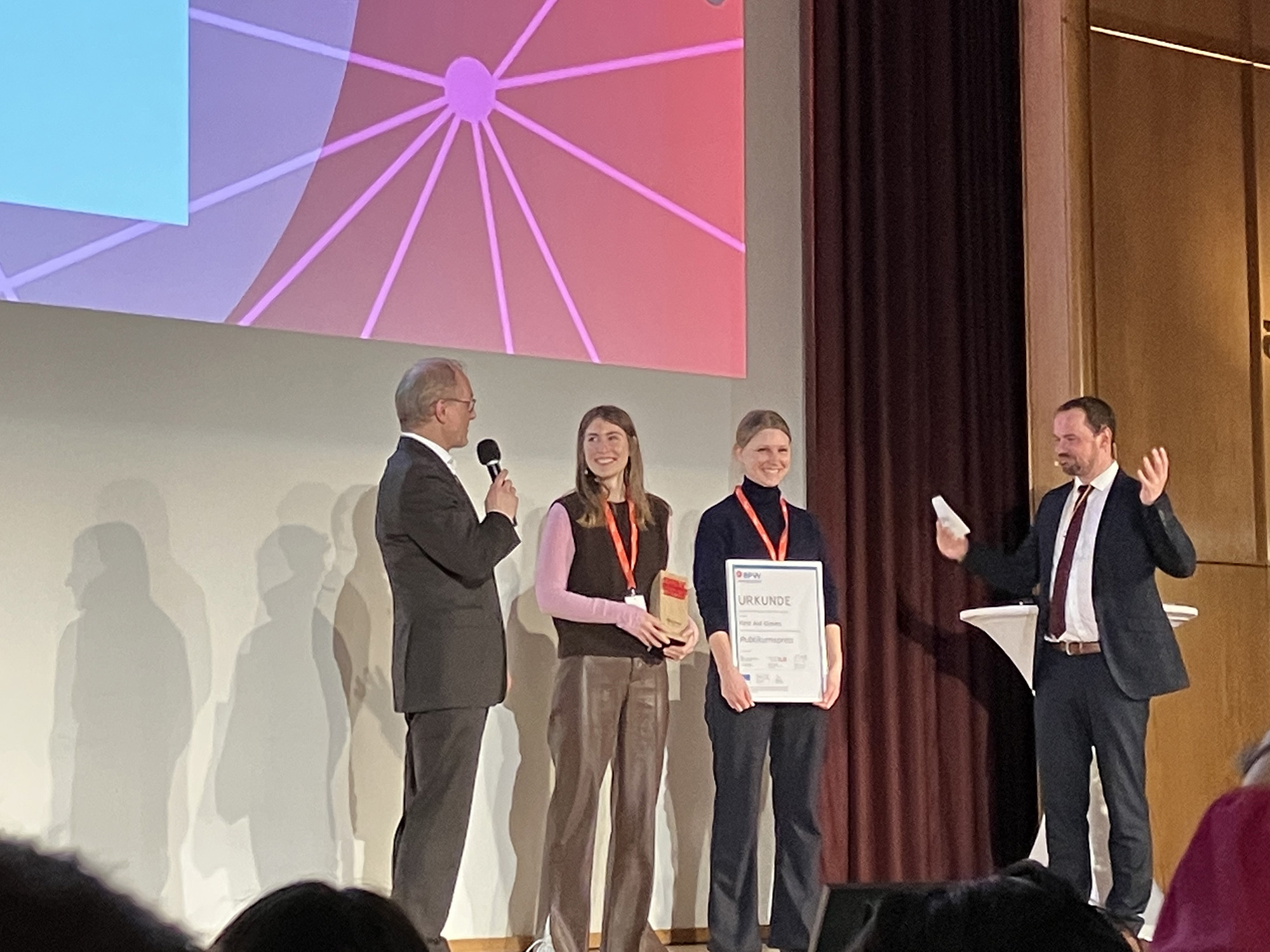 < – winners – >
 press interviews
„Ich habe den Prozess gefeiert. Das spielen und Improvisieren.“
Philipp Weber, Designer.
Master 2016.
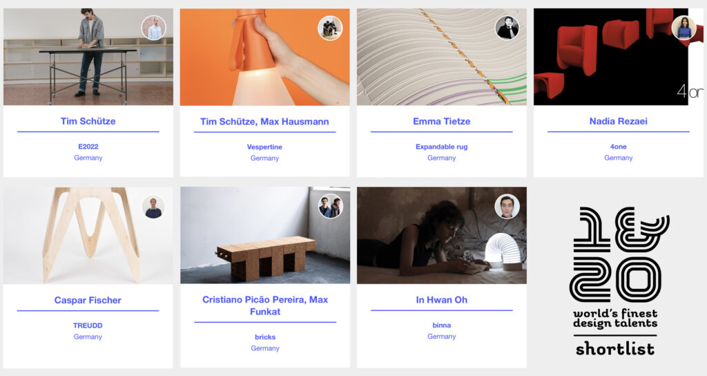
The 2023 shortlist for ein-und-zwanzig – the international young talent competition – is announced. Seven of the fifty nominees on the shortlist are students at UdK Product Design!
The German Design Council is one of the international centers of excellence in design. With the ein&zwanzig competition – initiated and organized by the German Design Council – offers design students and graduates a platform to present themselves effectively to the public. The range of her work extends from flexible systems, seating and office furniture to multifunctional objects, lights, everyday objects and textile design.
Soon the 21 designers that will be presented to an international audience will be announced, selected by an international jury.
As a winner, you will travel to the Salone del Mobile 2023, the German Design Council covers the travel costs and accommodation, and offers the opportunity to make contacts on site, as well as presentation in the press and their social media channels.
The shortlisted UdK projects are:
E2022 – Tim Schütze (MA)
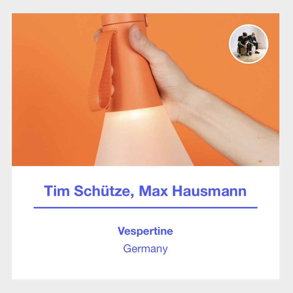
Vespertine – Max Hausmann & Tim Schütze (MA)
Expandable Rug – Emma Tietze (MA)
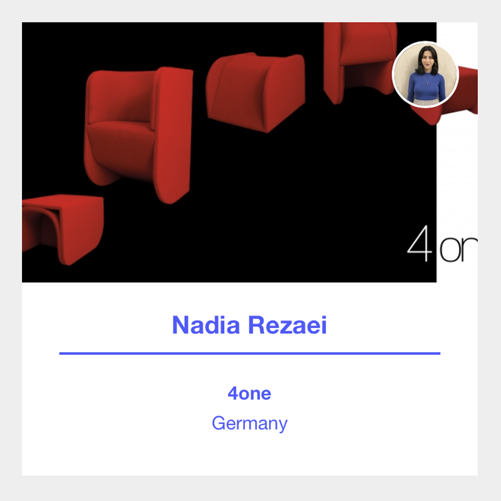
4one – Nadia Rezaei (BA 2020)
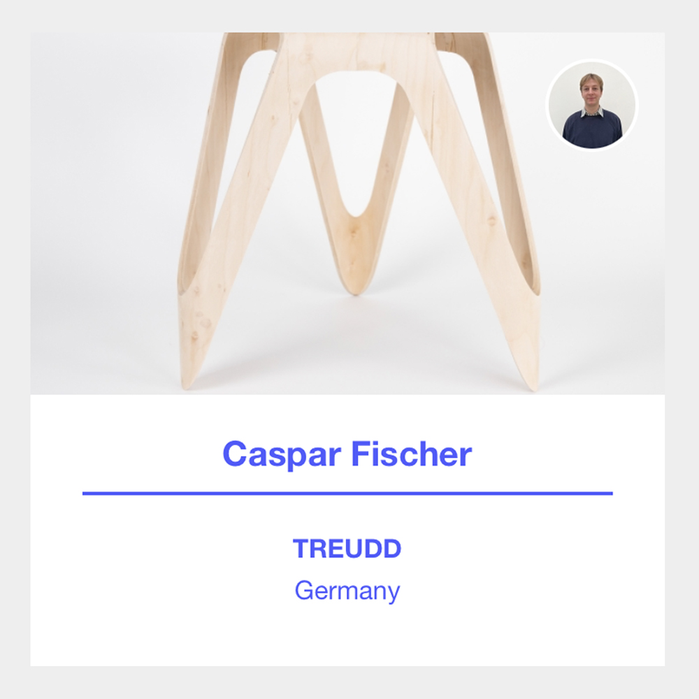
Treudd – Caspar Fischer (BA)
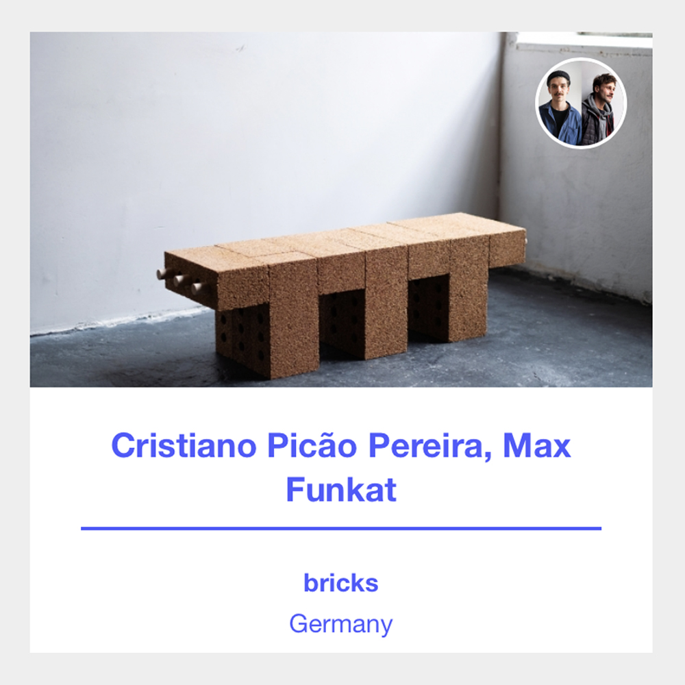
Bricks – Cristiano Picao & Max Funkat (BA)
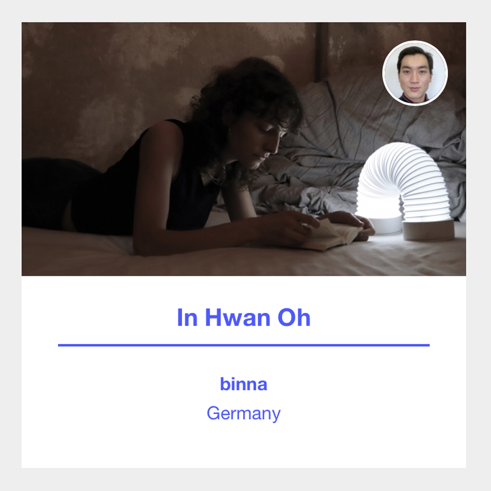
Binna – In Whan Oh (BA)
LINKS: ein-und-zwanzig (filter 2023)
End of February the DesignWanted Award 2023 winners were announced, a design competition launched and supported by DesignWanted magazine. The award aims to honor designers that are solving the world’s current problems and creating the most innovative design ideas for smarter homes and more sustainable living. Under the theme SMART HOME, over 1.500 projects from over 40 countries applied.
During Milan Design Week (April 18th to 23rd) there will be an exhibition at La Cattedrale in the Certosa area, at Via Barnaba Oriani 27
See and read more
DesignWanted Award winners announced – see you at Milan Design Week
You can apply for our Design Master studies (MA Product Design & MA Fashion Design)
From 1 March till 01 April the application procedure is open.
7. March 18:00 -19:00 (CET): online info meeting for all questions on the MA programs and the application process
PLEASE CLICK LINK HERE
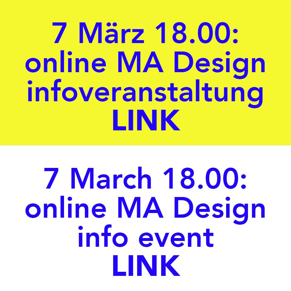
Du kannst dich für unser Design Masterstudium bewerben (MA Produkt Design & MA Mode Design) Vom 1. März bis 1. April ist das Bewerbungsverfahren geöffnet.
7. März: 18:00-19:00 Uhr (MEZ): Online Infotreffen: alle Fragen zum MA-Programm und dem Bewerbungsverfahren werden geklärt
LINK BITTE HIER KLICKEN
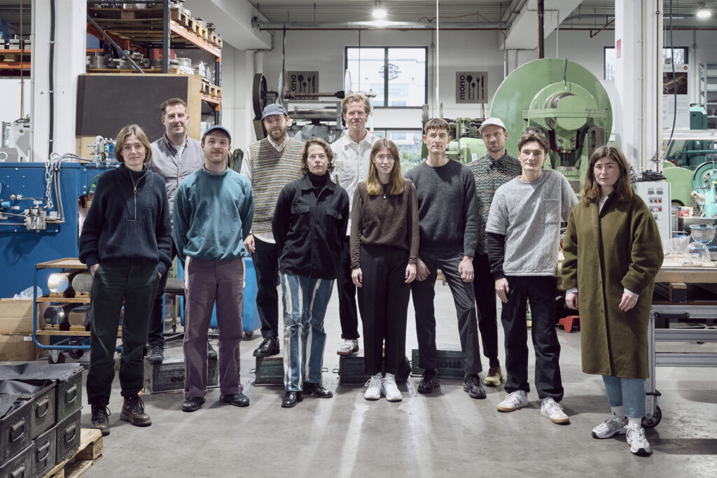
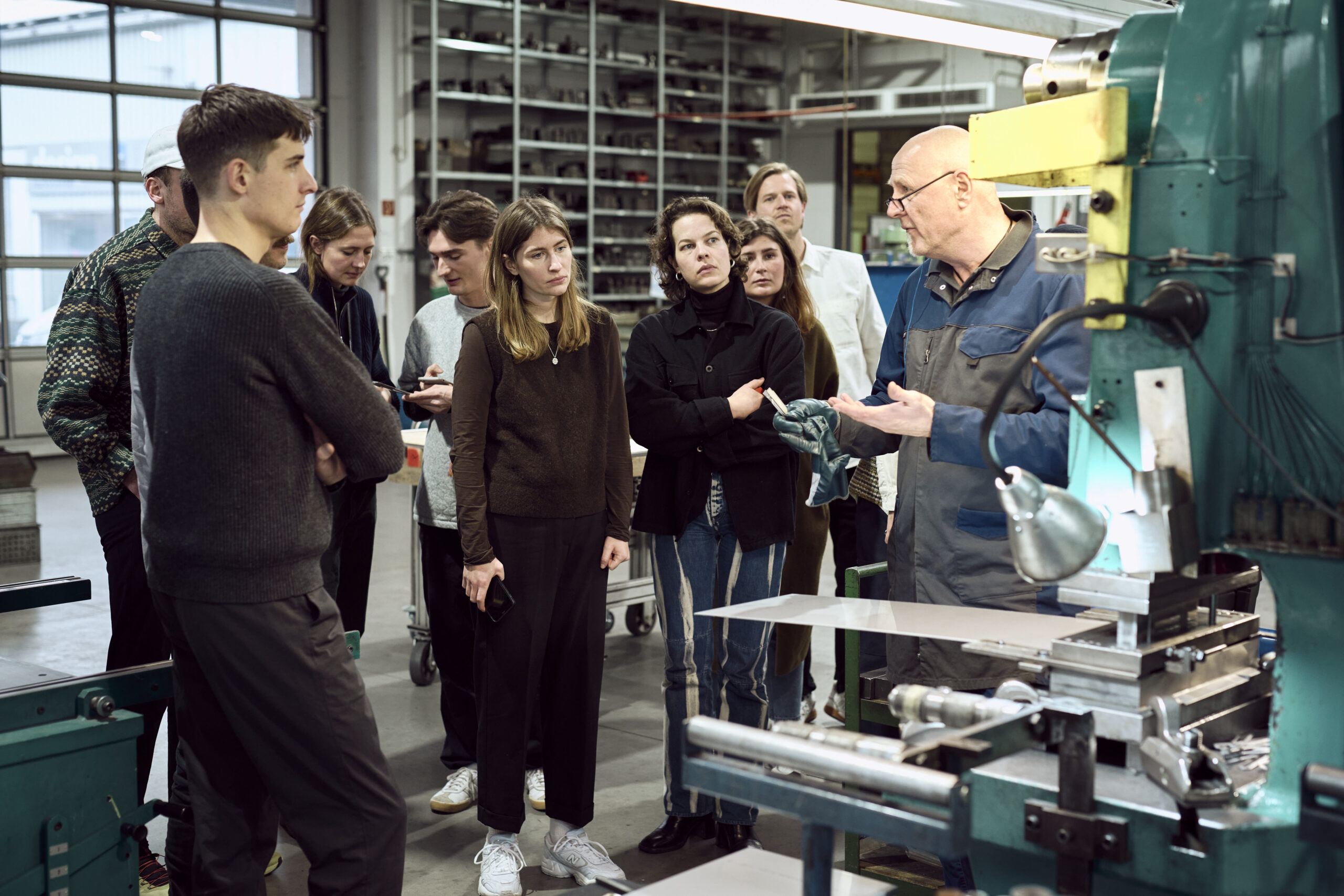
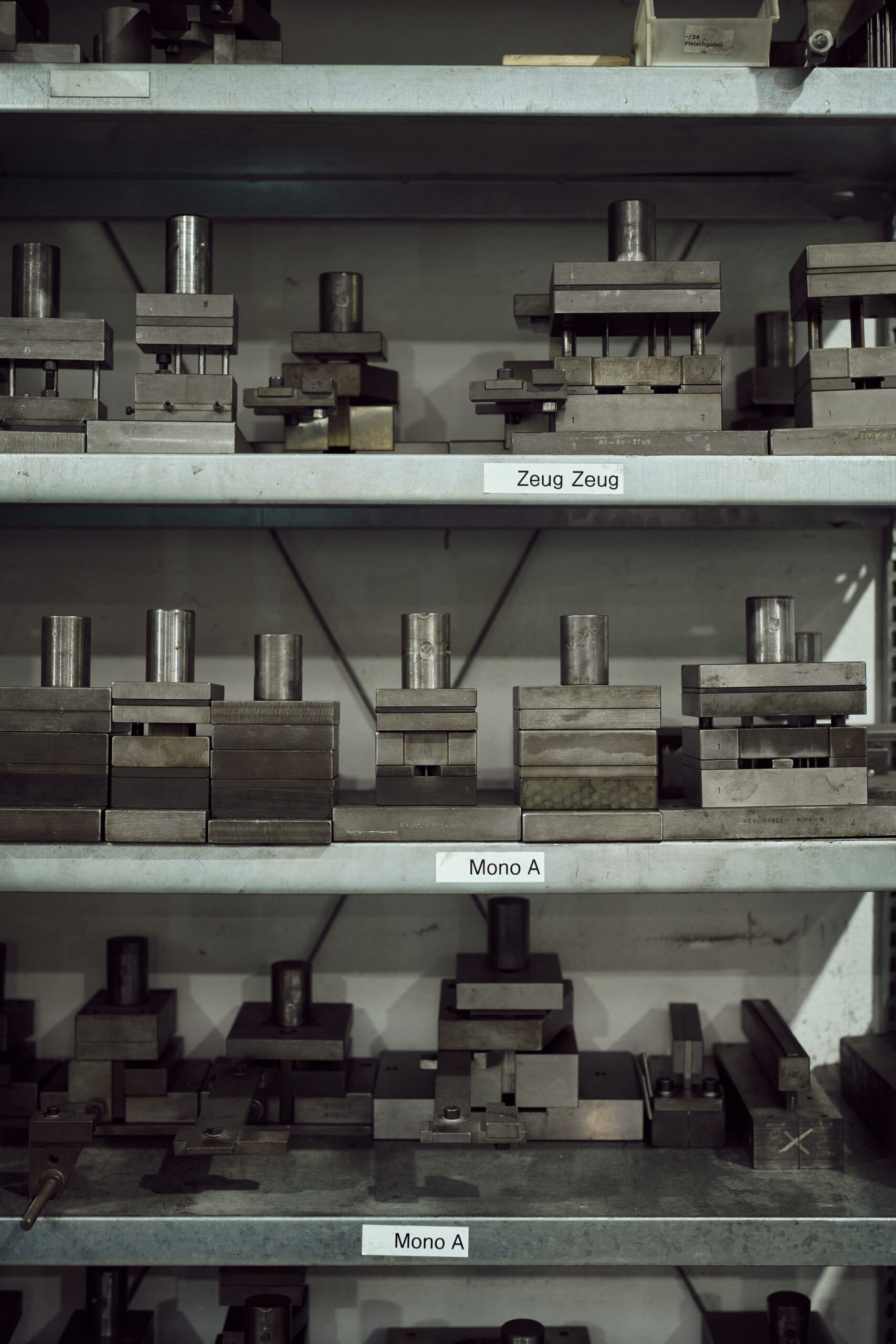
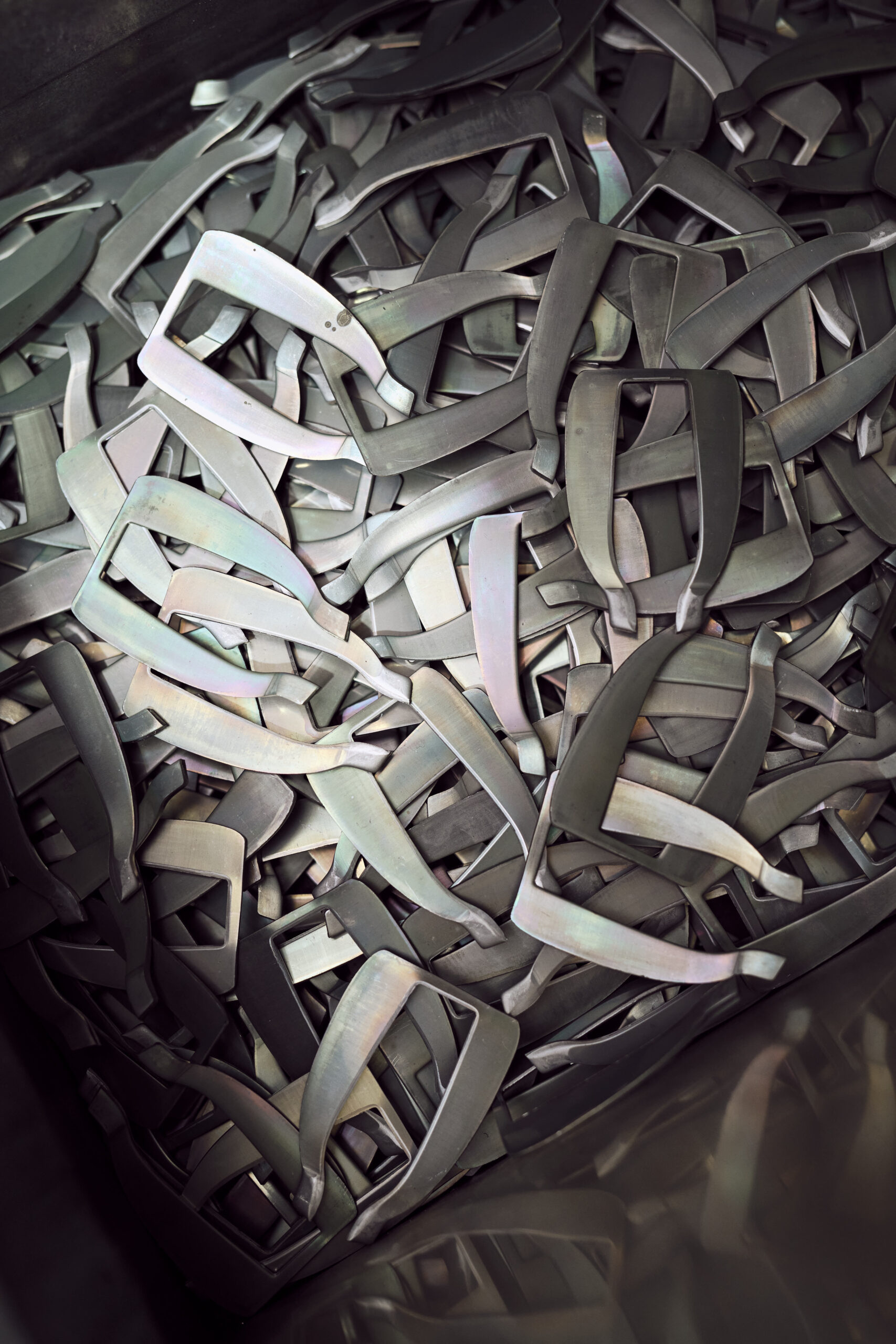
Mono Deutschland startet ein Nachwuchsförderungsprojekt mit German Design Graduates. Mit der „Mono Residency“ wurde das Familienunternehmen offizieller Botschafter der German Design Graduates. Das Residency-Projekt markiert den 40. Jahrestag der Mono-Teekanne. Für die Residency sind 10 Designer der ersten vier GDG-Jahre eingeladen, neue Perspektiven auf die klassischen Mono-Teekannen und ihr ikonisches Erscheinungsbild zu entwickeln. Darunter 4 Absolventen der UdK: Julian Ribler BA UdK 2018/19 (MA ECAL 2021), Sascha Huth BA UdK 2019/20, Matthias Gschwendtner MA UdK 2021/22, Marie Radke MA UdK 2021/22 (BA UdK 2018/19).
Das Projekt startete mit einer Einführung in der Produktionsstätten von Mono. Im Sommer 2023 werden die Designobjekte der Absolventinnen und Absolventen im Rahmen einer exklusiven Ausstellungsveranstaltung in Berlin der Presse und der Öffentlichkeit präsentiert.
Mono Germany launches a young talent development project with German Design Graduates. With the “Mono Residency”, the family business became an official ambassador of the German Design Graduates. The Residency project marks the 40th anniversary of the Mono teapot. For the residency mono picked 10 designers of the first four GDG years and has invited them to develop new perspectives on the classic Mono teapots and their iconic appearance. Among them 4 Graduates from the UdK: Julian Ribler BA UdK 2018/19 (MA ECAL 2021), Sascha Huth BA UdK 2019/20, Matthias Gschwendtner MA UdK 2021/22, Marie Radke MA UdK 2021/22 (BA UdK 2018/19).
The project started of with an introduction in the Mono production facilities. In the summer of 2023, the design objects of the graduates will be presented to the press and the public as part of an exclusive exhibition event in Berlin.
press info below and: www.mono.de / instagram
PRESSE
Mettmann, 10. Februar 2023
Mono ruft Nachwuchsförderprojekt mit German Design Graduates ins Leben.
Mit der „Mono Residency“ startet das inhabergeführte Familienunternehmen aus Mettmann als offizieller Botschafter der German Design Graduates ein Förder- projekt zum Jubiläum der Mono Teekanne.
Mono Residency
Als Botschafter der German Design Graduates – eine dem Rat für Formgebung angeschlossene Initiative im Diens- te der Nachwuchsförderung – initiiert Mono die „Mono Residency“, welche sich direkt an Jungdesigner:innen richtet. Der Familienbetrieb stellt seit über 125 Jahren am Produktionsstandort in Mettmann Designprodukte für den gedeckten Tisch in Manufakturarbeit her. 2023 lädt Mono eine 10-köpfige Auswahl der letzten vier Graduates-Jahr- gänge (2018-2022) zur Teilnahme am „Mono Residency“- Programm ein.
40 Jahre Mono Teekanne
1983 brachte das Unternehmen gemeinsam mit dem Designer Tassilo von Grolman die erste Mono Teekanne auf den Markt. Sie sollte in den folgenden Jahrzehnten zur Design-Ikone werden. Der Mono Classic Teekanne folgten die Modelle Mono Filio und Mono Ellipse, die sich ebenfalls in vielen Wohnzimmern von Tee- und Designliebhaber:in- nen weltweit wiederfinden. Dieses 40-jährige Jubiläum ist Anlass und zugleich Thema der „Mono Residency“- Erstauflage.
Neue Perspektiven
Mono lädt die Teilnehmer:innen der Residency dazu ein, zu spielen, zu intervenieren, zu dekonstruieren und neu zu kontextualisieren. Durch die Auseinandersetzung mit den Materialien der Mono Teekannen und ihrer ikonischen Er- scheinung entwickeln die Designer:innen neue Perspekti- ven auf den Klassiker. Als Ergebnis des Projekts entstehen zehn kreative Einzelstücke – zehn Kunst- und Design- objekte, welche die Materialität und Typologie der Mono Teekanne aufgreifen und die durch ihre Originalität
sowie starke Ästhetik für sich stehen.
Die zehn Jundesigner:innen
• Studio Bnag (Oliver Selim-Boualam & Lukas Marstaller) – Staatliche Hochschule für Gestaltung Karlsruhe `20/`21
• Matthias Gschwendtner – Universität der Künste Berlin `21/`22
• Justus Hilfenhaus – Bauhaus Universität Weimar `20/`21
• Sascha Huth – Universität der Künste Berlin `19/`20
• Elena Kayser – Hochschule der Bildenden Künste Saar `20/`21
• Paula Mühlena – Bauhaus Universität Weimar `20/`21
• Marie Radke – Universität der Künste Berlin `21/`22
• Silvio Rebholz – Staatl. Akademie der Bildenden Künste Stuttgart `18/`19
• Julian Ribler – Universität der Künste Berlin `18/`19
• Claire Wildenhues – Staatl. Akademie der Bildenden Künste Stuttgart `18/`19
Im Sommer 2023 werden die Designobjekte der Graduates der Presse und Öffentlichkeit im Rahmen eines exklusiven Ausstellungsevents in Berlin vorgestellt.
PRESS
Mettmann, February 10, 2023
Mono launches young talent development project with German Design Graduates.
With the “Mono Residency”, the owner-managed family business from Mettmann, as the official ambassador of the German Design Graduates, is launching a funding project to mark the anniversary of the Mono teapot.
Mono residency
As an ambassador for the German Design Graduates – an initiative affiliated with the German Design Council in the service of promoting young talent – Mono initiates the “Mono Residency”, which is aimed directly at young designers. For more than 125 years, the family business has been manufacturing design products for the laid table in manual work at the production site in Mettmann. In 2023, Mono invites a selection of 10 from the last four graduate classes (2018-2022) to participate in the “Mono Residency” program.
40 years mono teapot
In 1983, the company, together with the designer Tassilo von Grolman, launched the first Mono teapot. It was to become a design icon in the decades that followed. The Mono Classic teapot was followed by the Mono Filio and Mono Ellipse models, which can also be found in many living rooms of tea and design lovers around the world. This 40th anniversary is both the occasion and the theme of the first edition of the “Mono Residency”.
New Perspectives
Mono invites the residency participants to play, intervene, deconstruct and recontextualize. By examining the materials of the Mono teapots and their iconic appearance, the designers develop new perspectives on the classic. The result of the project is ten creative individual pieces – ten art and design objects which take up the materiality and typology of the Mono teapot and which are characterized by their originality
as well as strong aesthetics stand for themselves.
The ten young designers
• Studio Bnag (Oliver Selim-Boualam & Lukas Marstaller) – State University of Design Karlsruhe `20/`21
• Matthias Gschwendtner – Berlin University of the Arts `21/`22
• Justus Hilfenhaus – Bauhaus University Weimar `20/`21
• Sascha Huth – Berlin University of the Arts `19/`20
• Elena Kayser – Saar University of Fine Arts `20/`21
• Paula Mühlena – Bauhaus University Weimar `20/`21
• Marie Radke – Berlin University of the Arts `21/`22
• Silvio Rebholz – State. Academy of Fine Arts Stuttgart `18/`19
• Julian Ribler – Berlin University of the Arts `18/`19
• Claire Wildenhues – State. Academy of Fine Arts Stuttgart `18/`19
In the summer of 2023, the design objects of the graduates will be presented to the press and the public as part of an exclusive exhibition event in Berlin


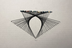
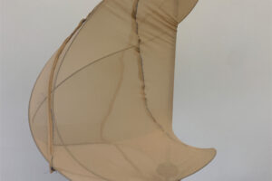
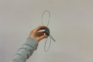
STRINGS
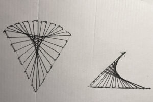
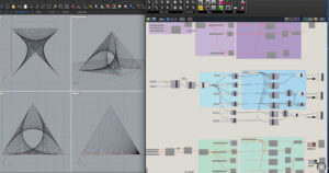
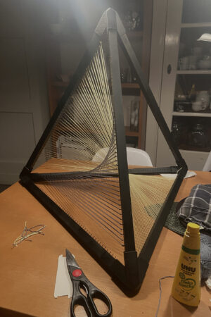
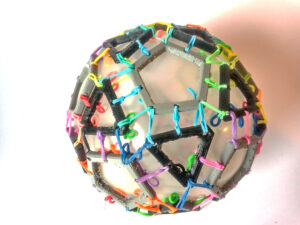
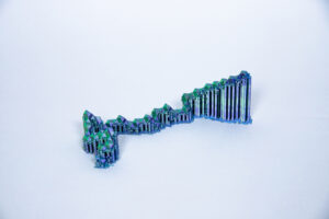
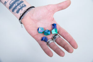
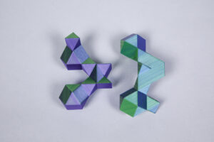
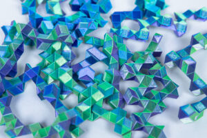
Bei STRINGS handelt es sich um eine experimentelle Erkundung von geometrischen Formen, wie dem Würfel, der Kugel und dem Tetraeder in Verbindung mit gespannten Fäden. Diese drei Formen dienen als Grundgerüst für die darin gespannten Fäden. Besonders interessant ist dabei, dass mithilfe von mehreren eng aneinander gespannten Fäden unterschiedliche kurvenartige Flächen entstehen. So wird aus etwas vermeintlich Geradem, Inflexiblem etwas Organisches und Bewegtes. Die Form des Rahmens, in dem die Fäden gespannt sind, beeinflusst die Art der entstehenden Kurven. Die Fäden durchdringen sich an einigen Stellen und bilden Verwebungen. Diese Verdichtung der Fläche bewirkt, dass die entsprechende Stelle stabiler und undurchsichtiger ist. Das größte Modell, das Tetraeder, spielt außerdem noch mit dem Thema Farbe: Blaue, gelbe und rote Fäden sind gespannt und durchdringen sich zur Mitte hin. Es entstehen Farbmischungen und Moires.
STRINGS is an experimental exploration of geometric shapes, such as the cube, the sphere and the tetrahedron in combination with tensioned threads. These three shapes serve as the basic framework for the threads tensioned in them. It is particularly interesting that different curved surfaces are created with the help of several tightly tensioned threads. In this way, something supposedly straight, inflexible becomes something organic and moving. The shape of the frame in which the threads are stretched influences the type of curves that arise. The threads penetrate each other in some places and form weaves. This compaction of the surface causes the corresponding area to be more stable and opaque. The largest model, the tetrahedron, also plays with the theme of colour: blue, yellow and red threads are stretched and penetrate each other towards the middle. Colour mixes and moires are created.


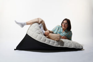
SPIDER CHAIR
Die tägliche durchschnittliche Sitzdauer in Deutschland beträgt 7 ½ Stunden, was sich nicht nur auf unsere Körperhaltung, Gelenkschmerzen und steife Gliedern auswirkt, sondern uns statistisch gesehen auch jünger sterben lässt. Der Spider Chair soll das ändern: Durch seinen unkonventionellen Kurvenverlauf lädt der Stuhl dazu ein, die Haltung regelmäßig zu verändern. Bestehend aus einer kleineren und einer höheren Rückenlehne, kann man sich in jede Richtung lehnen. Der Stahlrahmen sorgt für Stabilität, während der mehrschichtige Schaumstoff Bezug ein weiches und bequemes Sitzerlebnis kreiert.
Der Spider Chair entstand aus der Beobachtung und dem Studium der Sitzhaltung von Tänzer:innen, die ihren Körper beim Sitzen ständig bewegen, strecken und drehen. Er ist ein großartiges Werkzeug für Bewegung – sei es für Handstände und Dehnübungen – und eine bequeme Sitzgelegenheit. Man kann ihn im Büro oder zu Hause für die Arbeit am Bildschirm verwenden – beim Nach-Vorne-Lehnen kann eine aufrechte Position eingenommen werden, indem der Oberkörper und die Ellbogen abgestützt werden. Dies fördert eine gestreckte Wirbelsäule, öffnet die Lungen und entlastet die Wirbelsäule. Natürlich eignet sich der Spider Chair auch hervorragend zum Ausruhen, Lesen und Kontemplieren.
Als multifunktionales Objekt zielt der Spider Chair darauf ab, unsere Definition einer Sitzgelegenheit zu erweitern, indem wir uns auf ihm in jede Richtung lehnen können.
The daily average seating time in Germany is 7 ½ hours, which doesn‘t only affect our posture, joint pain and stiff muscles, it also statistically makes us die younger. The Spider Chair is set to change that: due to it‘s unconventional curve progression, the chair invites us to regularly change our posture. Constituted of a smaller and a taller back rest, one can lean into every direction. The steel frame provides stability, whereas the multilayered foam cover creates a soft and comfortable sitting experience.
Observing and studying how dancers sit, how they continuously move, stretch and twist their body while seated, the Spider Chair got it‘s shape. It is a great tool for movement – let it be handstands and stretching sessions – and comfortable seating option. One can use it in offices or at home for working on a screen – when leaning forward, one doesn‘t have so slouch, but one can rest their torso and elbows, aiding an elongated spine, which opens the lungs and relieves the vertebrae. And of course, the Spider Chair is great to rest, read and contemplate.
As a multifunctional object, it aims to widen our definition of a seating option by letting us lean into every direction.


Audiovisuelle Übersetzung
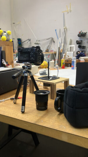
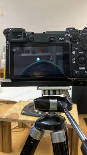
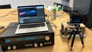
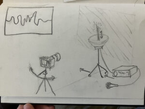
Während der Arbeit mit Audiosoftware wie Logic oder Ableton begegnen dem Nutzer häufig digital aufgezeichnete Audiowellen. Sie sind wichtig, um bestimmte Impulse oder Rhythmen im Audiomaterial zu erkennen oder zu verändern. Im Falle von aufgenommener Sprache sind diese Wellen ein fast perfektes Abbild der durch Luftschwingungen übertragenen sprachlichen Kommunikation des Menschen. Dies finde ich faszinierend, da hier deutlich wird wie naturhaft-abstrakt geformt diese Signale, die das Ohr bzw. das Gehirn sofort versteht, eigentlich sind. Mithilfe einer Kamera und einem Lautsprecher habe ich im Rahmen dieses Projekts versucht, eine momenthafte Darstellung der Audiowellen einzelner Wörter im echten Raum zu entwickeln. Hiervon ausgehend wurde untersucht, ob diese Art der Darstellung von Sprache auch eine Übersetzung sein kann. Welche Informationen sind den entstandenen Bildern zu entnehmen und könnte man lernen sie zu lesen?
Audiovisual Translation
While working with Digital Audio Workstations like Logic or Ableton one often encounters digitally produced images of audio waves. These are useful for analysing or manipulating specific impulses and rhythms in the source material. In the case of the recorded human voice they serve as an almost perfect image of our communication through the use of sound waves. The abstract and morphogenetic nature of these images and the fact, that the human ears and brain are capable of instantly understanding these signals, fascinates me. In the course of this semester I tried to develop a way of capturing the audio waves of specific words in realtime with a speaker and a camera. Based on the results I tried to determine if the images could be viewed as a translation of the spoken word. Could one learn to read them and what kind of information do they contain?


prob9
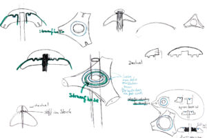
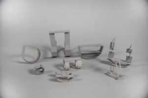
Inspiriert ist „prob9“ von Formen aus der Natur, Architektur, Medizin und anderen alltäglichen Bereichen, welche mit Druck und Spannung entstehen.
Die Formen werden durch die Veränderung der Winkel sowie Höhe und den dadurch entstehenden Minimalflächen generiert.
Die Eigenschaften von Feinstrumpfhosen und Federstahlstäben, sich an die gegebenen Bedingungen auf ihre Art anzupassen, aber auch in ihre Ursprungsform zurück zu springen, erwies sich für dieses Experiment als sehr passend.
Die Konstruktion besteht neben der Haut, aus insgesamt 10 Teilen, jeweils drei 33cm langen Federstahlstäben, zwei dreiteiligen Verbindungsstücken und einer Gewindestange in 9,18 oder 27cm länge.
Die Verbindungsteile bestimmen den Ausgangswinkel (0°, 30°, 90°) der Stäbe und sind somit ein ausschlaggebender Faktor für die entstehende Form. Genau so wichtig ist aber auch der Abstand der verbindenden Elemente um die Form zu verändern.
Hierbei fällt z.B auf, dass die Stäbe je nach Winkel ab einer bestimmten Höhe zur Seite ausweichen und die Form sich dabei verdreht wie ein Softeis.
So sind drei Gruppen entstanden, um die Unterschiede sowie die Ähnlichkeiten der einzelnen Formen darzustellen.
„prob9“ is inspired by forms in nature, architecture, medicine and other fields, which are created with pressure and tension.
The shapes are generated by changing the angles as well as height and the resulting minimal surfaces.
The properties, of fine pantyhose and springsteelrods, to adapt to the given conditions, but also being able to revert back to their original form, proved to be a very suitable quality for this experiment.
In addition to the skin, the construction consists of a total of 10 parts, three 33cm long springsteelrods each, two three-part connecting pieces and a threaded rod in 9,18 or 27cm length.
The connecting parts determine the initial angle (0°, 30°, 90°) of the rods and are thus a decisive factor for the resulting shape. Just as important, however, is the distance between the connecting elements in order to change the shape.
Here, for example, it is noticeable that the rods, depending on the angle, move to the side from a certain height and the shape twists like a softicecream.
Thus, three groups have been created to show the differences as well as the similarities of the individual shapes.


MONO
MONO ist ein Experiment, bei dem ich untersucht habe, wie weit ich von einer einfachen Form kommen kann, um ein funktionales Objekt zu schaffen. Die Grundform, die ich verwendete, war ein abgerundetes Quadrat mit vier Flügeln, und sie definierte die Grenzen und die Freiheit meines Spiels. Diese freie Form gab mir zahlreiche Variationen, um nach Formen und Strukturen zu suchen, und führte mich schließlich dazu, eine mögliche Form für ein Regal zu entdecken. Die nächste Herausforderung bestand darin, zu bestimmen, wie diese Form für ihre beabsichtigte Funktion hergestellt werden kann. Ich habe verschiedene Materialien und Technologien untersucht und mich schließlich für PVC und Sperrholz als mögliche Optionen entschieden. Ich fand die Arbeit mit Kunststoff sowohl inspirierend als auch einfach, während die Arbeit mit Sperrholz mehr Aufwand und Präzision erforderte und der Form einen komplexeren Charakter verlieh.
MONO is an experiment in which I investigated how far I could get from a simple shape to create a functional object. The basic shape I used was a rounded square with four wings and it defined the boundaries and freedom of my play. This free form gave me numerous variations to search for shapes and structures, ultimately leading me to discover a possible shape for a shelf. The next challenge was to determine how to produce this shape for its intended function. I explored different materials and technologies, ultimately settling on PVC and plywood as possible options. I found working with plastic to be both inspiring and easy, while working with plywood required more effort and precision, giving the shape a more complex character.


Lost and Found
Der Titel „Lost and Found“ basiert auf dem, was ich im Semester erlebte.
Ich war von Anfang des Semesters sehr verwirrt, was die Bedeutung des Hauptthemas ist, und ich fand endlich heraus, wie ich an diesem Projekt arbeiten sollte.
Nachdem ich mich mit der Zeit abmühte, meinen Weg zu finden, verstand ich die morphogenetische Strategie, und jetzt sehen wir, wie die eingeschränkten Parameter und die Kurven schöne Ergebnisse als Form ergeben.
Die Parameter werden auf dem Zentimeterpapier berechnet und die Streifen mit gleicher Länge werden darauf nur um die X-, Y-Achse verschoben.
Jetzt erleben wir die morphogenetische Strategie und Methoden mit verschiedenen Formen und verstehen sie.
The title ‚Lost and Found‘ is based on what I experienced in the semester.
I was very confused from the beginning what the meaning of the theme is and I finally found the way how I got to work on this project.
After I struggled in time to find my way, I understood the morphogenetic strategy and now we see how the restricted parameters and the curves make beautiful outputs as form.
The parameters are calculated on the centimeter paper and the strips with the same length are only moved to the X, Y axis on it.
Now we experience the morphogenetic strategy and methods with different forms and understand it.
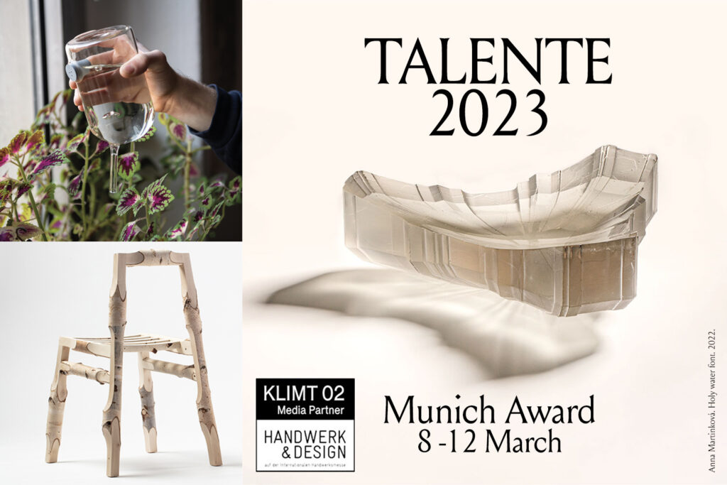
The graduation works of Agnes Kelm (DAS TUN AN SICH) and Matthias Gschwendtner (NEW SOURCES) is selected for Talente: 8-12 March.
The competition TALENTE – Meister der Zukunft showcases the most innovative works by young designers from across the globe. Whether glass, textiles, jewellery, ceramics or furniture making: the special exhibition of «Handwerk & Design» brings together a diverse range of design areas. A total of 98 participants from 24 countries were selected by an expert jury to present their work at the event. The public will then have the opportunity to take a closer look at the designs of the future in Hall B1 from 8 to 12 March 2023, read more
At talente they both won a TALENTE Preis
Internationale Handwerkmesse Munich
Hall B1: Talente – Am Messesee B1.4
instagram


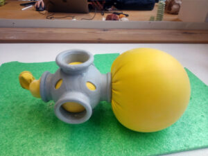
Hardshell Softcore
Wie eine Form entsteht und sich weiterentwickelt.
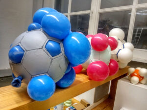
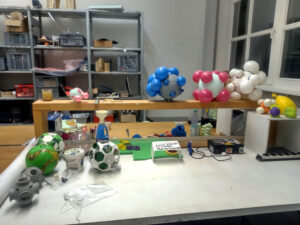
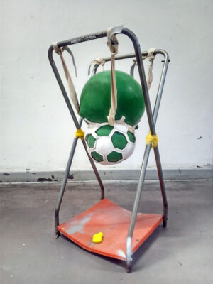
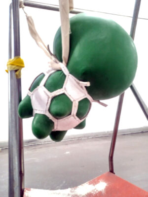
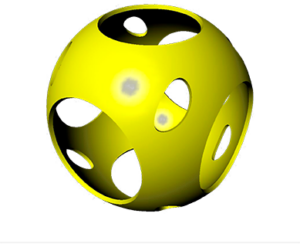
Ausgangspunkt ist die Sphäre. Basierend auf dem Muster von Sportbällen wie dem Fußball, Basketball und Tennis Ball habe ich angefangen, diese auseinanderzunehmen. In der ersten Testreihe habe ich ein Muster ausgewählt, dieses als Exoskelett repliziert und mit flexiblem Filament (TPU) 3D gedruckt.
Fünf Winkel und Dreiecke bestimmen die Kugel. Die einzelnen Elemente werden mit sogenannten „Loom Rubber Bands“ zusammengehalten. Beim Einsetzen und Aufblasen des Ballons kann die Kugel durch die Elastizität der Bänder und Formelemente vergrößert werden. Jedoch reagierte die flexible Außenhülle mit der elastischen Innenstruktur und das Ergebnis war nicht zufriedenstellend – es behält die gleiche Form.
Anhand dieses Prototyps habe ich zwei Restriktionen festgelegt: es bedarf einer harten Schale und einem weichen Kern.
Auf der ursprünglichen Grundidee des Balles erfolgten mehrere schnelle Experimente.
Für eine neue Formfindung in der ursprünglichen Geometrie habe ich Teile aus den Kugeln geschnitten und sie mit Luftballons gefüllt. Im Anschluss wurde das Befüllen mit Luft bis zum Maximum getestet. In weiteren Experimenten dieser Art konnte ich die Koinzidenz so bewusst kontrollieren, indem ich Muster, teils symmetrisch, teils ungleichmäßig, durch Ausschnitte in den Bällen erstellt habe.
Um mich von den typischen Merkmalen der Sportbälle zu entfernen habe ich lediglich die, auf der Kugel erzeugten, Lochmuster übernommen, in das 3D-Programm Rhino kopiert und damit Geometrien aus PLA-Filament gedruckt.
Aus vorherigen Experimenten mit den aufgeblasenen Ballons in einem Fußball erwiesen sich die Ergebnisse jedoch als wenig flexibel, was die mögliche Weiterentwicklung der resultierenden Form einschränkte. Die Fähigkeit des Morphens sollte erhalten bleiben.
Dafür wurden die Luftballons mit Mehl gefüllt – wie Antistressbälle. Durch die elastische Oberflächenspannung des Latex entsteht das zusätzliche Potenzial einer weiteren Verformung und Veränderung der aus den Löchern austretende Volumen. Das Ergebnis sind flache, platte, lange oder abgerundete Formen durch eine unterschiedliche Anordnung der Löcher in der Schale und der Formbarkeit der mit Mehl gefüllten Ballons.
Inspiriert ist das Projekt von kaputten Fahrradreifen, bei denen der Schlauch herausragt und Luftblasen bildet, oder den gerissenen Nähten eines Sportballs. In diesen Fällen verlieren die Objekte ihre Funktion und wirken einschränkend auf die Nutzung. Als Einschränkung des praktischen Nutzens verwende ich Formkomponenten, um meine Prototypen herzustellen. Damit verleihe ich der entarteten Sphäre eine formale Ästhetik. Darüber hinaus könnten diese Formen im Möbelbau und Design oder in der Architektur verwendet werden.
How a form develops and evolves.
Starting point is the sphere. Based on the pattern of sports balls like the soccer, basketball and tennis ball I started to take them apart. In the first series of tests, I chose a pattern, replicated it as an exoskeleton, and 3D printed it with flexible filament (TPU).
Five angles and triangles define the ball.
The individual elements are held together with so-called „Loom Rubber Bands“. When the balloon is inserted and inflated, the sphere can be enlarged due to the elasticity of the bands and form elements. However, the flexible outer shell reacted with the elastic inner structure and the result was not satisfactory – it keeps the same shape.
Based on this prototype, I set two restrictions: it requires a hard shell and a soft core.
Several quick experiments were made on the original basic idea of the ball.
To find a new shape in the original geometry, I cut parts from the balls and filled them with balloons. Afterwards the filling with air was tested to the maximum. In further experiments of this kind, I was able to control the coincidence so consciously by creating patterns, some symmetrical, some uneven, through cutouts in the balls.
To move away from the typical features of sports balls I simply took the hole patterns created on the ball, copied them into the 3D program Rhino, and used them to print geometries from PLA filament.
However, from previous experiments with the inflated balloons in a soccer ball, the results proved to be not very flexible, which limited the possible further development of the resulting shape. The ability to morph should be preserved.
For this purpose, the balloons were filled with flour – like anti-stress balls. The elastic surface tension of the latex creates the additional potential of further deformation and change in the volumes exiting the holes. The results are flat, platy, long or rounded shapes due to a different arrangement of the holes in the shell and the malleability of the flour-filled balloons.
The project is inspired by broken bicycle tires, where the tube protrudes and forms air bubbles, or the torn seams of a sports ball. In these cases, the objects lose their function and have a limiting effect on their use. As a limitation to practical use, I use molded components to create my prototypes. In this way, I lend a formal aesthetic to the degenerate sphere. Furthermore, these forms could be used in furniture making and design or in architecture.


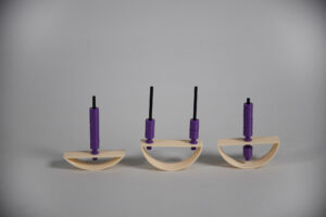
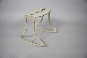
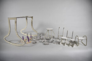
NUA
NUA ist ein Schaukelhocker, der sowohl für regelmäßige Bewegung als auch für eine stabile und aufrechte Sitzposition konzipiert wurde. Bei NUA geht es darum, unseren Körper dynamisch zu bewegen und Bewegung auch in Situationen zu ermöglichen, in denen langes Sitzen erforderlich ist. Er lädt uns ein, spielerisch in unser Zuhause zu kommen und verschiedene Sitzpositionen im Alltag zu erkunden. Das Wort ‚NUA‘ stammt aus der hebräischen Sprache und bedeutet ’sich bewegen‘ in einer imperativen Form. NUA wurde im Rahmen einer Untersuchung von Schaukelformen entworfen, bei der verschiedene Geometrien erstellt wurden, um zu testen, welche Kriterien für die ideale Schaukel erforderlich sind. Das endgültige Modell ist aus Birkensperrholz gefertigt und mit CNCFräsen geschnitten.
NUA is a swinging stool that was designed to allow regular movement as well as a stable and upright sitting position. NUA is designed to allow our bodies to move dynamically and to enable movement even in situations where prolonged sitting is required. It invites us to add playfulness into our home and explore different sitting positions during our daily routine. The word ‚NUA‘ stems from the Hebrew language and means to ‚move‘ in an imperative form. NUA was designed as part of a research on swinging forms in which different geometries were created to examine which criterias are required to create the ideal swing. The final model is made of Birch plywood and cut through CNC milling.


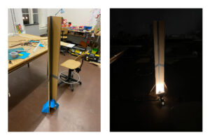
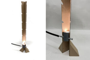
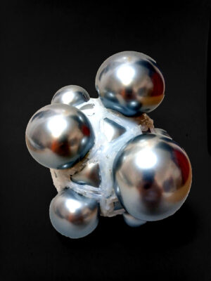
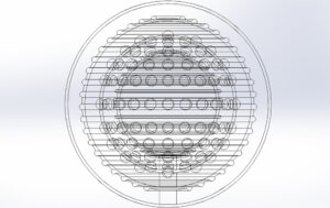
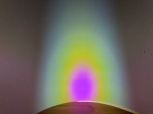
KIERA6
Eine Erkundung der Grenzen des einteiligen 3D-Drucks
Beim Herumspielen mit verschiedenen Volumina und ihren Verbindungsmöglichkeiten habe ich einen faszinierenden Effekt entdeckt. Wenn man einen kleinen Zwischenraum zwischen zwei Flächen lässt und ihn mit Wasser füllt, entstehen durch die Oberflächenspannung des Wassers Formen, die wachsen und sich auf organische Weise verändern wenn man eine der Flächen leicht bewegt.
Ich setzte mir die Herausforderung, dies in eine Lampe zu integrieren und begann mit dem 3D-Drucken der ersten Modelle, die darauf abzielten, diesen Effekt hervorzuheben und ihn in Beziehung zu Licht zu setzen. Für die Herstellung dieser Modelle verwendete ich den SLA-Druck, da ich ein wasserdichtes und mindestens lichtdurchlässiges Material benötigte. Bei der weiteren Optimierung habe ich aber schnell gemerkt, dass ich an die Grenzen dieses Herstellungsverfahrens stoße, also wollte ich herausfinden, wo diese für das von mir erstellte Design genau liegen. Ich fing also an, viele kleine Modelle zu drucken, welche die entscheidenden Parameter meines Designs erproben sollten und diese an ihr Limit brachten, so lange bis der Druck fehlerhaft verlief.
Danach hatte ich eine ziemlich komplexe 3D-Datei, die alle beweglichen Teile enthält und in einem Stück gedruckt werden kann. Die Oberflächen werden von Magneten bewegt und im inneren der Lampe kann eine Glühbirne angebracht werden. Das einzige Problem, das noch bleibt, sind die Kosten für den Druck in Originalgröße. Das Produkt wirklich drucken zu lassen ist aufgrund der komplexen Nachbearbeitung sehr teuer und konnte daher noch nicht realisiert werden, was bedeutet, dass meine Arbeit an diesem Projekt noch nicht vollendet ist.
An exploration of the limits of one-piece-3D Printing
By playing around with different volumes and their possibilities of connection, I have found a fascinating effect. If you leave a small space between two surfaces and fill it with water, the surface tension of water creates forms inbetween, which grow and change in an organic way by slighty moving one of those surfaces.
Challenging myself to integrate this into a lamp I started 3D-Printing first models that were aimed to expose this effect and put it into relation of light. I used SLA-Printing to manufacture those models as I needed a water tight and at least translucent material. But with further optimization I quickly realized that I am reaching the limits of this manufacturing process, so I wanted to find out where exactly these limits are for the Design I made. So I printed a lot of small models, which were testing the parameters that are important for the Lamp to work as intended. Then started to play around and overdoing them until failure.
Having done that, I was left with a fairly complex 3D-file which had all moving parts inside and could be printed in one piece, afterwards the surfaces could be moved with magnets and a lightbulb could be fitted inside the lamp. The only problem that is left is the cost of printing it in actual size, which I could not afford, so my work on this Project is to be continued.


Expansions
Since early days, man has tried to demarcate for himself a piece of the space under under something, in an attempt to create for himself and others a protected, understandable, shared-intimate area- a place for himself.
The research began searching for different tension structures from various disciplines – architecture, furniture, fashion, military, dance and more, in an attempt to design a new roof, that is capable of opening and closing, holding itself and the surrounding forces.
While researching, I saw that nature provides solutions of a completely different order than humans – massive and monolithic geological structures, stretching and climbing branches or alternatively, thin and flexible micro structures in leaves and animals, crafted to perfection through millions of years of evolution and iterations.
The Expansions project presents my attempt to take one principle from the plant world – the expansion of the margins in relation to the center of the surface, and translate it to the virtual realm. With the help of CAD modeling and node-based coding, I created a catalogue of objects that erect themselves, changing from simple 2D into a complex and constructive 3D shapes.
What can we do with such catalogue? We can look at the tests as they are, a pixelated and fascinating gif, we can translate them to textile, metal and concrete, or use them in new ways.
Those moments of digital tension and release are both a thin simulacrum of nature and at the same time new 3D entities of themselves which live in the new spaces that man is beginning to create around himself in our new, emerging virtual habitats, as a new exciting field of kinetic design.
https://www.figma.com/proto/MJCwcP1NhPbQYRmiHjPdFq/EXpantions?page-id=0%3A1&node-id=1%3A2&viewport=270%2C65%2C0.22&scaling=min-zoom&starting-point-node-id=1%3A2


DB!
Wenn eine Reihe einfacher, individueller Objekte zu einer kollektiven Einheit werden, verlieren sie manchmal ihre Individualität und verwandeln sich in ein massives Ding, das als neues, unabhängiges Wesen organisch wächst. z.B. Favelas in Rio de Janeiro, oberirdische Stromleitungen in Tokio oder Wohnhochhäuser in Hong Kong.
Mit einem Vektorgleichgewicht (Kuboktaeder), einer einfachen, aber sehr spezifischen Struktur, möchte ich modellieren, was als Morph-Variante begann, indem ich die 12 Scheitelpunkte des Vektors in Richtung Zentrum bewege.
Gleichzeitig ist die Vernetzung der Geometrie in 3D-Grafiken in der realen Welt auch eine Möglichkeit, modellbezogene Probleme zu lösen.
When a set of simple individual objects become a collective entity, sometimes they lose their individuality and metamorphose into a massive something that grows organically as a new, independent creature. e.g. favelas in Rio de Janeiro, cables spreading overhead in Tokyo or residential skyscrapers in Hong Kong.
Using Vector Equilibrium, a simple but very particular structure, I aim to model something that begins with a deformed variation by moving the 12 vertices on the vector toward the centre point.
At the same time, this is also an approach to solving the problems associated with modelling that can mesh the geometry in 3D graphics in the actual world.


beim wachsen zusehen
Für das Projekt „FormLab – morphogenetische Strategien und Methoden“ wurde ich von Porzellan und dem 3D Keramikdrucker inspiriert. Ich habe mir für mein Projekt vorgenommen, zwei neue Arbeitsmittel intensiv kennenzulernen: das Programm Rhino7 und den 3D Keramikdrucker.
Ich habe während meines Projekts zahlreiche Testreihen und fünf finale Serien gedruckt. Die Vorbereitung und Betreuung des 3D Druckers ist zeitintensiv und hat mich viel gelehrt – das lebendige Material Porzellan muss gut vorbereitet werden und hat seine Tücken. Die Drucke dauerten zwischen 15 und 45 Minuten und mussten ständig beobachtet und manchmal korrigiert, sowie neu gestartet werden. Teilweise mussten auch komplexe Objekte während des Drucks mit dem Heißluftföhn angetrocknet werden, damit sie nicht zu schwer werden und die Wände absacken. Nach dem Druck mussten die Objekte einmal gebrannt, lackiert, und noch ein zweites Mal gebrannt werden. Dieser Workflow benötigt ein gutes Zeitmanagement, um die Objekte dann wirklich zum Projektende fertigzustellen.
Entstanden sind fünf Serien mit je drei bis vier Objekten. Die Verformung und Veränderung dieser Objekte habe ich in Rhino7 konstruiert. Die Parameter für die Verformung habe ich nach visuellen Kriterien angepasst und so sichtbare Veränderungen erreicht, die dem Material und der Schwerkraft standhalten. Mein Ziel war es, das Material Porzellan im Laufe der Serien an seine physischen Grenzen zu bringen.
Die erste Serie ist eine freie organische Form, welche ich extrudiert und dann in sich gedreht habe. Die zweite Serie ist eine freie geometrische Form, die nach demselben Prinzip verformt ist. In der dritten Serie habe ich mich auf das Volumen konzentriert, welches sich im Laufe der Serie immer weiter vergrößert. Die vierte Serie zeigt vier geometrische Grundformen vom Fünf- bis zum Achteck, welche extrudiert und in sich verdreht sind. Die fünfte Serie zeigt drei Formen, die eine organische Grundform haben und sich parallel so weit verschieben, wie es mir im Druck möglich war.
watching it grow
For the project „FormLab – morphogenetic strategies and methods“ I was inspired by porcelain and the 3D ceramic printer. I have decided to get to know two new tools intensively during the project: the 3D modelling program Rhino7 and the 3D ceramic printer.
I printed numerous test series and five final series during my project. The preparation and managing of the 3D printer is time-consuming and has taught me a lot – the lively material porcelain has to be prepared well and has its pitfalls. The prints took between 15 and 45 minutes and had to be constantly monitored and sometimes corrected and restarted. In some cases, complex objects also had to be dried with a hot air gun during printing so that they didn’t become too heavy and the walls sagged. After printing, the objects had to be fired once, varnished, and then fired a second time. This workflow requires good time management to finish the objects in time for the deadline.
Five series were created, each with three to four objects. I constructed the deformation and modification of these objects in Rhino7. I adjusted the deformation parameters according to visual criteria and thus achieved visible changes that withstand the material and gravity. My goal was to push porcelain to its physical limits over the course of the series.
The first series is a free organic shape that I extruded and then twisted into itself. The second series is a free geometric shape, deformed according to the same principle. In the third series, I focused on the volume, which continues to increase as the series progresses. The fourth series shows four basic geometric shapes from pentagons to octagons, which are extruded and twisted. The fifth series shows three forms that have an organic basic shape and shift in parallel as far as I was able to in the print.
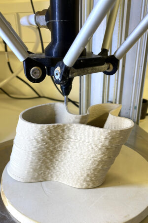
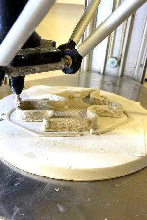
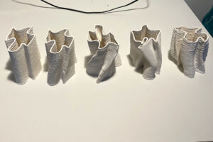
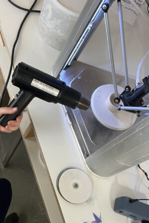


K_NOT
Ein Knoten ist eine absichtliche Komplikation im Tauwerk, die praktisch, dekorativ oder beides sein kann; ein Schlaufenknoten ist jeder Knoten, der eine Schlaufe bildet. Es ist ein morphogenetischer Prozess, bei dem die Art des Knotens, das Material und die Spannung das Ergebnis bestimmen.
In meinem Projekt habe ich die Verwendung von Knoten als Strukturen zur Manipulation und Verzerrung von Ton erforscht. Nach und nach begann ich, die Knoten als eigenständige Formen zu betrachten. Sobald ich sie wachsen ließ, versuchte ich, ihre Details zu reduzieren, um sie von den Eigenschaften der Schnur zu abstrahieren und ihre komplizierten Details zu vereinfachen. Ich erreichte dies, indem ich sie zunächst durch Tiefziehen filterte und dann digital manipulierte, indem ich ihre Größe und Triangulation anpasste.
Mein Ziel war es, die strukturelle Integrität des Knotens zu bewahren und ihn gleichzeitig so zu präsentieren, dass seine natürliche Entwicklung und seine digitale Neukonfiguration deutlich werden.
Das Endergebnis ist eine Vase aus Beton.
A knot is an intentional complication in cordage that may be practical, decorative, or both; a loop knot is any knot creating a loop. It s a morphogenetic process, in which the type of knot, the material and the tension determine the outcome.
For my project, I explored the use of knots as structures for manipulating and distorting clay. As I progressed, I began to view knots as independent forms. Once I made them grow I tried to reduce their details in order to abstract them from the characteristics of the cord, simplifying their intricate details. I achieved this by initially filtering them through deep drawing, and then digitally manipulating them, adjusting their size and triangulation.
My aim was to preserve the knot’s structural integrity while presenting it in a way that conveyed its natural evolution and digital reconfiguration.
The end result is a concrete vase.
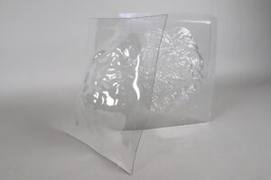
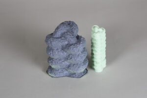
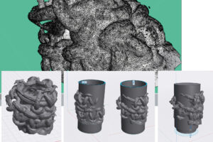
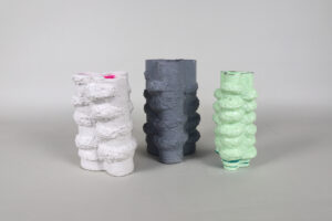
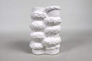
My very first notion was wanting to find a way to store clothes that didn’t require folding them. Whether it is hanging, rolling or any other innovative way- I knew I didn’t want to go for the a archityp. The model that started the whole process was born during team work. We constructed a wheel on which you can hang your clothes; with hanger, clothespins or just as it is. From then on, the Idea kept evolving, whist keeping the round shape and the spinning factor. Eventually the wheel-closet became a simple round compartment, with no shelves, no bars and no drawers.
I believe many people, just like myself, sometimes have trouble with picking what to wear In the morning. Sometimes you are just too tired, too distracted or are in a hurry. But what if you didn’t have to choose? What if someone could choose for you? I finally decided to design a closet made for socks – and potentially, any other form of clothing too – that would choose for you which Item you will wear. Simply spin the wheel, and I will spit out a random ball of socks.
PROZESS
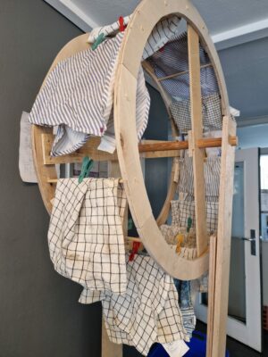
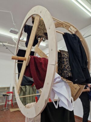
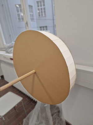
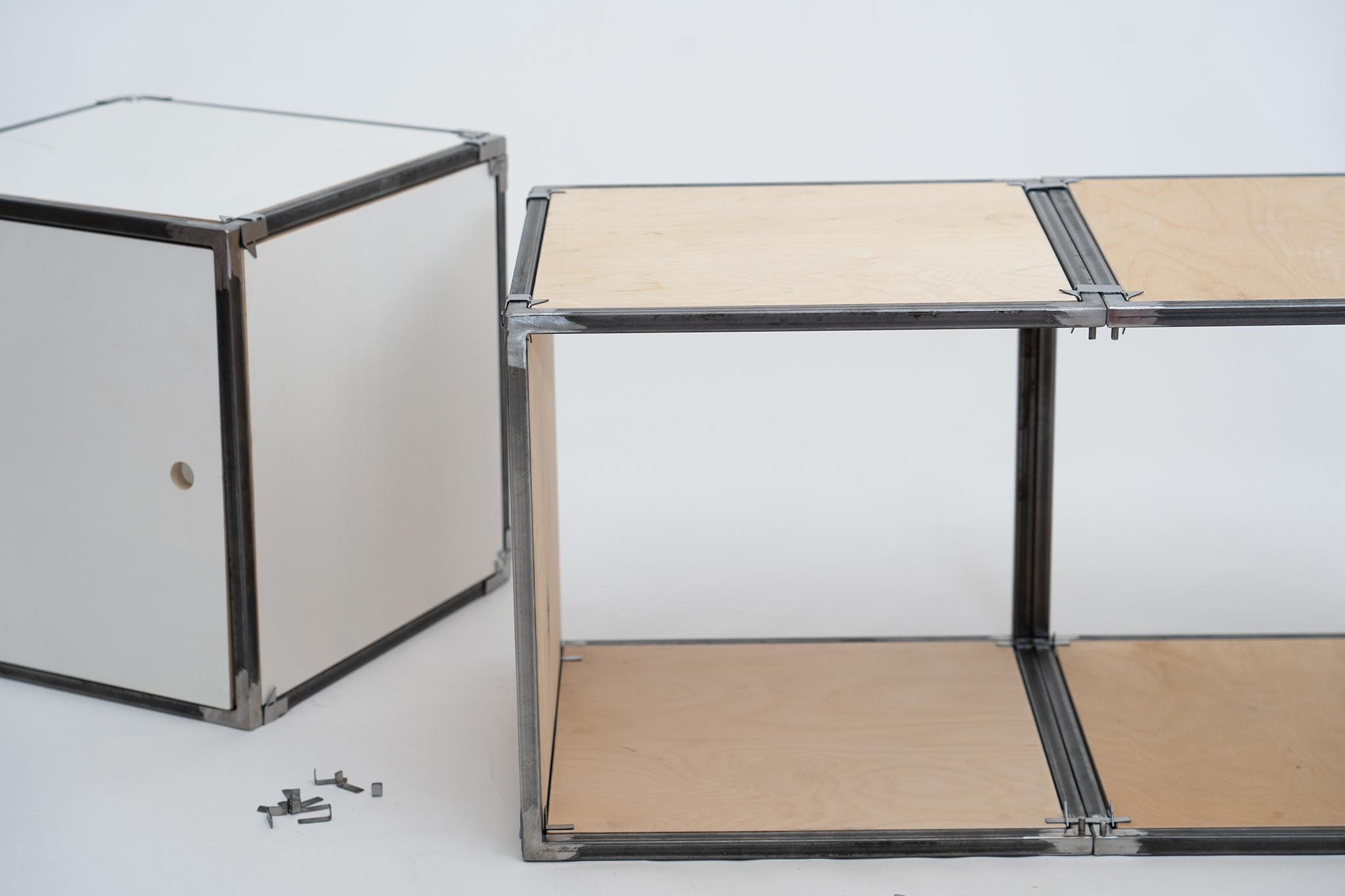
Ein modulares Schranksystem zum Stecken und Ver-stecken. Es besteht aus Metallquadern und Holz-einlegeplatten. Die einzelnen Quader können beliebig aneinander gesteckt werden und somit
jegliche Wunschdynamik annehmen. Zum Verbinden werden Steckklammern, gefertigt aus Stahlblech und zwischen den einzelnen Quadergestellen angebracht. Diese halten zusätzlich die Holzeinlagen.
Es handelt sich um ein einfaches Steckprinzip, bei dem weder Schrauben noch Werkzeuge beim Zusammenbauen benötigt werden. Zum Verschließen eines jeden Moduls, gibt es optional
eine verschiebbare Schranktür. Das STEQ System ist robust gebaut und hält mehr als das eigene Körpergewicht. STEQ gibt dir Raum zum Verstauen. Mit STEQ kannst du selbst frei gestalten
A modular system to store and hide your belongings. Metal squares and wooden panels, can be stacked individually adapting to your needs. Metal clips are used to connect
the frames and also the woodpanels. For building the cabinet there is no screws or other tools needed which makes the set up very easy. The metalframes are lightsome but
in case you want to close the front, doors are included in the system. The whole system is super stable and can carry way more than someones weight. STEQ give you enough
room to store you beloved things. STEQ gives you the freedom to decorate according to you ideas.
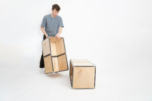
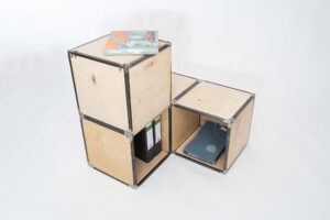
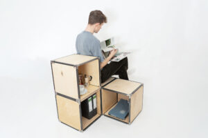
PROZESS


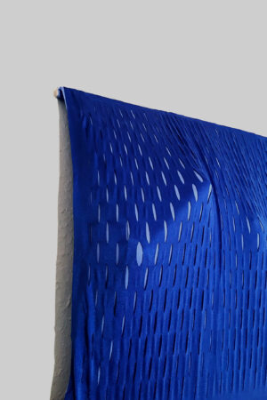
Was macht einen Schrank überhaupt zu einem Schrank? Wer legt fest, dass er zwingend ein quaderförmiges hölzernes Behältnis für Kleidung oder Küchenutensilien sein muss? Manchmal auf Füßchen stehend und verziert mit Ornamenten als Dekor oder auch ganz schlicht und geradezu anonym? Eins, das dank seiner opaken Oberfläche, jeglichen Inhalt vor der Außenwelt zu verbergen versucht? „Spannender Einblick“ stellt dagegen die Persönlichkeit des Nutzers in den Mittelpunkt und zeigt, dass ein Schrank nicht zwingend das starre, sperrige Möbel dein muss, das wir gewohnt sind. Eine elastische Stofffläche, bestehend aus drei Stofflagen, die am oberen und unteren Ende an Leisten befestigt sind, lässt sich durch Schraubhaken an die Wand spannen. Legt man von den Seiten nun etwas hinein, wird es durch die massive Spannung im Stoff an die Wand geklemmt und besonders leichtere Dinge rutschen nicht hinunter. Der Gegenstand drückt sich von innen gegen den Stoff und von außen sind so die Konturen und Strukturen erkennbar. Zudem ist der äußerste Stoff mit einem Muster eingeschnitten, wodurch sich an den Stellen, an denen sich ein Gegenstand durchdrückt, das Muster verzerrt, die Farbe des darunter liegenden Stoffes stärker hervortritt und so ein interessantes Bild entsteht. Der Schrankinhalt ist nun, ohne glatte Oberfläche, optisch direkt zugänglich und bildet die immer wieder wandelnde Form des Schranks. Das sperrige anonyme Behältnis wird zu einem platzsparenden, und auch äußerlich, persönlichen Möbel.
What makes a cabinet a cabinet anyway? Who determines that it must necessarily be a cuboid wooden container for clothes or kitchen utensils? Sometimes with little feet and decorated with ornaments as decoration or quite simple and downright anonymous? One that tries to hide any contents from the outside because of its opaque surface?
„Spannender Einblick“ focuses on the personality of the user and shows that a wardrobe doesn’t necessarily have to be the rigid, bulky furniture we are used to.
An elastic fabric surface, consisting of three layers of fabric attached to strips at the top and bottom, can be stretched against the wall using screw hooks. If you now put something in from the sides, it is clamped to the wall by the massive tension in the fabric and especially lighter things do not slide down. The object presses against the fabric from the inside and so from the outside the contours and structures are visible. In addition, the outermost fabric is cutted with a pattern, so where an object presses through, the pattern is distorted and the color of the underlying fabric becomes more prominent so it creates an interesting picture. The contents of the cabinet, without a smooth surface, are now visually directly accessible, forming the ever-changing shape of the cabinet. The bulky anonymous container becomes a space-saving and also externally, personal furniture.
PROZESS


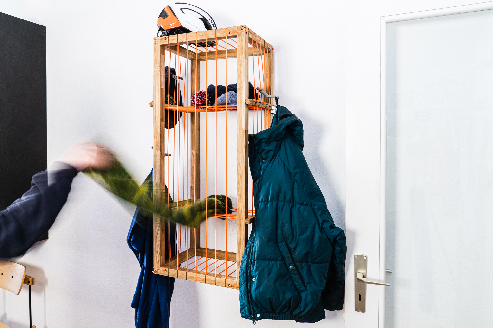
SCHNURSTRACKS
Ein Schrank zum ankleiden und ablegen, zum verschieben und behängen. Schnurstracks bietet als Flurmöbel platz für Jacken, Mützen, Schals und all die Dinge, welche man schnell erreichen will, die jedoch trotzdem gut verstaut sein wollen. Die Grundlage bildet ein mit Gummiseil bespannter Rahmen, in welchen man Haken zum aufhängen von Kleidung flexibel einhängen kann. Im Inneren befinden sich zwei verschiebbare Ebenen, welche ebenfalls durch das Seil aufgespannt werden. Sie eignen sich hervorragend für Mützen, Handschuhe, Beutel und vieles Weitere. Es ist komplett zerlegbar und verzichtet auf Leim oder Schrauben. Der Rahmen wird durch eine gefräste Zapfenverbindung zusammengefügt und mit Seilen fixiert.
schnurstracks bringt das Flexible in den starren Raum. Ein Möbel, das gestaltet und zum Gestalten einlädt. Das Innere verschränkt durch den Mantel des Äußeren.
A wardrobe for dressing and storing, for moving and hanging. schnurstracks offers as a hallway furniture space for jackets, hats, scarves and all the things that you want to reach quickly, but still want to be well stored. The basis is a frame stringed with rubber cord, in which you can flexibly hang hooks for hanging clothes. Inside there are two sliding levels, which are also stringed with rope. They are ideal for caps, gloves, bags and much more. It can be completely disassembled and does not require glue or screws. The frame is assembled by a milled tenon joint and fixed with ropes.
schnurstracks brings the flexible into the rigid space. A piece of furniture that designs and invites you to design. The interior covered by the mantle of the exterior.
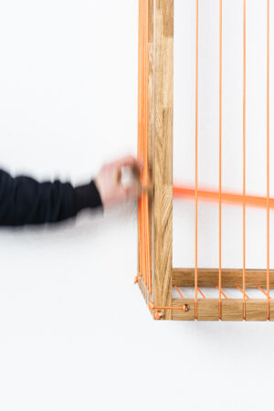
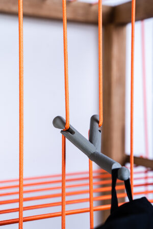
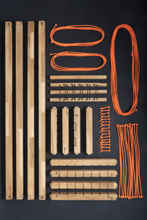
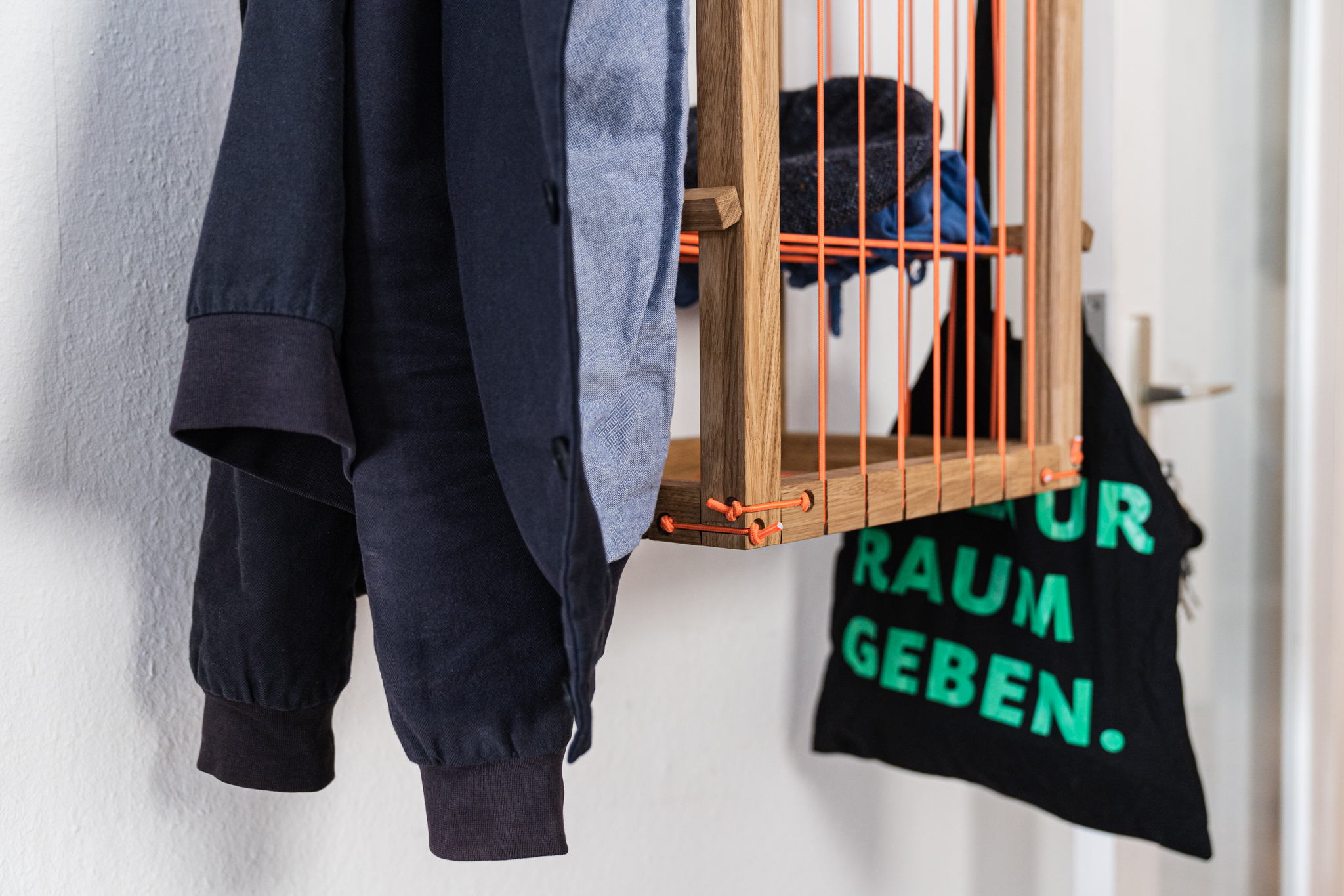
PROZESS


252DREICKE
„252 Dreiecke“ ist ein Projekt, das sich mit der Veränderung von Formen und der Manipulation eines immer gleich großen Kreises und seiner Achtel in Form von Dreiecken befasst.
Inspiriert wurde das Projekt durch die genauere Betrachtung der Abwicklung von Blüten, bei der sich herausstellte, dass diese in der Regel einen groben Kreis darstellen. Dabei sind die Abschnitte oft gleichmäßig aufgeteilt, zum Beispiel in Drittel, Viertel, Sechstel oder Achtel.
Die Formstudie von „252 Dreiecke“ dokumentiert die Veränderung eines immer gleich großen Achtels eines Kreises in sechs verschiedenen Formen. Der Kreis mit einem Durchmesser von 27 cm wird in acht gleich große Dreiecke unterteilt, hierbei wird jedes Achtel anders verformt. Ziel des Projekts war es zu erforschen, welche dreidimensionalen Formen aus derselben Fläche möglich sind zu konstruieren und wie sich das Volumen verändert, wenn mehr verformte Achtel hinzugefügt werden.
Für das Projekt wurde Draht für eine einfache Verformung und Moosgummi als Hauptmaterial benutzt.
Während des Experiments wurde mit Hilfe der Manipulation dieser bestimmten Dreiecke festgestellt, dass jede dreidimensionale Form unterschiedliche Volumenveränderungen aufweist. Manche der verformten Kreise schließen oder öffnen sich, während andere kleiner oder größer werden. Ebenfalls gibt es Formen, die spitzer oder flacher werden, je nachdem wie sie verformt werden.
252Triangles
„252 Triangles“ is a project that deals with the manipulation and transformation of a consistently sized circle and its eighths in the form of triangles. The project was inspired by a closer examination of the unfolding of flowers, revealing that they are typically divided into a circle with evenly spaced sections, such as thirds, quarters, sixths, or eighths.
The form study of „252 Triangles“ documents the transformation of a consistently sized eighth of a circle into six different shapes. A circle with a diameter of 27cm is divided into eight equal triangles, and each eighth is deformed into a different shape. The goal of the project was to explore the various three-dimensional forms that can be created from the same surface area and how the volume changes as more deformed eighths are added.
Wire was used for easy deformation and foam rubber as the primary material for the project.
During the experiment, where the eighths of the circle were deformed, it was discovered that each three-dimensional form resulting from the manipulation of a specific triangle has a different volume. Some of the deformed circles close or open, while others become smaller or larger. There are also shapes that become sharper or flatter, depending on how they are deformed.
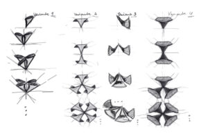
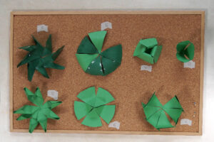
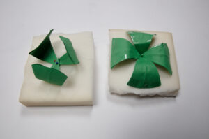
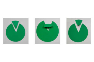
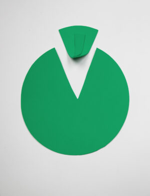
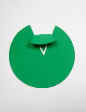
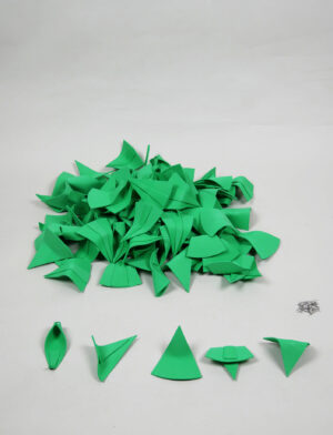


37 YEARS
Mäander sind natürlich auftretende Biegungen und Schleifen im Verlauf von Flüssen, Bächen und anderen Gewässern. Sie resultieren aus einem komplexen Zusammenspiel von Strömungskräften, die auf die fließenden Wassermassen einwirken, und der Beschaffenheit des umliegenden Geländes.
Durch die Erosion von Sedimenten an der Außenseite einer Flusskurve und die Ablagerung dieser Sedimente an der Innenseite der Kurve unterliegt die Form der Mäander einer fortwährenden Veränderung. So können schon die kleinsten Formveränderungen auf lange Sicht bedeutende Auswirkungen auf die Dynamik und Form des gesamten Flussverlaufs haben. Durch diesen Selbstorganisationsprozess, bei dem die Flussmorphologie durch die Interaktion zwischen Strömung und Sediment gesteuert wird, erfährt das Erscheinungsbild des Flusses eine kontinuierliche Transformation.
Die Strömungsbedingungen können dazu führen, dass sich bestimmte Biegungen der Mäander verstärken, während andere abgeschwächt werden oder mit der Zeit gänzlich verschwinden. Über einen längeren Zeitraum beobachtet, offenbart sich dem Betrachter die beeindruckende morphogenetische Entwicklung der Flussbewegungen, und es wird ein sich wiederholendes Muster in der Veränderung der Mäanderformen deutlich.
In meinem Semesterprojekt „37YEARS“ habe ich versucht, anhand einiger gesammelter Satellitenaufnahmen des Río Mamoré in Bolivien über einen Zeitraum von 37 Jahren diese unaufhörlichen und simultan stattfindenden Verformungen festzuhalten und darzustellen.
Durch die digitale Zusammenführung mehrerer Flusssegmente lassen sich die morphogenetischen Verformungen am Río Mamoré zwischen 1984 und 2020 innerhalb weniger Minuten beobachten.
37 YEARS
Meanders are naturally occurring bends and loops in the course of rivers, streams, and other bodies of water. They result from a complex interplay of flow forces on the flowing water masses and the topography of the surrounding terrain.
Due to the erosion of sediments on the outside of a river bend and the deposition of these sediments on the inside of the bend, the shape of meanders undergoes continuous change. Even small changes in shape can have significant long-term impacts on the dynamics and form of the entire river course. Through this self-organizing process, in which river morphology is controlled by the interaction between flow and sediment, the appearance of the river undergoes continuous transformation.
The flow conditions can cause certain meander bends to become more pronounced while others are weakened or disappear over time.
Over a longer period of observation, the impressive morphogenetic development of river movements becomes apparent to the viewer, and a repetitive pattern in the change of meander shapes is discernible.
In my semester project „37YEARS,“ I attempted to capture and represent these continuously and simultaneously occurring deformations by using several collected satellite images of the Río Mamoré in Bolivia over a period of 37 years. By digitally merging multiple river segments, the morphogenetic deformations on the Río Mamoré between 1984 and 2020 can be observed in just a few minutes.
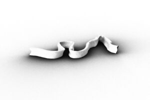
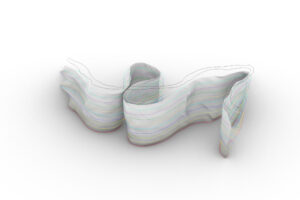
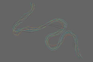
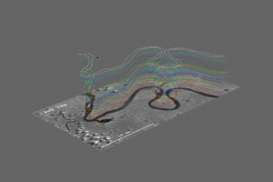
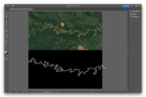
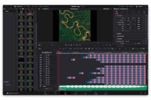


SIEBEN GLEICHT EINS
Das Gefäß „Sieben = Eins“ besteht aus unterschiedlich farbigen, gestapelten Acrylglasplatten mit einer Dicke von 3 mm. Es handelt sich um sieben Formen, welche ein vielseitig variierbares Gestell ergeben. Die Kleineren der Sieben wurden als Cutout in die Größeren gelastercuttet,so kann man diese ineinanderstecken und verstauen. Des Anderen sind nur vereinzelte Platten mit Acrylglaskleber befestigt worden, wodurch Formen teilweise ausfächerbar sind. Die Grundform wurde aus dem Abdruck und den dadurch entstandenen Geometrien von Wasserblasen gewonnen und mithilfe von Adobe Illustrator auf die Platten gelasert.
SEVEN EQUALS ONE
The vessel „Seven = One“ consists of different
colored, stacked acrylic glass sheets with a thickness of 3 mm.
There are seven forms which result in a versatile variable frame.
The smaller of the seven were cut out into the larger ones
with laser cutting. Due to that the smaller forms can be plugged
and stowed away into the bigger ones.
Only a few plates were attached with acrylic glass glue, therefore
the element of fanning out gives the design another way of v
variability.
The basic form was created from the imprint and the resulting
resulting geometries of water bubbles obtained and
lasered onto the panels using Adobe Illustrator.
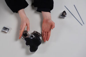
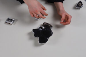
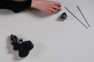
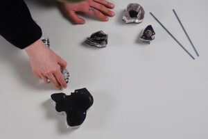
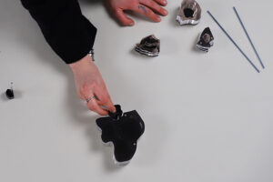
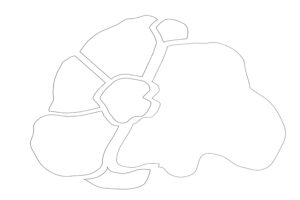
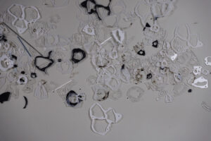
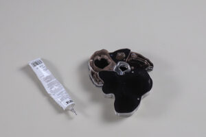
PIL
„PIL“ ist eine Konzeptarbeit, die über eine nicht normative Mensch-Objekt-Beziehung reflektiert.\
Es wird über historische Bedeutung und Kindheitserinnerungen kontempliert, wobei ein Schrank oder der Bereich hinter einem Schrank als der ganz eigene Raum für die eigene Vorstellungskraft diente. PIL stellt Objekte jeglicher Art aus und dient als kleiner Ausstellungsraum in ihrem Inneren.\
PIL kann viele Dinge sein, tun und halten und offenbart ihr Inneres, wenn man sie umarmt.
“PIL” is a concept piece that reflects on a non normative human-object relationship.\
Contemplating on historical meaning and childhood memories, were a closet or the area behind a closet could serve as a sacred space for ones imagination.\
It showcases objects of any kind and serves as a little gallery space within its womb.\
PIL can do, hold and be a lot of things and will reveal all that is inside, once you give it a good hug.
PROZESS


KVZ IDYLLE
Unscheinbare Objekte im urbanen Raum
Dieses Projekt befasst sich mit jenen Objekten in der Stadt, die so sehr Teil der urbanen Landschaft sind, dass wir sie kaum noch wahrnehmen.
Meistens sind sie ausgezeichnet durch eine Art urbane Patina, die sich mit der Zeit auf die Objekte legt.
So wie Objekte, die in der Natur zurückgelassen werden mit der Zeit von Flechten, Pilzen, Moosen und anderen Pflanzen vereinnahmt werden,
So geschieht es in ähnlicher Weise mit Objekten in der Stadt. Die Angleichung an die Umgebung passiert hier jedoch beispielsweise durch Aufkleber, Plakate, die wieder abgerissen werden und Spuren hinterlassen, Tags und Graffiti, Reifenstaub, Getränkereste, Urin, Taubenkot und Vandalismus.
Ein grauer Stromkasten wird auf diese Weise mit der Zeit noch unscheinbarer – ein getarnter Körper am Straßenrand, an dem wir täglich vorbeilaufen, ohne wirklich zu wissen, was in seinem Inneren vor sich geht.
Am Beispiel des Stromkastens möchte ich mit dem Projekt „KVZ Idylle“
(KVZ steht für Kabelverzweiger und ist die amtliche Bezeichnung für Stromkasten) eine Möglichkeit aufzeigen, diese unscheinbaren Orte am Straßenrand für alle nutzbar zu machen.
Inconspicuous objects in urban space
This project deals with those objects in the city that are that much a part of the urban landscape that we hardly notice them anymore.
Most of the time they are distinguished by a kind of urban patina that settles on the objects over time.
Just as objects left behind in nature are taken over by lichens, fungi, mosses and other plants over time, it happens in a similar way with objects left behind in the urban landscape, it happens in a similar way with objects in the city. The adaptation to the environment happens here, however, for example, through stickers, posters that are torn off again and leave traces, tags and graffiti, tire dust, drink residues, urine, pigeon droppings and vandalism.
In this way, a grey electricity box becomes even more inconspicuous over time.
A camouflaged body at the side of the road that we walk past every day without really knowing what is going on inside.
Using the example of the electricity box, I would like to use the project „KVZ Idylle“
(KVZ stands for Kabelverzweiger and is the official german term for power box) to show a way to make these inconspicuous places at the roadside usable for everyone.
I WANT TO BE A WARDROBE
Wenn man versucht einen Schrank in wenigen Adjektiven erklären zu müssen, dann stößt man häufig auf die Attribute: Groß, schwer, massiv. Das Projekt I want to be a wardrobe ist ein Gegenentwurf zum klassischen Verständnis vom Typus Schrank und versucht Fragestellungen wie die Notwendigkeit von Individualität in Möbeln, Trendfragen, und der Auseinandersetzung von ökologischen und sozialen Problemfeldern zu formulieren. Der Entwurf besteht nämlich aus einem Stahlgitter-Unterbau, dass wie ein Regal aufgebaut ist, und einem Stoffbezug, welcher nach Belieben ausgewechselt werden kann. Das Projekt intendiert dazu, dass auch andere Designer:innen Entwürfe für den Schrank entwickeln können, bzw. Schrankbesitzer:innen untereinander die verschiedenen „Outfits“ teilen können.
If you try to explain a wardrobe in a few adjectives, then you often get the answers: Large, heavy, massive. The project I want to be a wardrobe is a countersign to the classic understanding of the type wardrobe and tries to formulate questions such as the need for individuality in furniture, trend questions, and the confrontation of ecological and social problems. The design is made of a steel grid substructure, which is built like a shelf, and a fabric cover, which can be changed at will. The project intends that other designers can develop designs for the wardrobe, and that wardrobe owners can also share the different „outfits“ with each other.


Prozess


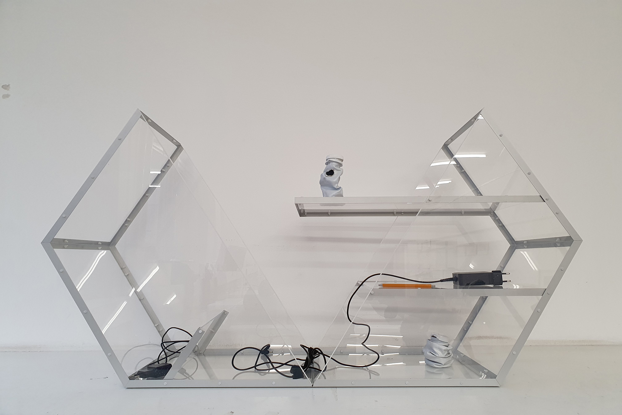
FUTURE MIRABILIA
Future Mirabilia ist ein Schrank zum Sammeln verschiedener Abfall Materialien aus unserer Zeit, die in Zukunft sammelbar werden können, wenn diese Materialien nicht mehr hergestellt werden. Mirabilia ist ein altes lateinisches Wort, das alles wunderbar bedeutet. future mirabilia hat eine sechseckige Form, da diese Form häufig in der Natur vorkommt und funktionale und ästhetische Merkmale aufweist, die der allgemeinen Form des Schrankdesigns dienen, da die Wunderkammer früher verschiedene Materialien und Gegenstände aus einer anderen Zeit und einem anderen Ort enthielt, die mit ihr reist wie eine Zeitkapsel. Für das endgültige Modell habe ich transparente und neutral gefärbte Materialien (Plexiglas und Aluminiumecken) gewählt, um Farbkonflikte mit den Gegenständen im Schrank zu vermeiden.
future Mirabilia is a cabinet to collect different waste materials from our time that can become collectable in the future when these materials become discontinued to be produced. the mirabilia is an ancient Latin word that means all that is wonderful. future mirabilia has a hexagonal shape as this shape is frequently found in the natural and has functional and esthetic features that serve the general form of the cabinet design as the curiosity cabinet used to contain different materials and items from a different time and place traveling with it like a time capsule. for the final model, I’ve chosen transparent and neutral-colored materials ( plexiglass and aluminum corners) to avoid color conflict with the items inside the cabinet.


Prozess


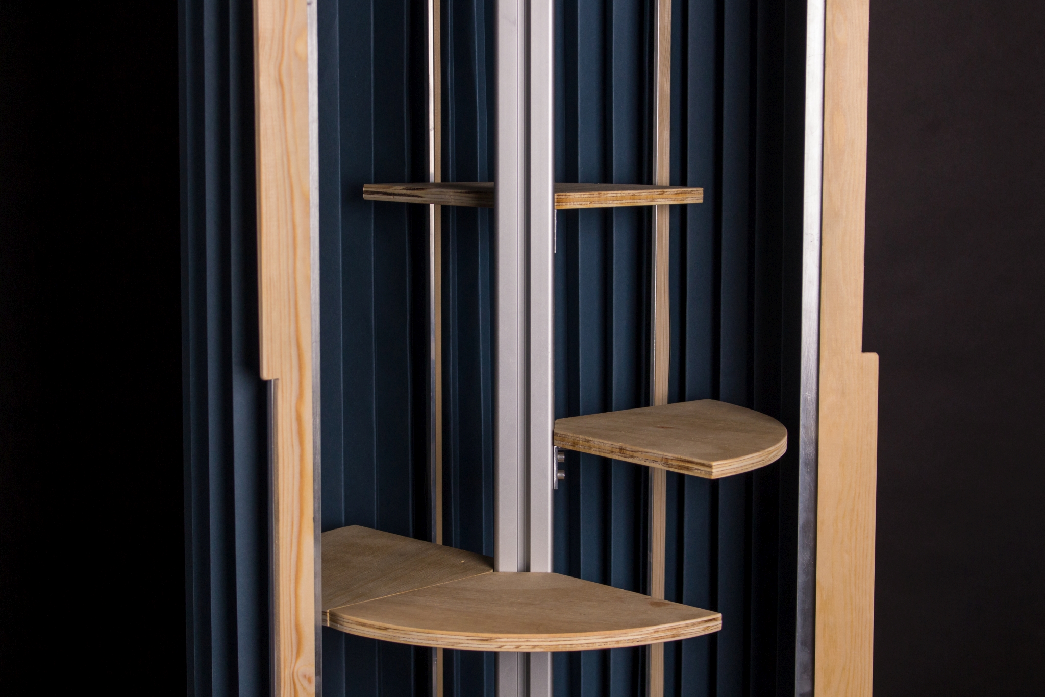
ALLACCESS
AllAccess- Eine stilvolle Rund(um)-Lösung zum Aufbewahren mit Leichtigkeit und Übersicht im runden Schrank.
Er misst eine Höhe von 708 mm und einem Durchmesser von 310 mm. Eine Mischung aus Aluminium und hochwertigen Holzelementen machen den AllAccess zum Mittelpunkt jedes Raumes. Durch den Faltenbalg als innovativer Verschlussmechanismus was das Erreichen Ihres verstauten Eigentums noch nie so einfach!
Ziel dieser Entwicklungsarbeit war das Erschaffen des vollkommenen Schrankes, der alle Eigenschaften, die einen Schrank ausmachen, von jeder betrachtbaren Perspektive innehat. Durch die freie Verschiebung der Schrankmembran wird dem sonst so unüberlegten Öffnen und Schließen eines Schrankes ein spielerisches Element beigefügt.
AllAccess- A stylish all-around solution for storing with ease and organization in a round cabinet.
It measures a height of 708 mm and a diameter of 310 mm. A combination of aluminum and high-quality wood elements make the AllAccess the centerpiece of any room. The bellows as an innovative closure mechanism makes accessing your stored belongings easier than ever!
The goal of this work was to create the perfect cabinet that has all the characteristics of a cabinet from every conceivable perspective. By freely shifting the cabinet membrane, a playful element is added to the otherwise thoughtless opening and closing of a cabinet.


Prozess


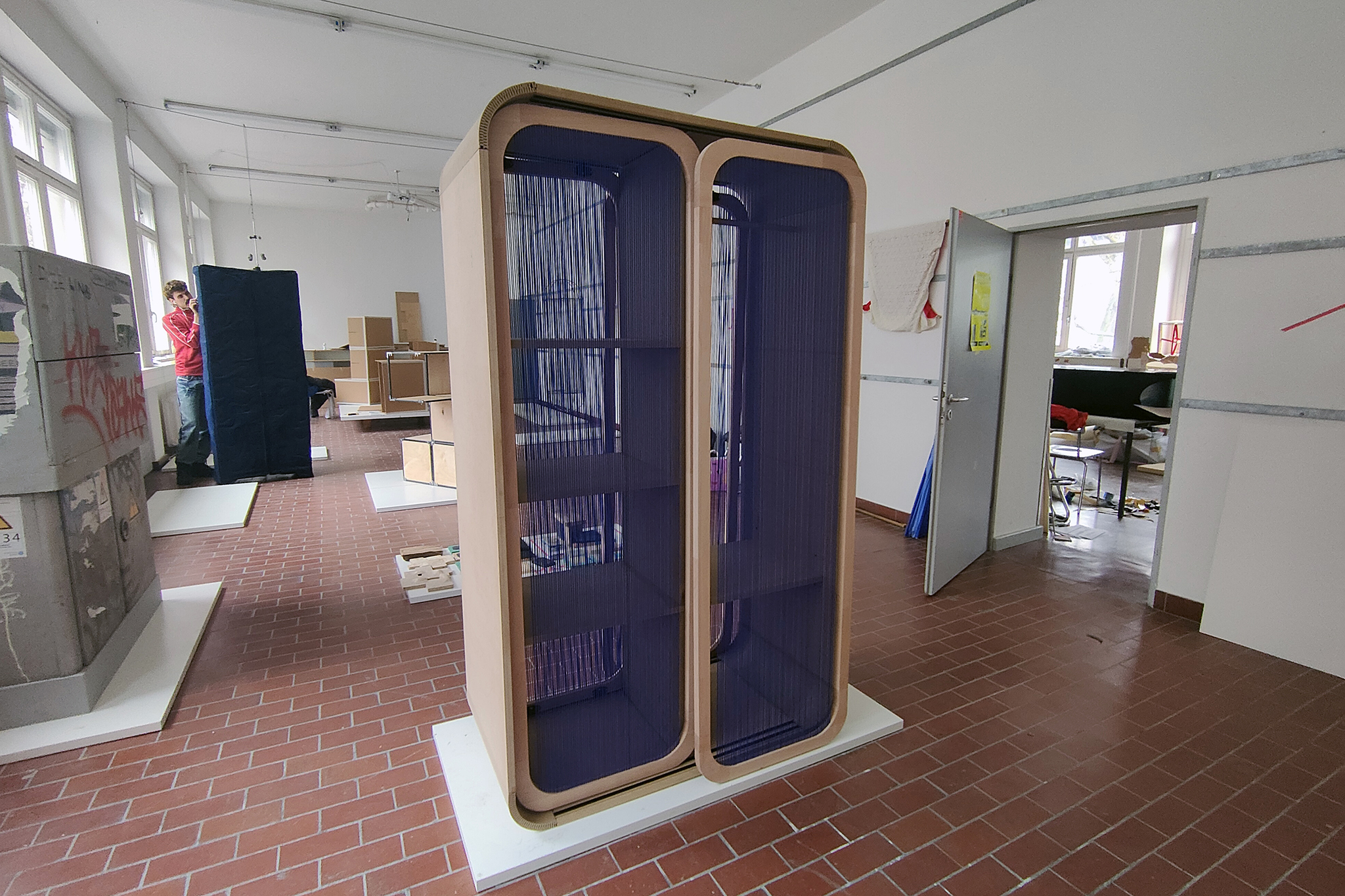
CROSSING
CROSSING ist ein Kleiderschrank mit einer durchlässigen Membran. Er hat einen großen Innenraum und verfügt über spezielle Schiebetüren aus Seilen. Die Schiebetüren ermöglichen es, Platz zu sparen, so dass der Raum vor den Schranktüren nicht leer gehalten werden muss. Gleichzeitig ermöglicht die Verwendung des Seils ein problemloses Durchgehen der Kleidung durch die Türe, wodurch die Notwendigkeit entfällt, die Türen im täglichen Gebrauch zu öffnen, und die Verwendung von Seilen beseitigt auch den Nachteil von Schiebetüren, die, wenn sie geöffnet werden, dazu führen können, dass ein Teil des Raums vollständig blockiert wird, manchmal unsere Erfahrung bei der Nutzung des Kleiderschranks sehr beeinträchtigt ist, während dies bei CROSSING überhaupt kein Problem darstellt.
CROSSING is a wardrobe with a permeable membrane. It has a large capacity and special sliding doors made of strings. The sliding doors make it possible to save space by eliminating the need to keep the space in front of the wardrobe doors empty. The use of the strings allows the clothes to pass freely through the wardrobe doors with a certain degree of obscurity, thus eliminating the need to open the doors in everyday use and also removes the disadvantage of sliding doors, which, when opened, leave part of the space completely blocked, while CROSSING does not have this problem at all.


Prozess


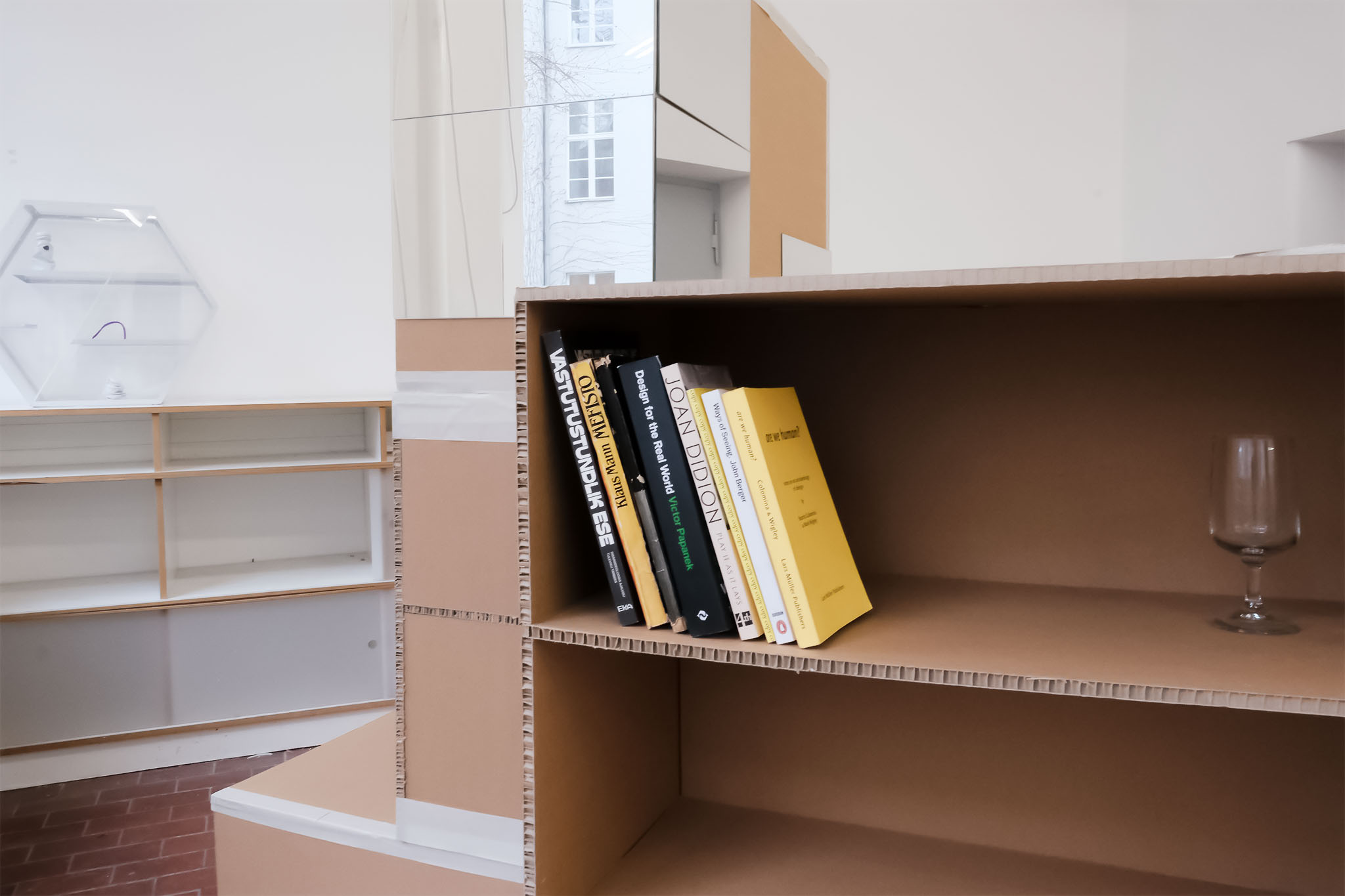
HELGA 2
Recycling the Soviet Era
During Soviet times there was no individualism. Everyone wore the same clothes, drove the same car, owned the same kitchen utensils and lived in apartments with the same layout. Why? To ensure people’s loyalty to the government. Every week and every life was identical – a united country of comradeship.
20 years after the collapse of the USSR, now independent post-soviet states are once again facing the fear of falling back to the Russian dictatorship. Free democratic countries are threatened by the loss of their country’s culture and individualism.
How to preserve nation, culture and individualism if history should repeat itself? This is a speculative redesign of one of the most important status symbol of the Soviet era, the furniture wall (Stenka in Russian). The possibility to easily reshape the wall unit, the form spread out in the room, and the individual mirror pieces on the cabinet create an interaction between the person and the object. All to remind the user of their roots and themselves as individuals rather than comrades.
The recyclable production and materials ensures a new life for the product, even if the dictatorship were to fall once more and people would want to get rid of the Soviet status symbols.
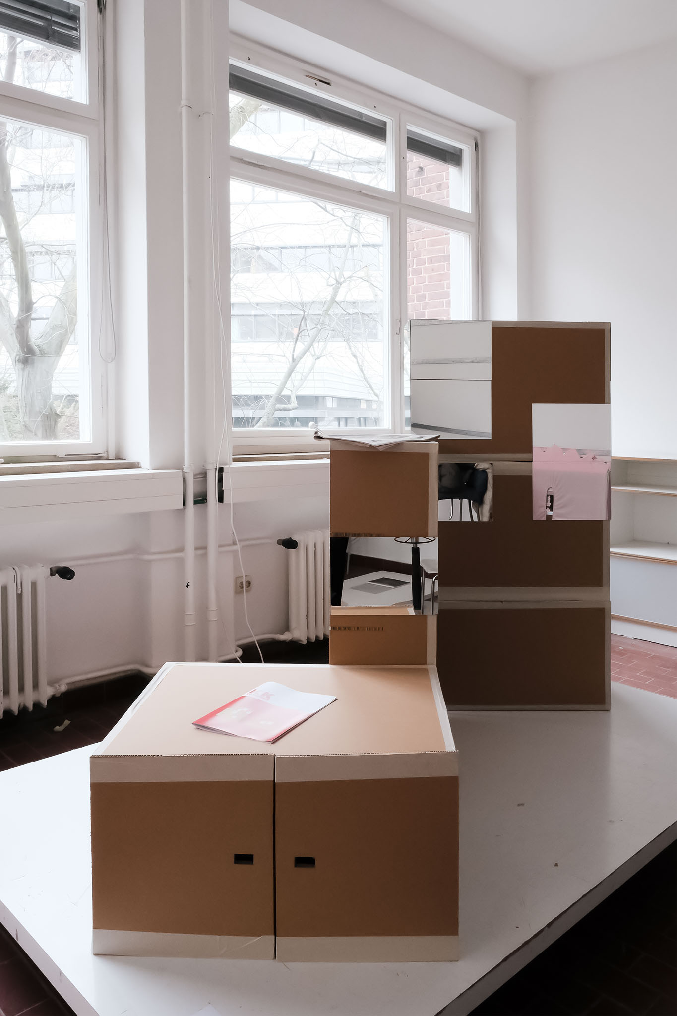


Prof. Holger Neumann, WM Steffen Herm
Endergebnisse


Fahnen


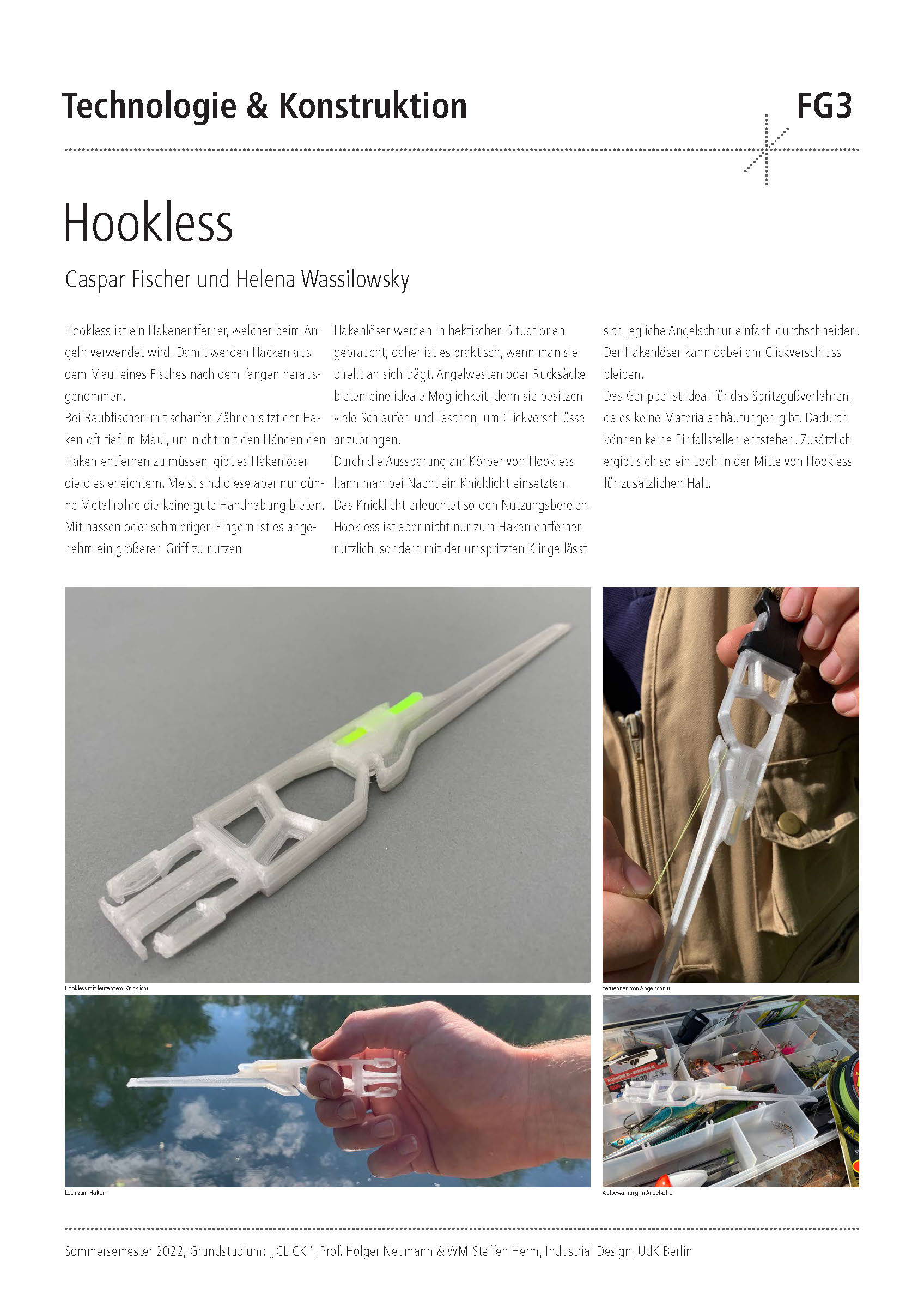

Erste Ideen und Modelle
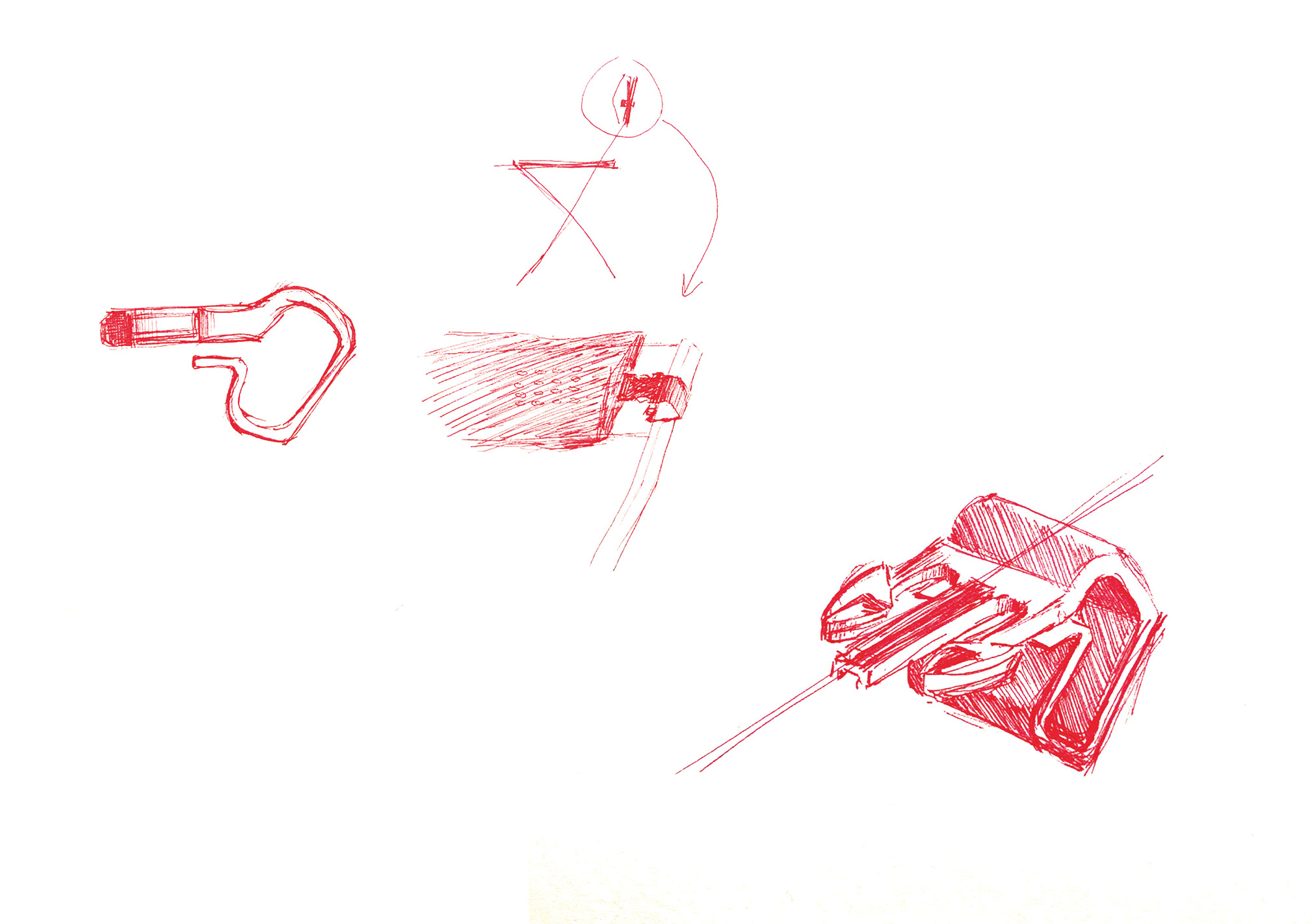
Endpräsentation
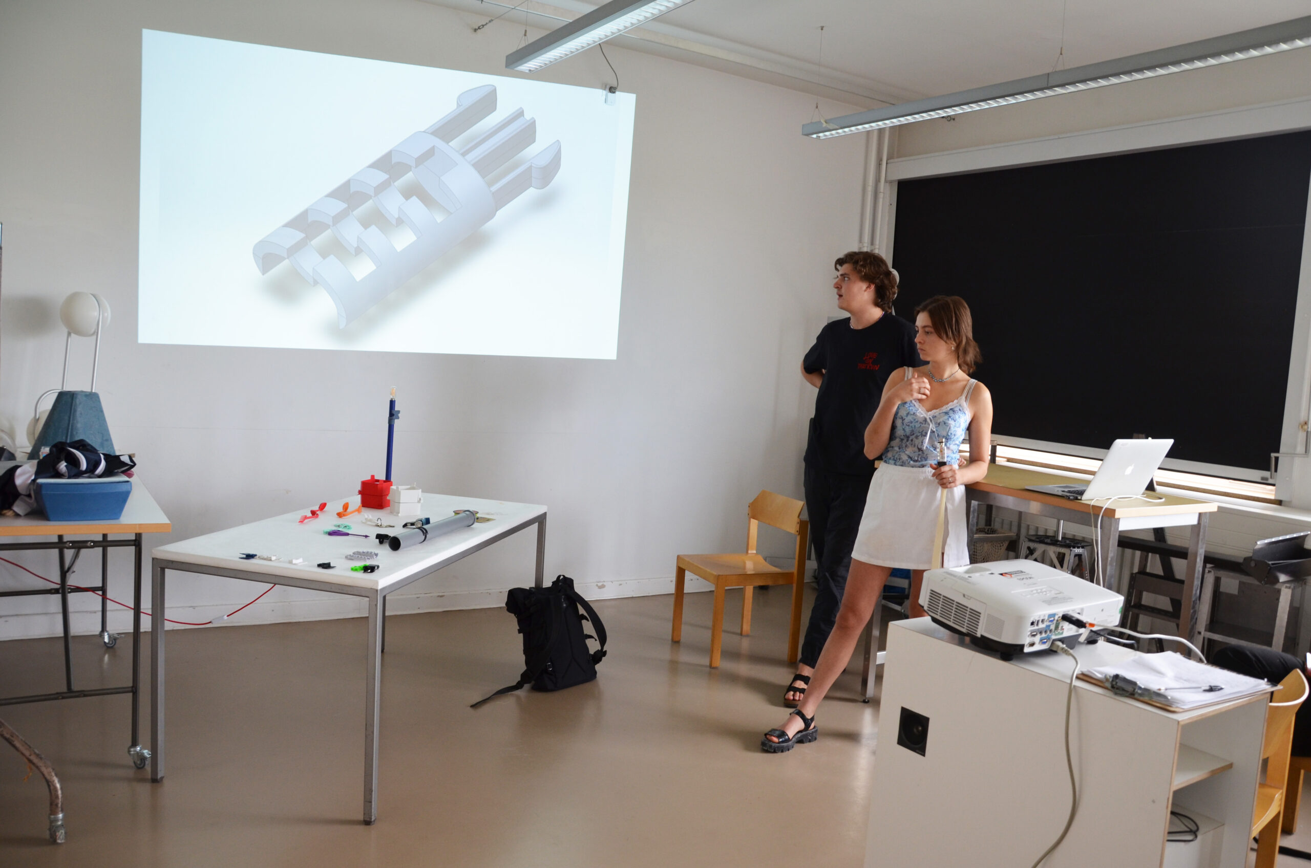
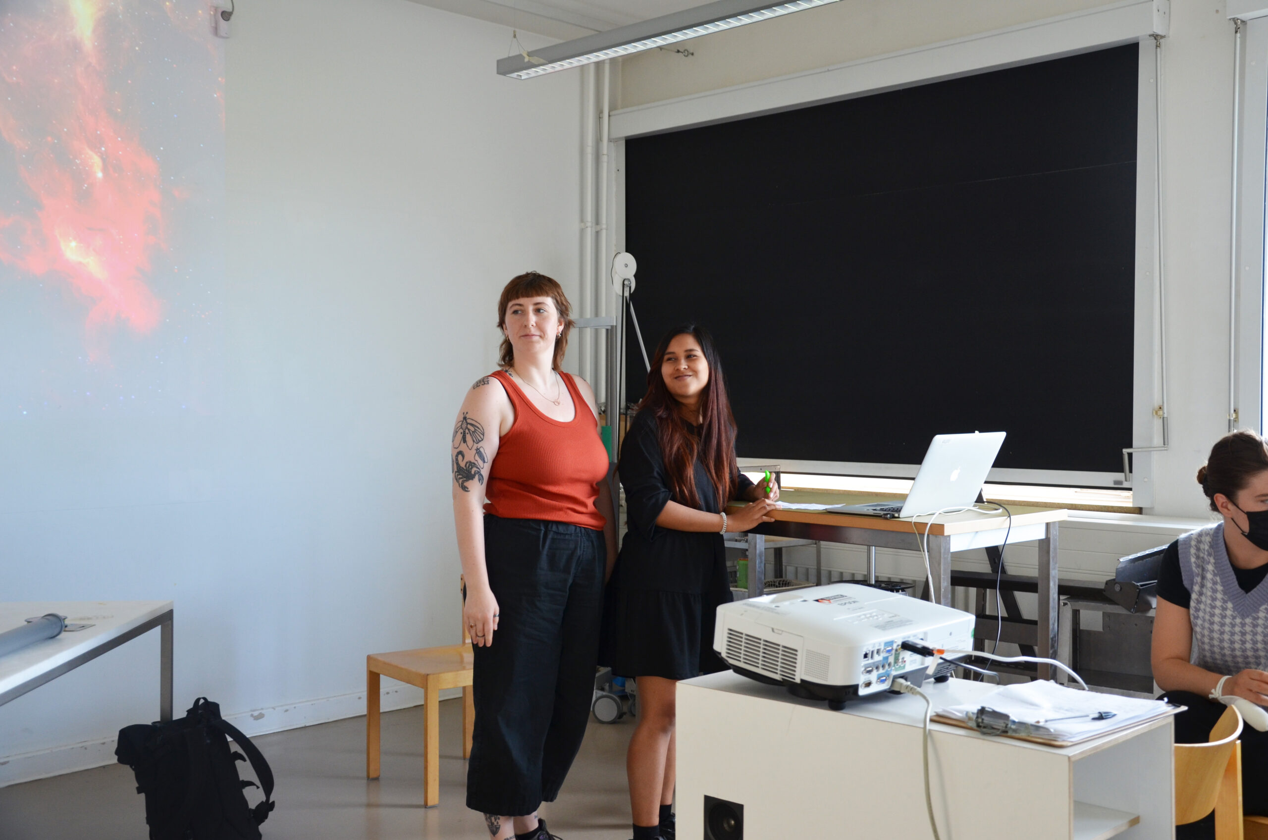

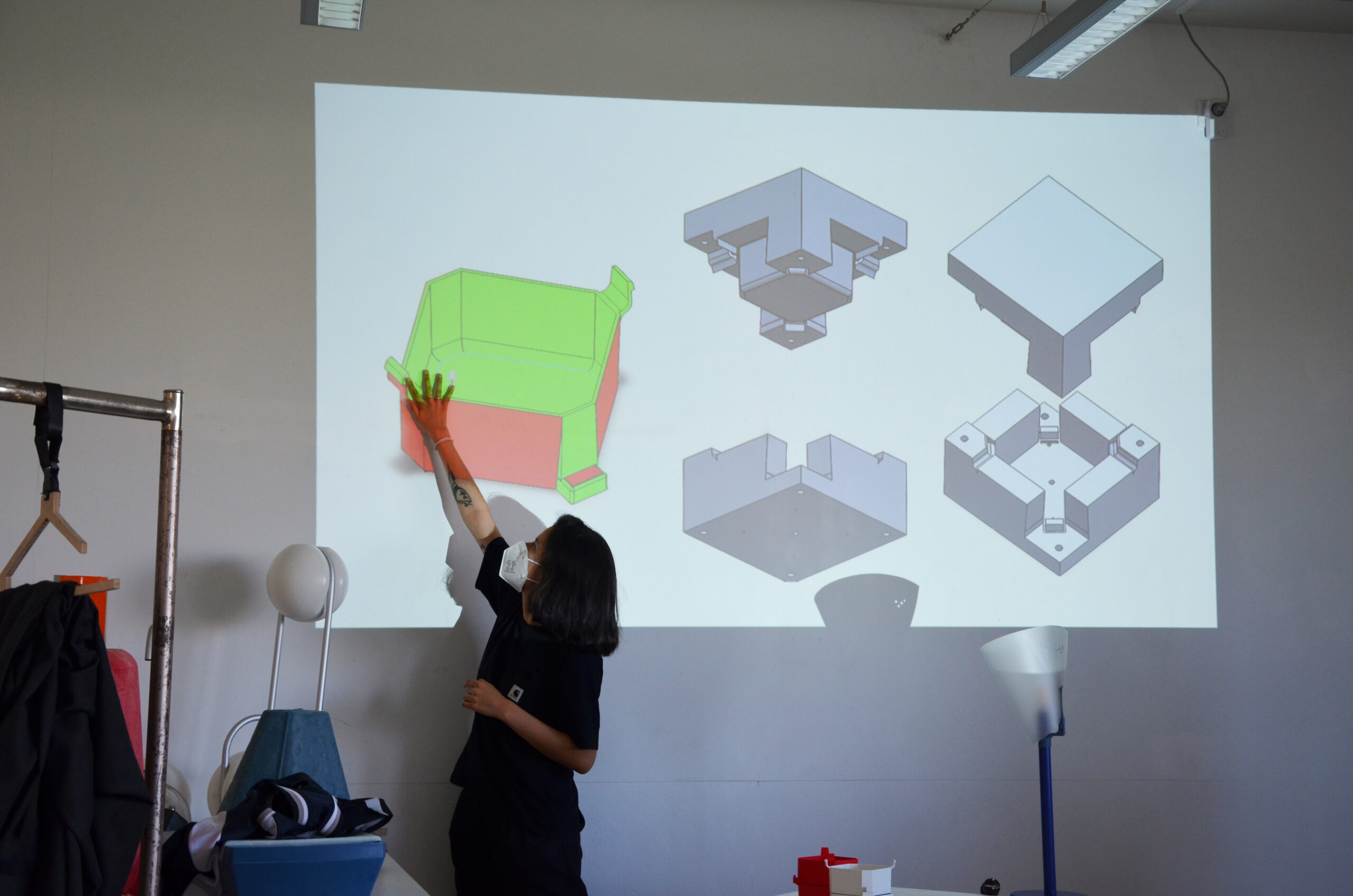
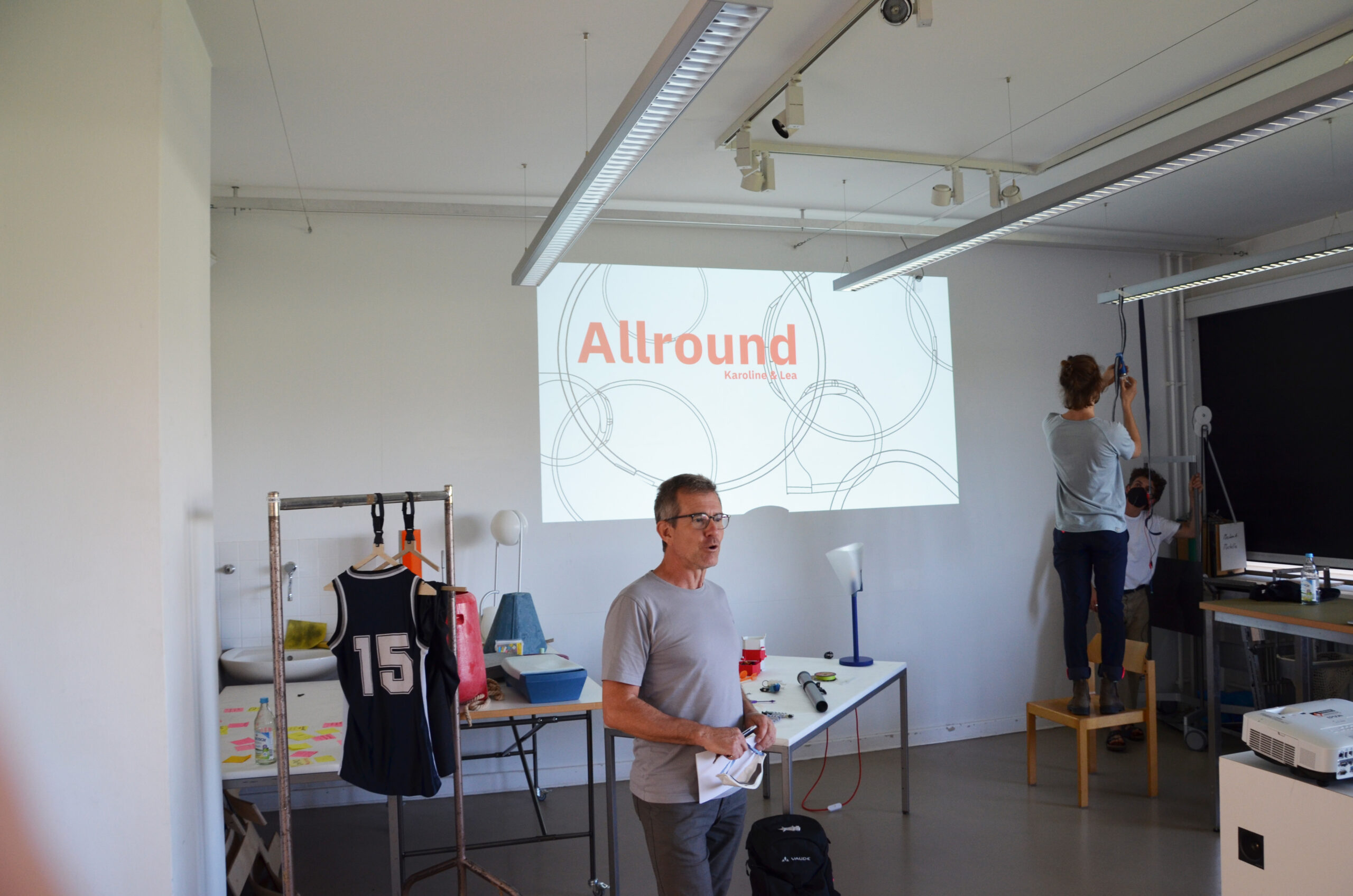

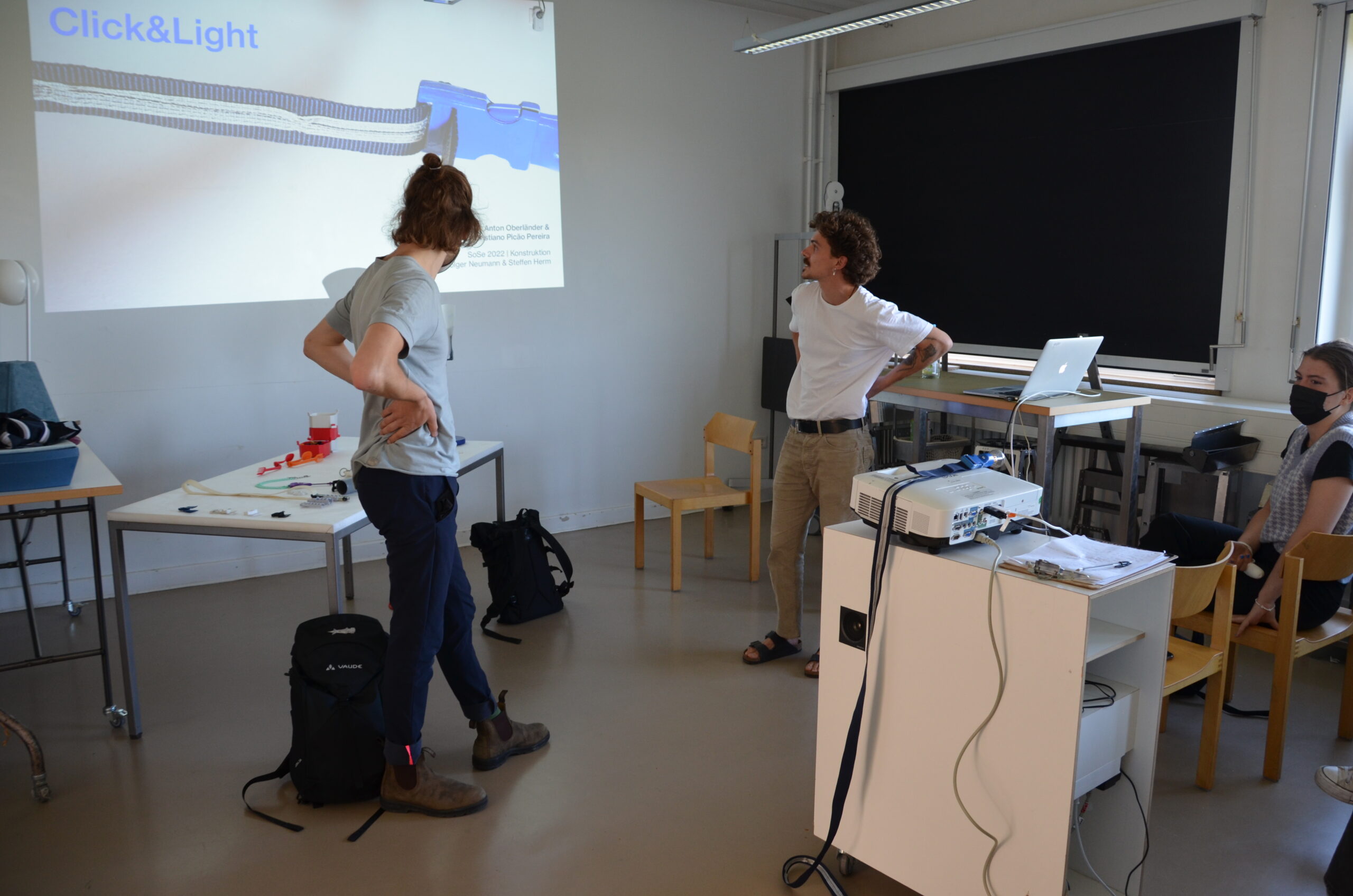
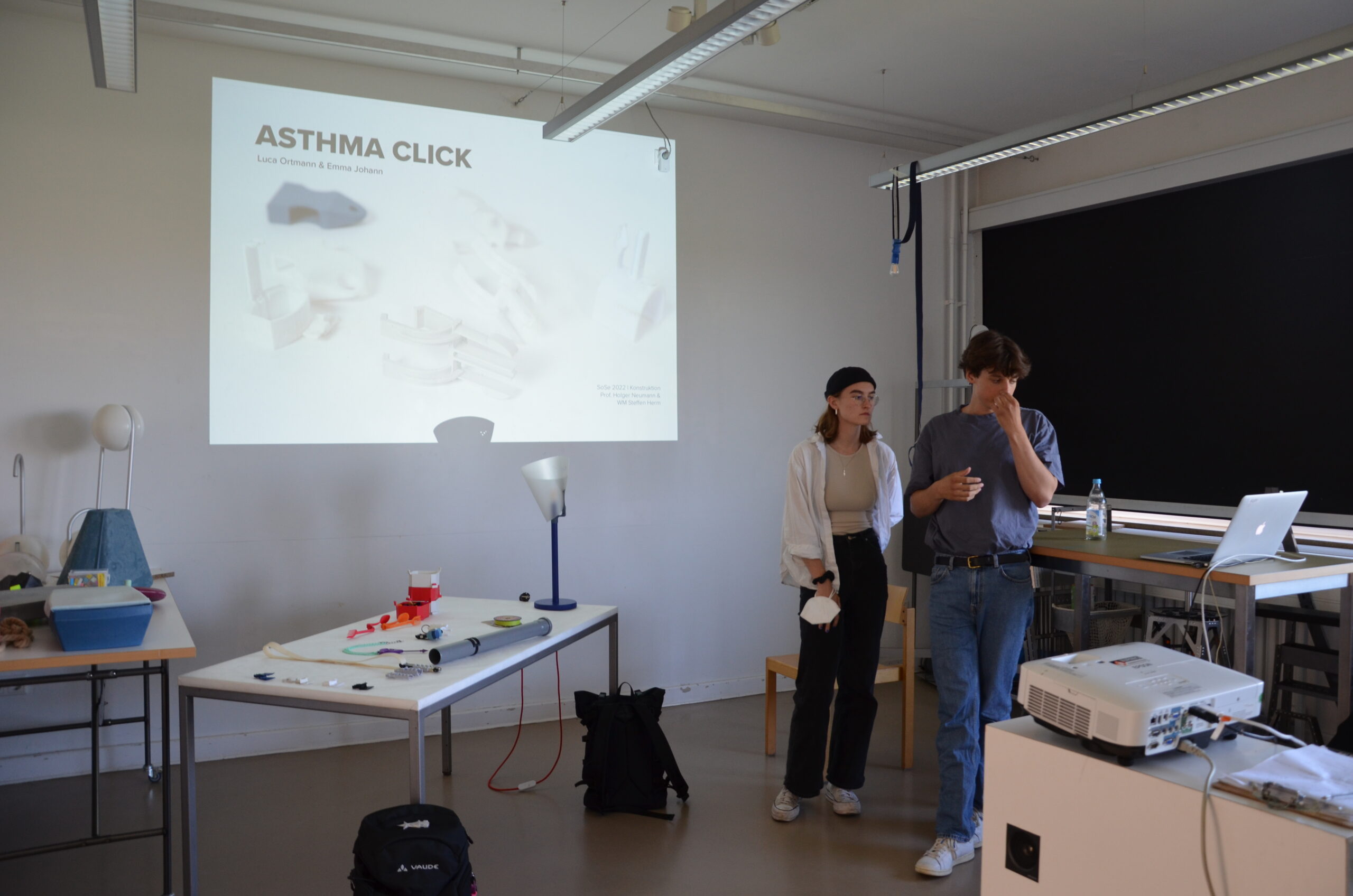
MAPPING
 SEMINARANGEBOT – COURSE OVERVIEW
 Seifenschale von Peer Alexander Assmann
Semesteraufgabe: Klick-Verschlüsse (Quick Release Buckle) begegnen uns üblicherweise im Alltag häufig an textilen Produkten (Rucksäcke, Taschen etc.). Sie bestehen aus zwei Teilen, dem Stecker und der Kupplung. Die gestalterische Übung besteht in der Entwicklung eines innovativen Steckers, der zusammen mit der Kupplung neue Einsatzgebiete für einen Klickverschluss erschließt. Das Maximalvolumen des neuen Steckelements darf 30 ml nicht überschreiten. Dieser Wert kann einfach in Solidworks ausgelesen werden. Der Entwurf muss mit einem 2-teiligen Werkzeug herstellbar sein (siehe d. Constraints unten). Die Prototypisierung soll mittels 3D-Druck erfolgen.
Vorraussetzung für die Entwicklung und Konstruktion eines Kunststoff-Spritzgussteiles ist ein Datensatz für eine Form, genannt “Werkzeug”, bestehend aus 2 Formhälften. Dieses Werkzeug wird parallel in der CAD Übung mit Ludwig Voigt entwickelt.
Design Constraints – Die Form:
1.) muss Entformungsschrägen besitzen, die ein Winkel von 2° oder mehr Grad aufweisen
2.) muss eine sinnvoll angelegte Geometrie der Formtrennung aufweisen, abhängig von der Teilegeometrie
3.) verfügt über einen definierten Angusspunkt und berücksichtigt den Materialfluss in der Form. Für sogenannte Mehrfachwerkzeuge ist ein Angusssystem notwendig
4.) hat eine Anguss-Geometrie und berücksichtigt das Auswerfen des Bauteils über sog. “Auswerfer”
5.) besitzt Entlüftungsmöglichkeiten (i.d.R. Entlüftung über die Auswerfer-Bohrungen).
6.) Euer Kunststoffteil soll durchgängig gleiche Wandstärken haben (ca. 2 mm)
Anforderungen
-regelmäßige Teilnahme Seminar + CAD-Seminar
-Referat
-Entwurf
-3D-Datensatz und Prototyp
-Dokumentation
-Poster und Präsentationsvideo
Betreuer
Prof. Holger Neumann
WM Steffen Herm
Prof. Holger Neumann, WM Julian Ribler
Basierend auf Referaten und Workshops wurden in Carello die relevanten Prinzipien und Parameter von verschiedenen Metallverarbeitungsverfahren vermittelt. Anschließend sollte das Wissen in dem individuellen Entwurf eines Wagens aus 1m³ gefaltetem Stahlblech angewandt werden.
Die Abwicklungen der Blechteile wurden gelasert, und in den Werkstätten gebogen und zusammengesetzt.
Endergebnisse
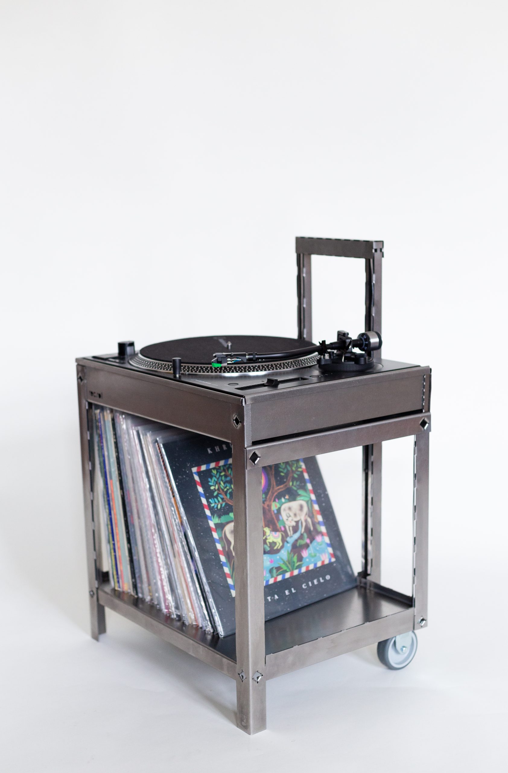
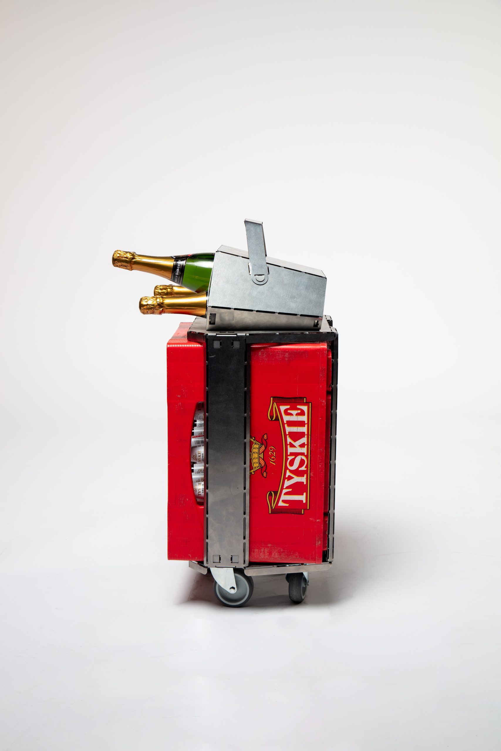
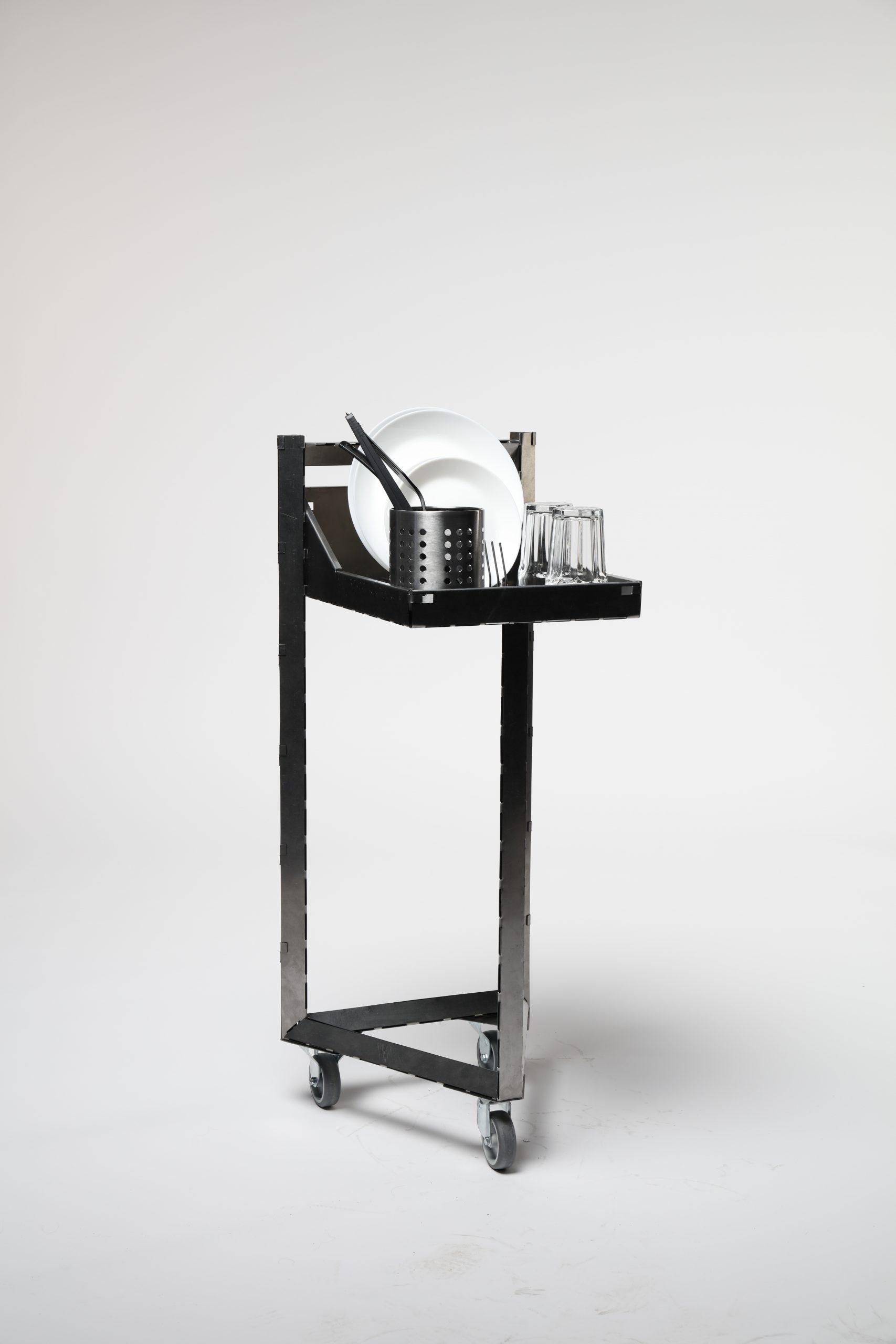
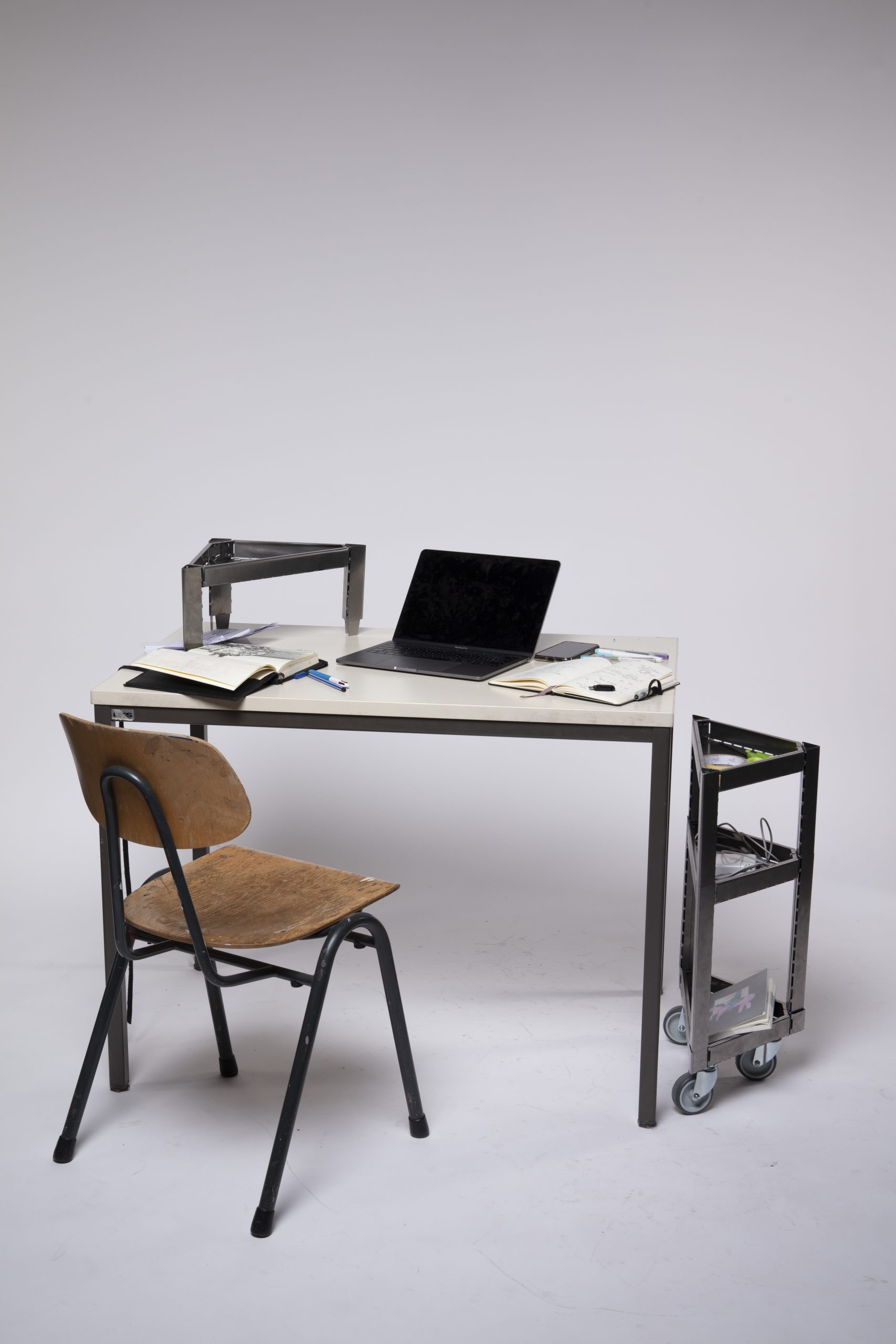
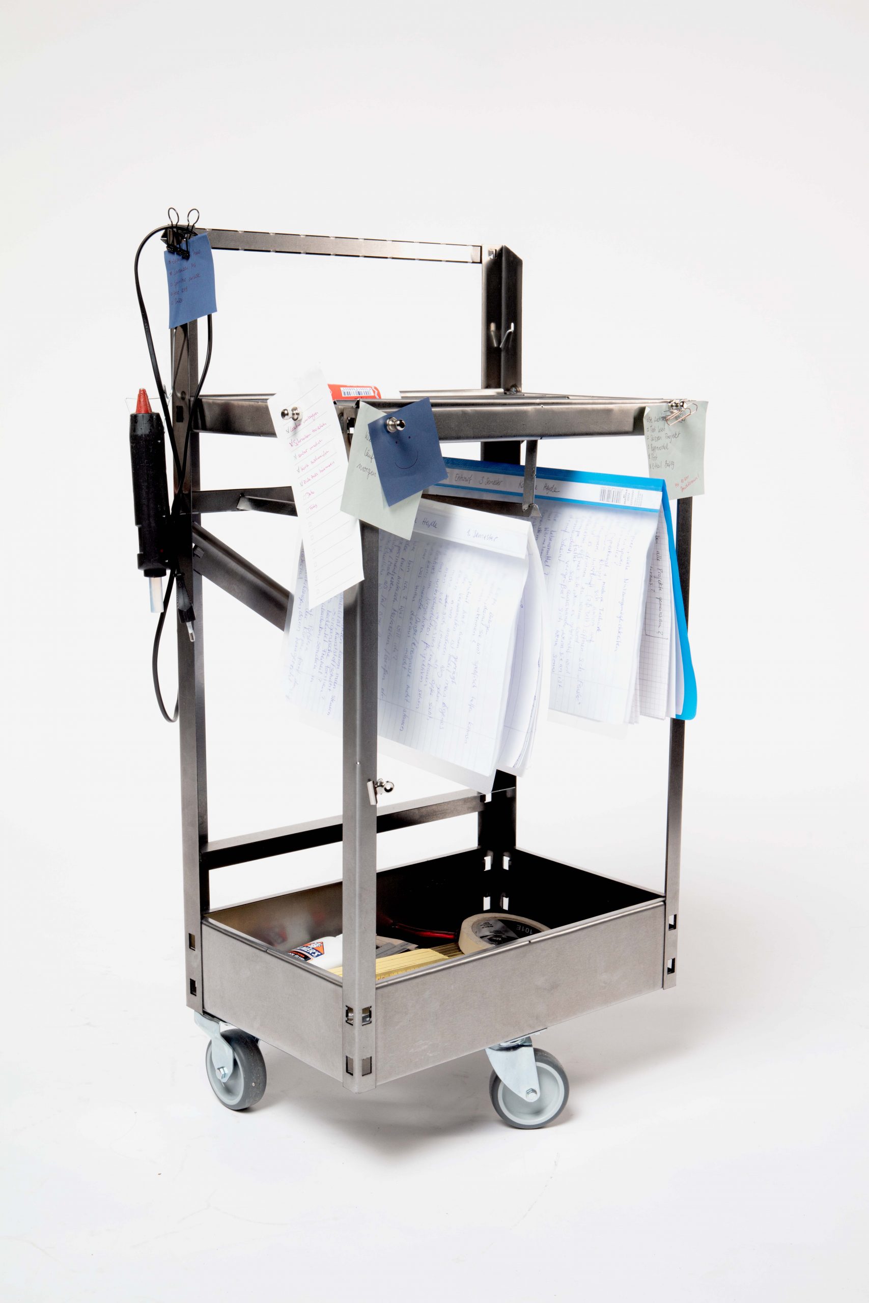
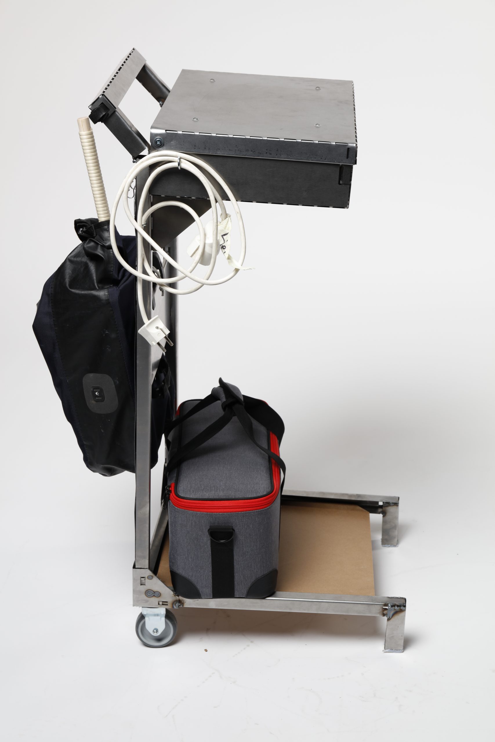
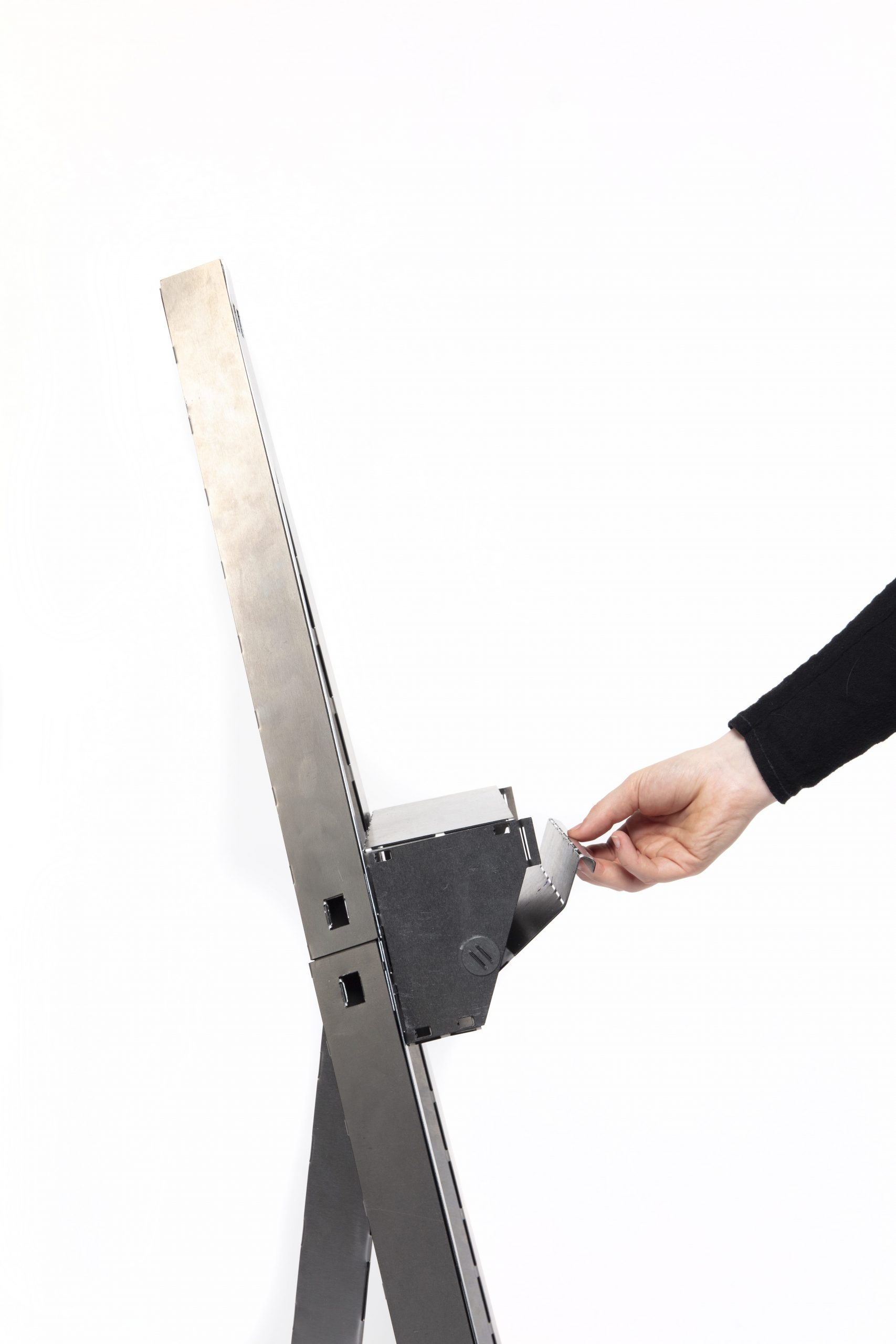
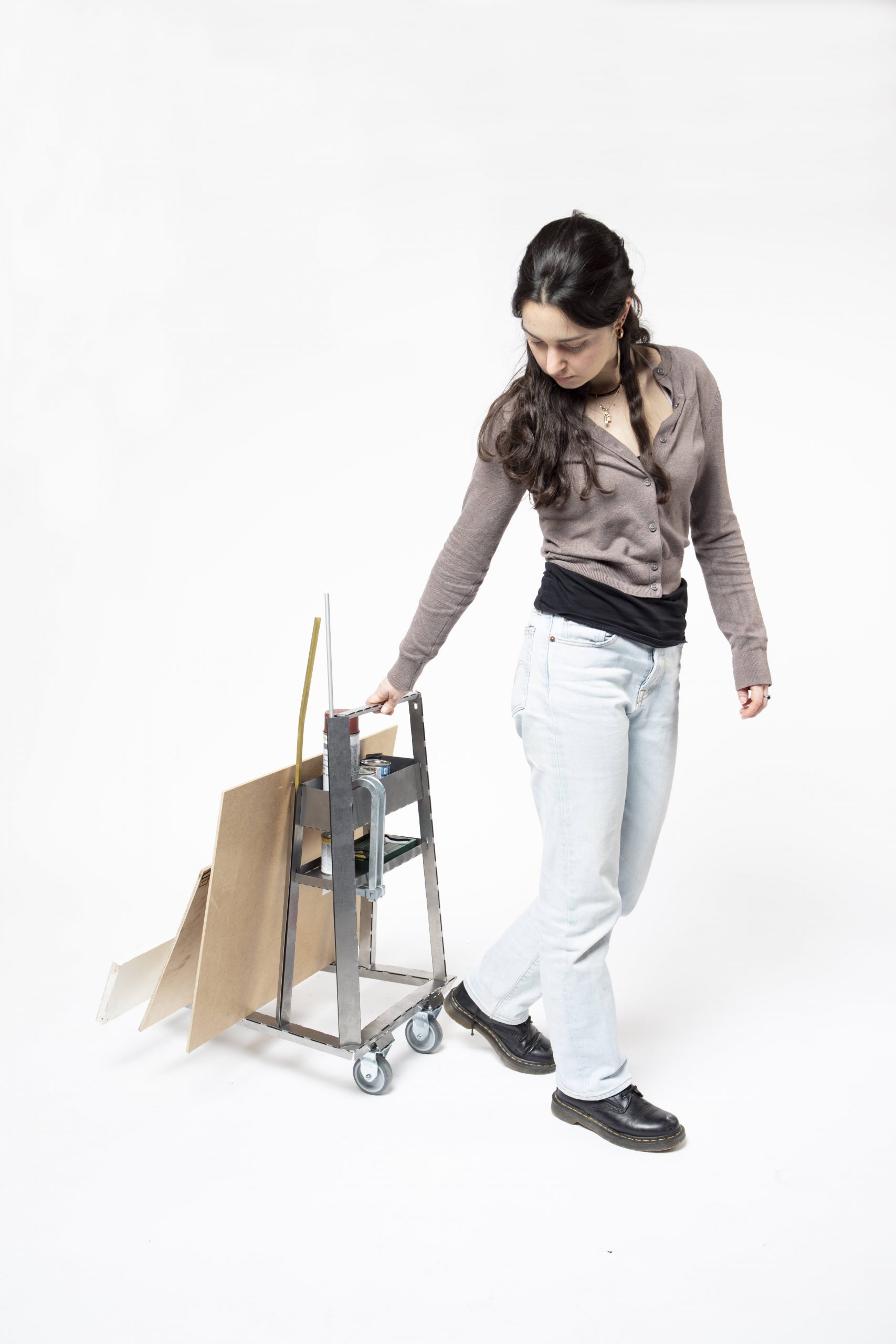

Fahnen

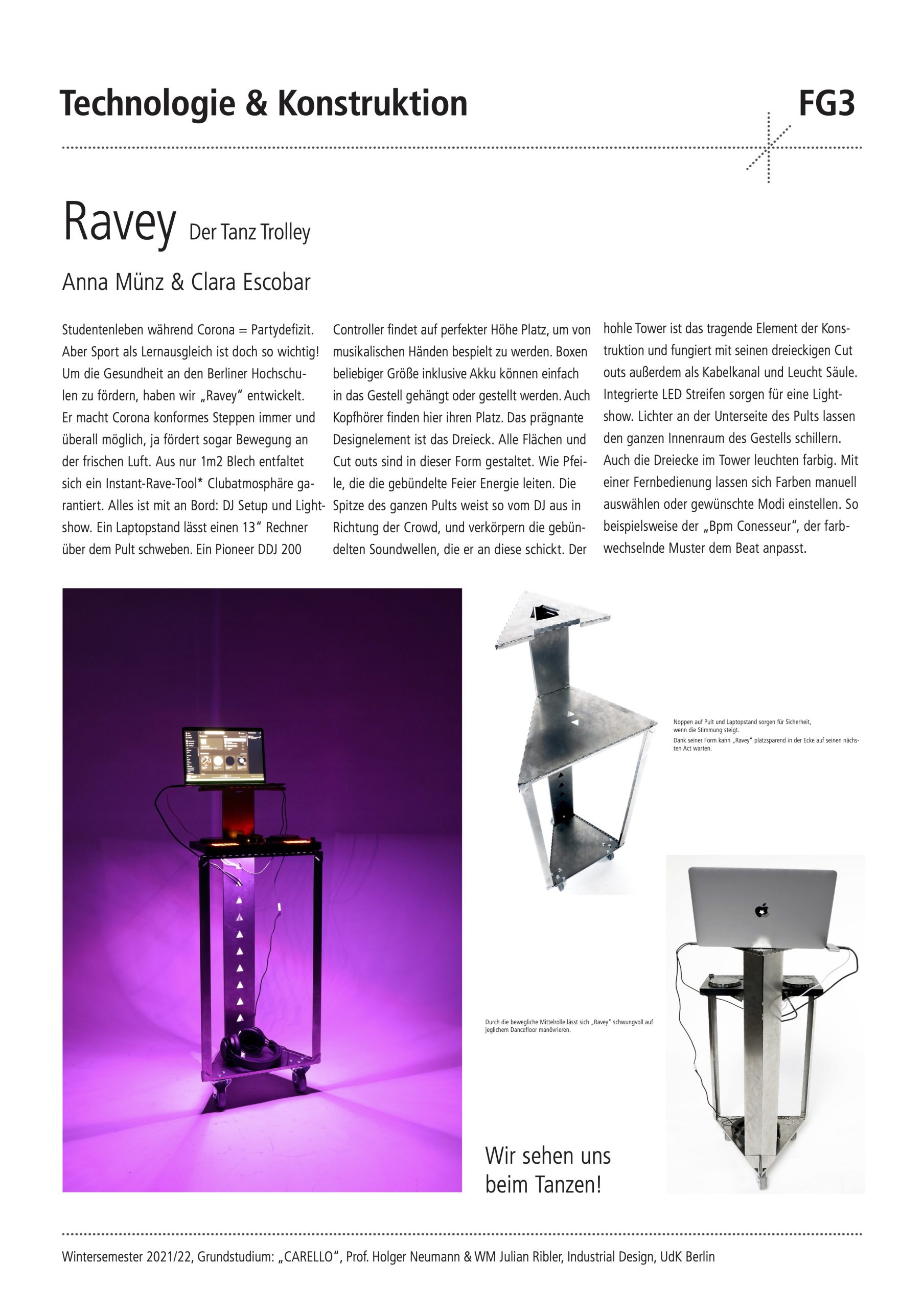

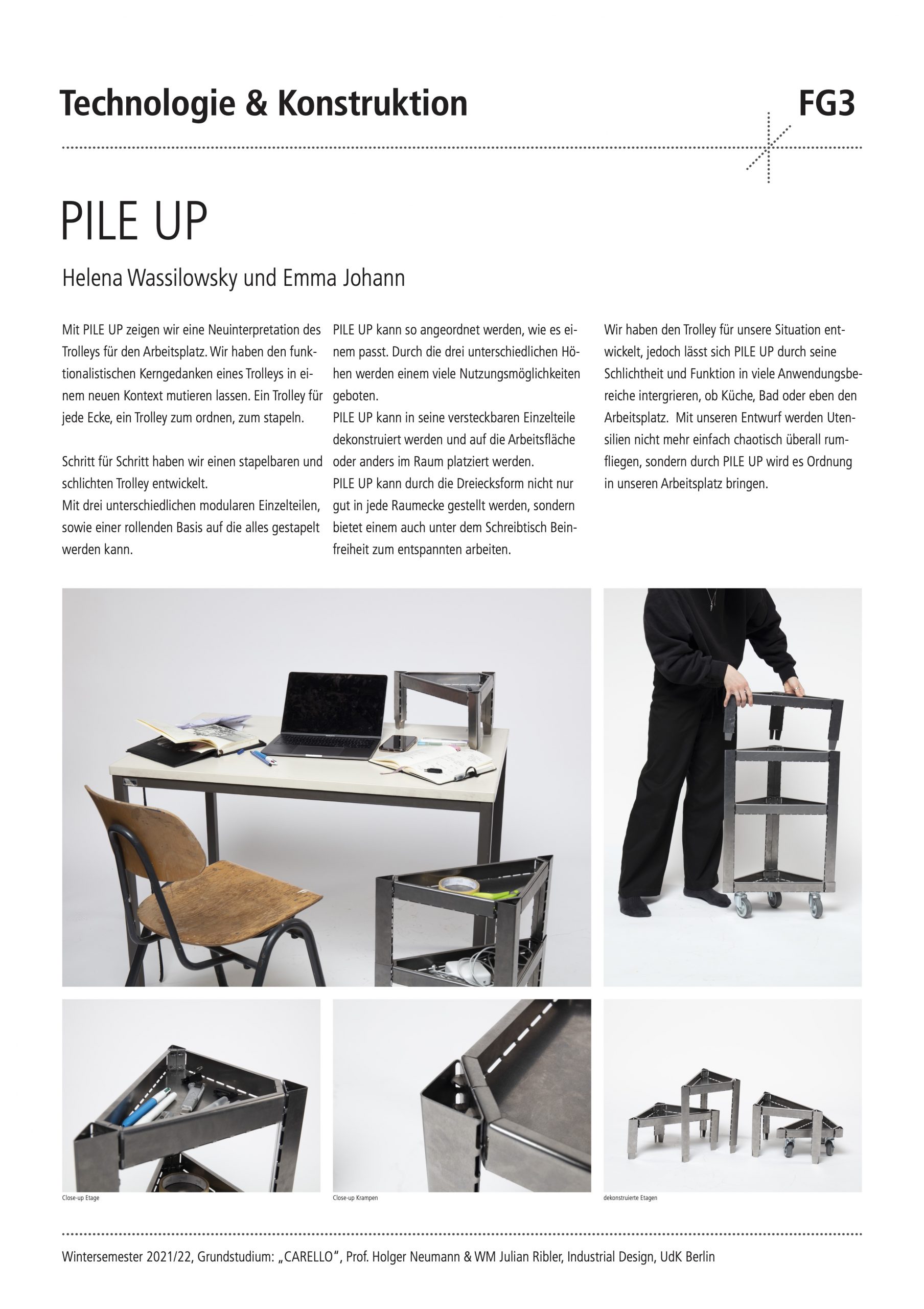
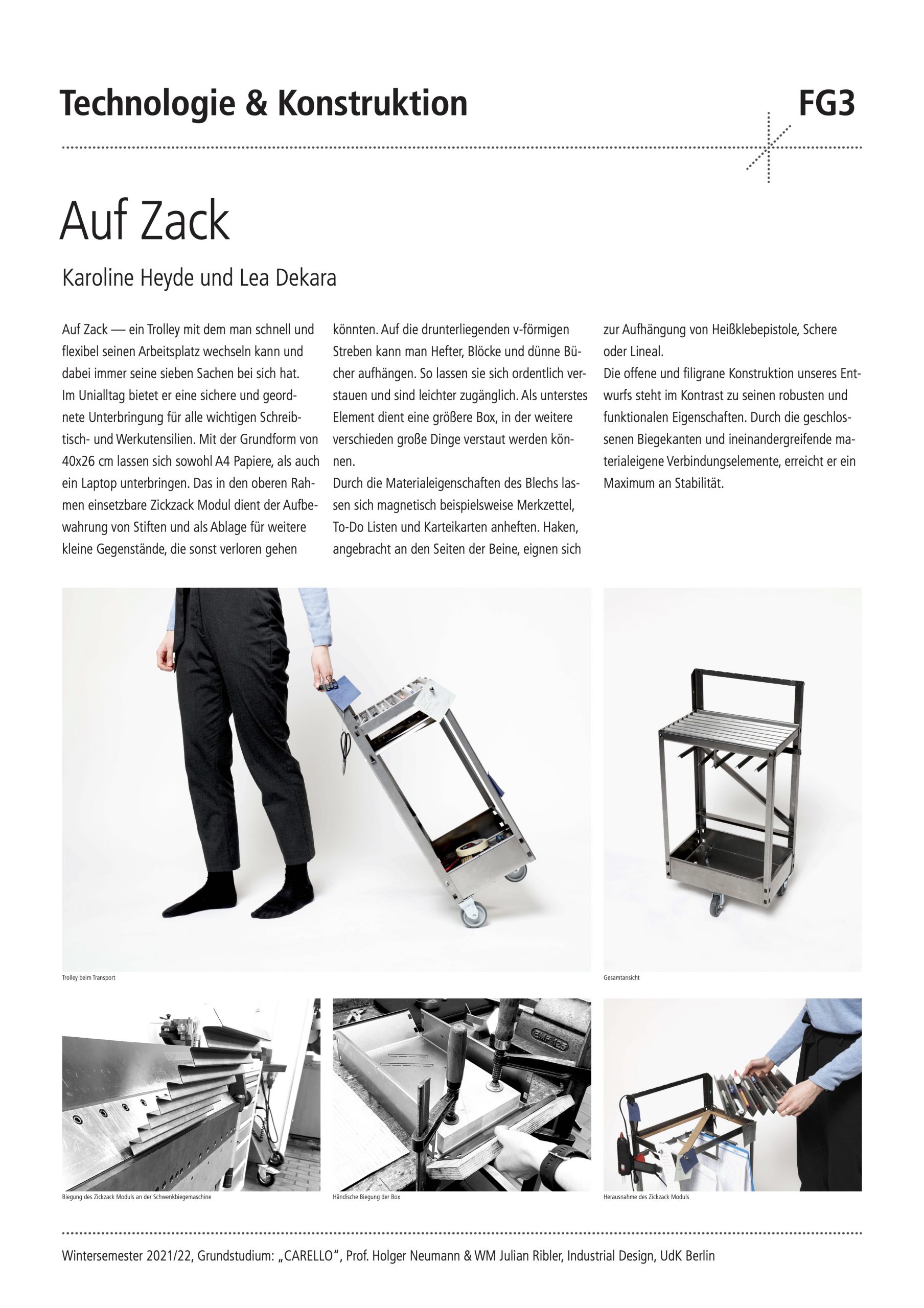

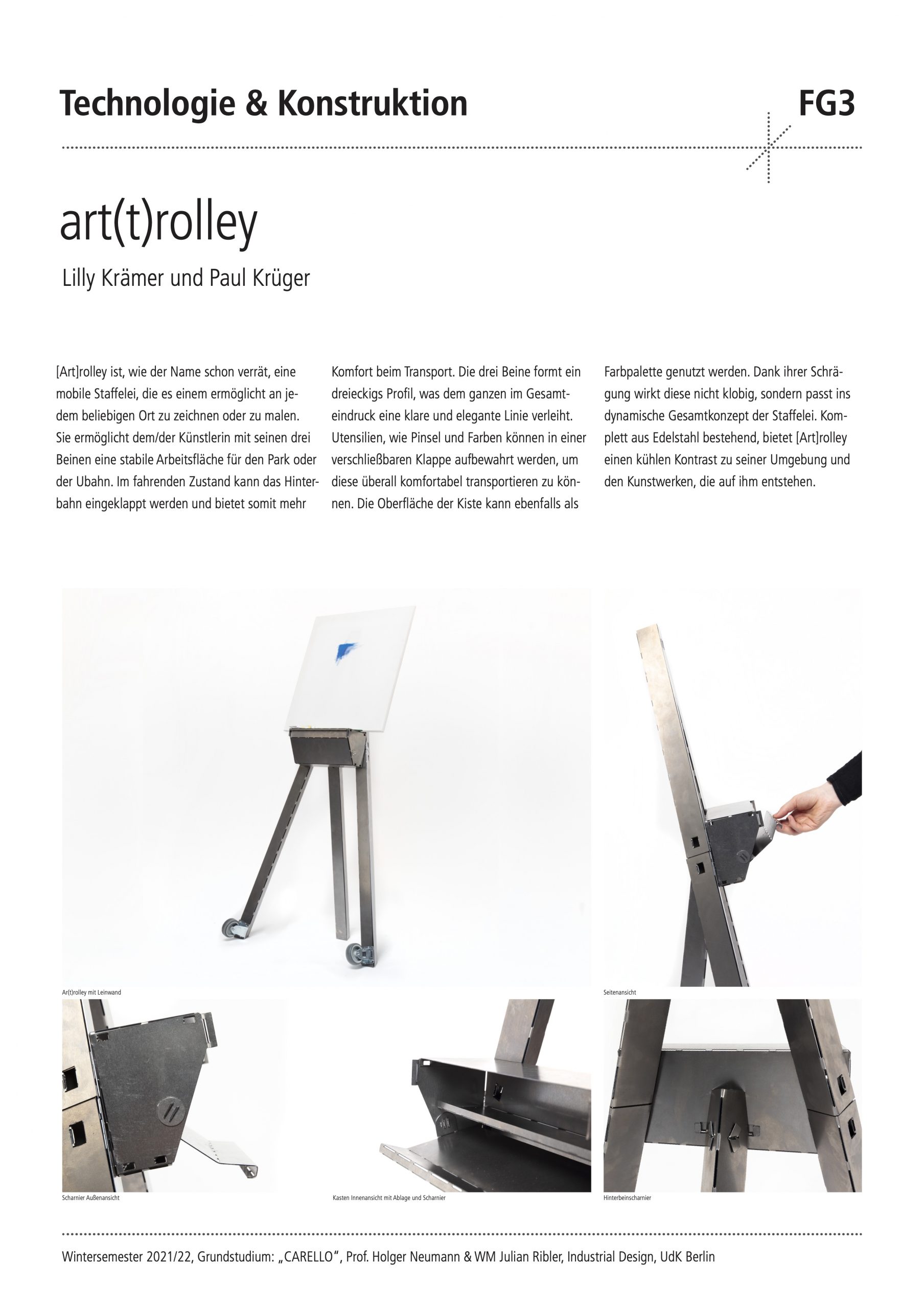

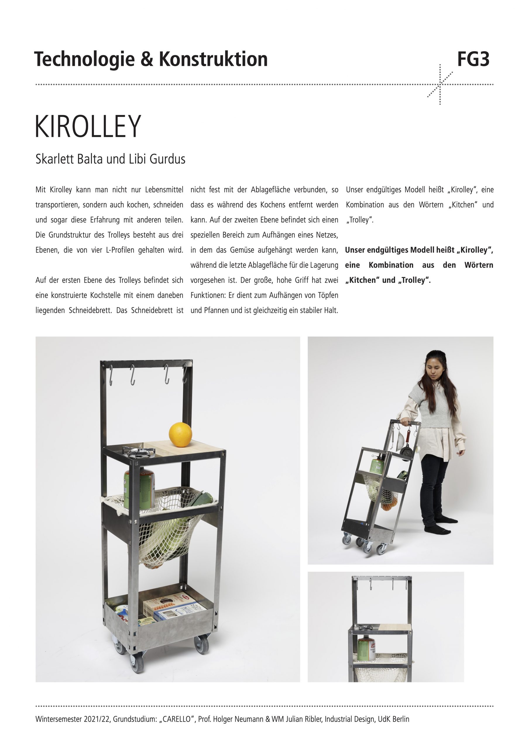
Endpräsentation
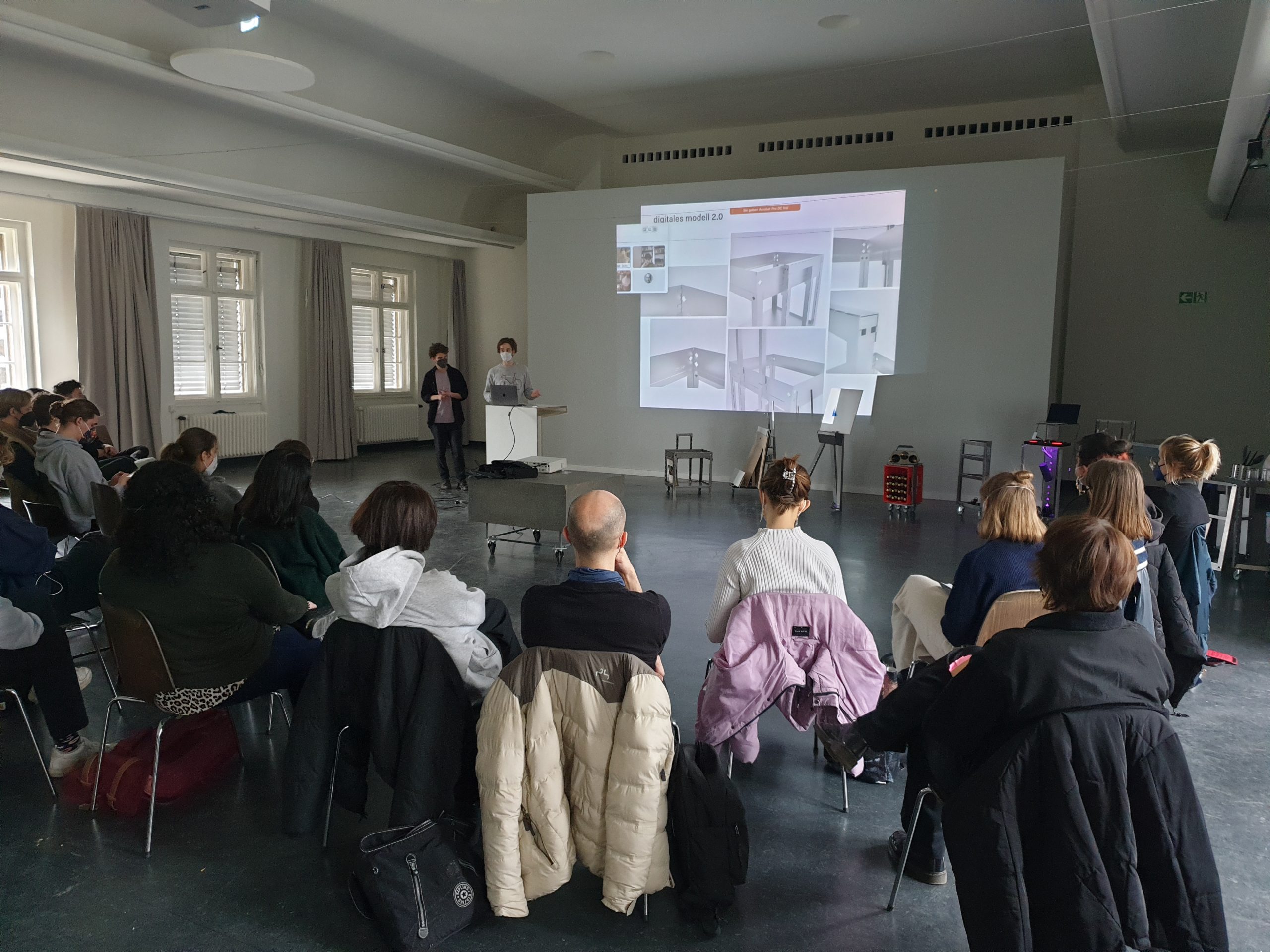
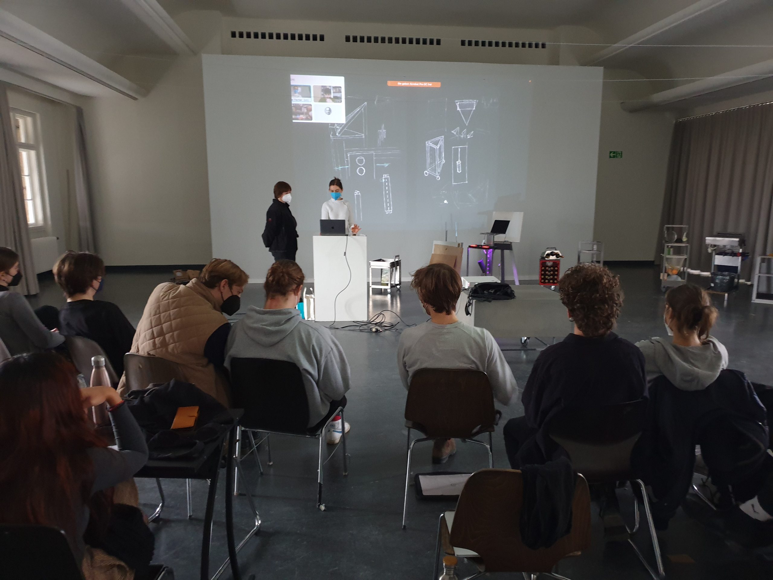

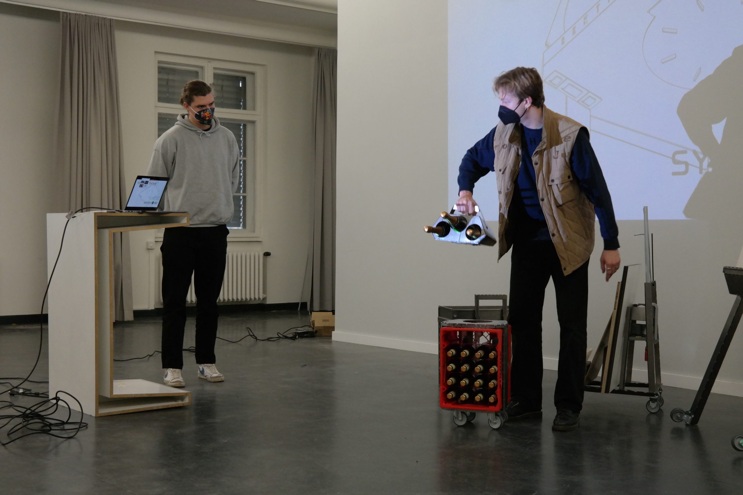
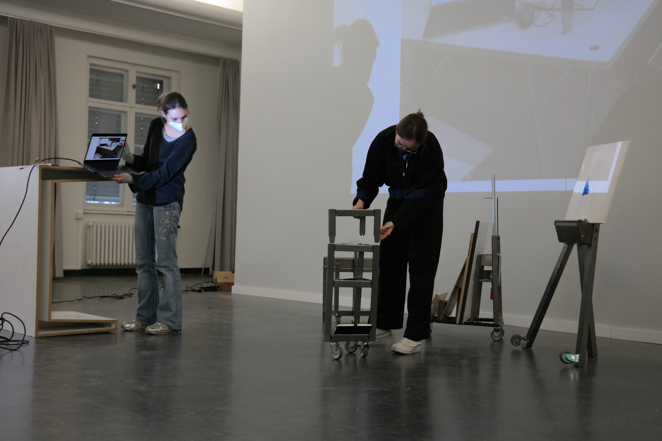
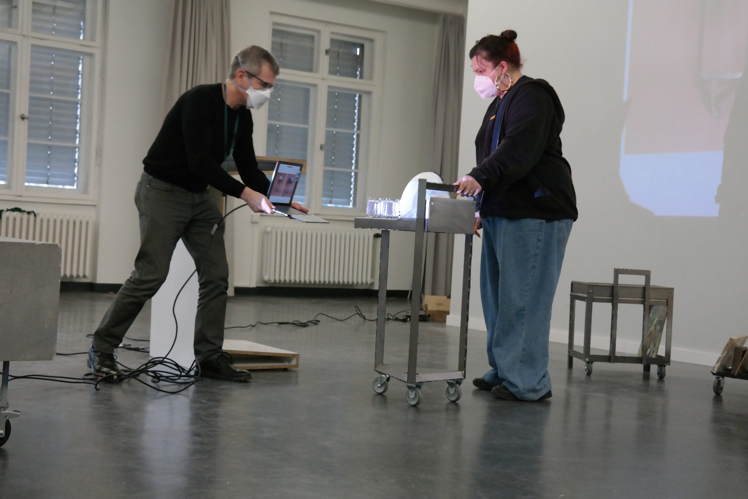
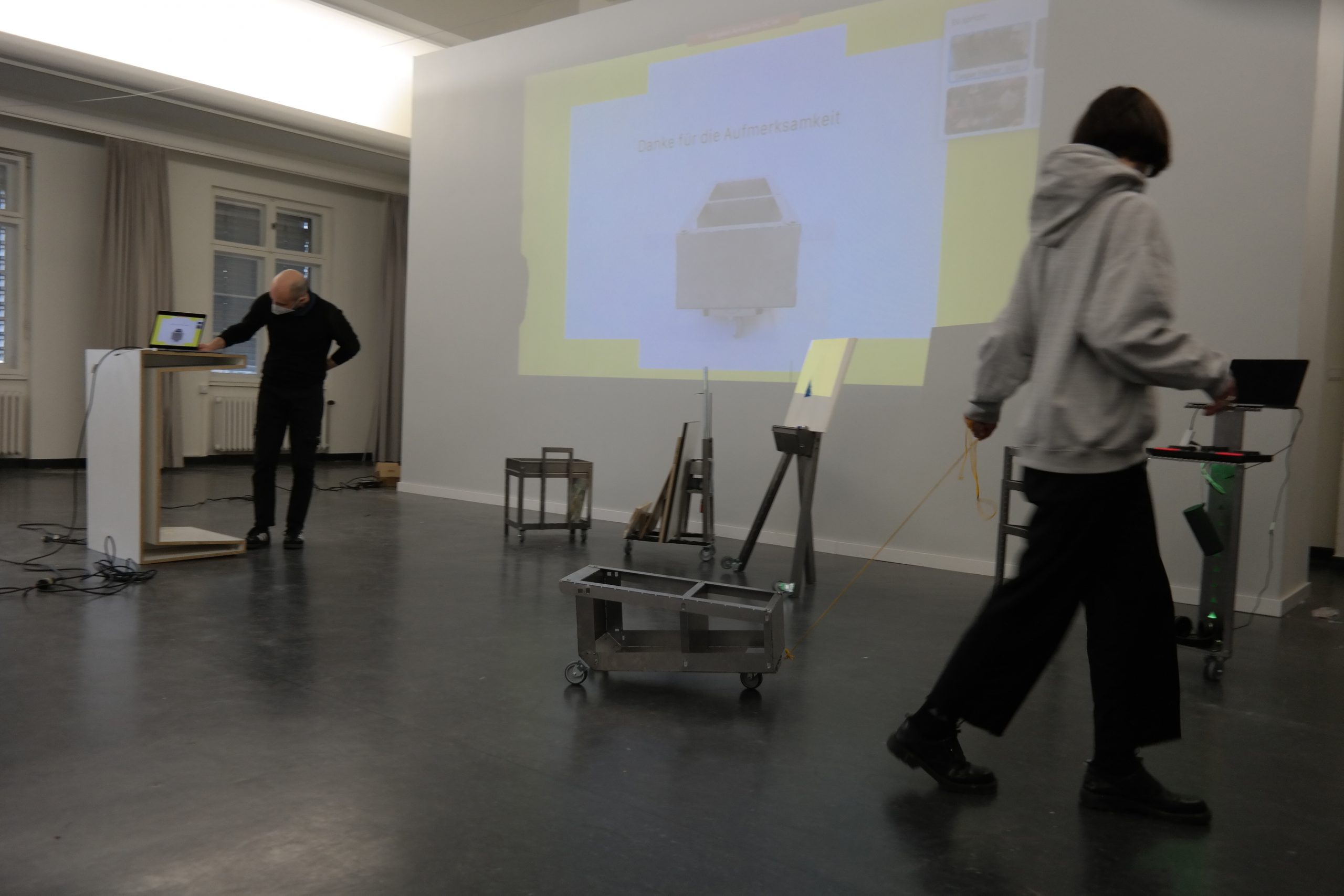


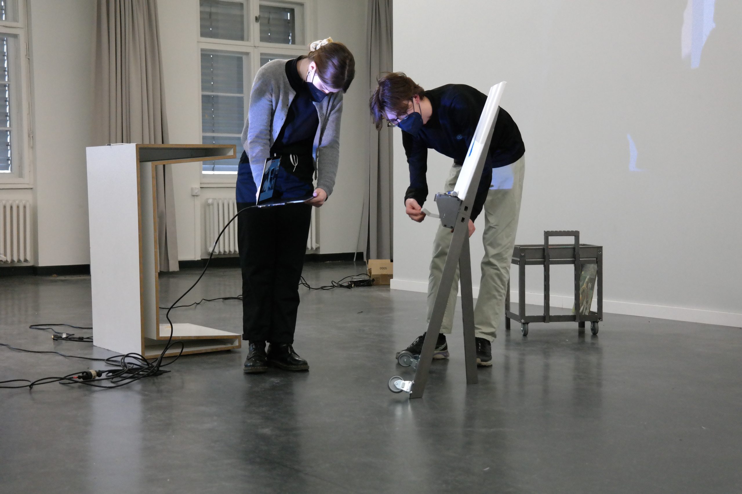
Erste Ideen und Modelle

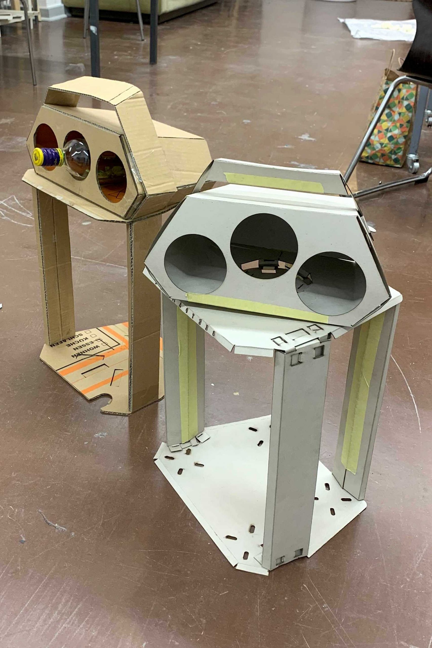
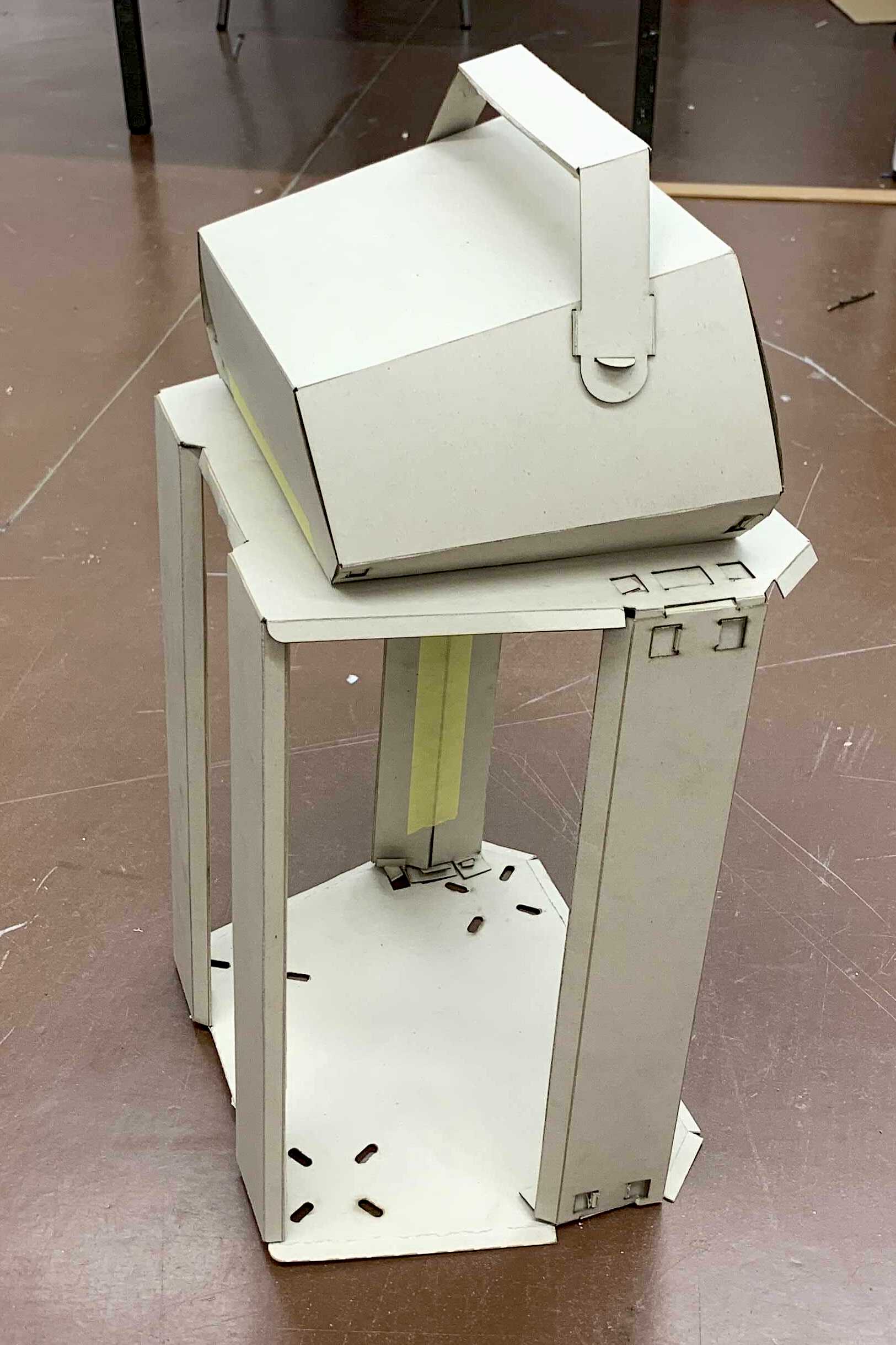

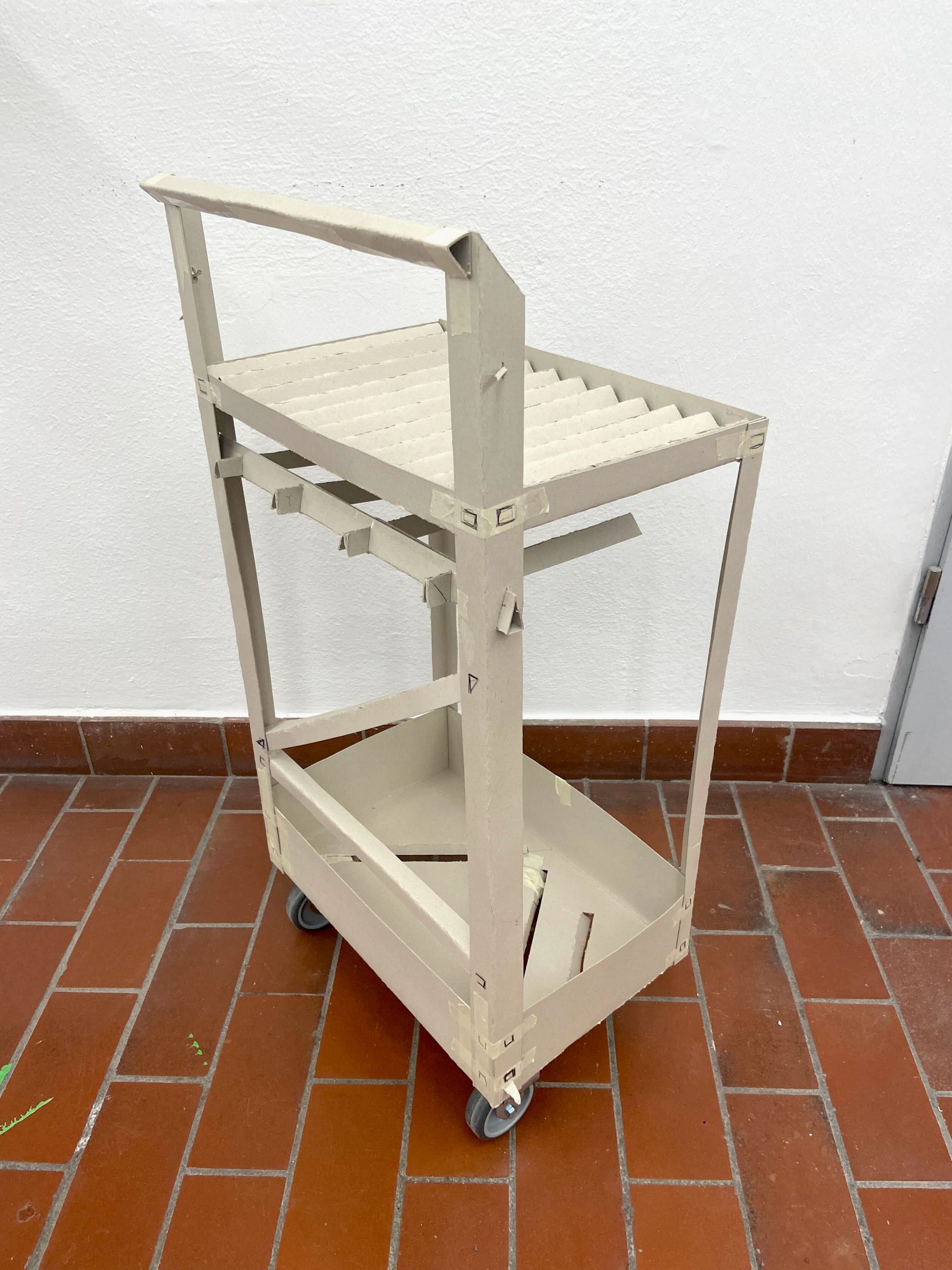
ZWISCHENPRÄSENTATION – MIT MALTE LICHT
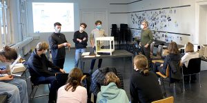
EXKURSION
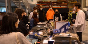
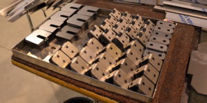
MINDMAP
Die individuellen Recherchen der Studierenden wurden als Inspiration und Orientierung mithilfe einer Mindmap kategorisiert, geclustert und visualisiert.
SEMINARANGEBOT – COURSE OVERVIEW
Bleche sind eines der wichtigsten und wesentlichsten Metall-Halbzeuge, insbesondere Stahlblech ist von grundlegender Bedeutung in der Industrie und wird nicht nur für Gehäuse, sondern auch für Lasten tragende Konstruktionselemente, Maschinenteile und Produkte gerne eingesetzt.Die Semesteraufgabe besteht darin, aus 1 qm Stahlblech der Stärke 1mm ein Objekt zu entwerfen, das bestimmte Funktionen erfüllen soll. Im Verlauf des Semesters werden wir beim Entwurf des Objekts, alle wichtigen Blechkonstruktionen kennenlernen und anwenden.
Das Objekt soll aus ausgelaserten und gekanteten Blechelementen bestehen. Alle abgewickelten Elemente müssen auf eine Fläche von 980 x 980 mm passen, wobei ein Mindestabstand von 10 mm zwischen den einzelnen Teilen bestehen muss. Die Verbindung der Blechteile soll aus dem Material ohne zusätzliche Verbindungselemente erfolgen (z.B. durch Laschungen). Kantungen werden durch gelaserte Perforationen vereinfacht. Die Fertigung der Blechabwicklung erfolgt durch unseren Projektpartner System 180 GmbH.
Besonderen Wert wird auf einen effizienten Materialeinsatz sowie eine dem Prozess und dem Material angemessene Formensprache gelegt. Gemeint ist eine konstruktive Eleganz, die das Zusammenspiel zwischen Konstruktion, Statik und gestalterischer Qualität verkörpert.
Anforderungen
-regelmäßige Teilnahme Seminar + CAD-Seminar
-Referat
-Entwurf
-3D-Datensatz und Prototyp
-Dokumentation
-Poster und Präsentationsvideo
Kooperationspartner
System 180 GmbH https://www.system180.com/
Gast
Dipl. Des. Malte Licht https://oxyd-gmbh.de/
Betreuer
Prof. Holger Neumann
WM Julian Ribler
ITACATE
Ein nachhaltiger Essensbehälter aus Nussschalenresten für lokale mexikanische Imbisse
Unser Ziel ist die Herstellung von wiederverwendbaren Lebensmittelbehältern für kleine Imbissbetriebe in Mexiko (las Cocinas Económicas), die hausgemachte Speisen literweise an Kunden verkaufen. Diese Unternehmen verwenden derzeit Einwegbehälter aus Styropor, die auf der Mülldeponie landen. Die vorgeschlagenen Behälter werden aus einem Biokompositmaterial aus PLA und gemahlenen Nussschalen hergestellt, die derzeit als Abfall der mexikanischen Pekannussindustrie anfallen.
A sustainable food container made from ground up nut shells for local Mexican eateries
Our goal is to produce reusable food containers for use in small scale food takeaway businesses in Mexico (las Cocinas Económicas) that sell home-cooked food by the liter to customers. These businesses currently use single-use styrofoam containers which end up in landfills. The proposed containers would be made of a biocomposite material of PLA and ground up nut shells, which are currently waste from the Mexican pecan industry.
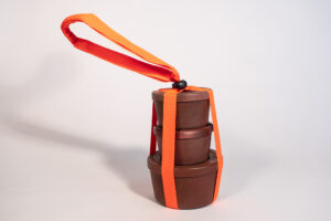
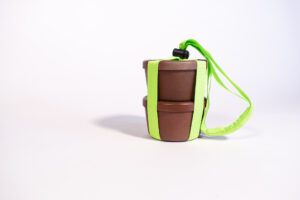
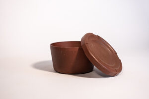
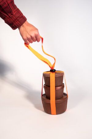
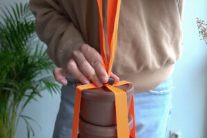
PROZESS
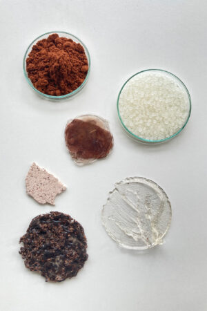
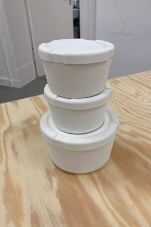
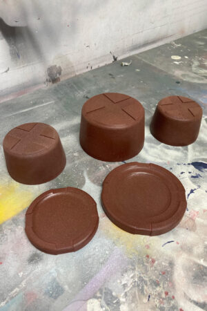
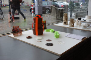
WATATREE
Ein Gehweg-basiertes Regenwasserspeicher-System für den städtischen Raum
Mit steigenden Temperaturen und Bäumen in Berlin, die Symptome von schweren Dürren zeigen, bietet WATA TREE eine langfristige Lösung, die einen einfachen Zugang zu Wasser für städtische Bäume gewährleistet und eine nachhaltige Wassernutzung in städtischen Umgebungen fördert.
Hergestellt aus langlebigem, verzinktem Stahl, ist WATA TREE einfach zu installieren, ohne dass aufwendige Bauprojekte erforderlich sind. Durch Anschluss an bestehende Abwasserrohre kann es zwischen 300 und 1500 Litern Regenwasser sparen, je nach den spezifischen Bedürfnissen des Gebiets.
Johanna Printz
A pavement-based rainwater storage system for urban areas
With rising temperatures and trees in Berlin showing symptoms of severe drought, WATA TREE provides a long-term solution that ensures easy access to water for urban trees and promotes sustainable water use in urban environments.
Made of durable galvanized steel, WATA TREE is easy to install without the need for costly construction projects. By connecting to existing wastewater pipes, it can save between 300 and 1500 liters of rainwater, depending on the specific needs of the area.
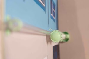
NODIEN
Ein Verbindungskonzept für Bambusrohre
Das Projekt befasst sich mit der Entwicklung von Verbindungen, die es ermöglichen, Bambusrohre ohne Schrauben oder Nägel zu verbinden und zusammenzuhalten. Die Verbindungen sind so konzipiert, dass sie das Material der Bambusrohre nicht beschädigen oder schwächen und sich so gut wie möglich an die natürlichen Formen und Variationen des Bambus anpassen. Die Bambusrohre sollen als ökologische und nachhaltige Alternative zu Stahlrohren in verschiedenen Anwendungsbereichen wie temporären Installationen, Festzelten, aber auch im Hoch- und Tiefbau eingesetzt werden.
A joining concept for bamboo canes
The project deals with the development of joints that allow bamboo canes to be connected and held together without screws or nails. The joints are designed not to damage or weaken the material of the bamboo canes and to adapt as well as possible to the natural shapes and variations of bamboo. The bamboo tubes are to be used as an ecological and sustainable alternative to steel tubes in various areas of application, such as temporary installations, marquees, but also in civil and structural engineering.
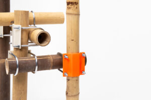

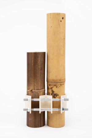
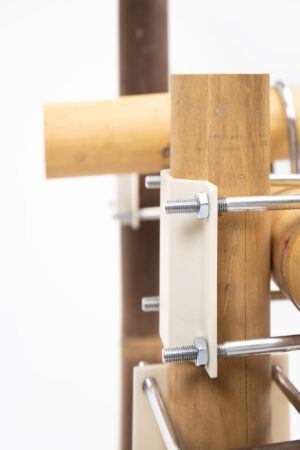
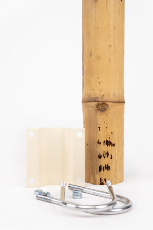
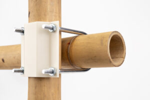
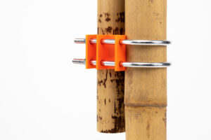
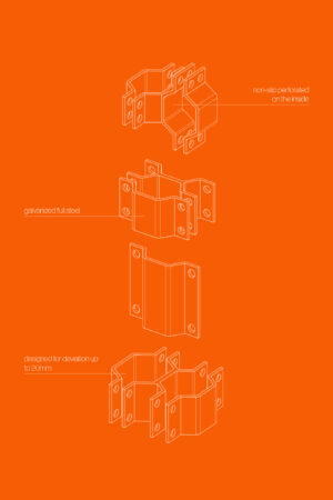
PROZESS
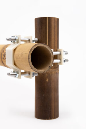
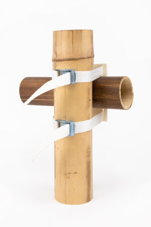
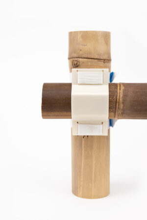
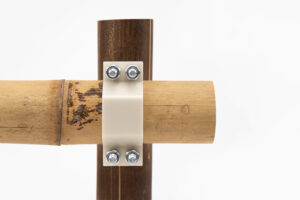
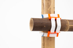
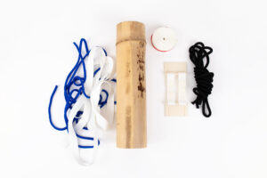
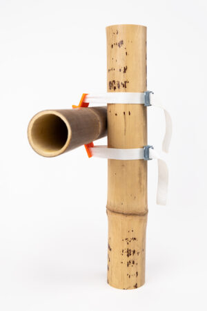
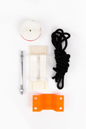
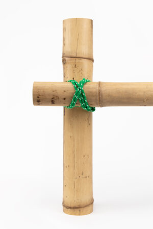
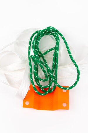
CONVERTIBLE PARCEL
Recyceltes und wiederverwendbare Mehrfach-Verpackung eines Päckchens
Das Projekt bietet dem Nutzer eine Mehrweg- Verpackung, die kostenlos zur Wiederverwendung an den Absender zurückgesendet werden kann. Durch die Verpackung entsteht das nutzbare Transportvolumen eines DHL- Paket S.
Ein aus Zuckerrohr hergestellter Kunststoff bildet zusammen mit einem Cellulose- Fasergewebe, das Kompositmaterial der Verpackung. Durch die Hohe Flexibilität des Fasergewebes und die Dauerhaftigkeit der Beschichtung erhält der Komposit eine hohe Schlagfestigkeit und Schlagzähigkeit.
Recyclable and reusable packaging of a parcel
The project offers the user reusable packaging that can be returned to the sender free of charge for reuse. The packaging creates the usable transport volume of a DHL Parcel S.
A plastic material made from sugar cane together with a cellulose fiber fabric forms the composite material of the packaging. The high flexibility of the fiber fabric and the durability of the coating give the composite a high impact strength and impact resistance.
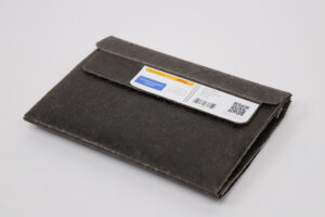
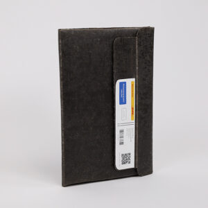
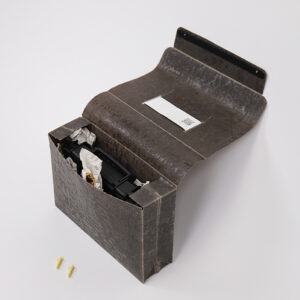
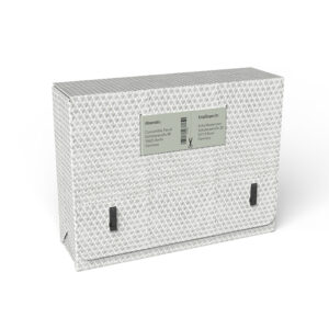
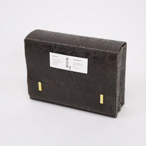
PROZESS
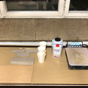
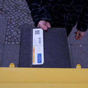
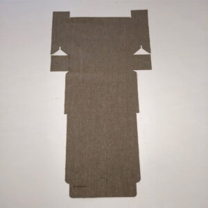
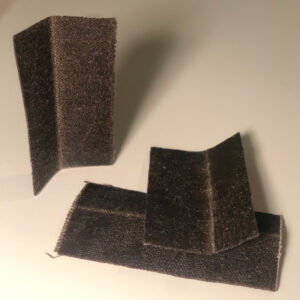
REPATCH
„Repatch“ ist ein Label, das beschädigte Kleidung wieder in einen Kreislauf bringt.
Das Konzept besteht darin, getragene Kleidung wertzuschätzen, sie durch Reparaturen oder Änderungen in einzigartige neue Stücke zu verwandeln und sich dabei nicht weniger modisch zu kleiden. Ziel ist es, das Label „re:patch“ als nachhaltige Marke gesellschaftlich zu etablieren, die für Langlebigkeit, Nachhaltigkeit und Umweltbewusstsein steht.
„Repatch“ is a label that brings damaged clothing back into circulation.
The concept is to value worn clothes, transforming them into unique new pieces through repairs or alterations, while dressing no less fashionably. The goal is to socially establish the label „re:patch“ as a sustainable brand that stands for longevity, sustainability and environmental awareness.
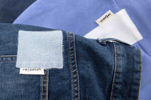
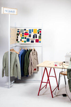
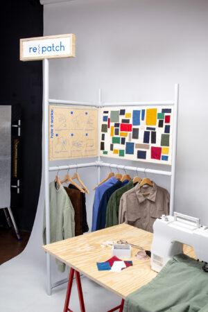
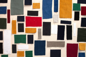
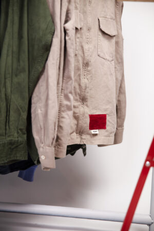
PROZESS
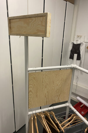
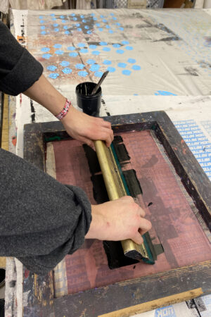
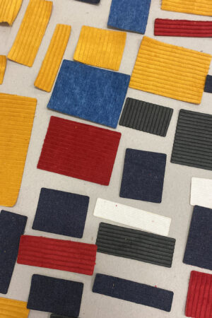
RECAN
Ein System für nachhaltige und recyclingfähige Getränkeverpackungen
Getränkekartons wie Tetra Pak bestehen aus bis zu sieben Schichten Papier, Aluminium und Plastik. Da diese Materialien nur unverbunden recycelbar sind, muss das Verbundmaterial mit einem aufwändigen Verfahren getrennt werden. Hierfür wird sehr viel Energie benötigt.
ReCan hingegen besteht aus zwei Elementen: einer Getränketüte aus Bio-Kunststoff, der aus Maisstärke gewonnen wird, und einer wiederverwendbaren und spühlmaschinenfesten Kanne. Mit Hilfe des Aufsatzes wird die ReCan-Tüte in der Kanne befestigt. So wird eine platzsparende Lagerung, ein einfaches Öffnen und Schließen, sowie ein ideales Handling ermöglicht. Da die ReCan-Tüte nur aus einem einzigen Rohstoff besteht, kann sie nach dem Verbrauch des Inhalts über den Verpackungsmüll recycelt werden.
A system to make beverage packaging more sustainable
Beverage cartons like Tetra Pak consist of up to seven layers of paper, aluminum and plastic. Because this material can only be recycled separately, the composite material must be separated in a complex process. This requires a lot of energy.
ReCan consists of two elements: a beverage bag made of bio plastic, which is obtained from corn starch, and a reusable jug. By means of the attachment, the bag is attached to the can. This ensures space-saving storage, easy opening and closing, as well as ideal handling. Being made of only one material, the ReCan-Bag can be easily recycled after use.
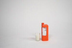
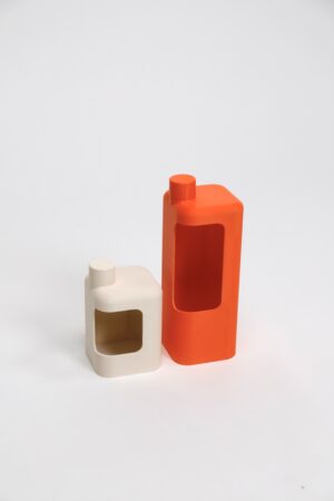
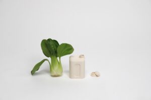
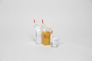
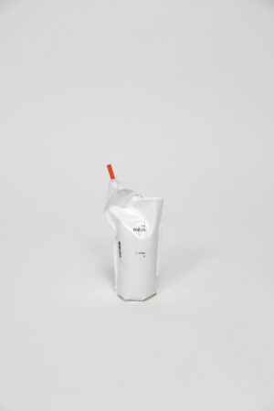
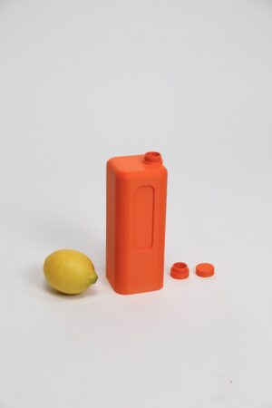
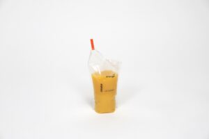
FRAME
Ein einfachaufzubauendes, modulares Sideboard aus recyceltem Aluminium und Wabenplatten aus Karton.
FRAME bietet eine Alternative zu laminierten Spanplatten. Laminierte Spanplatten sind häufig mit Kunstharzen beschichten, enthalten einen hohen Anteil an giftigen Klebstoffen und werden zu einem Großteil verbrannt.
Der Rahmen aus recyceltem Aluminium sorgt für Stabilität und Langlebigkeit und lässt sich leicht auf- und abbauen. Die Wabenplatten aus Karton sind zu 100% recycelbar, leicht und lassen sich einfach in den Rahmen stecken.
Michael Dziewior , 7. Semester WiSe 2022/23
An easy to assemble, modular sideboard made from recycled aluminum and honeycomb-cardboard.
FRAME provides an alternative to laminated chipboards. They are coated with resins, contain toxic adhesives, and are often incinerated during their disposal.
The frame made of recycled aluminum provides stability, durability and is easy to assemble and disassemble. The honeycomb-cardboard is 100% recyclable, lightweight, and simply plugged into the frame.
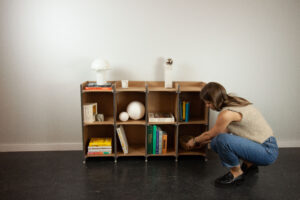
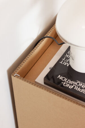
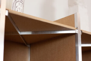
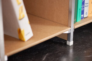
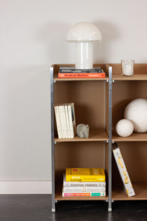
PROZESS
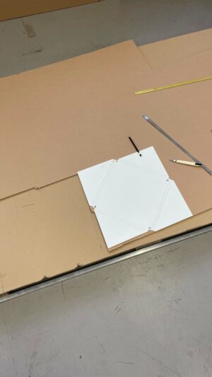
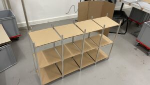
WHY NOT NUTS
Nutship – ein Blumentopf aus Walnussschalengranulaten für Verpackung von Sukkulenten
Walnussplantagen und die Sukkulentenindustrie sind traditionell in ähnlichen landwirtschaftlichen Regionen angesiedelt. Die Nutships – Blumentöpfe aus Walnussschalen – können eine lokale Alternative zu Plastiktöpfen für den Transport solcher Pflanzen sein, die nur wenig Wasser zum Wachsen benötigen.
Nutship ist eine nachhaltige Verpackung, die weder Ressourcen belastet noch Schadschtoffe enthält. Außerdem könnte diese Methode angepasst werden, um weitere Produkte mit anderen Arten von lokalen Nussschalen zu verpacken.
Limeng Liu. 3.Semester WiSe 2022/23
Nutship – a plant pot made from walnut shells for packaging succulents
Walnut farms and the succulent industry are traditionally located in similar agricultural areas. The Nutships – Plant pots based on walnut shells – can be a local alternative to plastic pots for transporting plants that require only little water. The packaging doesn’t burden resources and it´s 100% degradable in the soil.
Moreover, this approach could be adjusted to package further products with other types of local nut shells.
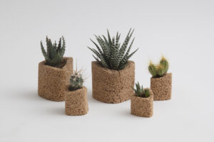
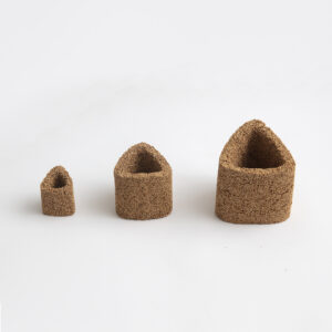
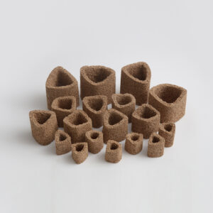
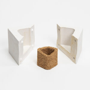
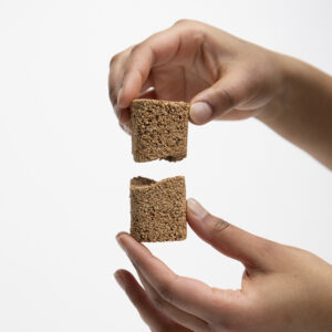
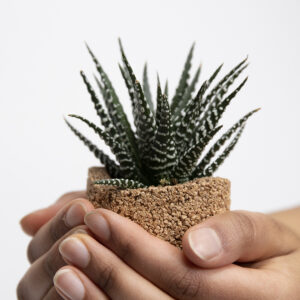
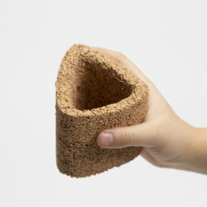
PROZESS
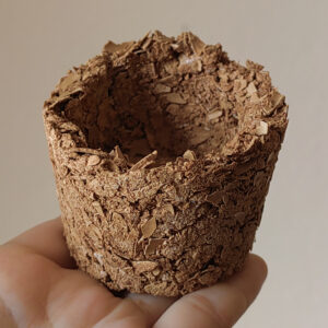
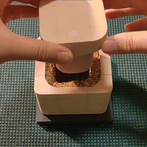
REST IN GROUNDS
Eine nachhaltige Urne aus Kaffeeresten
Die Weltbevölkerung nimmt zu und es besteht ein steigender Bedarf an Bestattungsmöglichkeiten. In den letzten Jahren wurden biologisch abbaubare Alternativen zu traditionellen Särgen entwickelt, aber sie beanspruchen noch immer viel Platz. Aufgrund des knappen Raums, sich ändernder Rituale und veränderter Einstellungen zu Bestattungen, nimmt die Zahl der Einäscherungen und Urnenbeisetzungen zu. Eine Studie aus dem Jahr 2021 bestätigt diesen Trend, indem sie zeigt, dass Feuerbestattungen im Vergleich zu traditionellen Sargbestattungen häufiger vorkommen. Die meisten Urnen werden begraben und sind oft aus schwer abbaubarem Material gefertigt. In Ländern wie Deutschland, Österreich und Italien besteht sogar die Pflicht, die Urne zu begraben.
Um diesem Bedarf gerecht zu werden und gleichzeitig die Umwelt zu schonen, haben wir die Kaffee-Urne entwickelt. Diese Urne wird aus Kaffeesatz hergestellt, der normalerweise als Müll endet. Durch ihre neutralisierende Wirkung auf die Asche hat sie einen positiven Effekt auf die Umgebung. Ihre einzigartigen Eigenschaften tragen zur Förderung des Wachstums und der Vitalität bei, was sie zu einer umweltfreundlichen und nachhaltigen Wahl für alle macht, die eine letzte Ruhestätte für ihre Verstorbenen suchen.
Nele Oetjens, 3. Semester WiSe 2022/23 , Insta @nele_inprogress
A sustainable urn out of coffee grounds
The world’s population is growing, and as more people pass away in the coming years, there is a growing need for funeral options. While bio-degradable coffin alternatives have been developed in recent years, they still take up space. Due to limited space, changing religious practices, and evolving views on funerals and burials, the number of cremations and the use of urns is increasing. This trend is also reflected in a study from 2021, which shows that cremation burials are becoming more prevalent in comparison to traditional coffin funerals. However, in many countries, these urns are still buried, and they are often made of materials that do not easily decompose. In addition, in Germany, Austria and Italy, for example, there is an obligation to bury the urn under the earth.
As a result, there is a growing demand for funeral options that have a positive impact on the environment. In response to this, we have designed the „bio urn“, which is made from used coffee grounds that would normally end up in the waste bin. Due to its neutralising effect on the ashes, it has a positive impact on its surrounding environment.
This unique properties help to promote growth and vitality in the surrounding environment, making it an eco- friendly and sustainable choice for those looking for a final resting place for their loved ones.
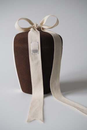
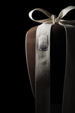
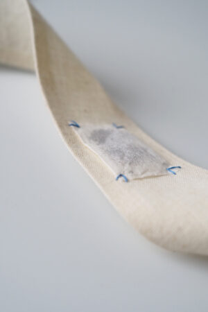
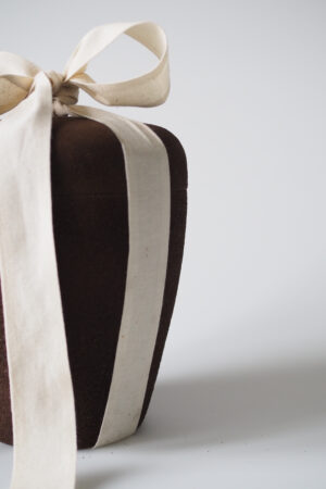
PROZESS
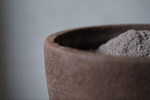
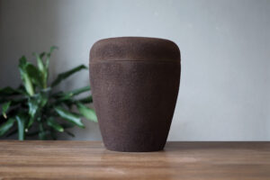
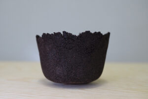
OCEANWASTE
ist ein Konzept für künstliche Riffe aus recycelten Muschelschalen.
Klimawandel und Umweltverschmutzung bedrohen unsere Ozeane, insbesondere fragile Ökosysteme wie Riffe sind besonders betroffen. Herkömmliche Maßnahmen künstliche Lebensräume zu schaffen stützen sich oft auf Materialien wie Beton oder Stahl, die bei der Produktion sehr viel CO2 ausstoßen und schädliche Stoffe ins Wasser aussickern lassen können. OCEAN WASTE bietet eine nachhaltigere Lösung, indem es weggeworfenen Muschelschalen aus der Fischerei eine zweite Chance gibt.
Finn Sauter, 3. Semester WiSe 2022/23
an artificial reef concept, made from discarded sea shells.
Climate change and pollution take a huge toll on our oceans and especially fragile ecosystems like reefs. Conventional solutions for recreating natural habitats often use materials like concrete or steel, which are CO2 intensive to produce and can leach harmful chemicals into the water. OCEAN WASTE offers a more sustainable solution by giving discarded sea shells from the fishing industry a second life.
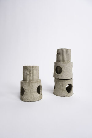

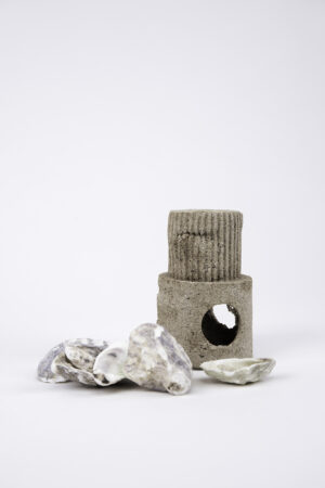
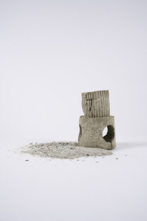
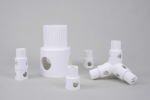
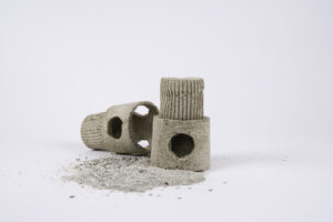
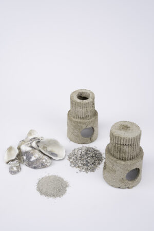
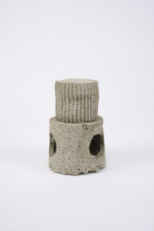
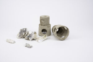
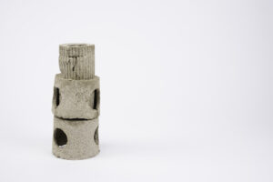
PROCESS
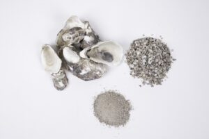
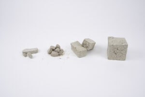
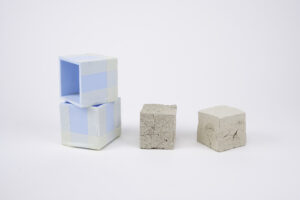
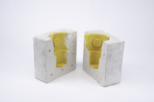
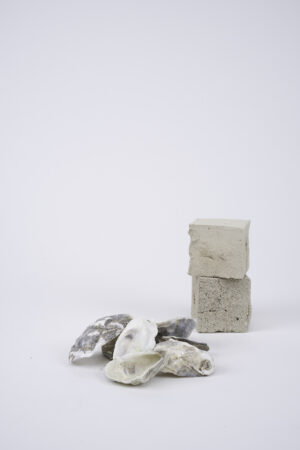
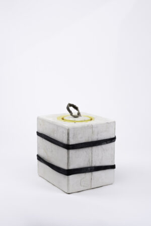
URBAN AQUAPONICS
Ein zirkuläres Farm- und Wassersystem, das mit der Stadtwasser verbunden ist
Das Projekt beschäftigt sich mit neuen Kultivierungsmethoden im urbanen Kontext. Wie viele andere Städte besitzt auch Berlin über ungenutzte Wasserflächen. Urban Aquaponics zeigt neue Wege der modernen städtischen Beziehungen auf. Es nutzt die bereits existierende Aquaponic Kultur und bringt sie in einen neun Kontext, der Stadtentwicklung. Dabei steht der große Fokus auf der Beziehung zur Stadt, ihren Bewohner*innen und den lokalen Gegebenheiten. Es entsteht ein zirkuläres Farmingsystem, welches in Harmonie mit dem bereits bestehenden Ökosystem existieren kann.
A circular farming and water system in conection with the city waters
The project deals with new cultivation methods in an urban context. Like many other cities, Berlin‘s waterways were highly used in the past. That relationship however has decreased with time. The project offers a modern review of tho- se relationships as an answer to existing problems most cities face nowadays! Urban Aquaponics uses the already existing aquaponics culture and places it in the urban waters of Berlin. The project‘s main focuses are the connections with local inhabitants, the relationship to the existing ecosystem, and the totality of the circular farming and water system.
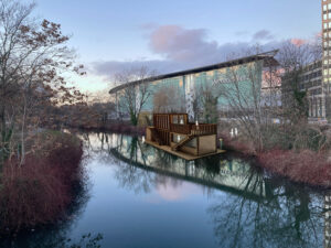
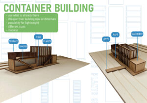
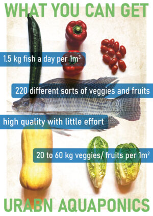
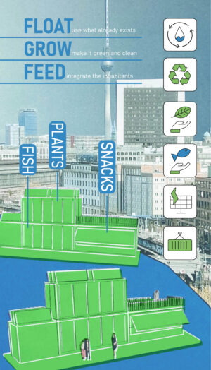
CABLE + AID
ein neues Konzept für den Umgang mit entsorgten elektronischen Komponenten.
Wenn ein Elektrogerät nicht mehr funktioniert, ist in der Regel nur eines seiner vielen Teile kaputt. In unserem jetzigen Umgang mit Elektroschrott werden alle anderen Komponenten einfach weggeworfen – selbst, wenn sie noch funktionieren.
Die Wiederverwendung von noch funktionstüchtigen Komponenten wäre ein zirkulärer Ansatz. Externe Netzkabel sind hierfür ein gutes Beispiel. Mit unserem Projekt stellen wir uns einen Arbeitsplatz vor, an dem Elektroschrott Recycler Netzkabel testet, zertifizieren und für den Wiederverkauf verpacken können.
Max O’Dell, Anpassungssemester Master WiSe 2022/23 – – www.odell.de
a new approach for handling discarded electrical components.
When an electrical appliance stops working, usually only one of its many parts is broken. In the current e-waste model, all other components are simply thrown away — even if they still function.
Reusing components where possible would be a more circular approach. External power cords are a promising example. In our project, we envision a workstation at e-waste recyclers where power cords are tested, certified, and packaged for resale
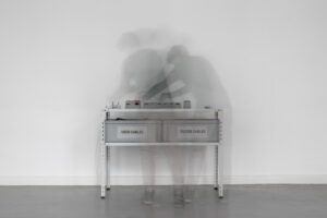
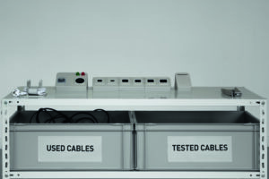
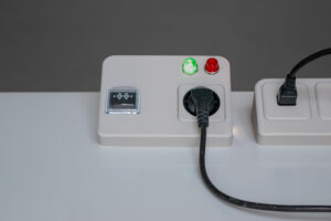
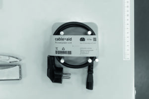
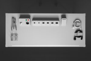
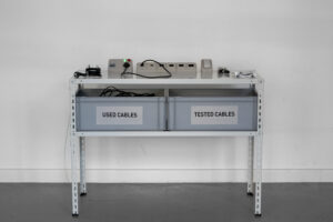
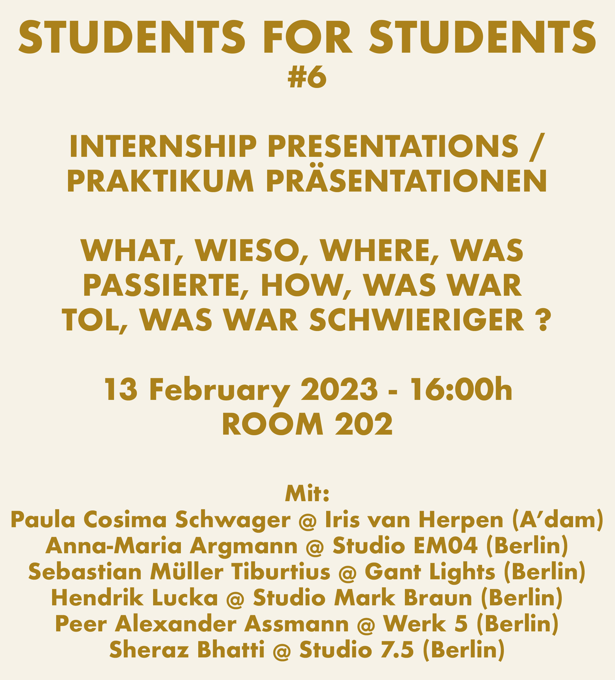
Produkt Design Students do internships.
In life presentations a recent group of interns present their whereabouts and the do and don’ts for internships: where were they, what did you do there, what was super and not so super, what did they learn, what can they advise, what was the overall experience, did you get paid, etc…
Monday 13 February
16.00-18.00h
Life in ROOM 202
Produkt Design Studenten machen alle ein Praktikum.
In Life-Präsentationen stellt eine aktuelle Gruppe von Praktikanten ihren Erfahrungen und die ‚Do and Don’ts‘ für Praktika vor: Wo waren sie, was haben sie gemacht, was war super und was nicht so super, was haben sie gelernt, was können sie beraten, was war die Gesamterfahrung, wurdest du bezahlt, etc…
Montag, 13. Februar
16.00-18.00 Uhr
Life in RAUM 202
You can apply for our master studies.
From 1 March till 01 April the application procedure will be open, but get yourself prepared and take a look at
HOW to apply and WHAT preparations to make at:
BEWERBUNG > über das Masterprogramm
INFO about
MA-Fashion Design or
MA-Product Design,
including their programs you can find BELOW
Important dates 2024/2025:
• 1. February week: OPEN CALLS 2023/2024 are online
• 1. March – 1. April: registrate and send in your application
• 5. March 18:00 -19:00 (CET): online info meeting for all questions on the MA programs and the application process
PLEASE CLICK LINK HERE (active 5. March)
• 13-22 May: online admission interviews
• 19 or 20 July: Invitation to ‚Rundgang‘ und ‚Projektbörse‘
Du kannst dich für unser Masterstudium bewerben.
Vom 1. März bis 1. April ist das Bewerbungsverfahren geöffnet,
aber bereite dir vor und schaue nach,
WIE zu bewerben und WAS vorbereitet werden müss unter:
BEWERBUNG > über das Masterprogramm
Die INFOS über das
MA-Modedesign und
MA-Produktdesign Studium,
einschließlich des Programms sind HIER UNTEN zu finden
Wichtige Daten 2024/2025:
• 1. Februarwoche: OPEN CALLS 2023/2024 sind online
• 1. März – 1. April: Registrierung und Einreichung der Bewerbung
• 5. März: 18:00-19:00 Uhr (MEZ): Online Infotreffen: alle Fragen zum MA-Programm und dem Bewerbungsverfahren werden geklärt
LINK BITTE HIER KLICKEN (activ 5. März)
• 13.20. Mai: Online Aufnahmegespräche
• 19. oder 20. Juli: Einladung zum Rundgang und der Projektbörse
Tobias Trübenbacher won the German Design Council Newcomer Award 2023!
the Newcomer Award is handed out to young designers with an impressive portfolio.
2023 was a very special year, since in 4 out of the final 5 candidates that were nominated for the Newcomer Award came from UdK Design: 3x Product design: Tobias Trübenbacher, Anna Koppmann & Tim Schutze. 1x Fashion: Paula Keilholz, see
See also their films below:
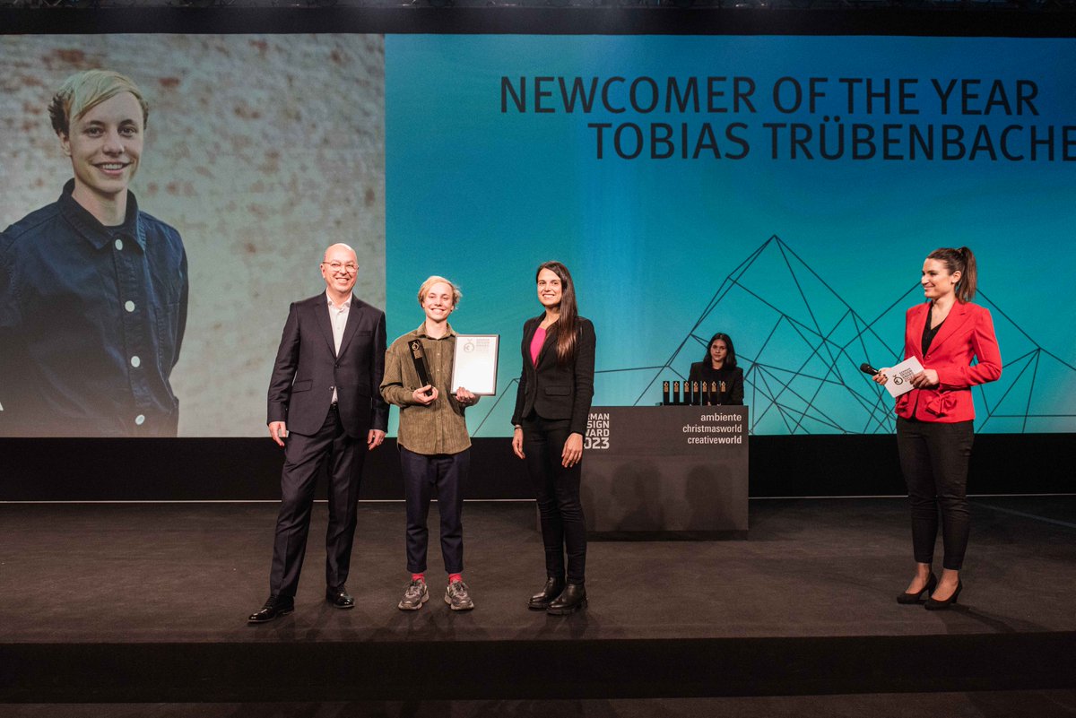
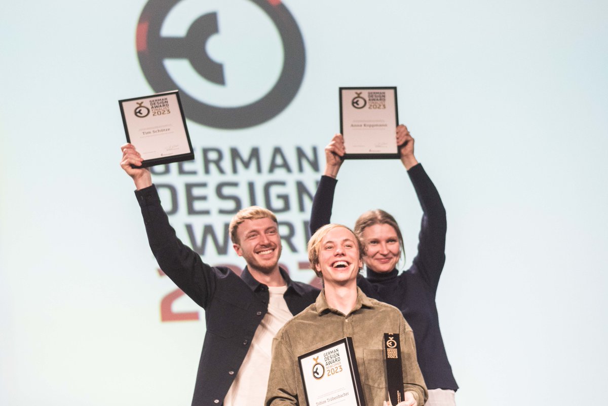
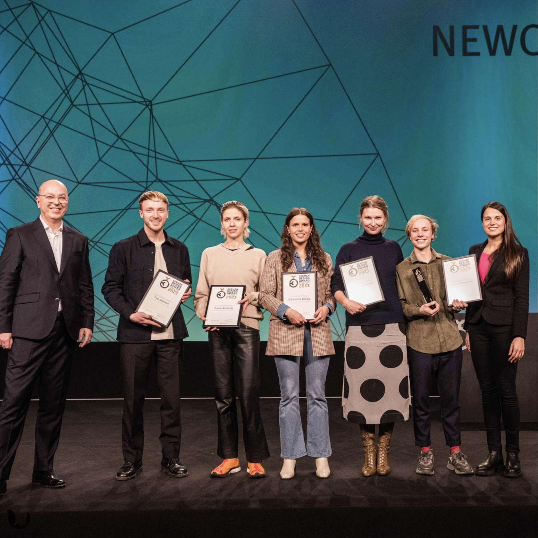
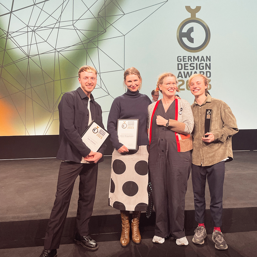
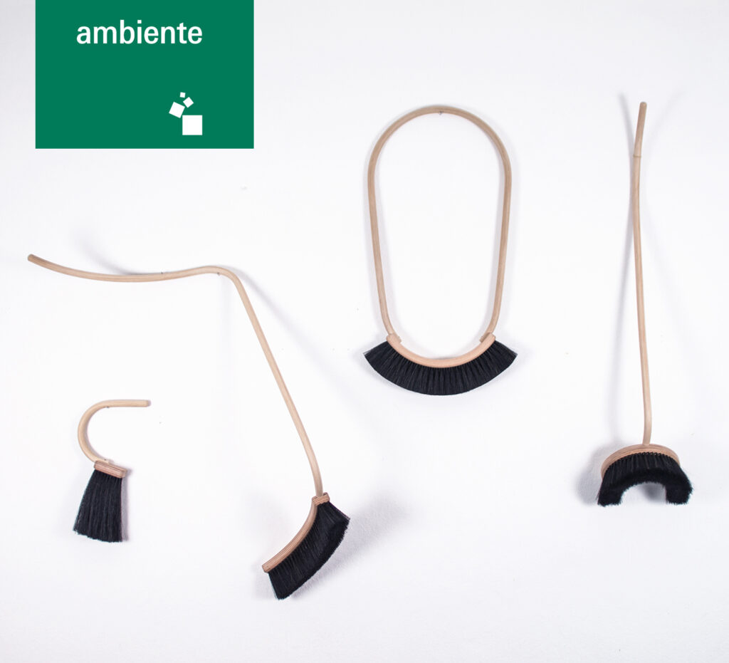
From 3 till 7 February Ambiente Frankfurt takes place.
As in previous years new talents are presented at this fair.
Ambiente – as ambassador of German Design Graduates – picked Agnes Kelm to show her graduation project DAS TUN AN SICH
She will be present in the hall for interior design (hall 3.1)
read more HERE
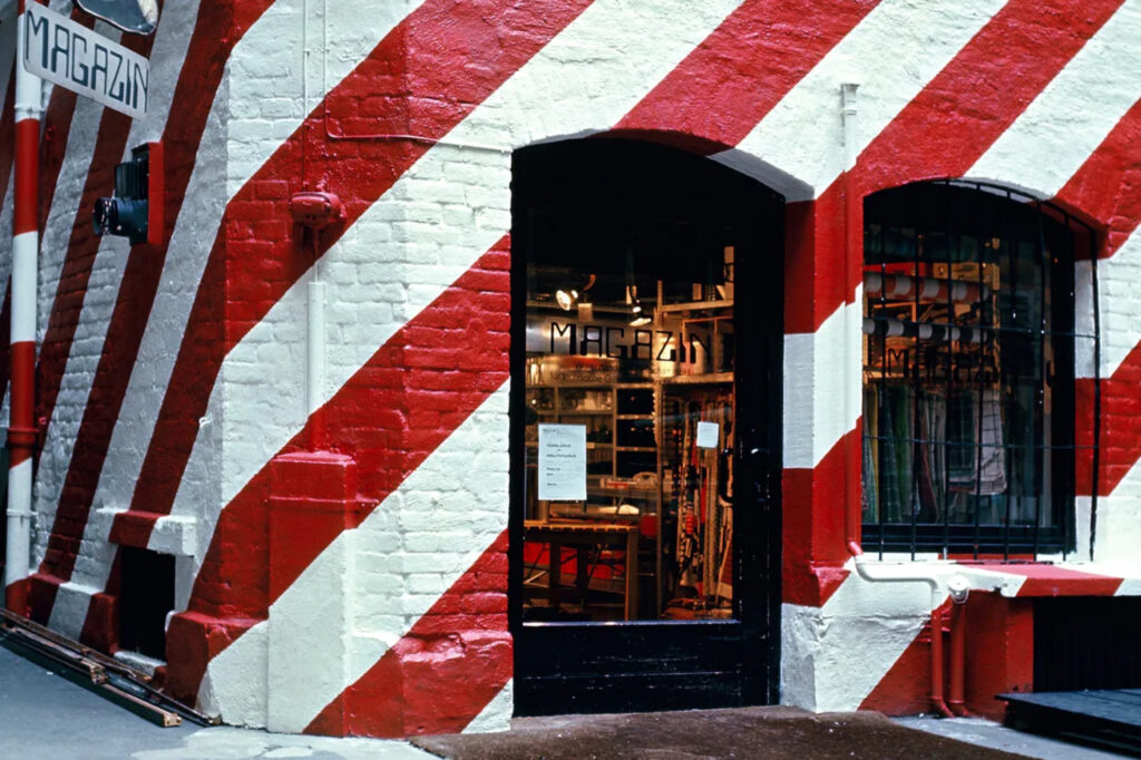
Tuesday afternoon (17 Jan 2023) the Master students Product design will end and present their Cooperation-Project with MAGAZIN® in room 402.
WITH YOUR BACK TO THE WALL
WE CORDIALLY INVITE ALL IN OUR HOUSE
for a short LUNCH PREVIEW from 13.00 to 13.25h
Am Dienstagnachmittag (17.01.2023) beenden und präsentieren die Masterstudierenden Produktdesign ihr Kooperationsprojekt mit MAGAZIN® in Raum 402.
MIT DEM RÜCKEN AN DER WAND
WIR LADEN ALLE IN UNSER HAUS HERZLICH EIN
zu einer kurzen LUNCH PREVIEW von 13.00 bis 13.25 Uhr
PERFORMATIVE EXTRUSION | Masterarbeit 2022
Performative Extrusion ist das Ergebnis eines experimentellen Designprozesses: Tests durchführen, Prozesse beobachten, Ergebnisse prüfen, neues Wissen herstellen, Erkenntnisse einspeisen und Vorgänge wiederholen. Das Experiment im Design ist ein untypischer Gestaltungsprozess und bietet die Chance, neue Herangehensweisen zu erproben und auf neue ästhetische sowie technische Ergebnisse zu stoßen.
In dem Projekt wird der Prozess des Strangpressens aus dem industriellen Kontext gelöst und in einem analogen Verfahren untersucht. Welche weiteren Potenziale stecken in dieser Verfahrenstechnik, die über die Produktion endlos gerader Stränge hinausgehen? Wie kann Bewegung mit einfließen und jenseits des Effizienzgedankens auch das ästhetische Potential ausgeschöpft werden?
Performative Extrusion ist eine Methode, um extrudierte keramische Masse neu zu formen. Die Beschaffenheit der Matrize bestimmt Bewegung, Form und Funktion. Performative Extrusion ist neu und liefert Einblicke in die Gestaltung von Erkenntnisproduktion.
Performative Extrusion is the result of an experimental design process: carrying out tests, observing processes, checking results, creating new knowledge, feeding insights and repeating processes. Experimentation is an uncommon design process that offers the possibilities to try new approaches and come across new aesthetic and technical results.
In this project, the process of extrusion is detached from the industrial context and examined in an analogous process. Which further potential does this process technology hold within that goes beyond the production of endlessly straight strands? How can movement be incorporated and the aesthetic potential be exploited?
Performative Extrusion is a method of reshaping extruded ceramic mass. The nature of the die determines movement, form and function. Performative Extrusion is new and provides insights into the design of knowledge production.
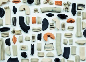
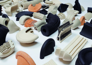


Betreut durch: Prof. Ineke Hans, Prof. Holger Neumann, KM Annika Unger
Kontakt: charlottemarabito.de
OSTHAFEN_JanColomer_7")
OSTHAFEN_JanColomer_6")
OSTHAFEN_JanColomer_5")
OSTHAFEN_JanColomer_4")
OSTHAFEN_JanColomer_3")
OSTHAFEN_JanColomer_2")
OSTHAFEN_JanColomer_1")
(P)OSTHAFEN | Masterarbeit 2022
Strategien für die sozial-ökologische Aufwertung der Spree im Osthafen
Die Spree beherbergt eine einzigartige Vielfalt an Lebewesen, jedoch ist sie gleichzeitig eines der am stärksten bedrohten Ökosysteme in Berlin. Systematische anthropozentrische Einwirkungen, in den letzten Jahrhunderten, haben die Physiognomie der wichtigsten Wasserstraße Berlins drastisch verändert. Damit die Stadt sich ausdehnen konnte, wurden Sumpfgebiete mit Sand aufgefüllt, der Fluss begradigt, Dämme und Schleusen sperrten seinen natürlichen Lauf und Kanäle verbanden ihn mit der Stadt. Durch diese Entwicklungsprozesse wurde ein ganzes Ökosystem aus seinem ursprünglichen Lebensraum verdrängt. Heute ist die Spree zu einer Wasserstraße geworden, die vor allem wirtschaftlichen Interessen dient und deren Wasserfläche hauptsächlich für den Transport von Gütern, den Tourismus und sportliche Aktivitäten genutzt wird.
Die Spree und ihre Ufer sind Gebiete, die durch eine Vielzahl von—teilweise widersprüchlichen—Interessen in Bezug auf Zugänglichkeit, Bewirtschaftung und Nutzung der Oberflächengewässer dominiert sind. Um das Potenzial des Flusses und seiner Ufer voll zu entfalten, müssen neue Nutzungs- und Bewirtschaftungsmodelle entwickelt werden. Der Osthafen ist eines der Gebiete in Berlin mit dem größten Verbesserungspotenzial. Diese Arbeit stellt Entwicklungsstrategien und gezielte städtebauliche Interventionen vor, die zeigen, wie die Spree—im Kontext des Osthafens—ökologisch wertvoller und sozial inklusiver gestaltet werden kann, zum Wohle der Berliner Bewohner*innen, Menschen und Nicht-Menschen gleichermaßen.
Strategies for the socio-ecological improvement of the Spree in Osthafen
The Spree harbours a unique diversity of live, yet at the same time, it is one of the most threatened ecosystems in Berlin. Systematic anthropocentric engineering in the last centuries drastically altered the physiognomy of the main waterway of Berlin. In order for the City to expand, marshy spaces were filled with sand, the river was straightened, dams and gateways locked its natural flow and channels connected it to the city. In turn, these development processes displaced an entire ecosystem from its original habitat. Nowadays, the Spree has become a waterway mainly serving economic interests, with its water surface being used mostly for the transportation of goods, tourism and sport activities.
The Spree and its banks are areas characterised by a diversity of—partly contradictory—interests in terms of accessibility, management and surface water uses. In order to fully develop the potential of the Spree, new uses and management models must be developed. The Osthafen is one of the areas in Berlin with the greatest potential for improvement. This work provides development strategies and targeted urban interventions that show how the Spree—in the context of Osthafen—could be more ecologically valuable and socially inclusive, for the benefit of Berlin inhabitants, humans and non humans alike.
Betreuer
Prof. Dr. Gesche Joost, Prof. Axel Kufus, KM Maciej Chmara
in Kooperation mit SpreeBerlin
ABC | Masterarbeit 2022
ABC – A Beautiful Consequence stellt ein Designprojekt dar, welches den Status quo unserer Zeit widerspiegelt, indem es die
zentrale Position des Menschen hinterfragt. Es liefert einen Vorschlag, für ein Design, welches dem globalen Ökosystem eine Rolle in der Autor*innenschaft von Produkten einräumt. Mit diesem Denkansatz ordnet sich die Beschaffenheit von Möbelstücken nicht den ästhetischen Gewohnheiten der
Menschen unter, sondern den Bedürfnissen des globalen Ökosystems. Dies gilt als logische Konsequenz, die der menschgemachte Klimawandel mit sich bringt. Da es im Interesse des globalen Ökosystems ist, die Rodung von Wäldern auf ein Minimum zu reduzieren, Lieferketten so kurz wie möglich zu halten und die Produktion von Materialien zu
minimieren, ergibt es sich, für die Möbelproduktion auf Materialien zurück zu greifen, die vor Ort zur Verfügung stehen.
Darum versucht dieses Projekt die Verwendung von Abfall- und Verschnittplatten für die serielle Möbelproduktion zu vereinfachen.
Dafür wurde ein digitales System entwickelt, welches den Umgang mit verschiedenen Plattenstärken und Formaten ermöglicht. Das exemplarisch entstandene Möbelstück wurde dafür nicht 3D konstruiert, sondern mithilfe von Rhino-Grasshopper programmiert. Die dadurch erzielte Parametrik ermöglicht ein sich gegenseitiges Anpassen der einzelnen Möbelteile, je nach Plattenstärke. Ein veränderter Nesting-Algorithmus ermöglicht ausserdem die Verwendung nicht rechteckiger Restplatten.
ABC – A Beautiful Consequence represents a design project that reflects the status
quo of our time by questioning the central position of the humanity. A design that
gives a voice to the global ecosystem within the authorship of a product. In this manner, the design of furniture is not subordinated to the aesthetic habits of a human being but to the global ecosystems needs. This is seen as a logical consequence of human-made climate change. Since it is in the interest of the global ecosystem to keep deforestation to a minimum, supply chains as short as possible and to minimize the production of materials, it is the consequence to use materials that are available anyway.
Therefore, this project shows an attempt, to enable the use of waste and off-cut panels for serial furniture production. For this purpose a digital system was developed which allows the handling of different board thicknesses and formats. The exemplary piece of furniture was not designed in 3D, but programmed with the help of Rhino-Grasshopper. The parametrics made possible by this allow the individual furniture parts to adapt to each other, depending on the panel thickness. A modified nesting algorithm allows the use of non-rectangular remnant panels.
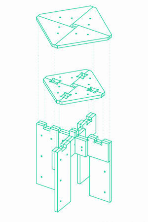
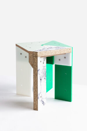
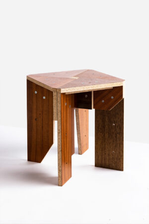
Prozess


Betreut durch: Prof. Ineke Hans, Prof. Dr. Gesche Joost, C. Schmidts
Kontakt:
In the Wintersemester of 2022/23 Students Product and Prozessdesign of the Universität der Künste Berlin deal with What Design Can Do’s ‘Make it Circular Challenge’. The project is run by the Design & Social Context project group led by professor/designer Ineke Hans, assistant/designer Maciej Chmara and visiting lecturer/designer Kubušová.
The WDCD-Challenge focuses on five circular ways of living: What we eat, What we wear, What we buy, How we package, How we build.
In a pop-up exhibition at the Temporary Bauhaus Archiv they present parts of their processes and the results. The exhibition will be accompanied by an evening symposium with young designer Louis Bindernagel, winner of the German Design Graduates Sustainability Award 2022, Vera Sacchetti international curator and design critic, Julian Lechner founder of Kaffeeform and the acclaimed Berlin designer Werner Aisslinger.
The evening symposium will take place on 30 January from 18.30 onwards and will end with a festive opening of the pop-up exhibition.
CIRCULAR IMPACT
Temporary Bauhaus Archiv, Knesebeckstraße 1, 10623 Berlin
mini-symposium + opening: 30 Jan 18.30 h, see
pop-up expo: 30 Jan – 8 Feb 2023, see
Extra info:
Instagram: www.instagram.com/udk_designandsocialcontext
WDCD Challenge: www.makeitcircular.whatdesigncando.com
Im Wintersemester 2022/23 beschäftigen sich Studierende Produkt- und Prozess-design der Universität der Künste Berlin mit der ‘Make it Circular Challenge’ von What Design Can Do. Das Projekt wird von der Projektgruppe Design & Social Context unter der Leitung von Professorin/Designerin Ineke Hans, Assistent/Designer Maciej Chmara und Gastdozentin/Designerin Vlasta Kubušová geleitet.
Die WDCD-Challenge konzentriert sich auf fünf zirkuläre Lebensweisen: Was wir essen, Was wir tragen, Was wir kaufen, Wie wir verpacken, Wie wir bauen.
In einer Pop-up-Ausstellung im Temporären Bauhaus Archiv präsentieren sie Teile ihrer Prozesse und Ergebnisse. Begleitet wird die Ausstellung von einem Abendsymposium mit Jungdesigner Louis Bindernagel, Gewinner des German Design Graduates Sustainability Award 2022, Vera Sacchetti internationale Kuratorin und Designkritikerin, Julian Lechner Gründer von Kaffeeform und der gefeierte Berliner Designer Werner Aisslinger.
Das Abendsymposium findet am 30. Januar ab 18.30 Uhr statt und endet mit einer feierlichen Eröffnung der Pop-up-Ausstellung.

What we eat, What we wear, What we buy, How we package, How we build
SYMPOSIUM SPEAKERS:
Vera Sacchetti (Lisbon, 1983) is a Basel-based design critic and curator, specialized in contemporary design and architecture and serving in a variety of curatorial, research and editorial roles. She is currently program coordinator of the multidisciplinary research initiative Driving the Human, and co-initiator of the Design and Democracy platform (2020–). Vera teaches at HEAD Geneva, and in 2020 joined the Federal Design Commission of Switzerland. She will reflect on CIRCULAR IMPACT from a curator and design critic point of view.
www.verasacchetti.net
@vsacchetti
Louis Bindernagel graduated from UdK and is the winner of the 2022 German Design Graduates Sustainability Award. From 2018 till 2020 he did an internship and worked as a freelancer for reknown Dave Hakkens (Precious Plastics).
Louis will speak about his graduate project Whole Earth, his experiences at Precious Plastics and being project manager of Re.Works with which he developed a project for Refugees in Greece.
www.brunowindt.com
@brunowindt
Werner Aisslinger (1964) graduated from UdK in 1991. Since then he dived into themes that are at the forefront of the design discourse; he worked with the latest technologies (Soft Cell, Juli Chair), new interior typologies (a.o. 25 Hours hotel/Bikini Berlin) and explored sustainable alternatives for furniture (Chair Farm, Hemp Chair). Very early in his career he looked at tiny living (Loft Cube) and with the exhibition House of Wonders he looked at potential future ways of living. Since 2012 he has been a judge in the German Bundespreis Ecodesign. Werner will present some case studies, talk about the role circularity plays in his praxis, and share some experiences being a judge in the Bundespreis Ecodesign.
www.aisslinger.de
@studioaisslinger
@werneraisslinger
Julian Lechner is a Berlin based designer who studied in Bolzano. He aims to give renewable resources – that would have ended up in the trash – a second life by transforming them into everyday objects and infusing them with a new purpose. He set up the company Kaffeeform with a unique formula at core to upcycle old coffee into new design products. The first coffee cup prototype was made in 2009, but was developed further and improved over and over again. Julian will take us through this process and explain about the design decisions he had to make along the way, to make the concept work in the market.
www.kaffeeform.com
@kaffeeform
After a successful presentation of the one material, one product projects at BASF in Ludwigshafen, BASF invited the MAster Produkt design students to their ‚Fabrikstag‘ at Vitra designcampus.The students and their projects were introduced to some of the most interesting industrial companies and were invited to take part in the Fabrikstag program all day.
We took the opportunity to combine the Fabrikstag also with some tours at the Vitra Campus, such as an architectural tour, a Vitra Factory tour (no photo’s ;-) and visit to Schaudepot.
Day 1: arrival, architectural tour & schaudepot
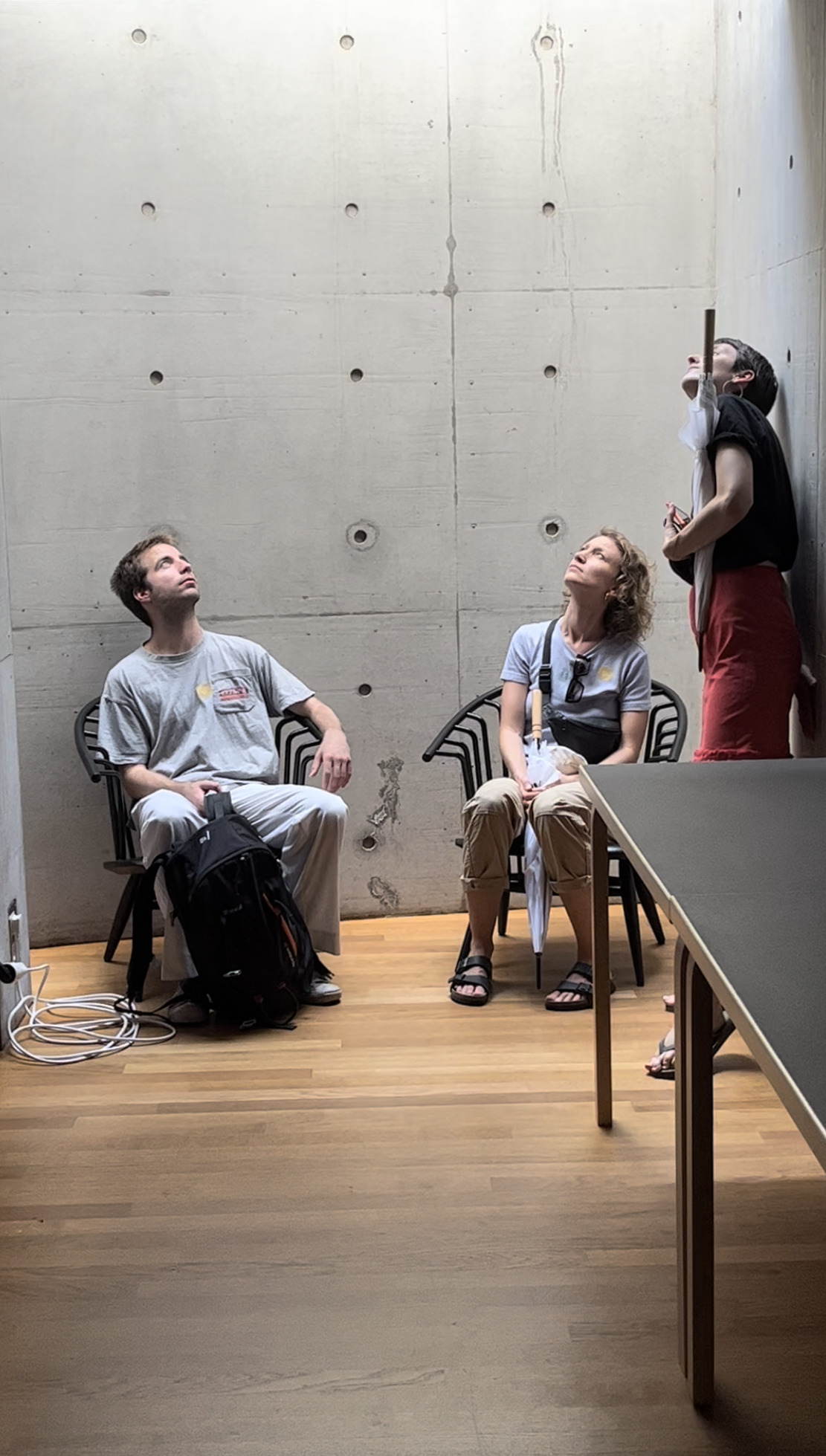
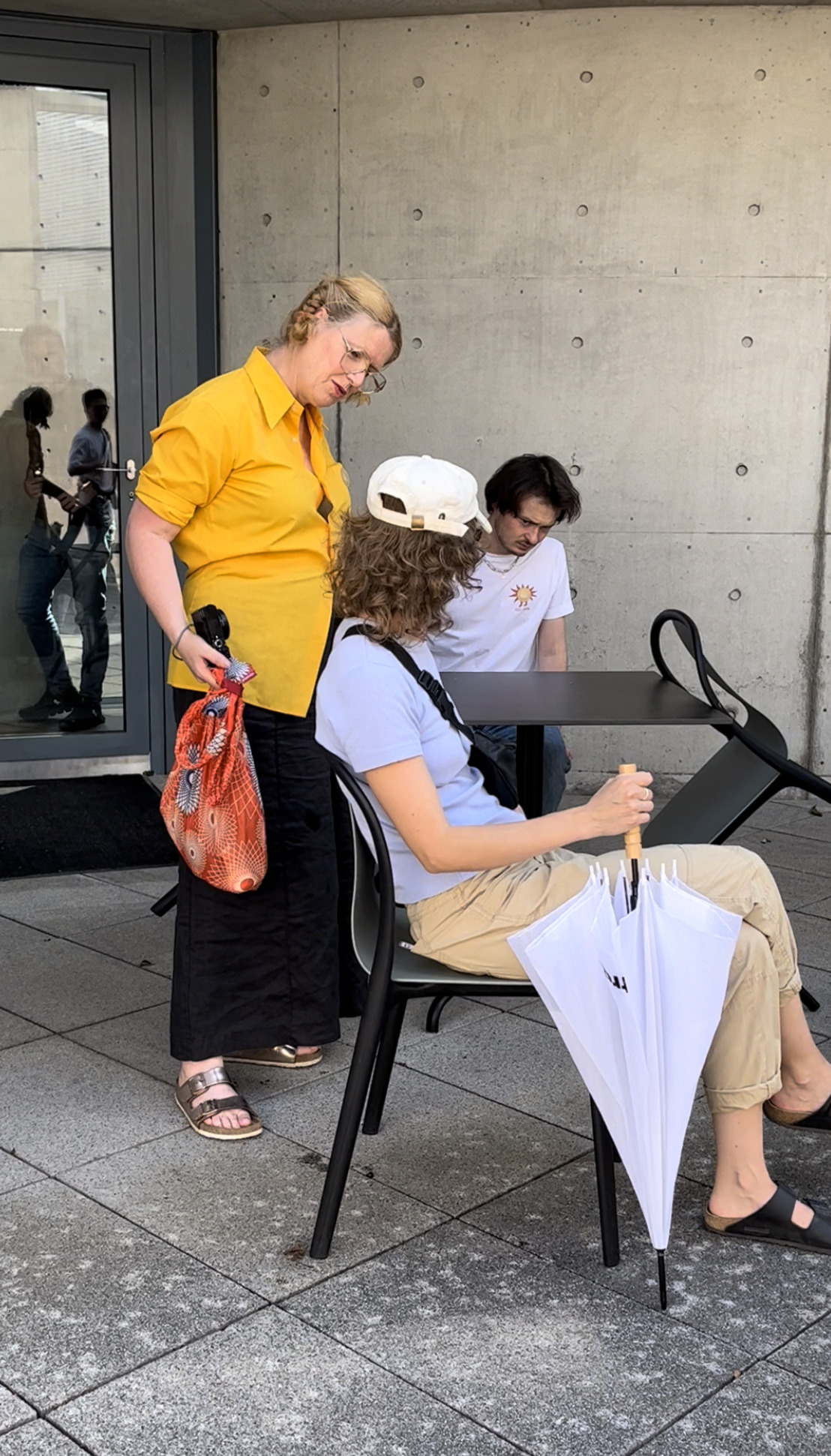
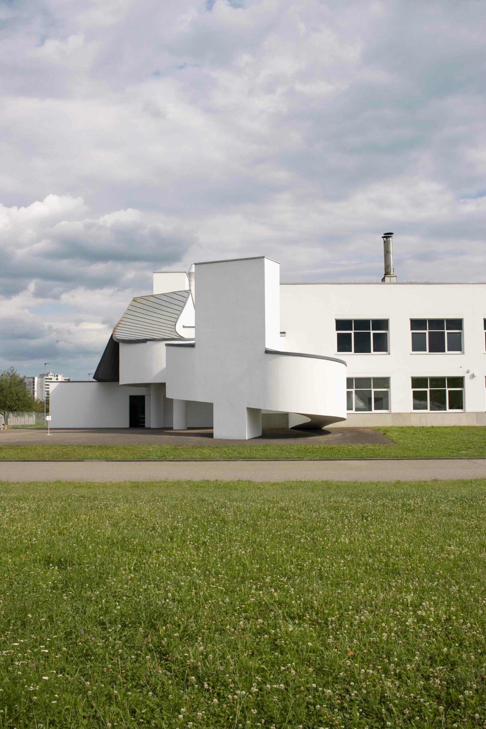
visiting Buckminsterfuller tent and see our projects being prepared for display (and getting nervous for tomororow)
Schaudepot
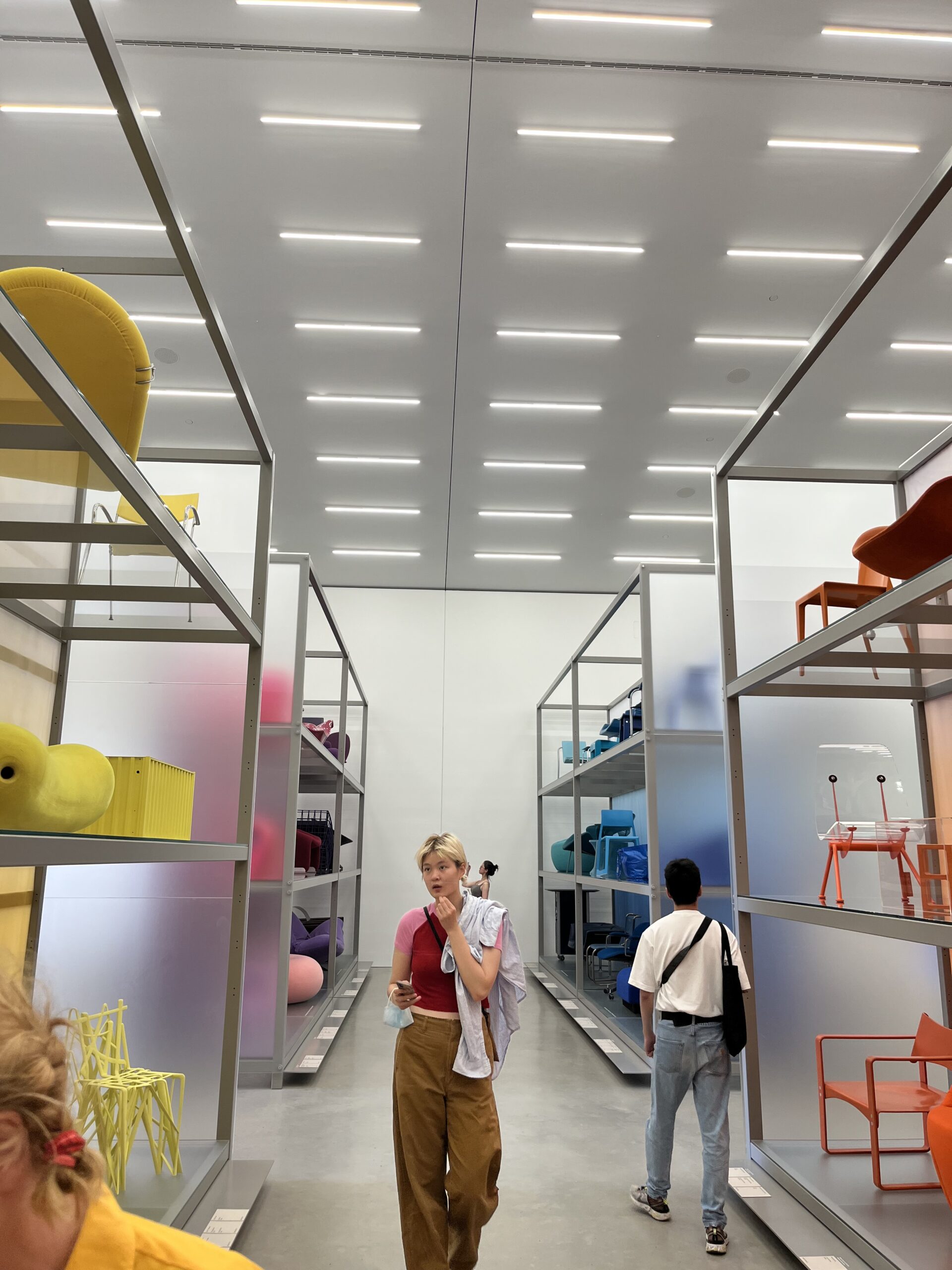
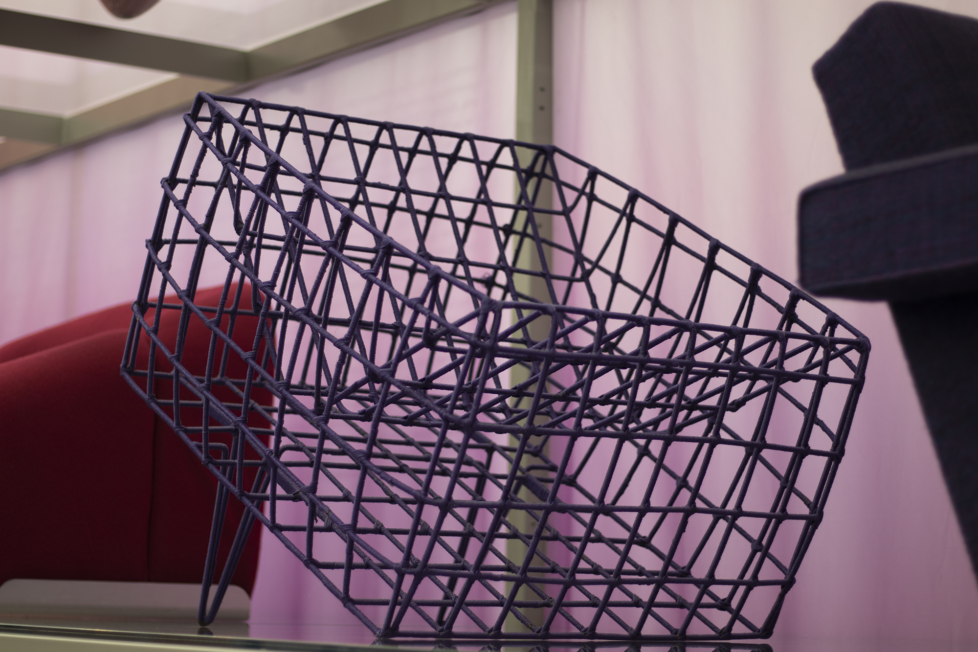
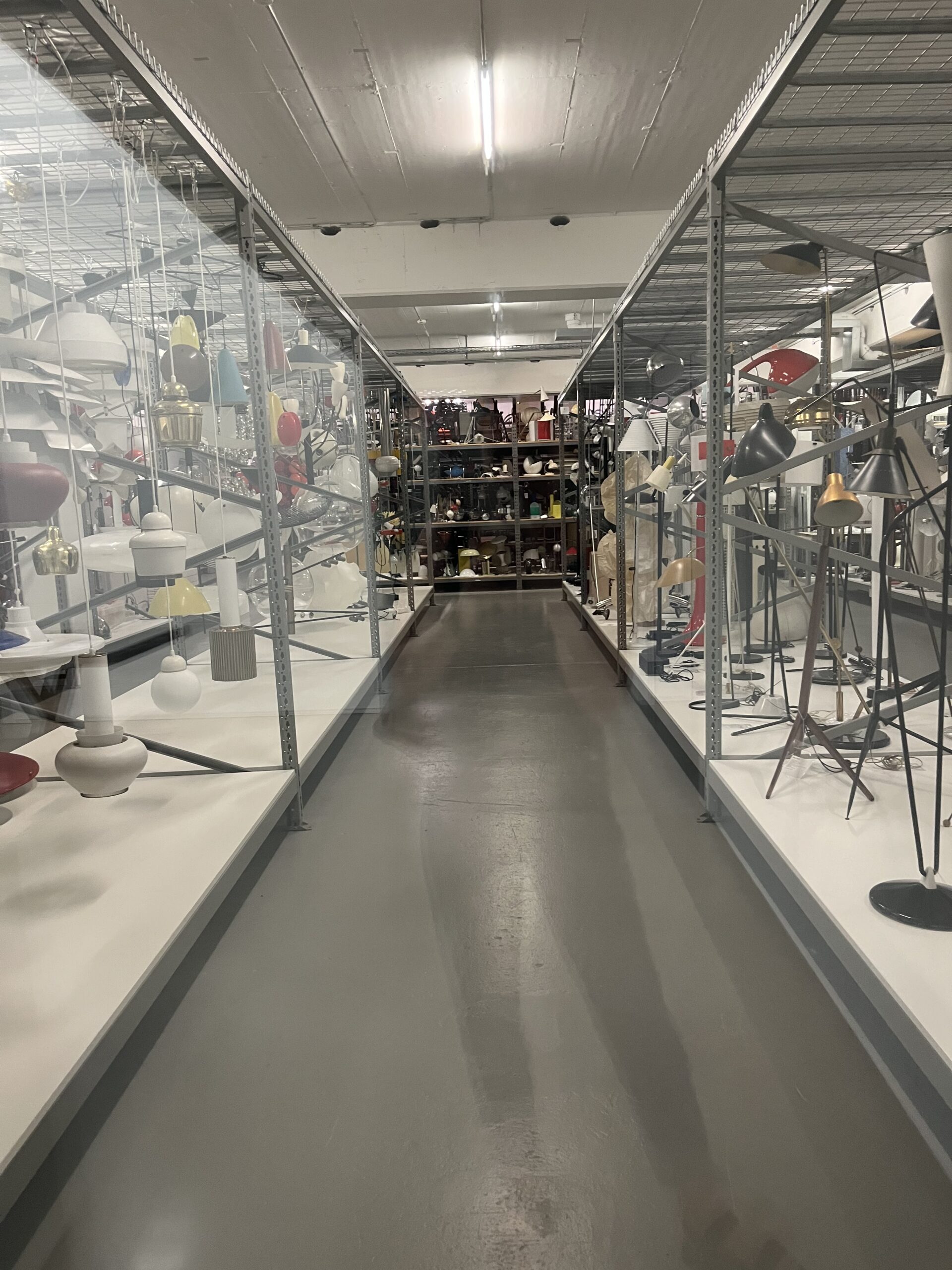
Day 2: museum tour & BASF fabrikstag
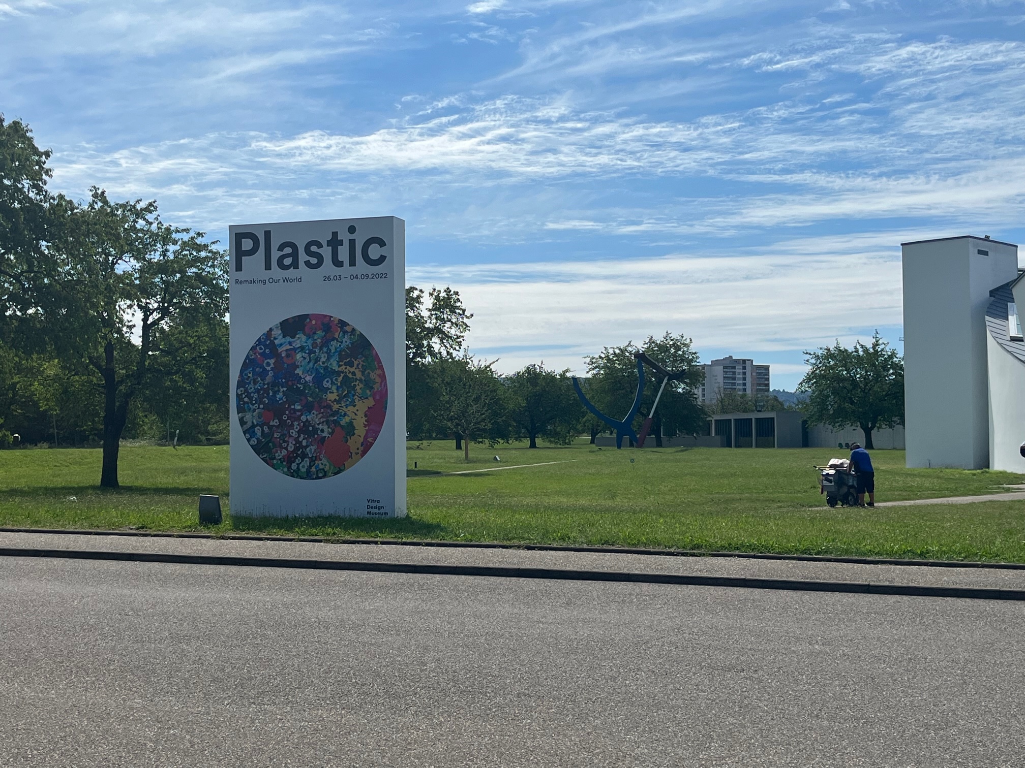
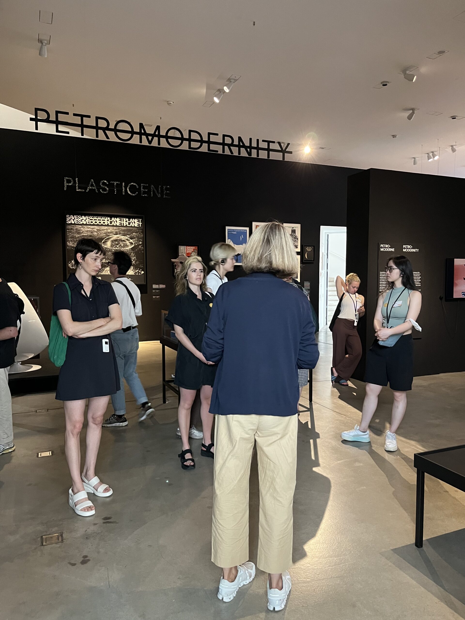
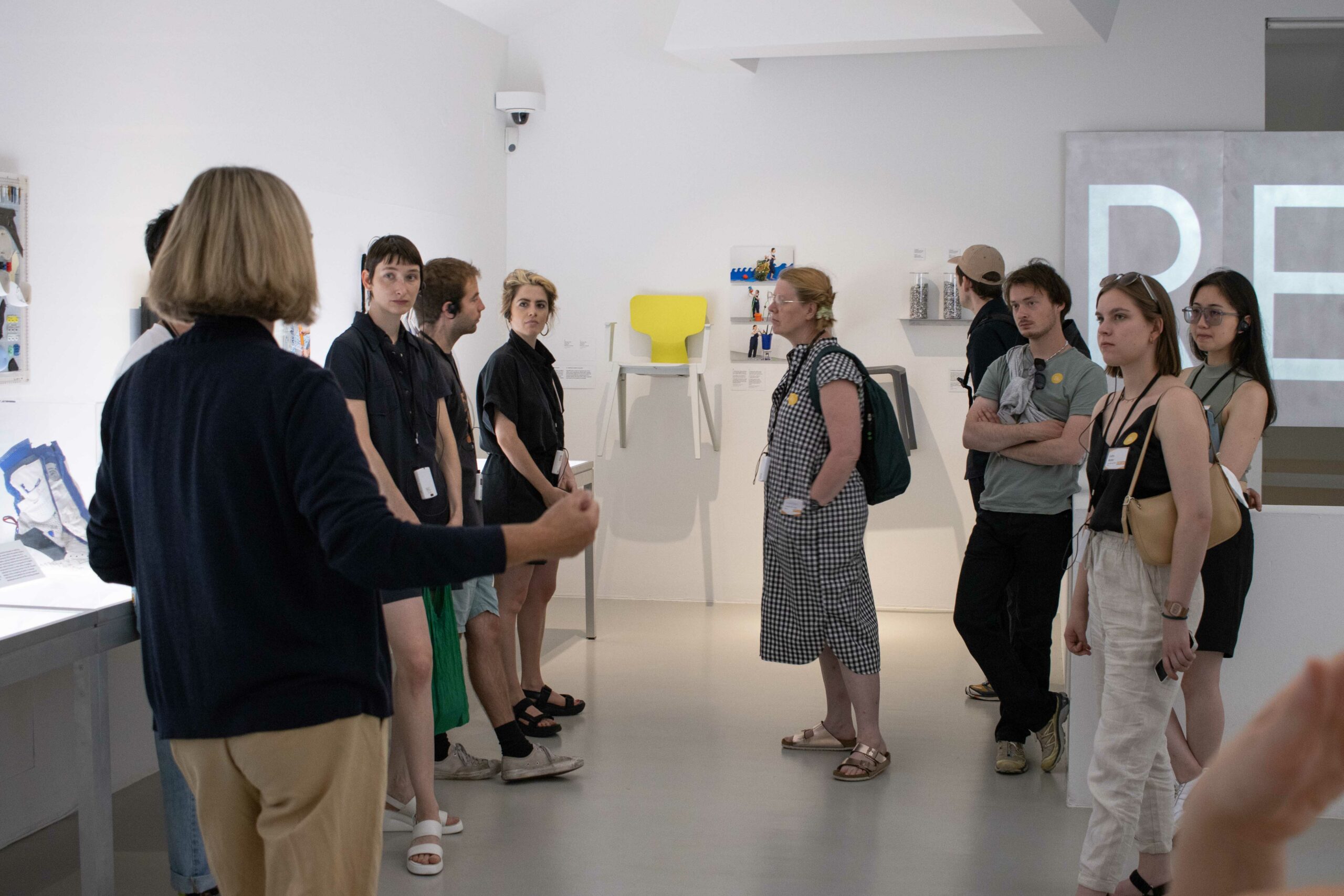
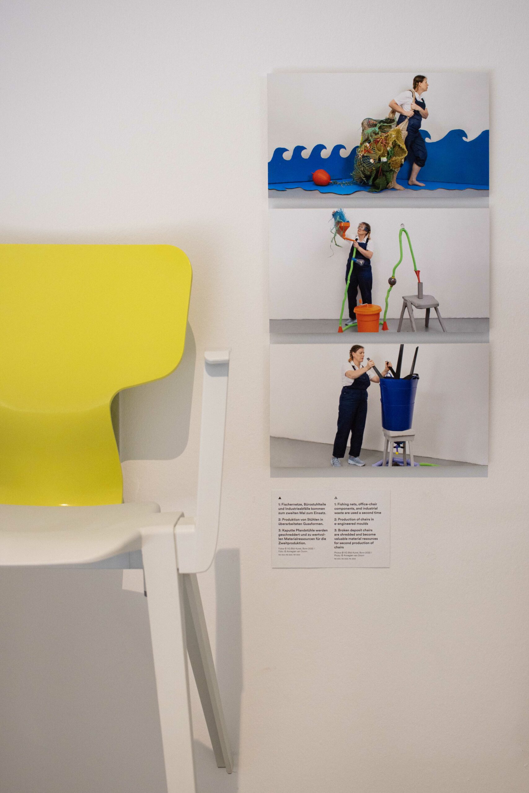
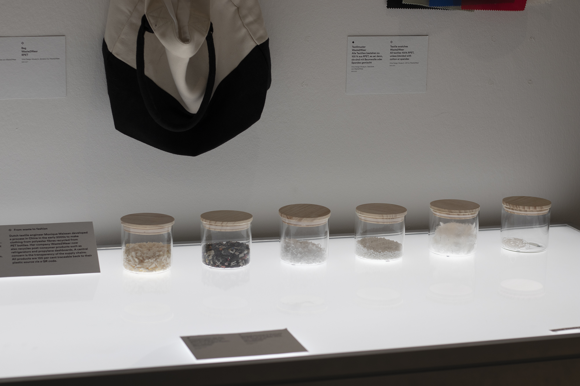
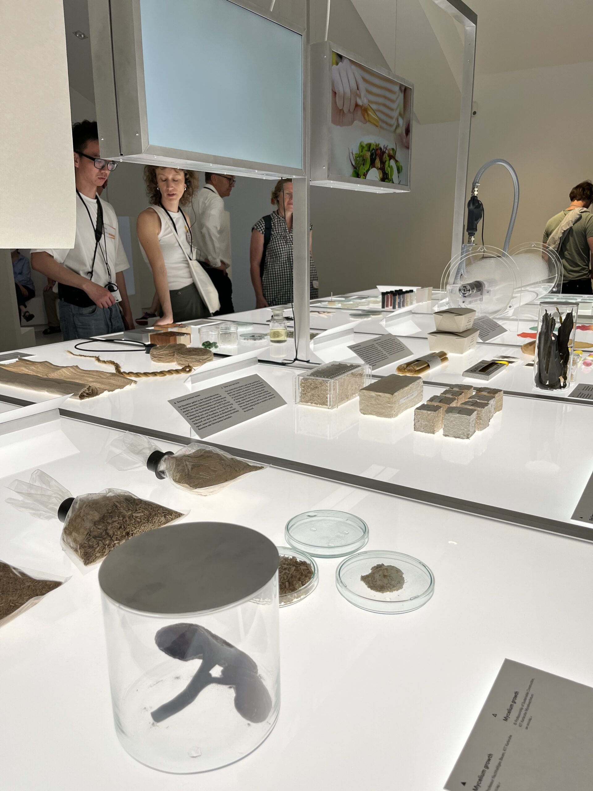
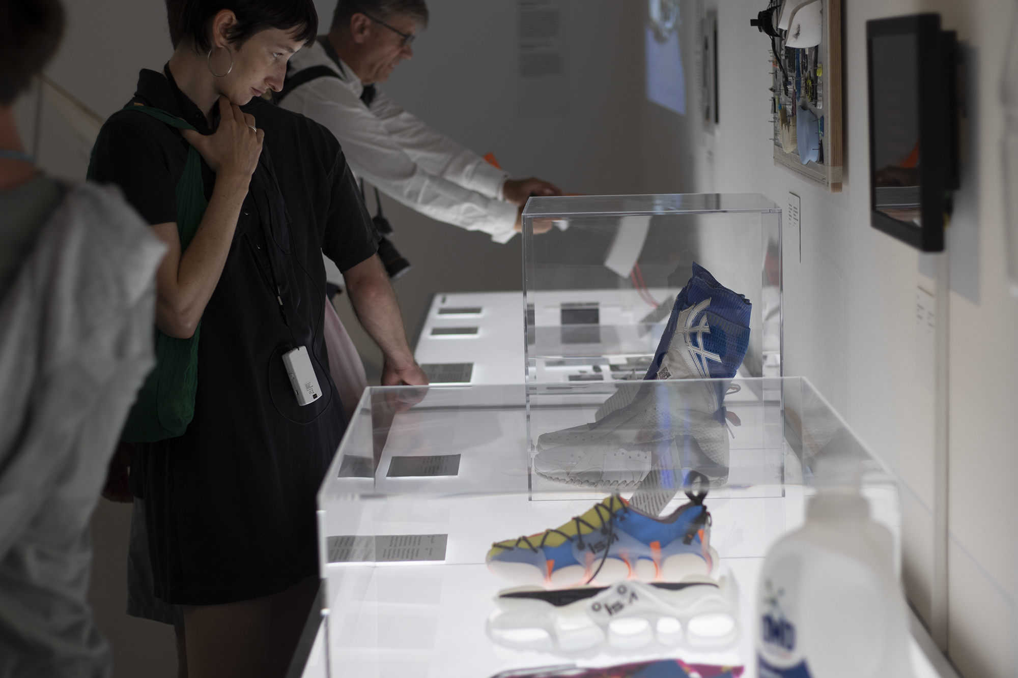
BASF Fabrikstag in Buckminster Fuller dome, first check out our exhibits!
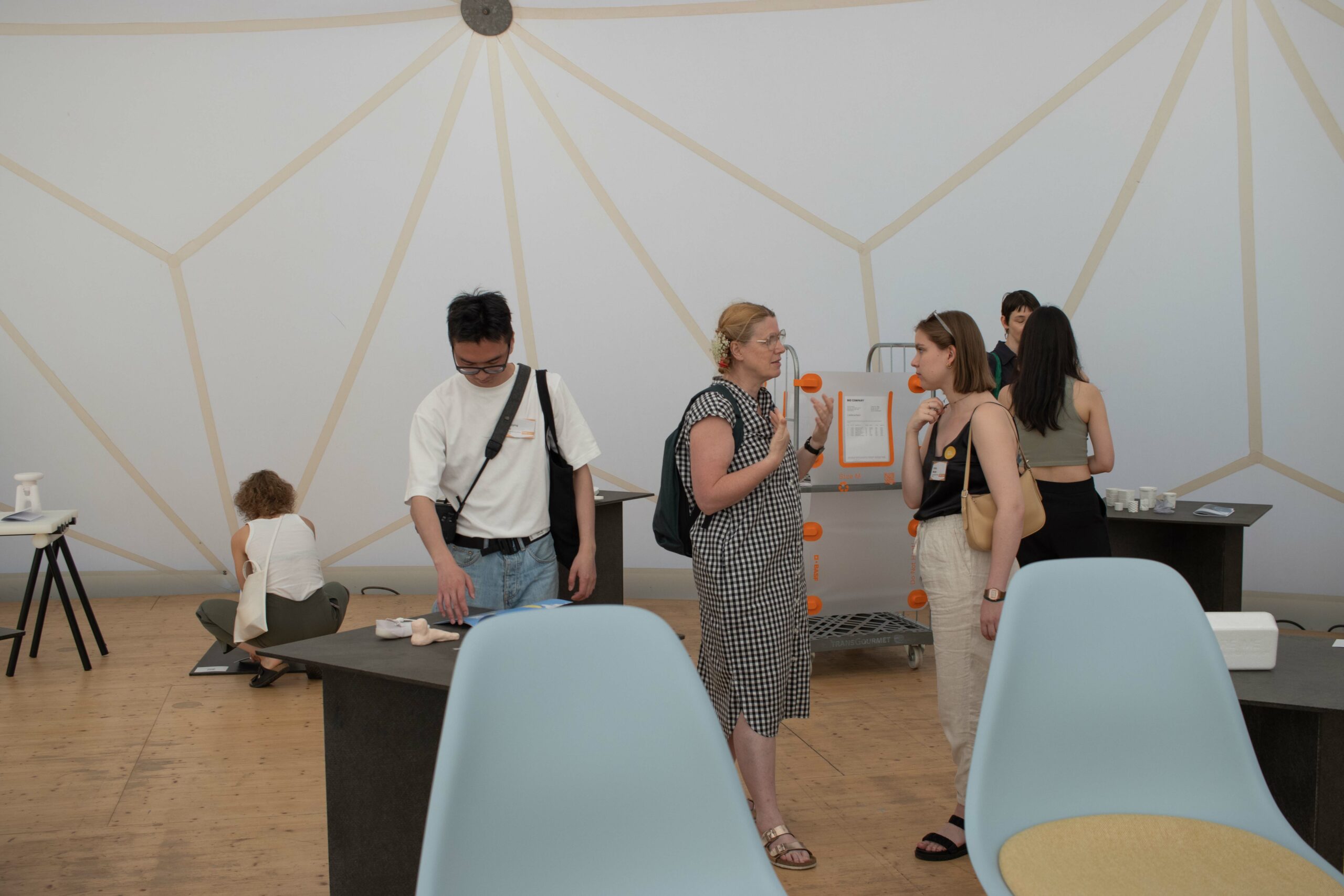
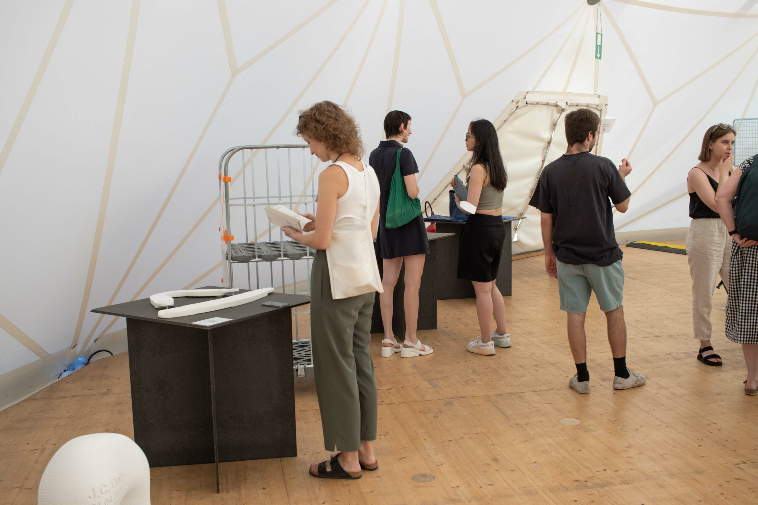
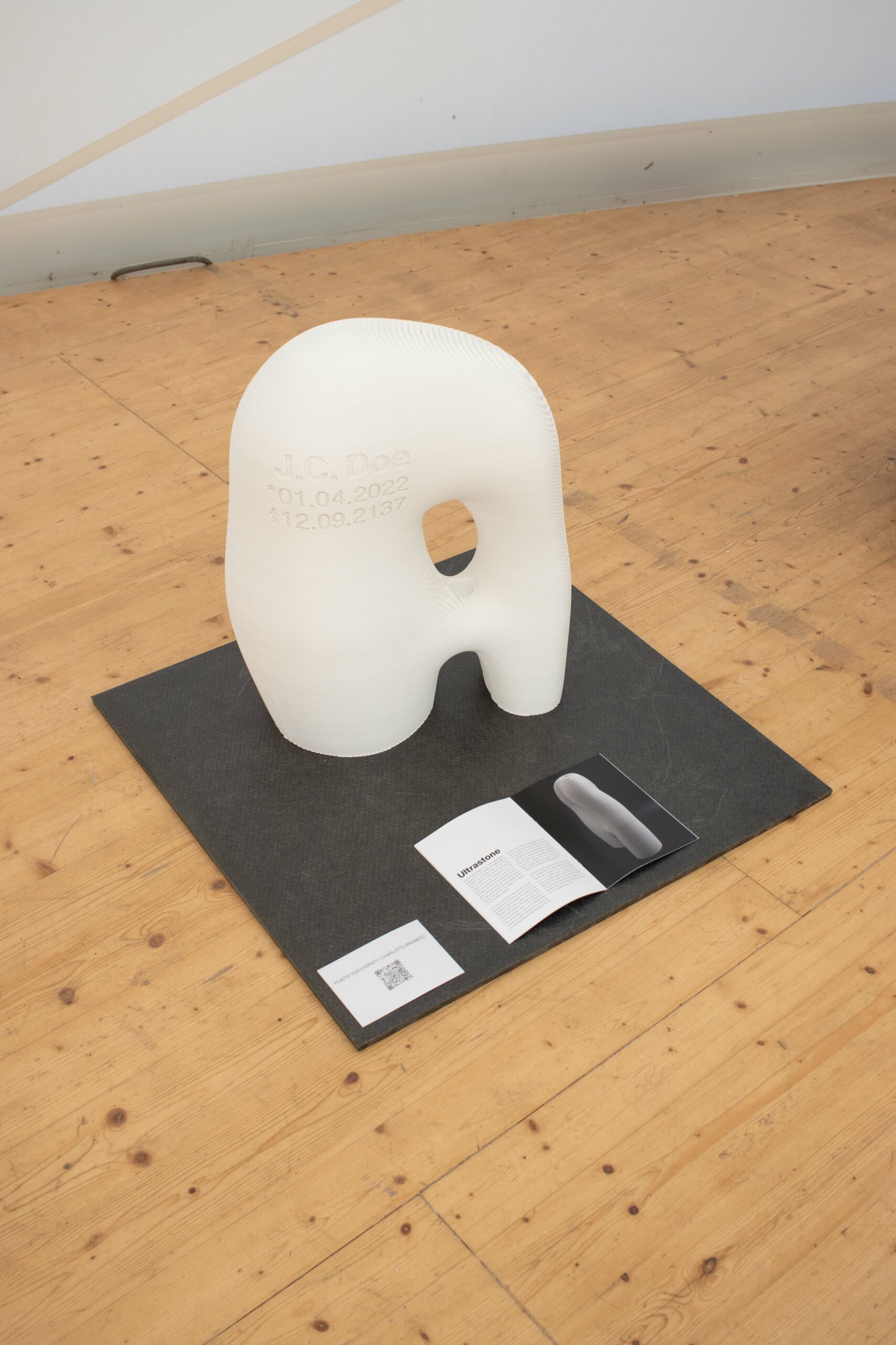
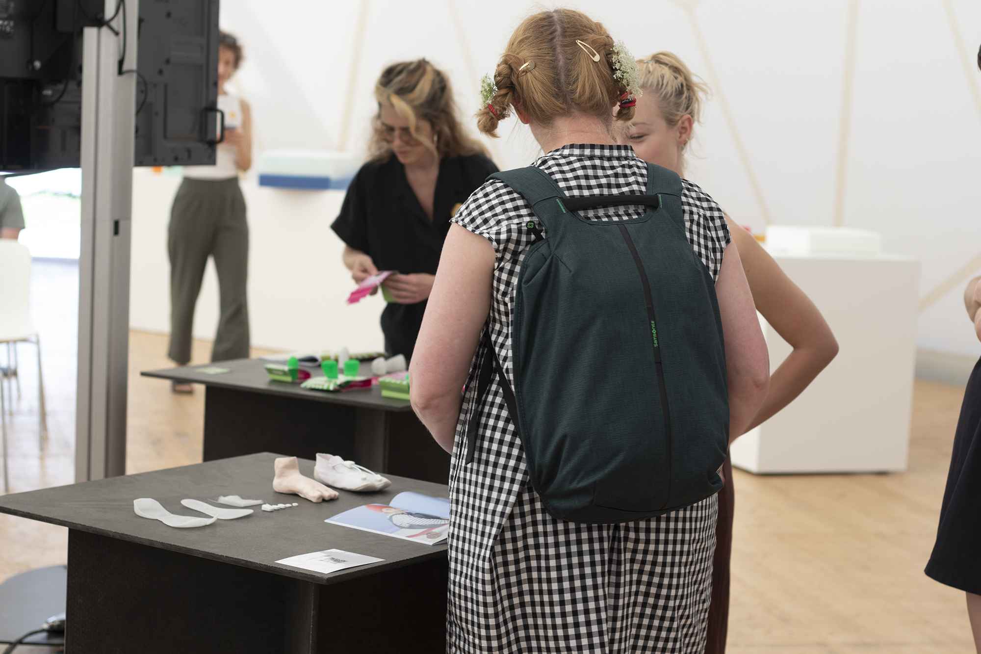
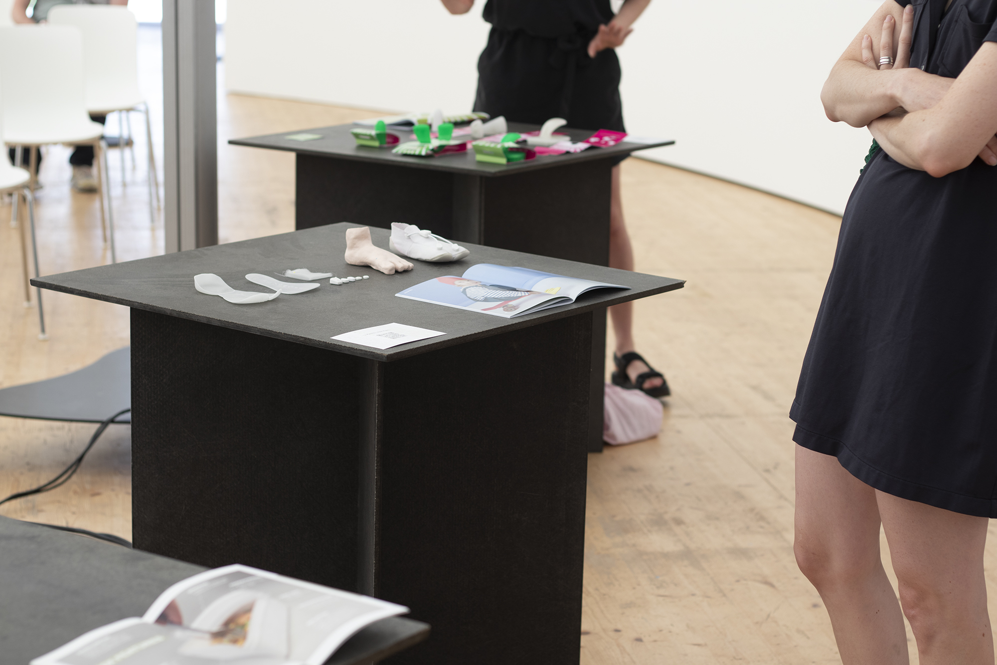
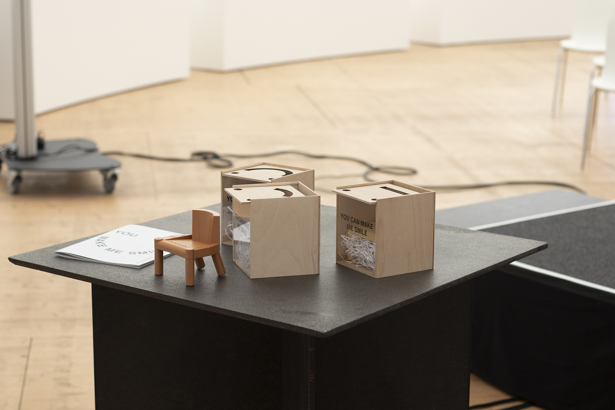
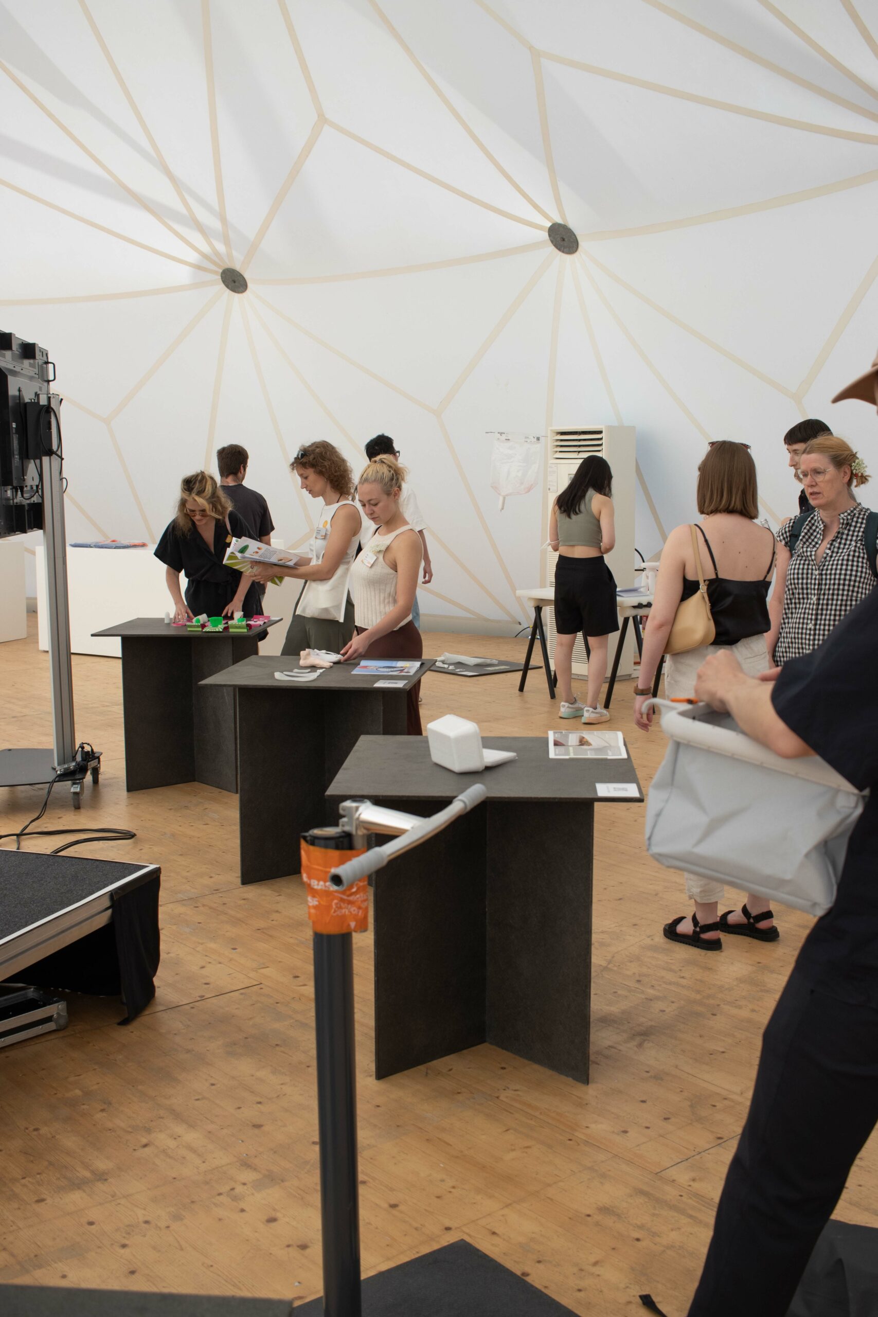
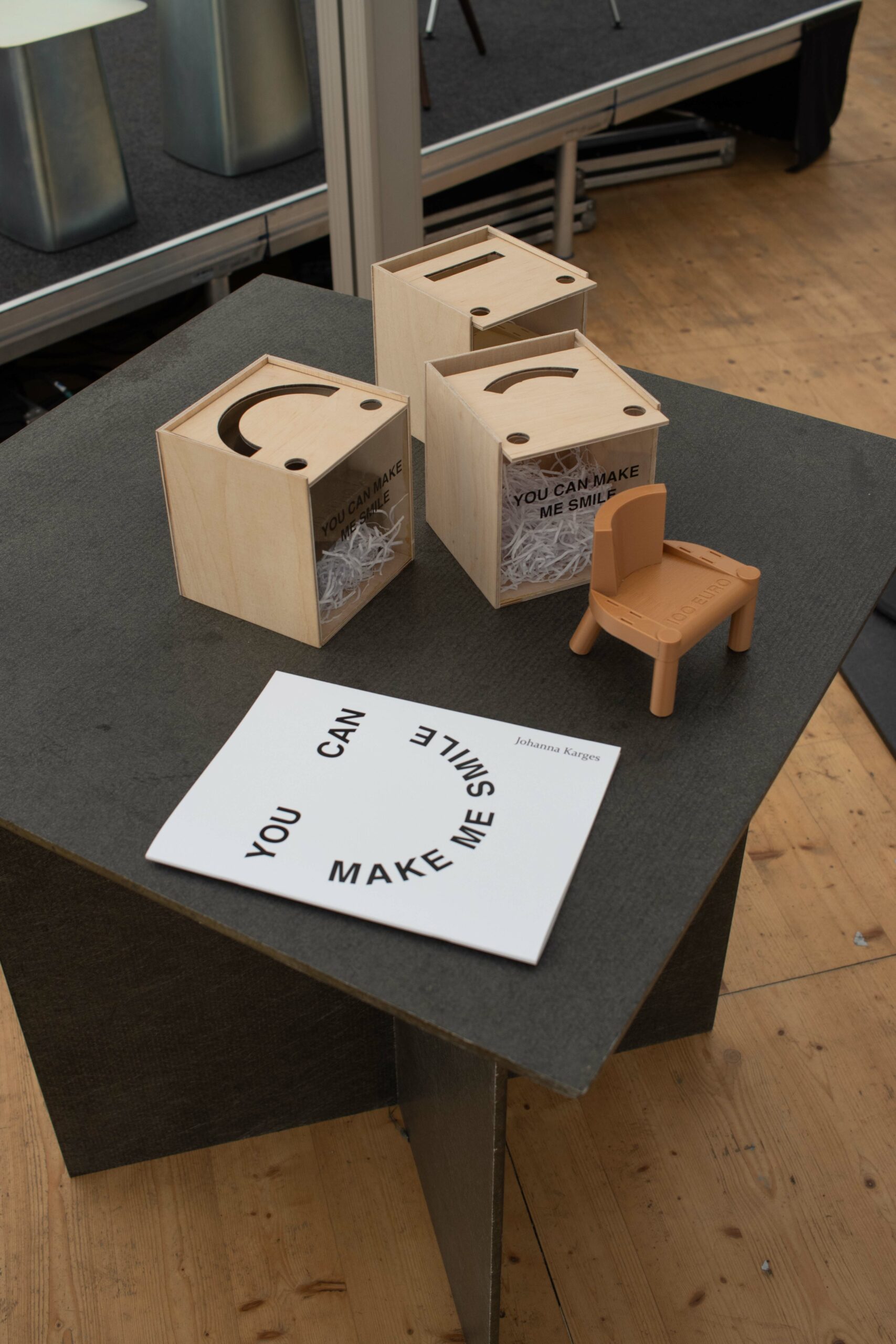
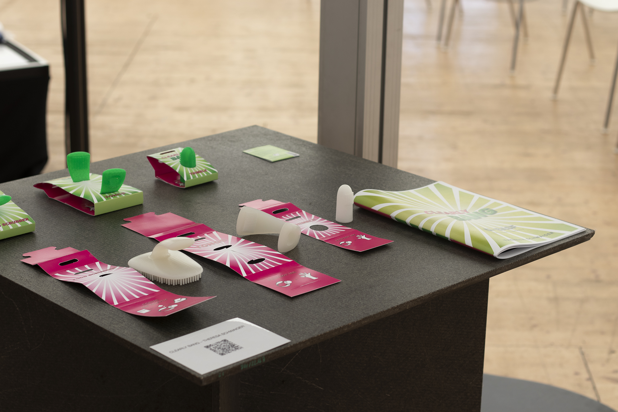
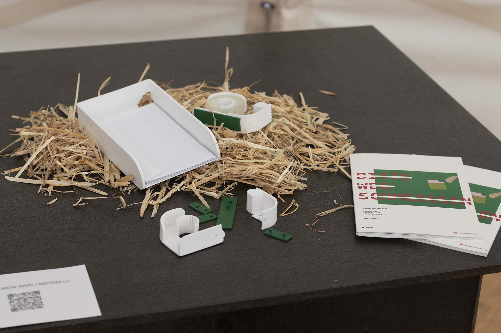
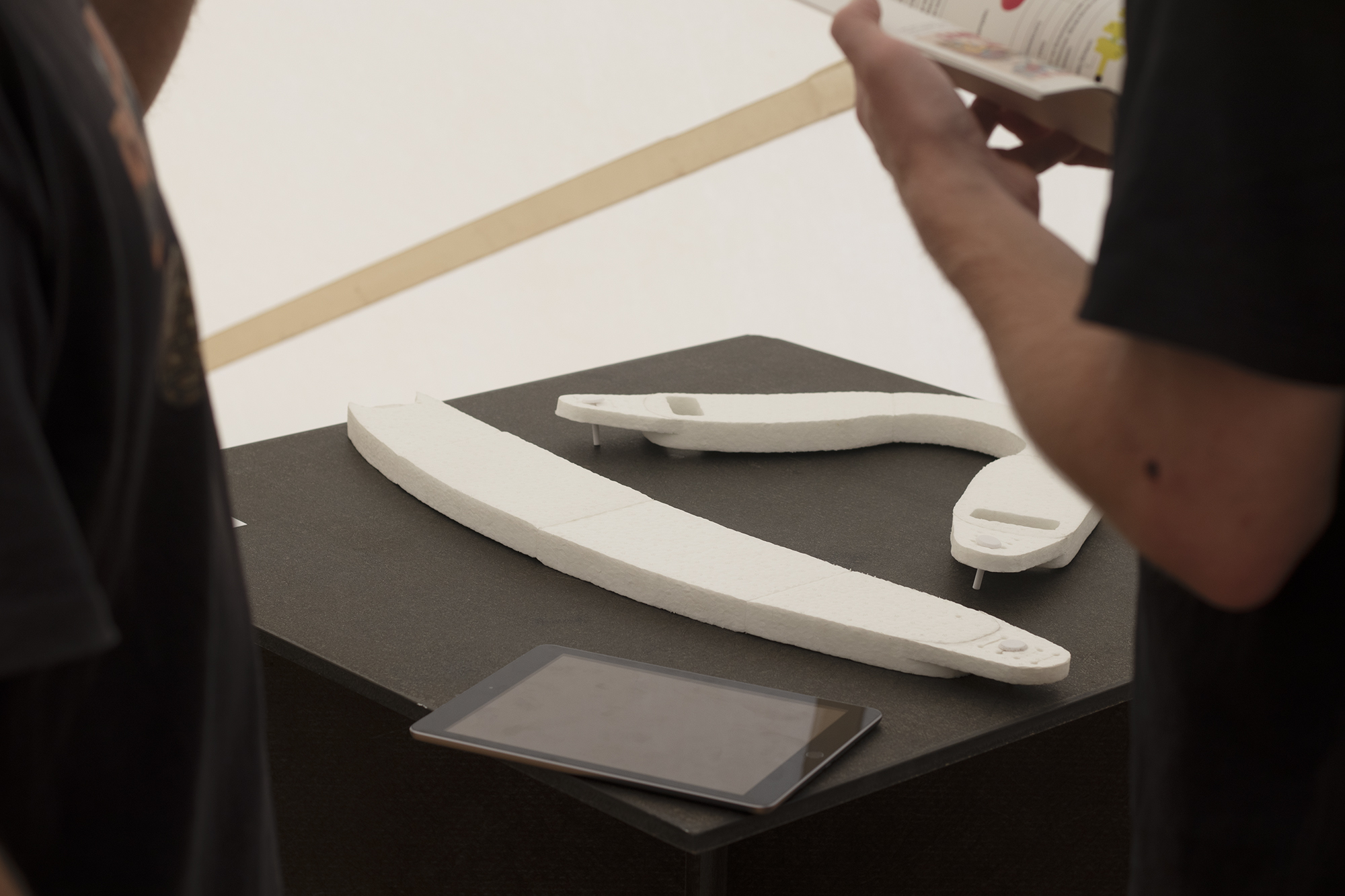
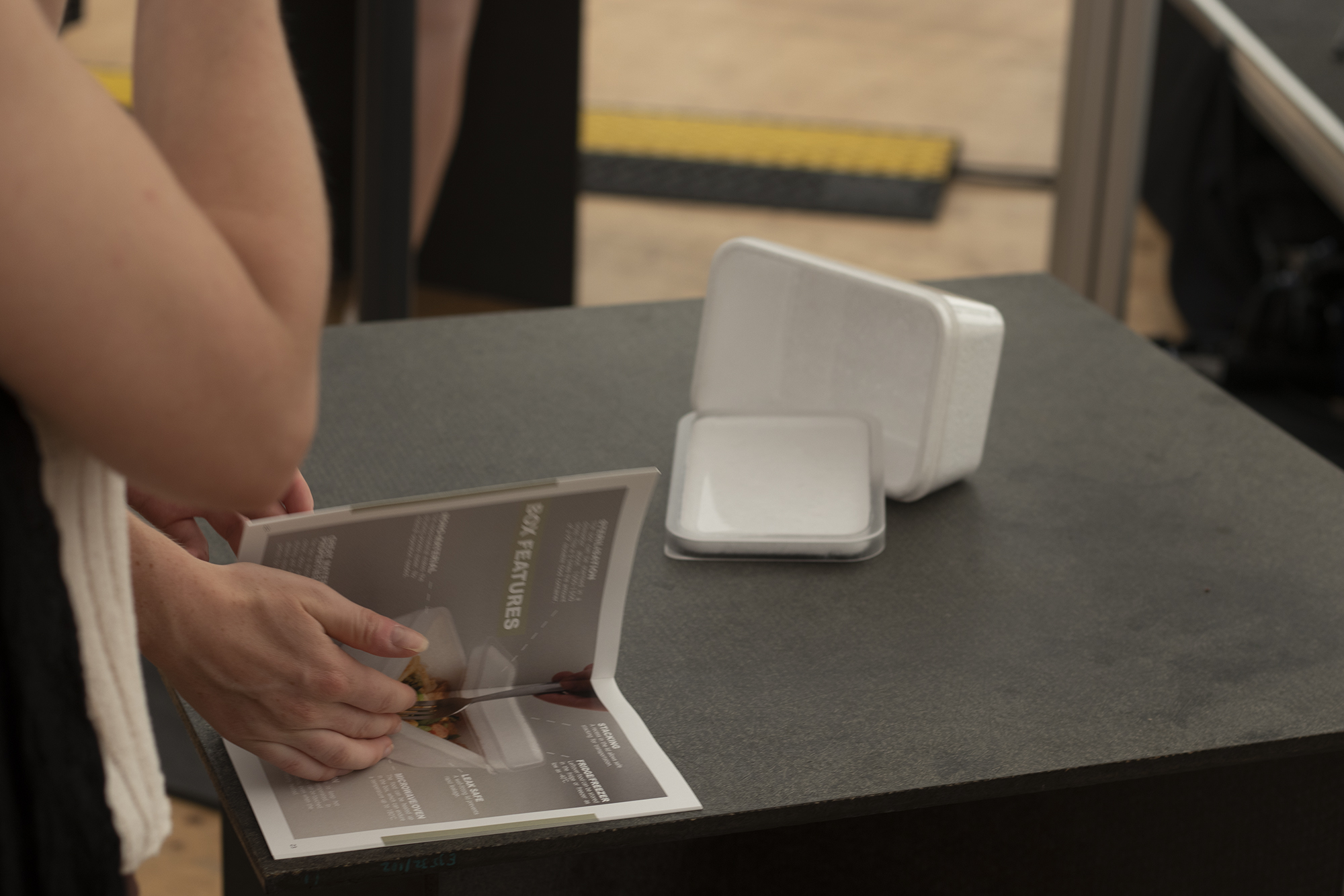
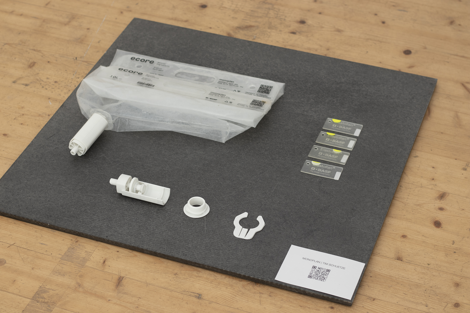
quick visit to Vitra Haus
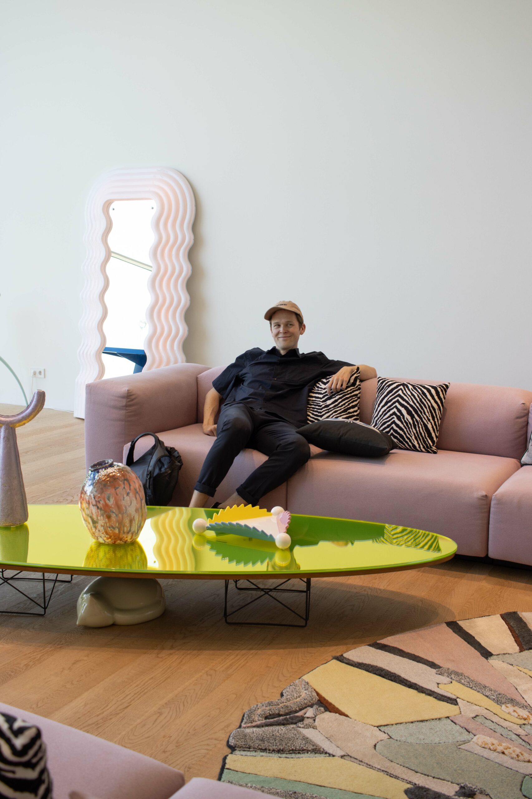
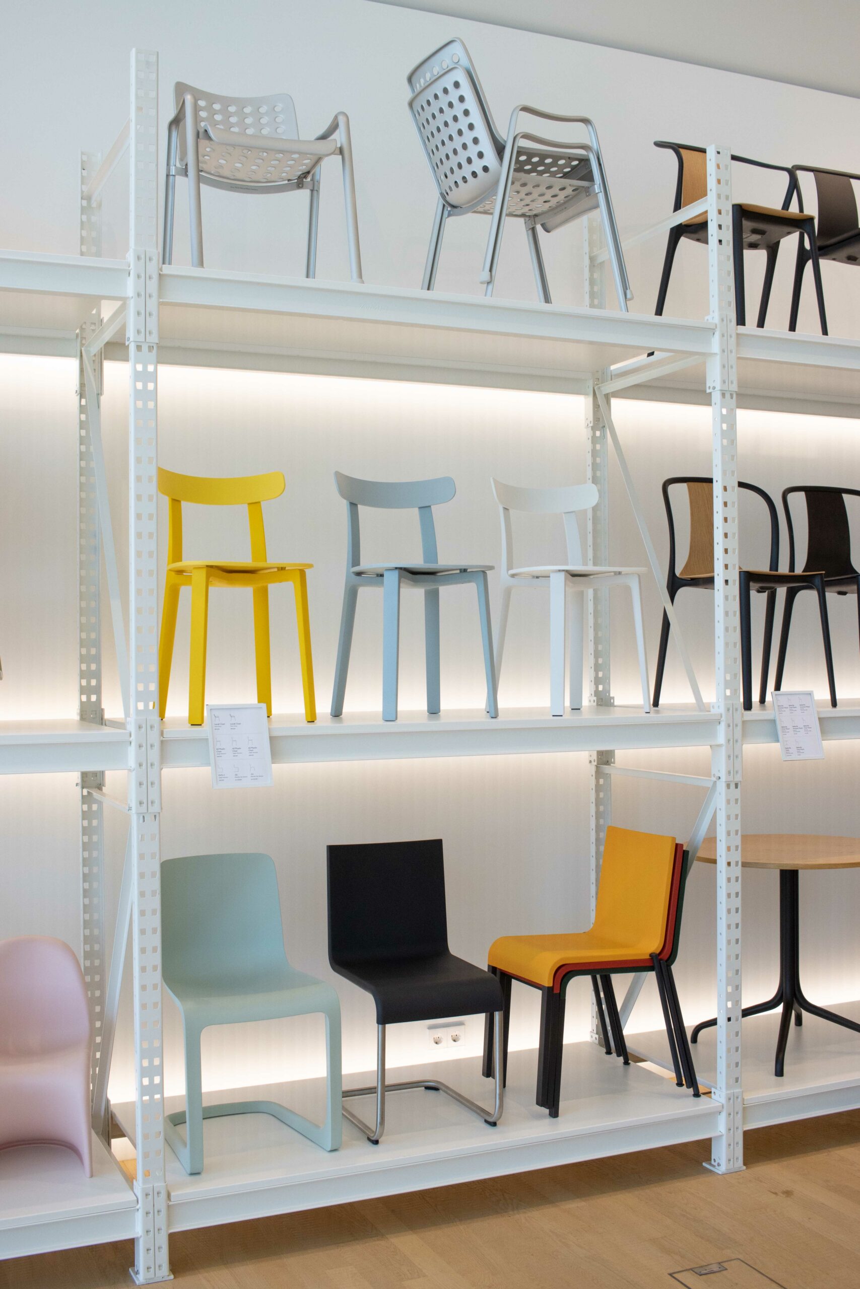
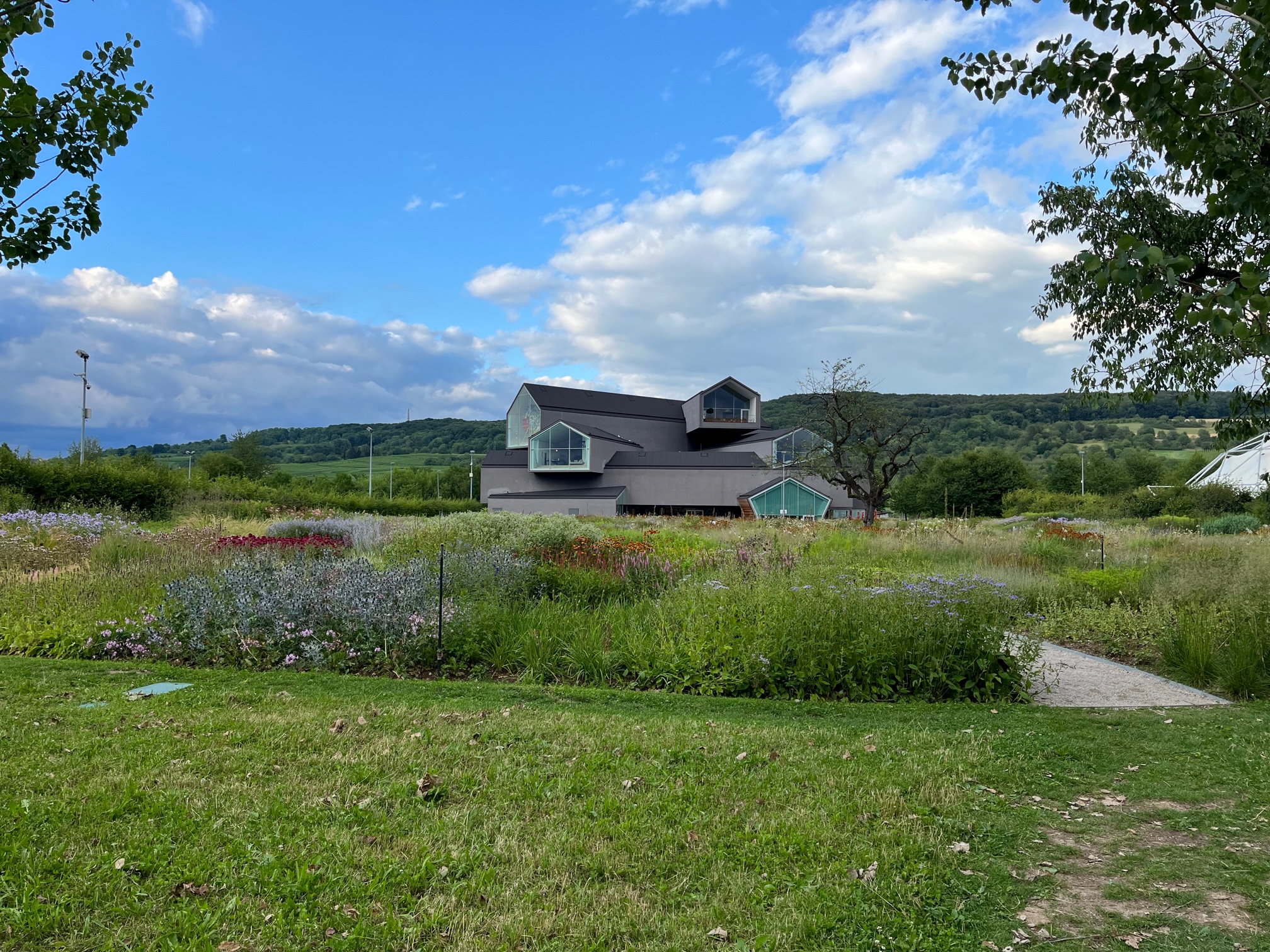
Fabrikstag starts
intro into our projects for BASF
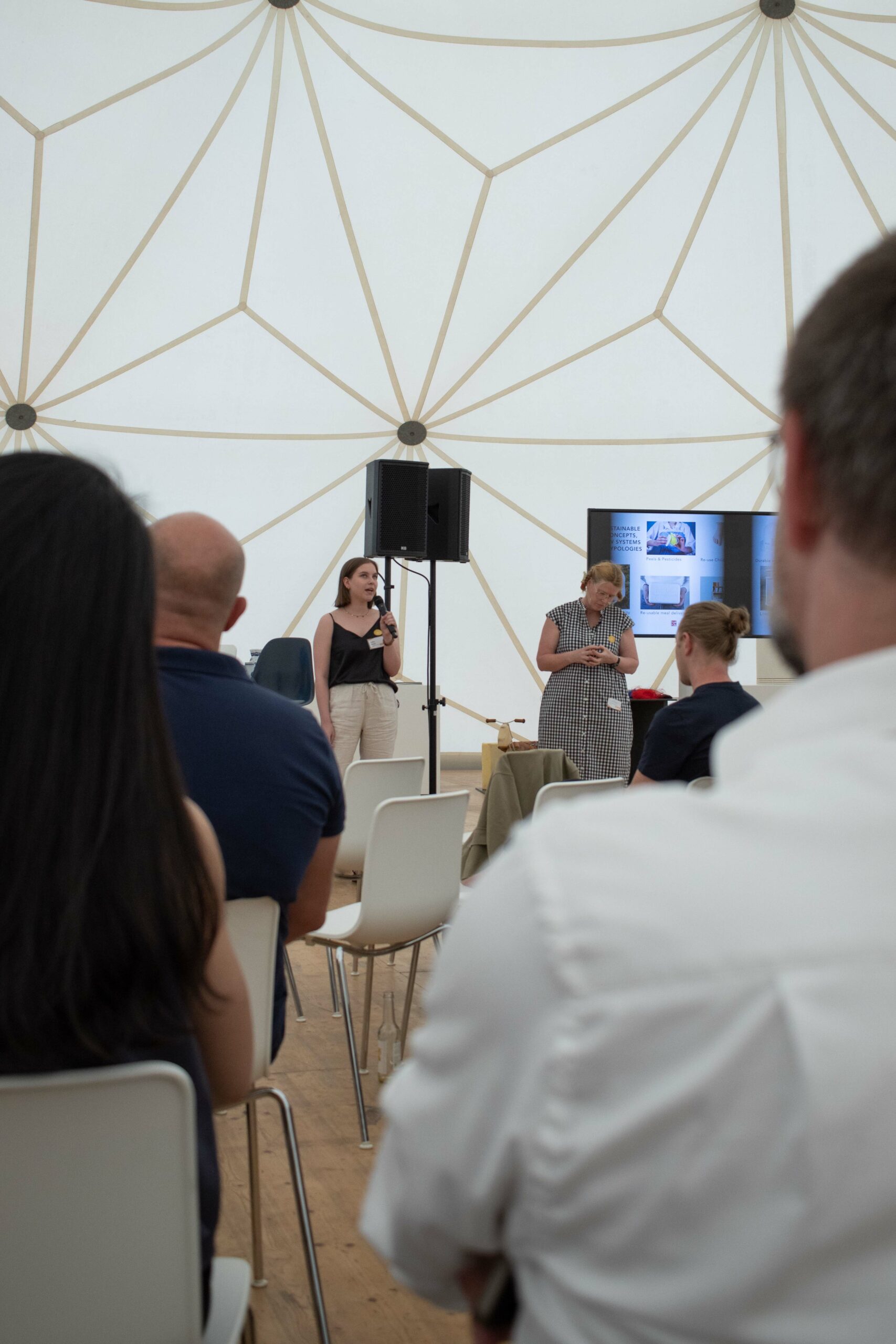
All projects presented to international audience of manufacturers and labs
|
V
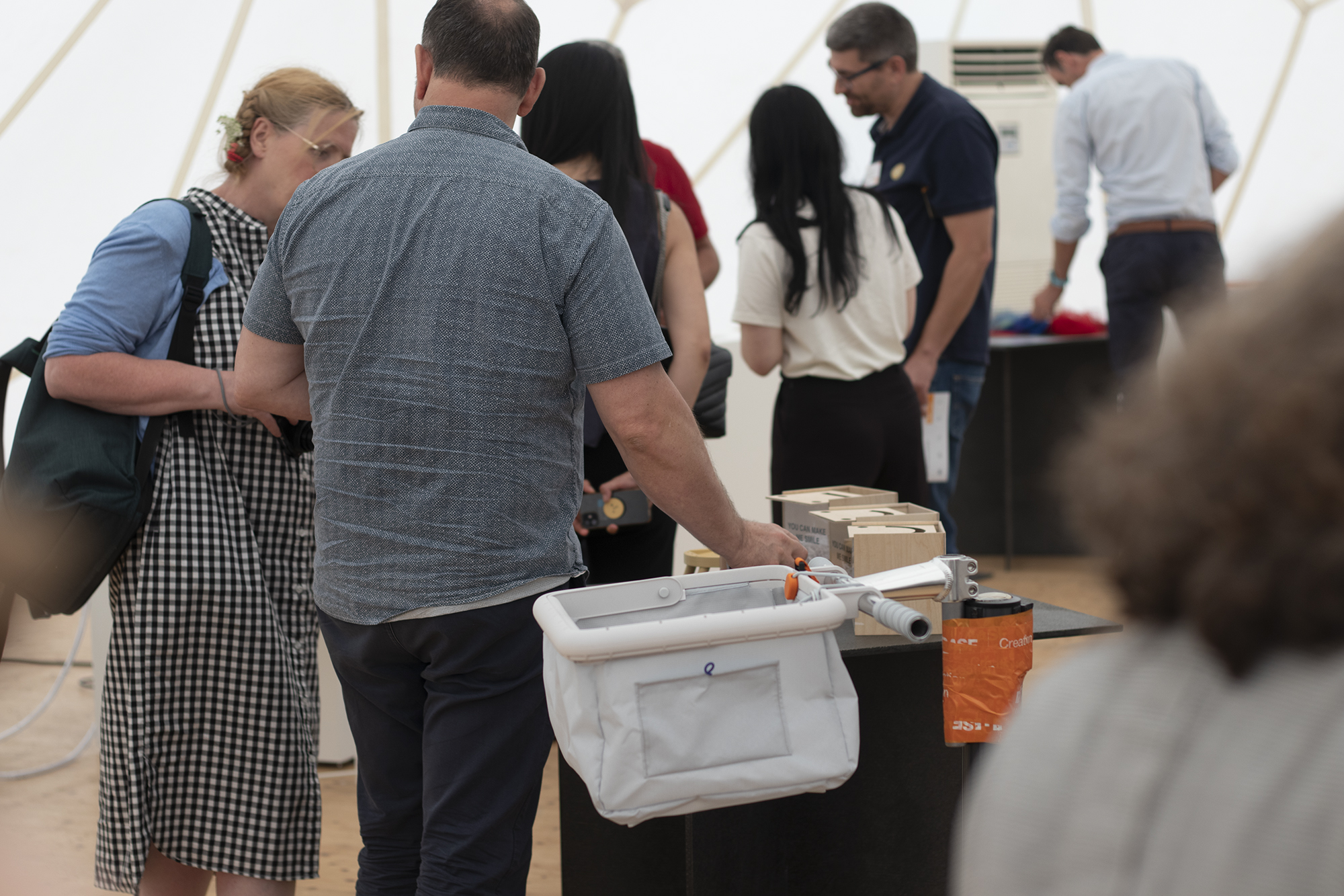
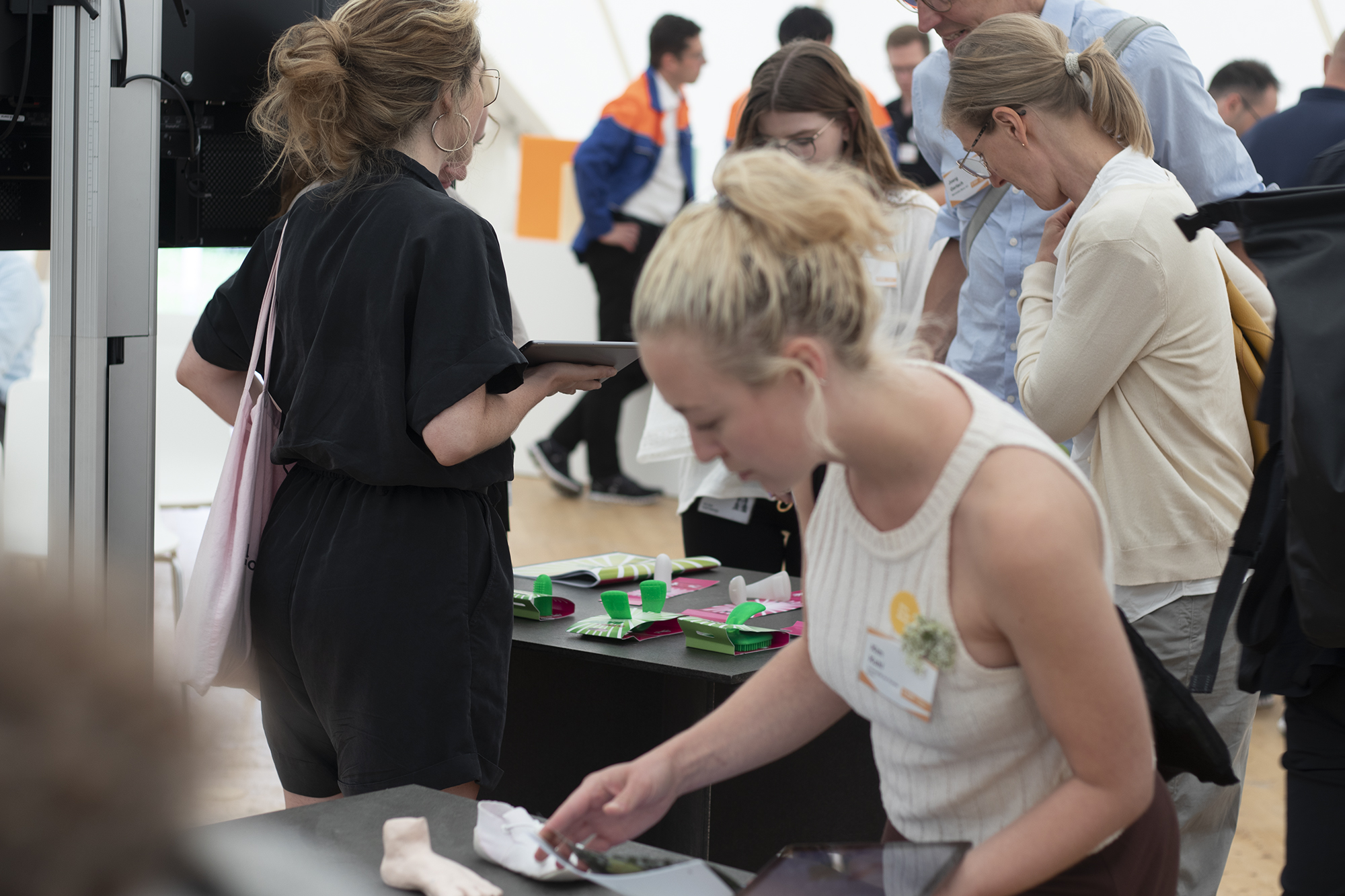
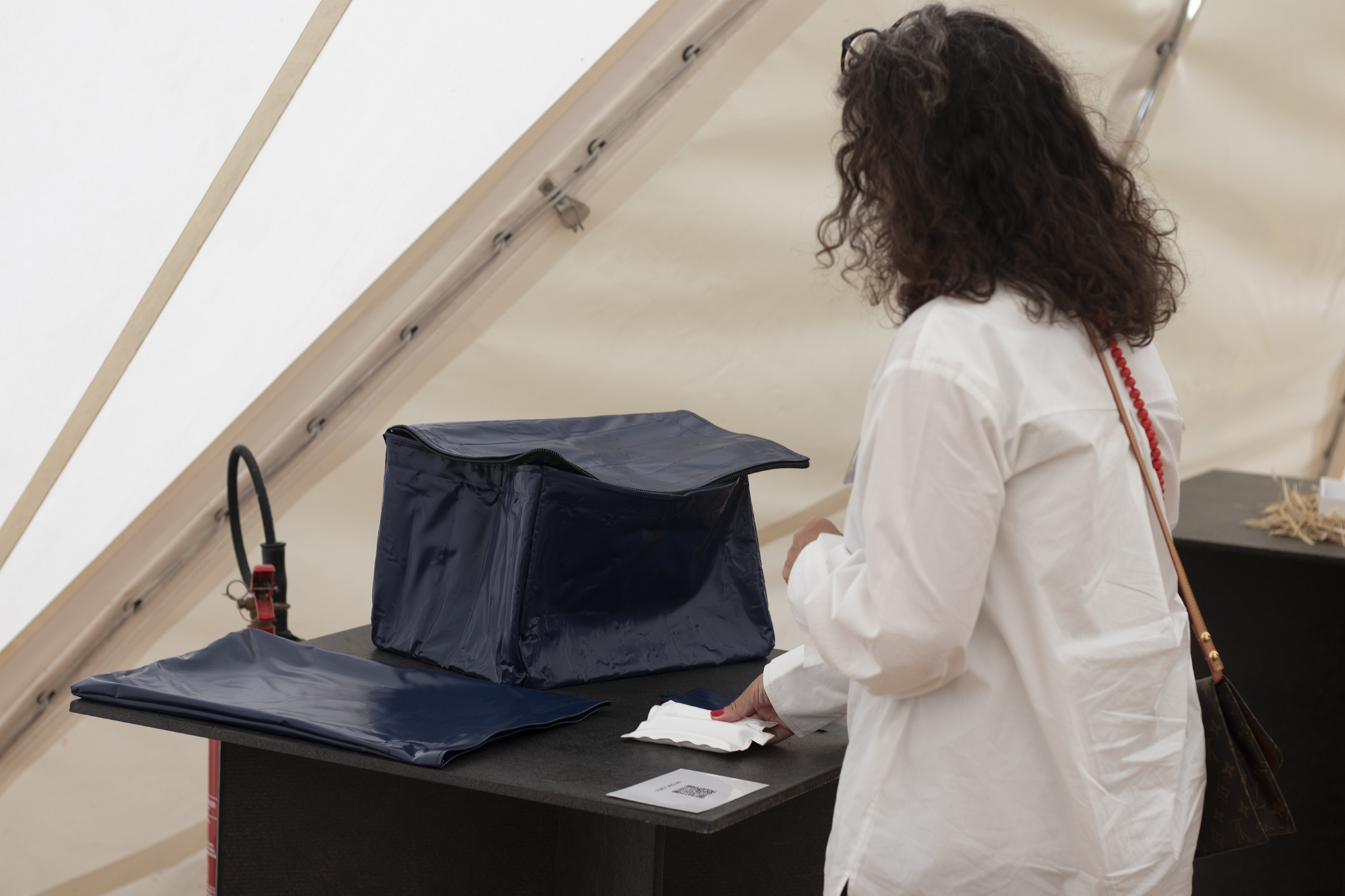
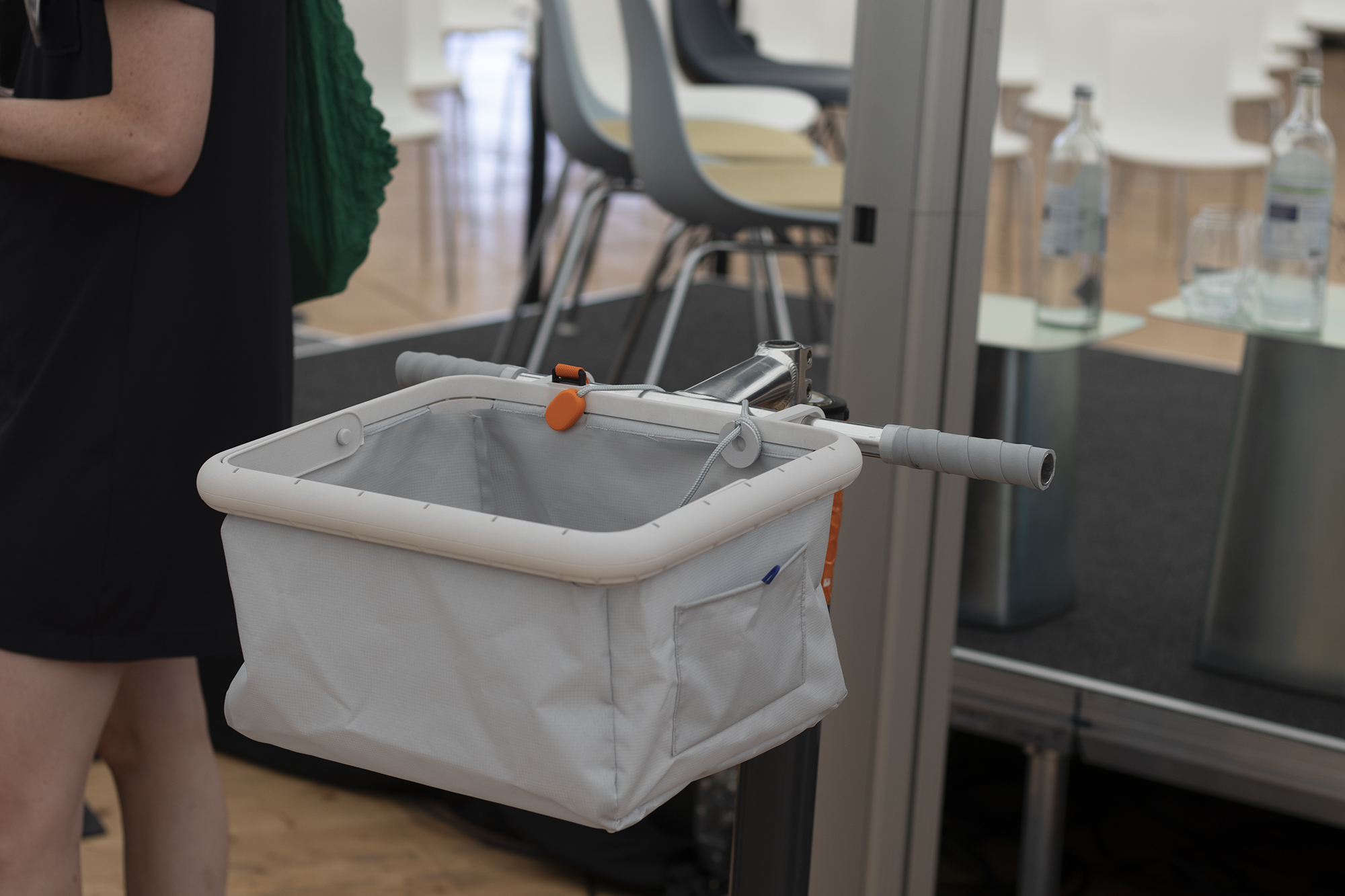
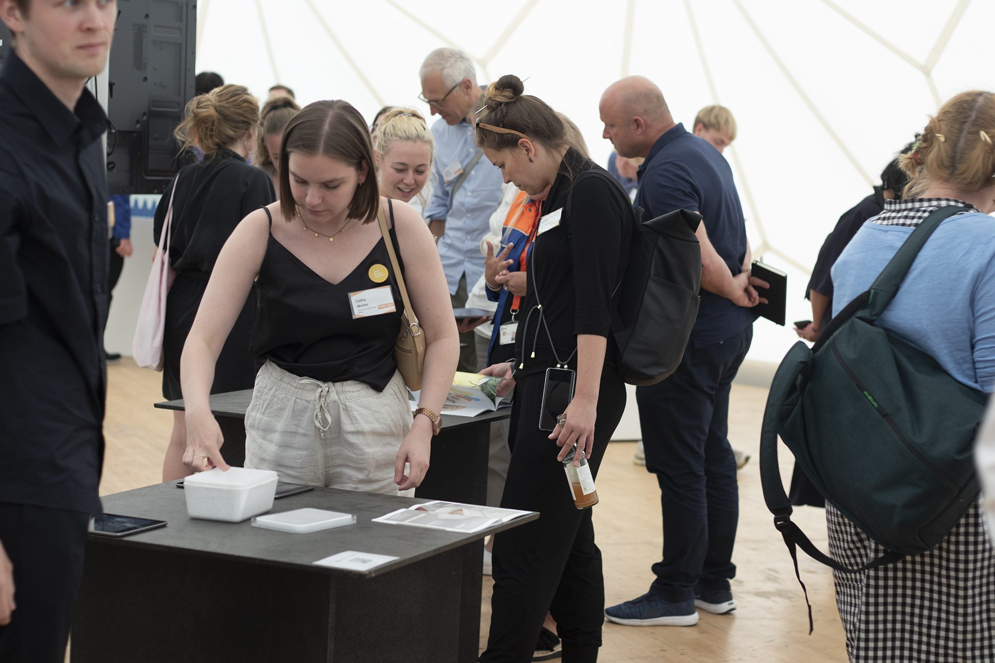
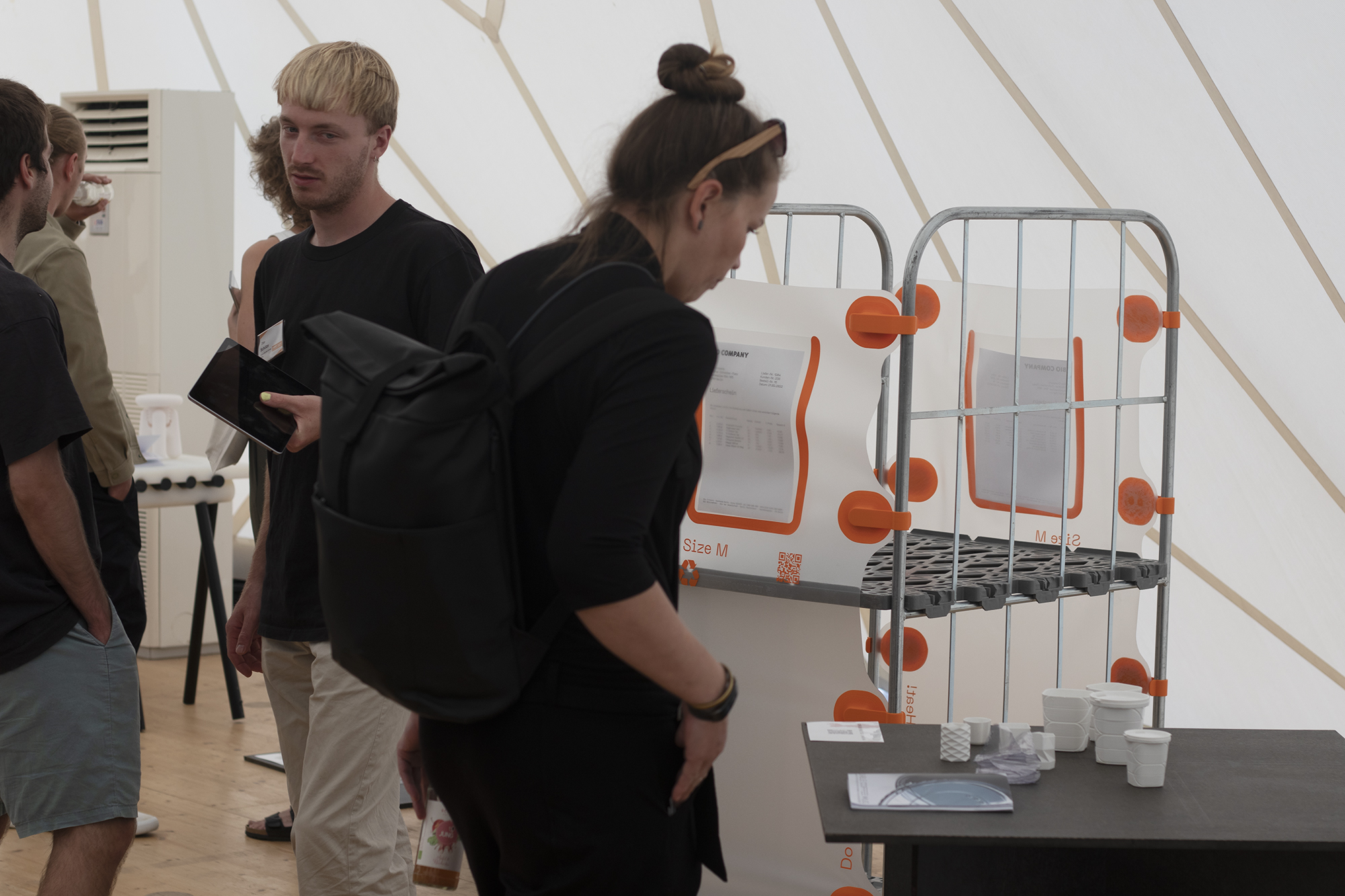
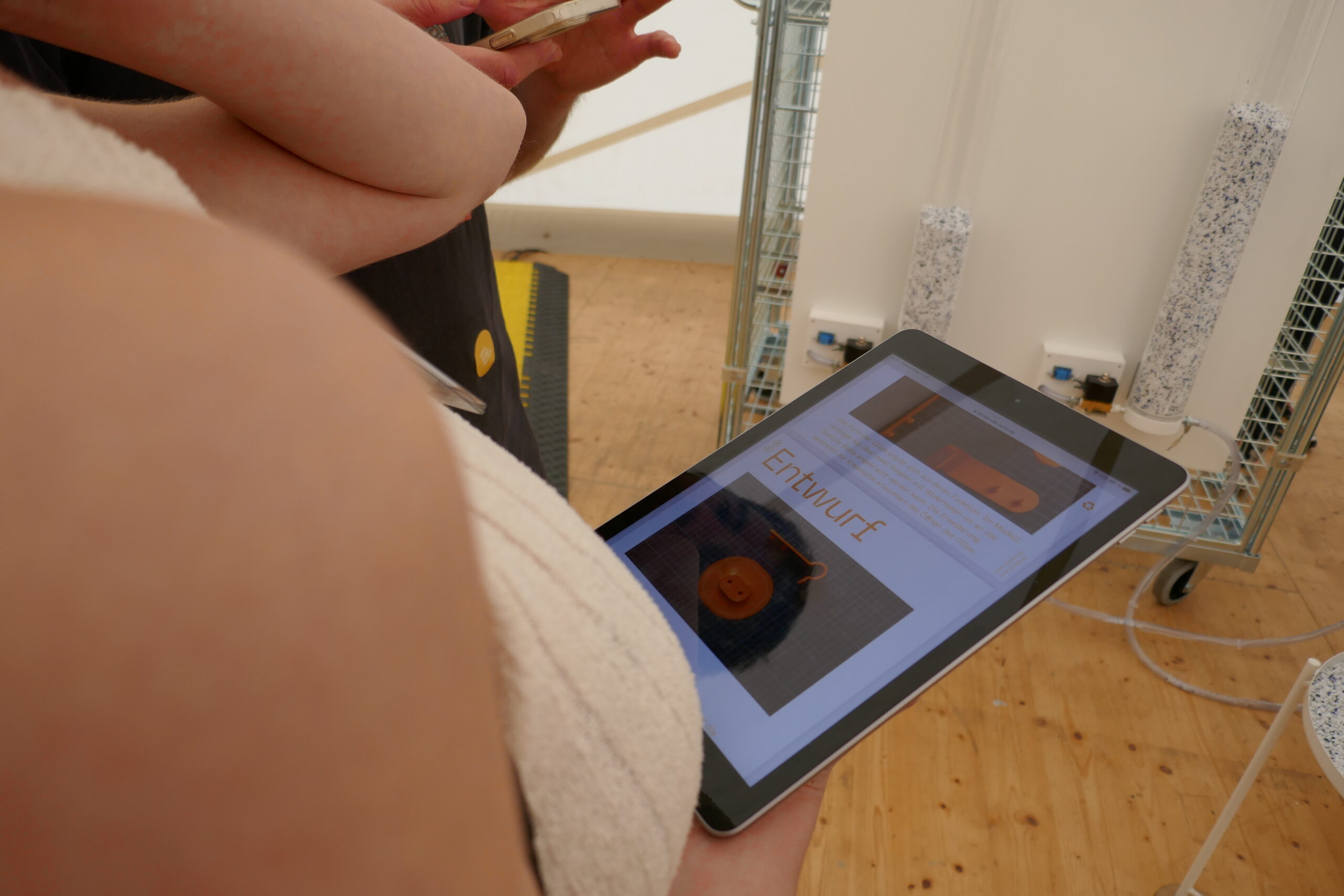
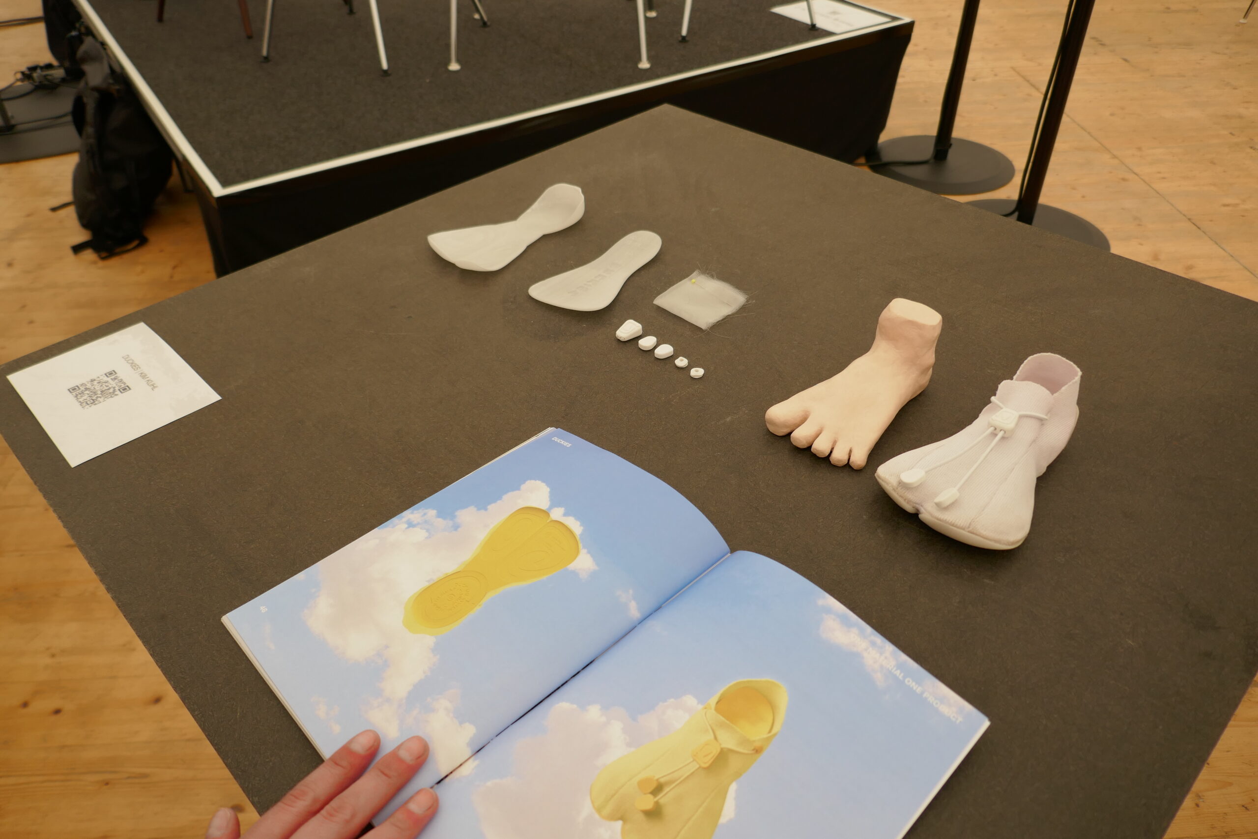
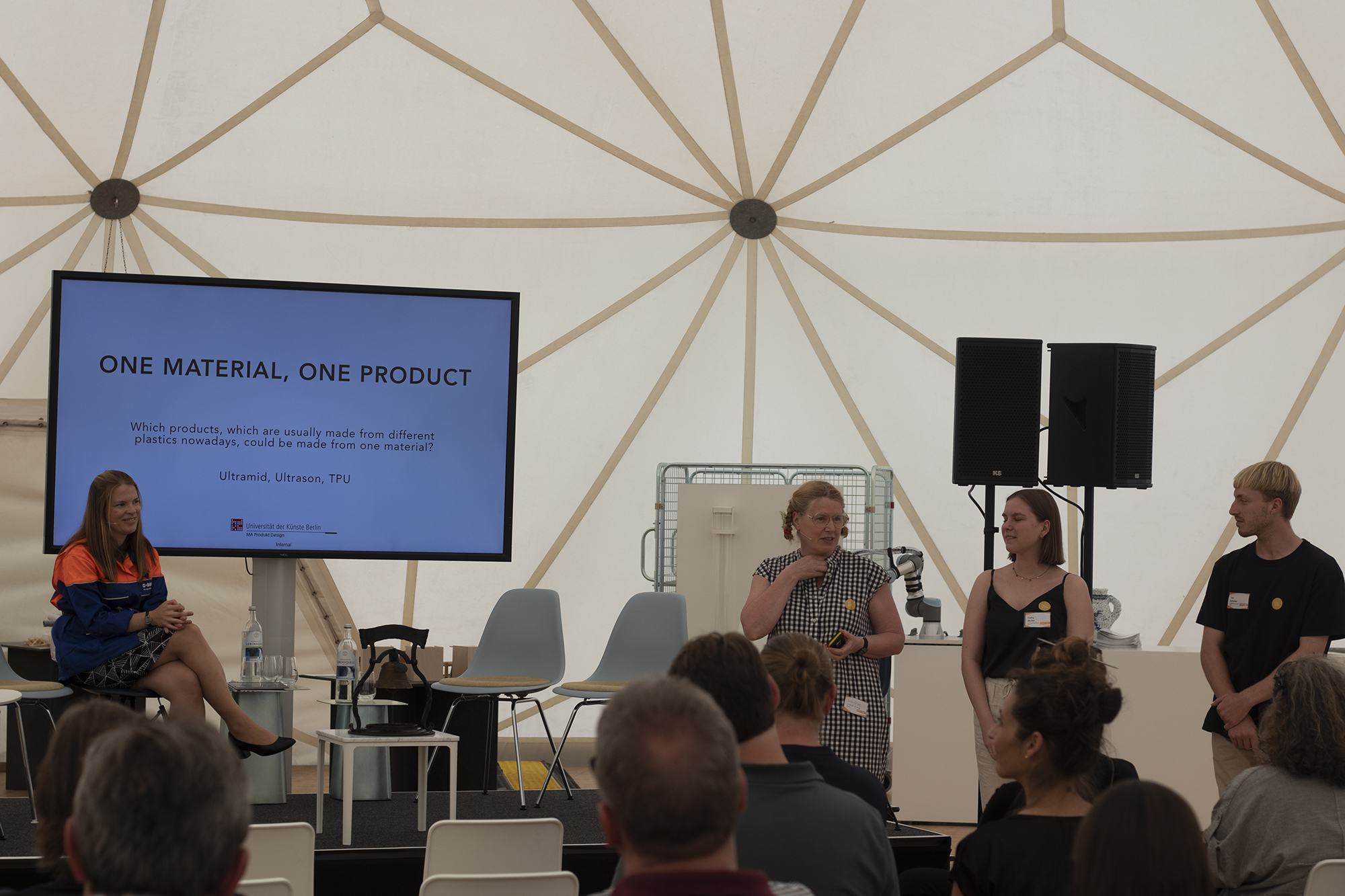
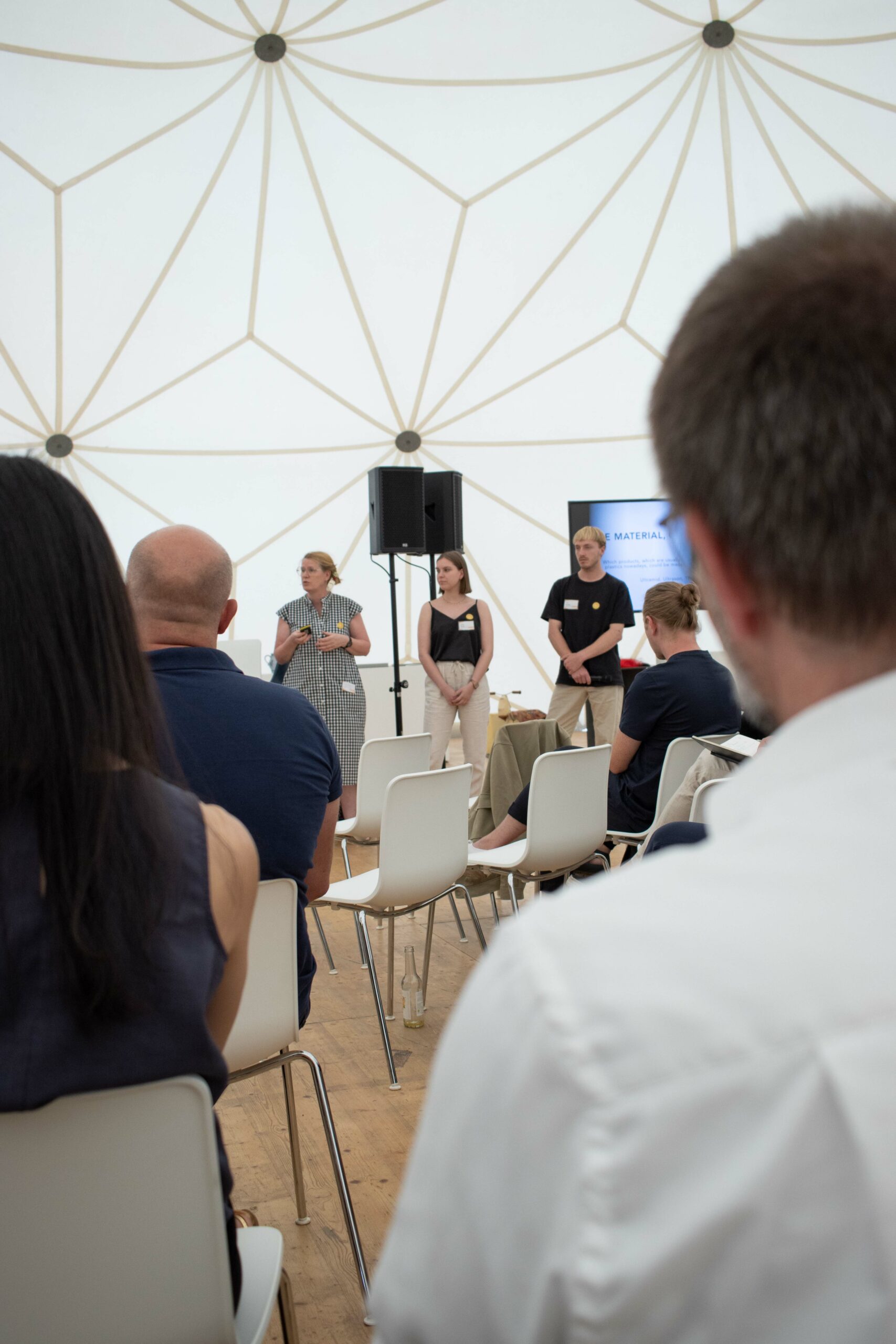
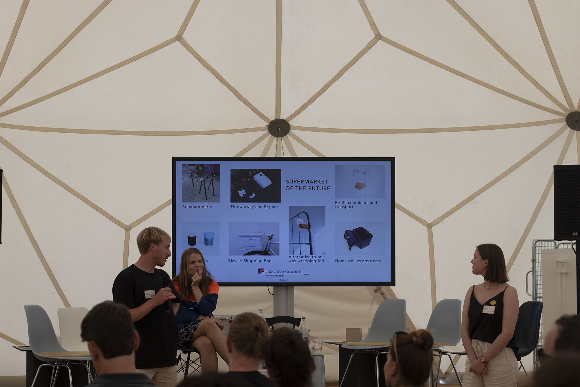
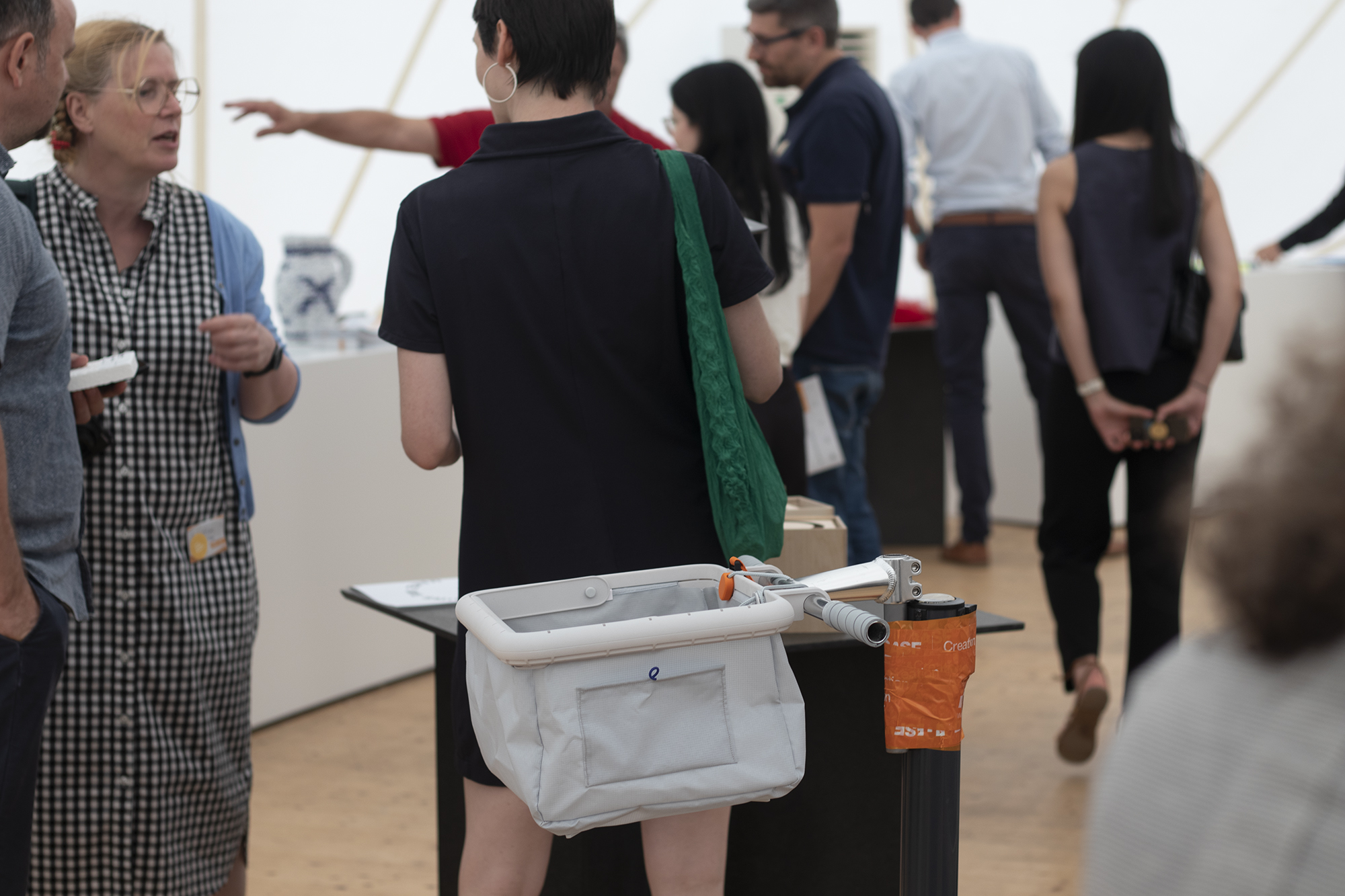
Chilling with drinks and food after the official program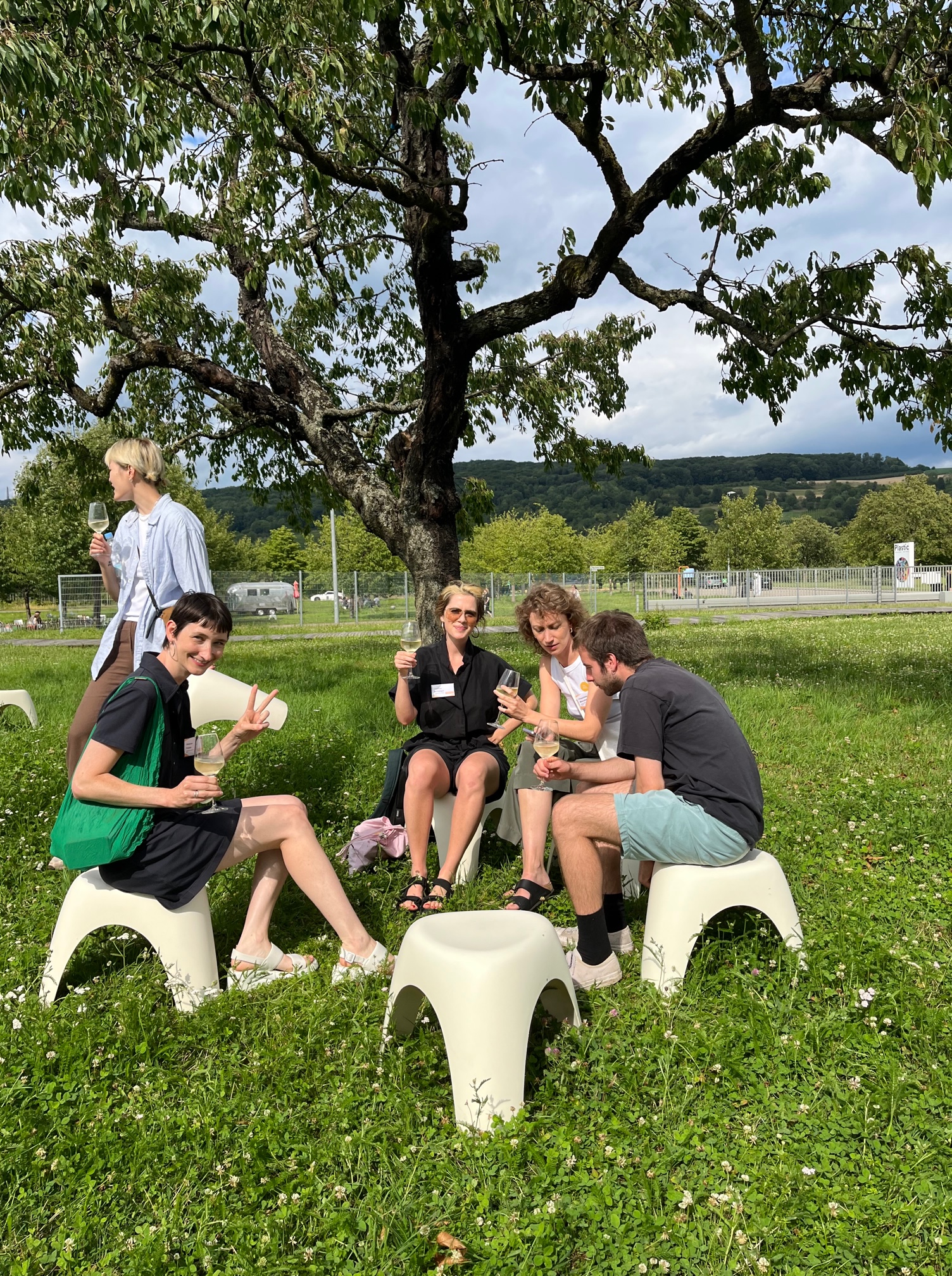
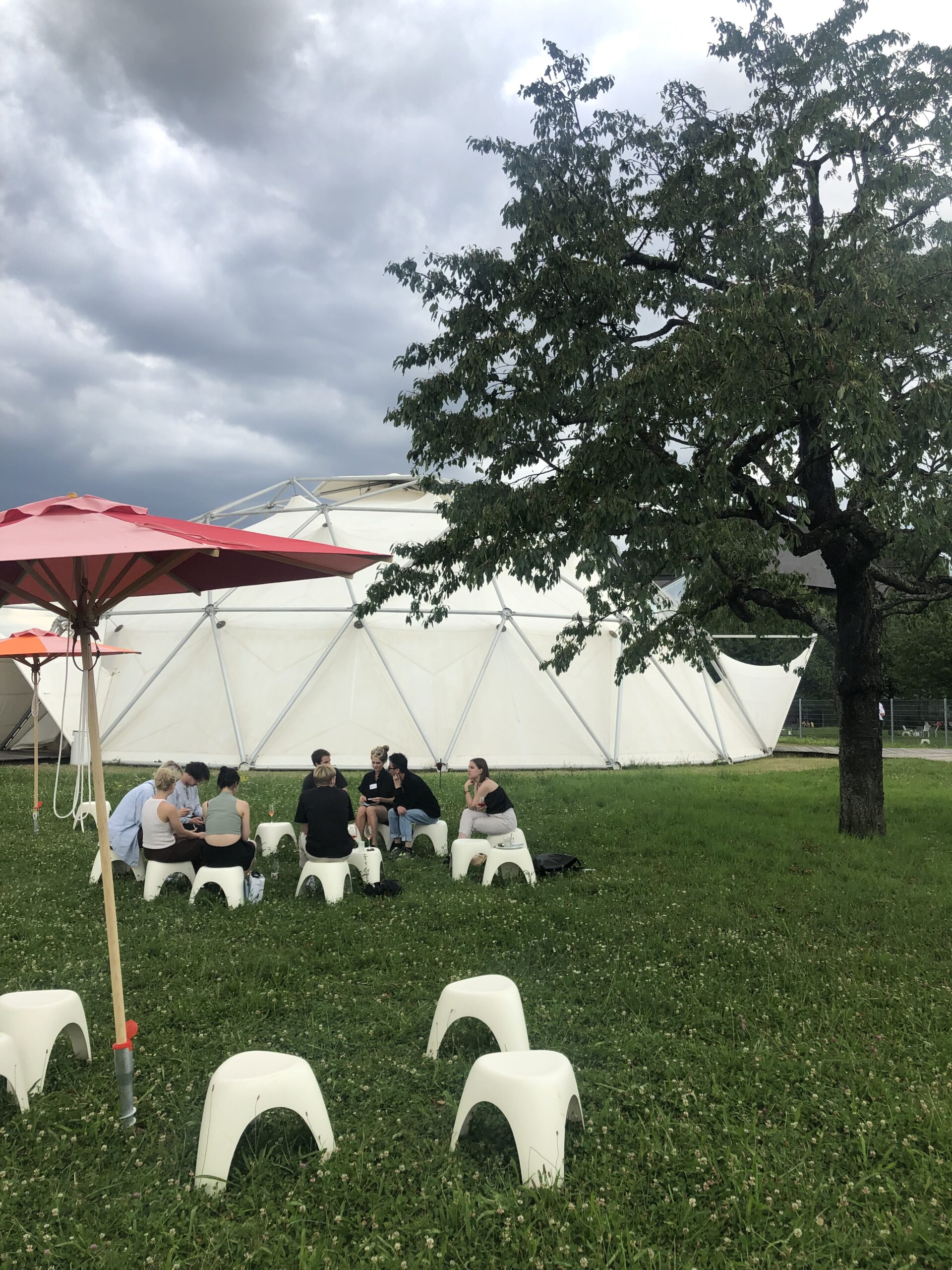
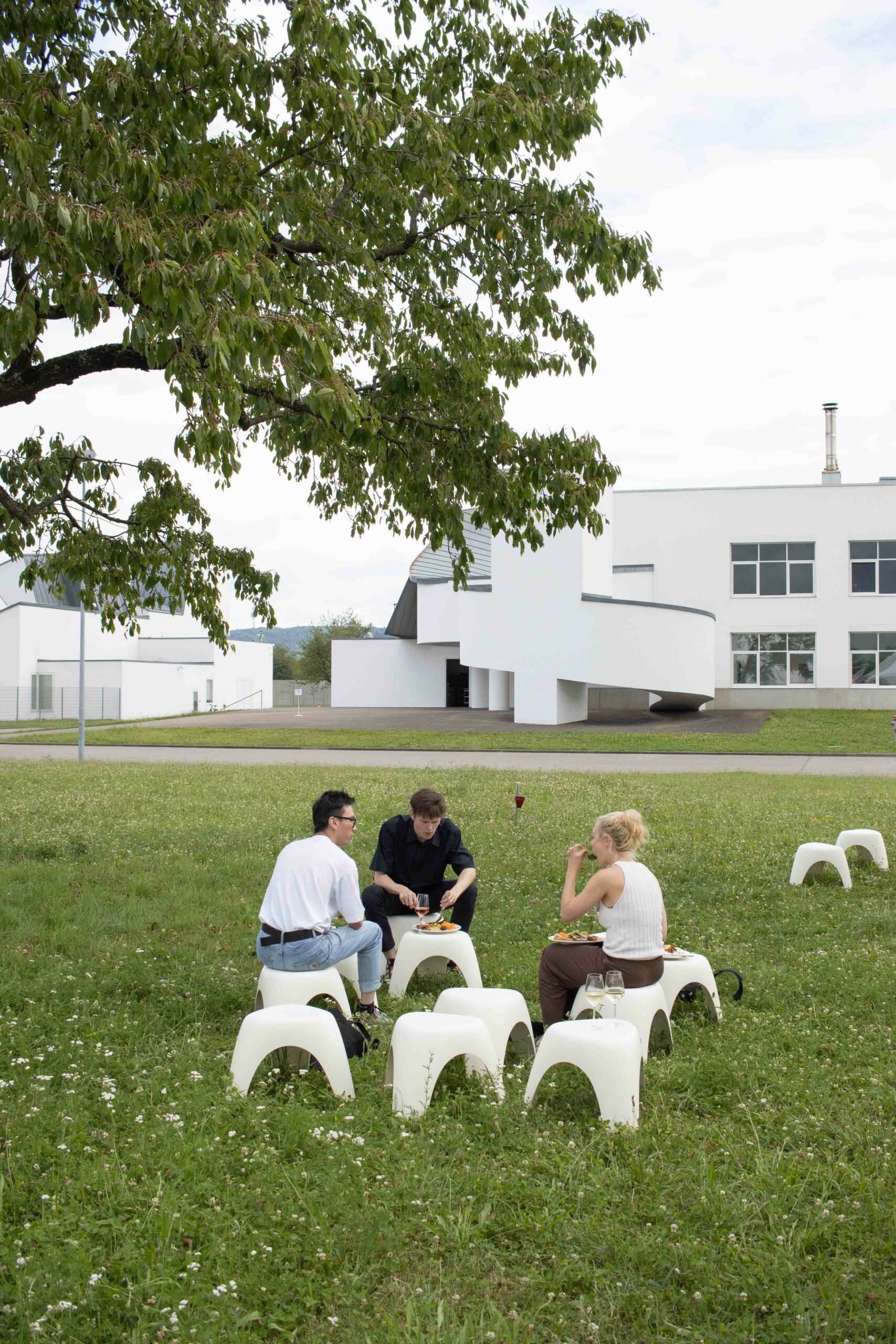
Day 3: factory tour (no images), some last impressions & departure
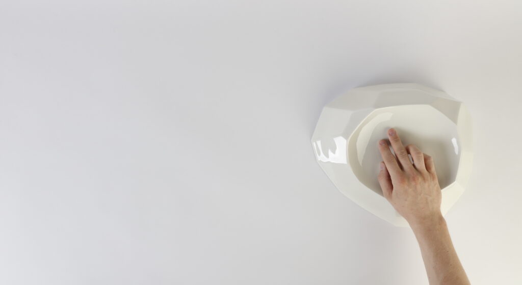
CERAMIC TOUCH – AN ANTIDOTE TO BLACK GLASS | Bachelorarbeit 2022
Es wirkt oft, als wäre es noch nicht gelungen die digitale Zukunft in unser aller Zuhause zu bringen, ohne ebenjene Eigenschaften, die Zuhause definieren, zu zerstören. Wenn Zuhause nach wie vor für Komfort und Sicherheit stehen soll, dann bedürfen dessen Technologien einen materiellen Wandel.
Ceramic Touch erlaubt mit ihrer ästhetischen, beinahe skulpturalen Qualität natürlicher Bestandteil unserer Zuhause zu werden. Gleichzeitig ermöglicht sie durch unauffällige und doch definierte Berührungen alle im häuslichen Kontext sich ergebenden digitalen Interaktionen.
Wenn wir uns die Technologien vergegenwärtigen, welche in unser häusliches Umfeld eintreten, so wird schnell deutlich, dass wir die Vorteile in Komfort und Nützlichkeit durchaus schätzen. Unsicher sind wir vielmehr gegenüber den überwachenden Eigenschaften, die mit diesen Technologien nicht ungleich einem Orwell’schen Albtraum einherkommen. Zentraler Spannungspunkt ist hier meist die Art und Weise der Interaktion mit diesen Technologien: Sprachassistenzen sind nützlich doch kann nie sicher davon ausgegangen werden, dass diese nicht heimlich weiter lauschen. Die direkte Interaktion über Smartphone oder Tablet umgeht dies, doch dessen digitale Präsenz bildet schnell eine scharfe Intrusion in unser Zuhause – einen Ort den wir zuweilen ganz bewusst frei von Displays und Ablenkungen halten möchten.
Das Projekt Ceramic Touch ergründet hier eine Alternative. Ein konzeptionelles Fundament wird durch Materialwahl, Formgestaltung und Interaktion ausgedrückt. So führt das Hinterfragen aktueller Möglichkeiten der Interaktion mit häuslichen Technologie zum Hinterfragen dessen zentraler Steuereinheit selbst. Eine neu gedachte solche Einheit muss sich ins Zuhause eingliedern ohne einen Bruch zu erzeugen, sowohl in ästhetischer als auch konzeptioneller Natur – nur aktiv gewollte Interaktion darf zugelassen sein, keine eigenwillige oder gar fremdgesteuerte Souveränität. Ihre Technologie muss versteckt um nicht aufdringlich zu sein und doch offensichtlich, um jeglichem Misstrauen Einhalt zu gebieten.
Als Interaktion wurde daher die Berührung gewählt – subtil und doch definiert, unaufdringlich und doch zugänglich. Weiterhin stellt diese eine inhärent menschliche Art der Kommunikation dar – sie ist uns natürlich und erlaubt tiefe Verbundenheit.
Ebenso wichtig ist jedoch das zu berührende Material. Dieses beeinflusst entscheidend ob die Interaktion als kühl oder warm, steril oder herzlich wahrgenommen wird. Übliche Materialien wie Kunststoffe, Metalle und Glas sind tendenziell oft der sterilen, Holz und Textilien der warmen Wahrnehmung zuzuordnen. Ein besonderes Zwischenfeld öffnen jedoch Keramiken, welche klare und zeitlose Eleganz mit einem gewaltigen kulturellen Erbe verbinden – Eigenschaften die dieses Material tief in der menschlichen Geschichte verankern. Wir interagieren mit diesem Material in natürlicher, ungezwungener Art und Weise und seine Ästhetik verbinden wir inhärent mit Attributen des Zuhause.
Das finale Objekt ist eine Zusammenkunft des Beschriebenen. Ein skulpturales Porzellanobjekt, definiert durch klare, kristalline Flächen, einzig durchbrochen von einer konkaven Mulde, welche die Hand zum Verweilen und Erforschen der Oberfläche einlädt. Das unwissende Auge mag dieses Objekt als reinen Teil einer geschmackvollen Einrichtung wahrnehmen, doch die Bewohner dieses Zuhause kennen die Feinheiten von Berührung und Gesten, die diesem Objekt komplexe Steuerung verschiedenster häuslichen Technologien ermöglichen, von Beleuchtung über Medien, Temperatur und vielem mehr. Die Steuerung selbst bleibt dabei stets intim und nahbar, ganz im Gegensatz zu den meisten aktuellen Alternativen.
It often seems we have not yet found a way to bring the digital future into our homes without sacrificing the very attributes of home itself. If home is supposed to mean comfort and secureness, then home technologies need a material change.
Ceramic Touch, through its aesthetic and sculptural quality offers to become a natural part of ones home living environment, while providing all necessary ways of digital home interaction through subtle yet definitive touch gestures.
When thinking of the technologies entering our homes nowadays, it quickly becomes clear that we actually do want most of their specific conveniences and comforts, yet we are uneasy about their surveilling presence that on occasion parallels an Orwellian dystopia. The main point of contention seems to be the way we interact with these technologies. Voice assistants are useful yet you may never be sure whether they are secretly listening. Controls through a phone or tablet computer may alleviate this, yet their digital presence can become a sharp intrusion into our home environment – a place that at times we specifically want to be devoid of screens and distractions.
The Ceramic Touch project tries to come up with an alternative through a number of ideas. At its core is a conceptual ground work, that is then expressed through materials, shape and interaction. To create a new way of interacting with our home technologies, the part we need to question is quite obviously the digital hub that is center to it all. This hub needs to blend into our home environment in both an aesthetic as well as a conceptual way – only open to actively intended interaction, not sovereign in itself. Its technology should be hidden as to not intrude, yet obvious in its functioning as to not raise unease.
As its input, touch was therefore chosen – given it is subtle yet definitive, unobtrusive yet always accessible. Yet more importantly, touch is a core way of human communication – it comes natural to us and builds deep connection.
Equally important however is the material forming the surface to be touched, as it informs whether this interaction is perceived as cold or warm, sterile or welcoming. Commonly used materials such as plastics, metals and glass tend to fall into the more sterile perception, while woods and textiles fall into the historically more homely one. A unique material in between however are ceramics. It combines the clear and timeless elegance that glass and metals may achieve while having a huge cultural heritage that grounds it firmly in human culture. We interact with ceramics in natural, unforced ways and its aesthetics are inherently tied to attributes we connect with home.
The final object is therefore a culmination of the above. A sculptural piece of ceramic, defined by crystalline faces for visual clarity and a slightly slanted, concave section which invites the palm to rest on its edge, naturally exploring its shape. To the unknowing eye, it may just be a show piece displayed for its aesthetic value. Yet the people calling its surroundings home know the intricacies of subtle touches and gestures that will reveal control over the various home technologies around such as lights, media, temperature and much more. This way, the control of ones home stay private and intimate, much unlike present solutions.
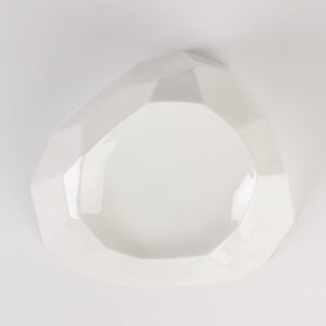
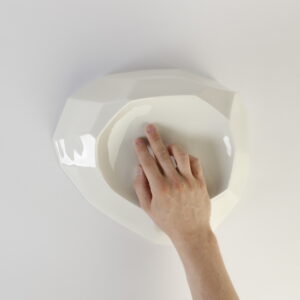
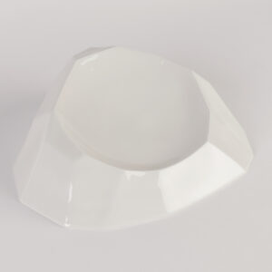
Prozess


Betreut durch
Prof. Achim Heine , Prof. Holger Neumann, Prof. Dr. Ingeborg Harms
Kontakt
MEA | Masterarbeit 2022
Cheap furniture with poor quality is in vogue. Thus, 10.5 million tons of furniture in Europe end up trashed every year. But our forests are suffering from our consumption and climate change! Even, renewable materials like wood are finite if we consume them faster than they can grow back.
MEA is a concept idea that stands for reparability. It questions our consumption behaviour and the handling of renewable resources in the furniture industry. MEA-Chair is an example that corresponds to this idea.
MEA-Chair is made entirely of solid wood and is therefore easy to repair. Due to detachable screw connections, it can be quickly disassembled and completely refurbished within less than 60 minutes. Irreparable individual parts can be replaced while all others stay in use. Replacing individual parts has in conclusion that the chair’s appearance changes over the years. Every tree trunk looks different and due to climatic changes, we do not know which tree species will settle in the future.
When the chair is no longer needed, it can simply be returned. It will be repaired and sold again. This time for less money, as hardly any new resources are used.
MEA makes repairability accessible to a wider audience and therefore allows furniture to remain in an endless cycle, hardly using any new resources.
After the first repair, MEA‘s life has just begun!
Billige Möbel mit schlechter Qualität sind im Trend. So landen 10,5 Millionen Tonnen Möbel jährlich in Europa auf dem Müll. Doch unsere Wälder leiden unter unserem Konsum und dem Klimawandel! Selbst nachwachsende Rohstoffe wie Holz sind endlich, wenn wir sie schneller verbrauchen als sie nachwachsen können.
MEA ist eine Konzeptidee, die für Reparierbarkeit steht. Sie hinterfragt unser Konsumverhalten und den Umgang mit erneuerbaren Ressourcen in der Möbelindustrie. MEA-Chair ist ein Beispiel, das dieser Idee entspricht.
MEA-Chair besteht aus Massivholz und ist daher leicht zu reparieren. Durch lösbare Schraubverbindungen ist der Stuhl schnell zerlegt und in weniger als 60 Minuten komplett aufgearbeitet. Irreparable Einzelteile können ausgetauscht werden, während alle anderen in Gebrauch bleiben. Der Austausch von Einzelteilen hat zur Folge, dass sich das Aussehen des Stuhls im Laufe der Jahre verändert. Jeder Baumstamm sieht anders aus und aufgrund klimatischer Veränderungen wissen wir nicht, welche Baumarten sich in Zukunft ansiedeln werden.
Wenn der Stuhl nicht mehr gebrauchet wird, kann er einfach zurückgegeben werden. Er wird repariert und wieder verkauft. Diesmal für weniger Geld, denn es werden kaum neue Ressourcen genutzt.
MEA macht die Reparierbarkeit für ein breiteres Publikum zugänglich und ermöglicht so, dass die Möbel in einem endlosen Kreislauf bleiben und kaum neue Ressourcen verbrauchen.
Nach der ersten Reparatur fängt das Leben von MEA erst an!


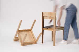
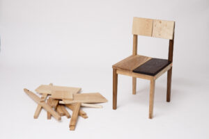
Prozess


Supervised / Betreut durch: Prof. Ineke Hans, Prof. Holger Neumann, KM Maciej Chmara
Kontakt: https://www.cathywolter.com/
LINK THE SYSTEM | Masterarbeit 2022
Durch die Verknüpfung von Disziplinen, Materialien, Zyklen und Designs
Der Bausektor stellt aufgrund seiner hohen Emissionen und seines Ressourcenverbrauchs ein besonders dringliches Handlungsfeld dar, weshalb sich diese Abschlussarbeit mit Geopolymeren als alternatives Baumaterial beschäftigt. Der ökologische Vorteil der Materialgruppe der Geopolymere ist, dass diese im Vergleich zu Zement nur in etwa 1/4 der CO2 Emissionen verursachen und gleichzeitig aus Abfallstoffen der Industrie bestehen können. Mit diesem Verständnis und dem Gedanken möglichst lokale Abfallressourcen – im Sinne des „Urban minings“- verwenden zu wollen, entwickelte sich die Idee Geopolymere aus Ziegelbruch herzustellen. Zusammen mit der TU Darmstadt wurde eine Strategie zur Vorgehensweise bei den Materialexperimenten erarbeitet, welche zu positiven Ergebnissen führte. Zusammen mit Design, welches in dieser Arbeit als eine Art Werkzeug verstanden wird, wurden die Erkenntnisse der Experimente in eine erfahrbare Form gebracht und ein System aus modularen ineinandergreifenden Bausteinen entwickelt. Die steckbaren Bausteine, welche in diesem Modell durch eingefügte Platten ergänzt wurden, sollen im kleinen Rahmen aufzeigen wo potenziell Möglichkeiten für eine nachhaltigere Gestaltung von Produkten und Einsatz von Materialien im Großen liegen könnten.
Um nämlich einen Beitrag zur Eindämmung des Klimawandels zu leisten, müssen emissionsintensive Materialien reduziert und durch nachhaltigere Materialien ersetzt werden. Weiterhin müssen bereits genutzte Ressourcen und Materialien so lange wie möglich im Kreislauf gehalten und Produkte so gestaltet sein, dass sie möglichst lange benutzt und wiederverwendet werden können. Das Abschlussprojekt LINK THE SYSTEM versucht all diese Aspekte in einem Konzept zu berücksichtigen.
By linking disciplines, materials, cycles and designs
The construction industry is responsible for high CO2 emissions and a large demand for resource-intensive raw materials. At the same time, there is a lot of potential to develop ideas and designs that make more sustainable use of building materials possible.
To explore more environmentally friendly materials, this project investigated the potential of geopolymers as a sustainable replacement of cement. Geopolymers emit 4-times less CO2 than cement and at the same time can be made from industrial waste materials. With this understanding and following the intention of using local waste resources – in the sense of „urban mining“ – the idea of producing geopolymers from broken bricks was developed.
In collaboration with the Technical University (TU) Darmstadt, we developed a strategy for the experimental procedure of the idea, which led to positive results. In the next step, the developed strategy was applied to present the new material in a tangible form – modular interlocking building blocks. The system can be extended with panels to demonstrate one further application of this design strategy. This project intends to show potential opportunities to develop more sustainable designs of products and materials.
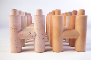
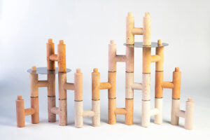


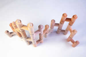
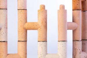
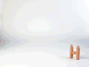
PROZESS
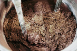
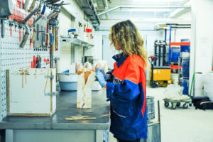
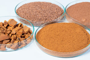
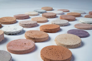
Betreut durch: Prof. Axel Kufus, Anja Lapatsch, Dr. Daniel Irrgang
Kontakt:
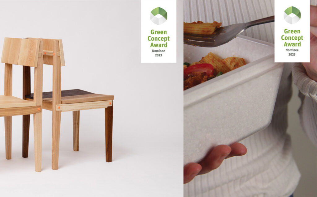
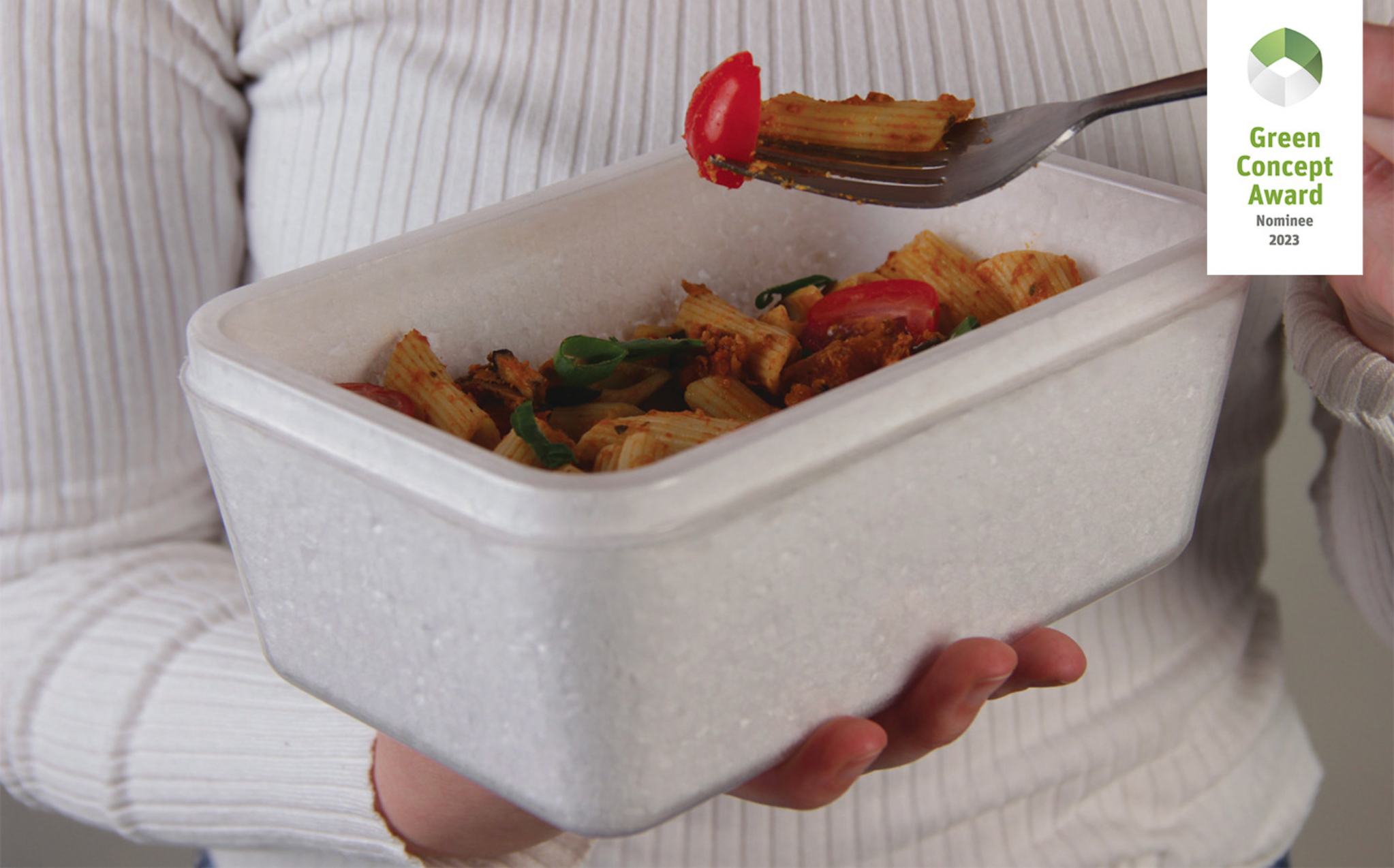
Cathy Wolter graduated in product design with an MA in September
Currently she is nominated with two of her designs in the GREEN CONCEPT AWARD 2023
First with her Project RE-ME developed for BASF, see
and also for her Master Projekt: MEA – Modern Restauration, see
See more at GREEN KONZEPT AWARD
and her projects here below
CareA | Bachelorarbeit 2022
CareA ist ein Pflanzenbewässerungssystem, das sich aus Gastronomie Abfällen, wie Joghurteimern, Tomatendosen und alten Leinenbeuteln zusammenbauen lässt. Alle Materialien sind leicht aufzufinden, bei Bedarf auch austauschbar und kostenlos. Die 3D-gedruckten, verbindenden Teile aus recyceltem PLA machen aus den geupcycleten Einzelteilen ein Gesamtsystem. Die Becken aus Dosen können je nach Bedarf verlängert oder gekürzt werden, dadurch, dass sie aus mehreren Gliedern bestehen. Der einfache Aufbau, und das Weglassen von technischen Elementen, wie in anderen hydroponischen Systemen sogt für eine bessere Zugänglichkeit und vereinfacht die Wartung. CareA ist ein Open-Source-Projekt. Eine Bauanleitung, ein Herbarium und alle 3D Modelle können heruntergeladen werden. Die Gemeinschaft der Nutzer soll in den Designprozess inkludiert werden, so kann sich in Foren ausgetauscht werden und das Herbarium wachsen, Tools überdacht und weiterentwickelt werden. Das System wurde konzipiert, um eine Art Haushaltsapotheke, bestückt mit regionalen Wildkräutern, bei sich in der WG, im Gemeinschaftsgarten oder in der Einzimmer Wohnung anzulegen. Fast verloren gegangenes Volkswissen aus Kloster Heilgärten soll wieder aufgelebt werden, und das Bewusstsein über den eigenen Körper und die uns umgebende Natur soll in unseren Alltag integriert werden. Das System ist wassersparend, da das Wasser zirkuliert und mit Nährstoffen versetzt wird und so bis zu einem Monat im Umlauf bleiben kann. Ich habe Prinzipien der Permakultur angewandt, so dienen Haushaltsabfälle oder organische Abfälle als Dünger und die Pflanzen können, durch die langen Becken, gegenseitig positiv bedingend angebaut werden.
CareA soll nicht die Pharmazie ersetzten, sondern eher ein Bewusstsein, über Ernährung und Fürsorge schaffen. In dem man mehr über Inhaltsstoffe in uns umgebenden Pflanzen lernt, die unsere Gesundheit positiv beeinflussen. Der Ansatz ist es, einen Kreislauf im eignen Haushalt entstehen zu lassen. Haushaltsabfälle, wie Gemüseverschnitt im Bokashi oder fermentiertes Urin, dienen als Dünger und aus den angelegten Kräutern können Tees, Salate oder Salben hergestellt werden, die wieder Auswirkung auf unseren Körper nehmen. Bei dem ganzen Prozess entstehen, so wenig Abfallprodukte wie möglich und verschaffen dem Nutzer gleichzeitig Autonomie.
CareA is a plant watering system that can be assembled from catering waste such as yoghurt buckets, tomato cans and old canvas bags. All materials are easy to find, replaceable if needed and free of charge. The 3D-printed, connecting parts made of recycled PLA turn the upcycled individual parts into a complete system. The basins made of cans can be lengthened or shortened as needed, thanks to the fact that they consist of several links. The simple construction and the absence of technical elements, as in other hydroponic systems, ensures better accessibility and simplifies maintenance. CareA is an open source project. A construction manual, a herbarium and all 3D models can be downloaded. The community of users is to be included in the design process, so they can exchange ideas in forums and the herbarium can grow, tools can be reconsidered and further developed. The system was designed to create a kind of household pharmacy, stocked with regional wild herbs, in a shared flat, in a communal garden or in a one-room flat. Almost lost folk knowledge from monastery healing gardens is to be revived, and awareness of our own body and the nature surrounding us is to be integrated into our everyday life. The system is water-saving as the water is circulated and nutrient-added and can thus remain in circulation for up to a month. I have applied permaculture principles, so household or organic waste serves as fertiliser and the plants can be grown in a mutually positive way, due to the long basins.
CareA is not meant to replace pharmacy, but rather to raise awareness about nutrition and care. By learning more about ingredients in the plants around us that positively influence our health. The approach is to create a cycle in our own household. Household waste, such as vegetable cuttings in Bokashi or fermented urine, serve as fertiliser and the herbs grown can be used to make teas, salads or ointments that have an effect on our bodies. The whole process produces as few waste products as possible and at the same time gives the user autonomy.
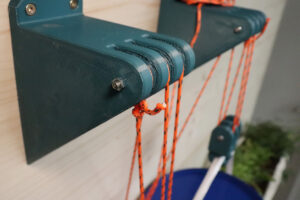
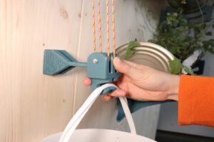


Prozess

Betreut durch
Prof. Dr. Michelle Christensen, Prof. Dr. Florian Conradi, Prof. Axel Kufus, Prof. Holger Neumann
Kontakt
@catalina_gomez_alvarez
Fotos: Camille Couturier
Thanks to Friedrich from Einstein Center for Digital Future and Nabor zu Bentheim
film: Tim Schütze
From 23-26 Oktober the Masterclass 2022/23 went to Voralberg where the explored workshops, producers and exhibition spaces in Bregenzerwald as an extra support to their MAGAZIN project: ‚With your back to the Wall‘.
Sunday:
• Arrival and visit to Kunsthaus Bregenz and architectural tour by Maciej Chmara (one of the most famous Peter Zumthor buildings)
Monday:
• Zumtobel tour, explanation. The range, production, light spectra, etc…
• Martin Bereuter, architect, carpenter, designer, chairman of the Bregenzerwald workshop, guided tour of production and the showroom
• Martin Mackowitz, Martin Rauch, clay production, clay construction and discussion in Martin Mackowitz’s private home on the qualities and production of clay (no photos allowed)
Tuesday:
• Mohr upholstery shop, guided tour and discussion with Johannes Mohr (co-initiator of the workshop). Guided tour by the managing director through the workshop and the current exhibition, small architectural tour by Maciej Chmara.
• Visit to Erhart Holz, the largest sawmill in Vorarlberg, explanation of the process and tour of the entire production, explanation of quality, regional material, etc.
• Short visit to the alpine dairy on Sunday
• Final workshop in Schnifis, cable car ride, short hike, and traditional Kasknöpfle food (and discussion with 3 Täler management and cable car manager).
^ arrival >
v zumtobel
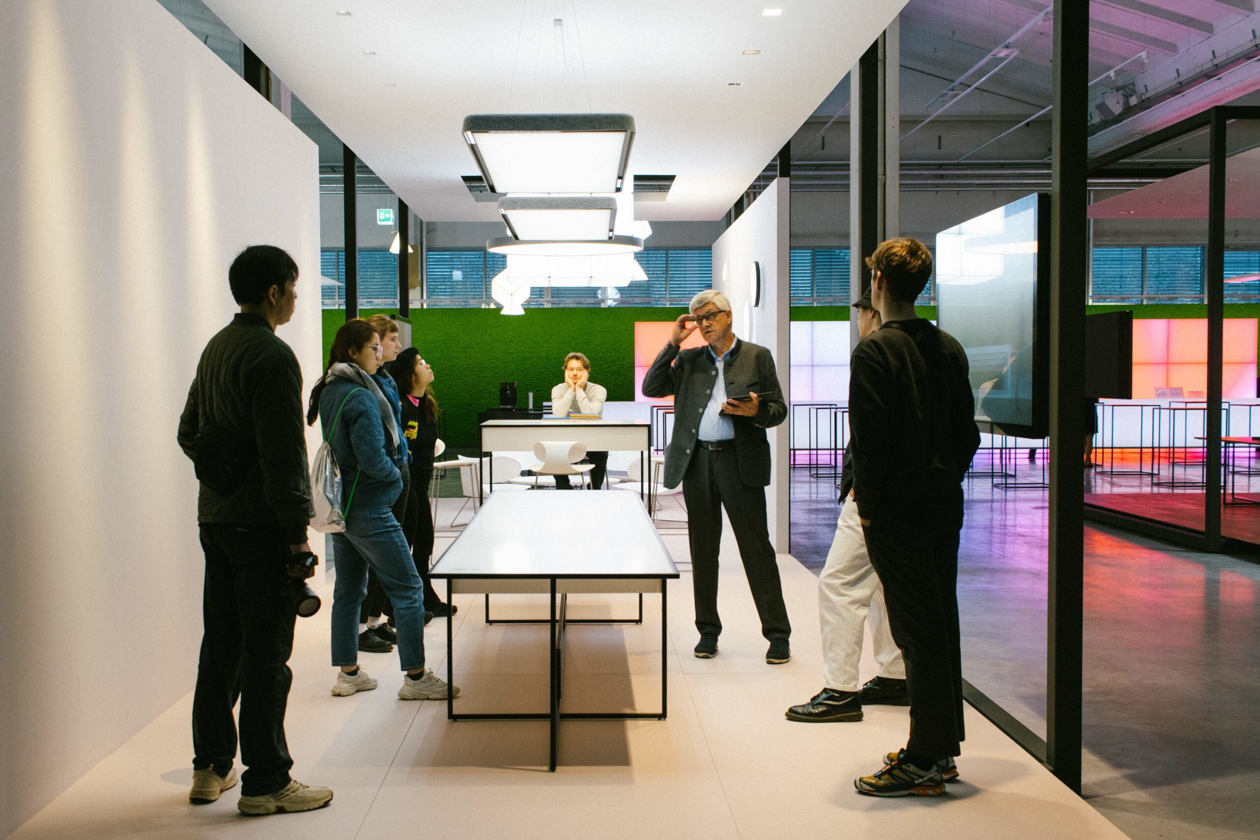
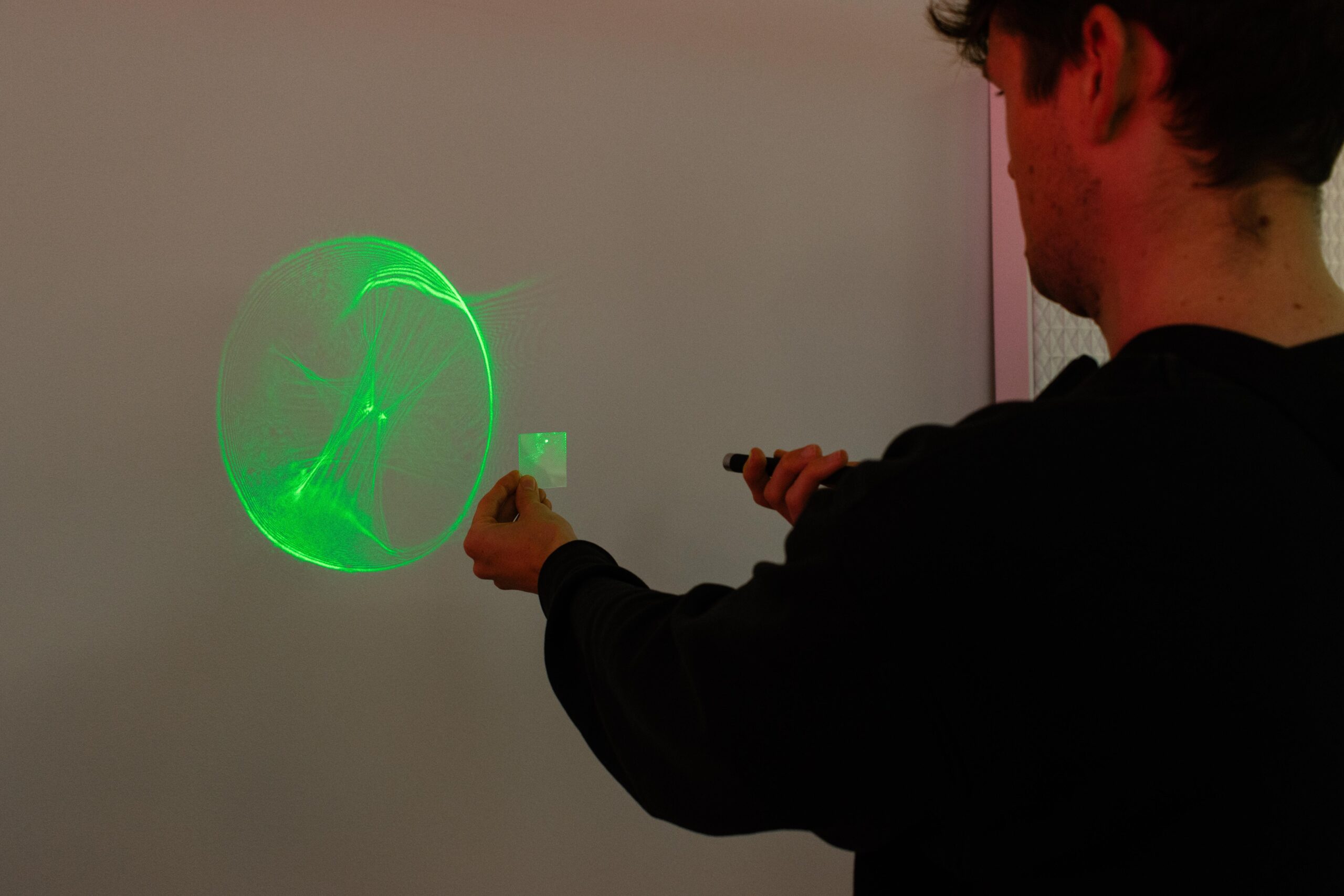
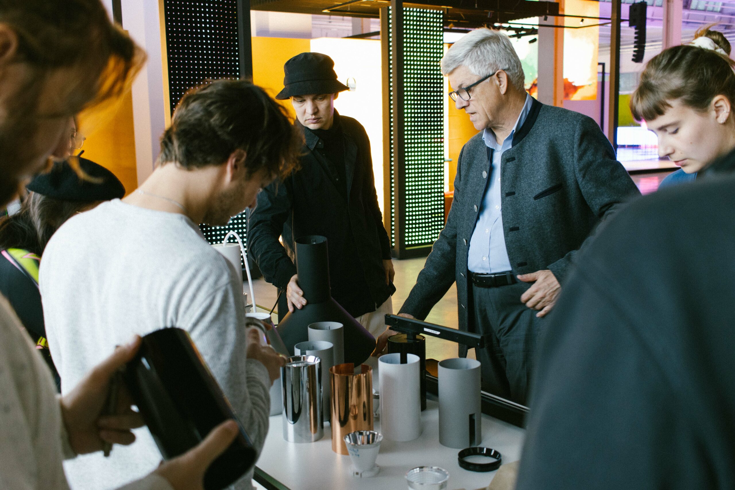
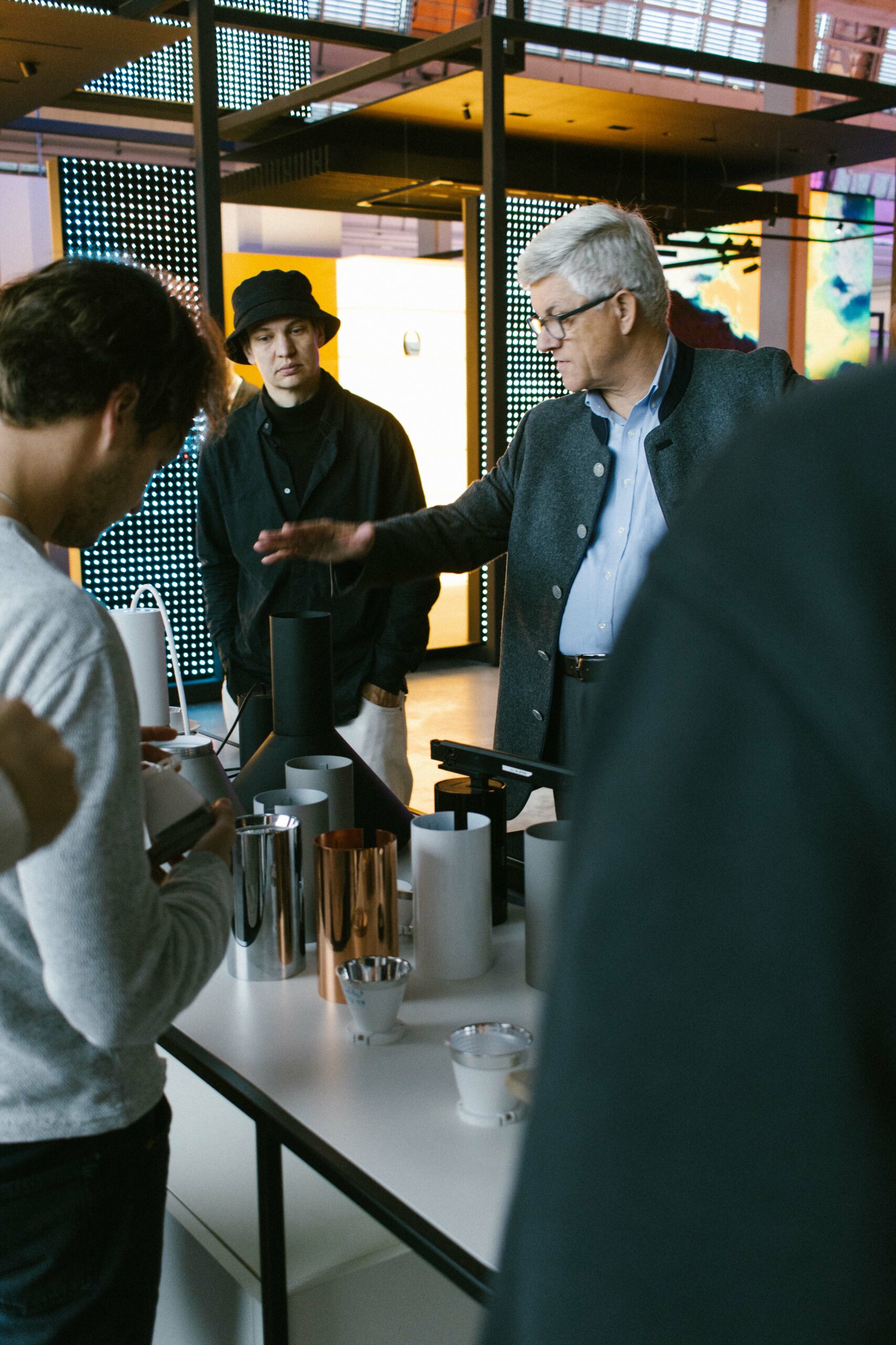
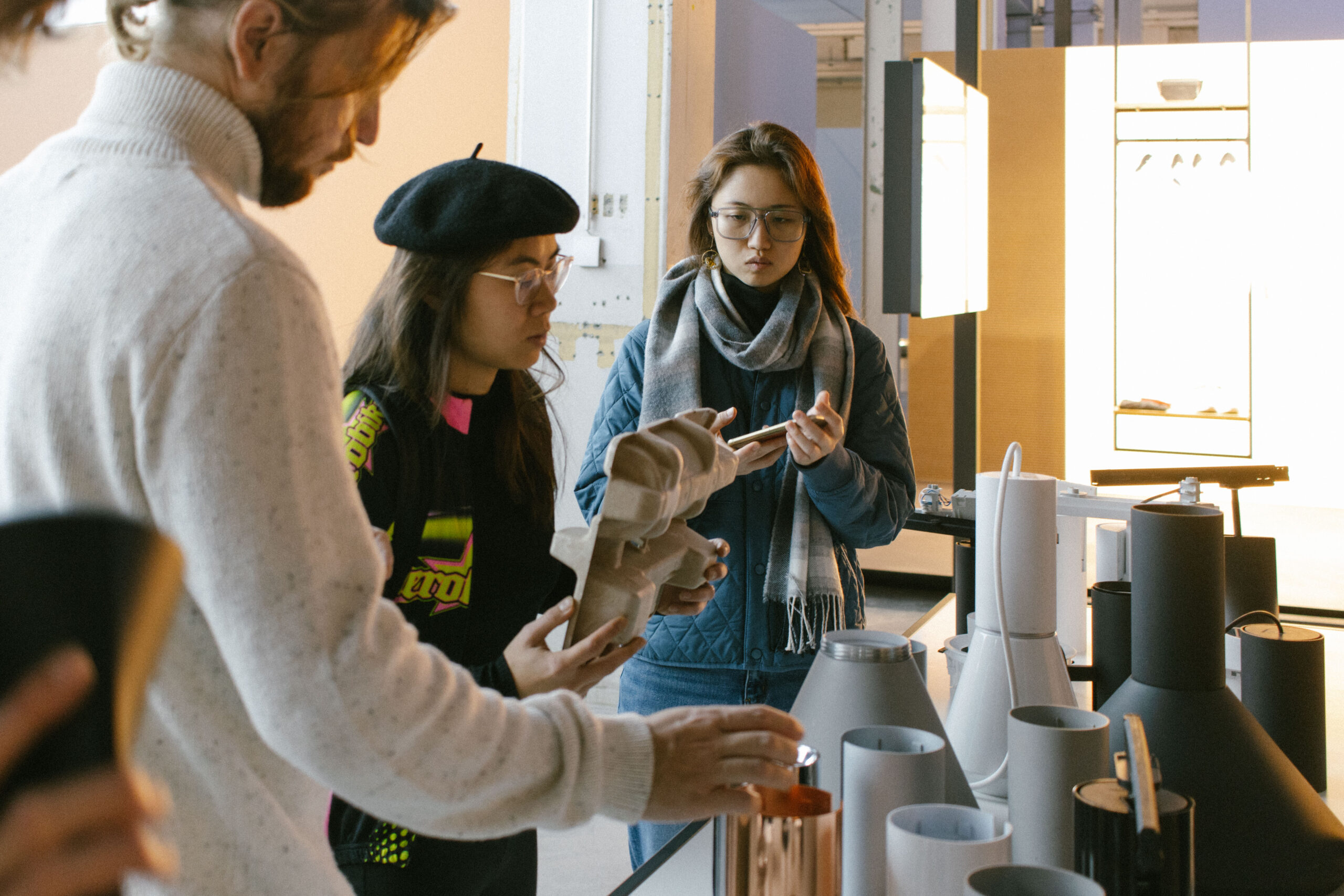
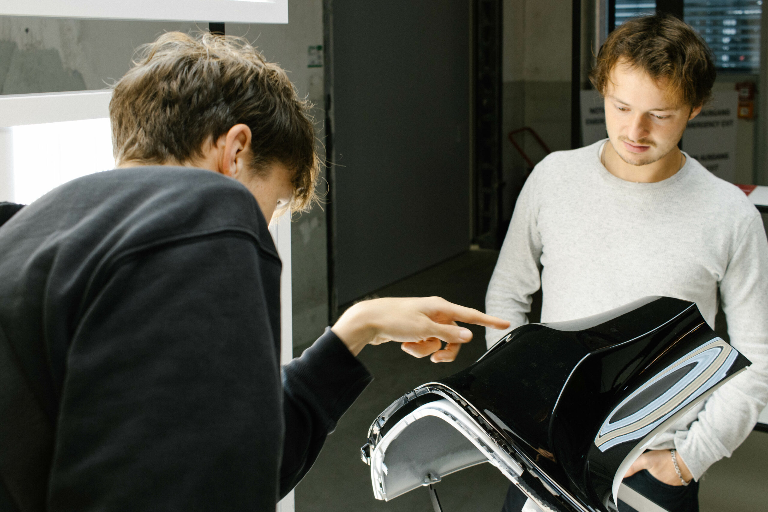
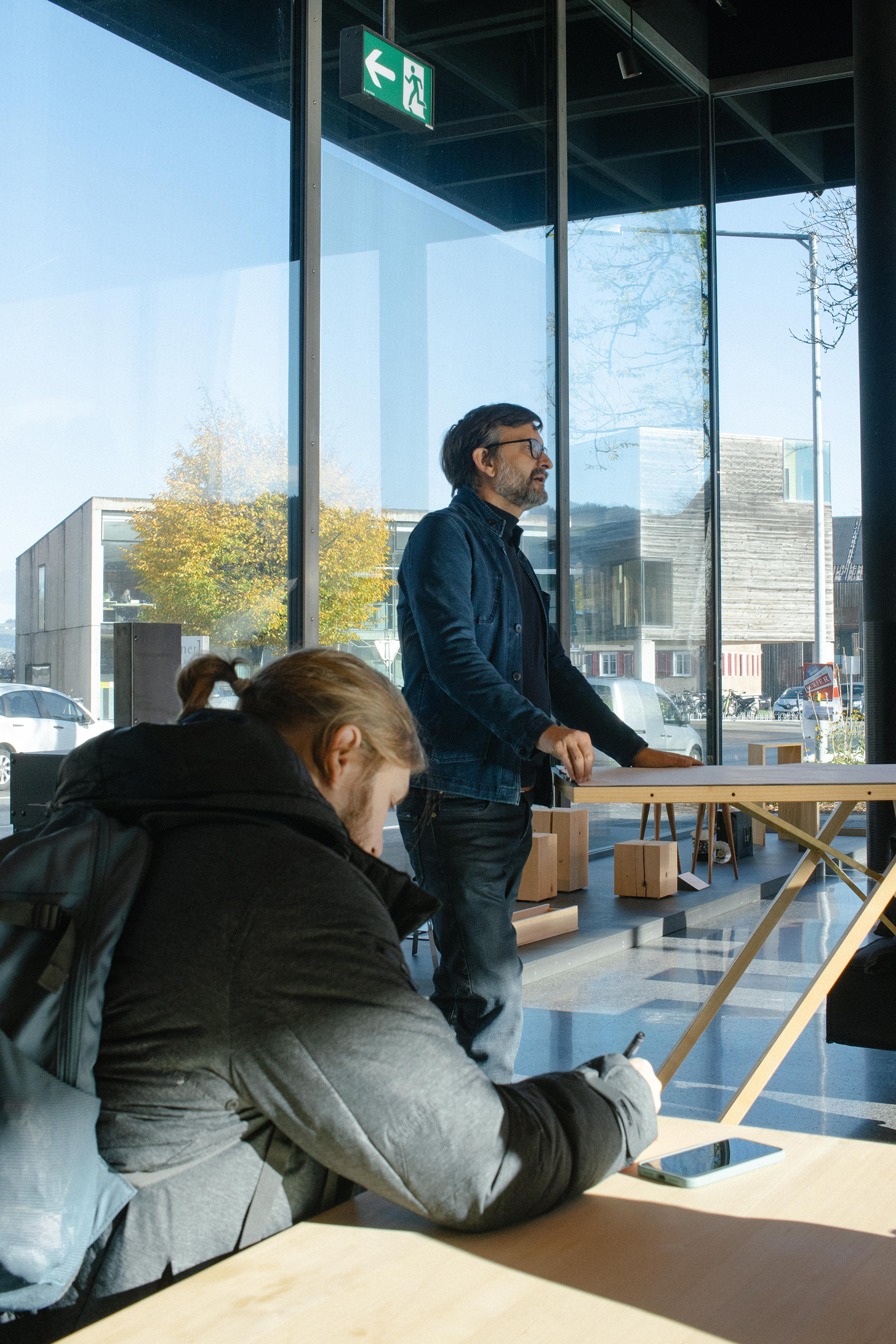
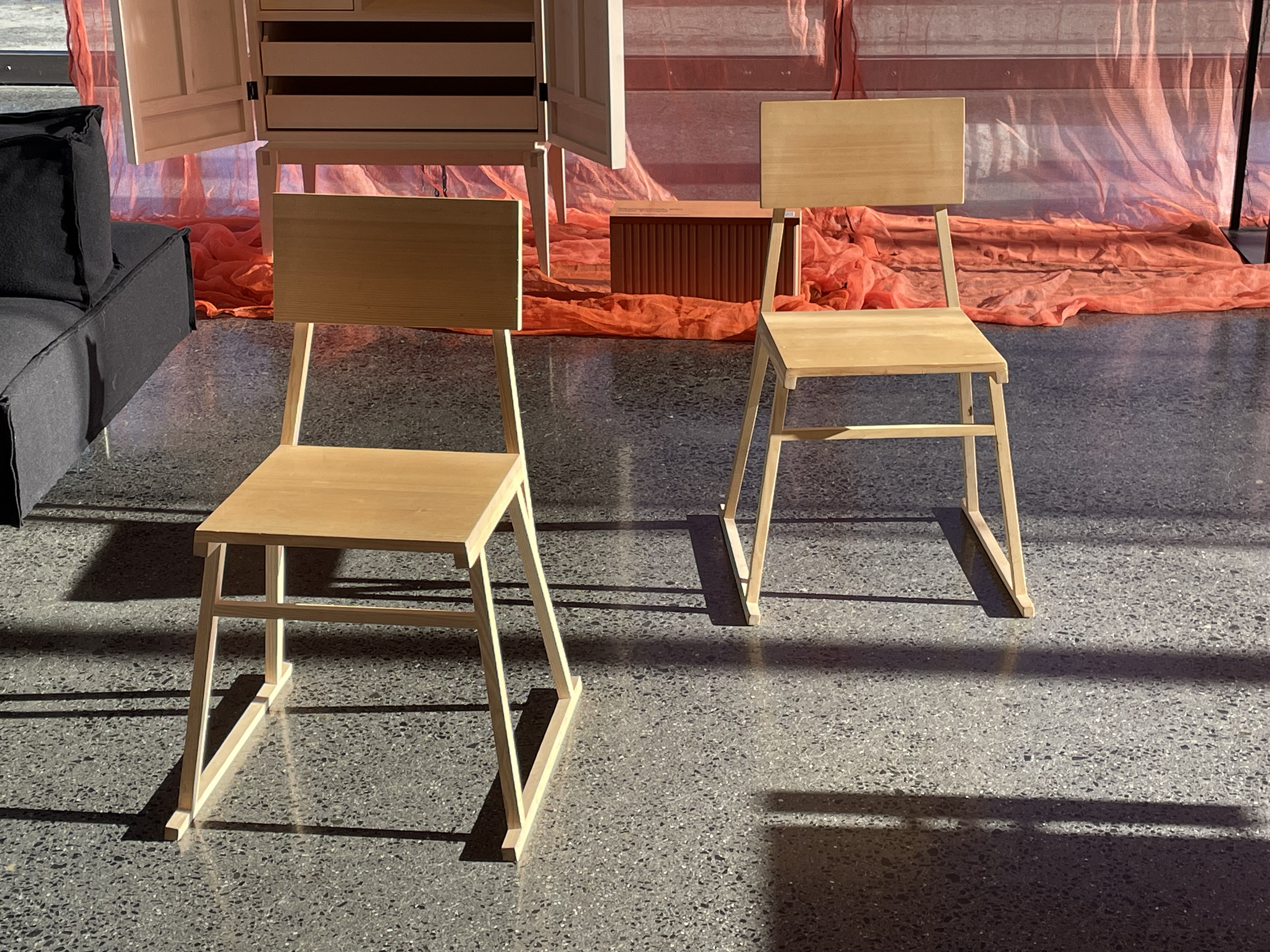
Mohr upholstery
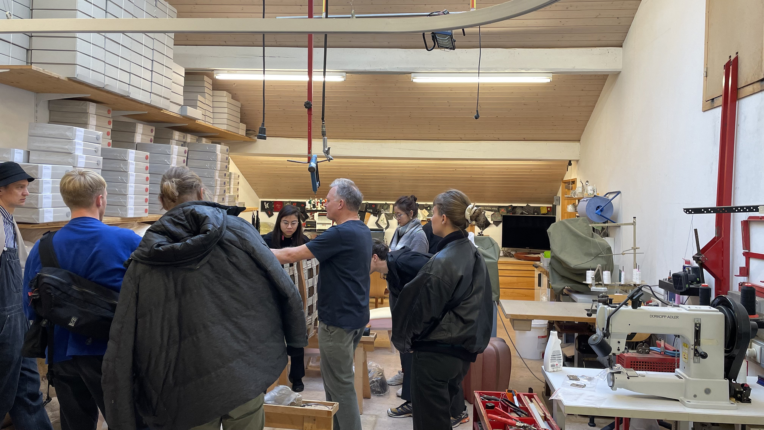
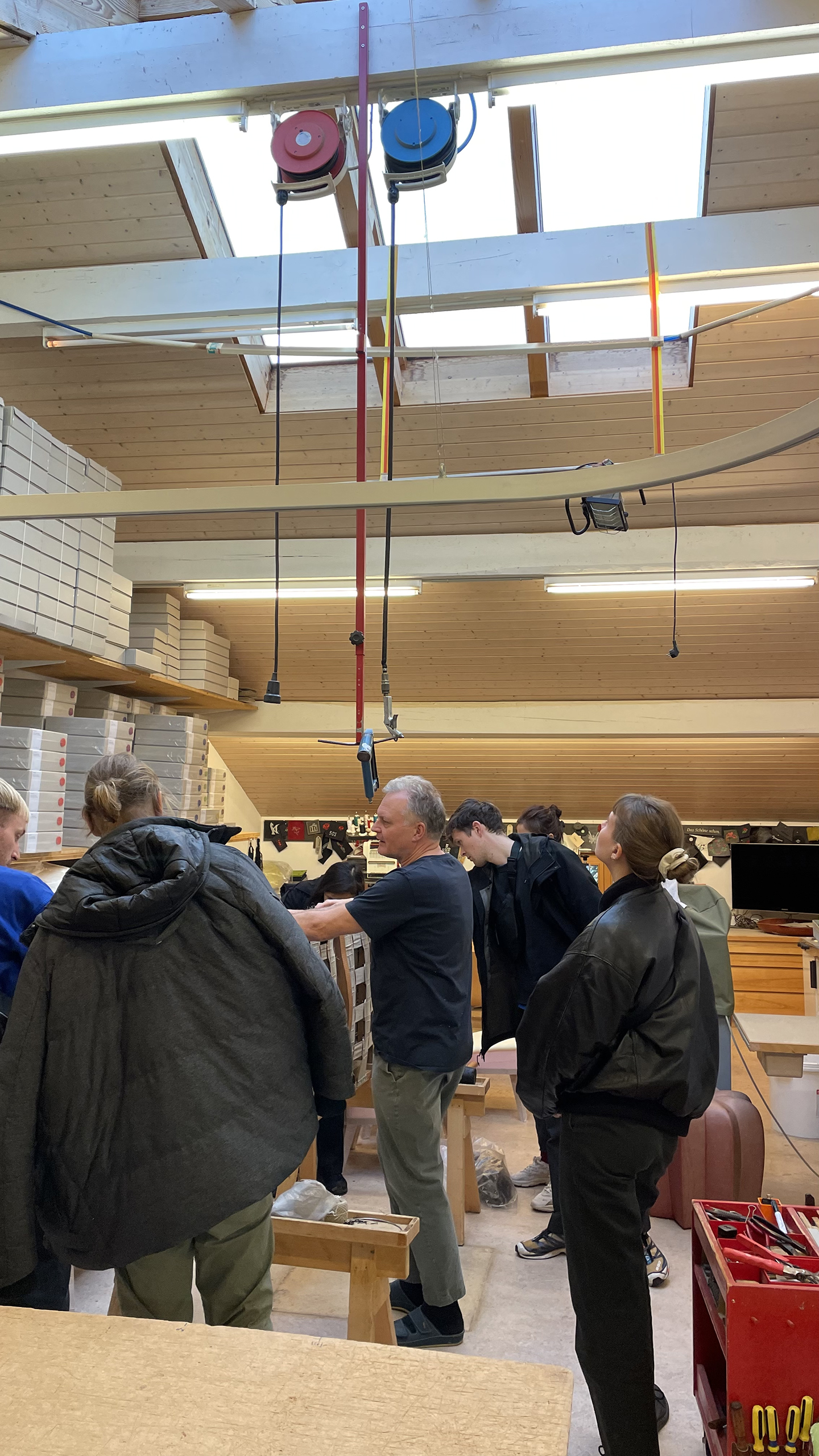
Erhart Holz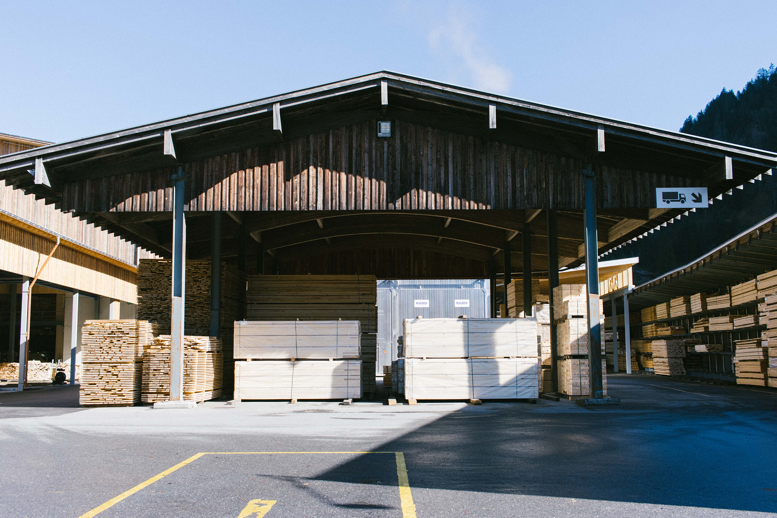
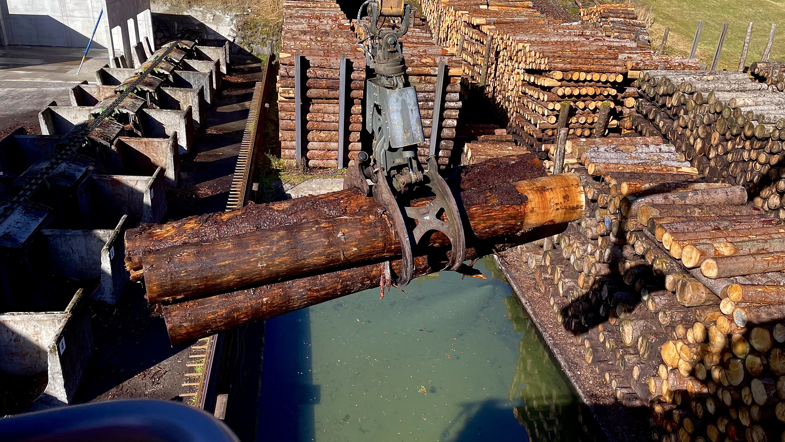
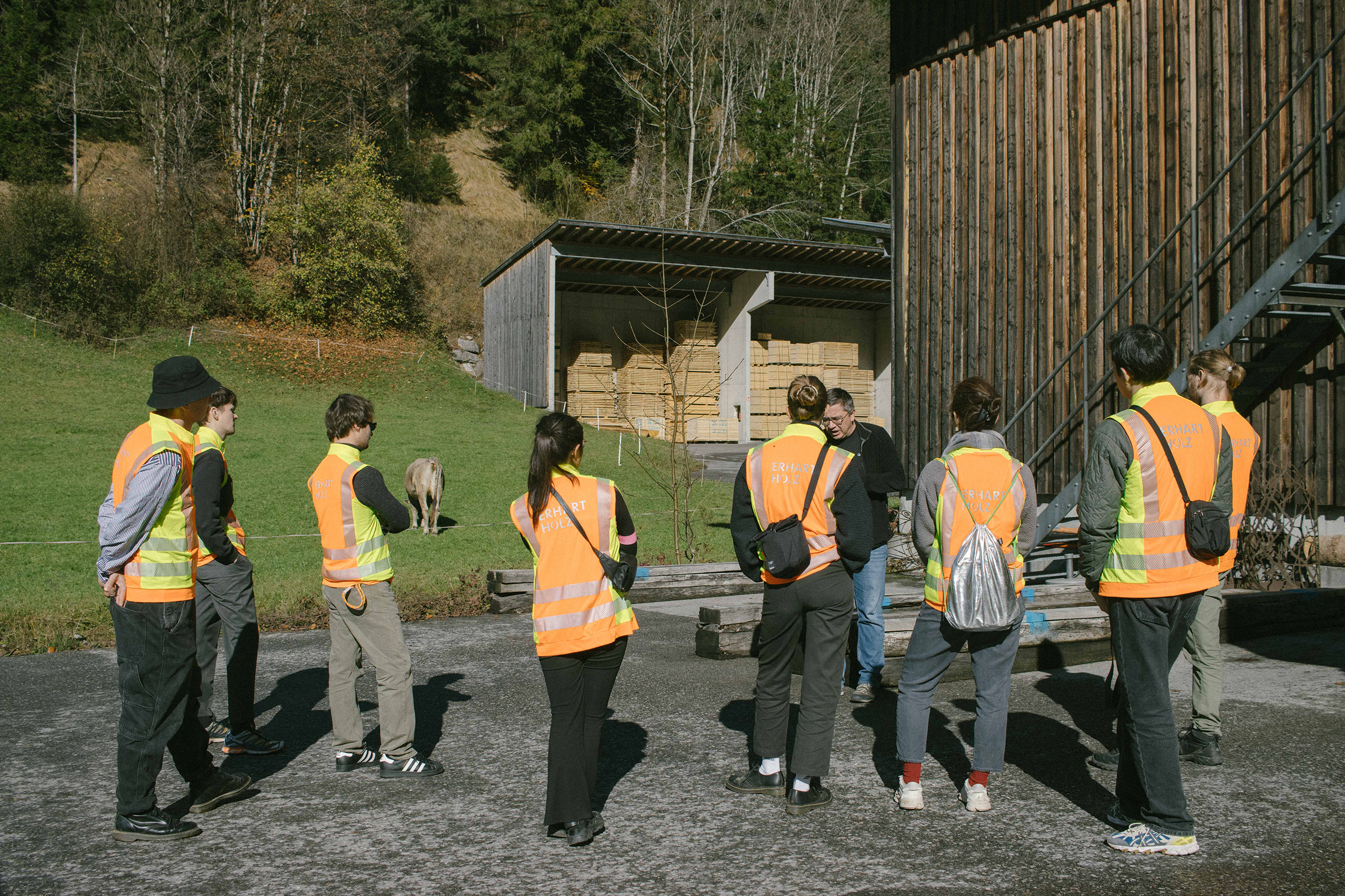
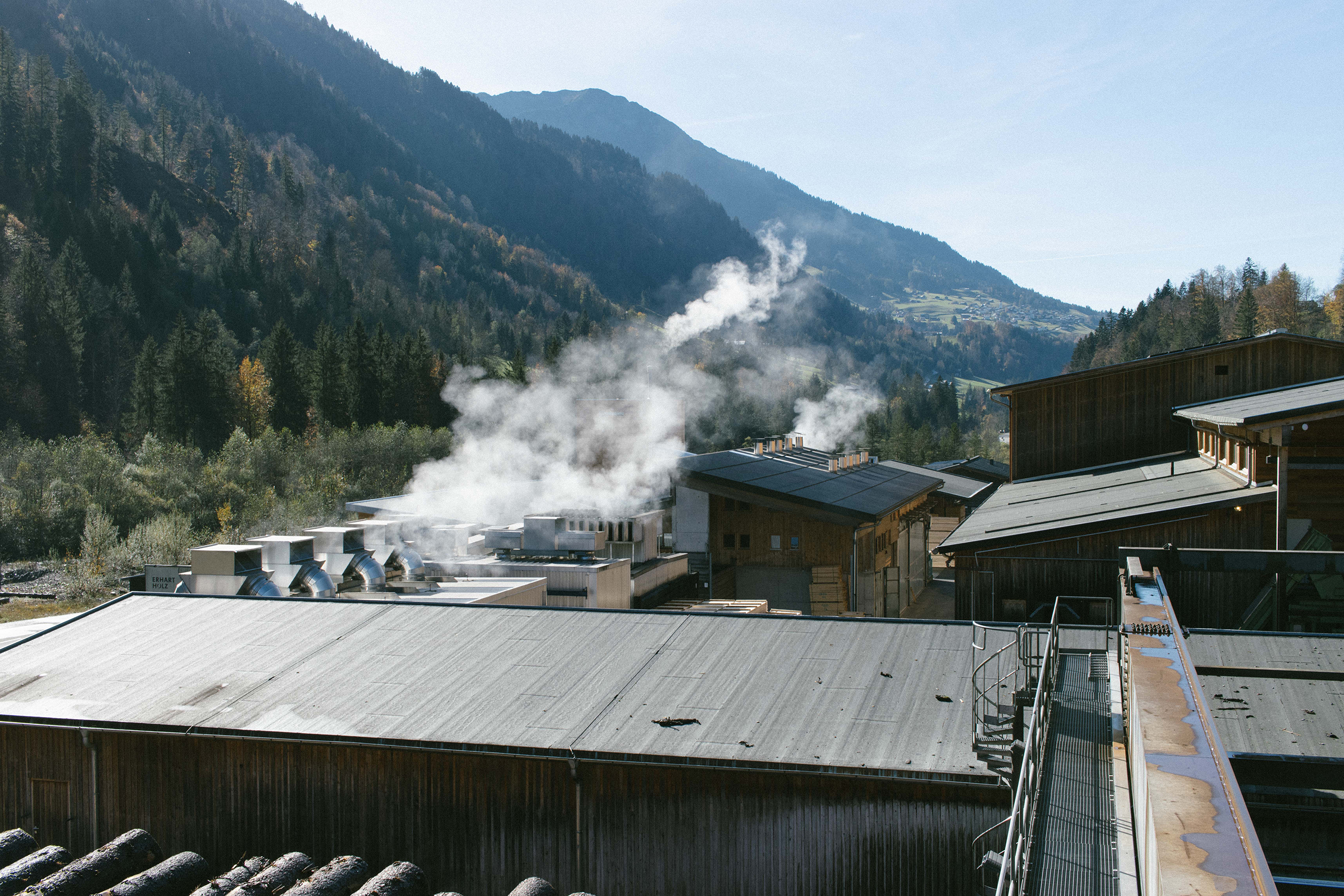
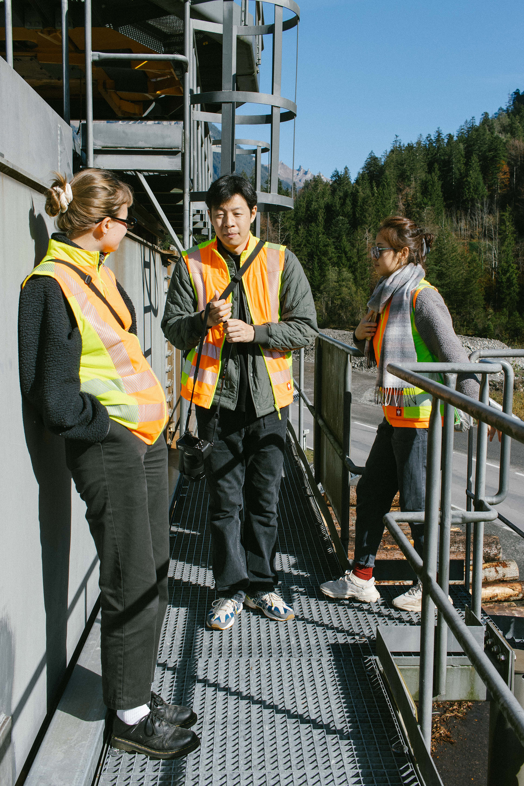
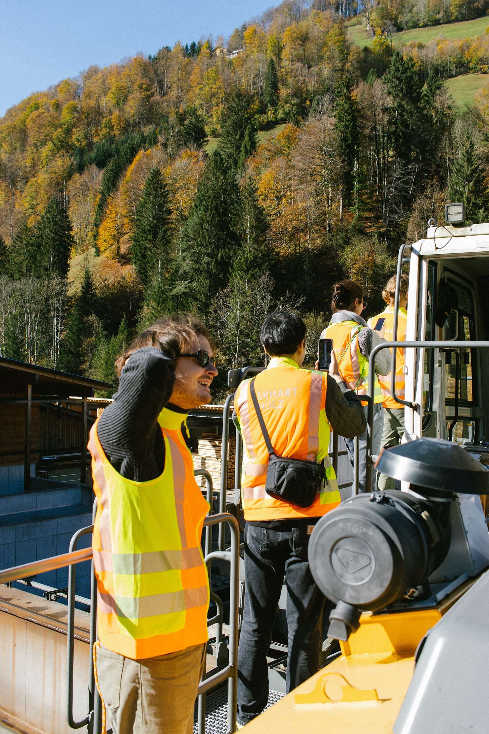
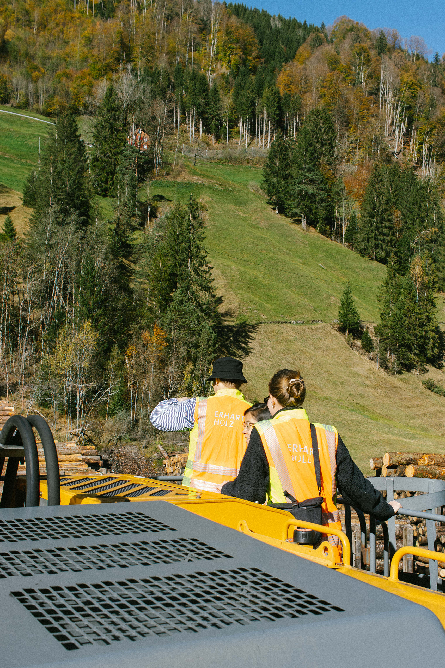
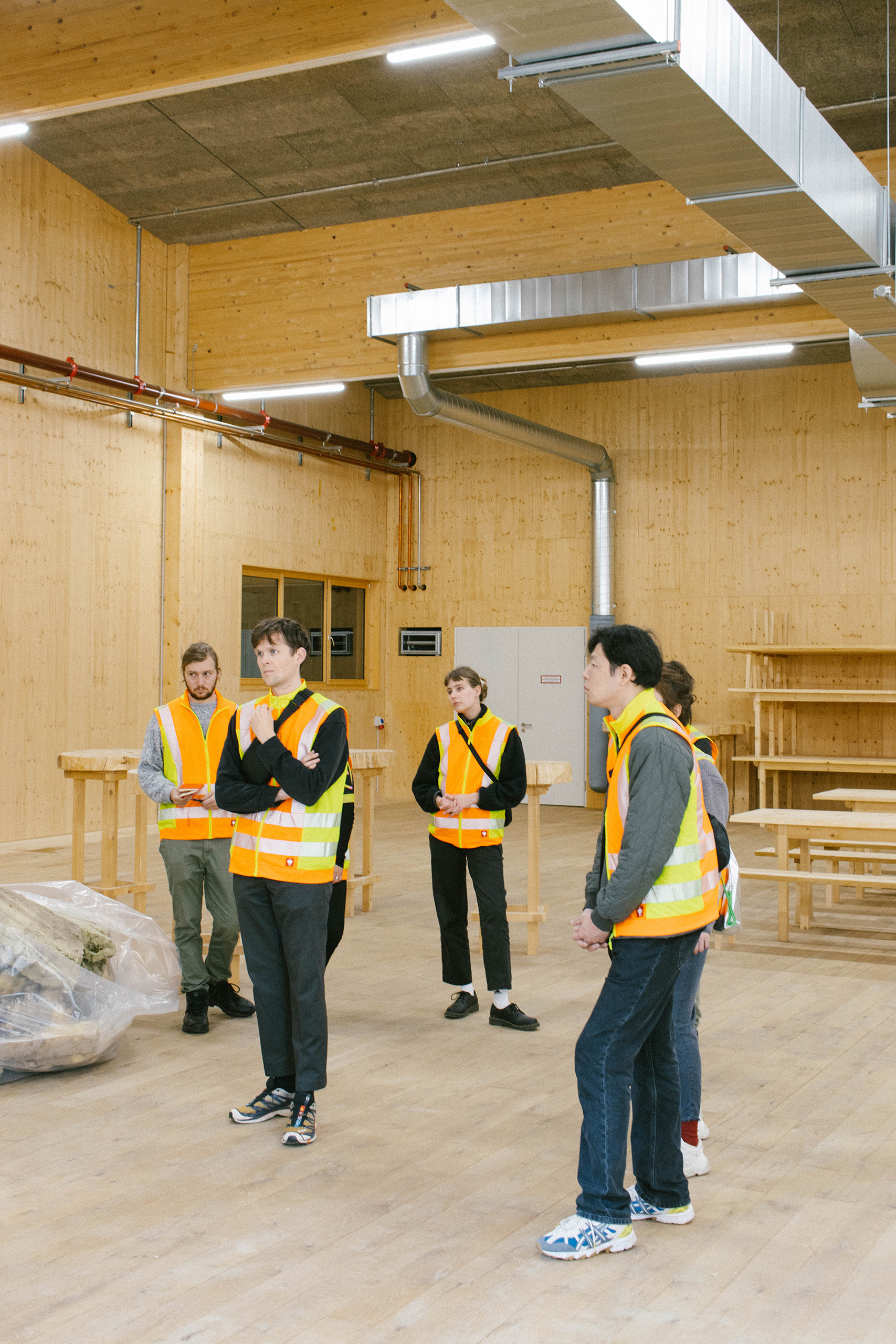
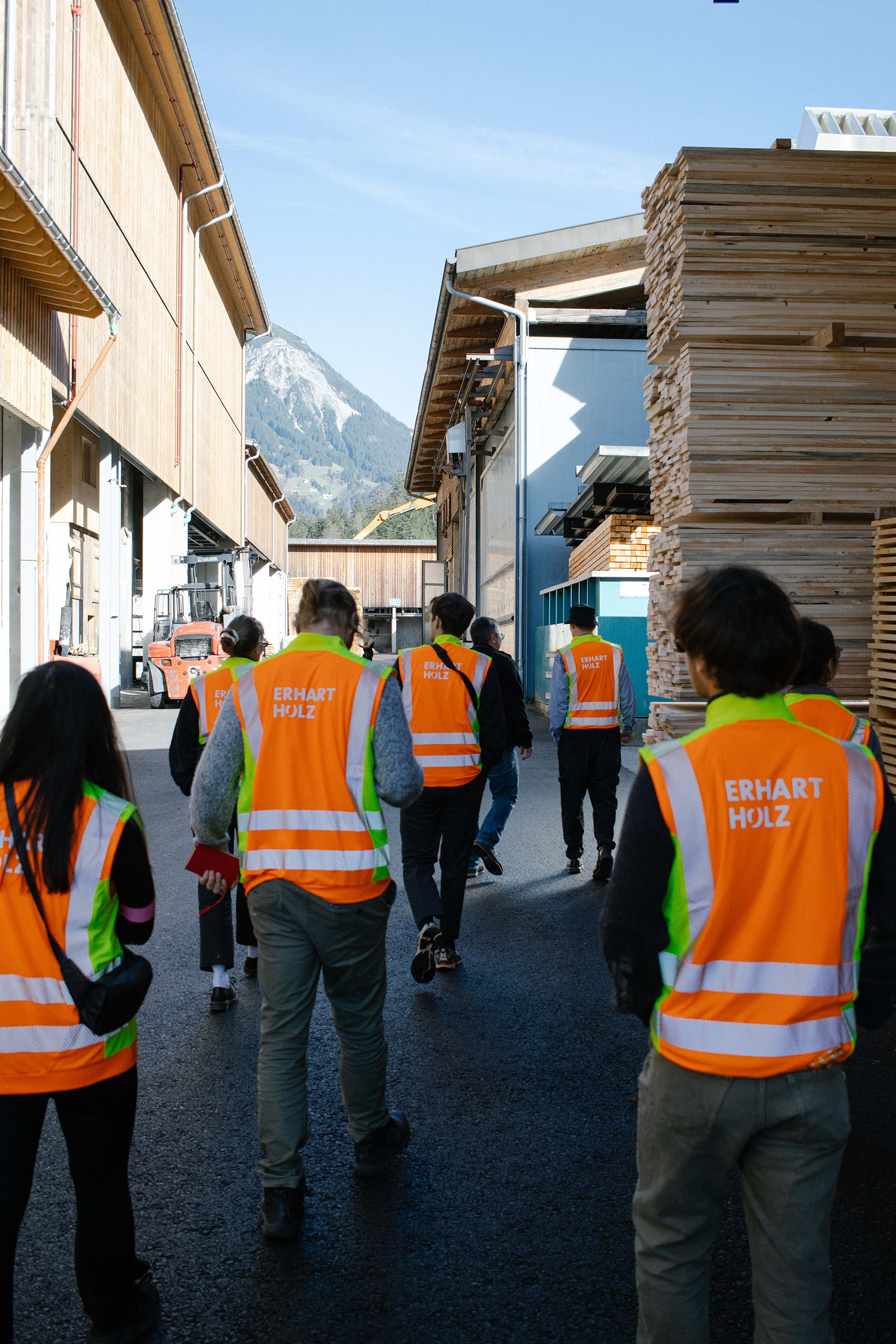
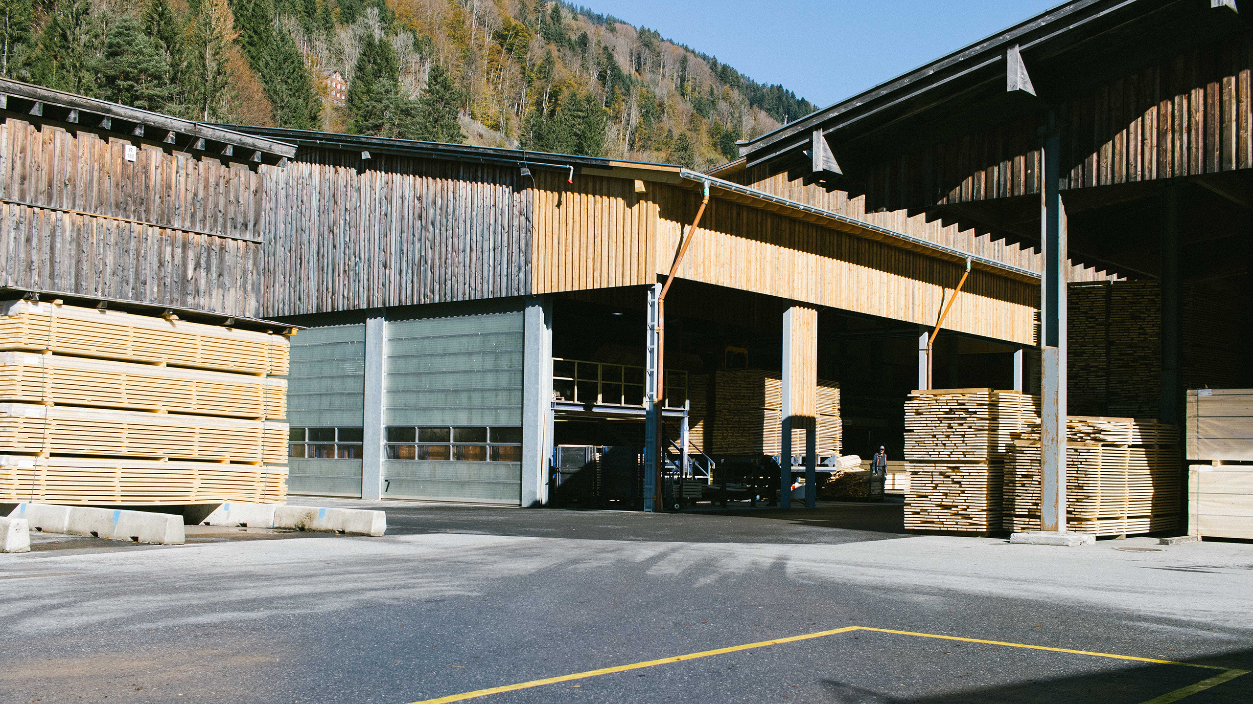
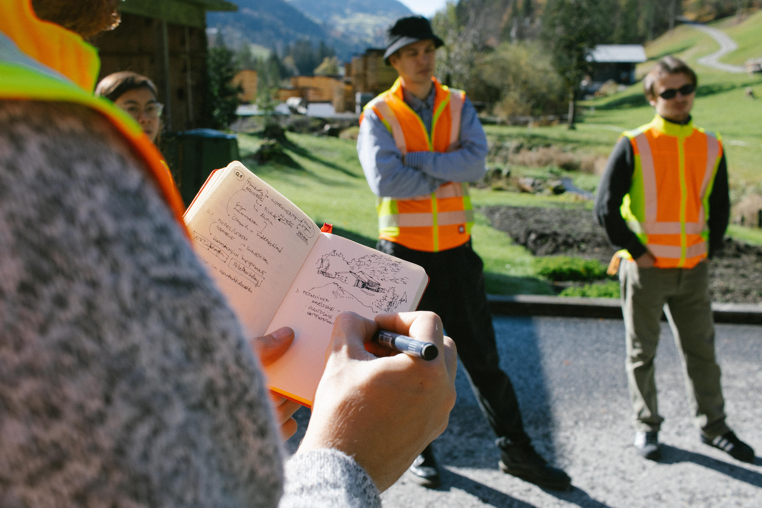
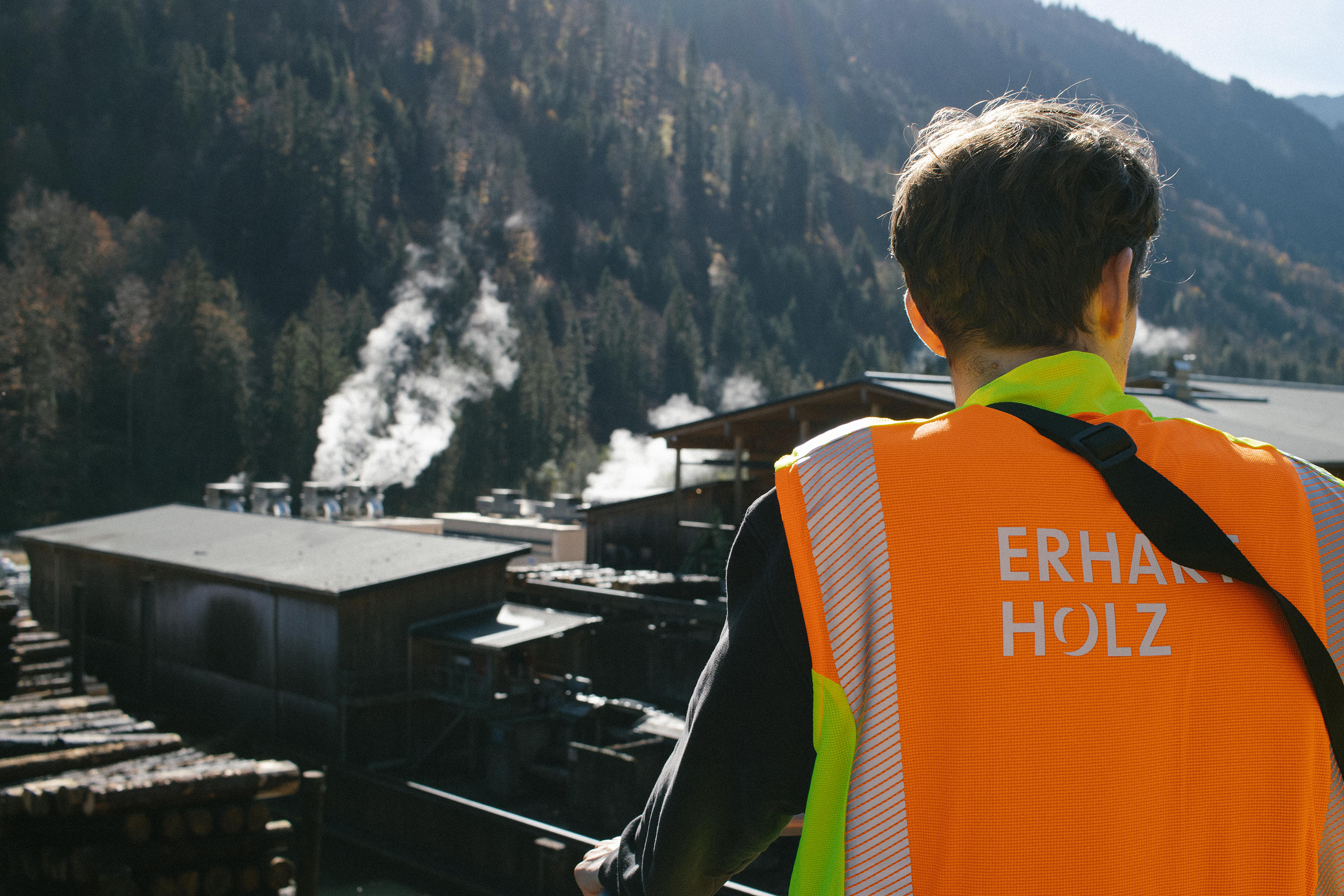
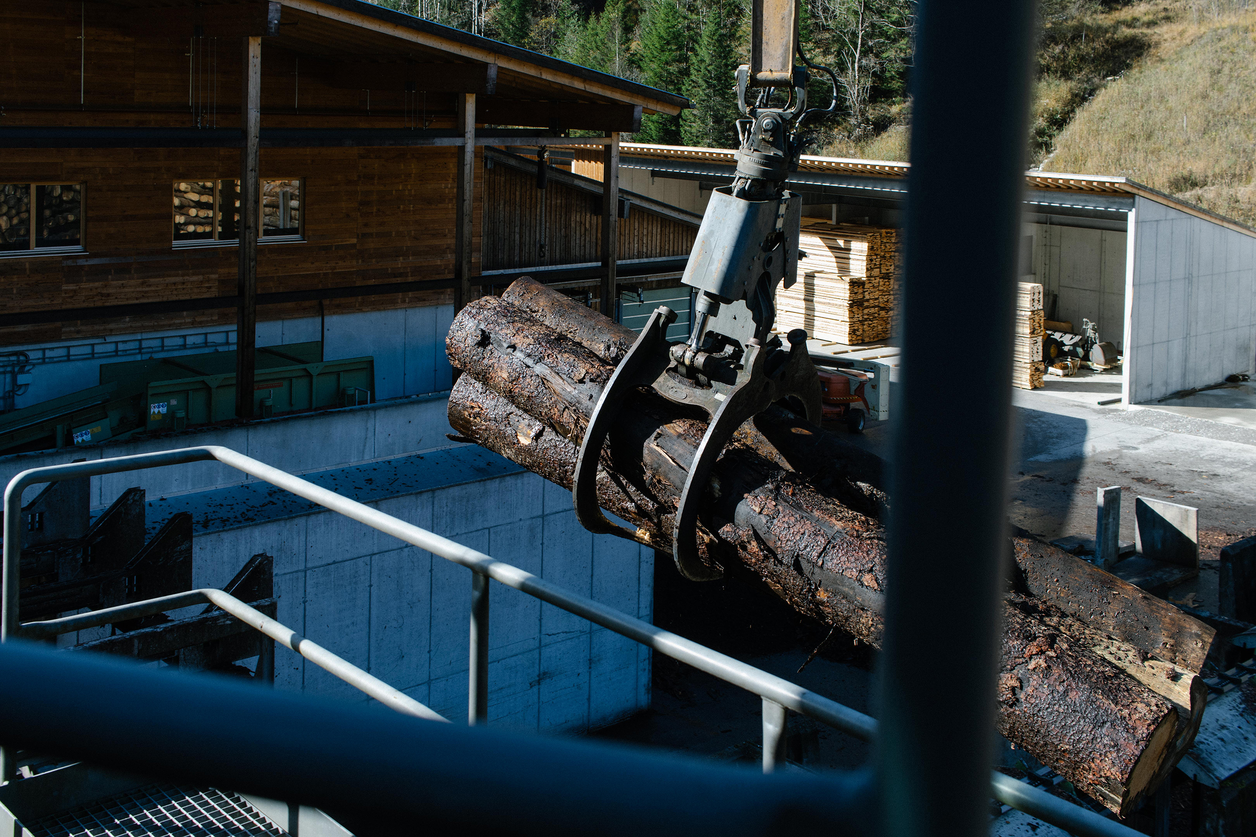
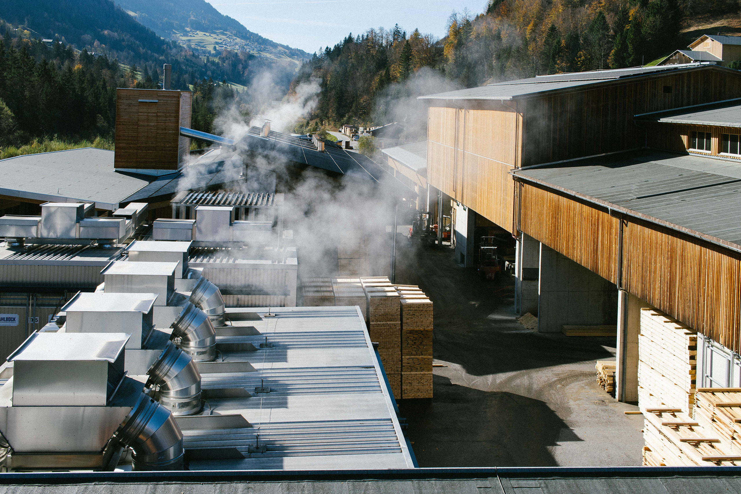
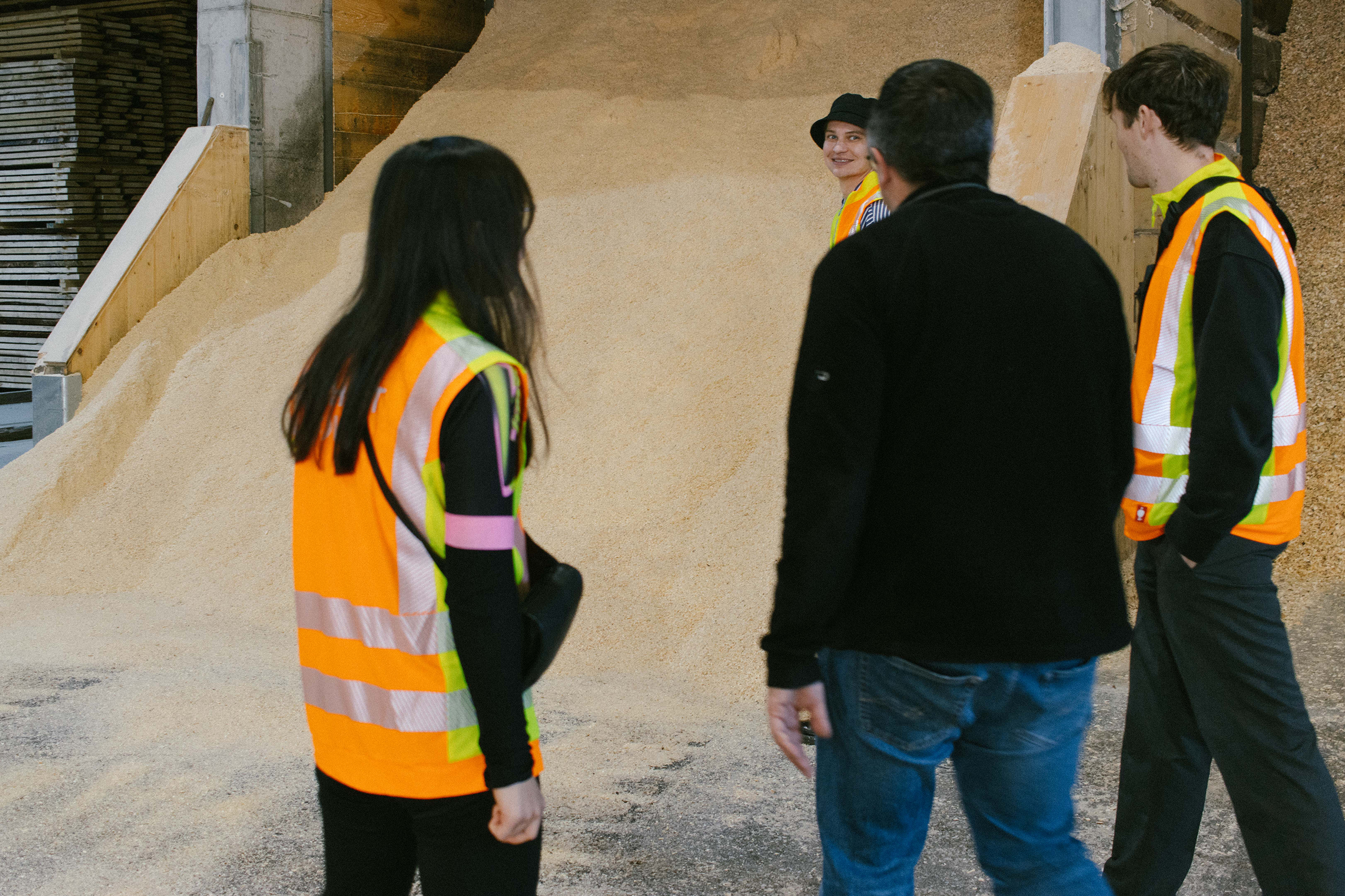
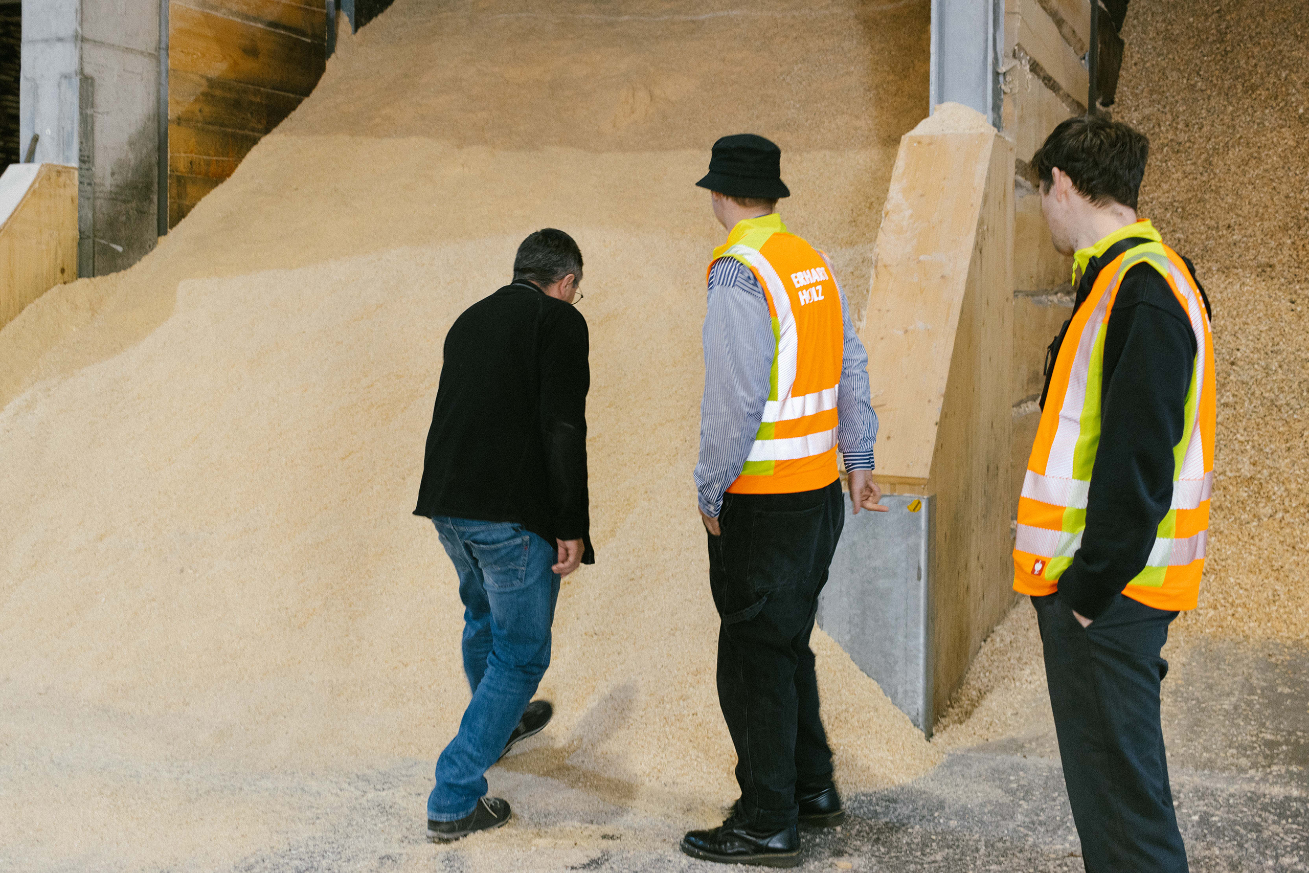
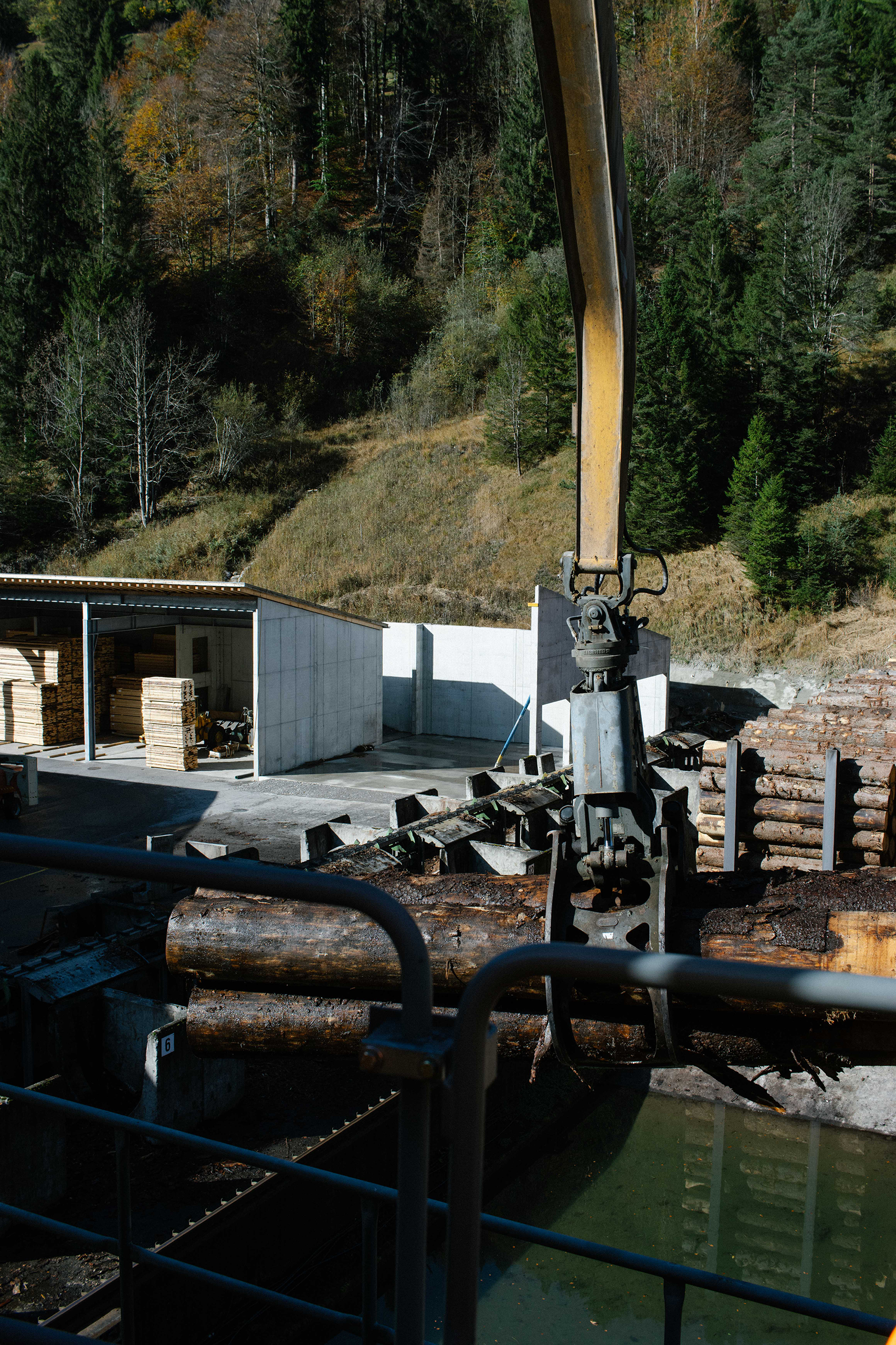
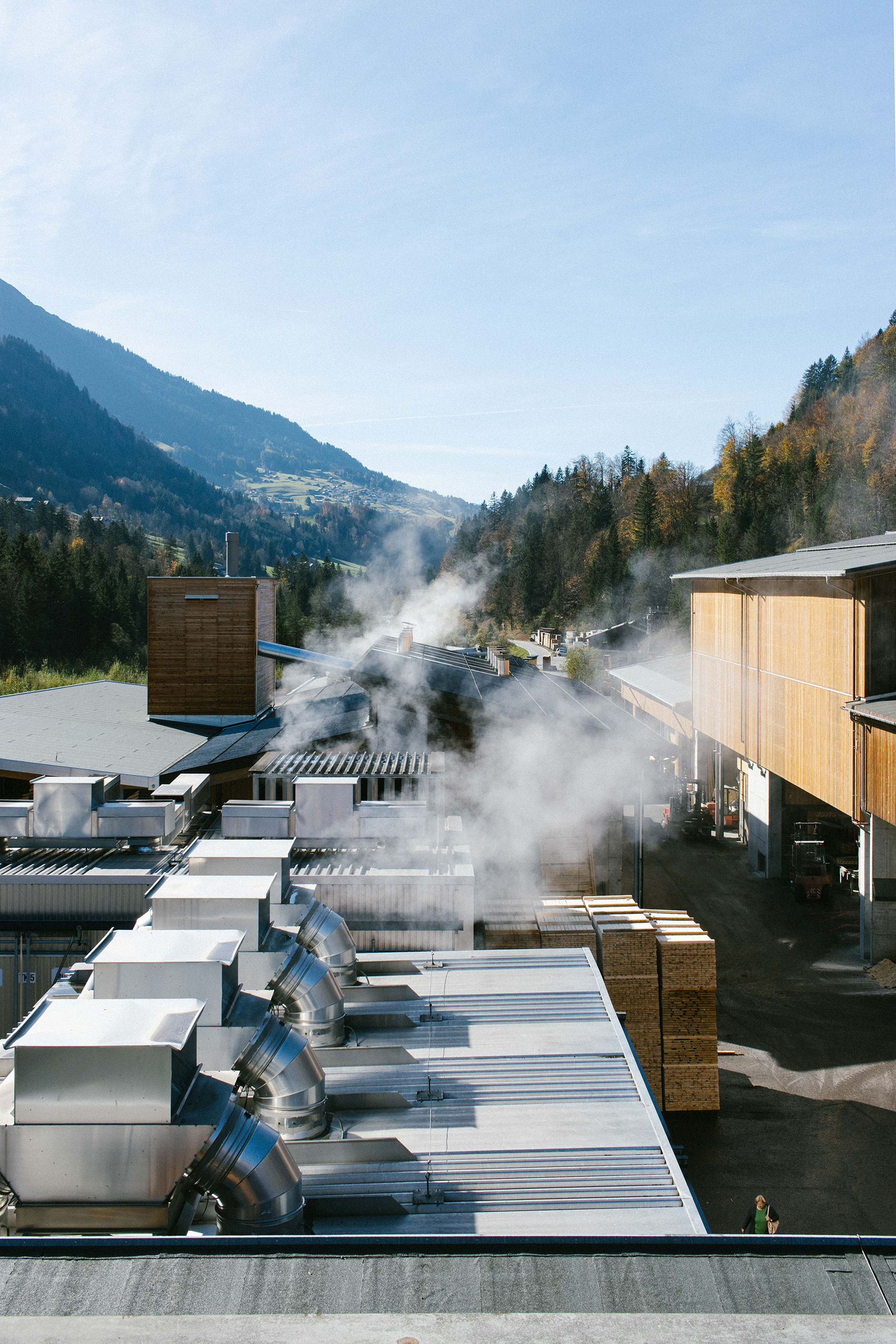
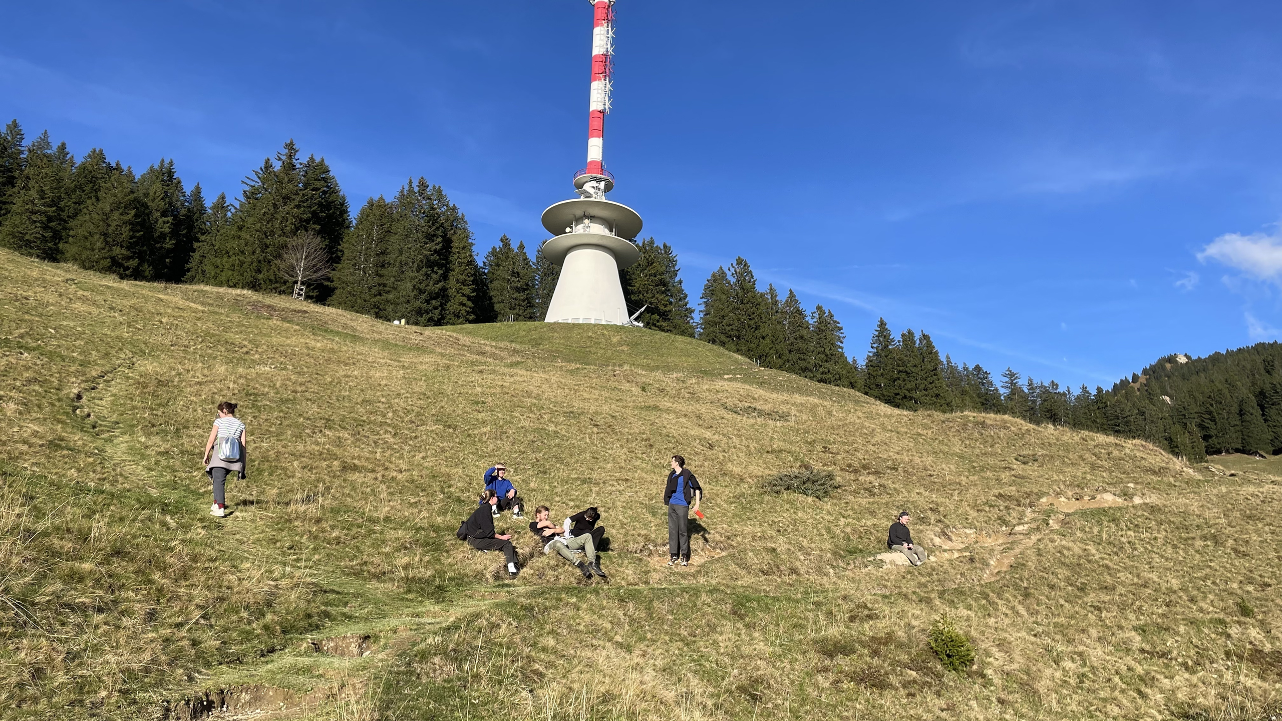
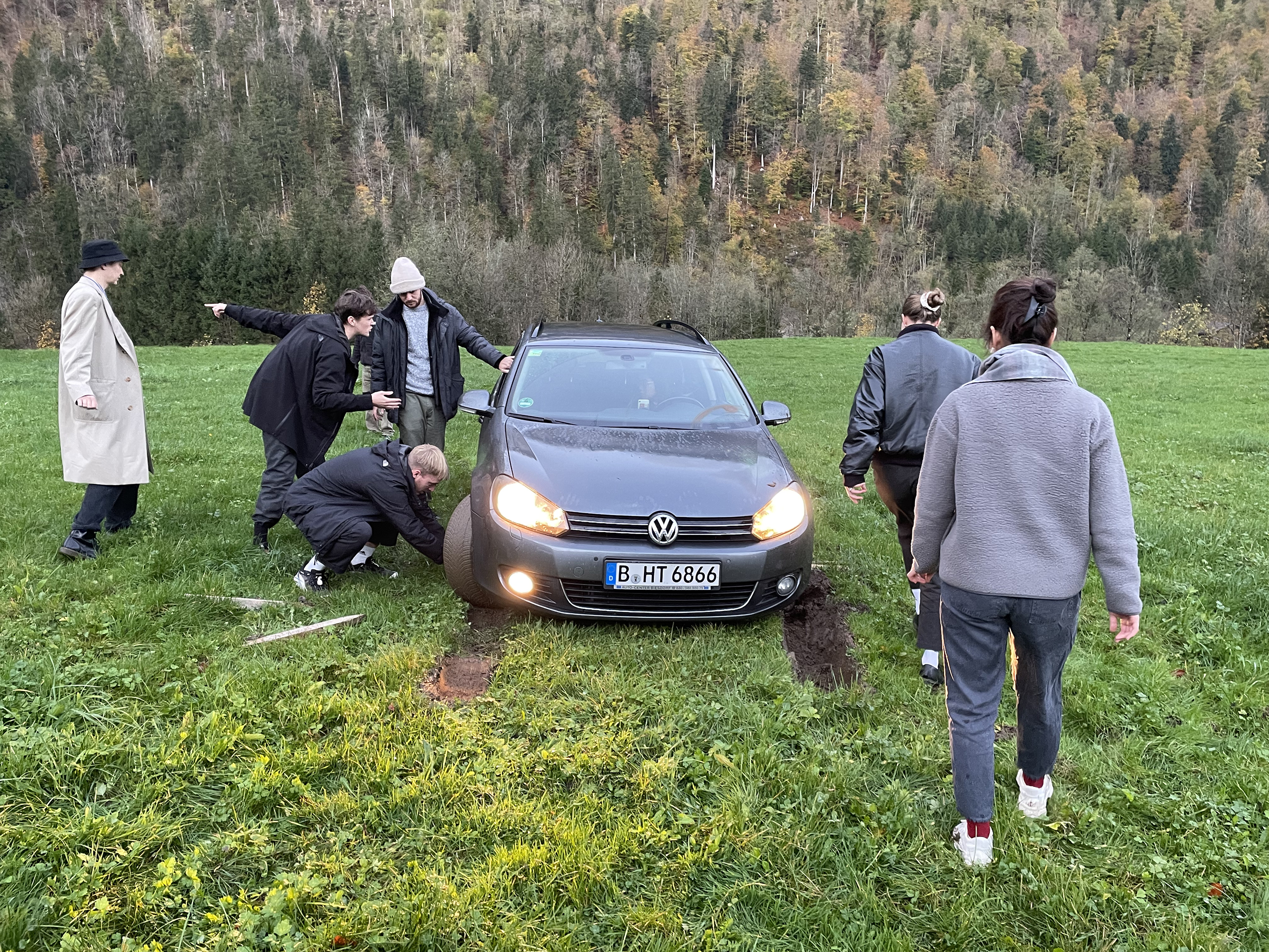
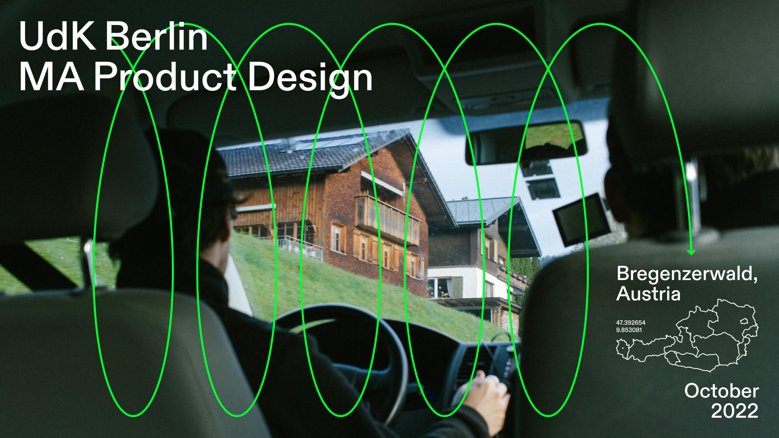
Prof. Holger Neumann, WM Steffen Herm
SEMINARANGEBOT – COURSE OVERVIEW
Endergebnisse
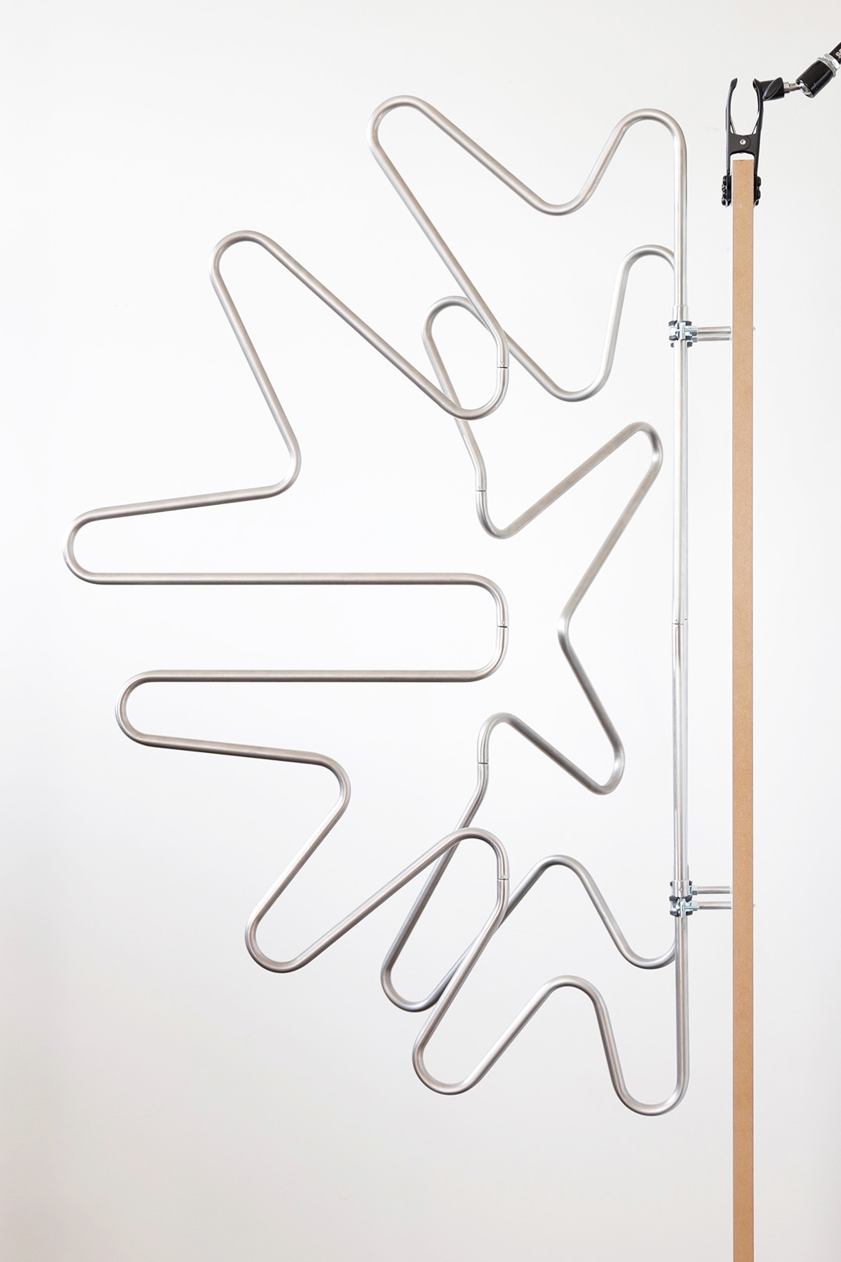
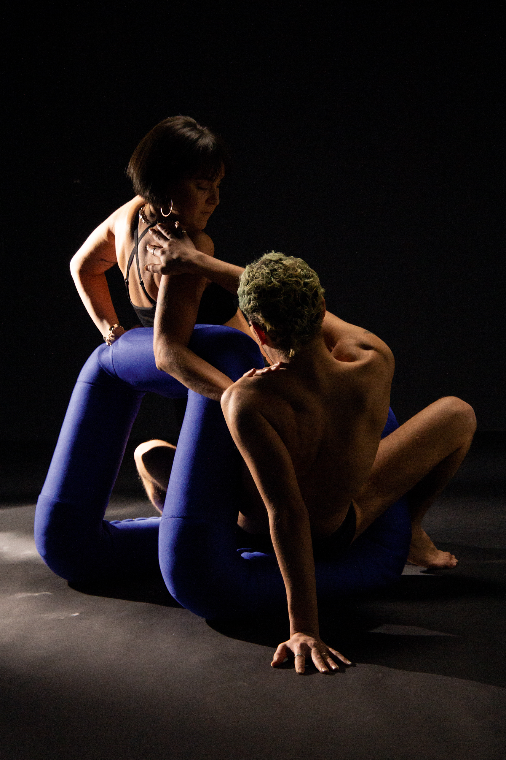
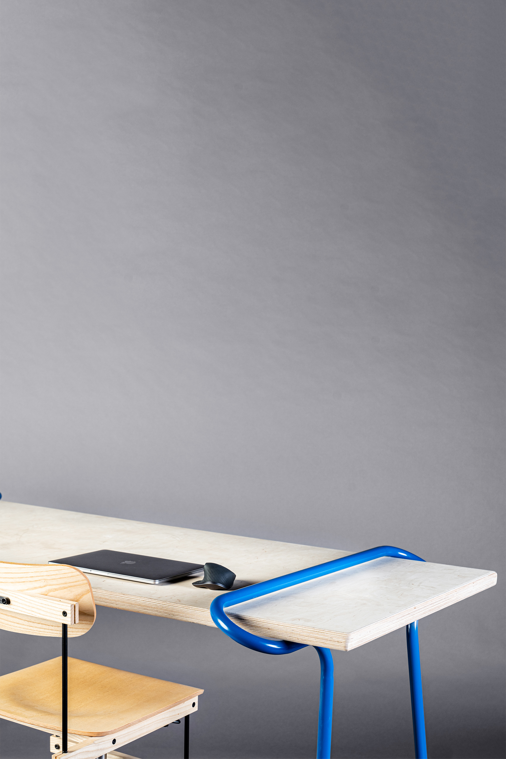
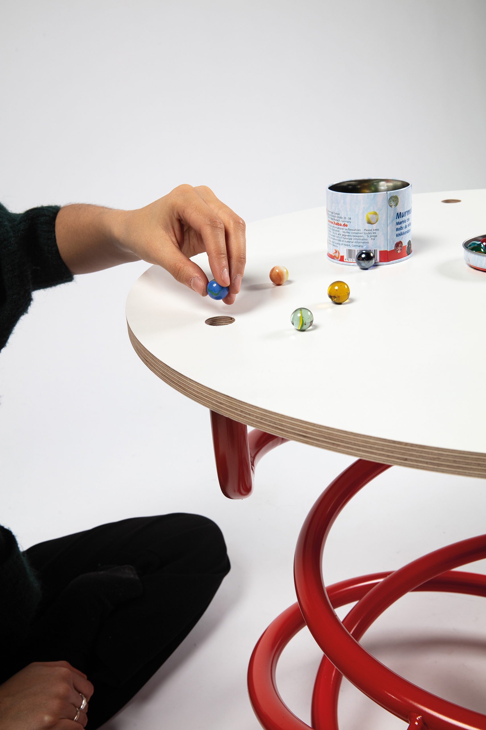
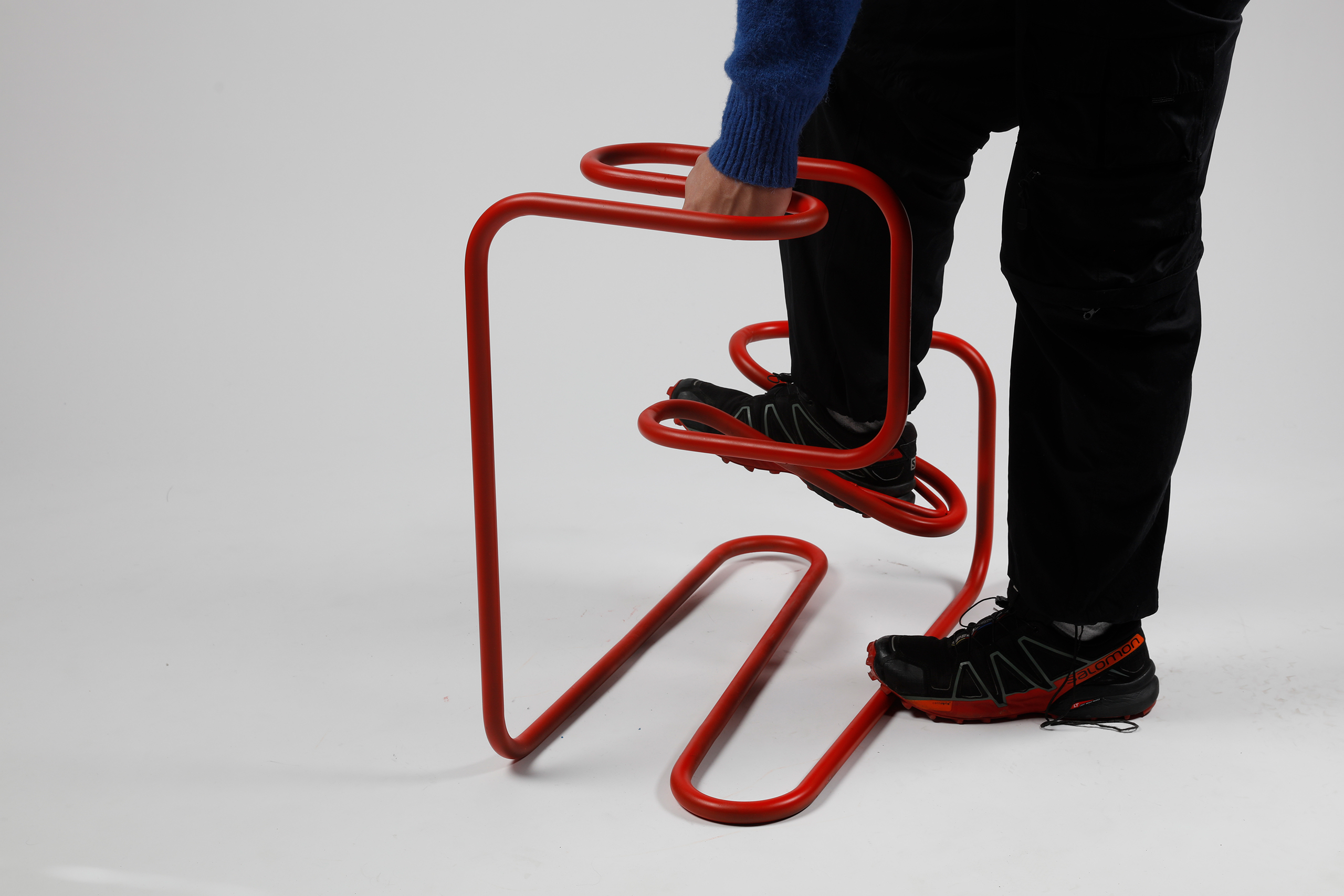
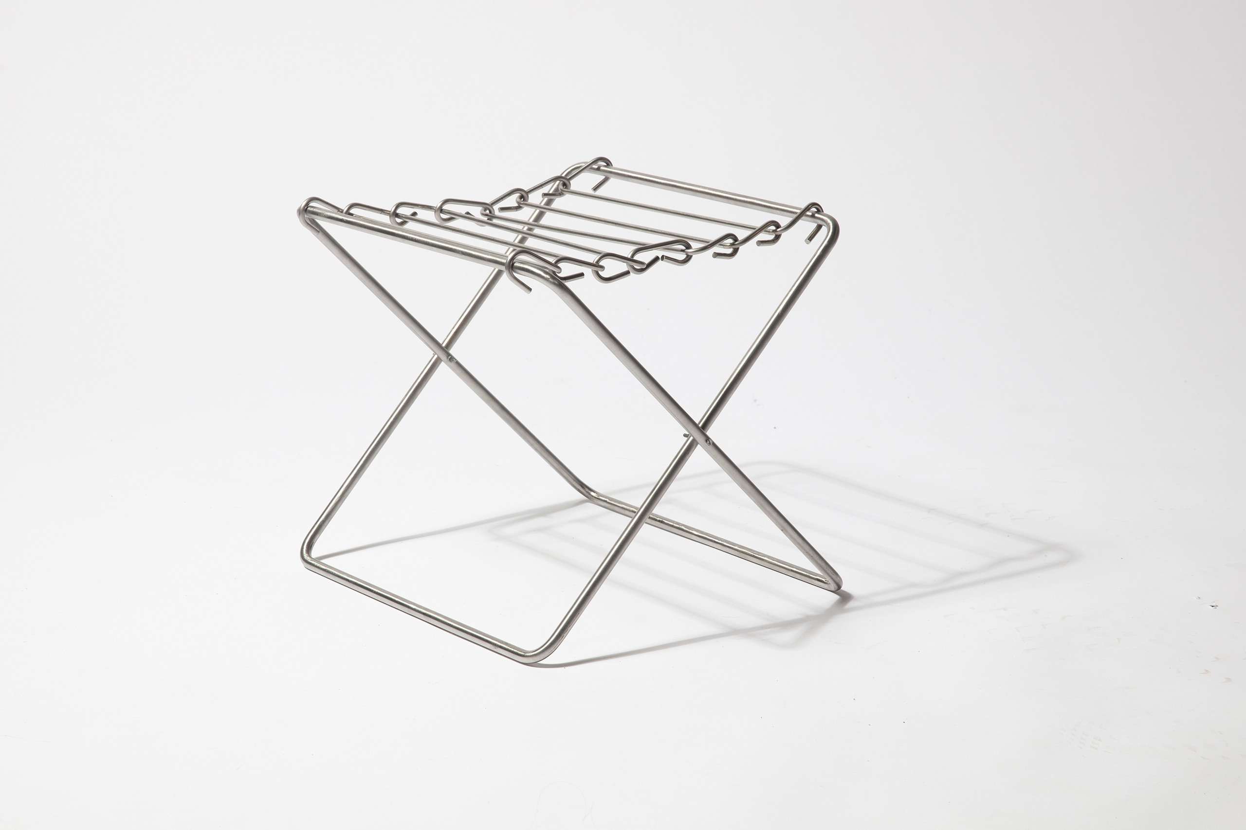
Fahnen
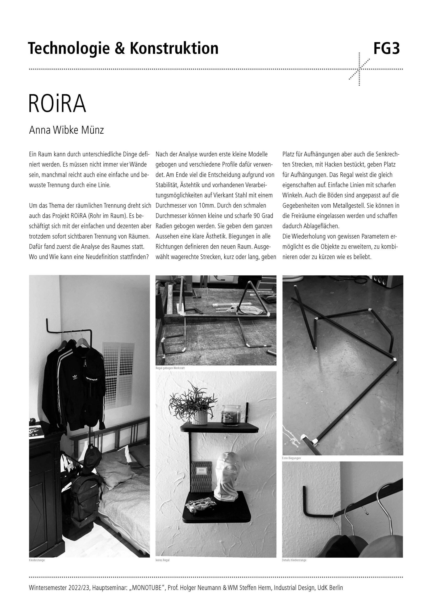
WORK IN PROGRESS
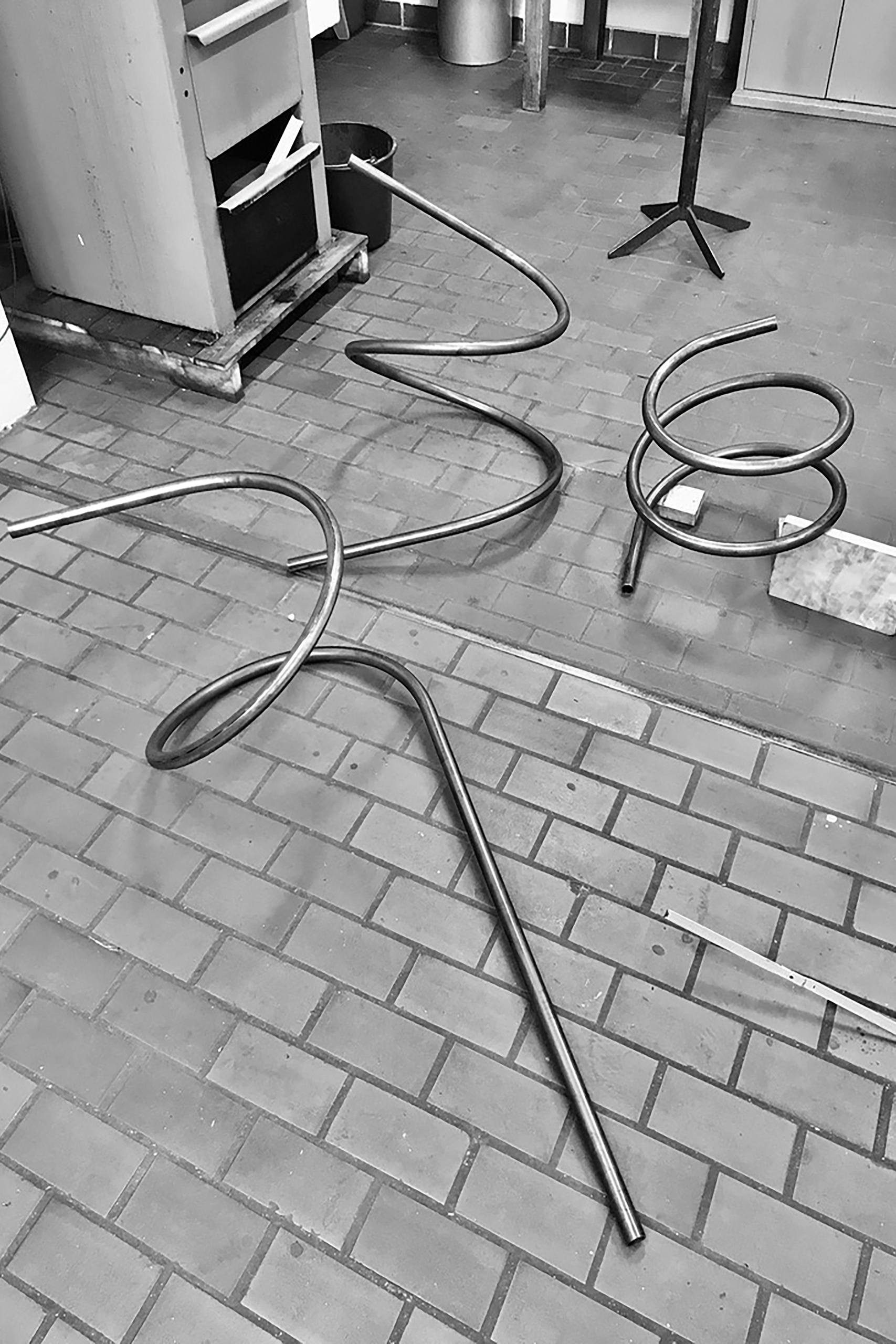
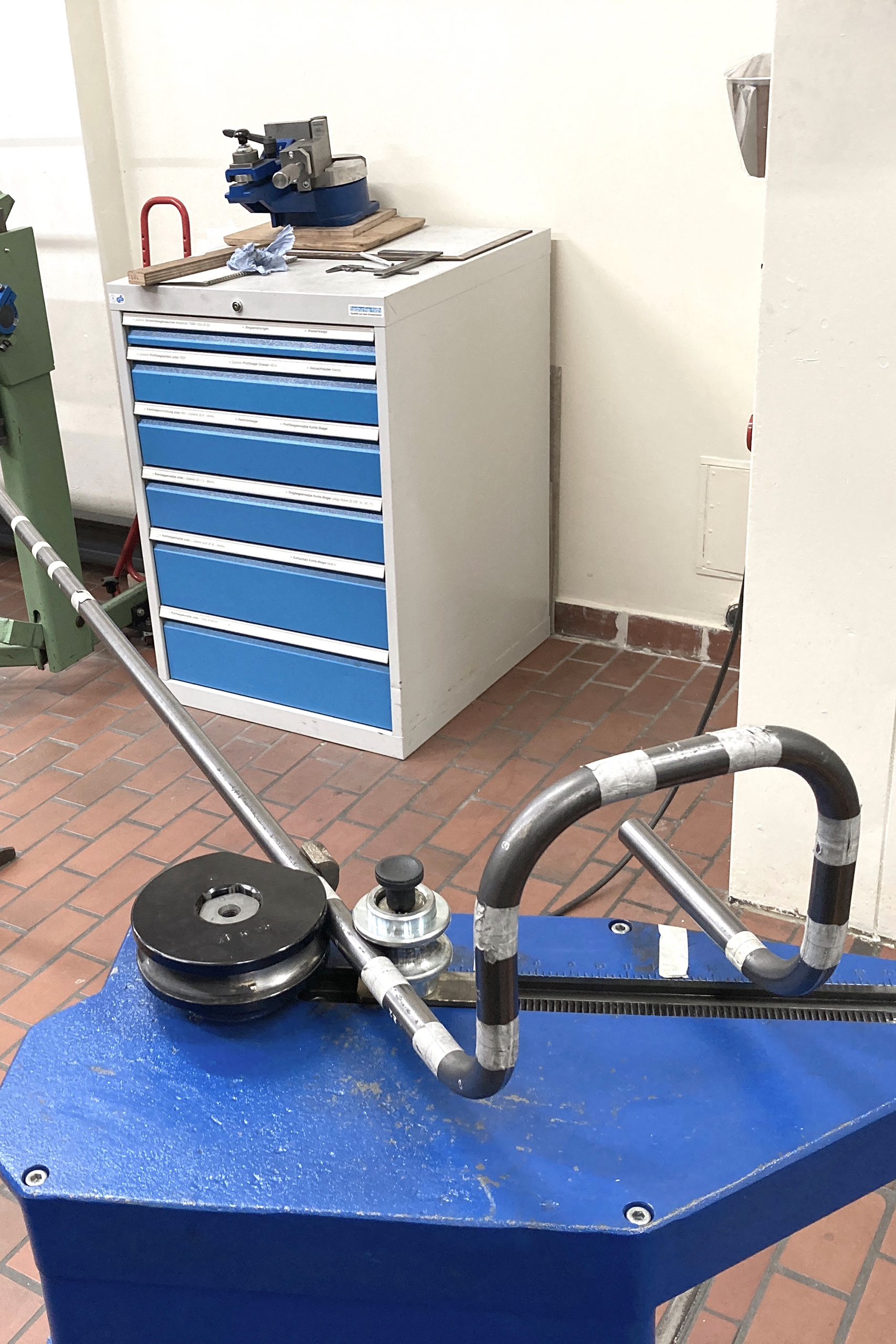
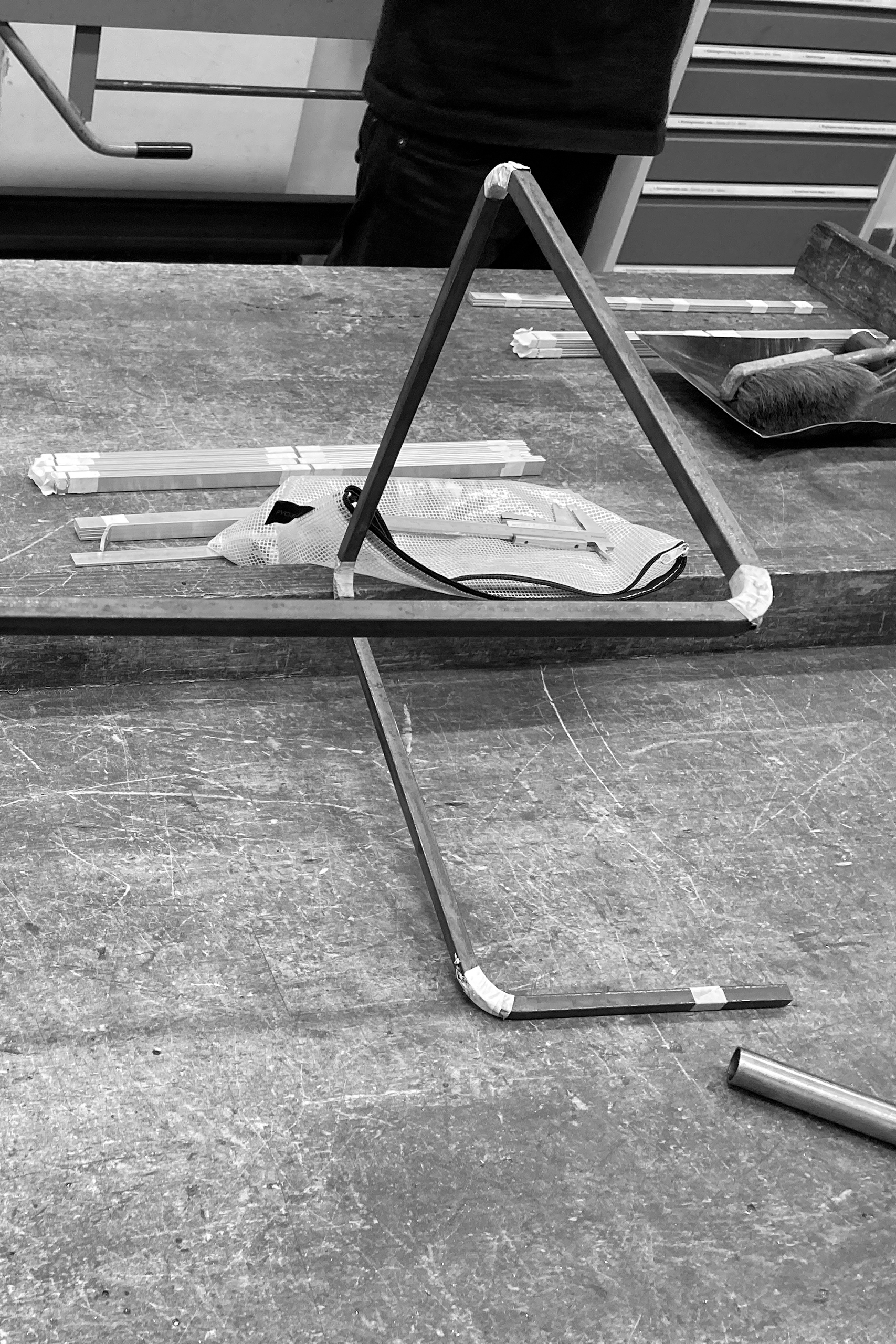
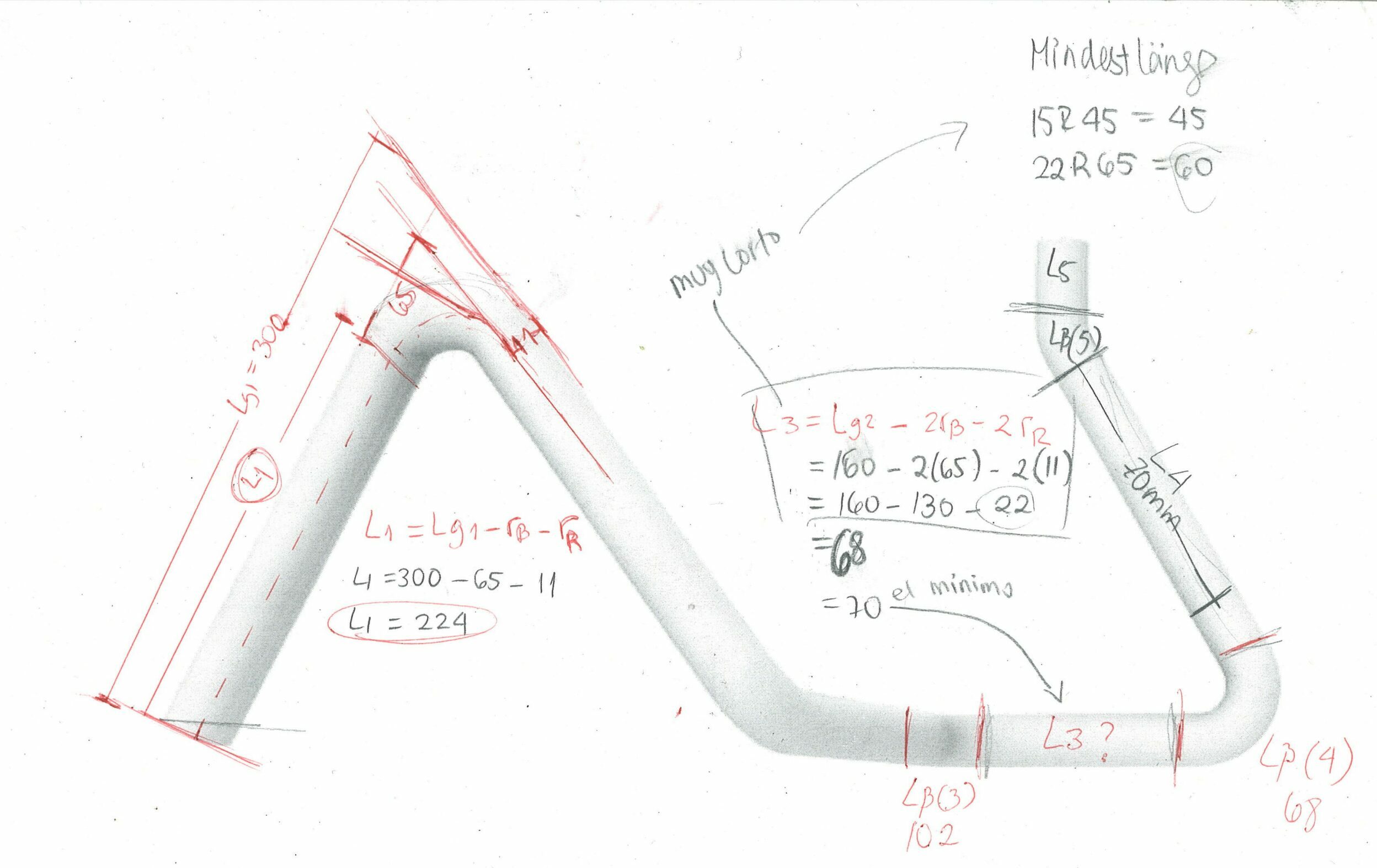
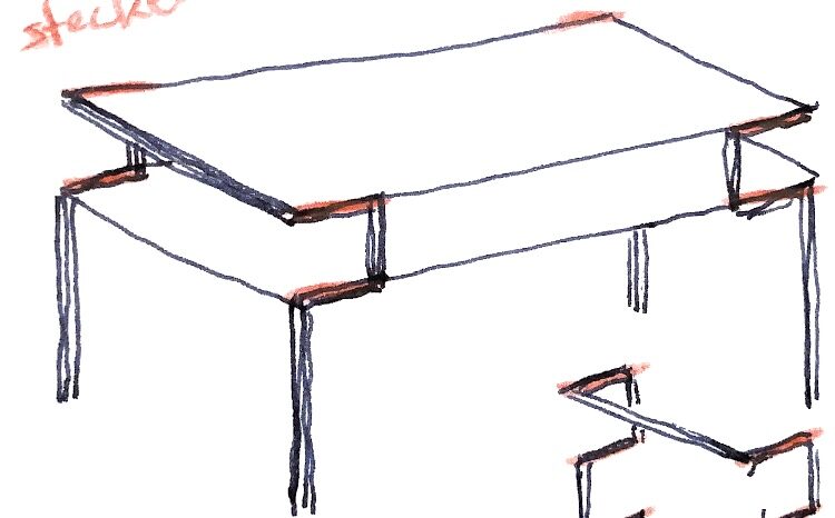
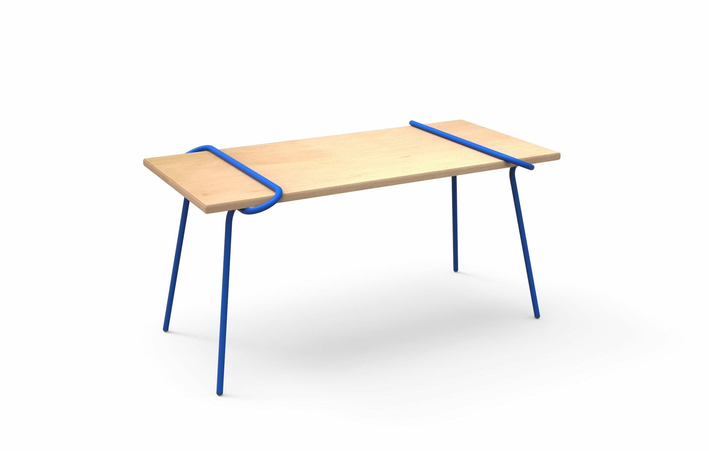
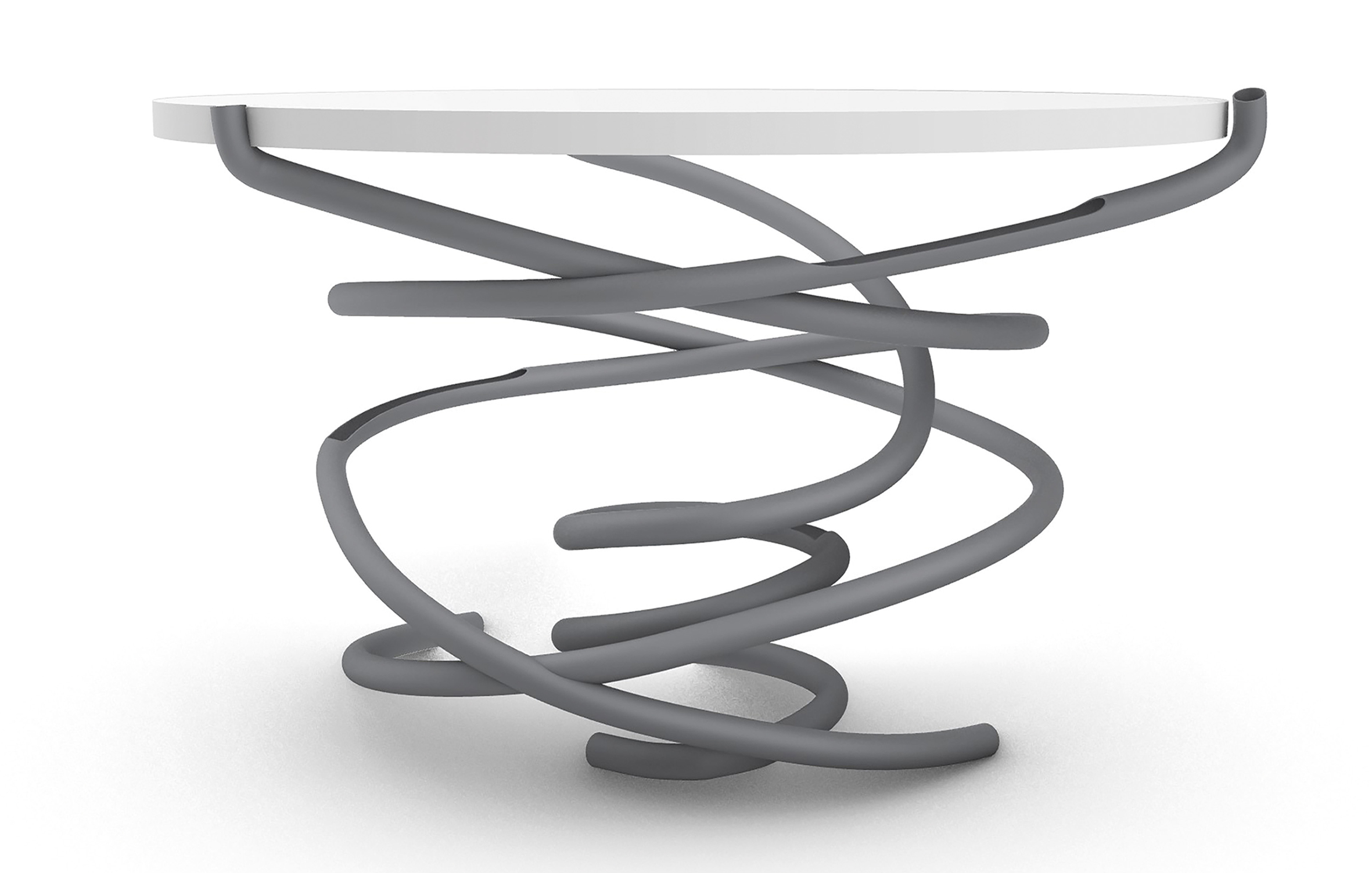
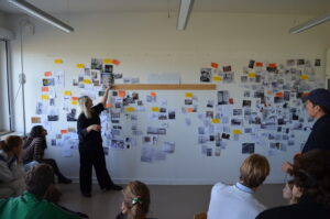
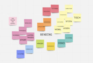
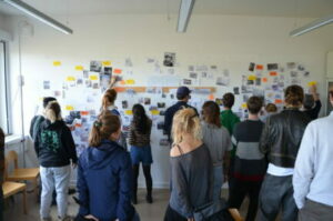
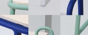
Rohrbiegen beschreibt als Sammelbegriff verschiedene Umformprozesse (Biegeverfahren), deren Ziel es ist, durch Krafteinwirkung eine plastische Verformung eines Rohres oder eines Metallstabs herbeizuführen. Für das Biegen von Rohren (und Profilen) können je nach Material und Abmessungen des Ausgangsmaterials, der Geometrie des Werkstücks sowie der geforderten Bearbeitungspräzision verschiedene Verfahren angewendet werden.
Semesteraufgabe: Entwurf und Konstruktion eines Objekts aus Stahlrohr oder aus Vollmaterial, das die Fertigungstechniken des Rohr- bzw. Vollstabbiegens berücksichtigt. Der Entwurf soll sich im Innenraum verorten und kann ggf. selbststehend, hängend oder montiert. Verwendet werden soll ein Standardprofil von maximal 6 Metern Länge.
Geplant ist die Umsetzung der Entwürfe in der hauseigenen Metallwerkstatt. Folgende Bedingungen sind zu einzuhalten: Verwendung “zölliger” Rohre (½, ¾ und 1 Zoll Durchmesser) bzw. Vollstäbe in Stahl oder Aluminium bis maximal 12 mm Durchmesser. Die Verwendung weiterer Materialien ist in Absprache mit Marcel Wältring möglich.
Voraussetzungen
– Regelmäßige Teilnahme am Seminar
– Vortrag
– Präsentationen
Abgabe
– Prototyp
– Dokumentation
– Poster
– Kurz-Video
Betreuer
Prof. Holger Neumann
WM Steffen Herm
Prof. Holger Neumann, WM Julian Ribler
Basierend auf Referaten und Workshops wurden in Carello die relevanten Prinzipien und Parameter von verschiedenen Metallverarbeitungsverfahren vermittelt. Anschließend sollte das Wissen in dem individuellen Entwurf eines Wagens aus 1m³ gefaltetem Stahlblech angewandt werden.
Die Abwicklungen der Blechteile wurden gelasert, und in den Werkstätten gebogen und zusammengesetzt.
Endergebnisse
Fahnen
Endpräsentation
Erste Ideen und Modelle
ZWISCHENPRÄSENTATION – MIT MALTE LICHT
EXKURSION
MINDMAP
Die individuellen Recherchen der Studierenden wurden als Inspiration und Orientierung mithilfe einer Mindmap kategorisiert, geclustert und visualisiert.
SEMINARANGEBOT – COURSE OVERVIEW
Bleche sind eines der wichtigsten und wesentlichsten Metall-Halbzeuge, insbesondere Stahlblech ist von grundlegender Bedeutung in der Industrie und wird nicht nur für Gehäuse, sondern auch für Lasten tragende Konstruktionselemente, Maschinenteile und Produkte gerne eingesetzt.Die Semesteraufgabe besteht darin, aus 1 qm Stahlblech der Stärke 1mm ein Objekt zu entwerfen, das bestimmte Funktionen erfüllen soll. Im Verlauf des Semesters werden wir beim Entwurf des Objekts, alle wichtigen Blechkonstruktionen kennenlernen und anwenden.
Das Objekt soll aus ausgelaserten und gekanteten Blechelementen bestehen. Alle abgewickelten Elemente müssen auf eine Fläche von 980 x 980 mm passen, wobei ein Mindestabstand von 10 mm zwischen den einzelnen Teilen bestehen muss. Die Verbindung der Blechteile soll aus dem Material ohne zusätzliche Verbindungselemente erfolgen (z.B. durch Laschungen). Kantungen werden durch gelaserte Perforationen vereinfacht. Die Fertigung der Blechabwicklung erfolgt durch unseren Projektpartner System 180 GmbH.
Besonderen Wert wird auf einen effizienten Materialeinsatz sowie eine dem Prozess und dem Material angemessene Formensprache gelegt. Gemeint ist eine konstruktive Eleganz, die das Zusammenspiel zwischen Konstruktion, Statik und gestalterischer Qualität verkörpert.
Anforderungen
-regelmäßige Teilnahme Seminar + CAD-Seminar
-Referat
-Entwurf
-3D-Datensatz und Prototyp
-Dokumentation
-Poster und Präsentationsvideo
Kooperationspartner
System 180 GmbH https://www.system180.com/
Gast
Dipl. Des. Malte Licht https://oxyd-gmbh.de/
Betreuer
Prof. Holger Neumann
WM Julian Ribler
German Design Award 2023: Five newcomer finalists selected. Four of them are graduates from UdK Design!
Product Design: Anna Koppmann, Tim Schütze and Tobias Trübenbacher, Fashion: Paula Keilholz.
Frankfurt, October 31, 2022
The jury of the German Design Award 2023 has selected the finalists for the »Newcomer« award.
The five up-and-coming designers from German design schools, Katharina Düing, Paula Keilholz, Anna Koppmann, Tim Schütze and Tobias Trübenbacher, impressed with their excellent portfolios. With their work, they show in particular a keen eye on social and ecological challenges – contemporary, relevant and with intelligent solutions. The award thus proves the importance of young design for the competitiveness and future viability of medium-sized companies and the German economy.
Design can provide answers to pressing questions of our time – this year, social issues and a strong ecological awareness are reflected in the portfolios of the finalists. What they all have in common is the focus on developing new solutions for ecological, social and global challenges and improving social interaction. What is exciting about the portfolios of the five selected young designers from different disciplines such as product, industrial, communication and fashion design is the diversity of perspectives and their respective implementation in practice.
The five finalists convinced the jury with their contemporary and progressive designs, which focus on topics such as gender justice, the energy and climate crisis or civil courage. The nominees were presented on October 12, 2022 in Berlin in the Soho House on the occasion of the Design Gala of the German Design Council. You get the chance to win the German Design Award, which is worth 15,000 euros.
German Design Award 2023: Fünf Newcomer Finalist*innen ausgewählt. Vier davon sind Absolventen der UdK Design!
Produktdesign: Anna Koppmann, Tim Schütze und Tobias Trübenbacher, Mode: Paula Keilholz.
Frankfurt, 31. Oktober 2022
Die Jury des German Design Award 2023 hat die Finalist*innen für die Auszeichnung »Newcomer« ausgewählt.
Die fünf Nachwuchsdesigner*innen deutscher Gestaltungshochschulen, Katharina Düing, Paula Keilholz, Anna Koppmann, Tim Schütze und Tobias Trübenbacher, haben mit ihren ausgezeichneten Portfolios überzeugt. Sie zeigen mit ihren Arbeiten insbesondere einen scharfen Blick auf soziale sowie ökologische Herausforderungen – zeitgeistig, relevant und mit intelligenten Lösungen. Der Award belegt damit die Bedeutung von jungem Design für die Wettbewerbs- und Zukunftsfähigkeit mittelständischer Unternehmen und der deutschen Wirtschaft.
Design kann Antworten auf drängende Fragen unserer Zeit geben – so spiegeln sich in diesem Jahr vor allem soziale Themen ebenso wie ein starkes ökologisches Bewusstsein in den Portfolios der Finalist*innen wider. Allen gemeinsam ist die Ausrichtung auf die Entwicklung neuer Lösungen für ökologische, soziale und globale Herausforderungen und die Verbesserung des gesellschaftlichen Miteinanders. Spannend an den Portfolios der fünf ausgewählten Nachwuchsdesigner*innen aus unterschiedlichen Disziplinen wie Produkt-, Industrie-, Kommunikations- und Modedesign ist die Diversität an Perspektiven und deren jeweilige Umsetzung in die Praxis. Mit ihren gegenwartsnahen und progressiven Designs, die Themen wie Gendergerechtigkeit, Energie- und Klimakrise oder Zivilcourage in den Fokus nehmen, haben die fünf Finalist*innen die Jury überzeugt.
Die Nominierten wurden am 12. Oktober 2022 in Berlin im Soho House anlässlich der Design Gala des Rat für Formgebung präsentiert. Sie erhalten die Chance auf die mit 15.000 Euro dotierte Auszeichnung des German Design Award.
LESE MEHR
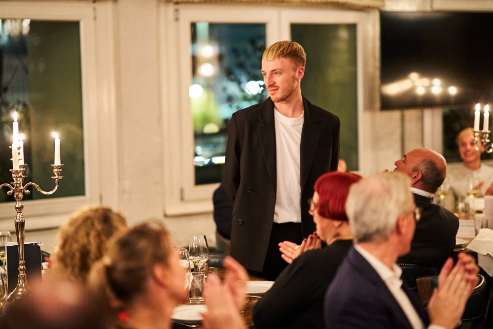
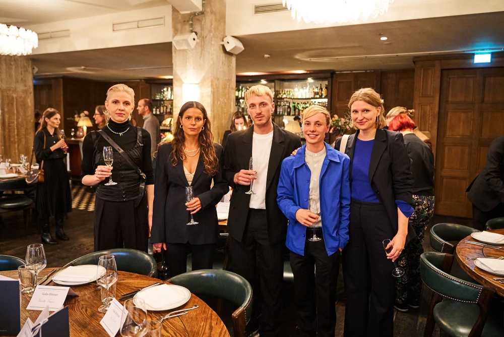

LIGNOFLAX | Bachelorarbeit 2022
LignoFlax ist eine Material und Formstudie, welche das Potenzial von Lignin und Flachsfasern als Verbundwerkstoff untersucht.
Lignin ist ein natürliches Biopolymer, welches sich in Pflanzen und Bäumen wiederfindet. Es fungiert als Kleber, um die einzelnen Zellwände zusammenzuhalten.In jedem Holz oder jeder verholzenden Pflanze kommt ein Anteil von 30 % Lignin vor. Lignin ist eine Ressource, die jedes Jahr um 20 Milliarden Tonnen nachwächst.
Neben seiner hohen natürlichen Verfügbarkeit fällt Lignin zusätzlich in einer weltweiten Höhe von insgesamt 50 Millionen Tonnen pro Jahr als Abfallprodukt bei der Papierherstellung an.
Mischt man Lignin mit Naturharzen, natürlichen Fettsäuren, Cellulose, biologischen Additiven und natürlichen Verstärkungsfasern, so erhält man einen unter Temperatur- und Druckerhöhung verarbeitungsfähigen biologischen Kunststoff.
Das ARBOBLEND® des süddeutschen Hersteller Tecnaro GmbH ist ein Thermoplast, welcher auf industrielle Kunststoffverarbeitung hin konzipiert und optimiert wurde. Der Werkstoff ist zu 100 % bio-basiert und biologisch abbaubar.
Der Flachs oder auch Lein genannt ist eine historische Kultur Pflanze. Leinpflanzen bevorzugen vor allem ein maritimes Klima, deshalb gedeihen sie am besten im Küstenbereich, wie etwa in Nordfrankreich, Belgien und den Niederlanden. Flachs ist eine zwei Nutzungspflanze. Die Samen werden zu Öl und die Fasern zu Textilien verarbeitet. Der Flachs ist unkompliziert im Anbau, braucht keine Fungizide, Insektizide oder Wachstumsregler. Mit keiner Getreide Art verwandt, eignet er sich bestens zur Auflockerung der Frucht Folge. Die weltweite Leinernte beträgt etwa 2 Millionen Tonnen und macht damit 2 % des weltweiten Faseraufkommens aus.
Die Bcomp ampliTex® Serie steht für eine zukunftsweisende Technologie, die Flachsfasern in modernste Verbundwerkstoff-Produkte integriert. Dabei greift das Schweizer Unternehmen auf den regionalen europäischen Flachs zurück. Dabei sorgen die non-crimp Flachsfasergelege für höchste Stabilität und stellen leistungsstarke Naturfaserverbundwerkstoffe dar. Das Sortiment an technischen Geweben umfasst verschiedene Web Arten, biaxial, Twill und UDs – optimiert für leichte Verstärkung.
LignoFlax is a material and shape study investigating the potential of lignin and flax fibers as a composite material.
Lignin is a natural biopolymer based in plants and trees. It acts as a glue to bind the individual cell walls together. In any wood or lignifying plant, 30% lignin is present. Lignin is a resource that grows back by 20 billion tons every year.
In addition to its high natural availability, lignin is also produced worldwide as a waste product in paper production, amounting to a total of 50 million tons per year.
If lignin is mixed with natural resins, natural fatty acids, cellulose, biological additives and natural reinforcing fibers, the result is a bio-plastic that can be processed under increased temperature and pressure.
ARBOBLEND® from the southern German manufacturer Tecnaro GmbH is a thermoplastic that has been designed and optimized for industrial plastics processing. The material is 100% bio-based and biodegradable.
The flax or also called linen is a historical culture plant. Flax plants primarily prefer a maritime climate, so they thrive best in coastal areas, such as northern France, Belgium and the Netherlands. Flax is a two-use crop. The seeds are processed into oil and the fibers into textiles. Flax is uncomplicated to grow, needing no fungicides, insecticides, or growth regulators. Not related to any cereal species, it is best suited for loosening the fruit sequence. The global flax harvest is about 2 million tons, accounting for 2% of the world’s fiber supply.
The Bcomp ampliTex® series represents a pioneering technology that integrates flax fibers into state-of-the-art composite products. The Swiss company uses regional European flax for this purpose. In the process, the non-crimp flax fiber fabrics ensure maximum stability and represent high-performance natural fiber composites. The range of technical fabrics includes various weave types, biaxial, twill and UDs – optimized for lightweight reinforcement.
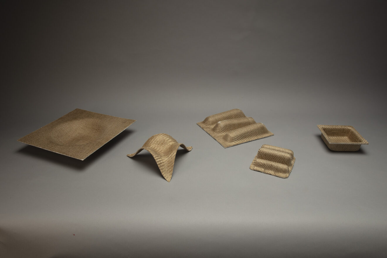
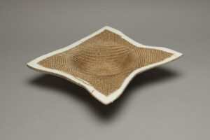
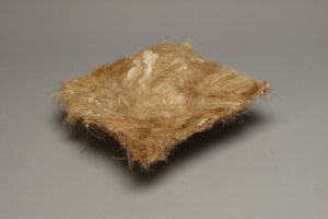
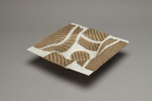


Betreut durch
Prof. Jozef Legrand, Prof. Holger Neumann, Prof. Burkhard Schmitz
Kontakt
andreasweidauer.com
Vortrag und Diskussion auf Englisch: Dienstag, 8. November, 19:00 @ designtransfer, Einsteinufer 43
More information @ designtransfer website.
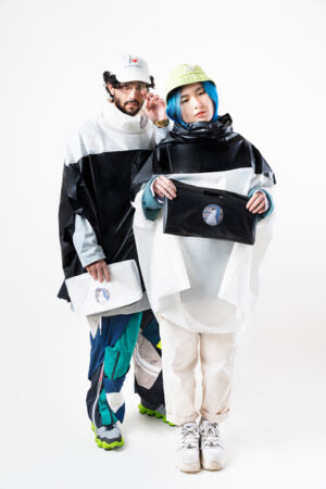
WEATHER UNDERGROUND 2021, Foto: Max Weise
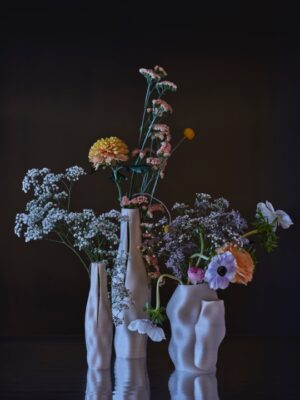
crafting plastics! studio
Produkt Design Students have internships. In an online presentation a recent group of interns present their whereabouts and the do and don’ts for internships: where were they, what did you do there, what was super and not so super, what did they learn, what can they advise, what was the overall experience, did you get paid, etc…
Thursday 20 October 17:00 via:
https://udk-berlin.webex.com/meet/m.chmara
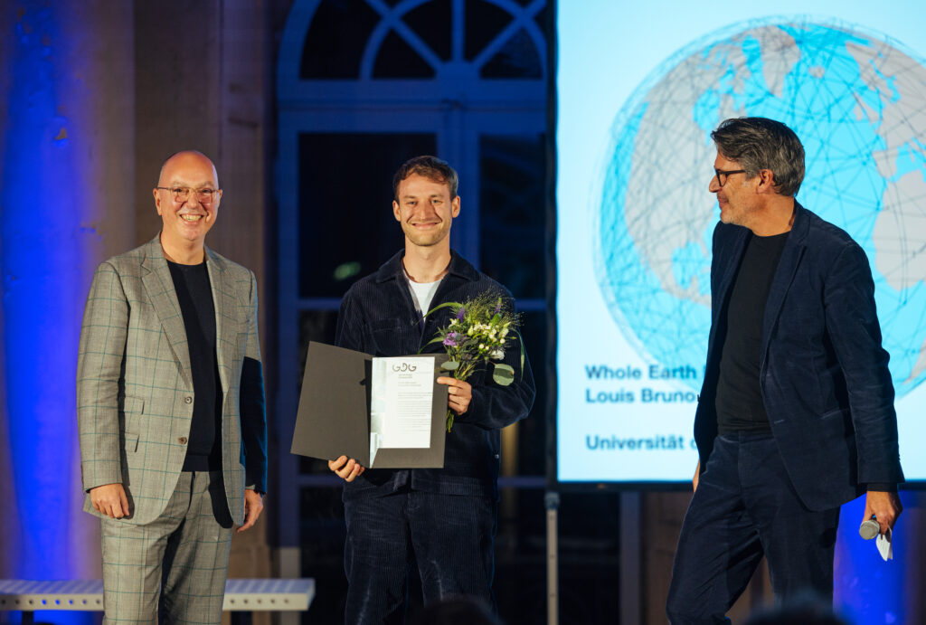
At the recent German Design Graduates award ceremony at Schloss Pillnitz Louis Bindernagel won one of the four main awards with his graduation project „Whole Earth Project“.
He was handed over his award by the jury and books by the renown design critic Alice Rawsthorn in person.
Jury Statement:
The Circular Design Award 2022 goes to the „Whole Earth Project“ by Louis Bruno Bindernagel, a graduate of the Berlin University of the Arts. The work bears witness to the designer’s intensive examination of economic, ecological and social challenges at the same time. The project deals with the analysis, consolidation and creation of networks dedicated to the idea „Think Global, Make Local“ and follows the approach of a decentralized production system with ideas shared worldwide.
The jury was particularly impressed by the integration of several principles such as efficiency, sufficiency, resilience and consistency in one design, which are designed to be circular in as many phases of a life cycle as possible.
The jury: Prof. Daniela Bohlinger (Head of Sustainability Design BMW Group), Leif Huff (most recently Head of Design Wirelane)
Louis’ work is on show with 40 other projects in in the GDG show 2022 in schloss Pilnitz till 31 October, see
You can read more on the Award winners, here
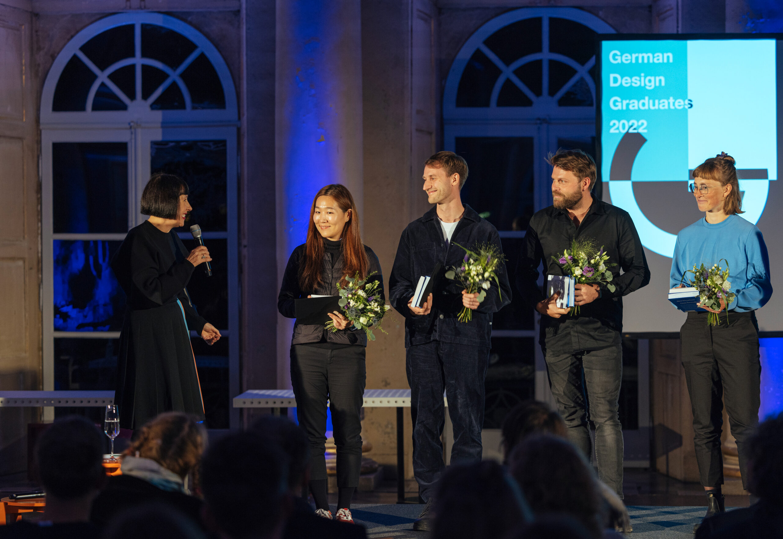
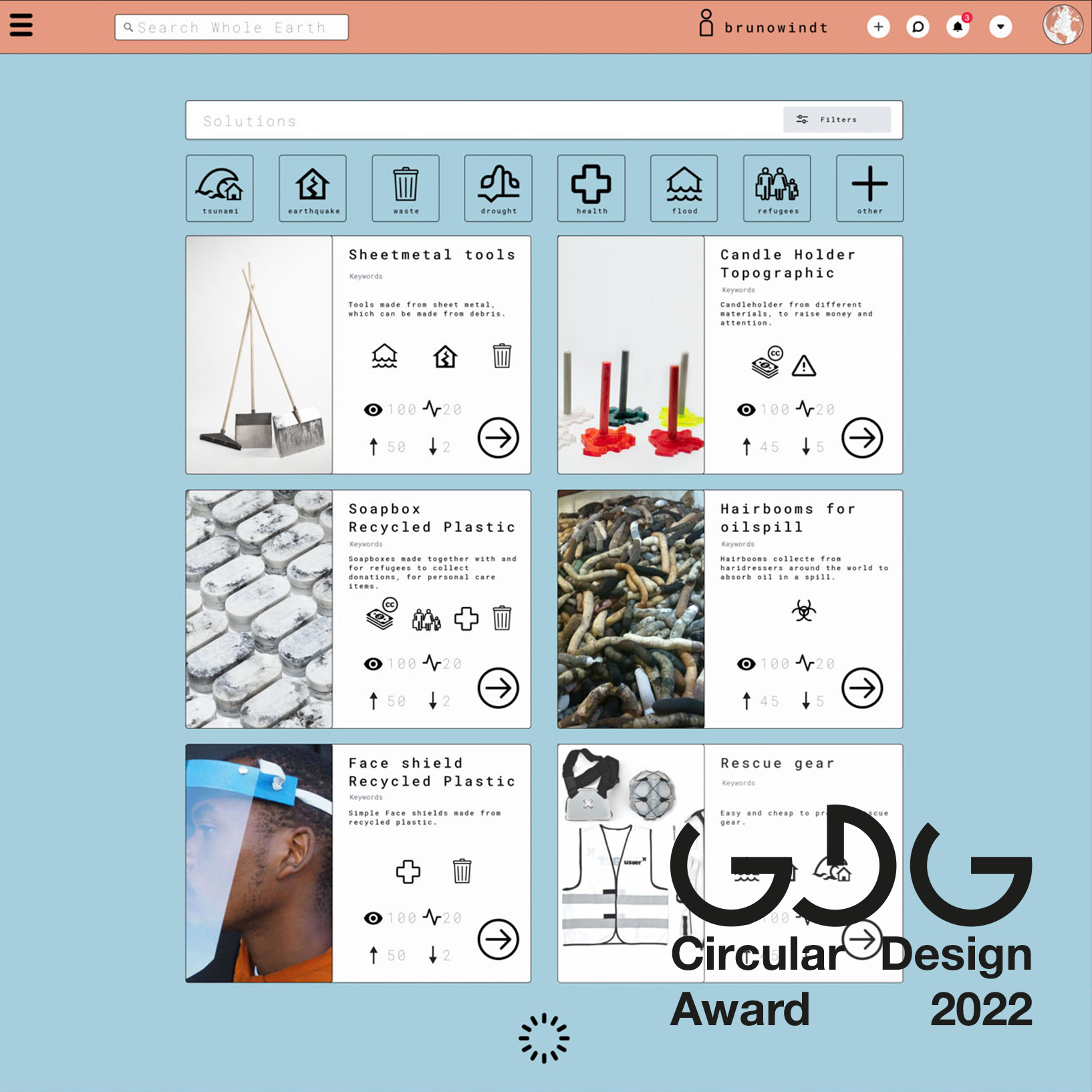
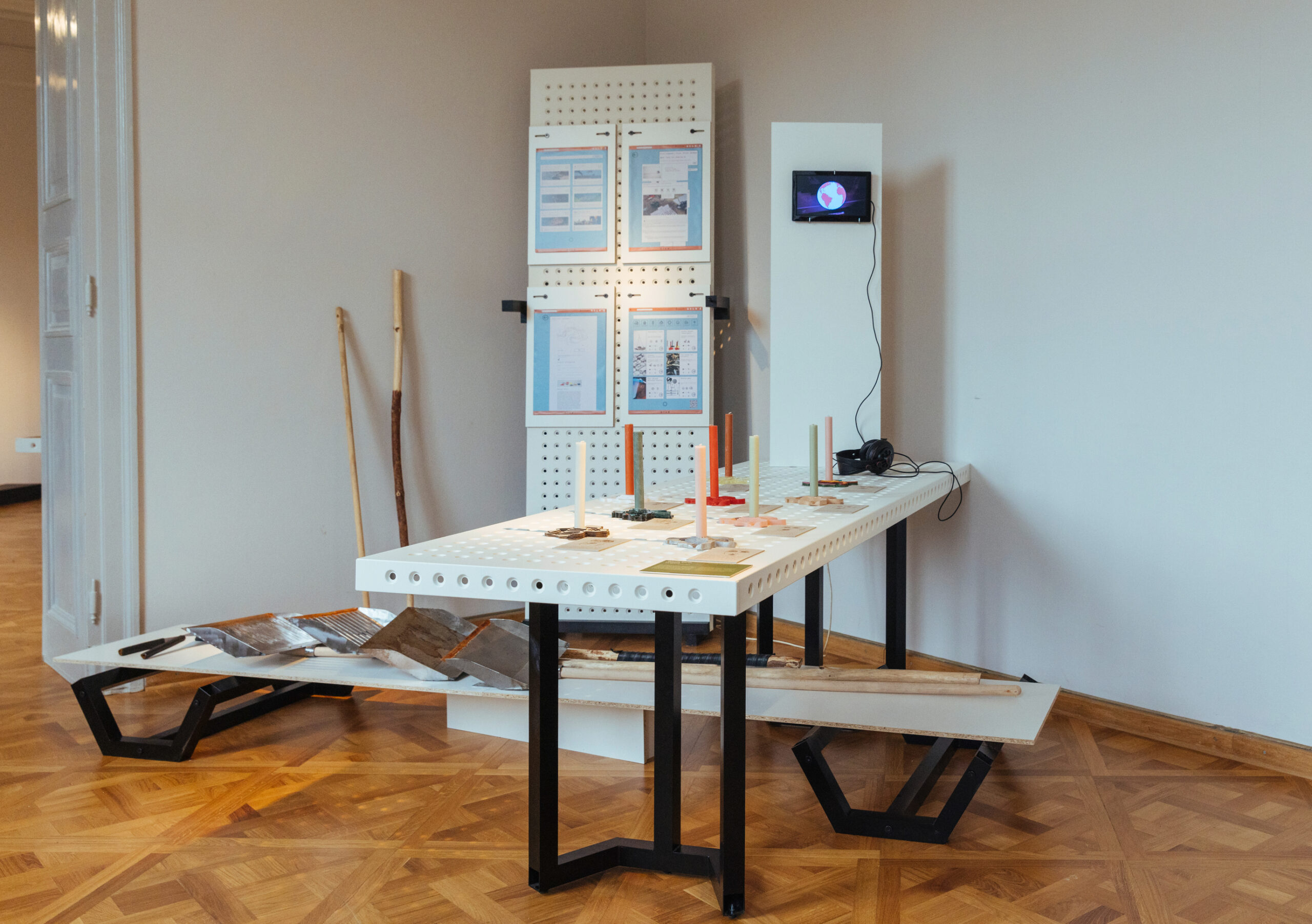
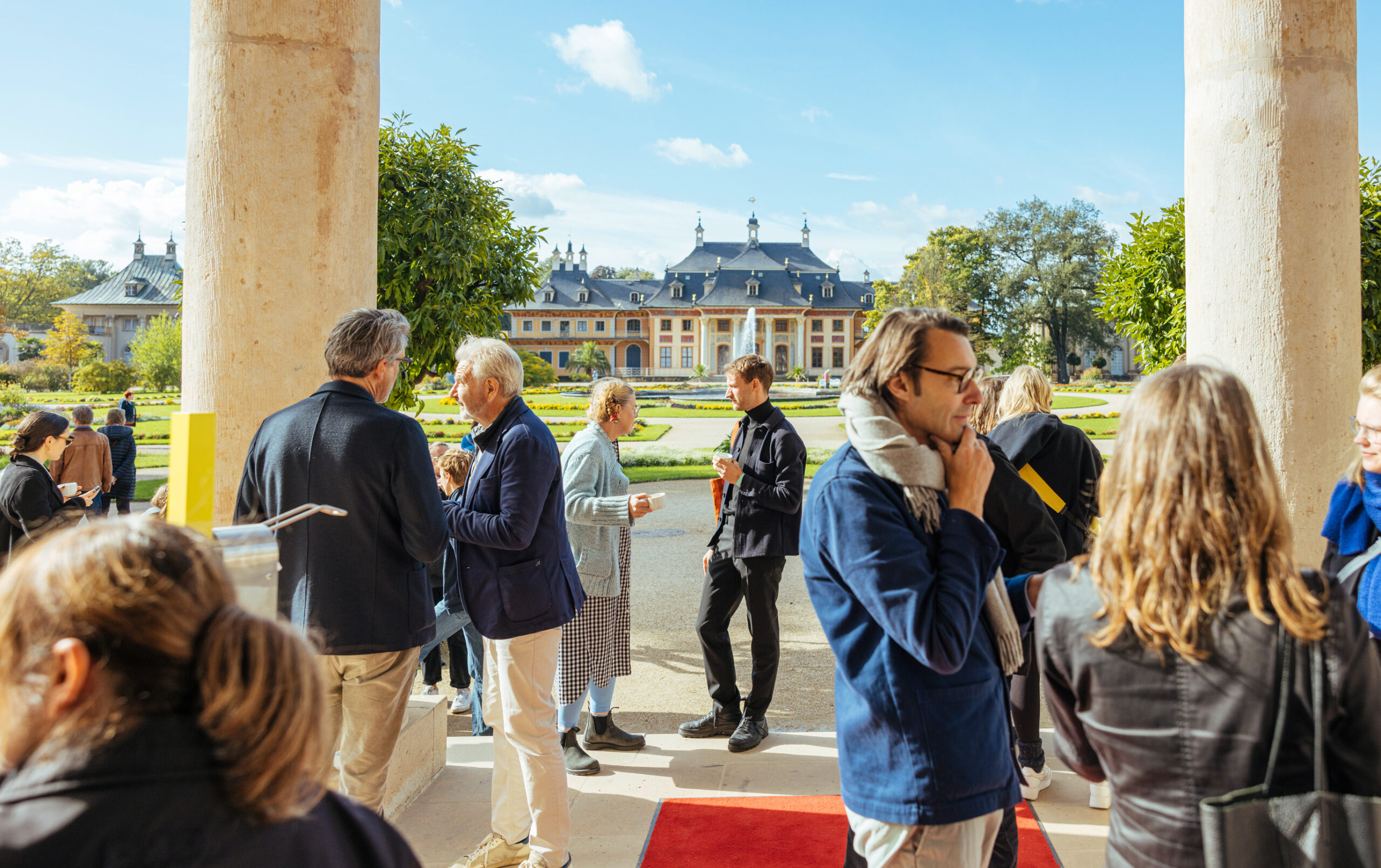
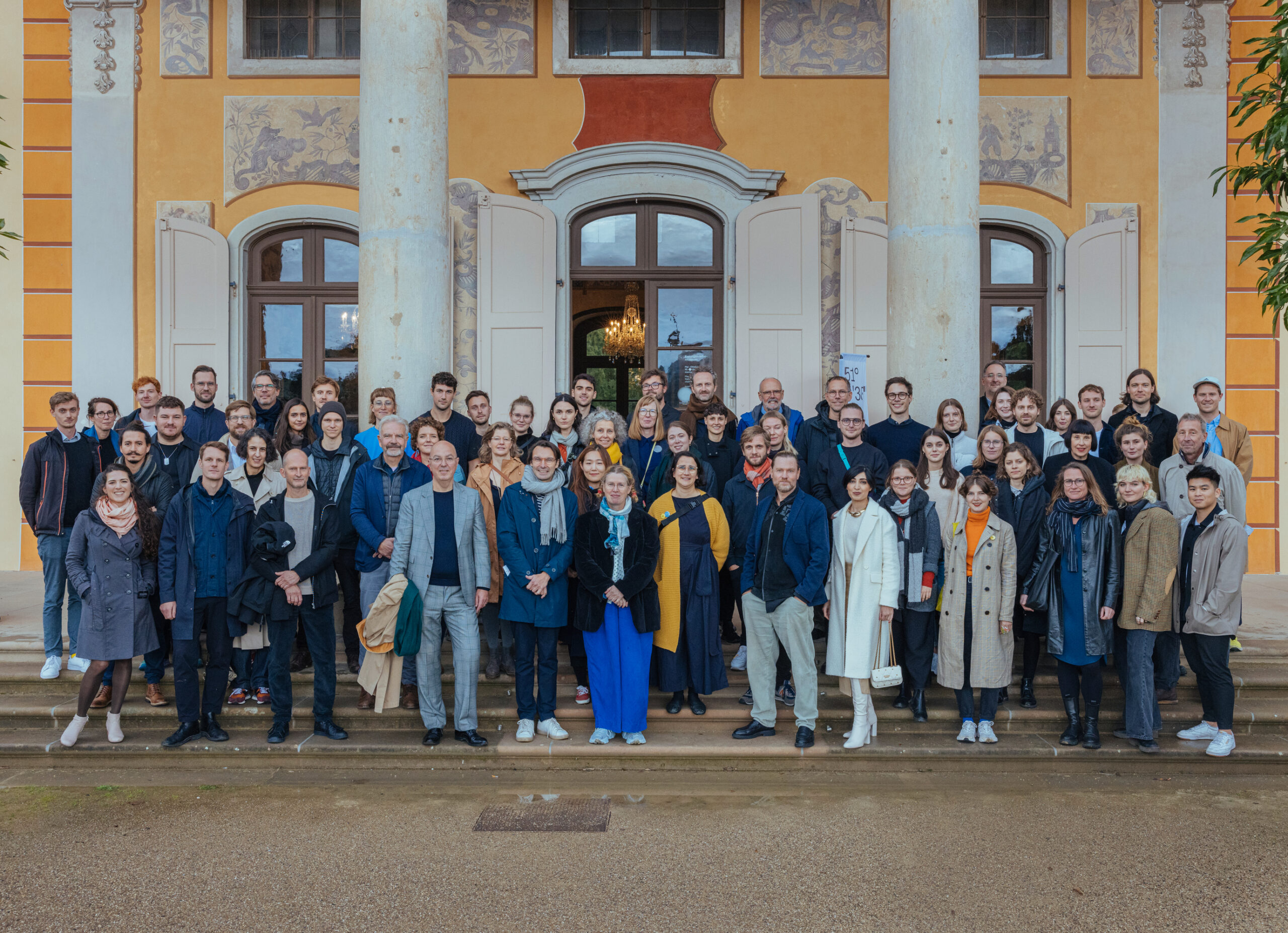
K fair is the biggest fair for plastics and rubber taking place in Dusseldorf every 3 years. It is a technical fair showing interesting innovations and techniques.
This year it has its 70 year aniversary, and the big topics in 2022 are circular economy, digitisation, climate protection.
BASF Creation Center shows some of the Projects on the fair that were developed with last years MA students in the project One Material, One Product
K Messe Dusseldorf
19-26 October
Booth in hall 5, C21/D21
see more on K-messe, here
and on its history, here
see the MA – BASF projects below
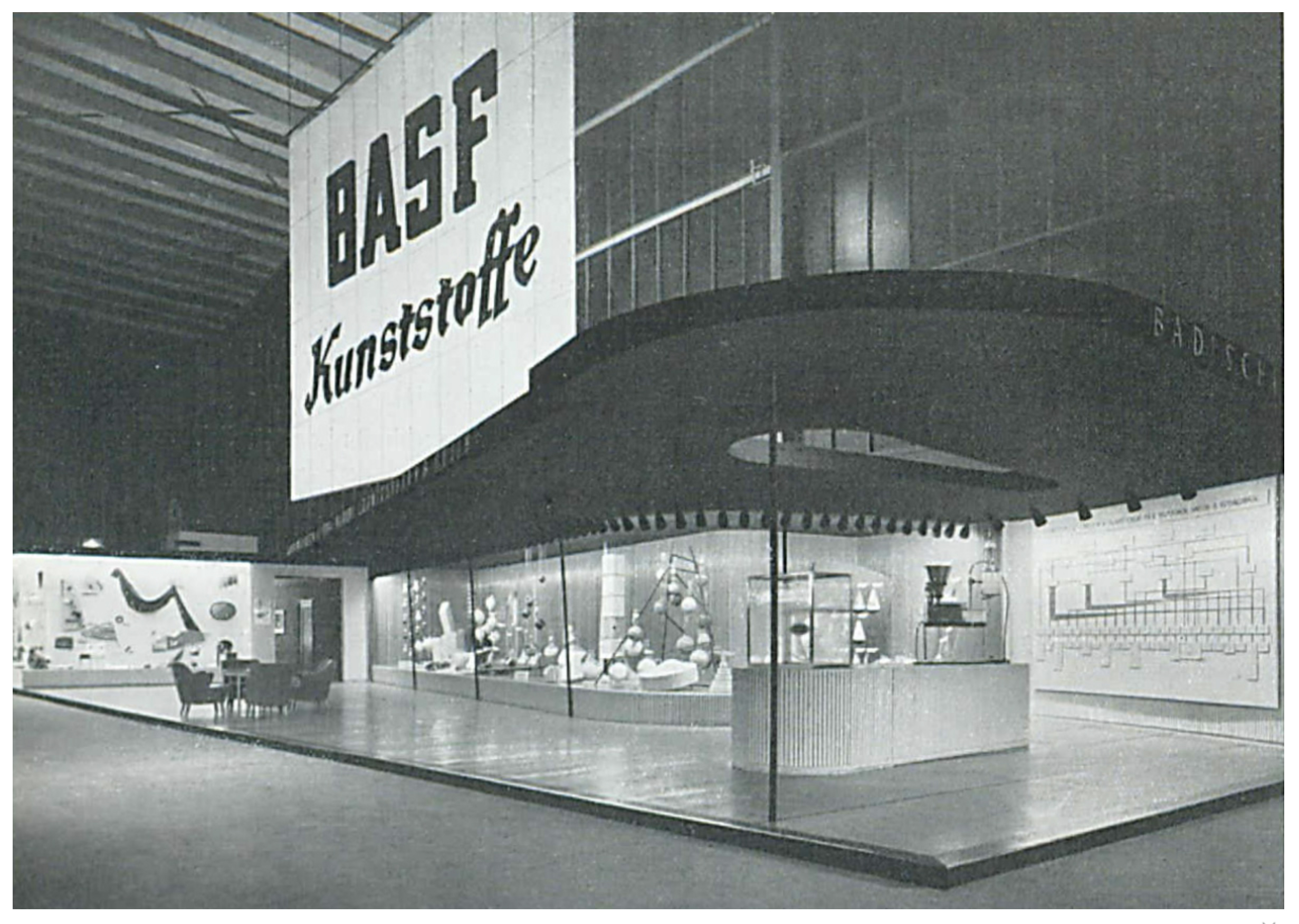
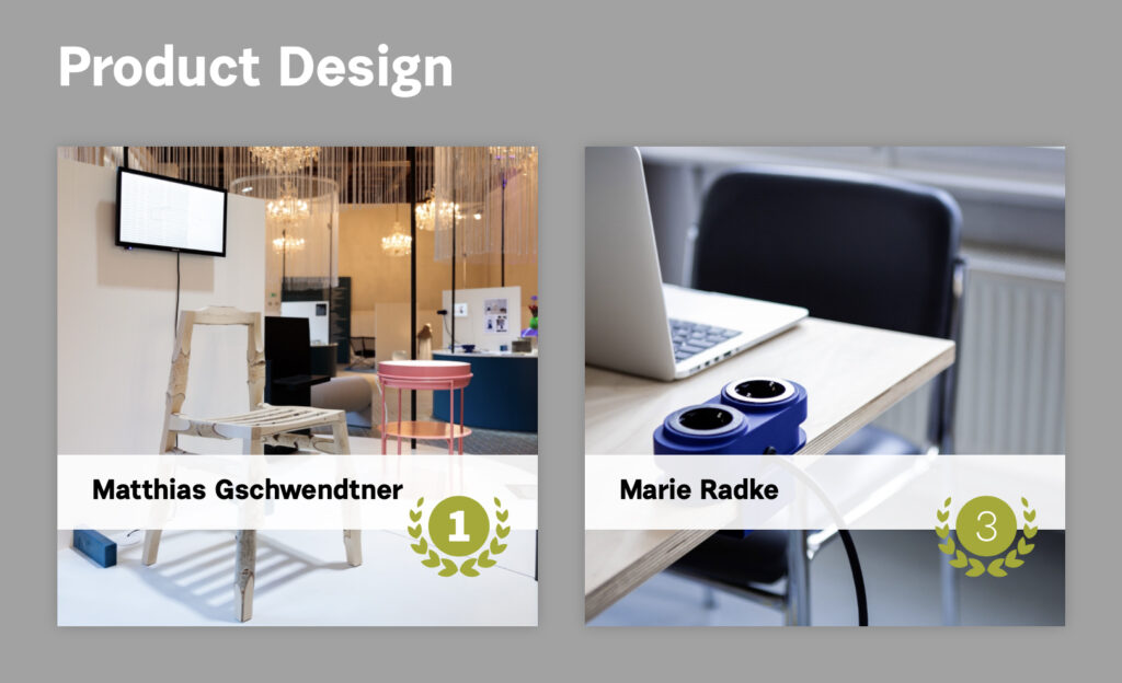
During Designblok Prague 2022 Matthias Gschwendtner & Marie Radke won prizes with their UdK MA projects. The took part in the Diploma Selection of the annual design festival. Matthias won the 1st Prize, Marie the 3rd Prize.
The Diploma Selection international competition is organized by Designblok in cooperation with EUNIC Cluster CZ (European Union National Institutes for Culture), see more