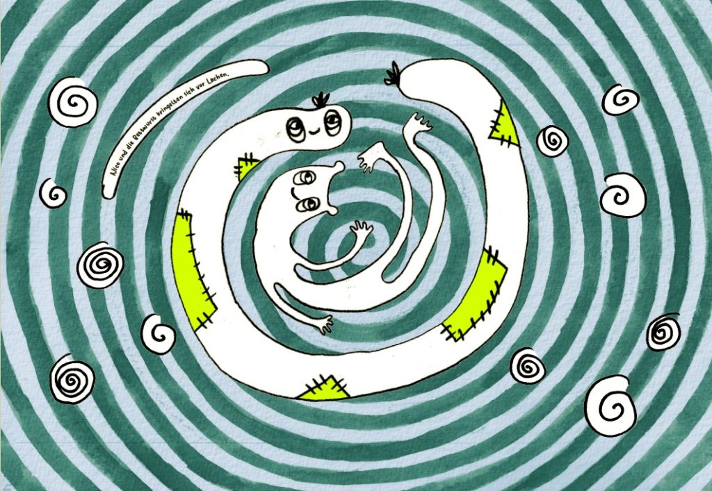
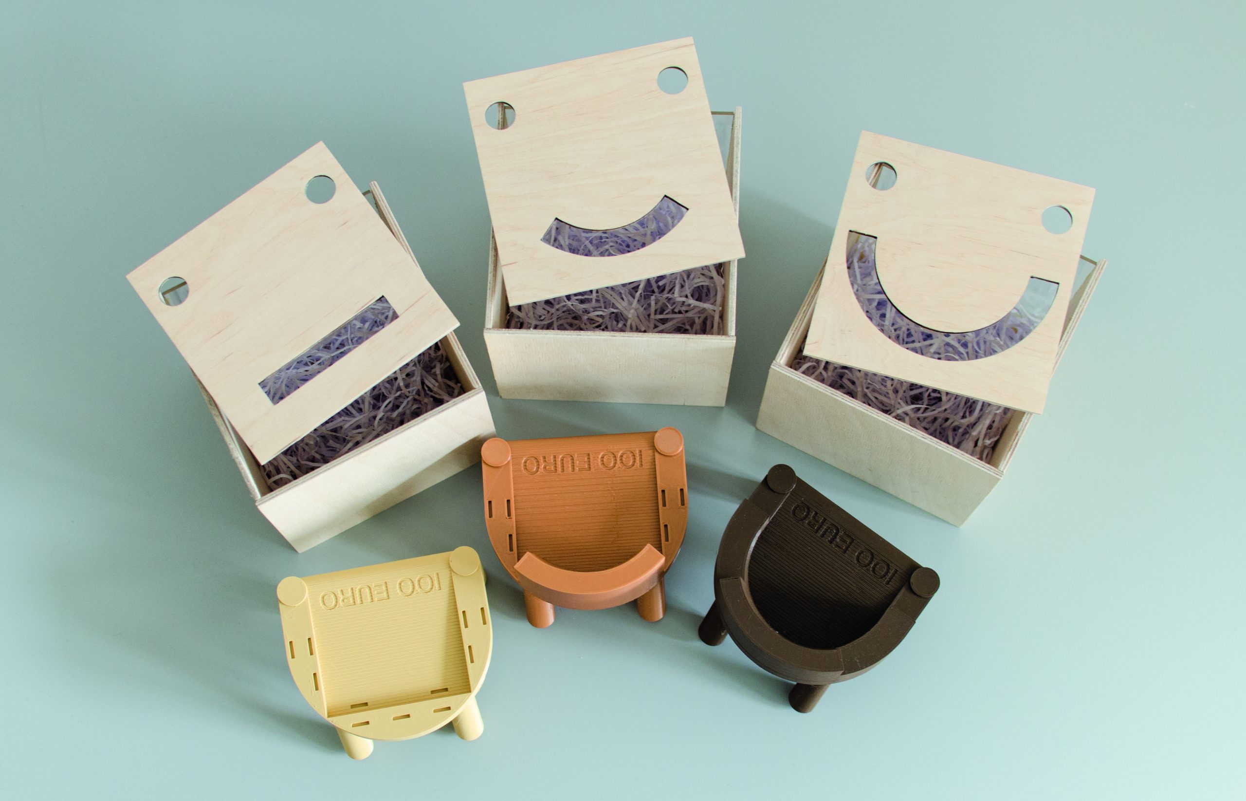
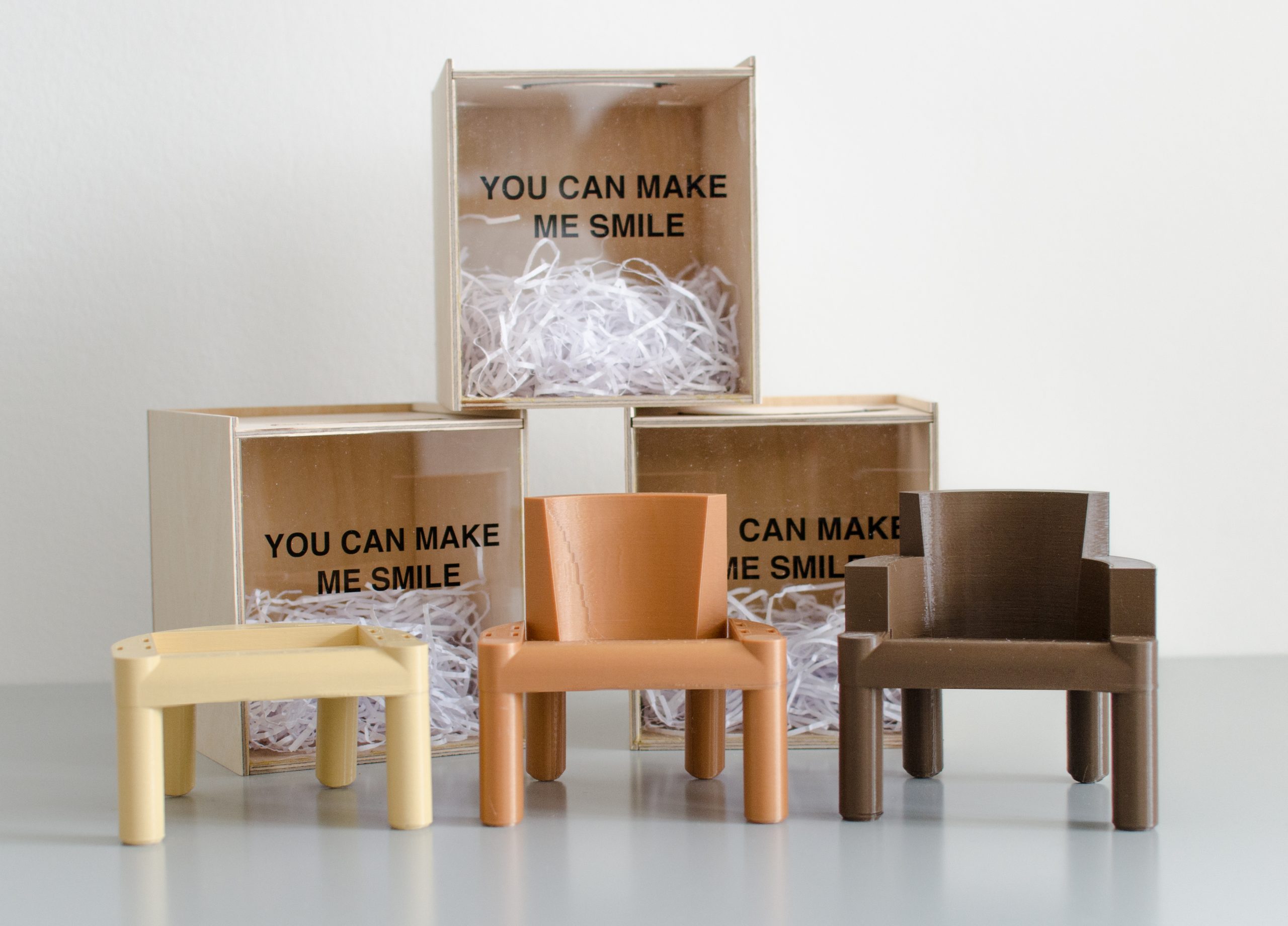
HOODIE GUT, ALLES GUT // Basisprojekt Mode // SS21
Bei glücklichem Ausgang eines Hoodies sind die dafür überwundenen Mühen und Schwierigkeiten schnell vergessen – Analyse und Interpretationen eines Kaputzenpullovers.
Ein stark konnotiertes Kleidungsstück dessen Aussagekraft und Codes klar gesetzt sind – Wohlbefinden, soziale Schichten, Materialitäten, Formensprache.
Was macht den Hoodie zum Hoodie?
Klare Merkmale sollen in dem Semester hinterfragt, neu definiert und noch klarer und präziser gesetzt werden.
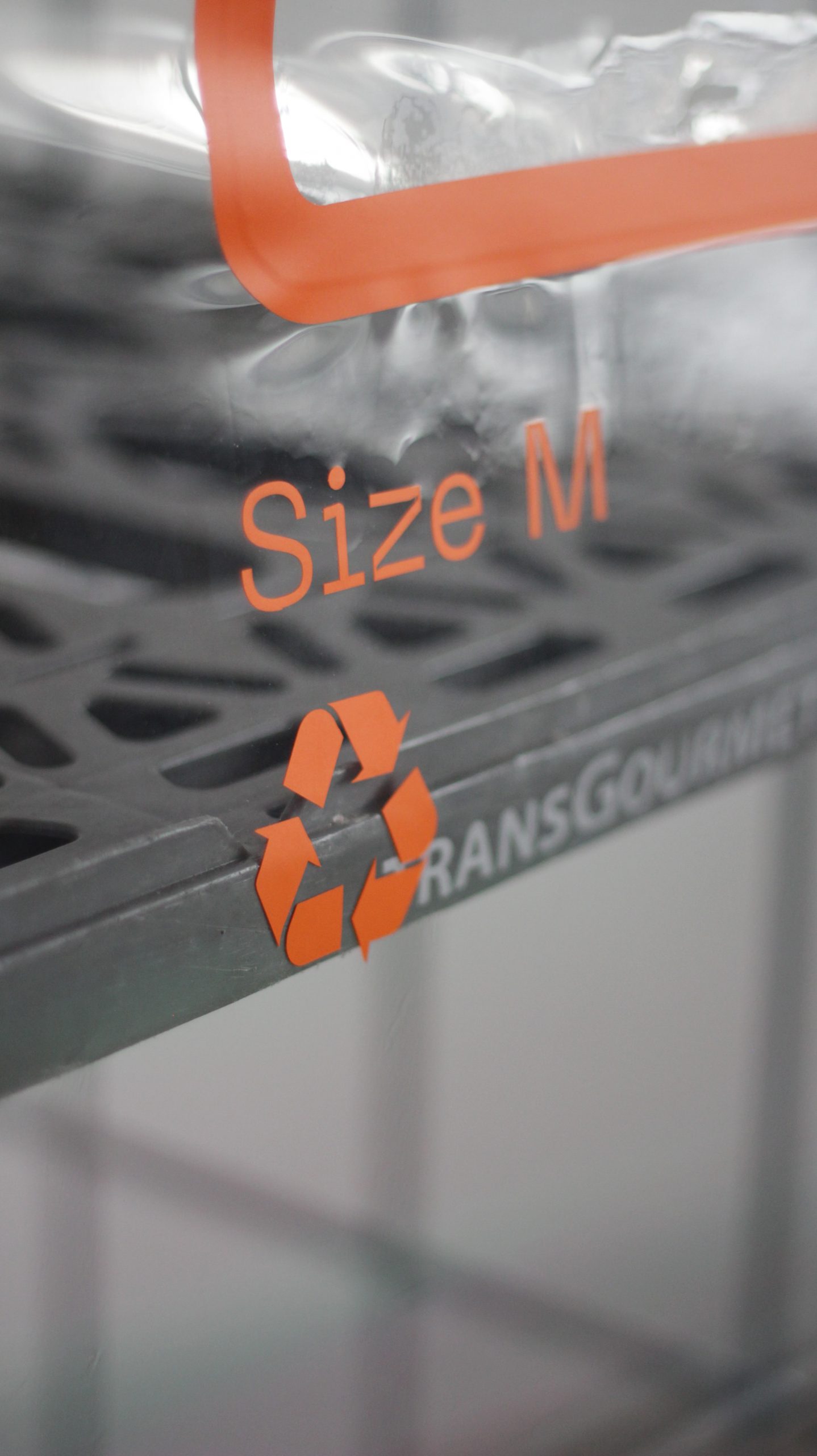
Durch upcycling oder Materialbearbeitung (Siebdruck ausgeschlossen) soll ein Hoodie kreiert und dessen Grenzen getestet werden.
Ist die Form relevant? Ist die Funktion relevant, oder reicht das Material und die Codes der Taschen?
Um tiefer in all diese Fragen einzutauchen soll im ersten Schritt eine Hoodie Analyse, sowie eine Recherche zu Material, Form und Schnitt gemacht werden.
Die Präsentationsform am Ende des Semesters kann eine Installation, eine Kampagne, ein Video oder eine Performance sein.
Lehrende: Gast Prof. Julian Zigerli, KM Magdalena Kohler
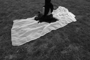
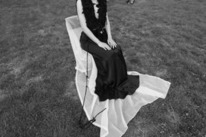
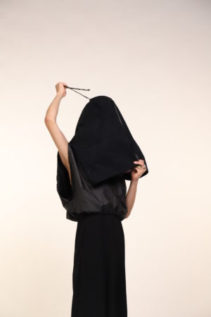
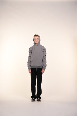
Achim Kwon // „sense of weight“
Der Entwurf verdeutlicht das Gefühl von Gewicht in meinem Inneren.Es bedeutet das Maß an Verantwortung, die ich fühle oderder Grad der Atmosphäre, die ich empfinde, wenn ich bestimmte Dinge sehe.Der Oberkörper (Weste) des Hoodies erscheint schwer, indem breit geschnittene Jerseystreifen aus einem alten Kleid neu verstrickt wurden.Das Wesen des Kleides bleibt somit in einer anderen Form erhalten.Der Kapuzenteil des Hoodies ist großzügig geschnitten und besteht aus leichtem und dehnbarem Jersey. Die Silhouette sollte leicht beginnen und in ein Wechselspiel der Schwere und Leichtigkeit der Materialien übergehen.Der Rock zeigt gewissermaßen eine grobe rechteckige Form. Durch die Beschaffenheit der Seide klebt der Rock am Körper und zeigt die Silhouette im Inneren.Um den Rock mit dem Oberkörper zu verbinden, habe ich eine dünne Kette verwendet.Ich mag die Harmonie der leichten Seide verbunden mit der dünnen Kette.Fein aber stark, verschwommen und dennoch sicher.
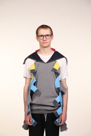
Elea Jenner // „Play“
Playing with covering and veiling the body in a society where one is sexualised and sexually objectified, often depending on what and how much one shows off oneself.How do I deal with sexualization? How do I choose to act in this context every day? I seek balance anew every day.The hoodie is the starting point of the veiling. Large opaque volumes drape over the body, making the actual shape of the body unrecognizable. In contrast, tight mesh garments enclose the body tightly and not only leave it visible, but put an additional focus on it.The two materials play with each other, wrestle with each other. They take on the qualities of the other. A negotiation between veiling and unveiling.
Model: Ayleen Tuncer / Photography: Elea Jenner
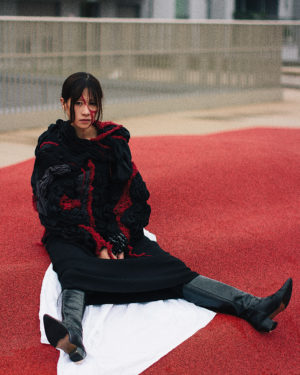
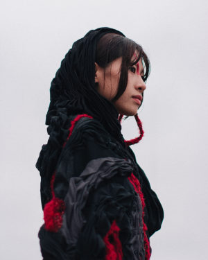
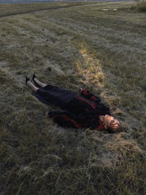
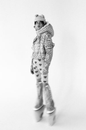
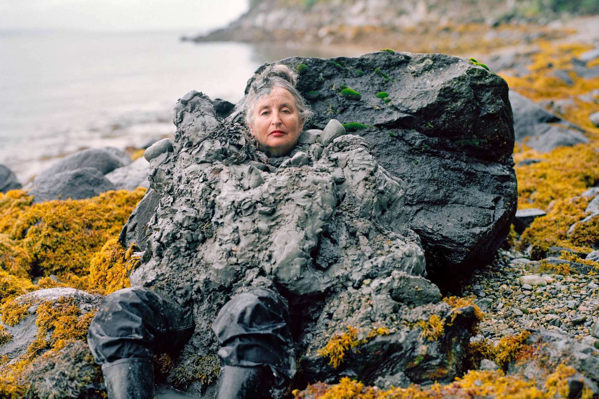
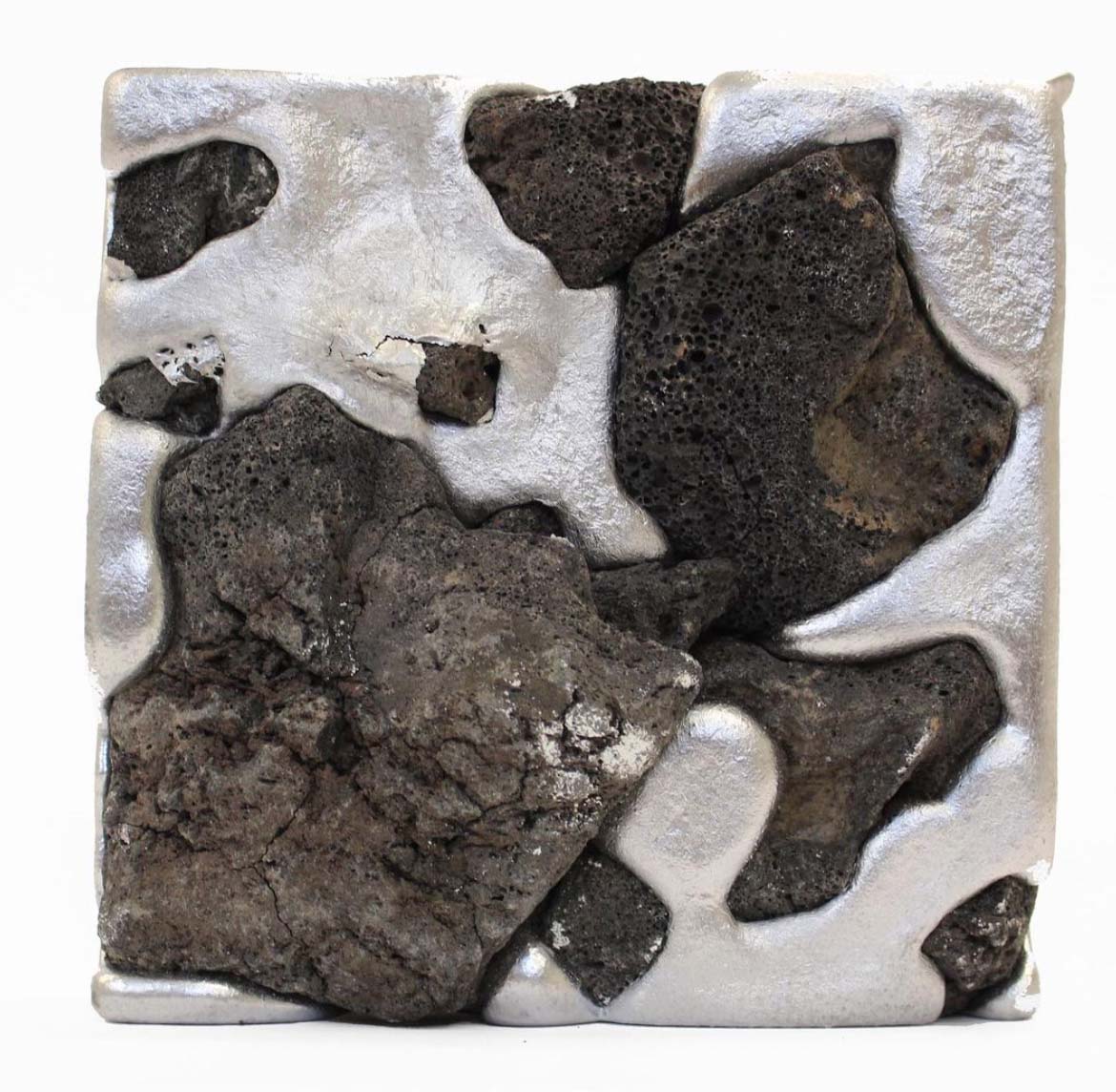
Elizaveta Efimova // „PXOENIX“
For my project I was inspired by the beauty of nature in its primal state. I wanted to focus on contrasting accents such as solid and liquid, cold and burning hot, dark and light, life in motion versus stillness, and movement as something deadly yet beautiful. In my video I wanted to emphasize these contradictory elements to show the flow of life and its integration with nature, as well as the melancholy of motionlessness. The volcano was the main inspiration for my hoodie, which was the mood board not only for the colors but also for the textures I chose.The volcano rewards with life through its stillness and punishes with death through its movement – for me this reflects the embodiment of beauty.Through the smocking technique, the pleats and wavy lines, I wanted to translate the organic texture of the stone into the garment, and the knitted red rough lines hidden between the pleats and revealed at the top represent burning, flowing lava erupting in the form of the hood over the hoodie.
Models: Achim Kwon, Daria Kazak
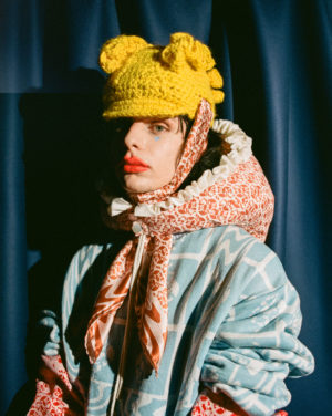
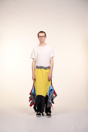
Ina Bak // „Blaze of color“
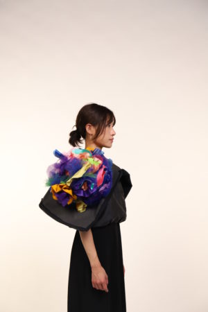
Die Insperation kam von dem Anime Film „Colorful“. Dieser Film erzählt das jede/r seine eigene Farbe hat, egal ob sie schön oder hässlich ist. Die Frage ist, ob du deine eigene Farbe herausfinden kannst.Der schwarze Hoodie wird mit dem Reißverschluss in zwei Teile geöffnet um mit den farbenfrohen Blüten die Innenseite zu zeigen. Nach der Öffnung der Kapuze sieht man den Farbübergang, obwohl die schwarze Dunkelheit noch darunter liegt.Das Öffnen des Reißverschlusses symbolisiert das Aufblühen einer Blume. Als veränderter Prozess sehen wir nicht mehr den schwarzen Hoodie, der einen versteckt, sondern schöne Farben in Form von Blumen.Durch diese Inside Out Transformierung möchte ich mit dem Hoodie eine Assosiation zum Überstehen von Hinderniessen schaffen. Das Überstehen kann vieles unterschiedliches sein, denn jede Person hat seinen eigenen Kampf. Was könnte ein Kampf sein? Manche Menschen leiden unter Depression und müssen den Mut aufbringen, zum Arzt zu gehen , oder Andere haben Angst in einer Fremdsprache zu versagen und brauchen die Motivation zum Lernen , und widerum Andere kämpfen mit dem Weg zur Selbstständigkeit.Durch das Ziehen des Schnur wird die Kapuze geöffnet und die farbenfreue Innenseite bezeigt.Das Ziehen bzw. Reißverschluss steht die Motivation / der Wille / die Aktion da, und als Ergebnis davon sehen wir nicht mehr Schwarze Kapuze, die einem versteckt , sondern schöne Farben in Form Blumen. Dieser Prozess symbolisiert das Aufblümen einer Blume.
Model : Achim Kwon
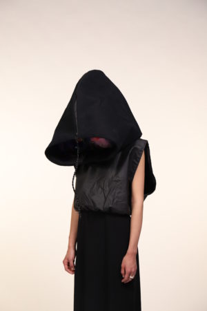
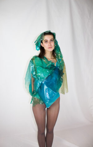
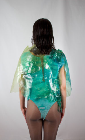
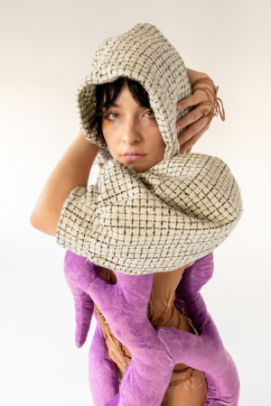
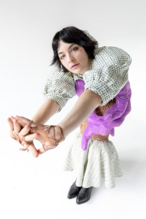
Iva Hoes // „Zweite Haut“ / „Second Skin“
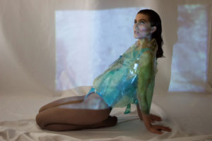
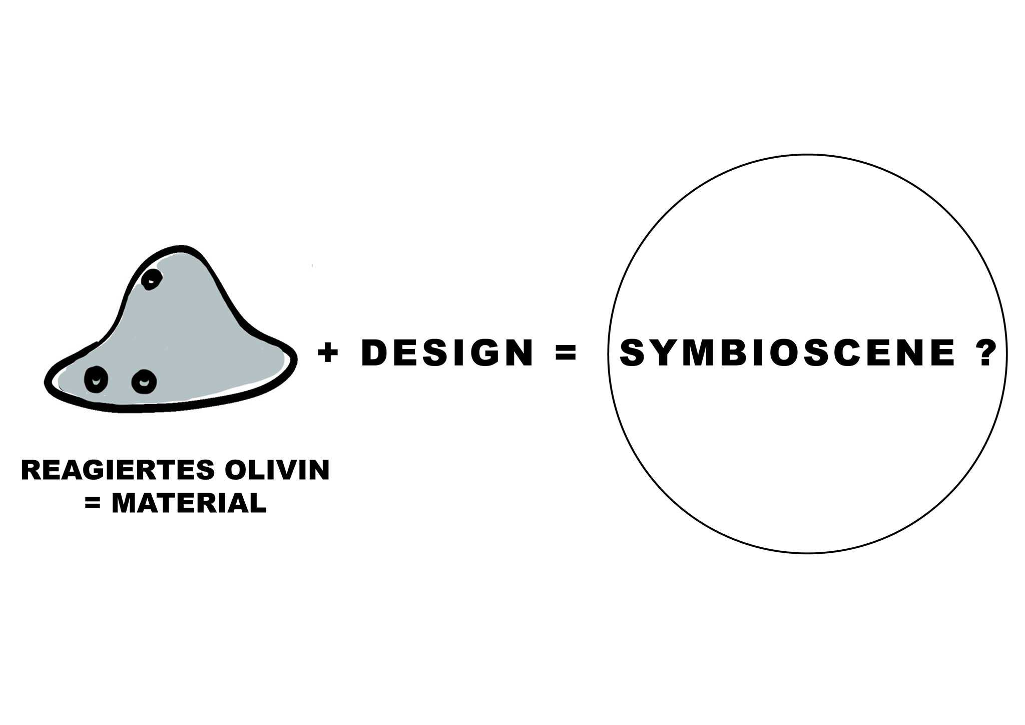
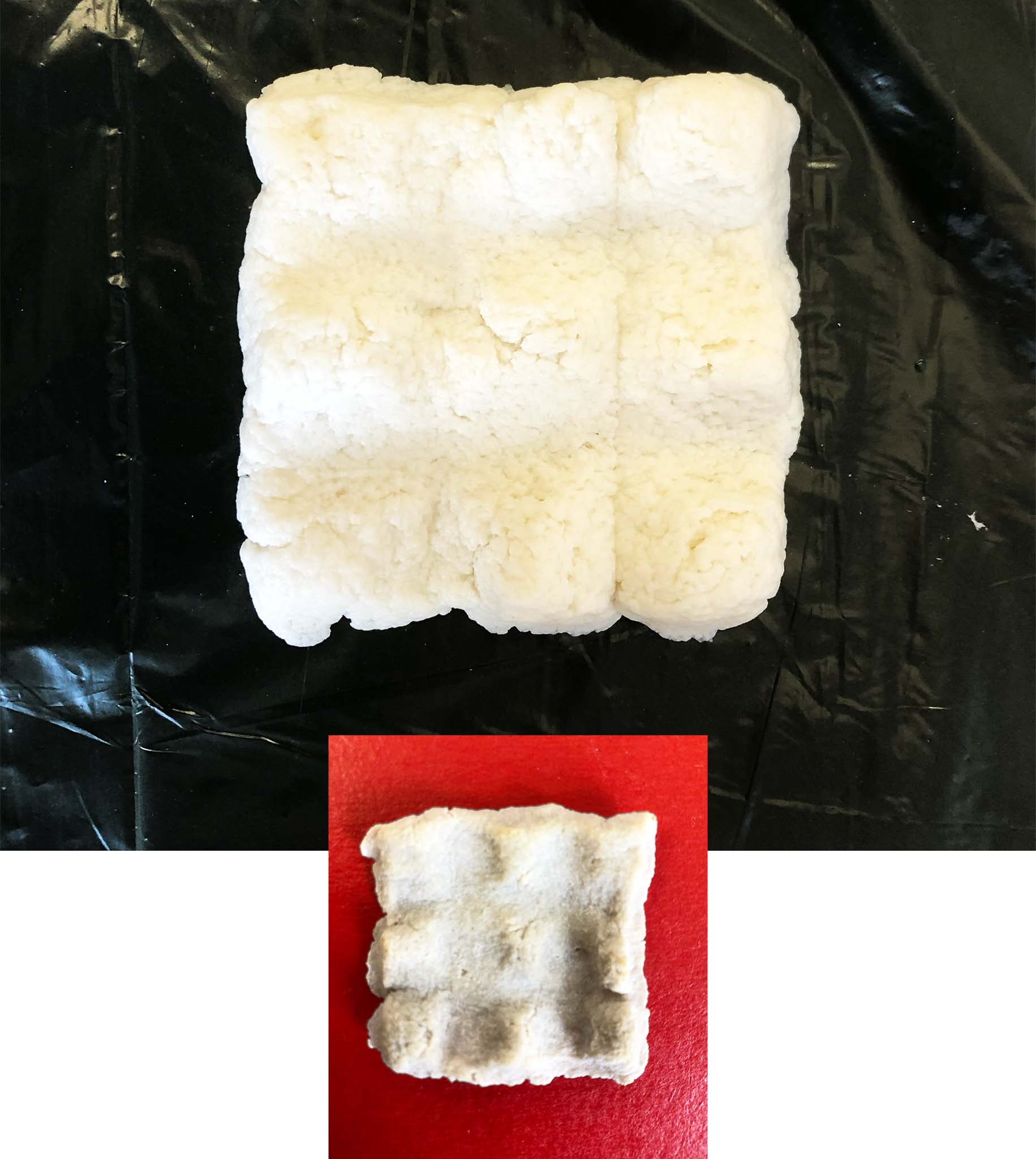
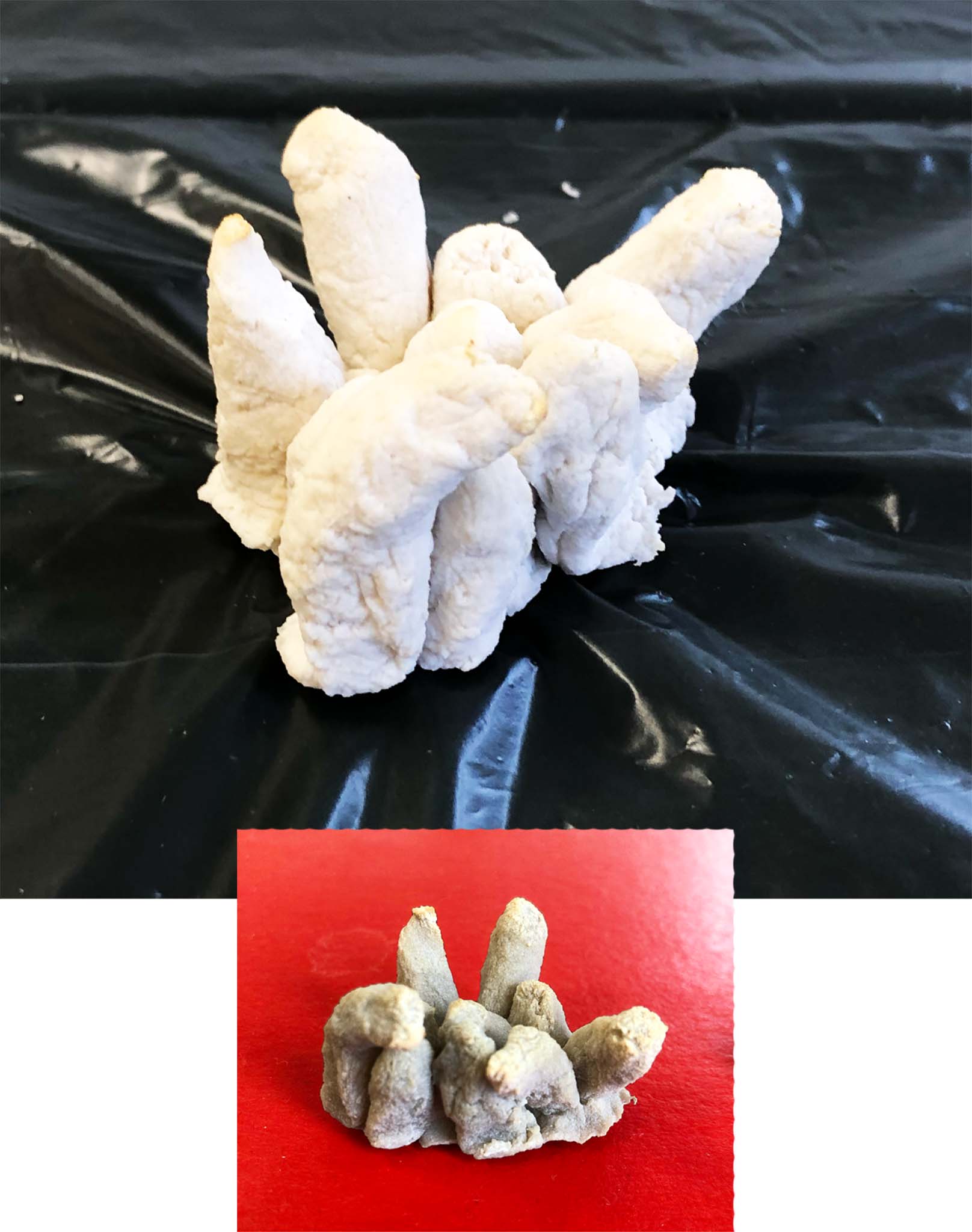
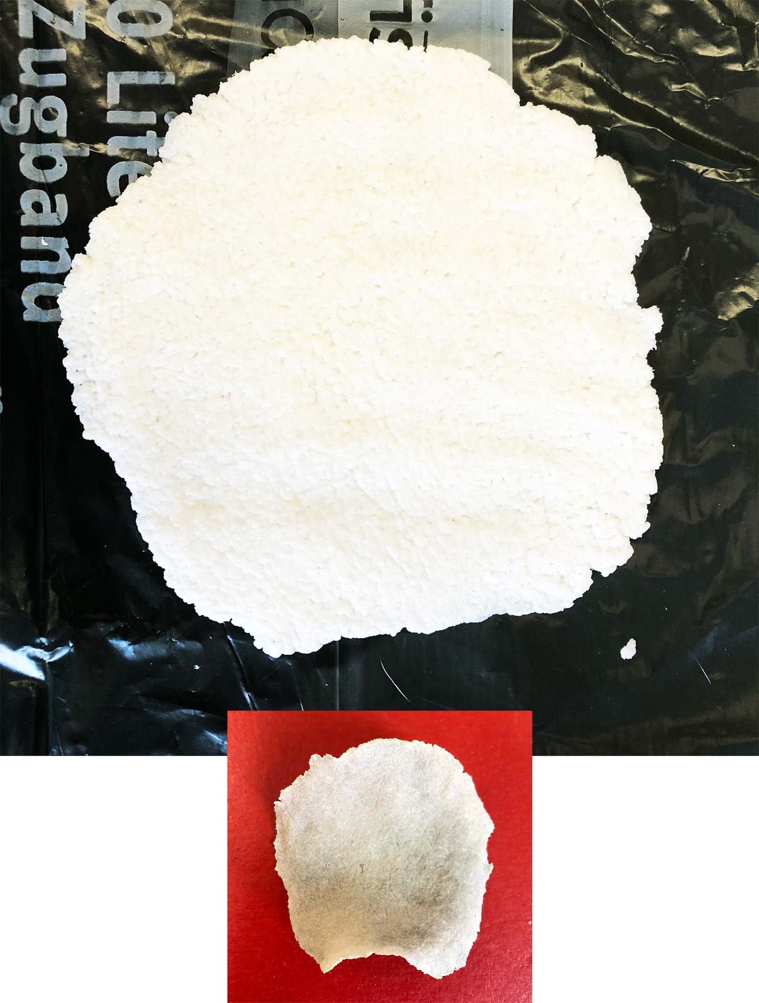
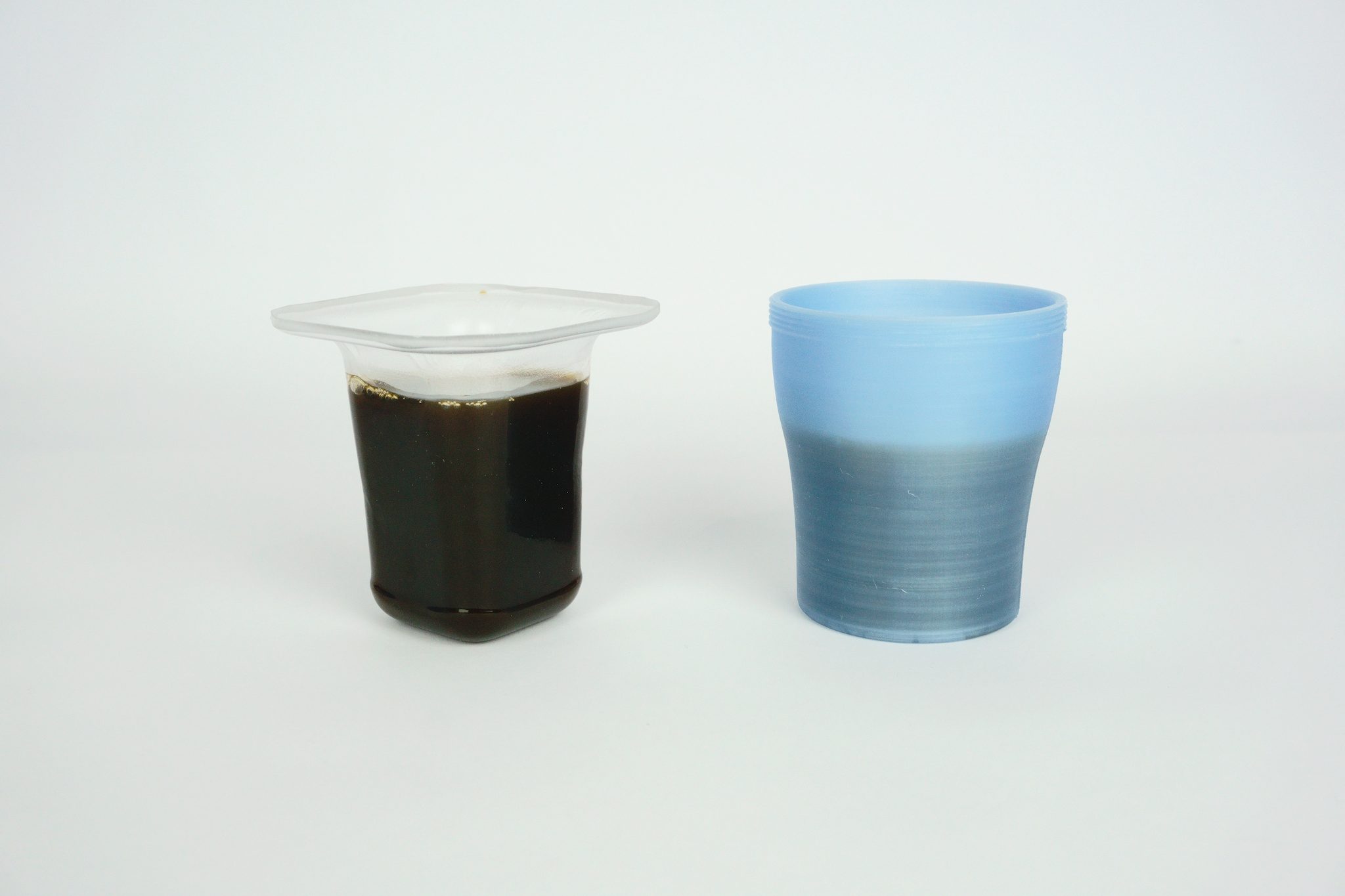
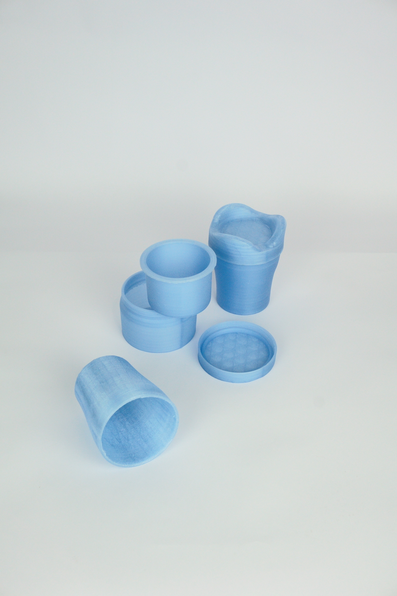
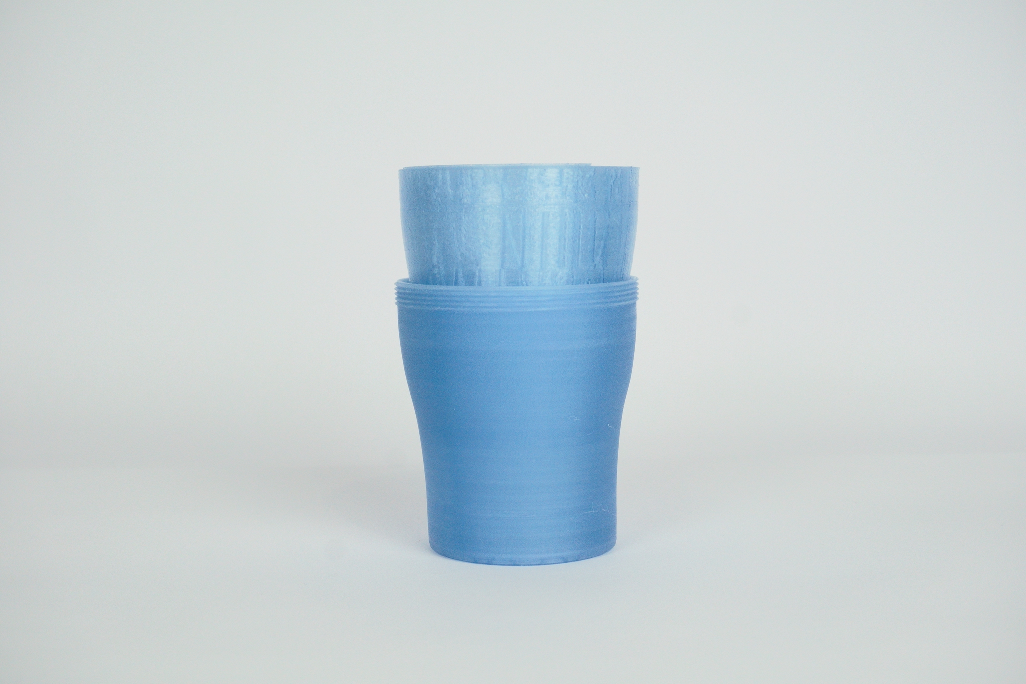
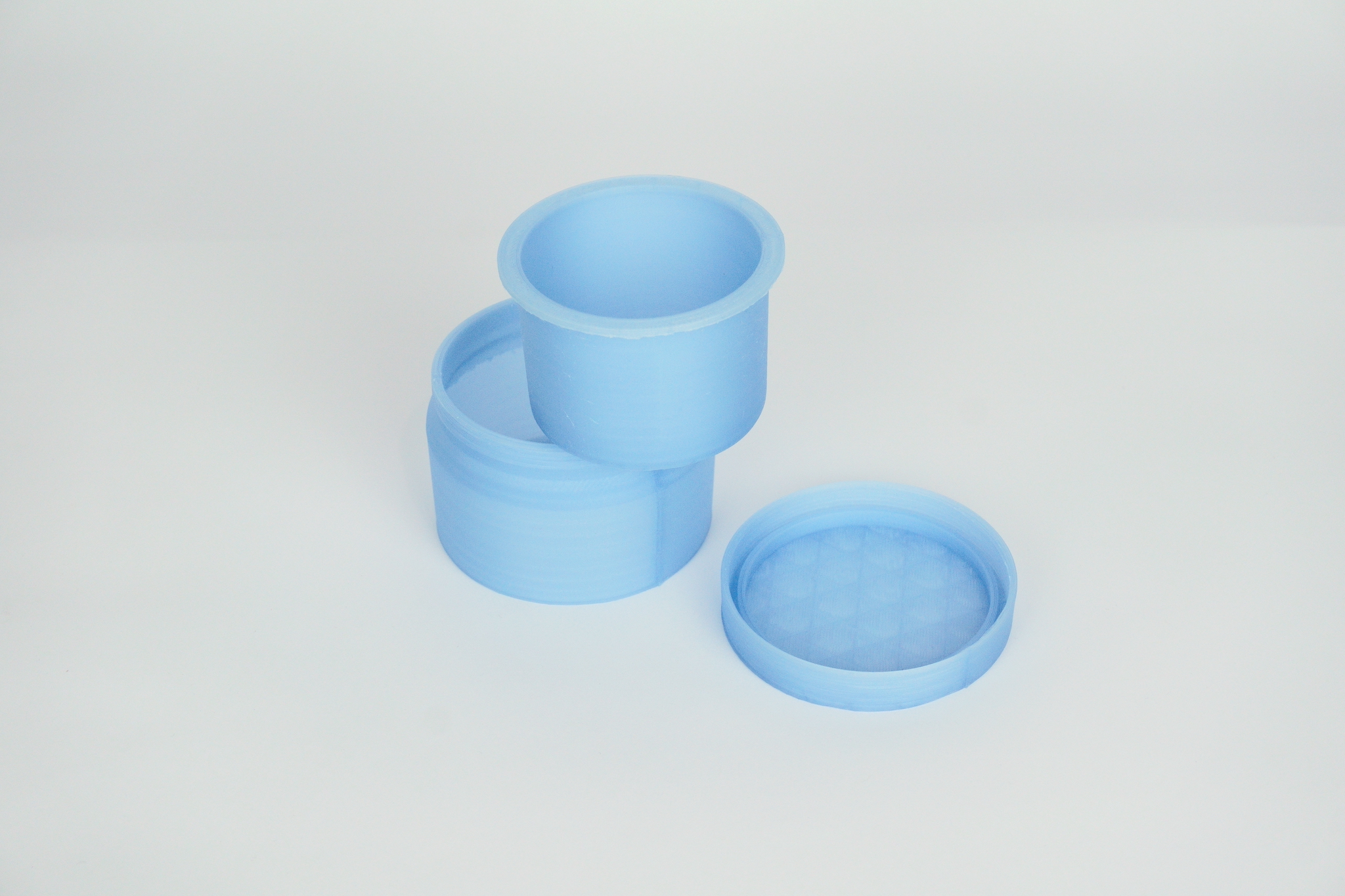
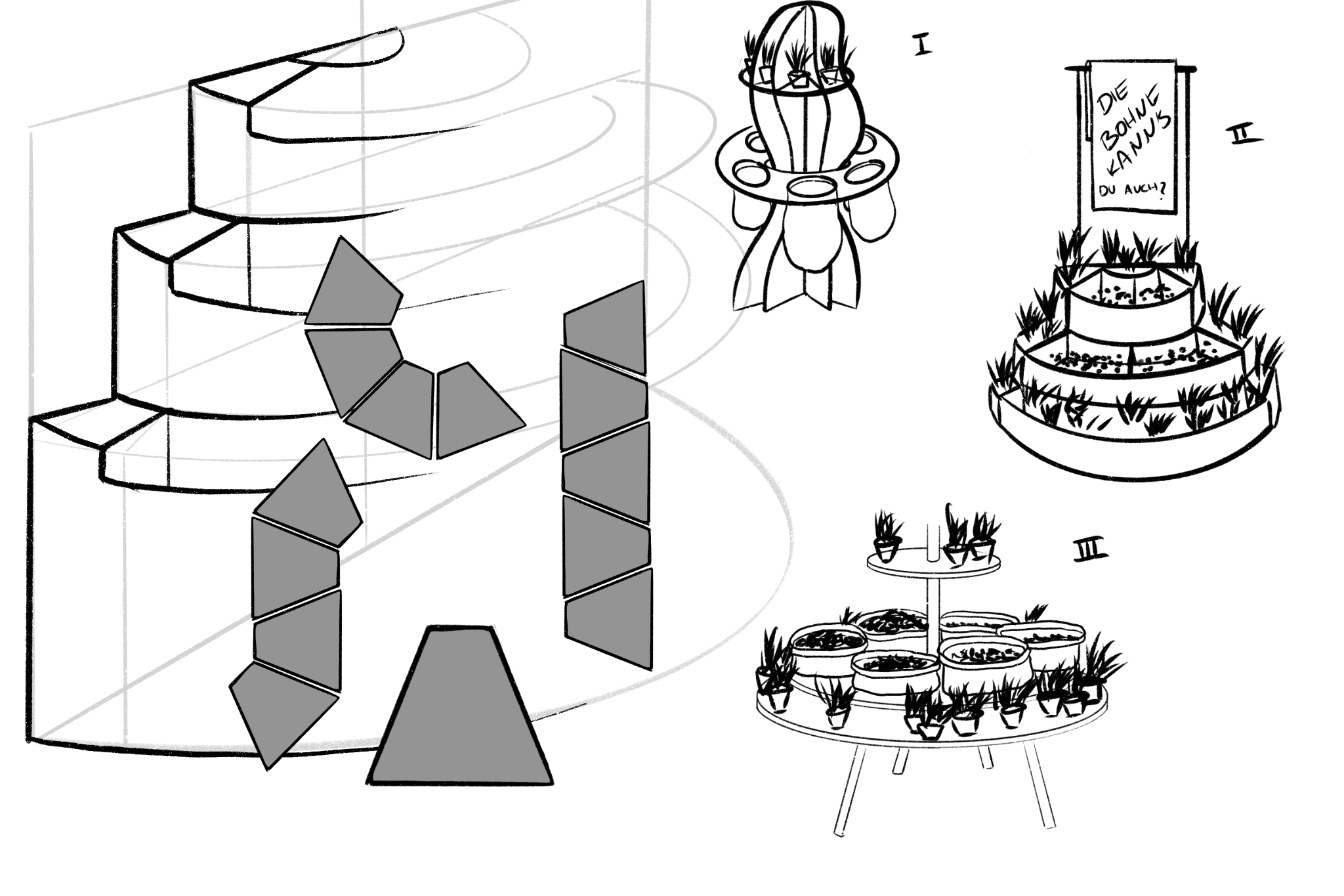
The skin offers us protection and is the visible outer shell of living beings. As well as the hoodie as a second layer becomes a very personal, own part of our body, of our existence. Safe, protected, as if fitted to one’s own body, the garment exists on and connected to the human being. The play between the natural and an outer shell, becomes one.My project deals with the human surface in its biological form, designed by self-produced bioplastics that, like us, will eventually decay. Inspired by nature, water and waves, the garment wraps asymmetrically and organically around the body. It is reminiscent of a mystical transformation of the human being in the hoodie. This installation represents the excursion of bio-based materials, which are our future, with the abstract representation of the human form.
Jakob Deutschmann // „Wandertag“
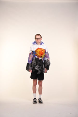
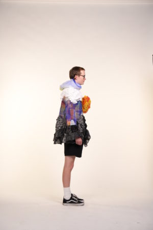
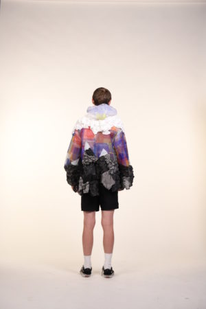
Es ist Wandertag: Es ist sehr heiß und die Sonne strahlt, nein, brennt vom blauen Himmel herunter, der hier und da von weiß-strahlenden, ungefährlichen Wolken durchbrochen wird, darüber können nur die Sterne sein. Man wandert zu einem Gipfel der Alpen, weit hoch, so hoch, dass normalerweise nur Vögel dort sind, doch erst muss ein steiniger Weg hinter einem gelassen werden. Die grauen, harten Berge formieren sich vor einem, vor dem Anstieg weiß man schon: Das wird ein Kampf! Die Hitze ist enorm, es ist anstrengend, doch hat man große Freude, denn der Weg ist das Ziel. Wenn man aber doch das Gipfelkreuz des höchsten Berges weit und breit endlich erreicht hat, hat man es geschafft, man ist frei, kann sich entspannen und die Aussicht genießen. In einem Hoodie fühlt man sich wohl, es ist ein Kleidungsstück zum Entspannen und um abzuschalten. Dasselbe passiert auch beim Wandern und in den Bergen, weswegen ich meinen Hoodie mit dieser Freude des Wanderns, einem Gefühl der Freiheit und der Naturverbundenheit verbinden wollte, eins mit der Natur werden, der Träger wird zur Natur, Mensch und Natur, eine Symbiose.
Jonathan Richter // „Ärmel hoch, Hose runter“
„Ärmel hoch, Hose runter“ geht ehrlich mit der Rolle der Workwear als Dekoration um und entzieht ihr konsequent den Nutzen. Medizinische Schuhe werden zu hoch um drin zu laufen, Schutzhandschuhe werden aufgeschnitten und Helme werden weich. Die Kapuze wird zu dem dekorativen Element, dass sie eigentlich schon immer war. Und einige Elemente erscheinen auch nur, weil sie schön sind – denn nicht alles in Menswear bedarf einer Erklärung.
Model: Luis Schrümpf / Makeup: Alice Daniela Kister / Photographie: Matthias Leidinger
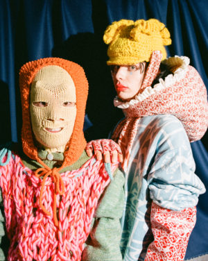
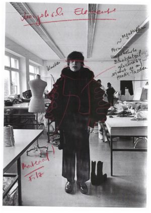
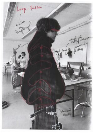
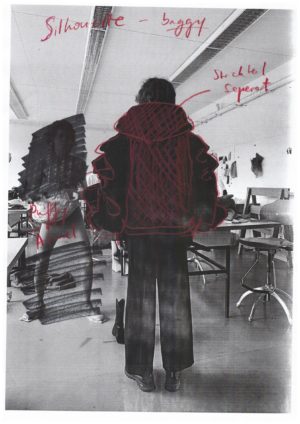
Khulan Klecker // „My Hood UB“
„My HoodUB“ is a new interpretation of the classical streetwear hoodie influenced by traditional mongolianelements. Mongolia is literally my hood, since I spent there my childhood. Young people call the capital Ulaanbaatar “UB”.For the last few years the music industry is flourishing, especially the rap scene. These artist are strongly influenced by the western culture but never forget their own culture, the nomadic way of life. You probably see a rapper on a camel in the steppes only in Mongolia today.My goal was to show exactly this contrast and its fusion of the nomadic and the hoodie as a streetwear. To achieve this, I used felt, which is still used to this day by nomads as a main material for their home, yurt. In form and cutting, I was inspired by the traditional clothing , called deel. I also used the traditional knotting techniques for buttons.
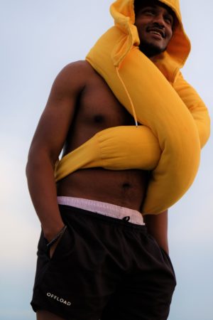
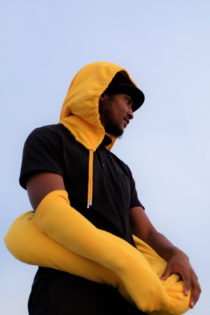
Kiarash Amourizi Varnamkhasti // „Unter der Sonne“ / „Under the sun“
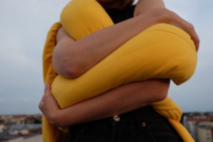
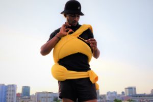
Hugging, sunlight and the color yellow have one thing in common: the release of serotonin in the body, helping to balance the flow of emotions and mood in a being. In fact, one of the hardest things to unlearn is the feeling of physical touch. The most human, friendly and simple act between two people, became almost impossible due to the pandemic. How to express this intimate exchange of feelings between two people?By the feeling of safety and peace that you get from wearing a hoodie, you come closer to the feeling of hugging.Everyone deserves a hug. My design is an accessory for everyone who is in the shadow of the pandemic. For everyone who feels left behind. For all who simply miss the feeling of touch….
Photo by Karla Vandon / Models: Alia shashaidullina, Le Dok, karim baazaoui
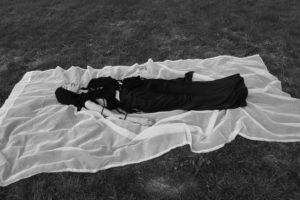
Leif Kessler // „Inside out“
Models: Jakob Deutschmann, Luca Ortmann, Sofia Sieron, Arthur Vuillamoz, Azande
Leo de Payrebrune // „subversive sex“
„Certain body parts become imaginative centers of pleasure precisely because of how they correspond to the normative ideal of such a body specific to gender identity.“[1]
– Judith Butler
The simplest form of concealment can be done by deforming the body with the help of clothes. Among these is the contour-dissolving hoodie. In contrast, the corset puts the focus on sexualized limbs, additi-vely is straining the body and leaves drawings in the name of restrictive gender roles. The work deals with the process of differentiation and becoming aware of one‘s own gender identity and the accompany-ing dysphoric relationship to the body. The original points of view of the corset are intentionally shifted to other points.
[1[ Judith Butler, Gender Trouble: Feminism and the Subversion of Identity, 1990, p. 111
Photographer: Matthias Leidinger / Model: Alice Daniela Kister
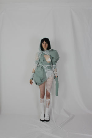
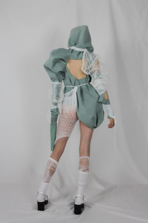
Mai Hoang // „avoid the social gaze“
Shame is a powerful emotion, whose very existence involves the perceived and internalised Gaze of society. It’s essentially being used as a weapon to manipulate individuals to behave in a certain way, hiding their true identity. The internalisation comes to a point that one lives with a constant tension between the self’s action and the self’s standards.Either secluding oneself from society or hiding one’s true identity and personality are the only ways out if you feel not fit to live in your own community. avoid the social gaze addresses our daily struggles with the feeling of shame since our very actions are steered by the need to avoid feeling shame.The whole body is covered by at least one garment with only bits and pieces of bare skin peeking out. The hoodie is masking the most identifiable part of the body – the face. The lies you tell the people around you to fit their expectations of you just start to pile up and wear you down. Living this way is uncomfortable, suffocating and unsatisfying. Stuck in the facade you once built yourself even when you finally decide to shed that shell.
Photography by Matthias Leidinger / Model: Tim Escher
Maren Eisemann // „Rendezvous“
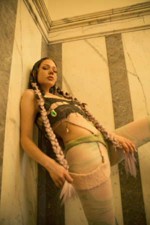
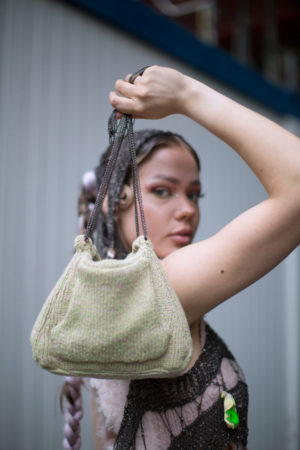
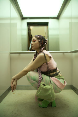
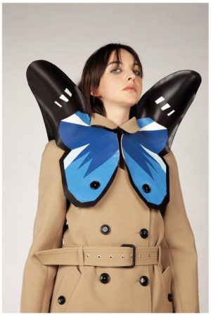
Reminiscent of the page 6 it girls, this deconstructed three-piece knit hoodiebrings back memories of Paris Hilton, Gwen Stefani and the like.With the tiny kangaroo-pocket handbag, a mix of textures and color and abutterfly inspired cut. But it’s made for the it-girls of today. Tik-Tok is their realm and they grew up with strong fashionistas as their childhood idols.It is inspired by the historical fact that women first wore hoodies in the 17th century to be able to go to their rendezvous unrecognized. Such a girl might consider a classical hoodie unflattering, unfashionable andinterfering or hindering a good posture.The hand knitted chain hood helps to keep their privacy safe but is still able todisplay their love for art, fashion, jewelry and self-made pieces.
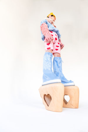
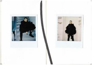
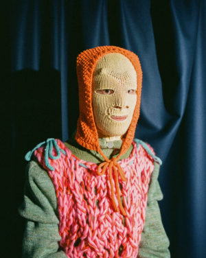
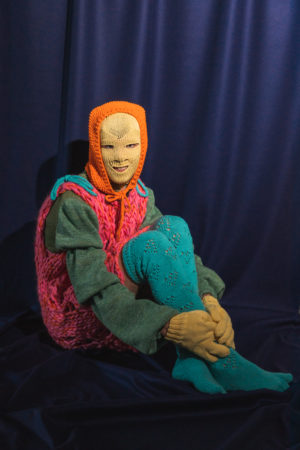
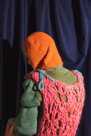
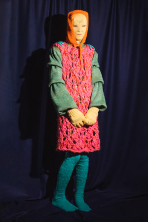
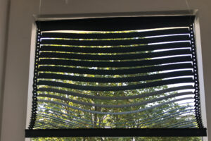
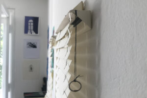
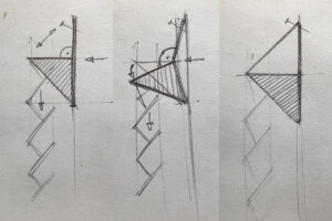
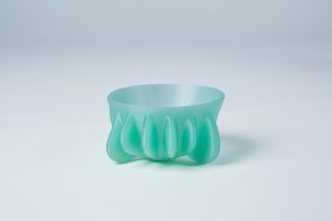
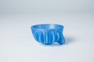
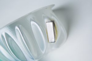
Tim Escher // „Distorted Perception Of The Body“
Throughout history, an ideal body has developed that people have not been able to distance themselves from for a long time. People who do not fit into this perfect image are prisoners in their body, which is not perceived as perfect by society. The hoodie serves as protection and a place of retreat from contemptuous looks and comments. Dealing with this subject has led me to develop a distorted perception of the body. Between stigmatized classical beauty, a sculptural figure develops that distorts/deconstructs the body as it is known and is meant to bring it into new dimensions. A play between space and body emerges that both relate to the body and distances itself from it. By modifying the silhouette, a positive reference is drawn to inequalities that are inherent in everybody.By creating a manifestation, the viewer is encouraged to distance himself from the „normal“ ideal image. The wearer must turn away from familiar body shapes in his appearance, which creates a stadium between sculpture and human being. They should feel comfortable and fade out the reduction to society’s ideal image.


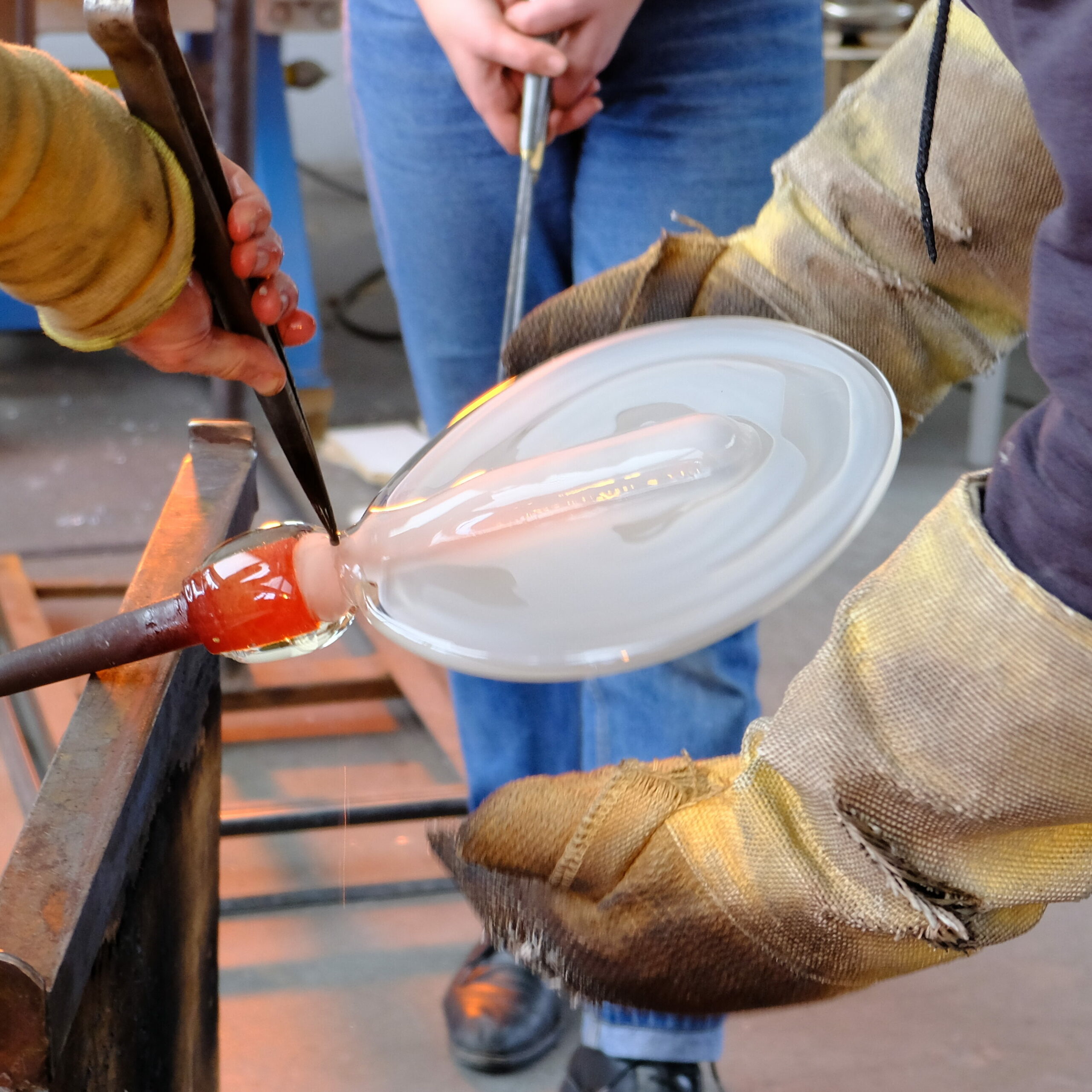
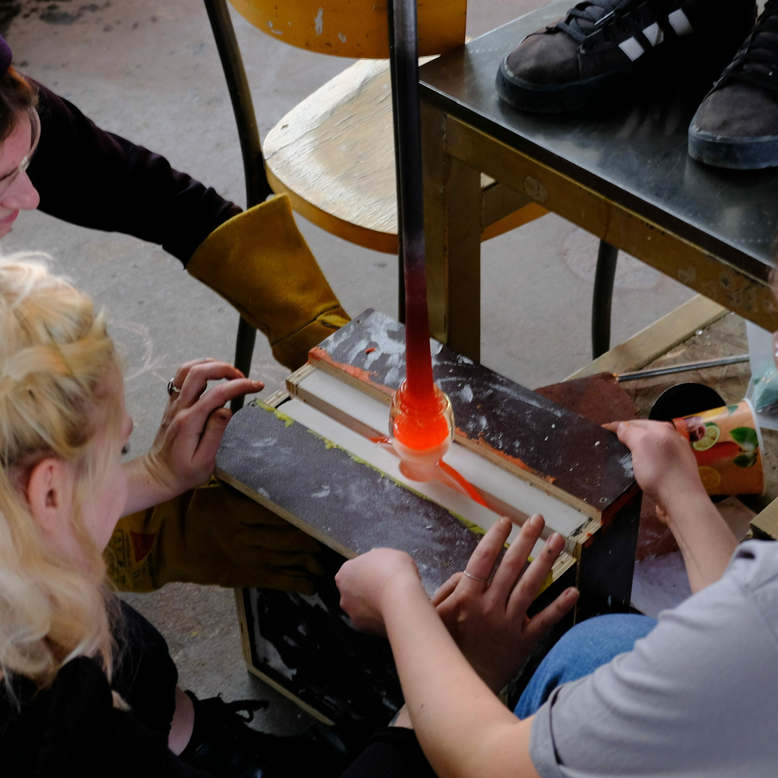
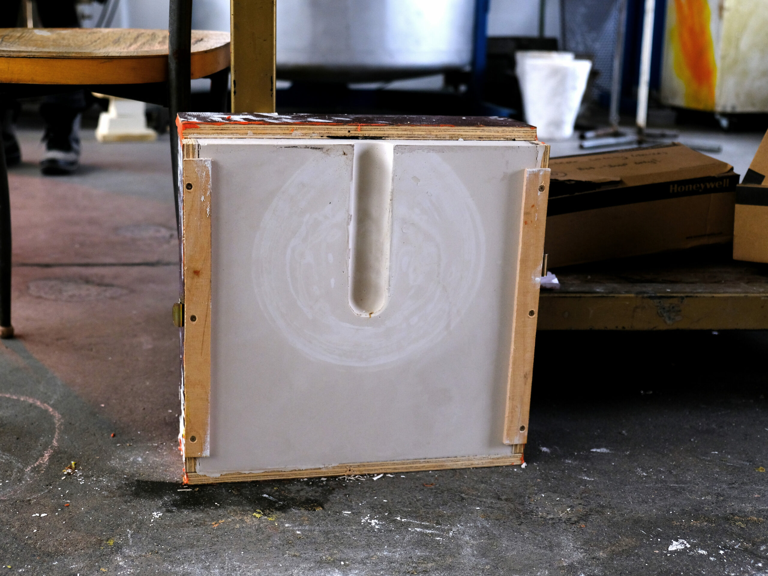


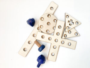
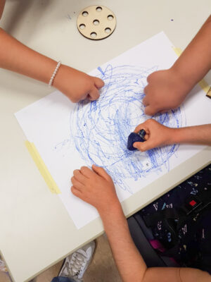
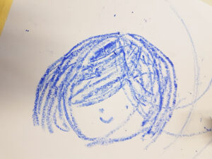


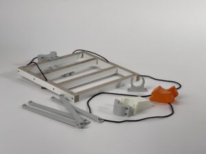


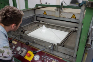
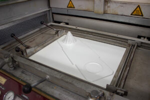

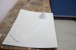


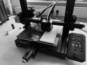
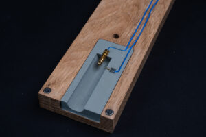


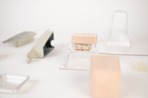
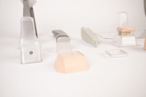
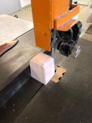

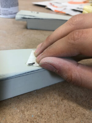


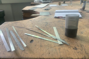


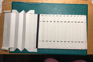


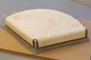


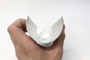


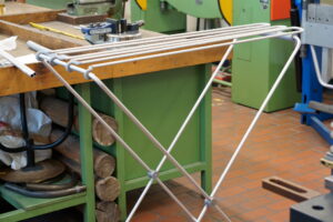
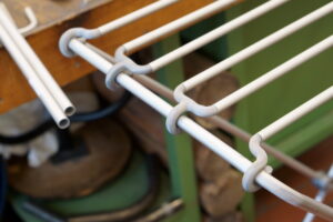
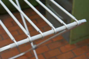
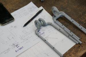
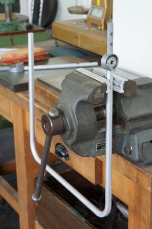
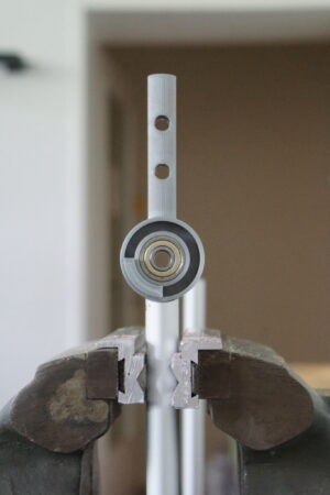

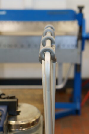


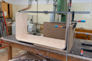
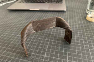
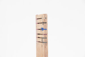


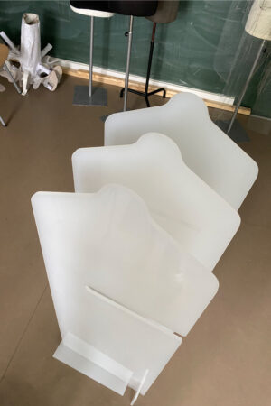


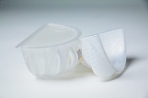
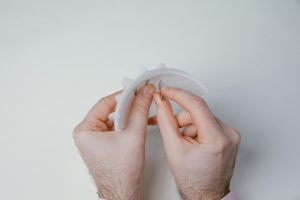
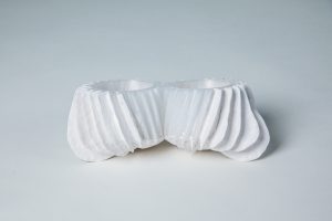

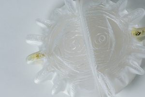
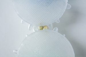


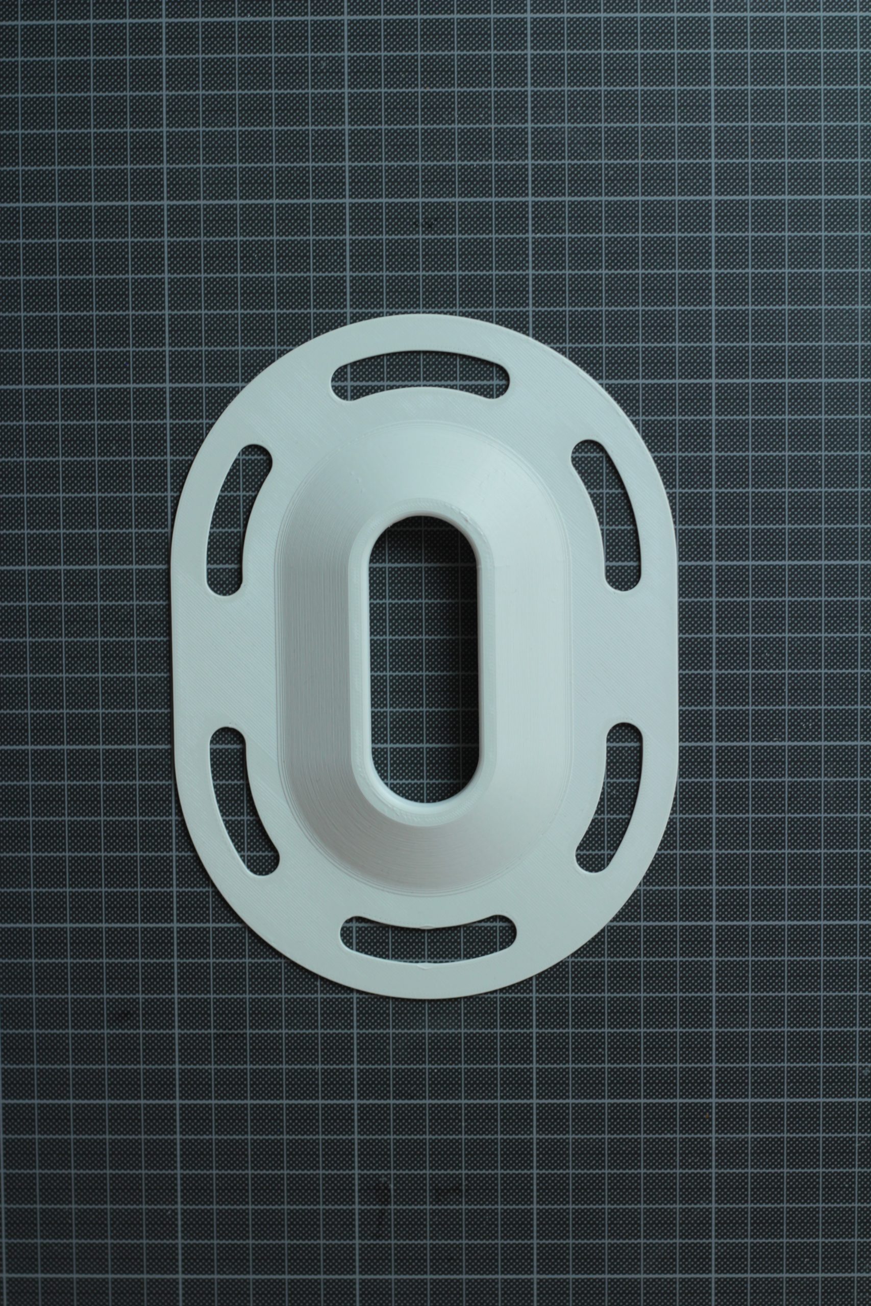
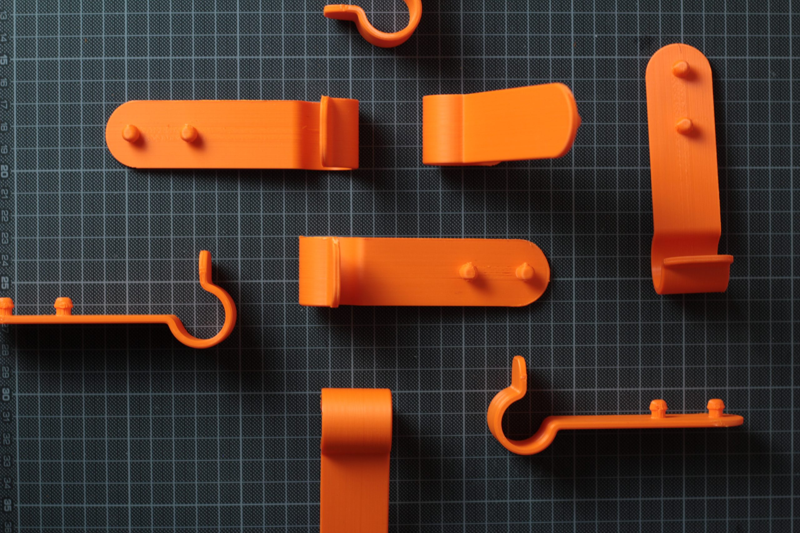
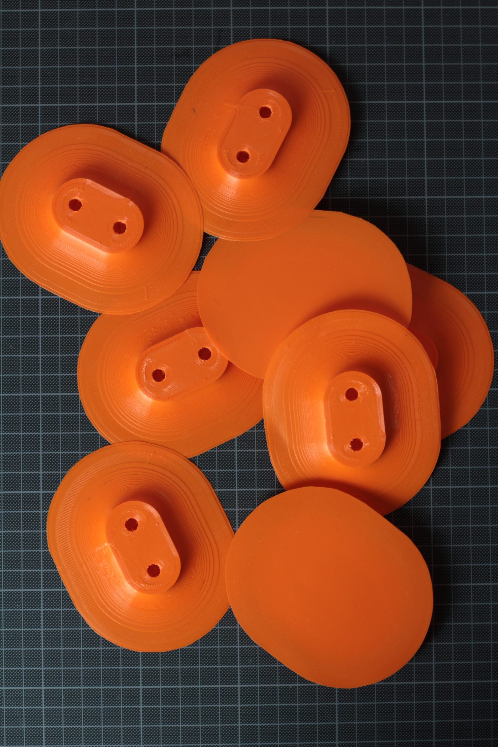
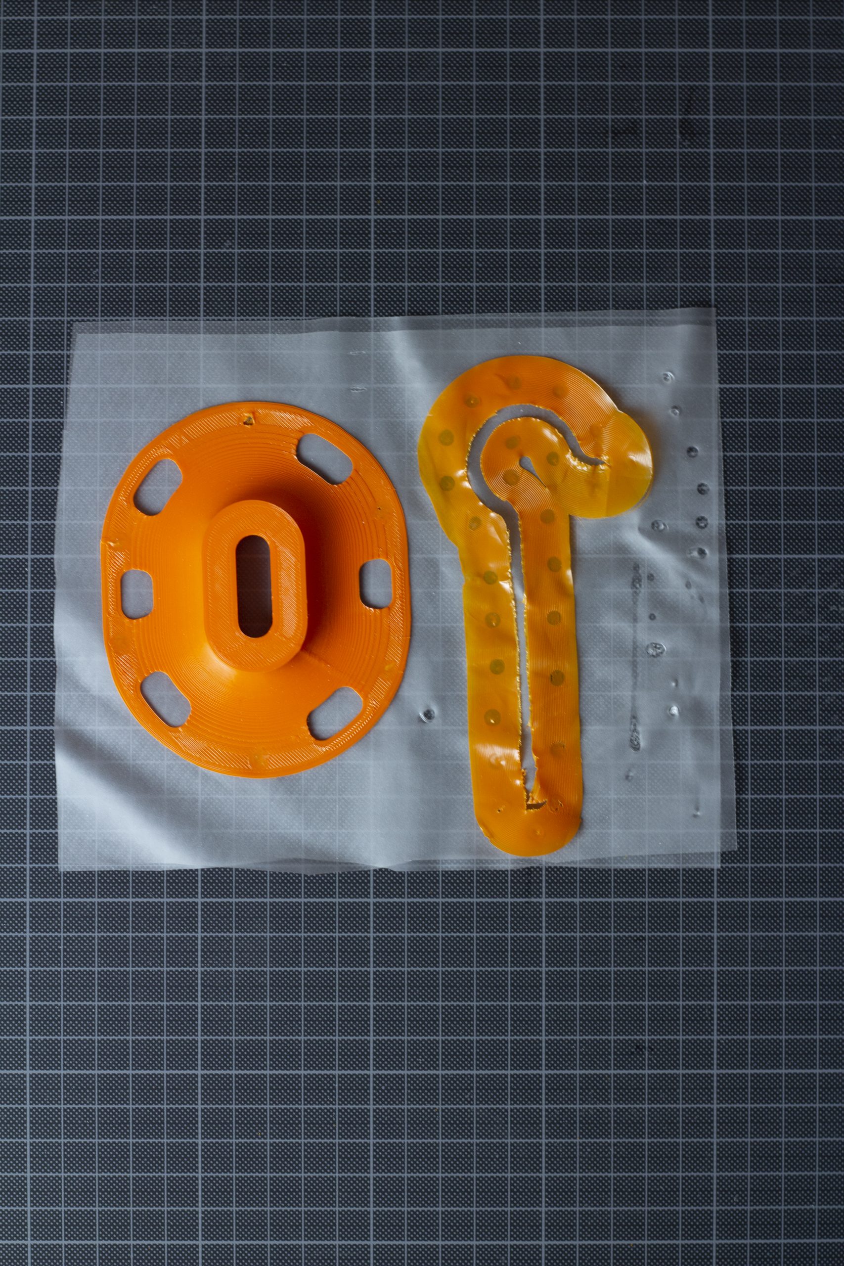

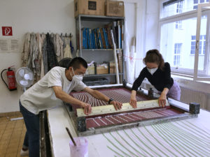
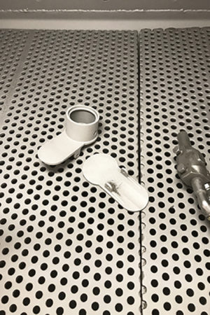
 process:
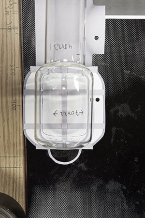
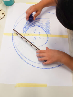
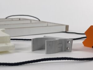
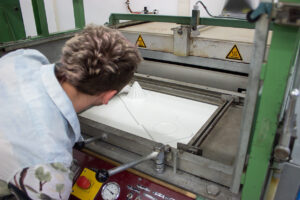
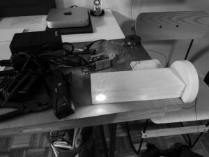
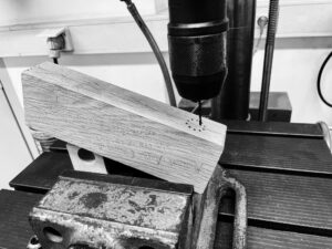
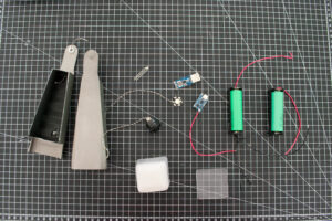
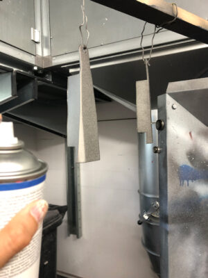
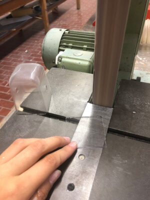
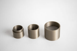
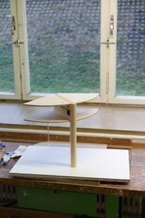
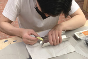
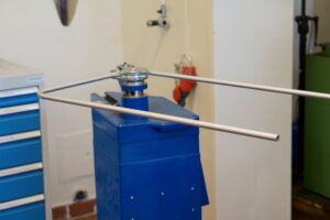
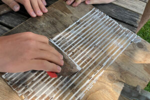
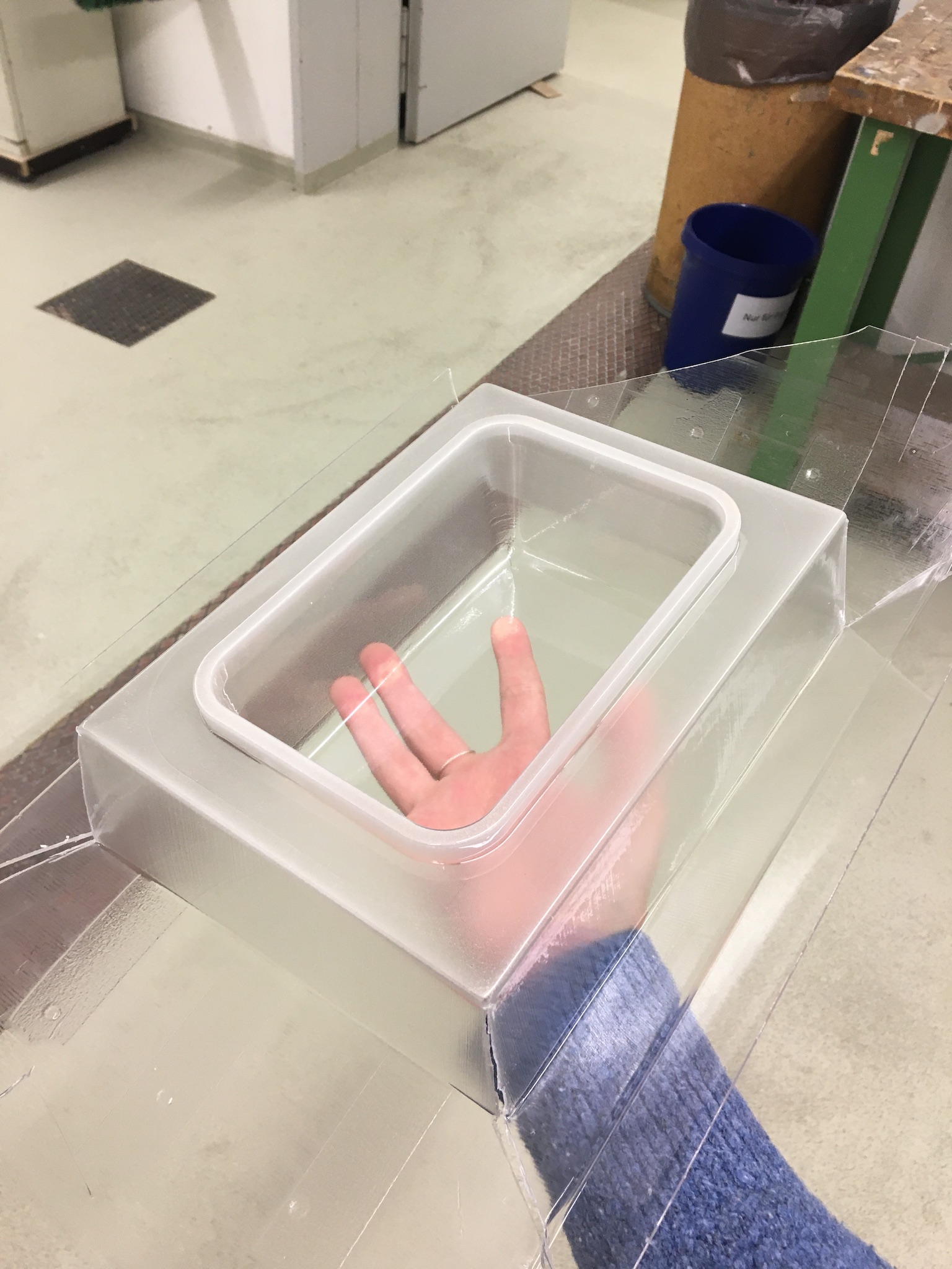
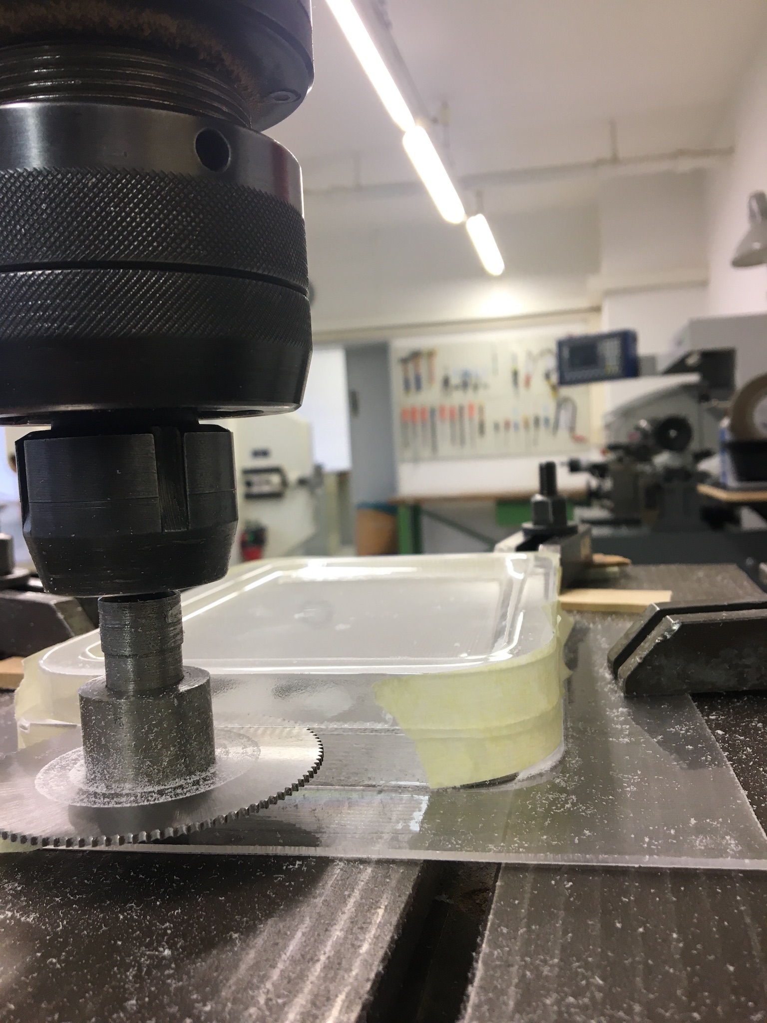
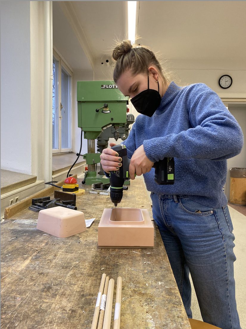
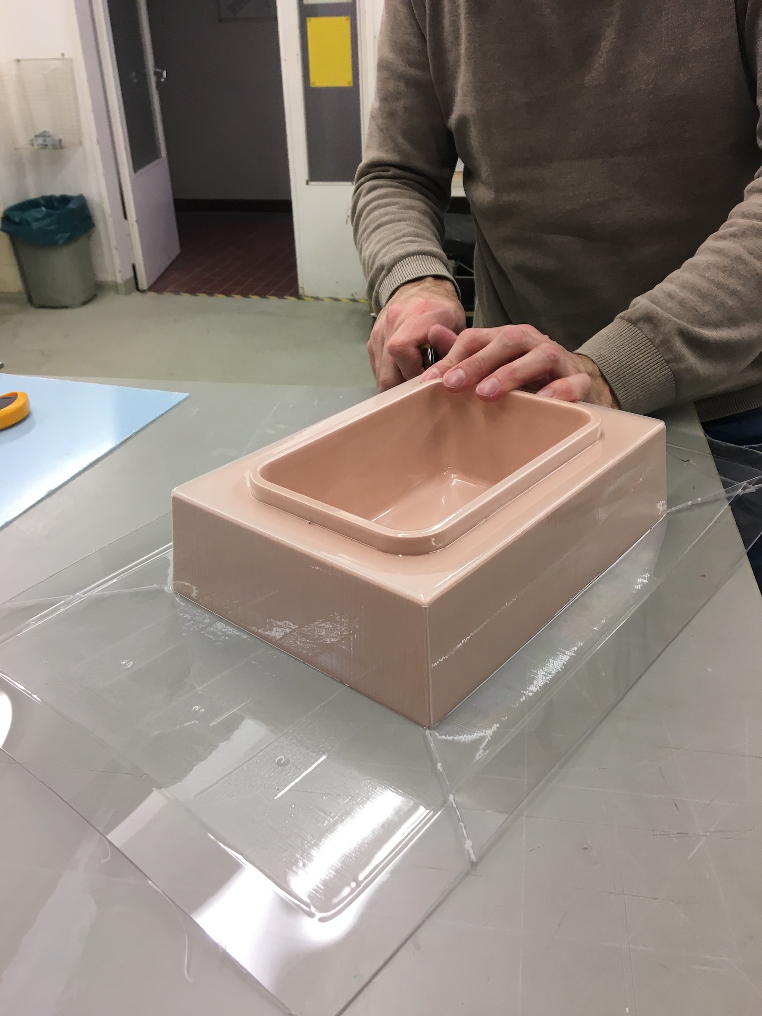
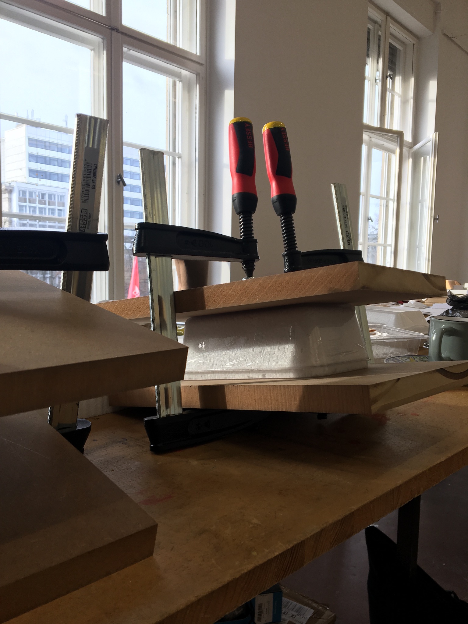
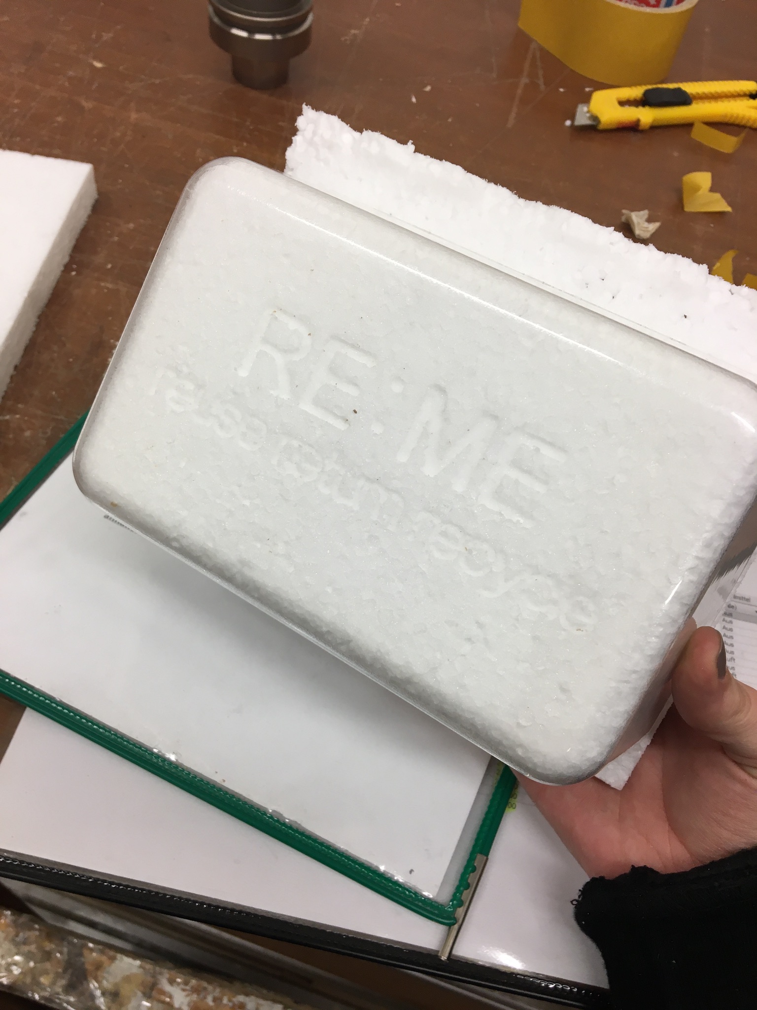
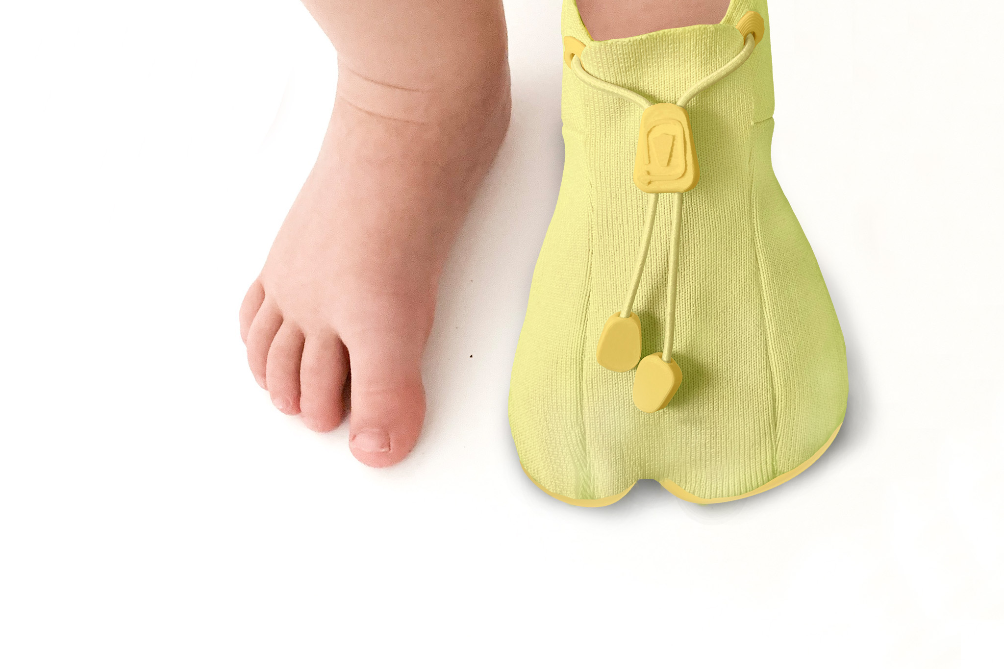
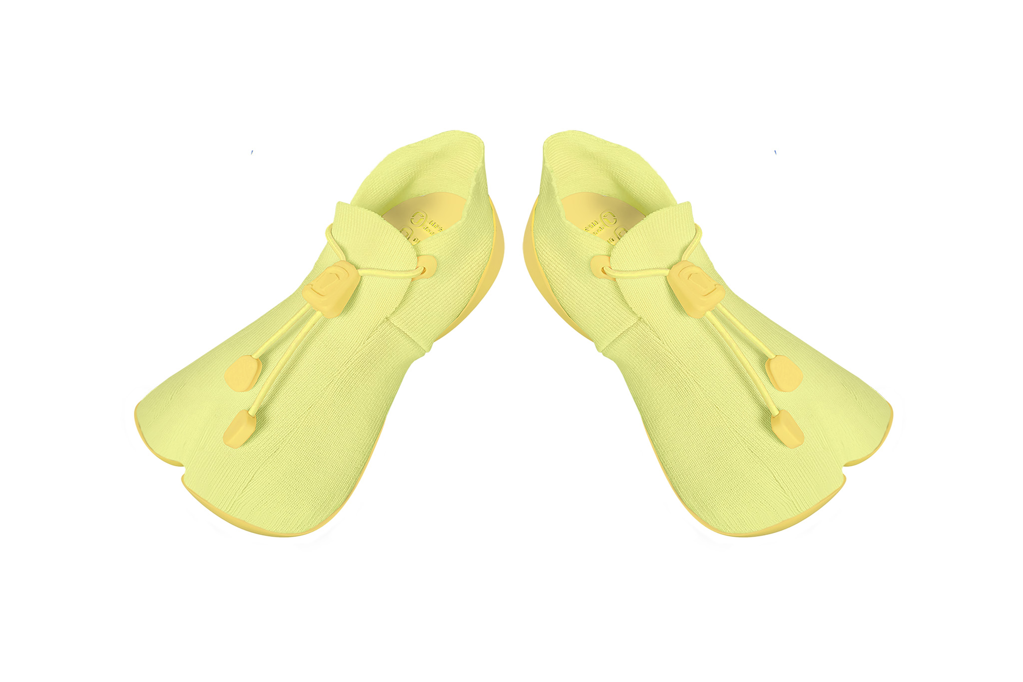
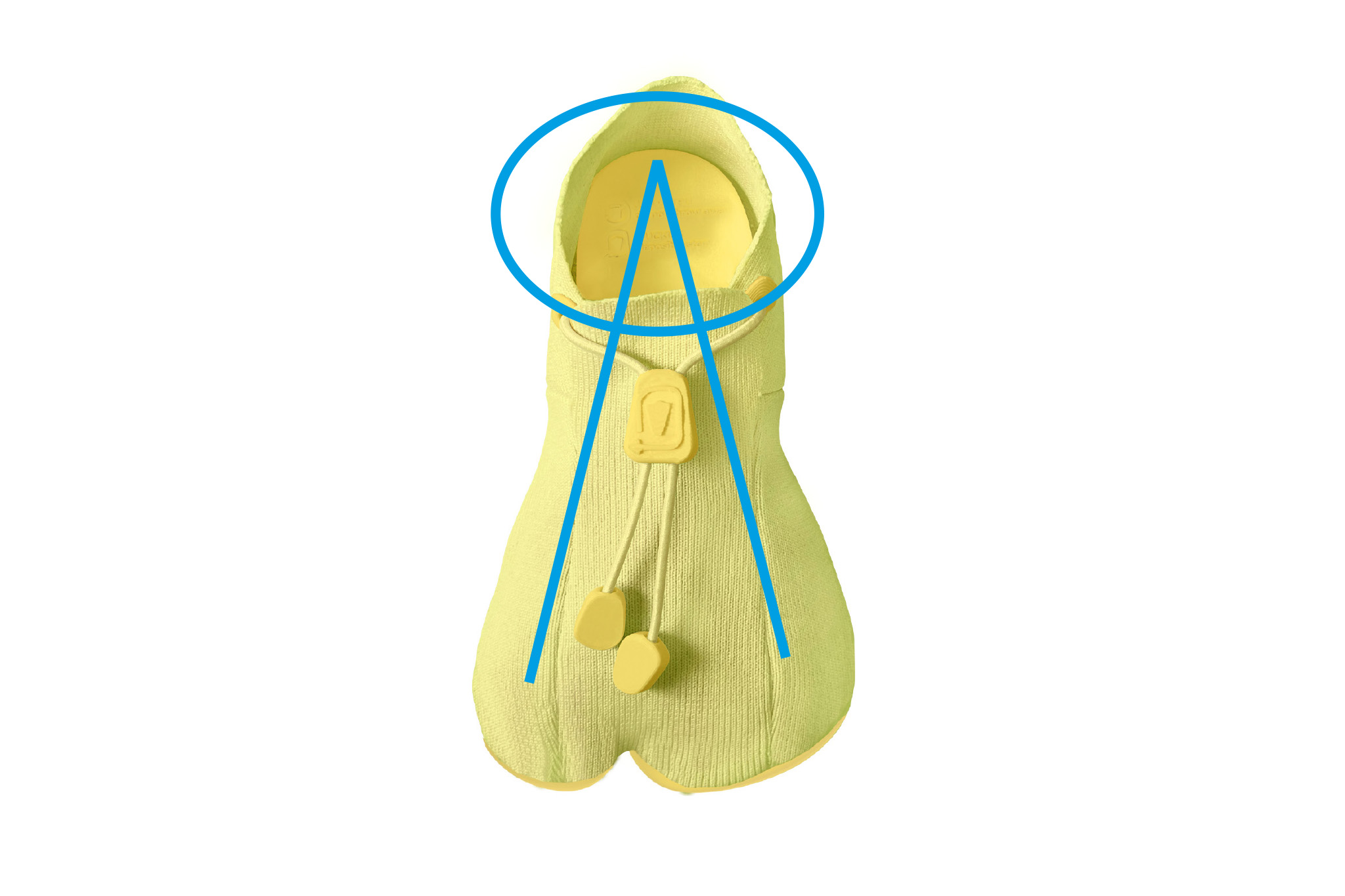
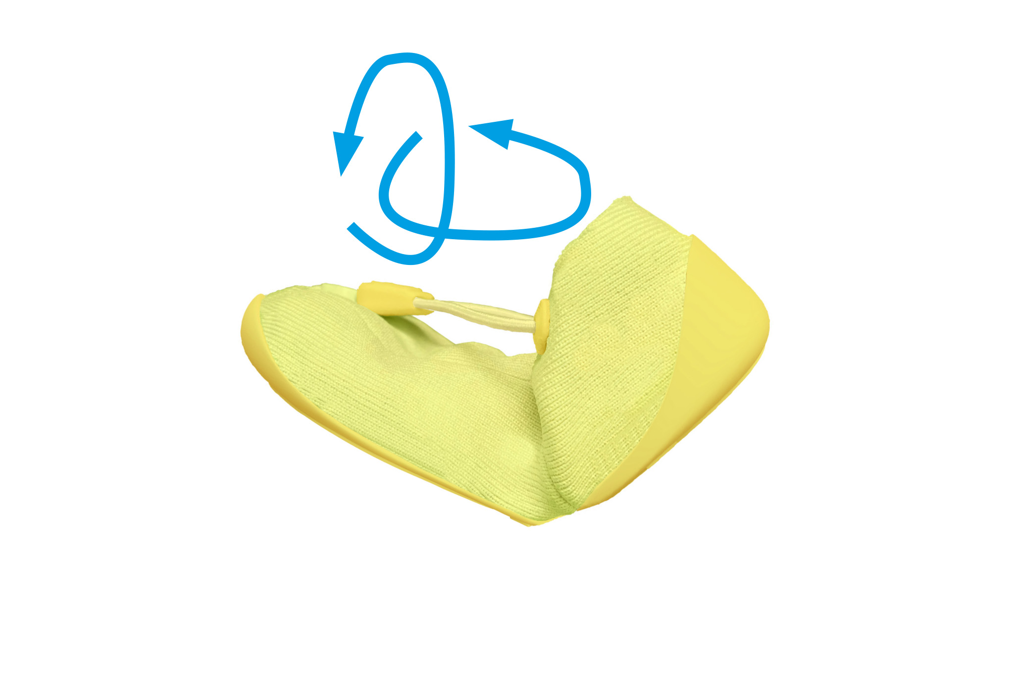
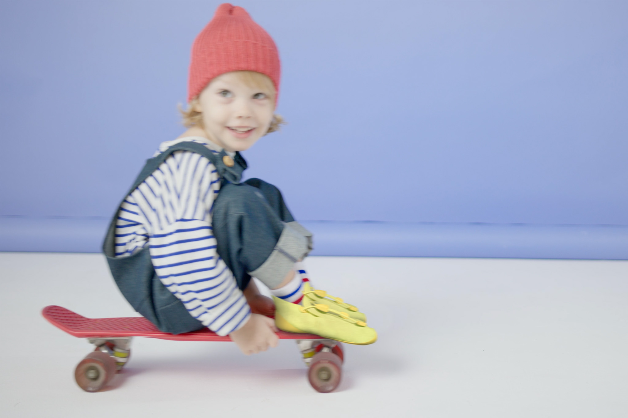
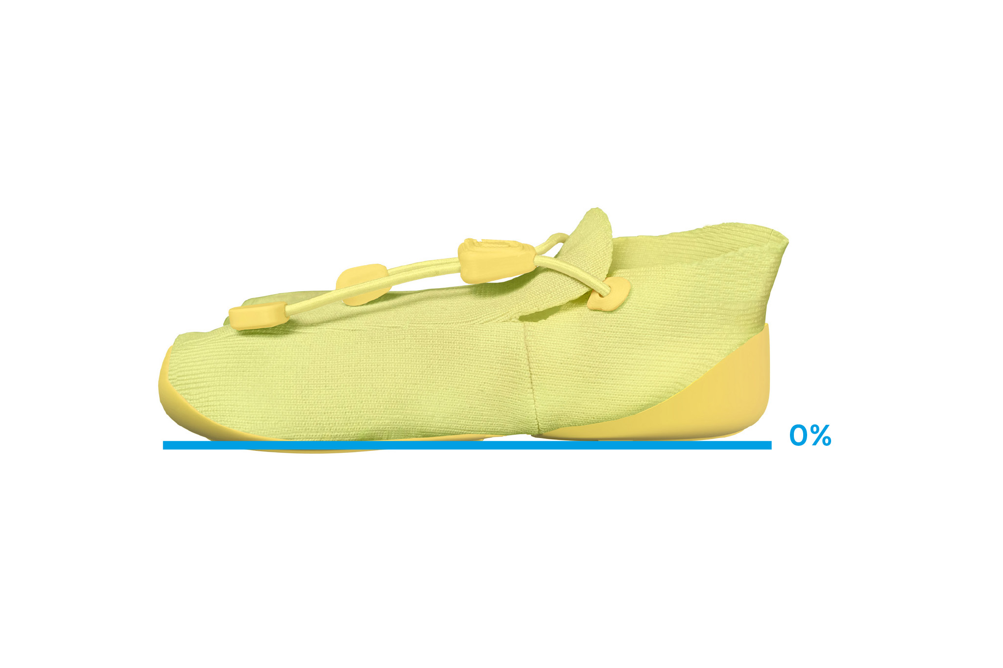
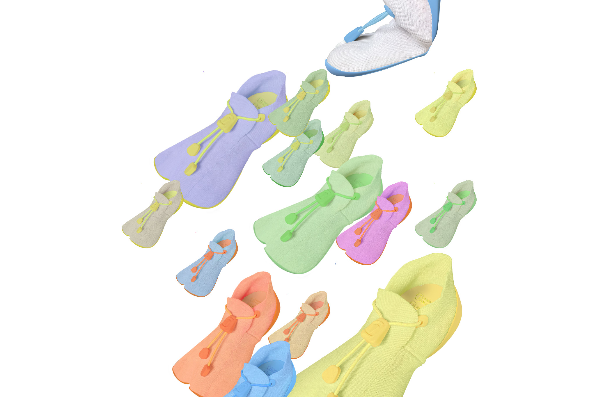
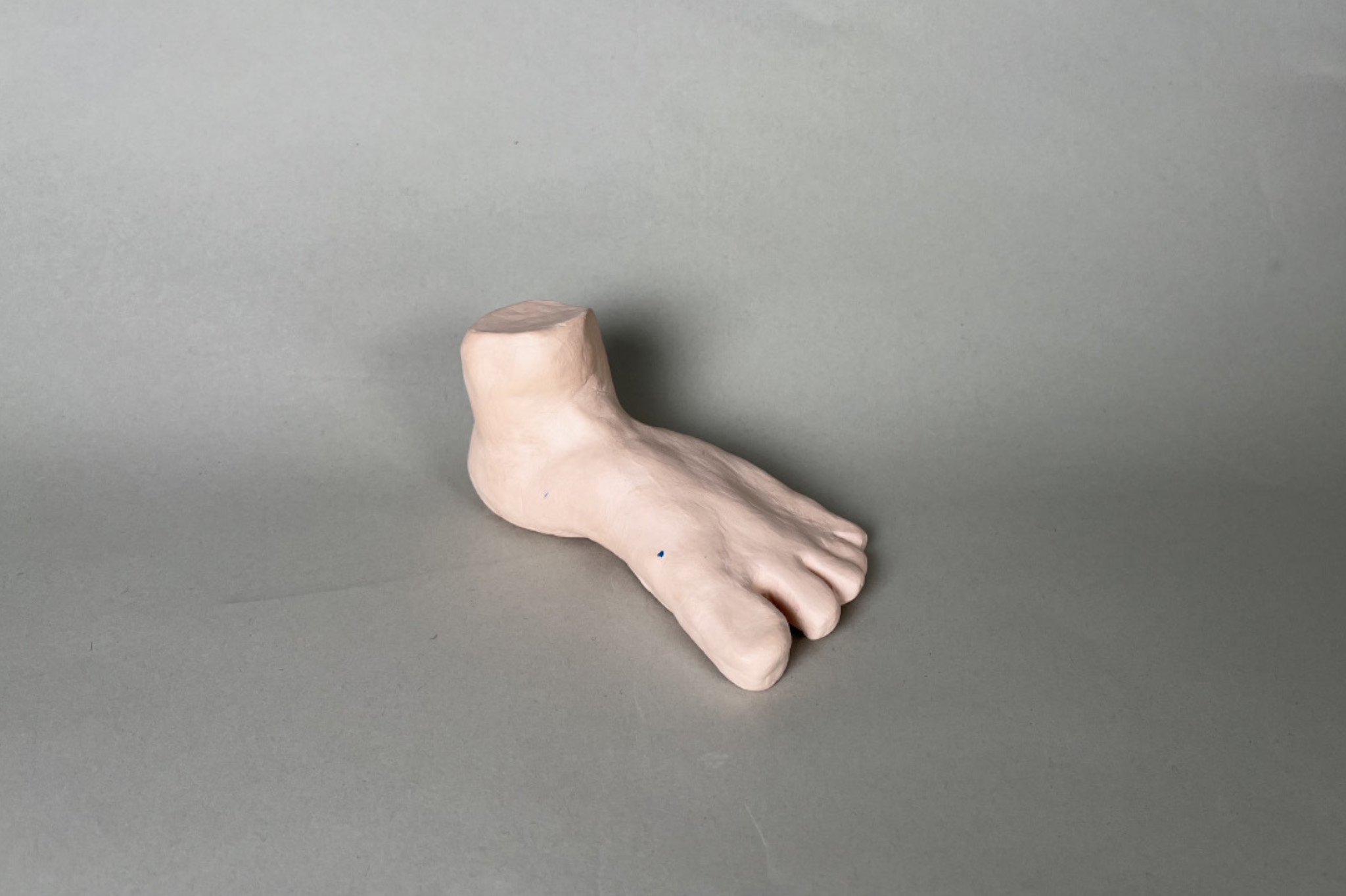
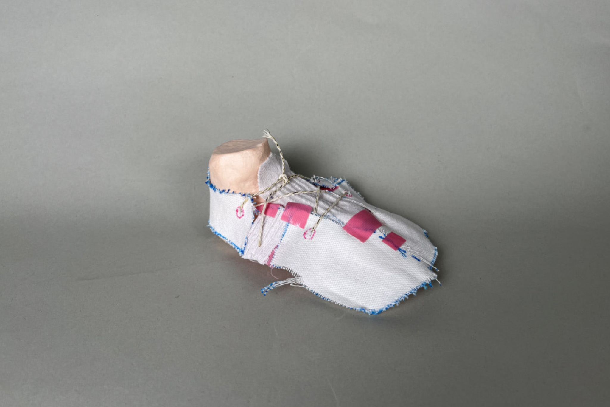
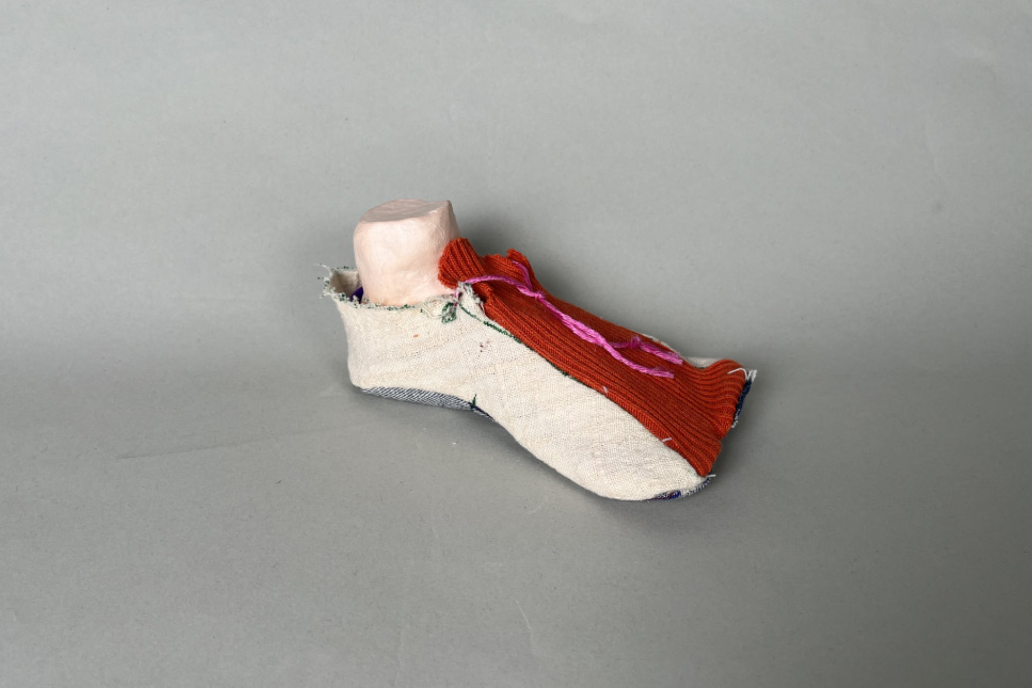
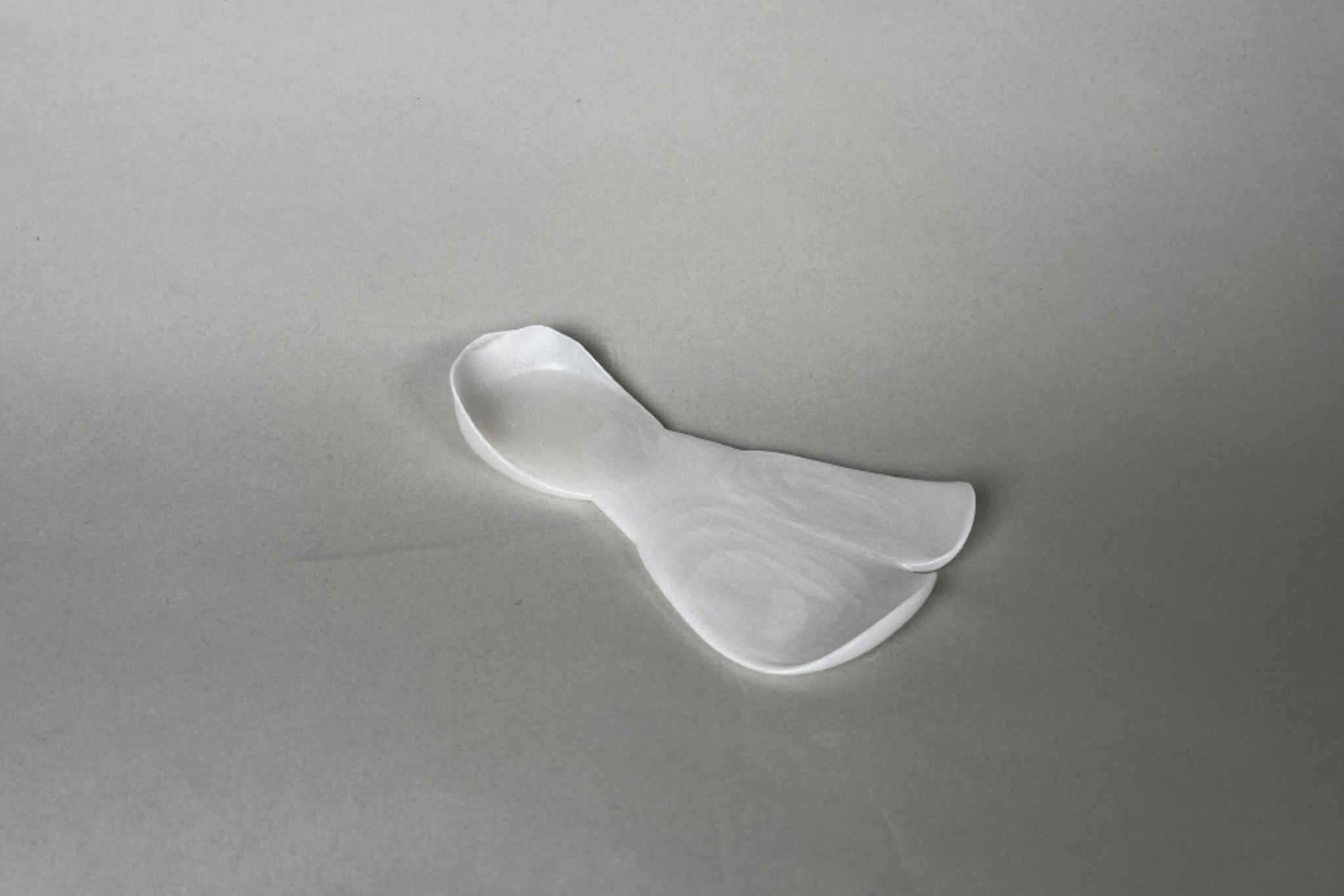
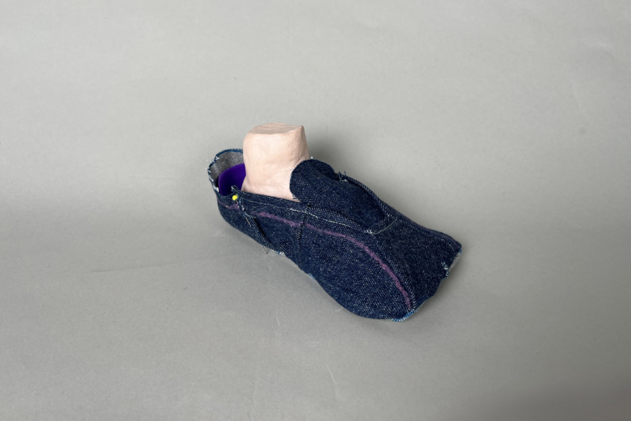
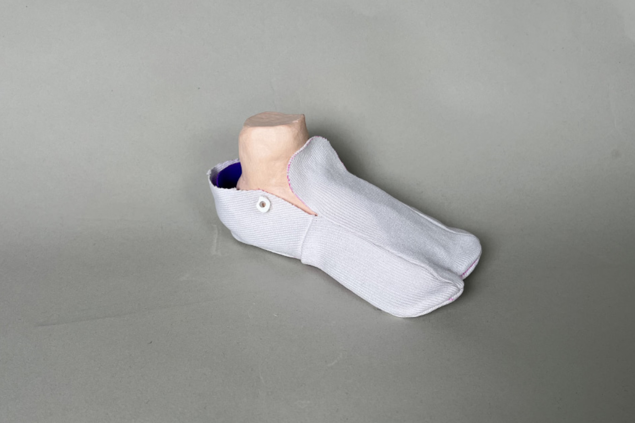
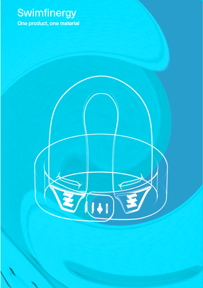

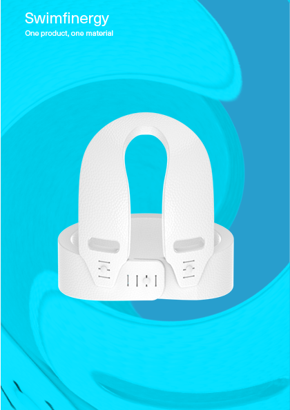
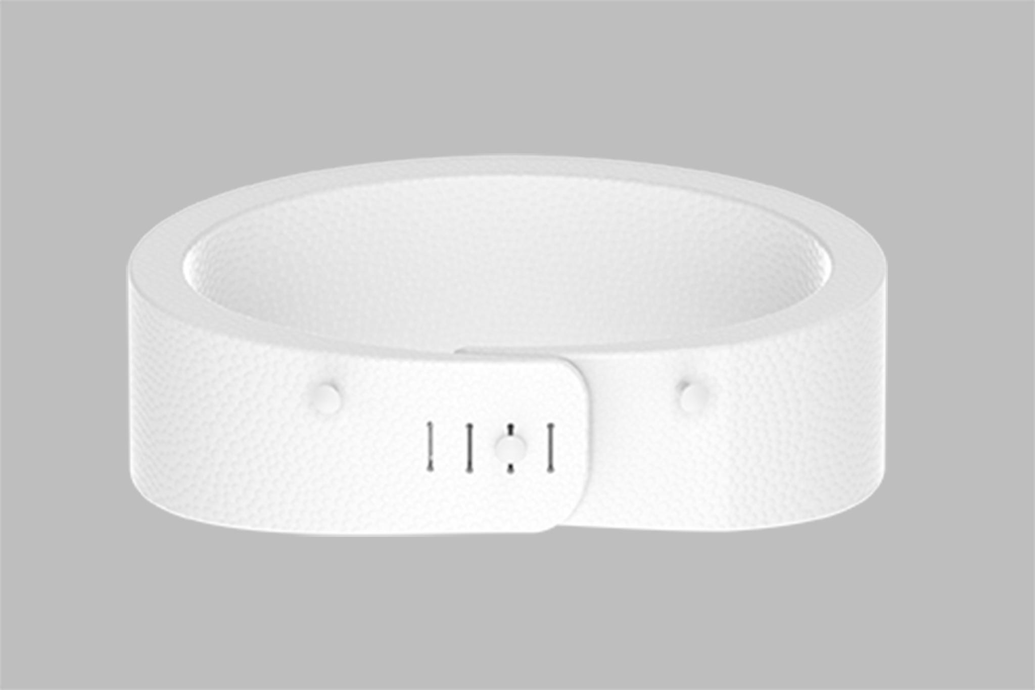
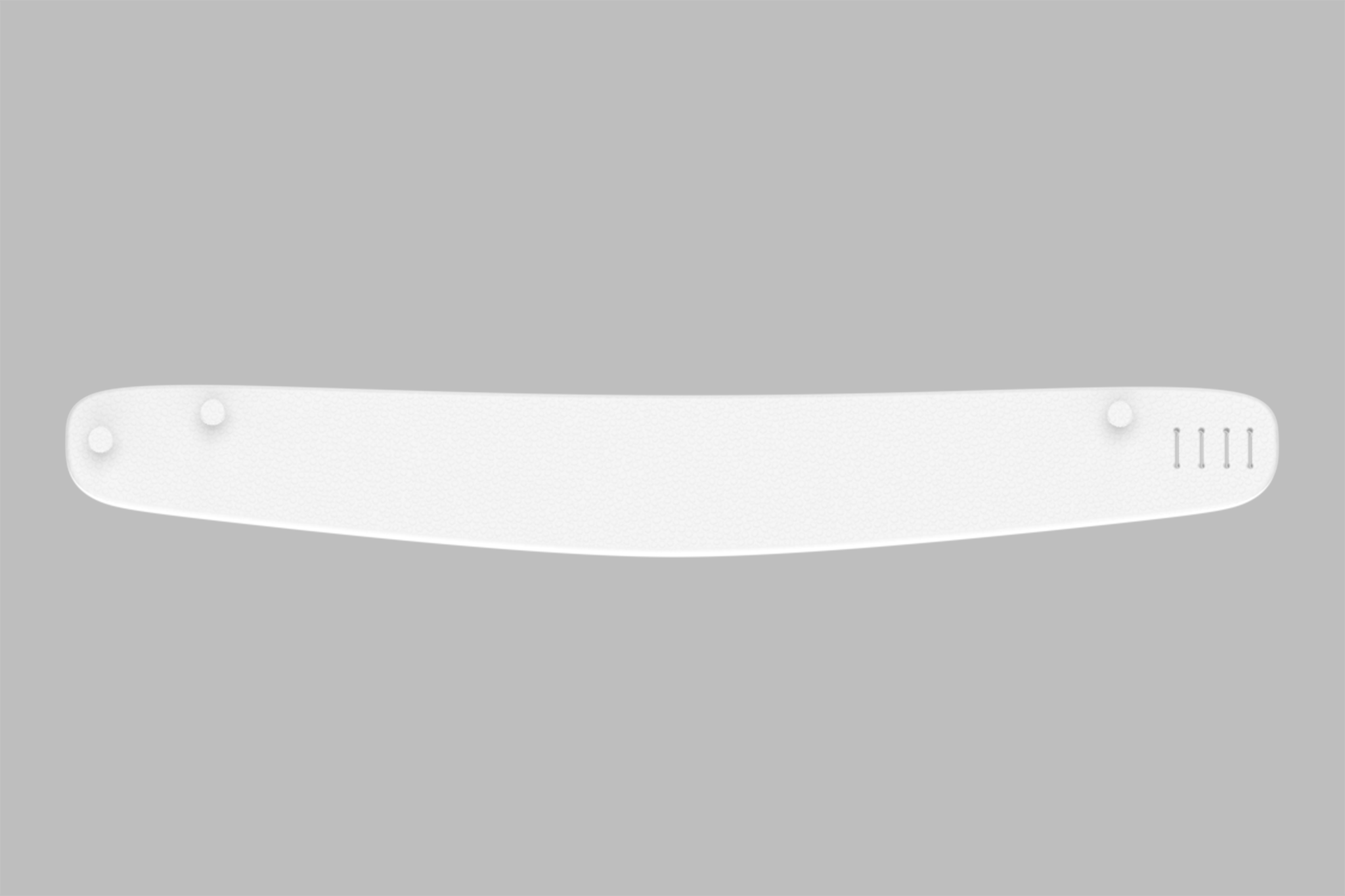
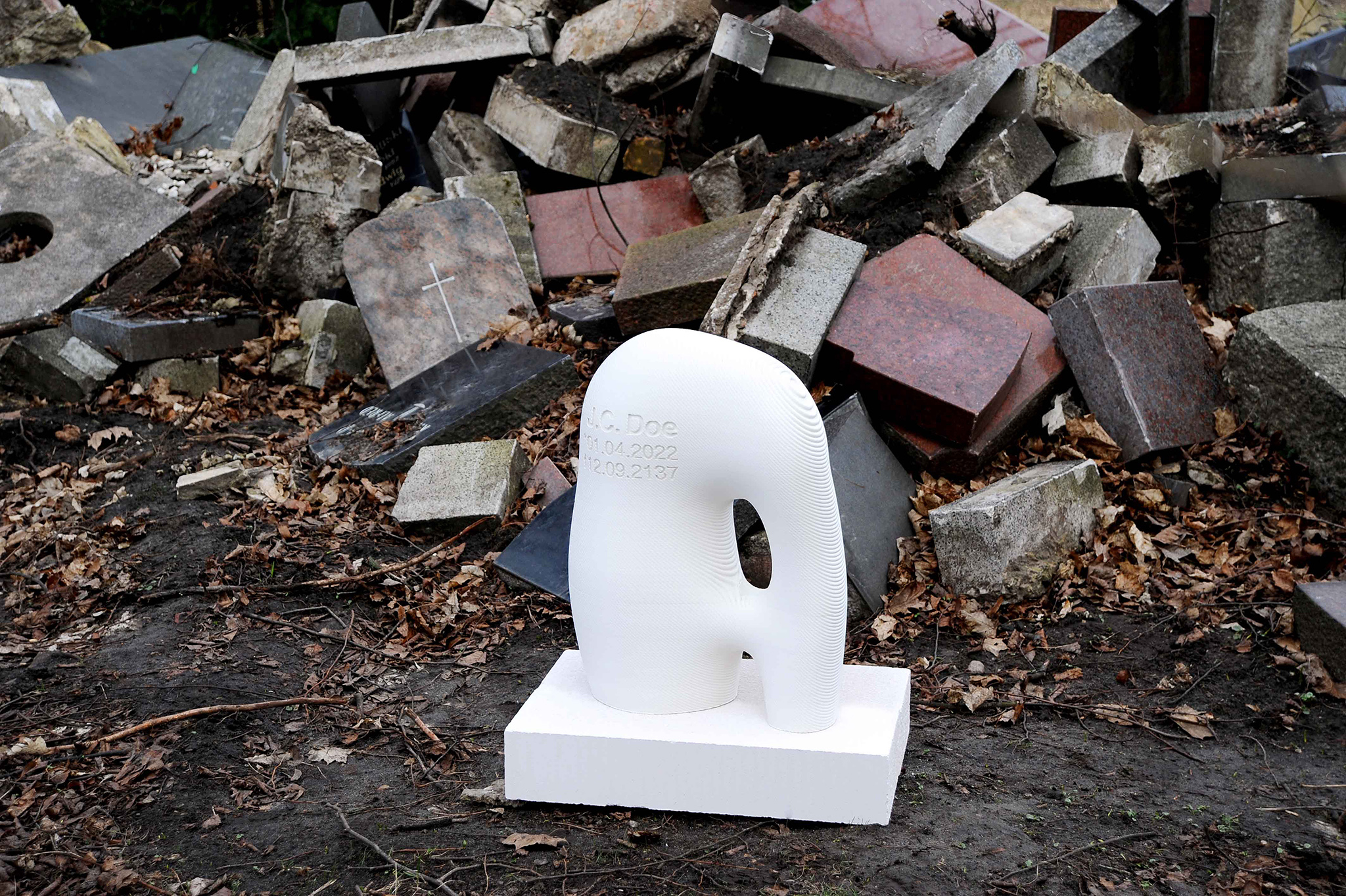
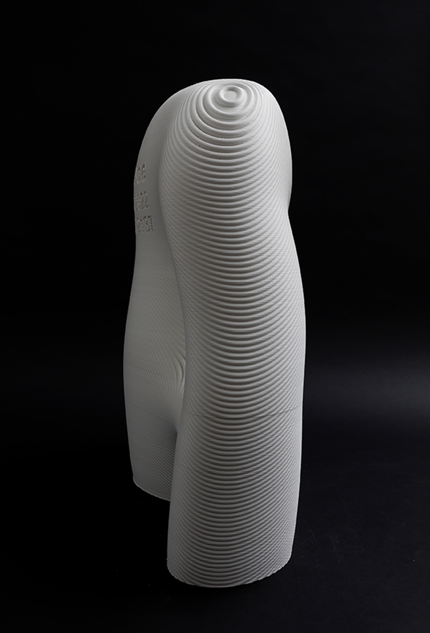
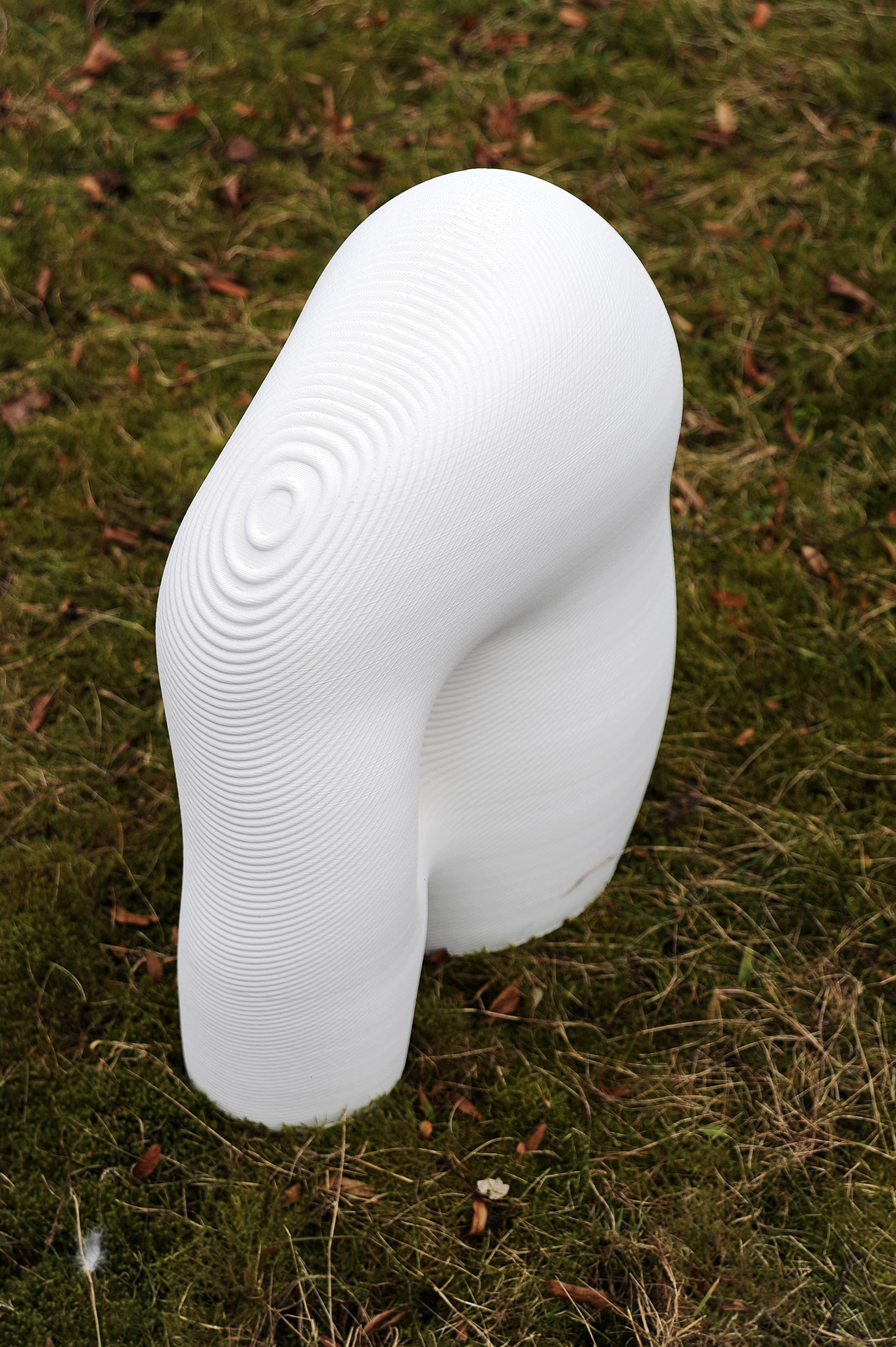
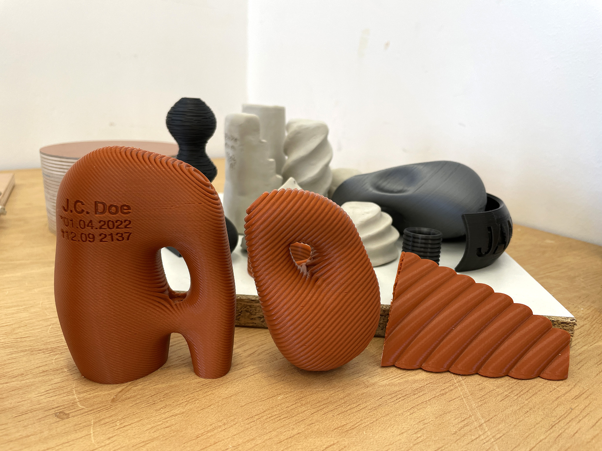
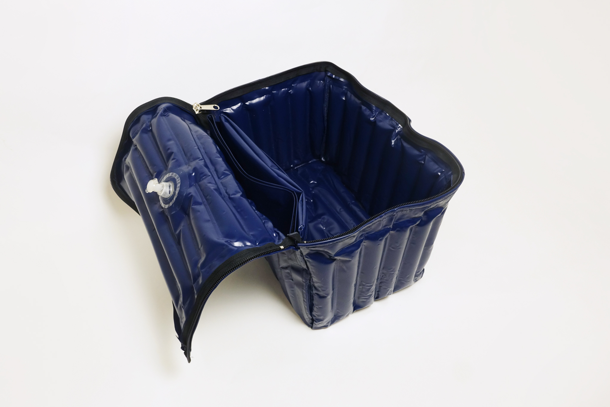
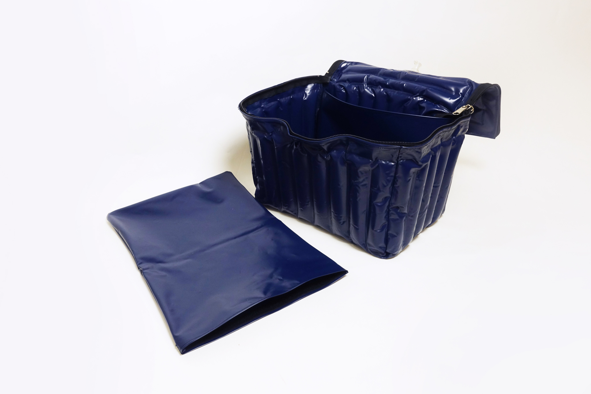
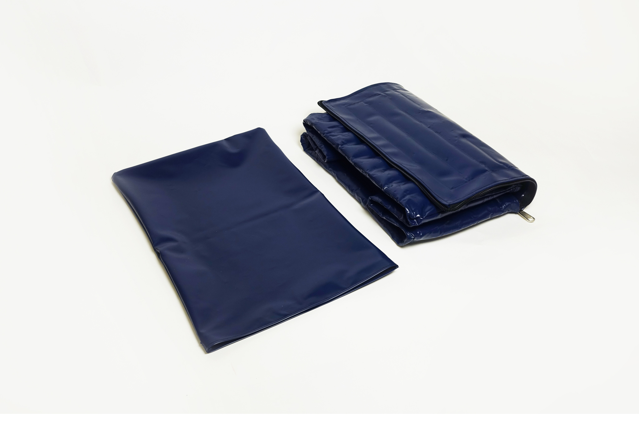
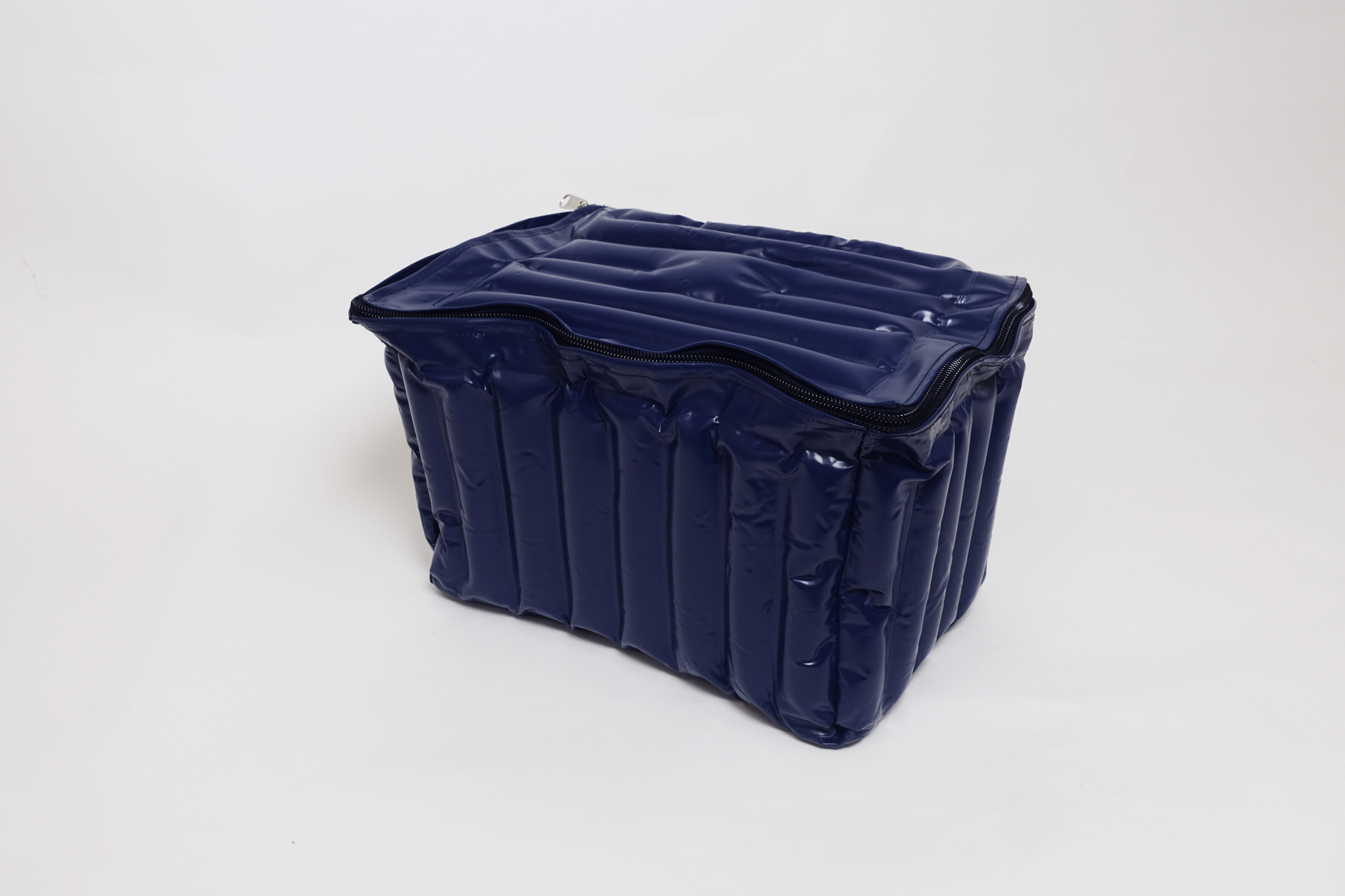
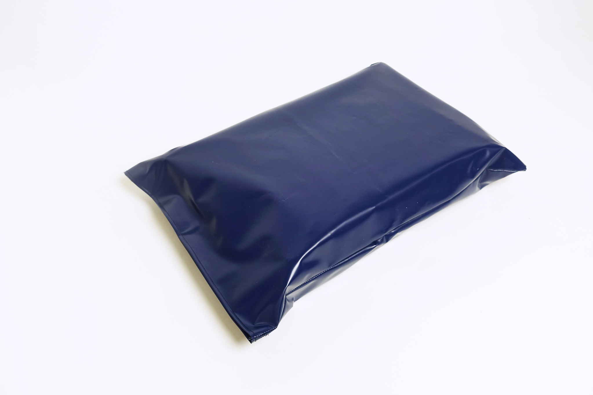
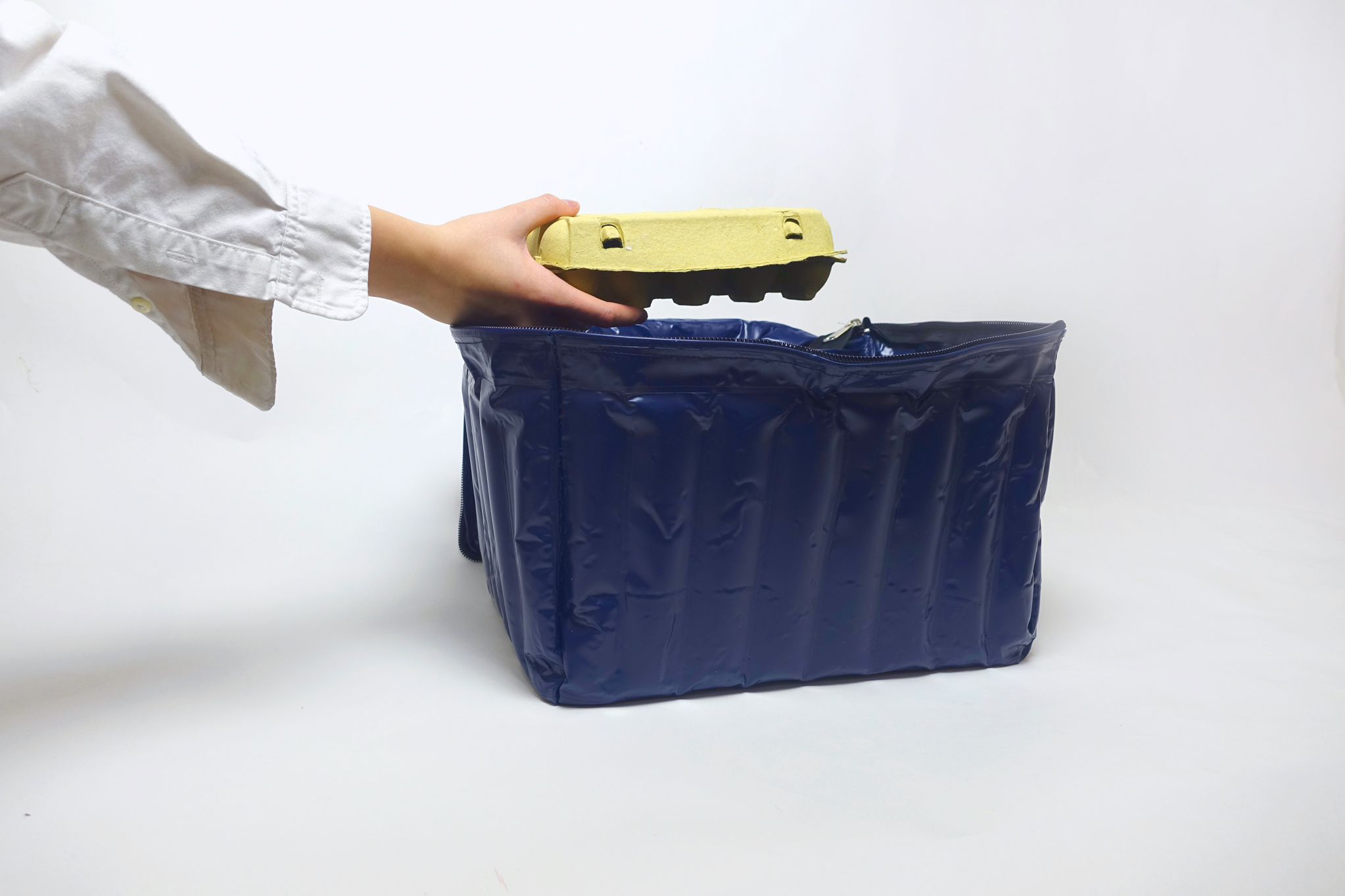
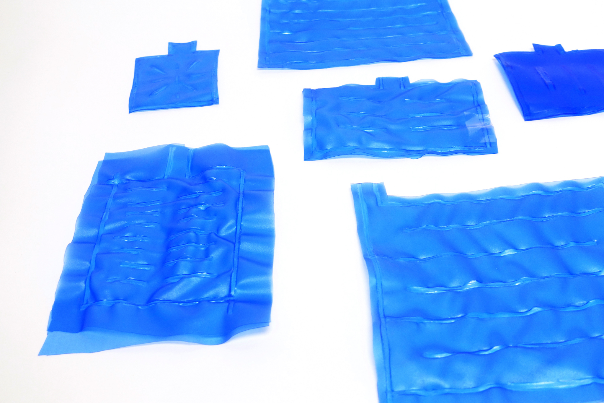
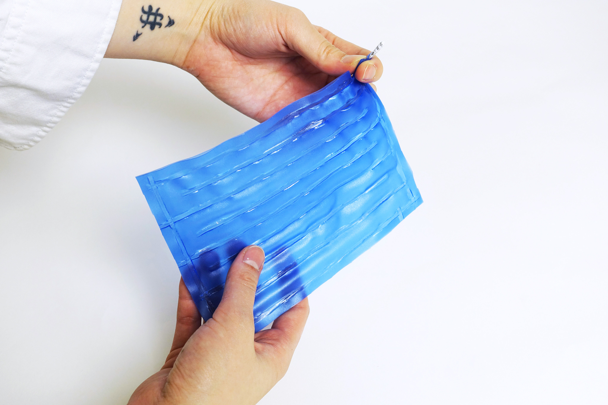
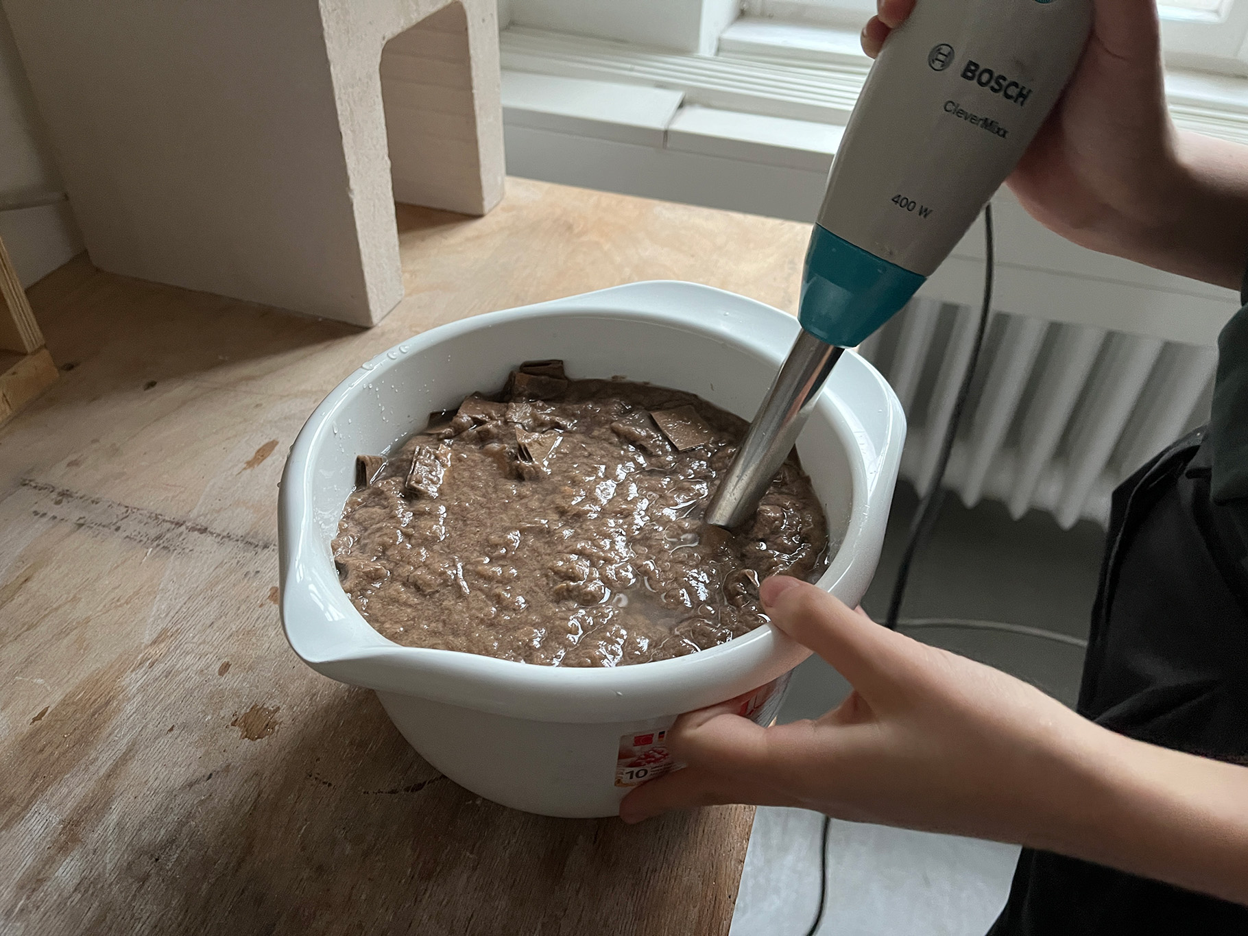
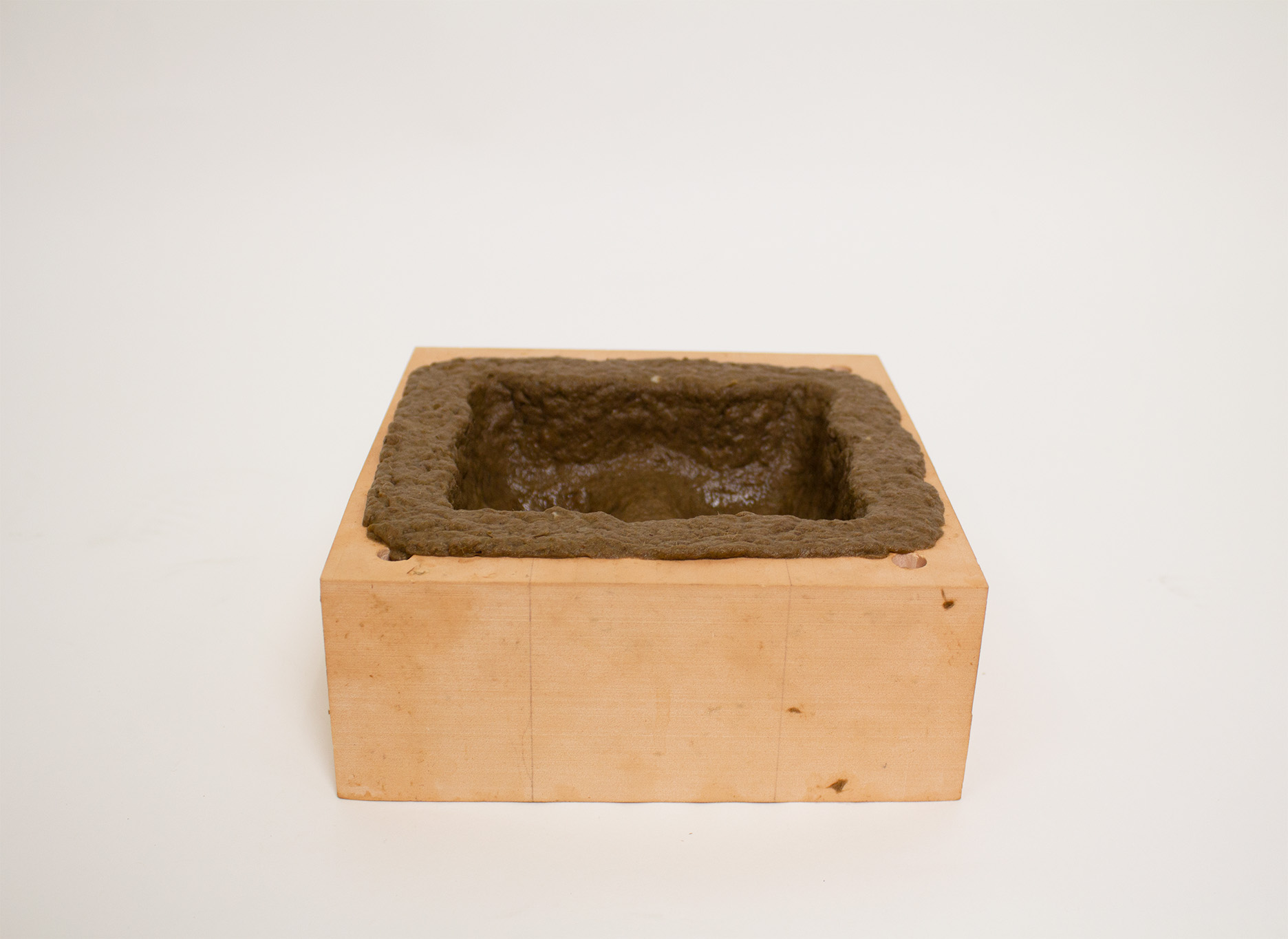
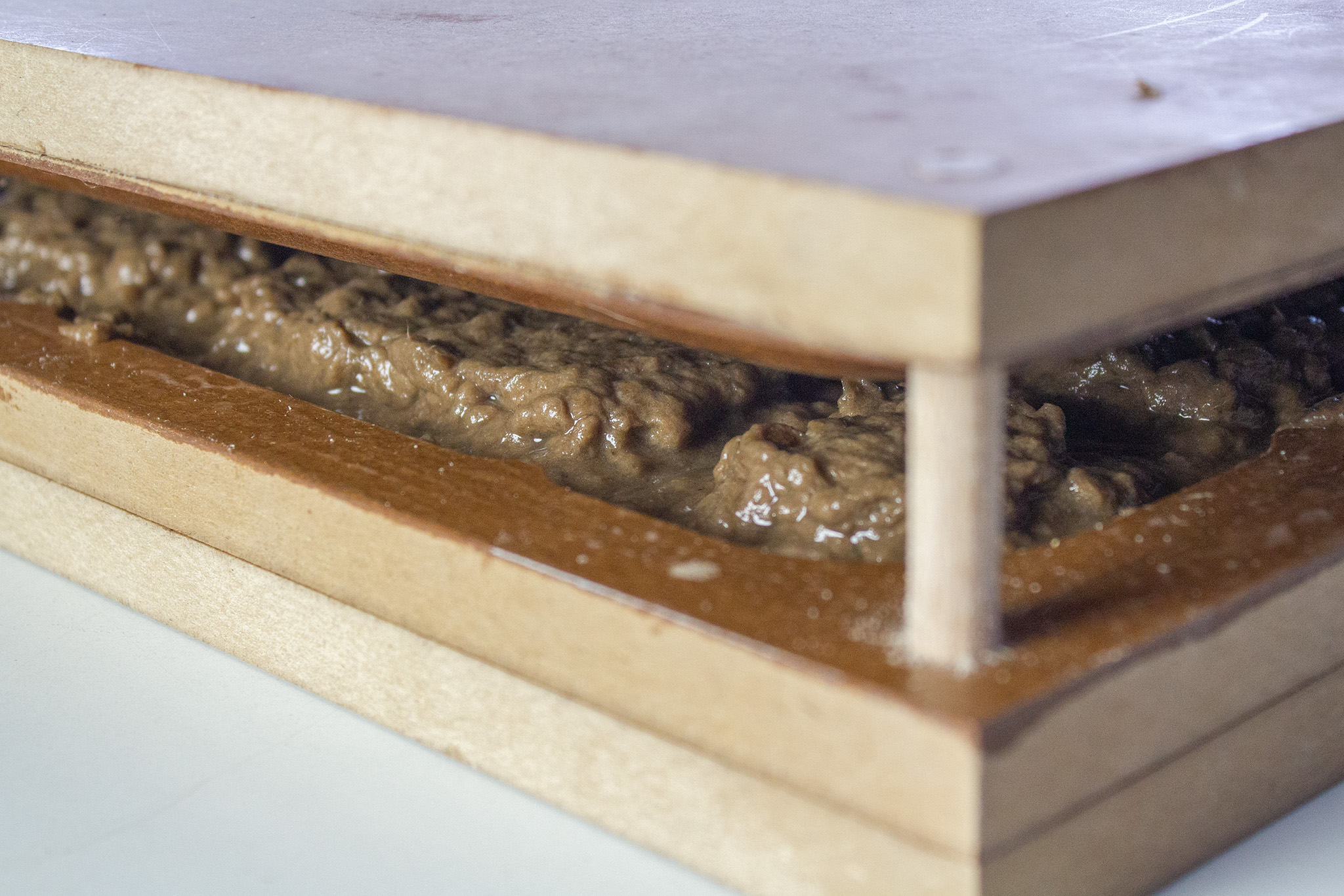
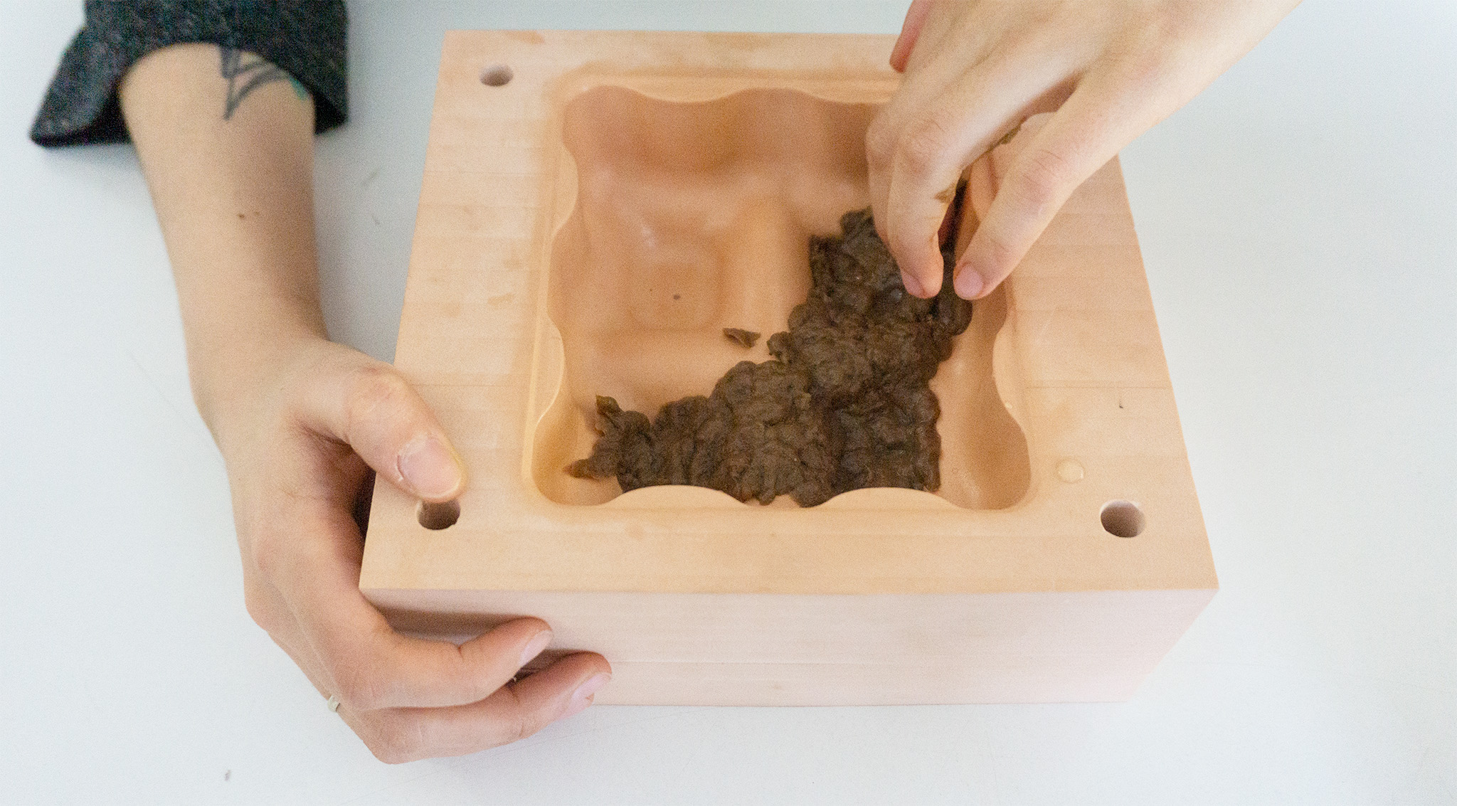
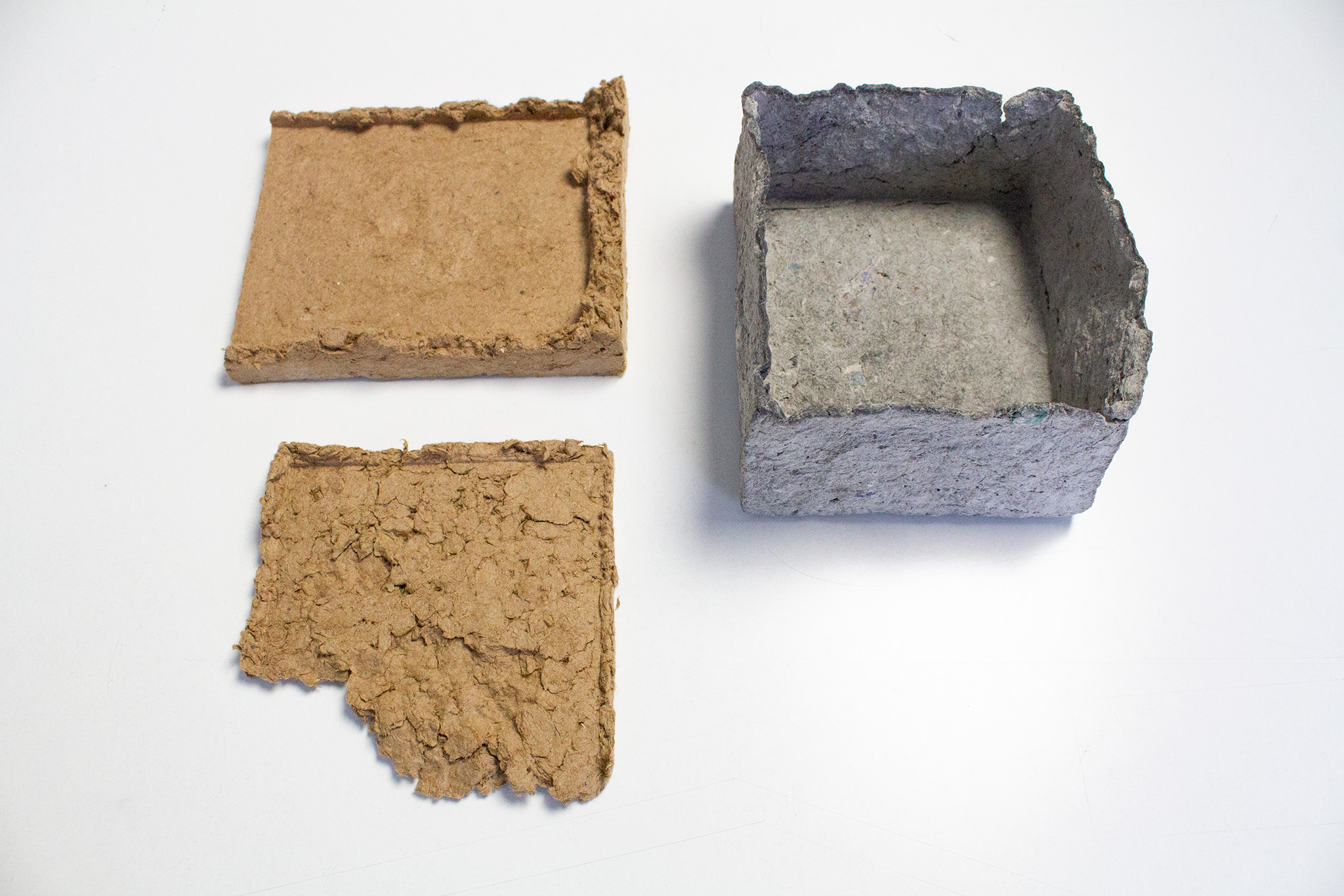
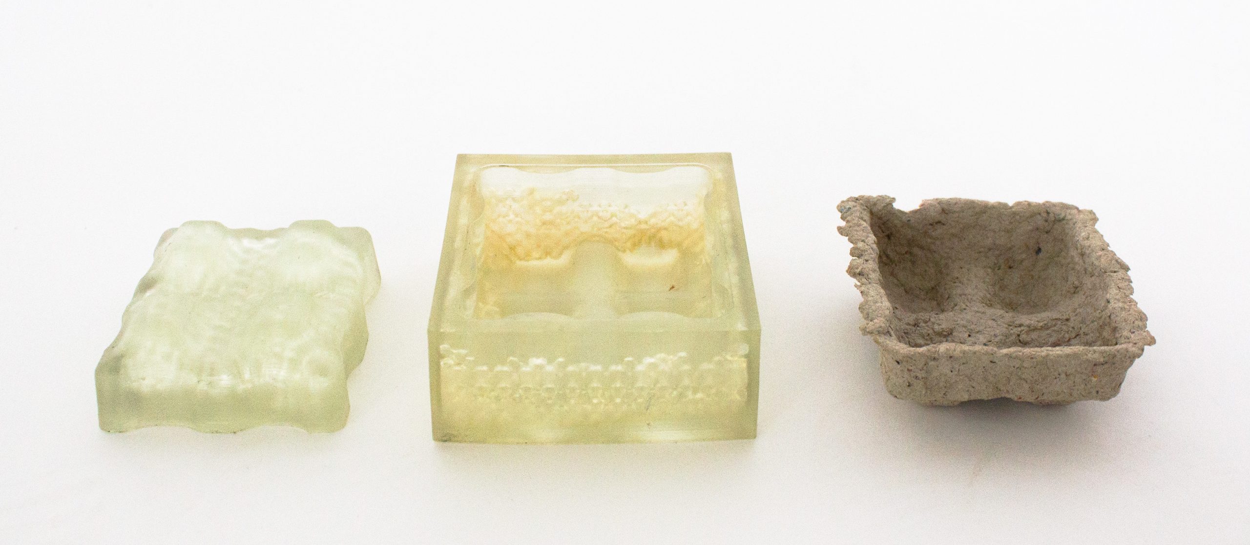
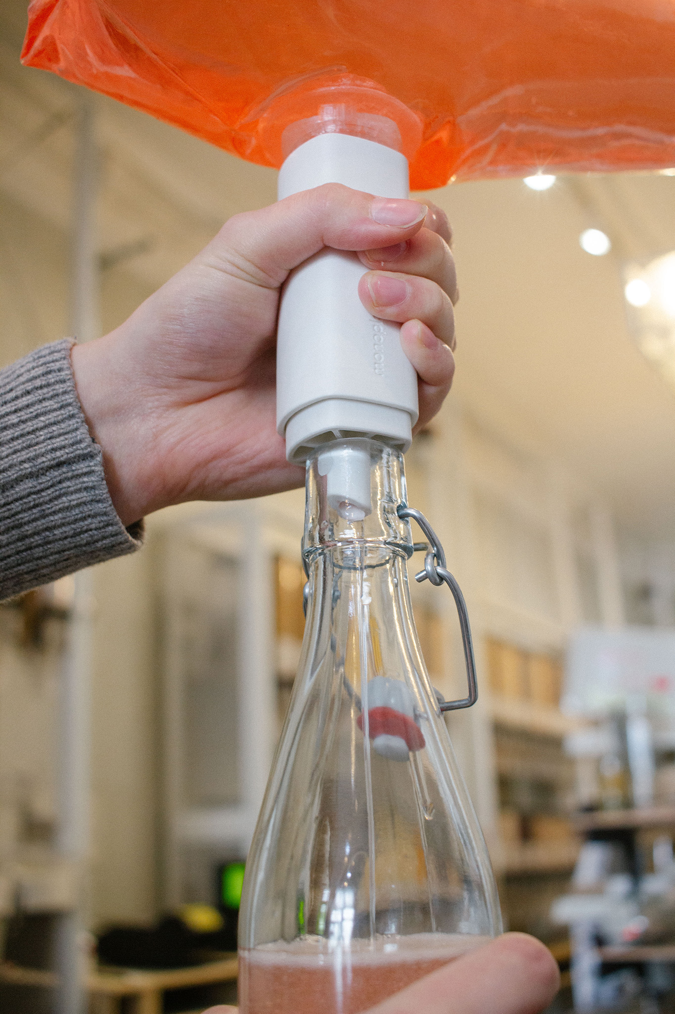

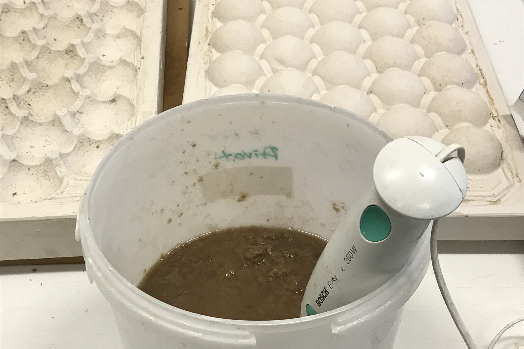
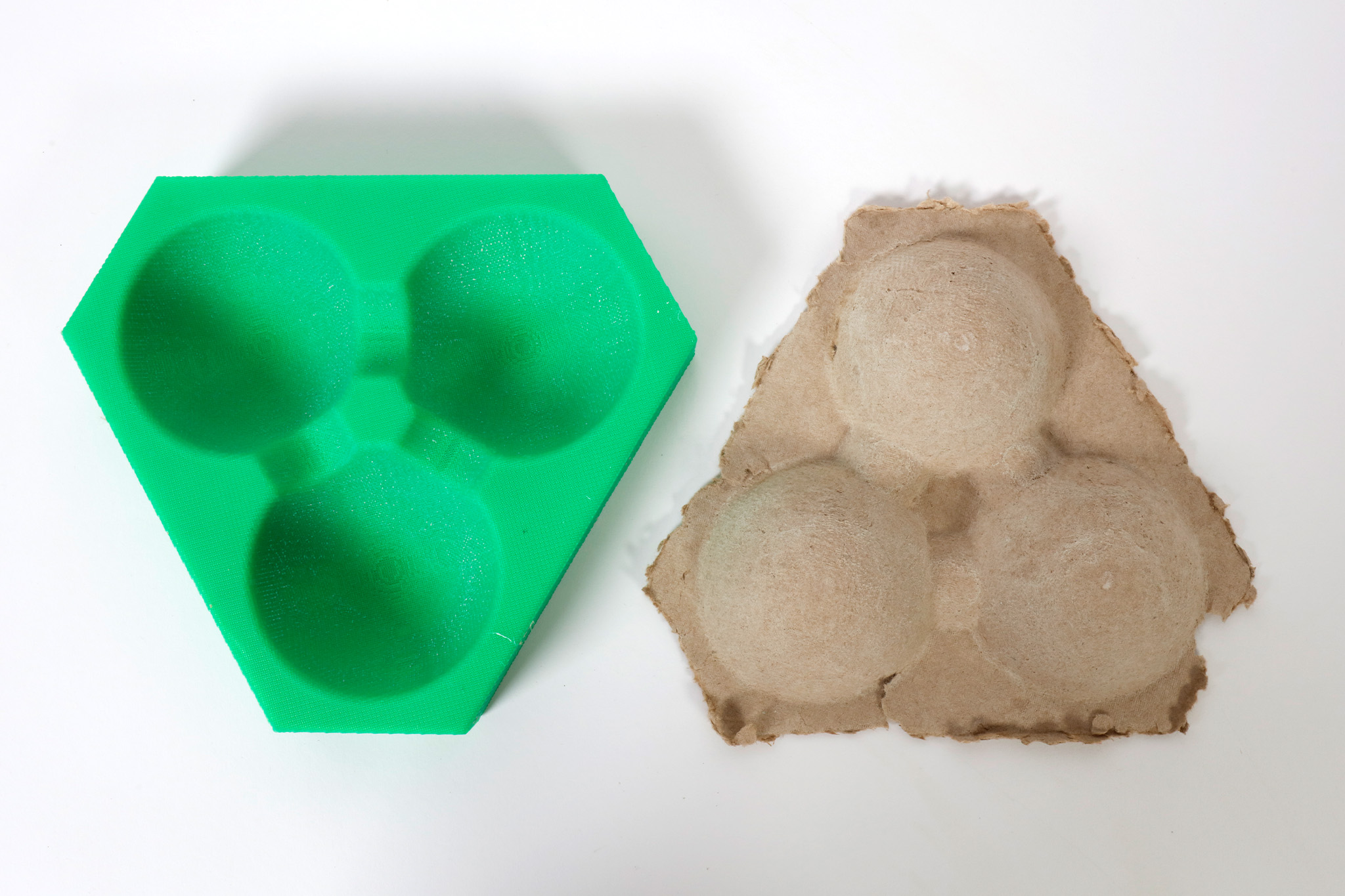
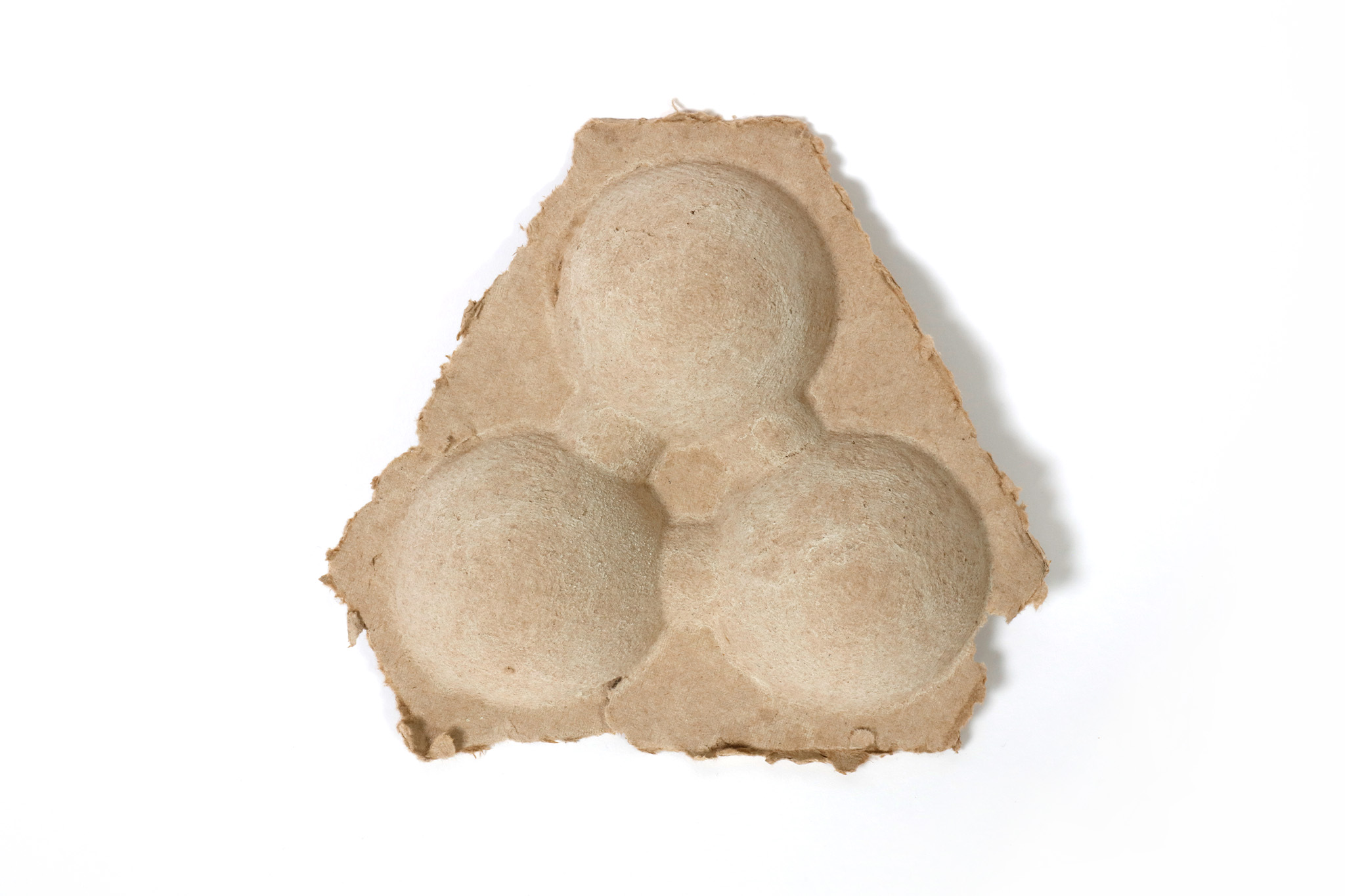
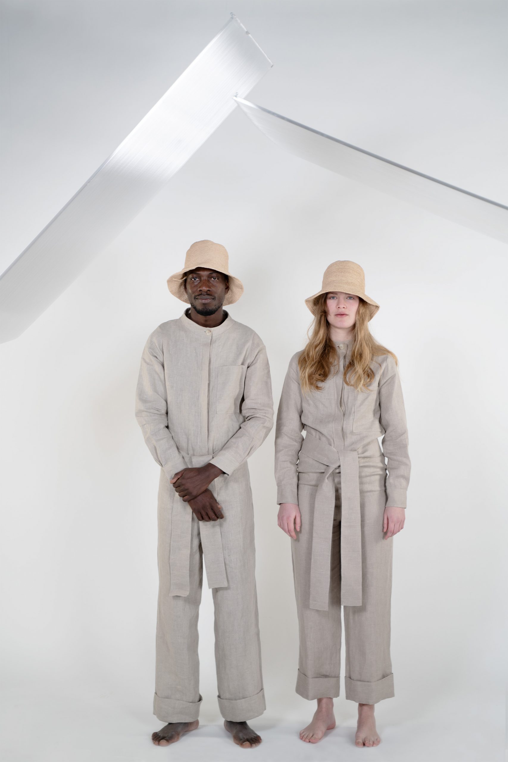
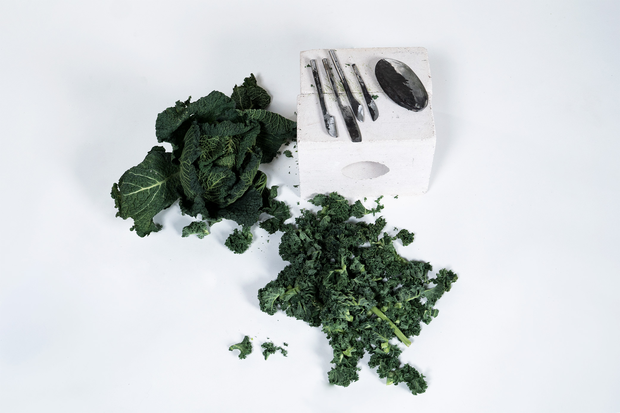
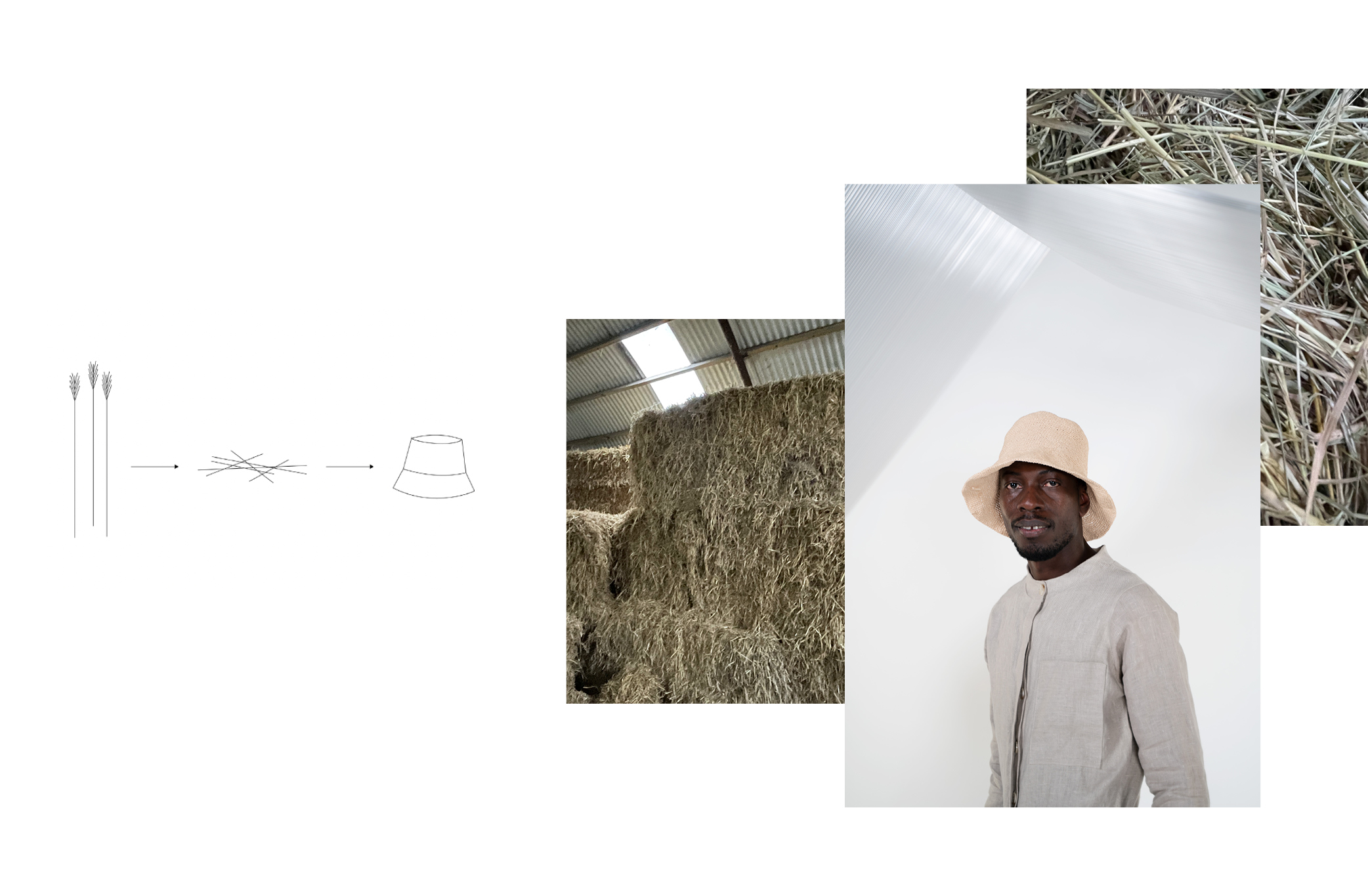
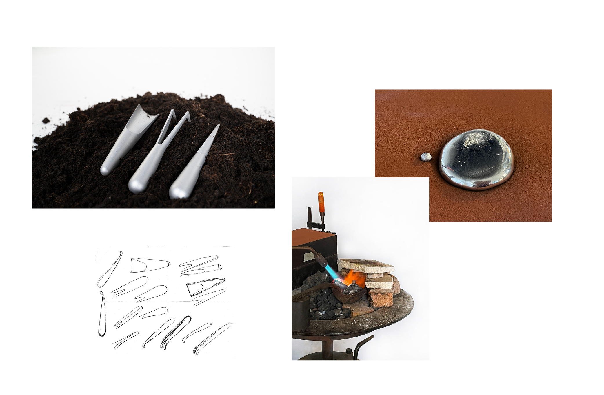
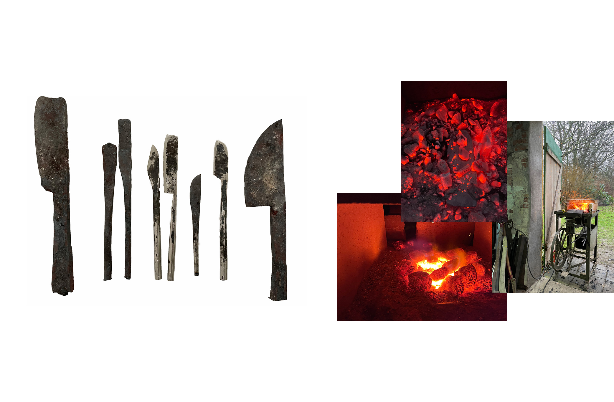
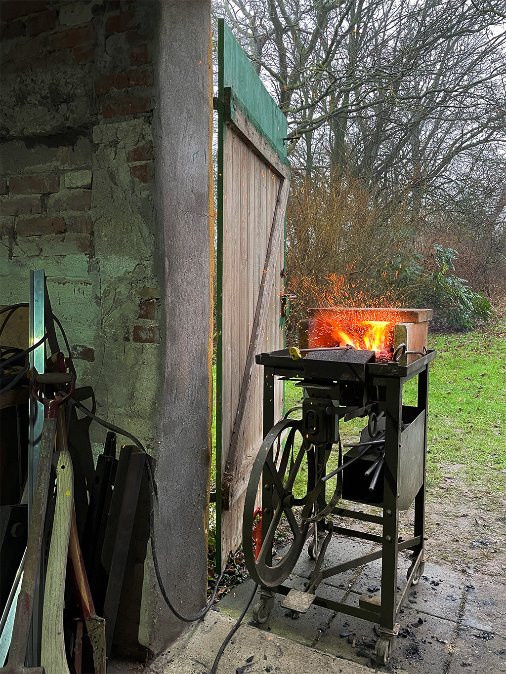
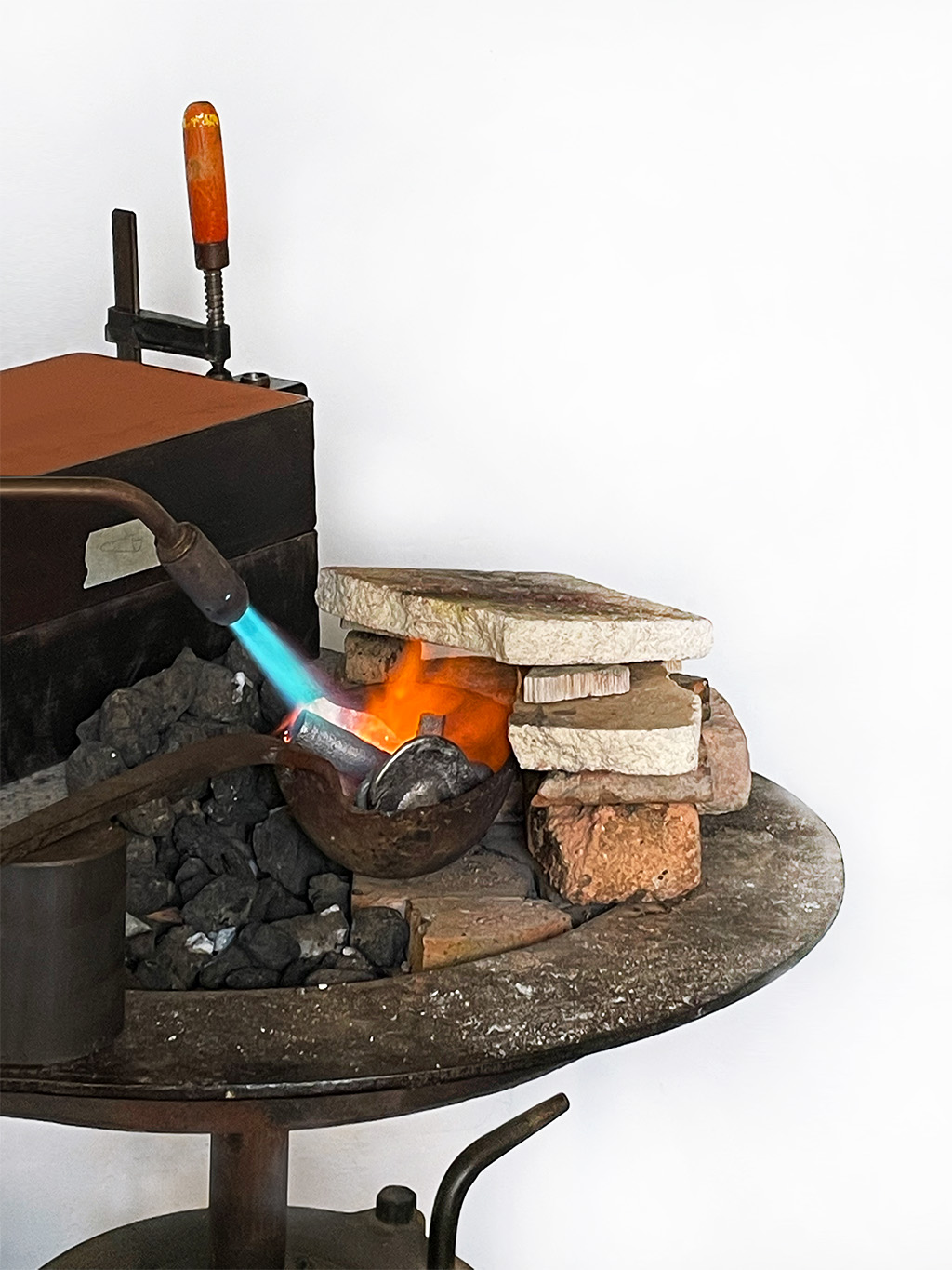


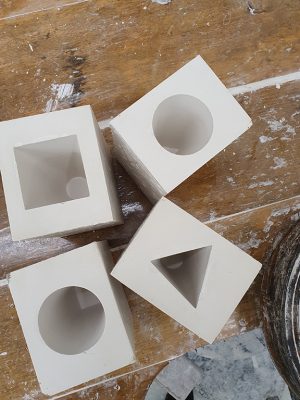
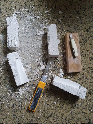
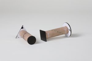
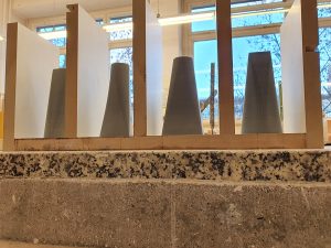
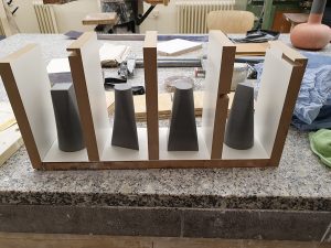
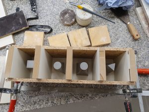


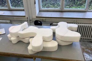
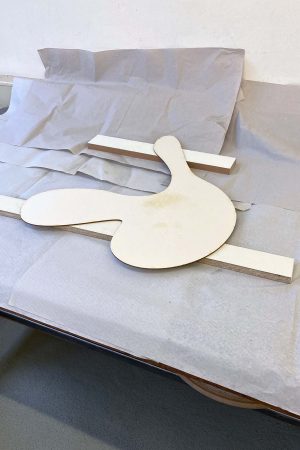
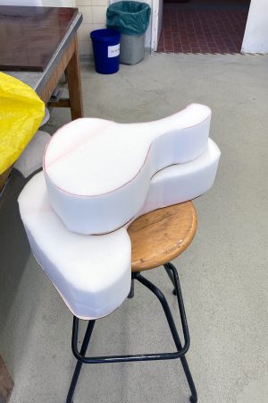


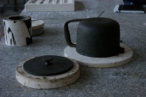
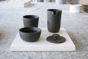
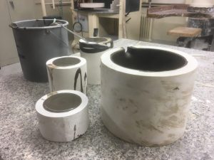
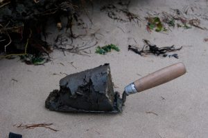
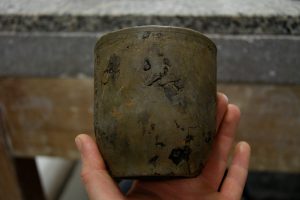

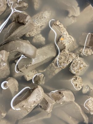
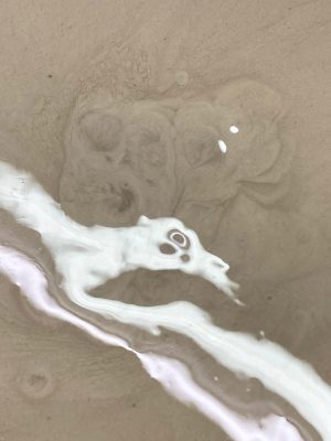


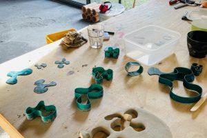
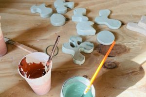
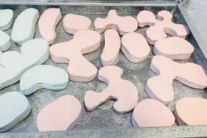
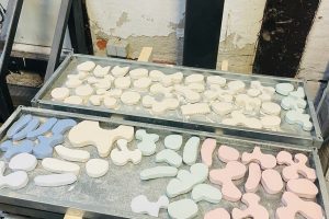
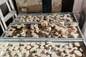
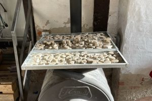


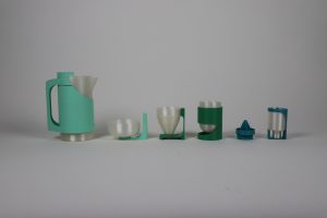
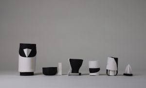


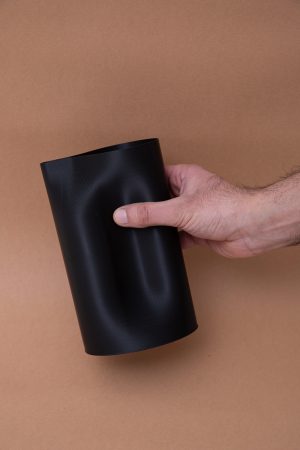
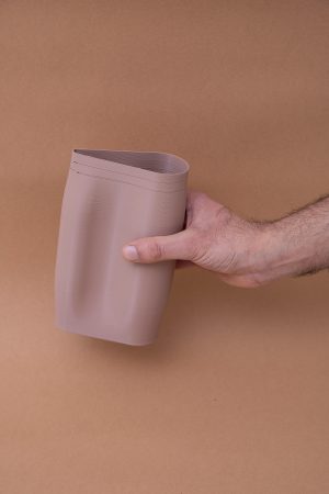


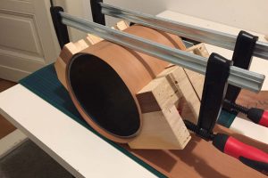
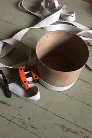

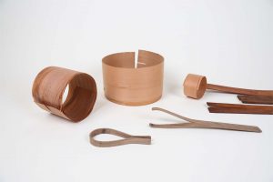
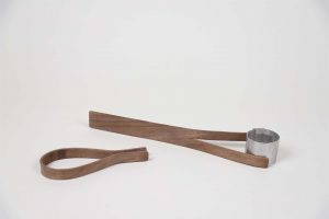
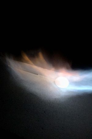
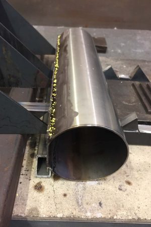
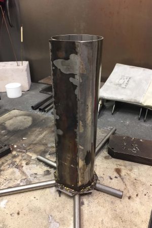
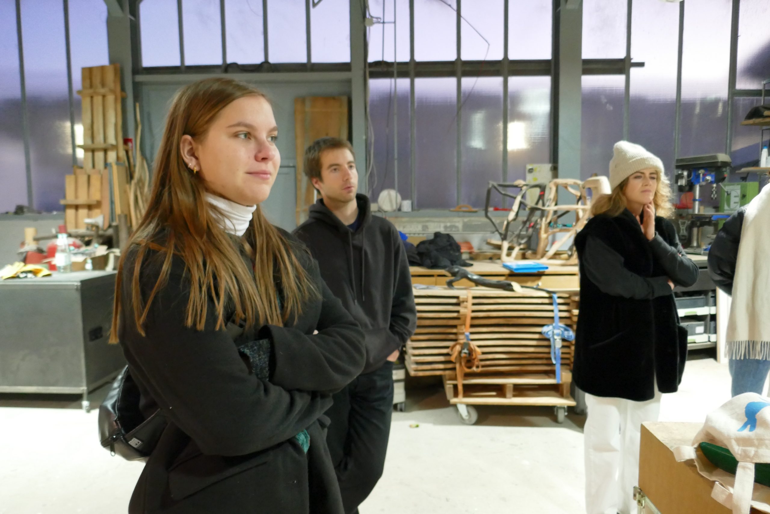
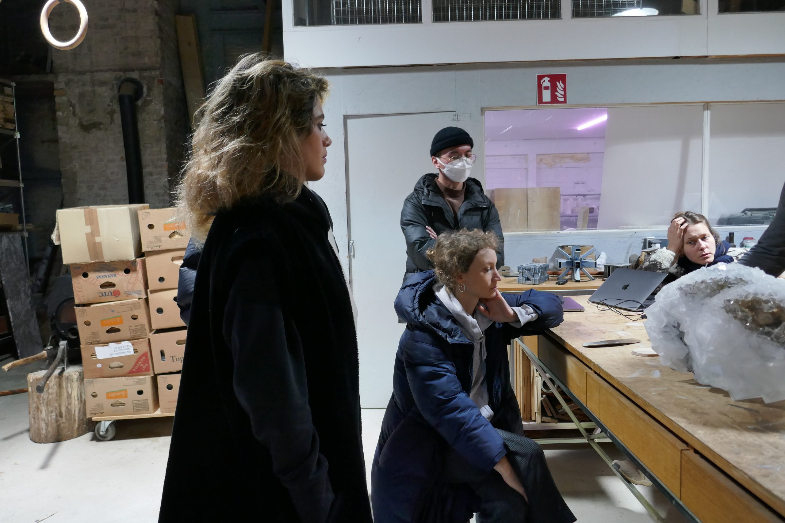
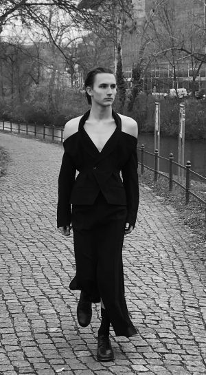
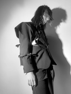
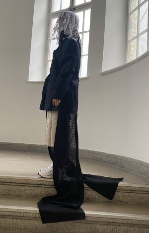
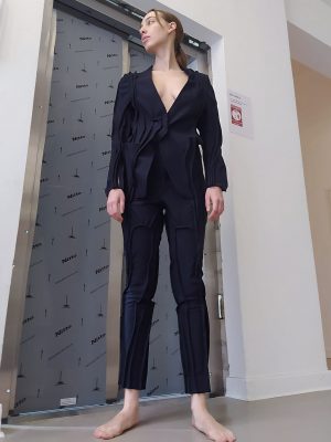
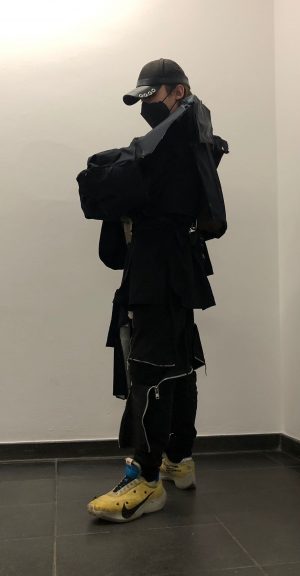


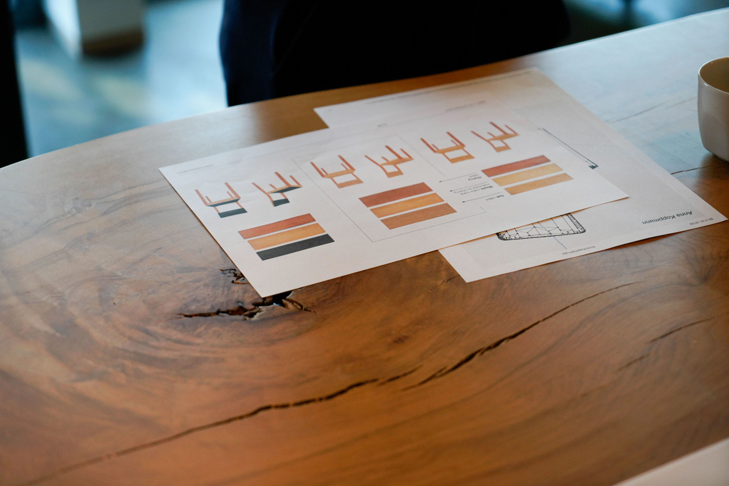
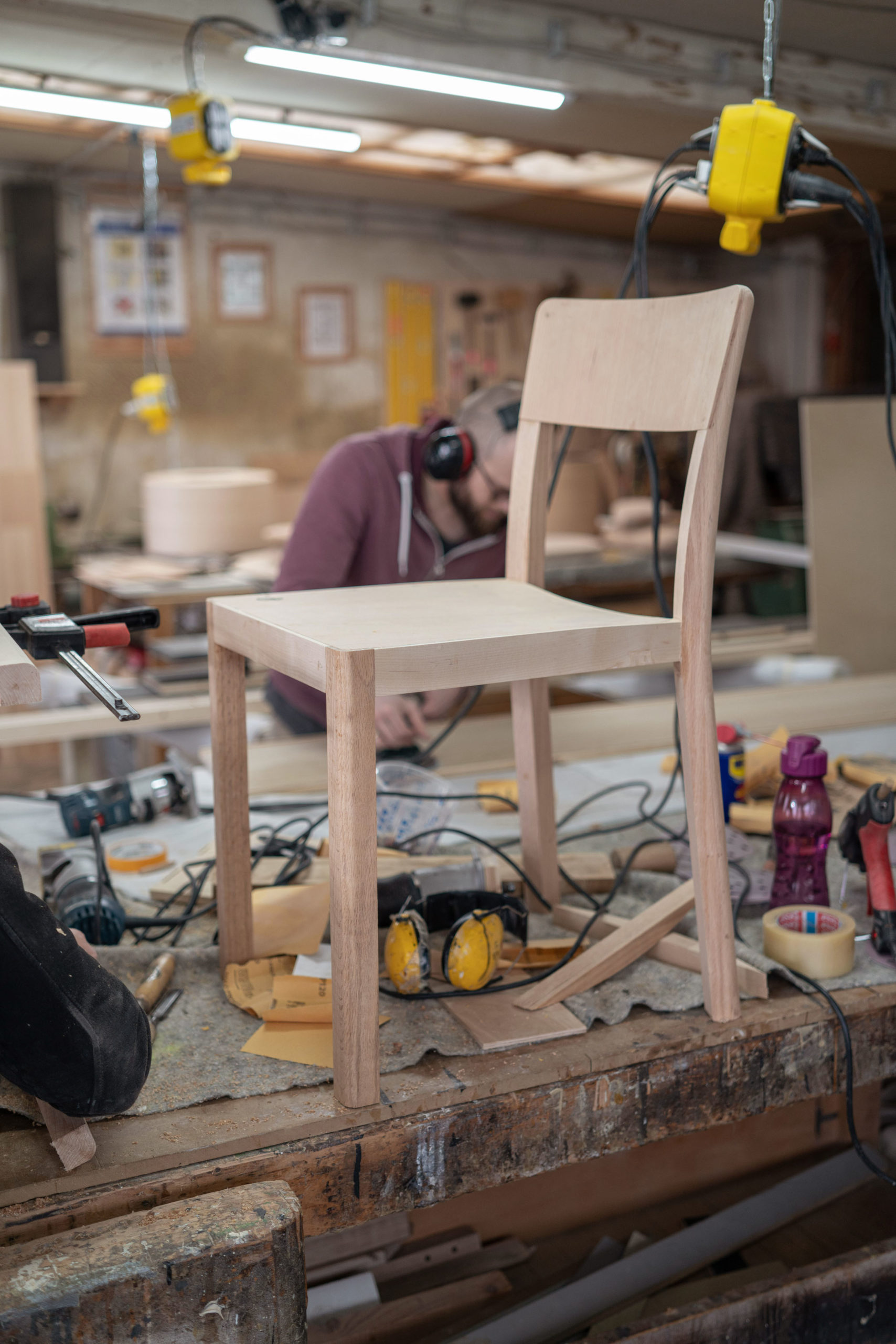
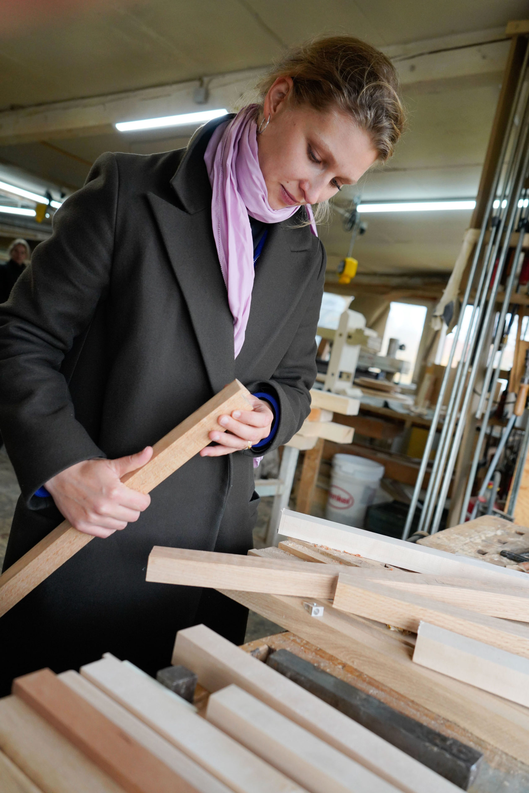
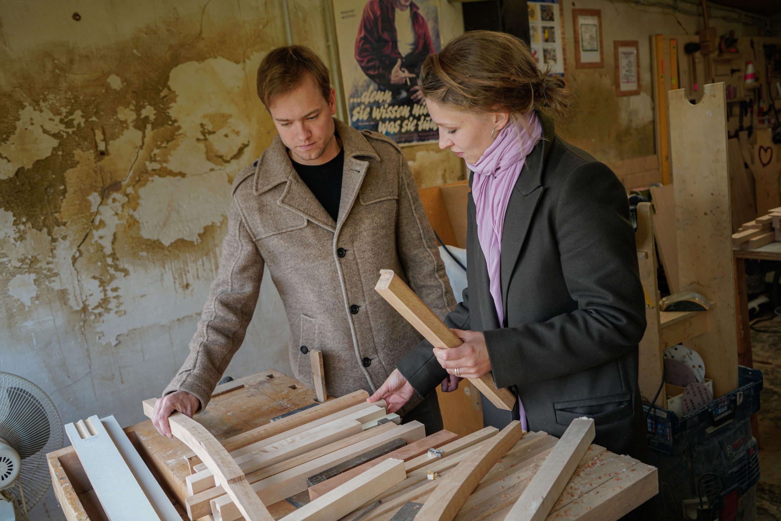
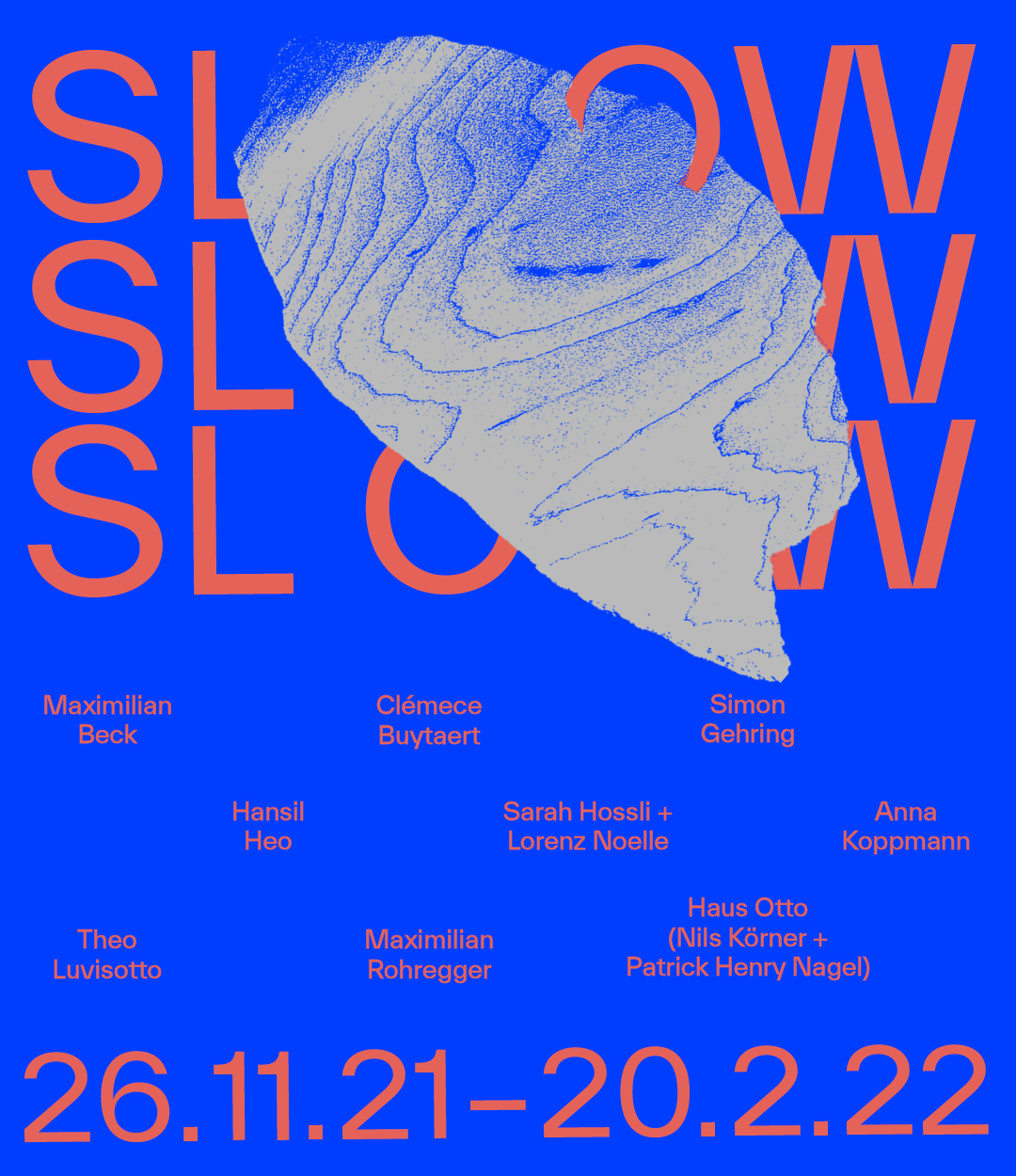
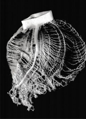
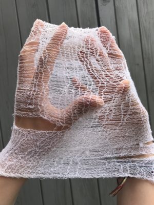
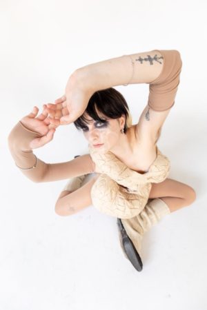
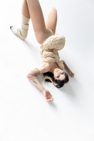


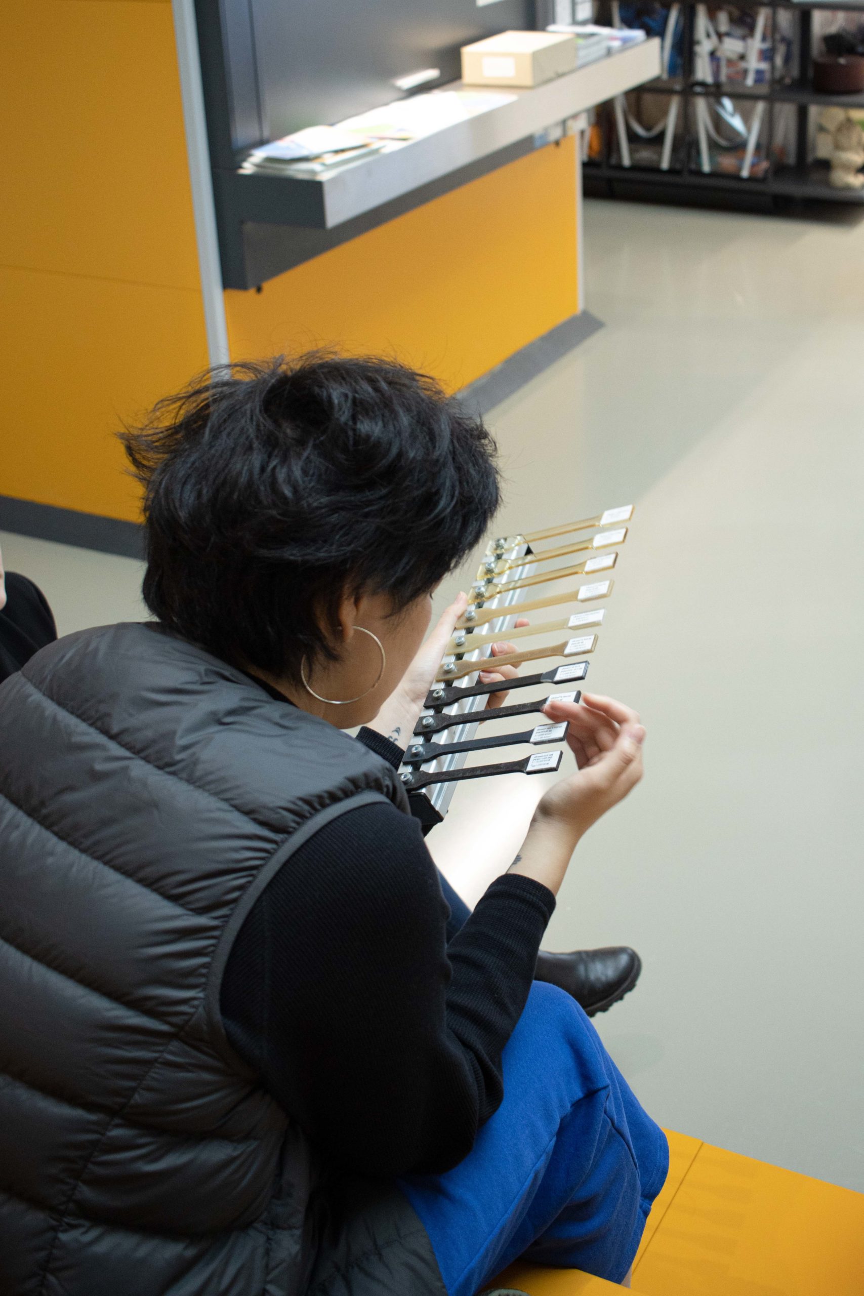


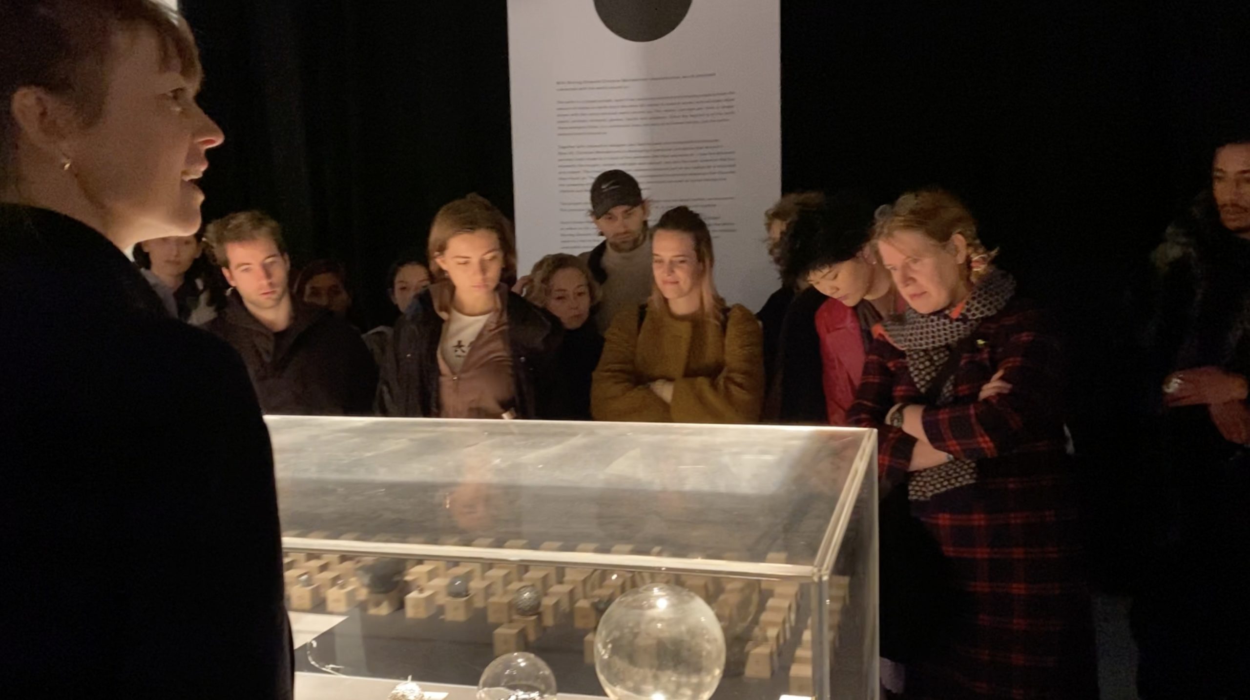
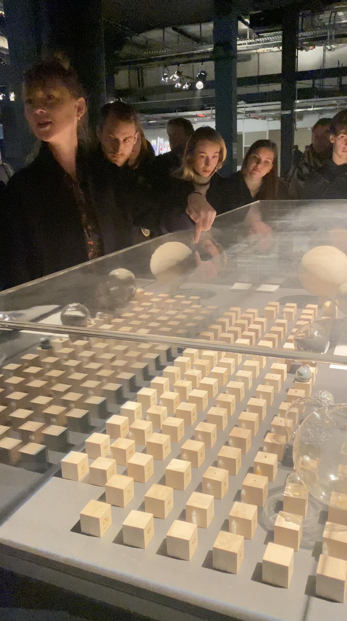
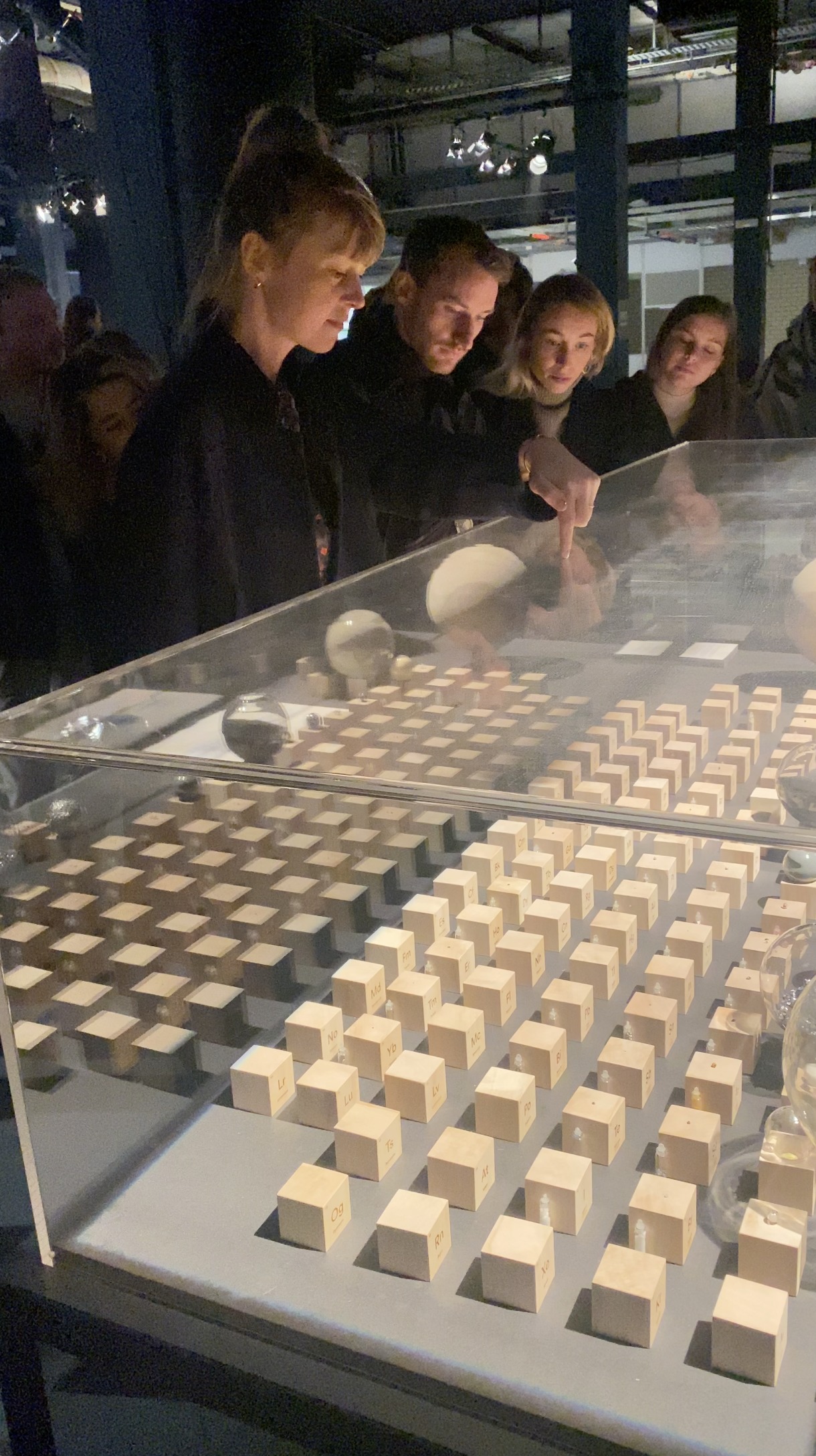
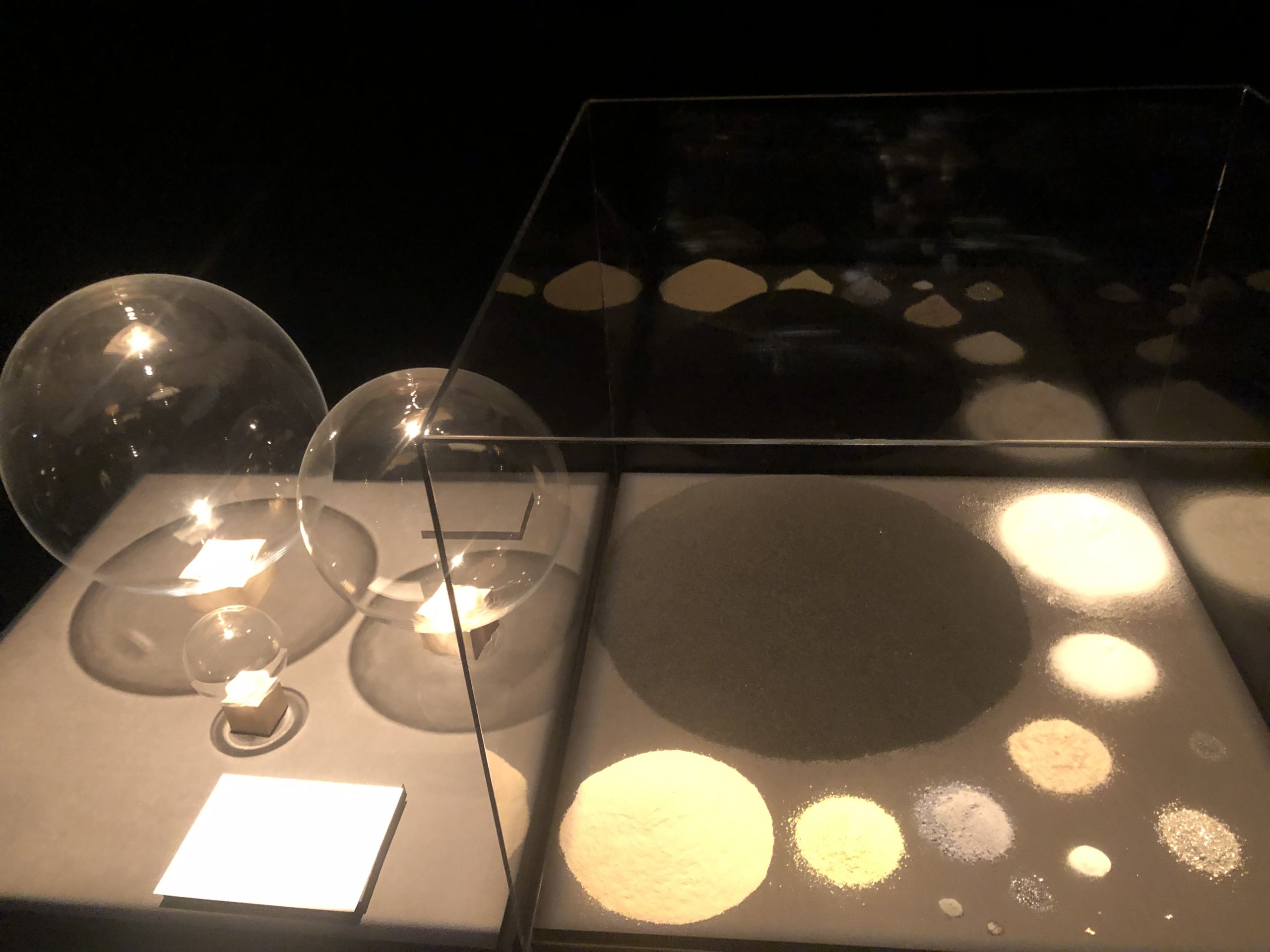
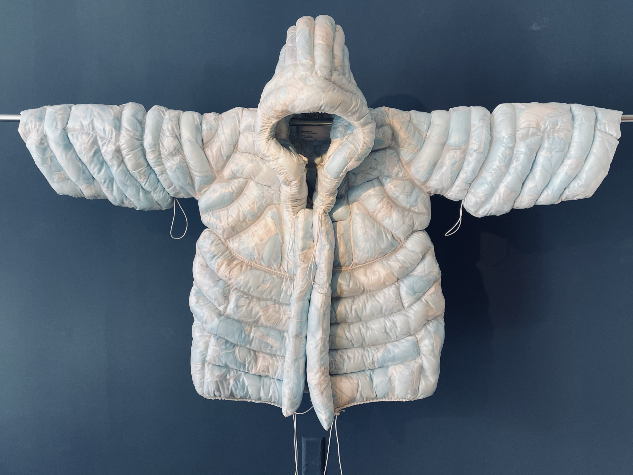
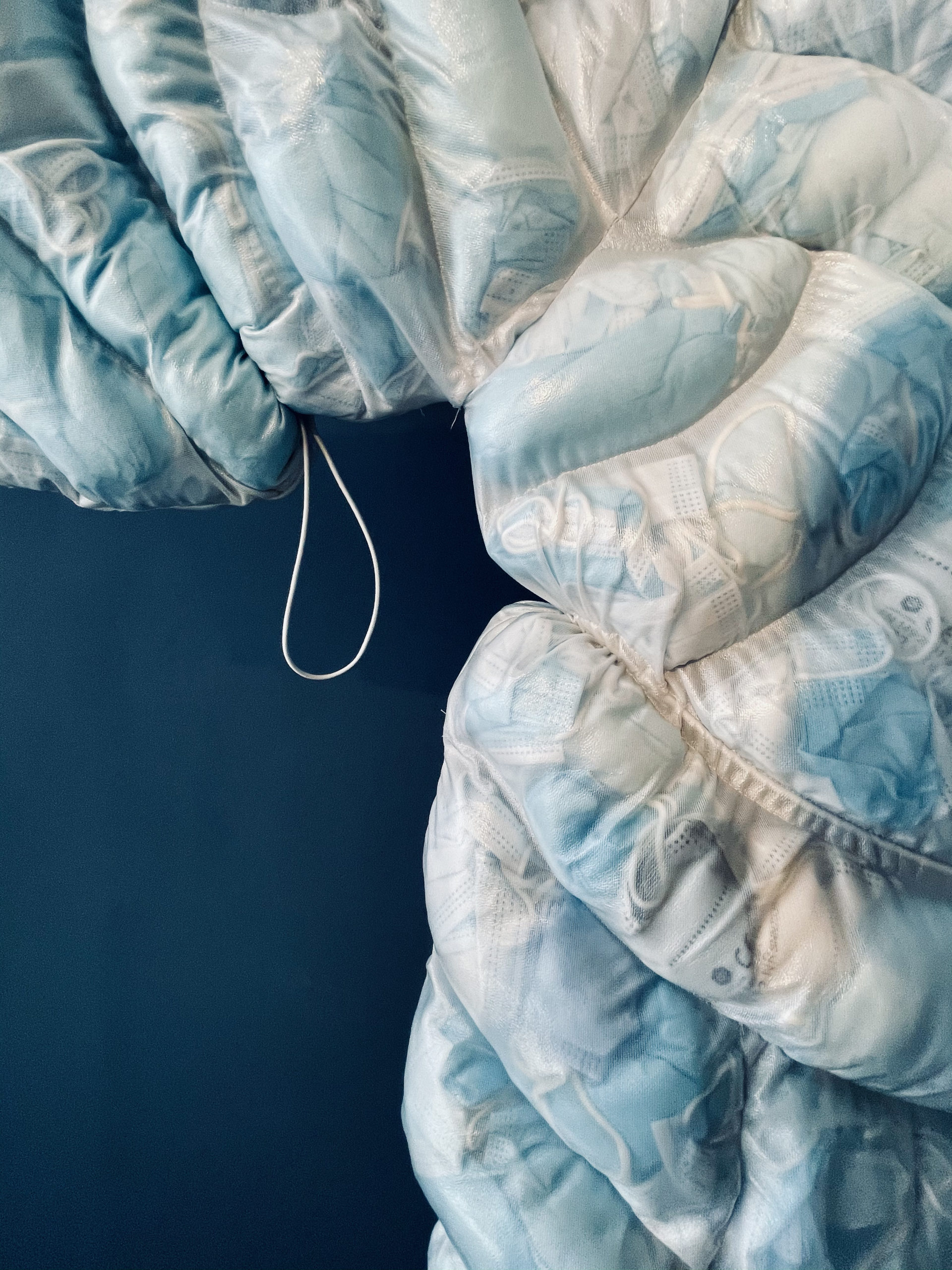
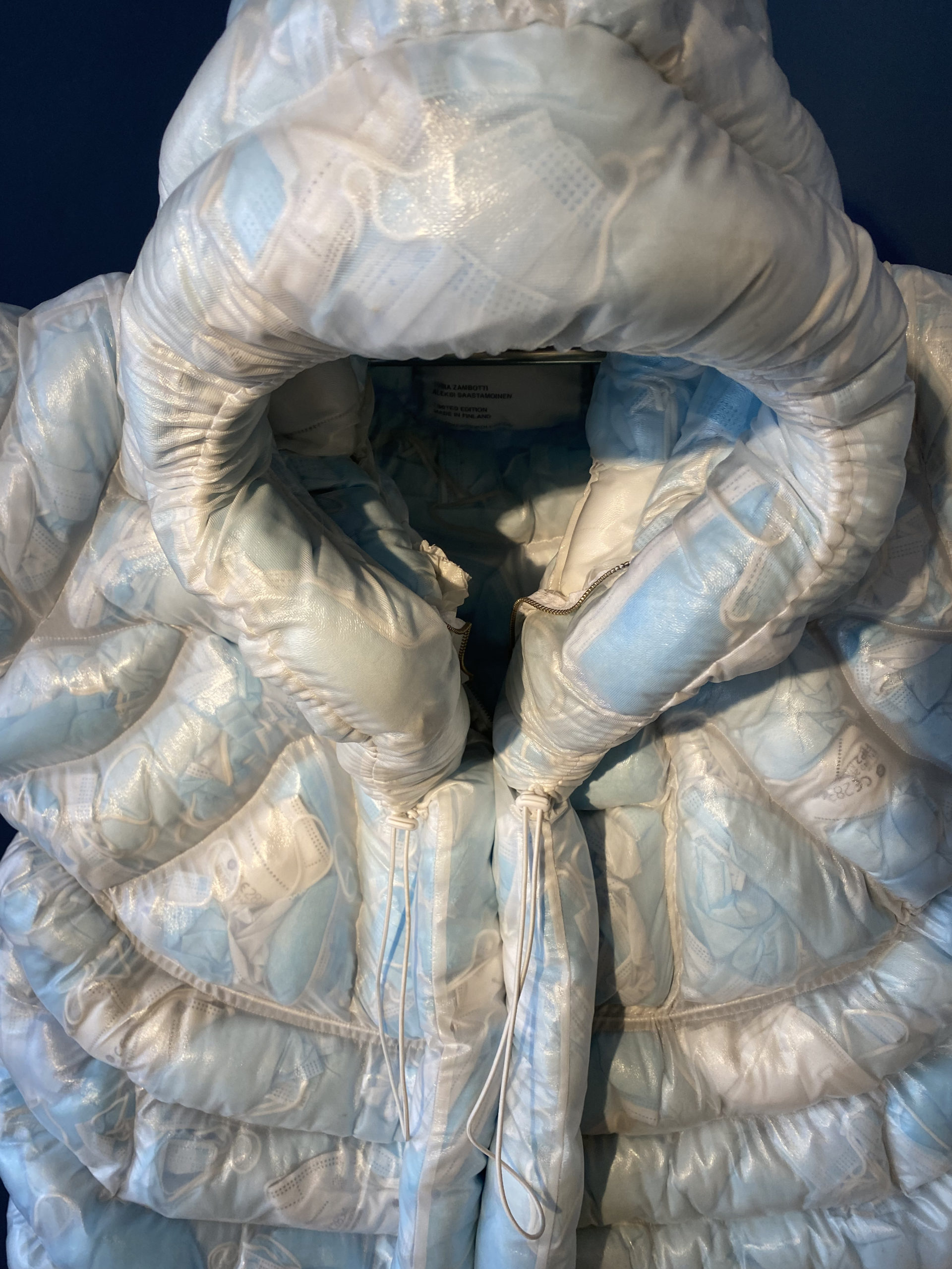
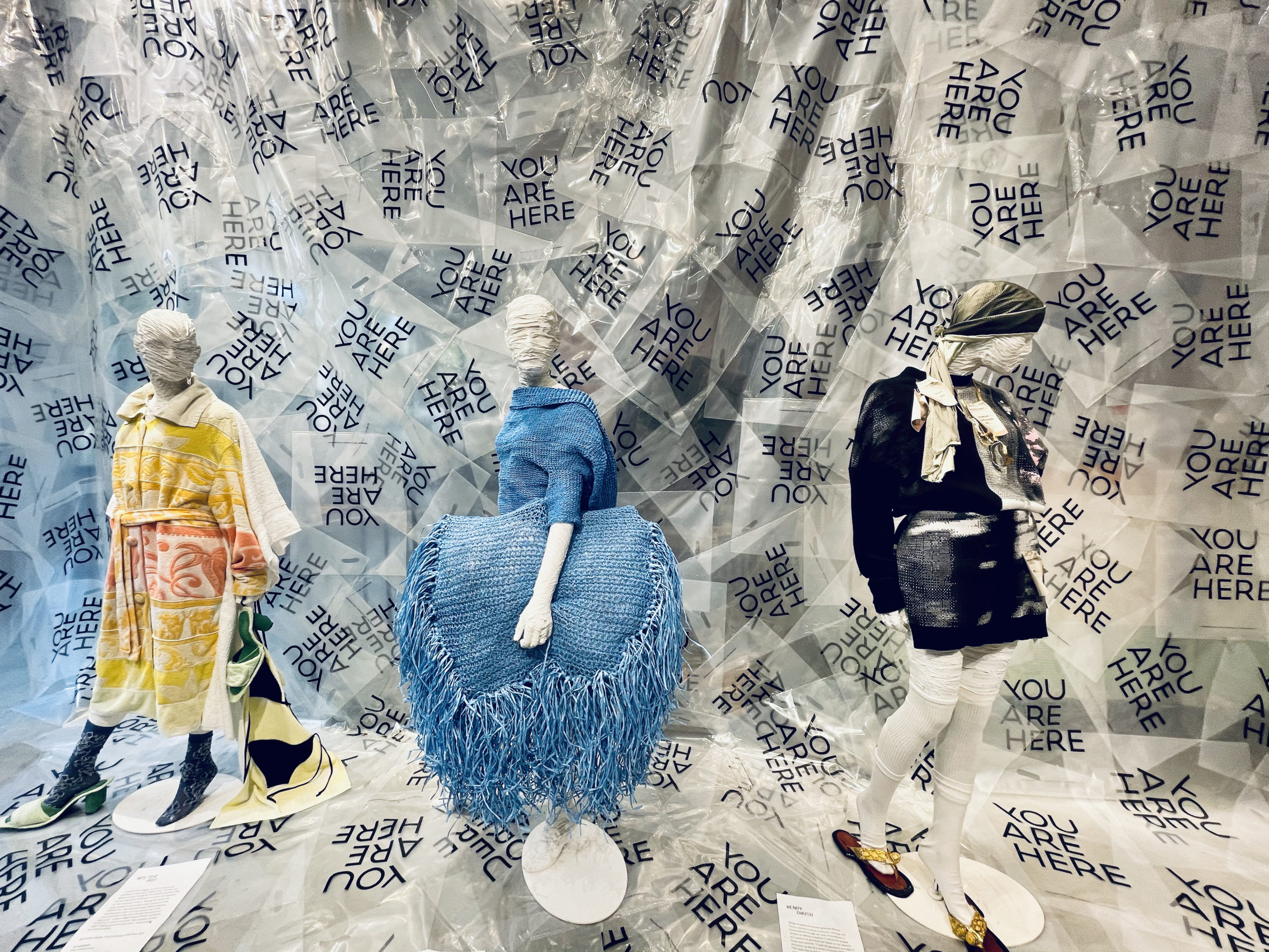
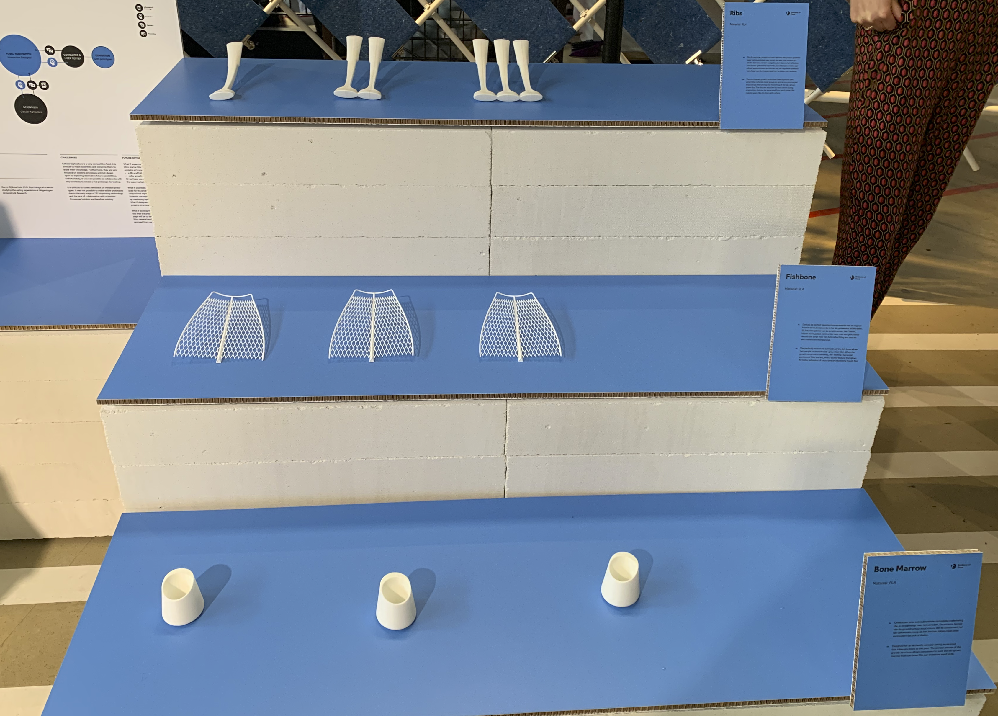
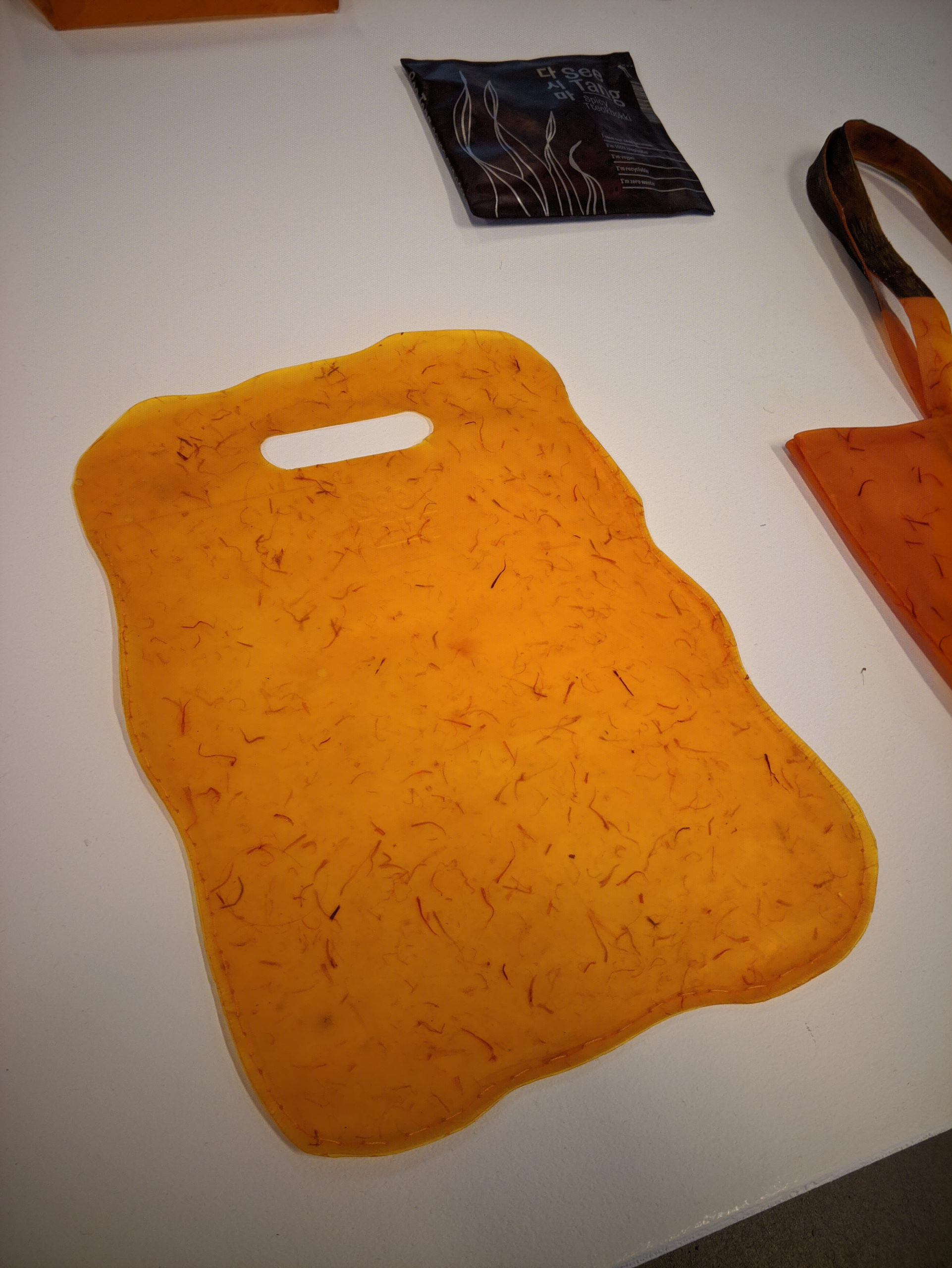
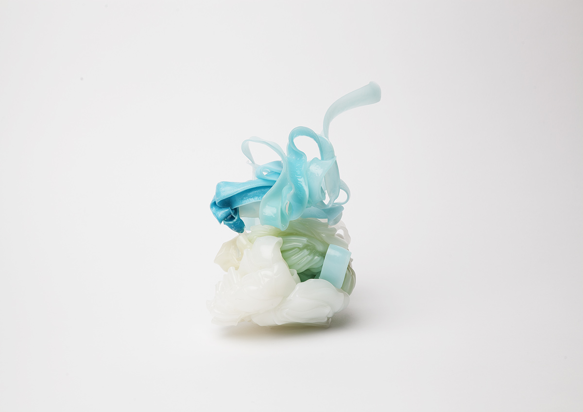

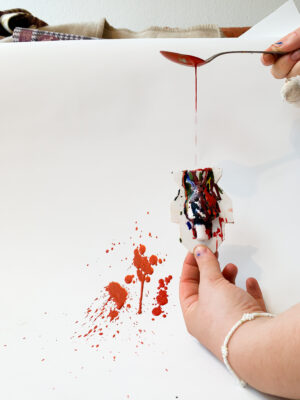
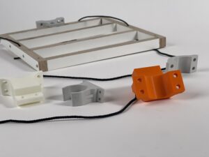
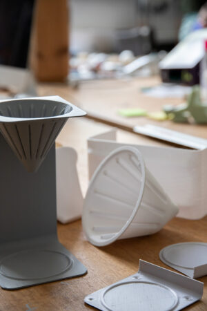
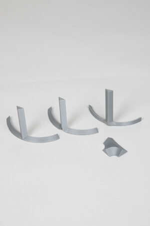
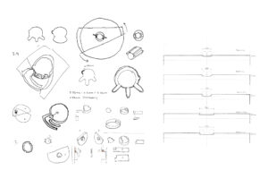
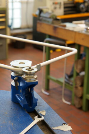
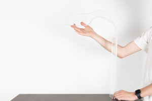
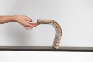
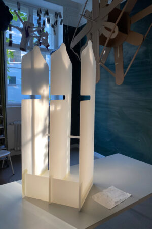
 photo: Sander Plug
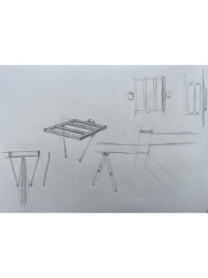
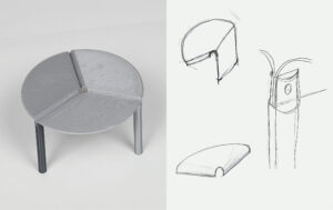
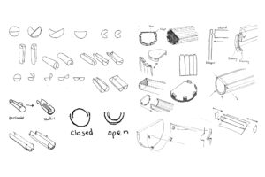
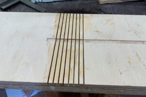
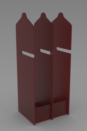