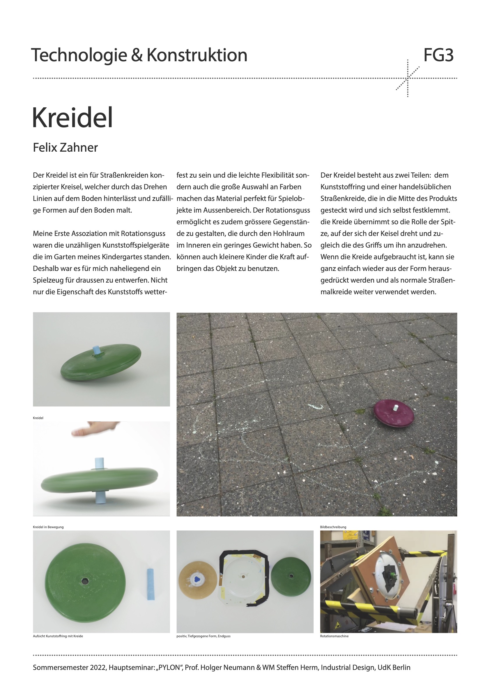
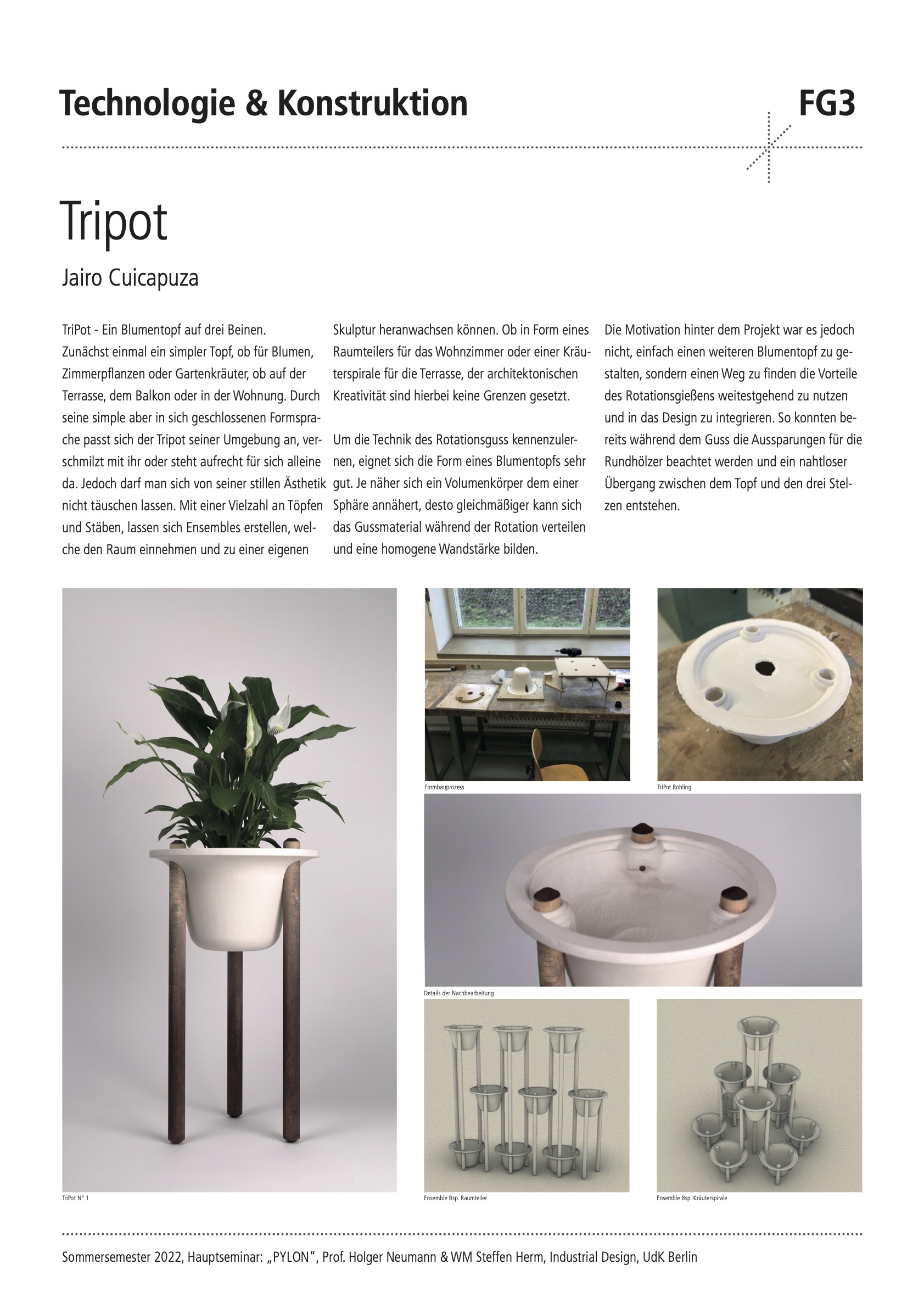
Ausflüge, Reisen, Urlaub und Ferien sind etwas, wovon wir gerne träumen. Schöne Landschaften, aufregende Städte, faszinierende historische Denkmäler. Unser Wunsch wegzugehen hat meiner Meinung nach mehr mit uns selbst zu tun als mit dem Ziel unserer Träume. Das Glück, das mit einer Reise verbunden ist, hat weniger mit dem Ort zu tun, an den wir gehen, sondern mehr mit der Erfüllung unserer Bedürfnisse und Wünsche. Durch das Reisen schulen wir unsere Vorstellungskraft und die Art und Weise, wie wir die Dinge im Allgemeinen sehen, was zweifellos eines der glücklichsten Dinge am Reisen ist. Wir nutzen den Urlaub als Flucht vor der Realität. Es bietet uns Abstand von zu Hause, unserem Alltag, unseren Routinen und stressigen Jobs und macht uns stattdessen frei und abenteuerlustig. Wir wollen etwas anderes erleben; eine andere Welt und wir sehen es als gesund und normal an, Sehnsucht nach fernen Orten zu verspüren.
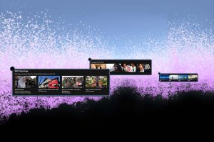
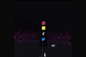
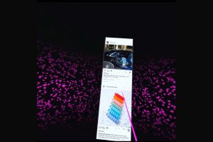
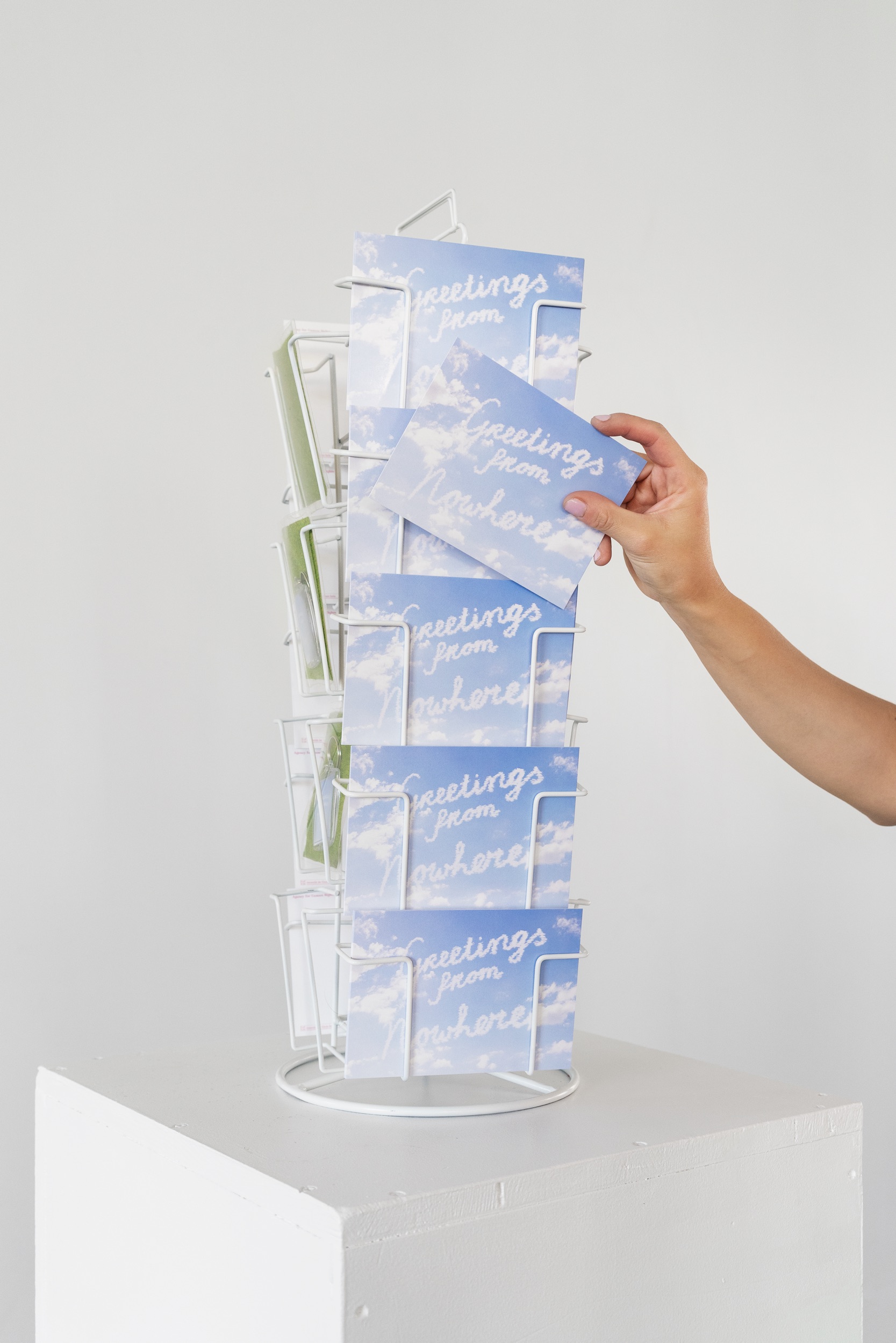
Bei diesem Projekt geht es darum, von fernen Orten zu träumen und einen tiefen Drang zu haben, die Welt und all ihre Spektakel zu sehen. Die Ferne und Exotik mit eigenen Augen erleben, anstatt Geschichten zu hören, zu lesen oder Filme über ferne Orte zu schauen. Meine Motivation kommt von einer ständigen Erinnerung daran, dass es so viele Orte gibt, an die man gehen kann, verstärkt durch die Existenz von Social-Media-Plattformen wie Instagram, wo jeder die ganze Zeit überall scheint zu sein.
Was ist der nächste Hotspot, zu dem ich gehen sollte? Wie kommt es, dass ich nie in dieses Museum gegangen bin? Welches der 10 schönsten Cafés dieser Stadt darf ich nicht verpassen? Scheiße, habe ich vergessen, die atemberaubende Aussicht zu teilen, die ich heute Morgen auf diesem Berggipfel hatte?
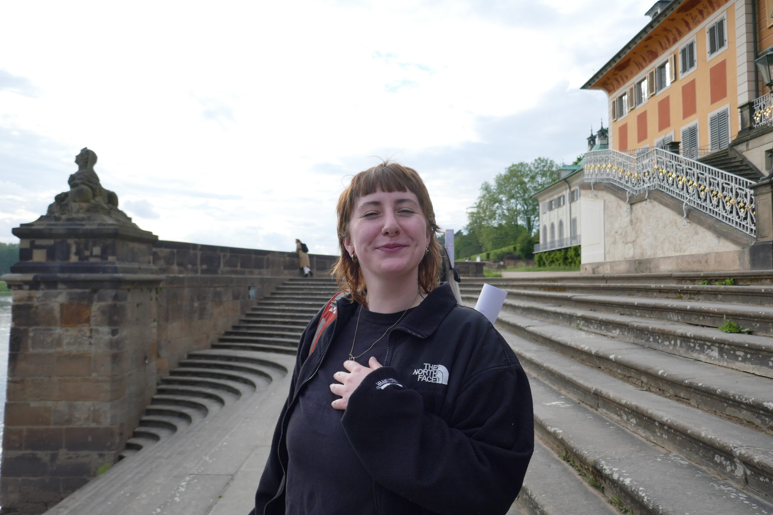
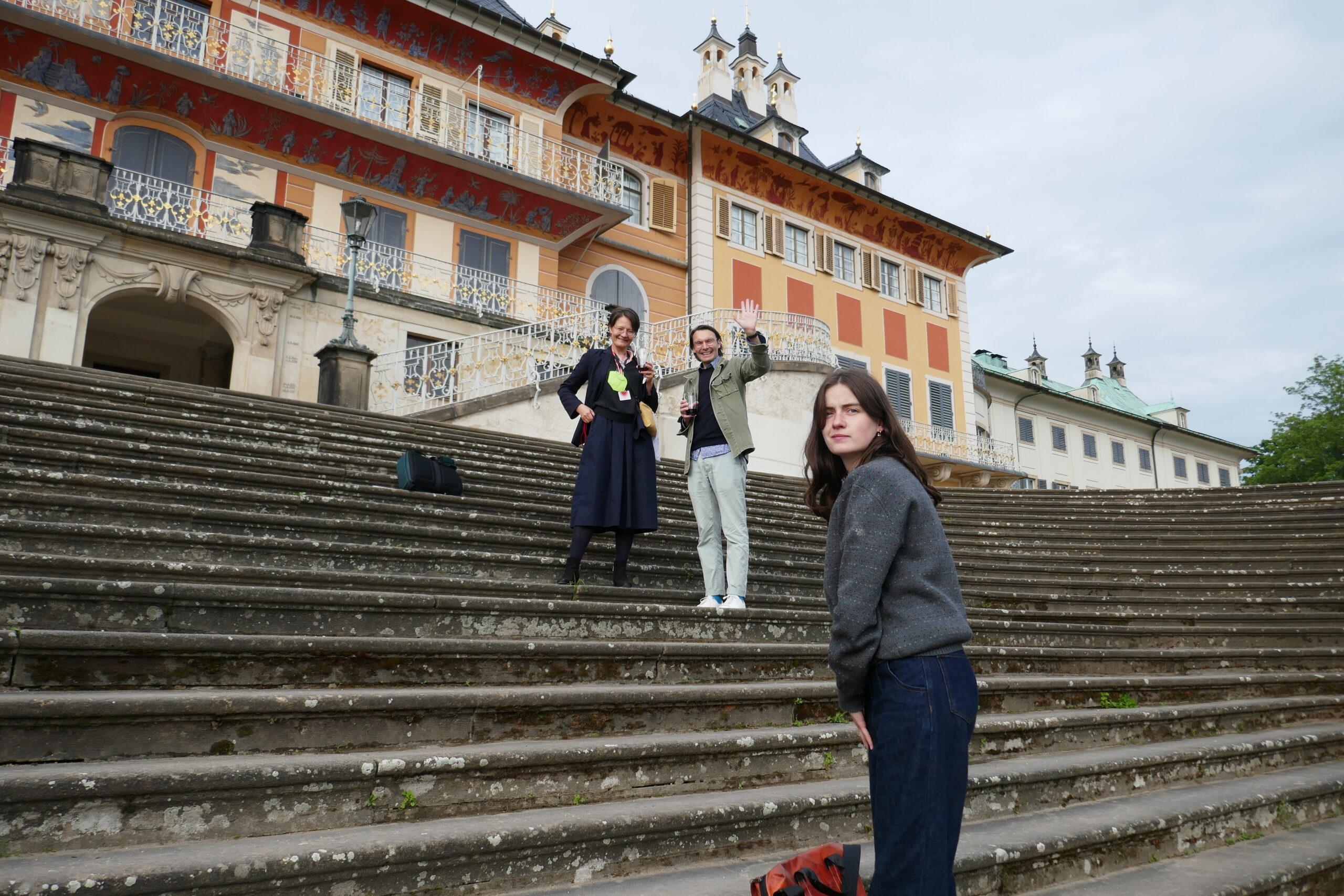
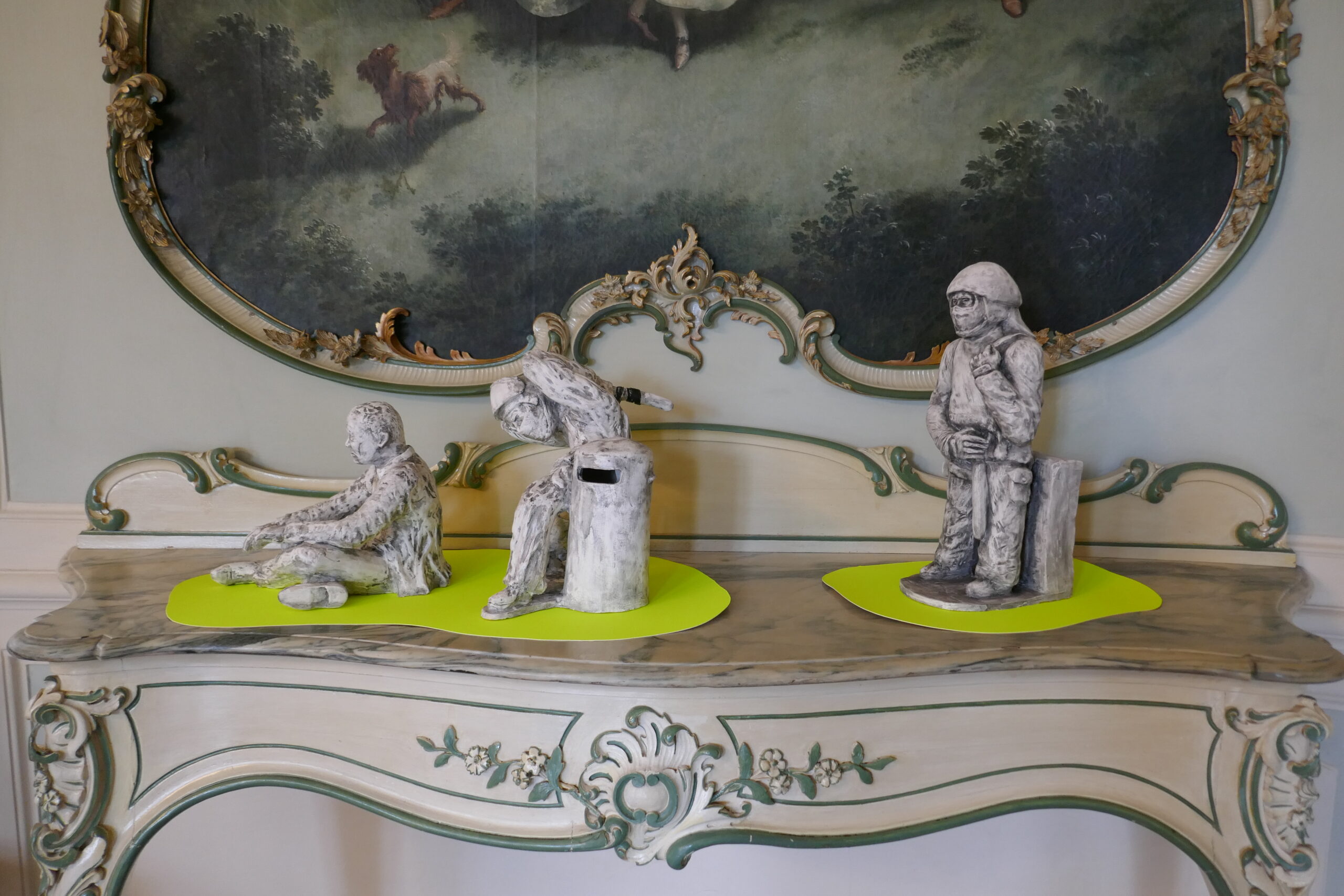
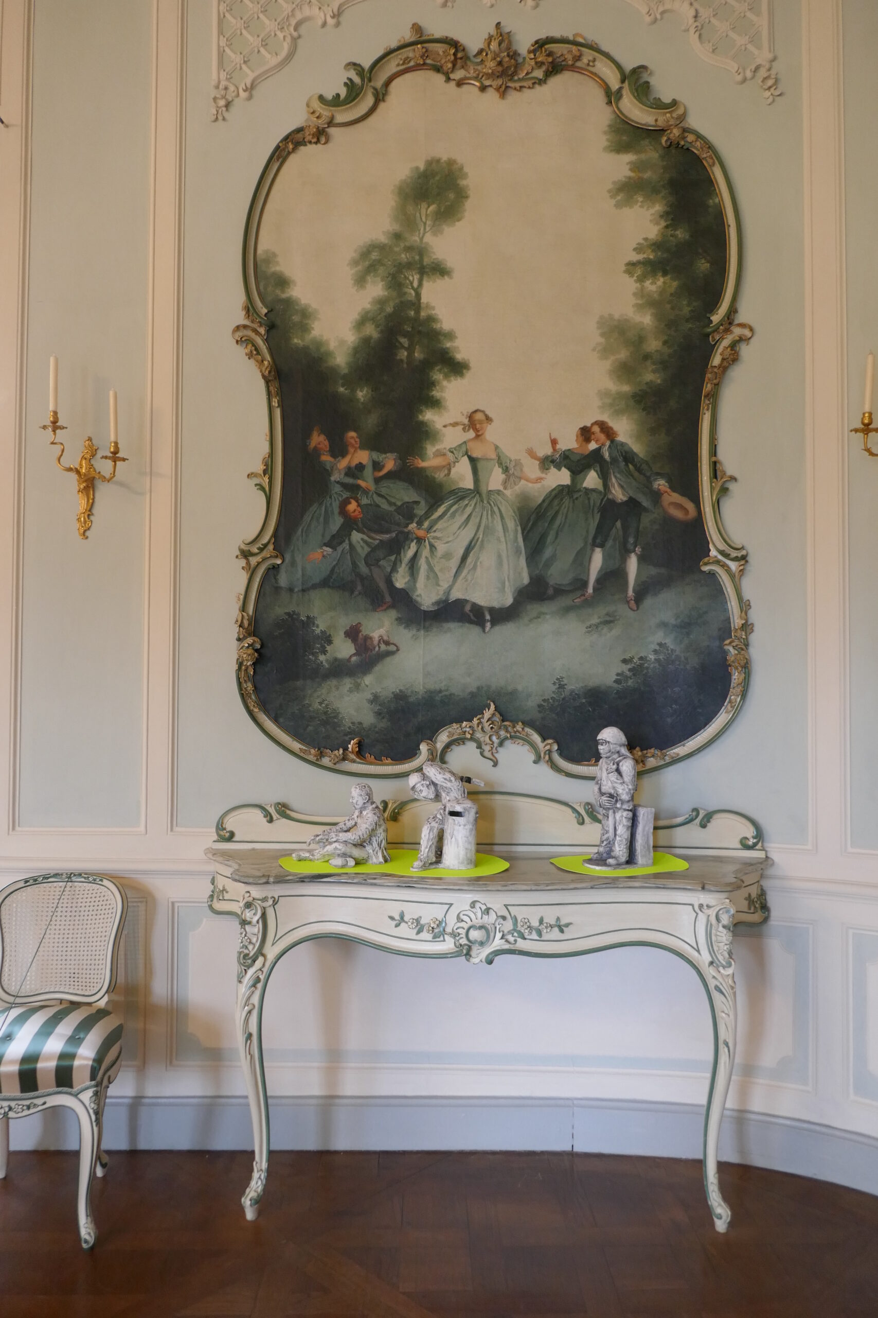
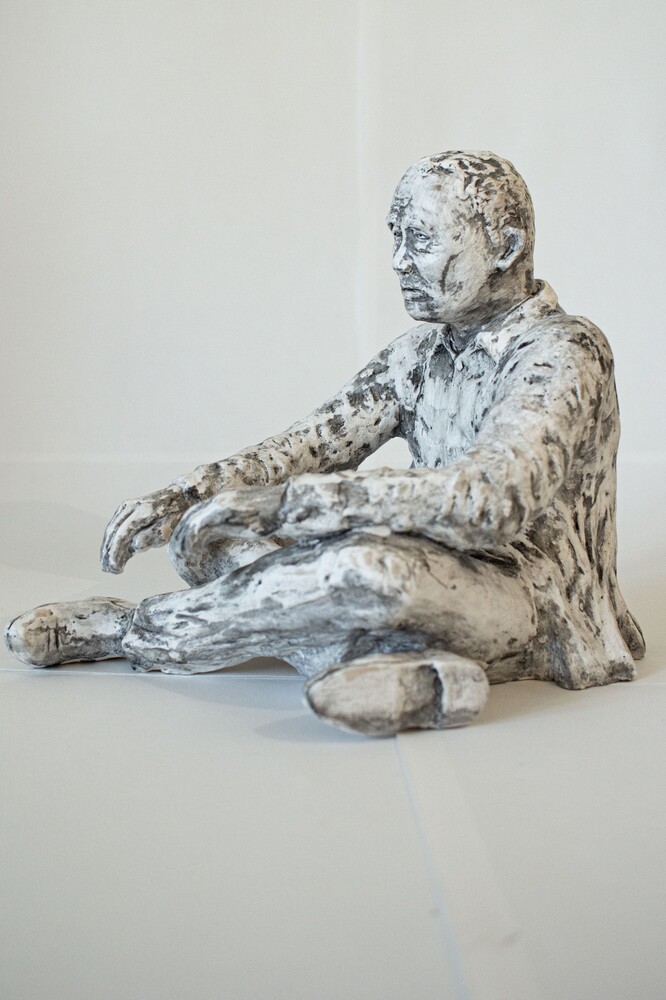
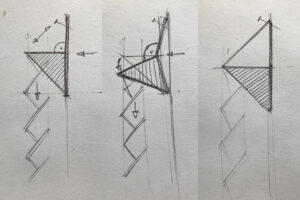
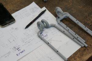
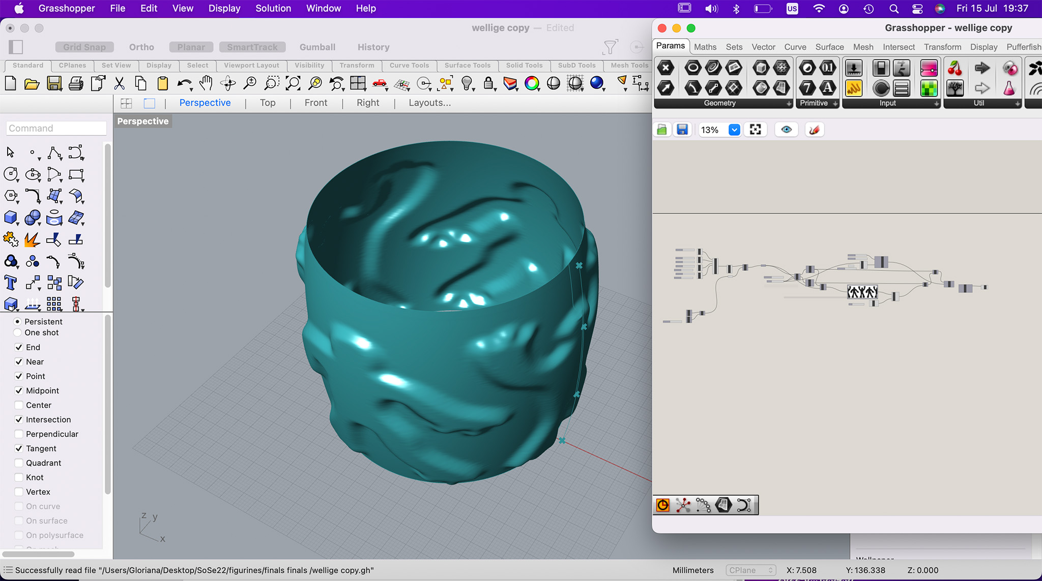
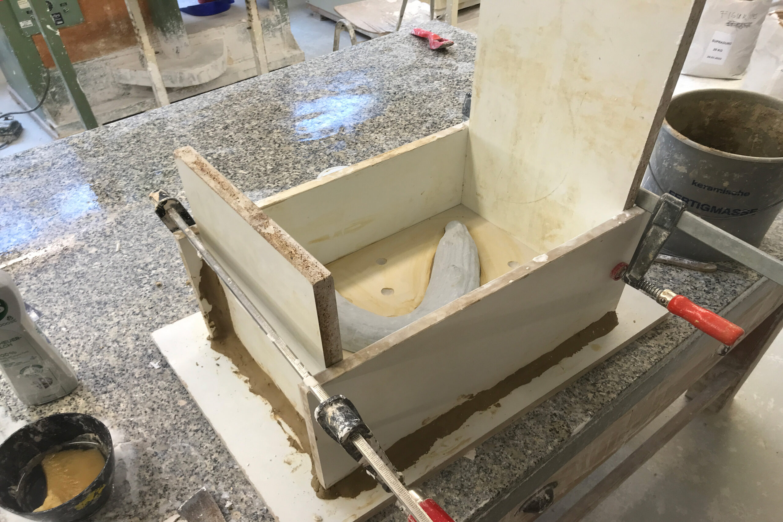
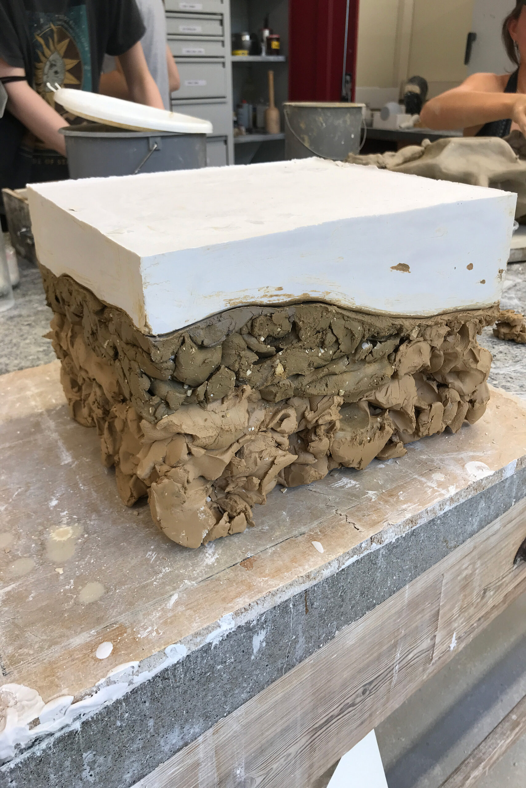
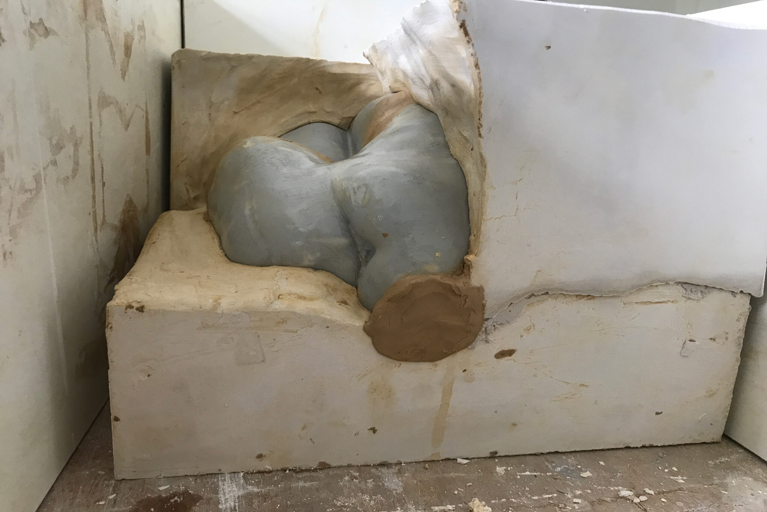
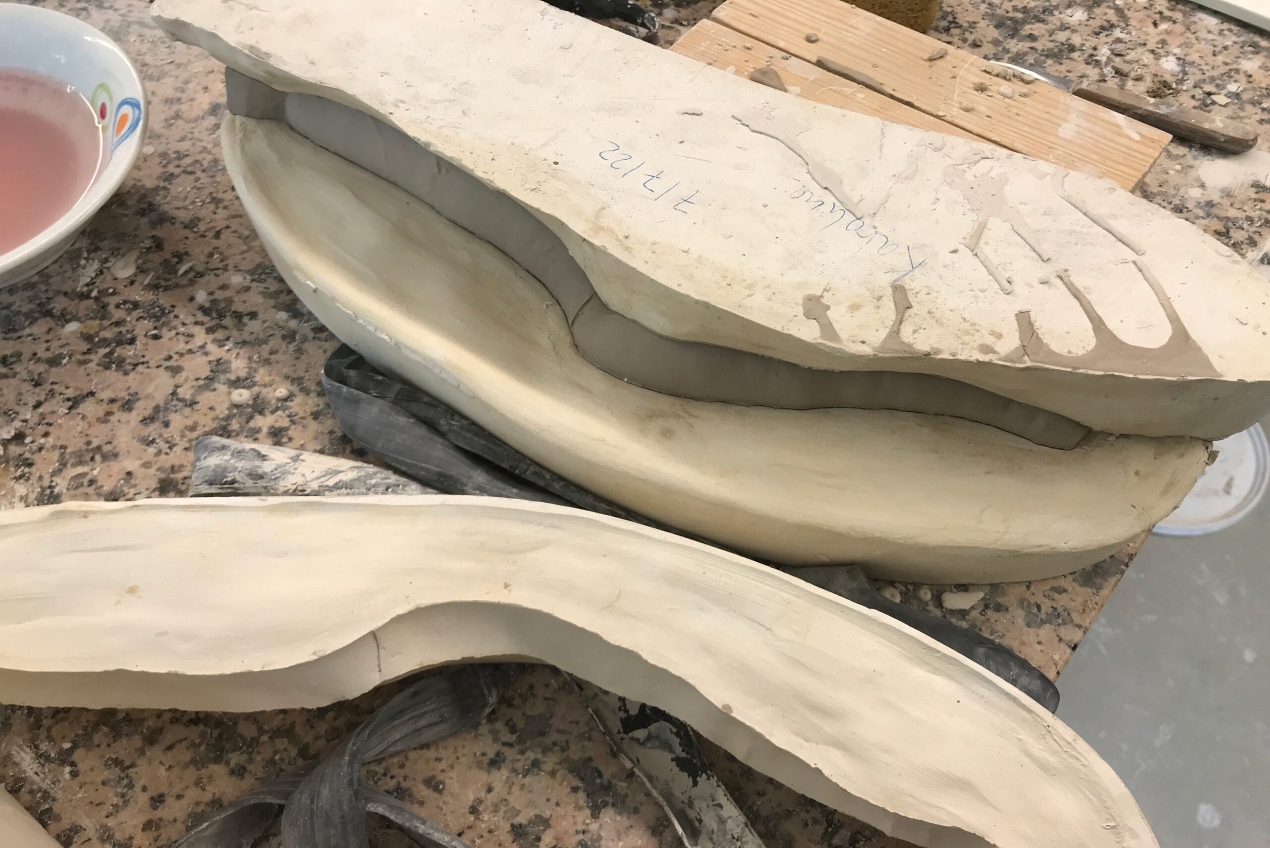
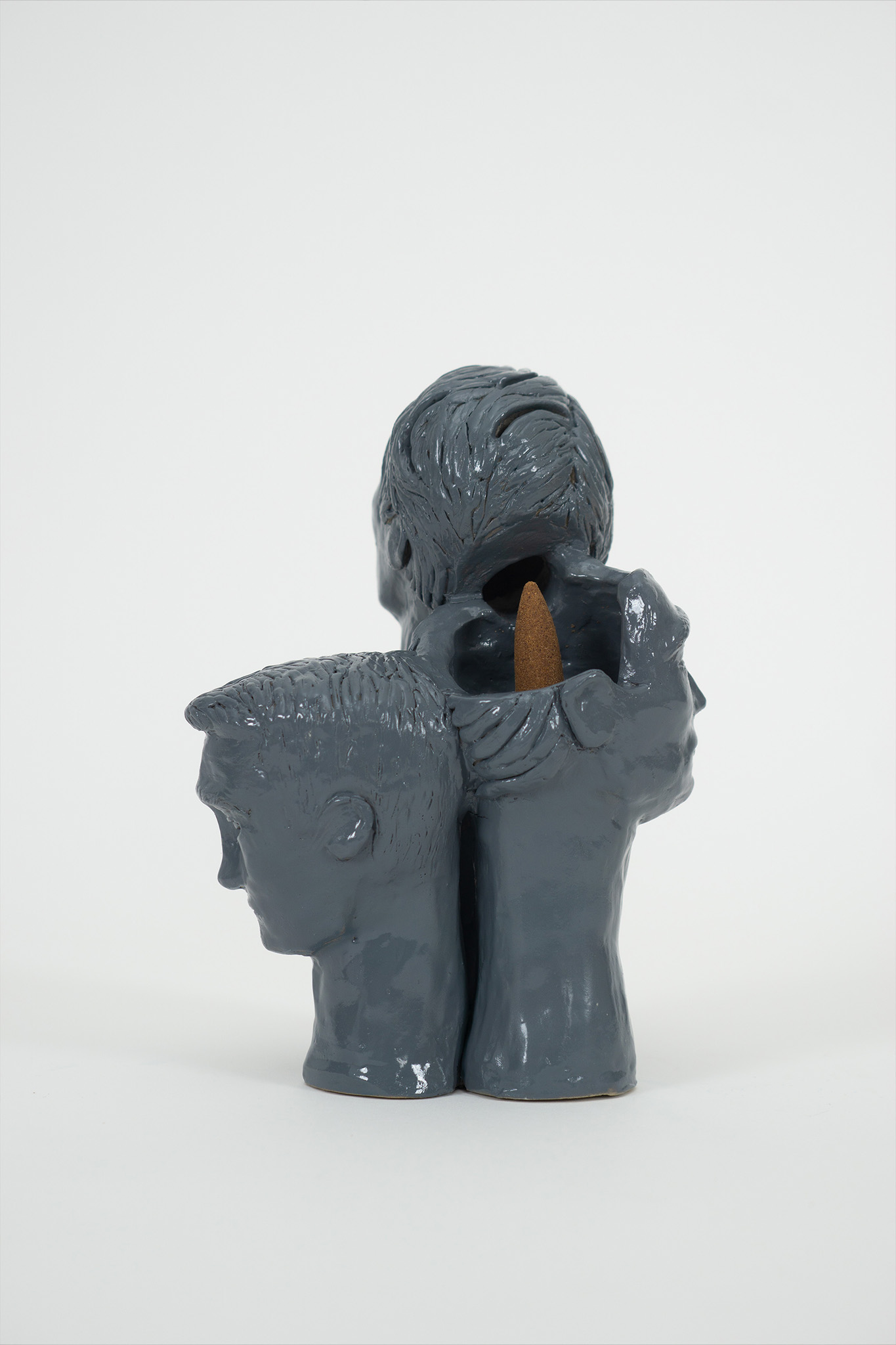
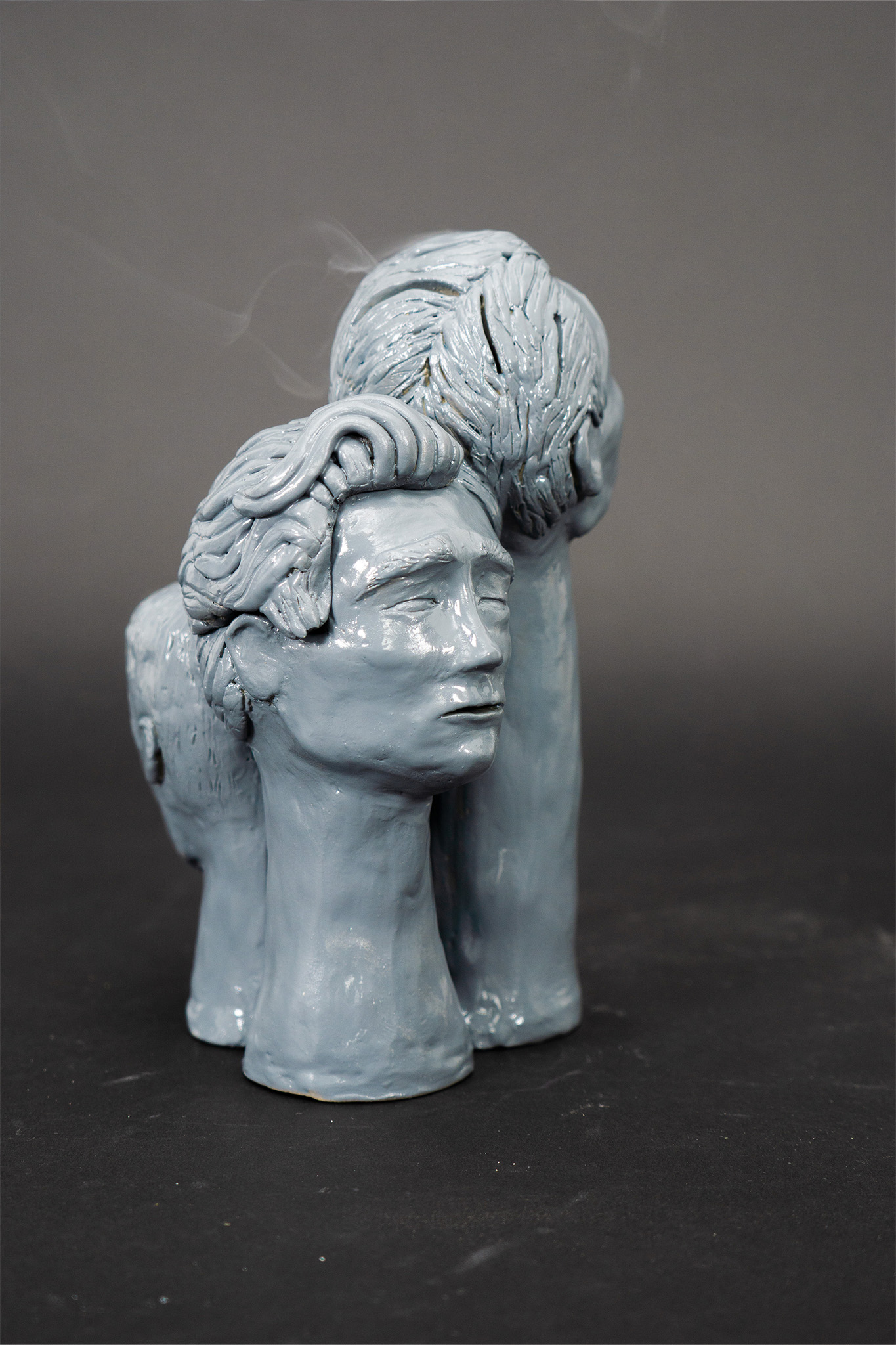
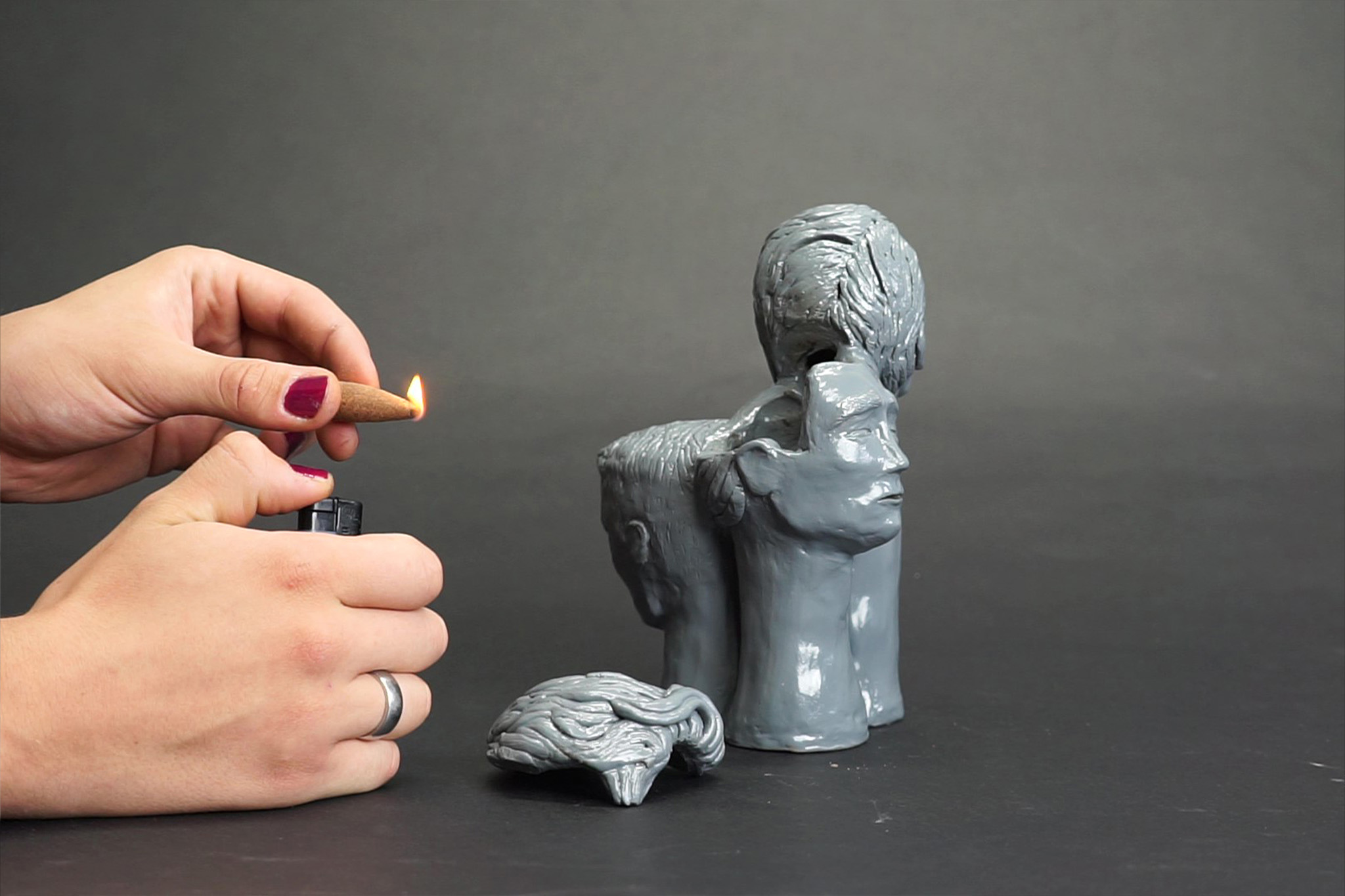
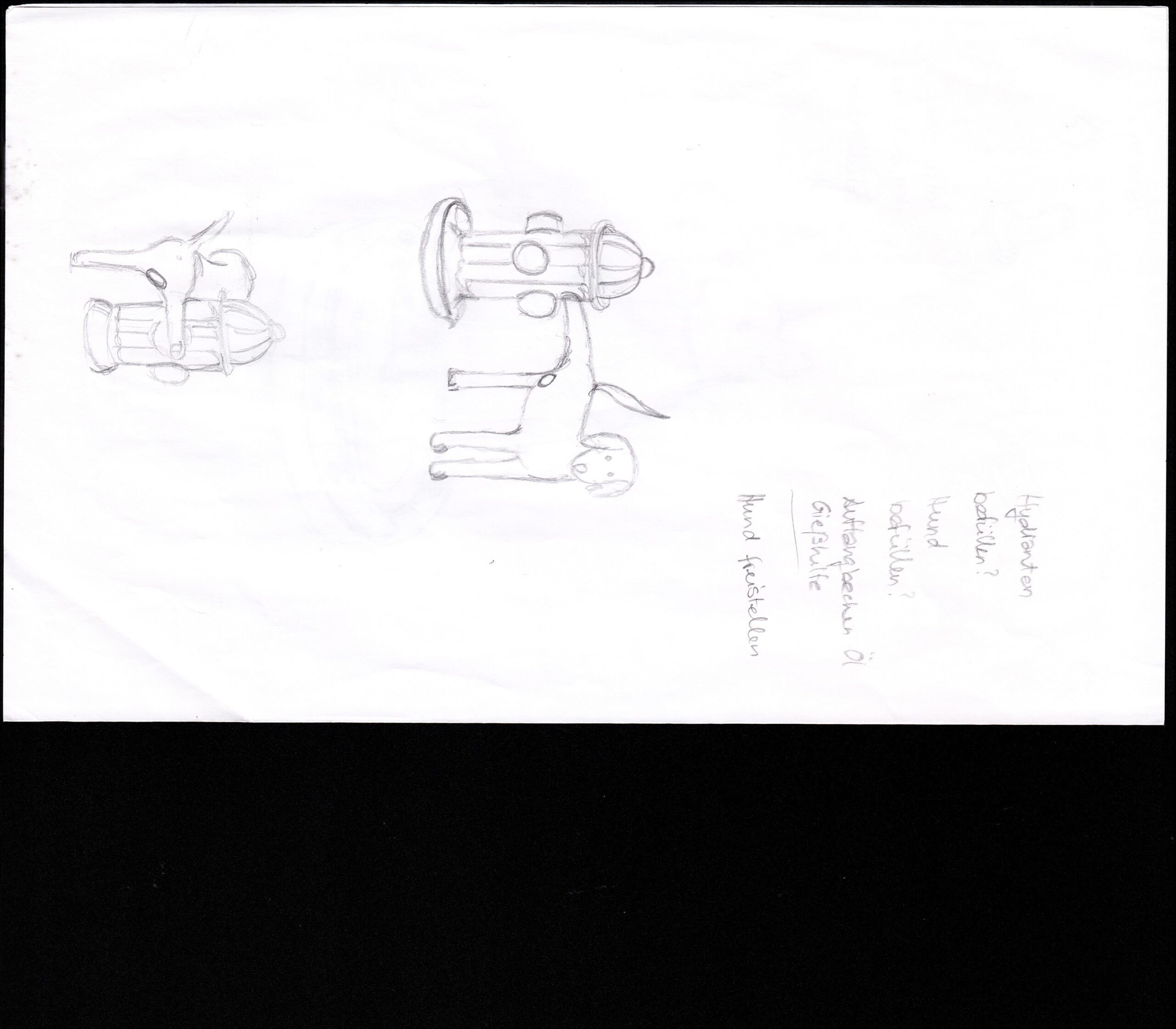
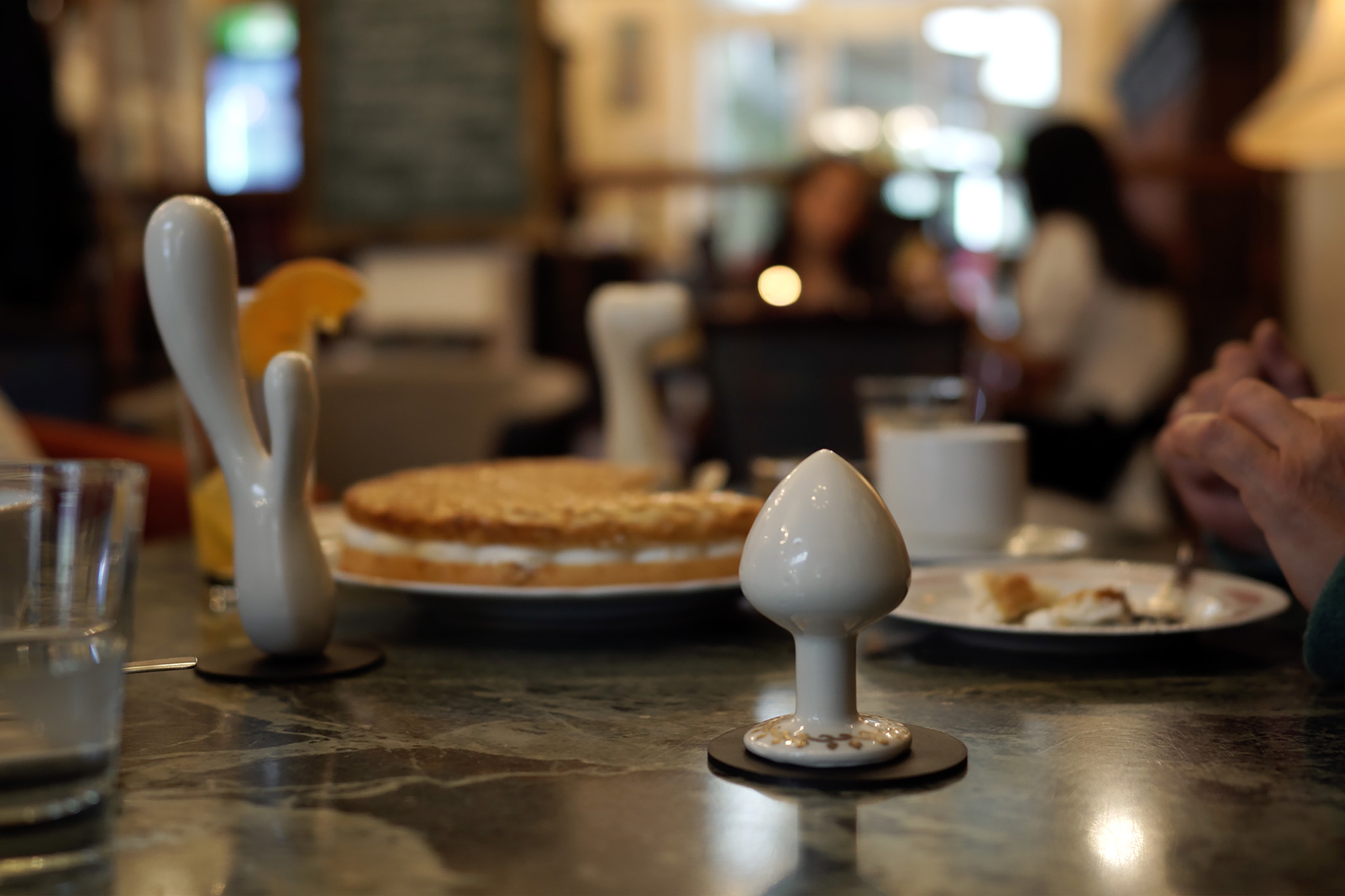
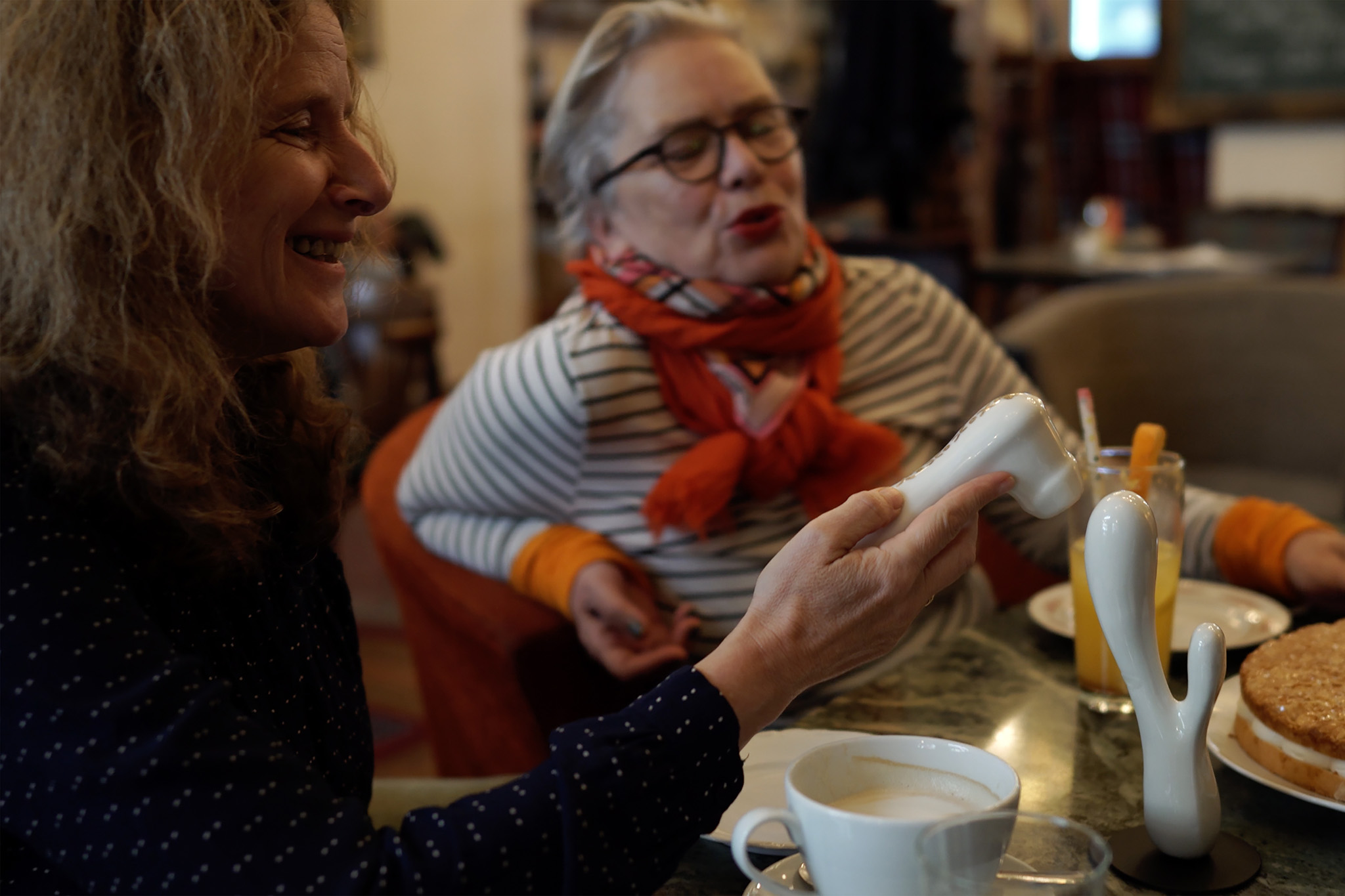
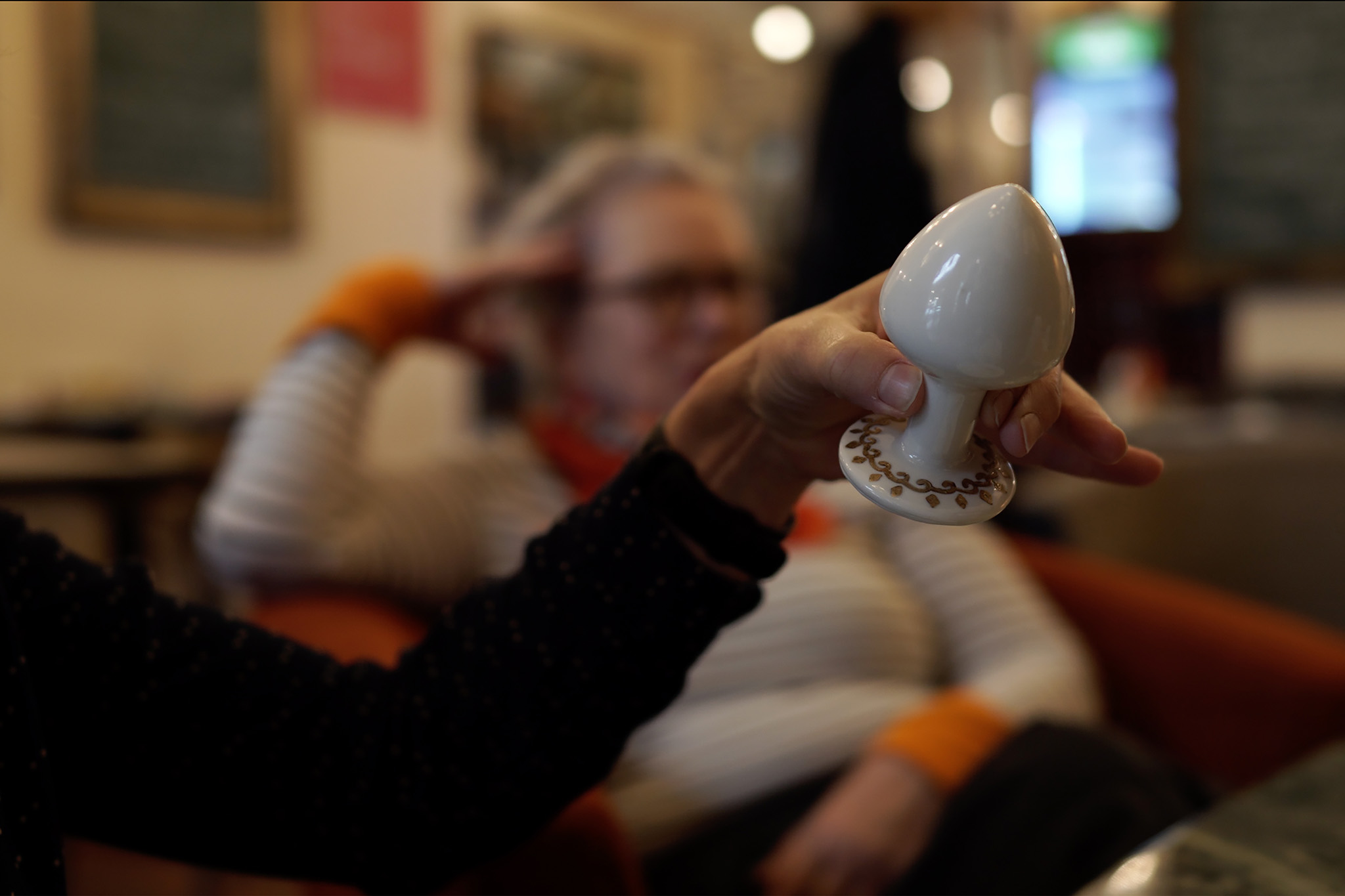
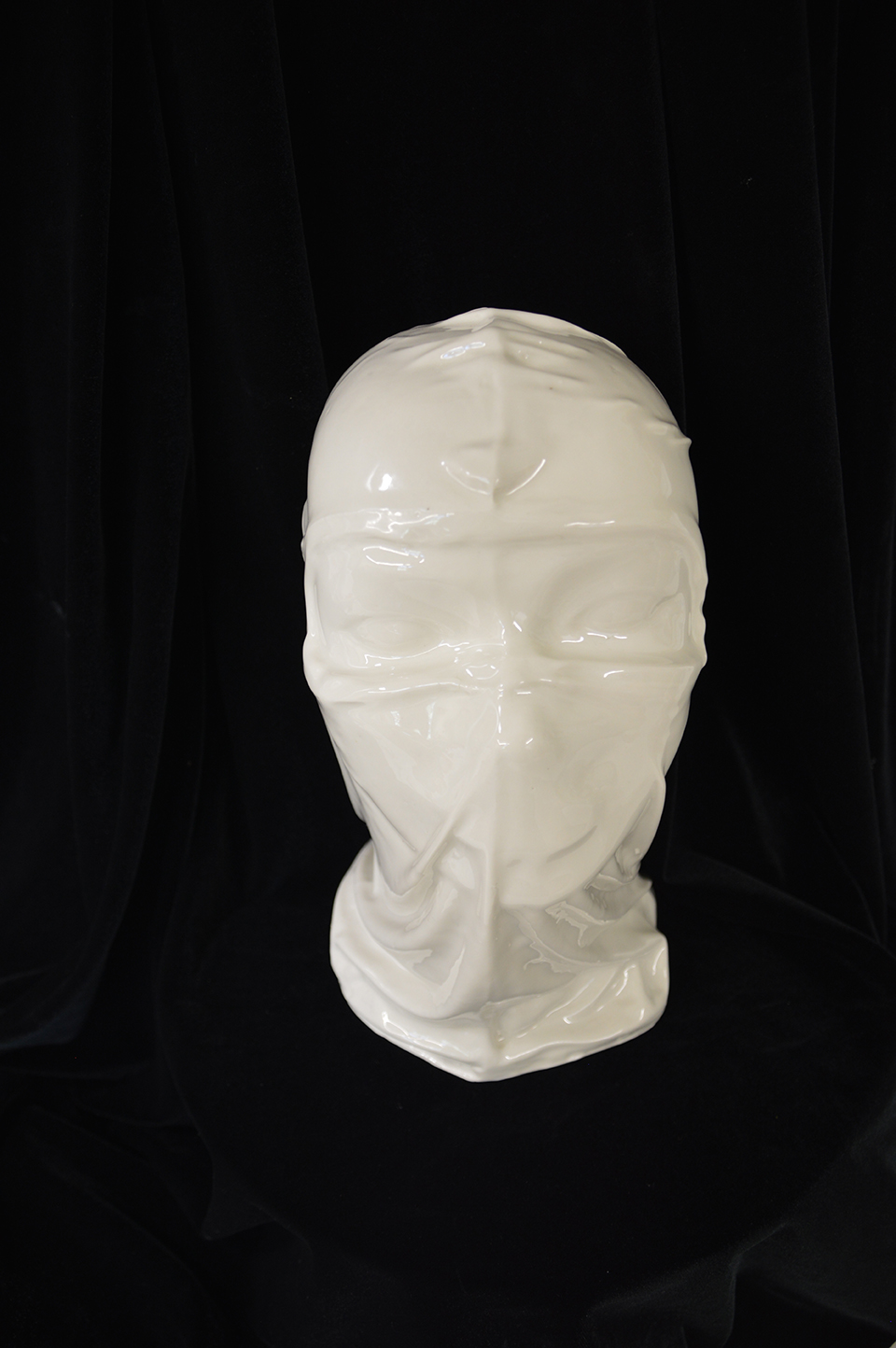
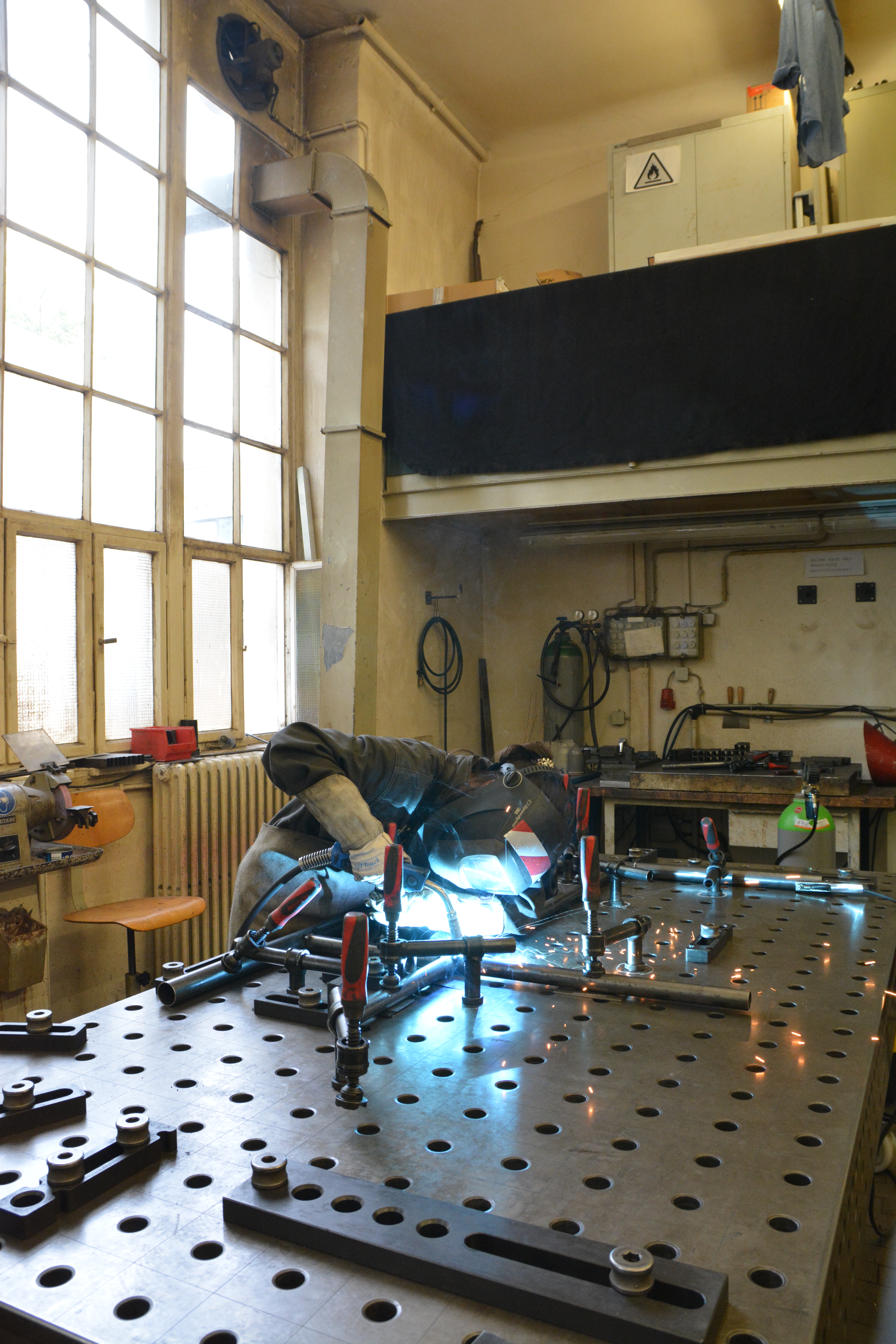
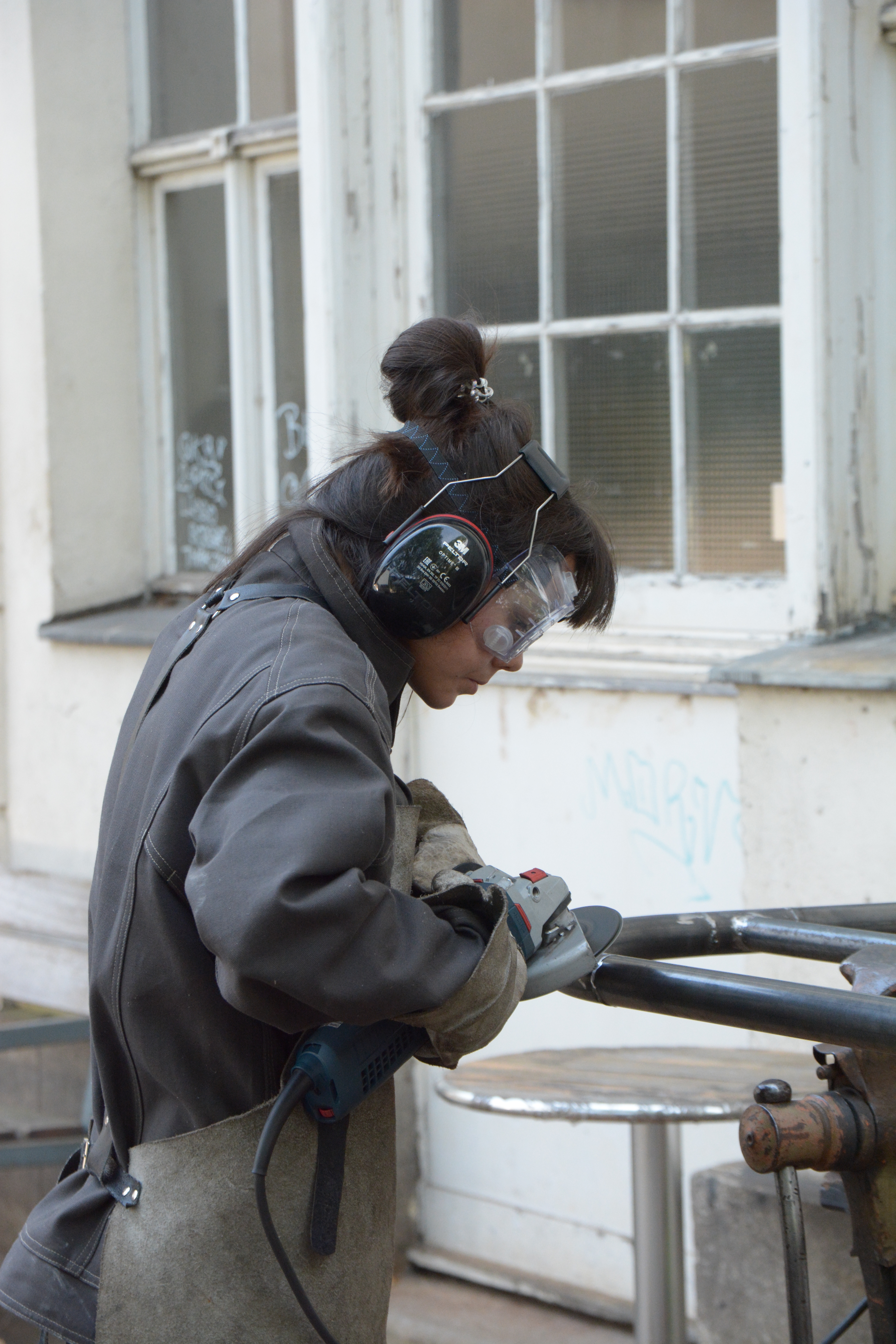
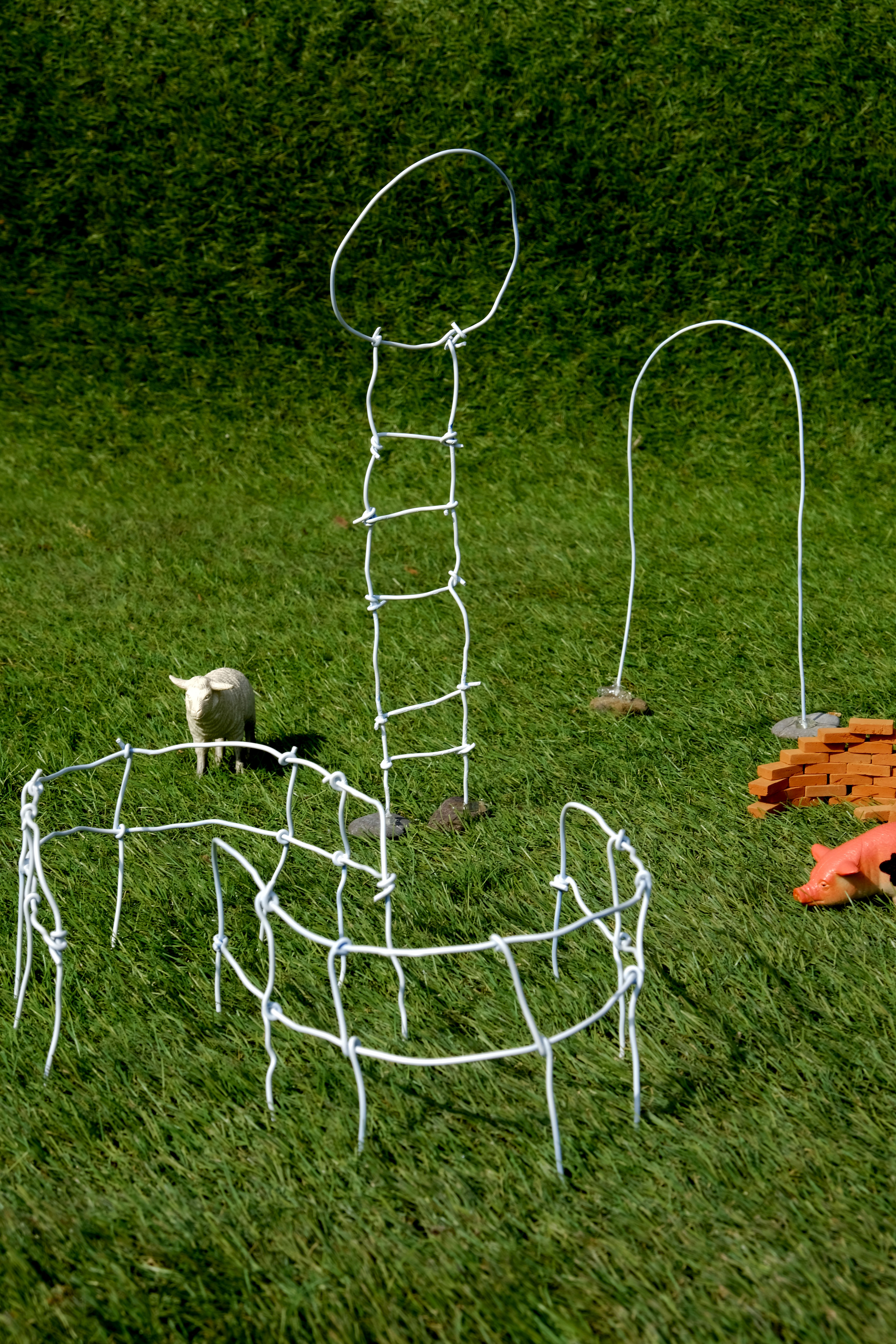
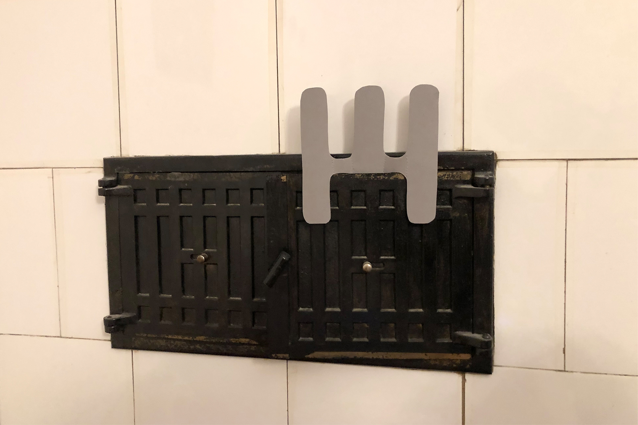
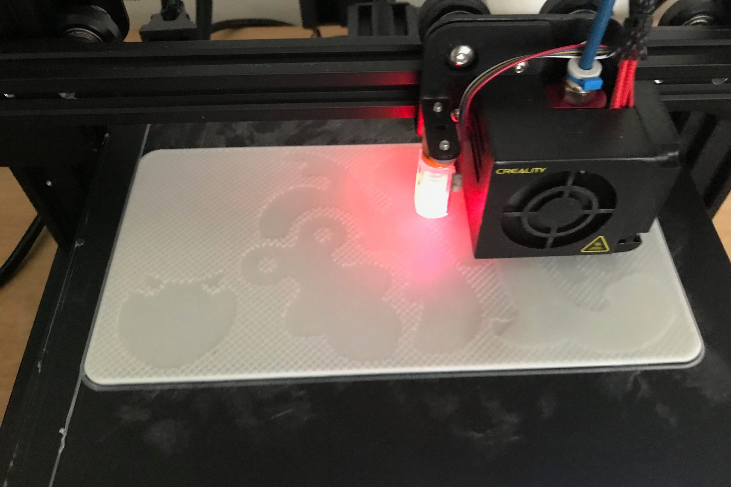
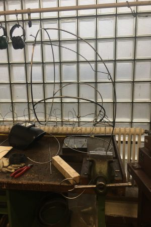
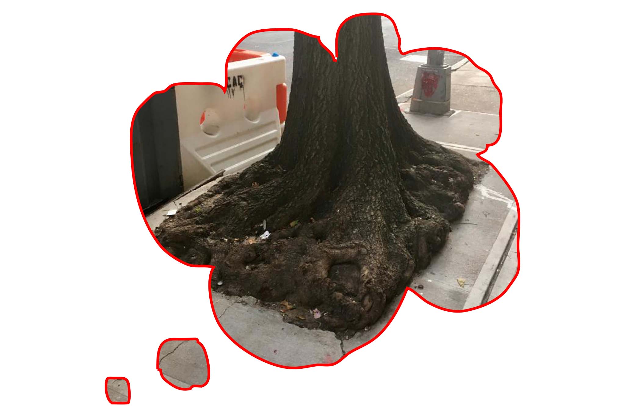
Die Agency of Unseen Sights wurde gegründet und ihr Zweck ist es zu erforschen, wie Orte behandelt werden, wenn sie mit Objekten markiert sind, die darauf hinweisen, dass es etwas zu sehen gibt. Ich wollte verstehen und sehen, ob die Politik von Objekten vermitteln kann, wie sie verwendet werden sollten und welche Ergebnisse die Verwendung dieser Objekte haben wird. Wird der Betrachter/Benutzer ein tieferes Verständnis für den Akt des Sehens und Besichtigens haben? Wird der neu kontextualisierte Ort, an dem meine Objekte platziert werden, als Sehenswürdigkeit gelesen/gesehen?
Mit Agency of Unseen Sights möchte ich nicht unbedingt positive oder negative Seiten des Sightseeings vermitteln, aber der Zweck ist, dass die Menschen den Akt des Sehens hinterfragen, sich Gedanken darüber machen, wie unsere Augen und Ansichten mit Objekten gelenkt und markiert werden, wie unsere Sehenswürdigkeiten vermarktet werden. Was wollen sie uns zeigen? Vielleicht sogar darüber nachzudenken, ob Ihre eigenen Augen darauf trainiert sind, nach ‘sehenswürdiges’ zu suchen, oder ob alles zu einem Spektakel werden kann, wenn Sie erkennen, dass Sie derjenige sein können, der entscheidet, was Sie sehen möchten. Oder nicht.
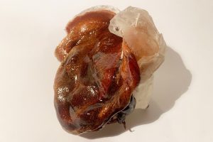
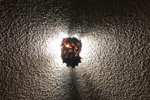
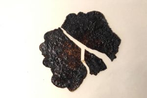
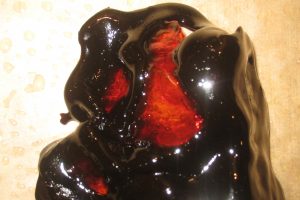
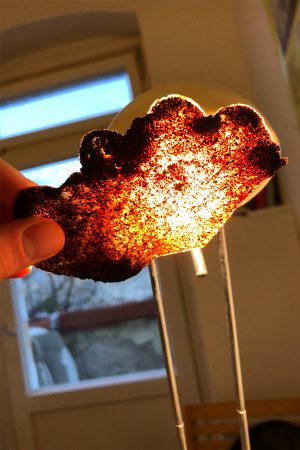
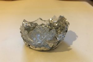
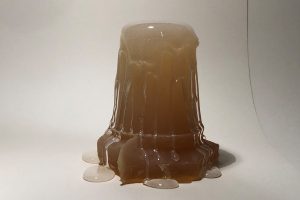
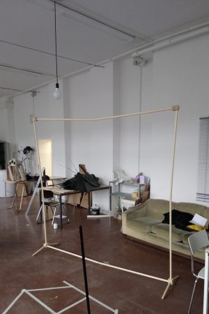
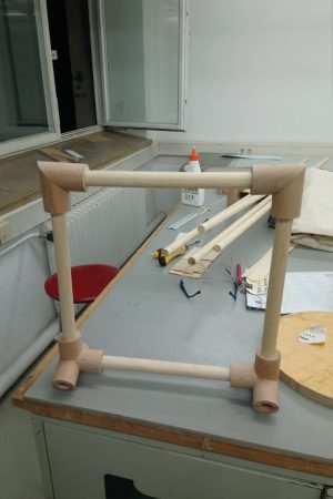
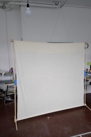
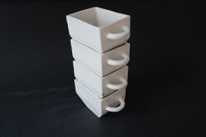
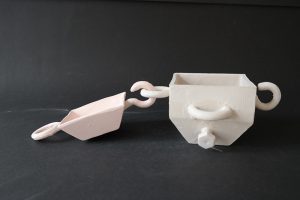
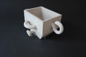
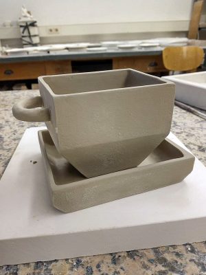
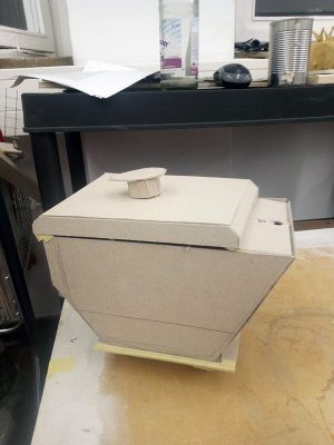
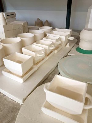
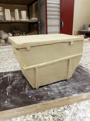
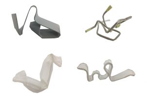
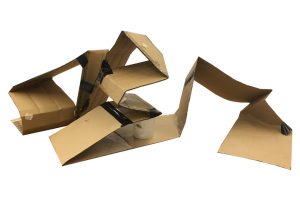
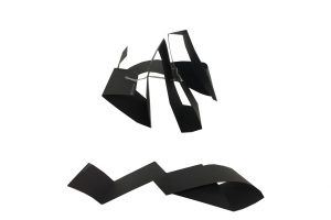
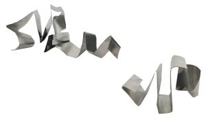
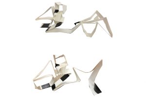
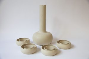
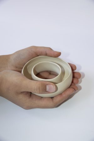
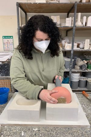
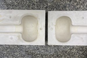
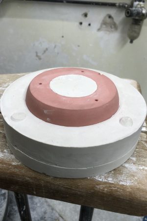
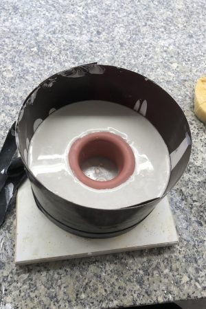
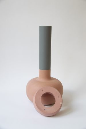
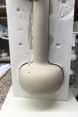
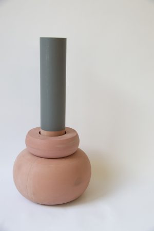
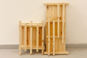
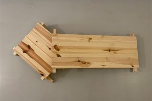
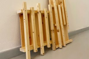
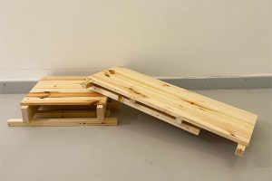
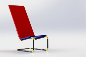
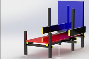
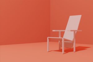
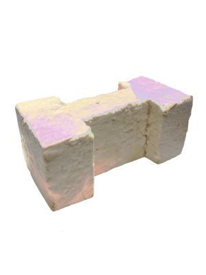
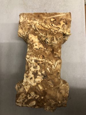
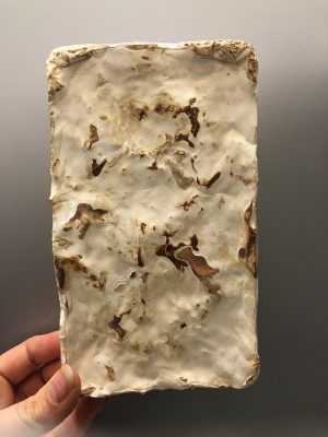
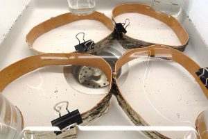
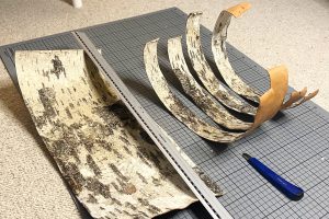
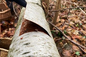
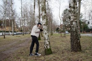
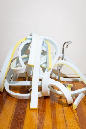
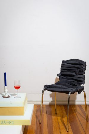
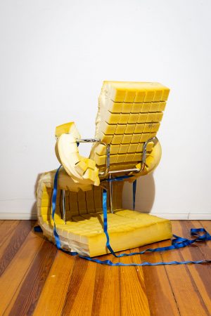
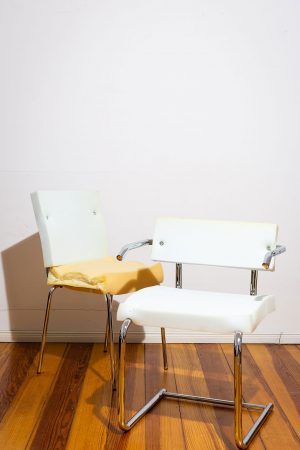
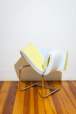
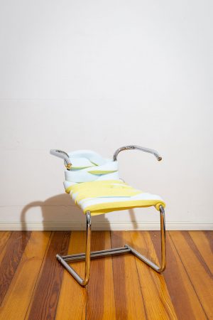
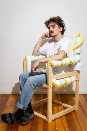
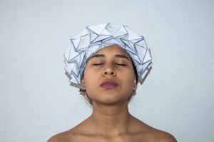
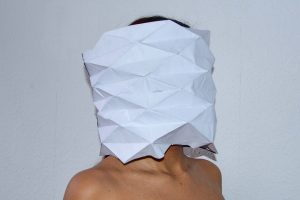
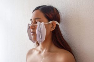
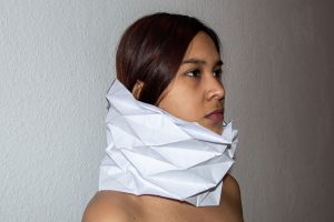
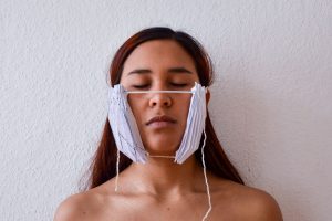
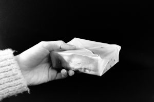
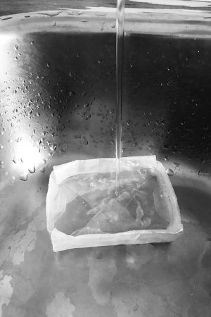
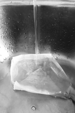
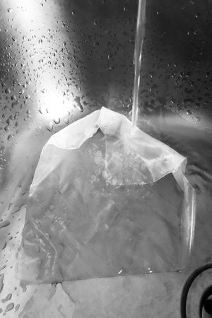
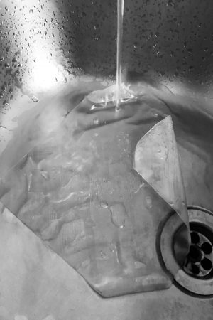
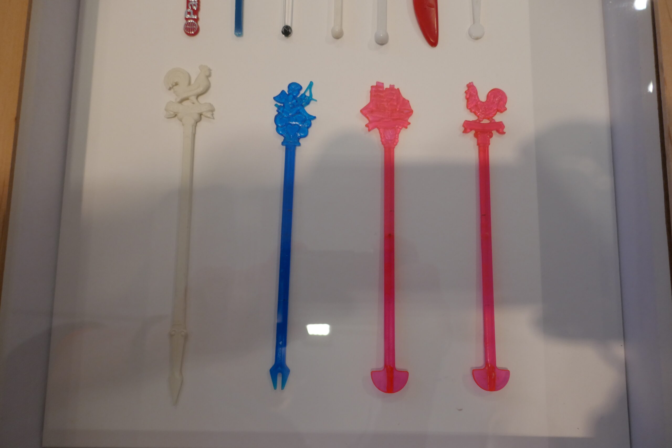
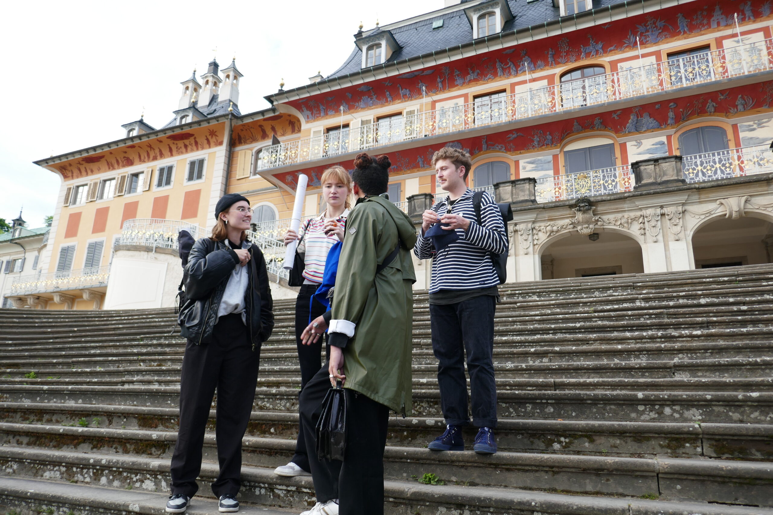
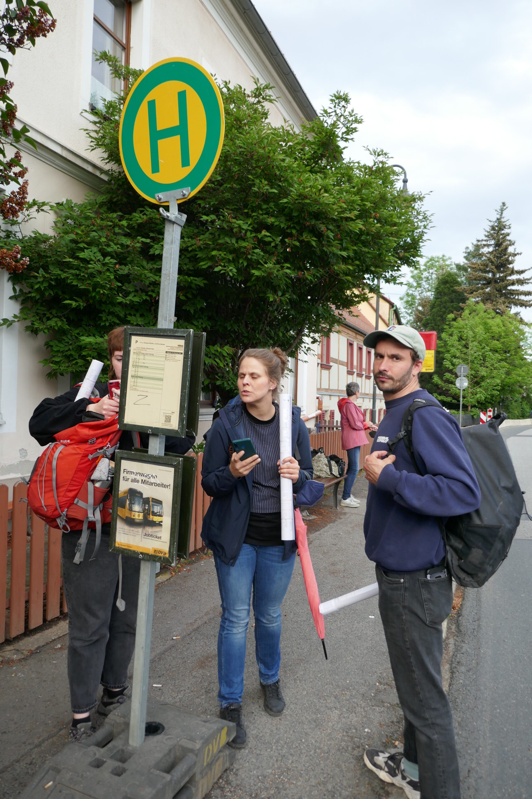
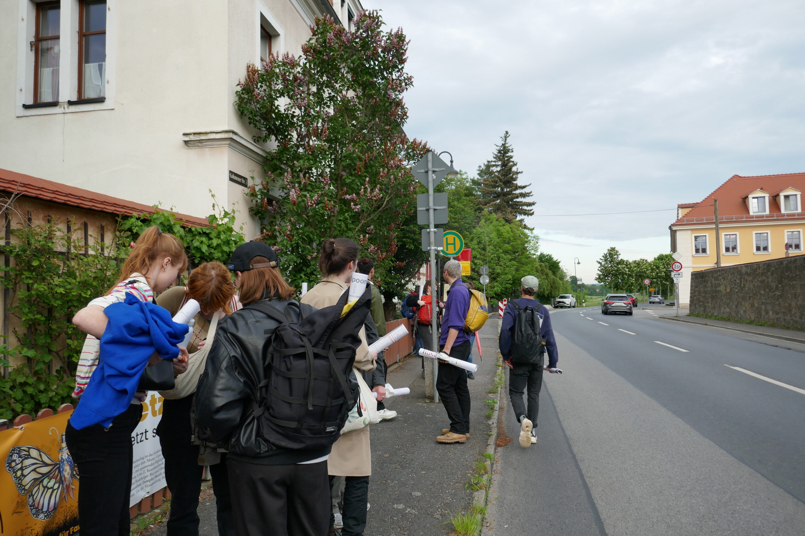
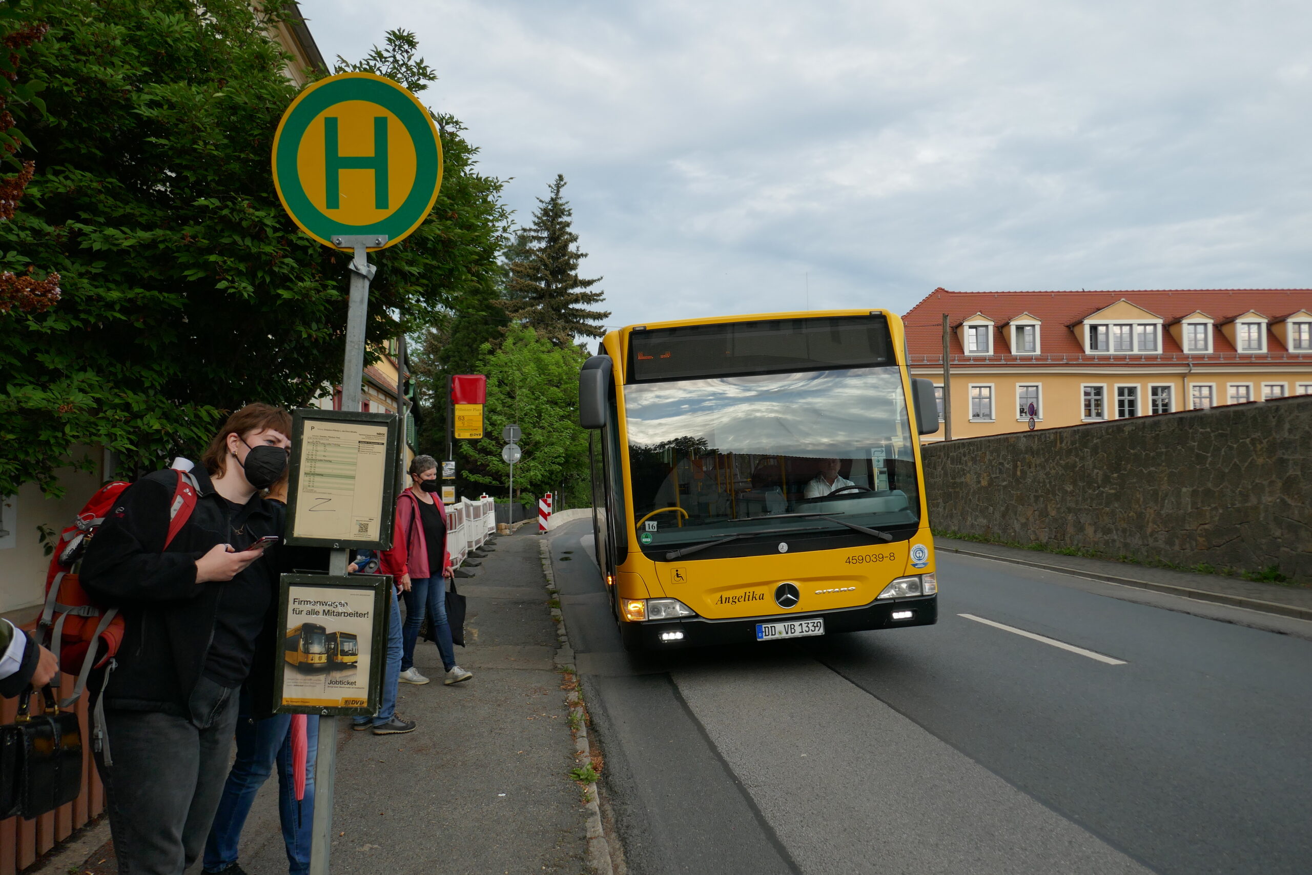
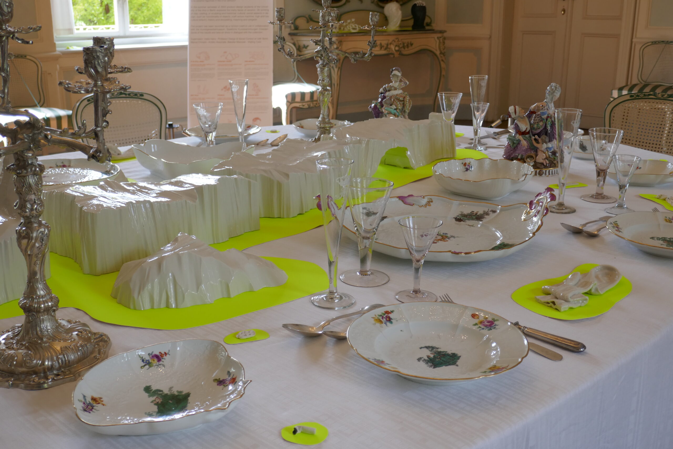
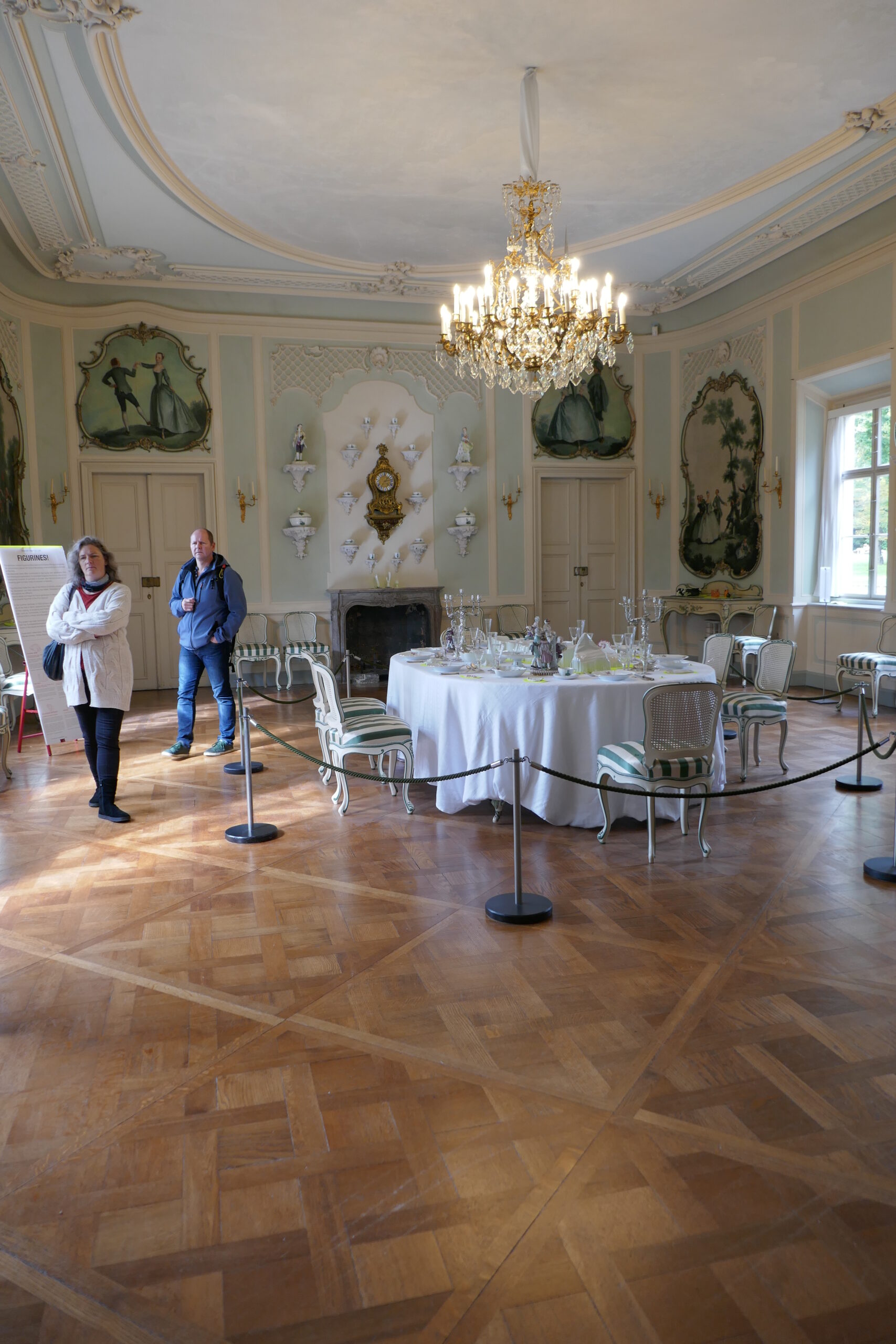
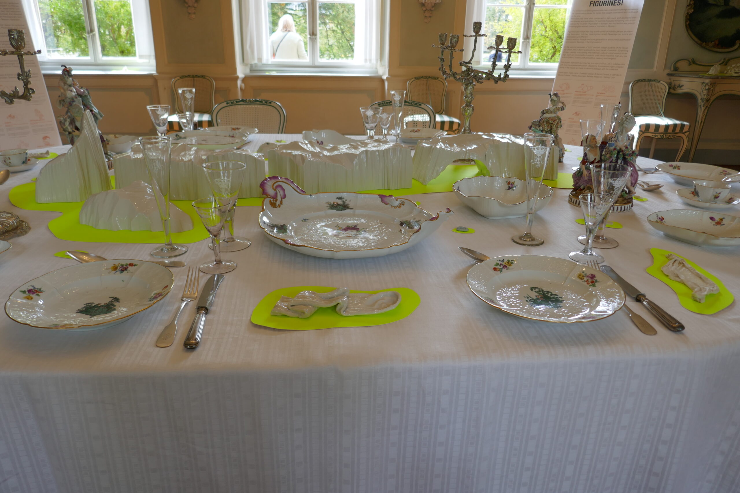
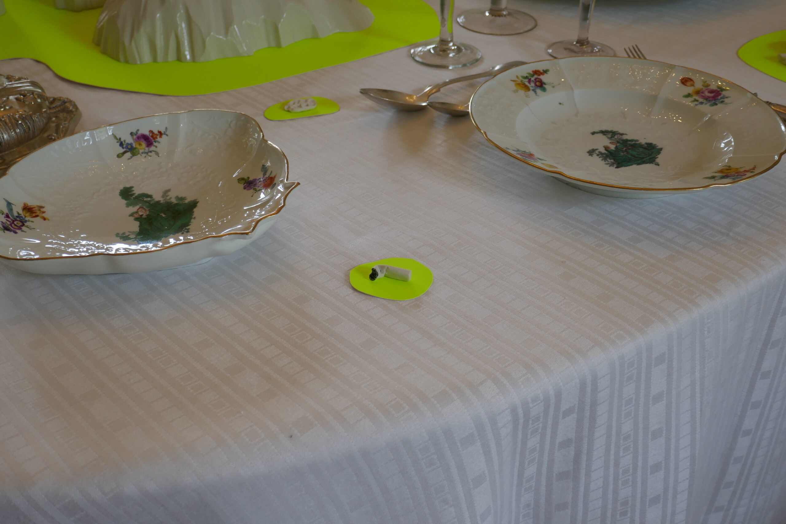
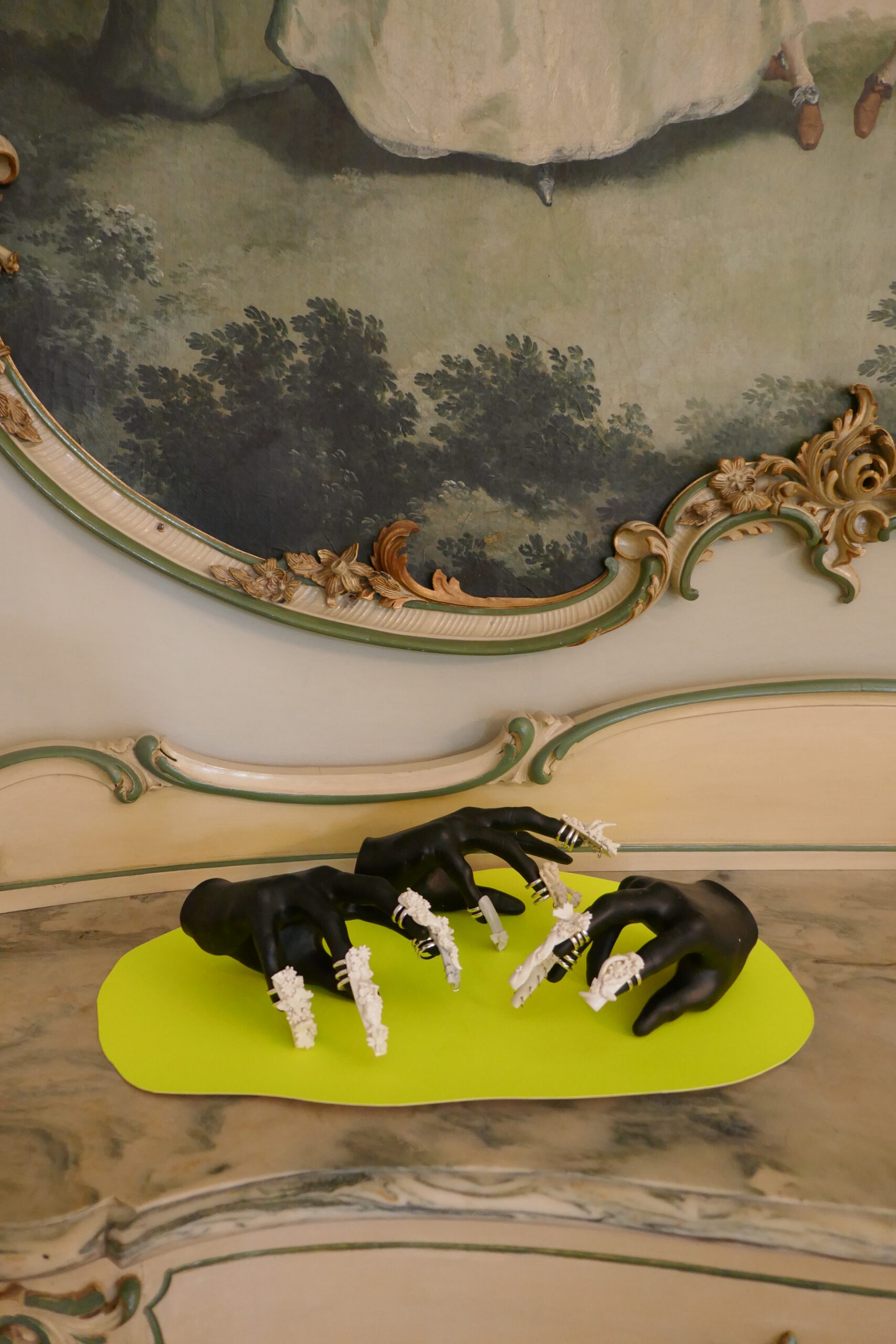
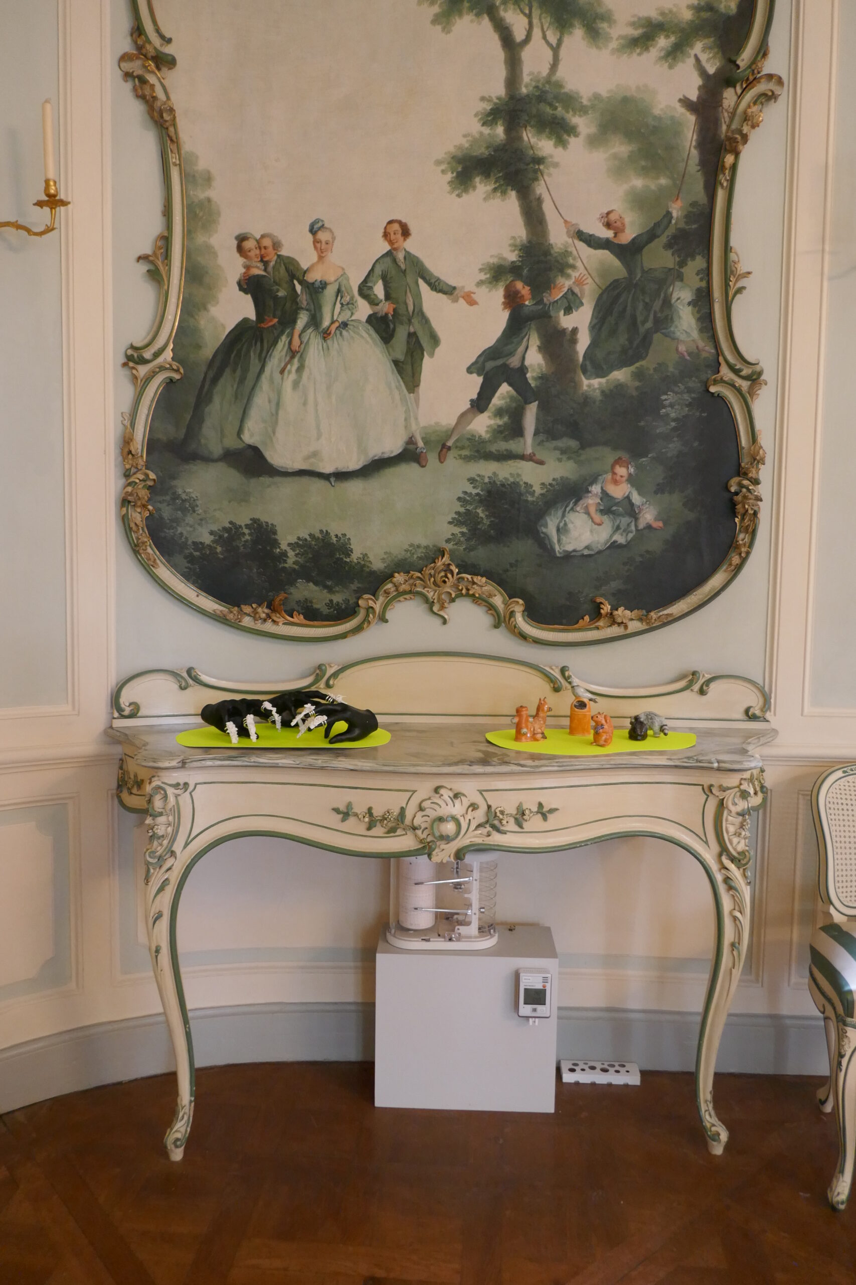
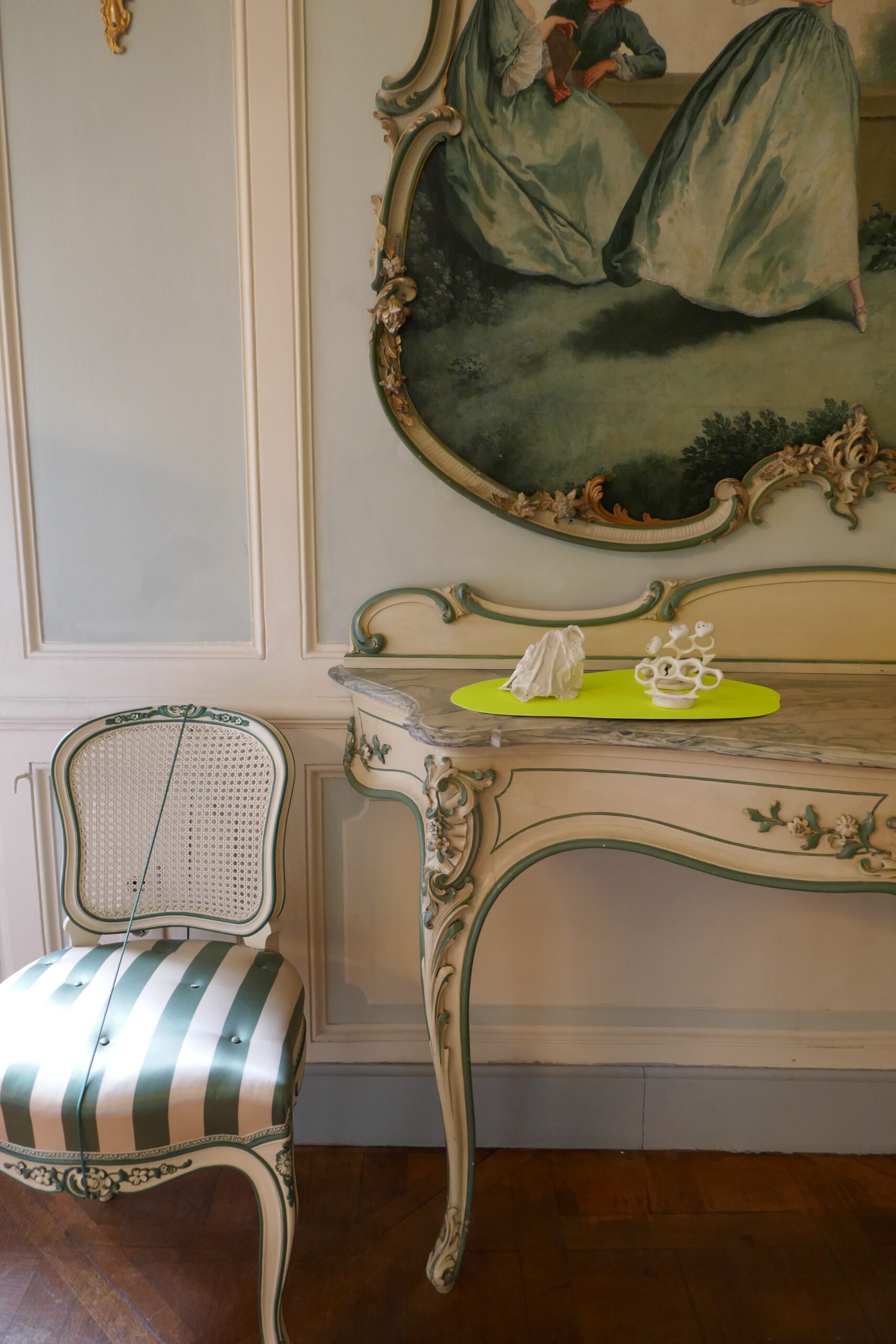
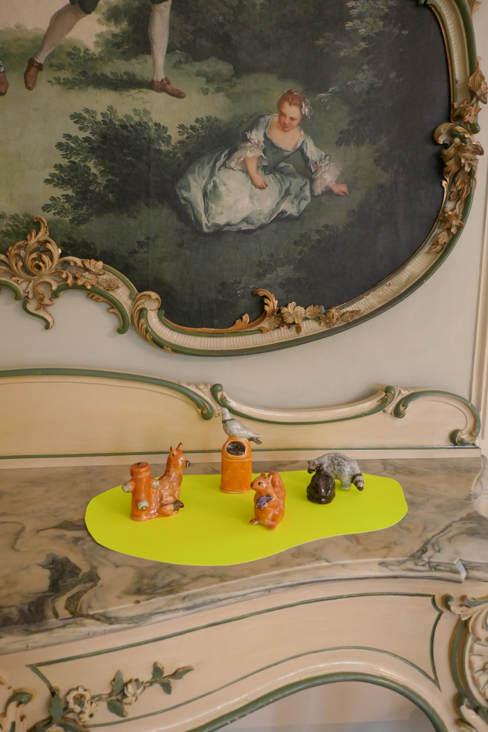
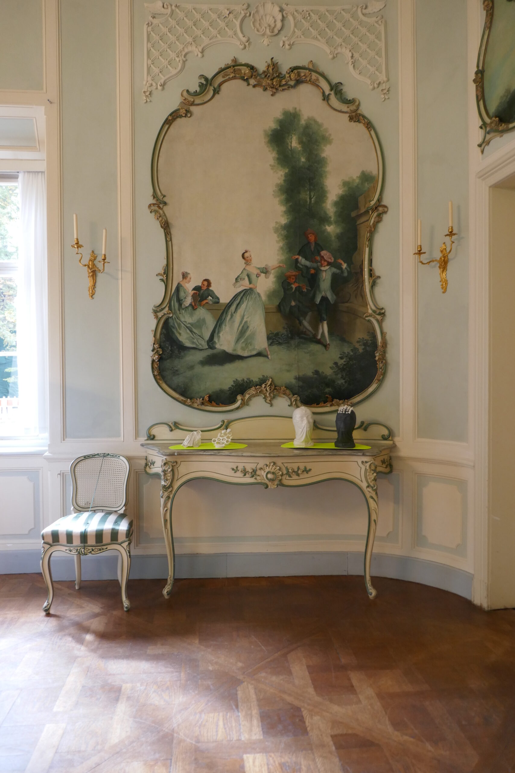
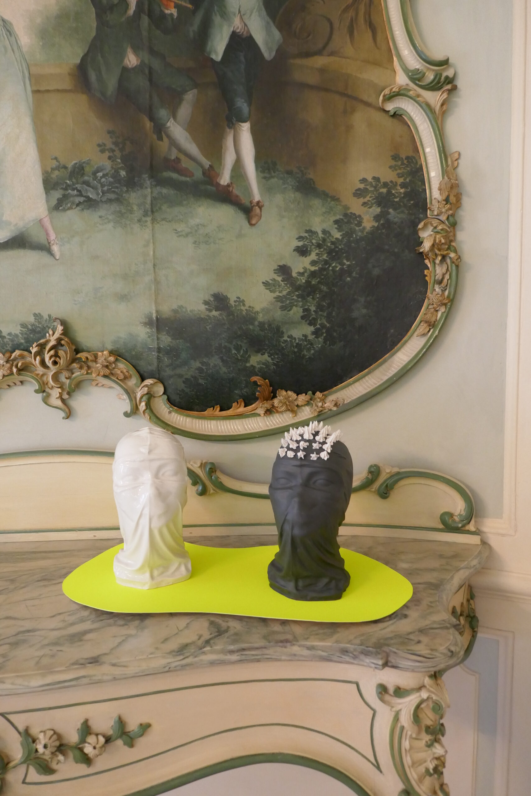
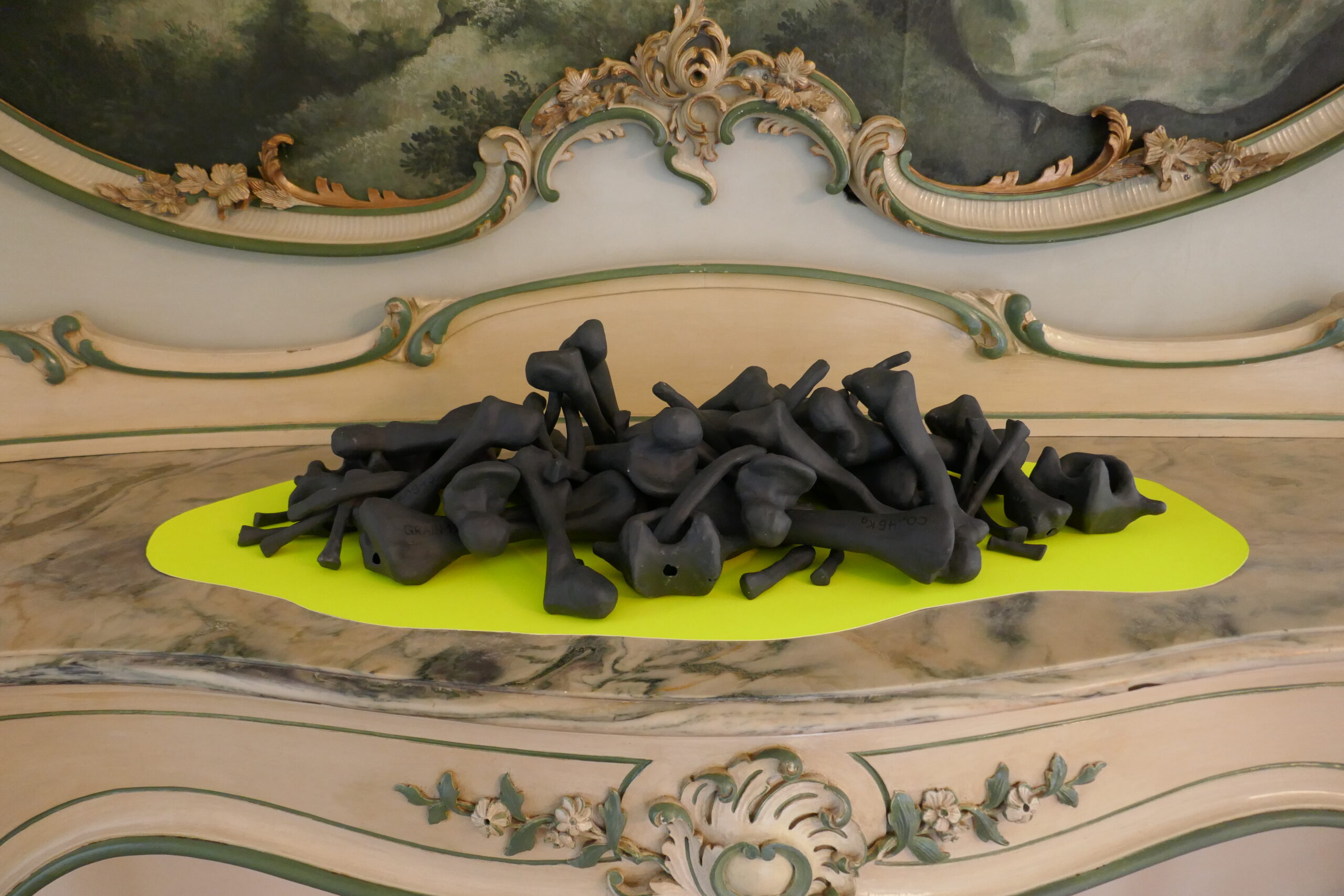
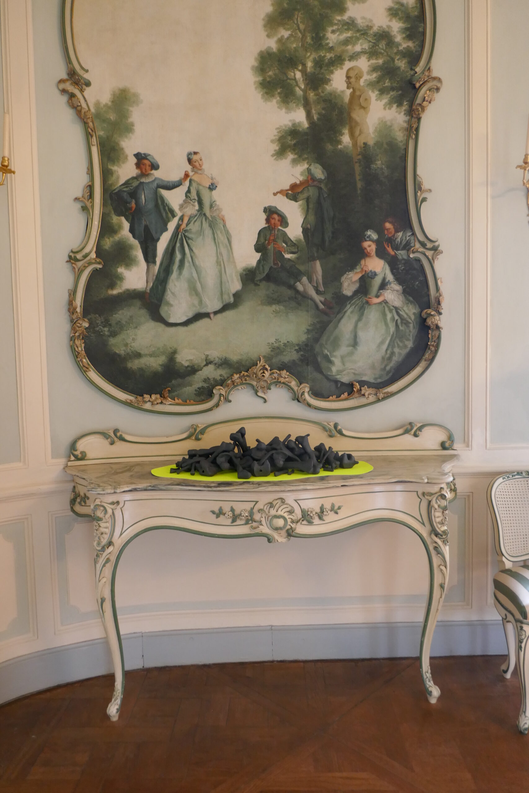
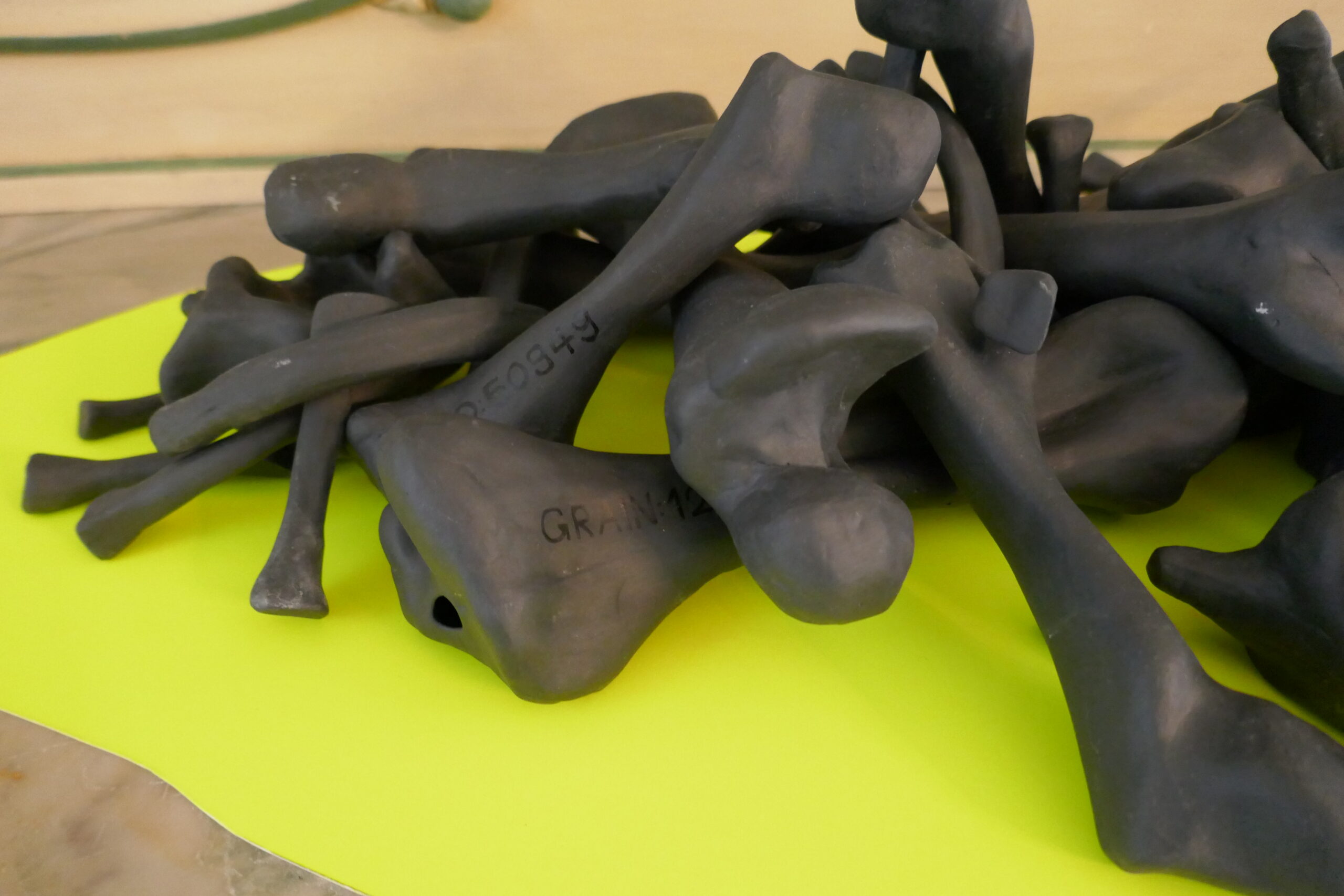
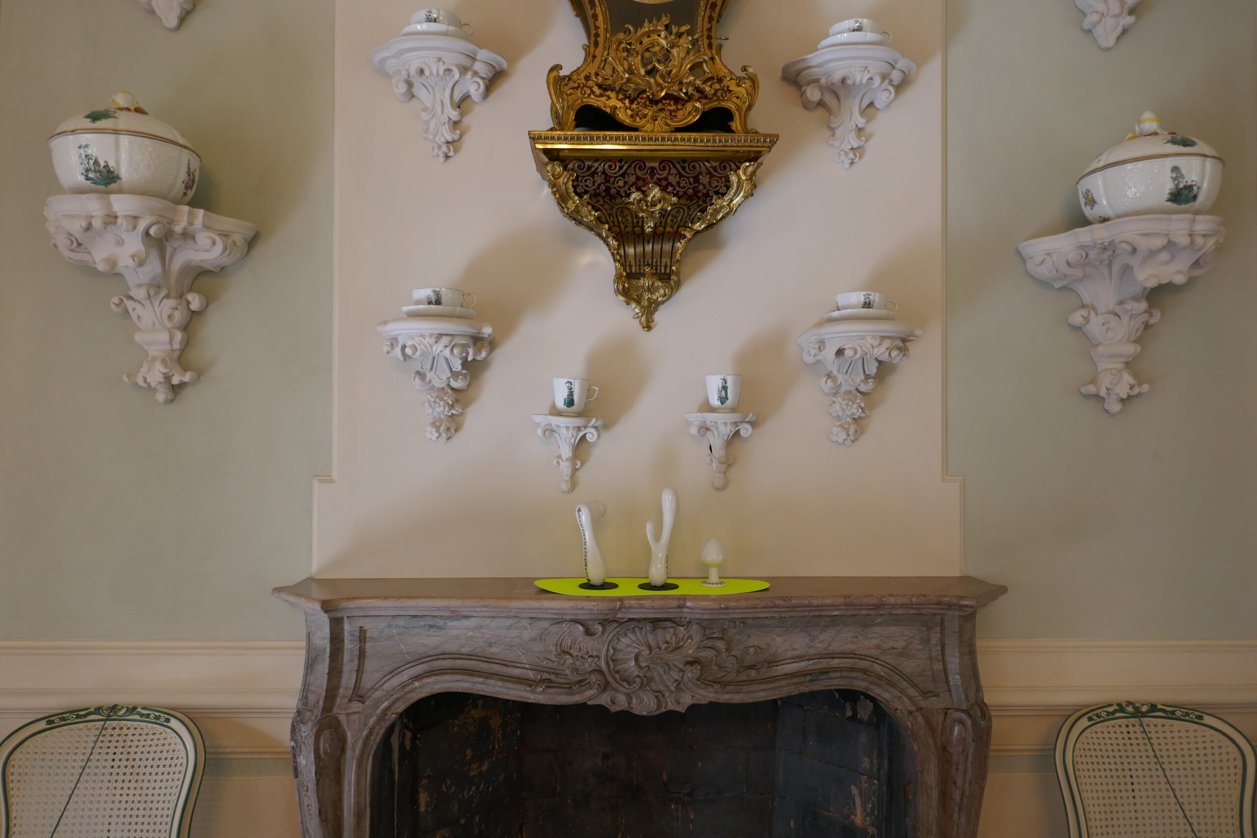
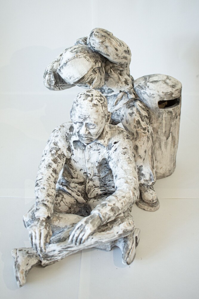
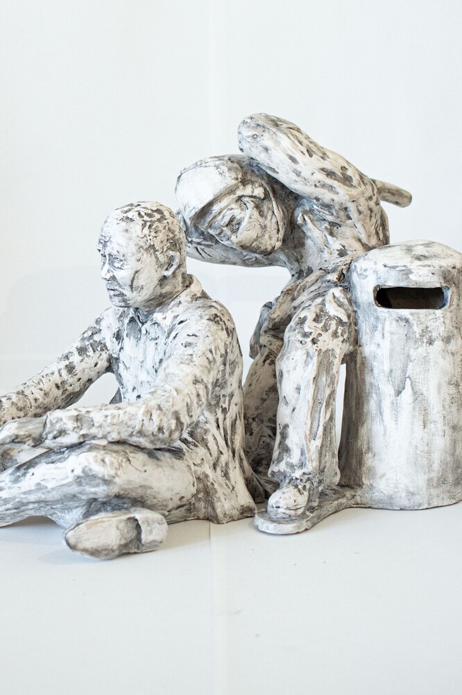
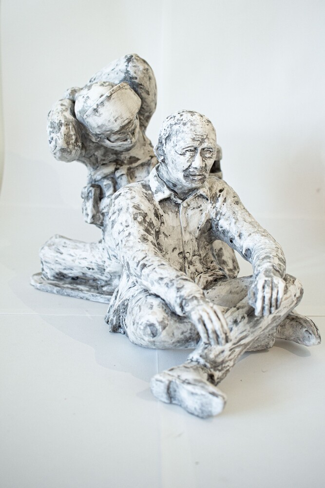
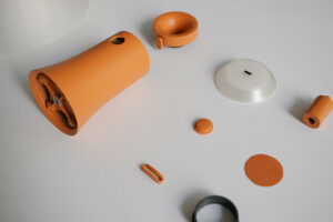
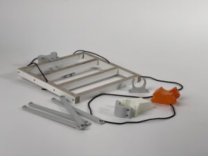
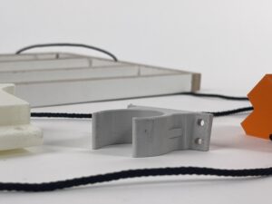
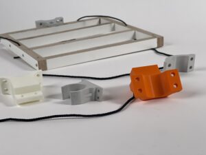
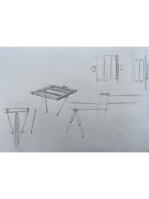
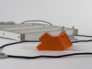
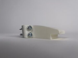
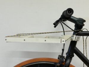
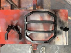
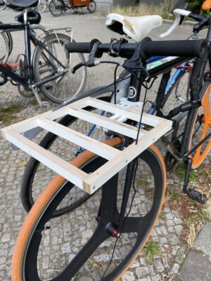
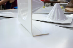
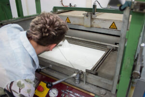
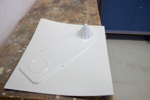
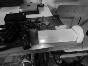
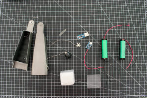
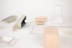
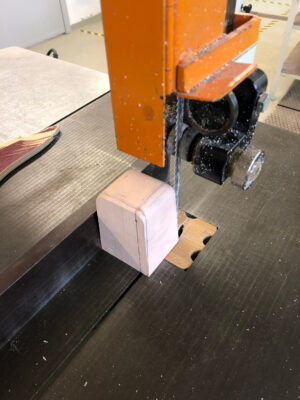
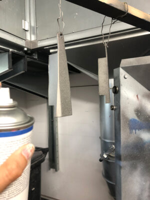
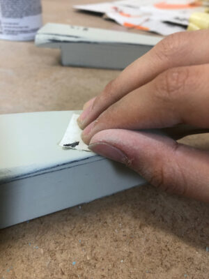
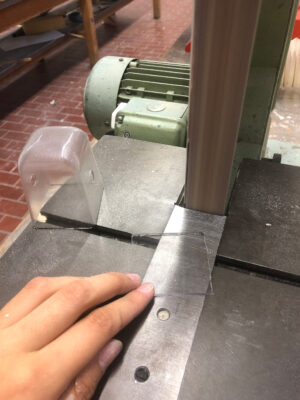
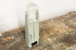
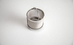
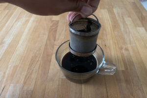
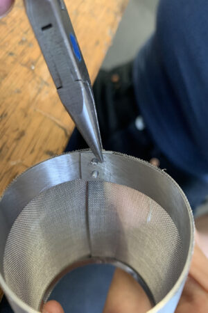
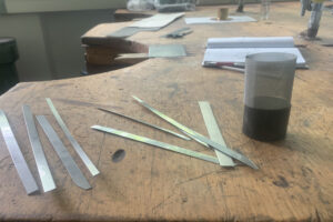
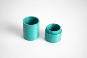
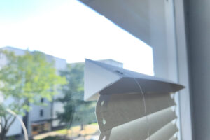
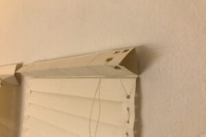
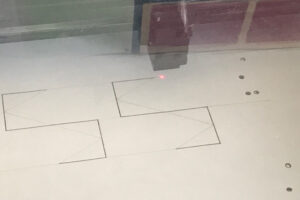
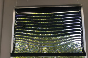
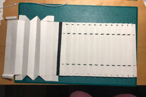
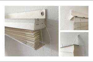
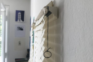
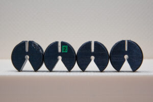
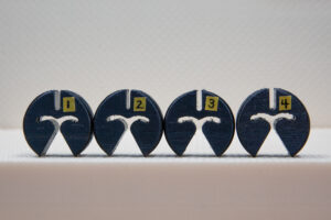
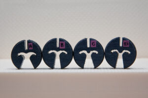
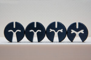
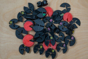
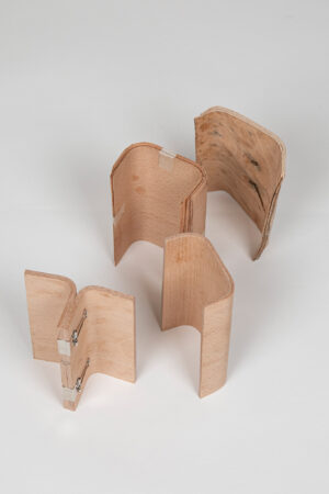
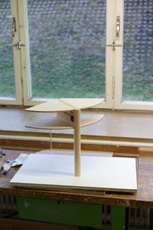
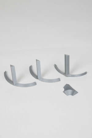
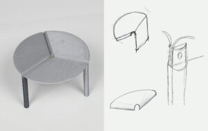
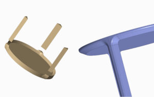
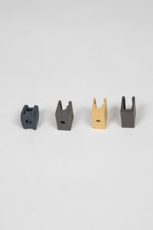
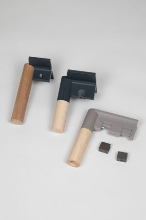
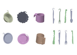
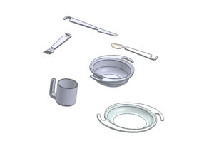
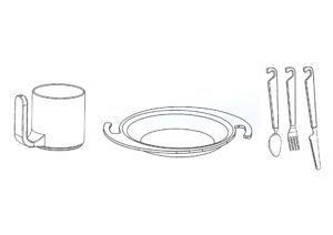
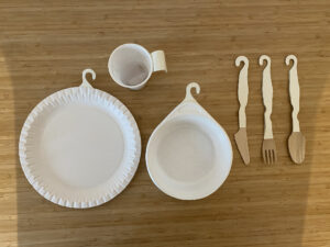
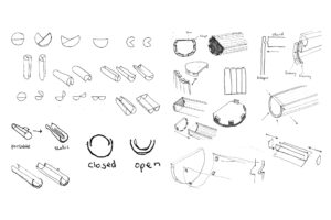
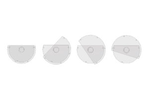
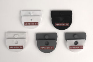
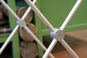
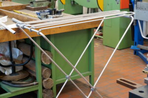
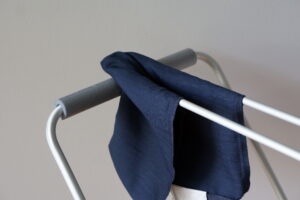
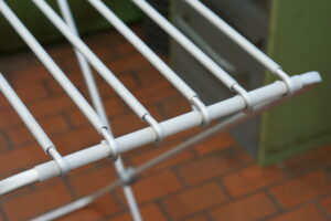
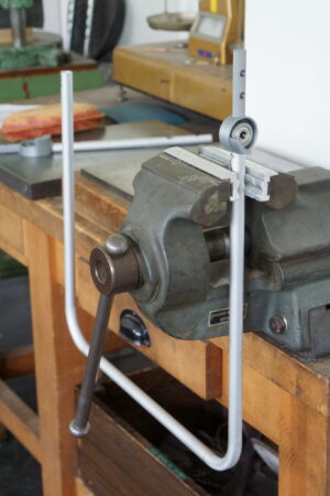
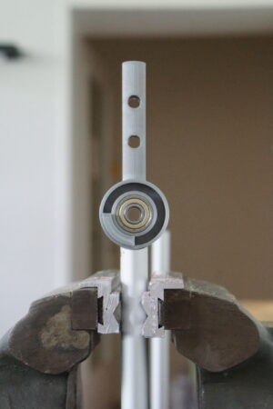
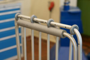
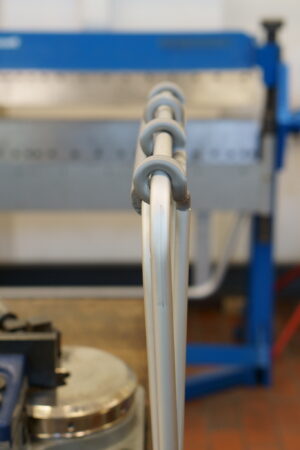
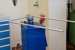
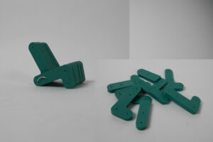
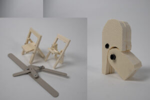
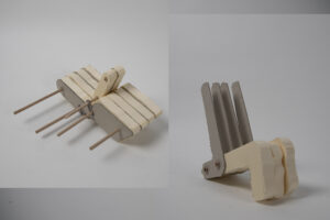
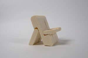
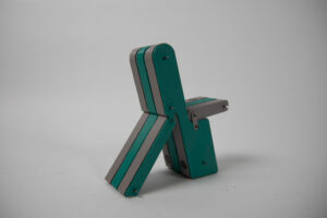
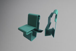
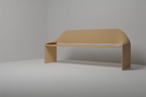
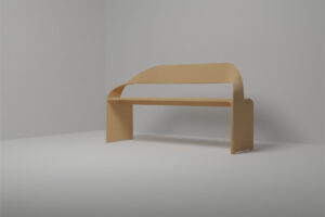
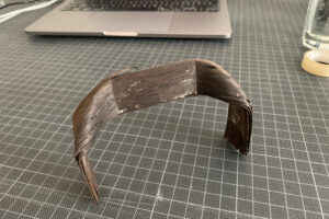
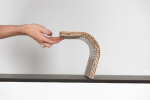
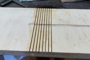
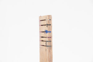
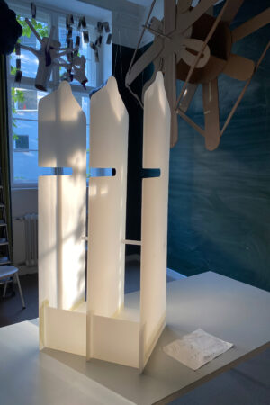
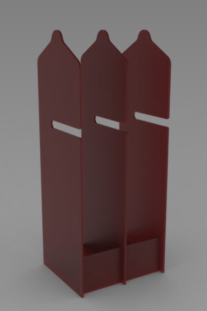
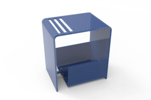
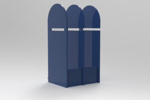
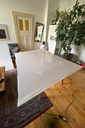
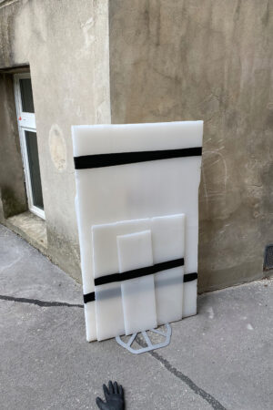
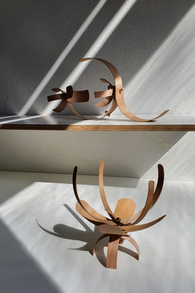
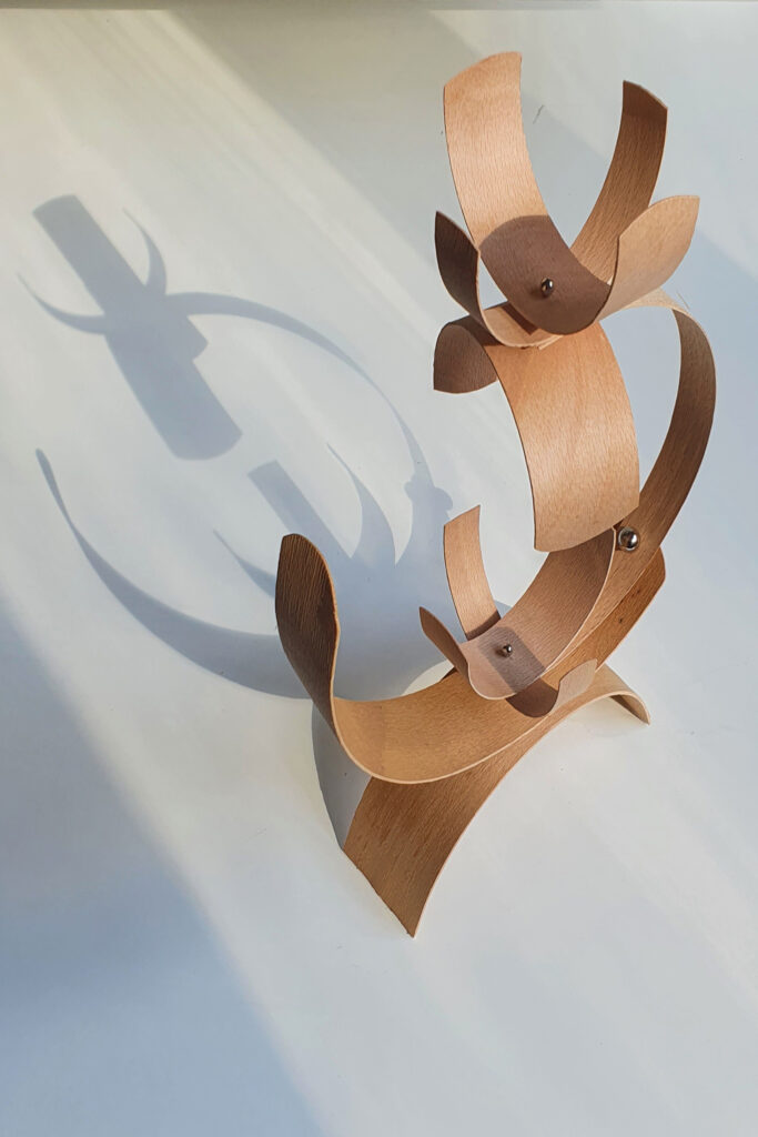
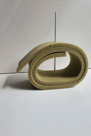
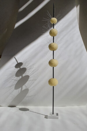
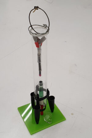
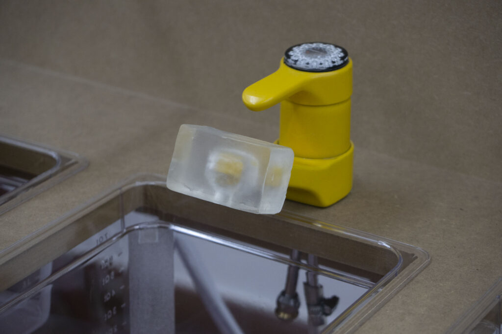
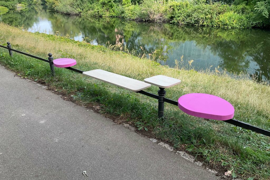
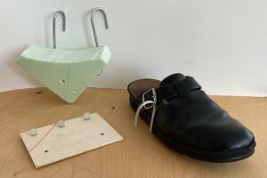
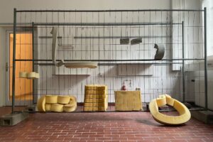
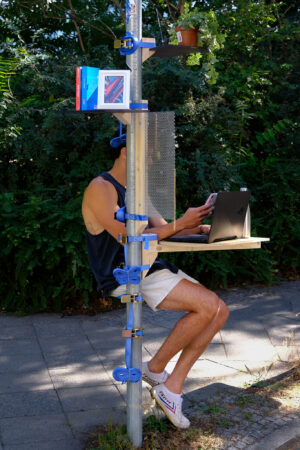
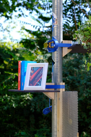
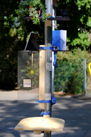
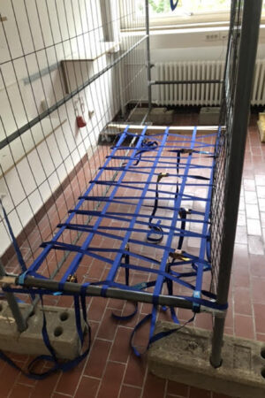
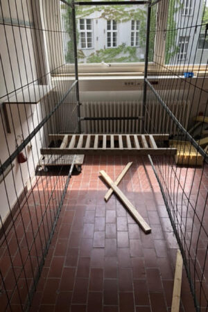
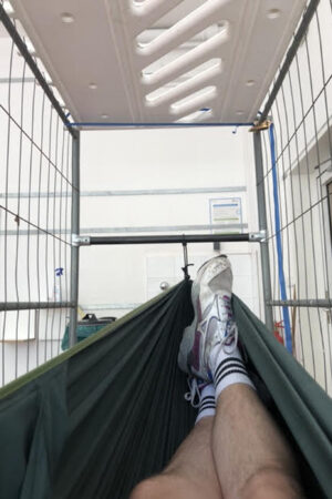
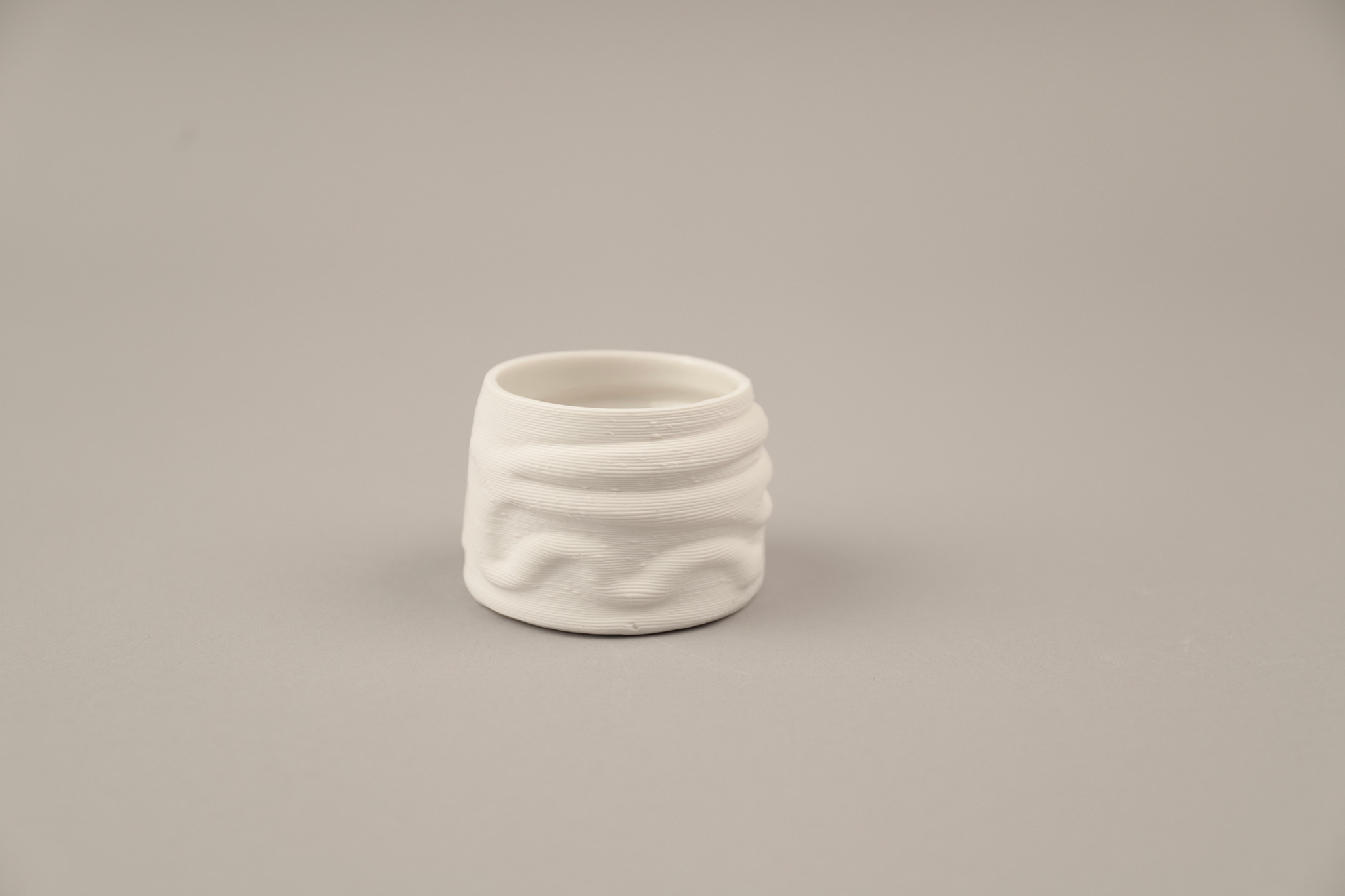
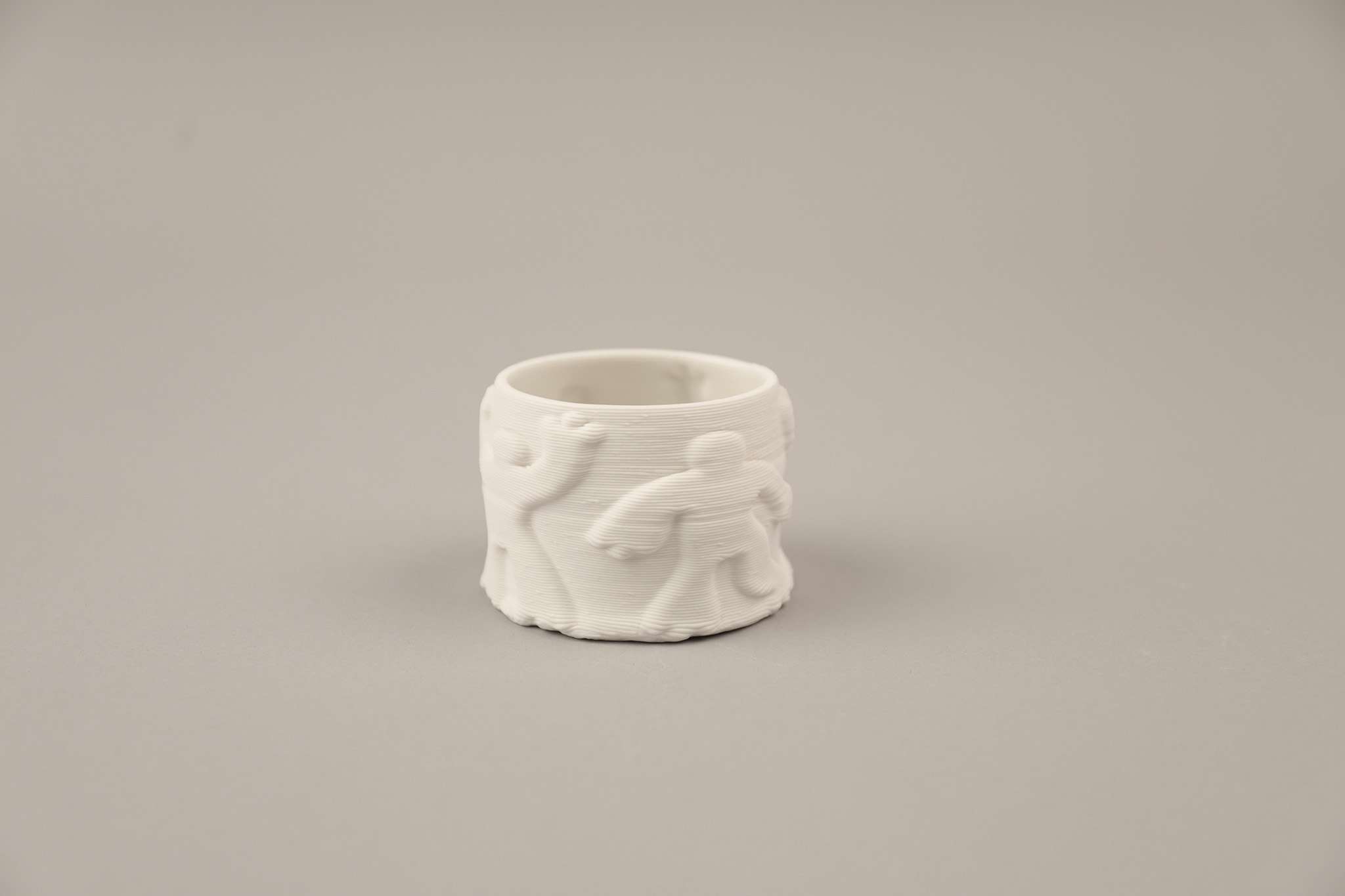
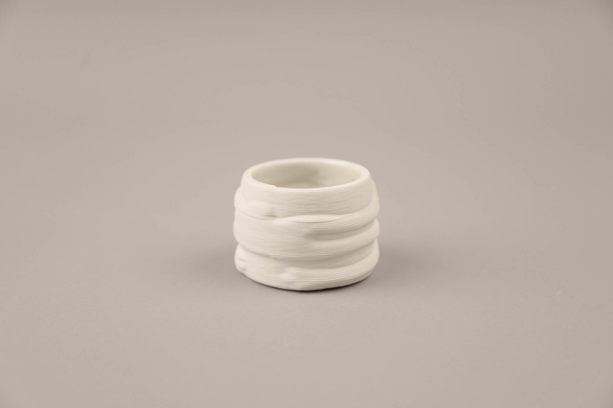
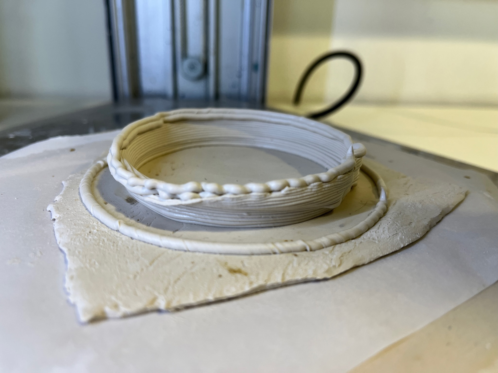
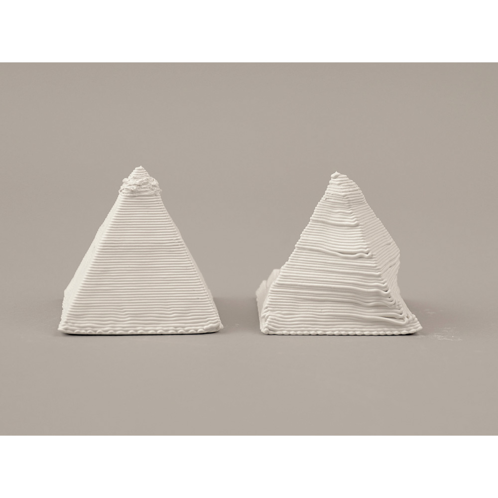
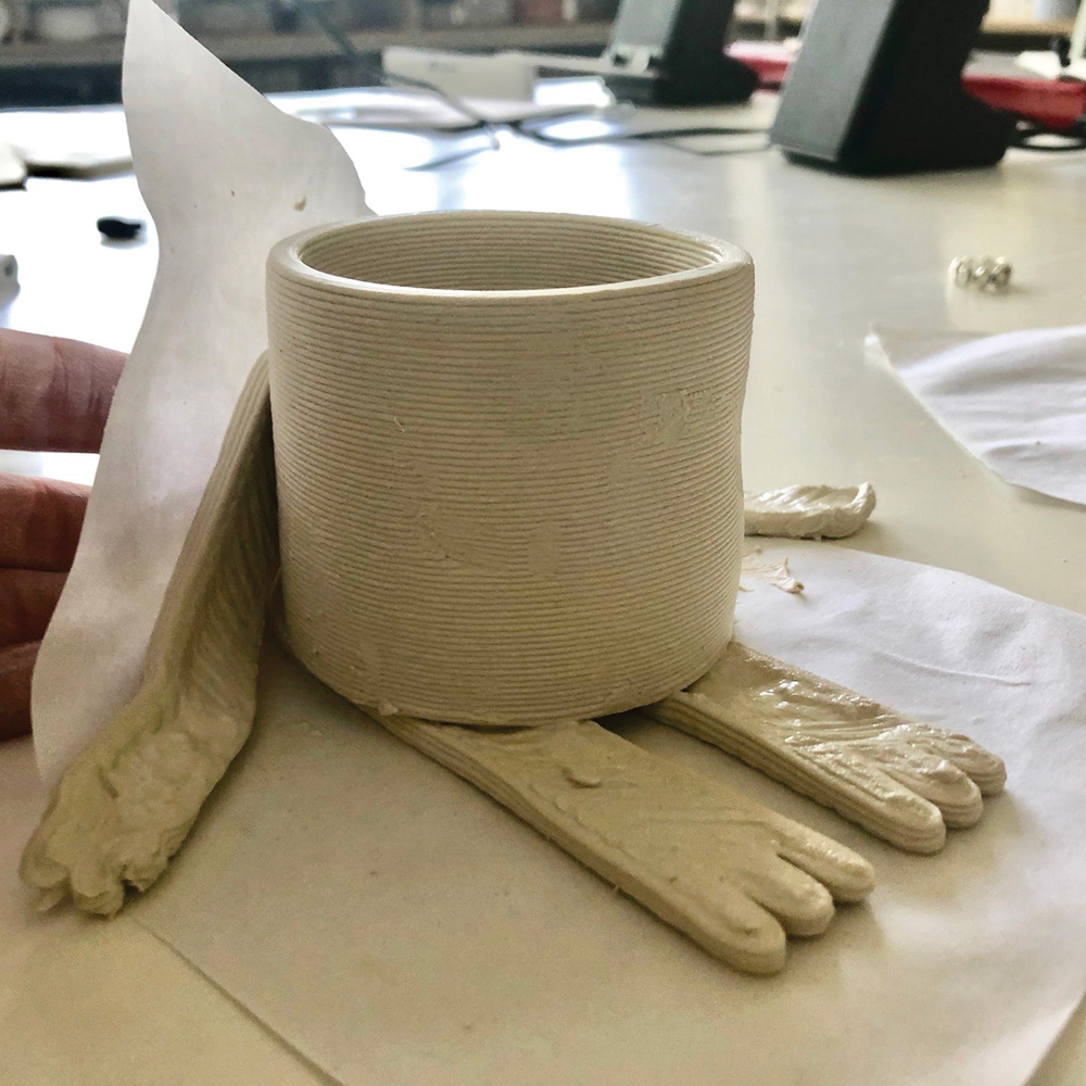
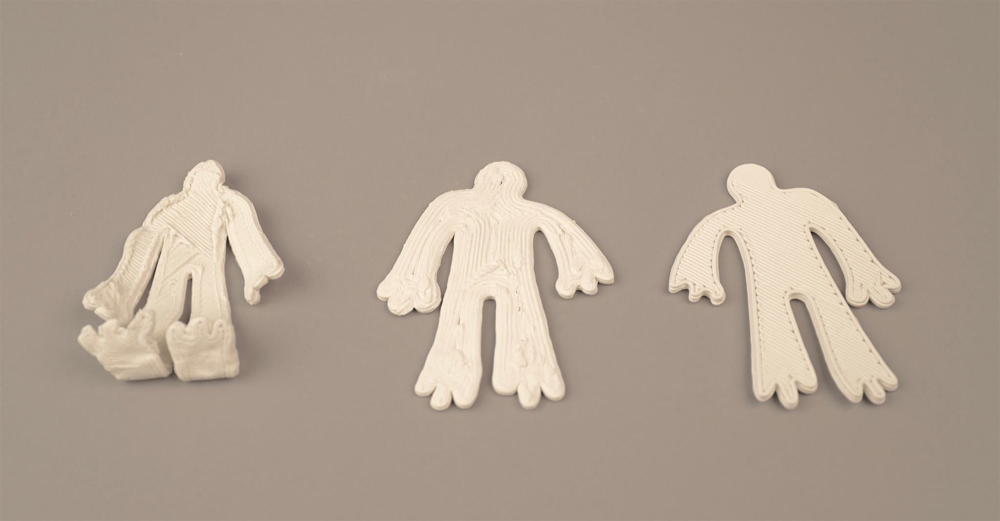
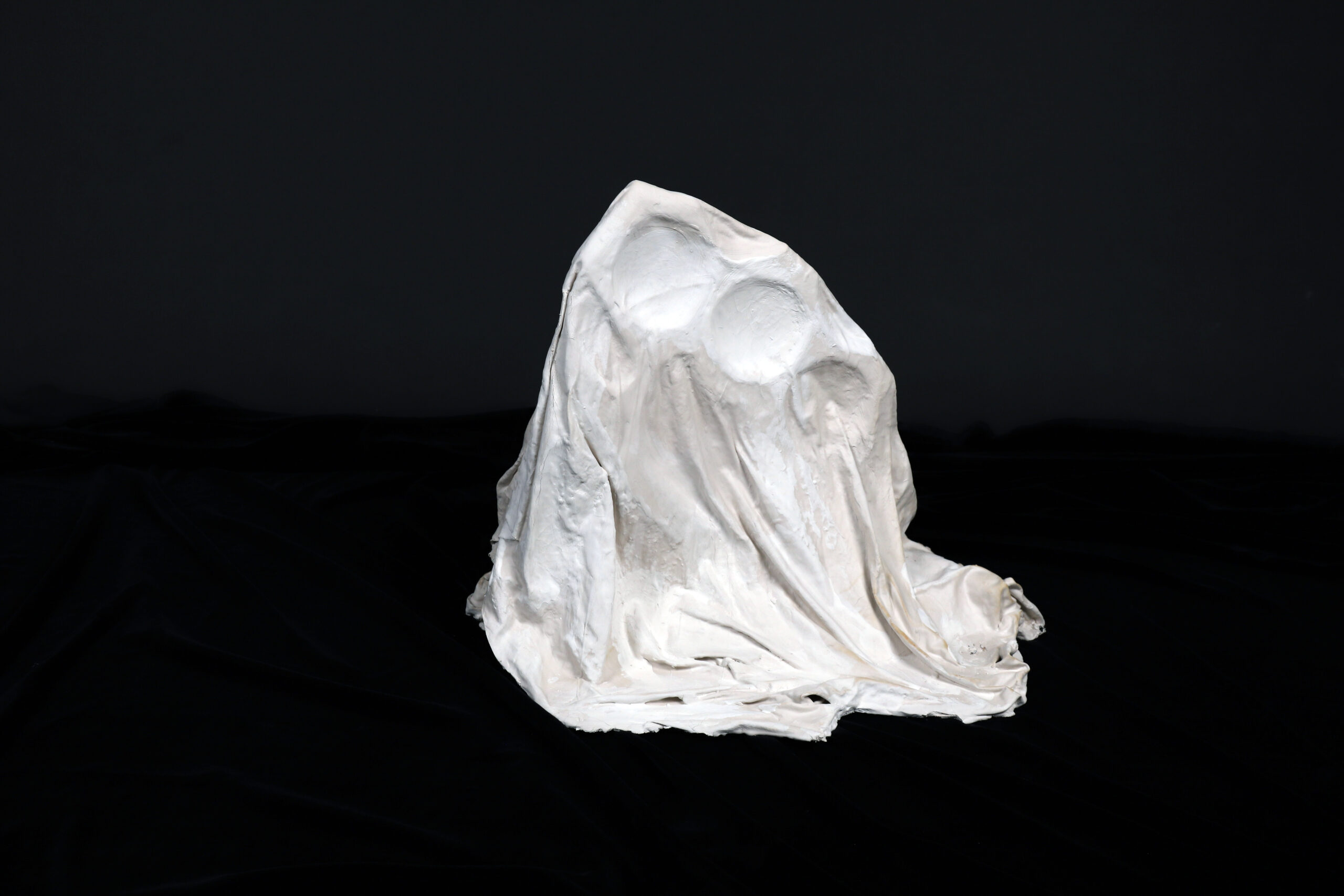
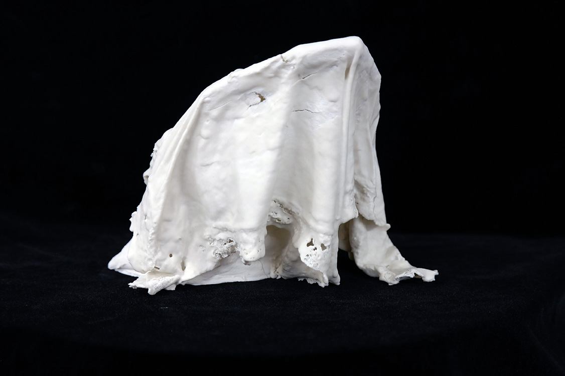
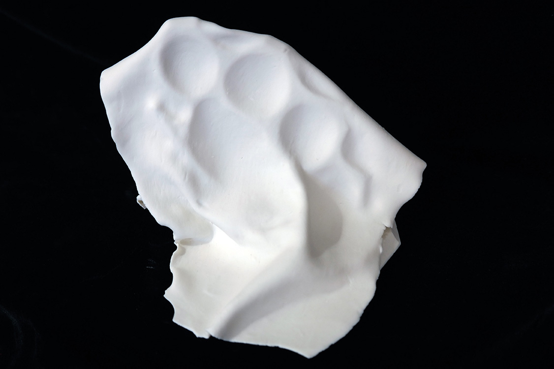
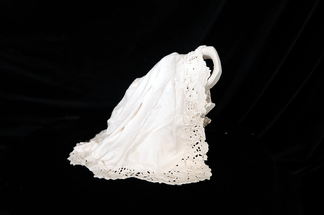
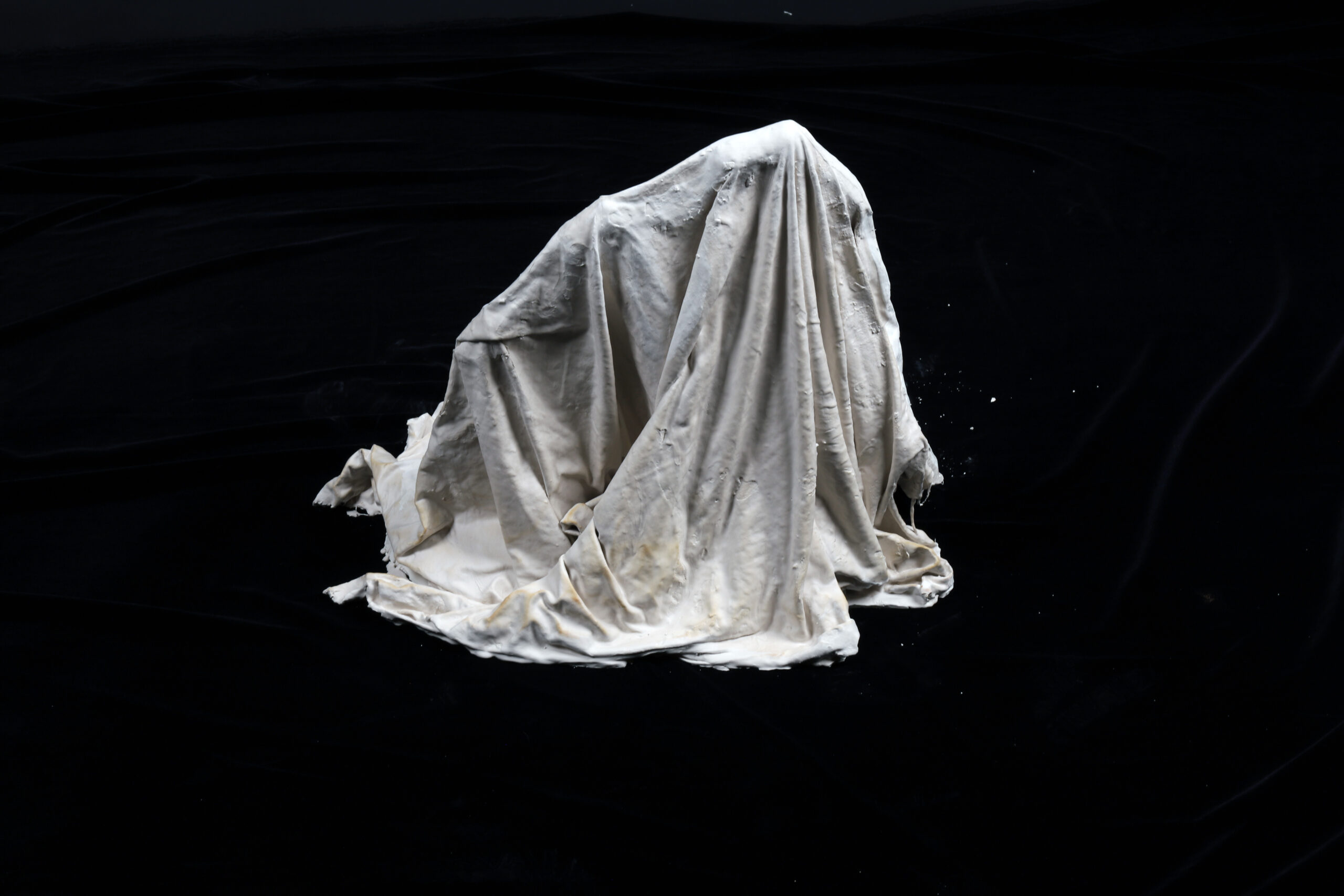
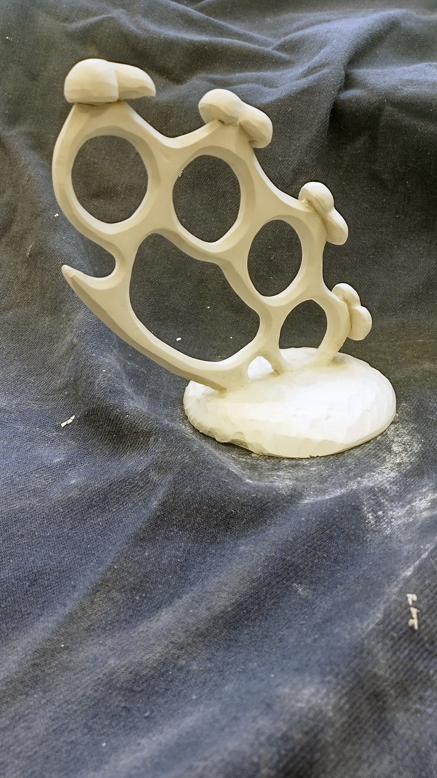
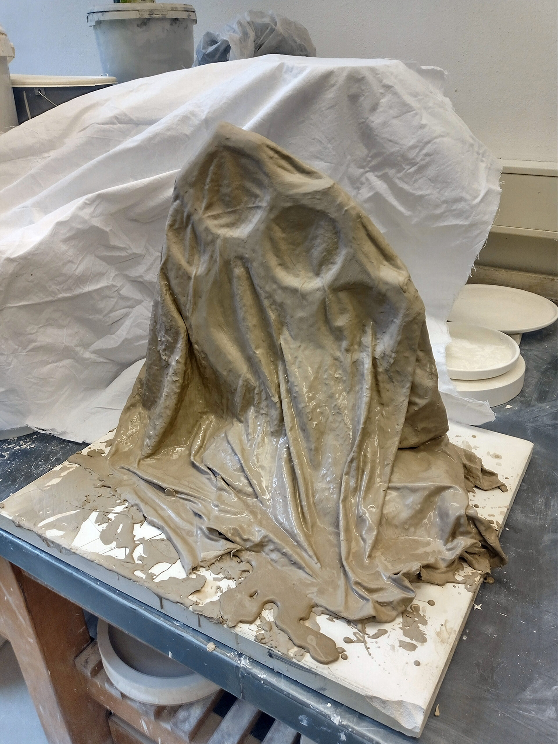
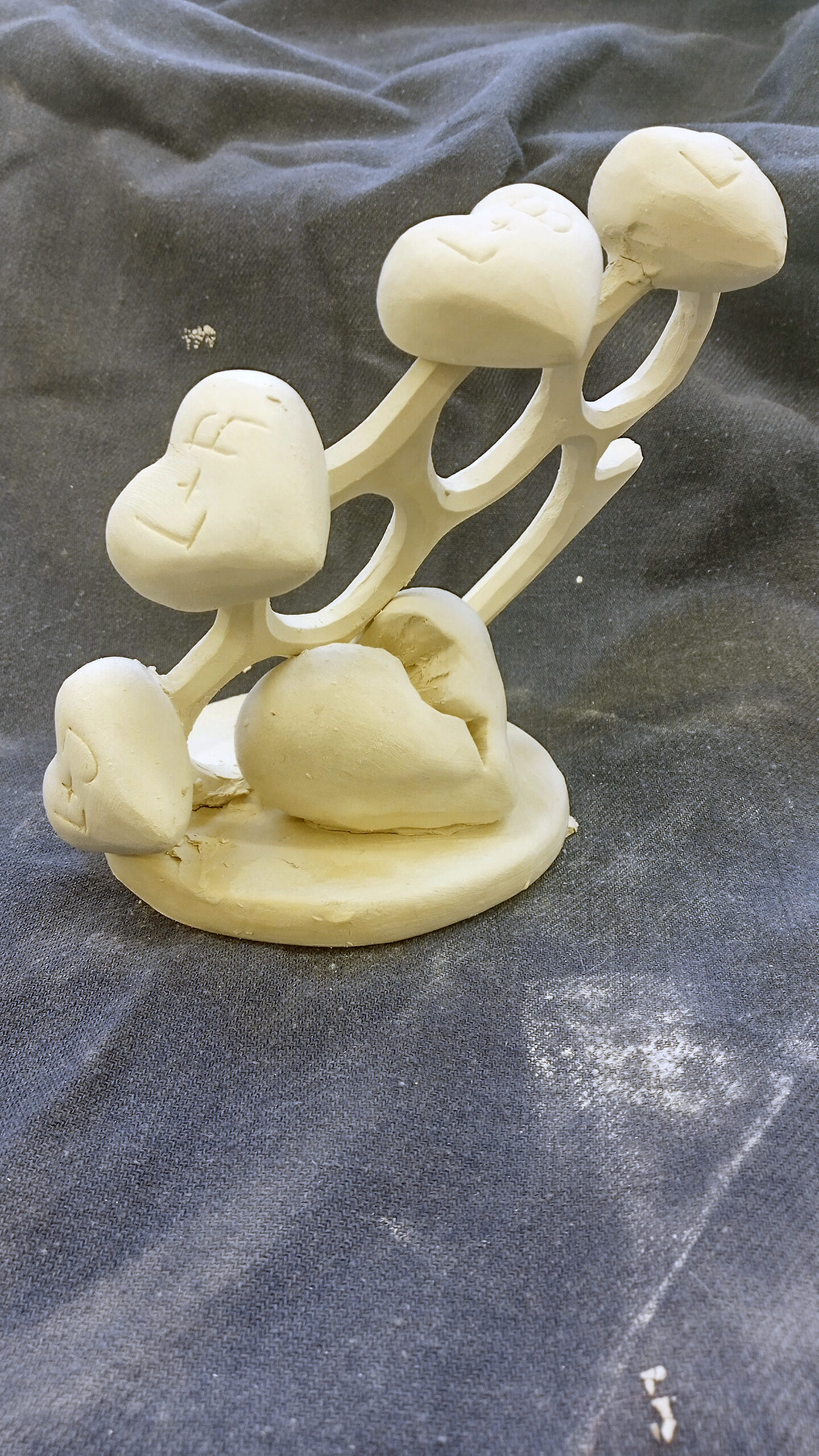
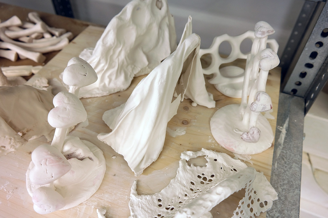
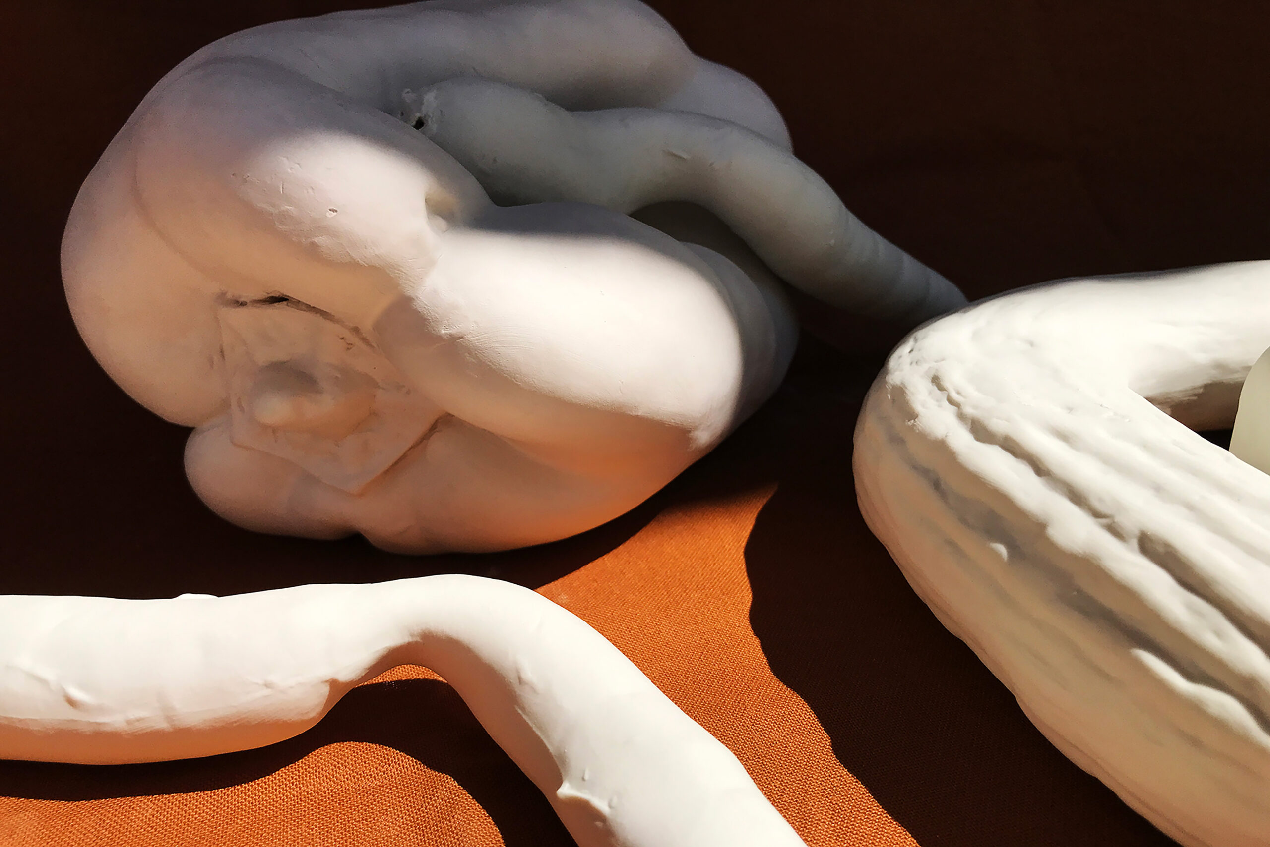
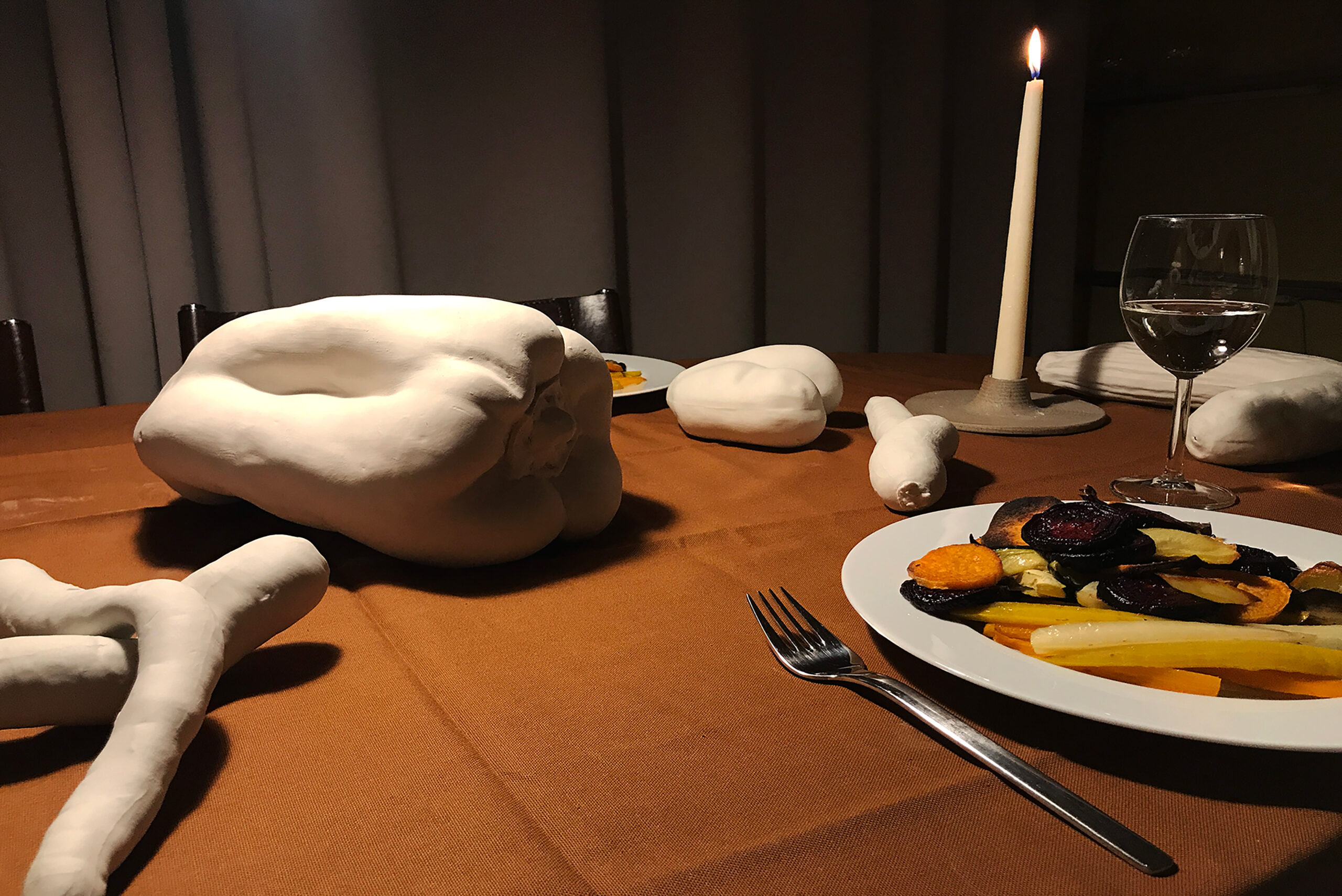
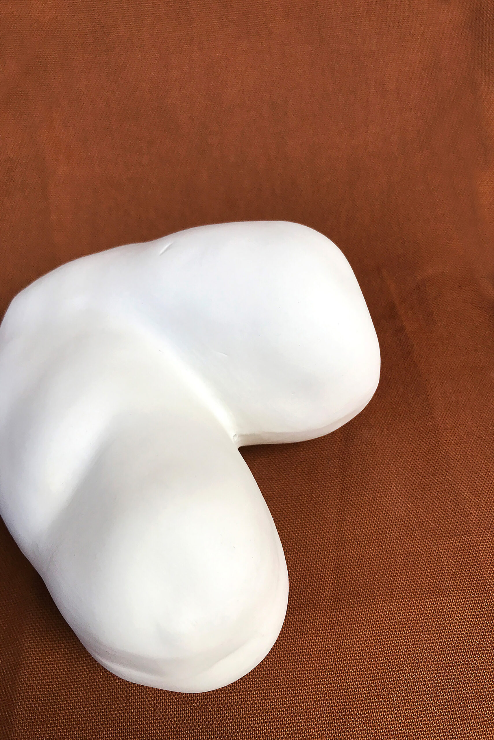
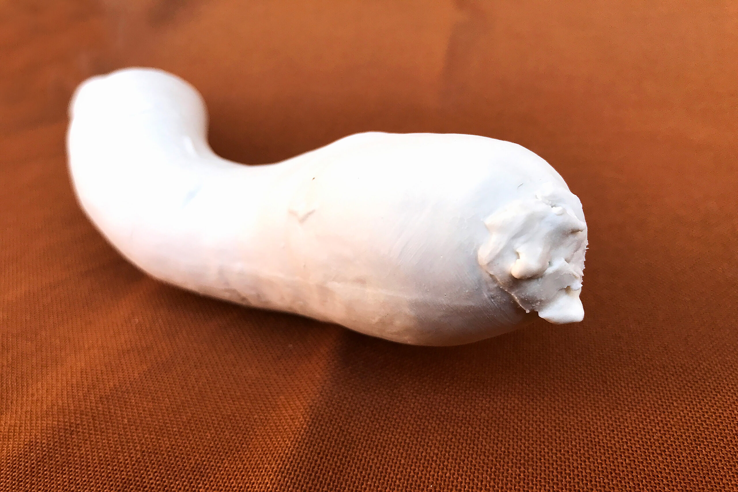
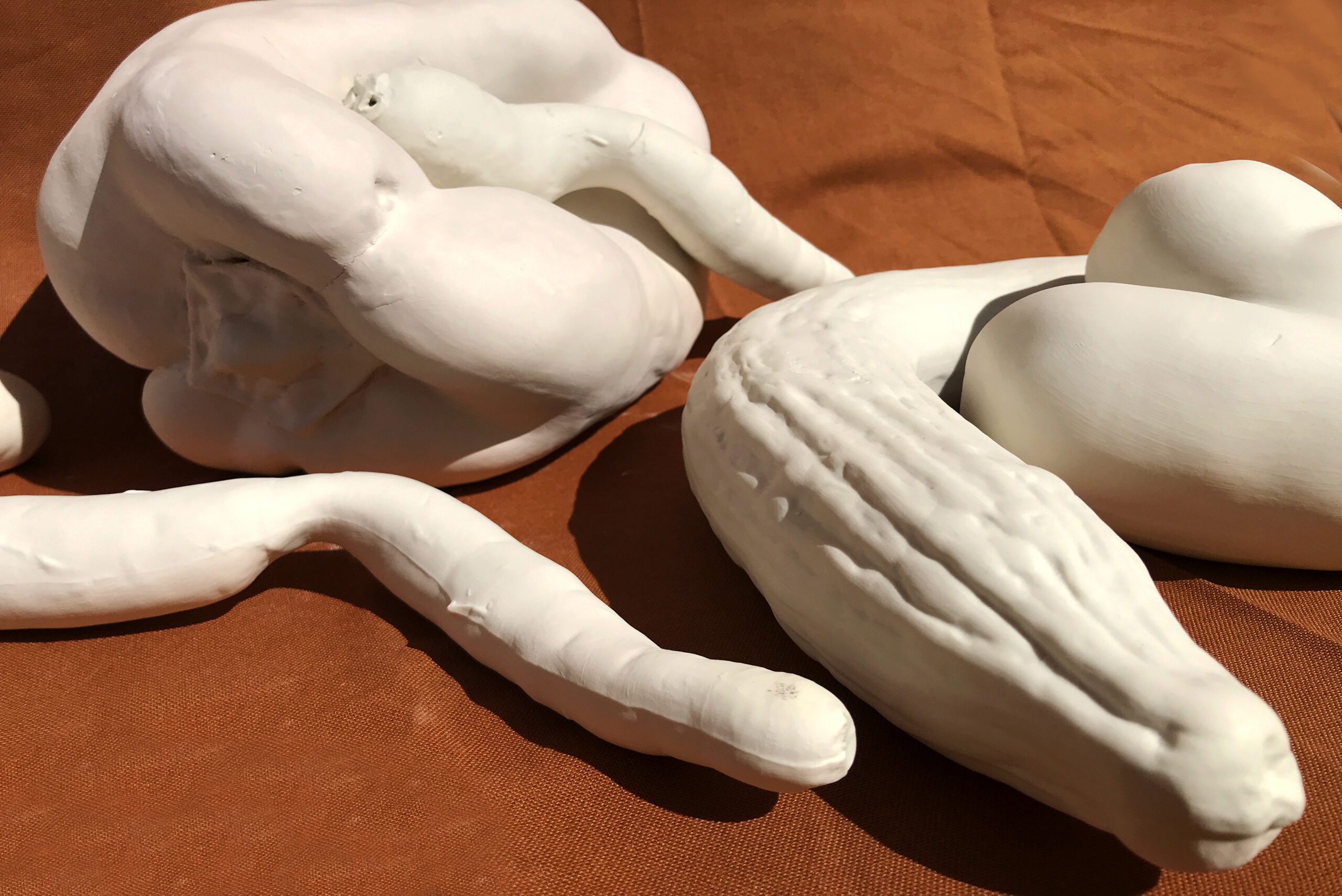
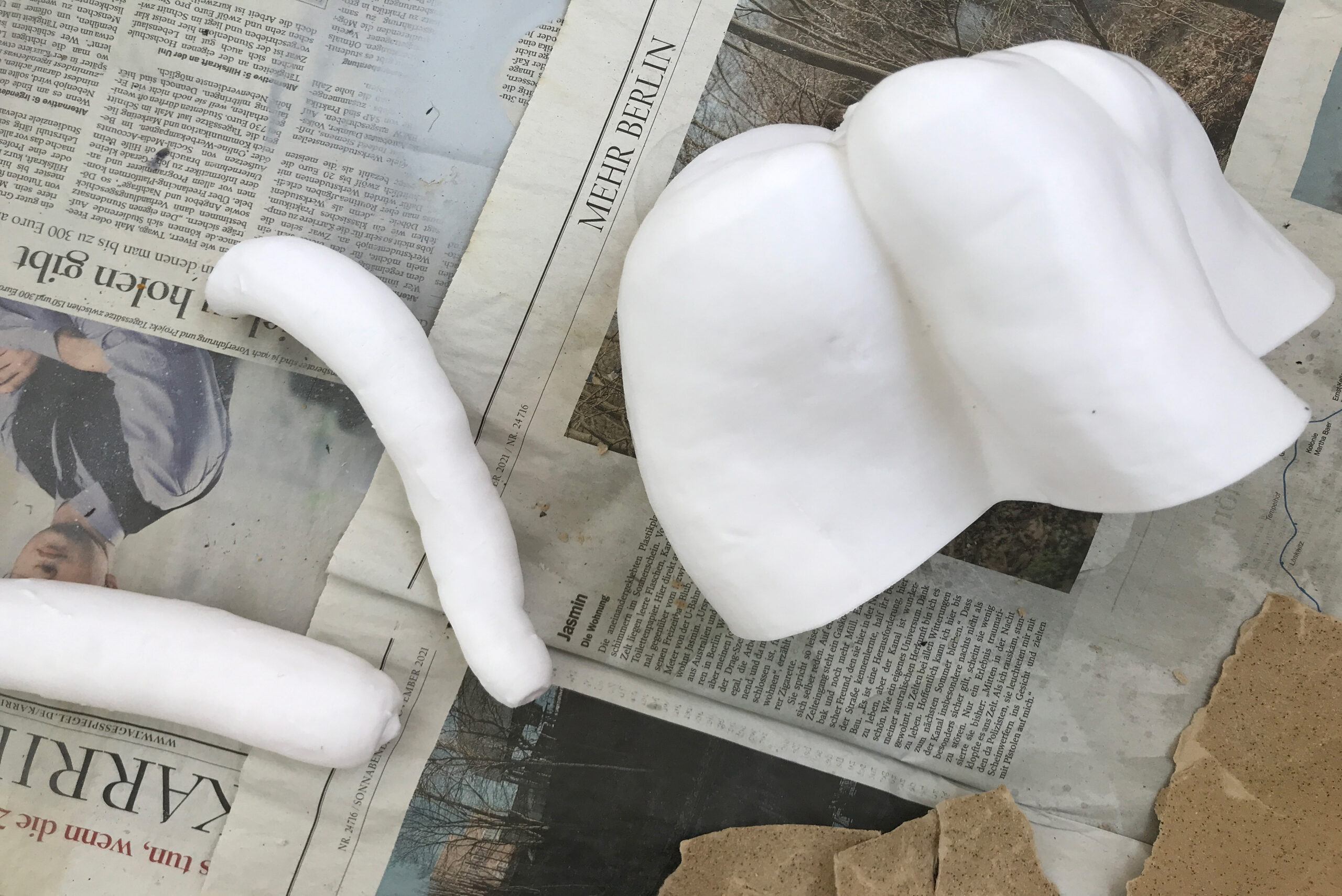
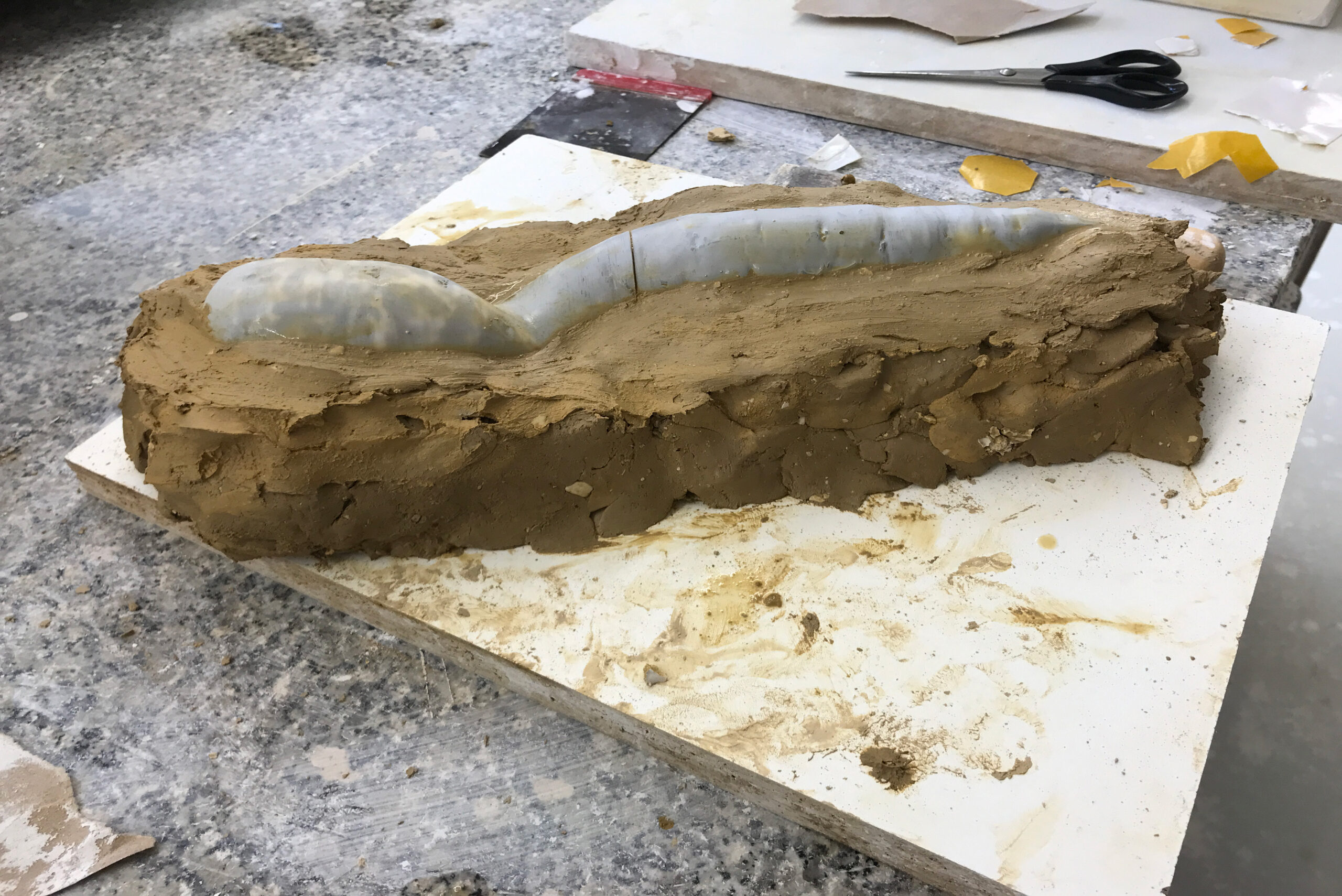
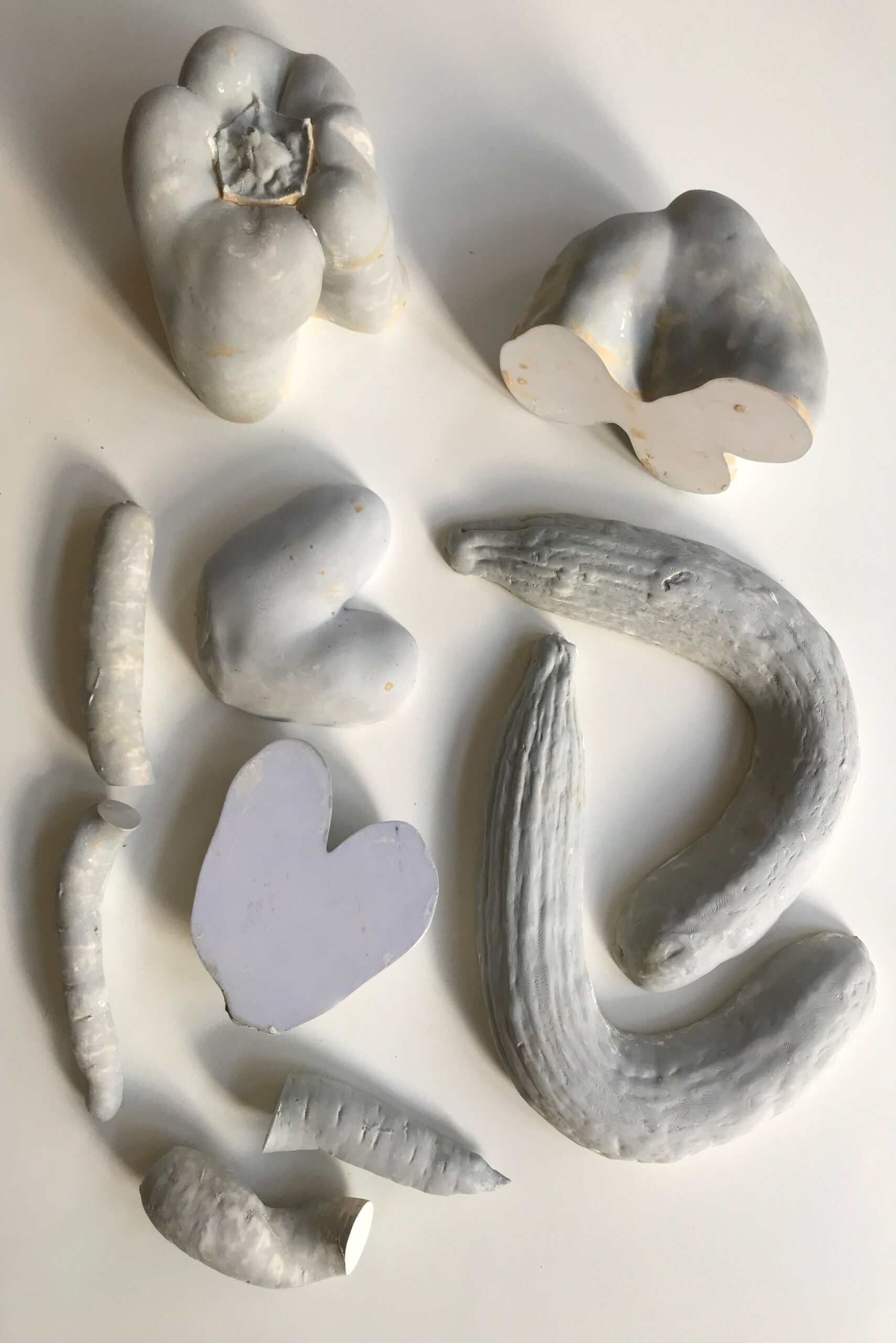
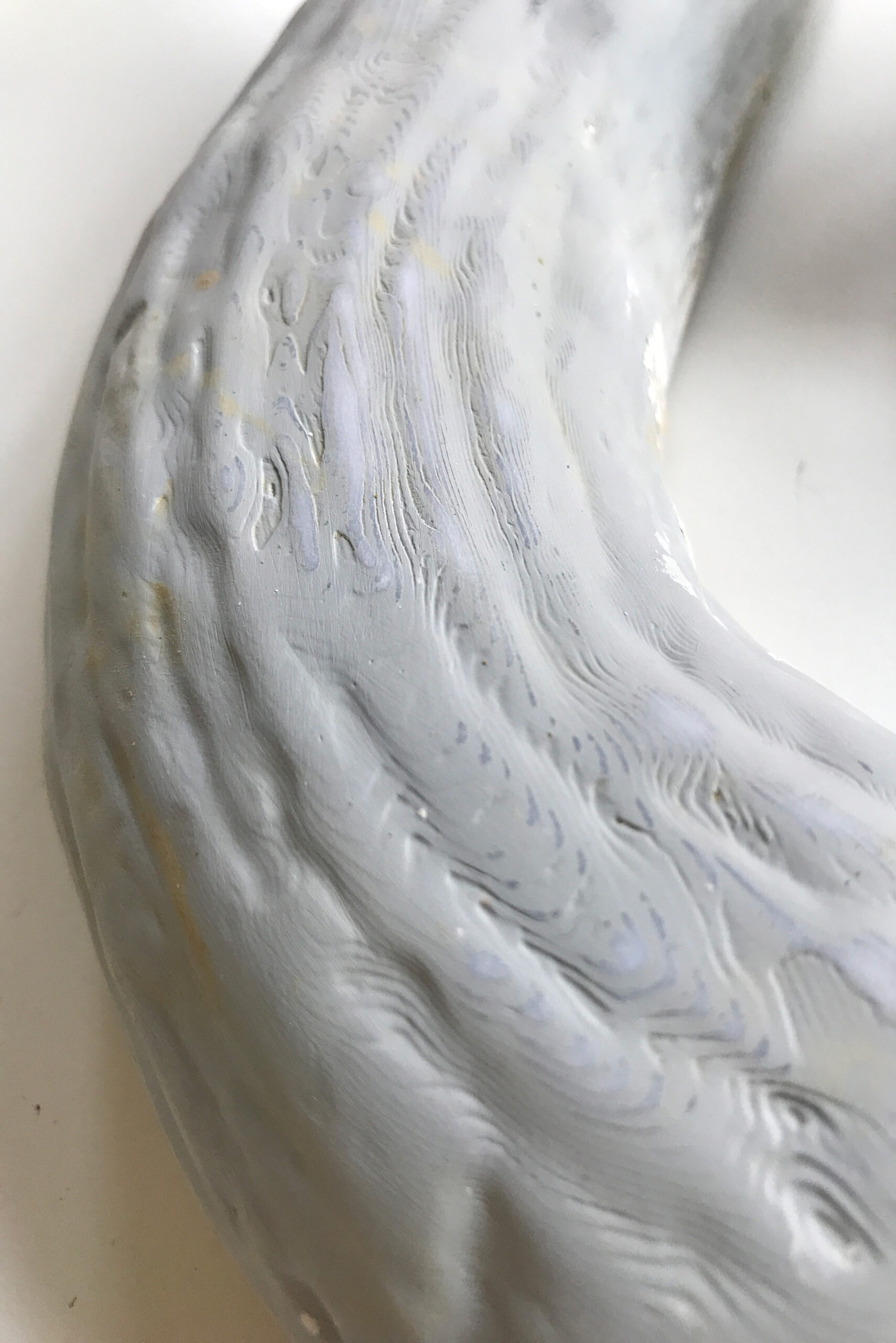
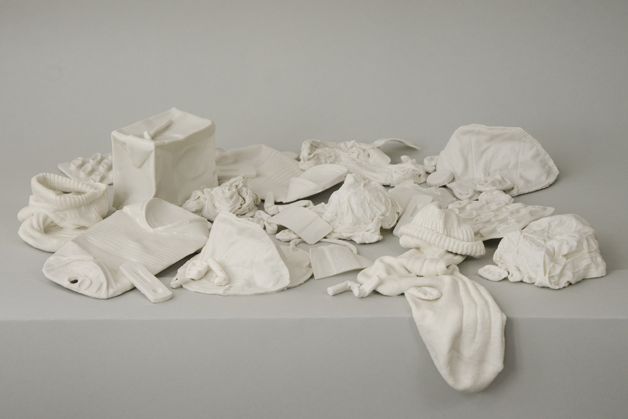
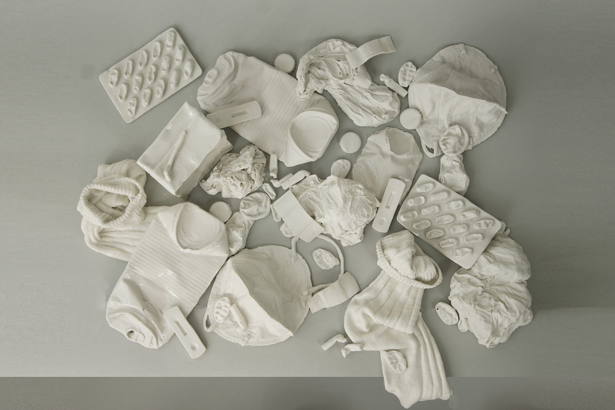
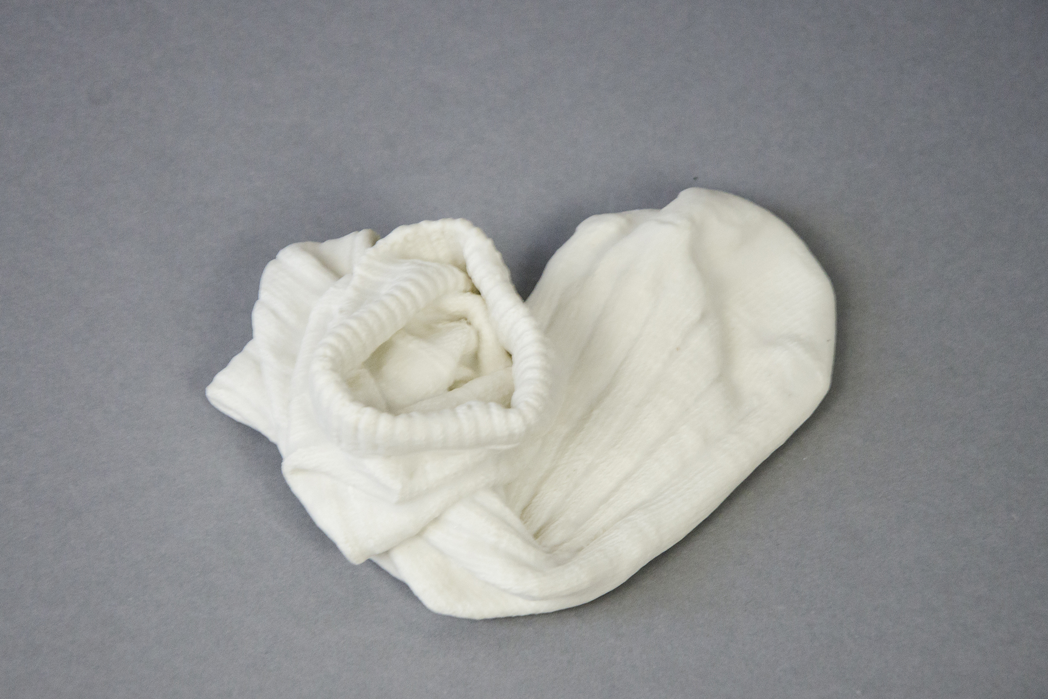
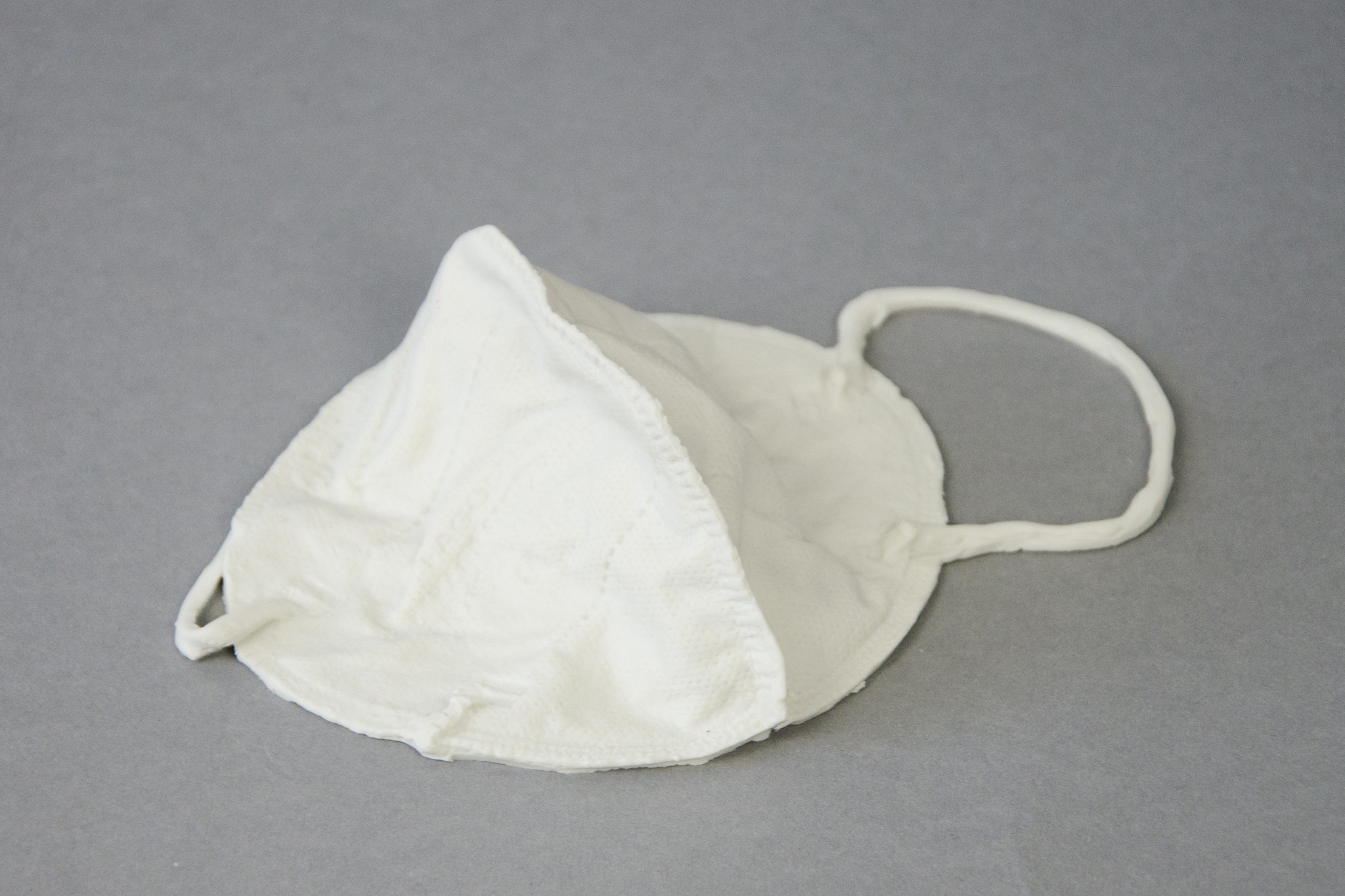
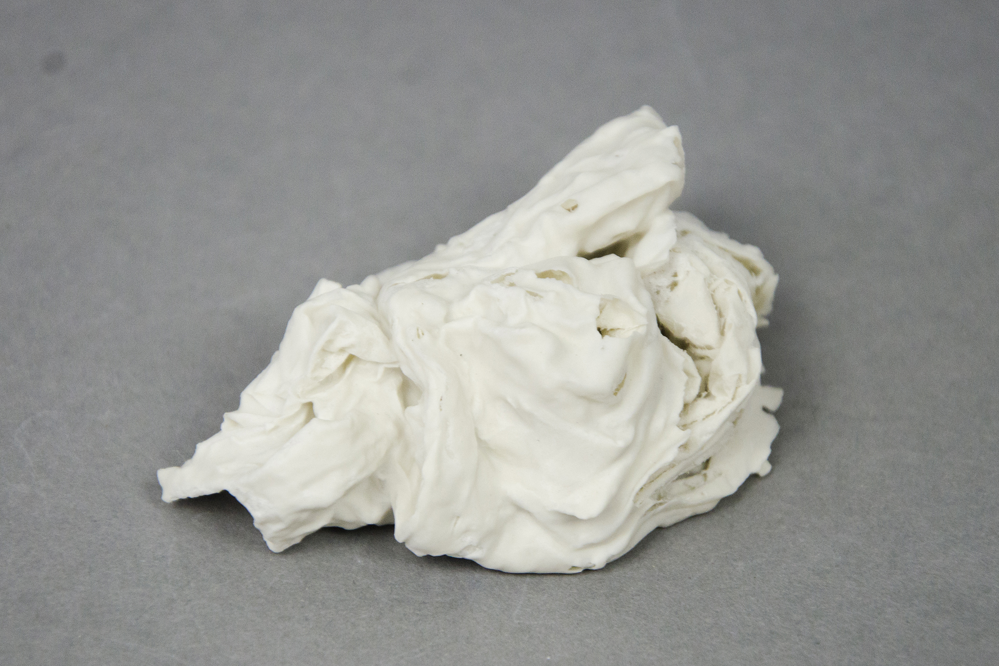
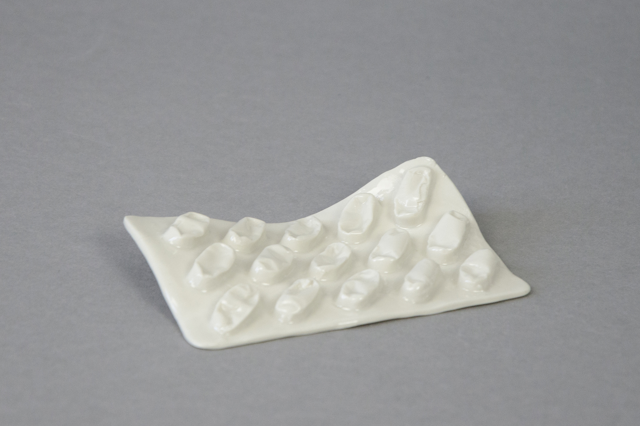
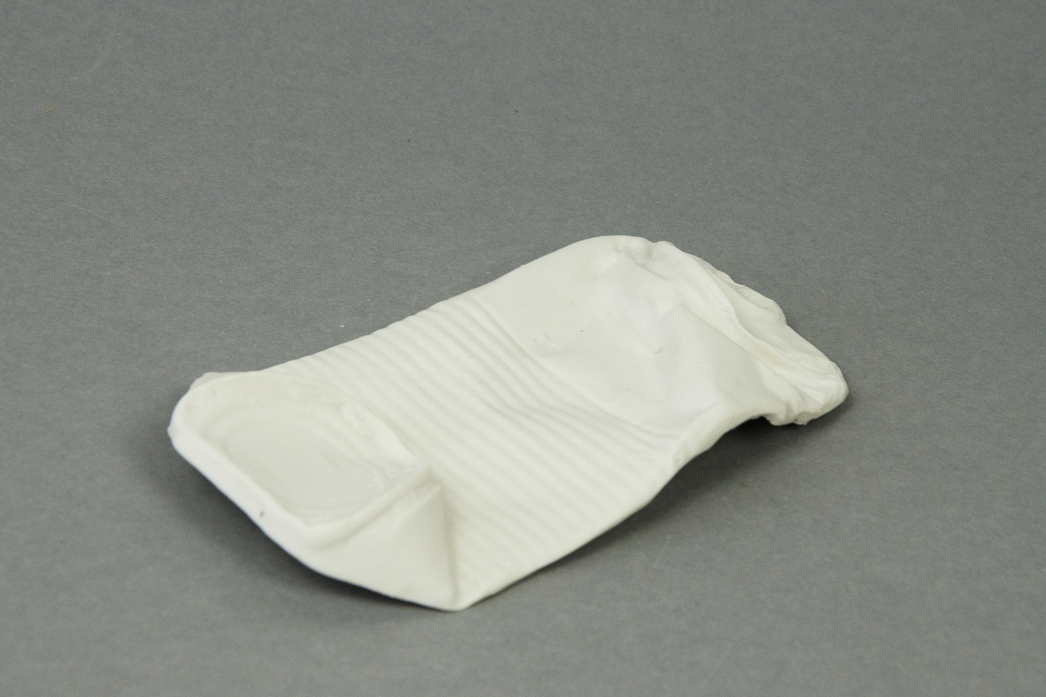
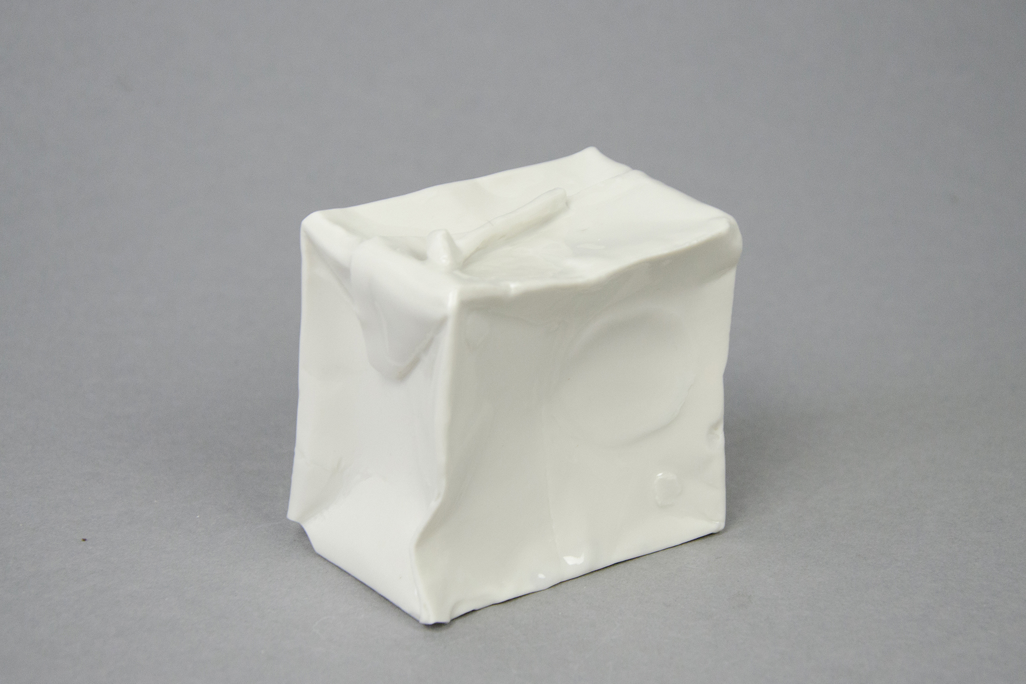
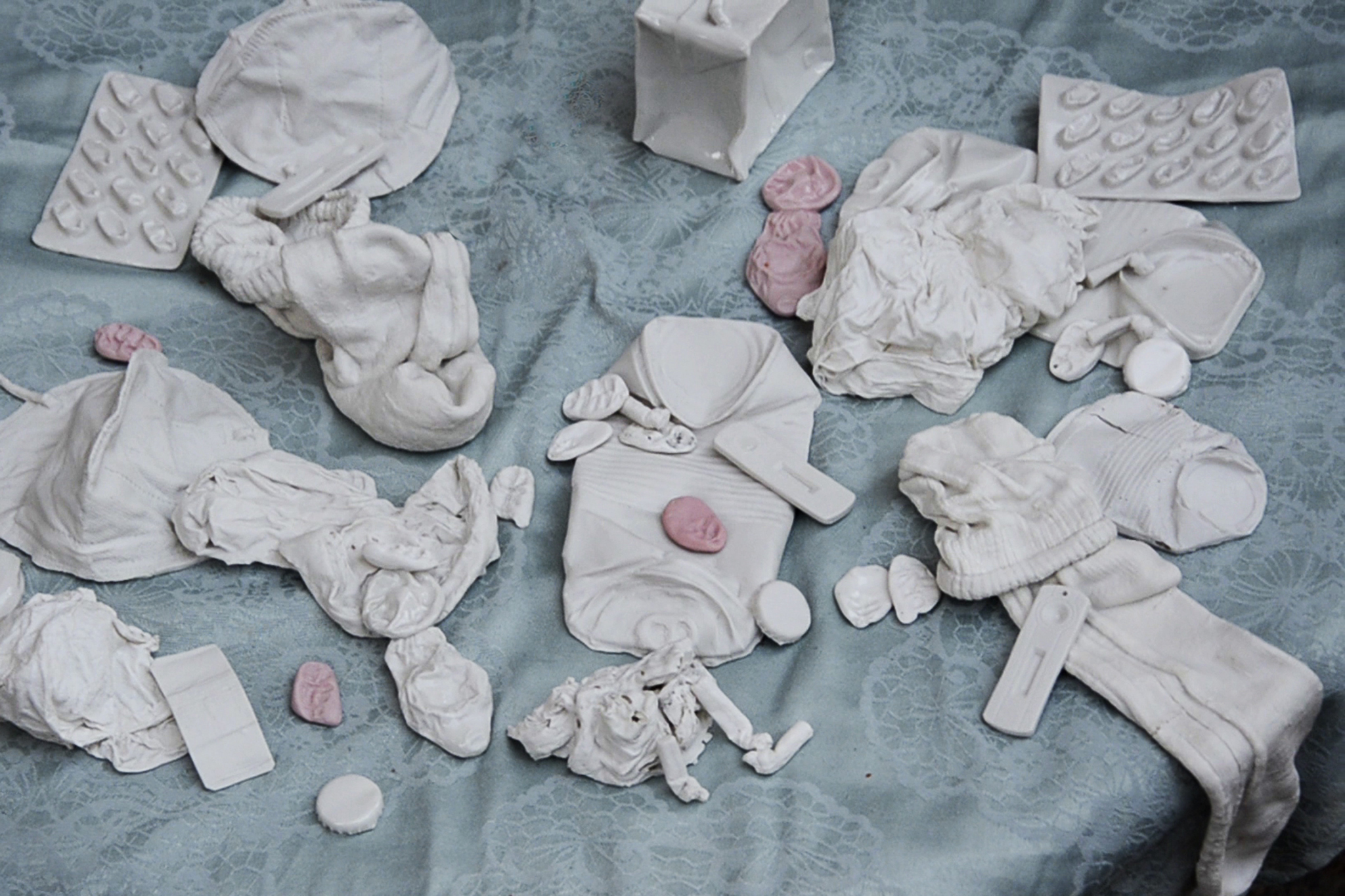
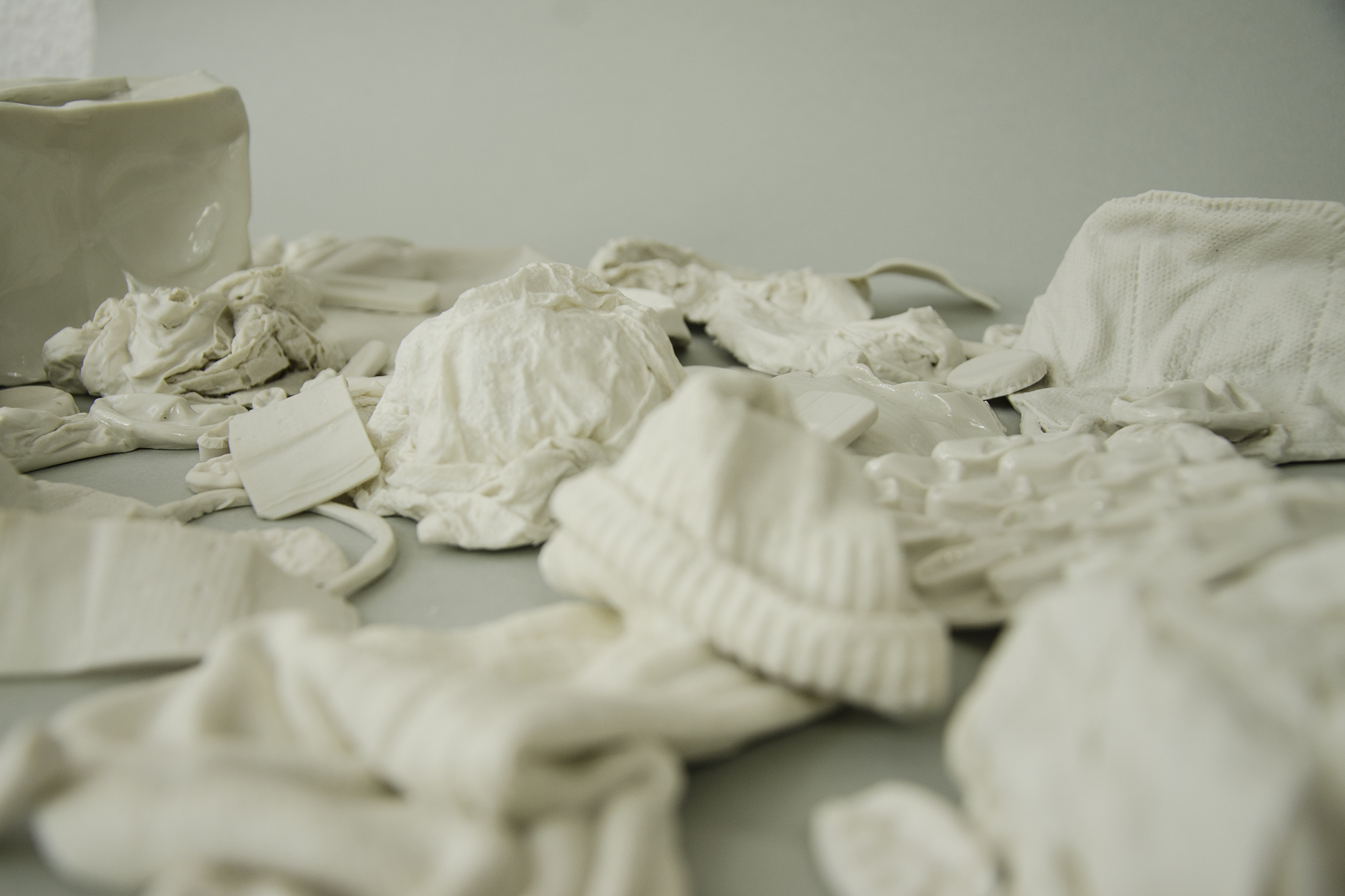
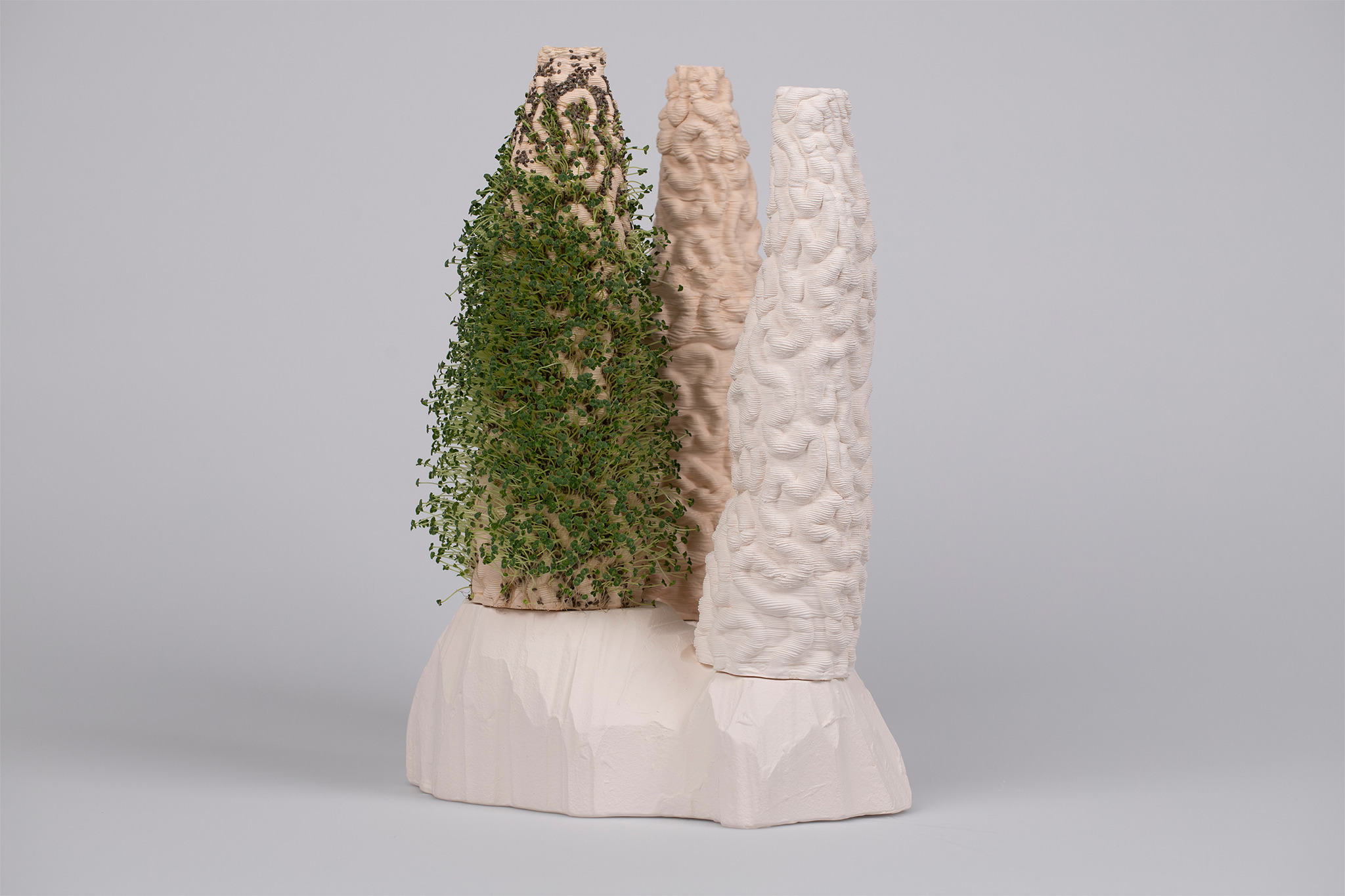
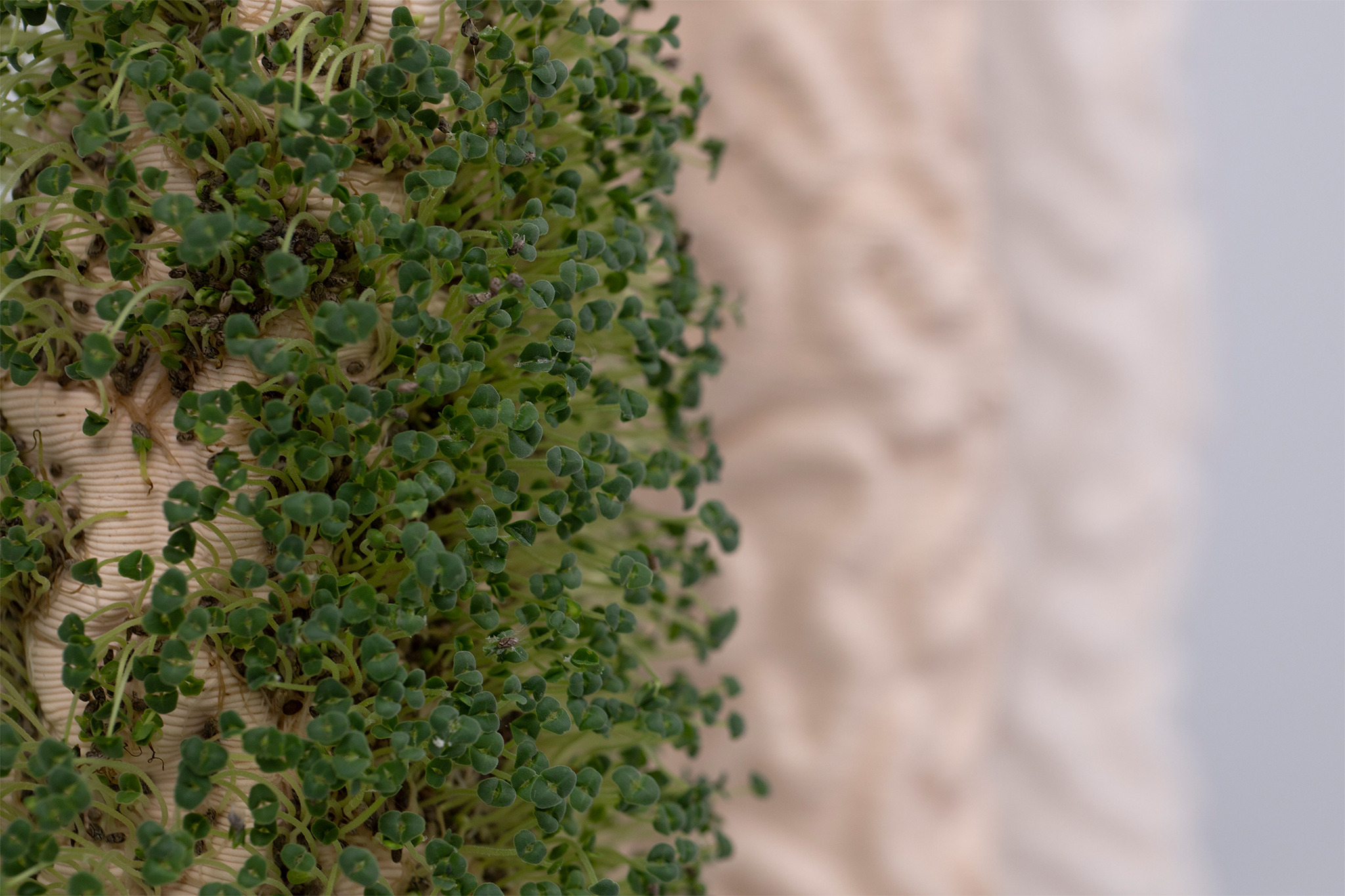
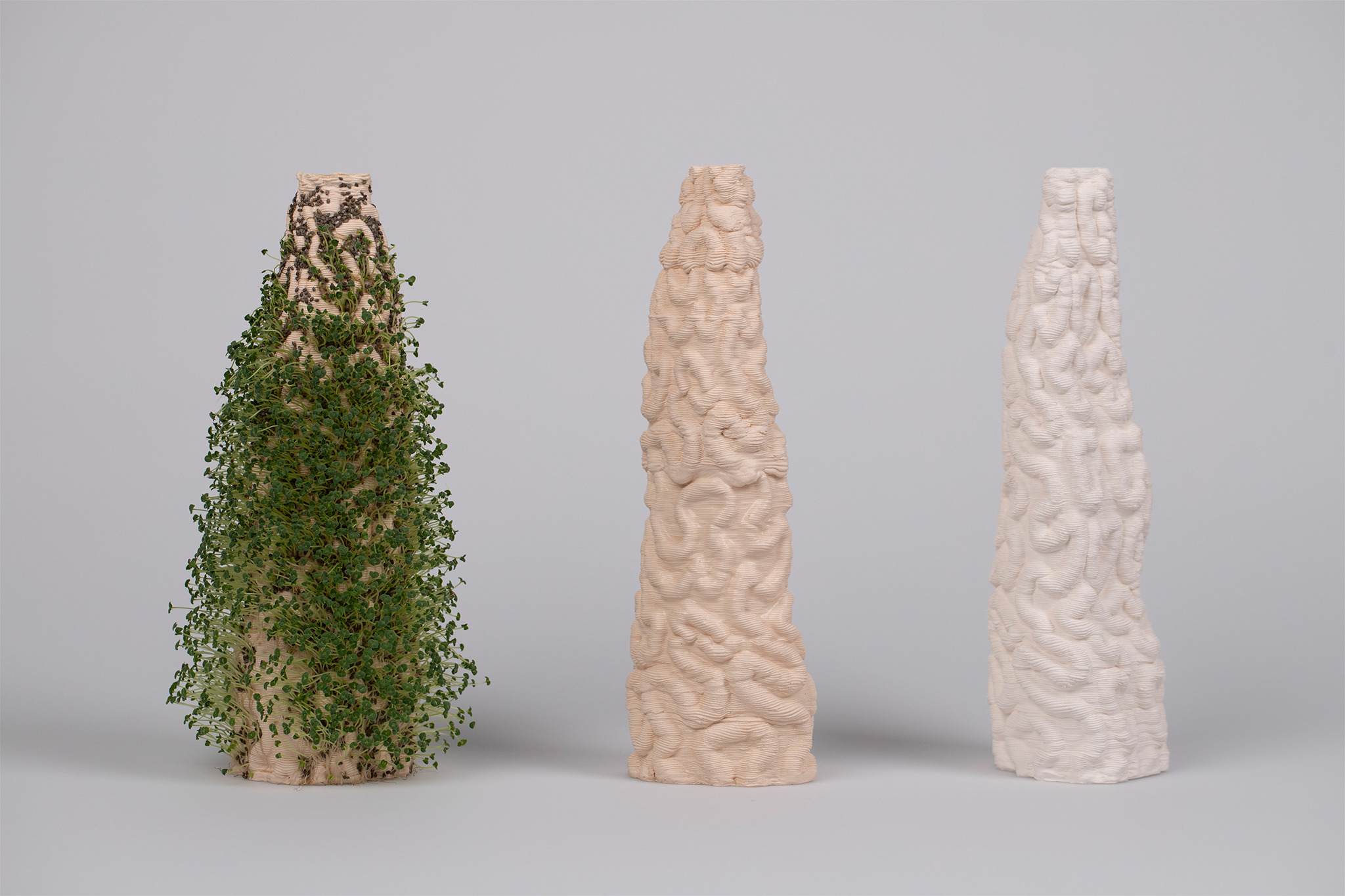
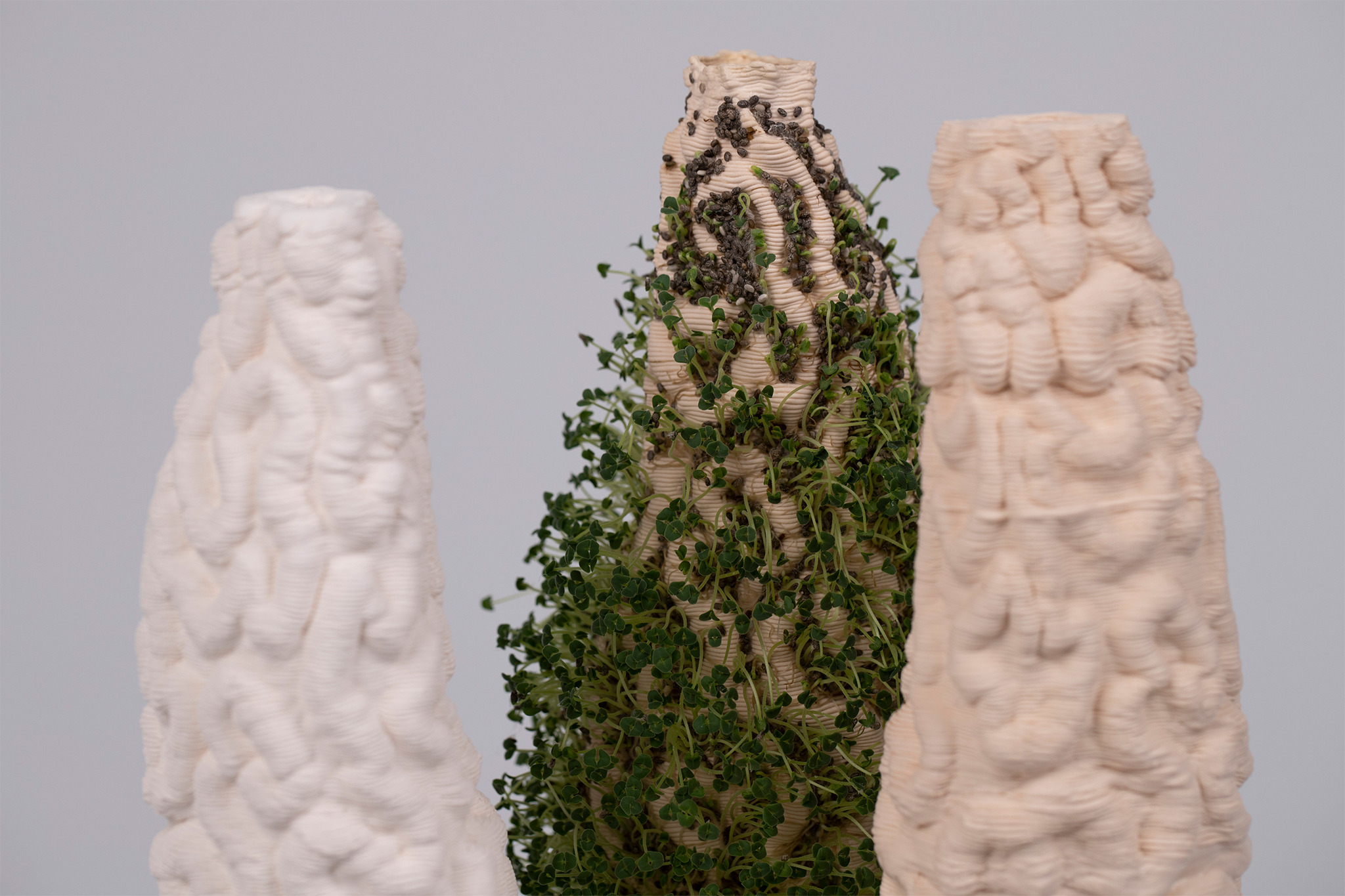
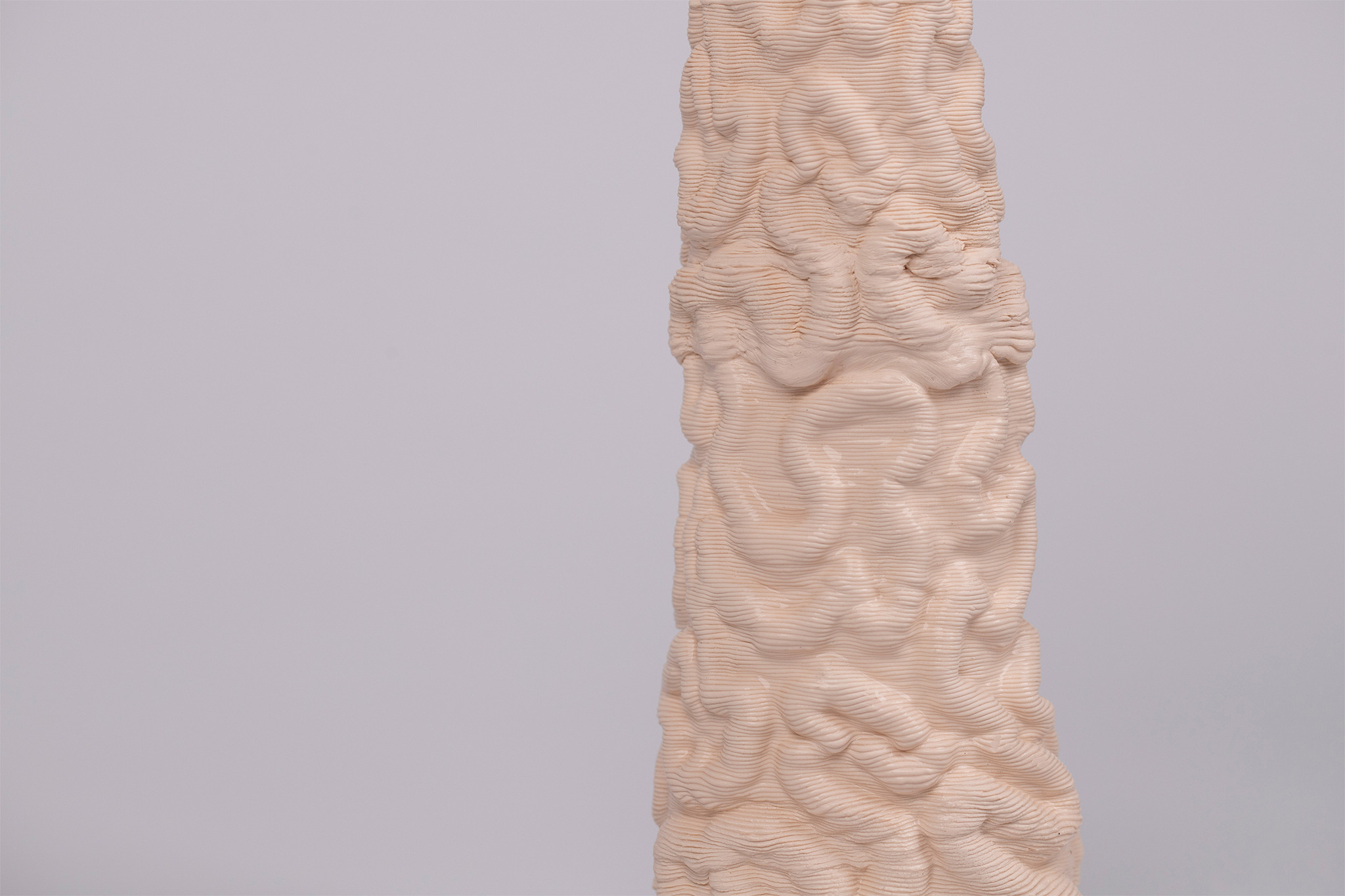
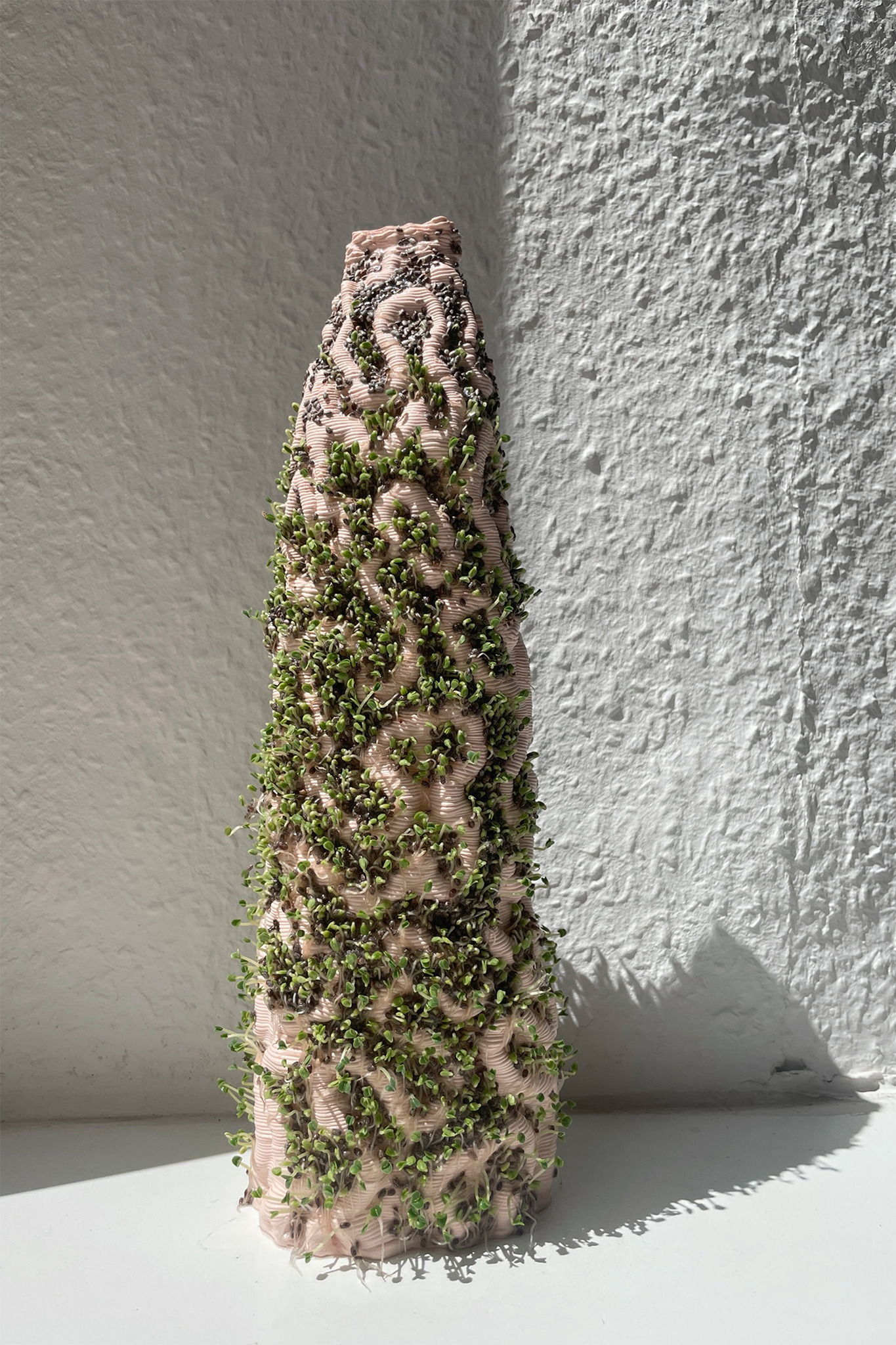
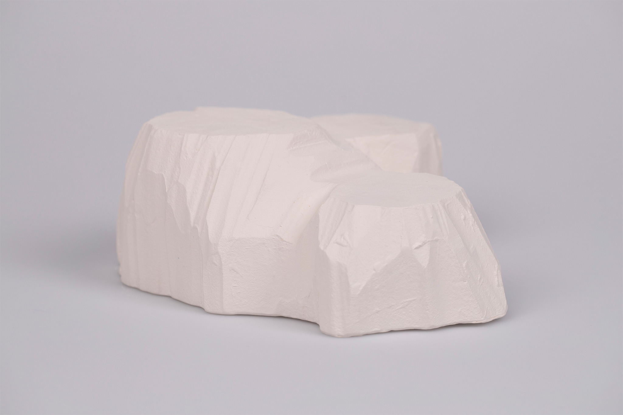
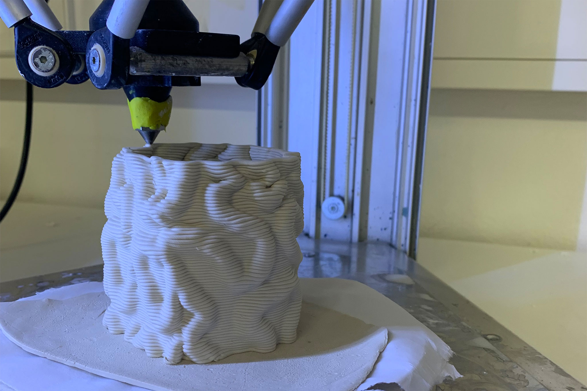
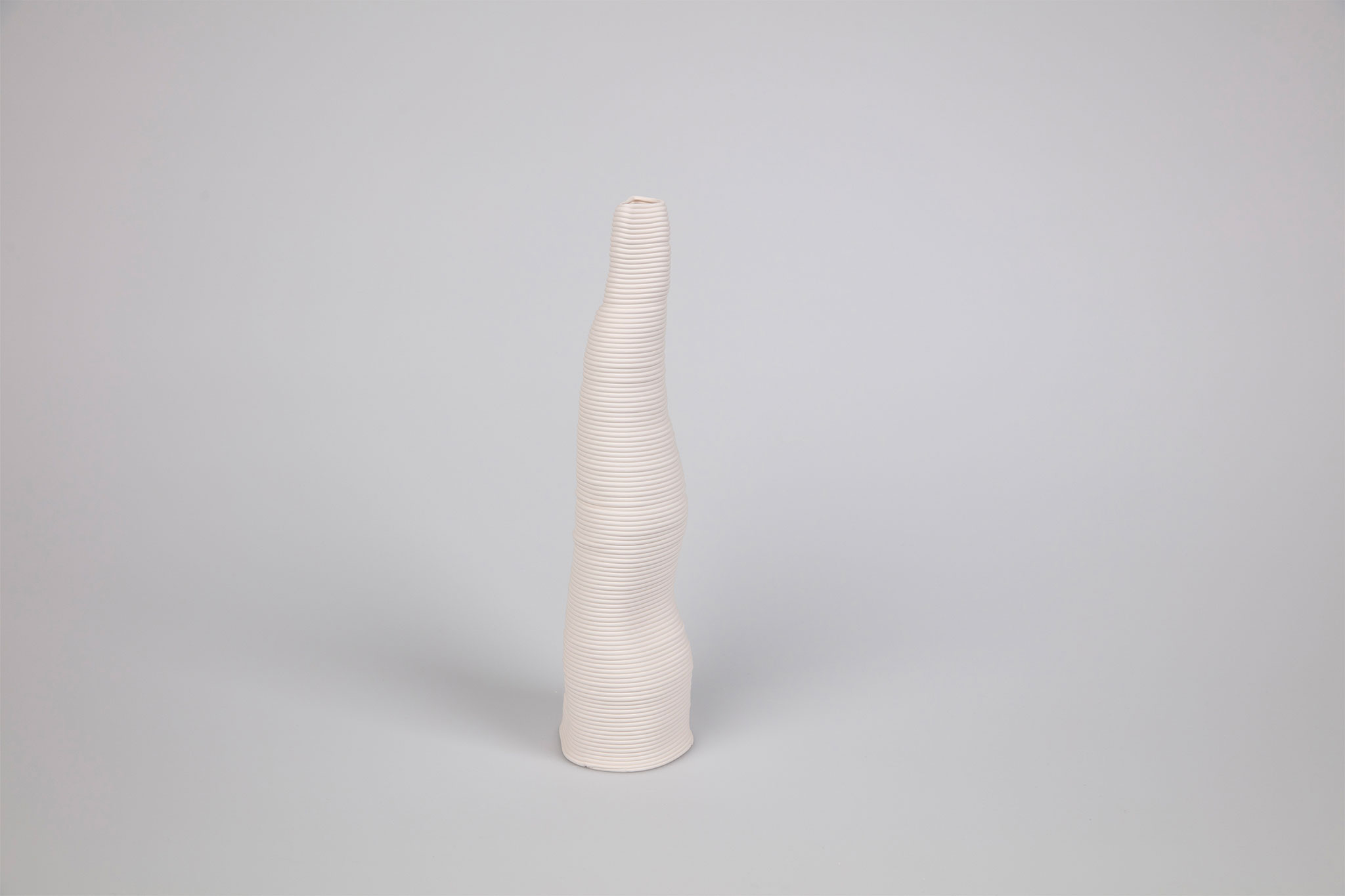
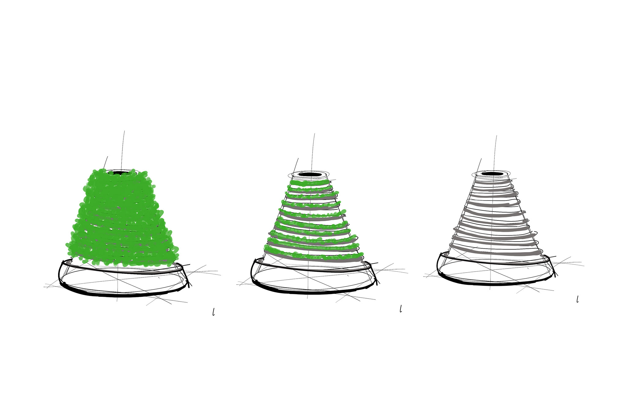
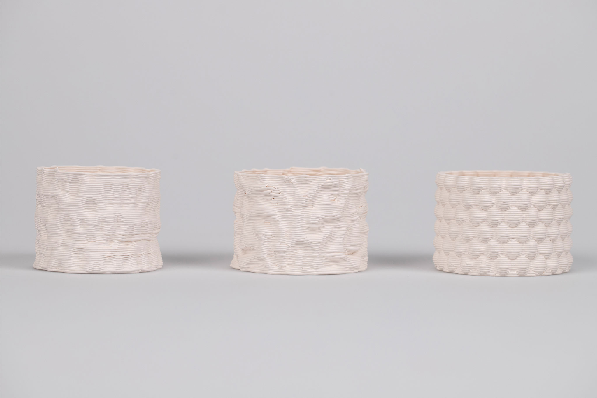
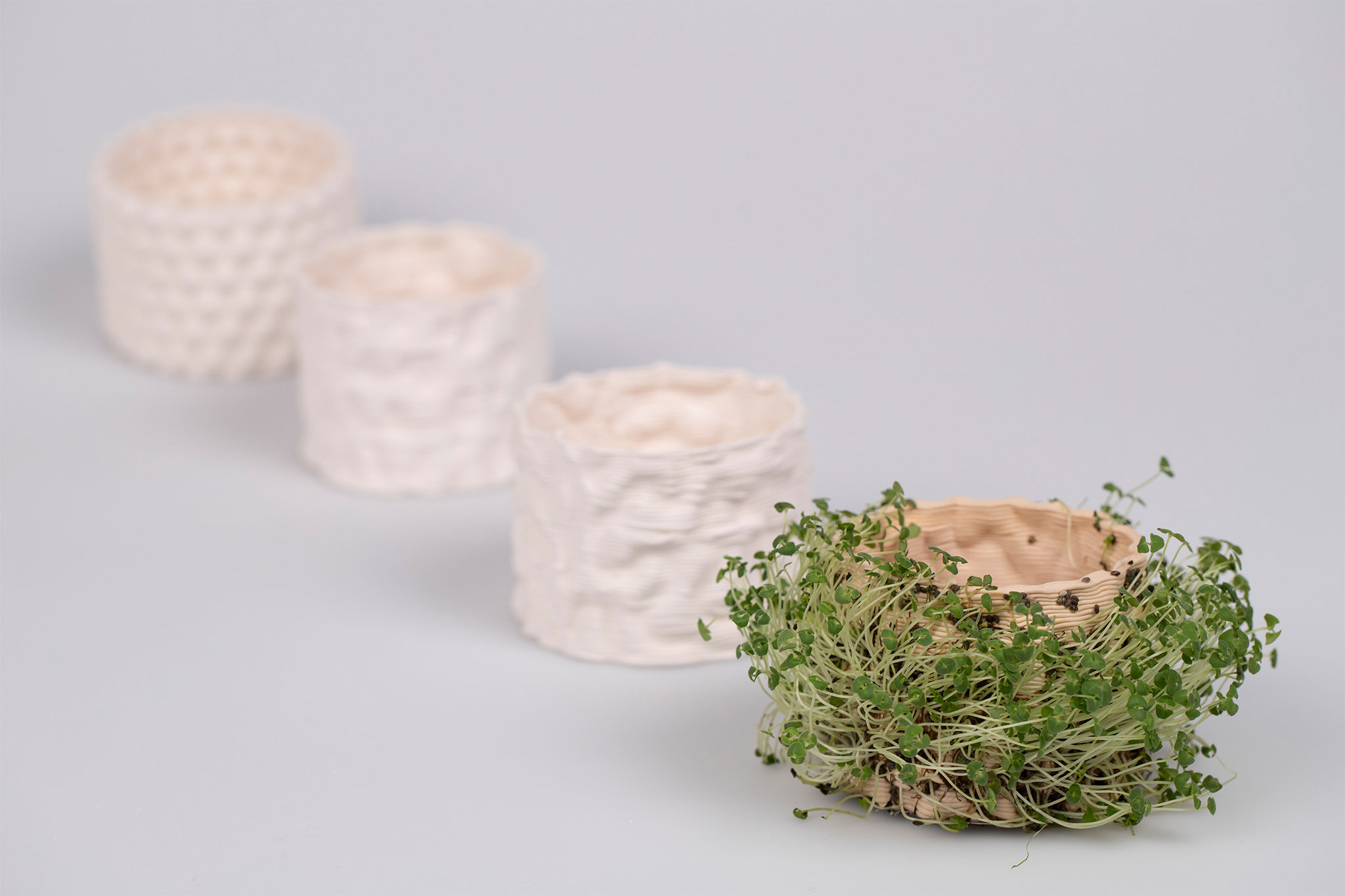
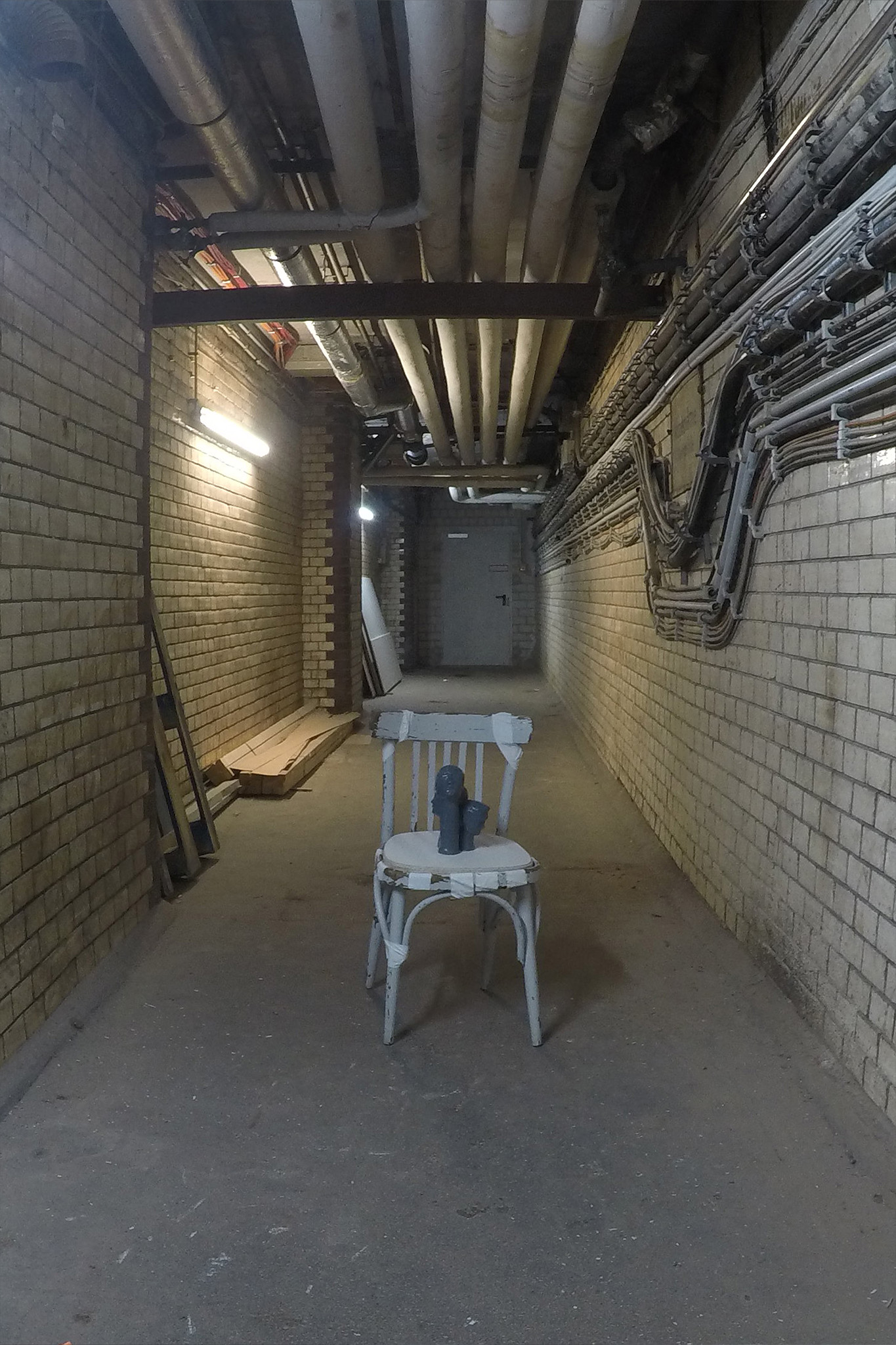
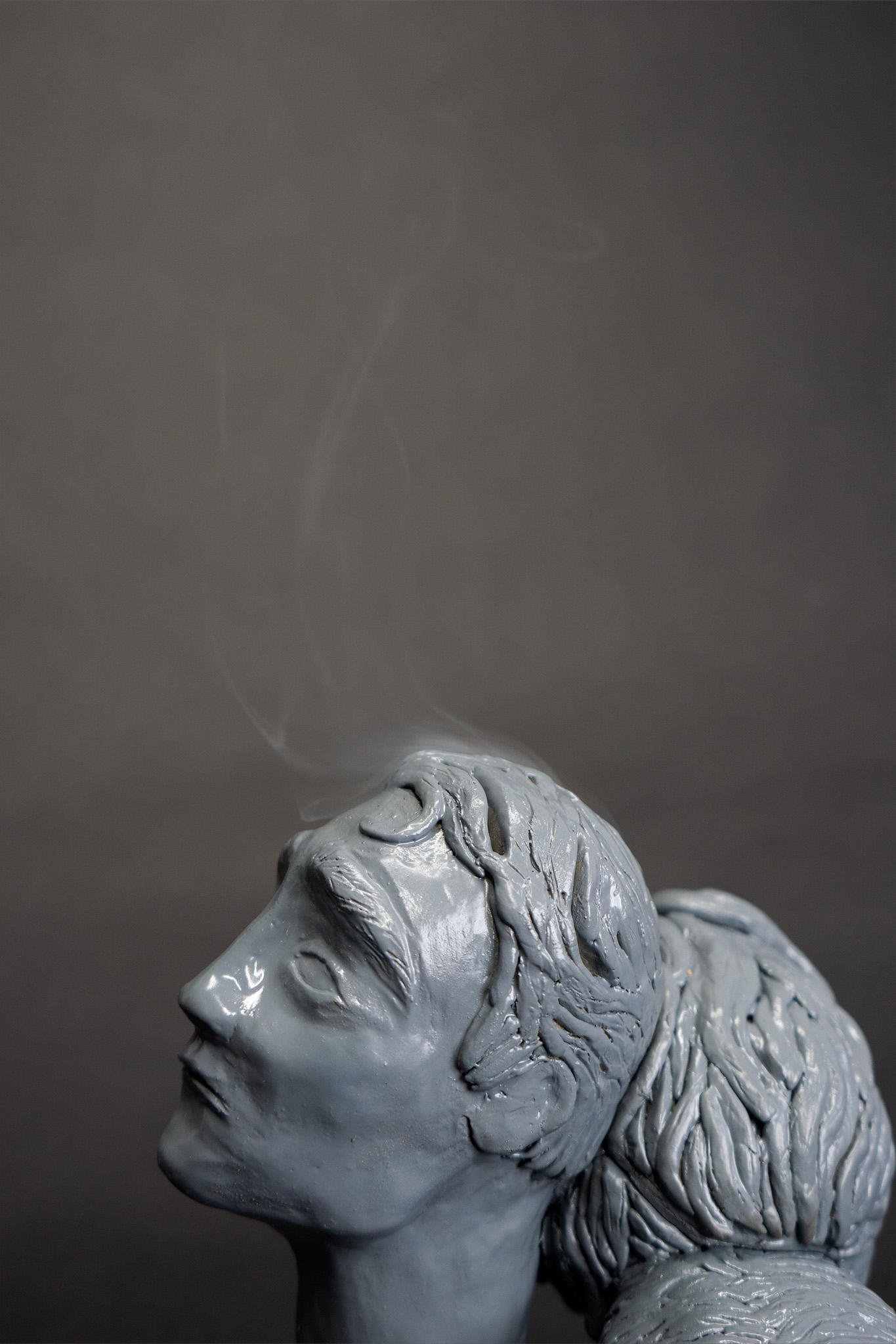
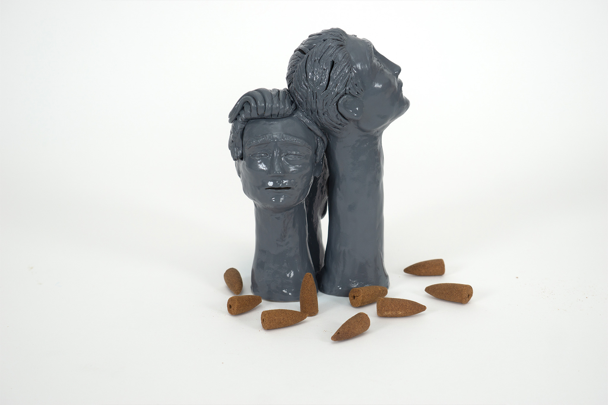
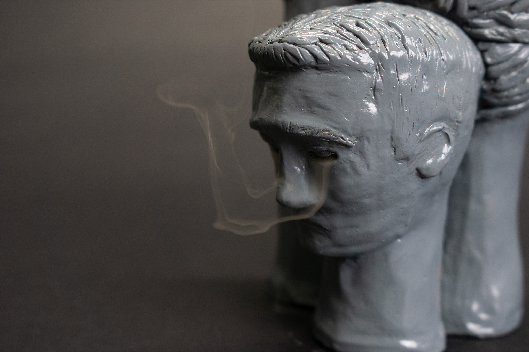
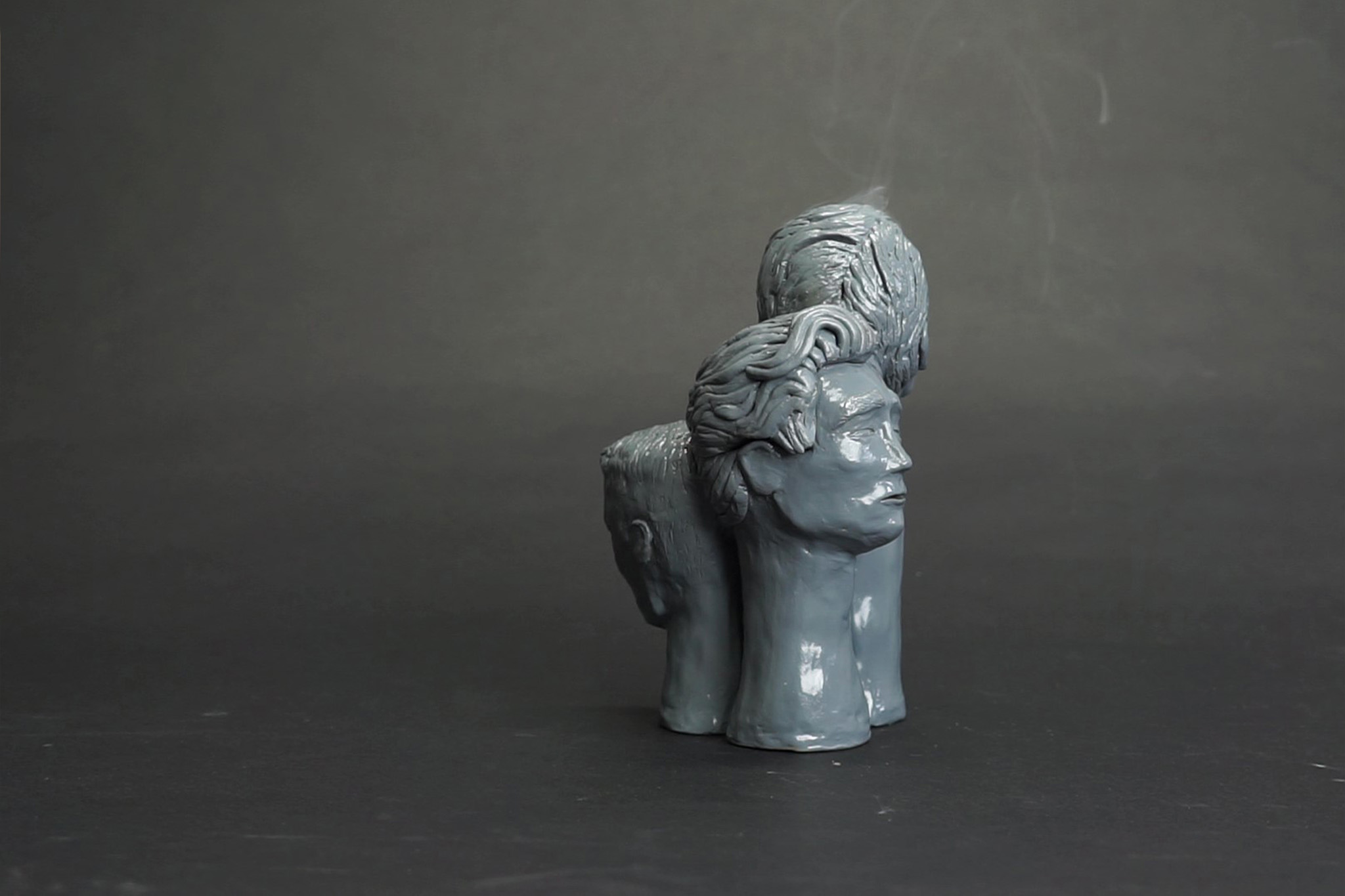
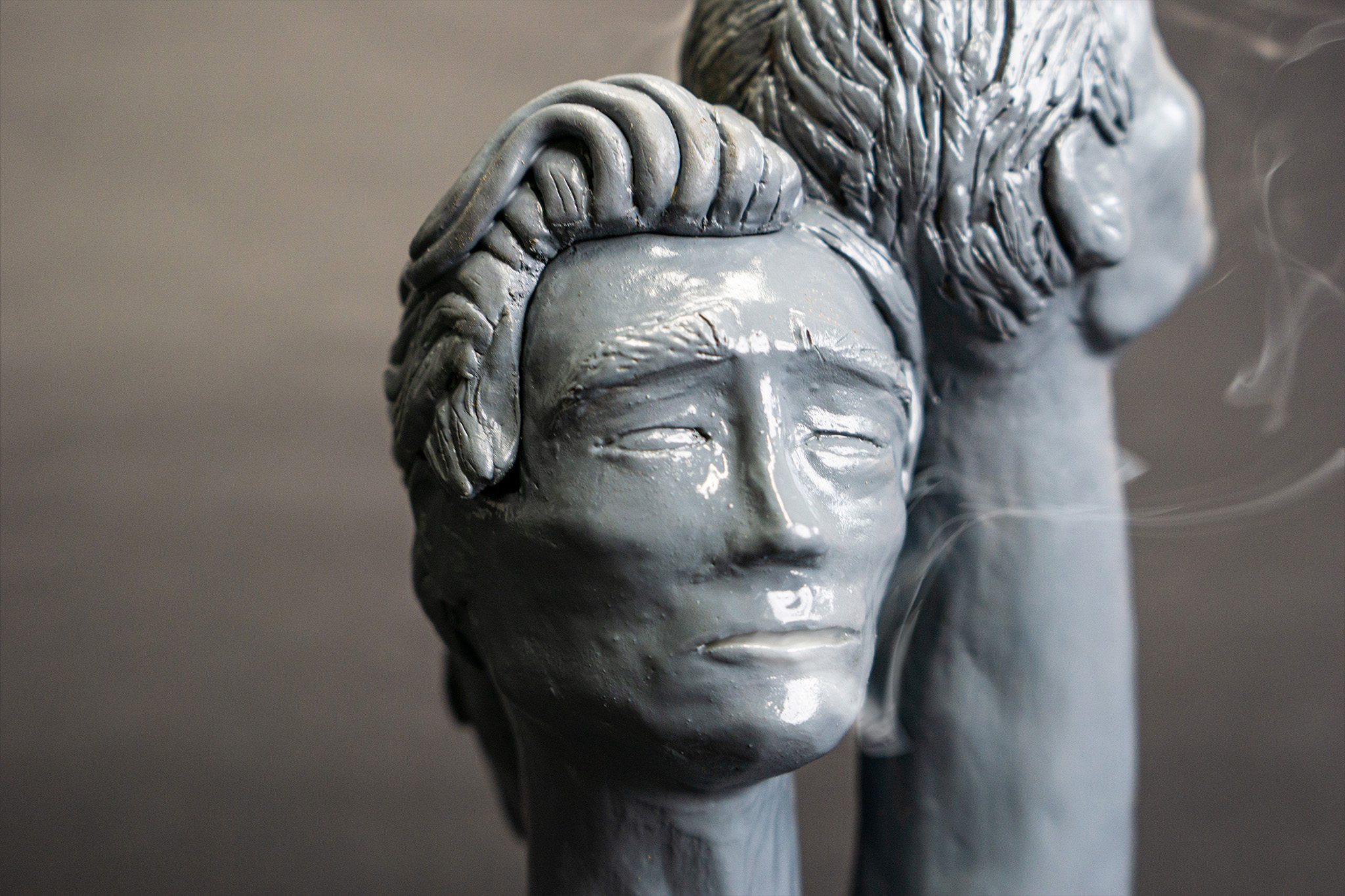
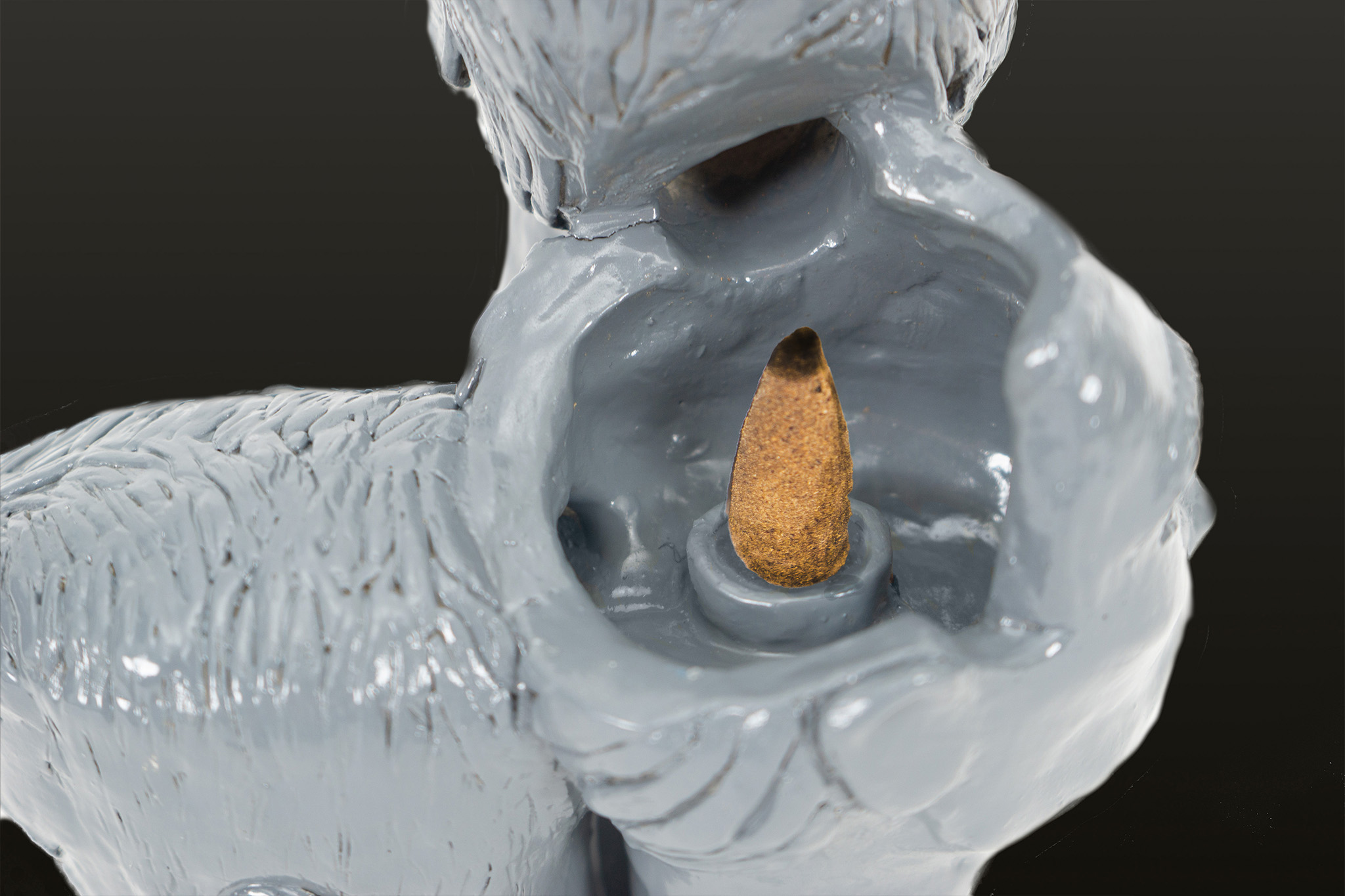
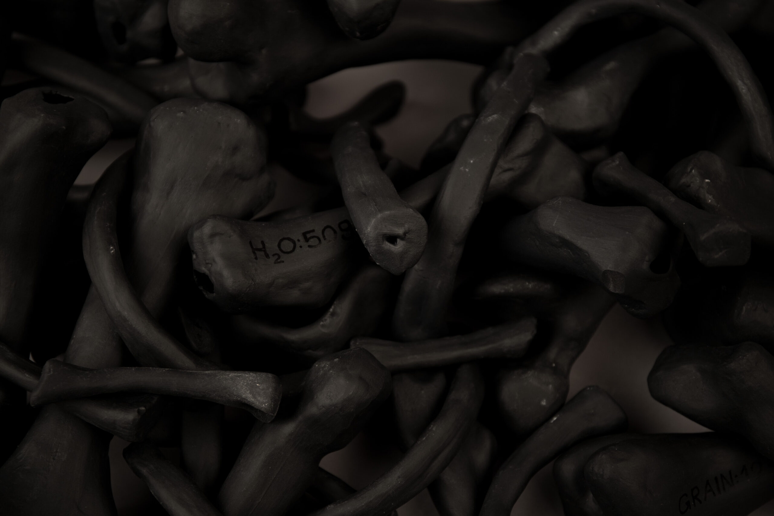
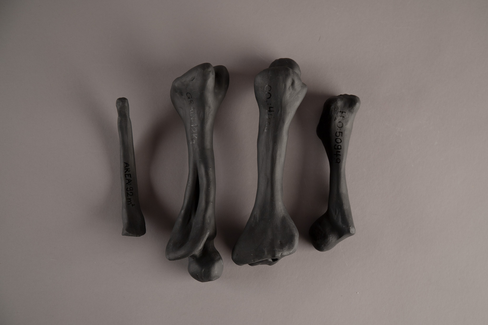
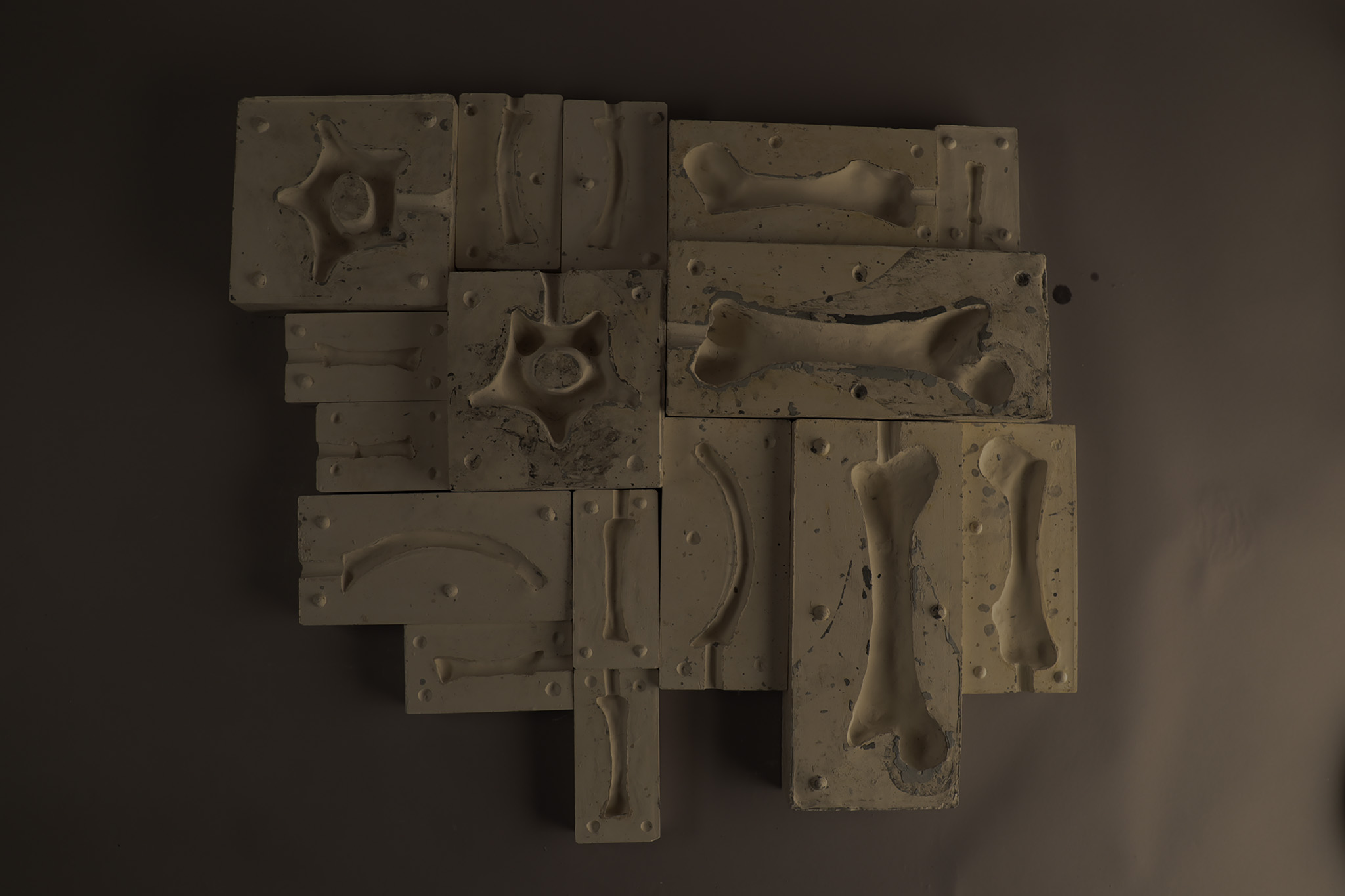
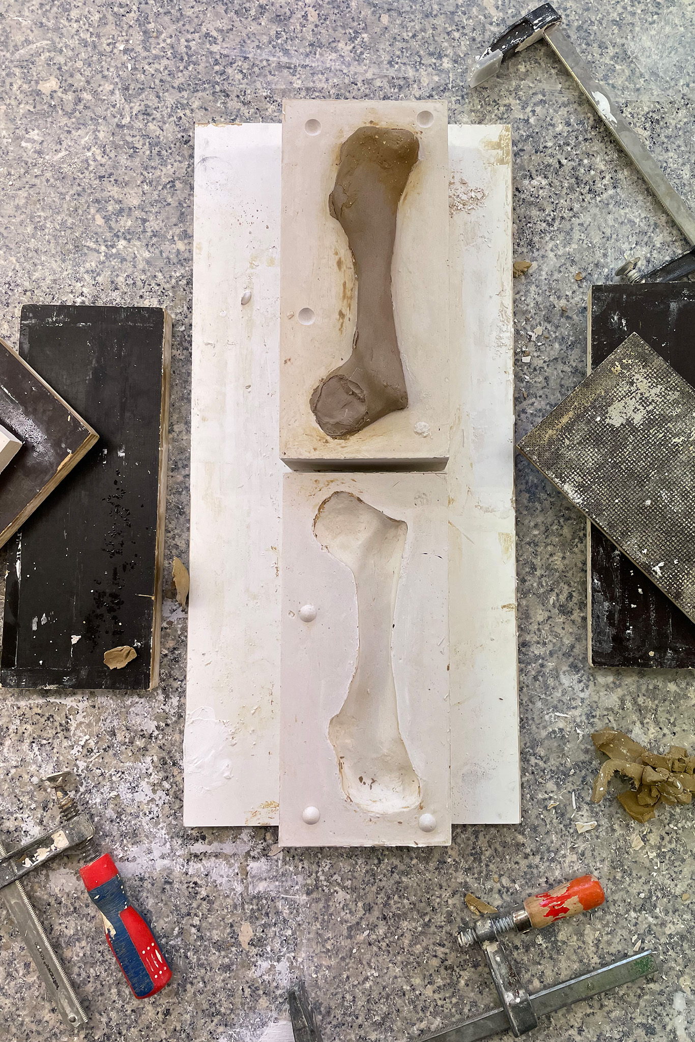
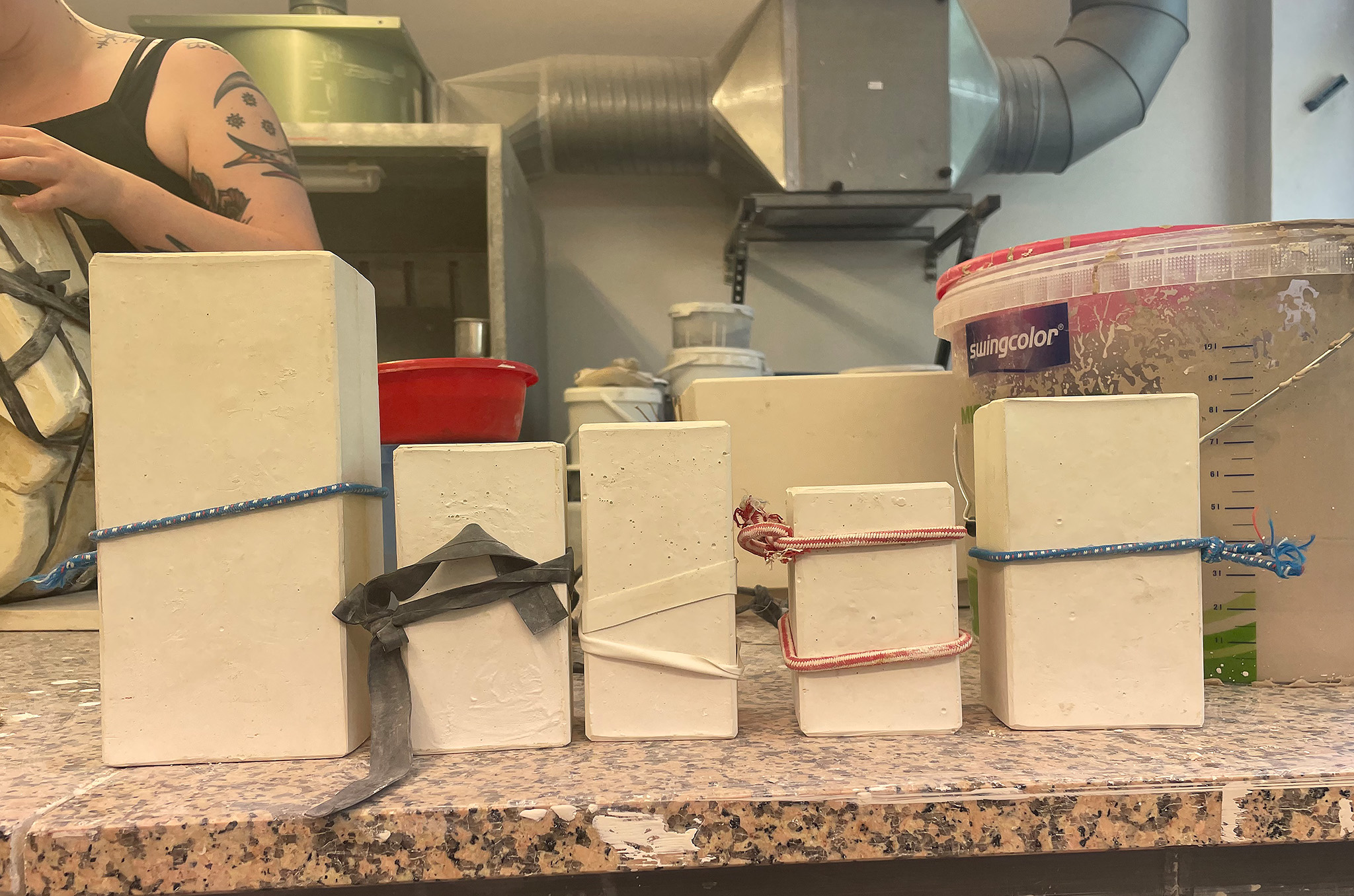
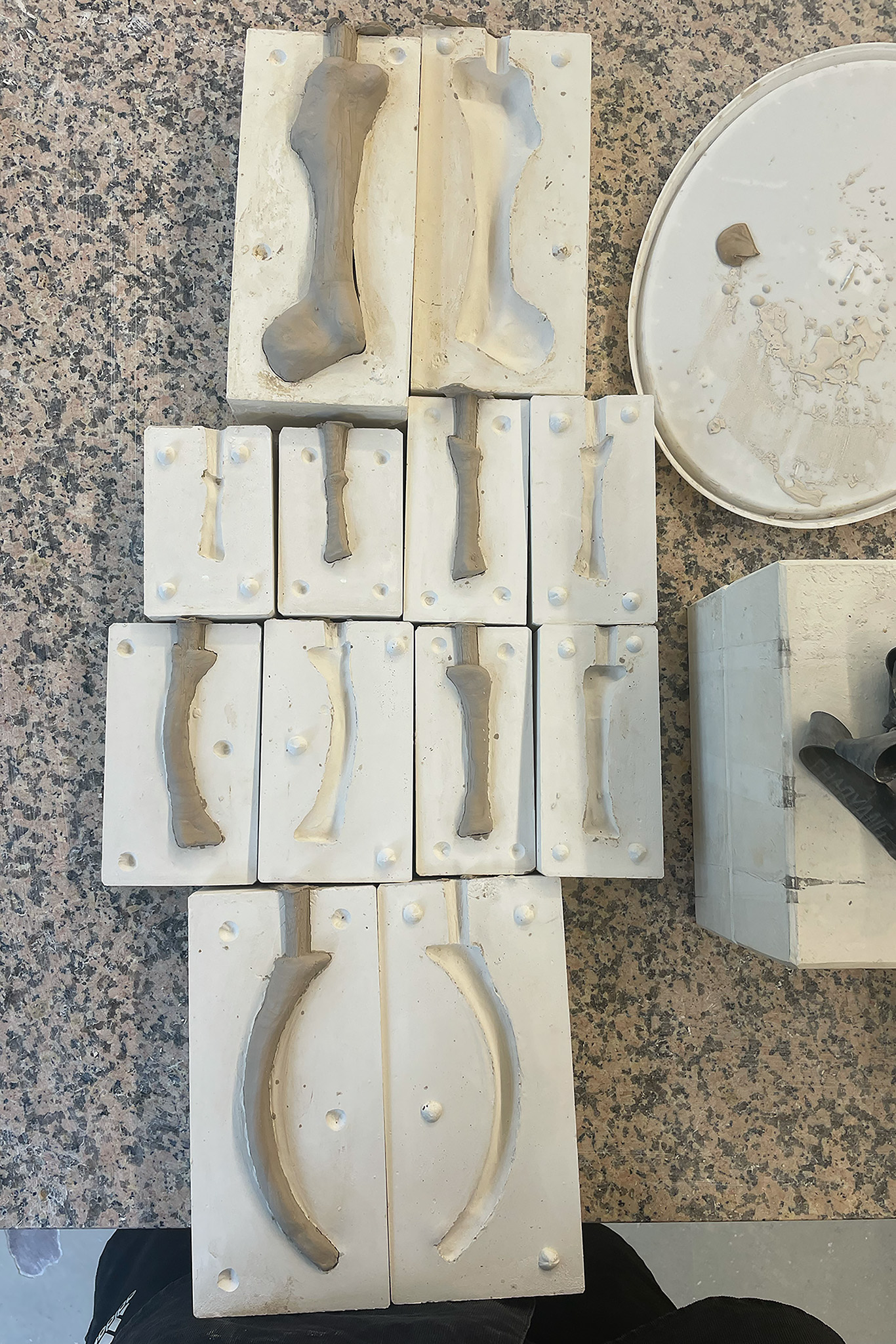
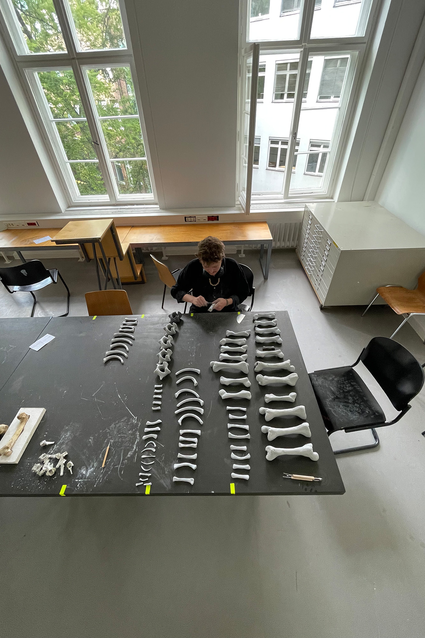
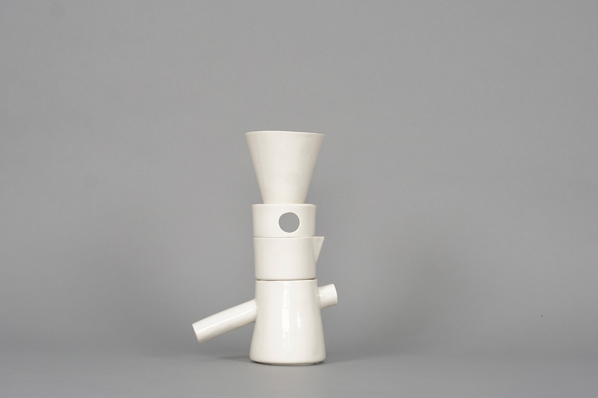
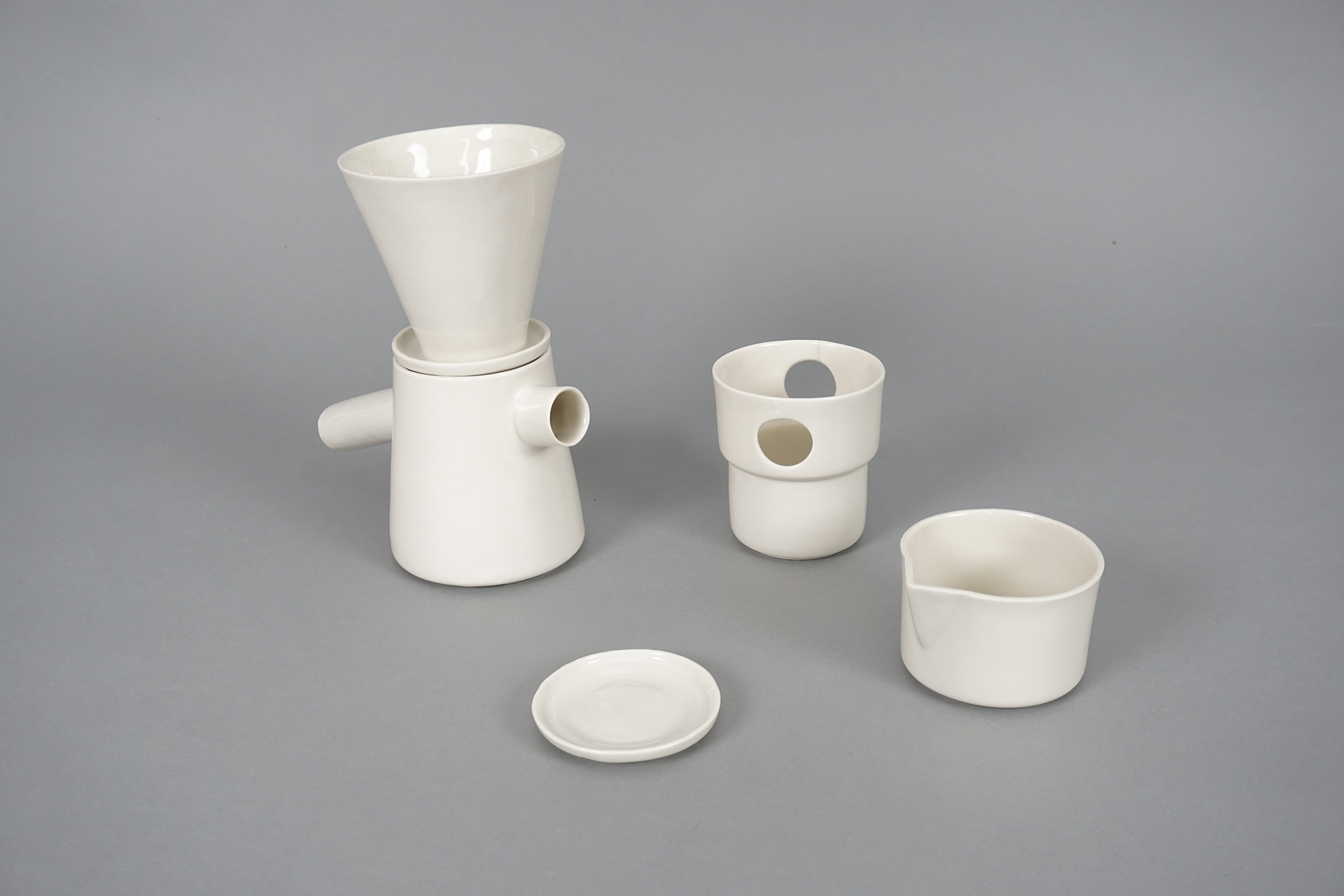
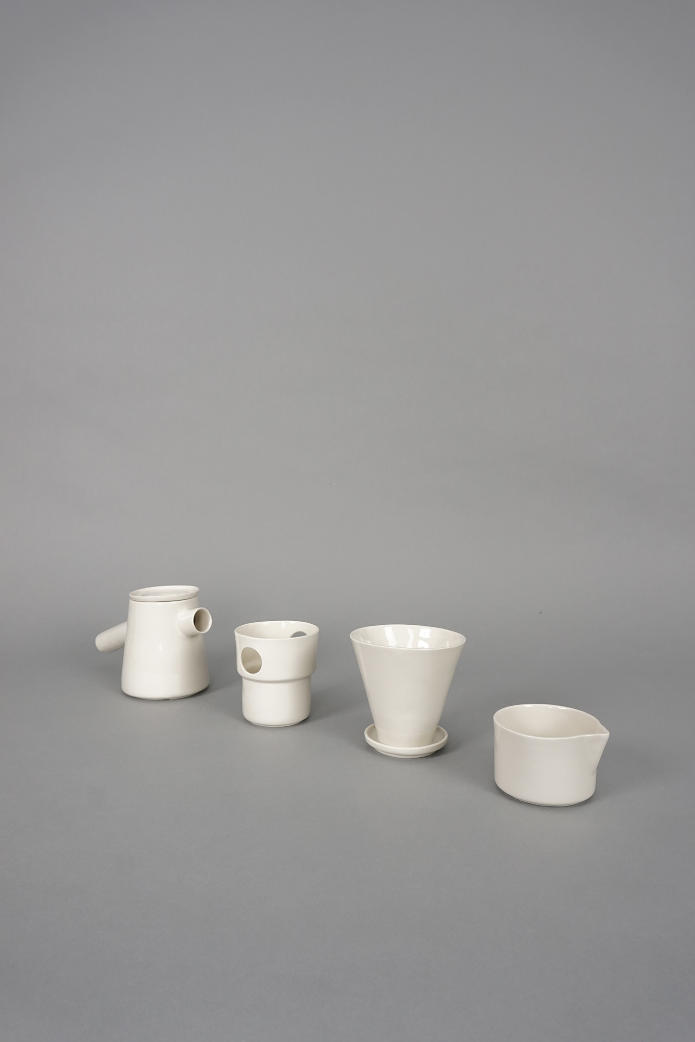
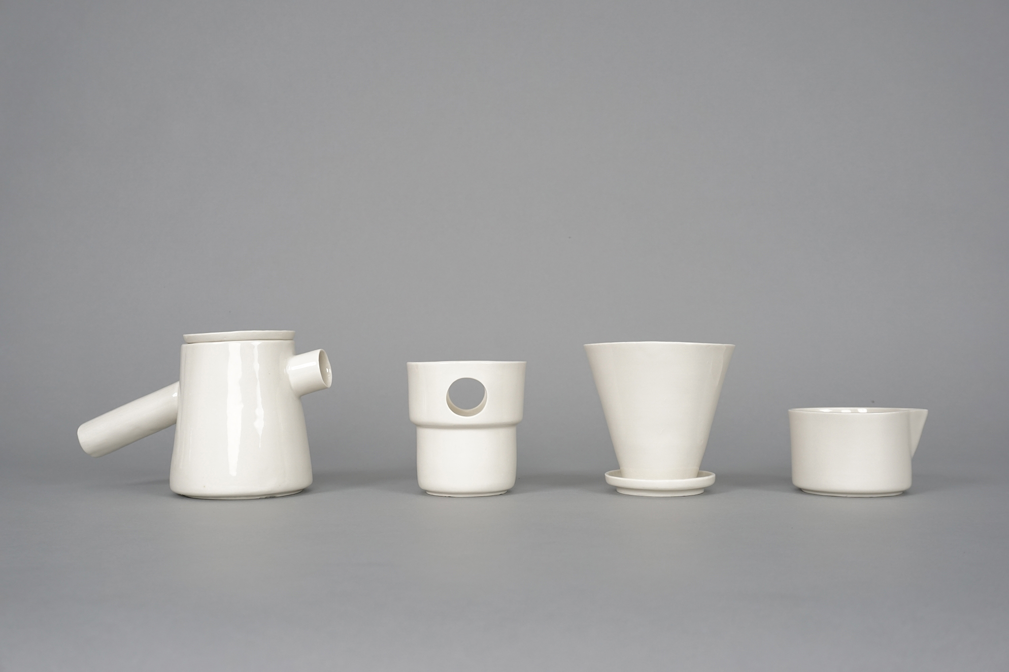
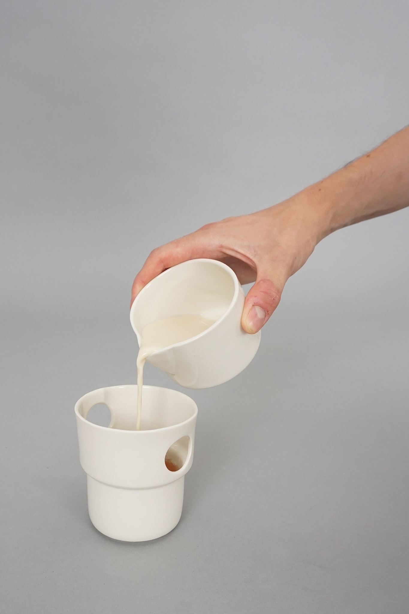
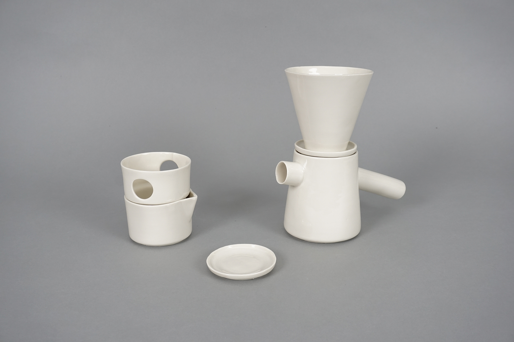
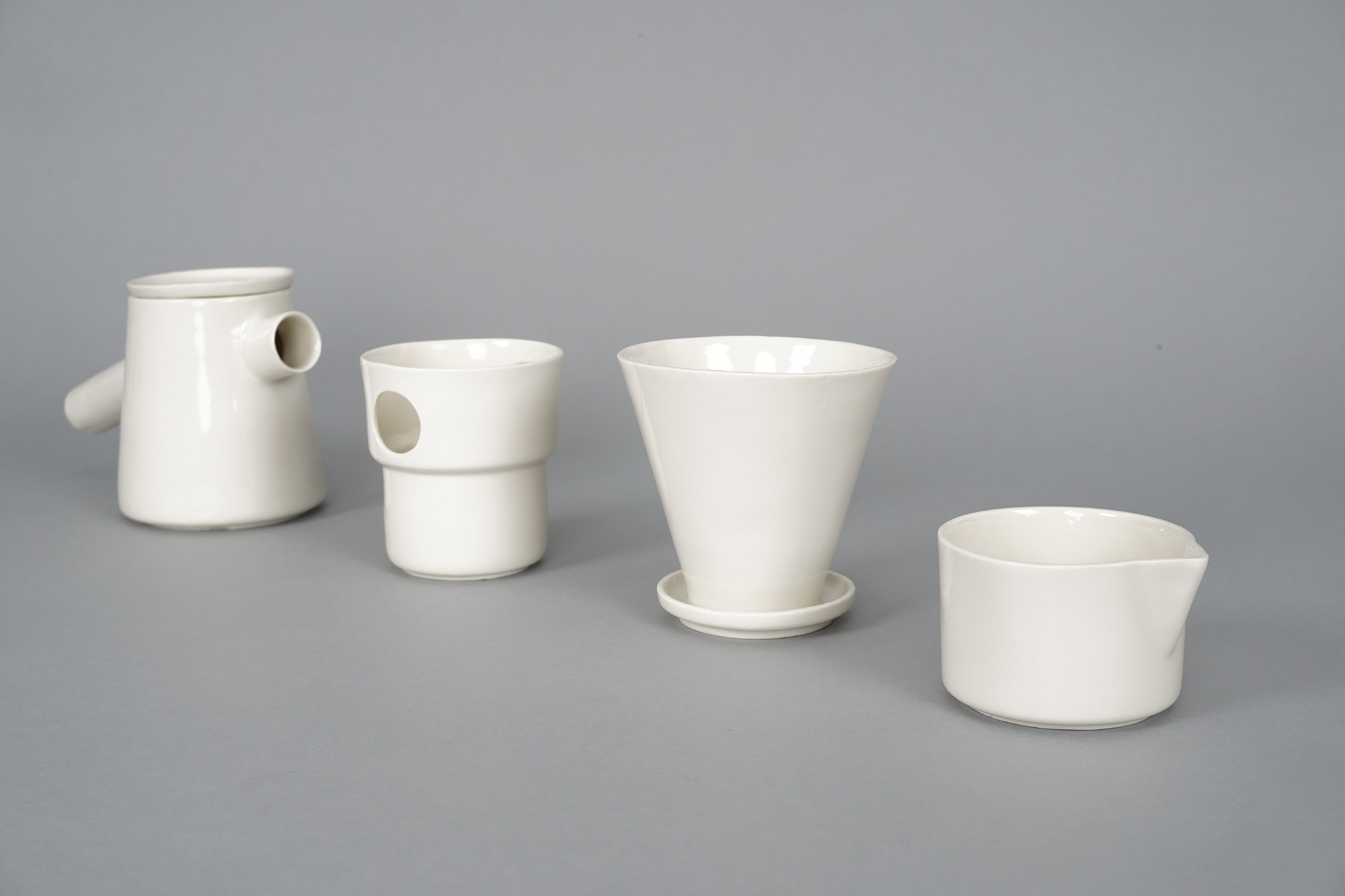
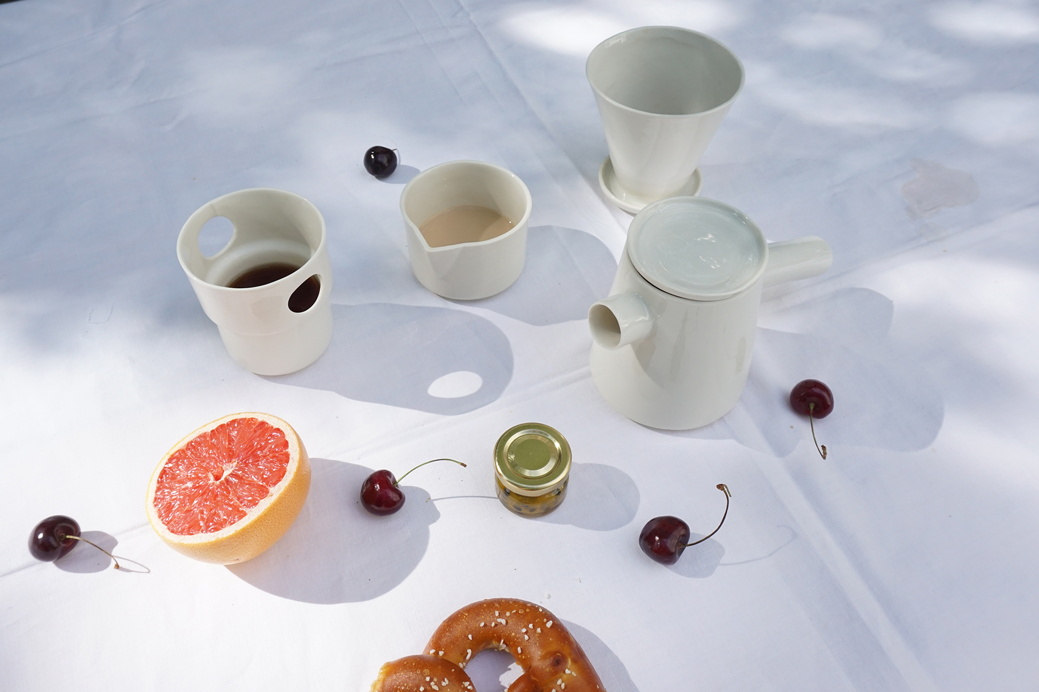
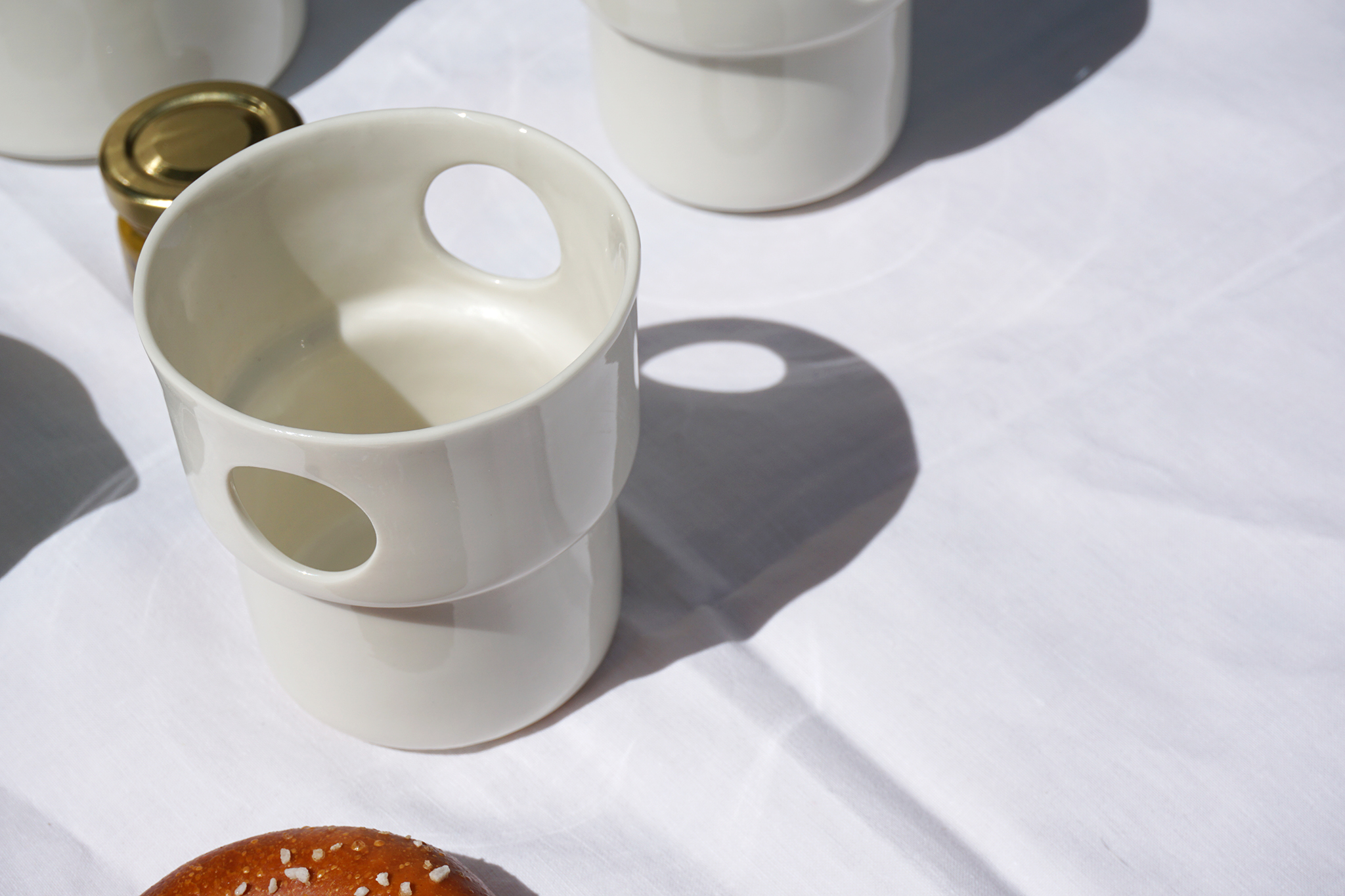
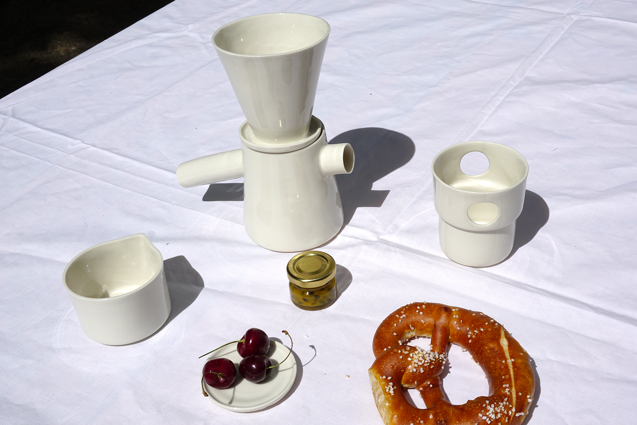
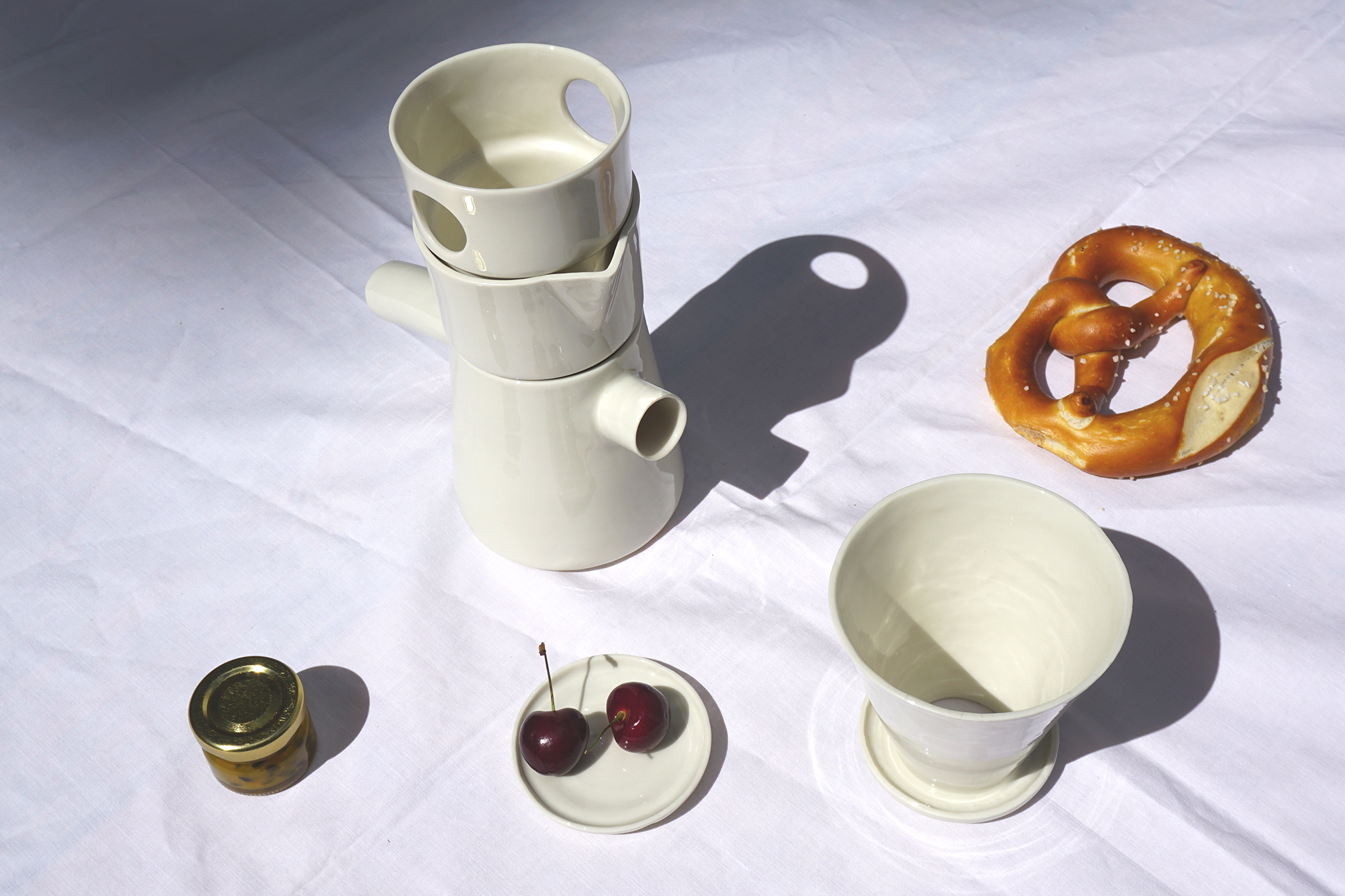
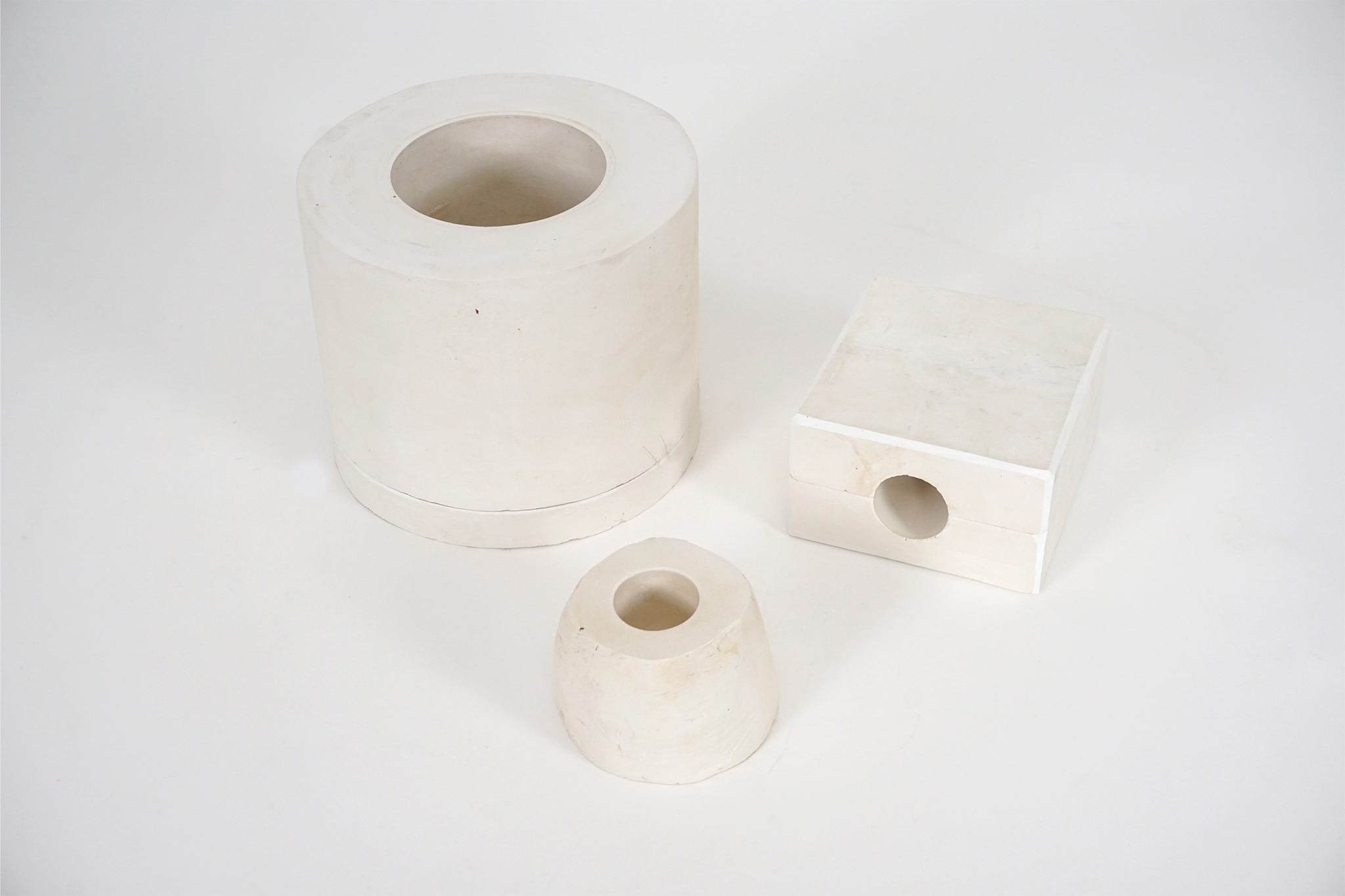
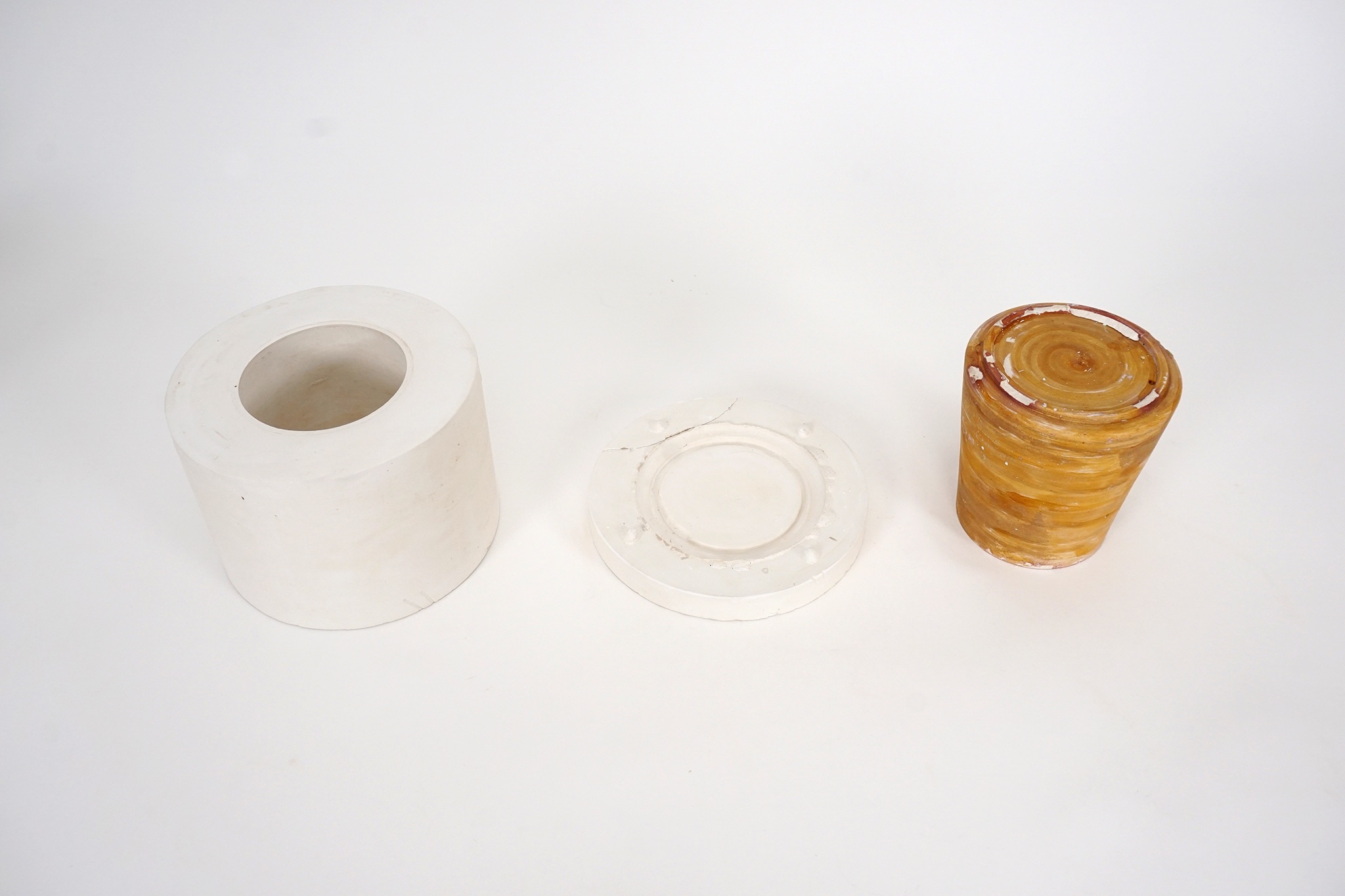
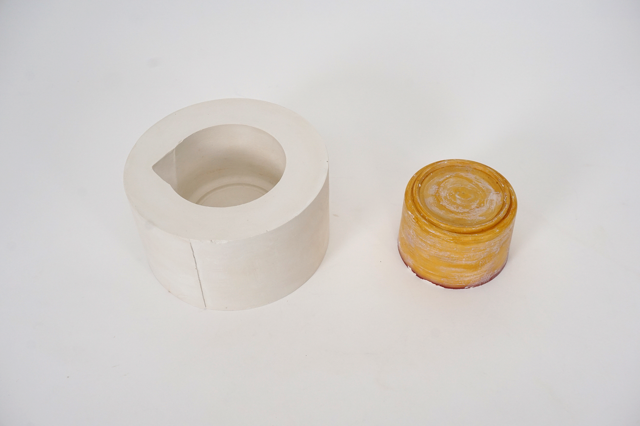
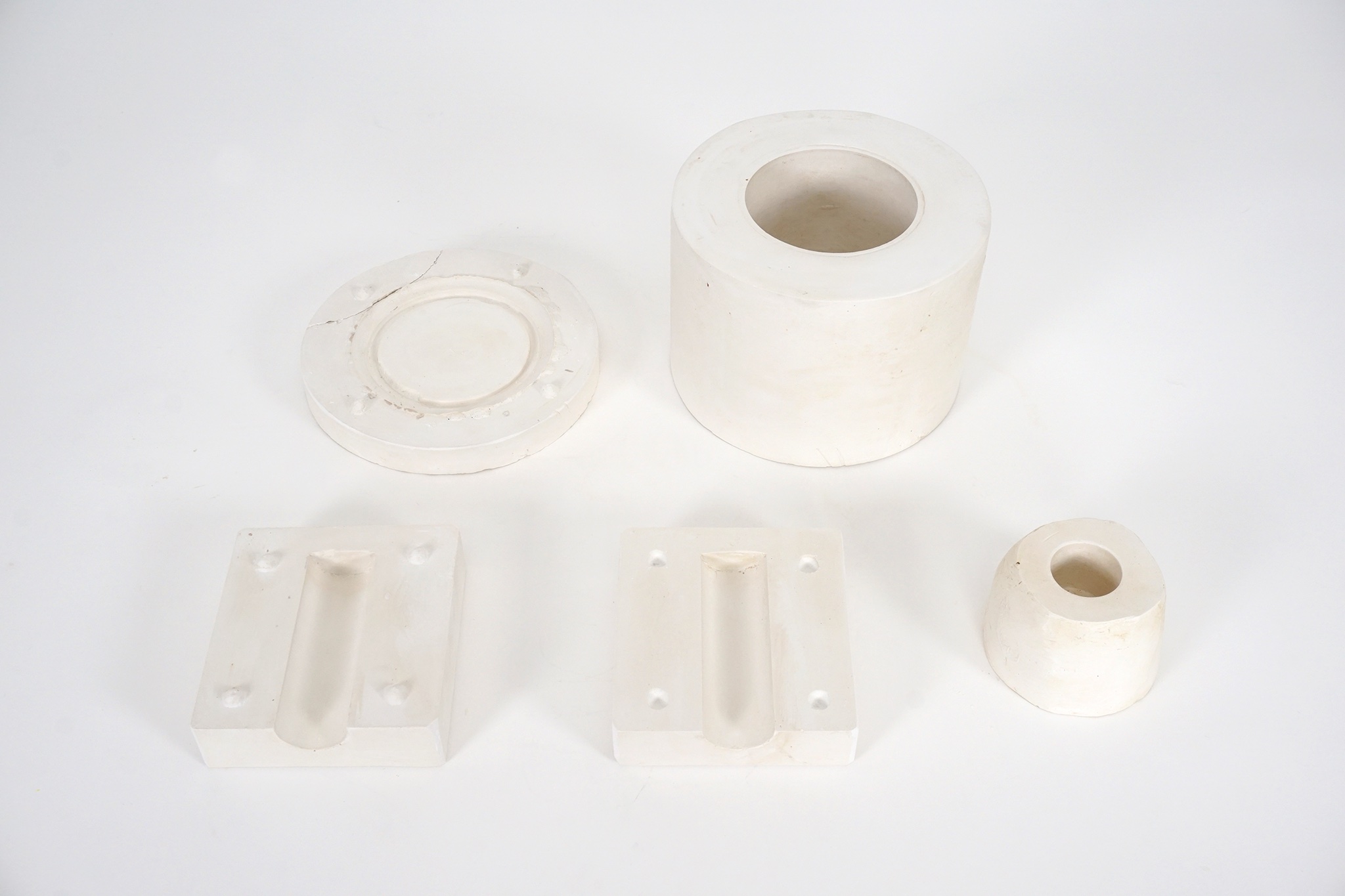
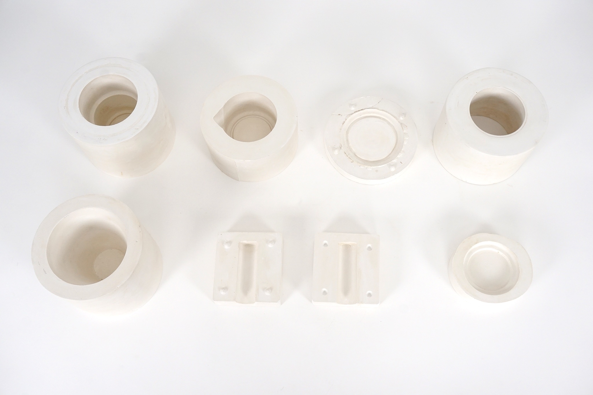
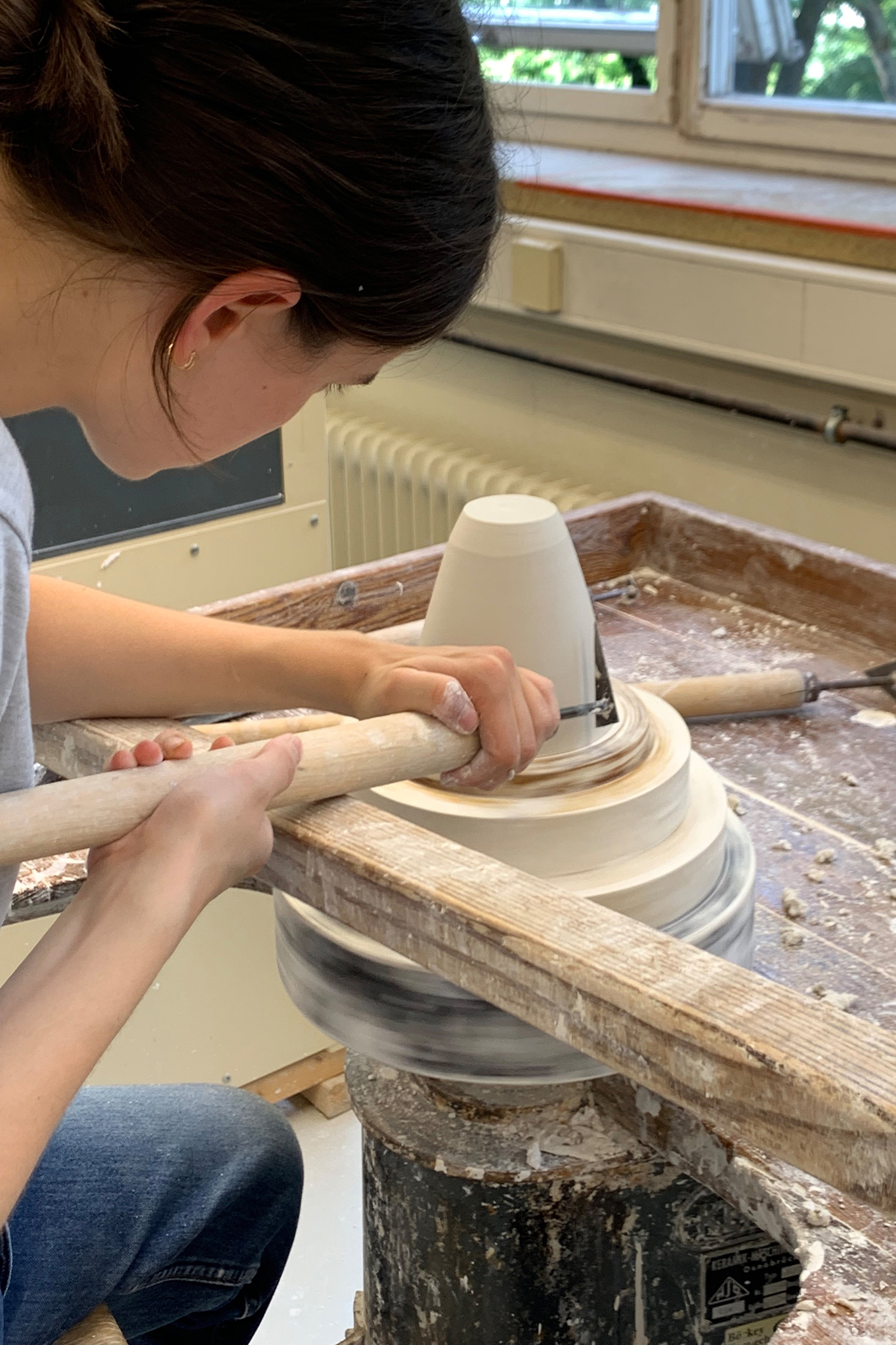
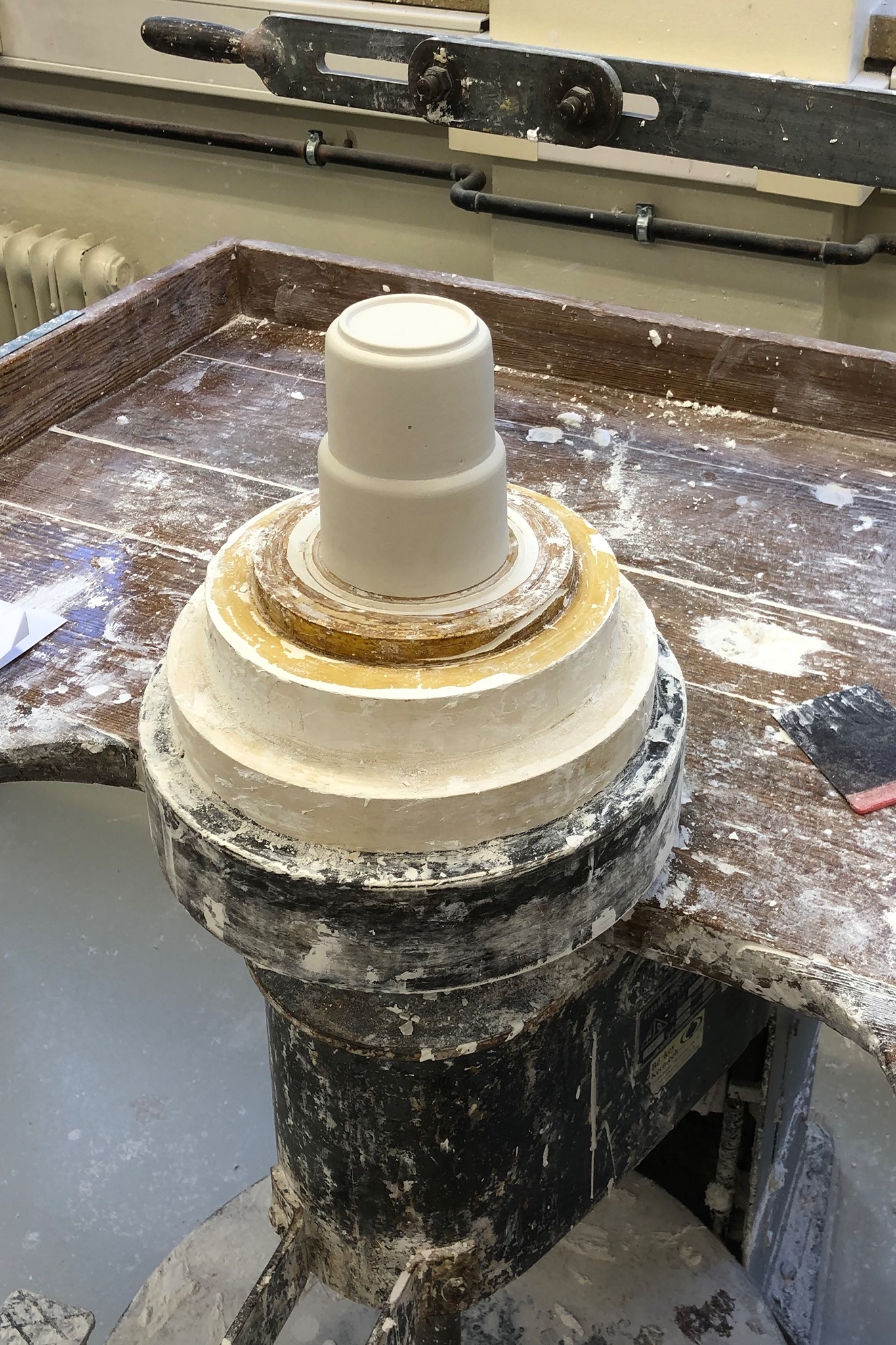
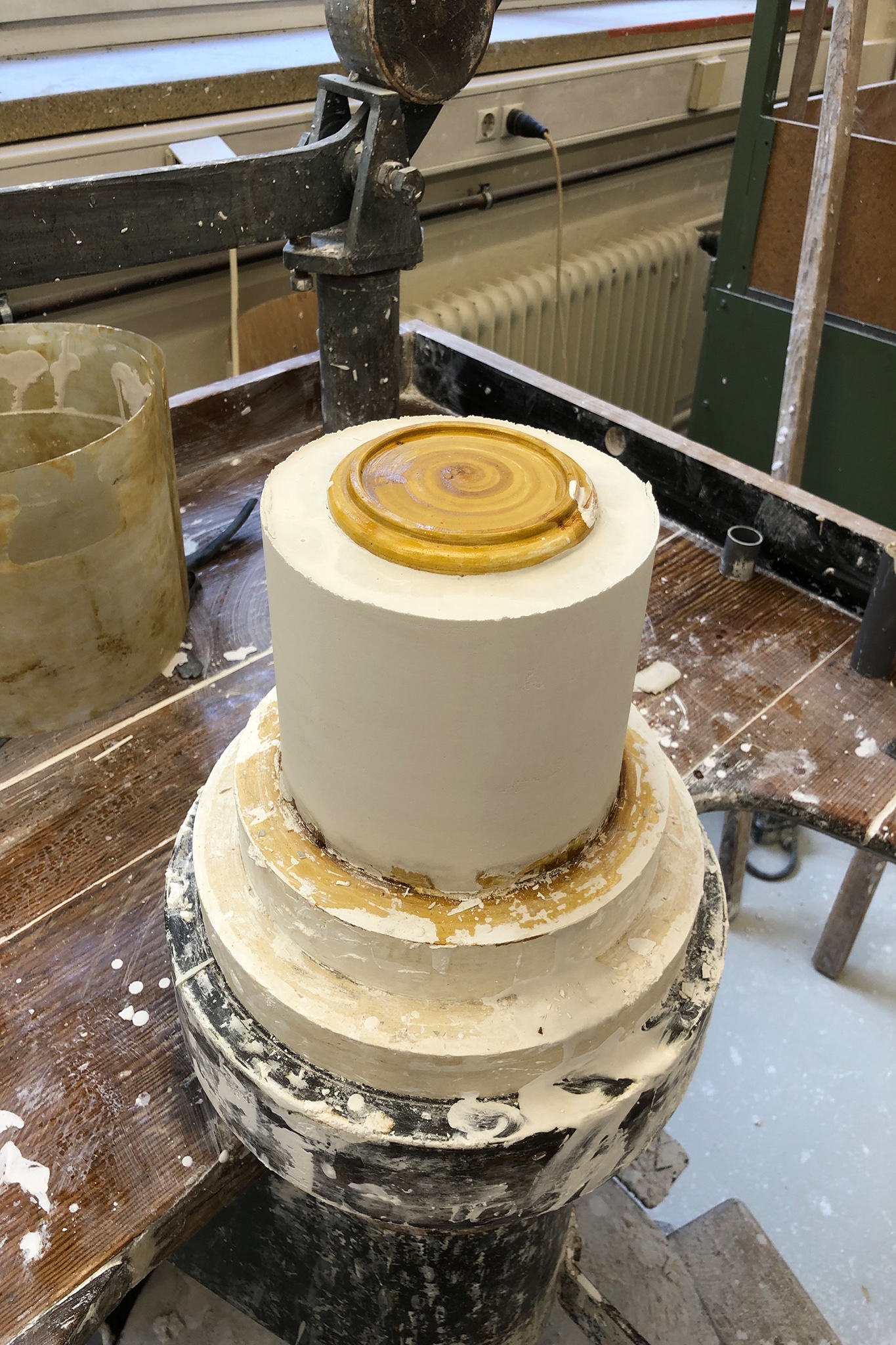
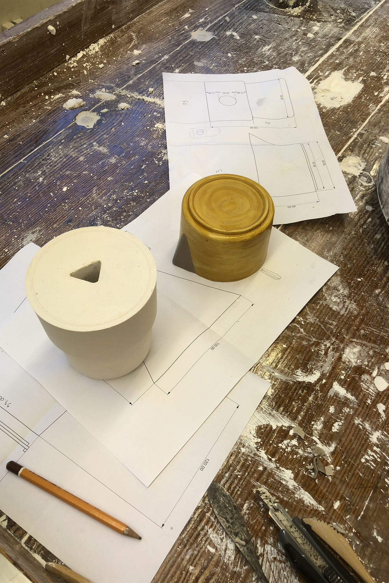
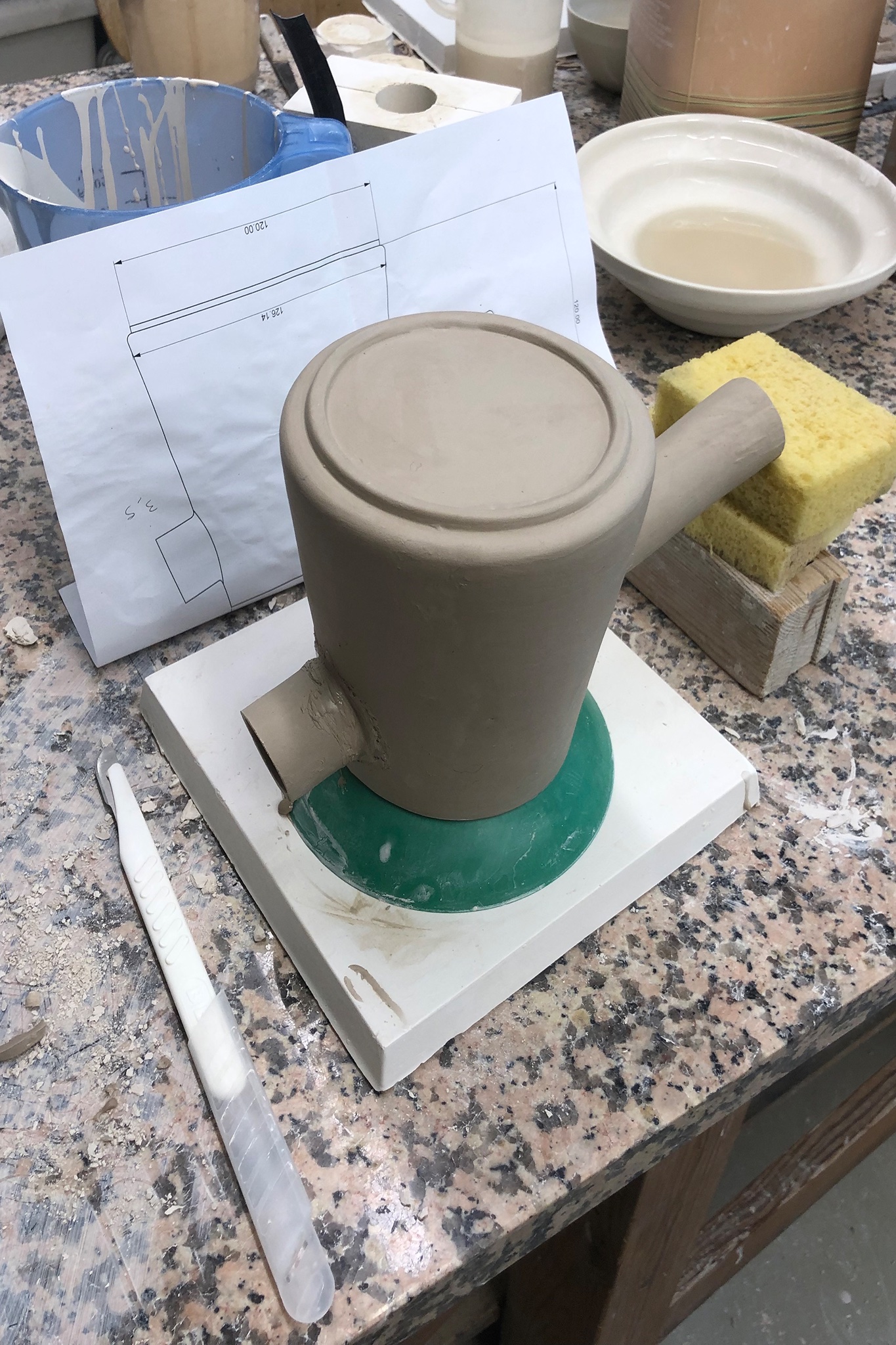
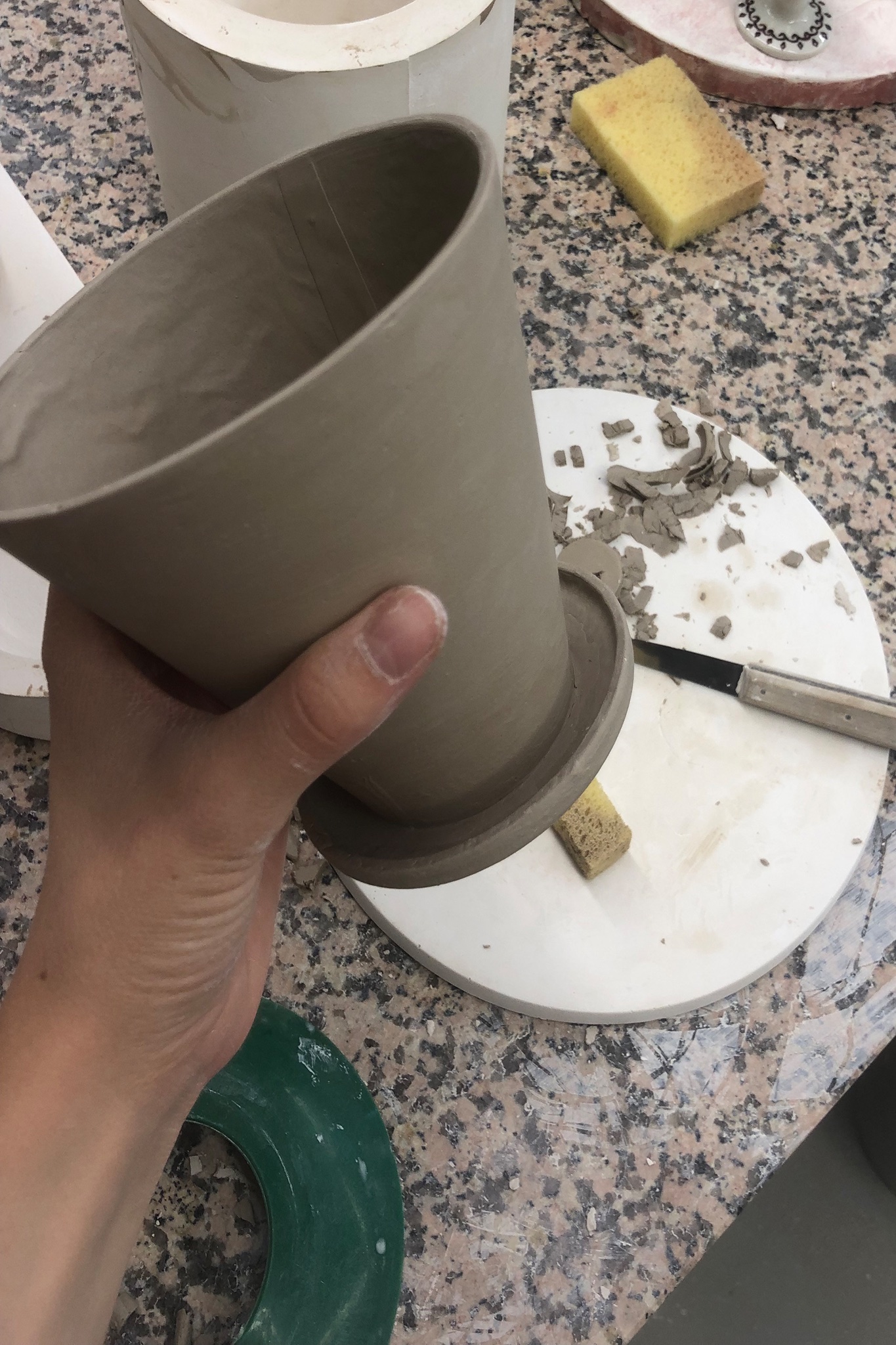
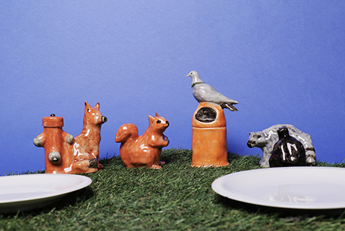
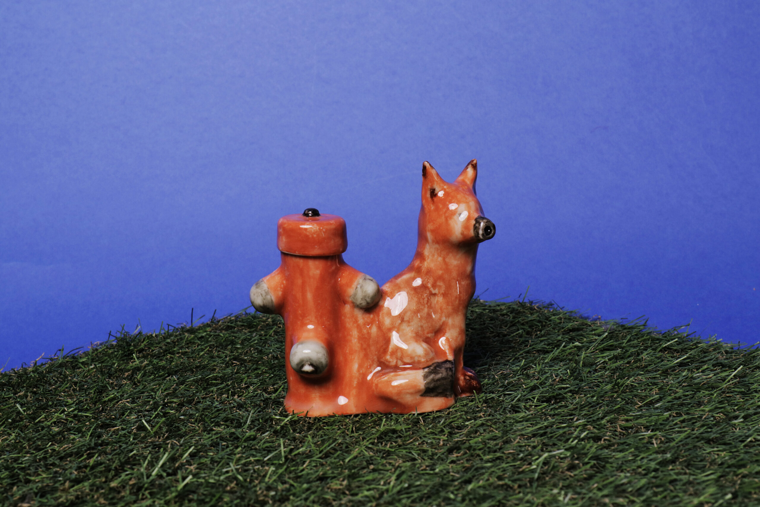
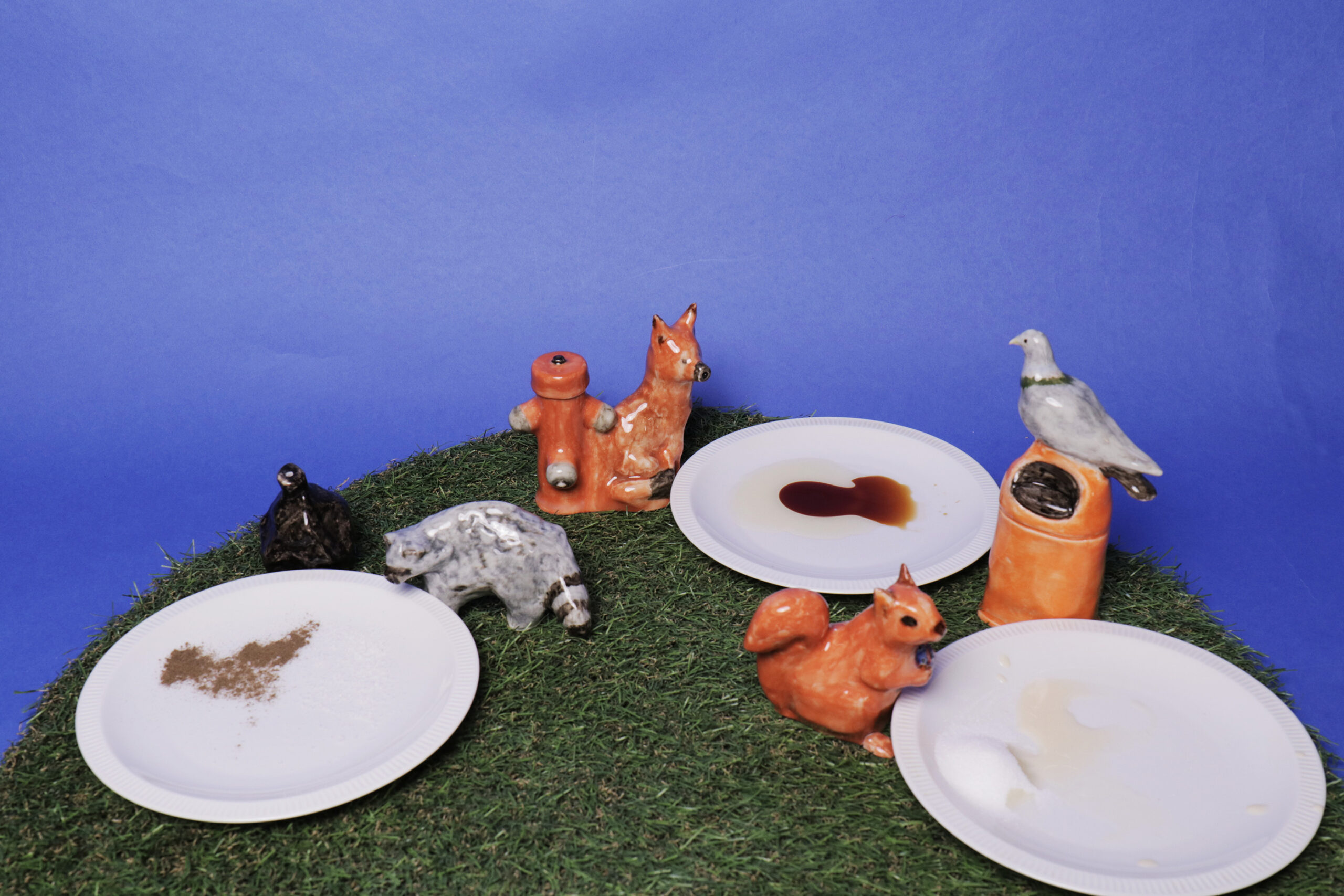
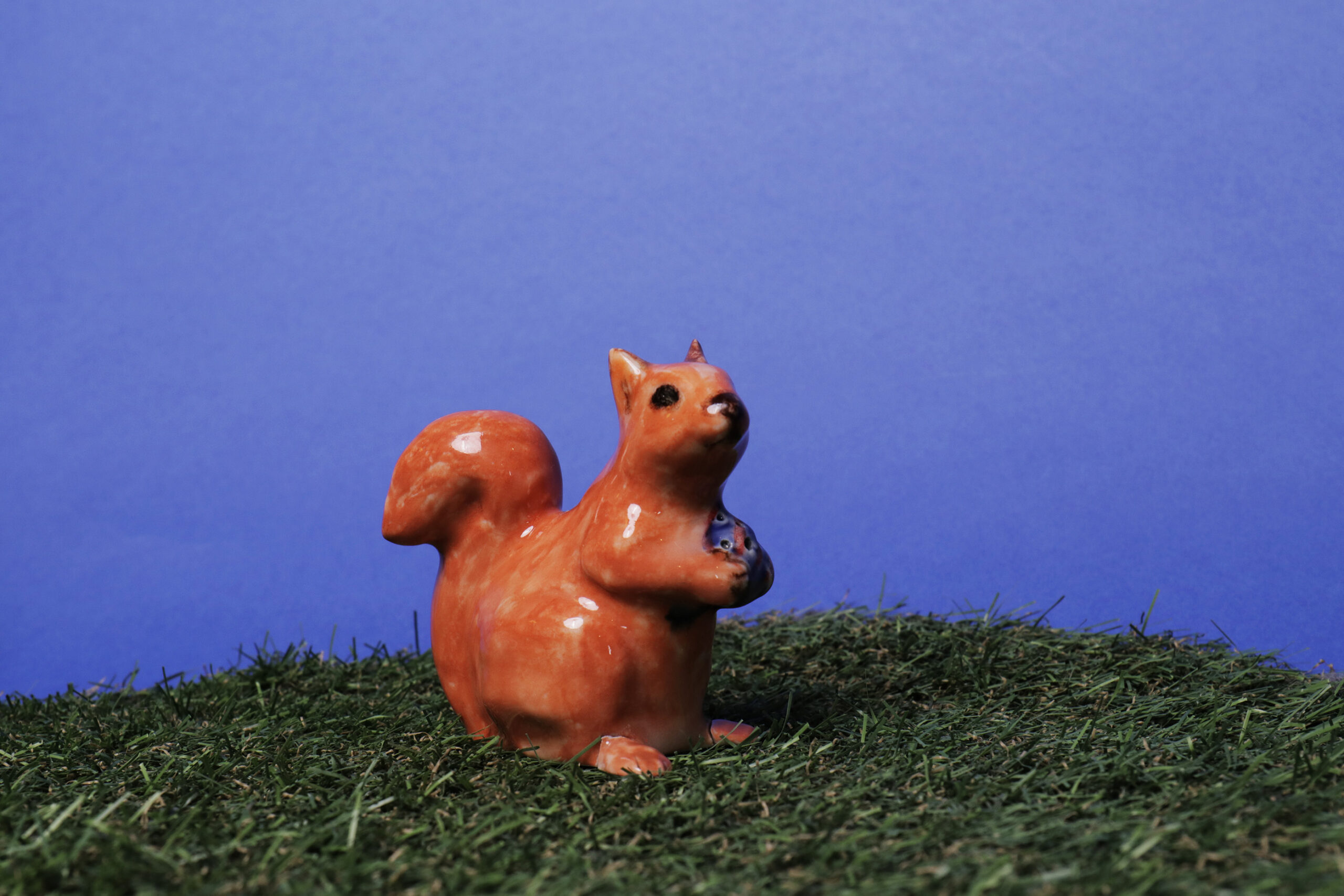
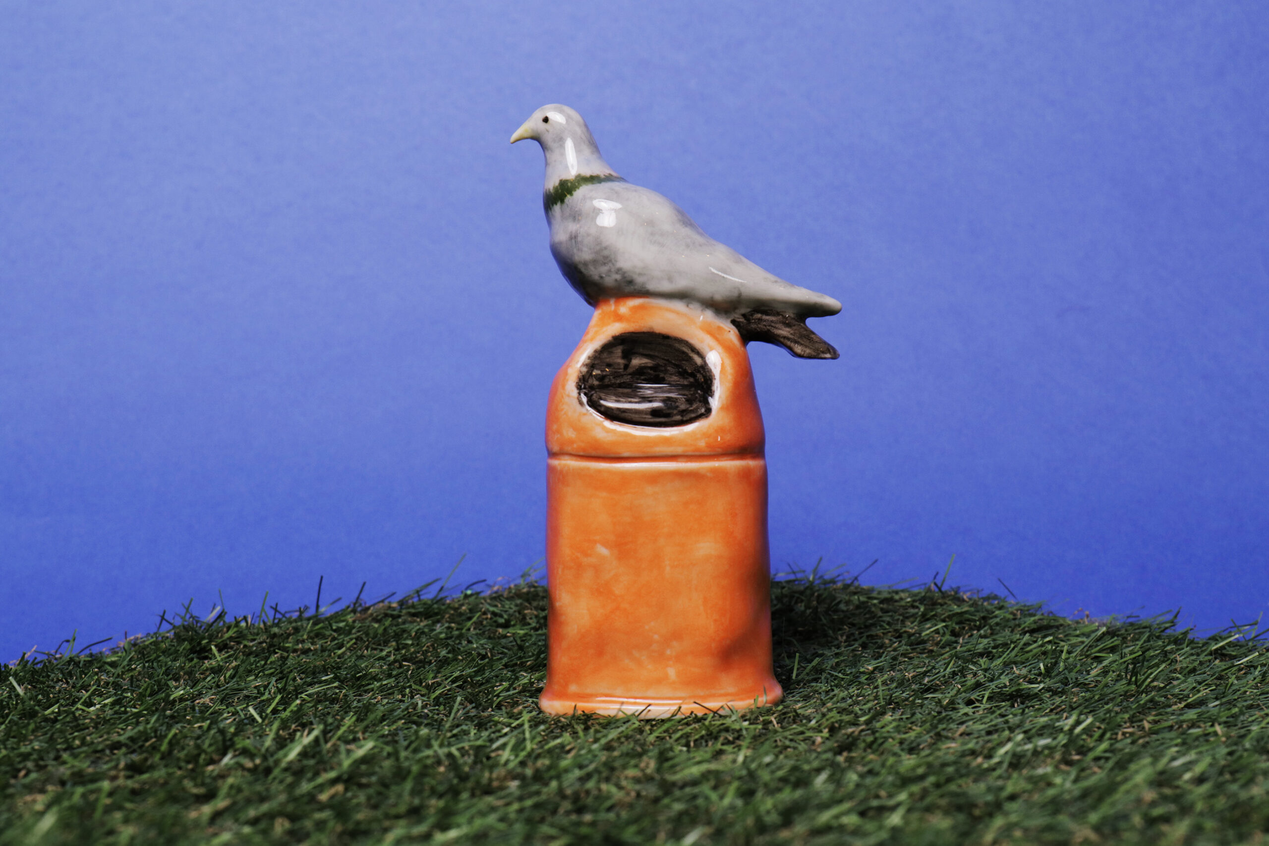
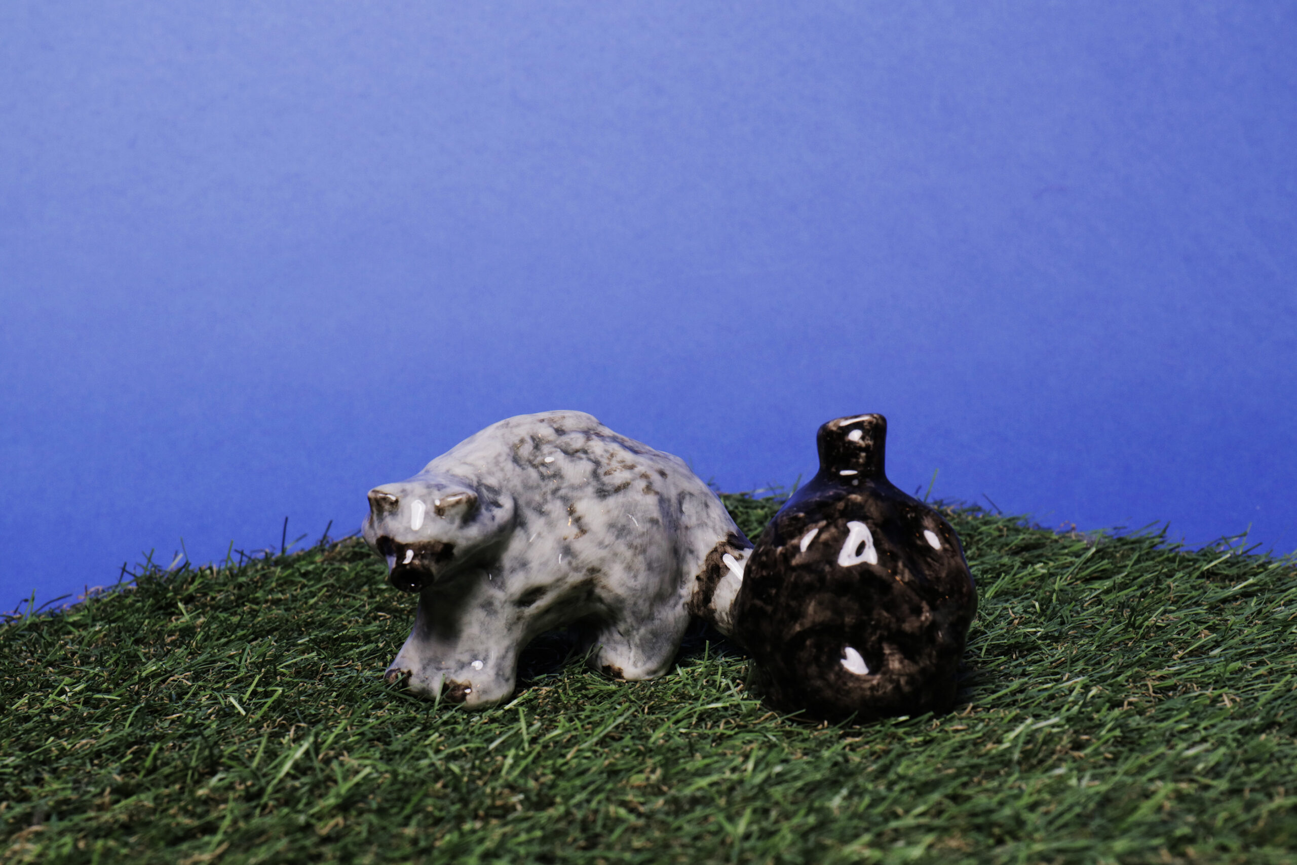
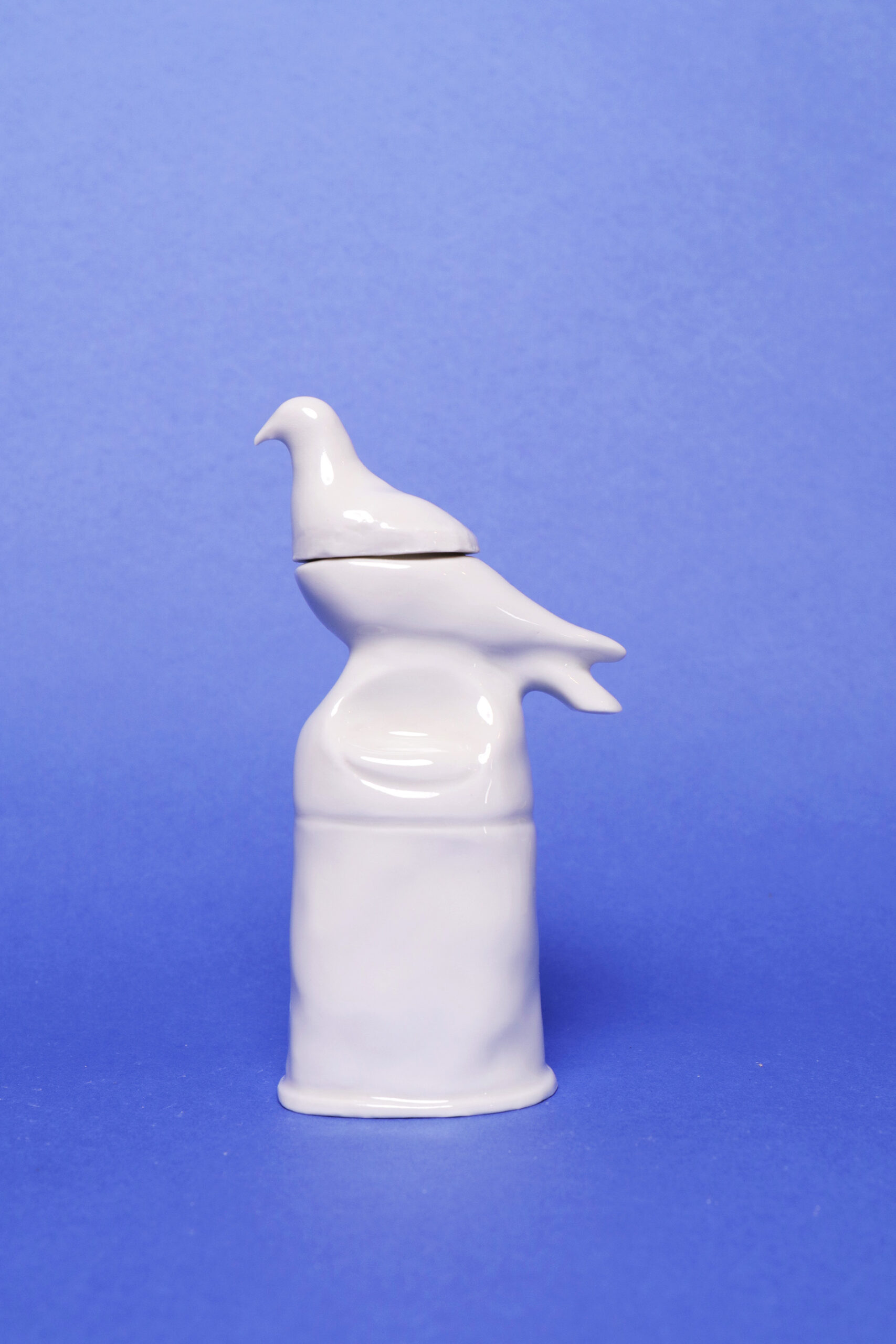
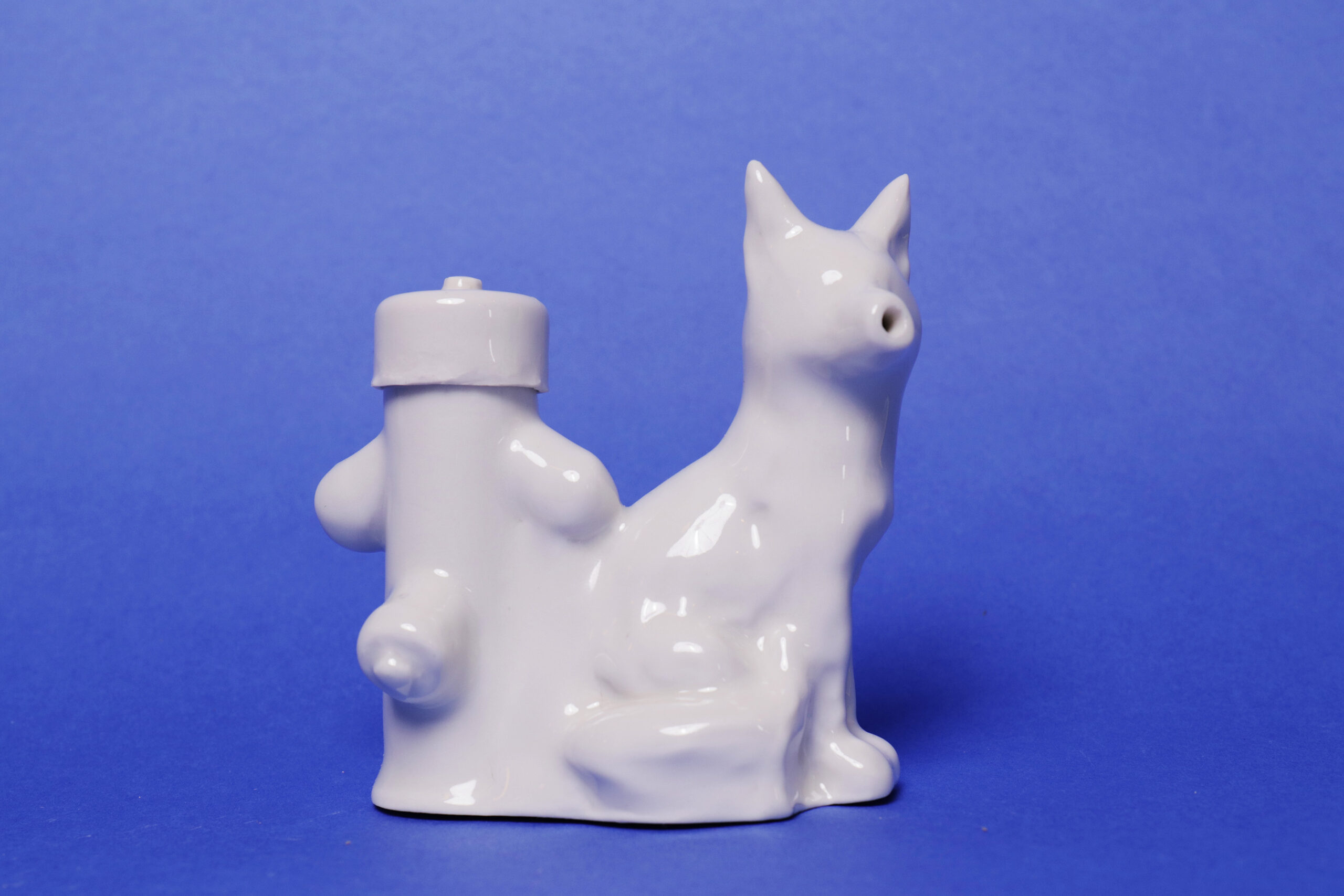
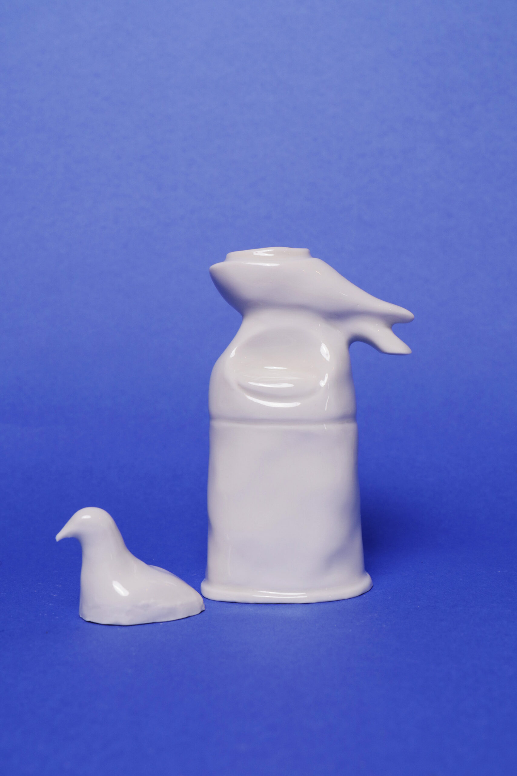
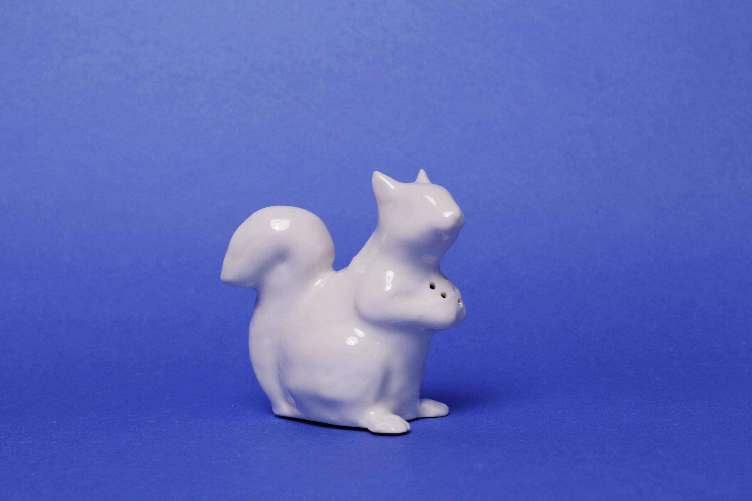
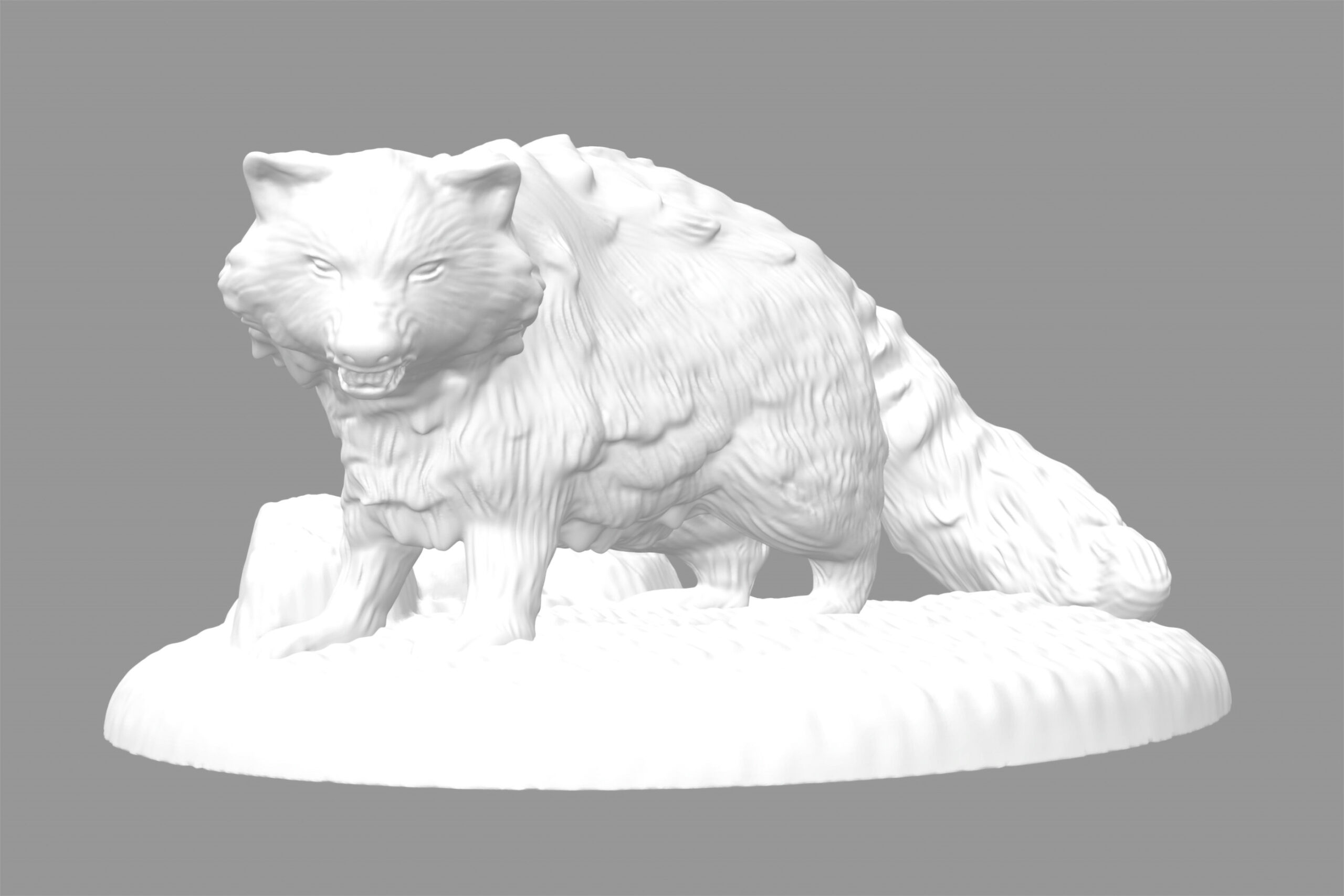
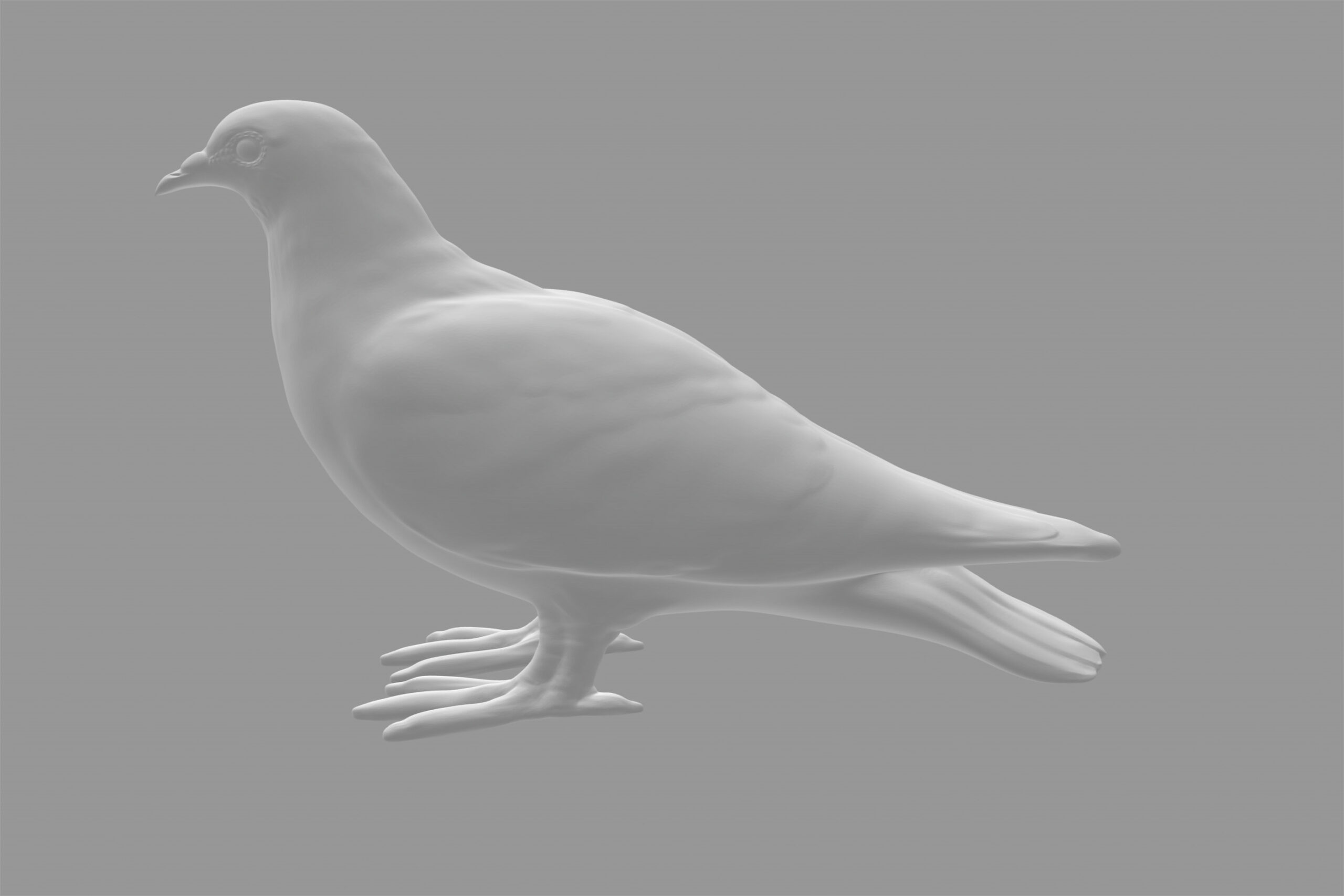
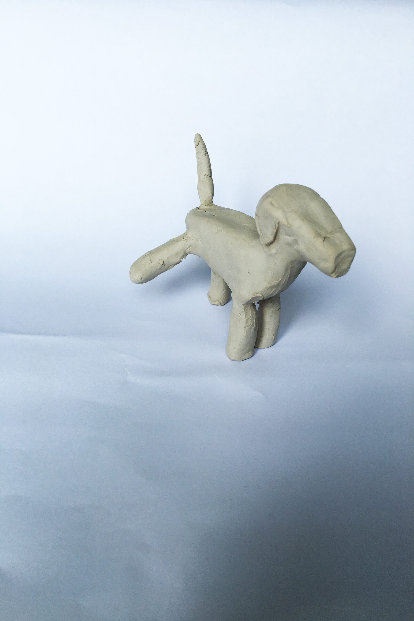
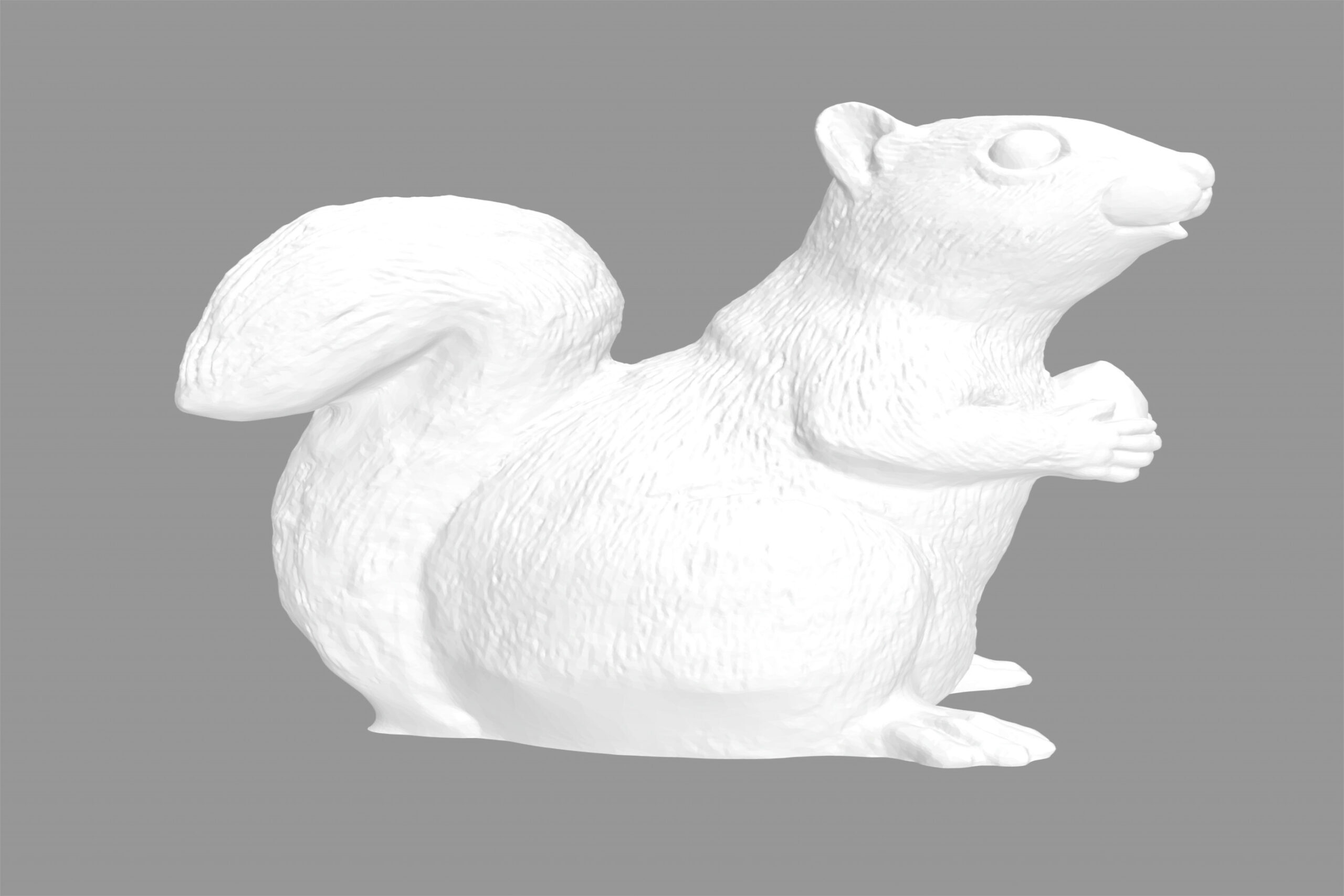
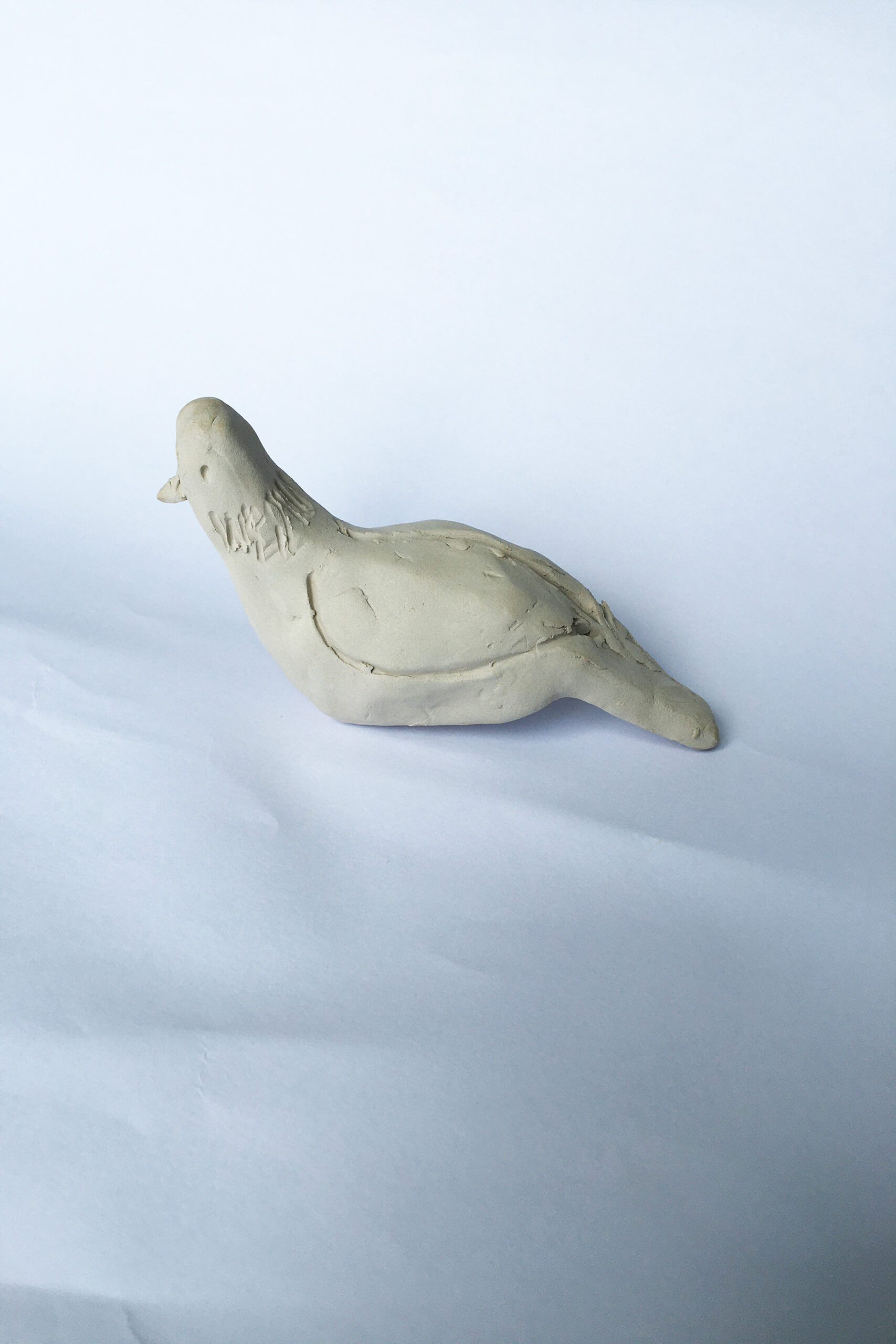
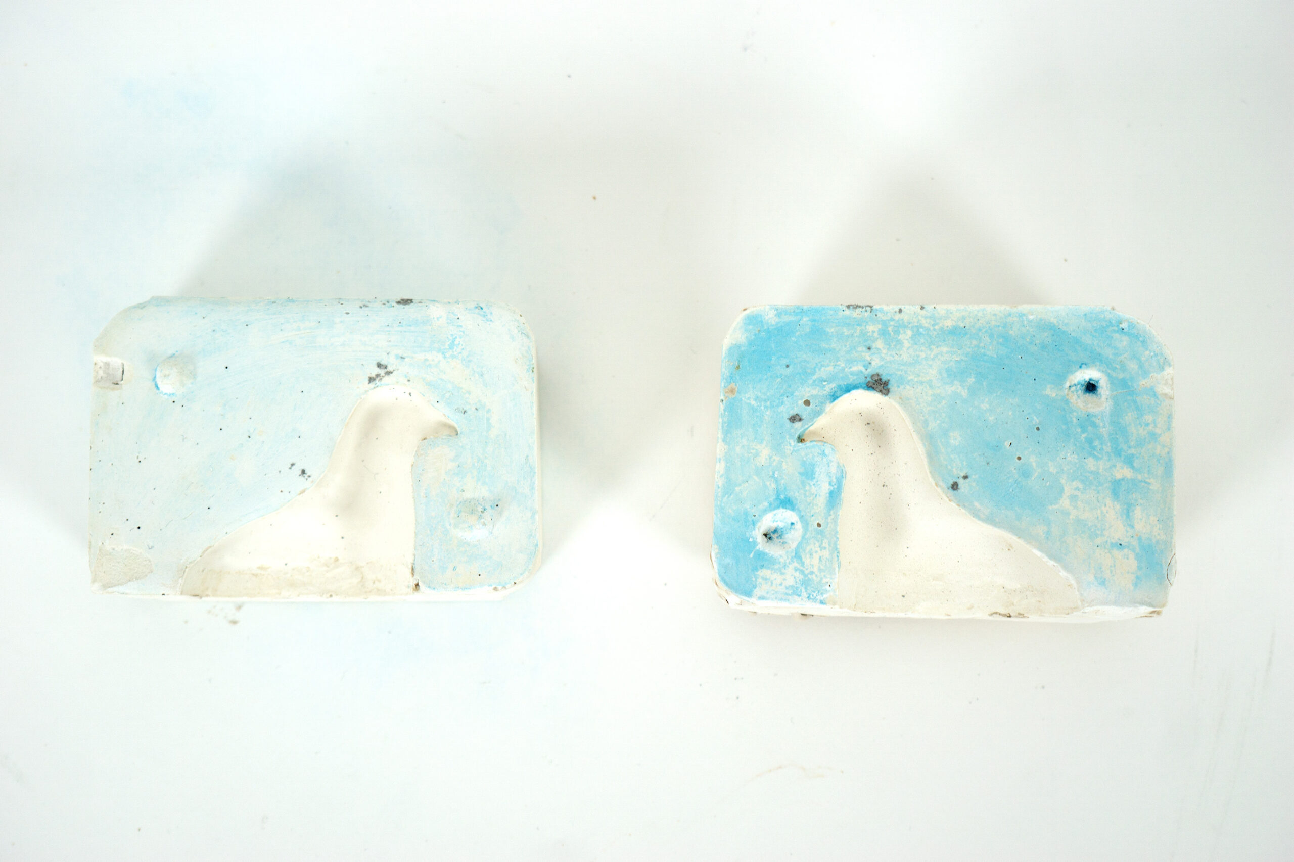
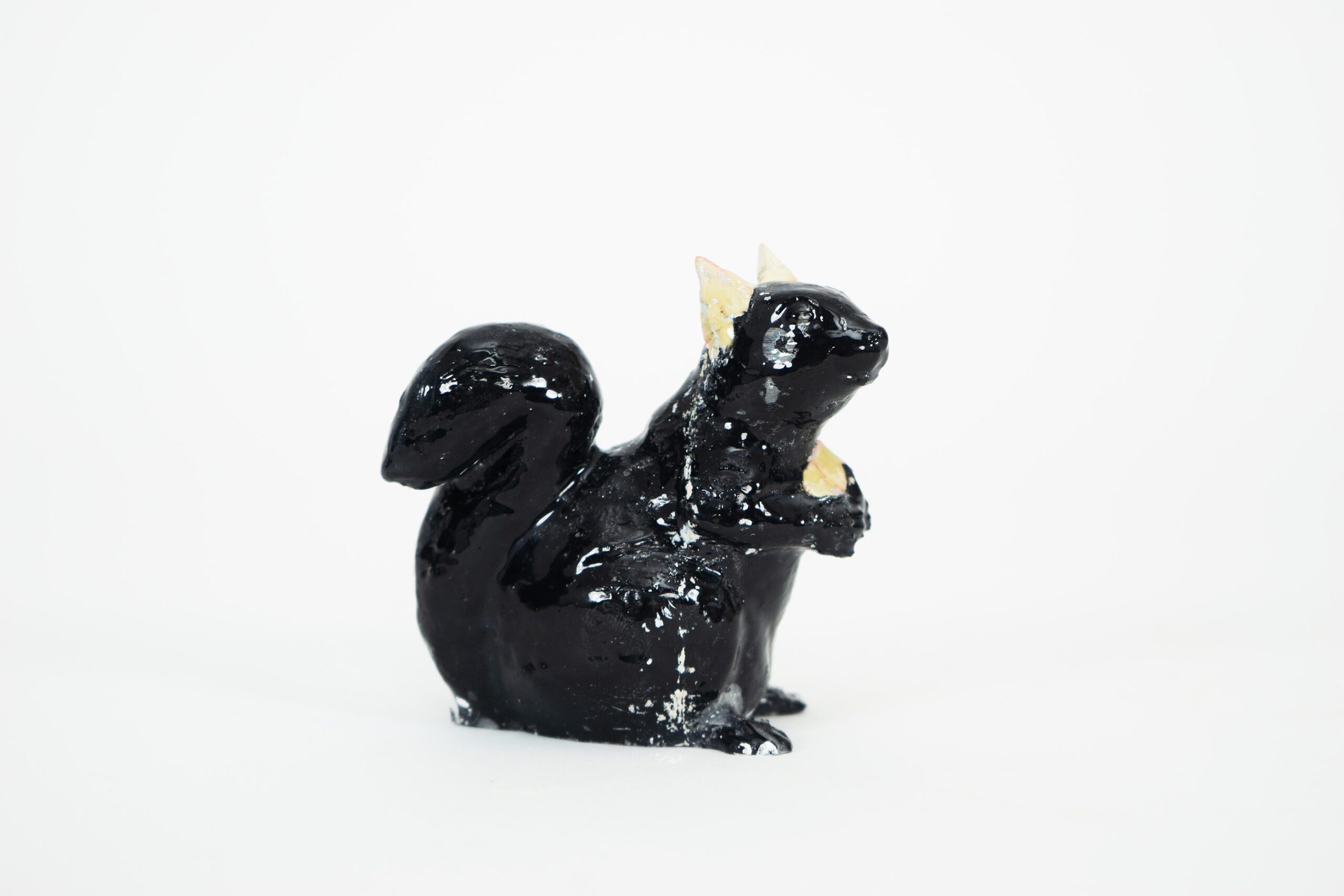
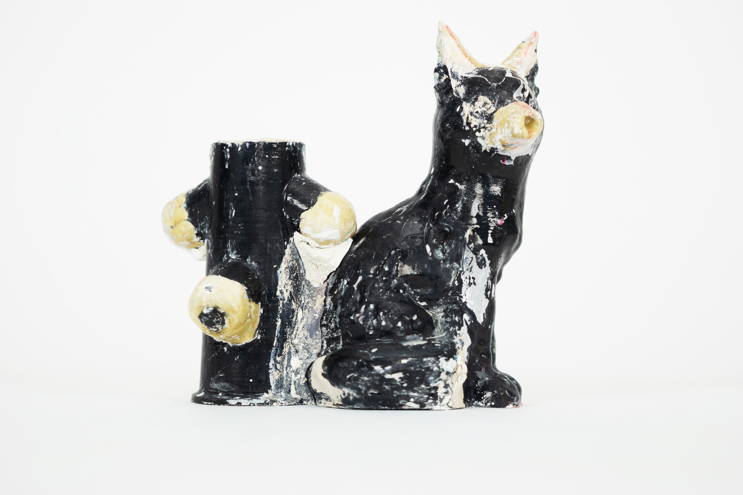
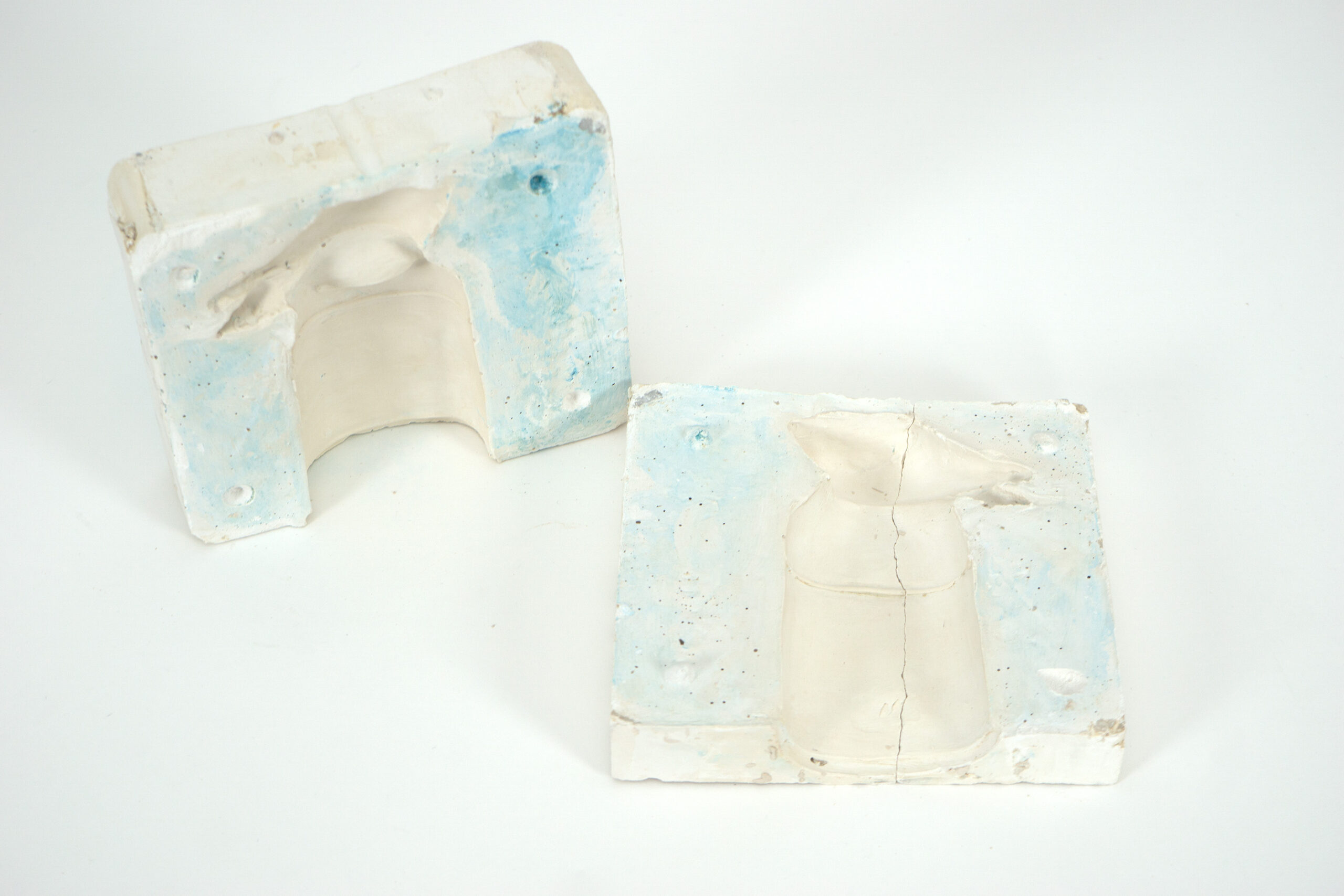
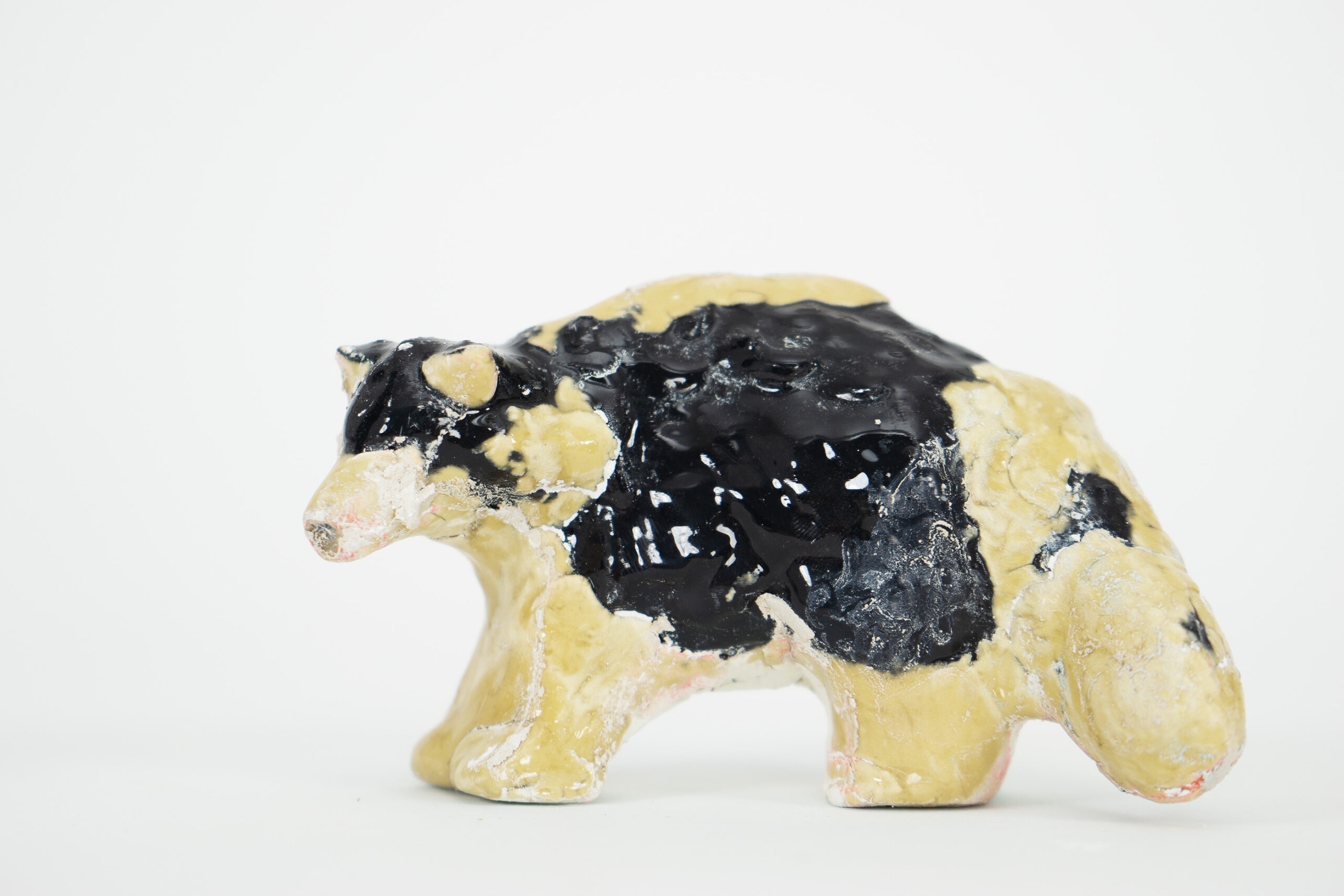
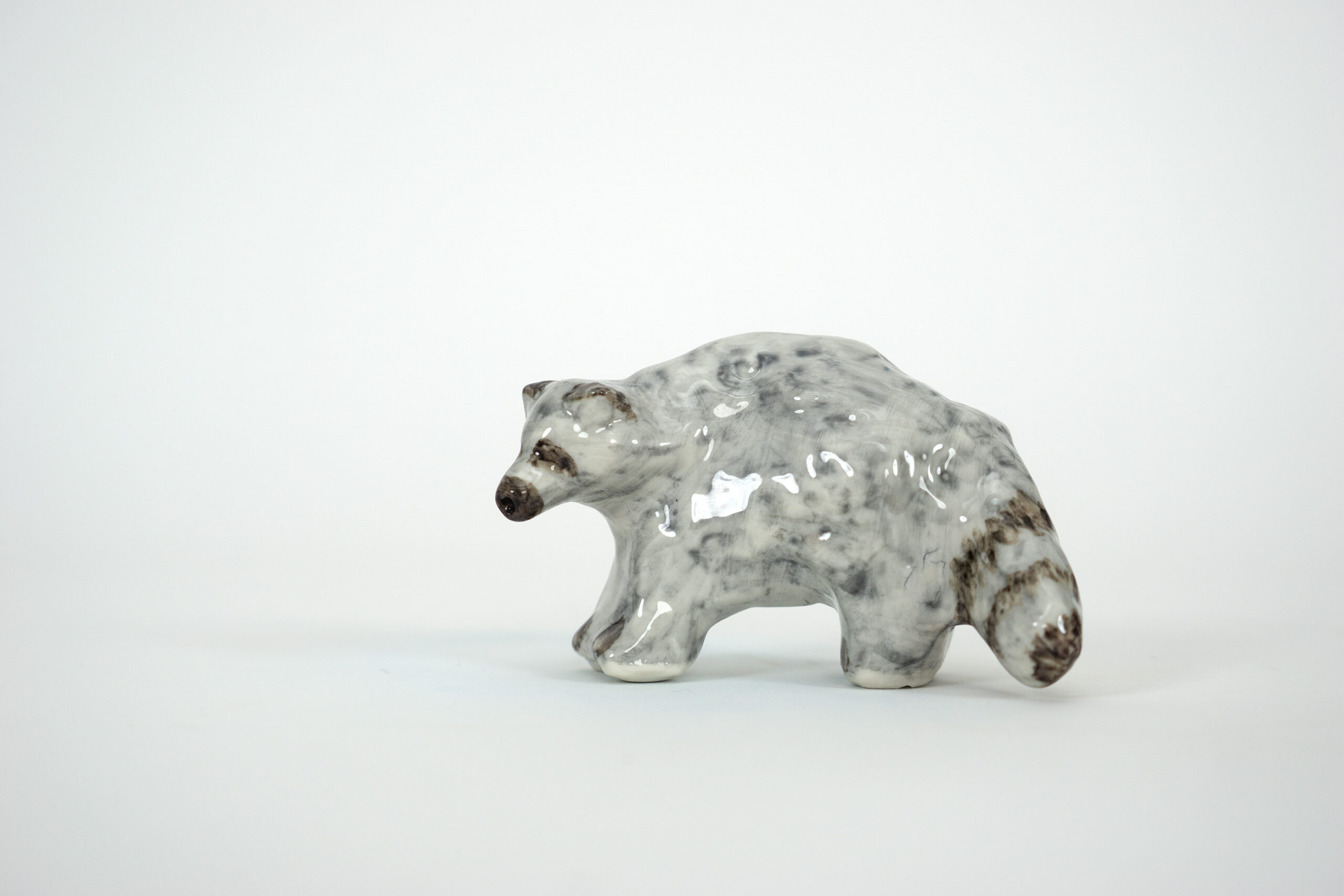
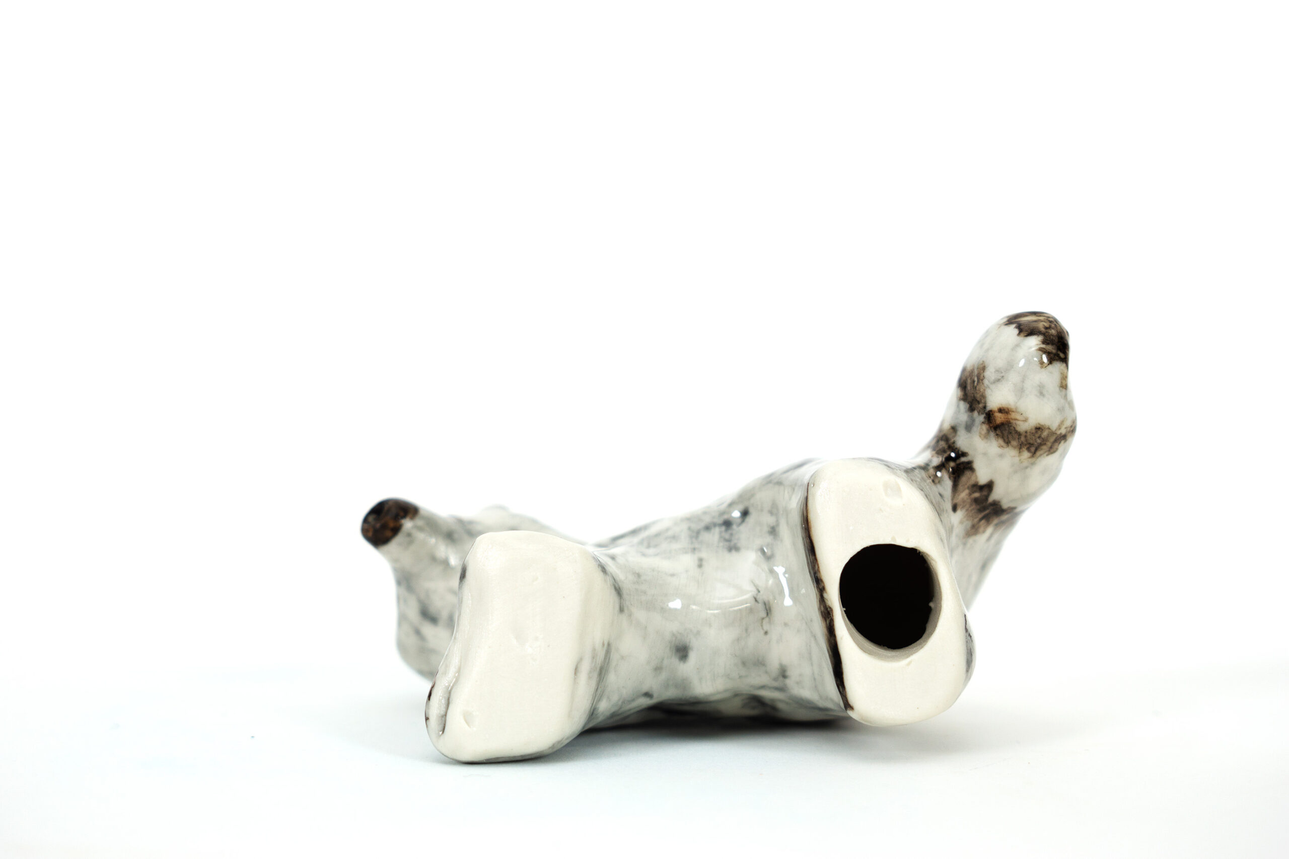
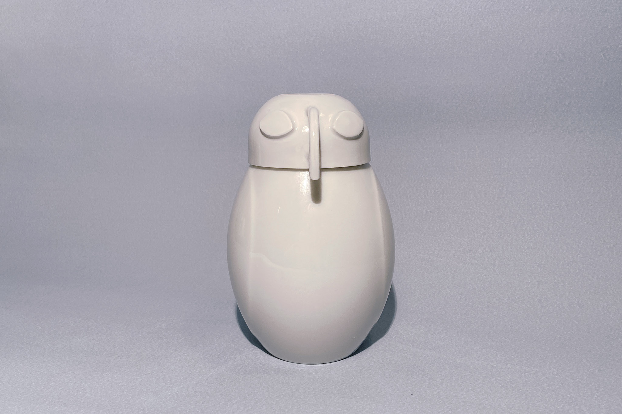
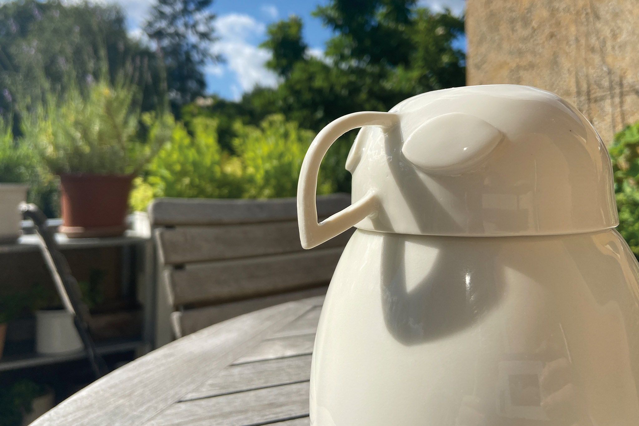
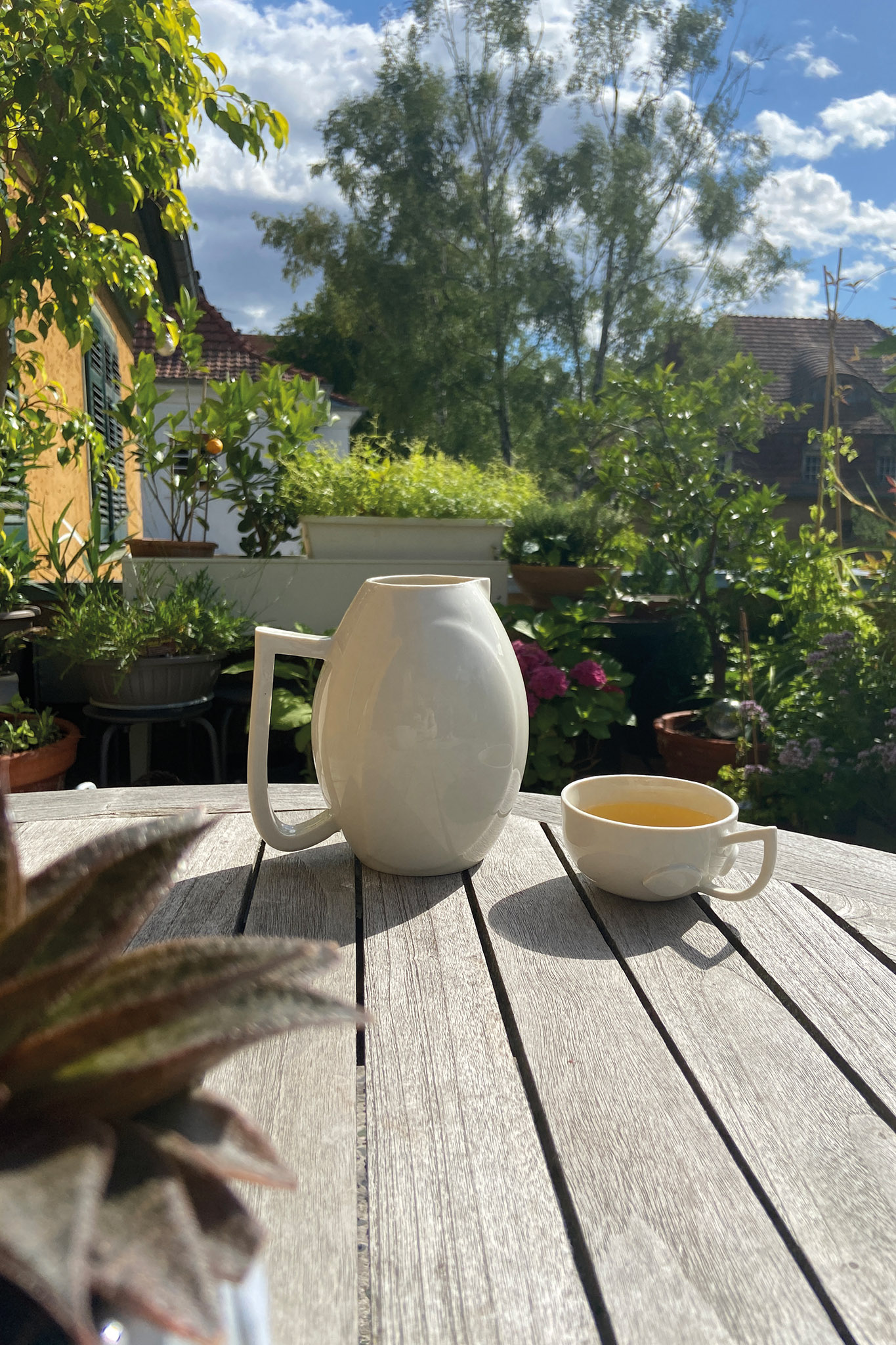
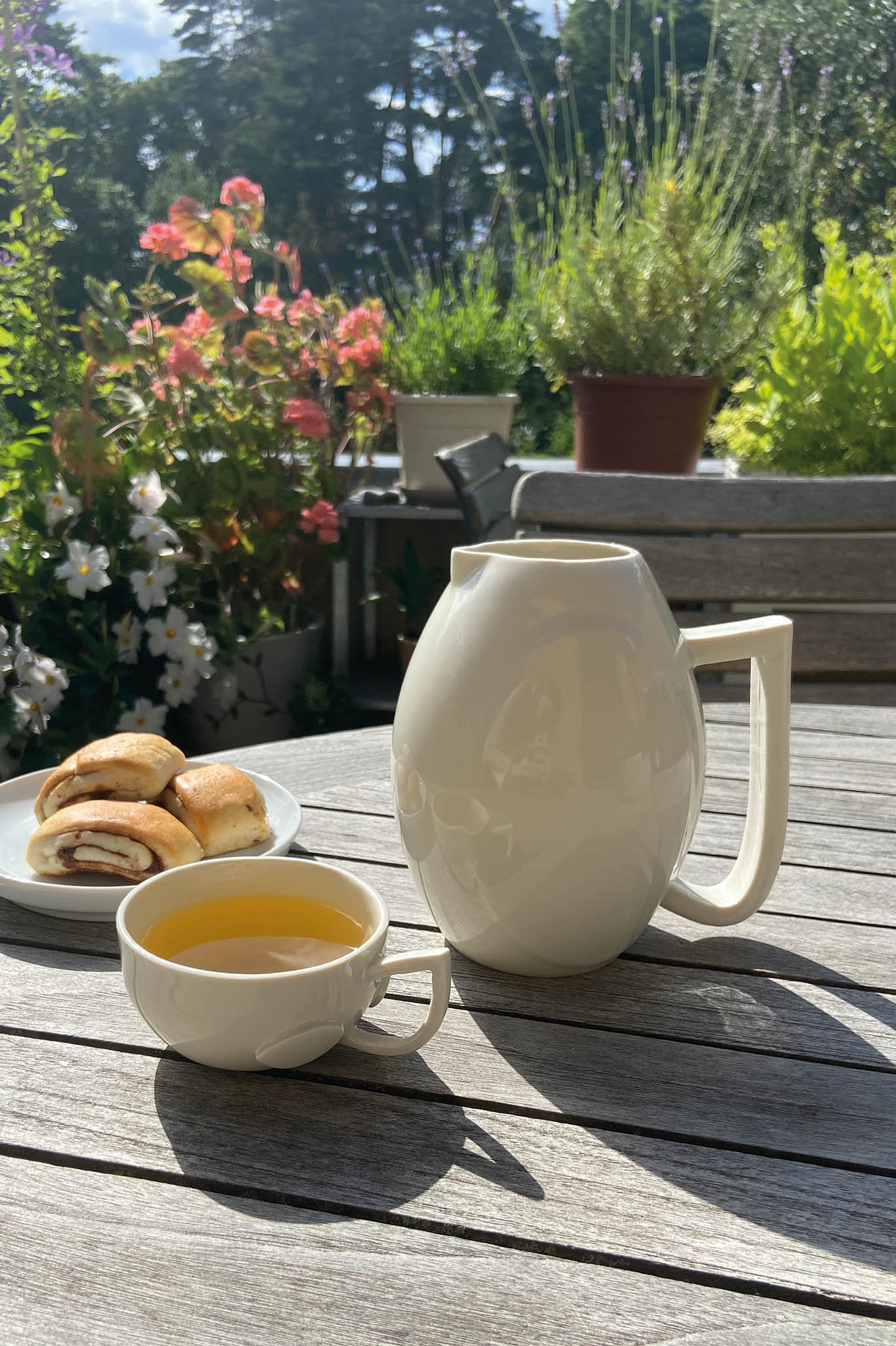
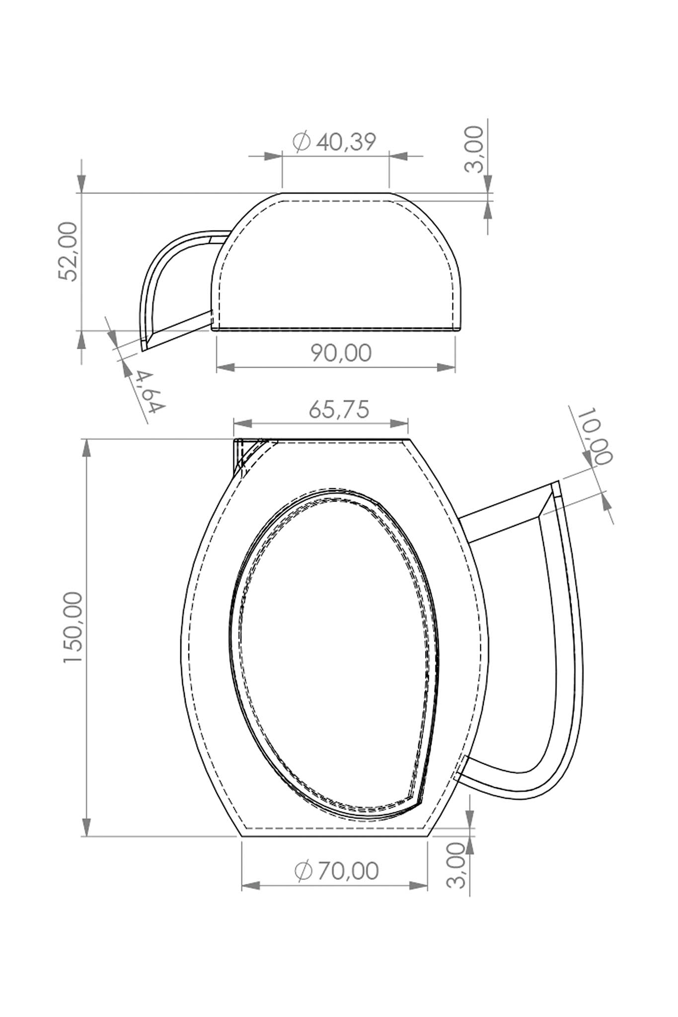
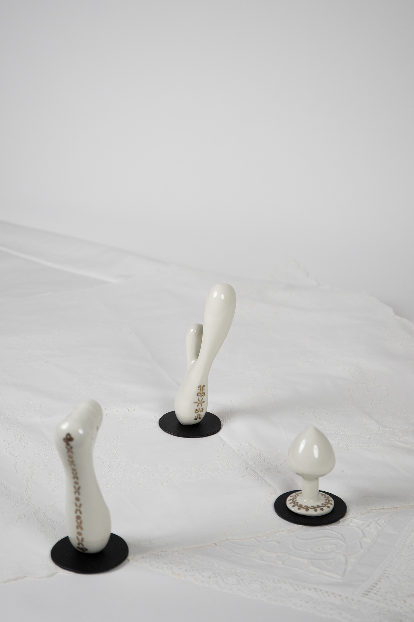
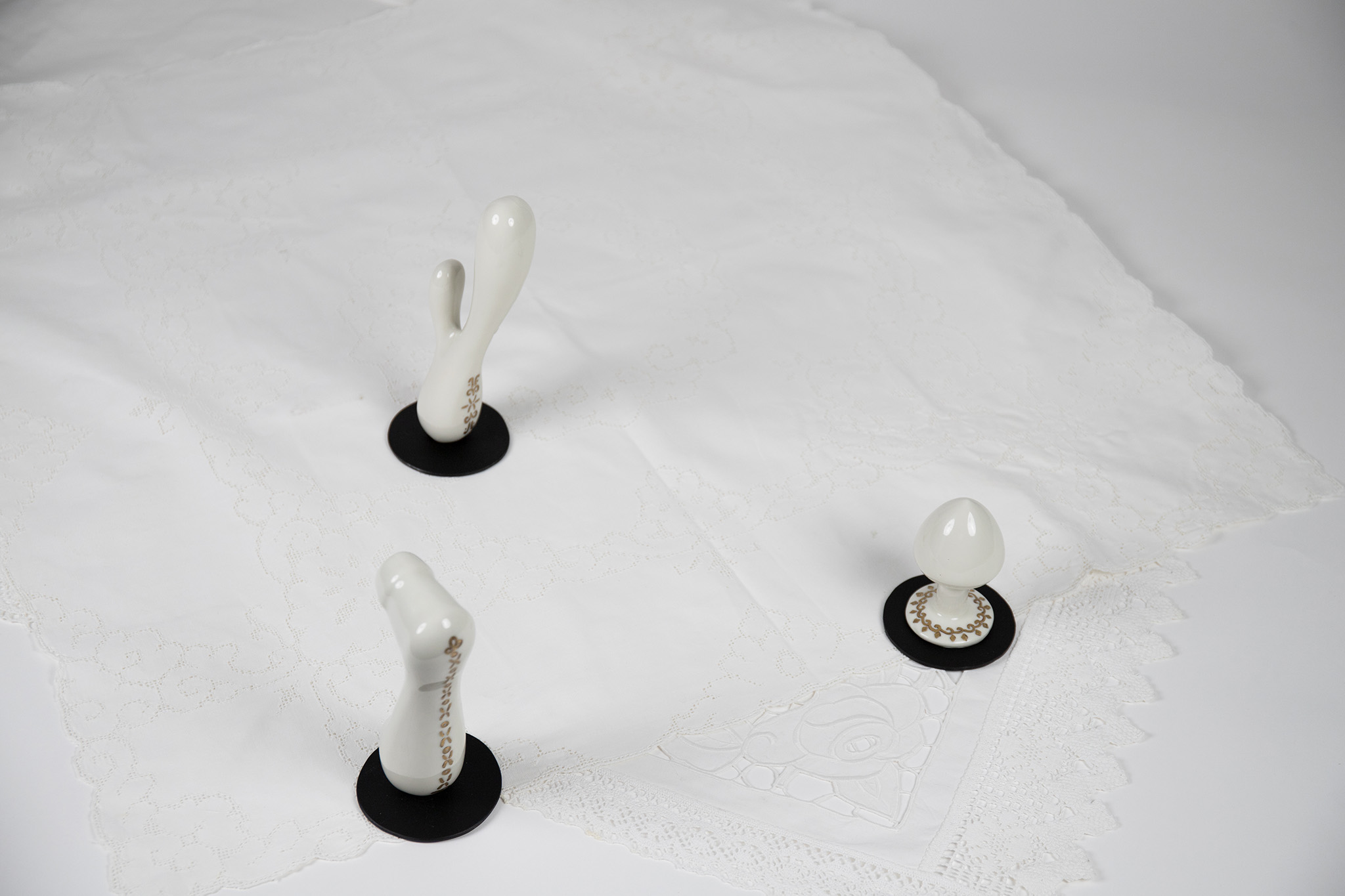
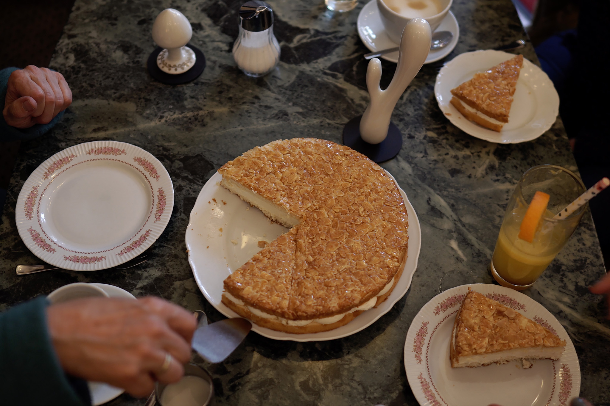
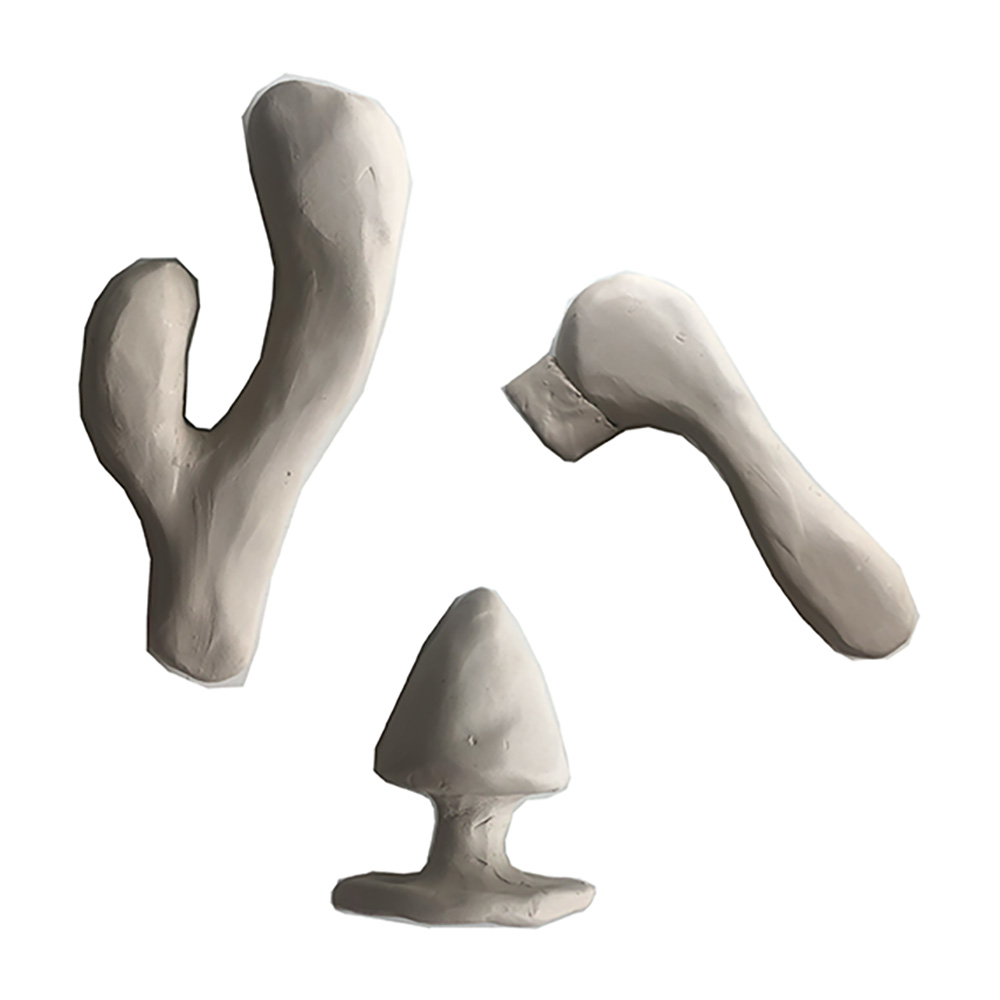
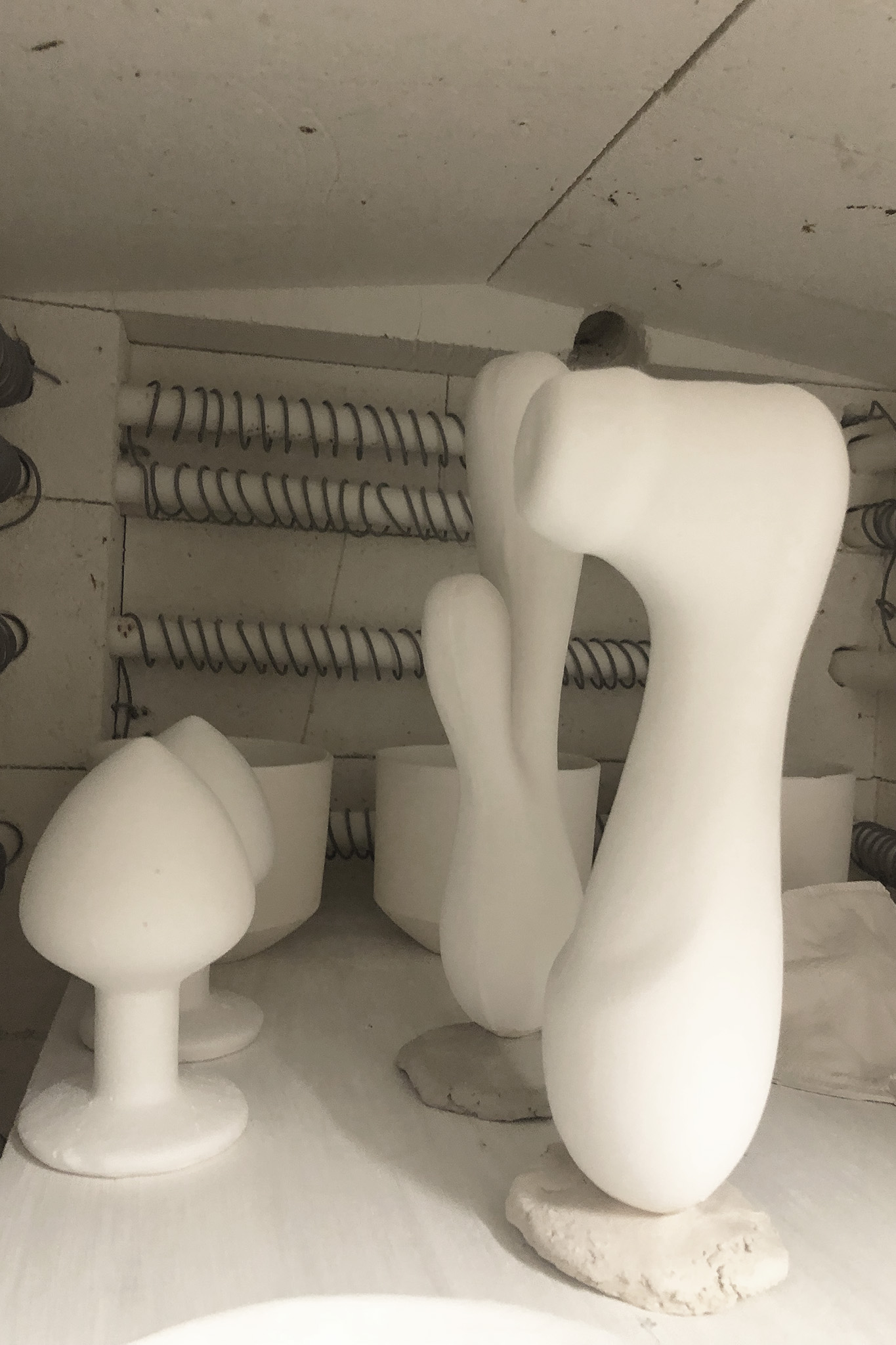
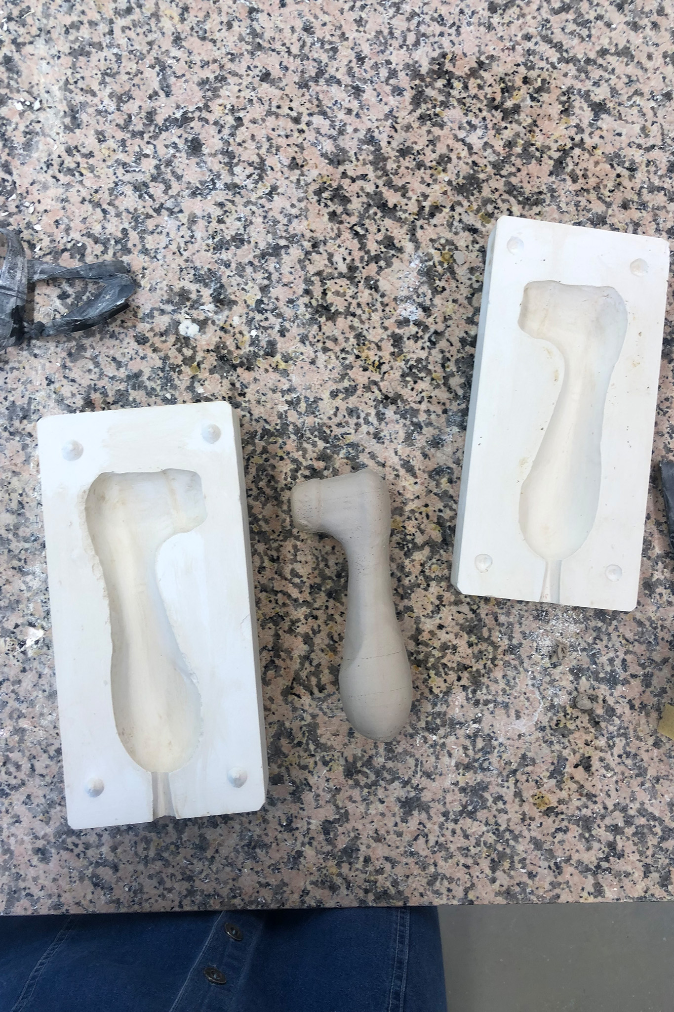
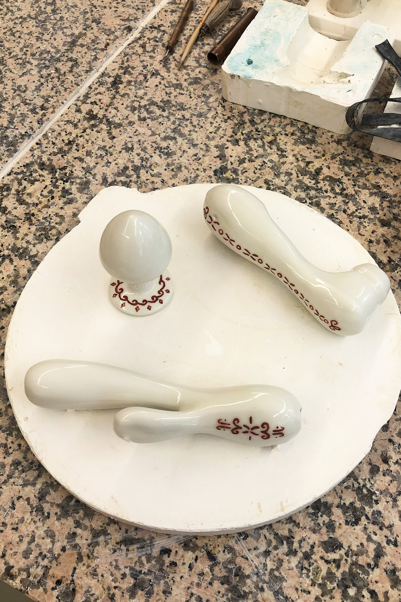
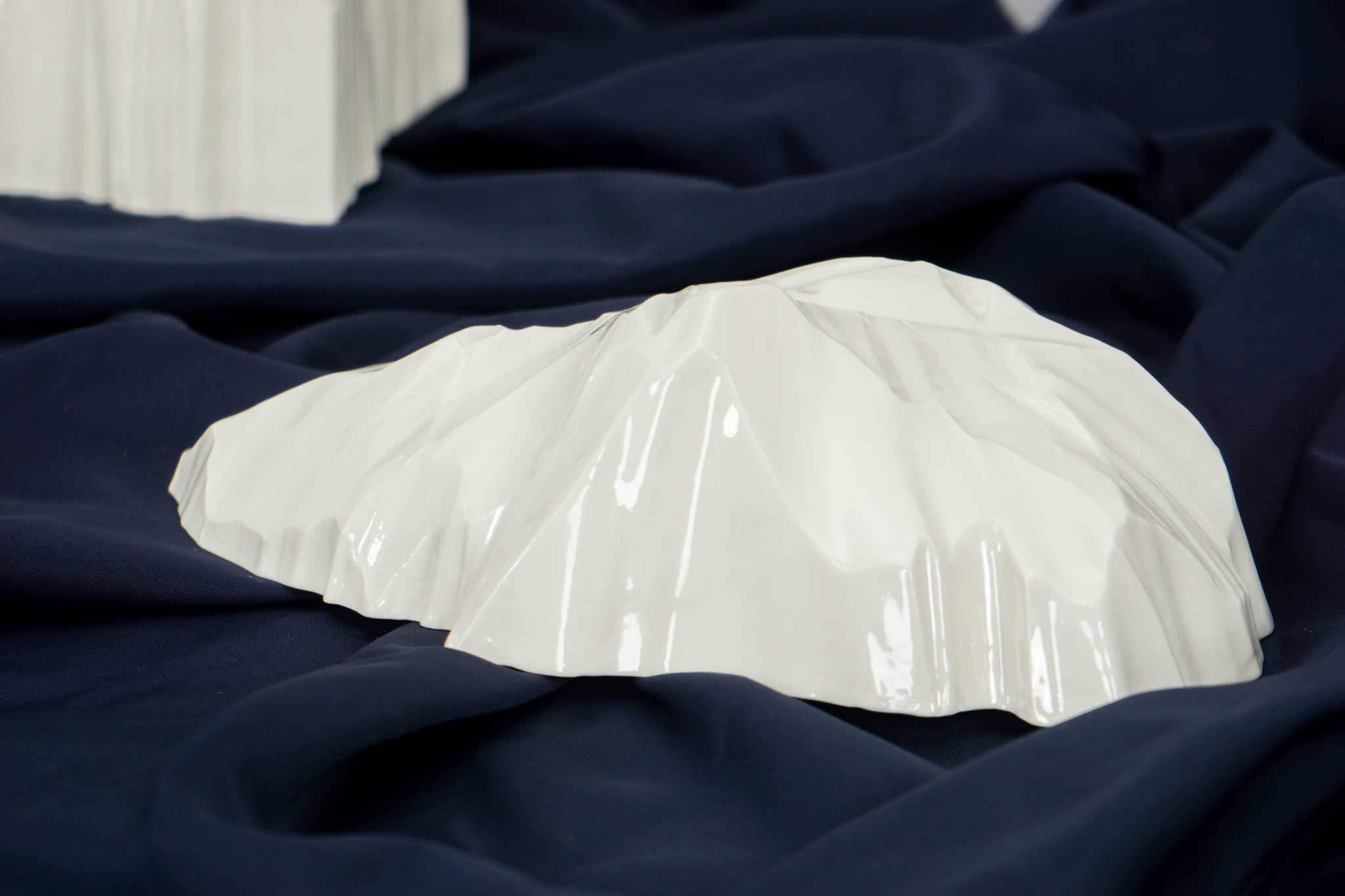
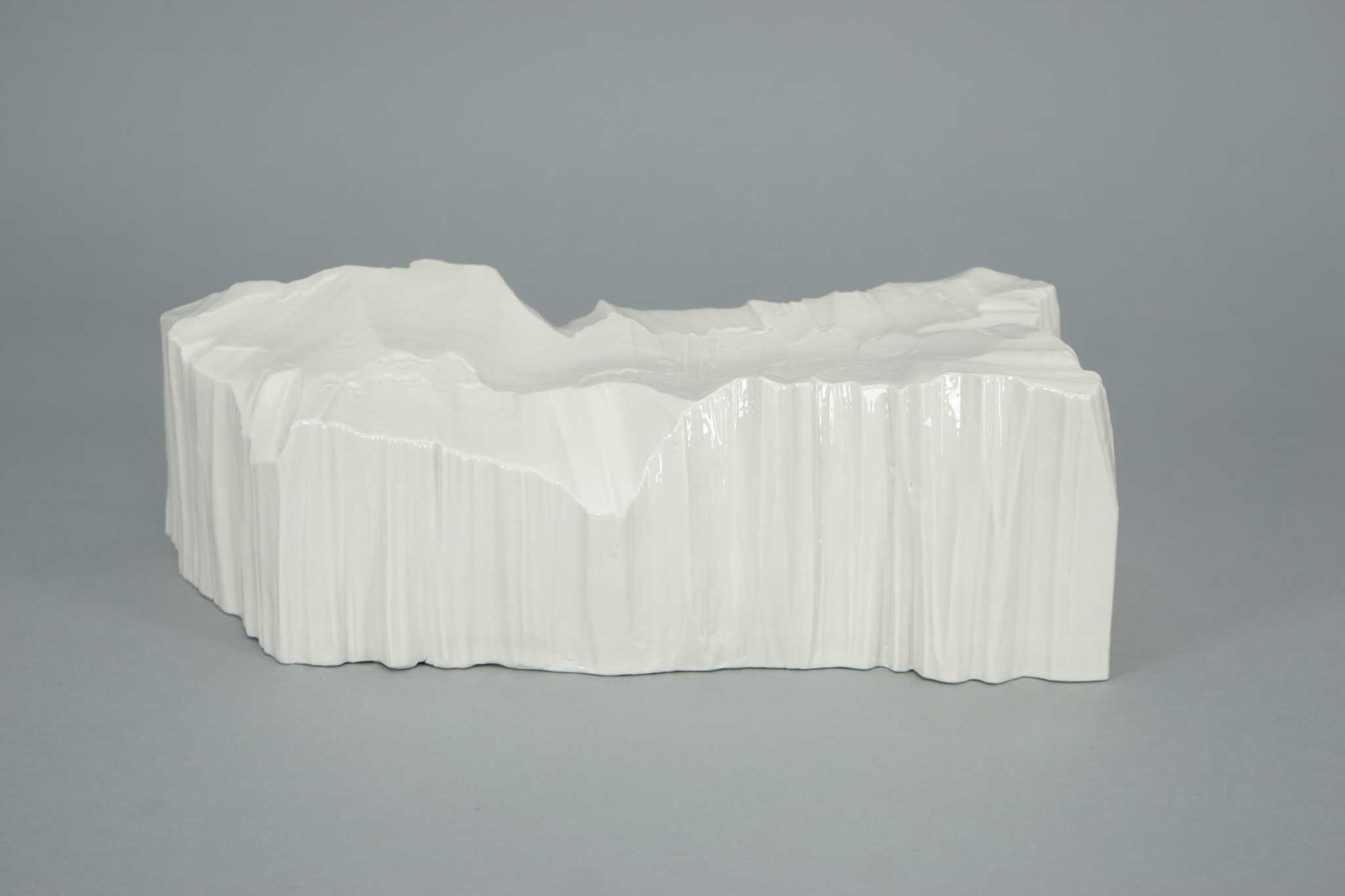
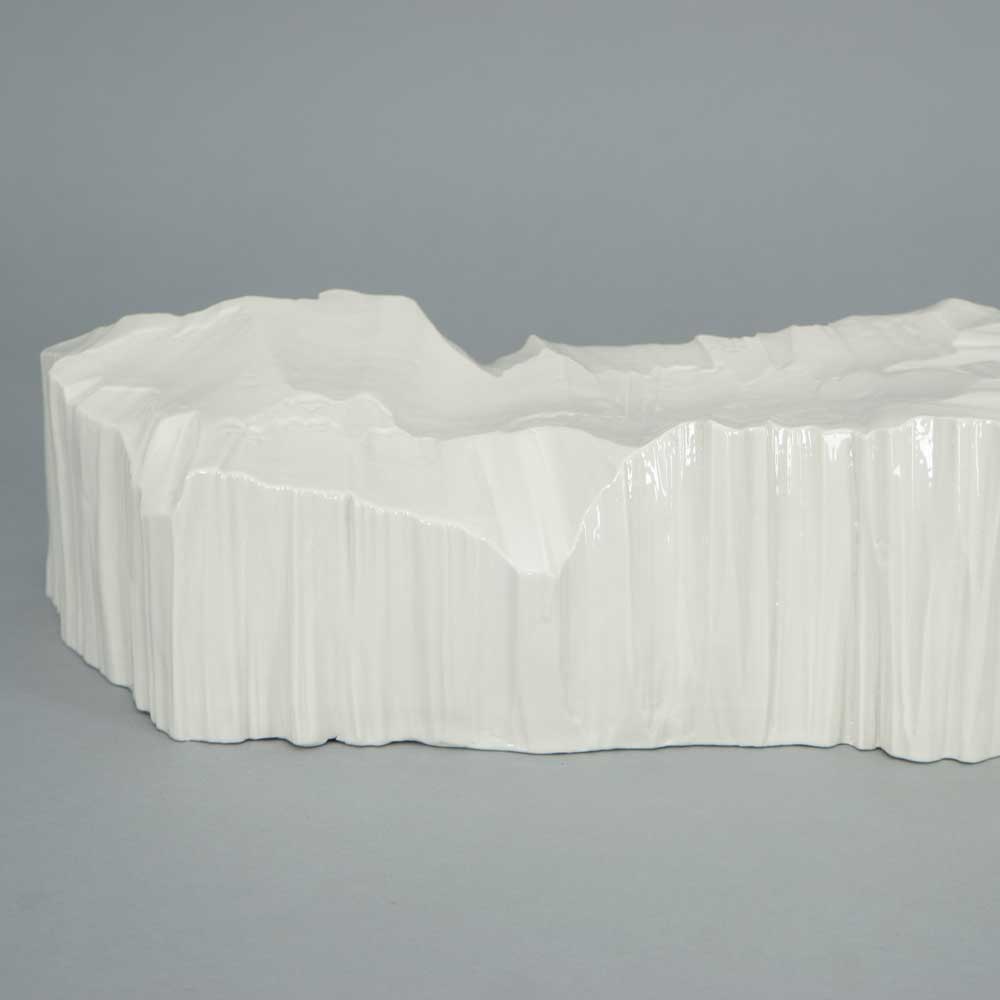
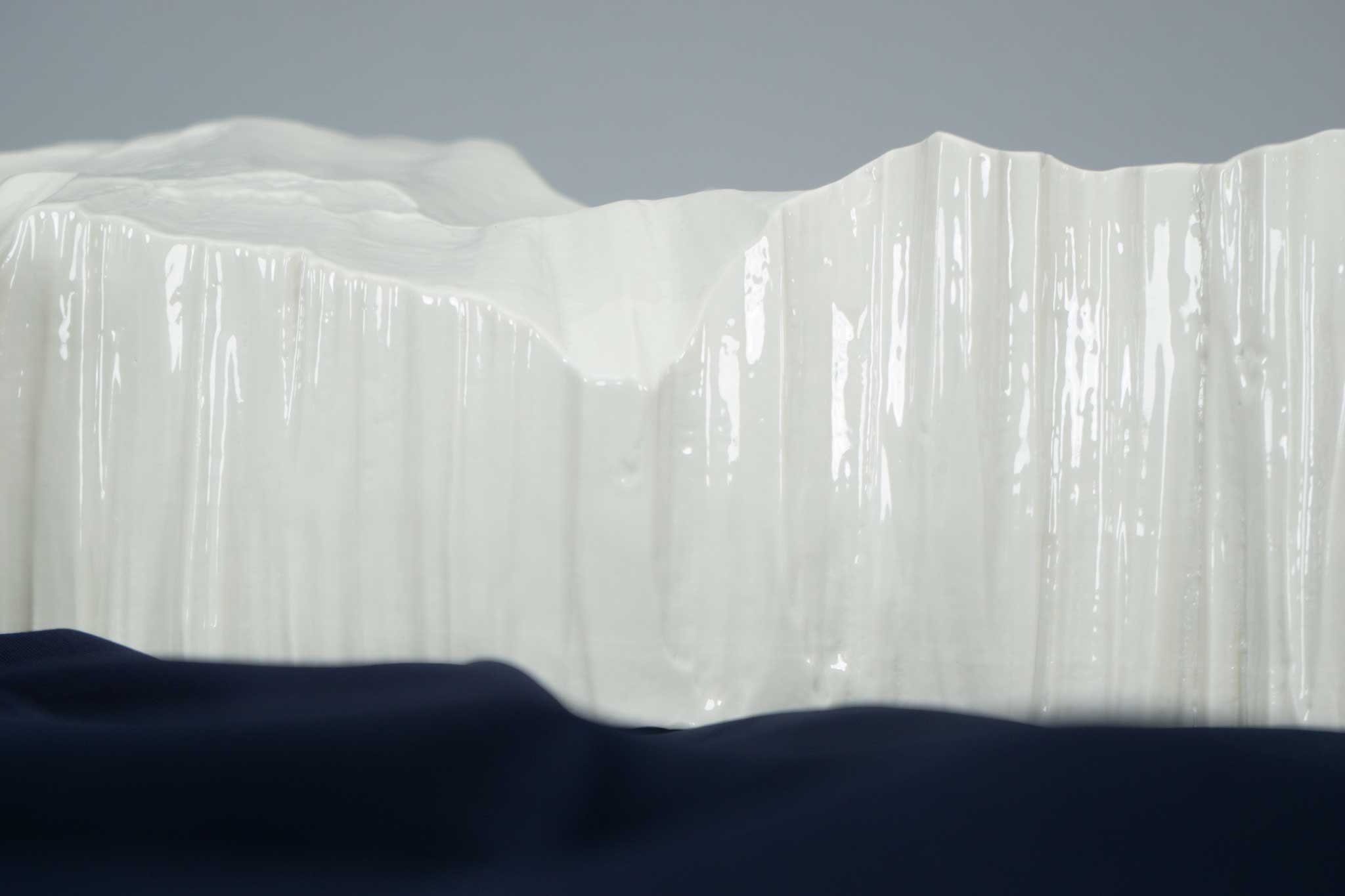
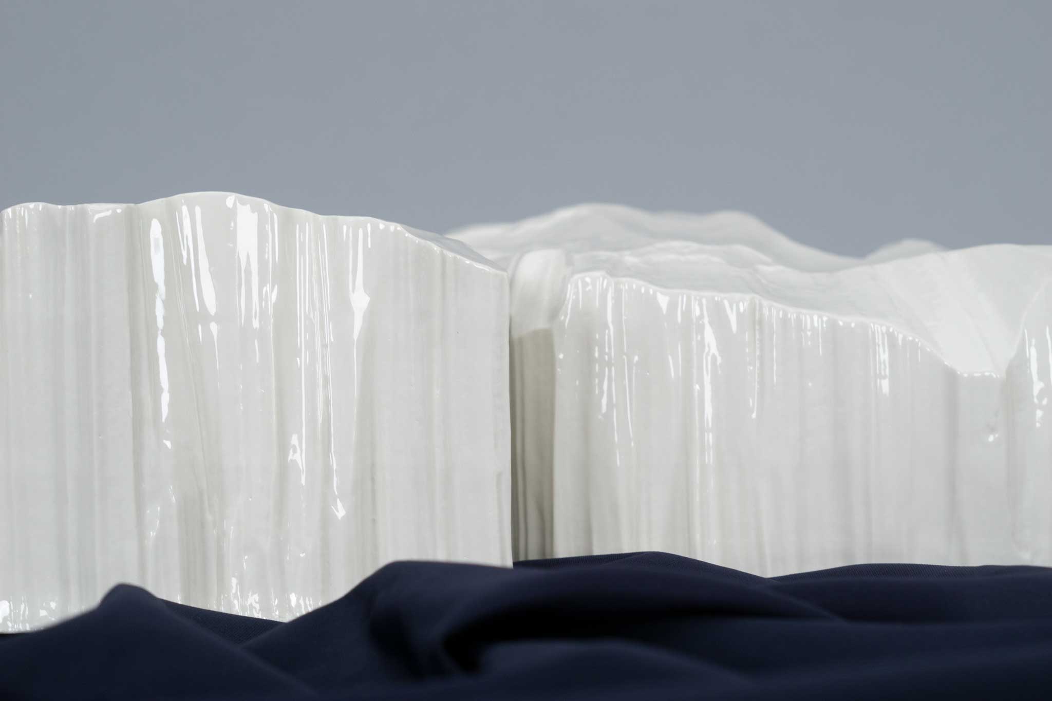
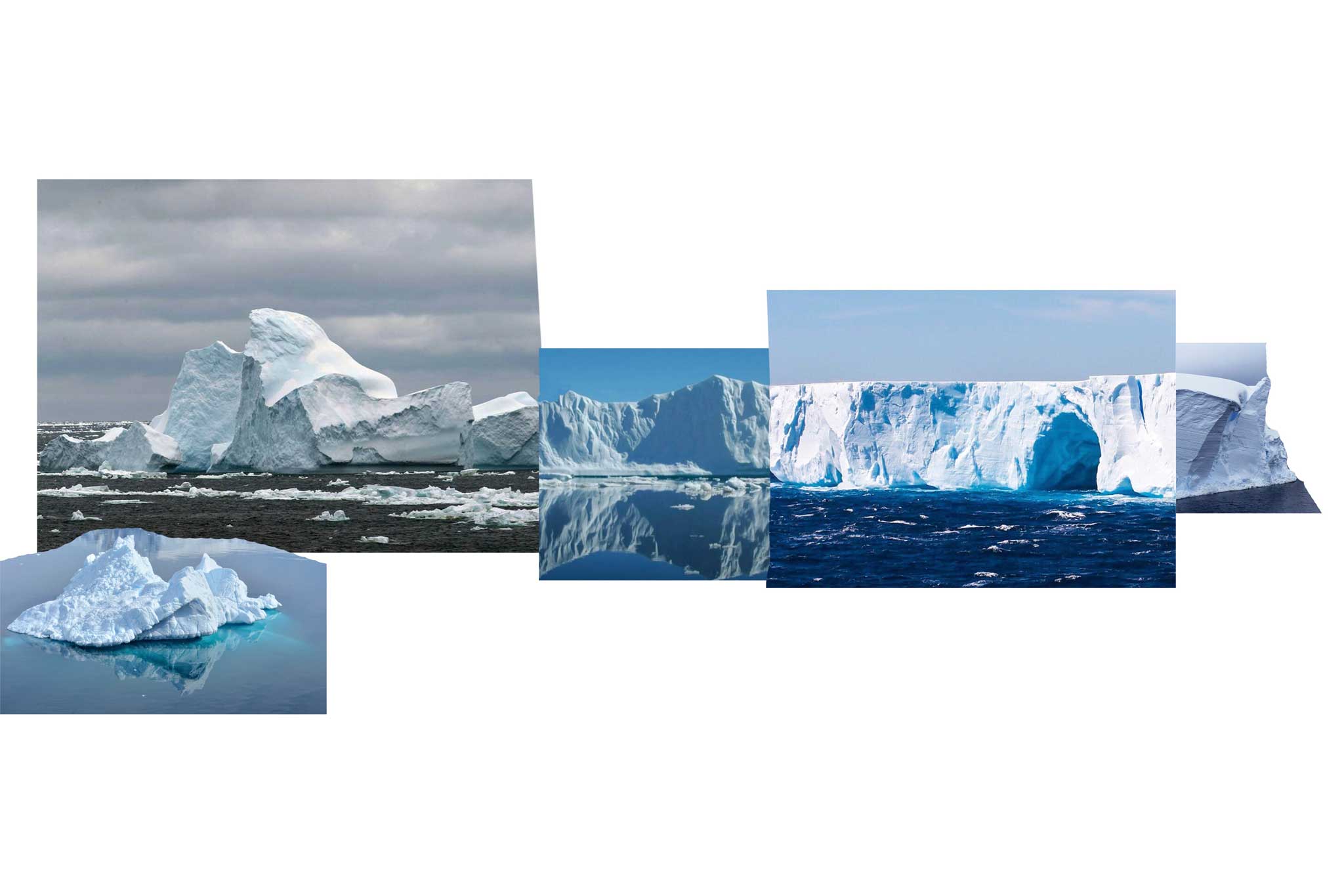
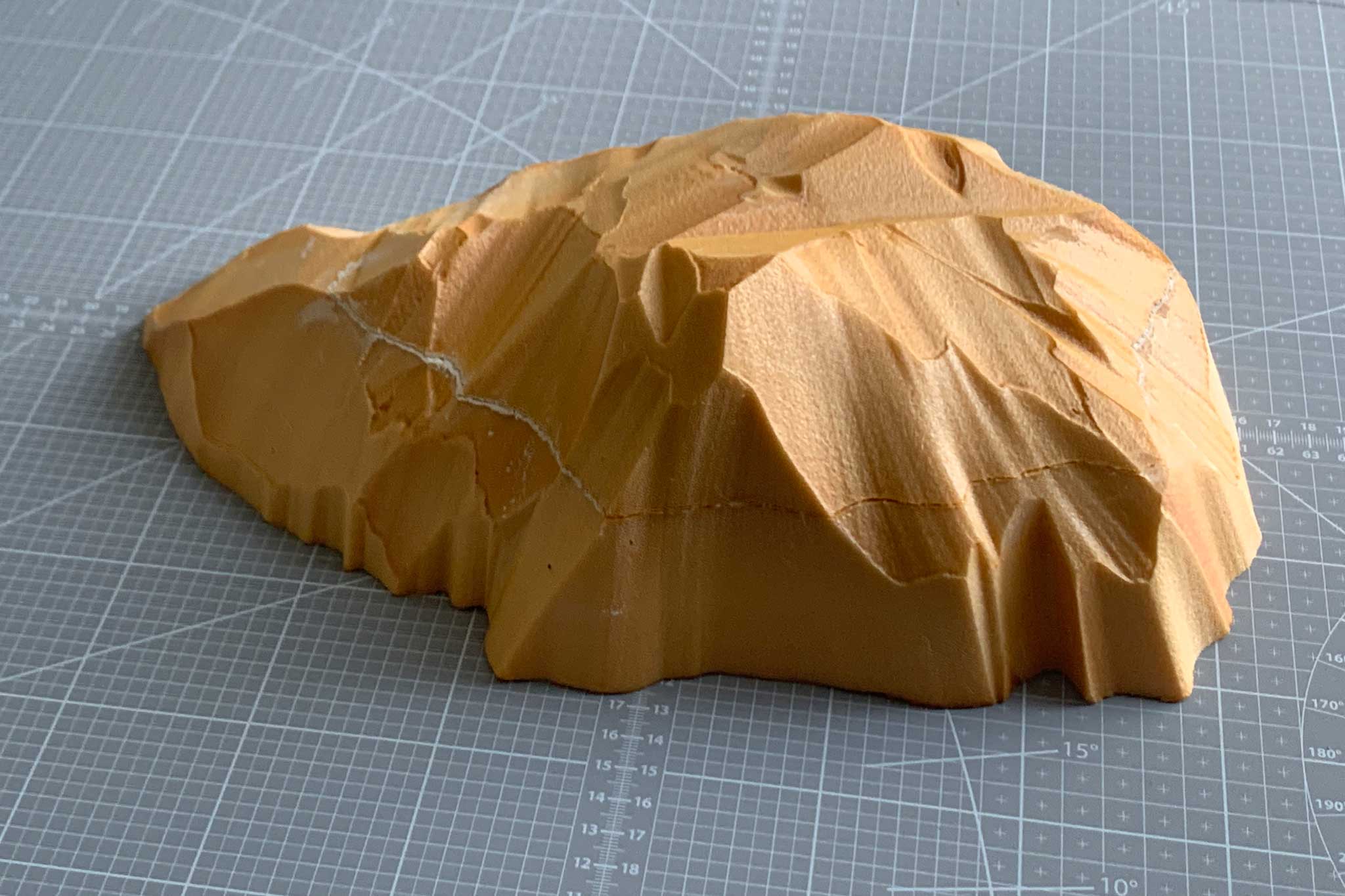
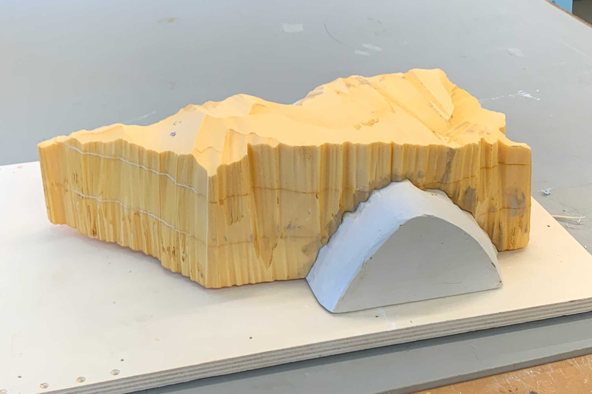
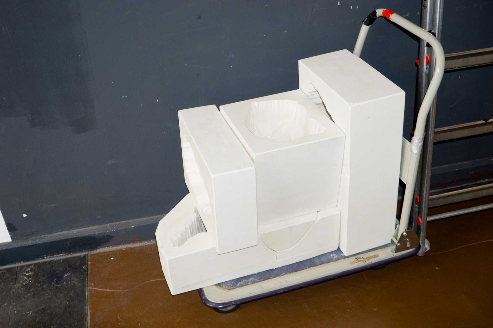
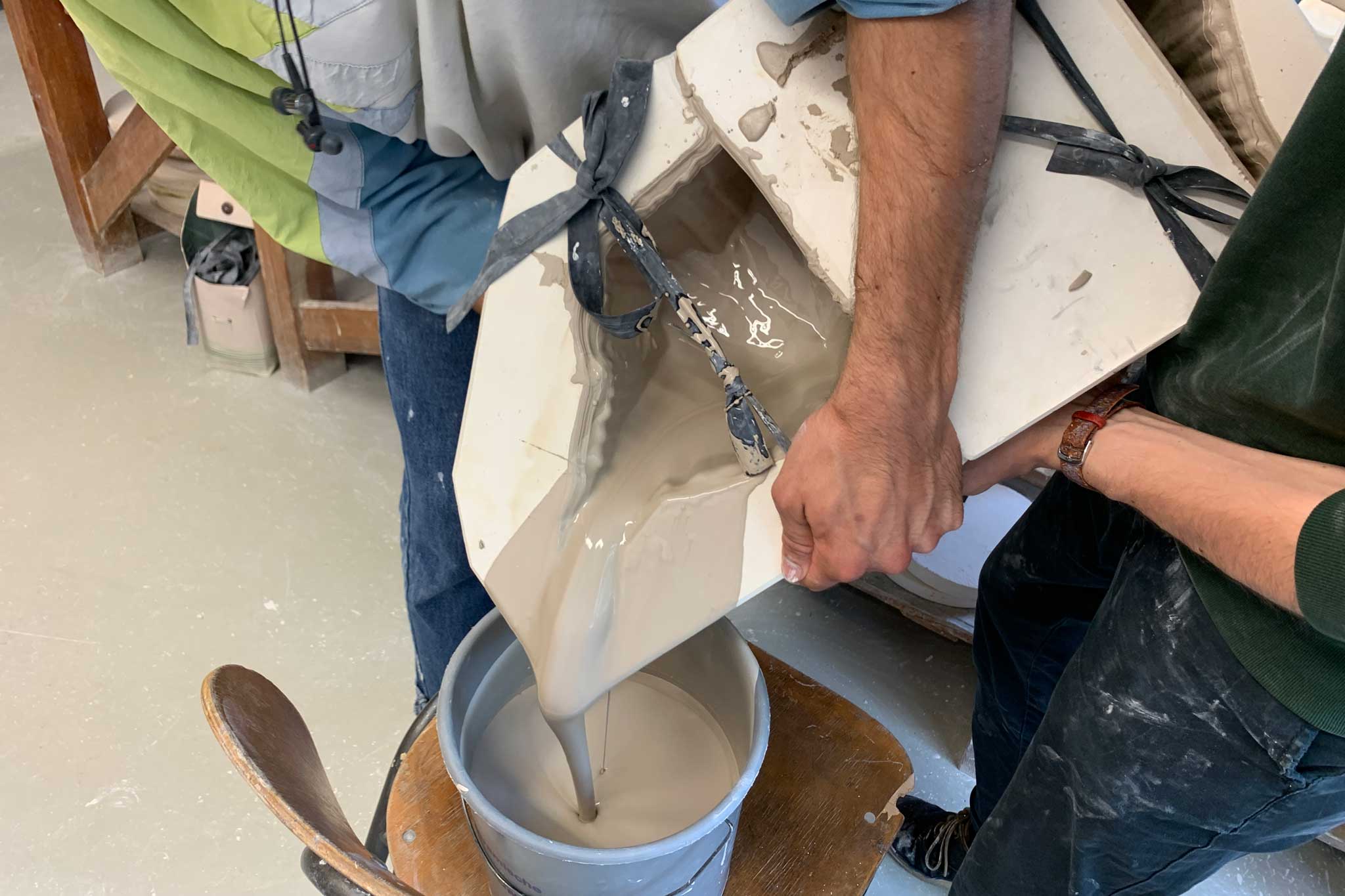
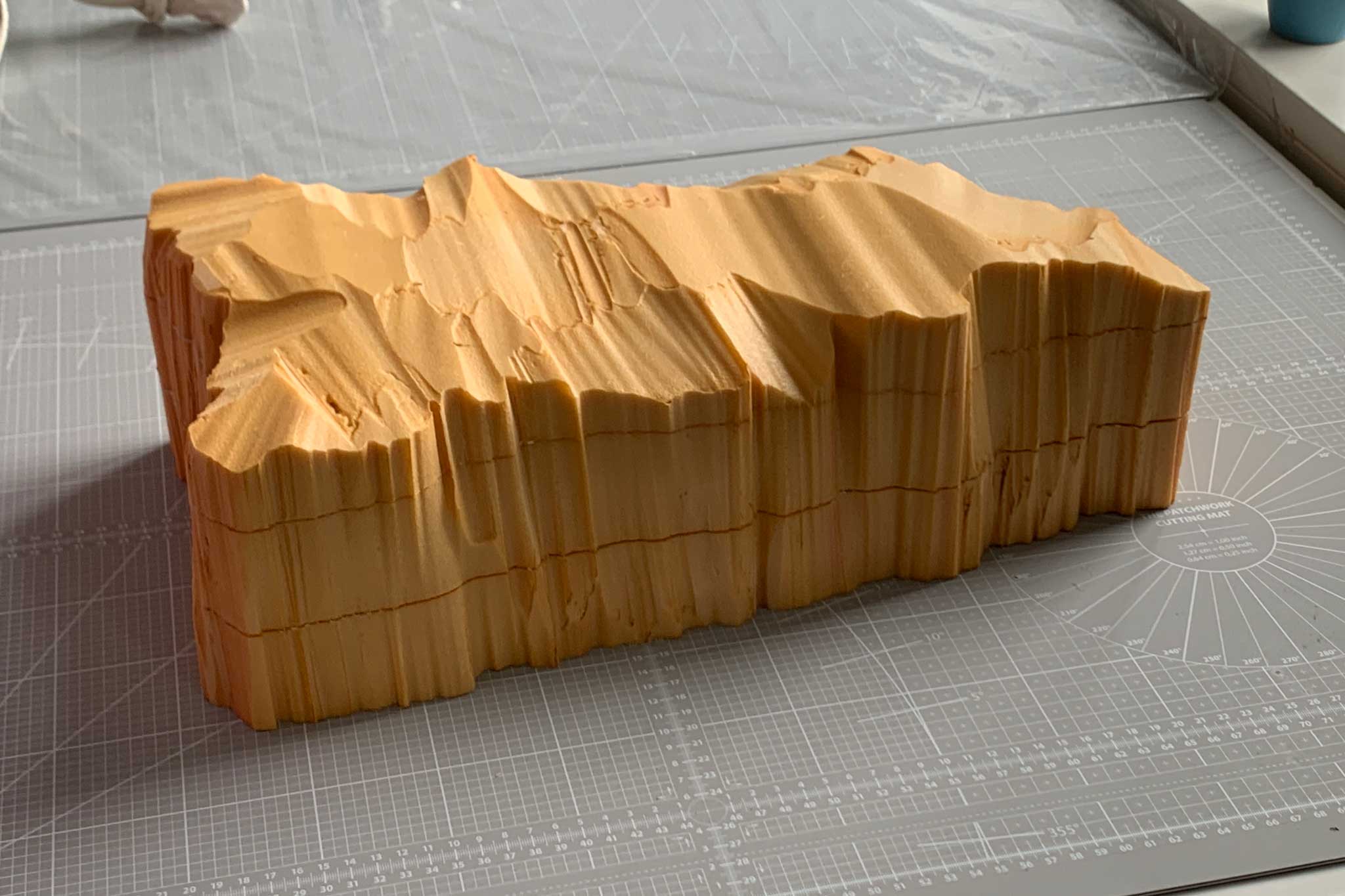
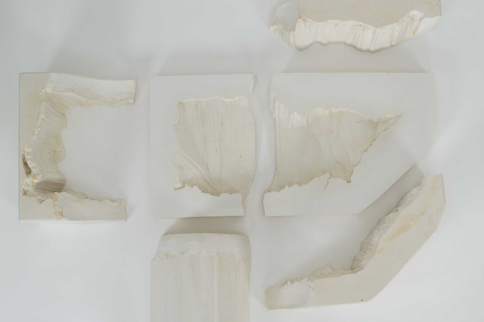
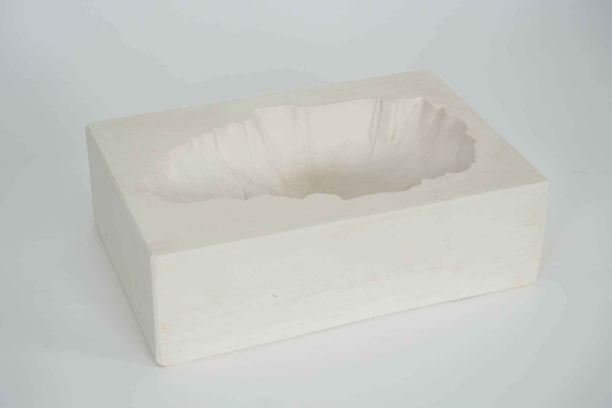
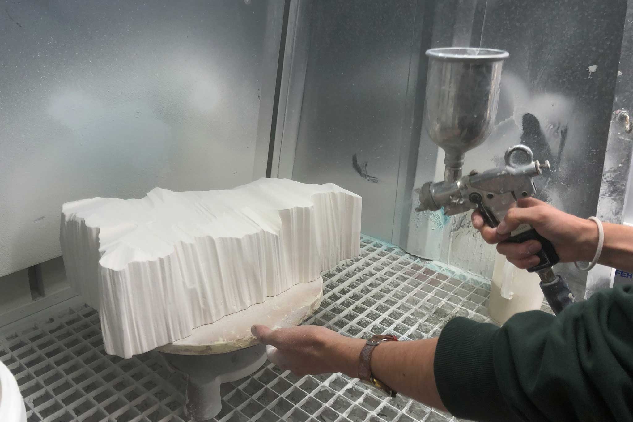
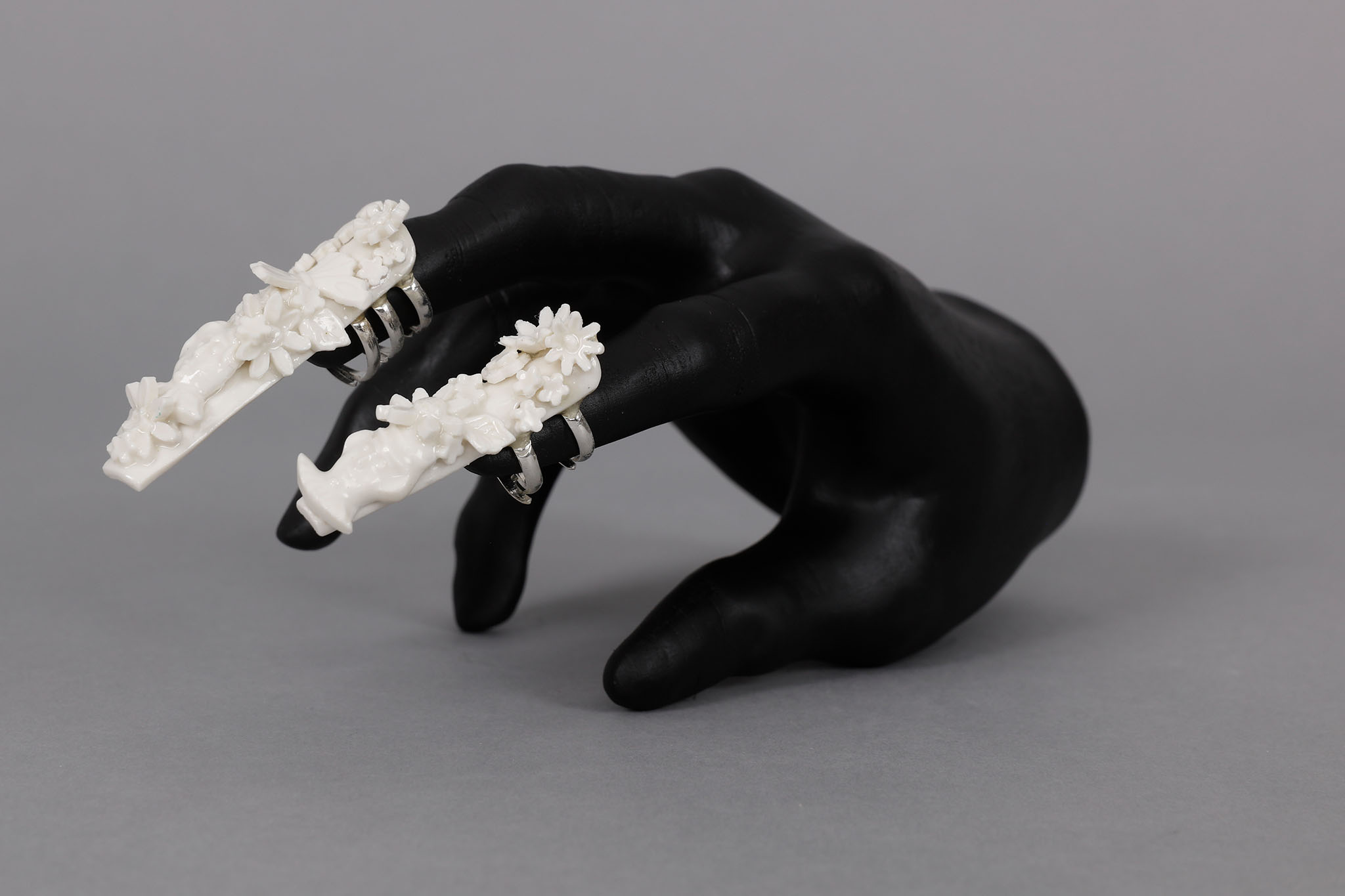
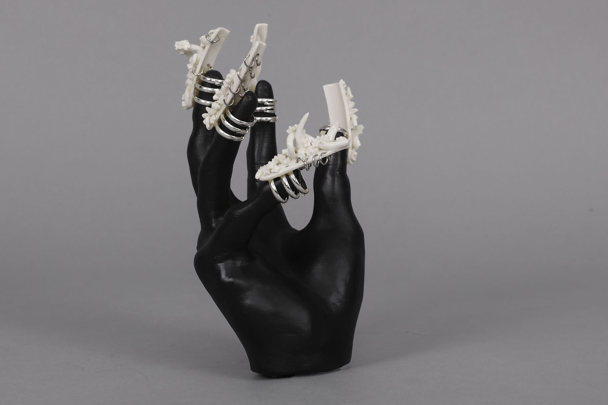
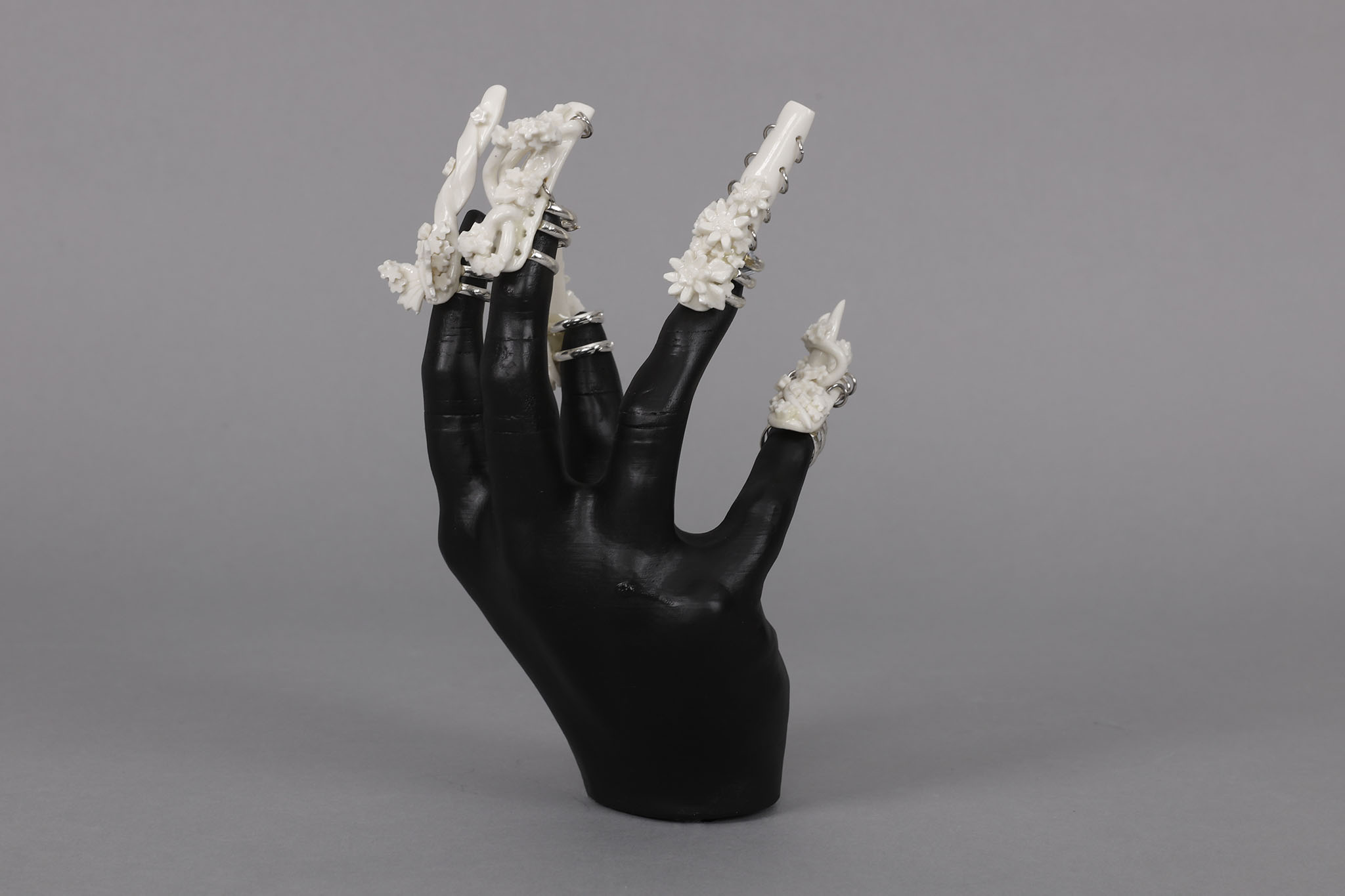
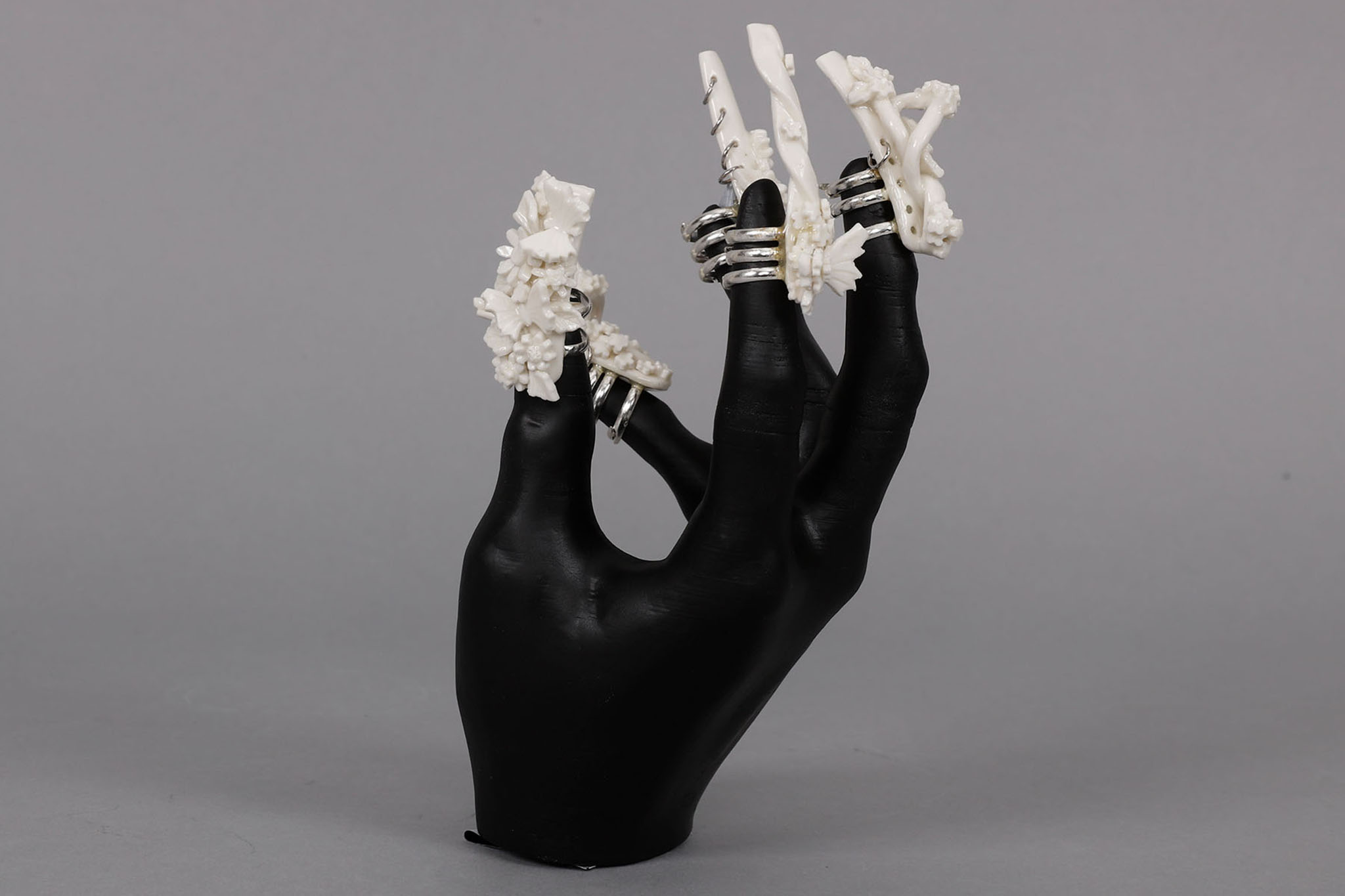
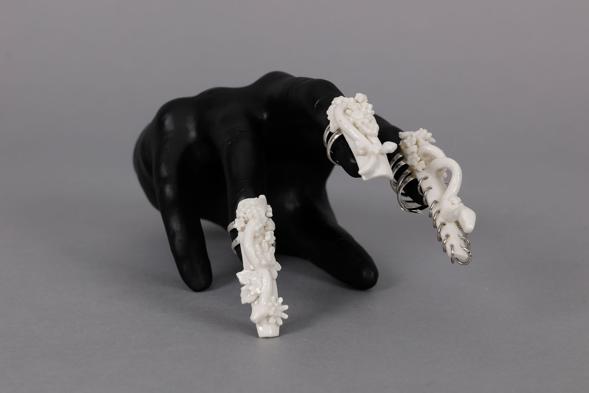
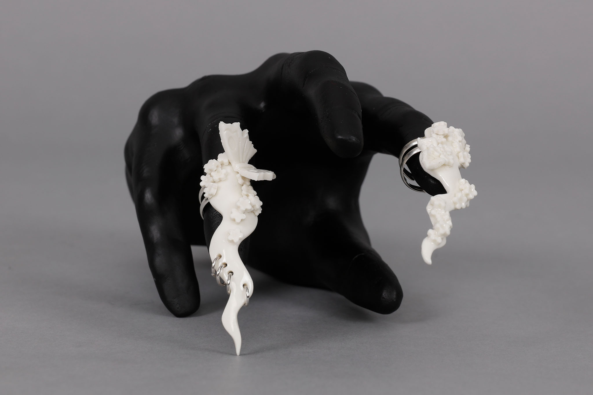
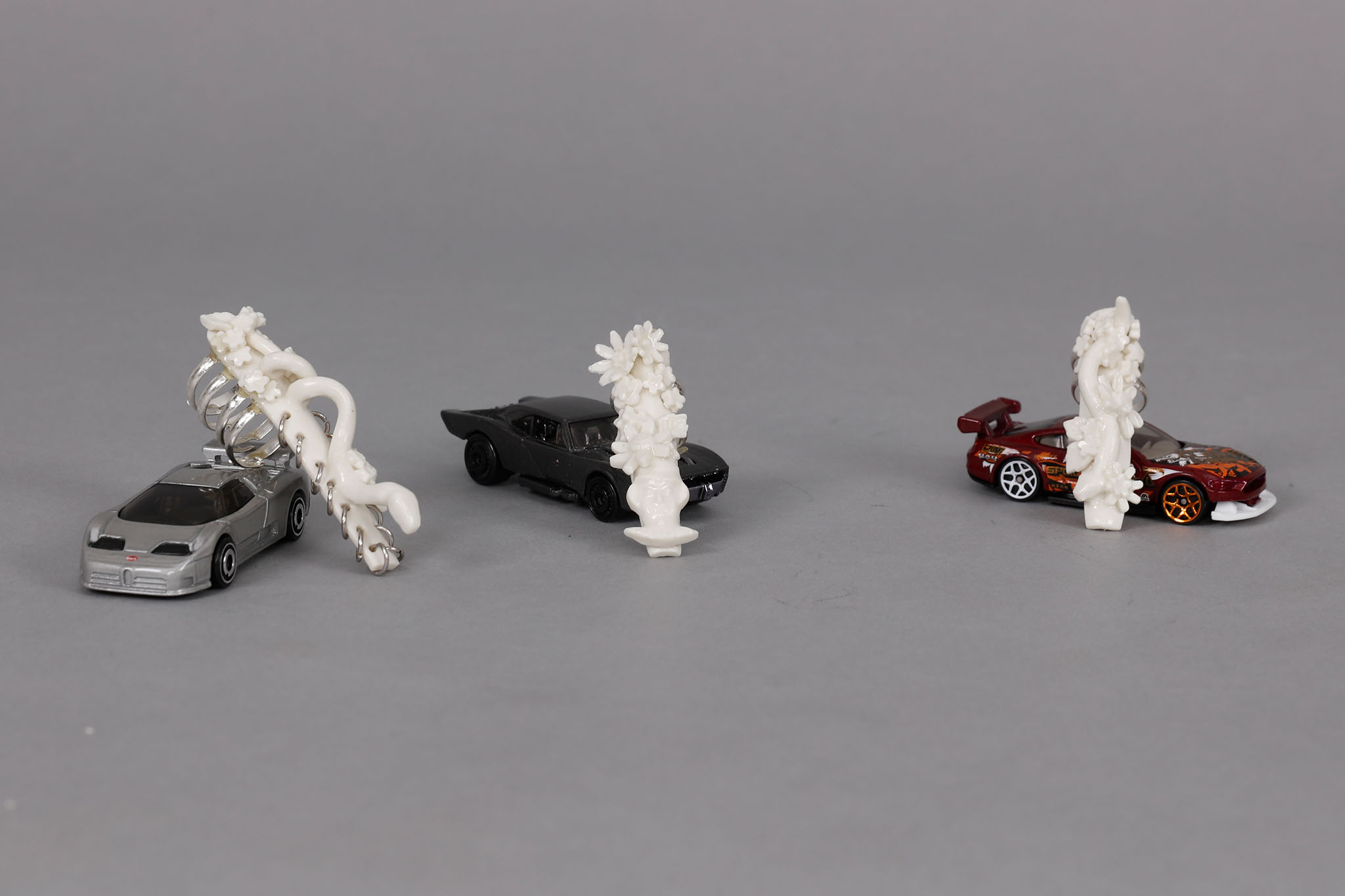
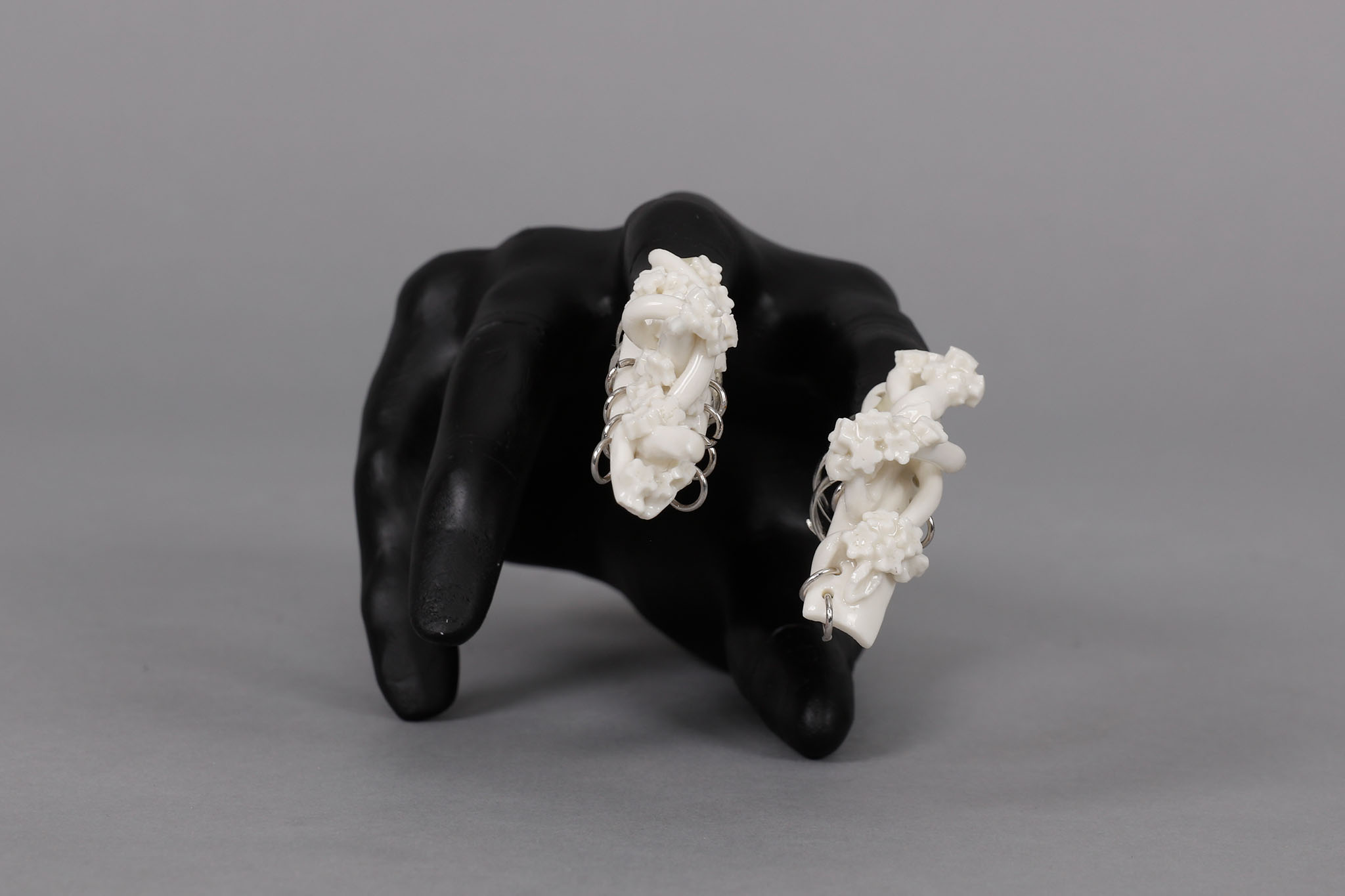
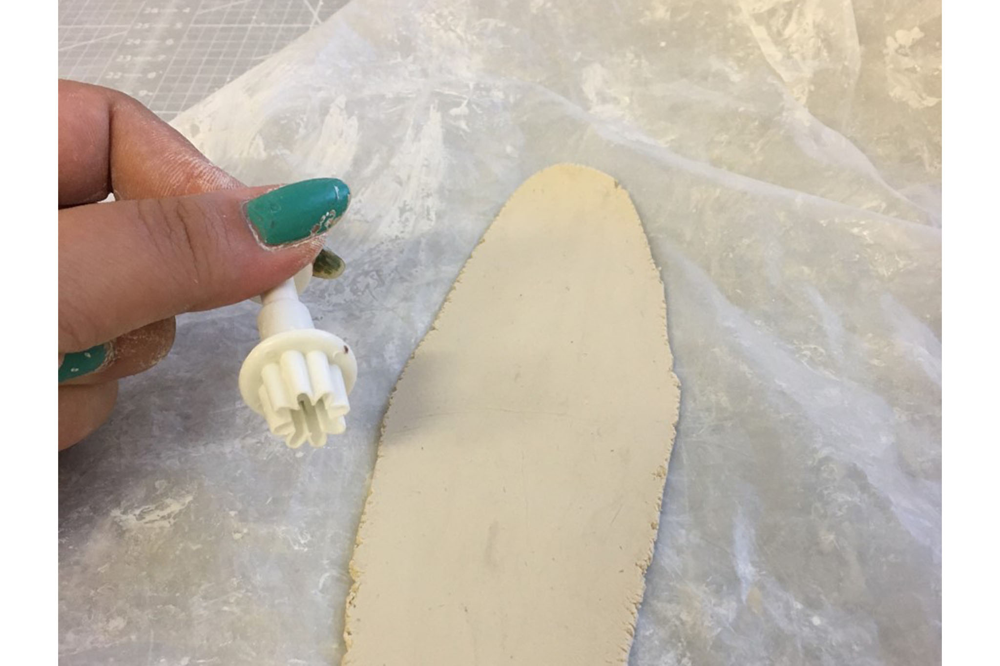
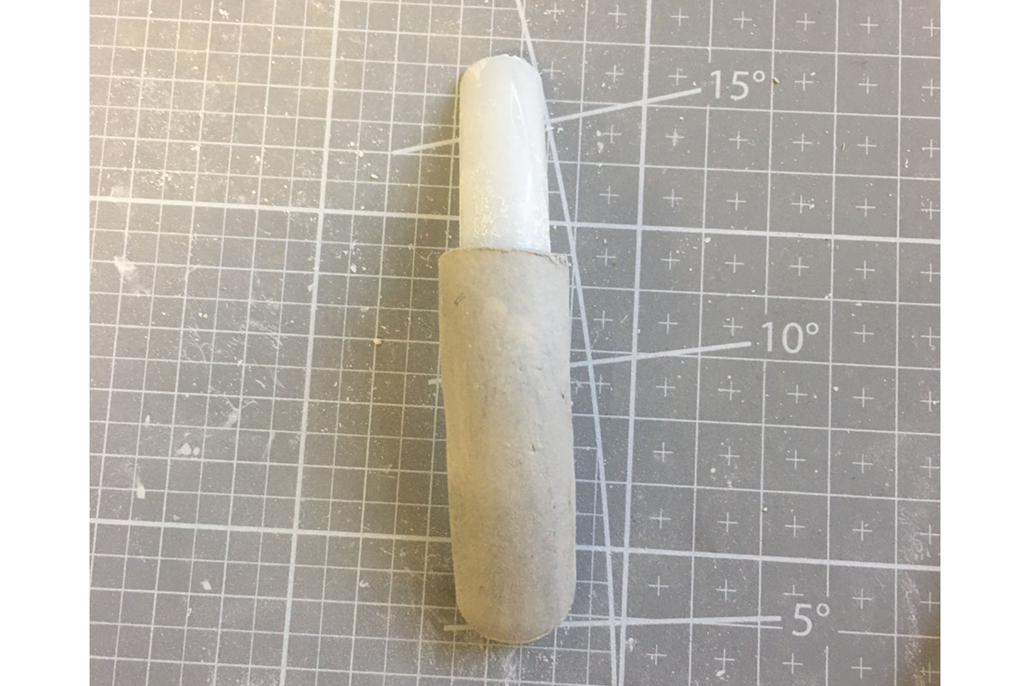
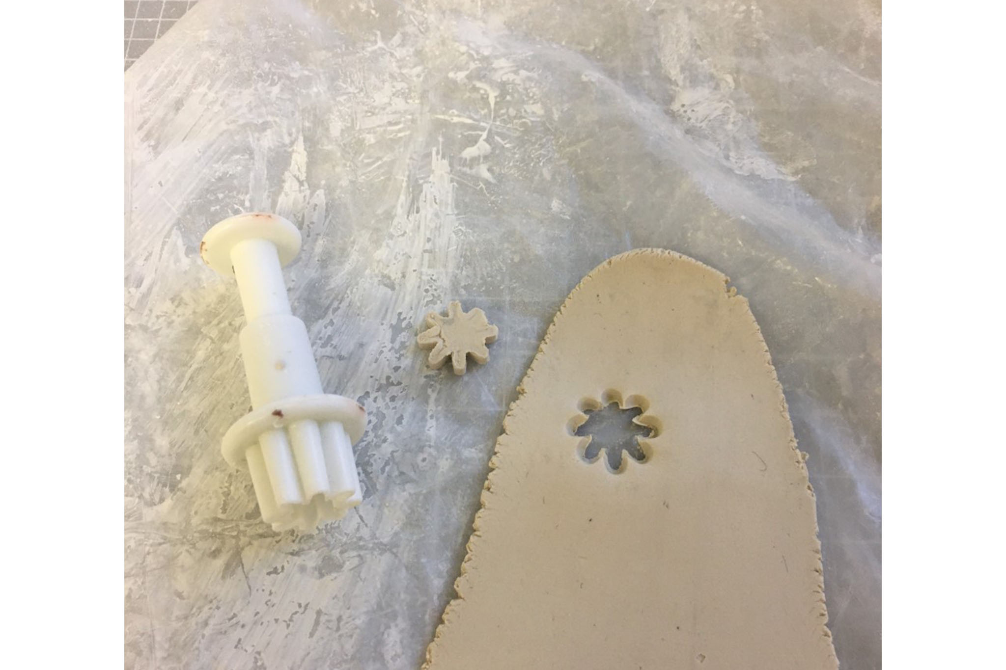
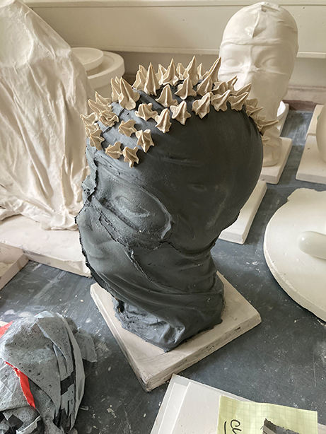
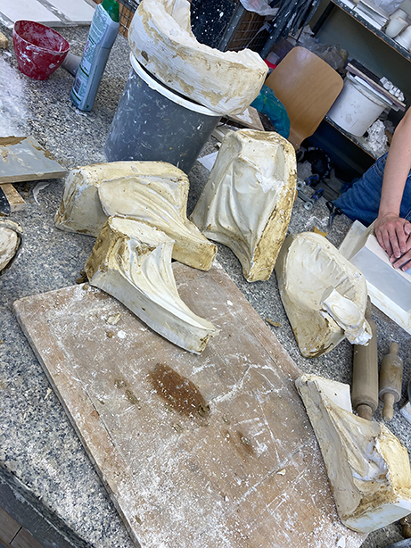
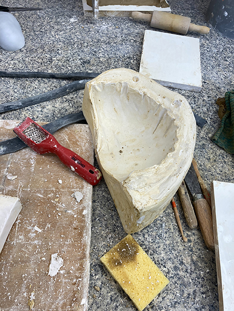
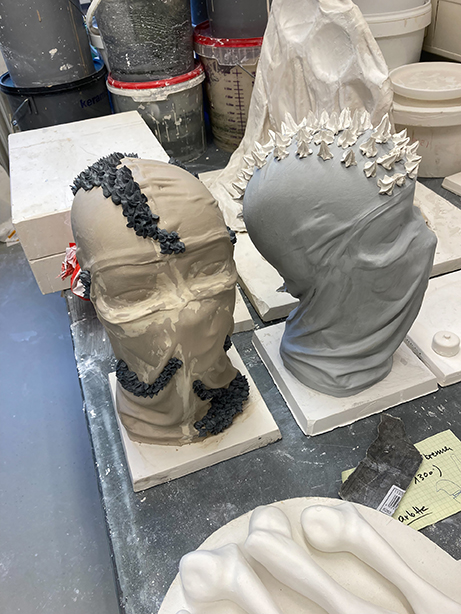
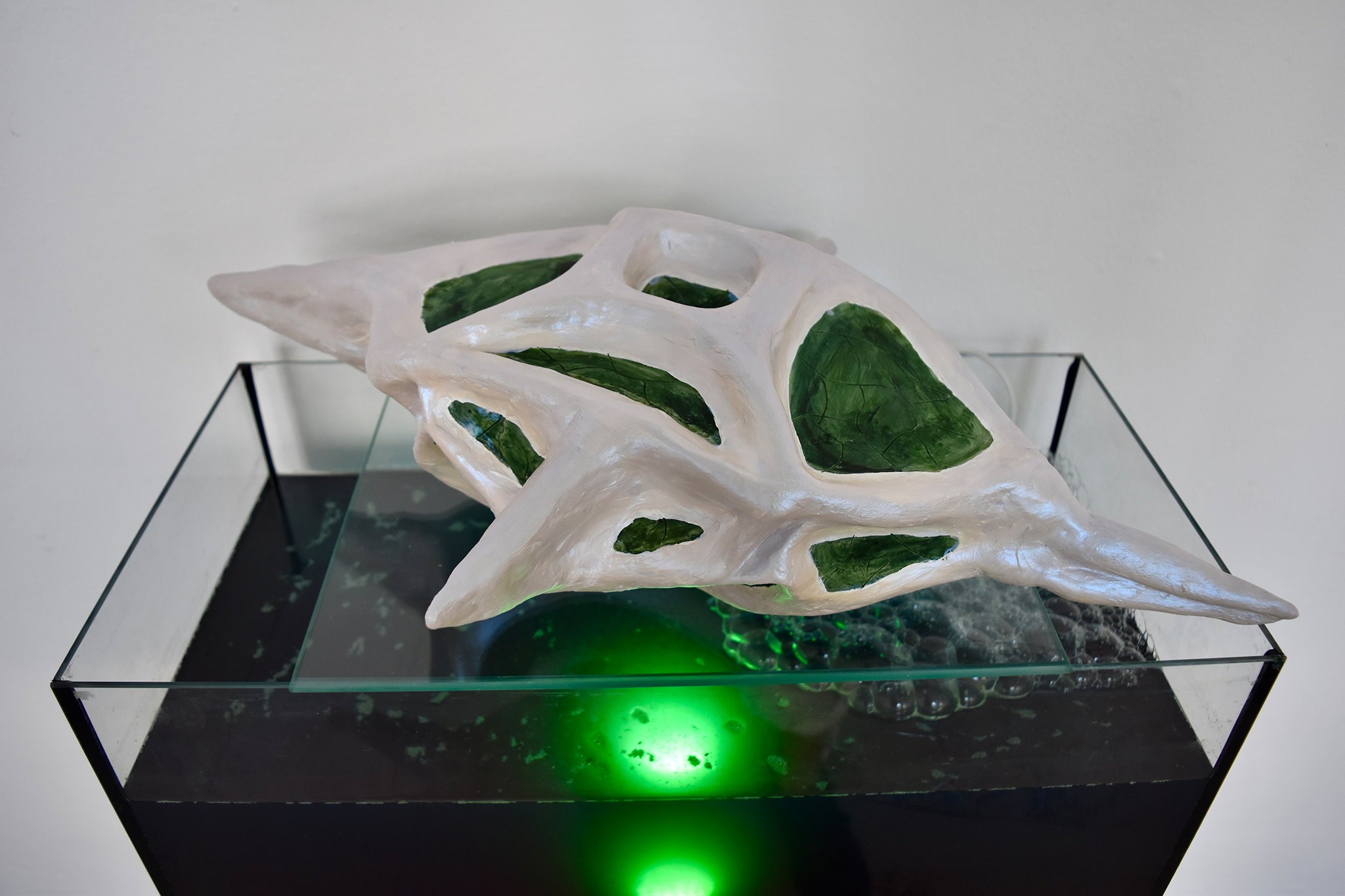
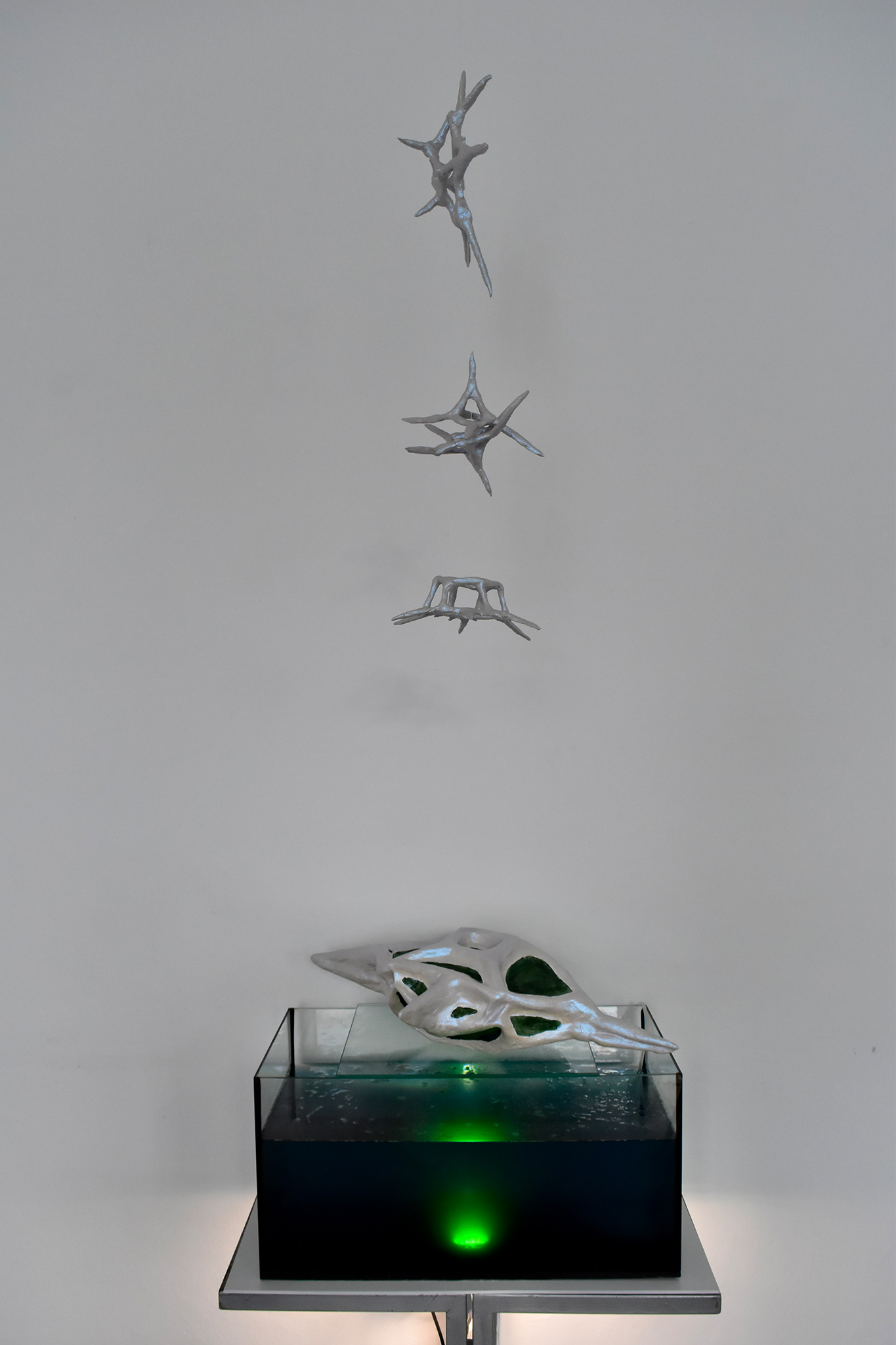
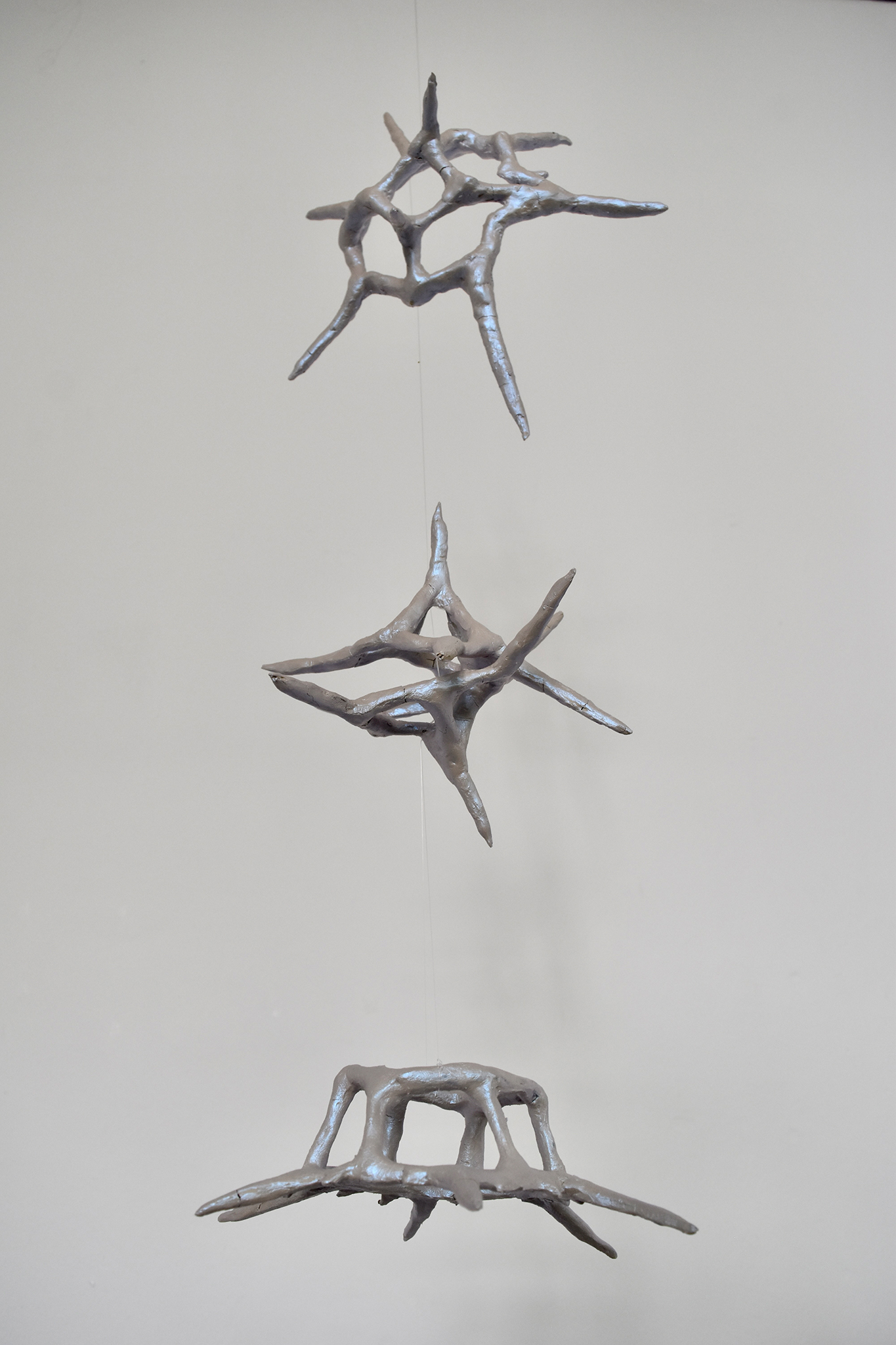
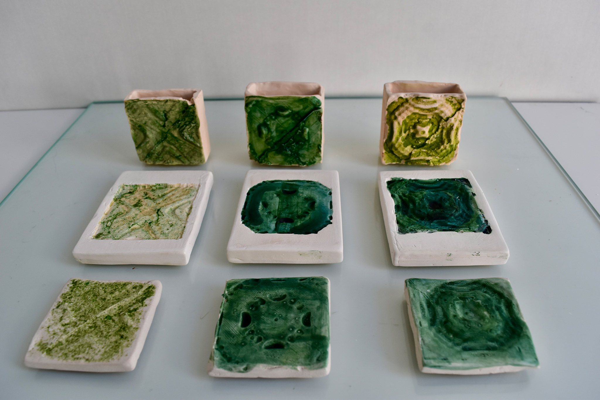
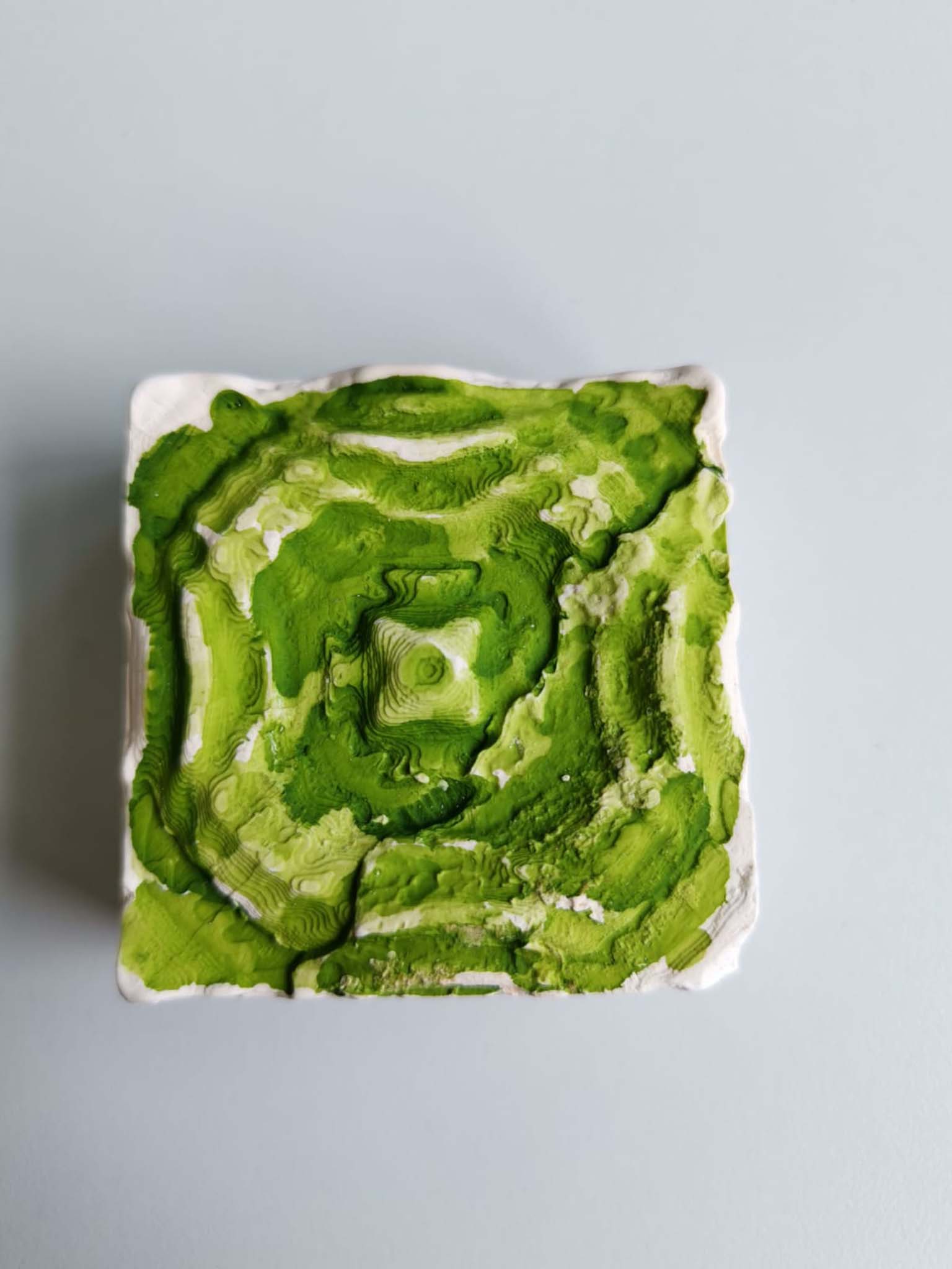
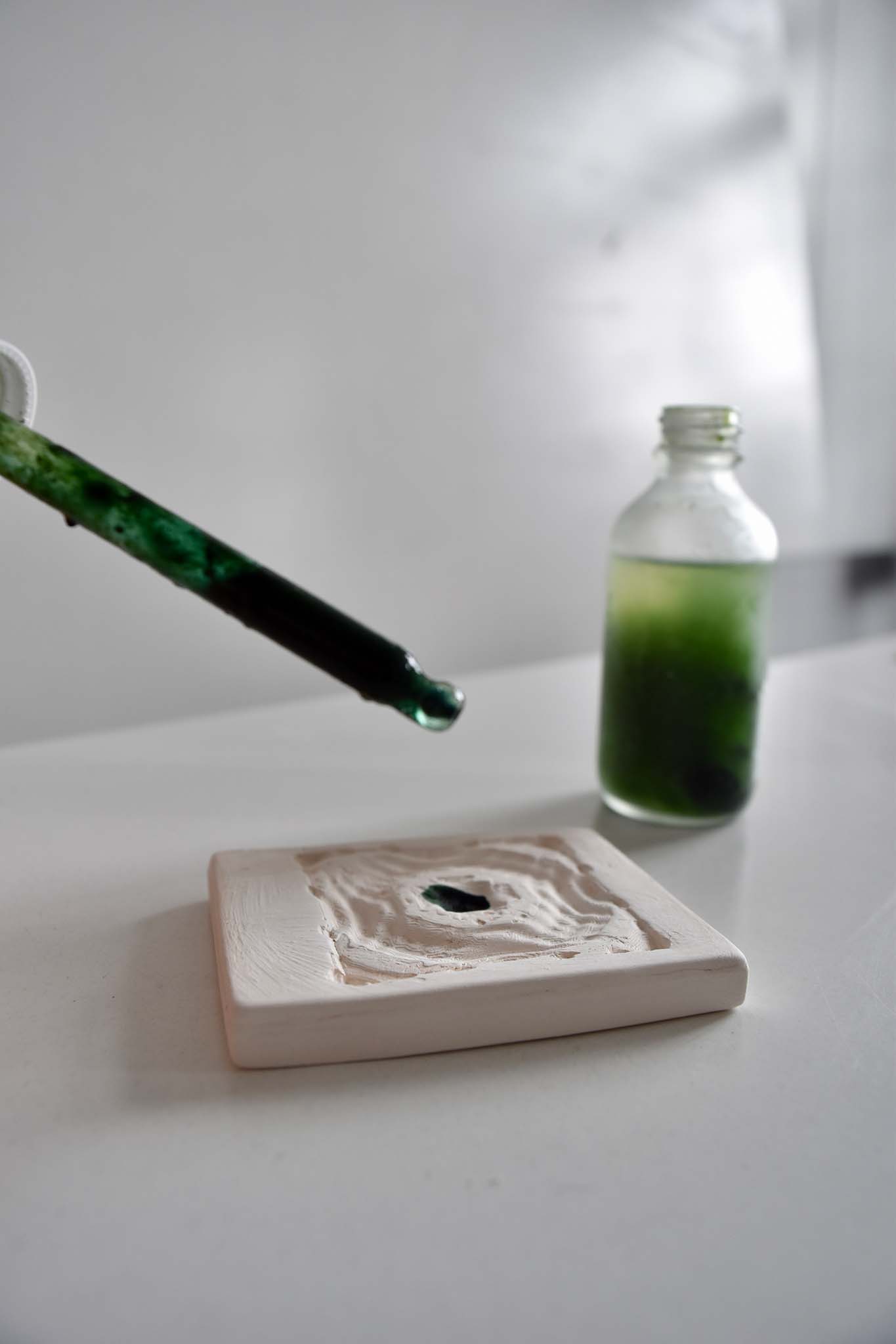
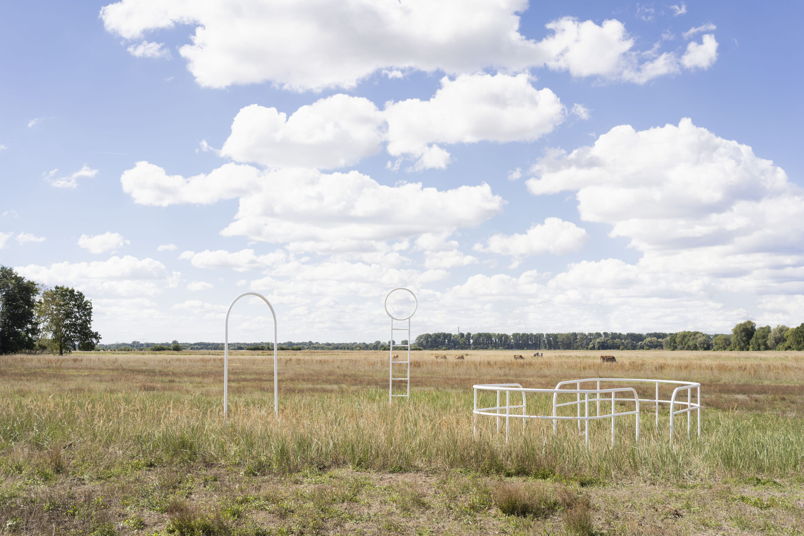
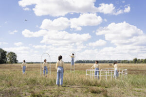
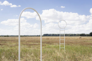
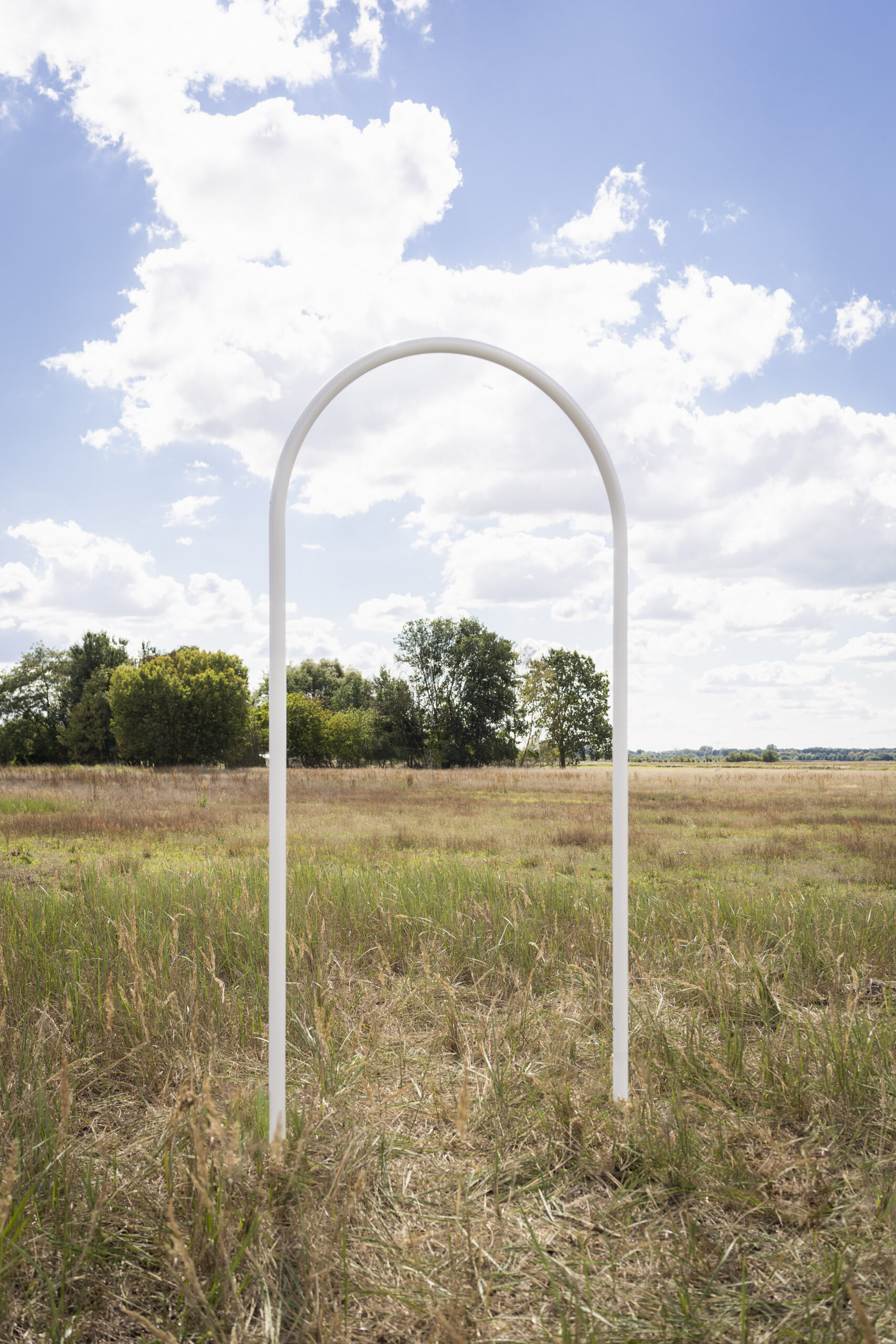
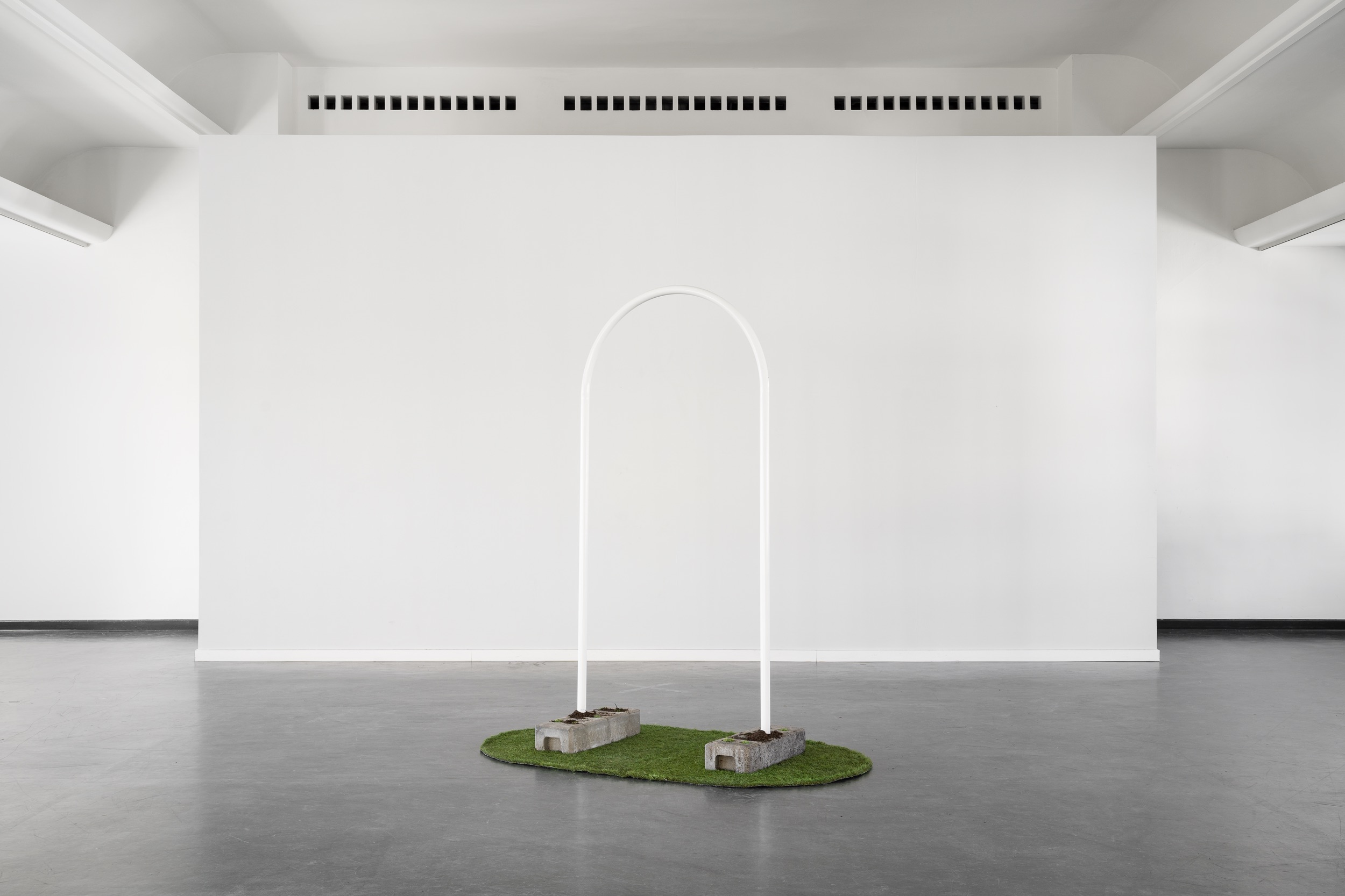
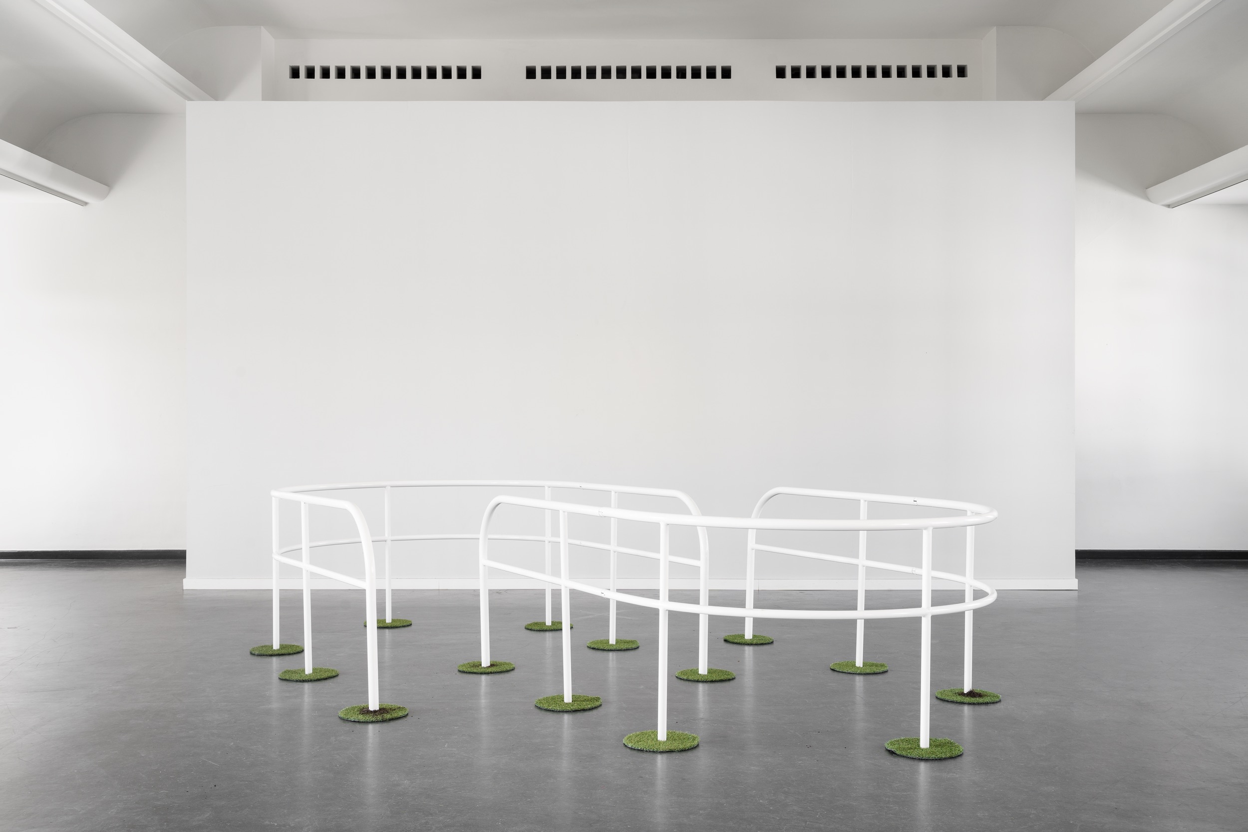
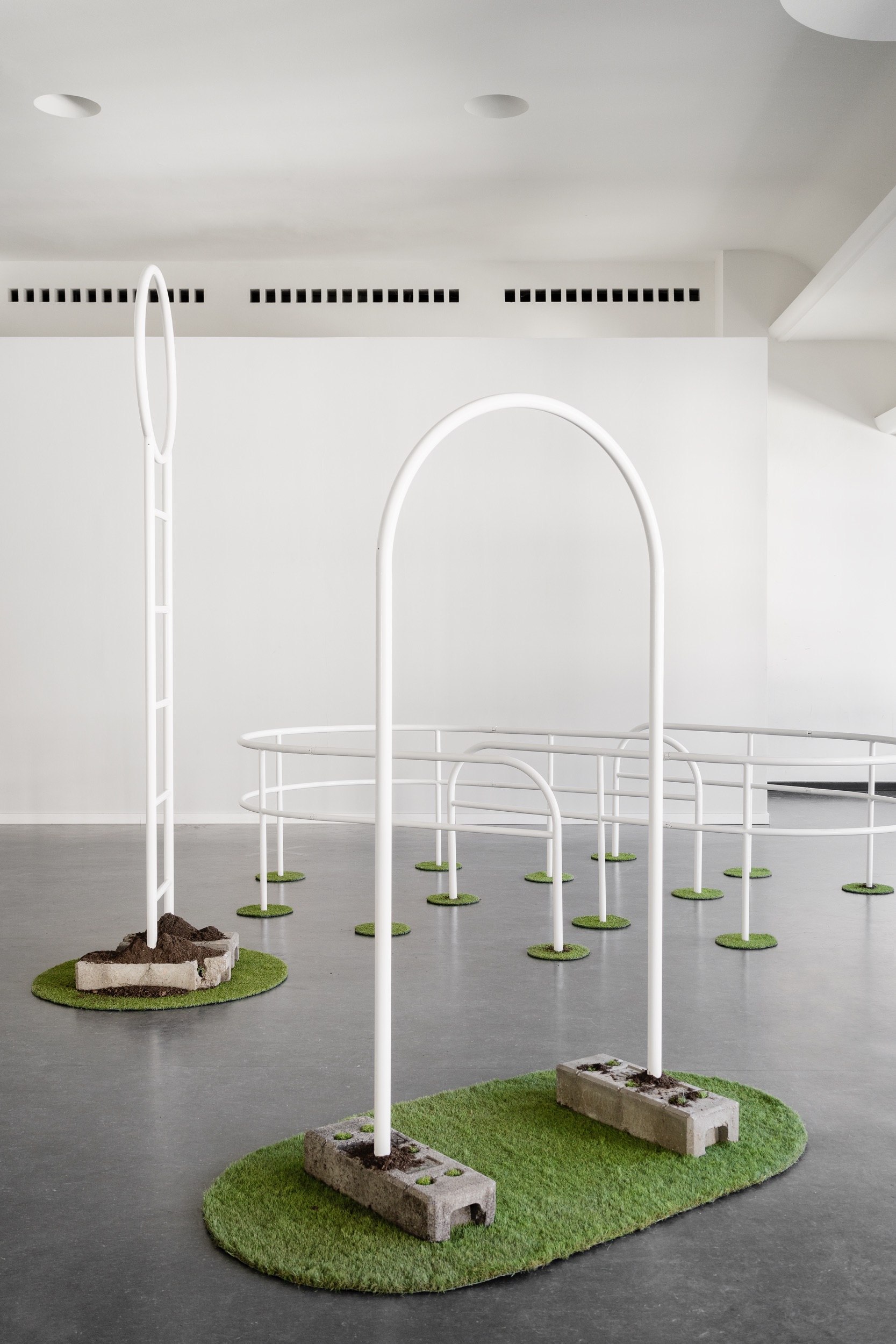
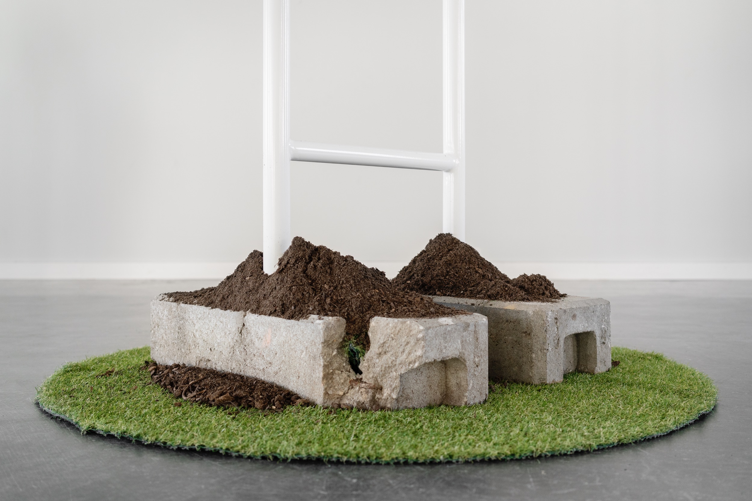
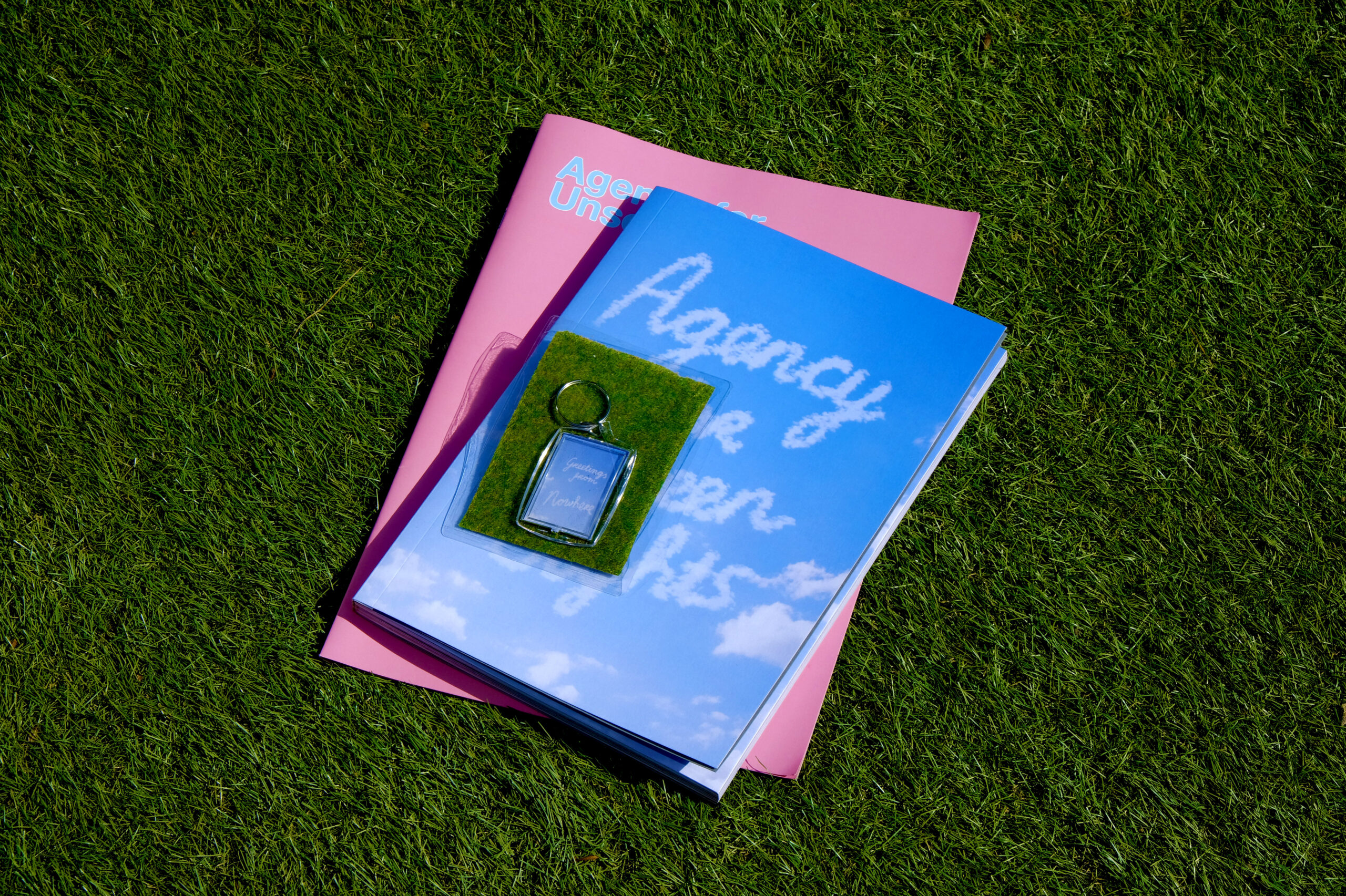
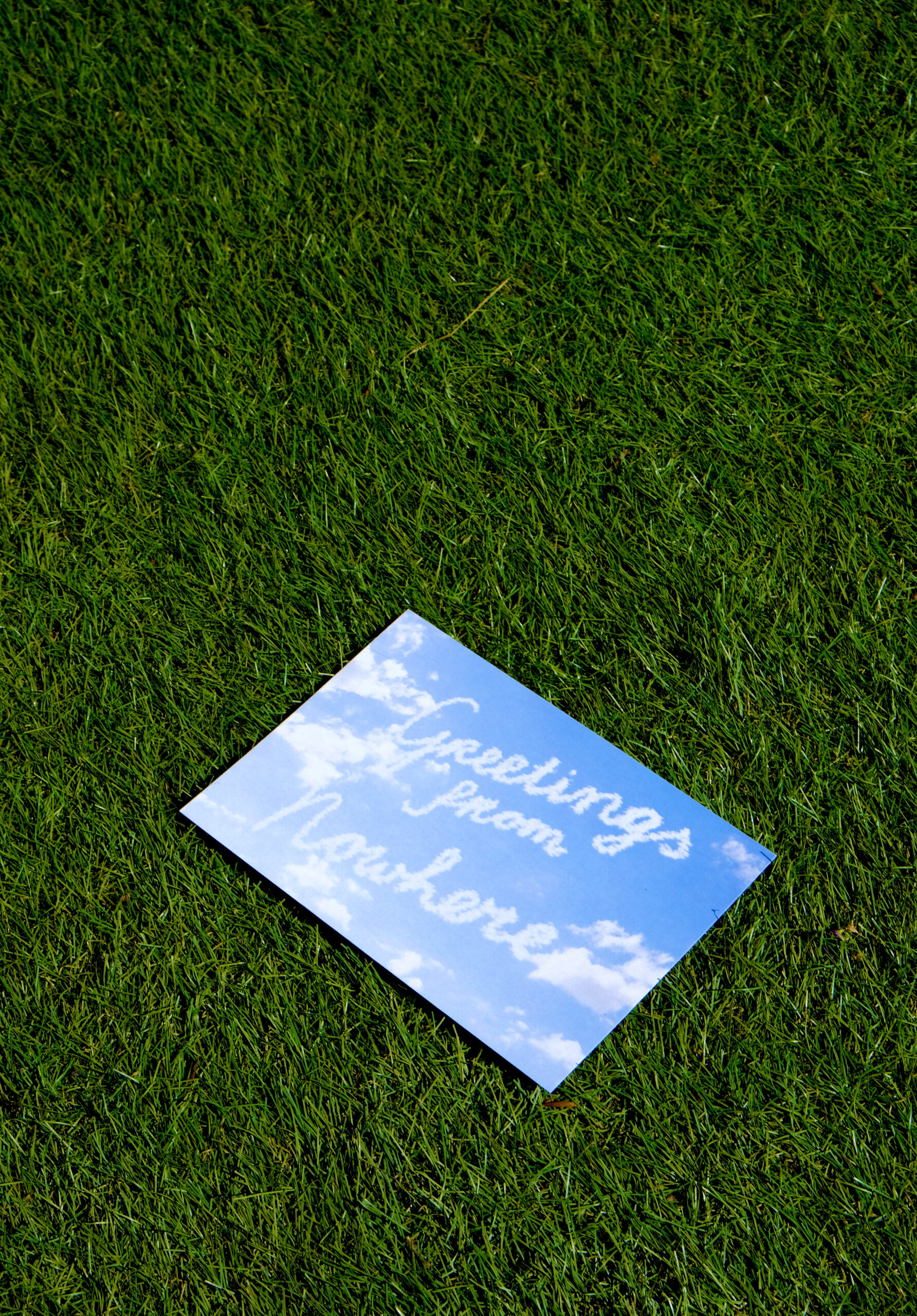
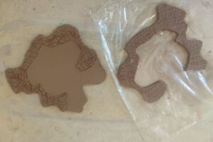
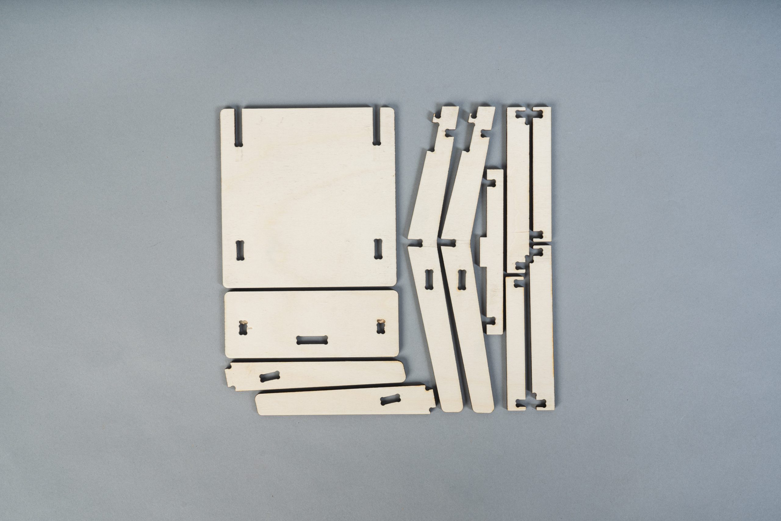
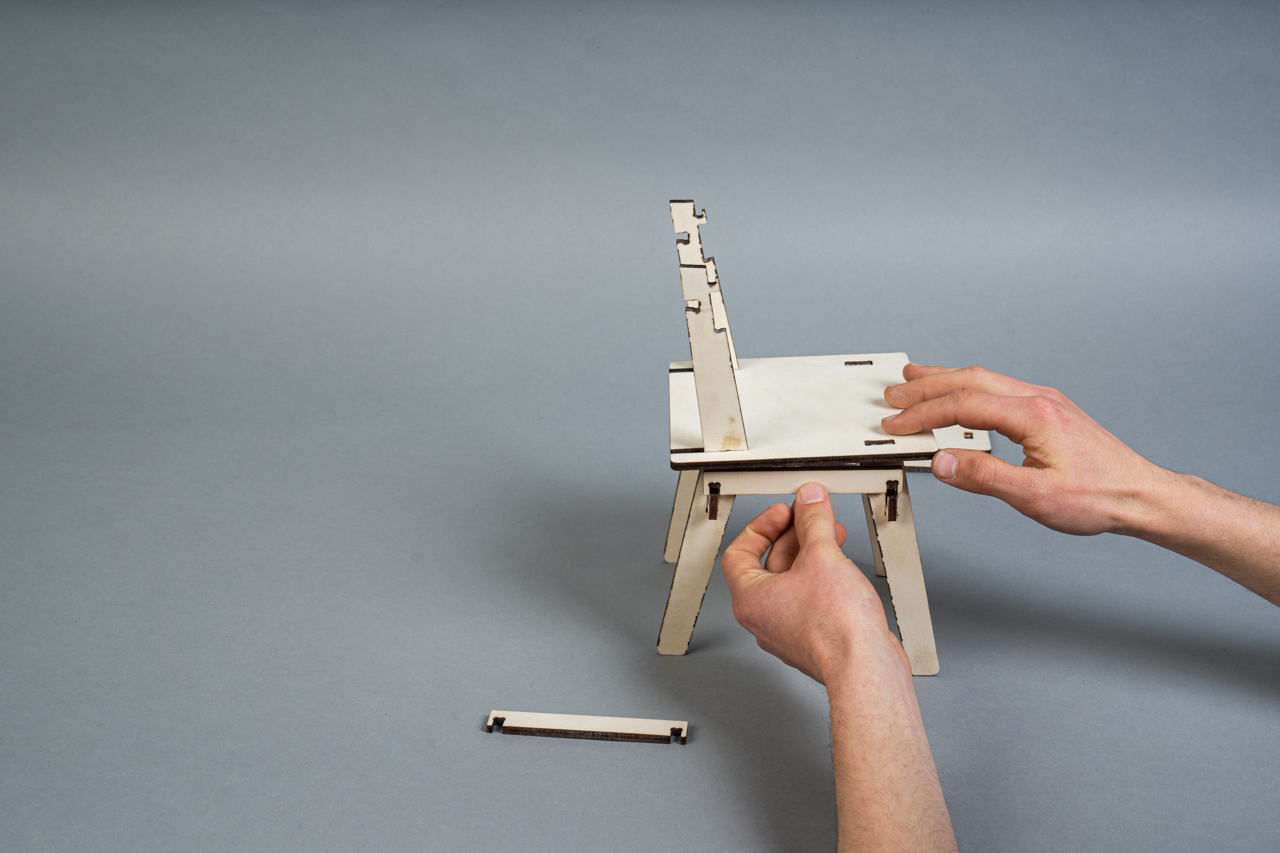
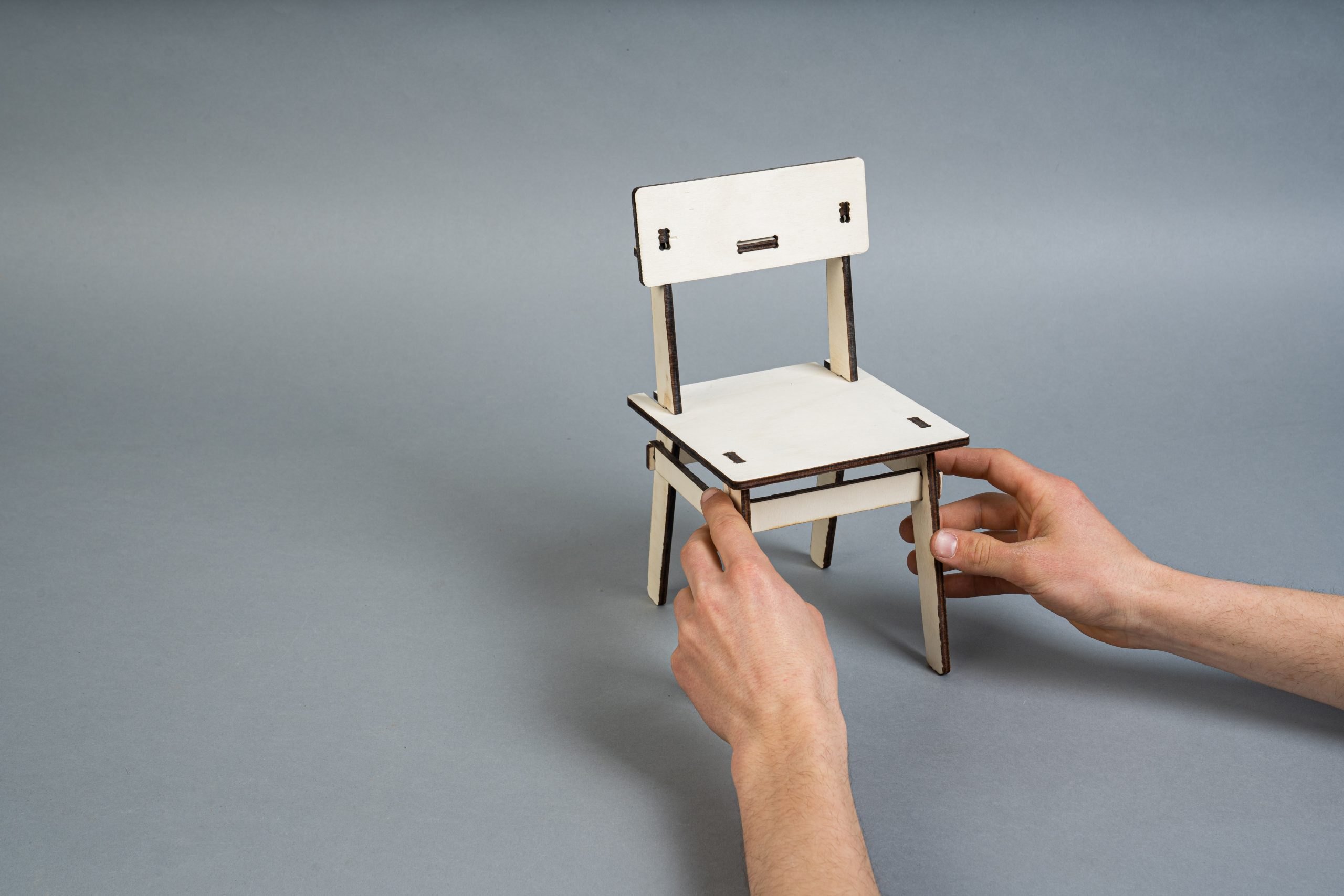
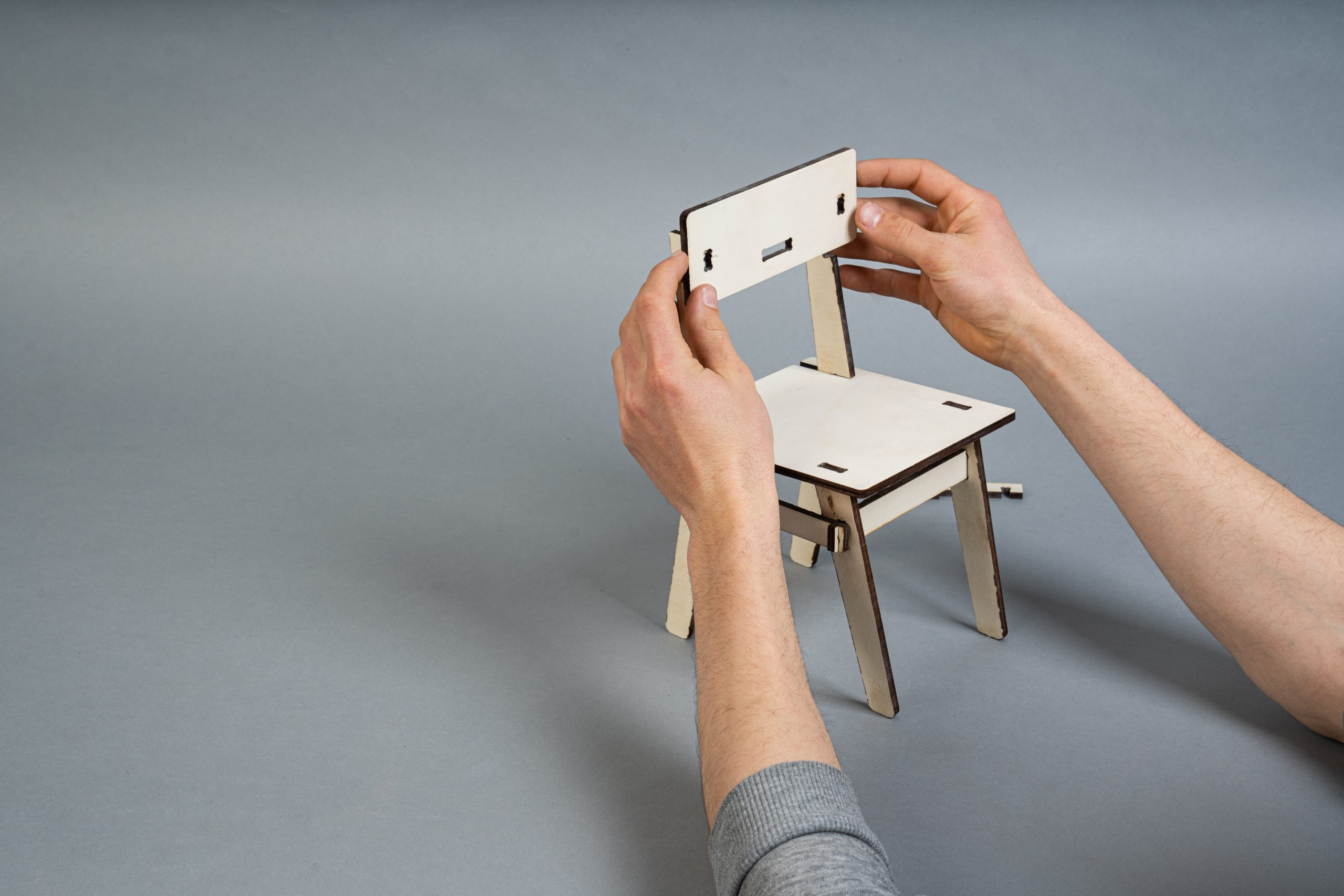
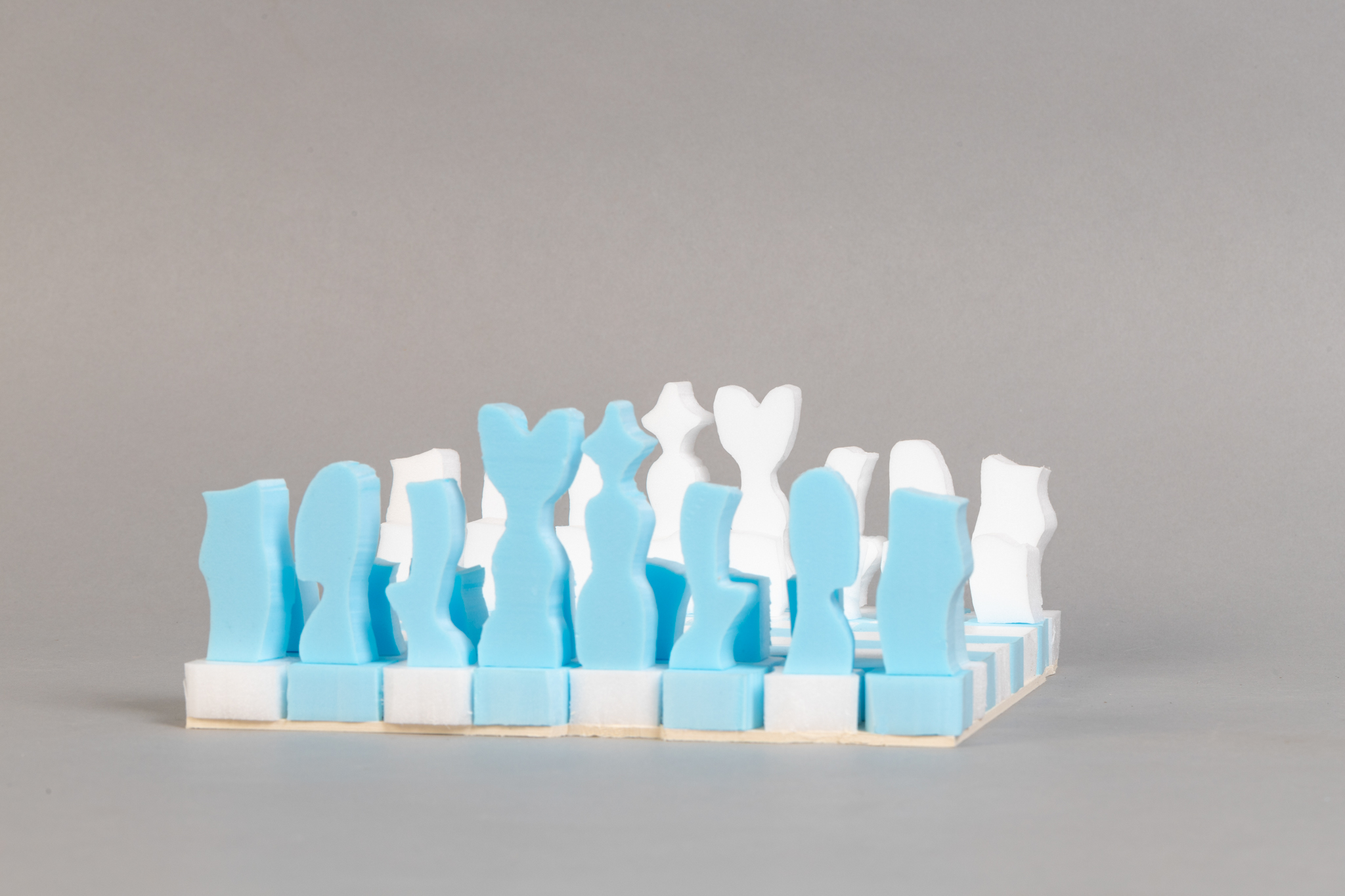
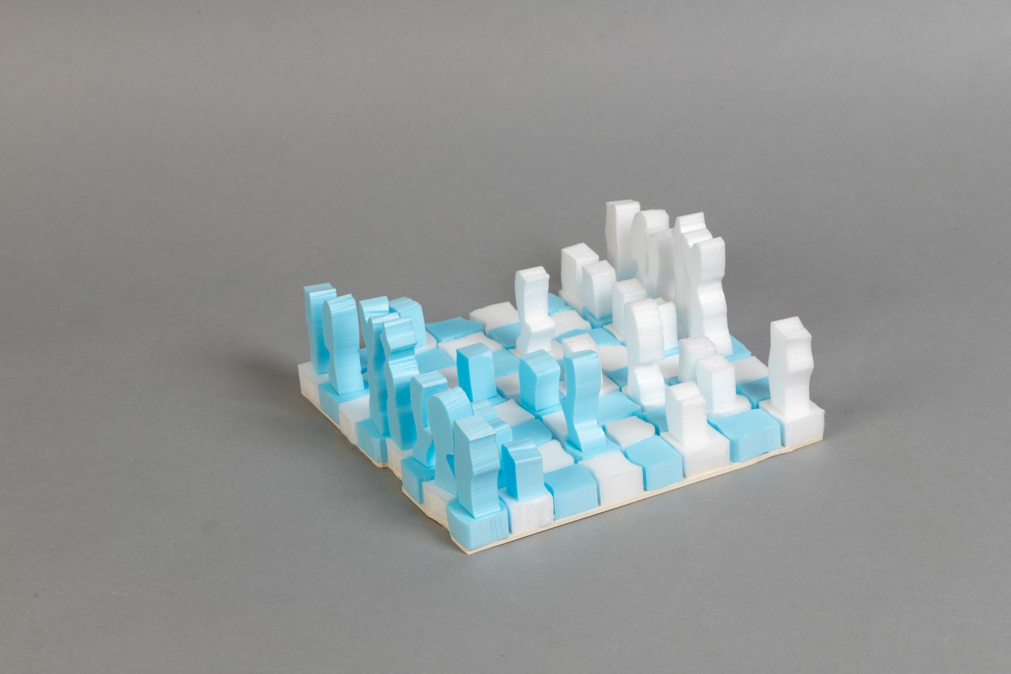
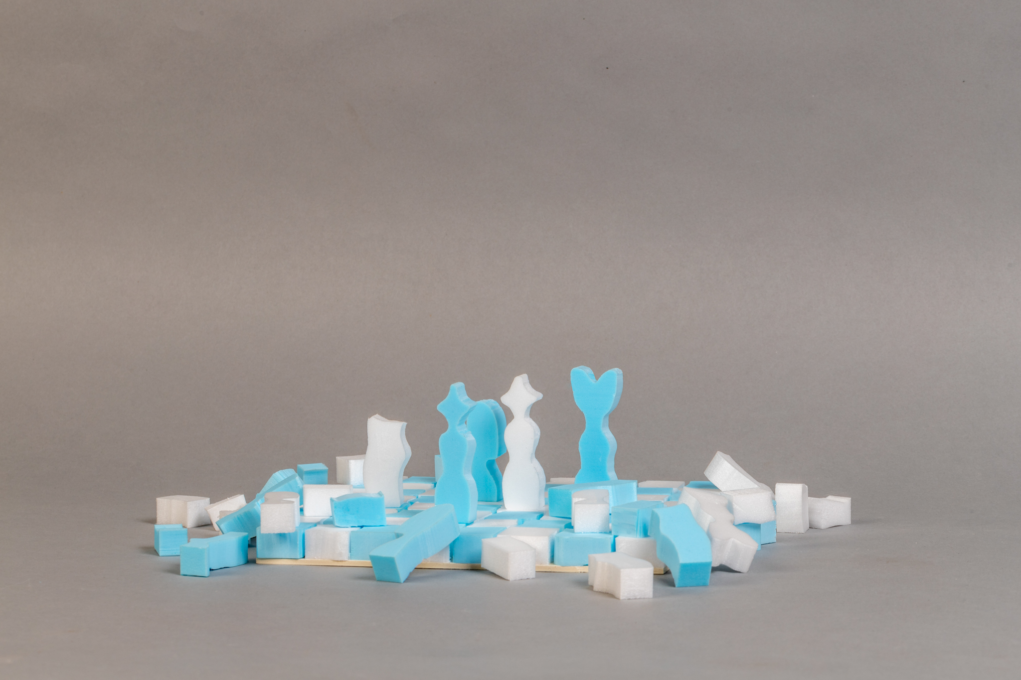
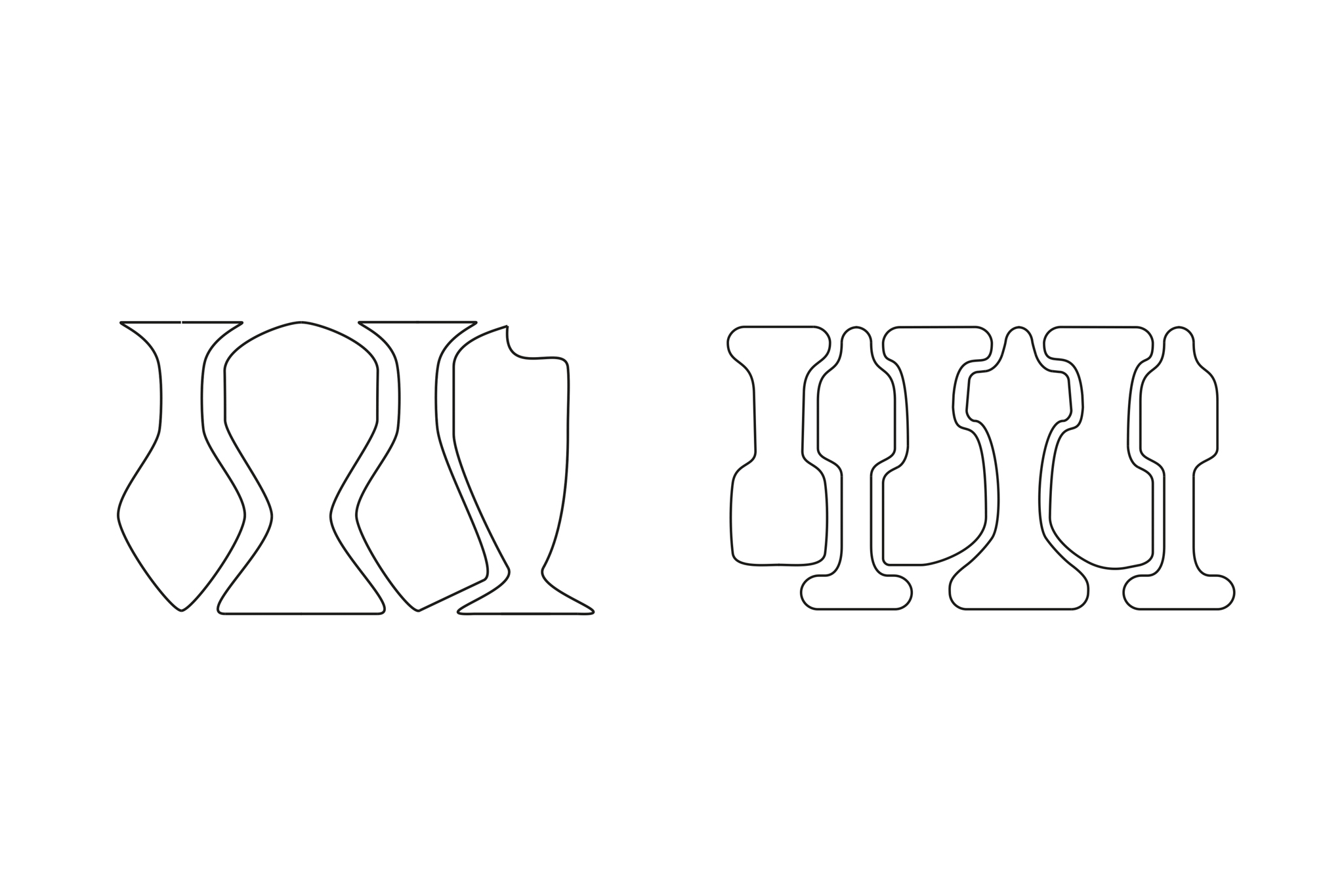
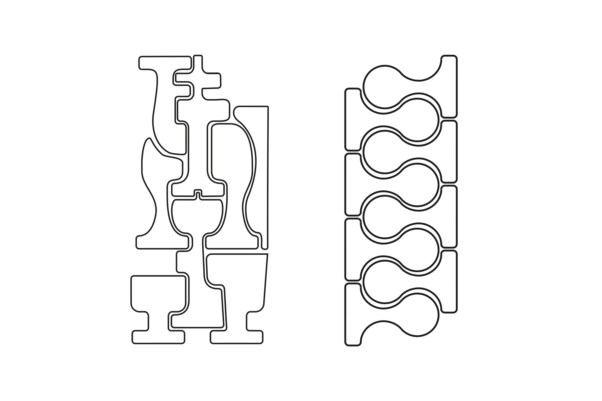
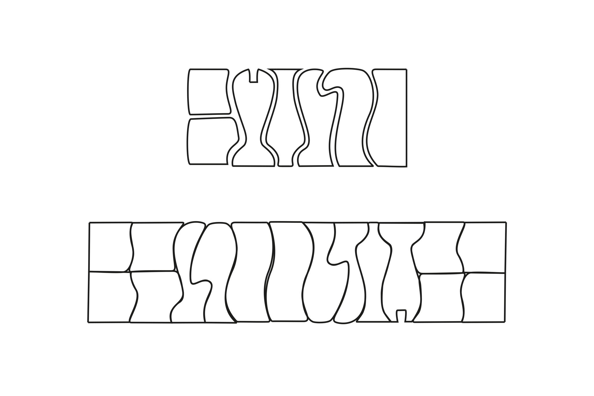
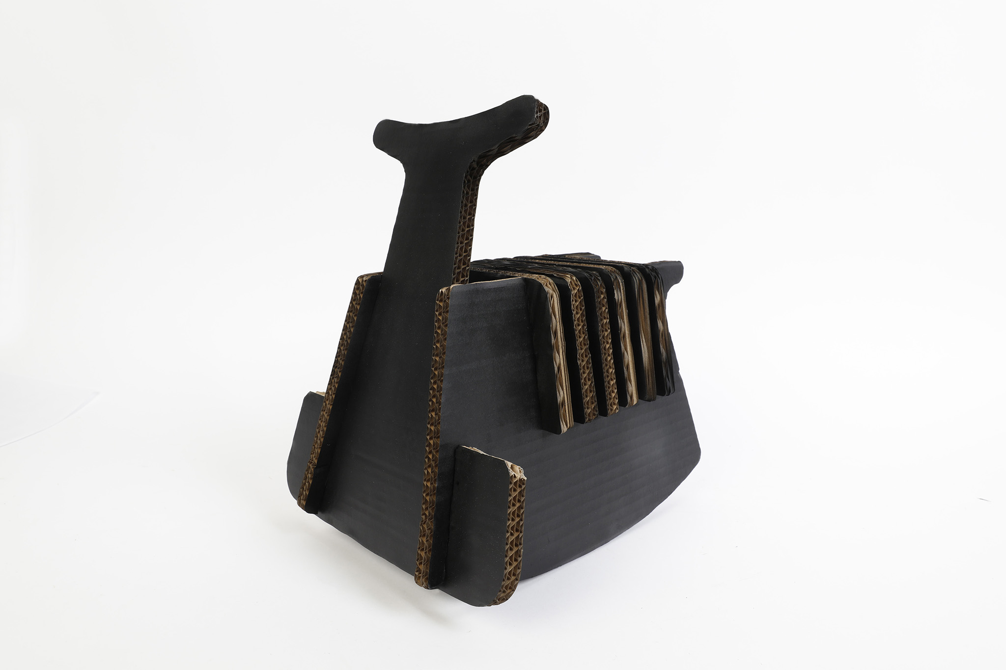
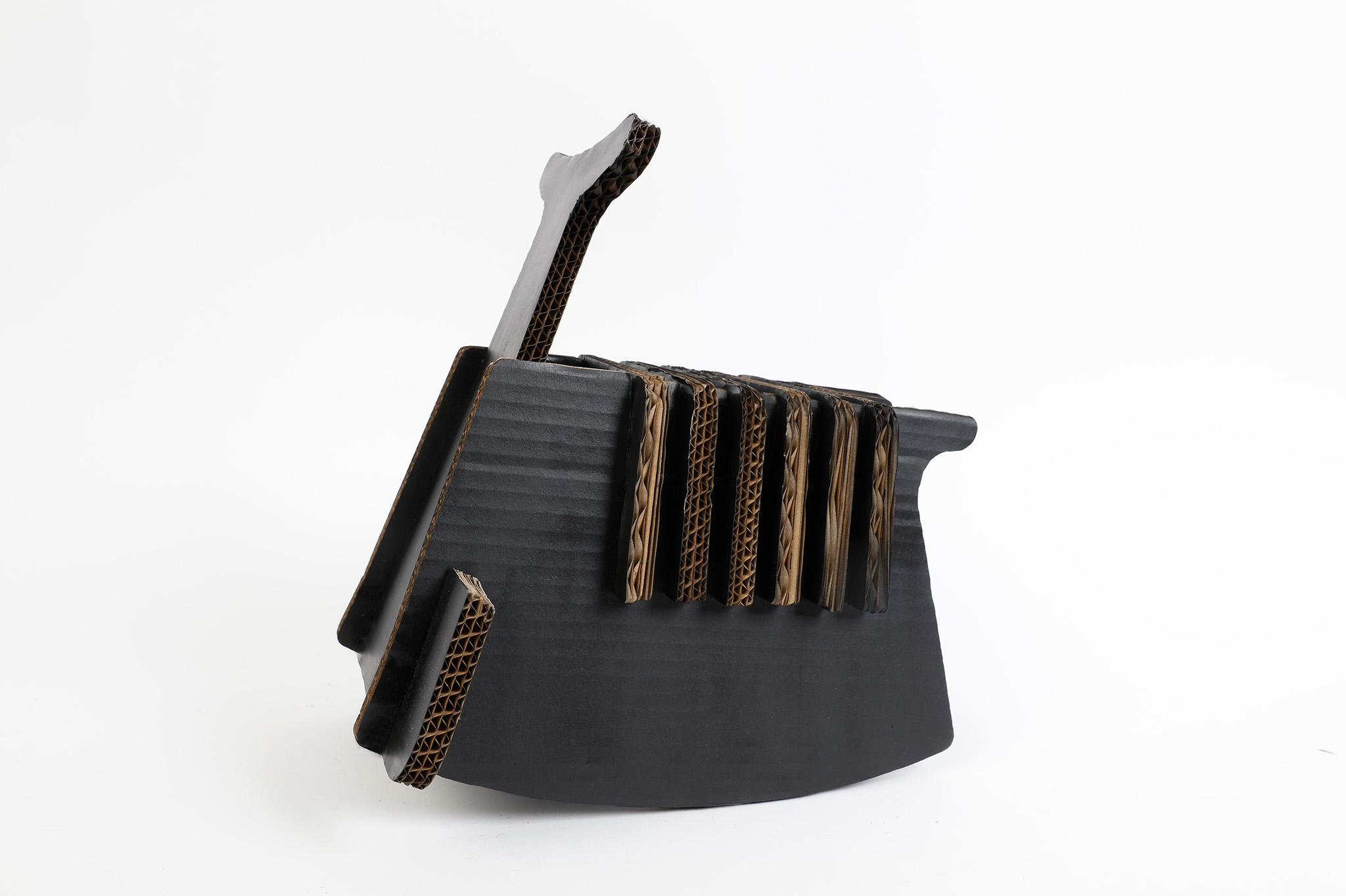
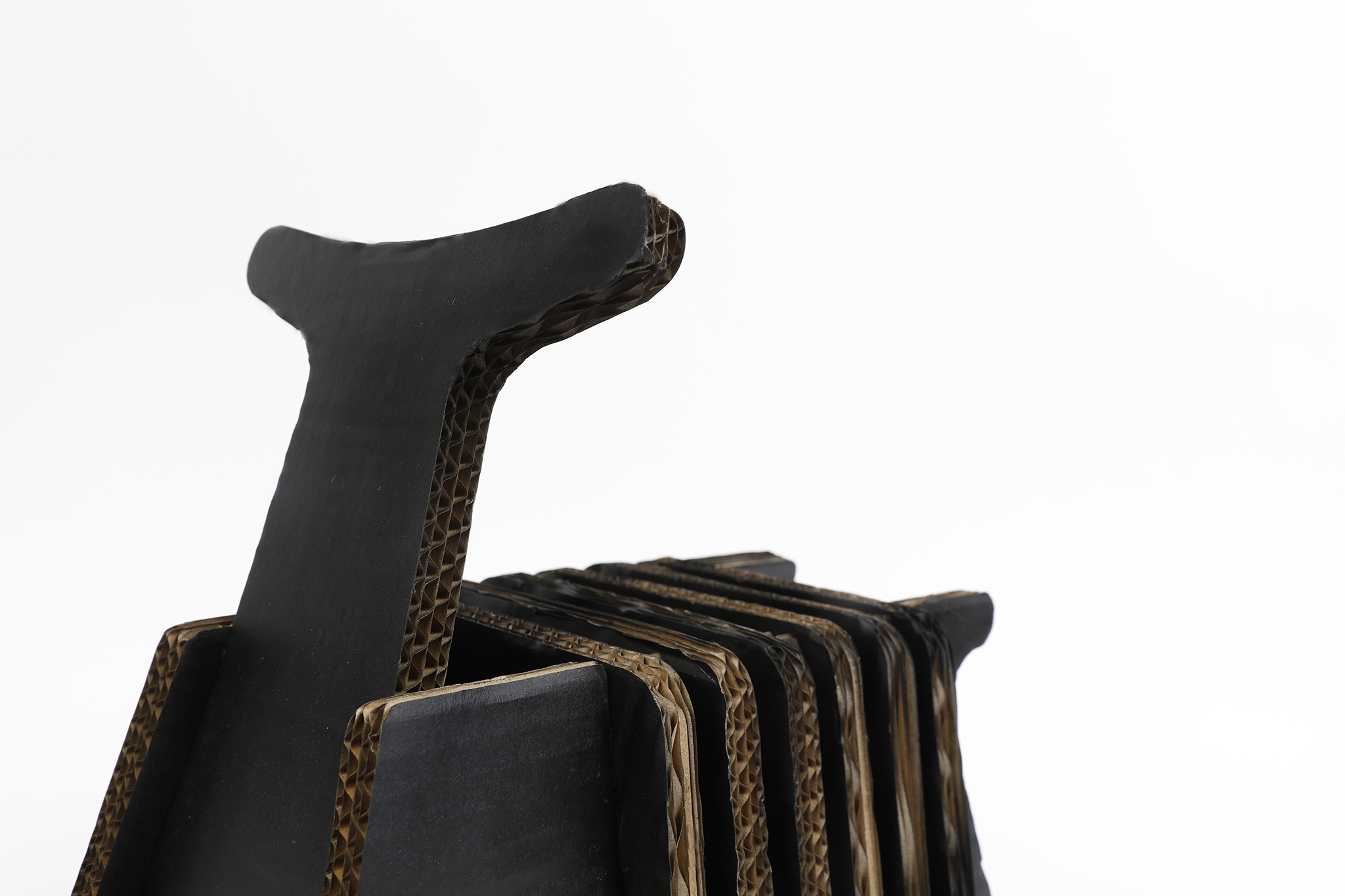
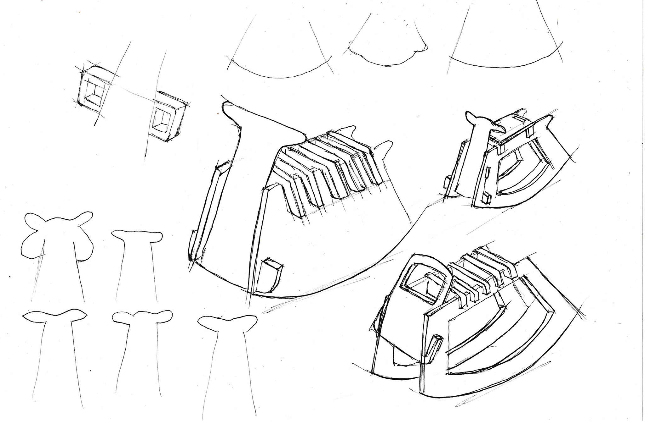
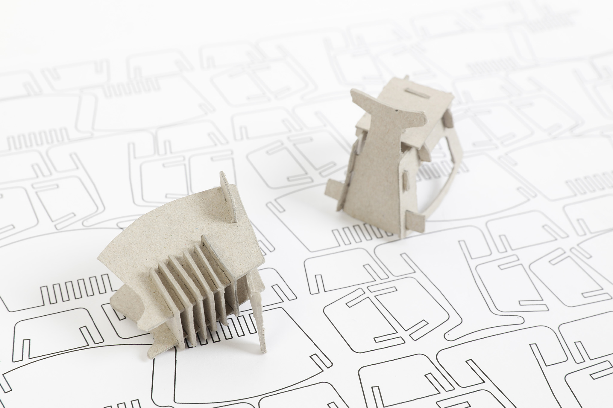
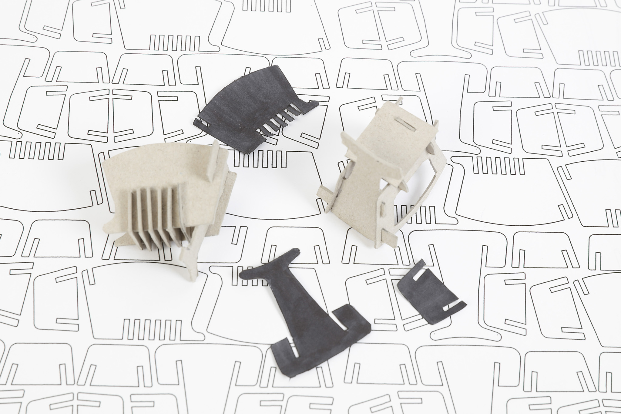
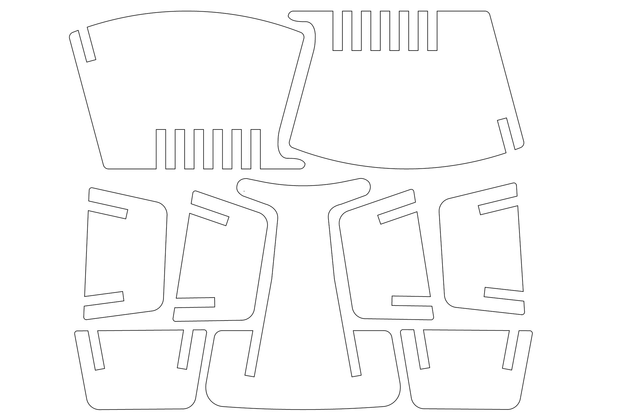
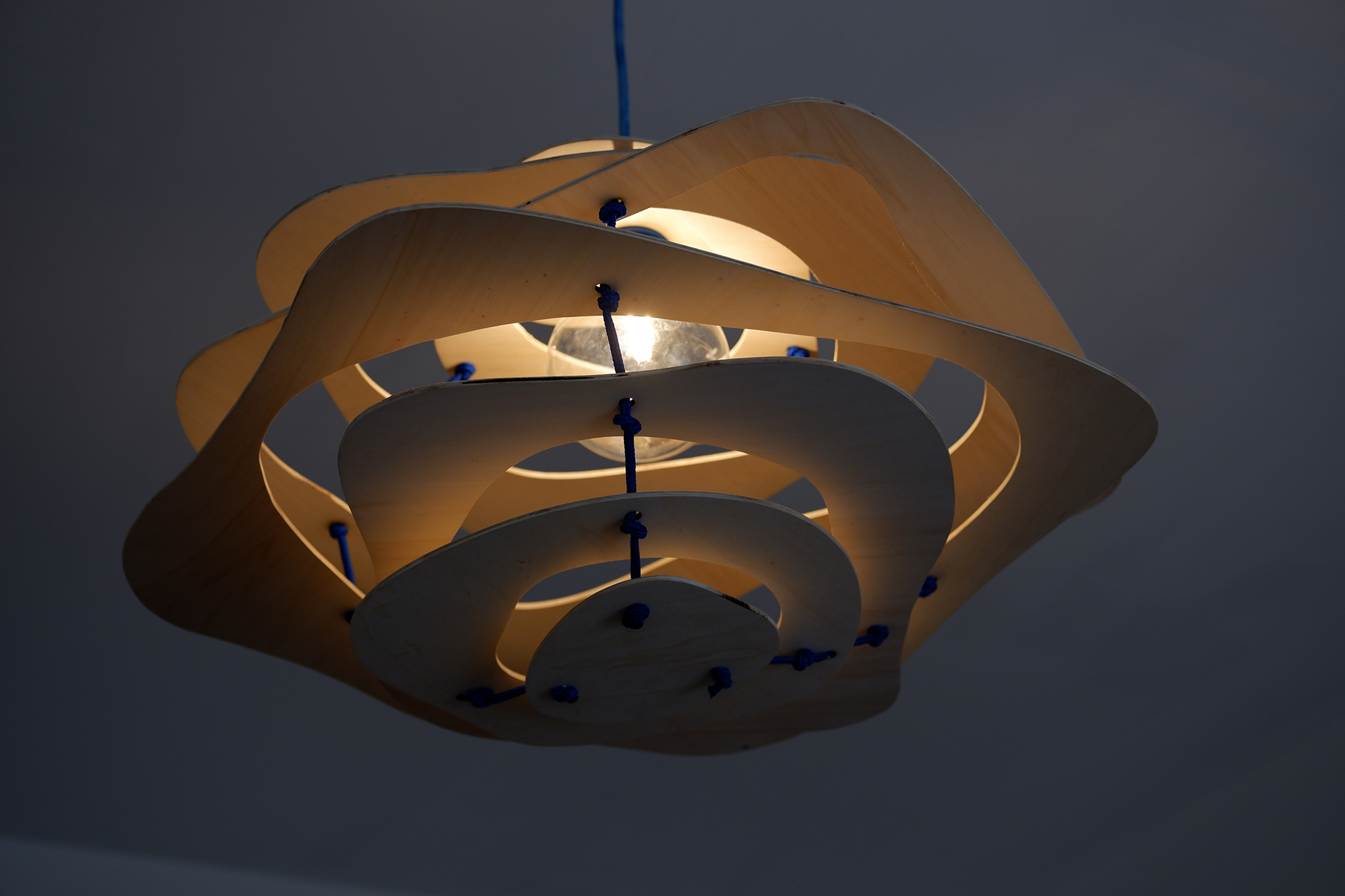
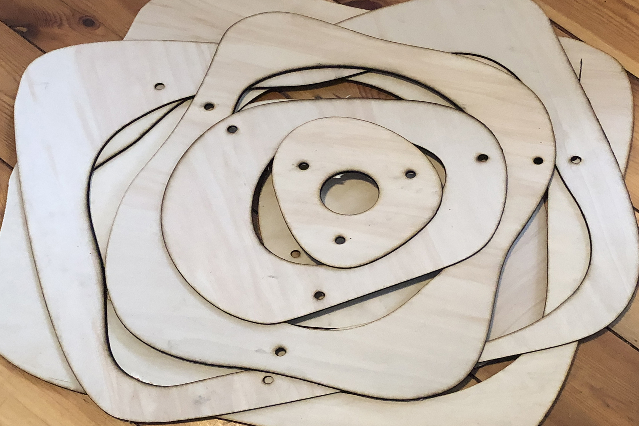
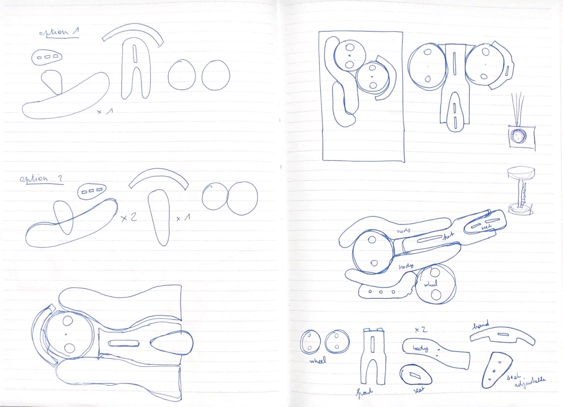
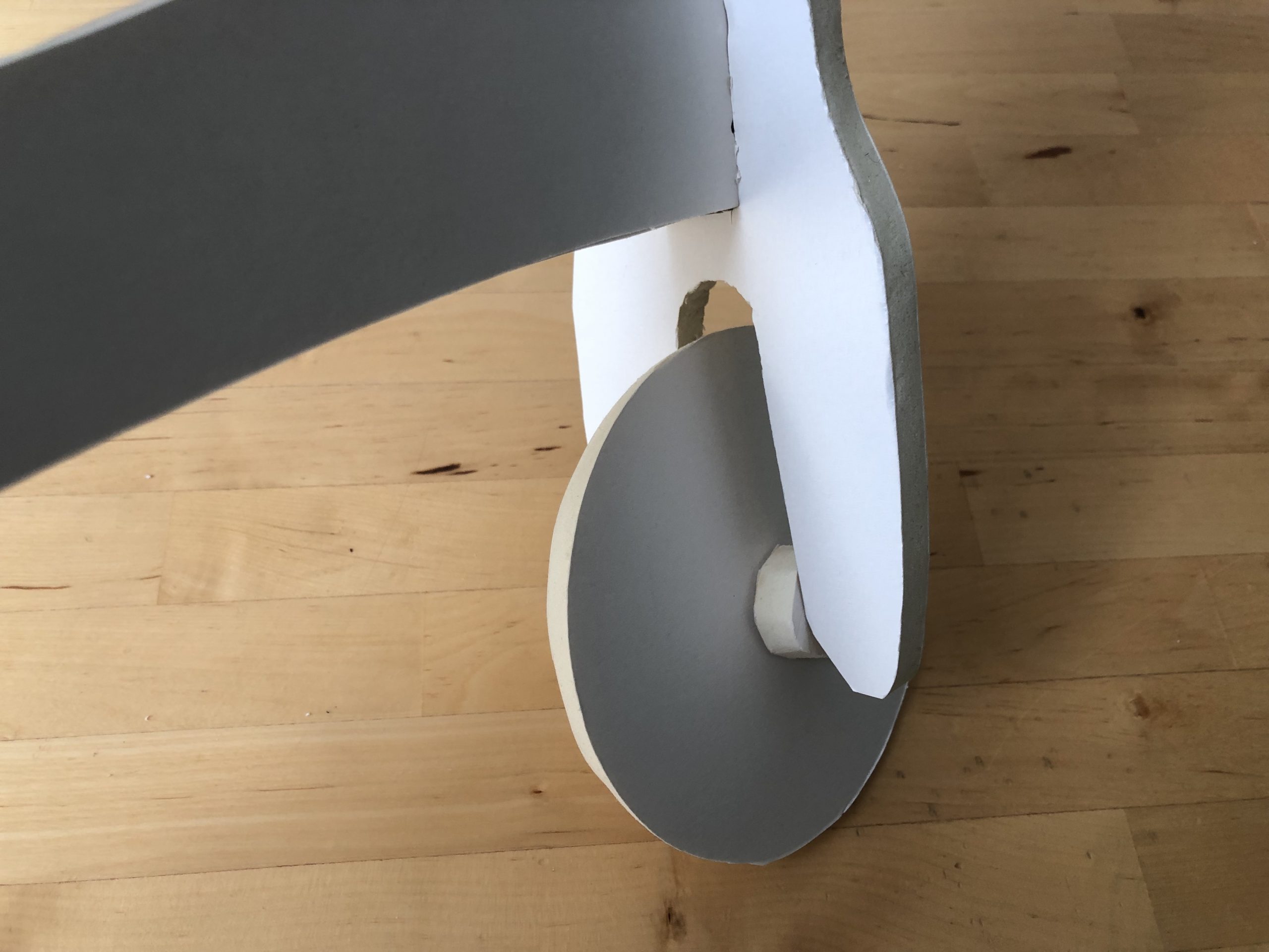
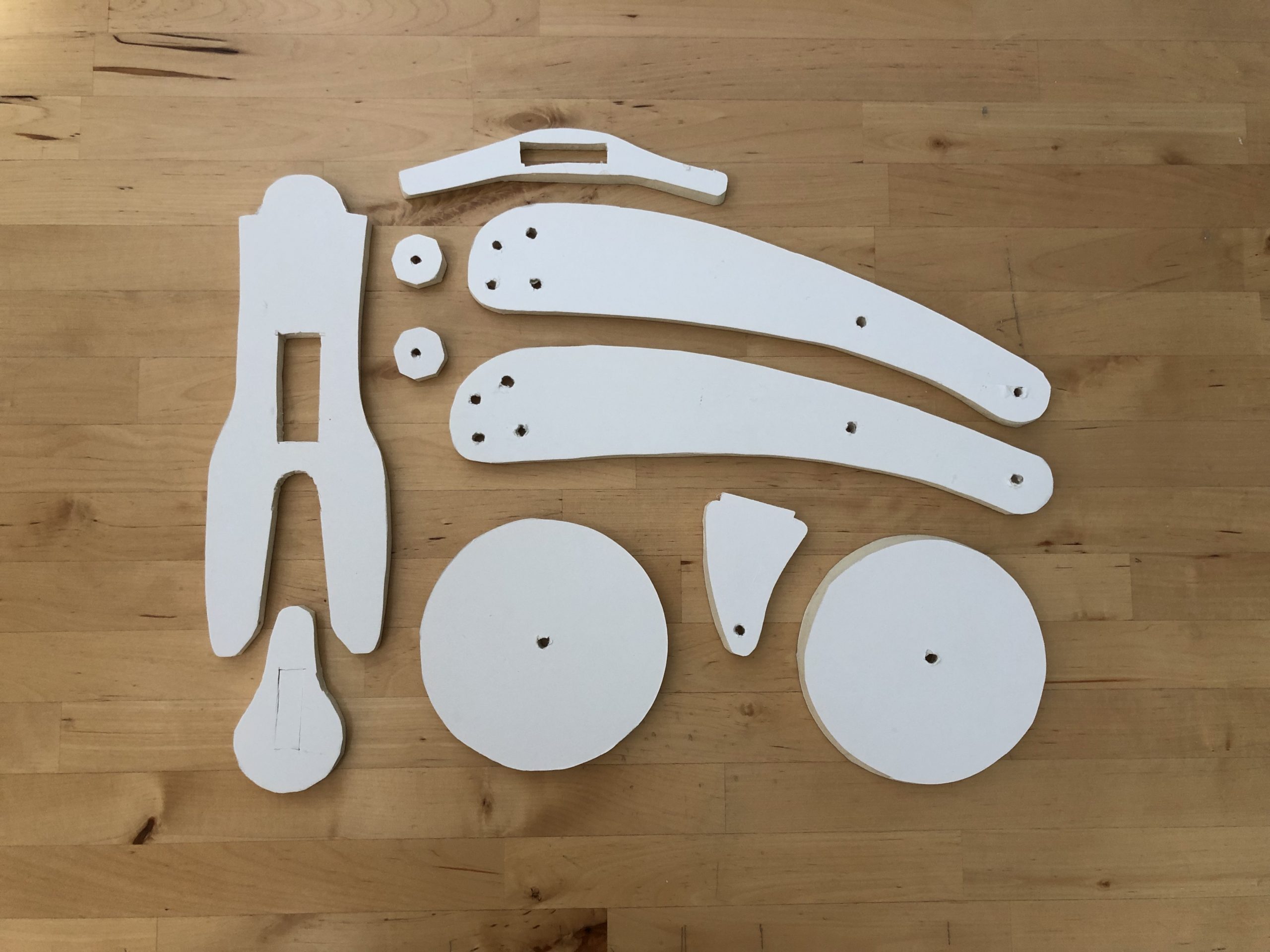
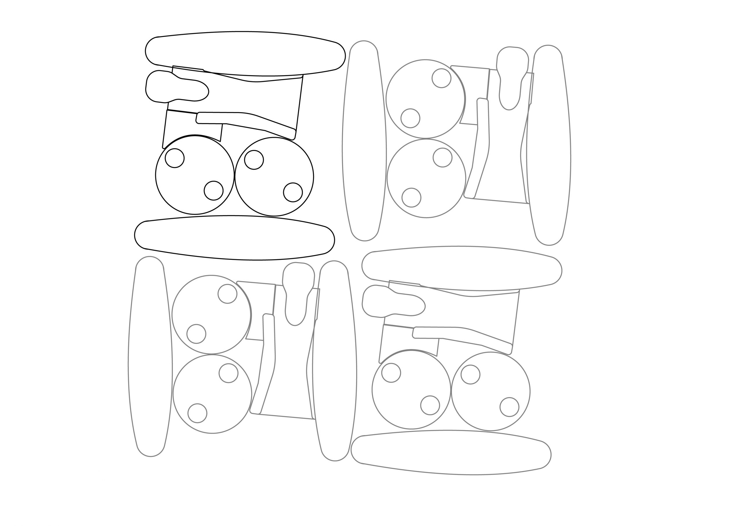
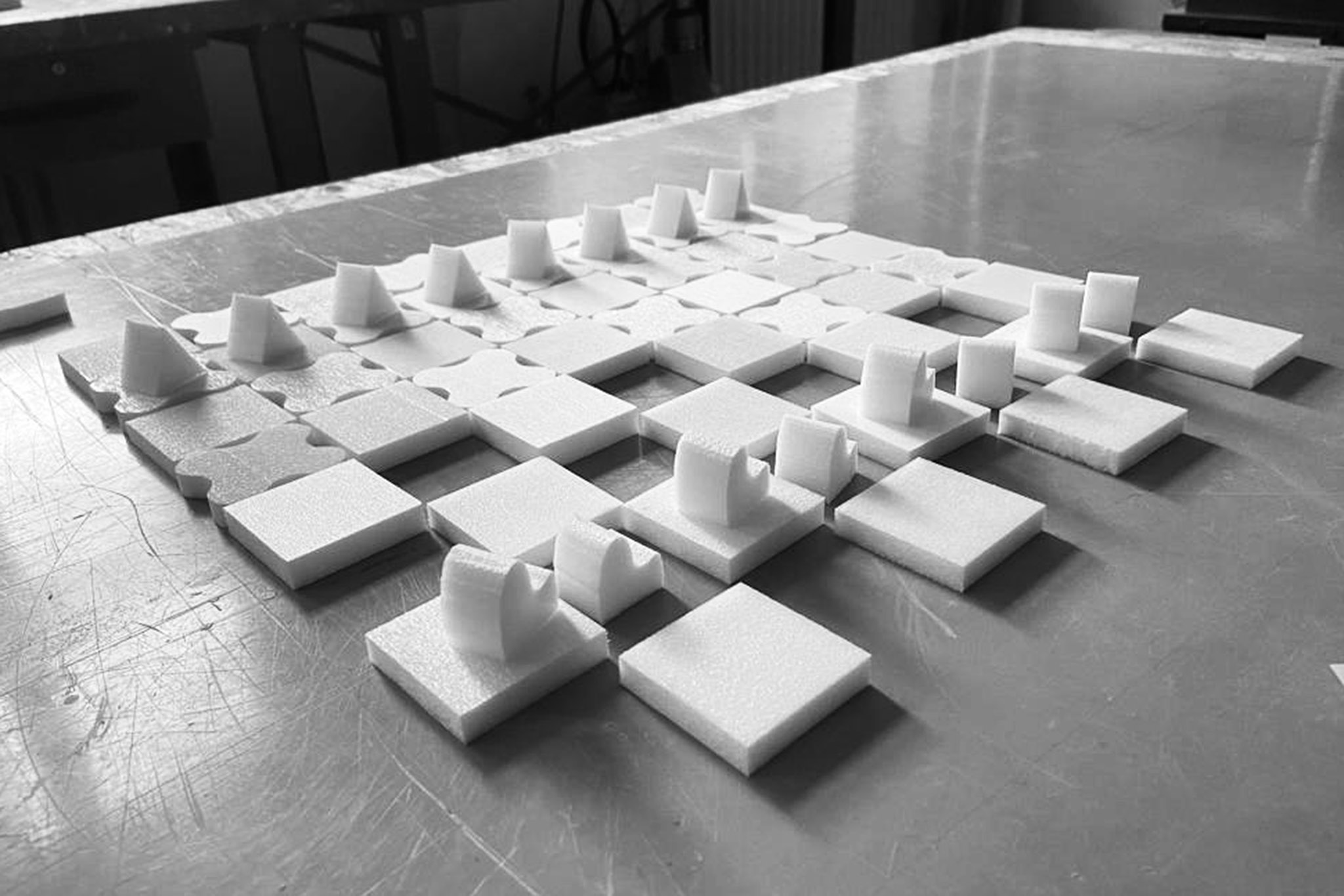
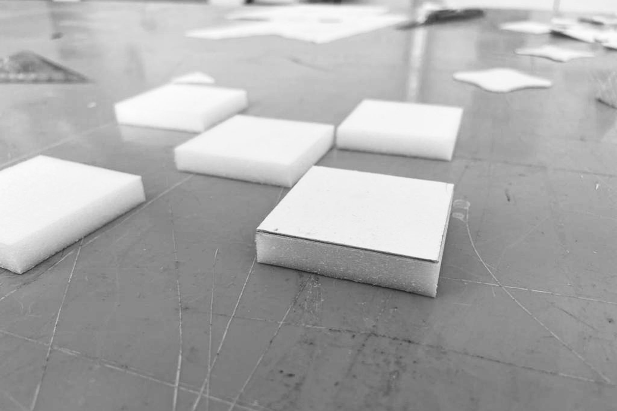
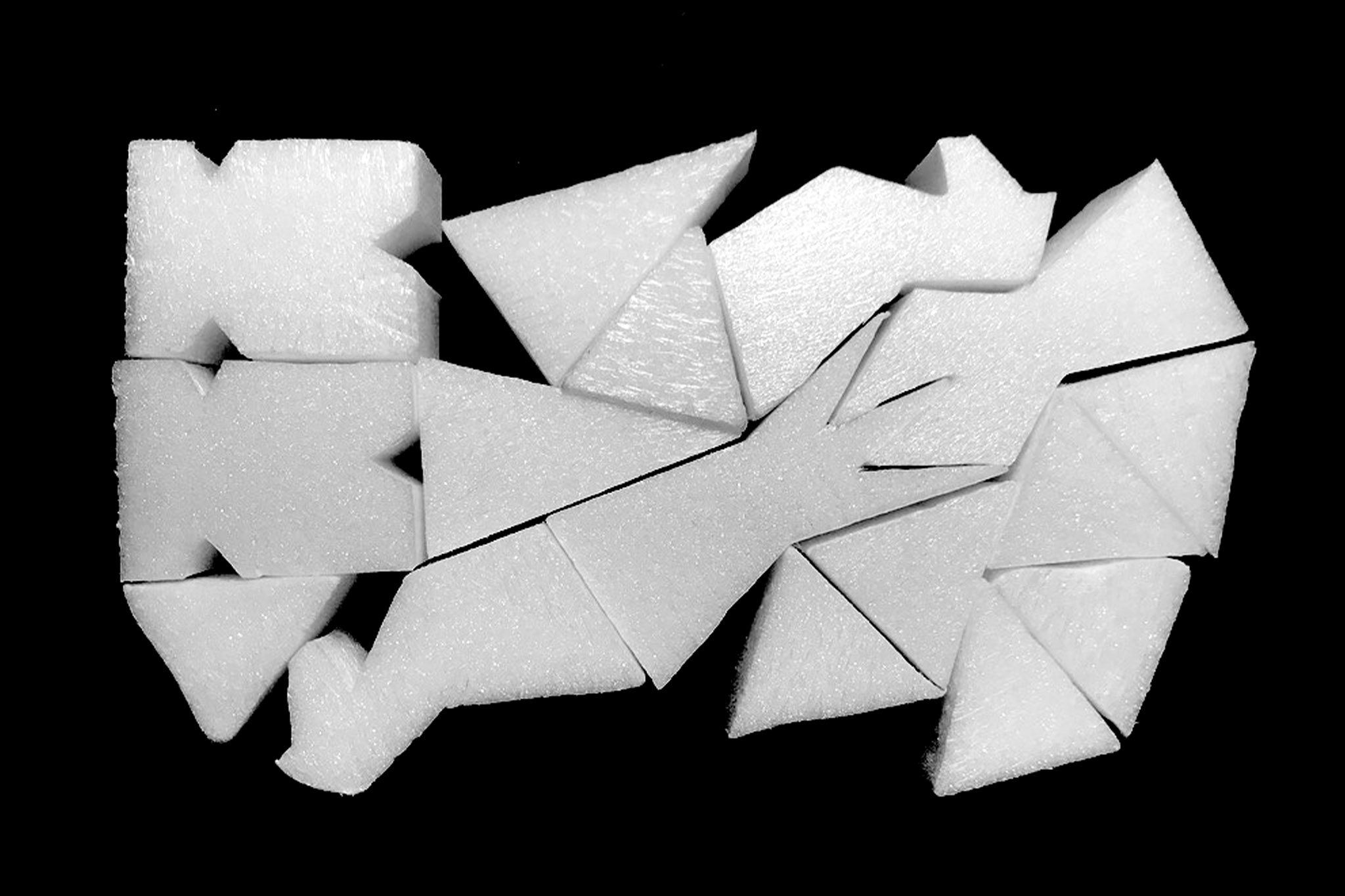
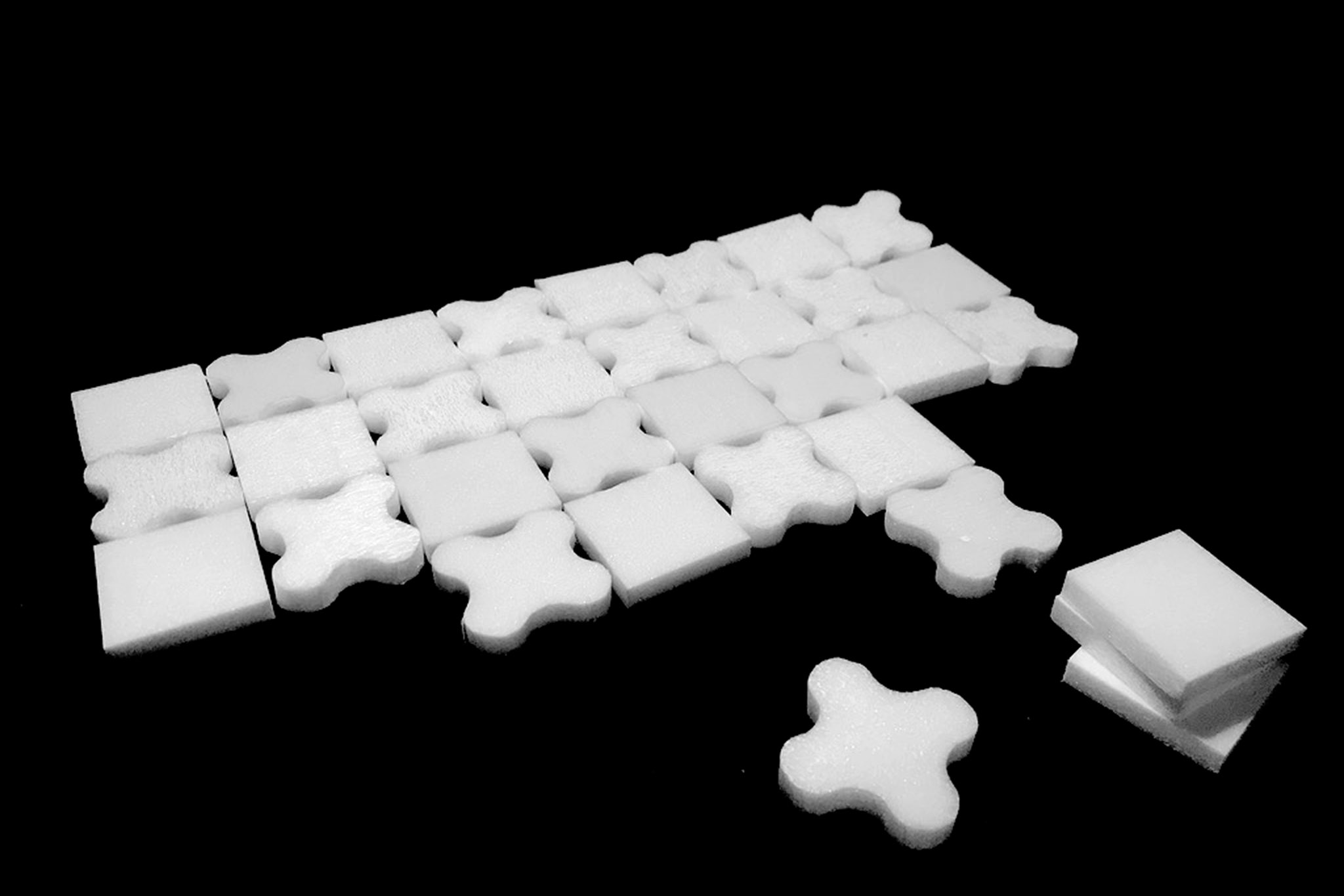
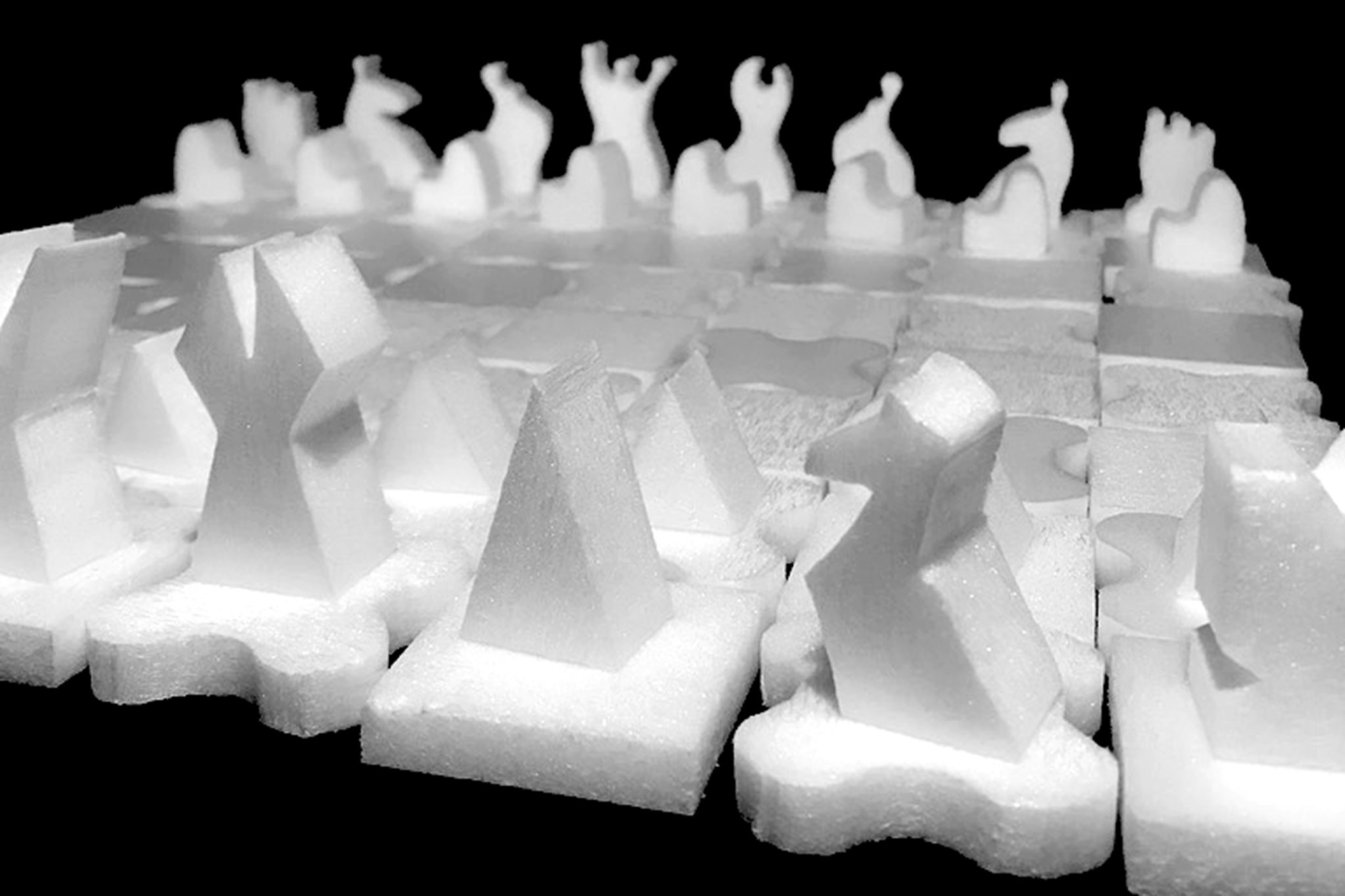
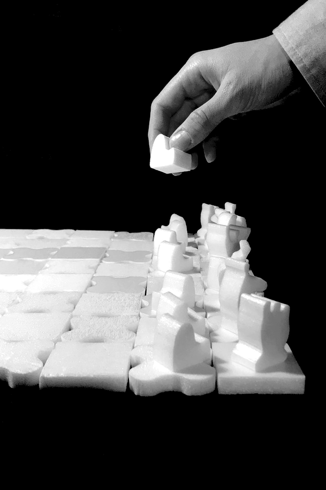
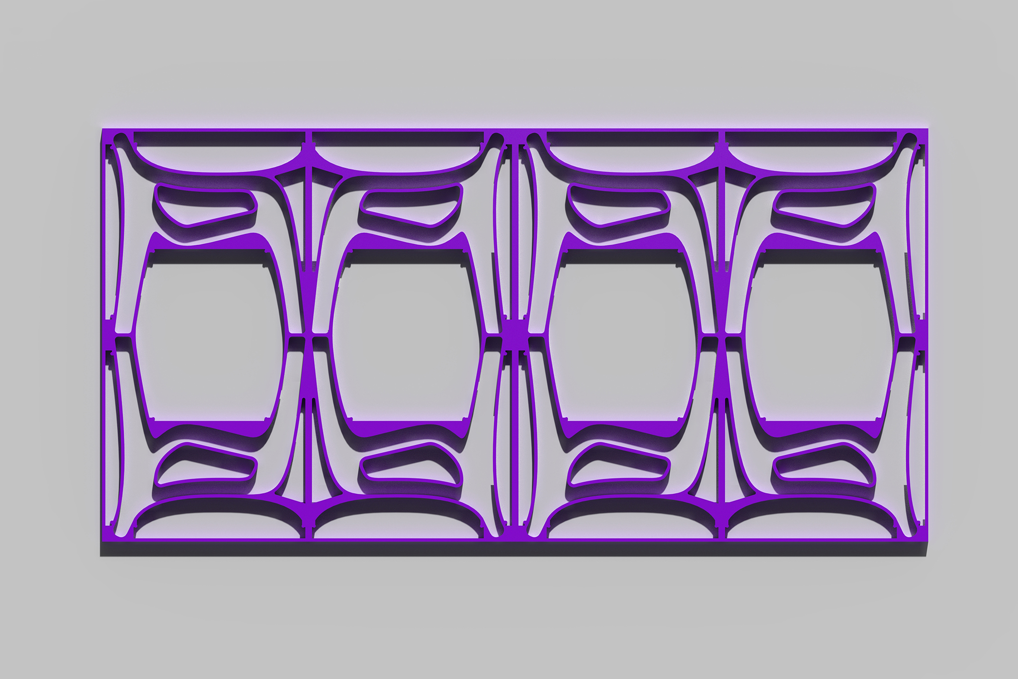
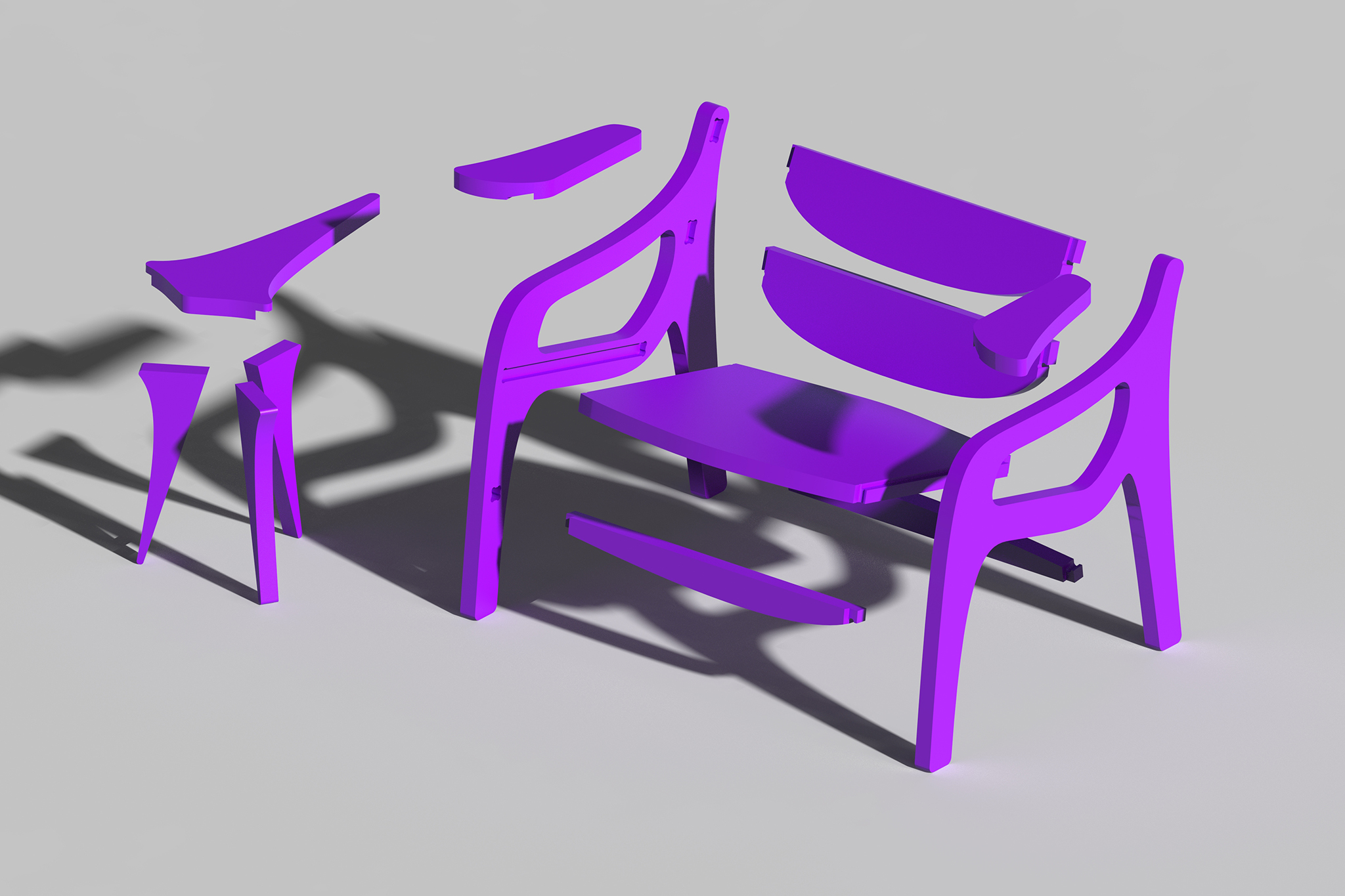
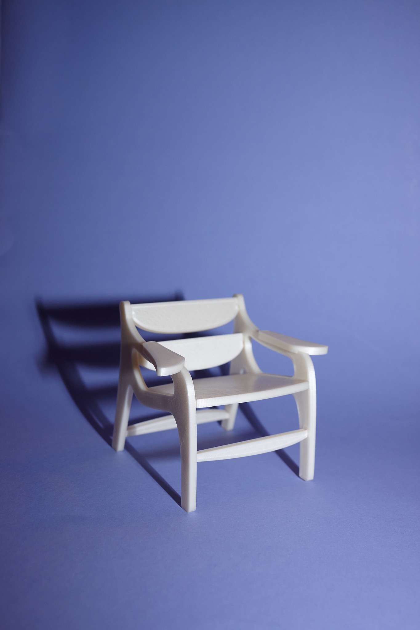
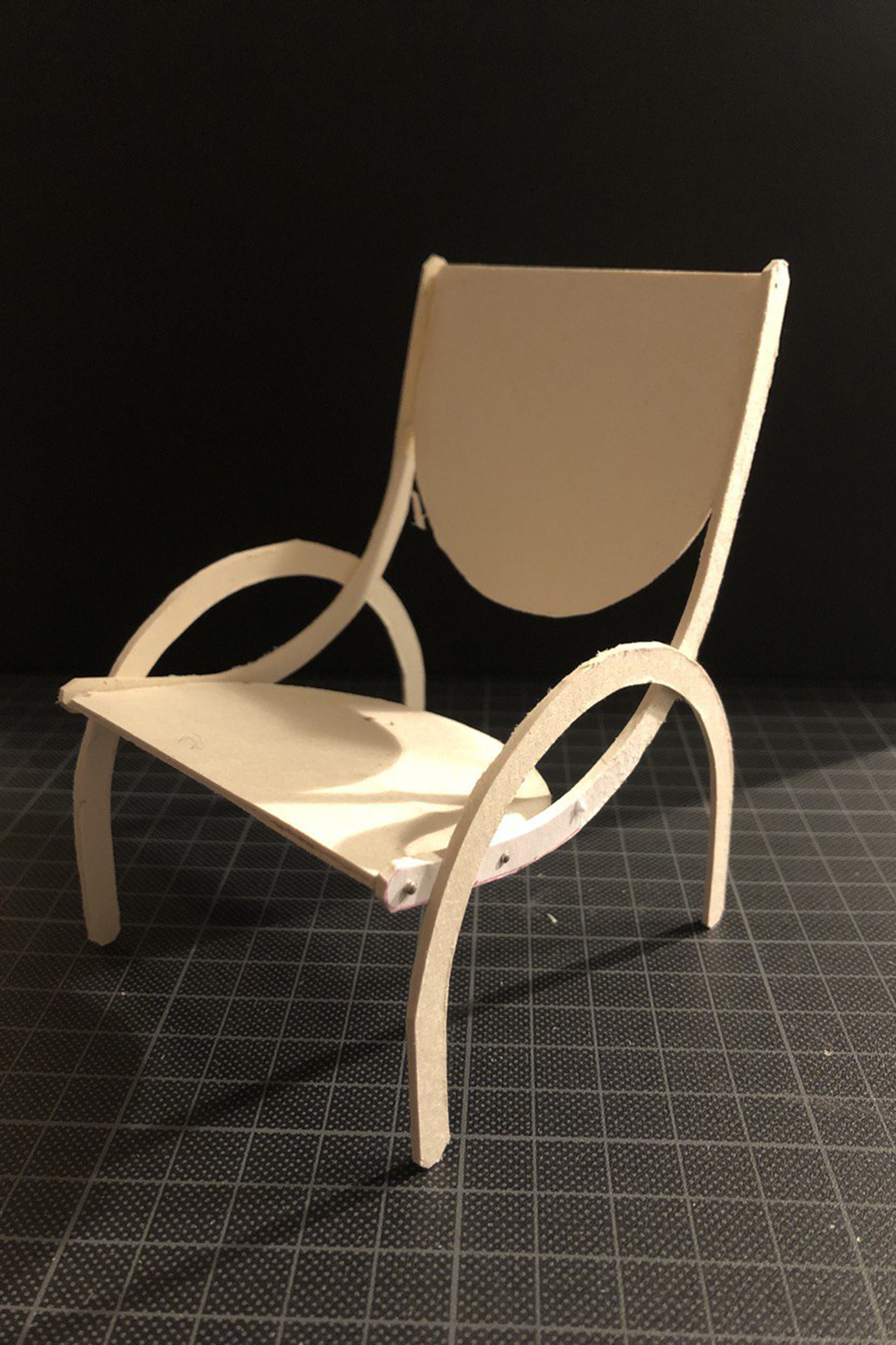
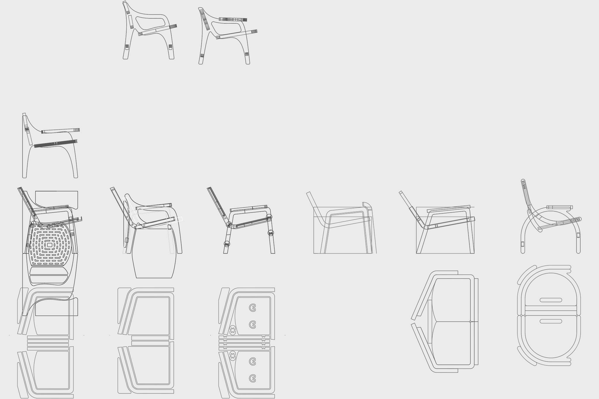
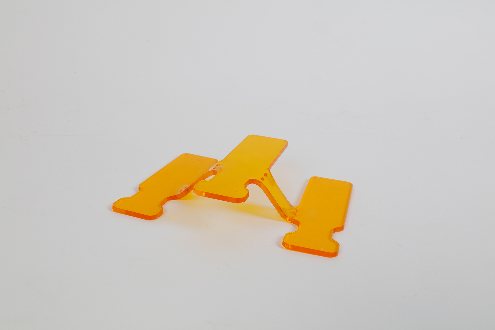
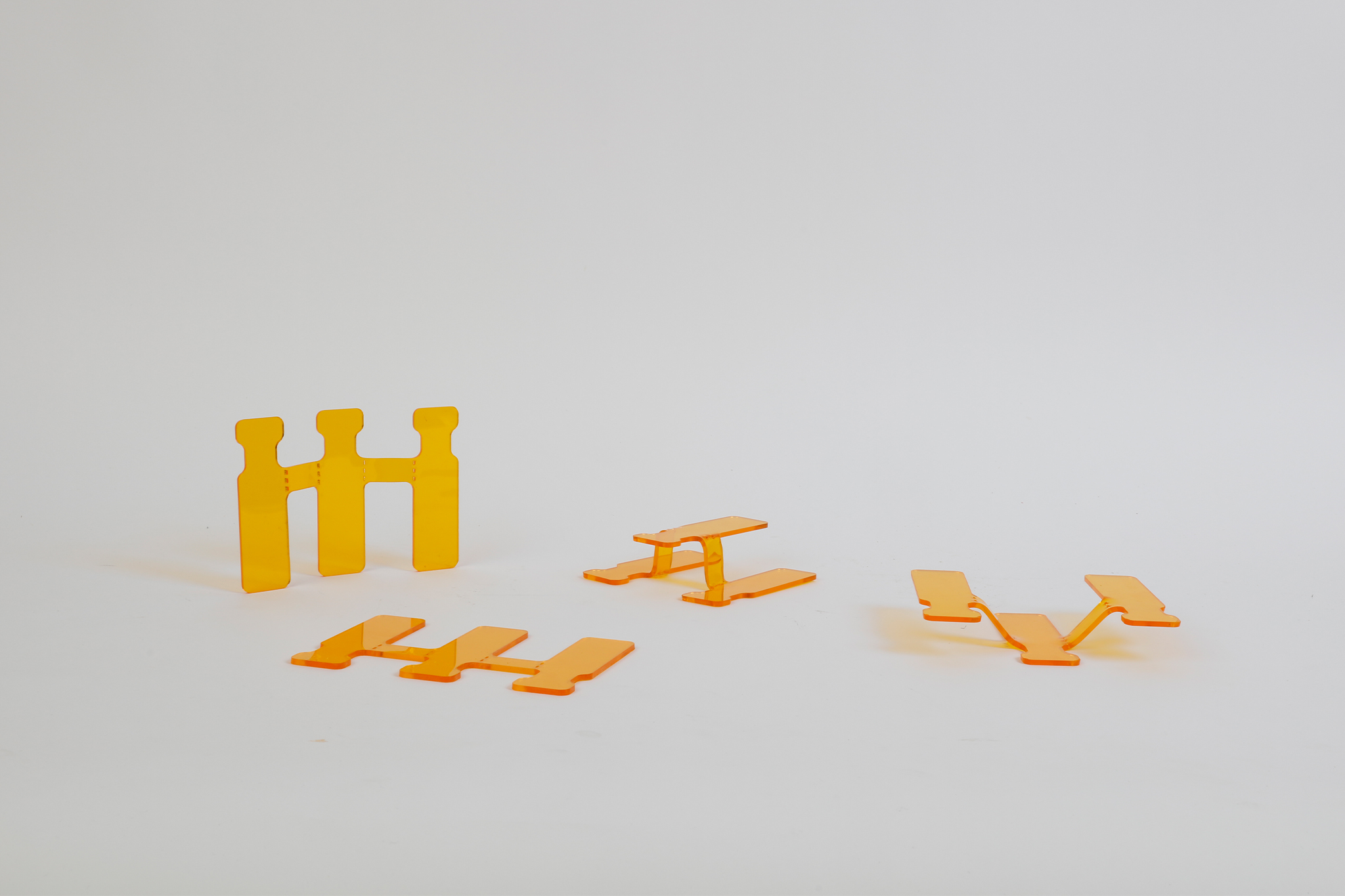
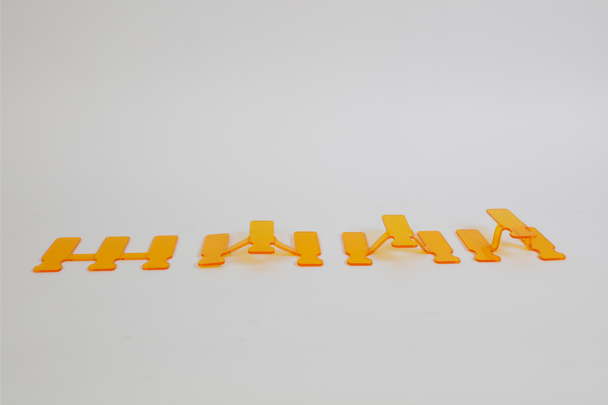
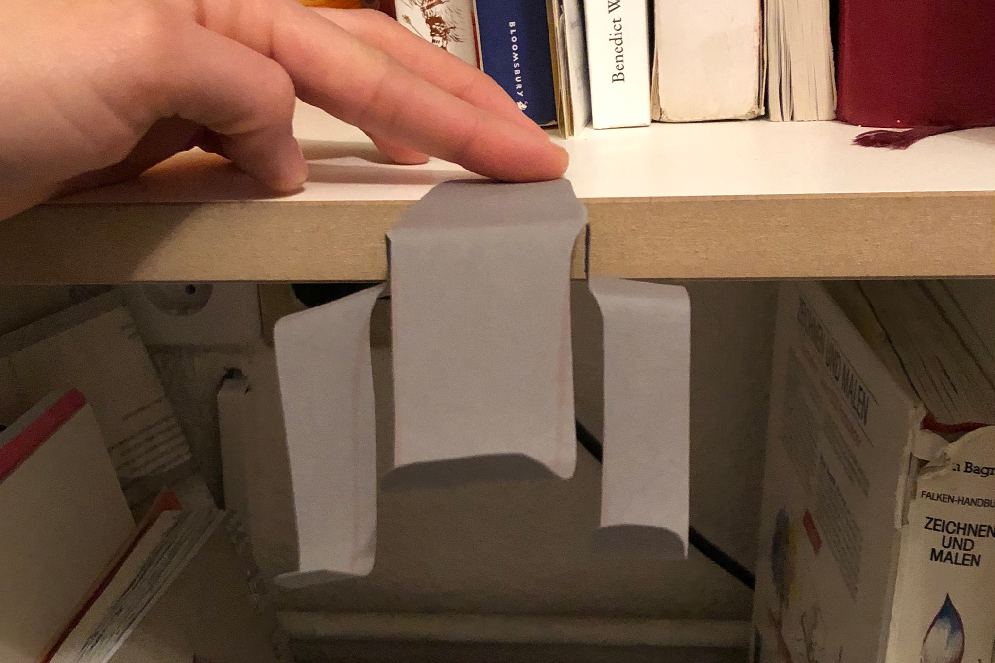
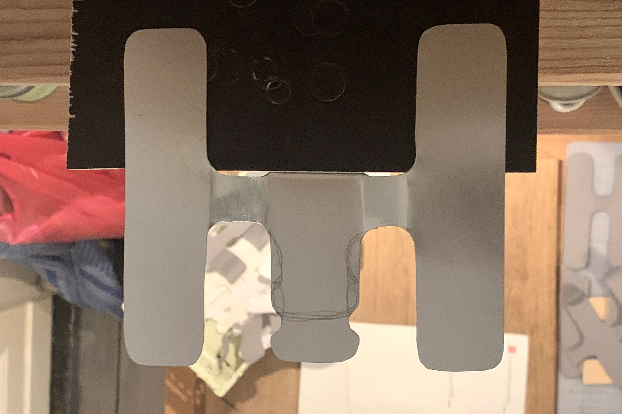
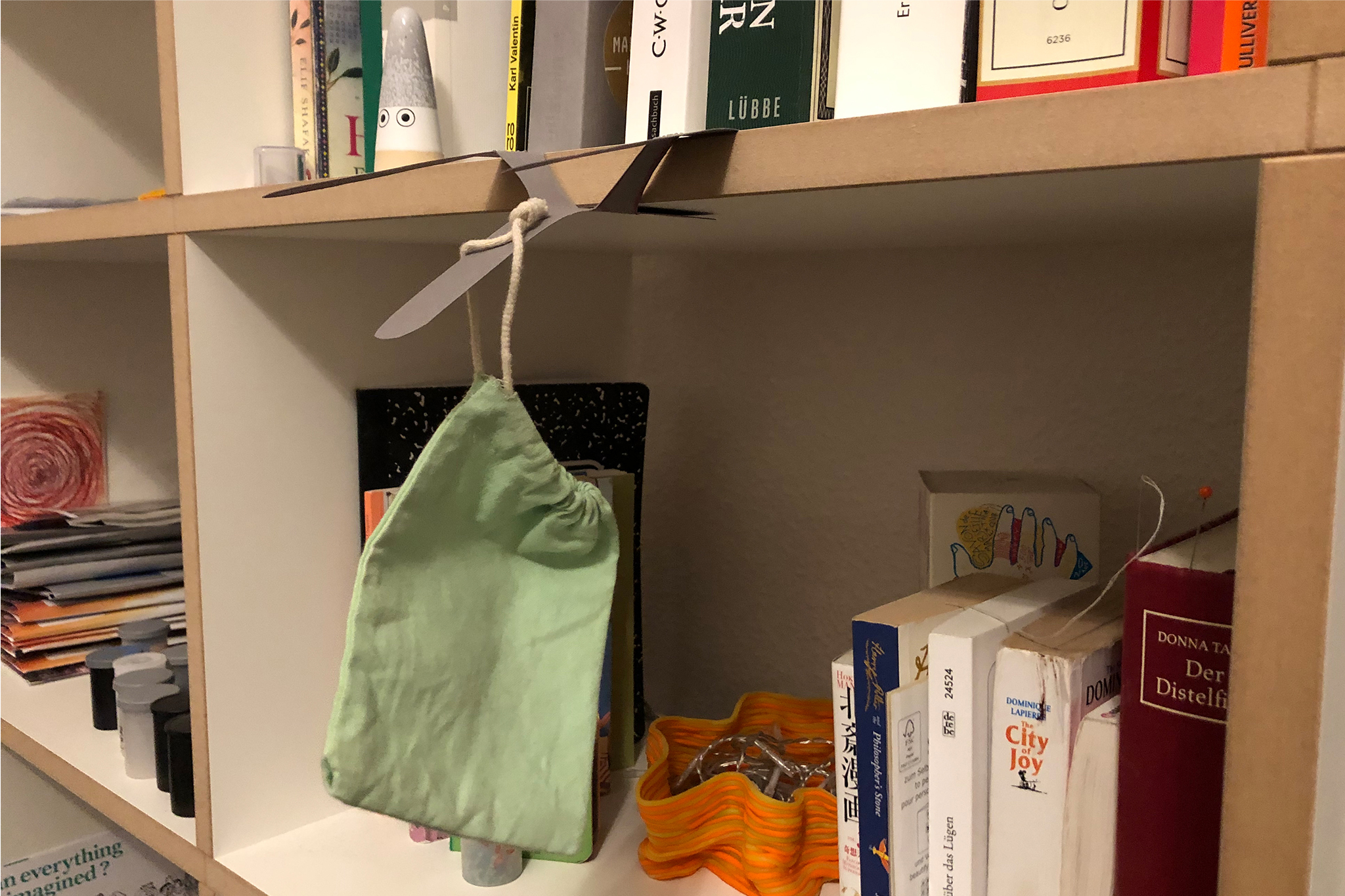
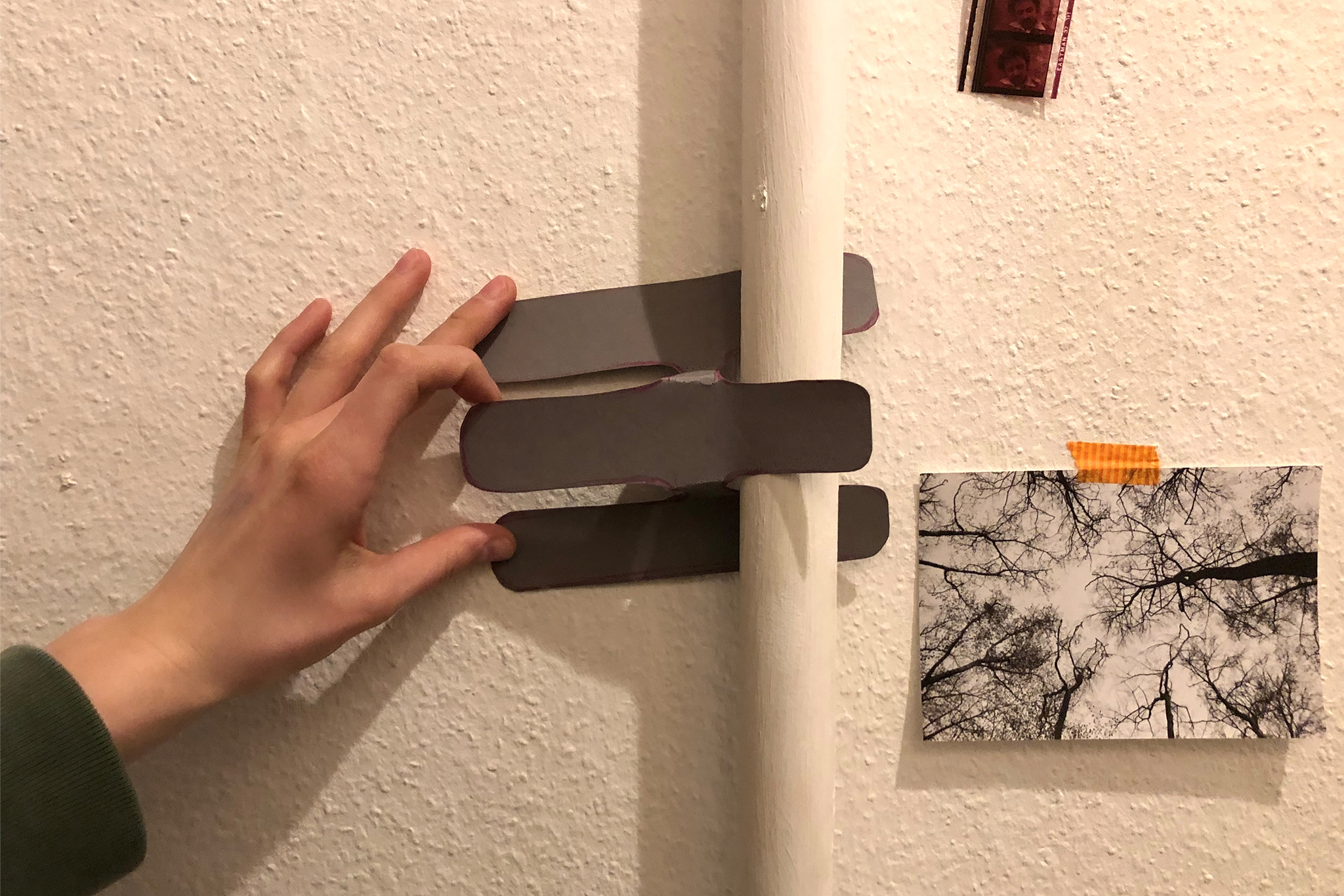
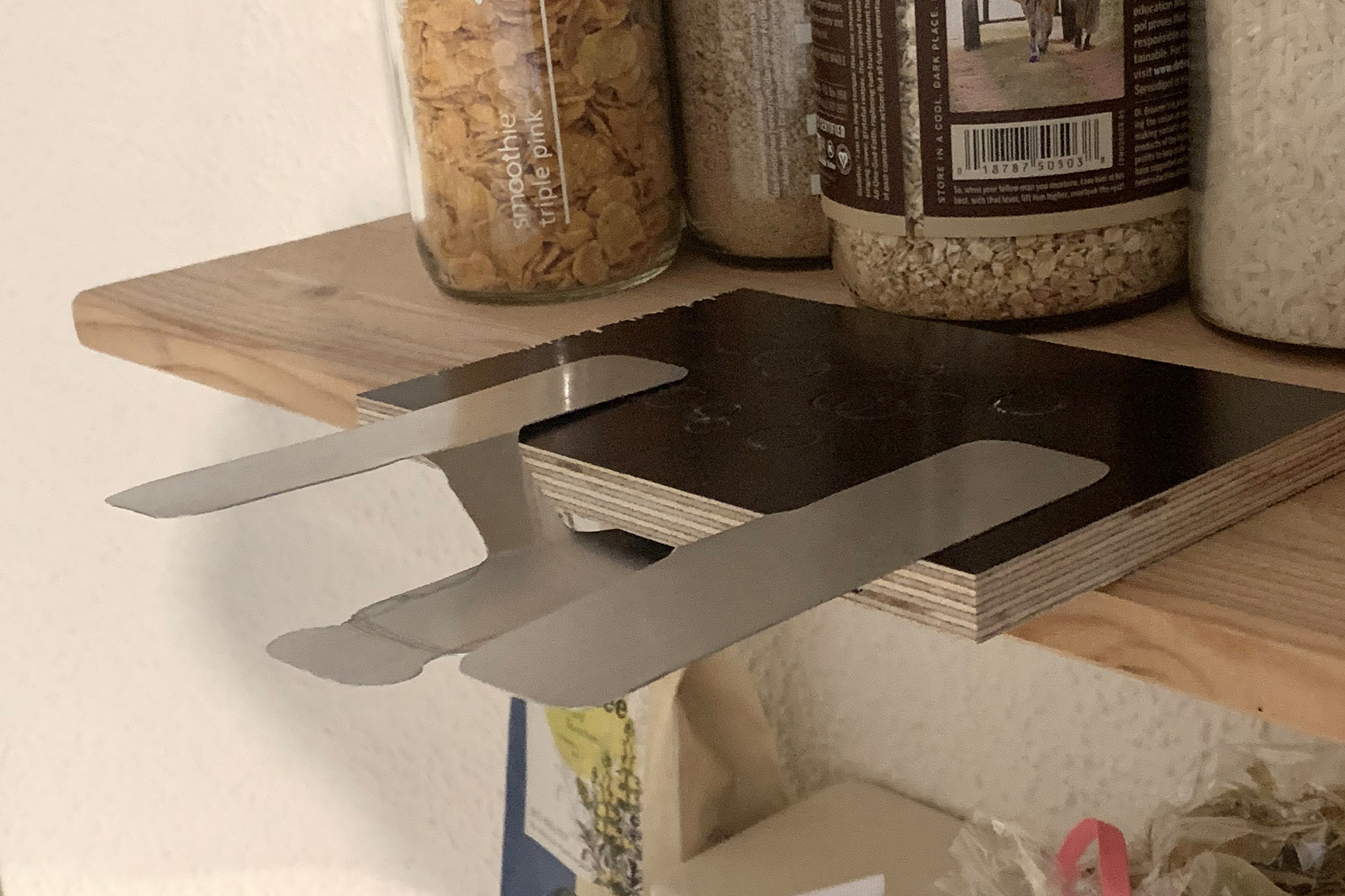
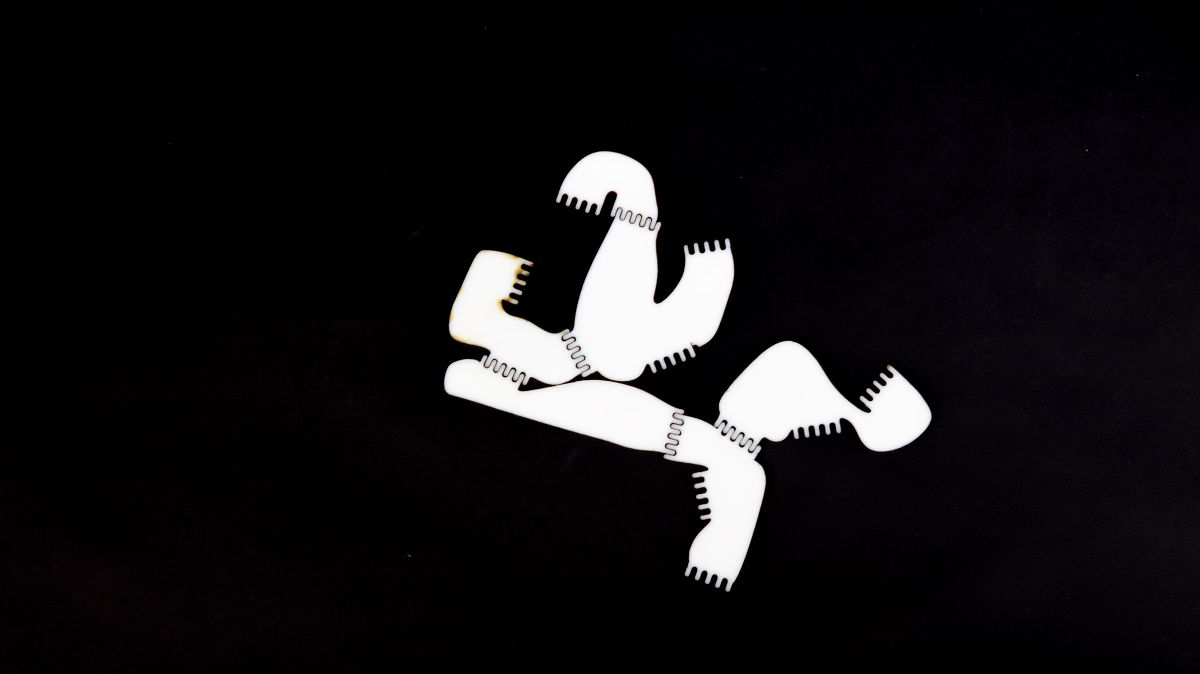
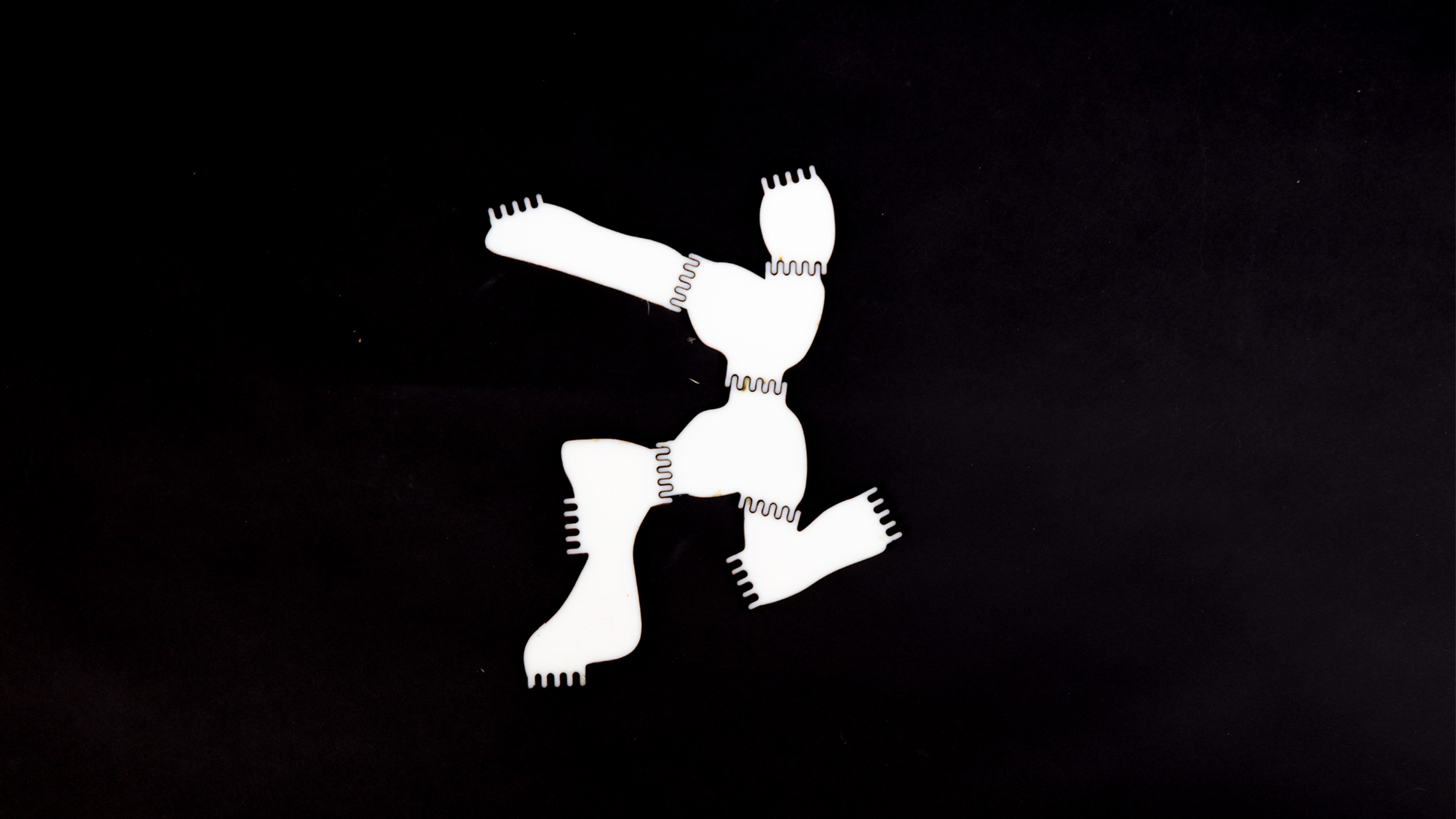
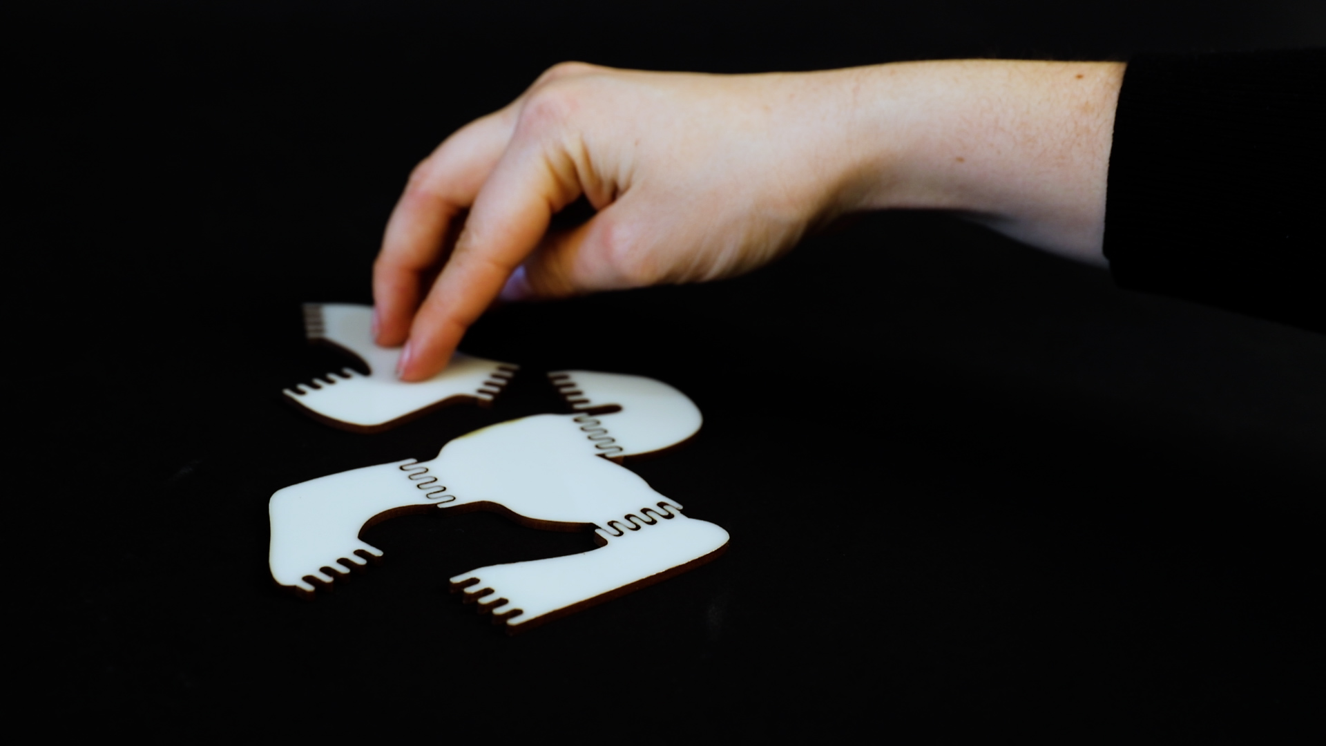
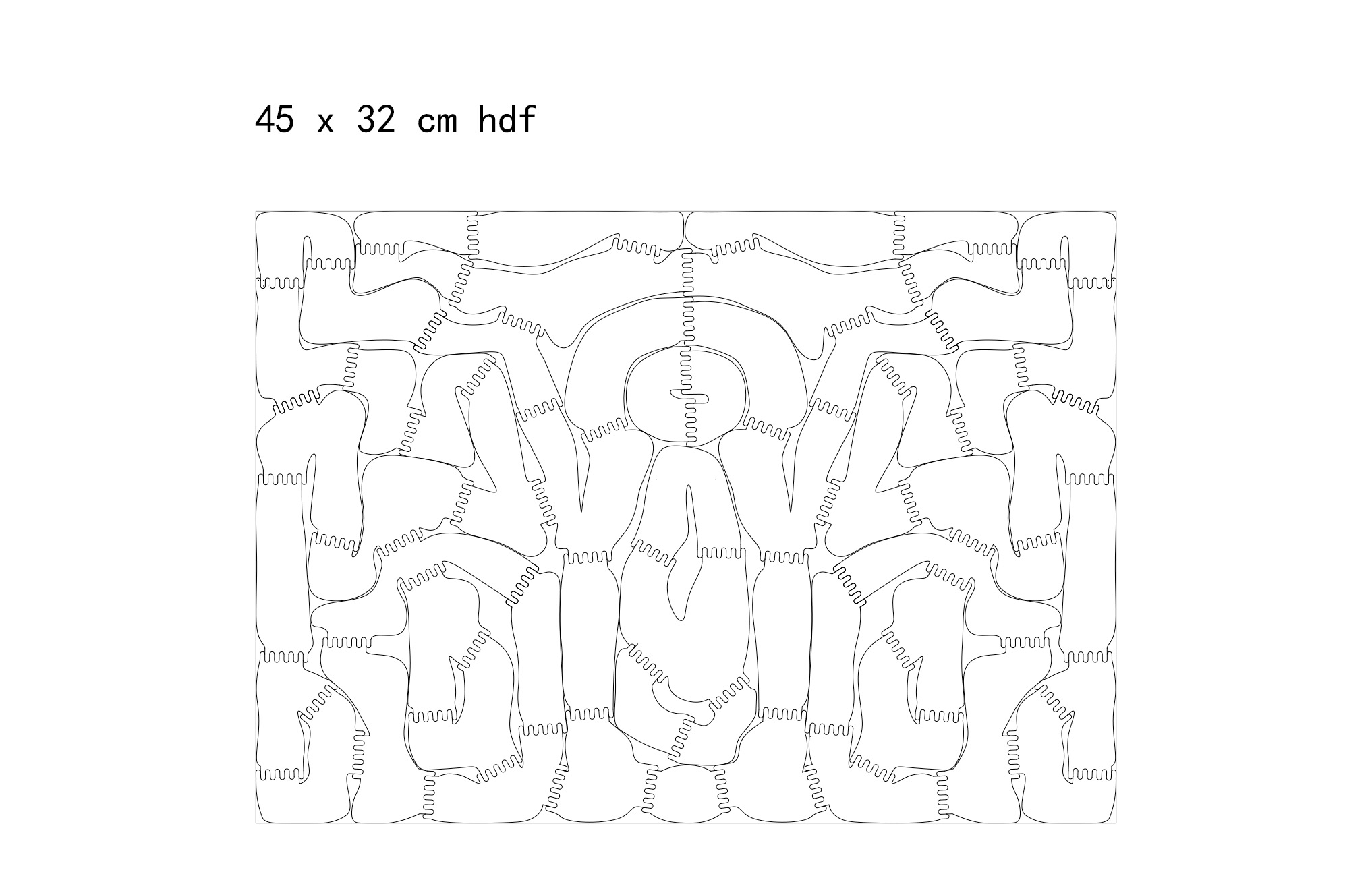
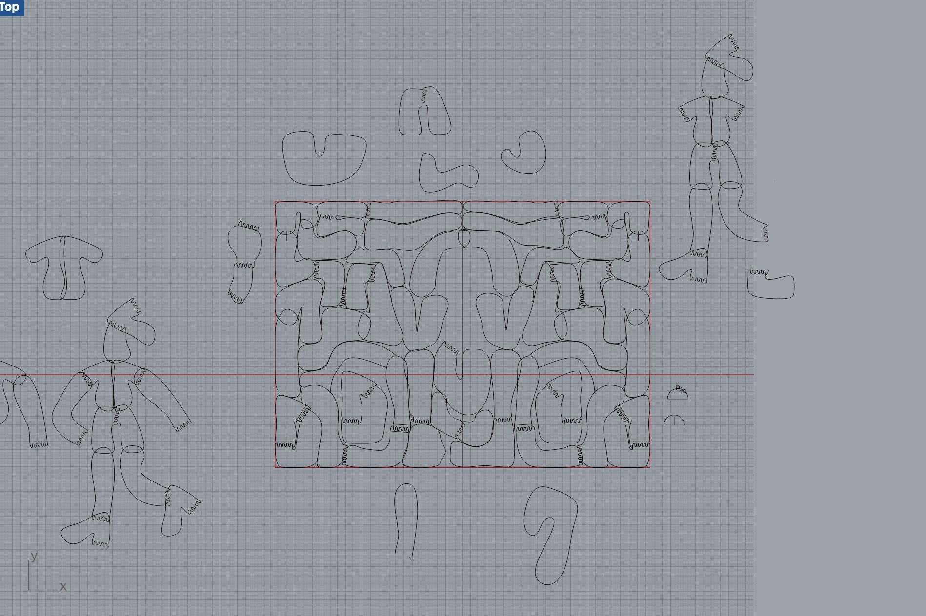
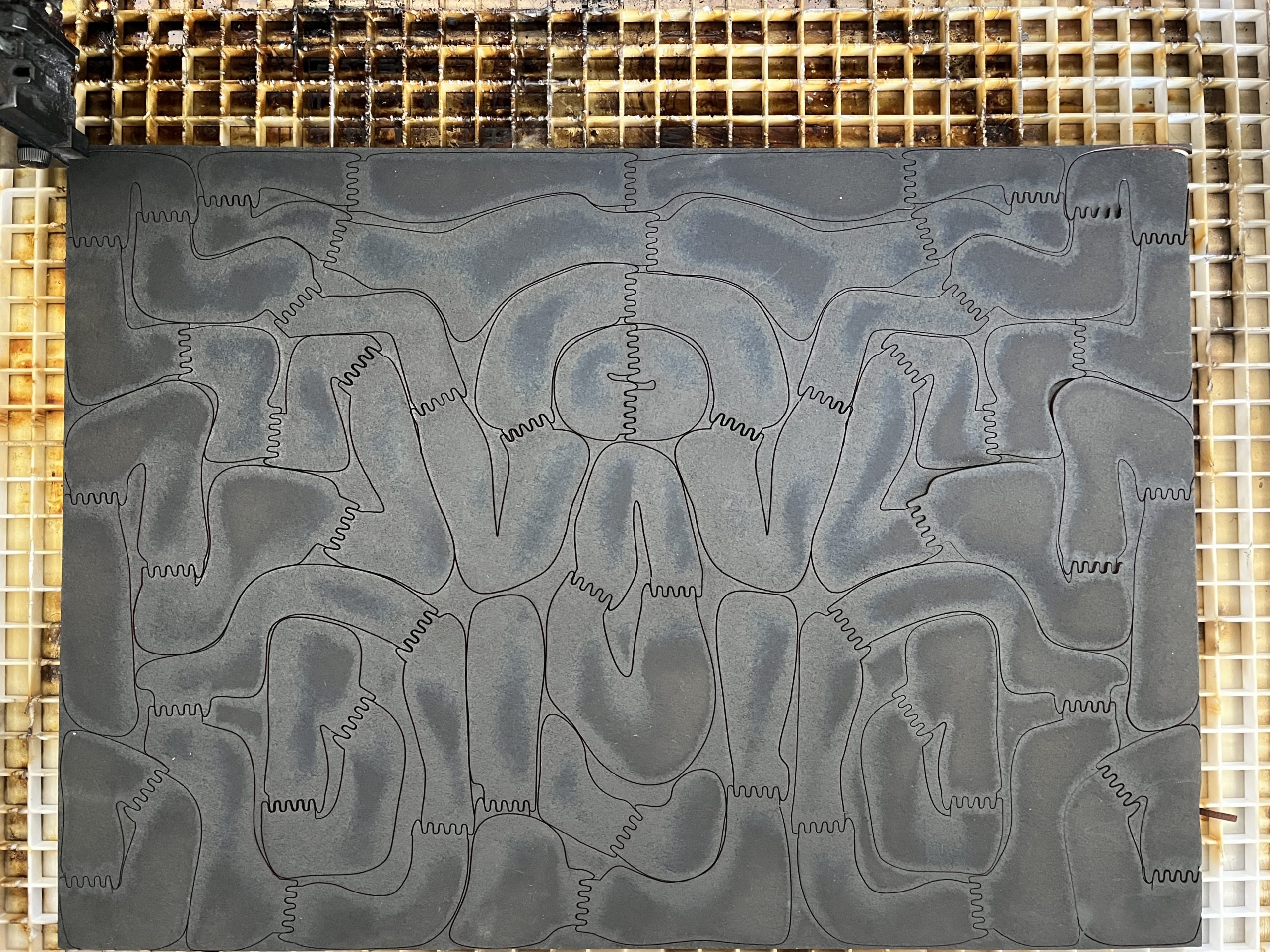
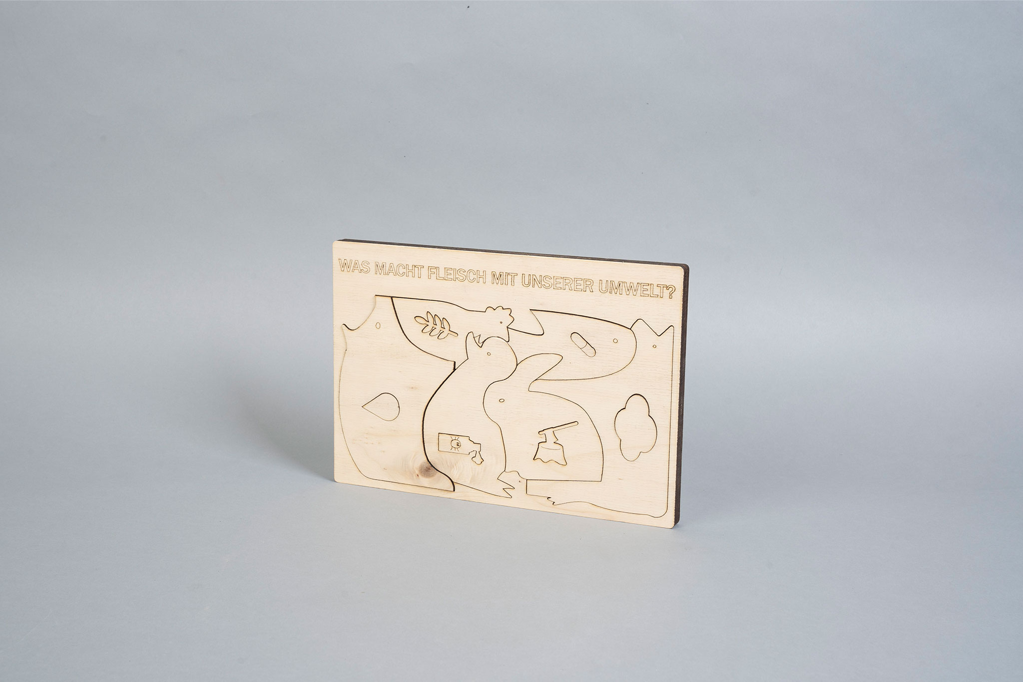
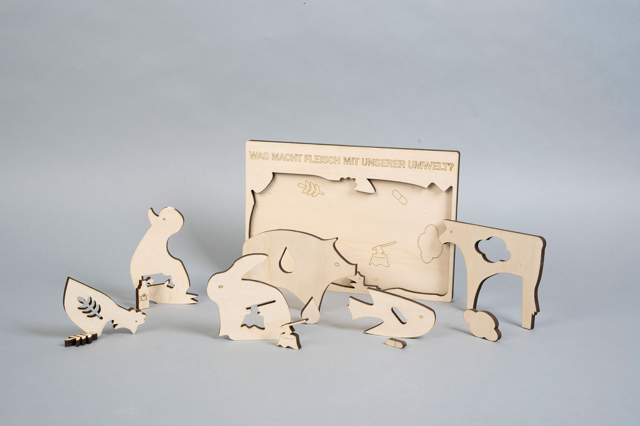
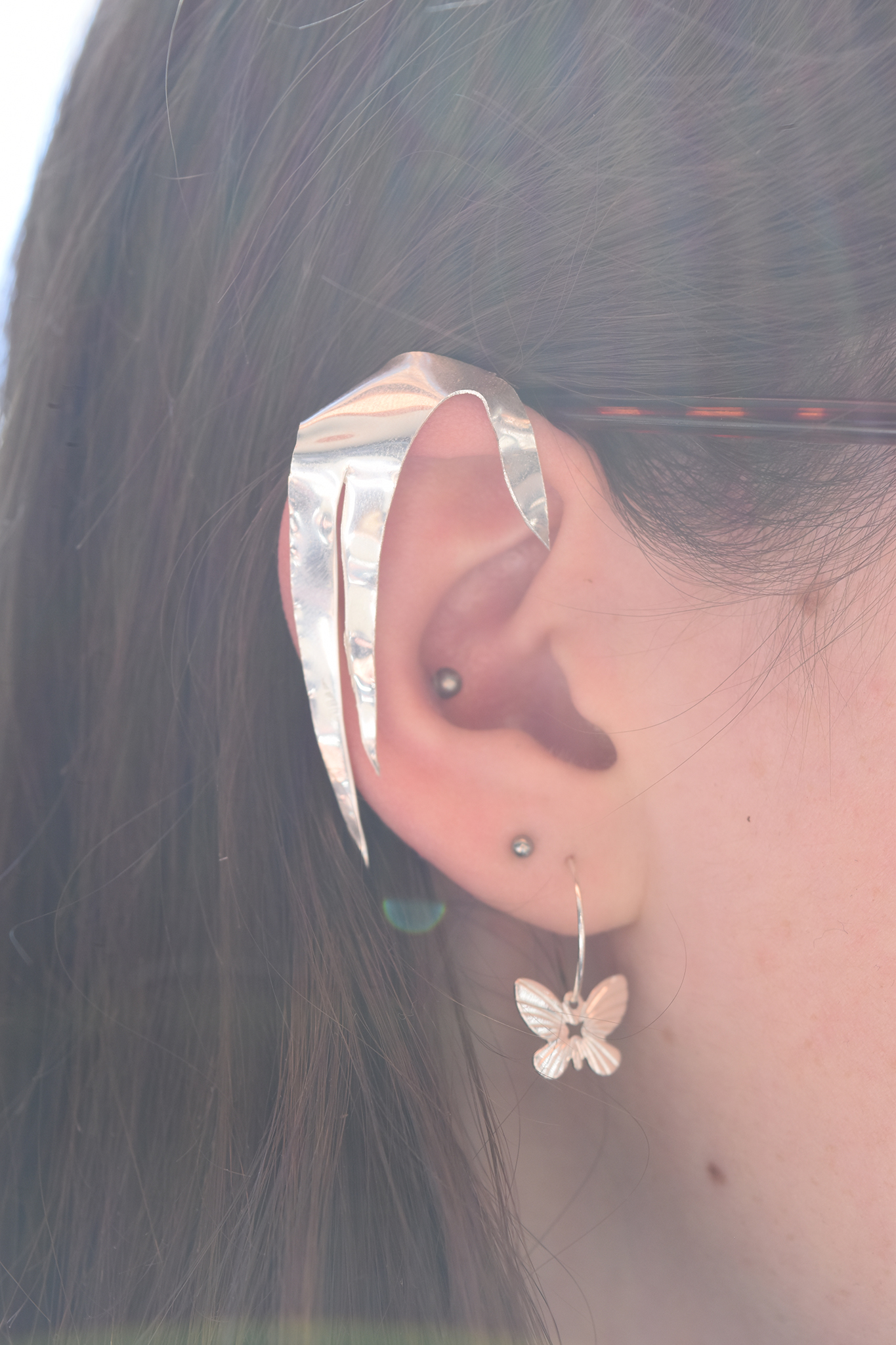
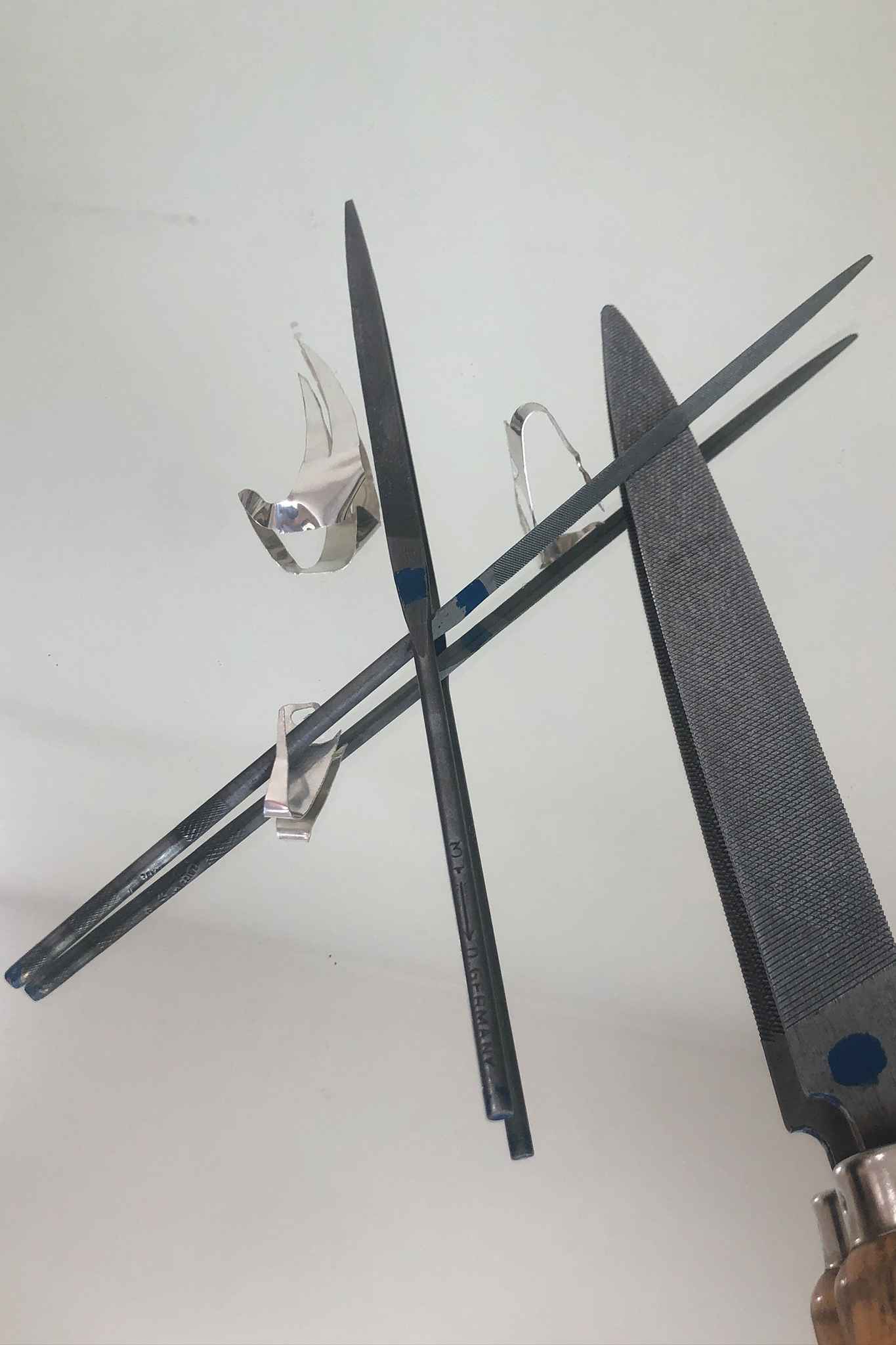
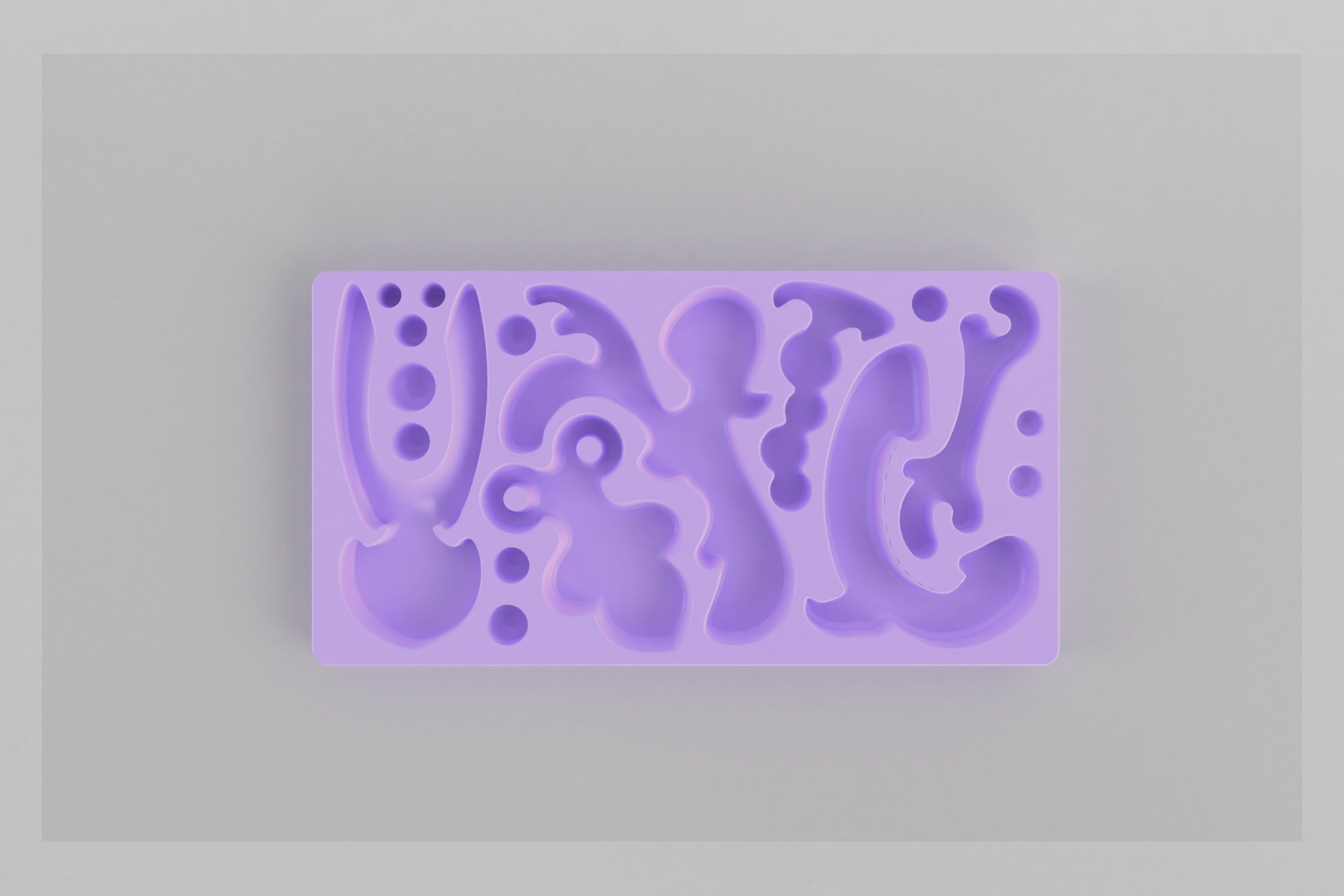
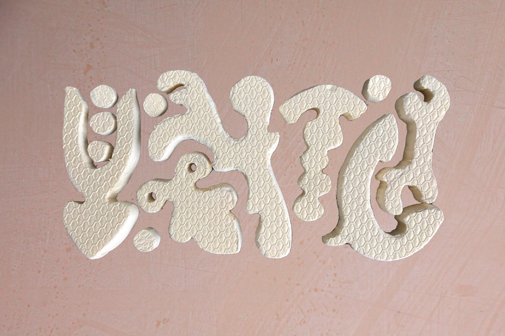
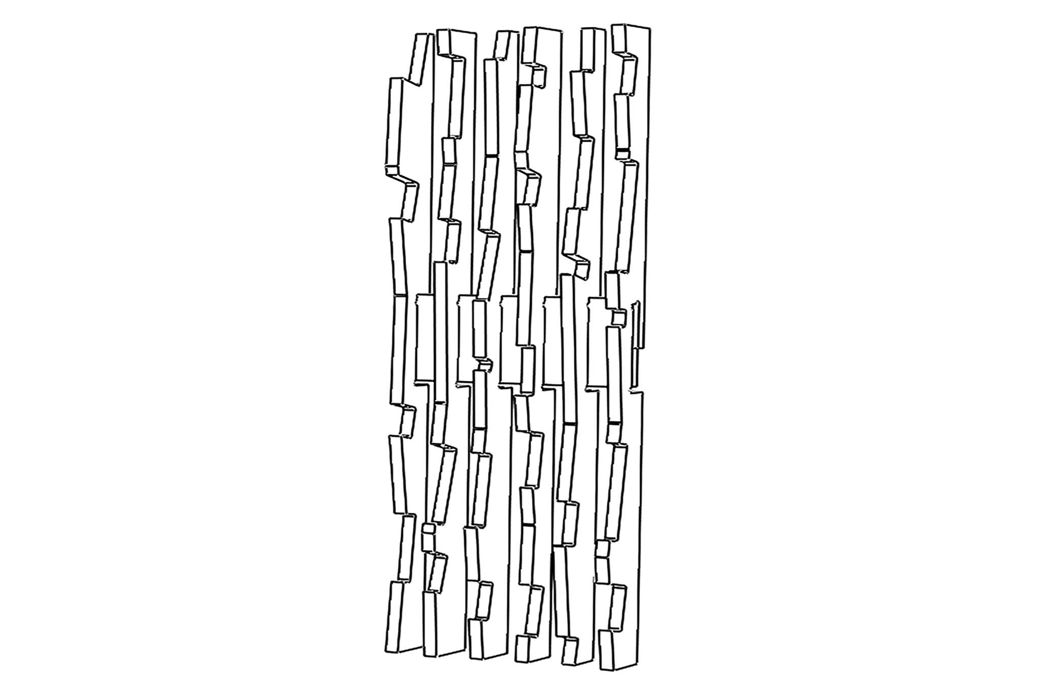
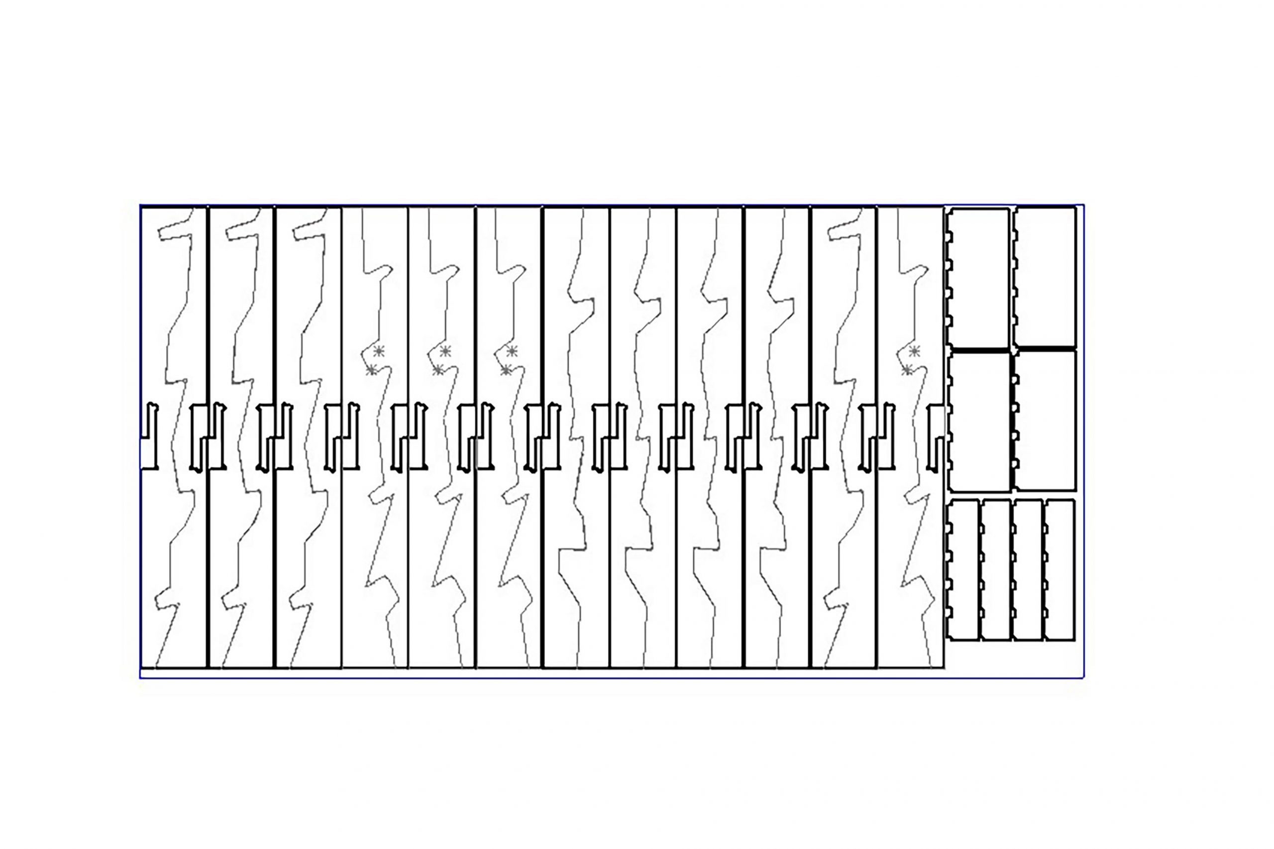
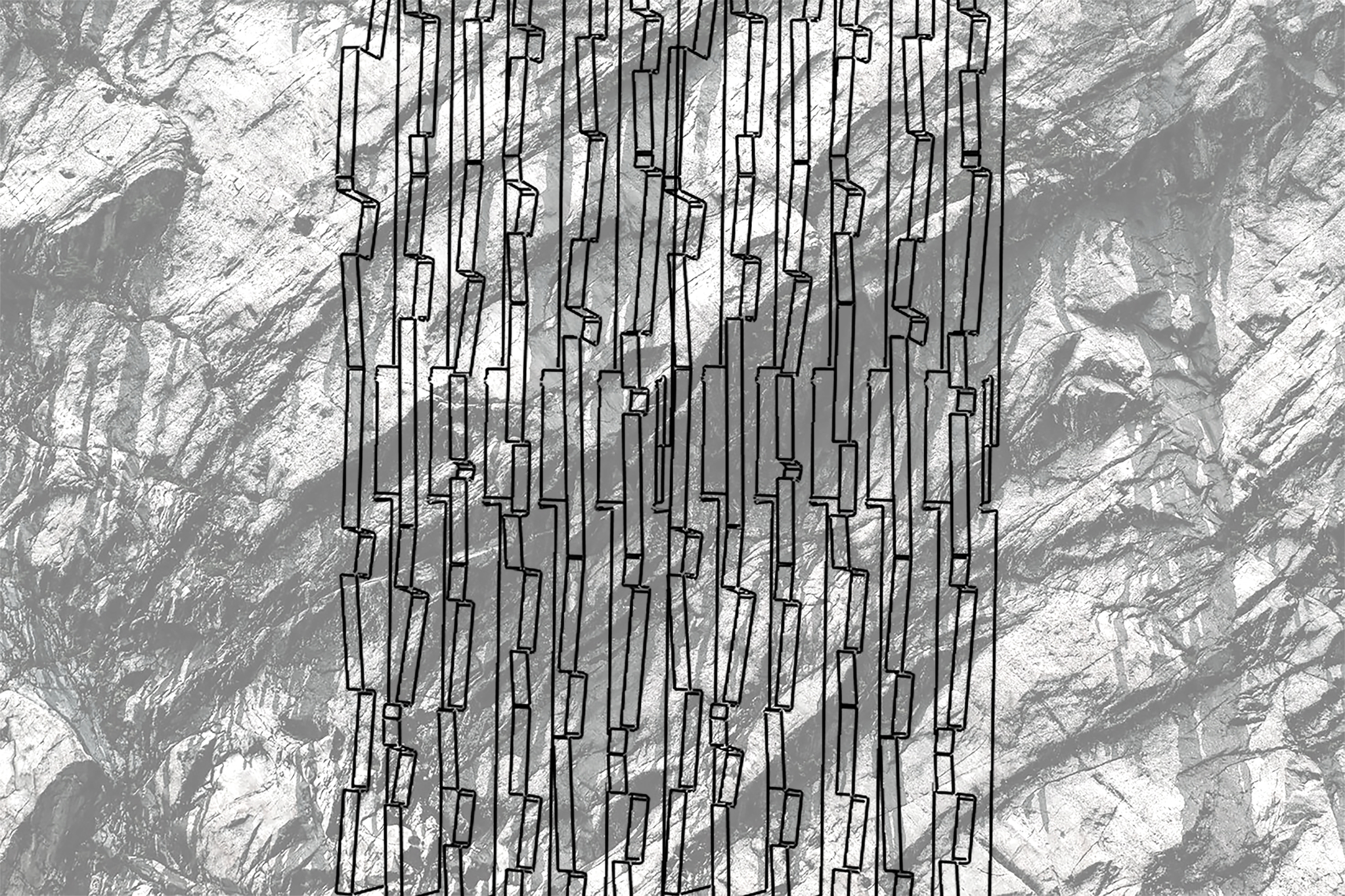
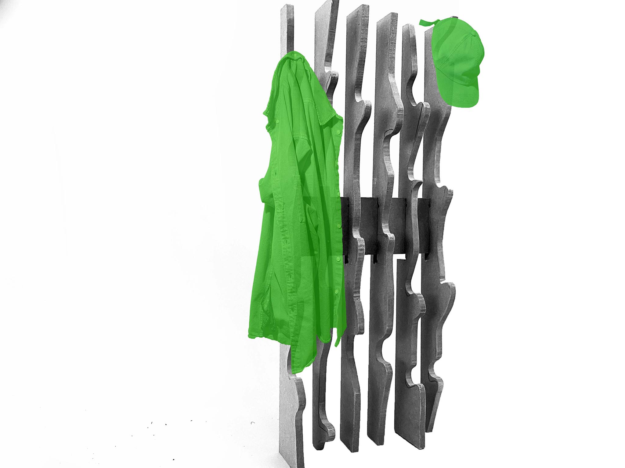
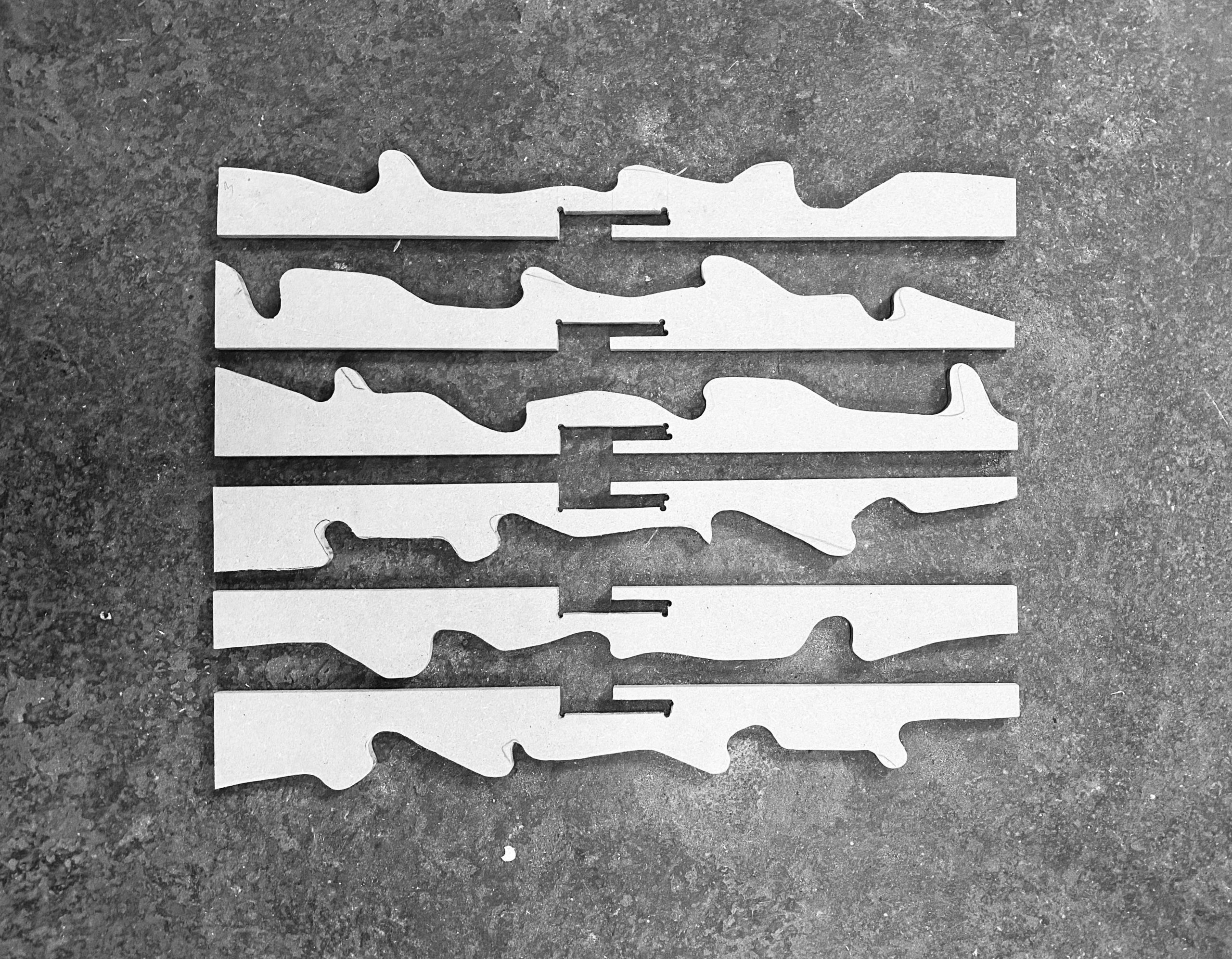
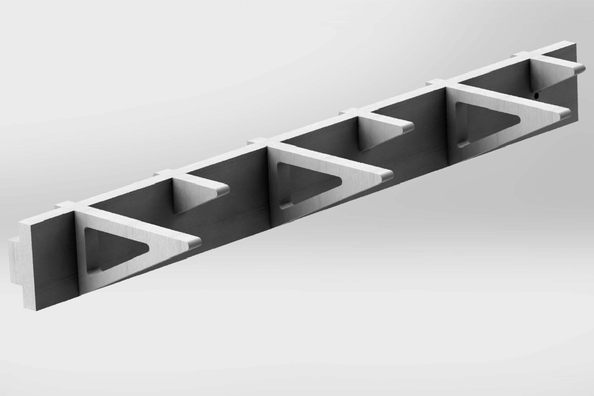
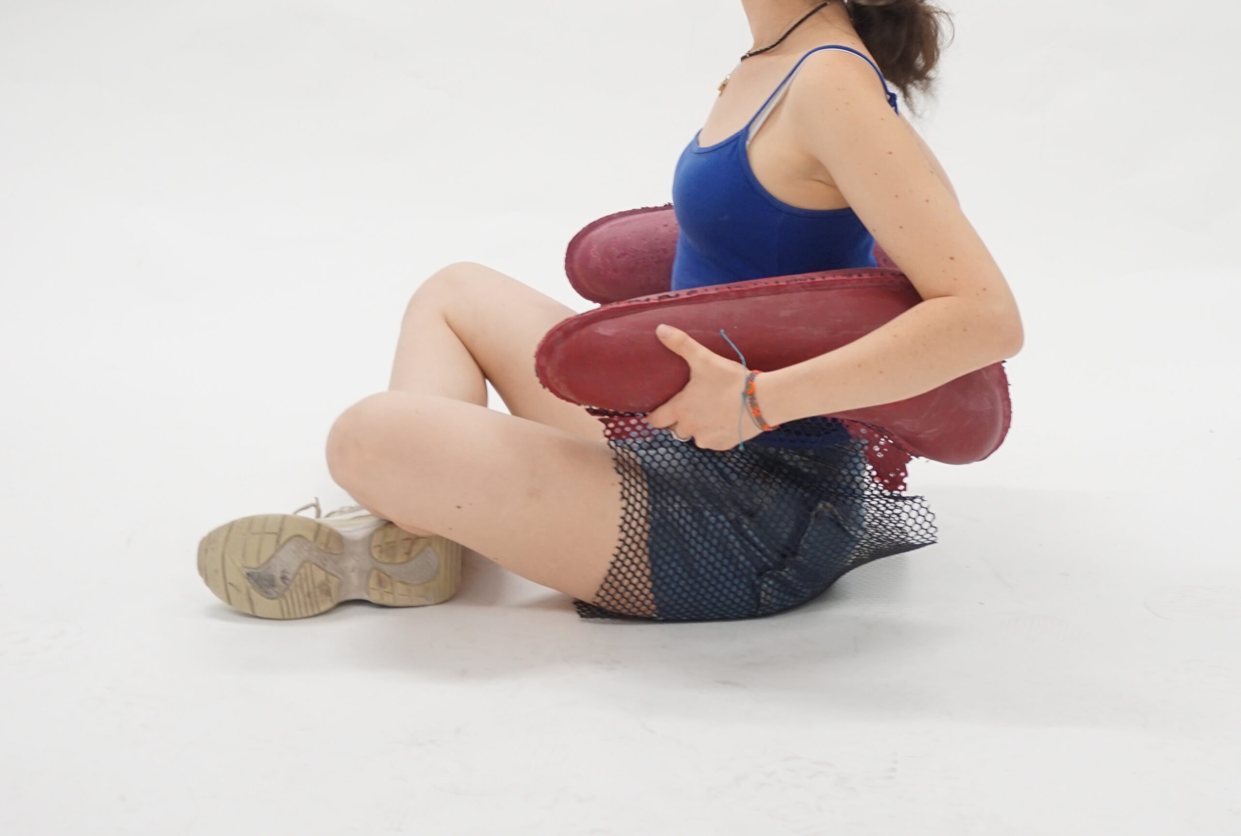
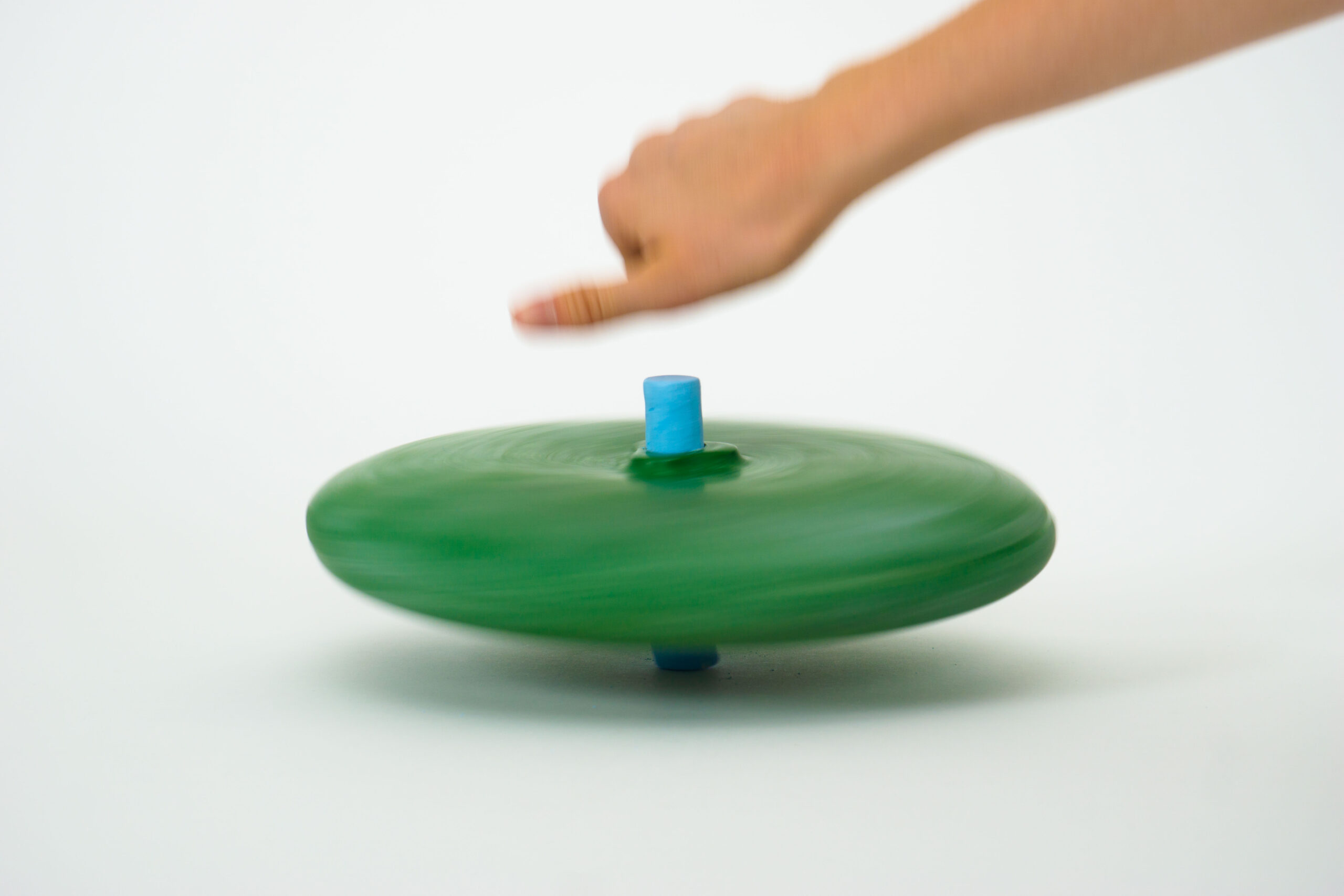
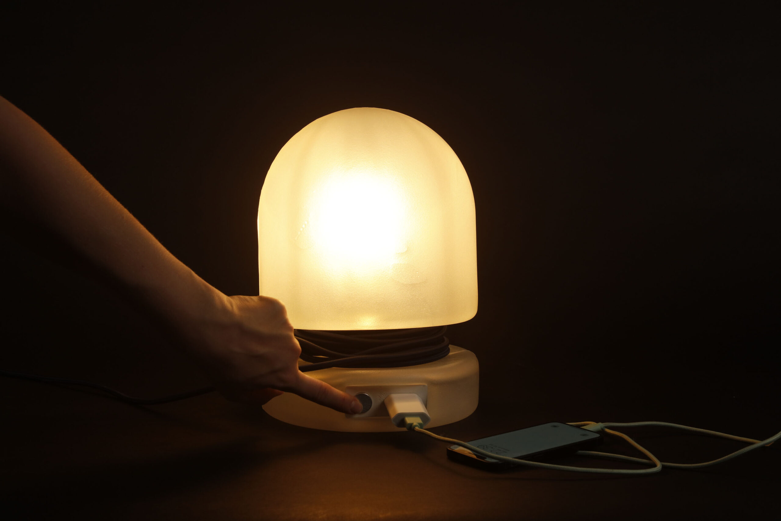
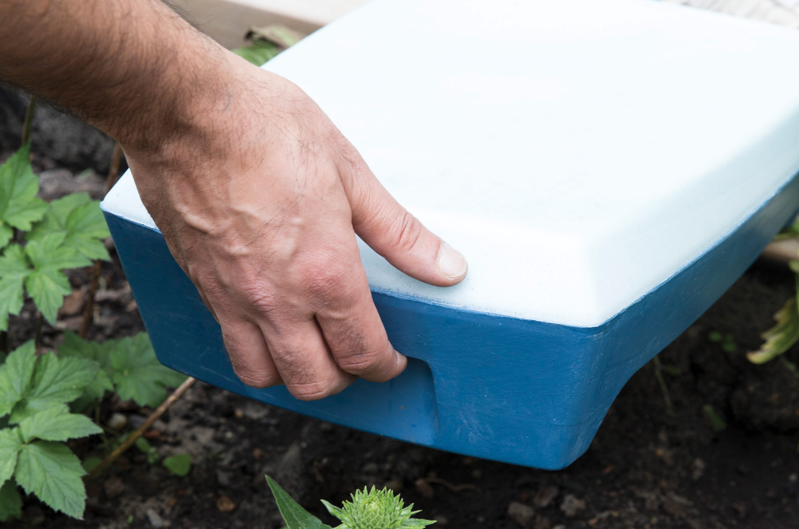
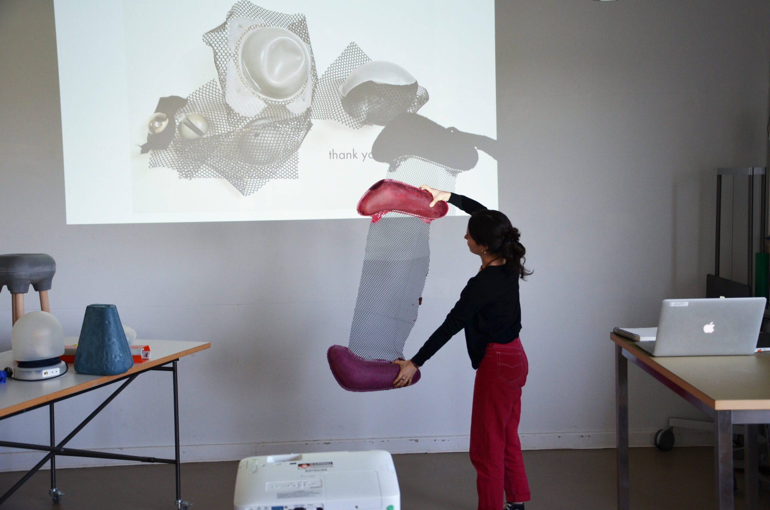
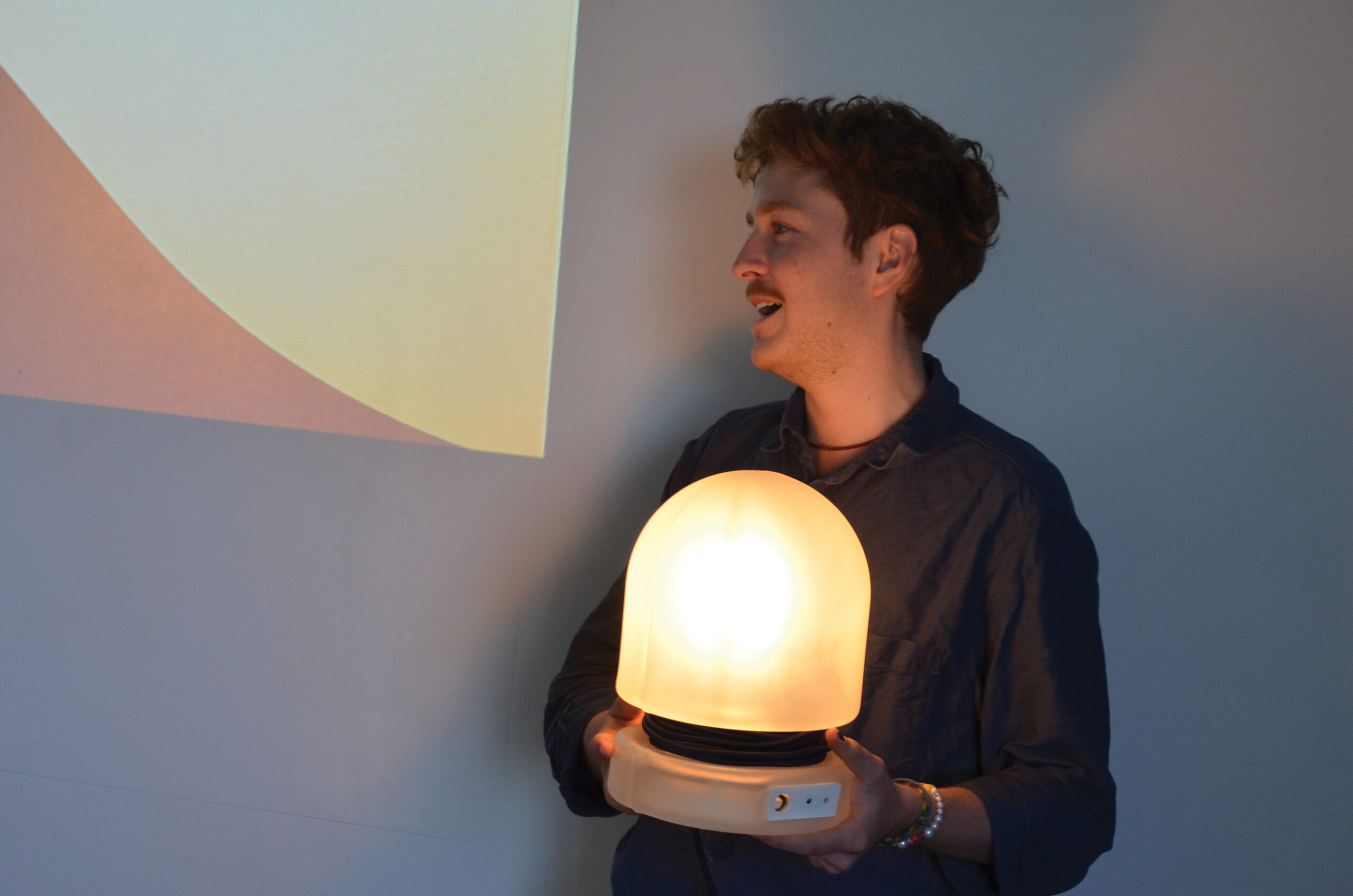
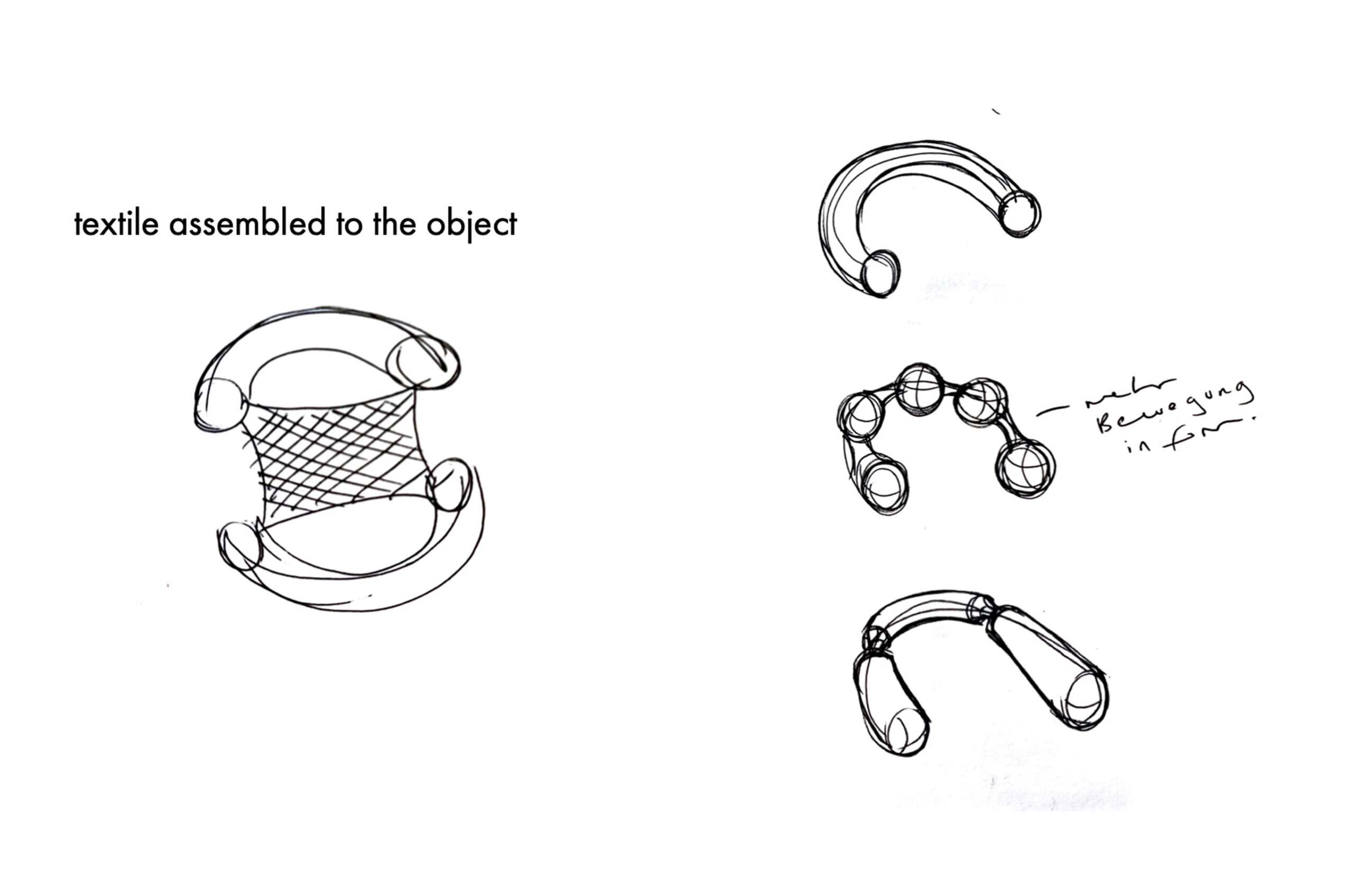
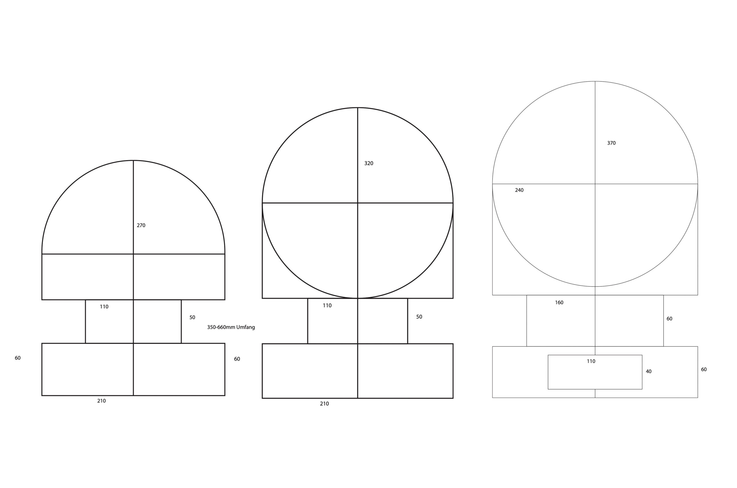
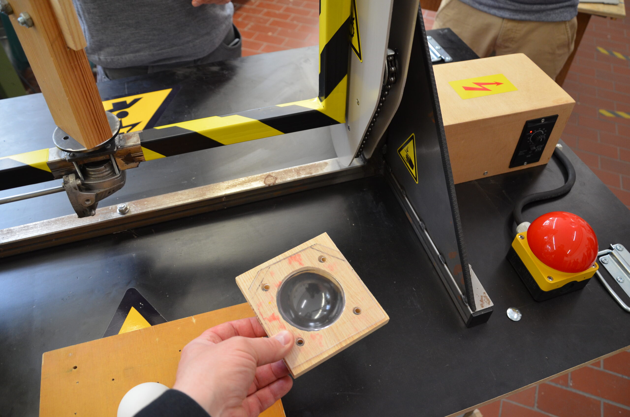
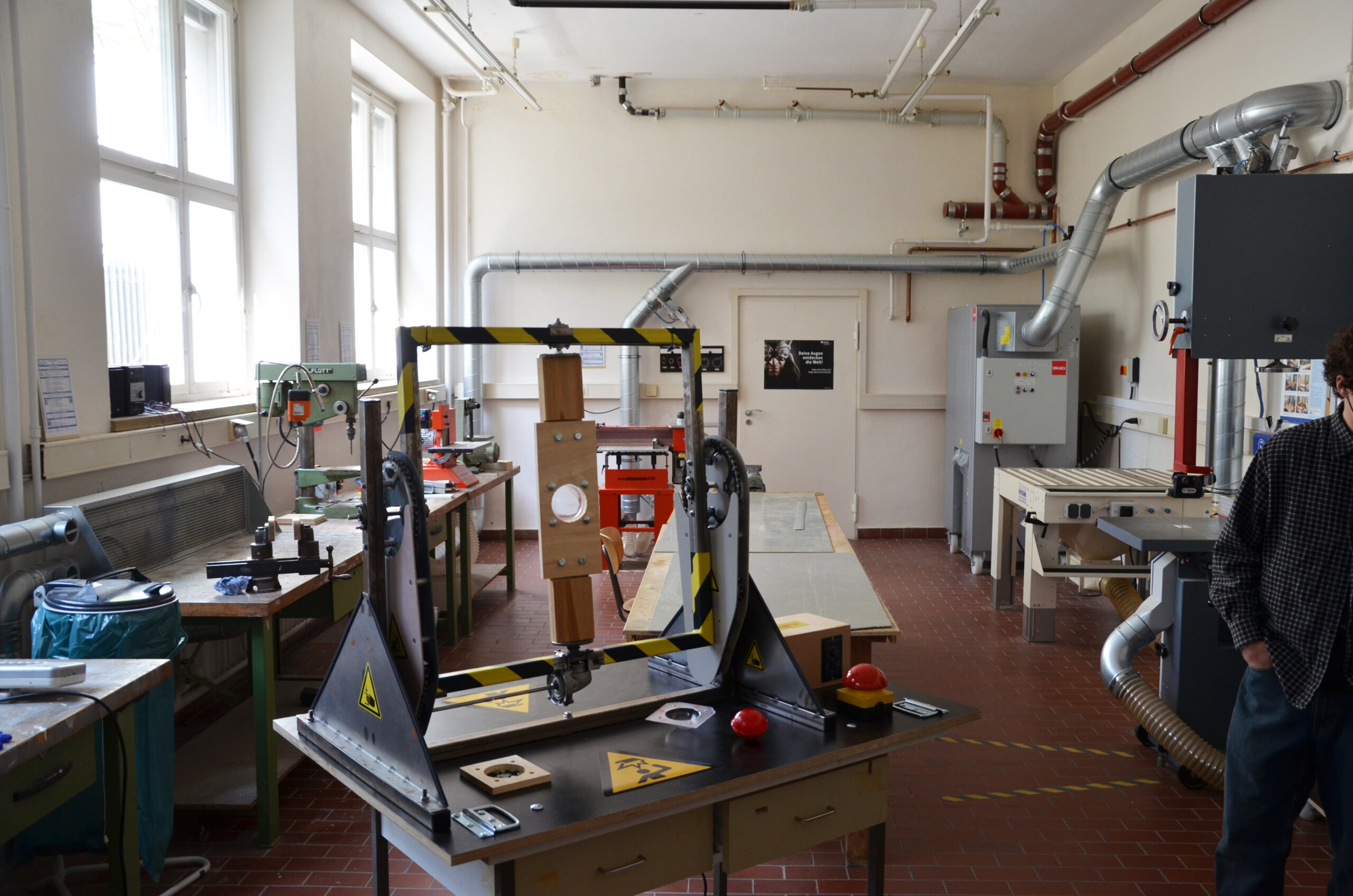
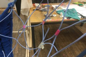
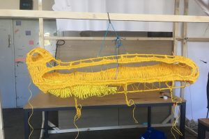
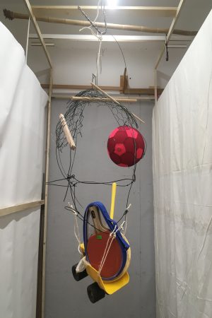
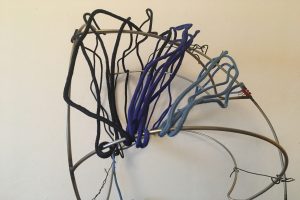
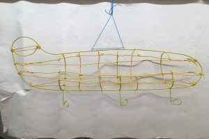
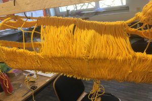
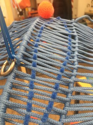
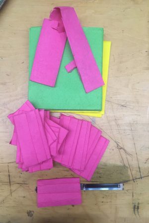
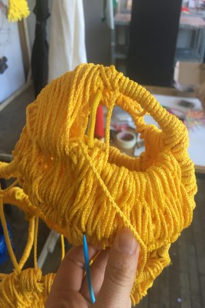
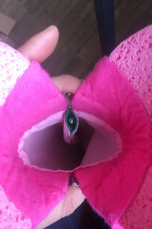
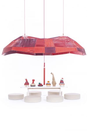
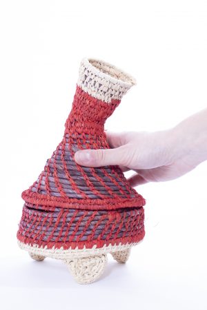
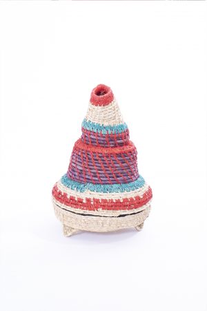
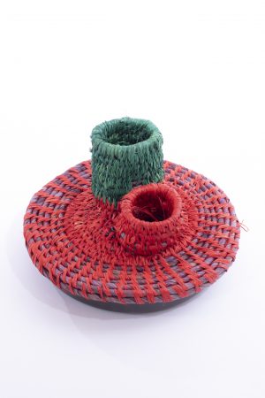
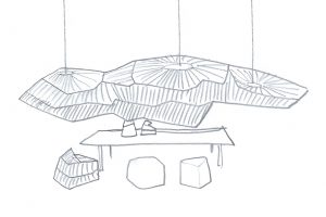
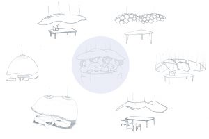
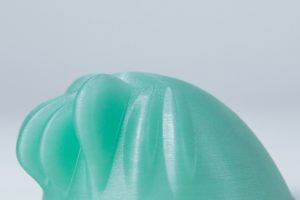
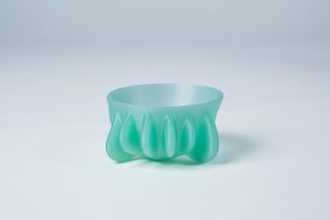
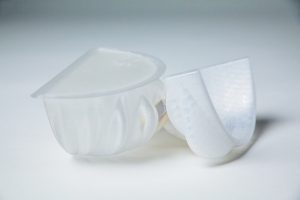
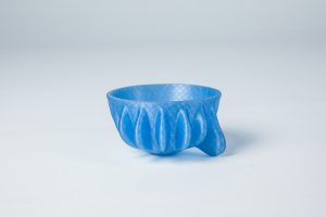
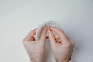
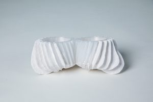
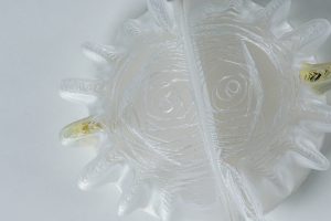
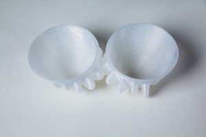
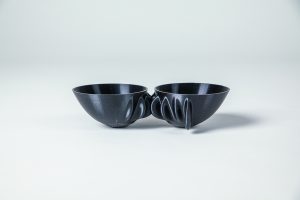
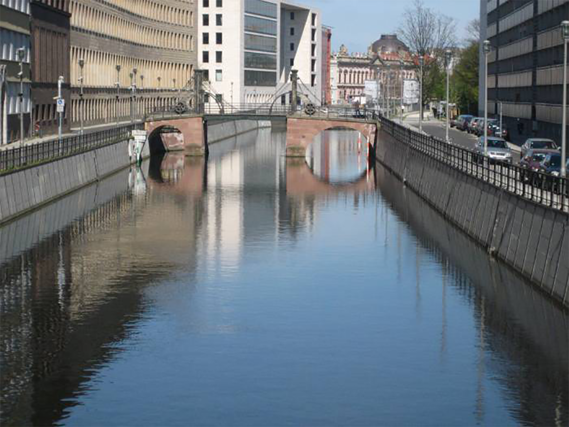
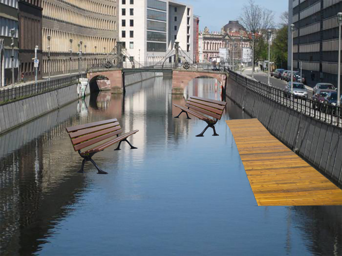
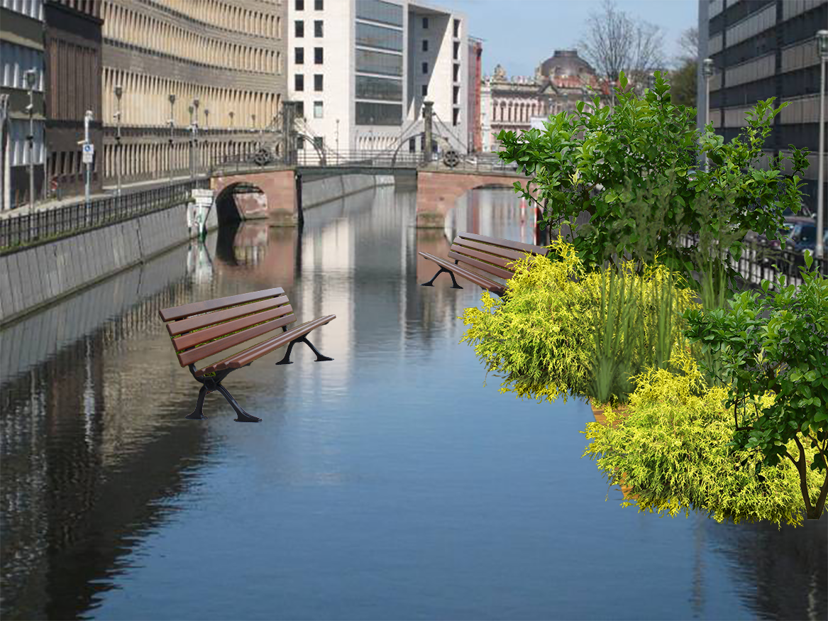
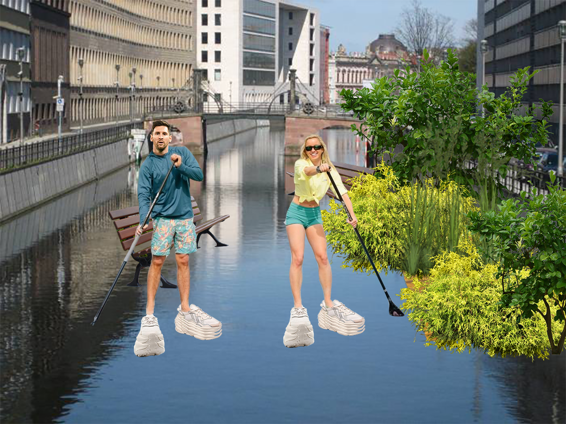
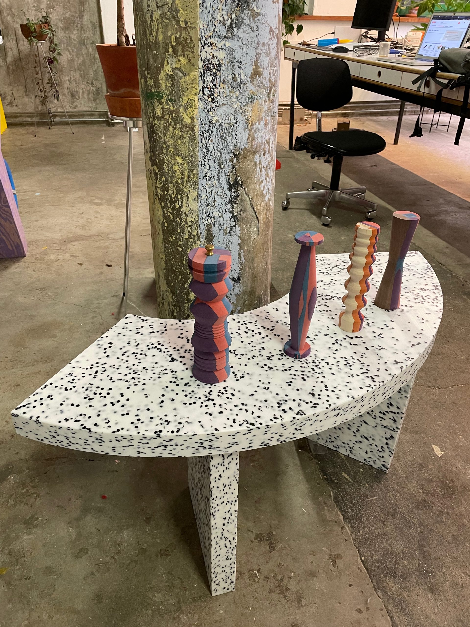
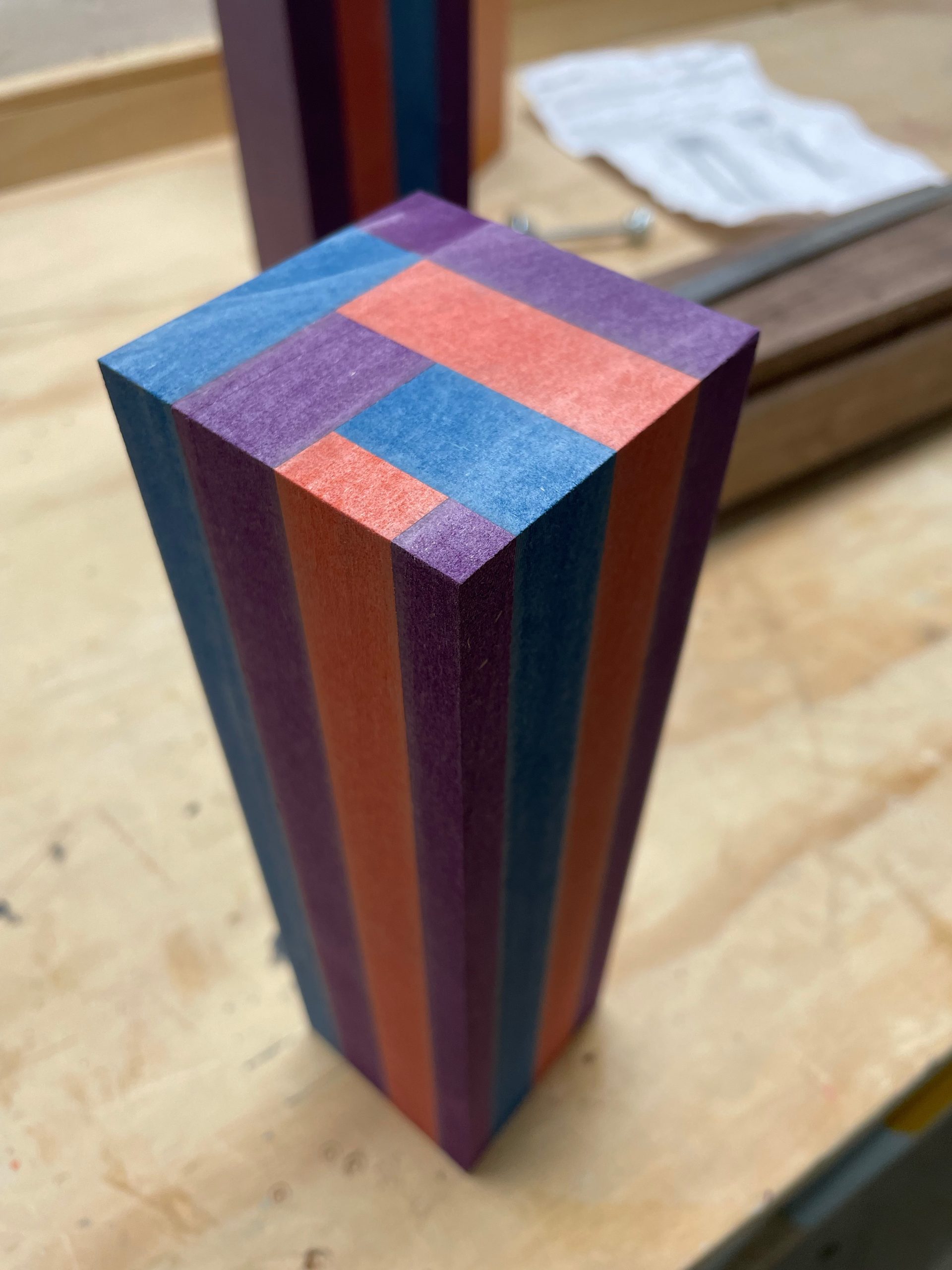
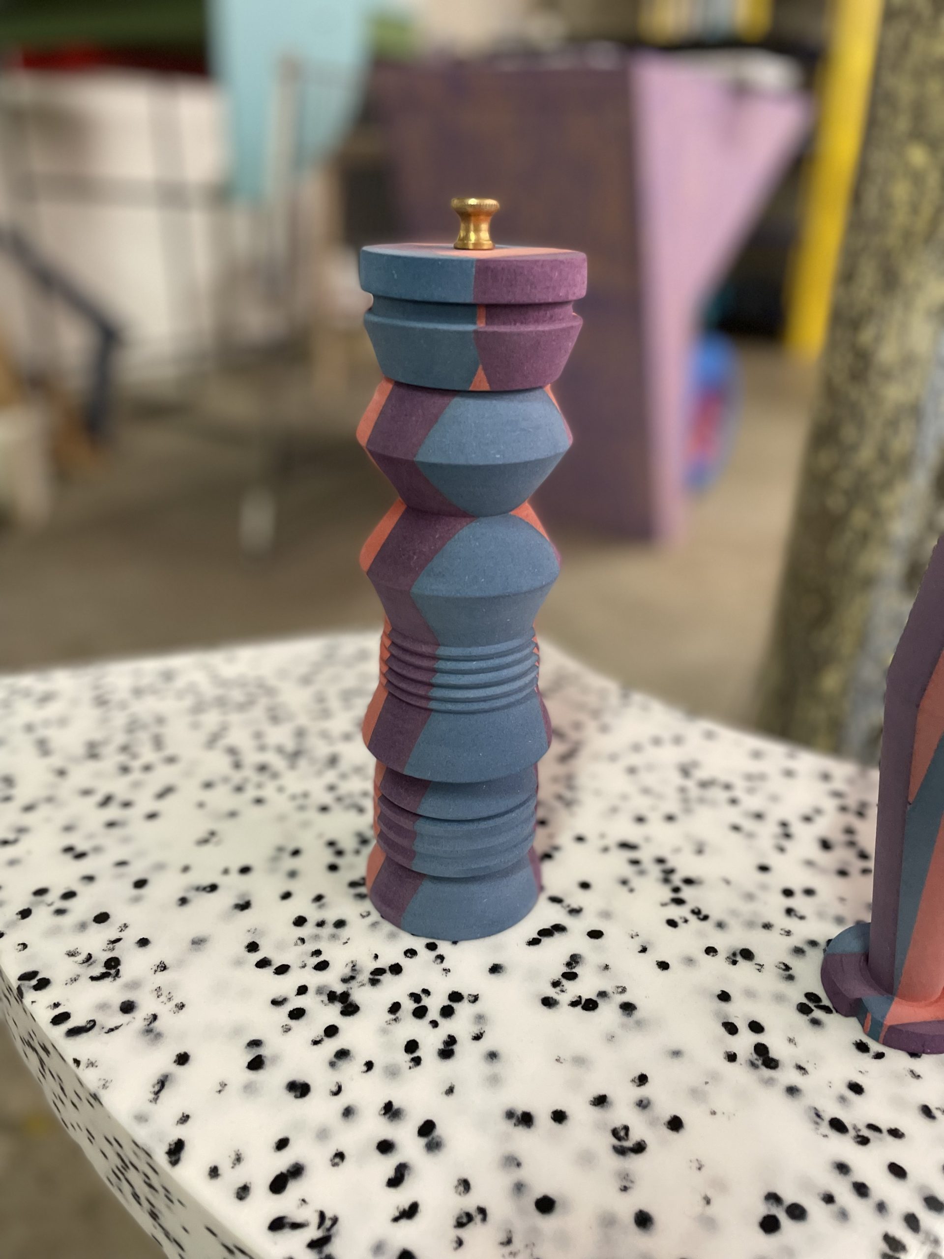
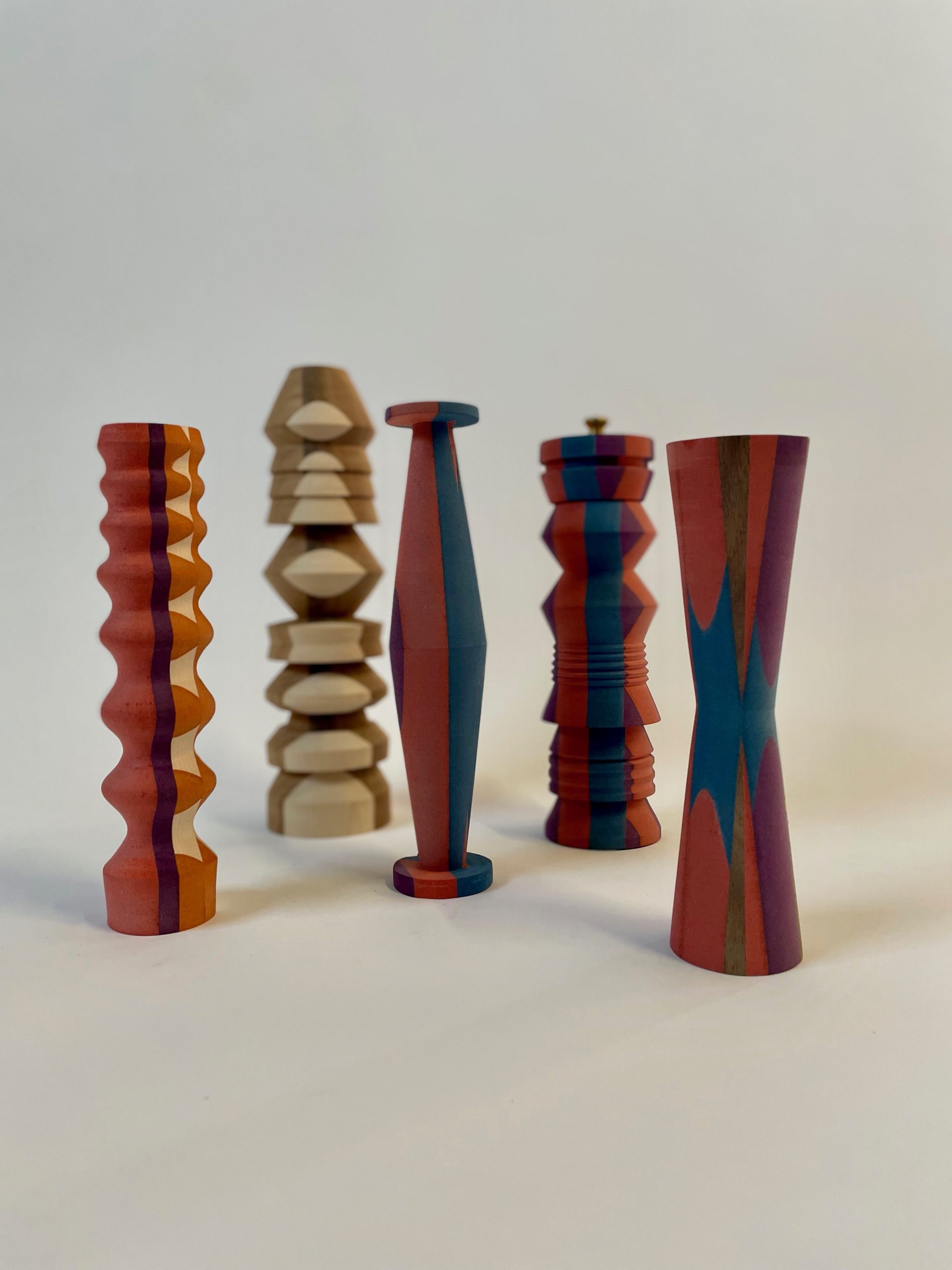
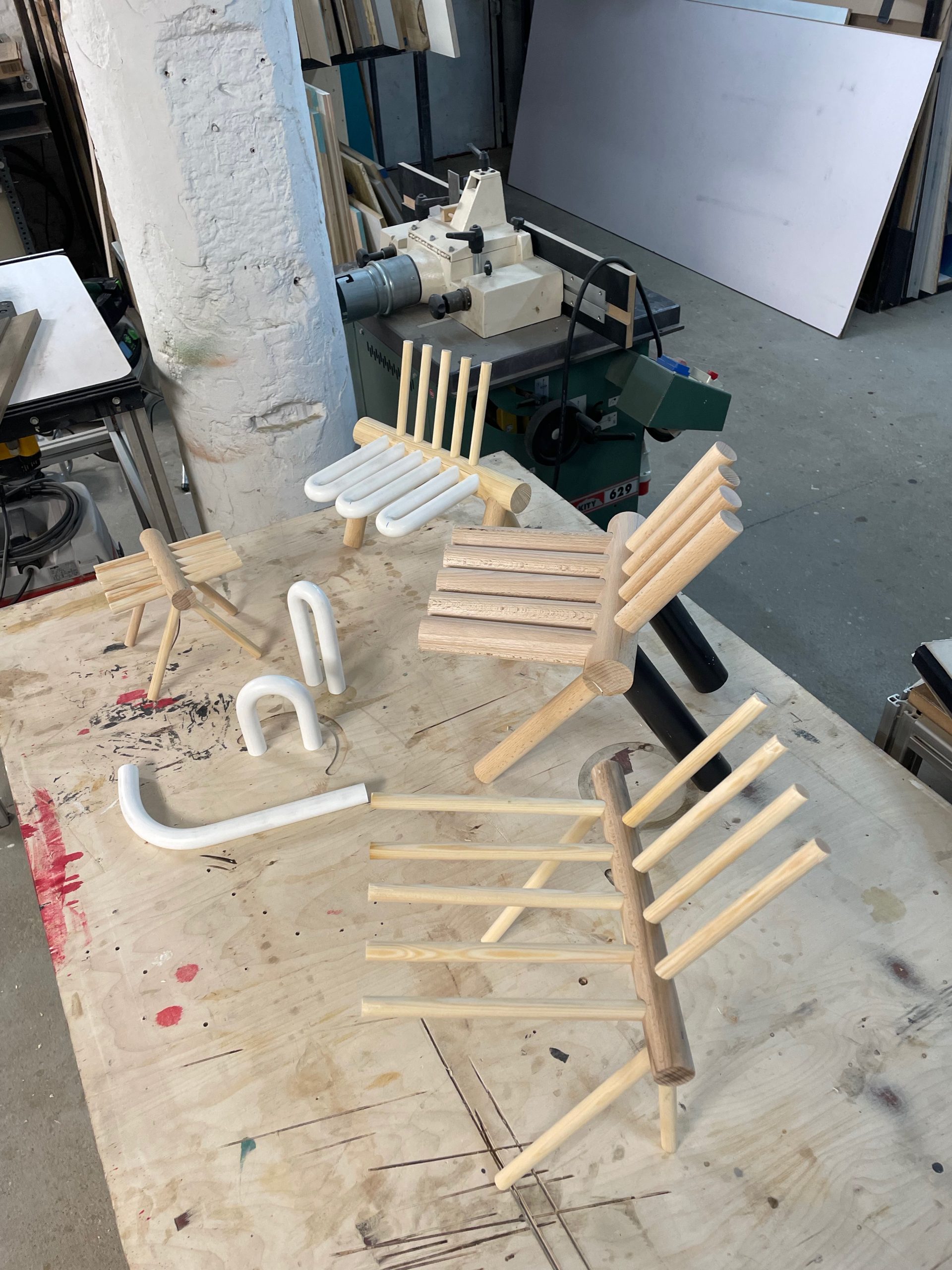
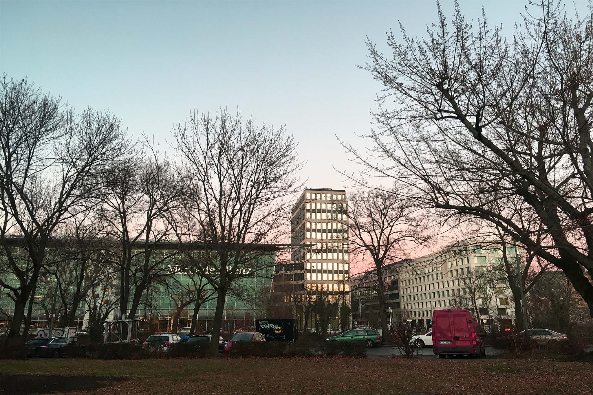
Agency for Unseen Sights ist eine neu gegründete fiktive Agentur, die Infrastruktur bereitstellt, um jeden Ort in eine Sehenswürdigkeit zu verwandeln. Mit Objekten aus dem Katalog der Agentur lassen sich Orte, die auf den ersten Blick nicht besonders erscheinen, in Must-sees verwandeln.
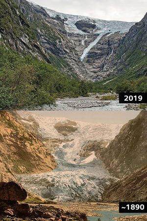
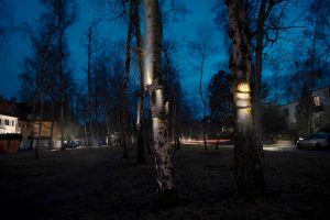
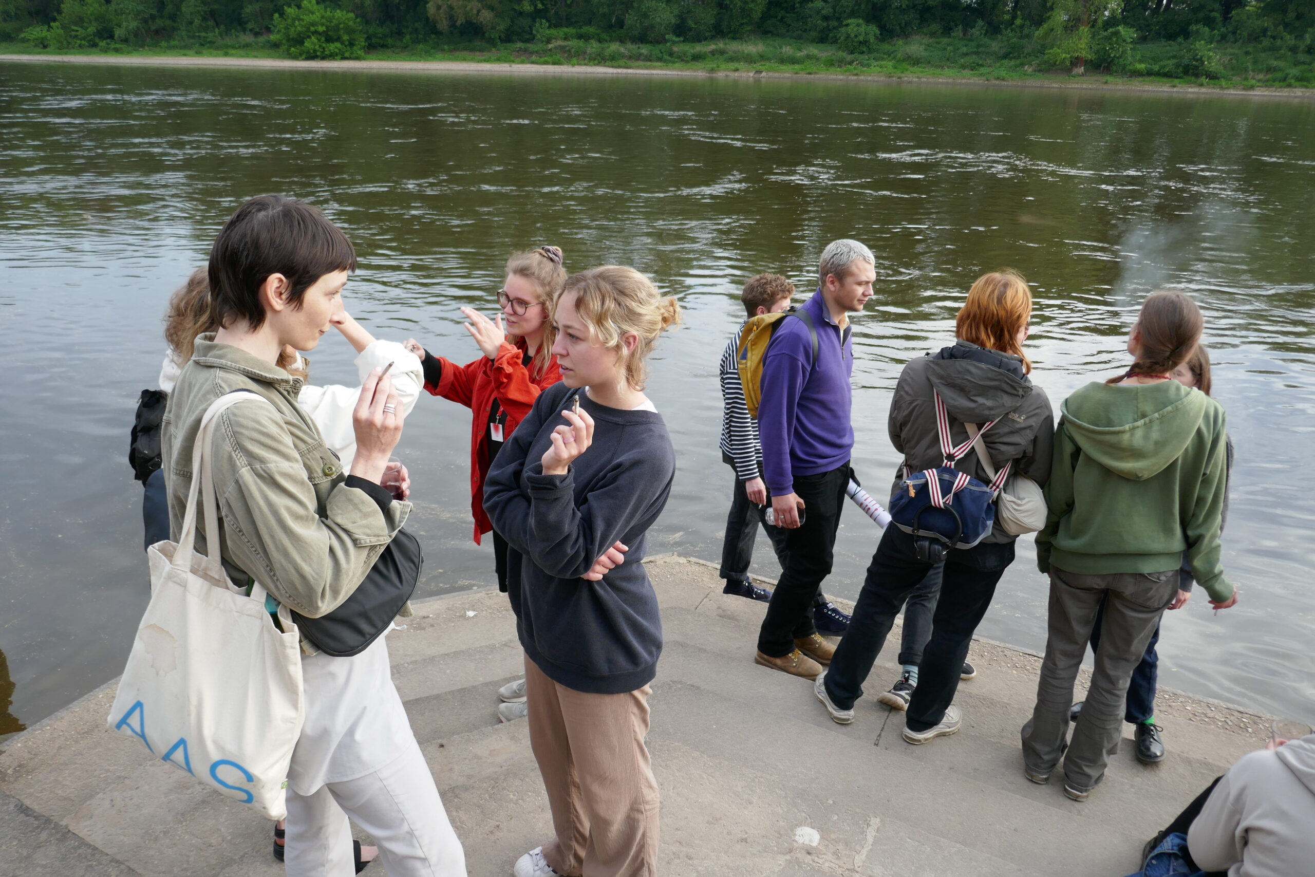
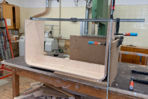
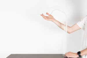
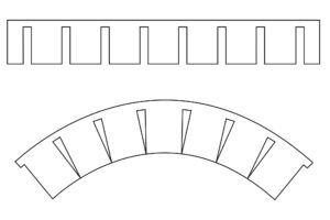
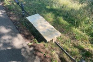
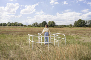
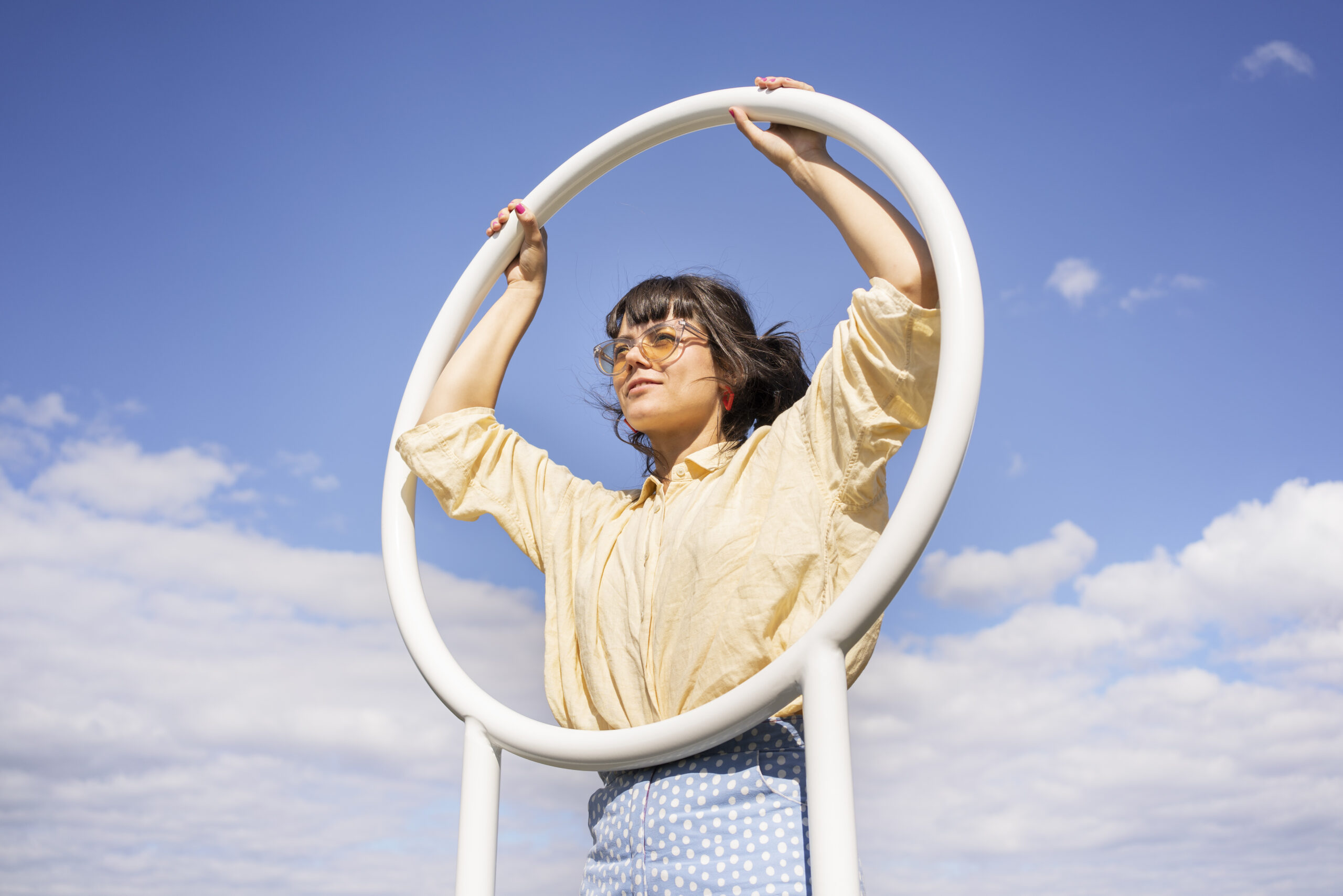
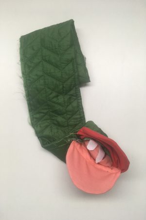
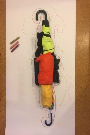
Die Agency for Unseen Sights bietet die Möglichkeit, unsichtbare „Sehenswürdigkeiten“ sichtbar zu machen und hinterfragt kritisch die Art und Weise, wie wir für neue Perspektiven und Erfahrungen in die Ferne reisen, und die Gründe, warum wir uns an bestimmte Orte begeben, um sie zu betrachten. Kann man überall schöne Ausblicke genießen? Ist es der Ort, der interessant genug sein muss, um Aufmerksamkeit zu erregen, oder sind es die Umstände? Können mit Hilfe von Infrastruktur, Artefakten, Schildern oder Markierungen interessante Sehenswürdigkeiten geschaffen werden, die uns daran erinnern, dass wir hinschauen müssen, dass etwas passieren muss, das es zu beachten gilt?
Trips, travel, holiday and vacation are something we like to daydream about. Beautiful landscapes, exciting cities, fascinating historical monuments. In my opinion, our wish to go away has more to do with ourselves than the destination of our dreams. The happiness connected to a trip has less to do with the place where we are going, but more with fulfilling our needs and desires. Through travelling we train our imagination and the way we see things in general, which is undoubtedly one of the most fortune things about travel. We use vacations as an escape from reality. It offers us distance from home, our everyday lives, our routines and stressful jobs and instead make us feel free and adventurous. We want to experience something else; a different world and we see it as healthy and normal to feel a longing for distant places.
This project is about dreaming of distant places, having a deep urge to see the world and all its spectacles. experiencing the far away and exotic with own eyes instead of hearing stories, reading or watching movies about far away places. My motivation comes from a constant reminder that there are so many places to go, strengthened by the existence of social media platforms like Instagram, where everyone seems to be everywhere all the time.
What is the next hot spot I should go to? How come I never went to this museum before? Which cafe of the 10 nicest cafes in this city can’t I miss? Shit, did I forget to share the amazing view I had on this mountaintop this morning?
Agency of Unseen Sights was born and it’s purpose is to research how places are being treated when they are marked with objects that indicate that there is something to be seen. I was driven to understand and see if the politics of objects can communicate how they should be used and what outcome the usage of these objects will have. Will the viewer/user have a deeper understanding of the act of seeing and sightseeing? Will the newly contextualized place where my objects are put in be read/seen as a sight? With Agency of Unseen Sights I do not necessarily aim to communicate positive or negative sides about sightseeing, but the purpose is for people to question the act of seeing, to have a second thought about how our eyes and views are guided and marked with objects, how our sights are being marketed. What do they want us to see? Maybe to even think about if your own set of eyes are trained to be looking for spectacles, or if everything can turn into a spectacle once you realize you can be the one to decide what to look at. Or not.
Agency for Unseen Sights is a newly founded fictional agency that provides infrastructure to turn any place into a place of interest. With objects from the agency’s catalogue, places that at first-hand don’t seem special can be transformed into must-sees.
The Agency for Unseen Sights offers the possibility to make invisible ‘sights’ visible and critically questions the way we travel far for new perspectives and experiences and the reasons we are going to specific places to gaze. Can scenic views be enjoyed anywhere? Is it the place that needs to be interesting enough to draw attention or is it the circumstances? Can interesting sights be created with the help of infrastructure, artefacts, signs or markers that reminds us that we have to have a look, that there must be something going one which should be observed?
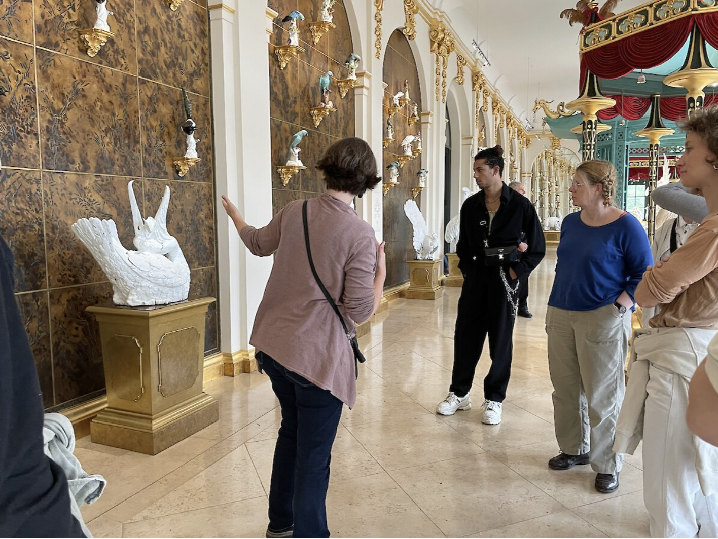
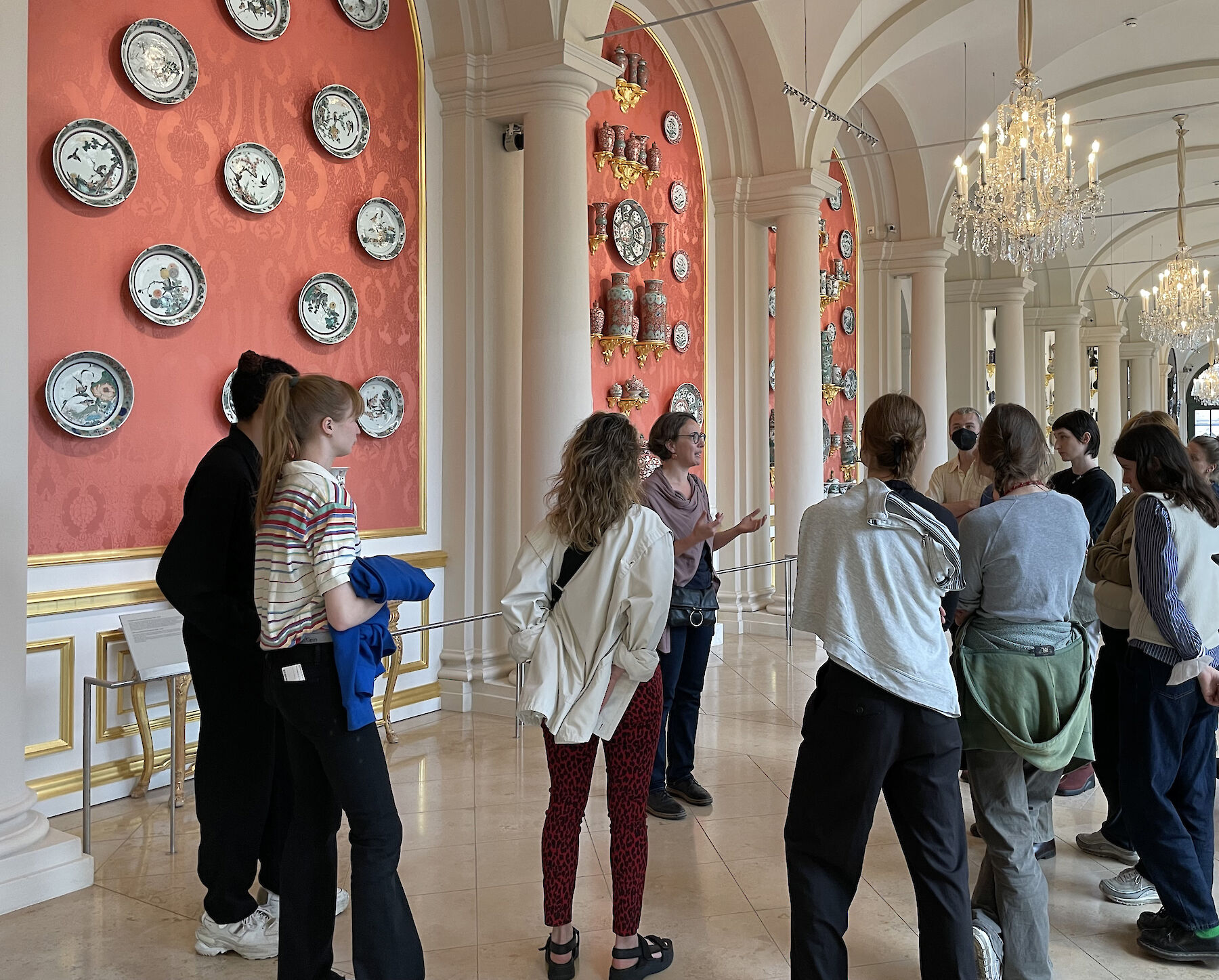
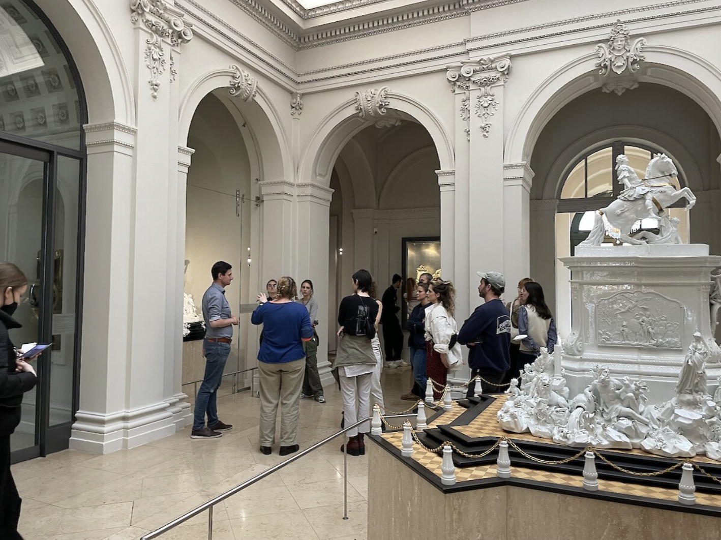
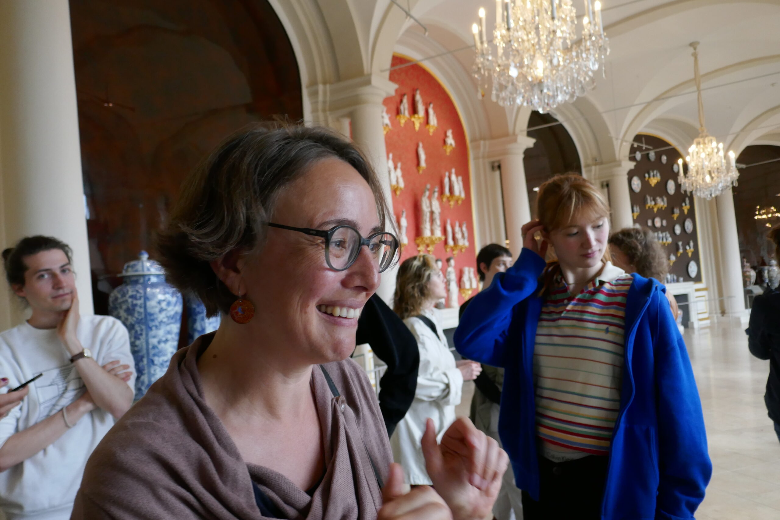
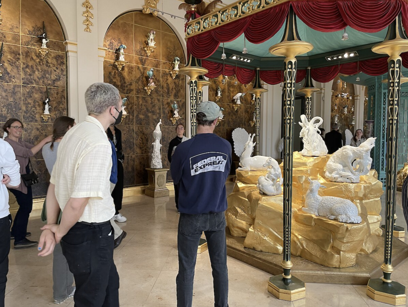
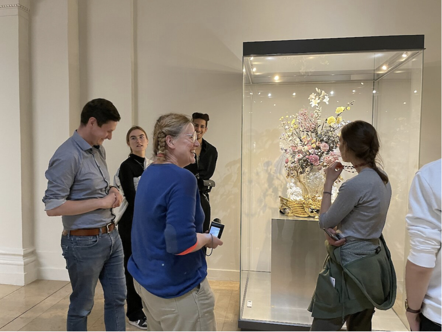
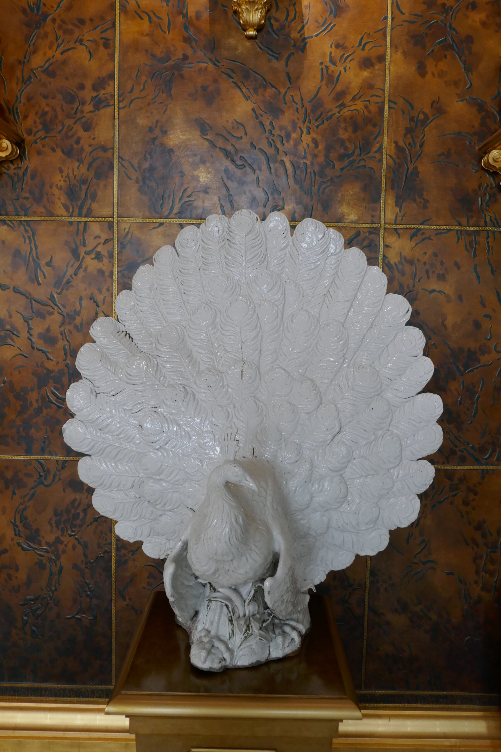
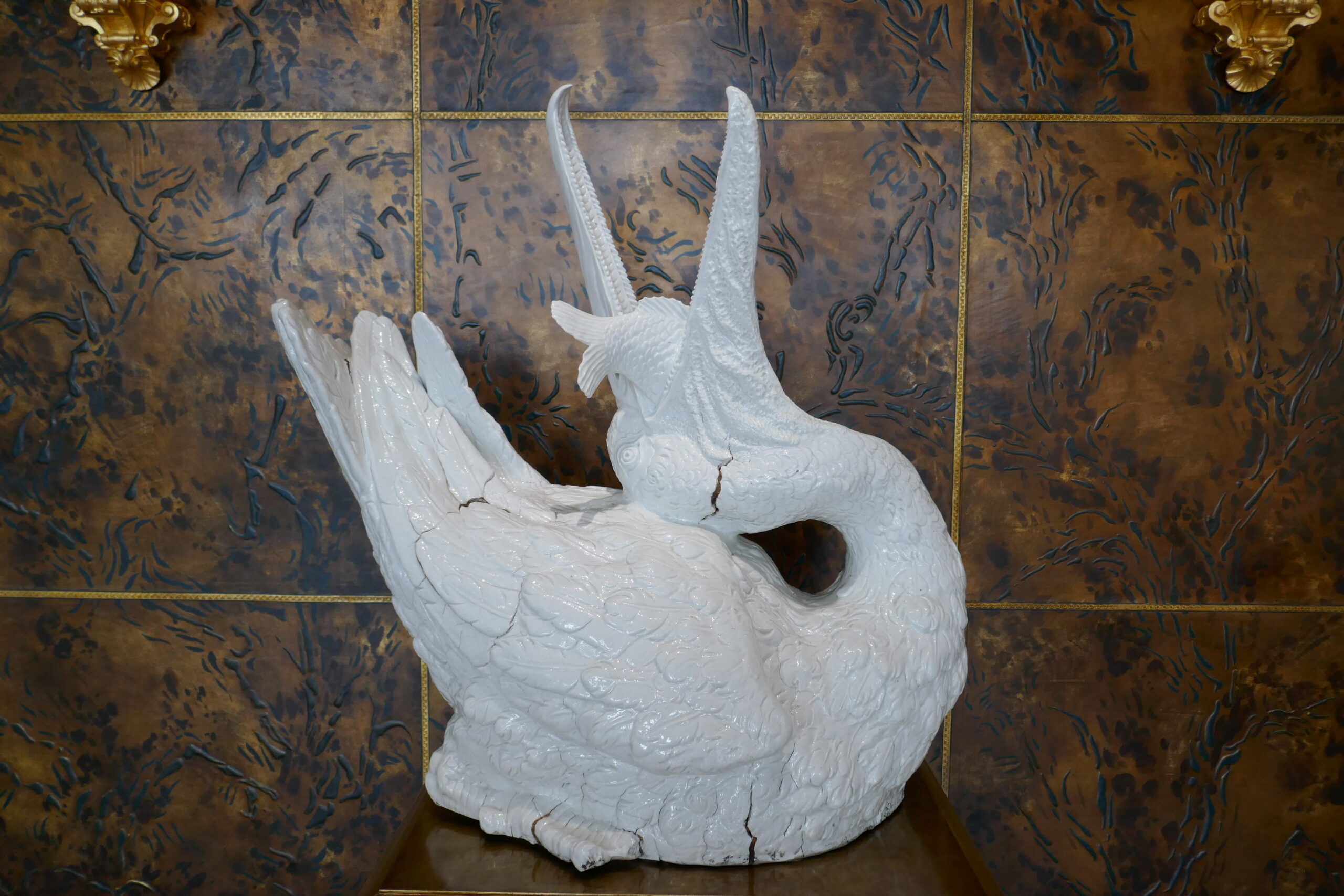
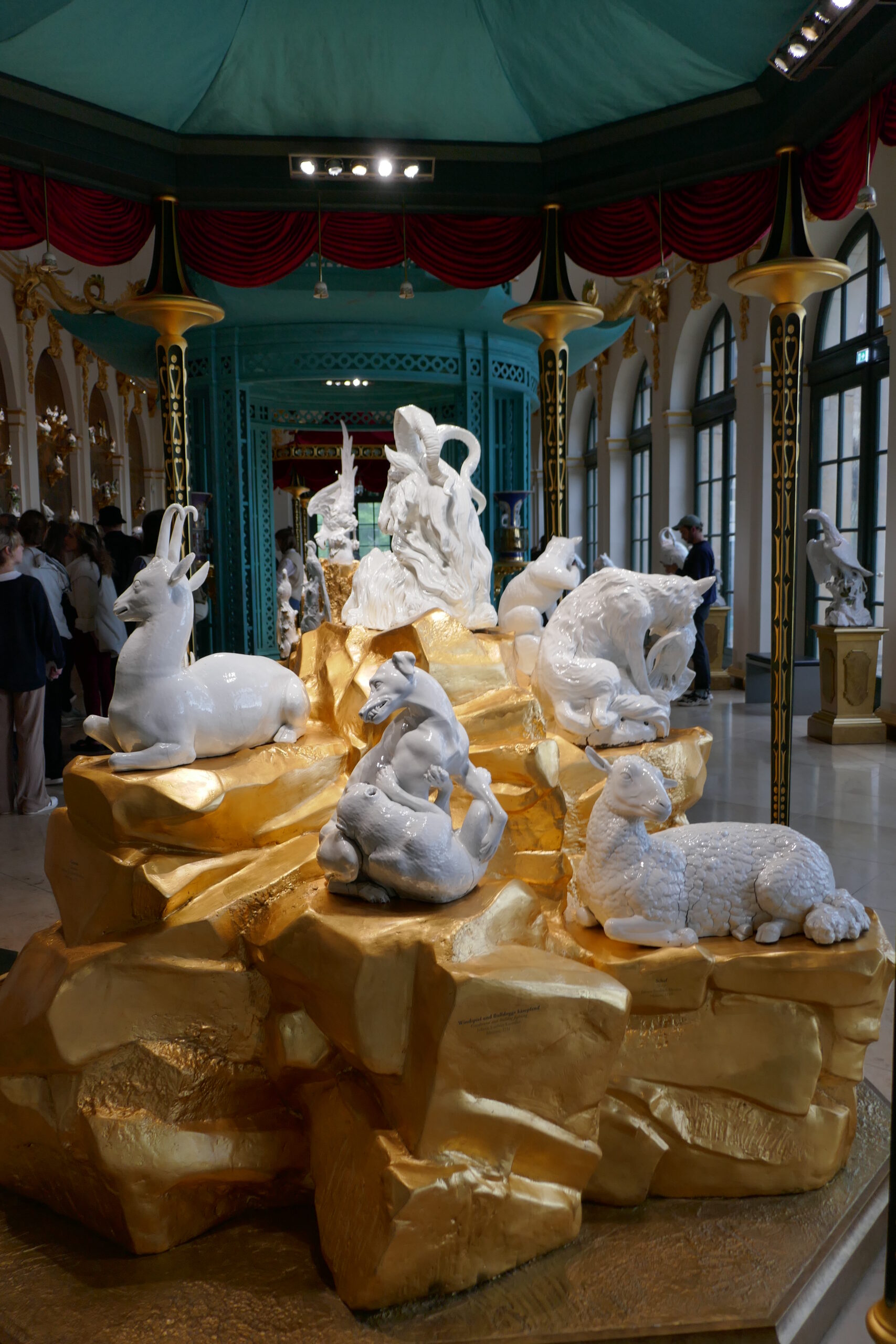
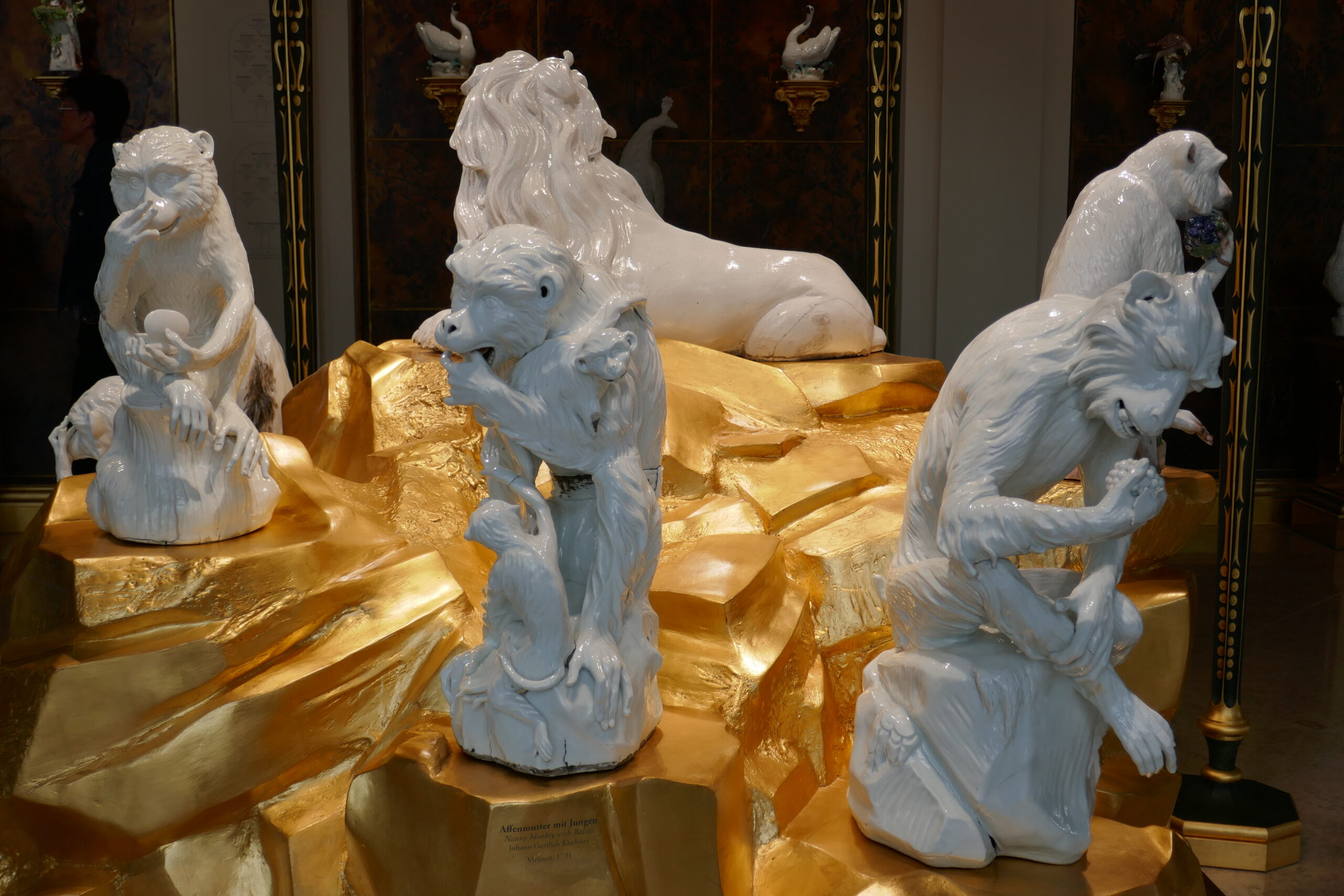
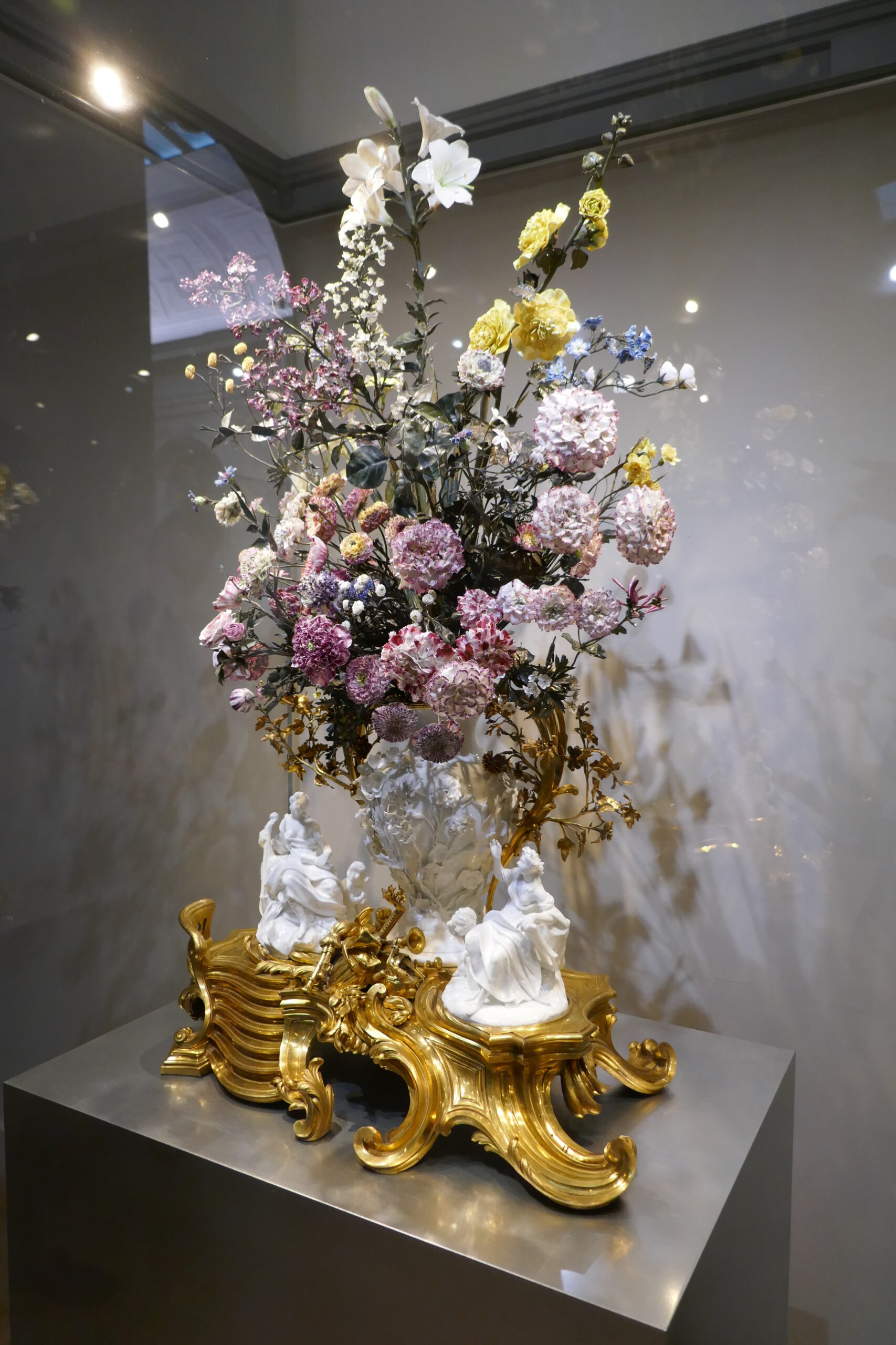

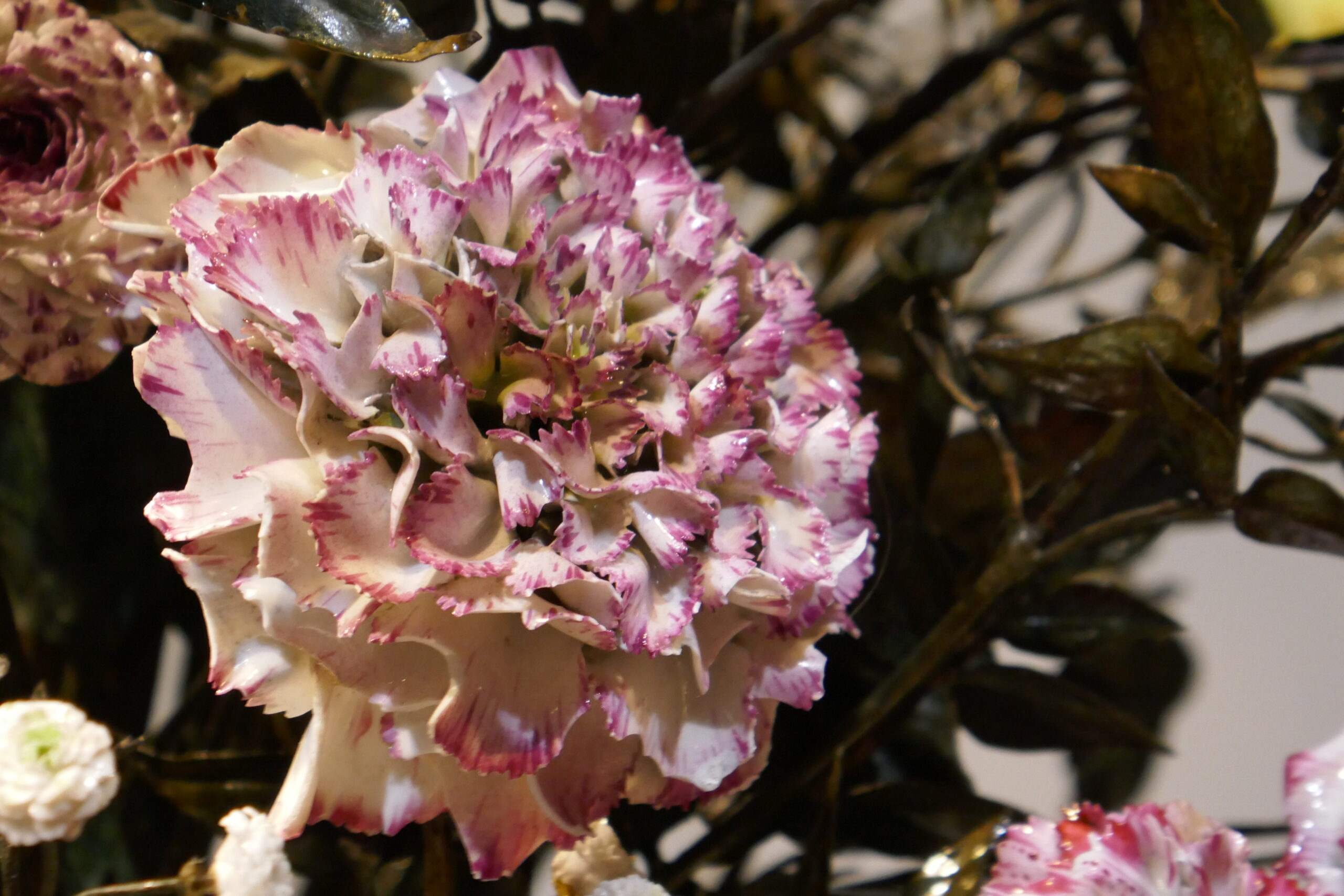
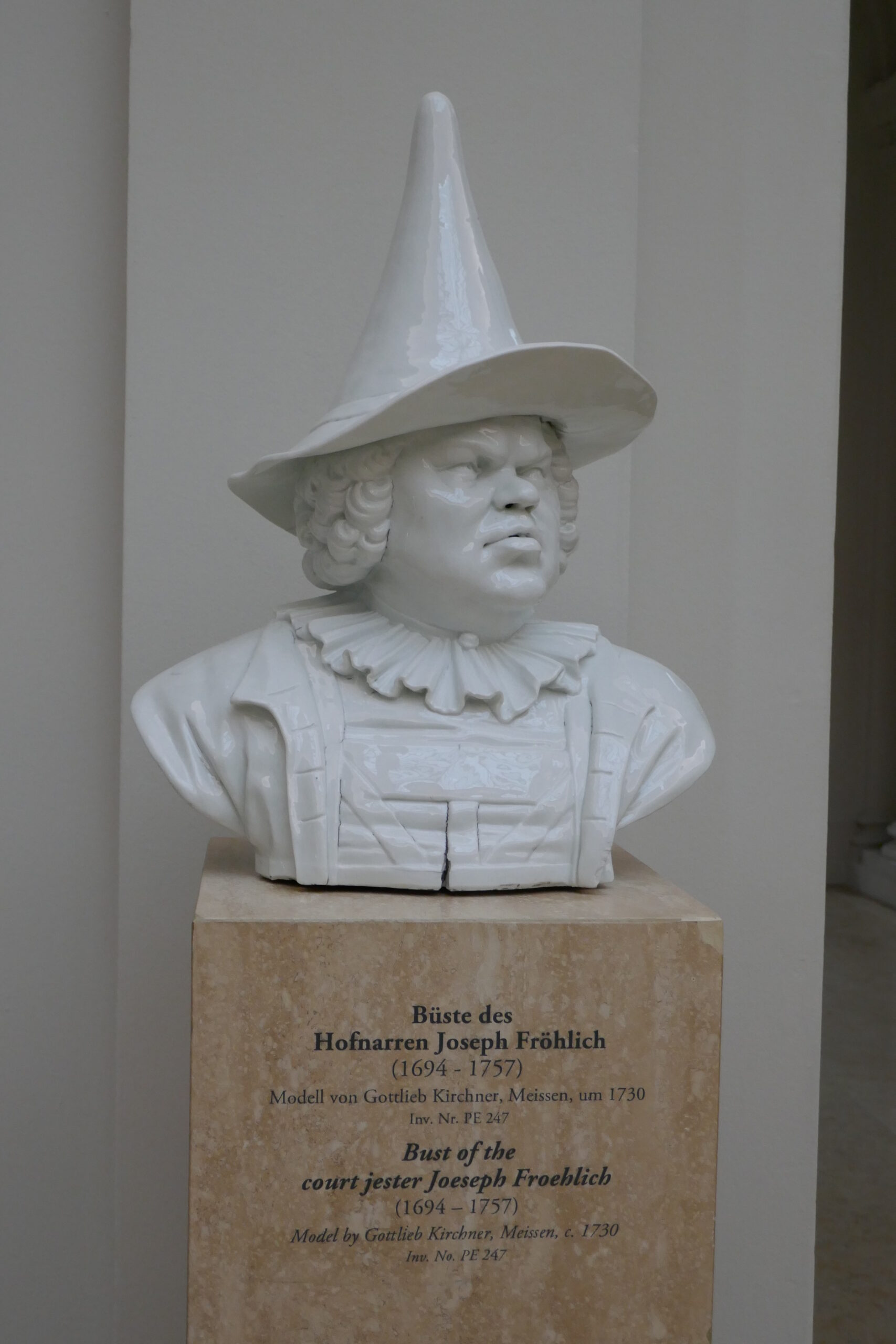
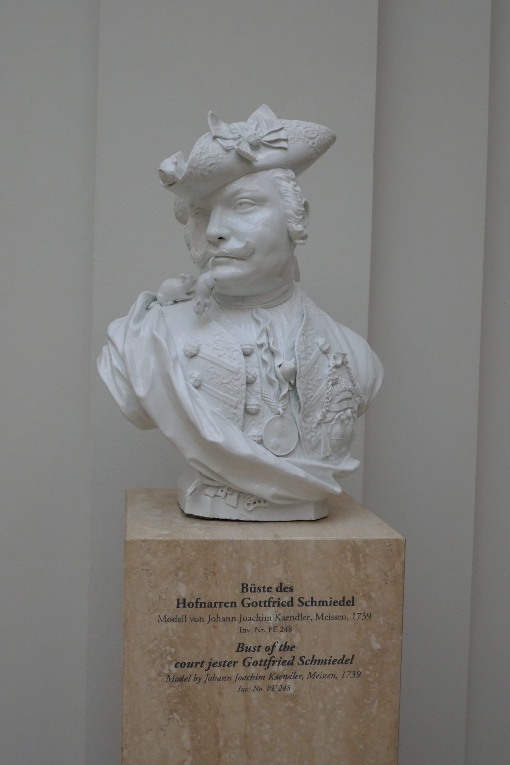
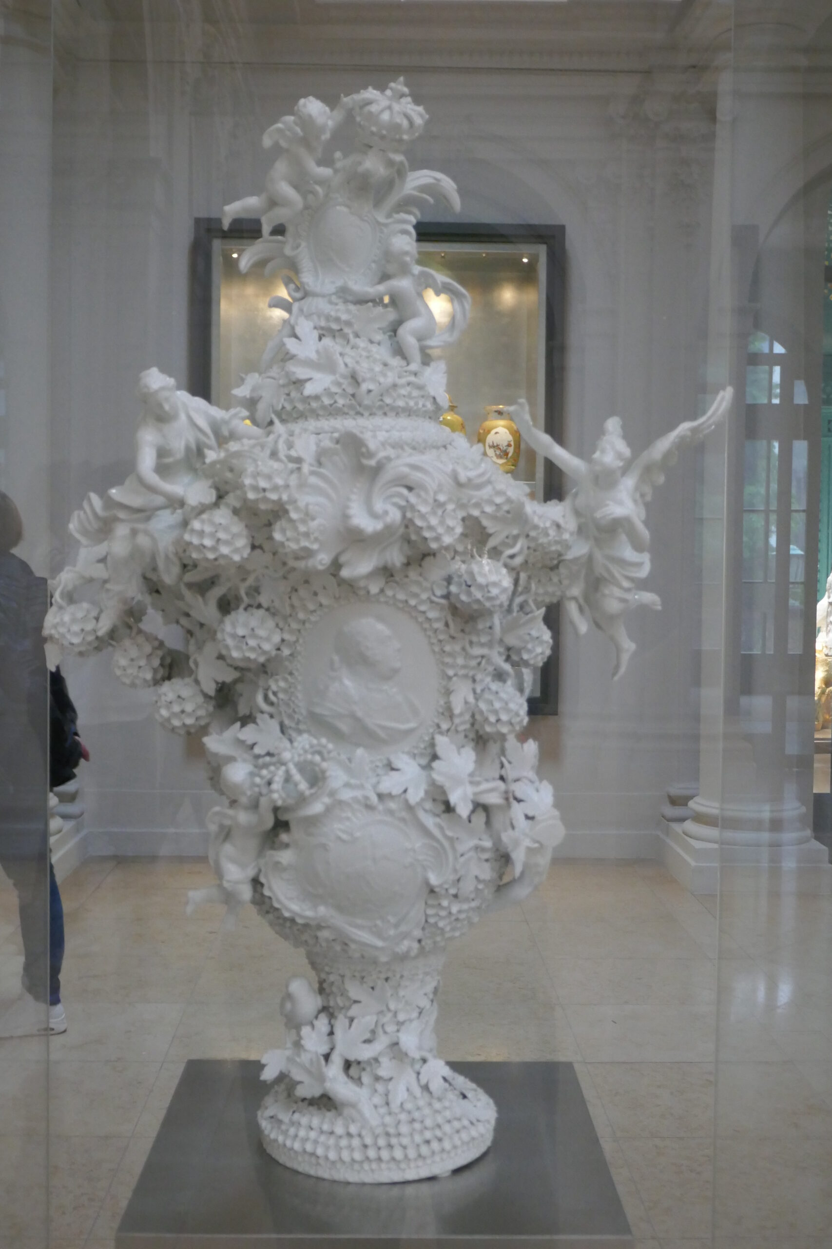
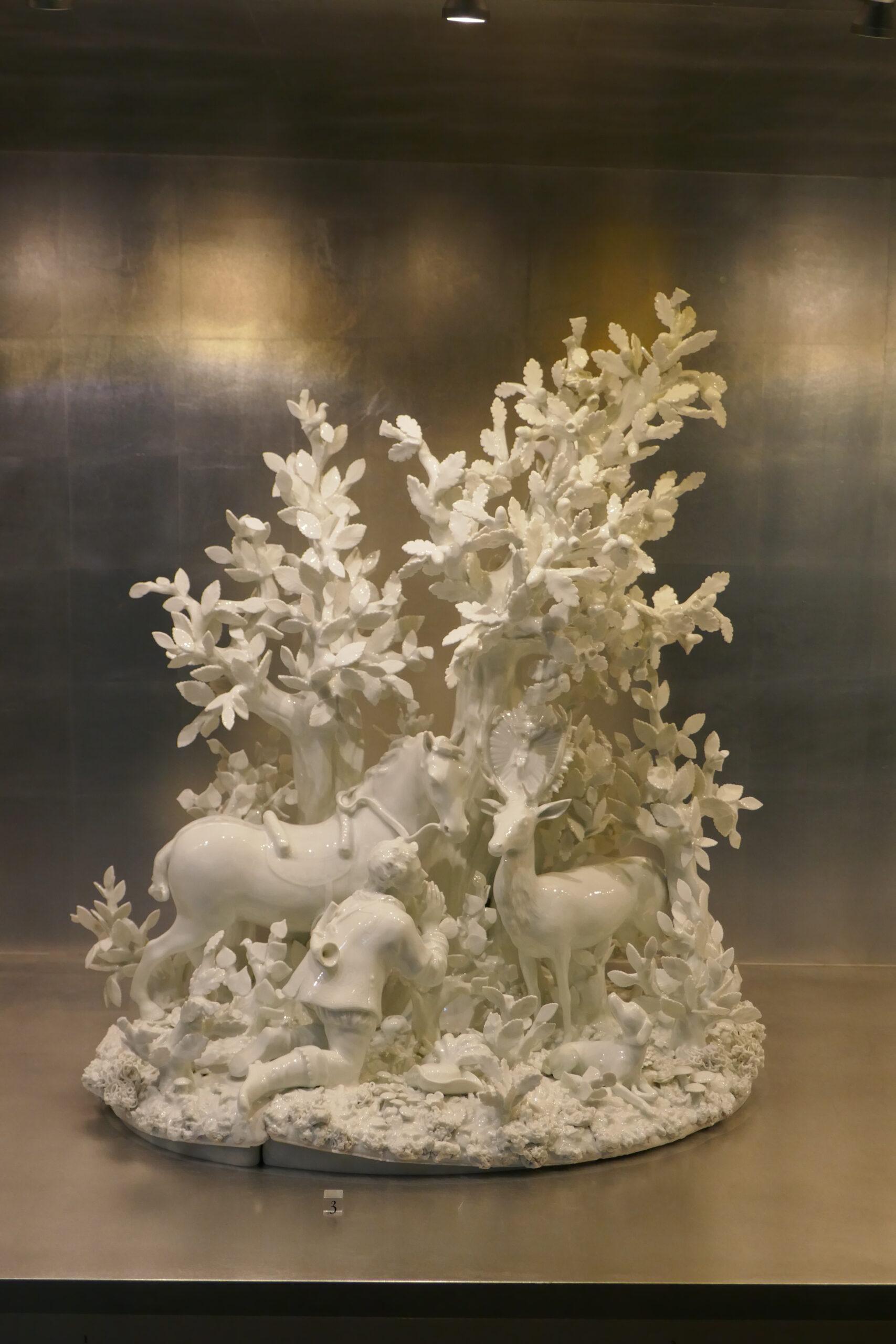
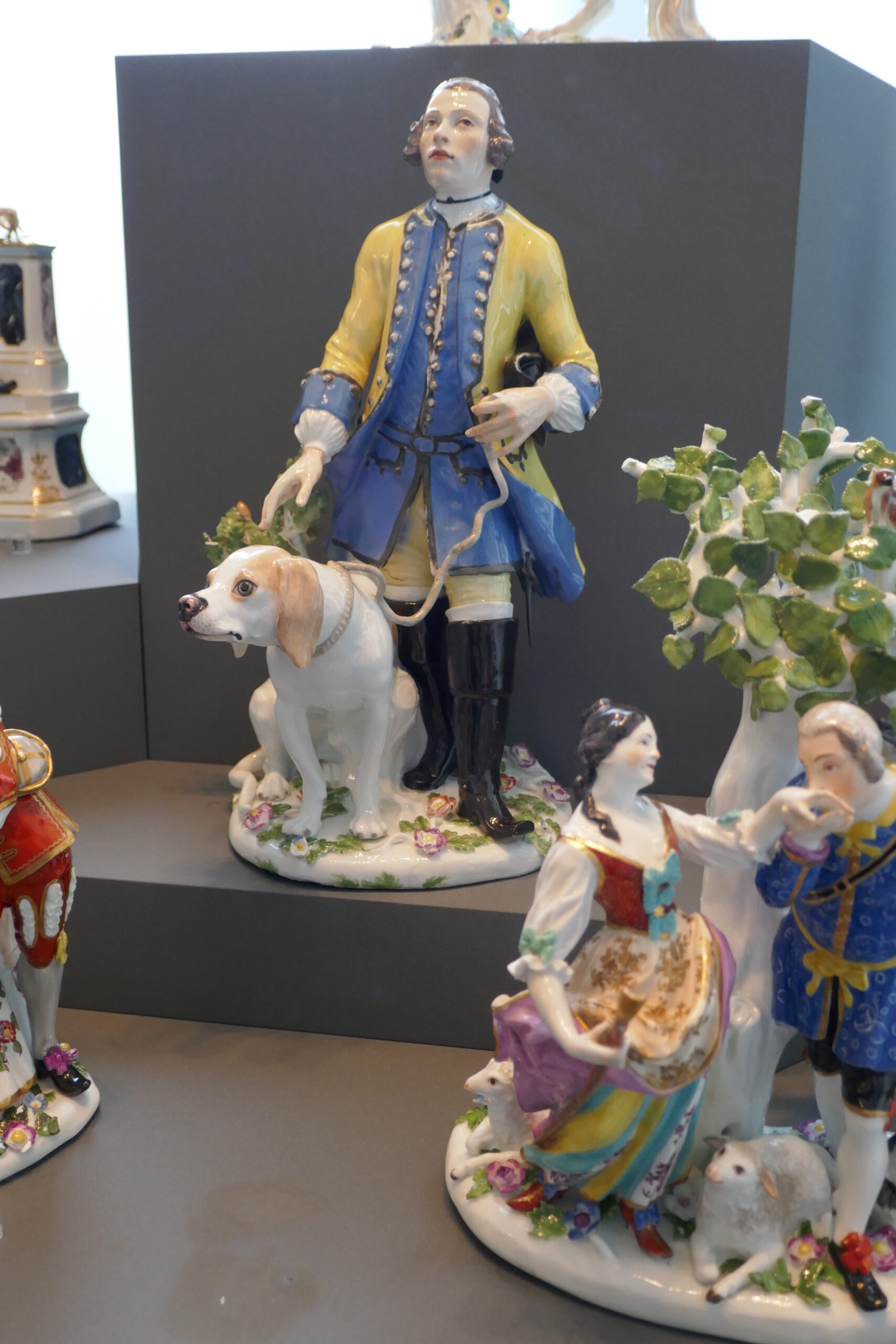
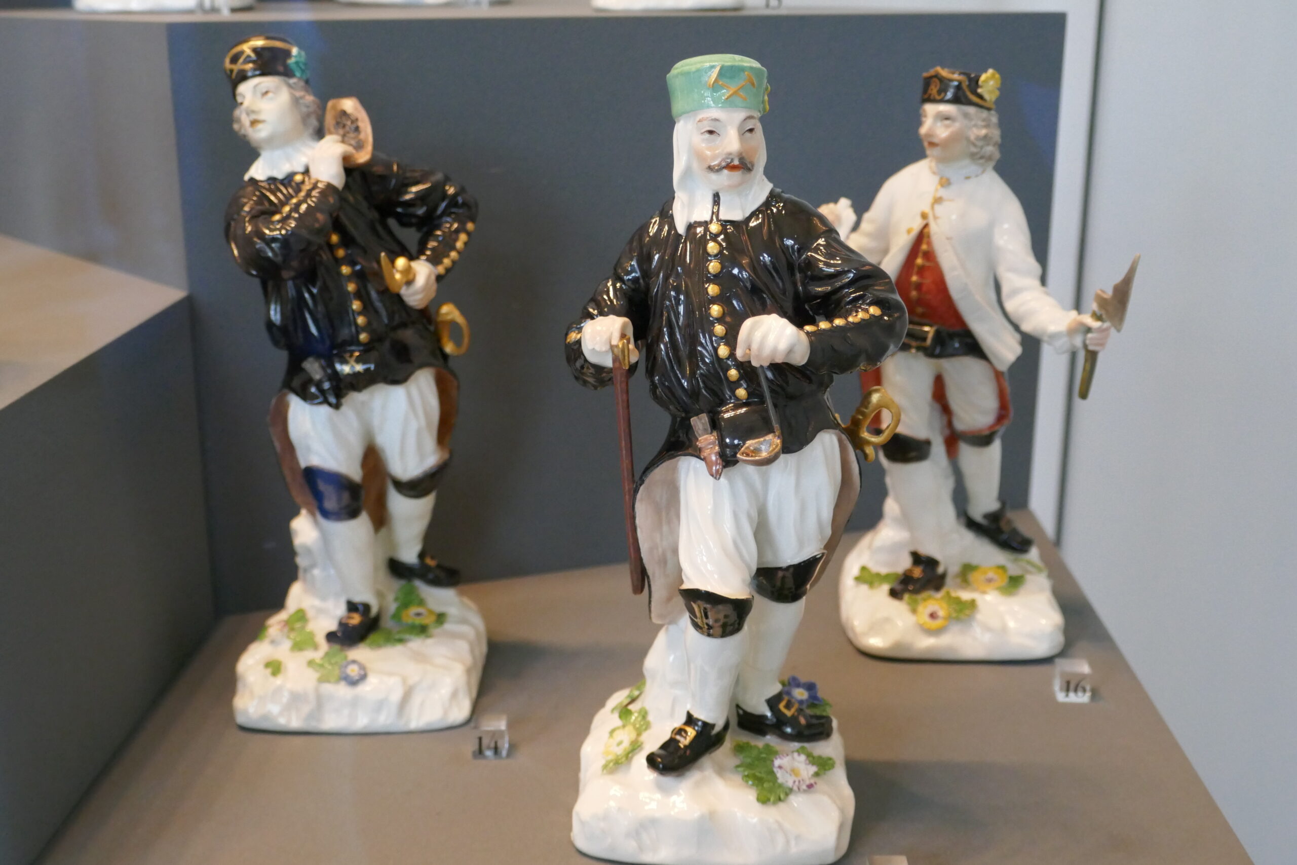
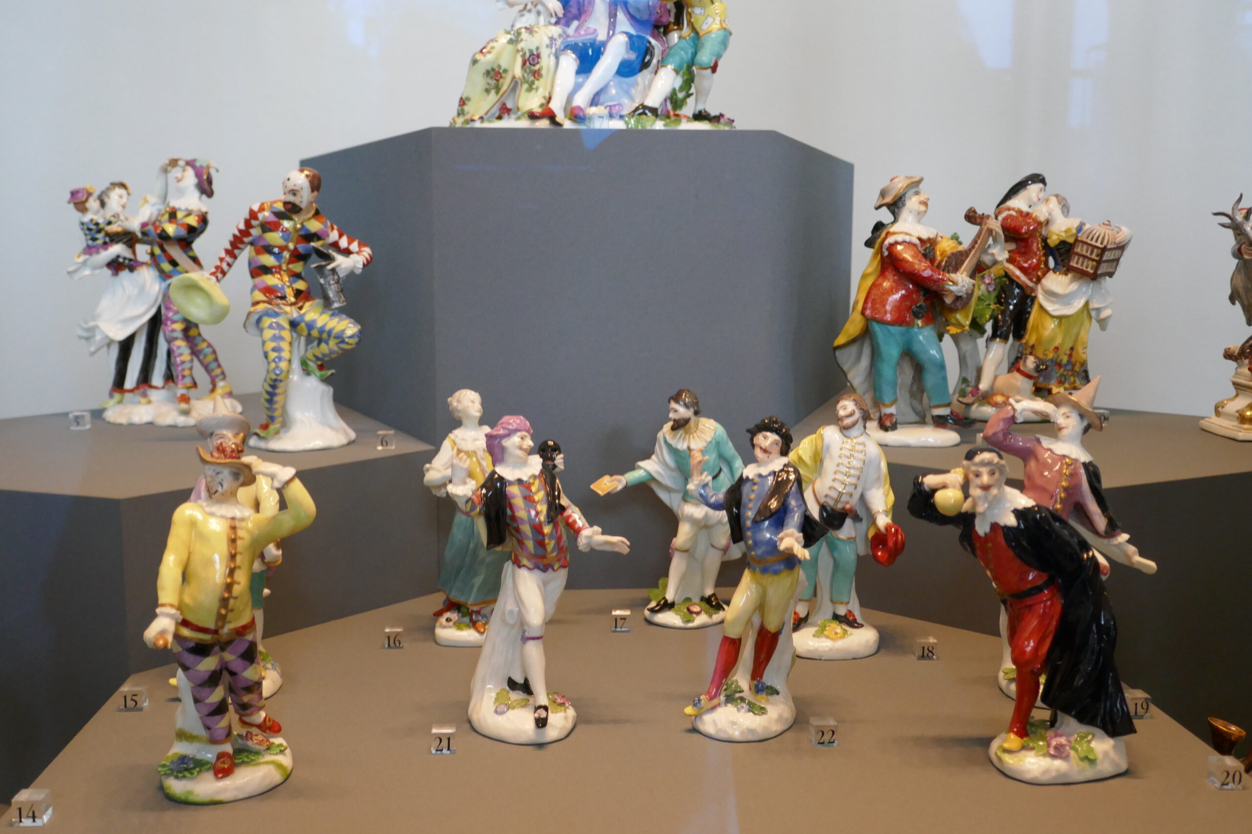
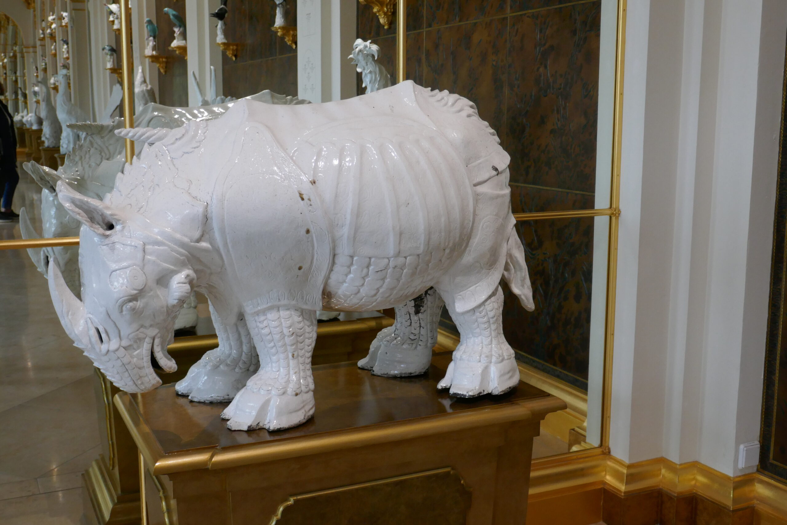
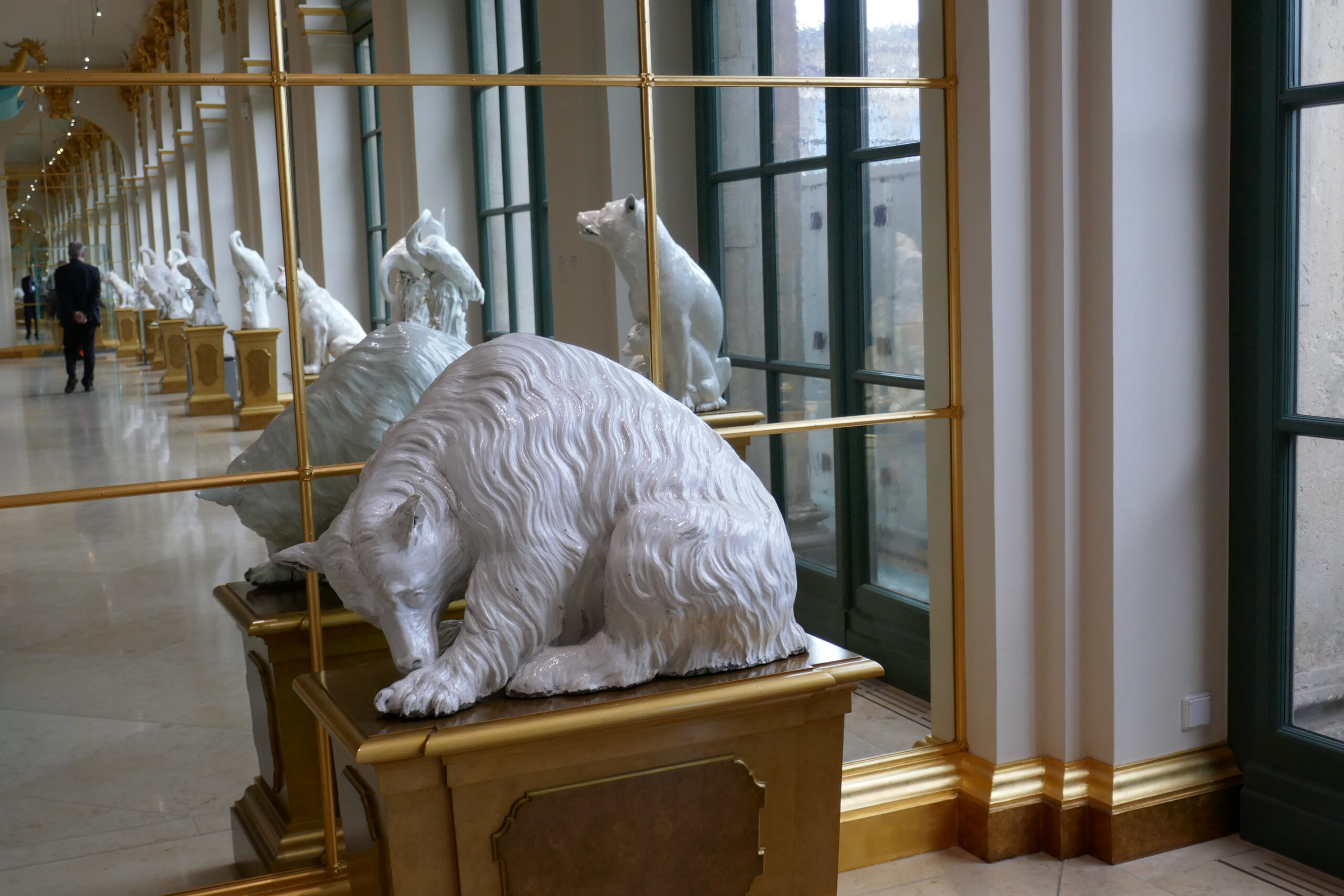
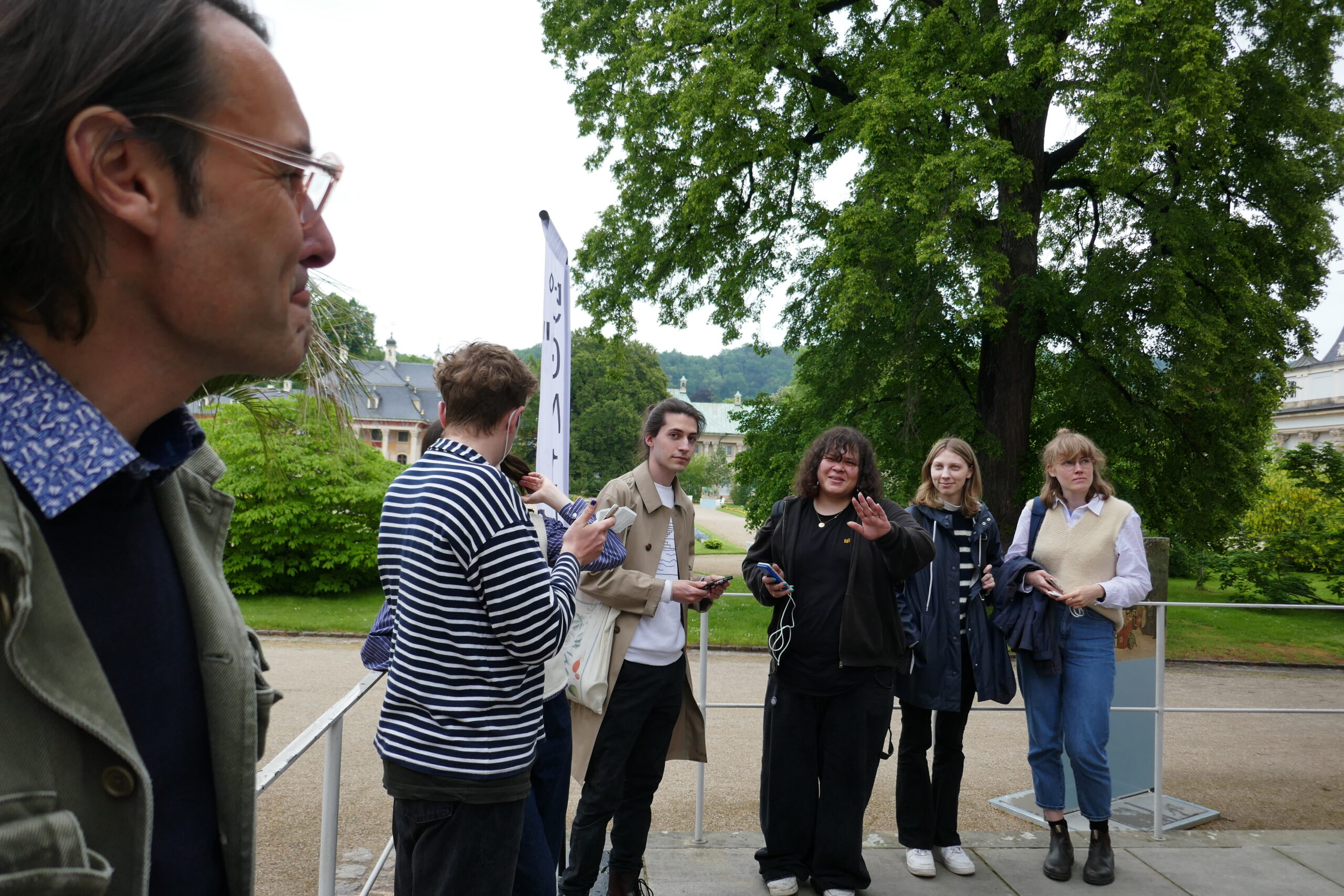
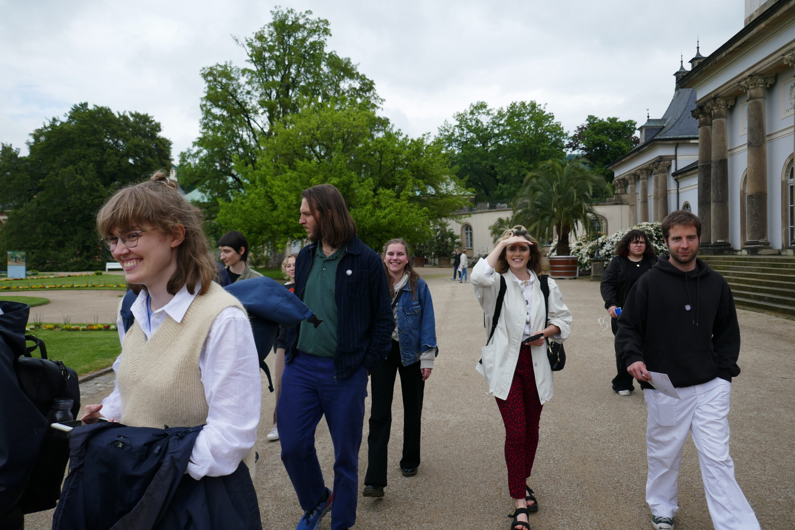
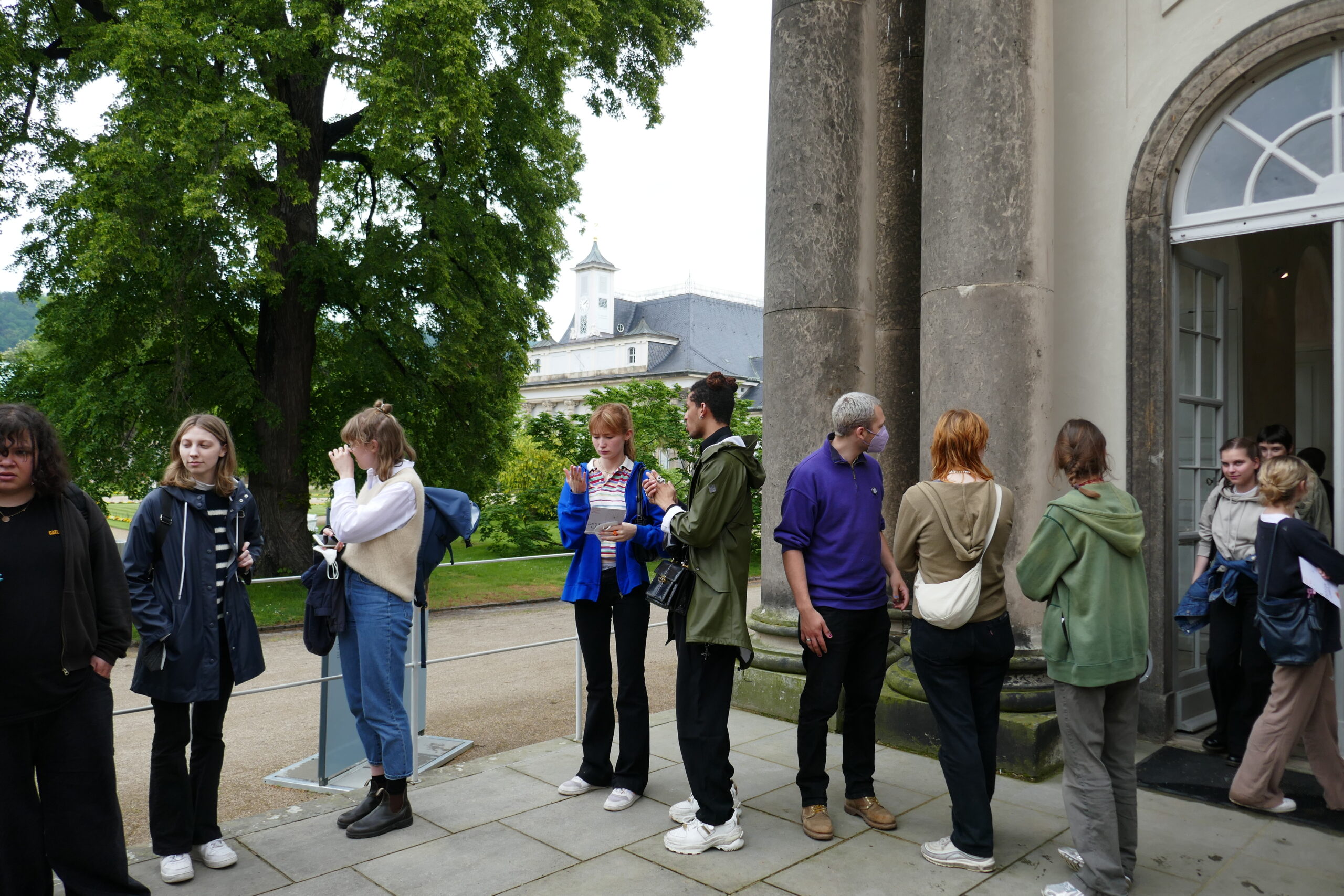
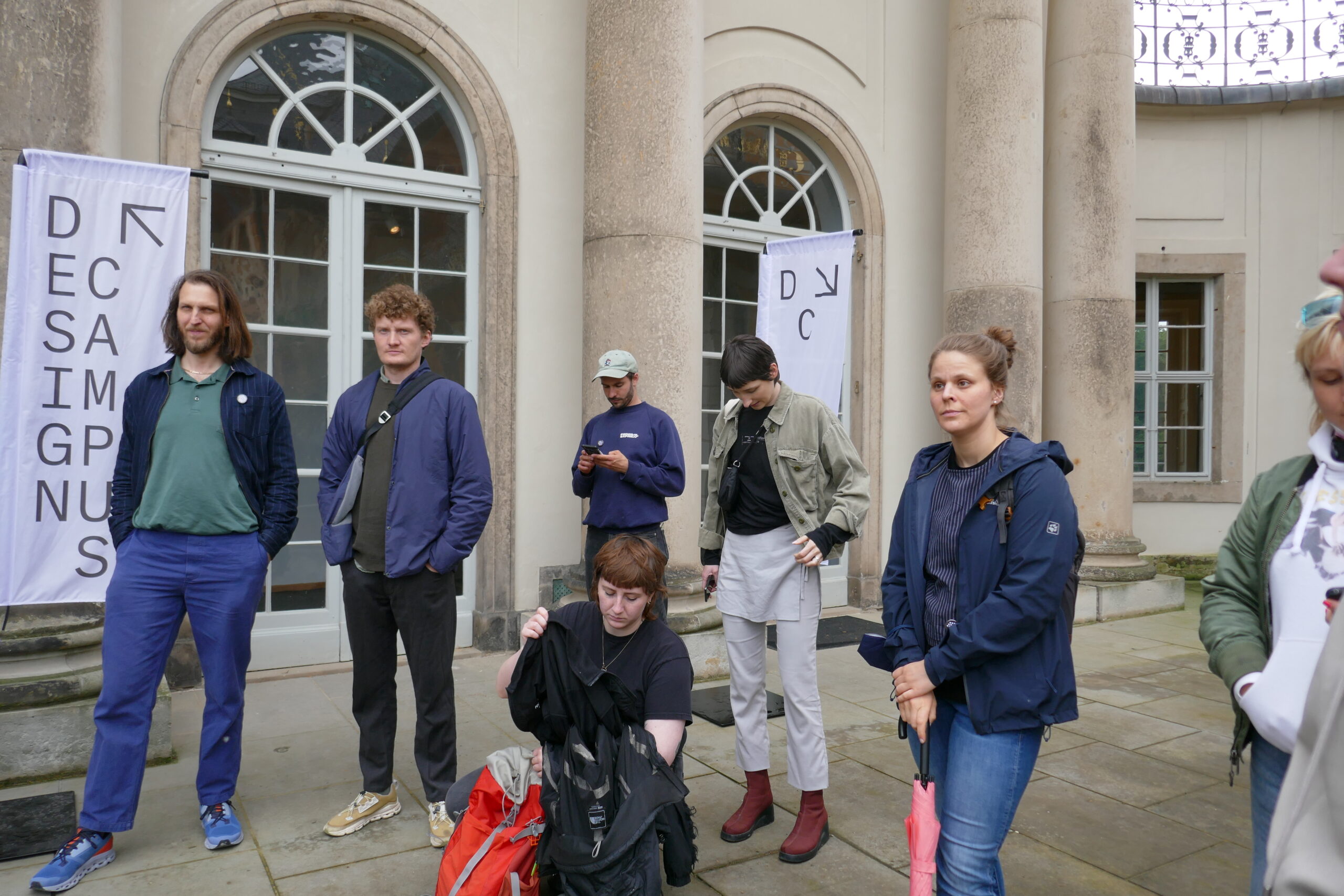
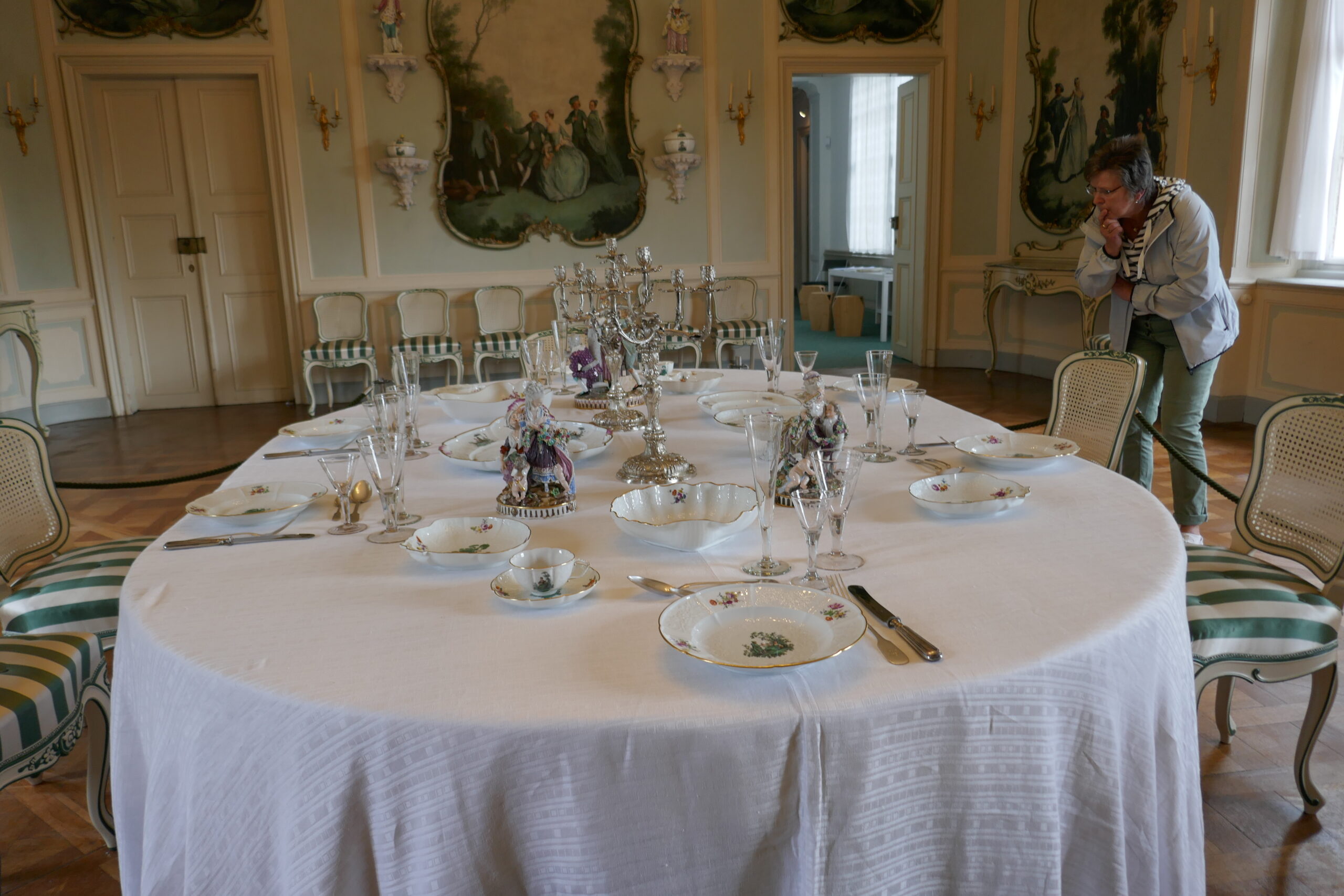
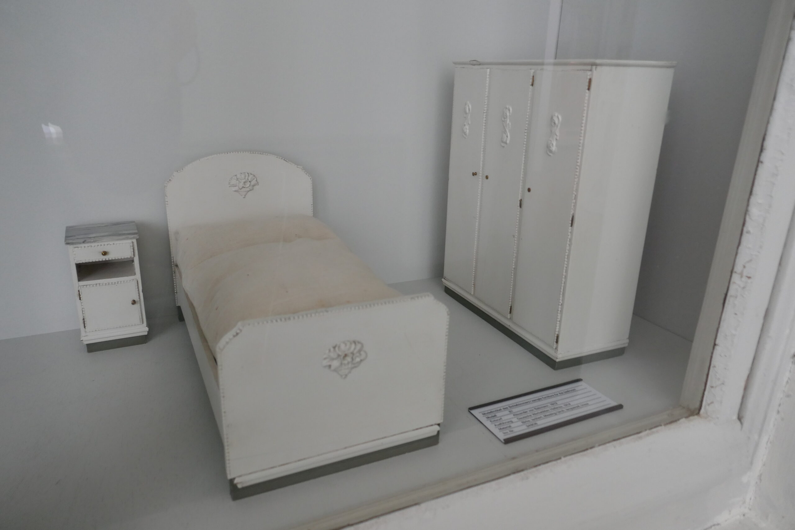
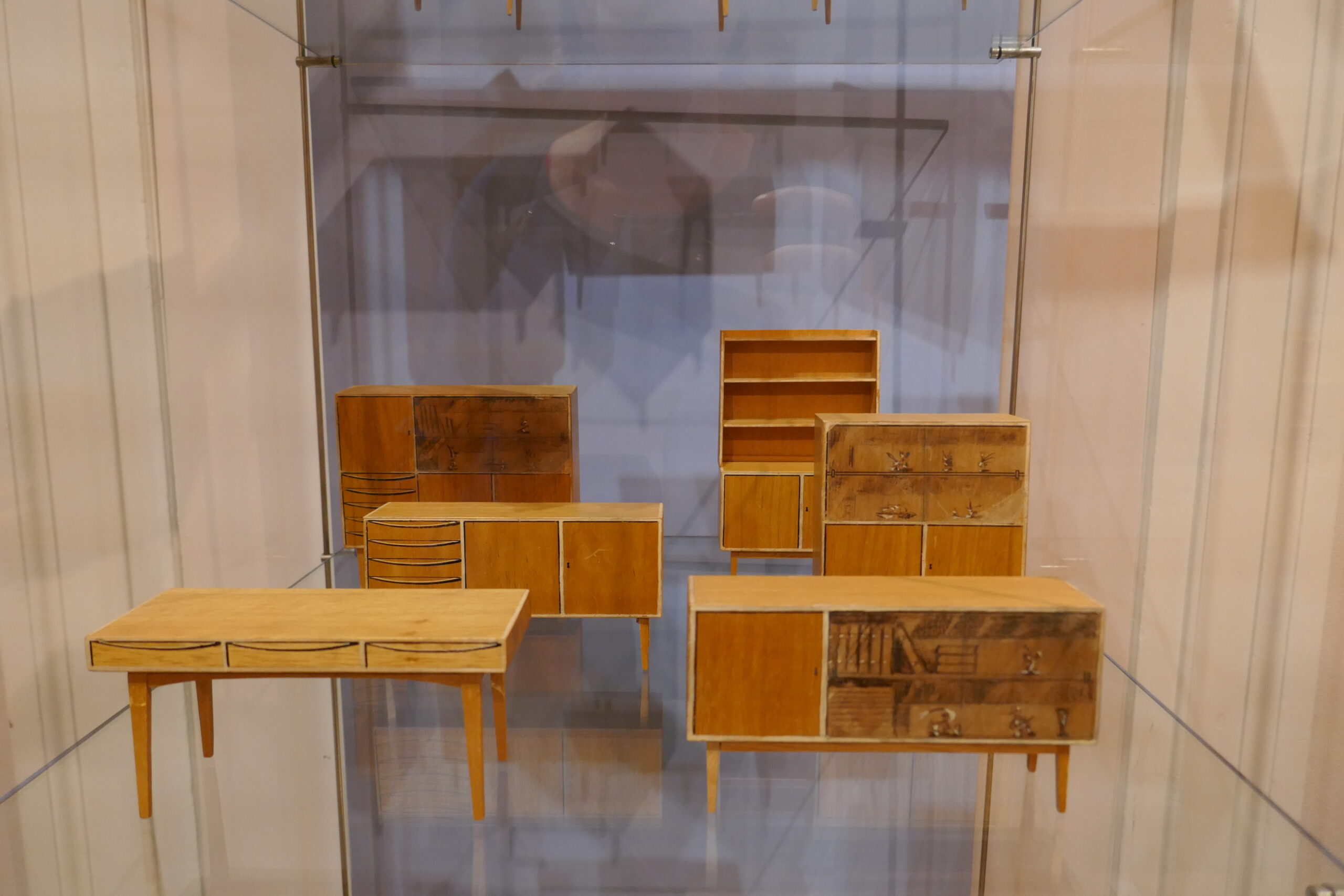
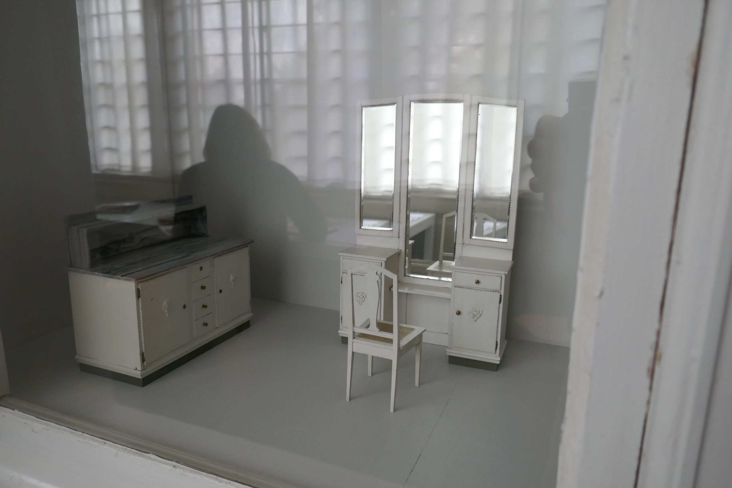
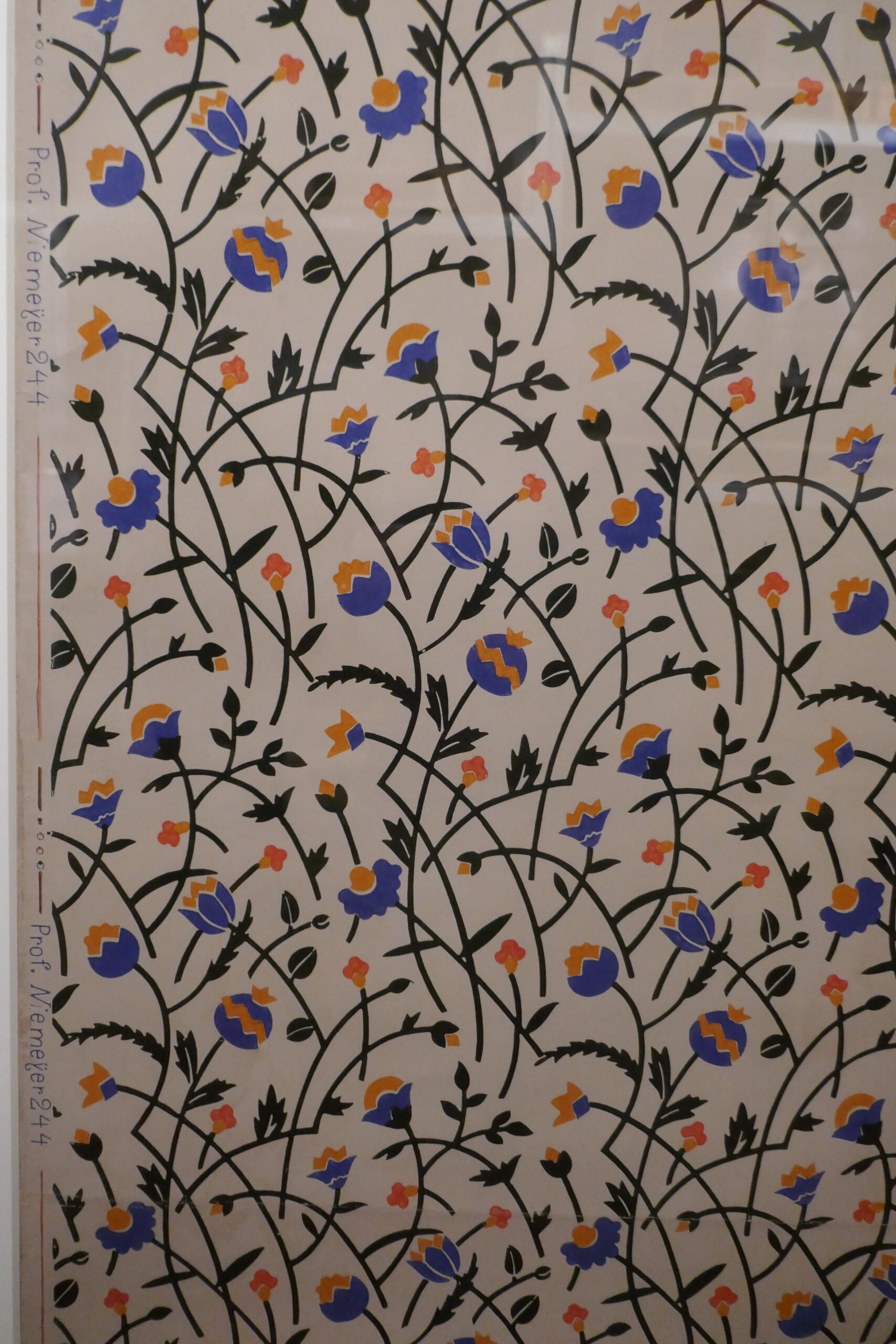
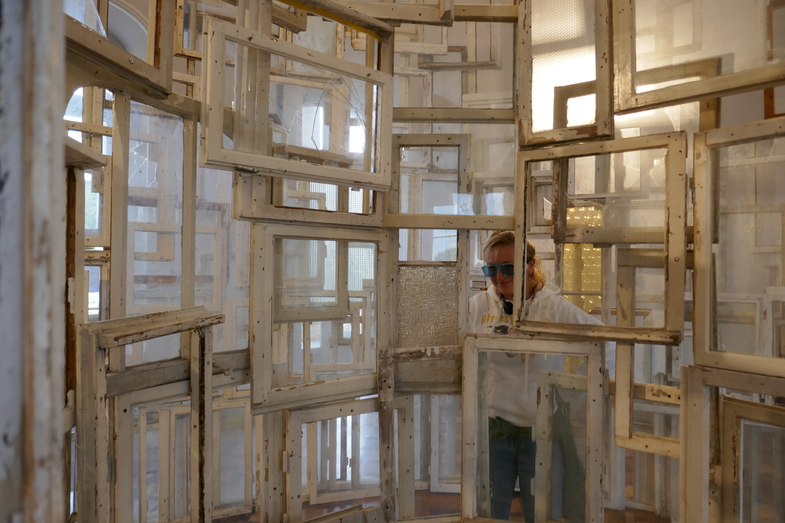
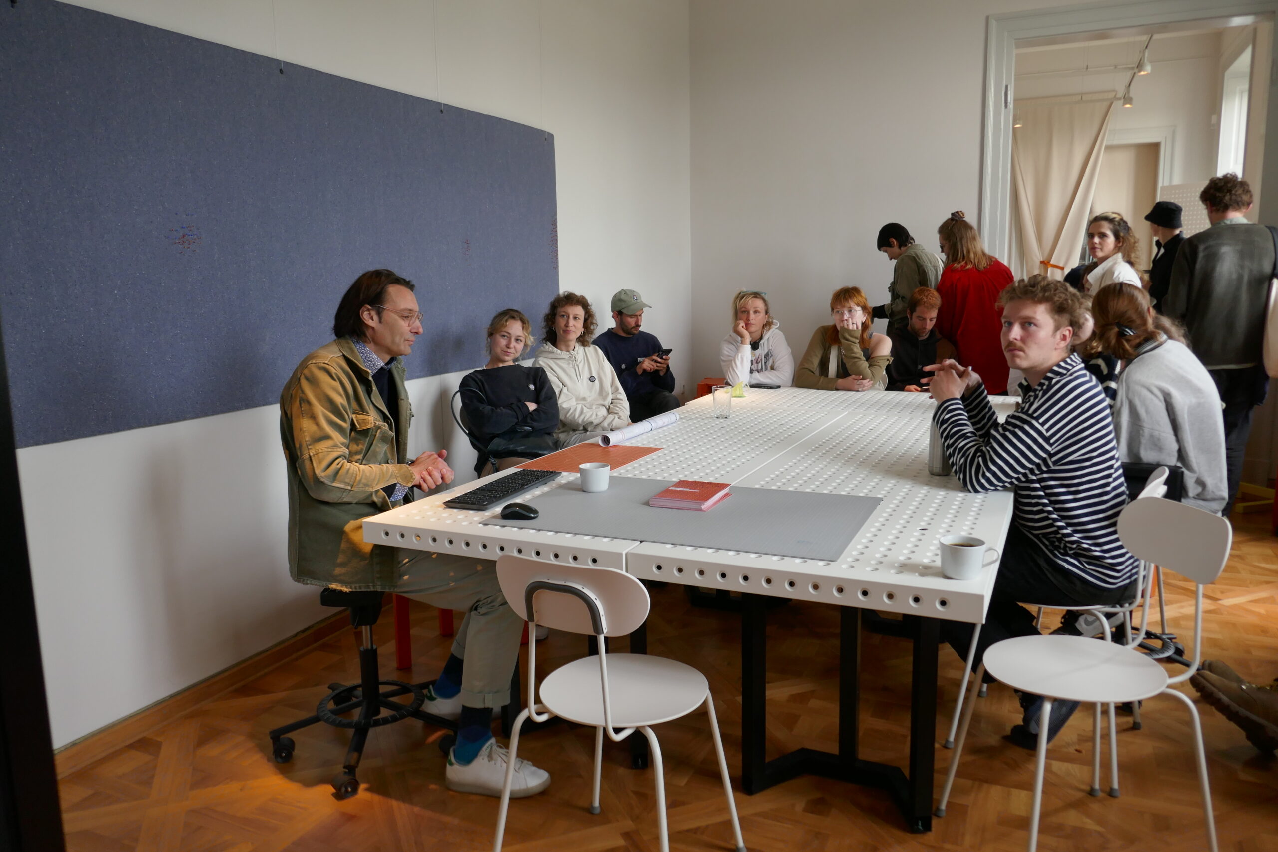
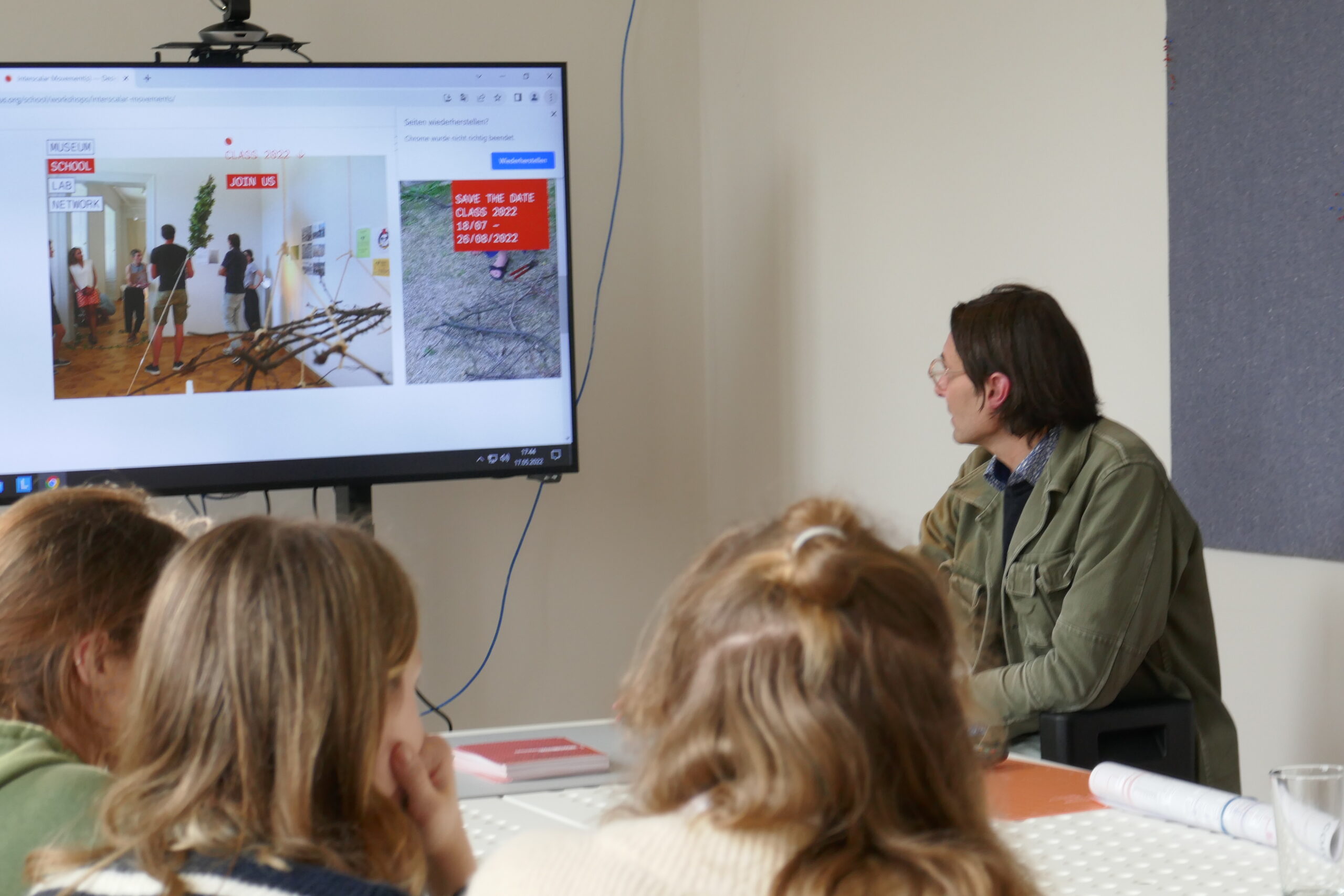
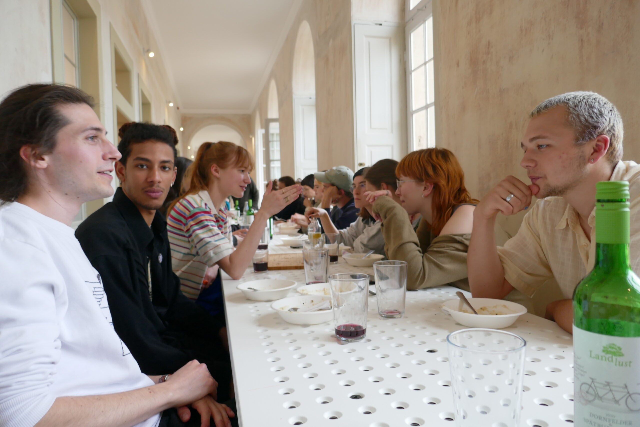
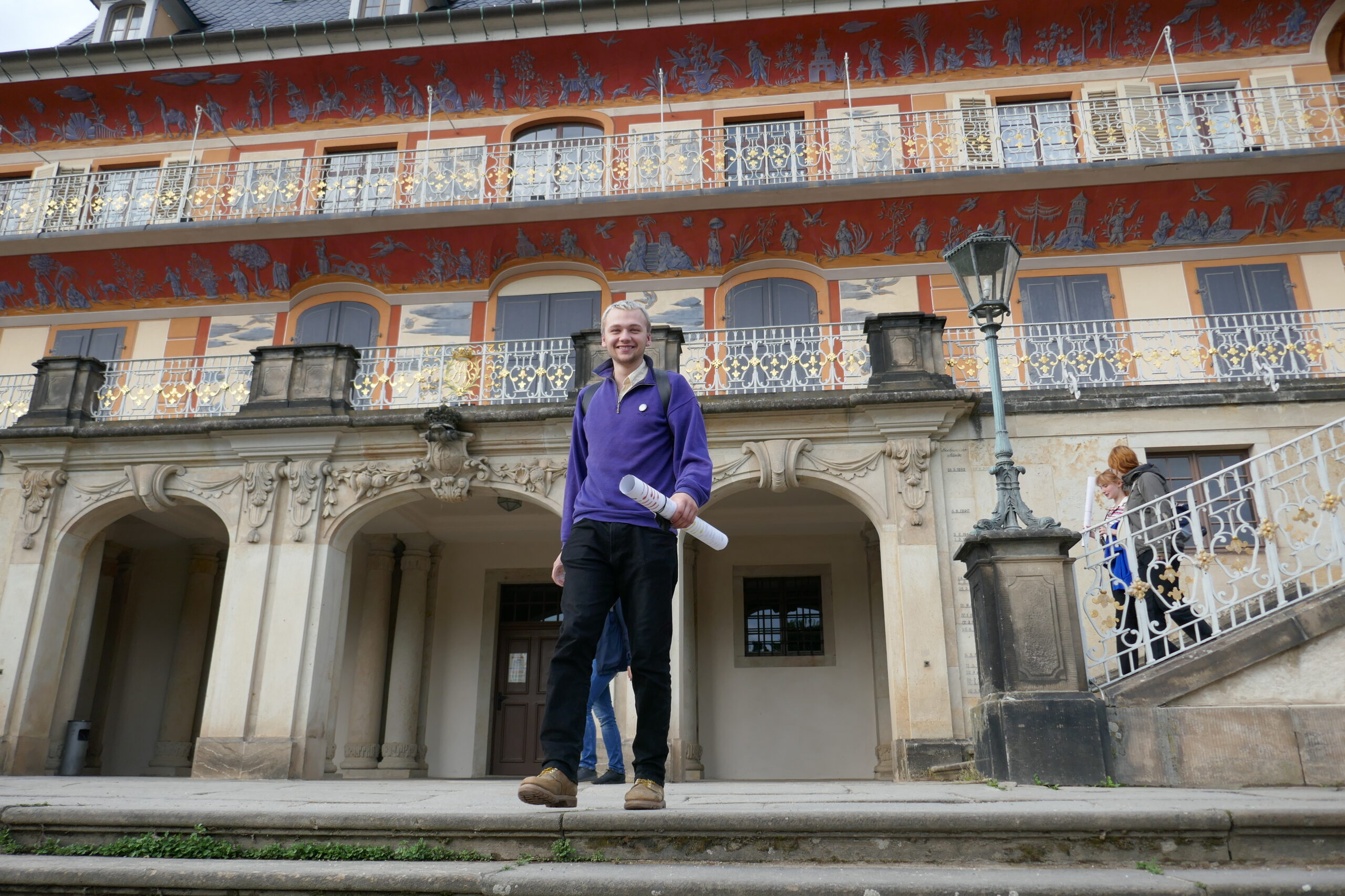
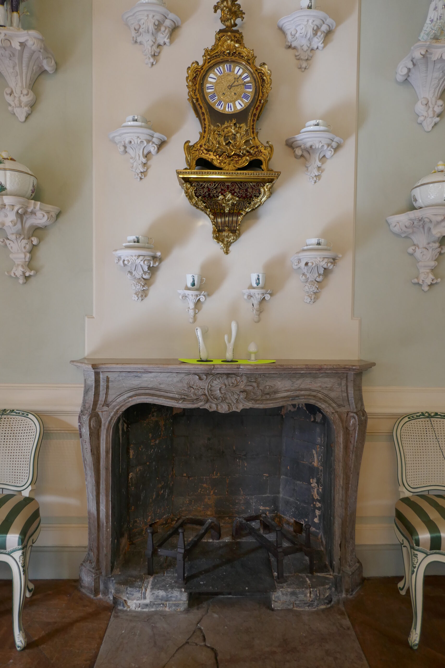
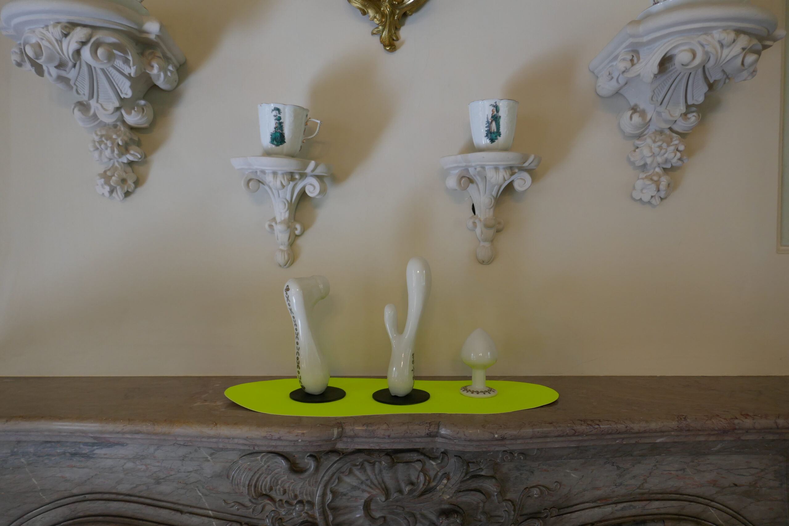
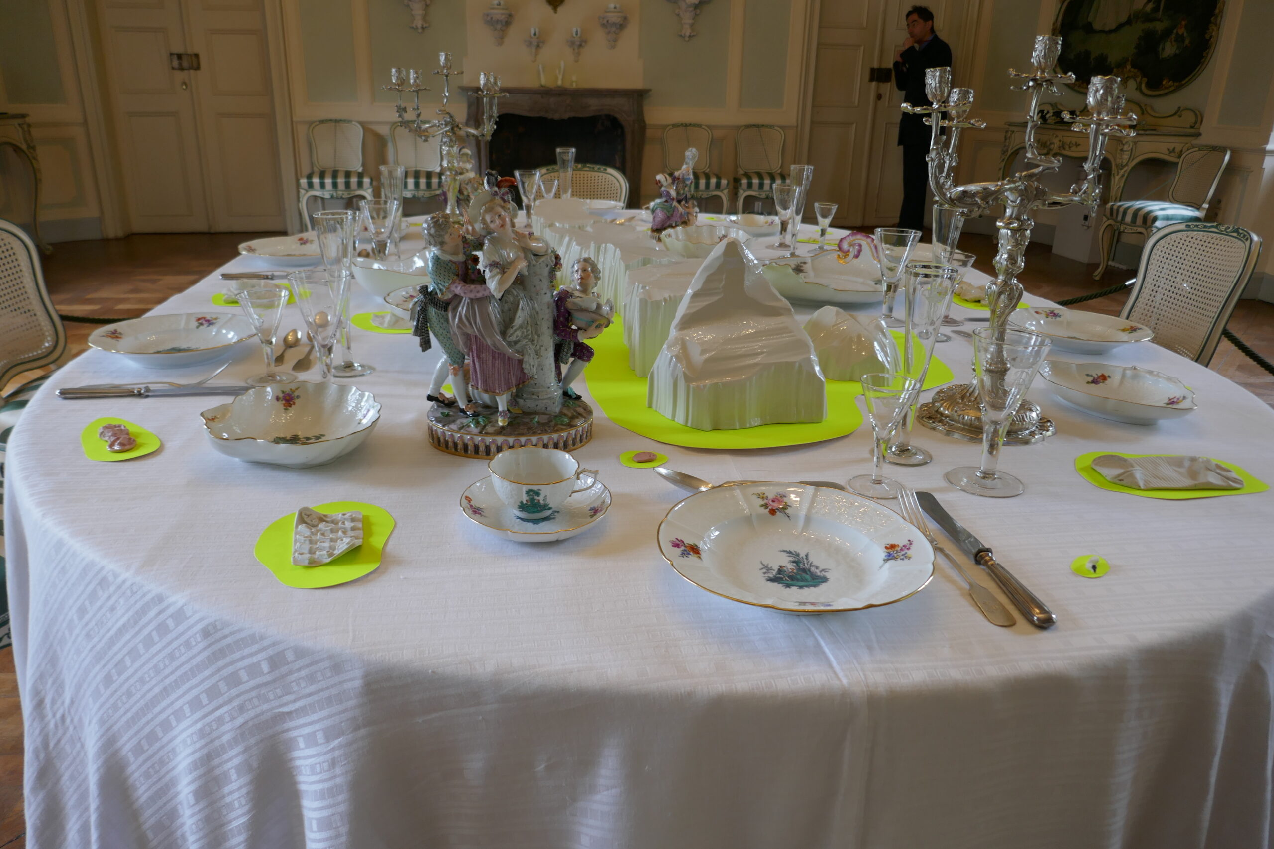
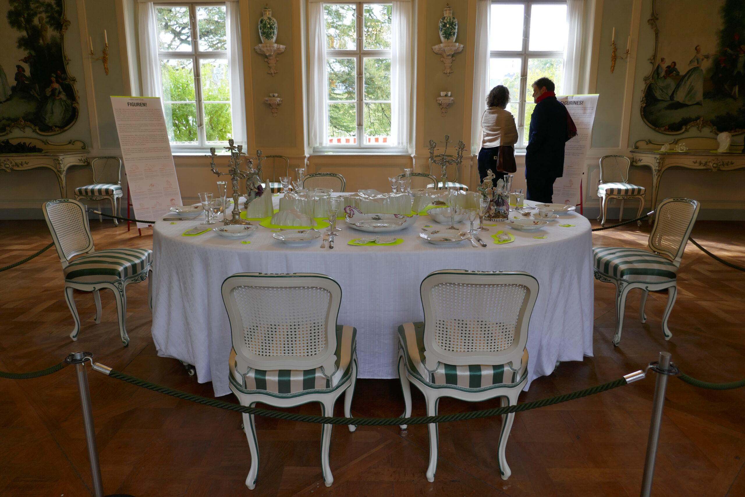
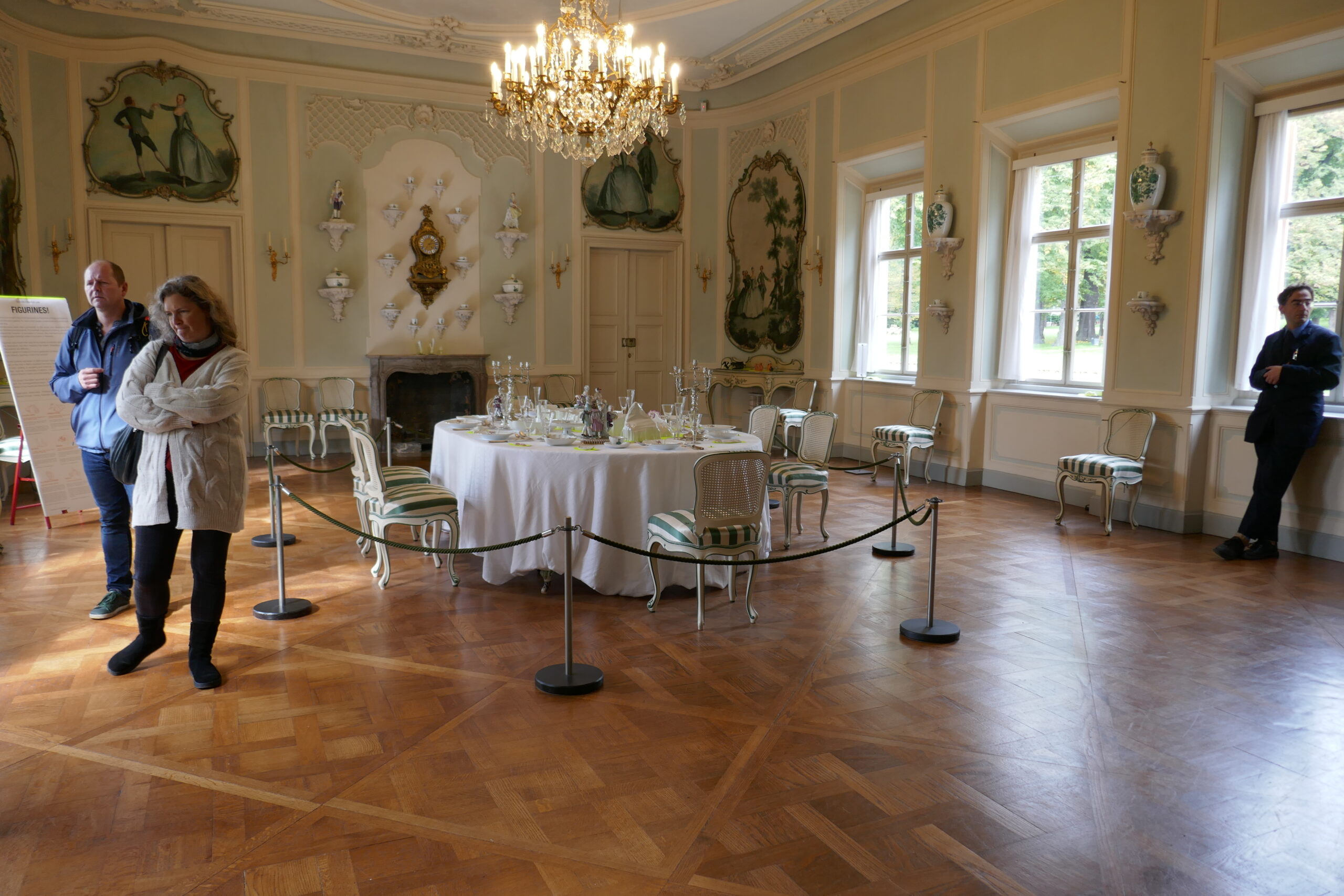
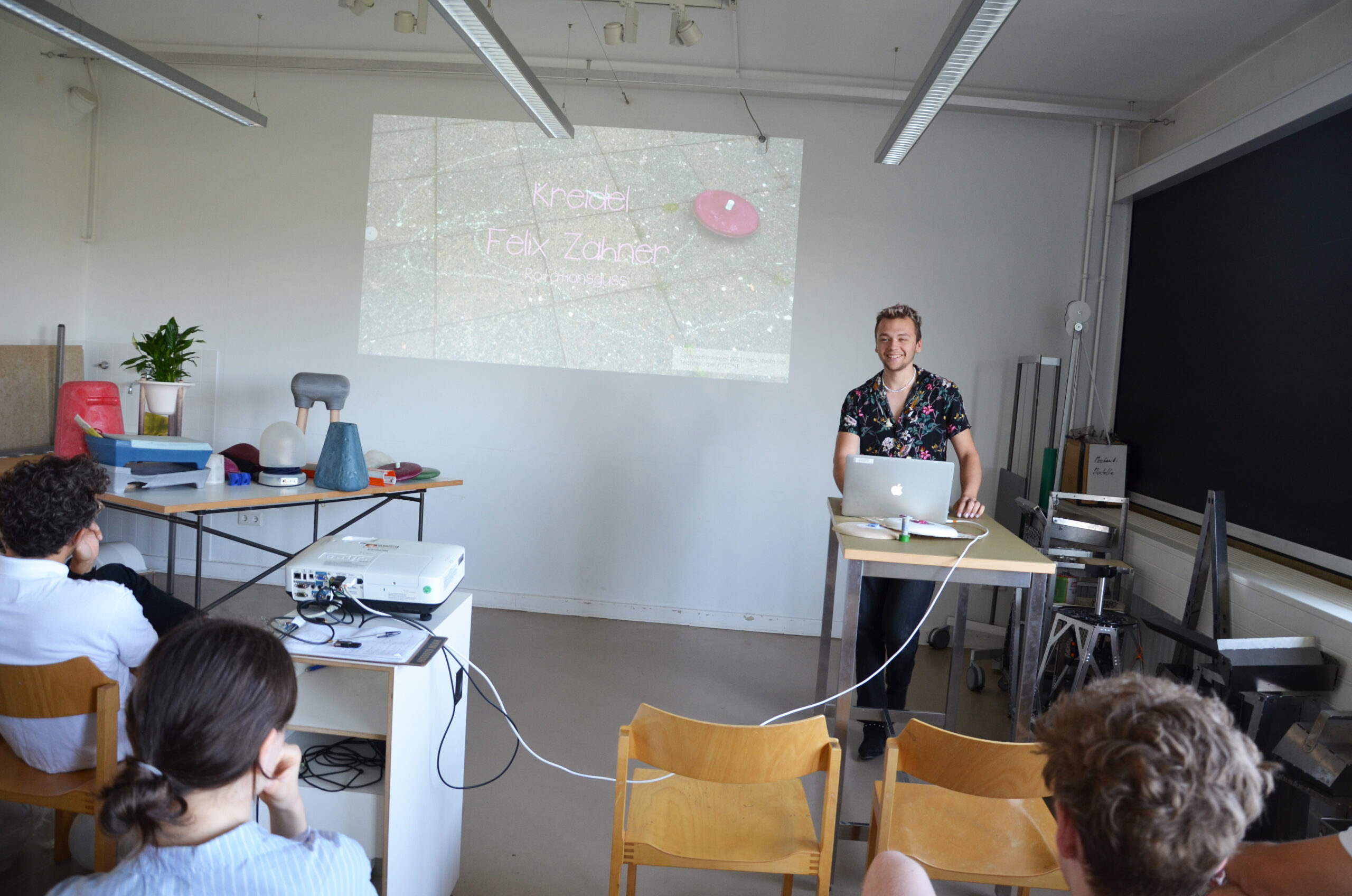
 Design Campus / Kunstgewerbemuseum
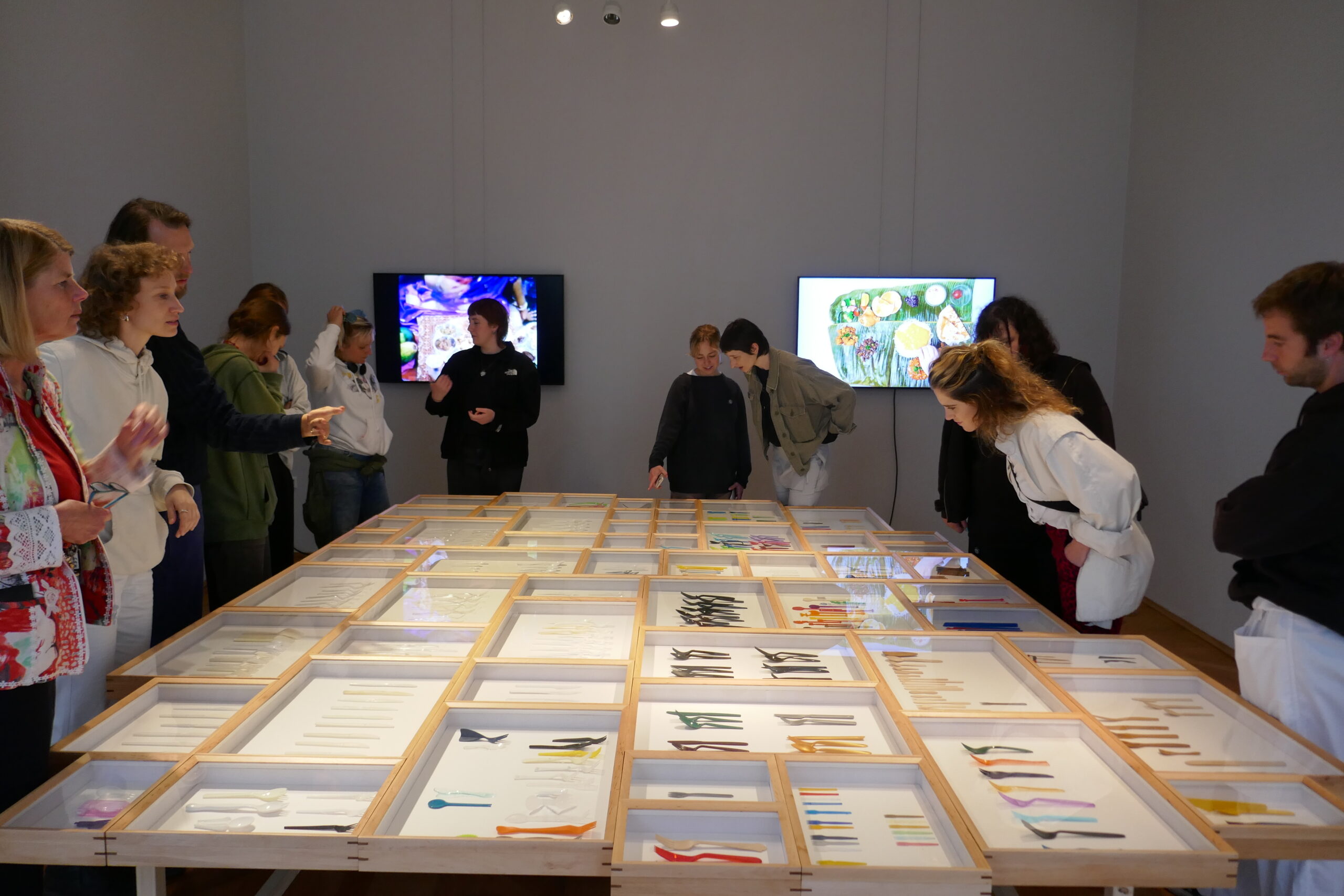
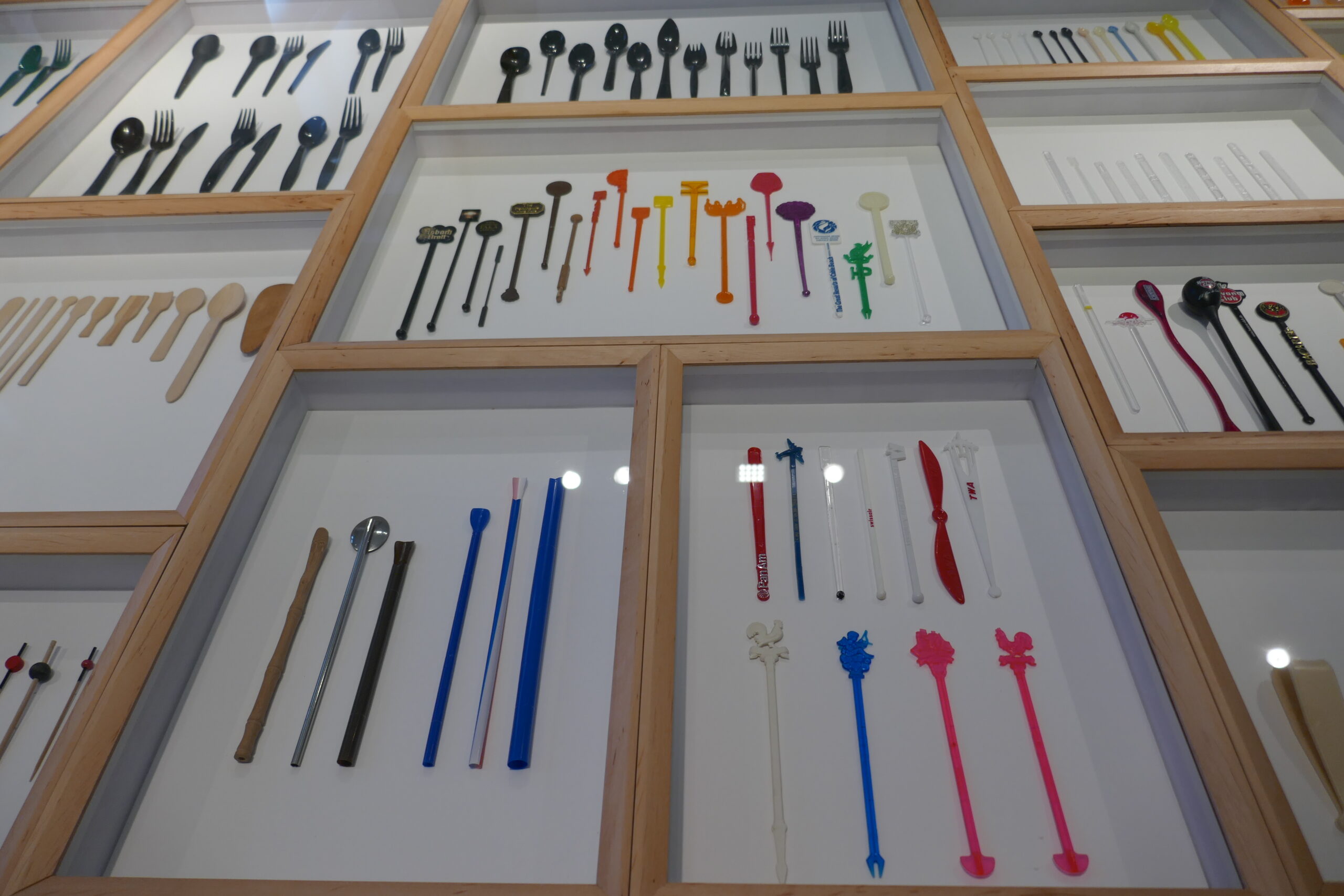
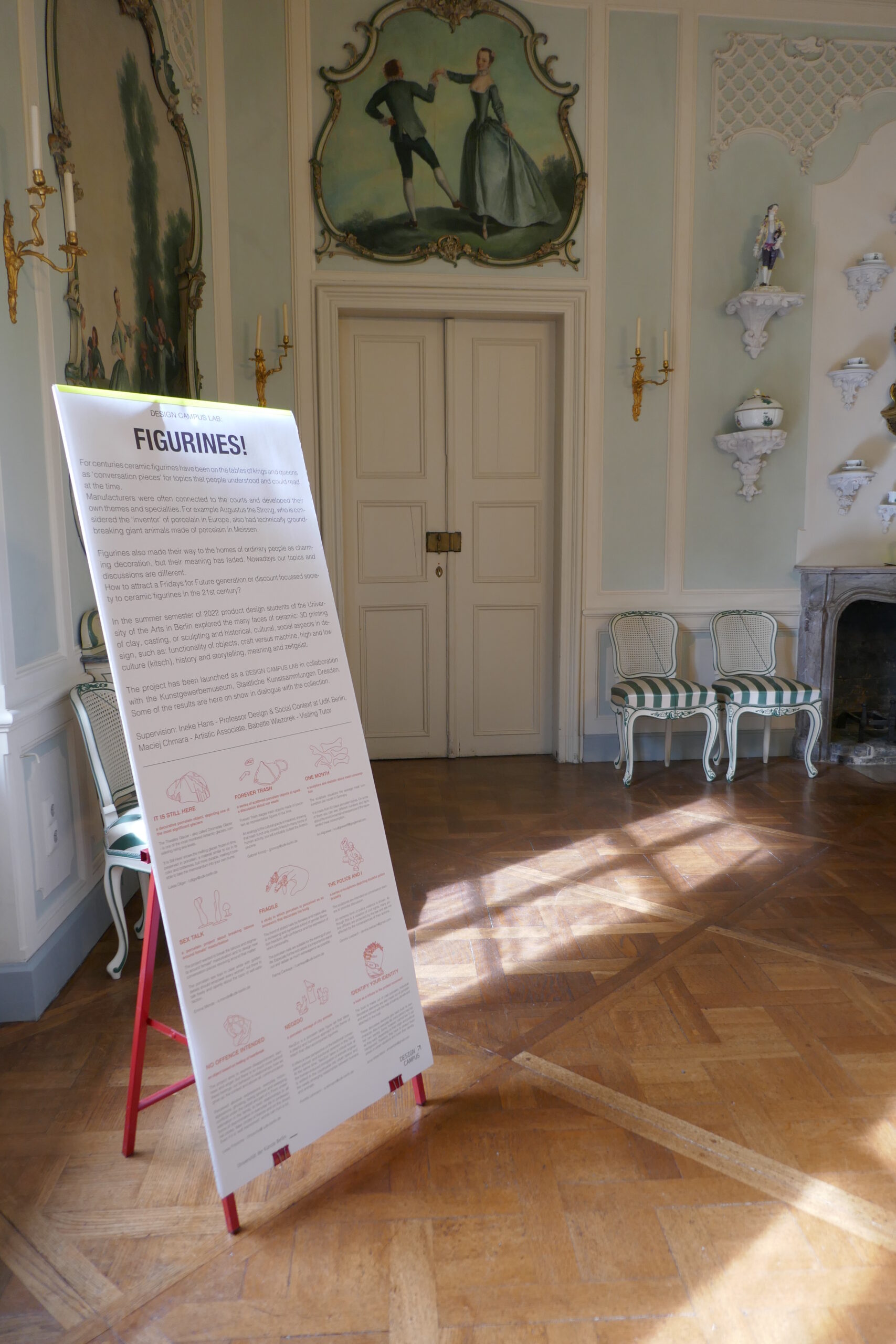


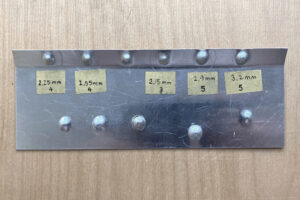

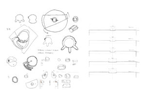


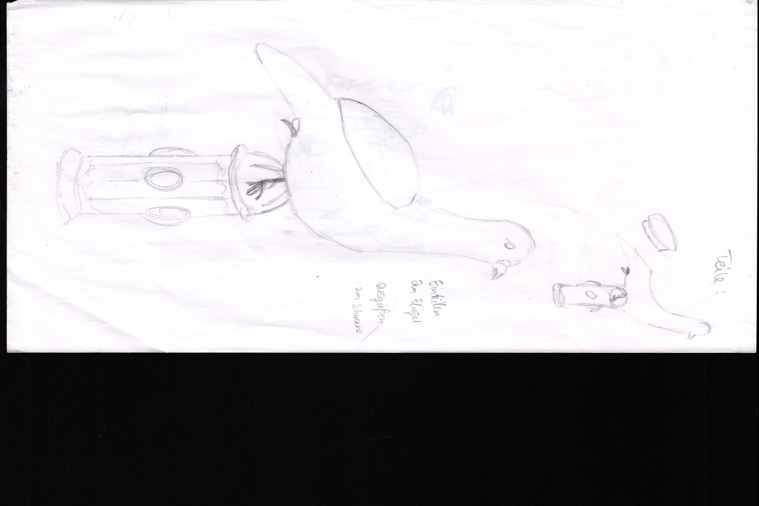


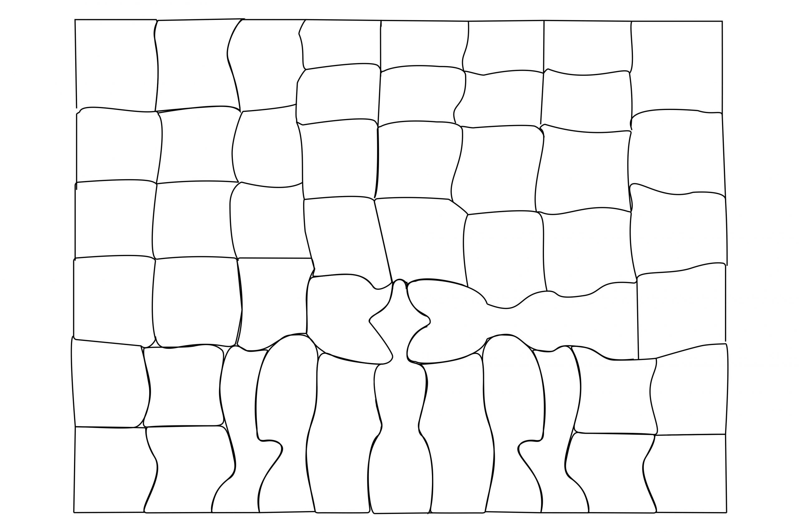


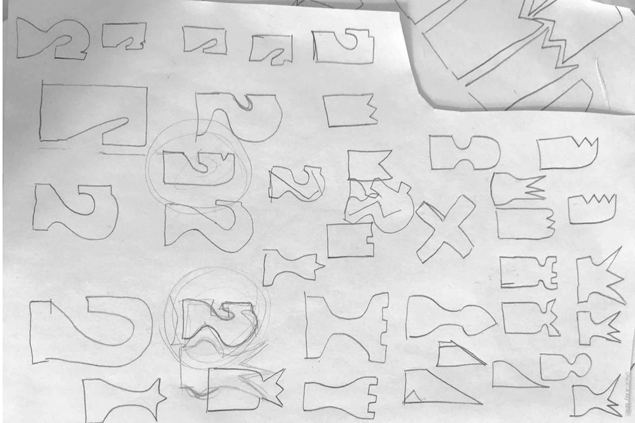


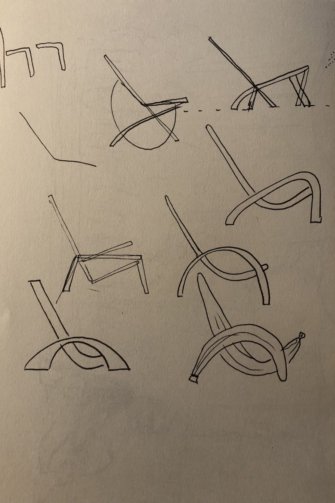
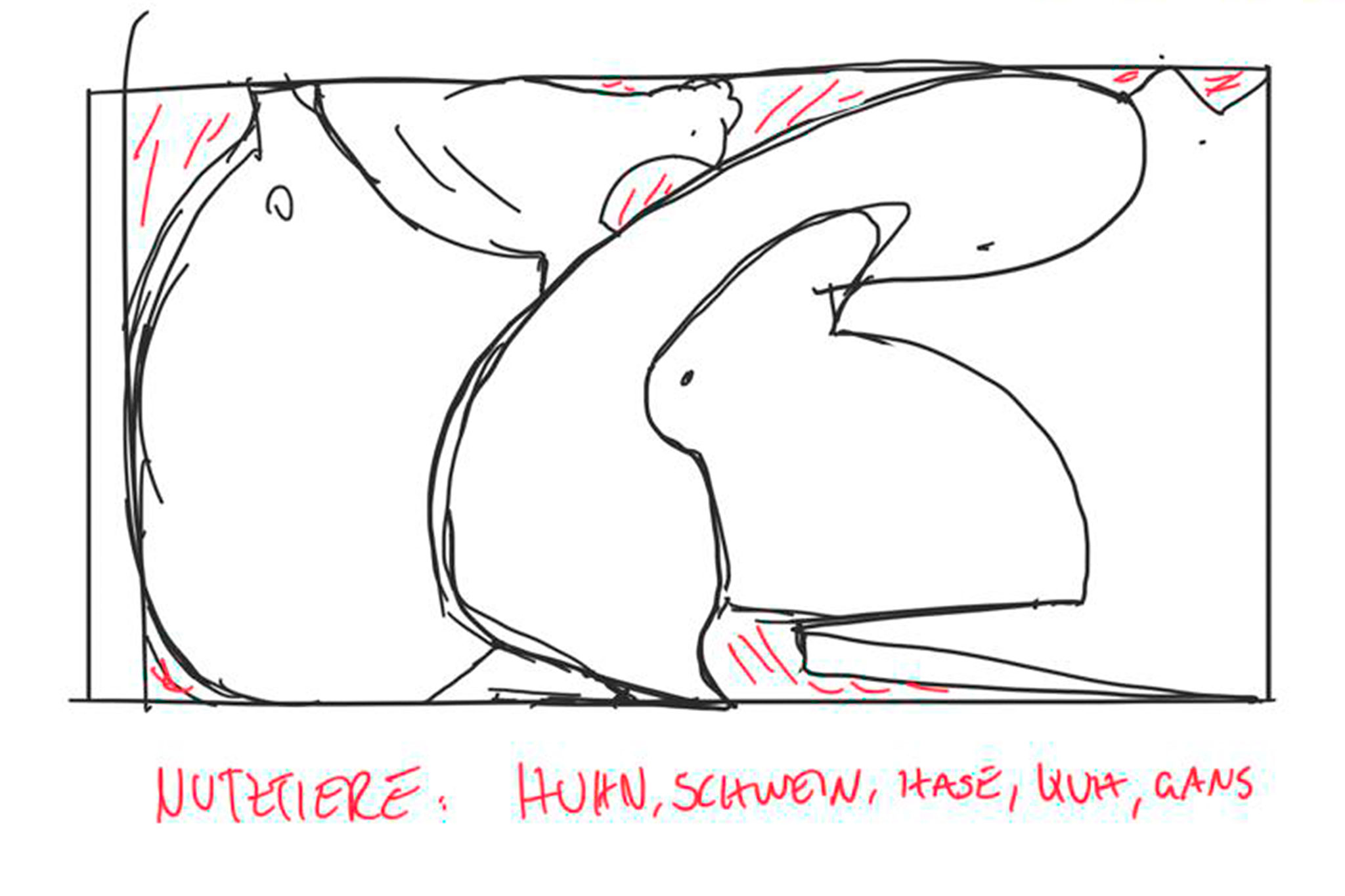
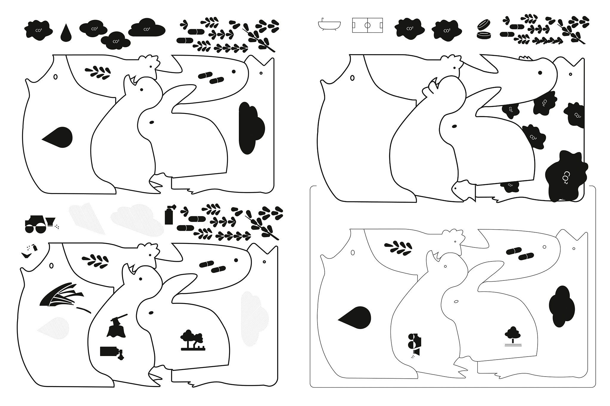
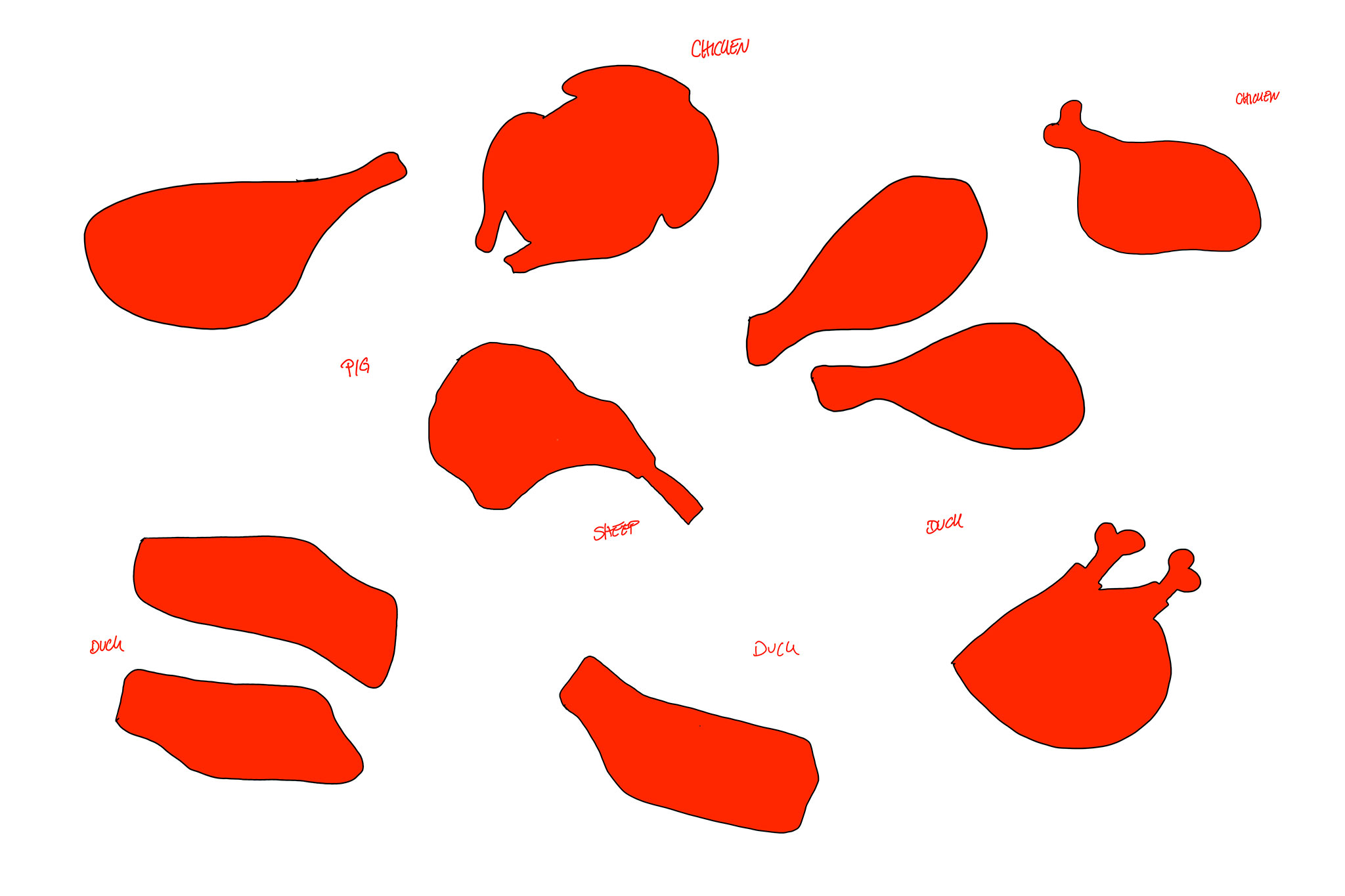


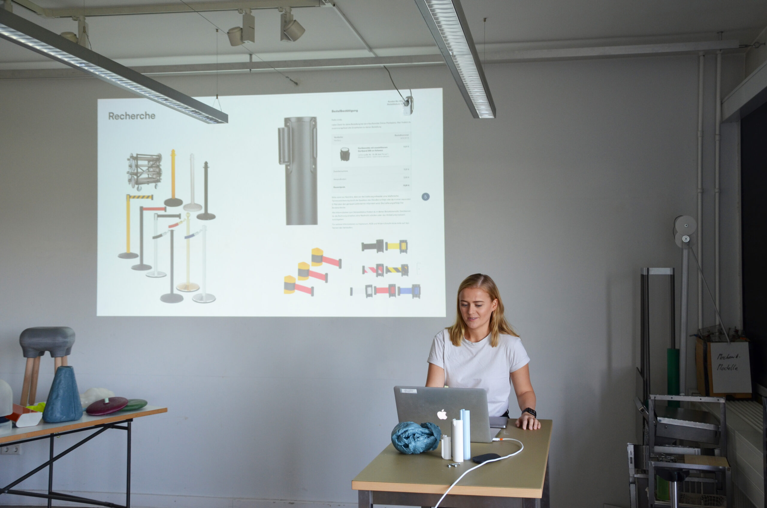


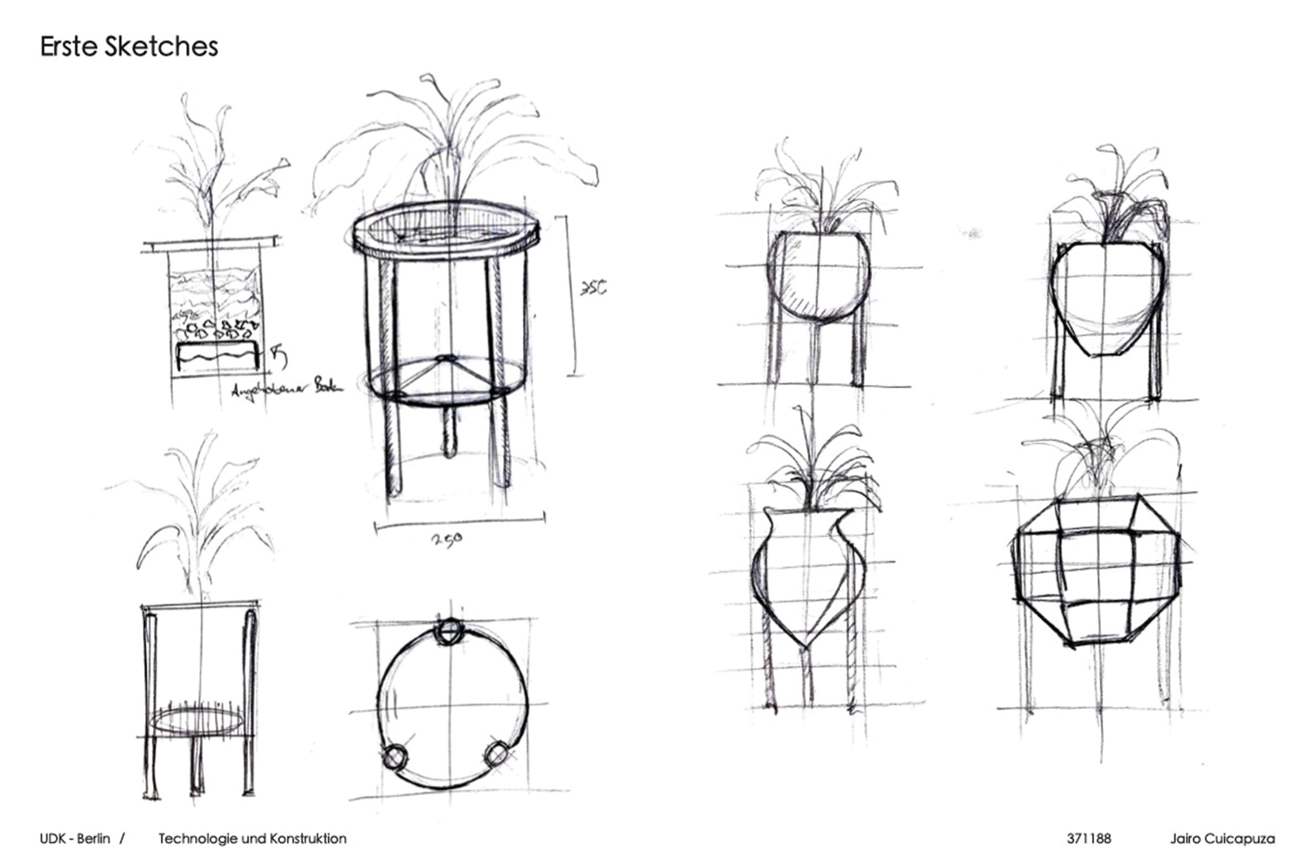


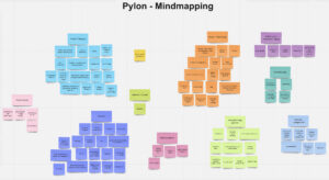
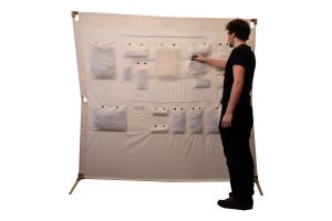
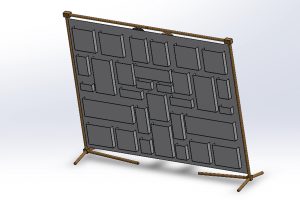
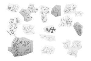
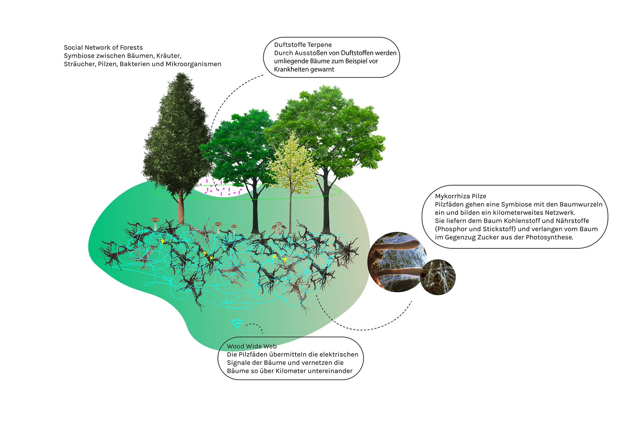
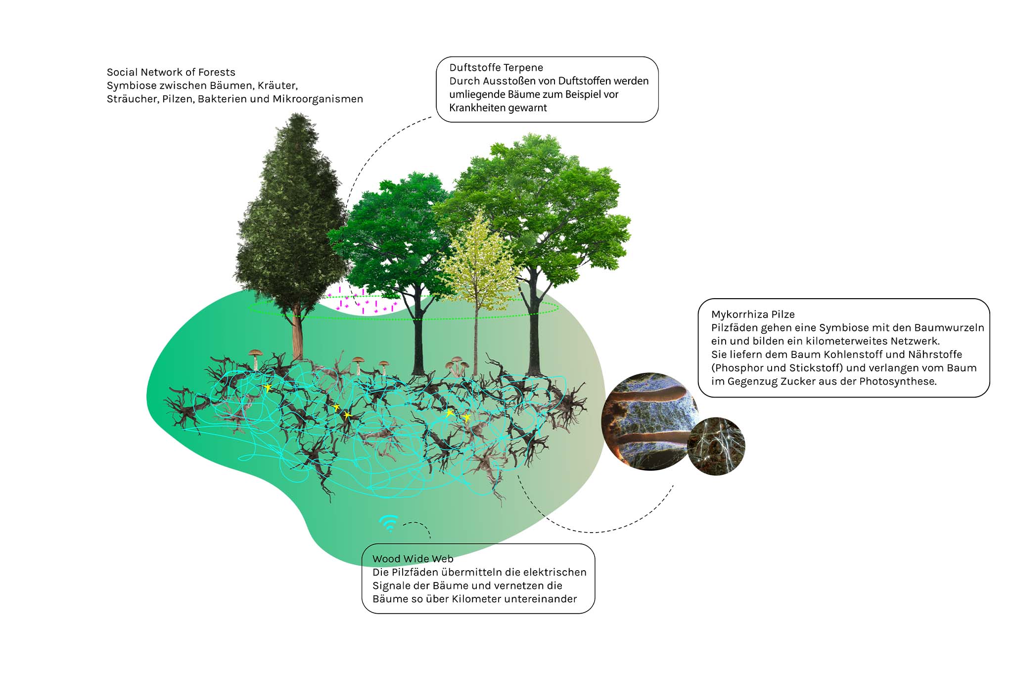
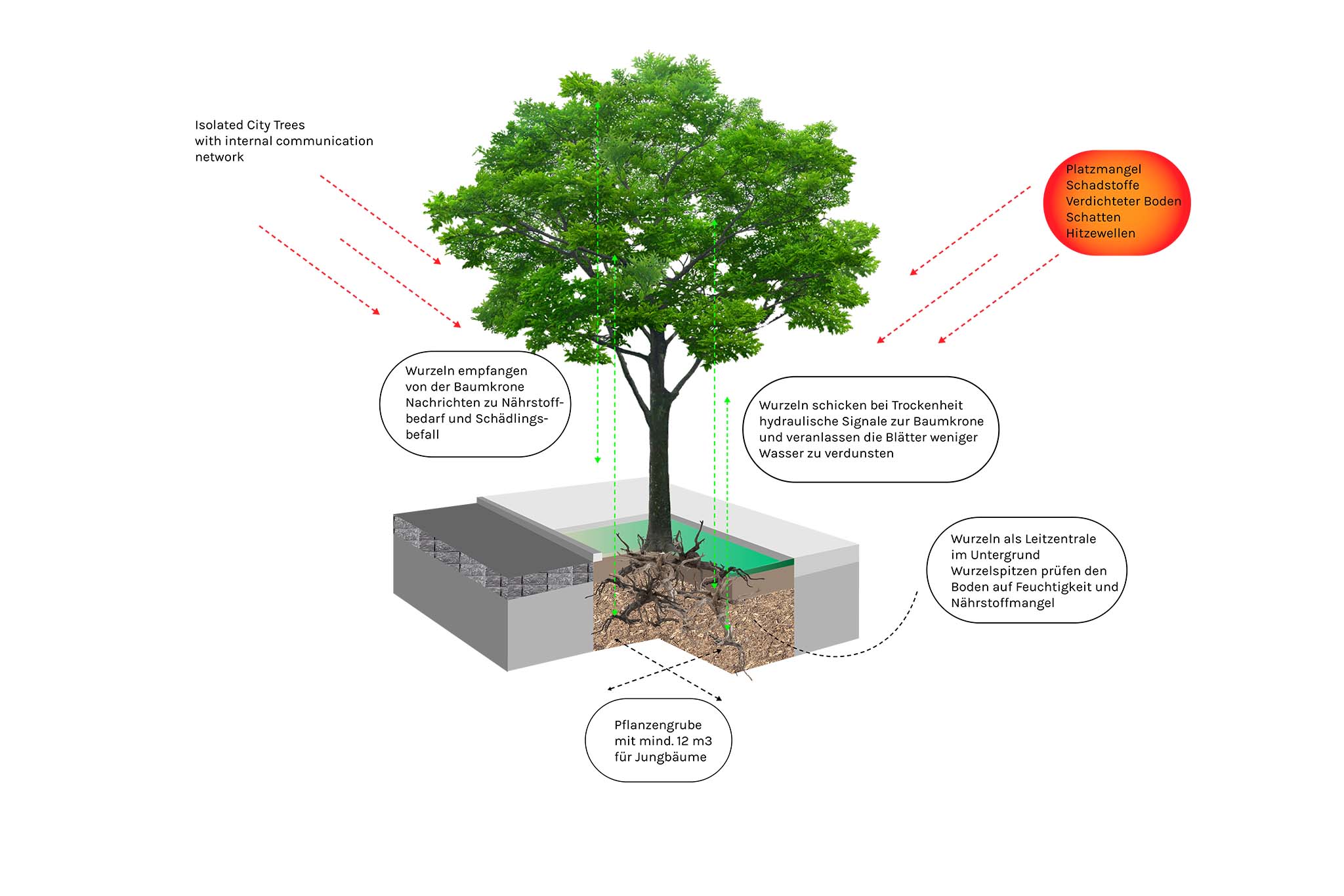
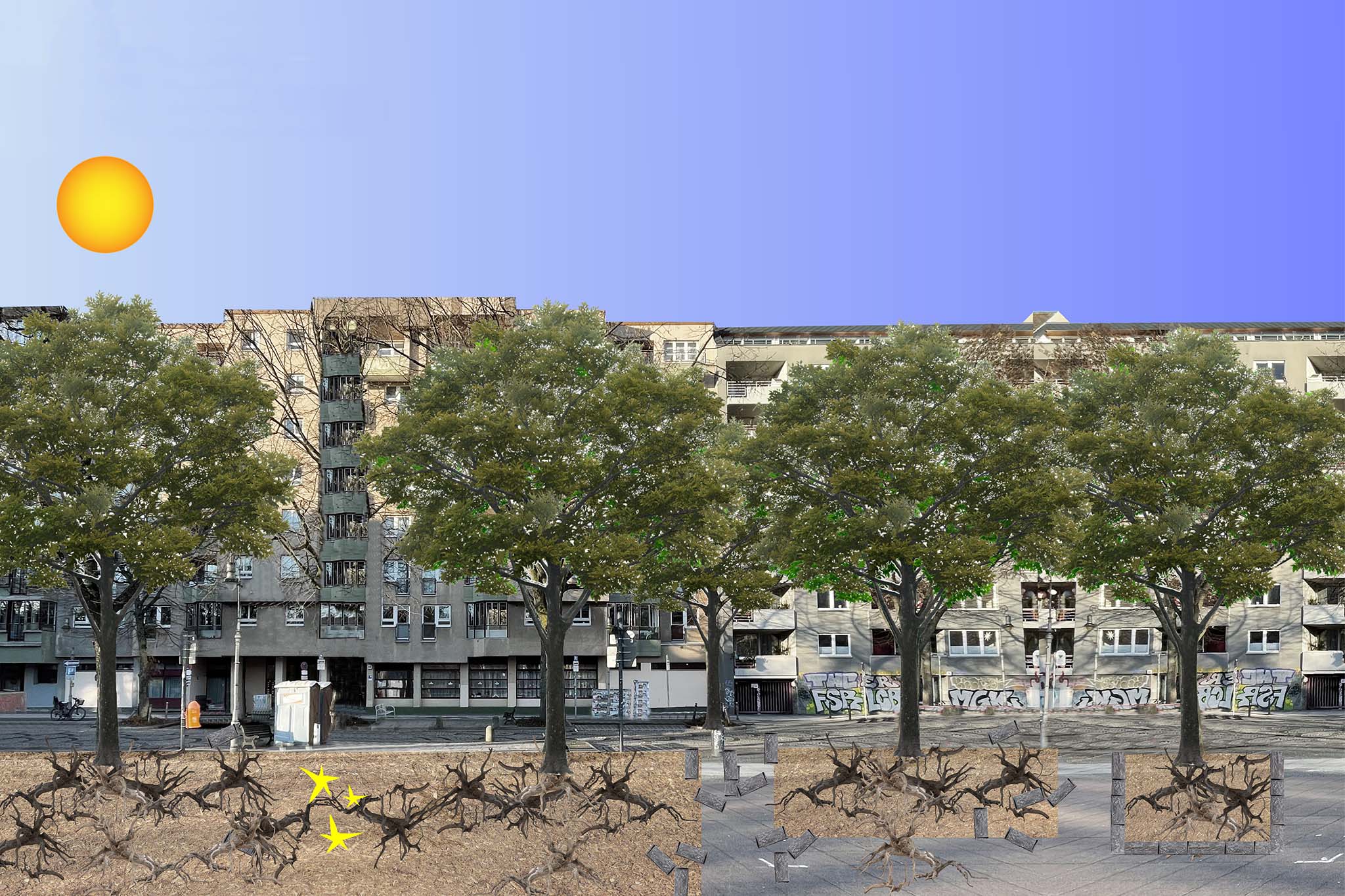
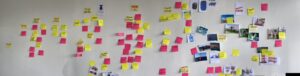 Die individuellen Recherchen der Studierenden wurden als Inspiration und Orientierung mithilfe einer Mindmaps kategorisiert, geclustert und visualisiert.
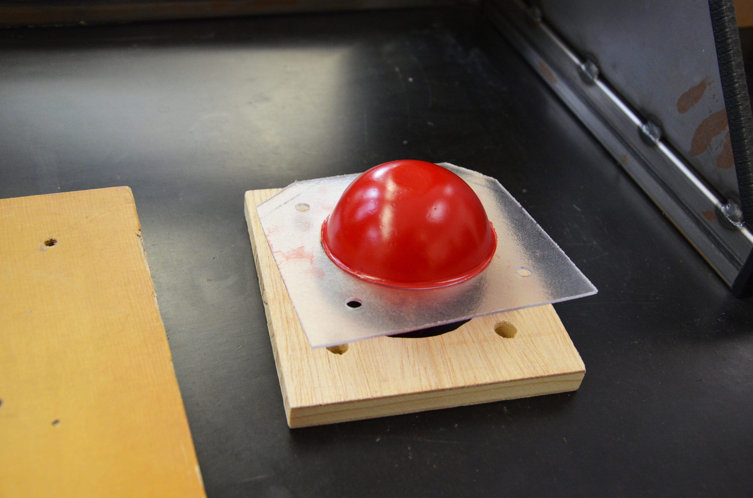


")
")
")
")
")
")
")
")